Continuing our ongoing series celebrating multiple anniversaries for the classic pulp character, The Shadow.
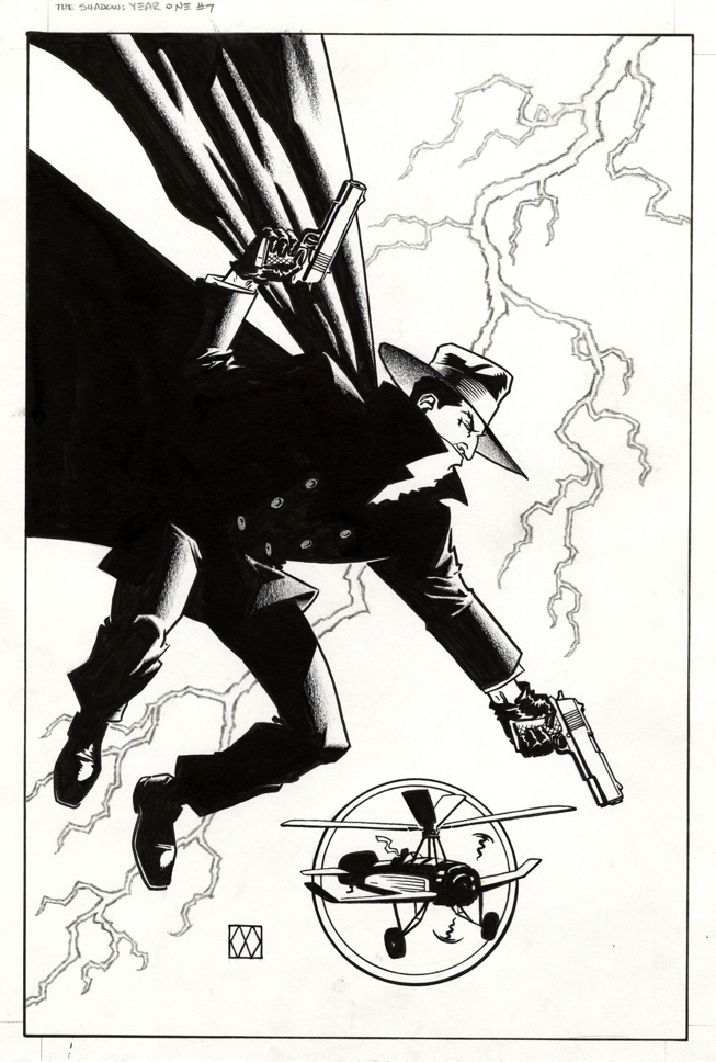
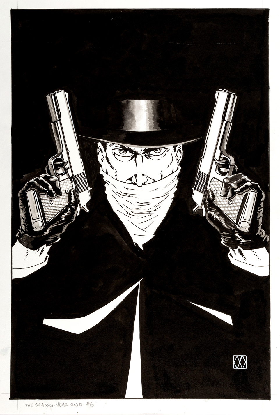
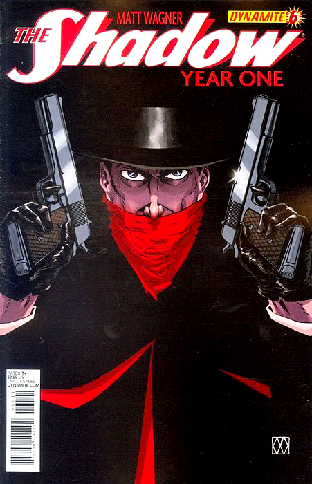
Here is another great Matt Wagner cover, from the same terrific Shadow “origin” series as the last one.
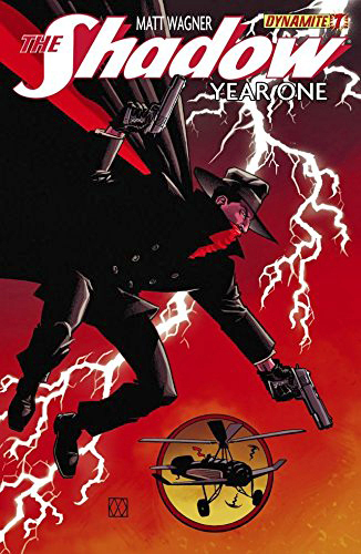
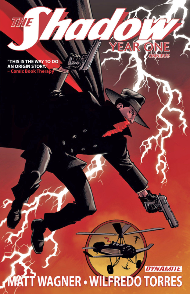
So great, it ended up as the cover of the collection of the entire series as well.
So, I think we should, and will in fact, let this superb cover stand on its own without additional dissection.
For more on Matt and his interest in the character and other legends of the pulp era, click here.
Also definitely worth checking out are the exhaustive Shadow Chronology, available at a very reasonable price from Amazon, and Walter Gibson’s (out of print, unfortunately) Shadow Scrapbook, a nice first person history.
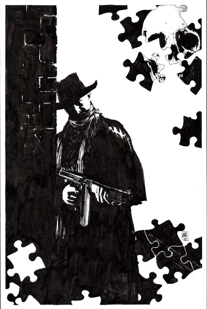
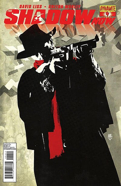
Tim Bradstreet delivers a great Shadow cover that was, ultimately, unused.
Why are some comic book covers re-worked?
Subjective question. Subjective answers.
If it’s a licensed title, as in the case of The Shadow, maybe the licensor doesn’t like it.
Editorial decision, perhaps? Certainly a logical answer in many cases. Possibly not a strong enough image to “sell” the issue. Or perhaps the content doesn’t quite match the interior content.
And, in some cases, the artist himself finishes the piece and decides he doesn’t like it. Both Jim Steranko and Neal Adams have told me they’ve finished covers, changed their minds, and started from scratch.
That seems reasonable, even if time consuming. If your signature is going on the piece, you might re-think something you personally don’t like. Especially if you’re going to have to look at it — forever.
And in a pre-digital age, physical covers were lost occasionally. Trust me, it happened.
Whatever happened here –– definitely not the final possibility, of course — I think the unpublished version is cool. The puzzle pieces, skull included, are a nice touch. The published cover drops them in favor of a larger, more dramatic Shadow pose.
Bradstreet, of course, is a great choice for Shadow covers. Can’t go wrong, and for my two cents, I don’t think there’s anything wrong at all here.
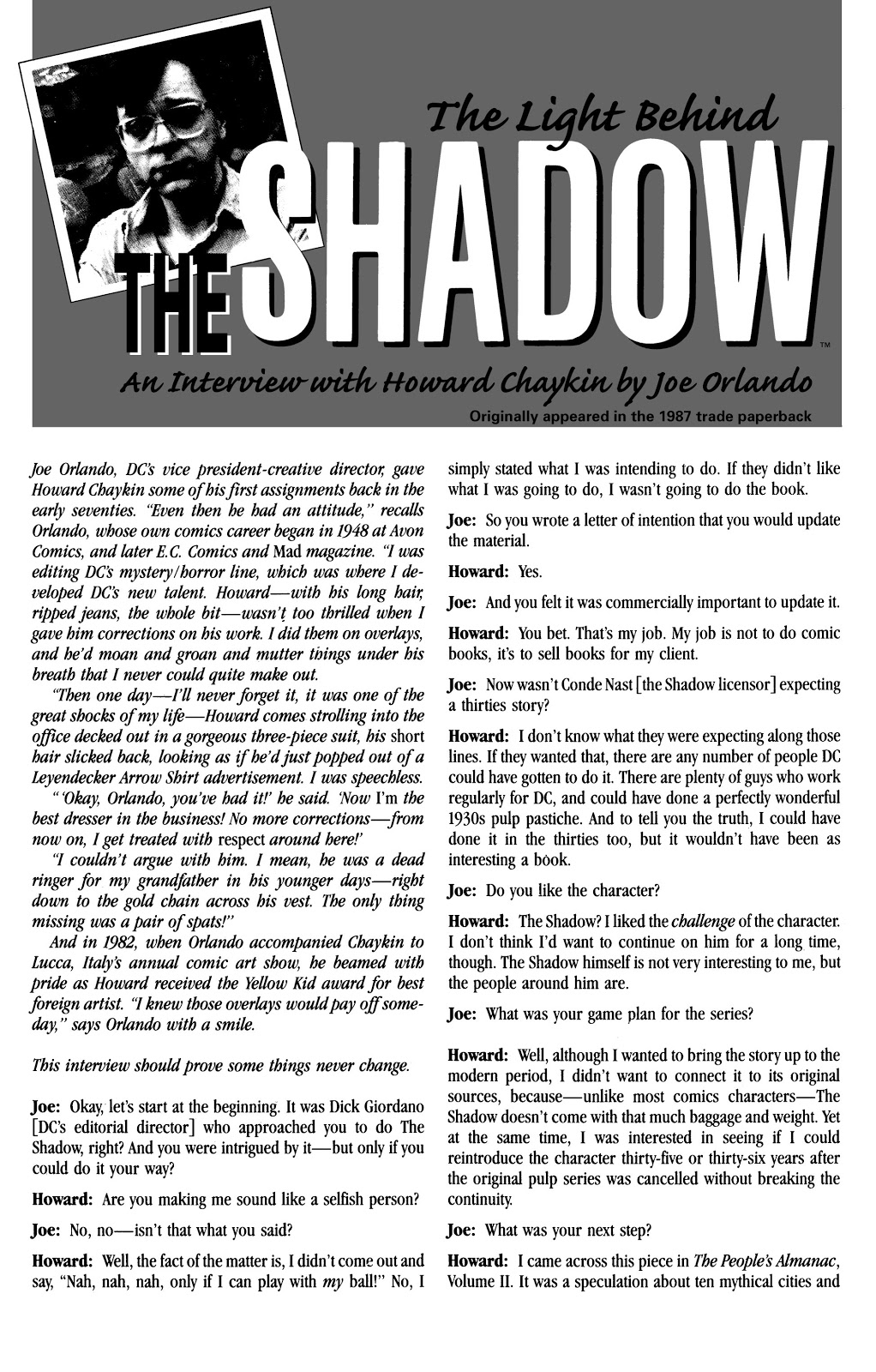
Comic book pundits in 1986 decided the Shadow mini-series by Howard Chaykin was “controversial.”
Translation: Some fans liked it, some didn’t.
The late Harlan Ellison famously hated it. And Harlan was not famous for being gentle about his opinions. So there’s that. (Comic book journalists, critics, fans and trolls didn’t need the Internet in those days. They had fanzines. But I digress.)
Setting the series in the contemporary era seems to be a primary trigger for fans of the classic pulp character. Fans, who, it should be noted, mostly had abandoned their commercial interest in the character long ago.
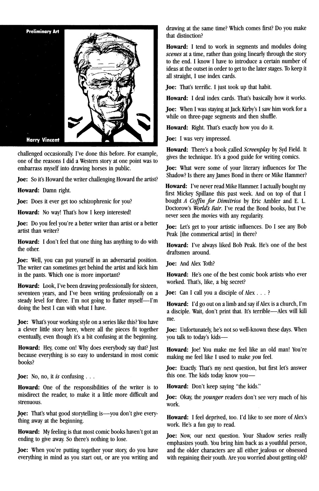
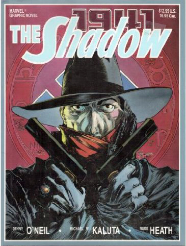
A decade earlier, a series by Denny O’Neil and initially drawn Mike Kaluta, brilliantly faithful to The Shadow’s pulp origins and era, didn’t last past 12 issues.
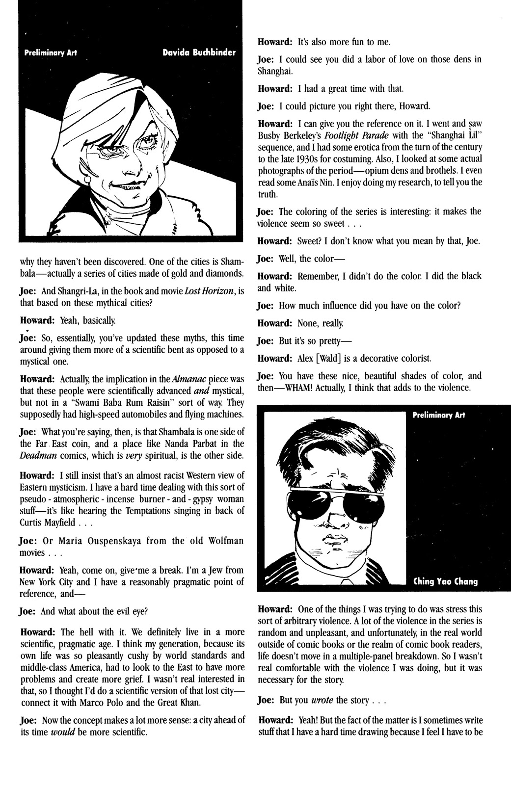
So DC and Chaykin took a different approach with this series. And Chaykin’s world of The Shadow was definitely more “adult” (grittier, sexier, etc.) than earlier versions. Sign of the times, and Chaykin’s mature approach to comic book content specifically. (Chaykin’s Blackhawk and Black Kiss would follow shortly.)
For what it is worth, I gave it a shot, and liked it. The storytelling and art were — not surprisingly — top shelf. Did I care that the character was set in modern times?
I didn’t lose much sleep over it.
Controversial was an overly word then, and virtually worthless now. Dictionary definition is “giving rise or likely to give rise to public disagreement.”
So art is pretty much always “controversial.” Read some contemporaneous reviews of Citizen Kane or Star Wars. I’ll wait.
In 2020, of course, everything is controversial. I never thought I’d see the day when established facts were “controversial.”
Nearly all writers, amateur or professional, struggle with writers block at some point.
My blog schedule for 2020 is fairly consistent. About 250 -300 words per post, three posts per week. Add in some extra narrative in the captions, and the occasional “bonus” post, and we can generously call it 1000 words per week. 50,000 words per year, give or take.
That’s significantly less than my early newspaper or magazine days, and yet, every once in a while, I stare at the art — and the screen— blankly, trying to get my thoughts together in a semi-coherent fashion.
And then, there’s Walter Gibson, creator of the Shadow. During the height of the character’s popularity in the 30s and 40s, he wrote two novels PER month, each 50-60,000 words. (Using the pen name Maxwell Grant.)
50,000 — 60,000 (or more) words every… two… weeks.
In Gibson’s NY Times obituary, the paper calculated that in some years, his annual output was well over 1.6 million words!
Reading some of these Shadow stories, it’s obvious that although they were genre books, with certain themes and ideas repeated throughout, they were well written, creative and original. Quality novels, twice a month.
How the heck did he pull it off? Astonishing is definitely an understatement.
Turns out he and I were living fairly closely to each other shortly before he passed away in 1985. I wish I knew that (where was the internet when I needed it?), so I could have perhaps expressed my astonished admiration directly. And of course, thank him.
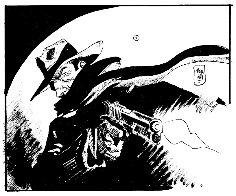
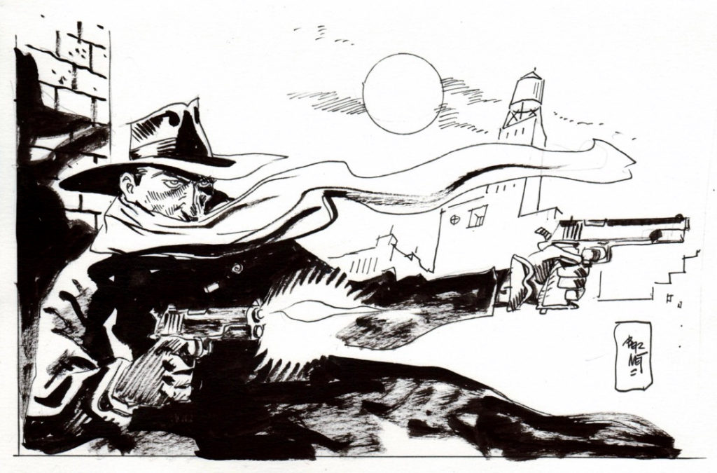
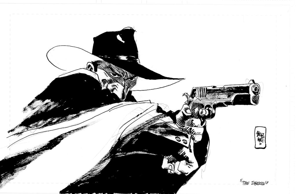
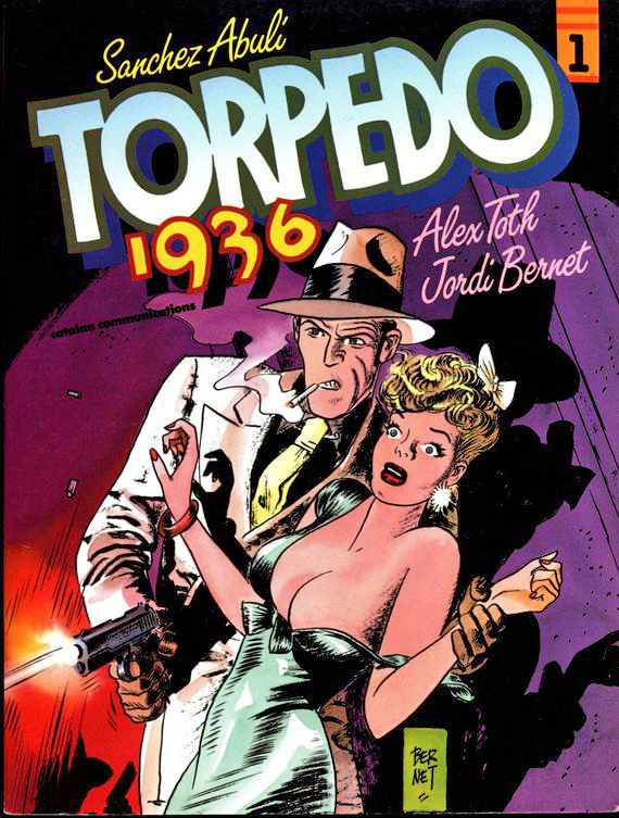
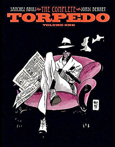
Oh, yes, back to the art: A great commission by the terrific Jordi Bernet. He’s done a bunch of these, so I assume he’s a fan.
I was fortunate enough to meet him — and host him briefly — at the 2011 San Diego Comic–Con. IDW published the first high quality collection of Torpedo stories in English. And although I’m not a huge fan of the stories themselves, I’m a big fan of the art.
That too, is an amazing understatement.
But at least I had an opportunity to tell him that. Even if my Spanish is fairly impotent.
Alex Toth drew the earliest Torpedo stories, but he wasn’t fond of the writing, so he dropped out. His replacement, Jordi Bernet, is a legendary storyteller in his own right.
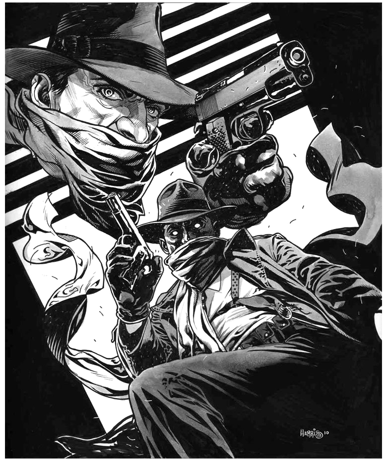
Tony Harris’ brilliant and detailed Shadow commission captures the great noirish elements of the classic pulps.
Those classic pulps: Many comics fans of my generation learned about them anecdotally from our folks (my dad was the perfect age for the pulp heyday) AND “officially” from Jim Steranko’s wonderful 1970 History of The Comics, Volume 1.
Steranko connected many, if not all, of the dots in popular fiction that influenced the Golden Age of comics.
Briefly excerpted below is Jim’s summary of the pulp era:
“Pulps were untrimmed magazines named for the soft paper flecked with shreds of wood on which they were printed. Publishers use pulp paper because there was nothing cheaper available. Pulps had little to do with quality. The key word was quantity! Publishers became successfully relentlessly asking themselves this question: How can I print more books, more often, more cheaply?…
“Many titles were started only to be dropped after a few issues. Some bombed after a single issue. Others scored and lasted for decades. A few were so successful that publishing empires were built around them.
“Pulps measured 9 ½ x 71/2 and 114 to 162 pages between full color enamel stock covers. Most had 128 pages, which usually featured a lead novel of some 50,000 to 60,000 words and half dozen short stories totaling an additional 20,000 words…
Some pulps were issued weekly, some monthly, others bi-monthly or quarterly, but at most times 250 titles were on newsstand display. Every month chalked up a staggering total of twenty month million words!
“Those words told every kind of story imaginable, no plot was too remote, no idea too fantastic…
The pulps were cheaply printed, luridly illustrated, sensationally written, and cost a thin dime.”
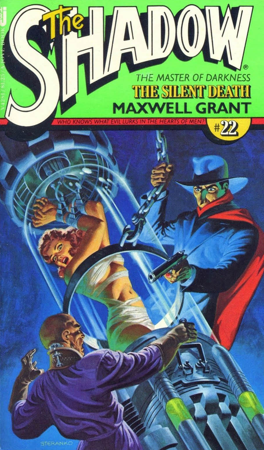
As part of the nostalgia boom that began slowly in the 60s and exploded in the 70s, The Shadow returned to prose fiction with pulp reprints featuring brand new painted covers by Steranko. Jim has taken originals with him to exhibit at conventions on occasion, and the paperbacks while beautiful, don’t do justice to the originals. Trust me.
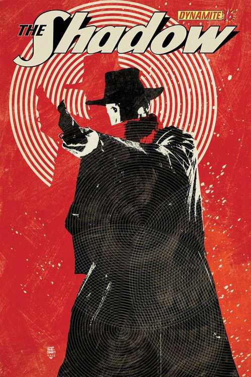
Matt Wagner delivers a dynamic two-gun version of The Shadow for his much lauded Shadow origin series in 2015.
The Shadow routinely carried two .45 guns. That said, he wasn’t opposed to a rifle or machine gun, now and then.
Matt wrote this excellent series, and illustrated most of the covers, each one a frame-worthy rendition of the classic pulp character.
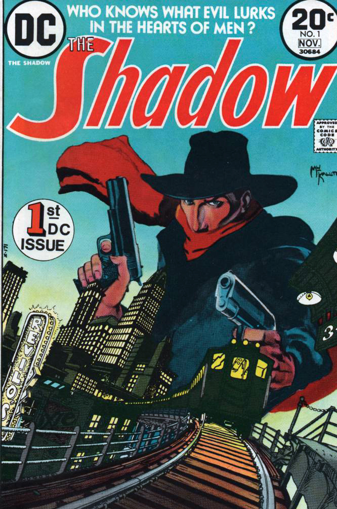
When DC brought back The Shadow after a long absence from comics in 1973, Mike Kaluta drew the now genre-defining early issues, and ultimately illustrated a beautiful graphic novel for Marvel years later.
Mike is also a big fan of the double-barreled look as well.
Color version and the more dramatic black and white version as a variant cover.
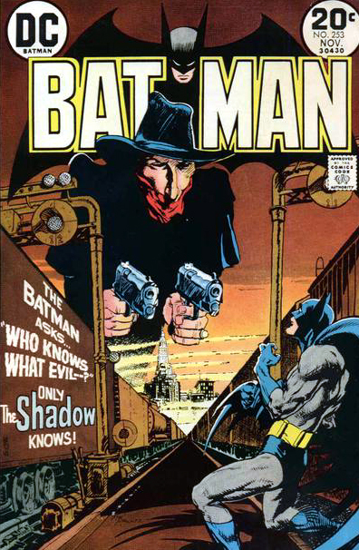
Who knows what evil…? Mike Kaluta knows.
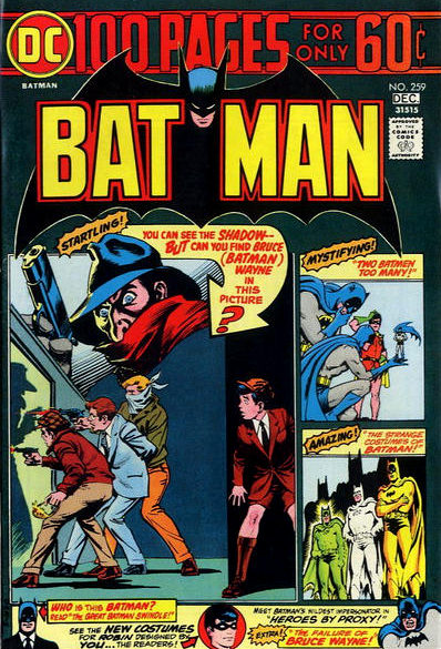
The Shadow is acknowledged as the inspiration for Batman, and when DC acquired the rights to the character in 1973, they “crossed-over” twice.
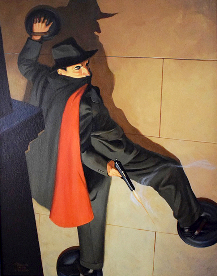
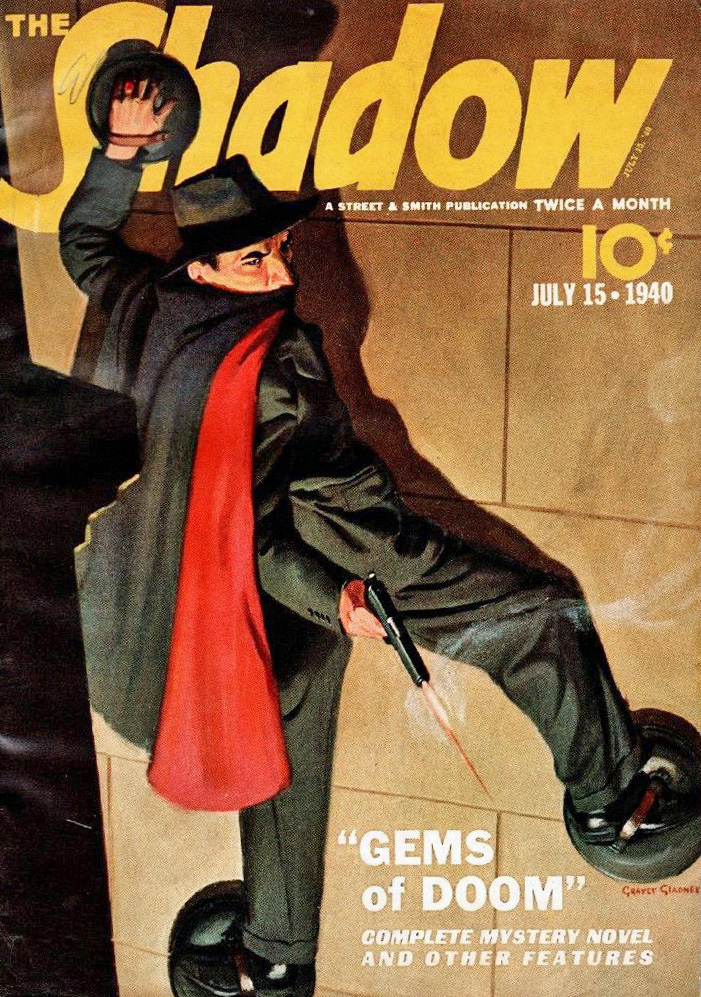
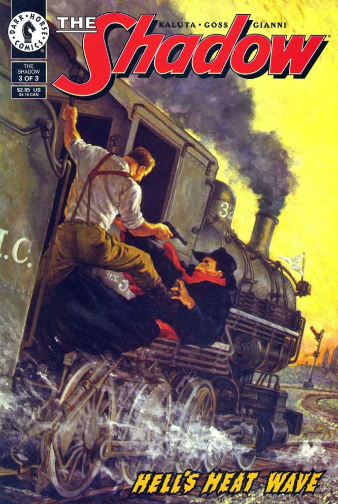
Shadow Pulp Cover Re-creation (original by Graves Gladney, 1940), 2007
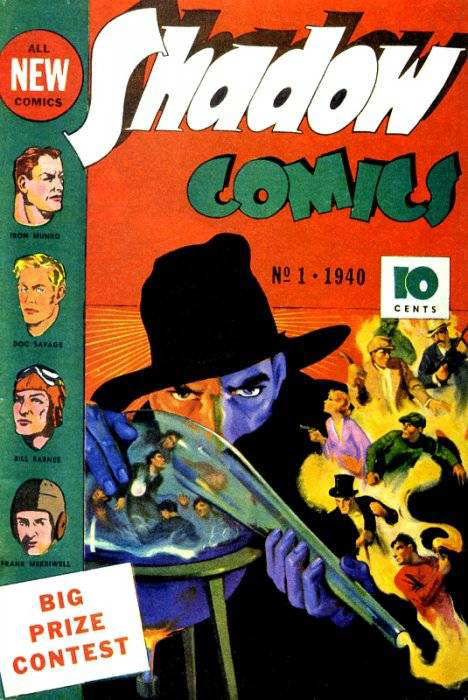
2020 is a double for anniversary for the legendary man of mystery, The Shadow.
The character was first introduced 90 years ago, in 1930 as the mysterious narrator of the radio drama, Detective Story Hour, which tied into the classic pulp magazine, Detective Story Magazine.
(Listeners, however, kept asking their newsstand dealers for “that Shadow detective Magazine”, so by the following year, the management team at Conde Naste smartly fleshed out the character and gave him his own mag, It rapidly became widely popular and successful.
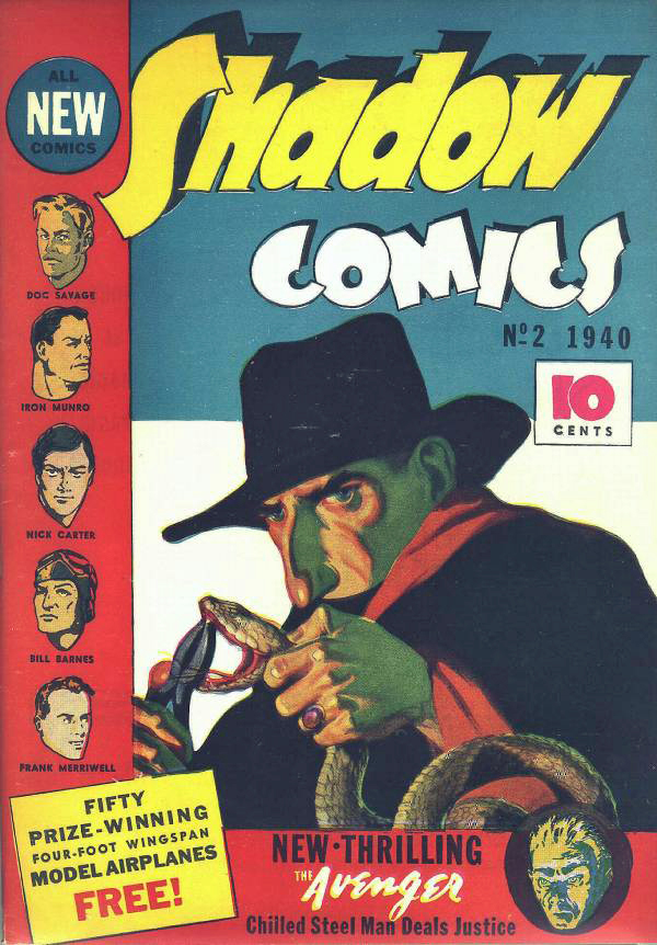
By 1940, with the boom in comic books in full swing, The Shadow and some of his pulp “superhero” compatriots entered the four-color fray with their own comics. So it’s an 80thanniversary for the character’s appearance in comic books format as well.
Thomas Gianni, who sadly passed away a few months ago, loved pulp characters and the great pulp cover paintings.
Here, he recreates a classic, originally painted by the amazing Graves Gladney in 1940.
A talented artist and a terrific guy, I will miss chatting with Gianni, which was always an enjoyable moment when our paths crossed.
Much more on The Shadow, and the great Shadow artists in the next few weeks of posts, as we celebrate his amazing history.
Graves Gladney was one of the great pulp cover artists, as evidenced above.
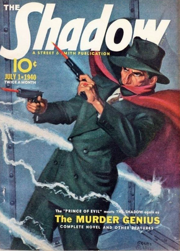
The Shadow blasts his way into comic books in 1940.
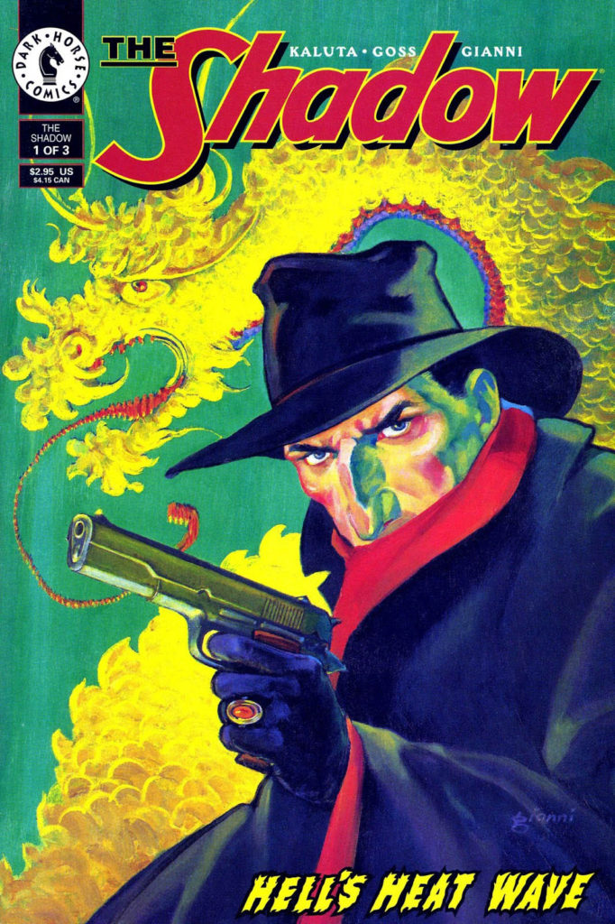
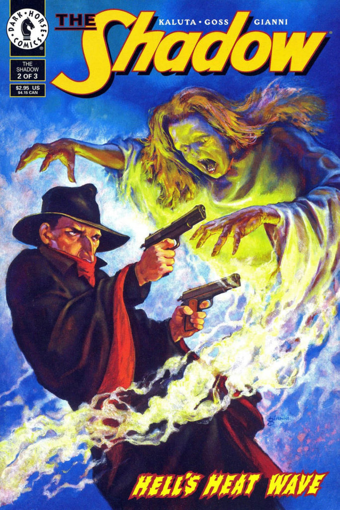
Thomas Gianni’s brother Gary drew a few Shadow series for Dark Horse in the 90s, and created all three pulp-inspired covers for Hell’s Heat Wave.
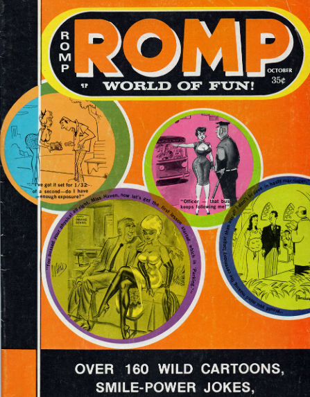
The National Cartoonists Society would be poised for their annual awards event this month if it wasn’t for the COVID pandemic, so it’s a good week to celebrate cartoons.
And we need some way to celebrate summer again…
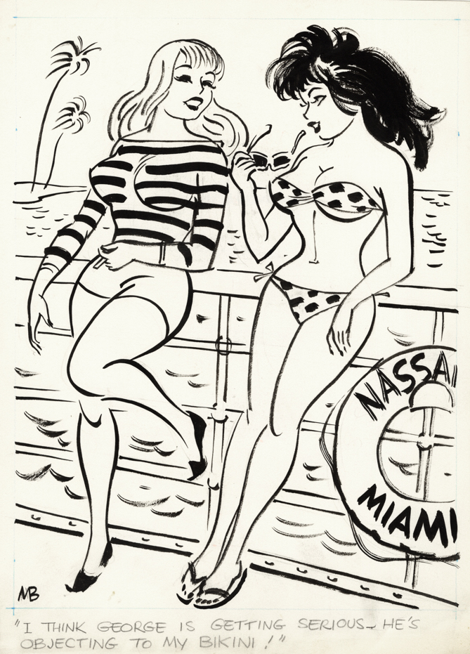
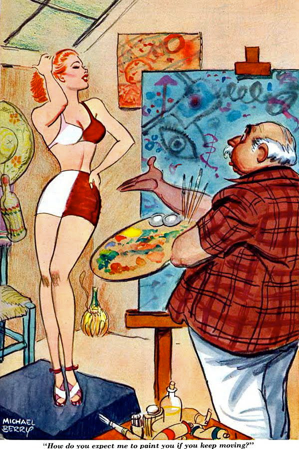
Michael Berry is very underrated cartoonist. With many appearances in Esquire and Playboy, plus hundreds of cartoons in the “cheapie girlie” magazines, his love of pretty women was always apparent. And many of his gags actually still hold up.
Unlike his better-known contemporaries like Dan DeCarlo, Jack Cole, Bill Ward et al, not enough is known about his life and career. That’s a shame — he’s just as good. One of the many things I enjoy about his art is that the finished result appears effortless.
Although I am sure it wasn’t.
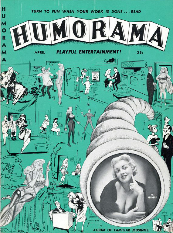
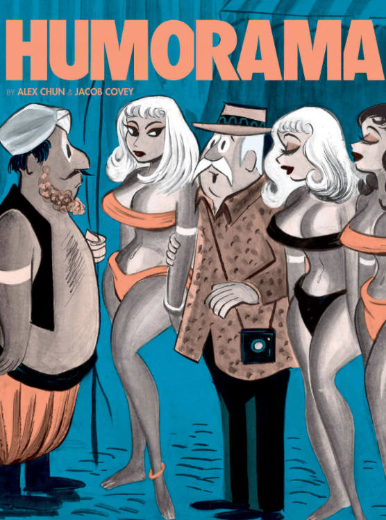
Humorama applies to a single magazine, as well as an entire line of inexpensive men’s gag magazines, published during the 50s and 60s by Martin Goodman of Marvel Comics fame.
A collection of Humorama cartoons from recent years — currently out of print, unfortunately.
The National Cartoonists Society would be poised for their annual awards event this month if it wasn’t for the COVID pandemic, so it’s a good week to celebrate cartoons.Plus, we need some laughs.
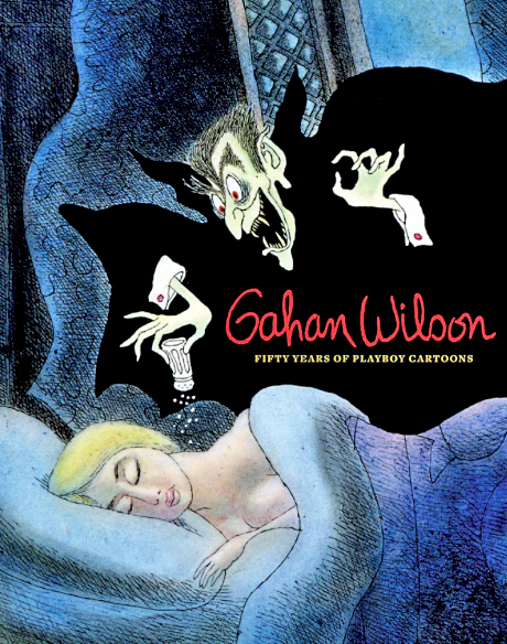
Gahan Wilson was one of the great cartoonists of the 20th century, period.
Don’t trust me. Here’s what the New Yorker said in his obit. They know something about cartoons and cartoonists:
“Wilson excelled at depicting the extraordinary. Although he habitually delved into that dark funny corner that we associate with Charles Addams, his style was singular. He liked to depict ordinary folks encountering some kind of anxious terror, or experiencing the unthinkable in mundane places. It’s a man at a pizza counter hovering over an entire pizza—the man’s mouth the same oval shape, the same size, as the whole pie. It’s fishermen on a calm lake, with one about to be murdered by the other, who is removing a human mask to reveal his true monster self. Wilson’s art is both the heart-thumping you feel when you dare look under the bed and the relieved inner laugh you let loose after he’s scared the pants off of you.“
Or, let’s see what Hugh Hefner said about Wilson’s cartoons in Playboy:
“Gahan Wilson was an immediate hit with our readers and a perfect contrast to our usual, more sexual cartoon fare,” Mr. Hefner wrote in the introduction to “Gahan Wilson: 50 Years of Playboy Cartoons” (2011).
“By the early 1960s,” he continued, “I could say with real satisfaction that no other magazine in the world — The New Yorker included — had a cartoon stable the equal of Playboy’s. And no cartoonist was more popular, or more enduring, than Gahan Wilson.”
Wilson was one of my favorite cartoonists as a kid, and still is. If there’s a missing link between Charles Adams and Gary Larson, you’ve found him here.
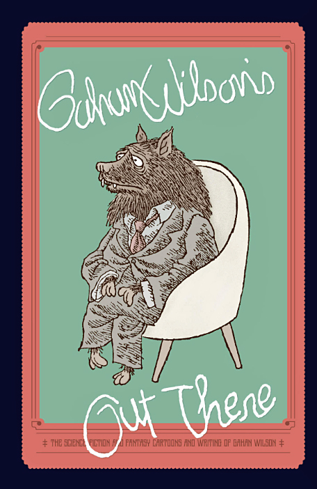
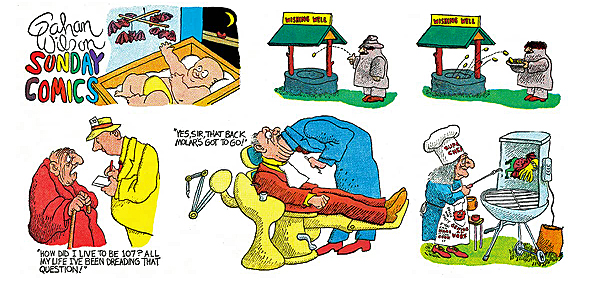
Recent collections of Wilson’s science fiction magazine cartoons, as well as a comprehensive Playboy set.
Also, my pal — at least most of the time. (Creators and publishers have differing points of view on occasion.)
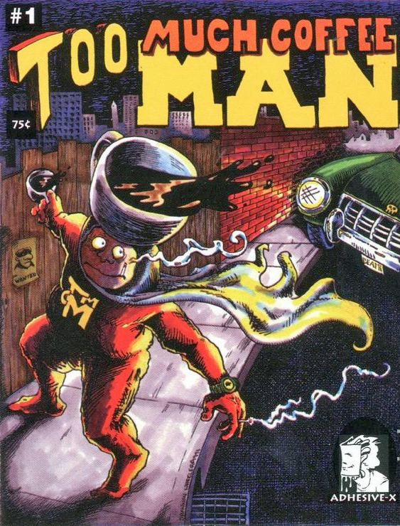
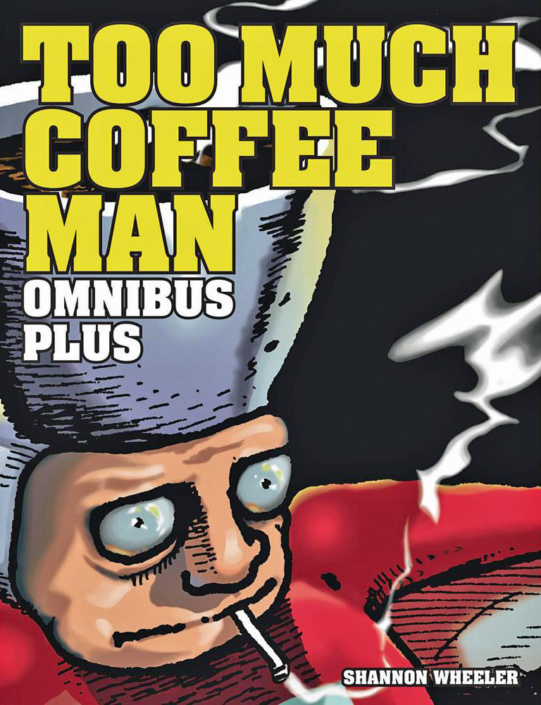
I’ve loved his work since I met him and his wacky alternative comic Too Much Coffee Man at the 1993 San Diego Comic Con. (Also, I drink too much coffee.)
One of the many things I will miss about Comic Con in 2020 is rummaging through his originals, printed and unpublished alike. I find many of them funny as hell.
But you can buy some on-line. And they are terrific deals as far as I’m concerned.
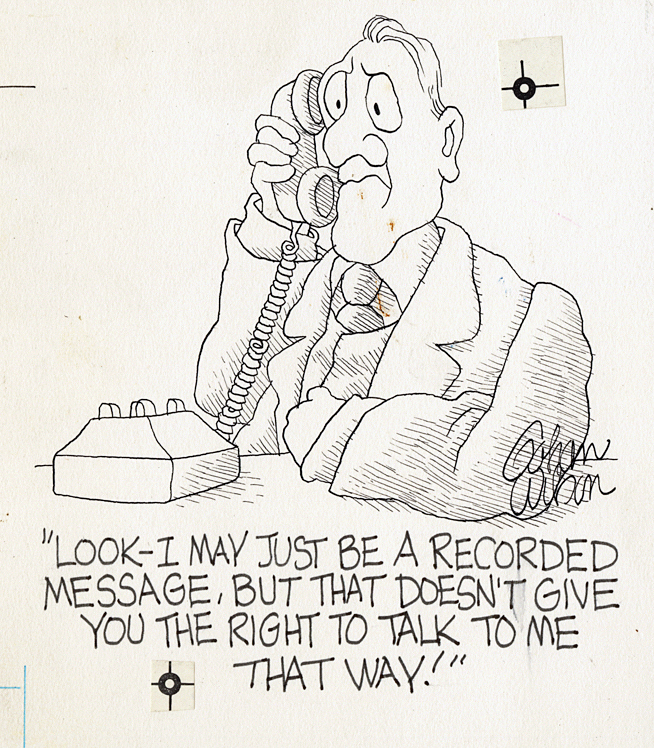
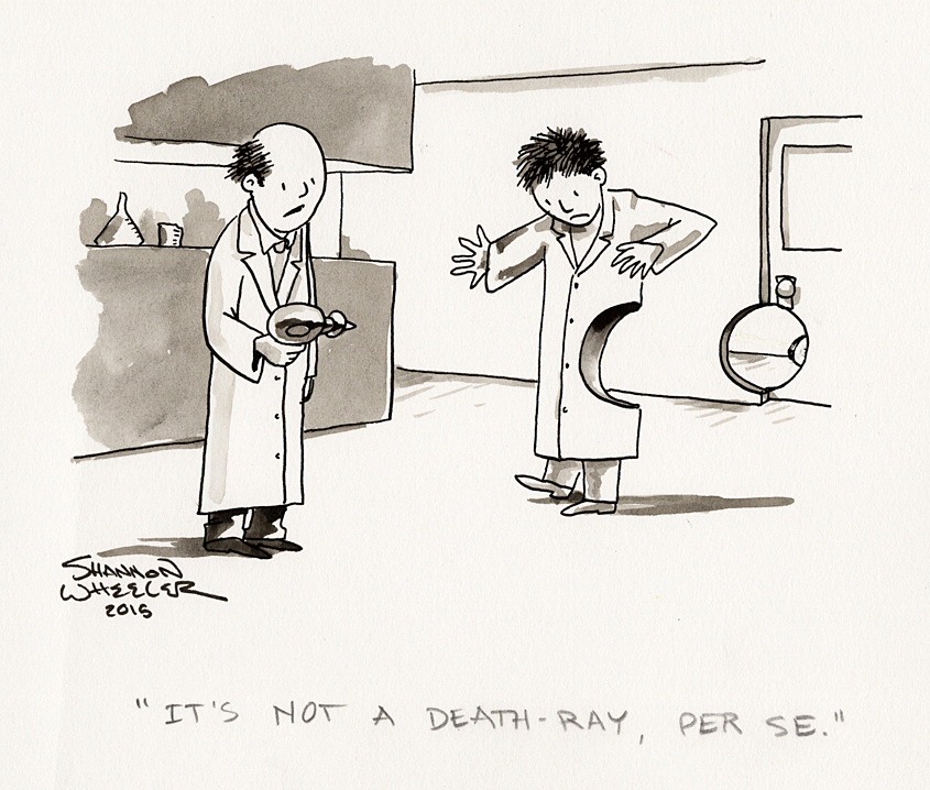
I love gags that apply specific word choices as a chief component of the humor. To me, there is absolutely nothing that would make the cartoon funnier than “per se.”
But, maybe that’s just me.
The National Cartoonists Society would be poised for their annual awards event this month if it wasn’t for the COVID pandemic, so it’s a good week to celebrate cartoons.
See you again on Thursday with an example from the late great Gahan Wilson.
An award winning winning collection of cartoons, plus some very funny illustrations taken direct from the horse’s mouth, so to speak.
The first appearance of Too Much Coffee Man in a mini-comic (1991) and the most recent giant omnibus collection.