Batman: The Silver Age Dailies and Sundays, Volume #1, March 2014
As noted a few years back, Pete Poplaski has been called an “artist’s artist” by many creators. His name might not be known as well as other artists, but his talent is unquestionable.
Pete, who broke into comics in the 70s underground community, ultimately became Kitchen Sink Press’ art director, and among many accomplishments helped give some of Robert Crumb’s projects just the right design touch.
Kitchen had the rights to reprint the DC Batman and Superman comic strips in the early 1990s, and Pete created brand new covers that evoked the classic style of those strips.
When we acquired those reprint rights at IDW in 2012, we went back to Pete to see if he would be interested in picking up where he left off, and fortunately he was.
Wayne Boring. Dick Sprang. Al Plastino. You name a classic artist, and Pete can replicate the style.
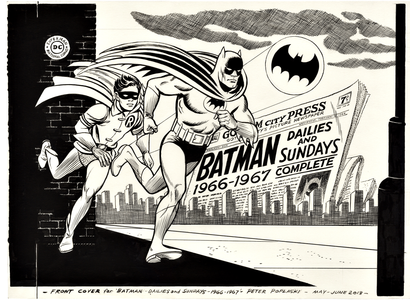
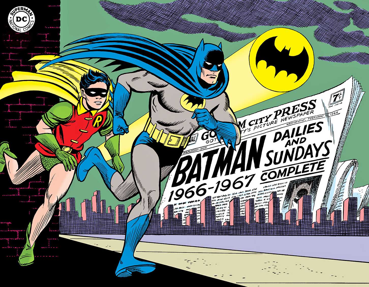
This, of course, is his amazing cover to Batman Silver Age Vol.1. It not only evokes the classic 60s Carmine Infantino revamp of the Dynamic Duo, but also the opening animation of the classic (beloved, and often hated) 60s Batman TV show. (Which is why these newspaperstrips exist in the first place, but, as always we digress.)
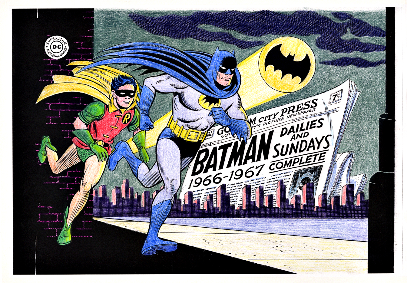
Pete takes his Black and White Art, photocopies it and hand colors it to create a color guide.The published cover — entirely hand drawn except fo the DC logo in the upper left corner.
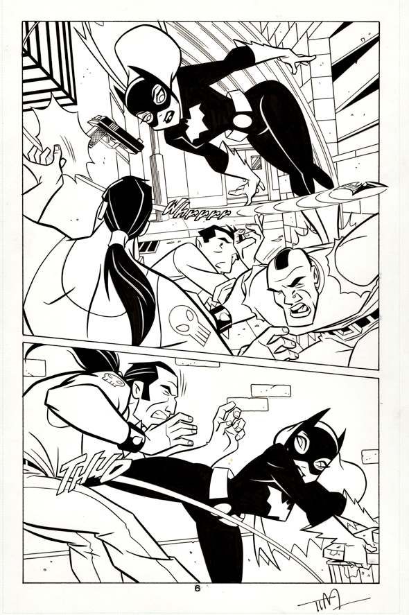
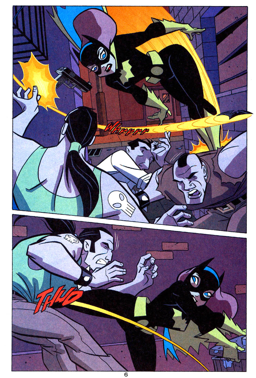
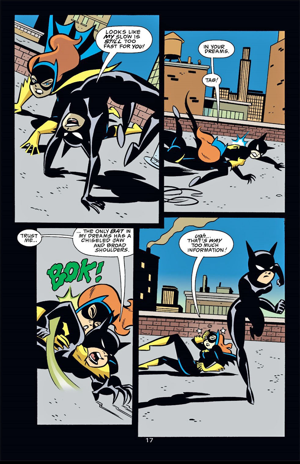
Here’s a cool “Batman-animated” style page from Tim Levins that captures the fun and the flair of the 90s animated series.
The best art pages have no words — therefore, no word balloons needed. (And therefore, no missing word balloons on original modern art, 98% or more of word balloons are digitally added later.)
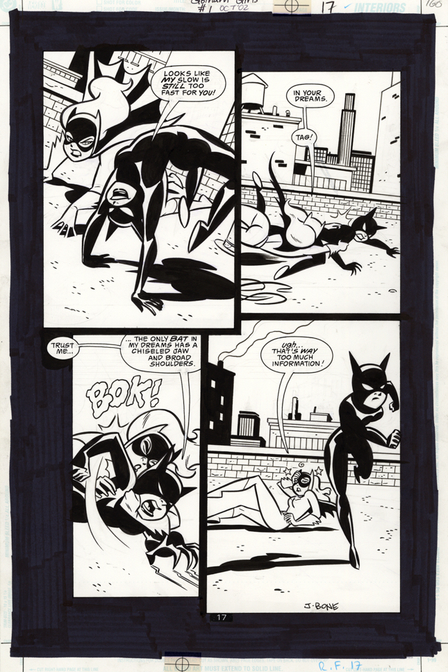
I realize its a bit of a cliche — but I always do get a kick out of Batgirl’s signature action move.
And, yes, I likely deserve one myself for employing that pun.
Batgirl fighting Catwoman? — seems like a great way to celebrate Halloween (upcoming) and Batman Day (belatedly) within a terrific action page by Jennifer Graves and the equally terrific J.Bone.
And, always a pleasant surprise to have a 21st Century piece of art with the word balloons hand lettered on the page.
Call me “old-school” all you want. It’s a compliment.
Fun fact: It took nearly 20 years for DC to collect this mini-series, and when they did they renamed it “Harley Quinn and the Gotham Girls to capitalize on — you guessed it — Harley Quinn, who is by no means the centerpiece of the original series.
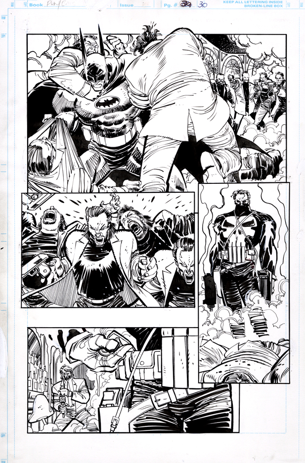
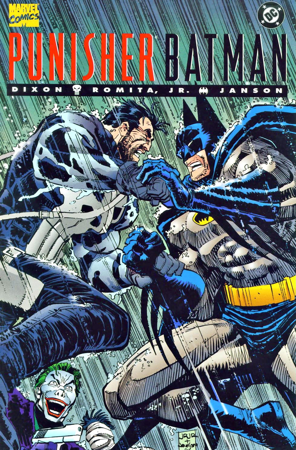
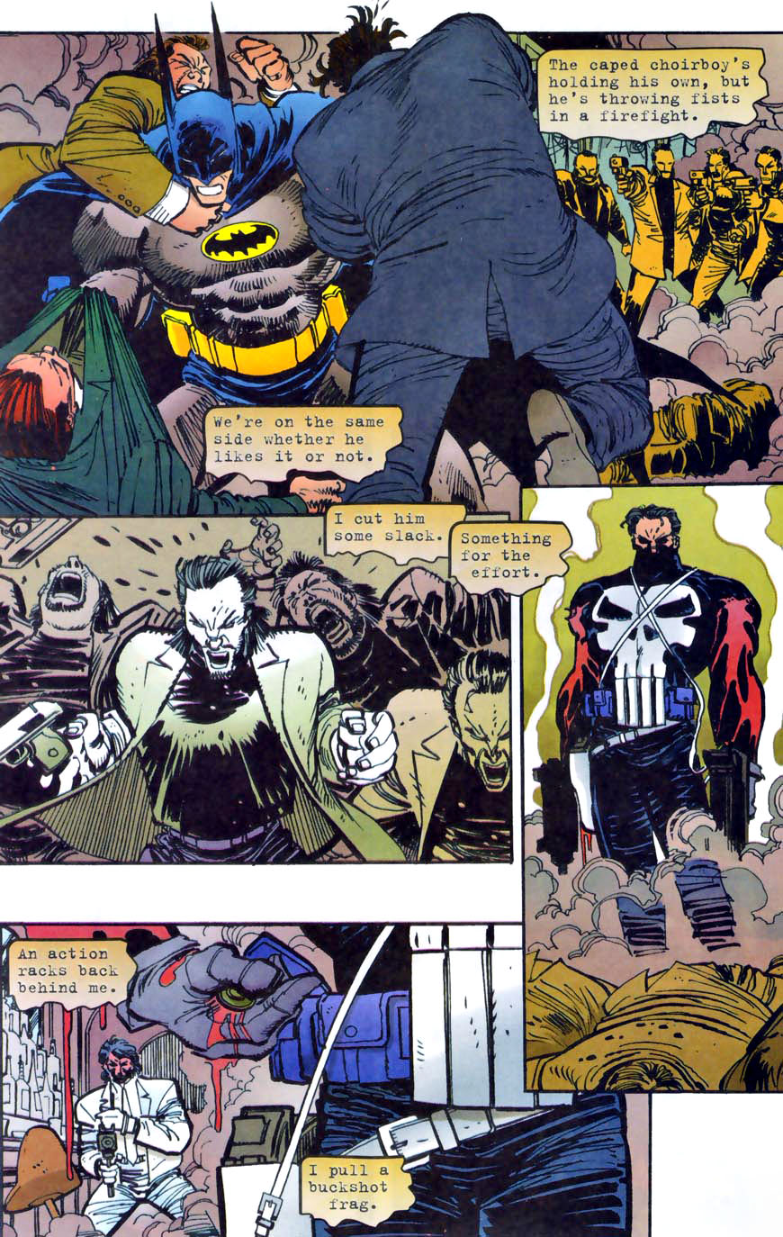
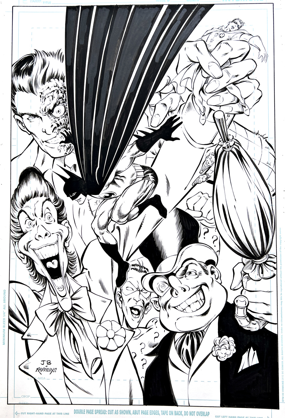
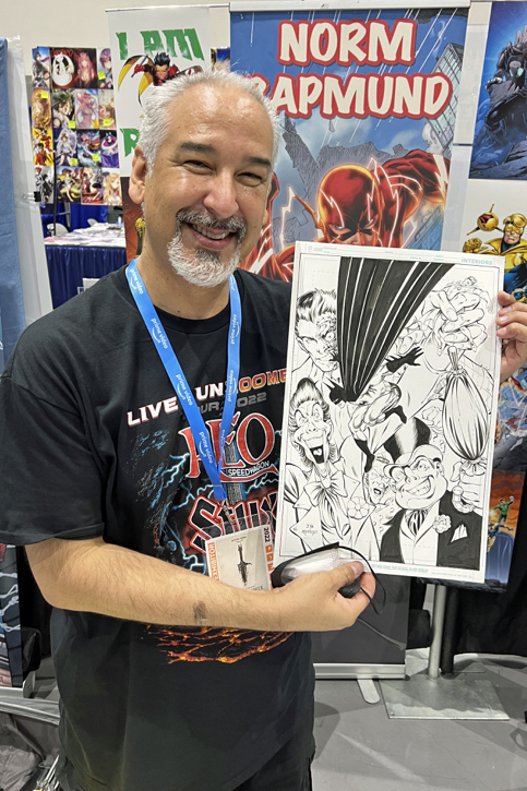
Norm Rapmund Recreation of John Byrne Batman, July2022
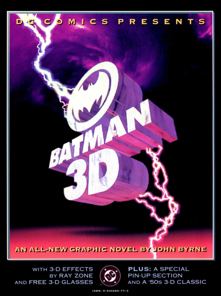
How to celebrate the 500th blog post — and a little more than three years of posting?: Here’s a beautiful Norm Rapmund recreation of a John Byrne Batman splash page (from the 1990 Batman 3-D graphic novel) that Norm started well before this blog was even conceived. (Probably 2017 or so.*)
The 500 milestone includes some “reruns” and a few “cheats,” but hey, 500 is still 500. And we have may slipped in frequency for the first time this past month, but there’s still more great art to come.
Stay tuned.
(*A story for another day.)
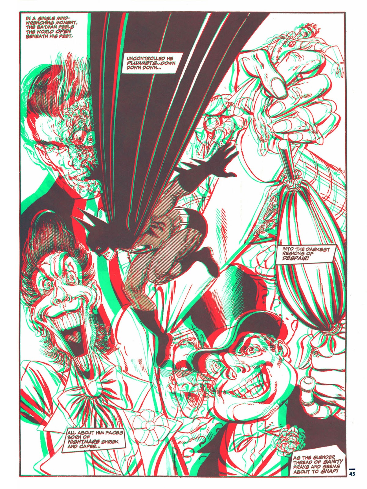
Byrne’s original 3D graphic novel and the black and white reprint from a Byrne DC collection 25 years later. One change that Norm made that I really like is that the Harvey Dent side of Two-Face’s face is a bit less evil — as it should be.
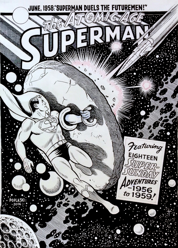
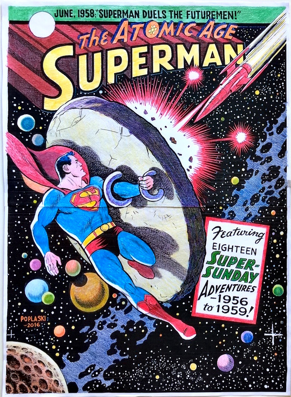
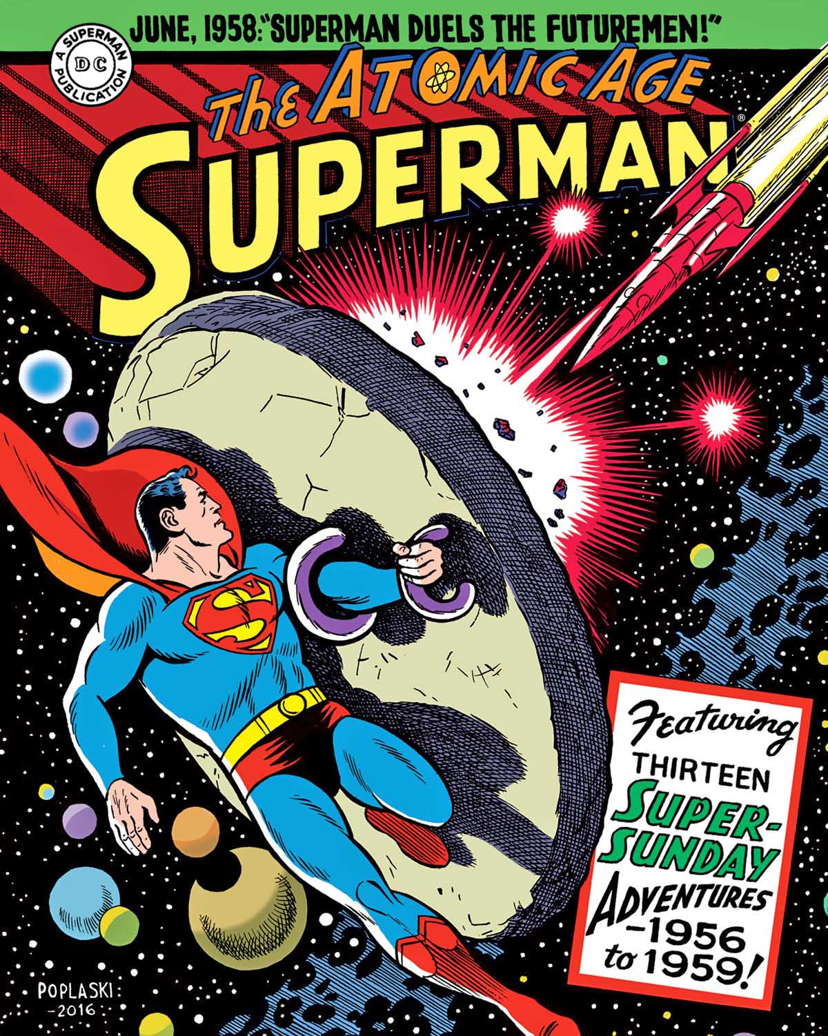
Superman — Atomic Age Sundays Volume 3, December 2017
As described in a earlier post, Pete provided all the terrific covers for our DC superhero strip reprints for The Library of American Comics.
Pictured is a typical great example where Pete emulates legendary artist Wayne Boring — with some Curt Swan thrown in for good measure.
Oversized — and beautiful.
Fun Facts: (From the marketing copy):
Written by Alvin Schwartz and Bill FInger and Illustrated by Wayne Boring
The Man of Steel stars in thirteen classic adventures as the 1950s “Atomic Age” comes to a close. Some of the stories are original to the newspaper strip, while others were alternate versions of tales that were simultaneously published in the regular comic books. One of the featured adaptations is “Superman Versus the Futuremen,” written by Batman co-creator Bill Finger, which retells Superman’s origin. This concluding volume of Superman’s Atomic Age Sundays reprints all strips July 1, 1956 to October 11, 1959.
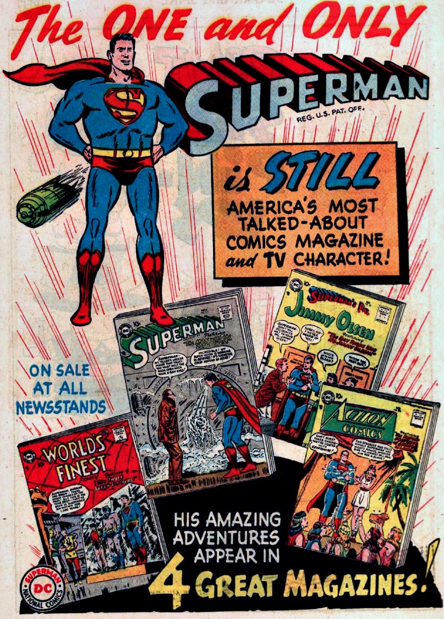
Pete hand colors copies of his original art, and those color guides are then handed off to the digital colorist who completes the work for publication.Meanwhile, over in the comics, Superman reminds us to read all his adventures.
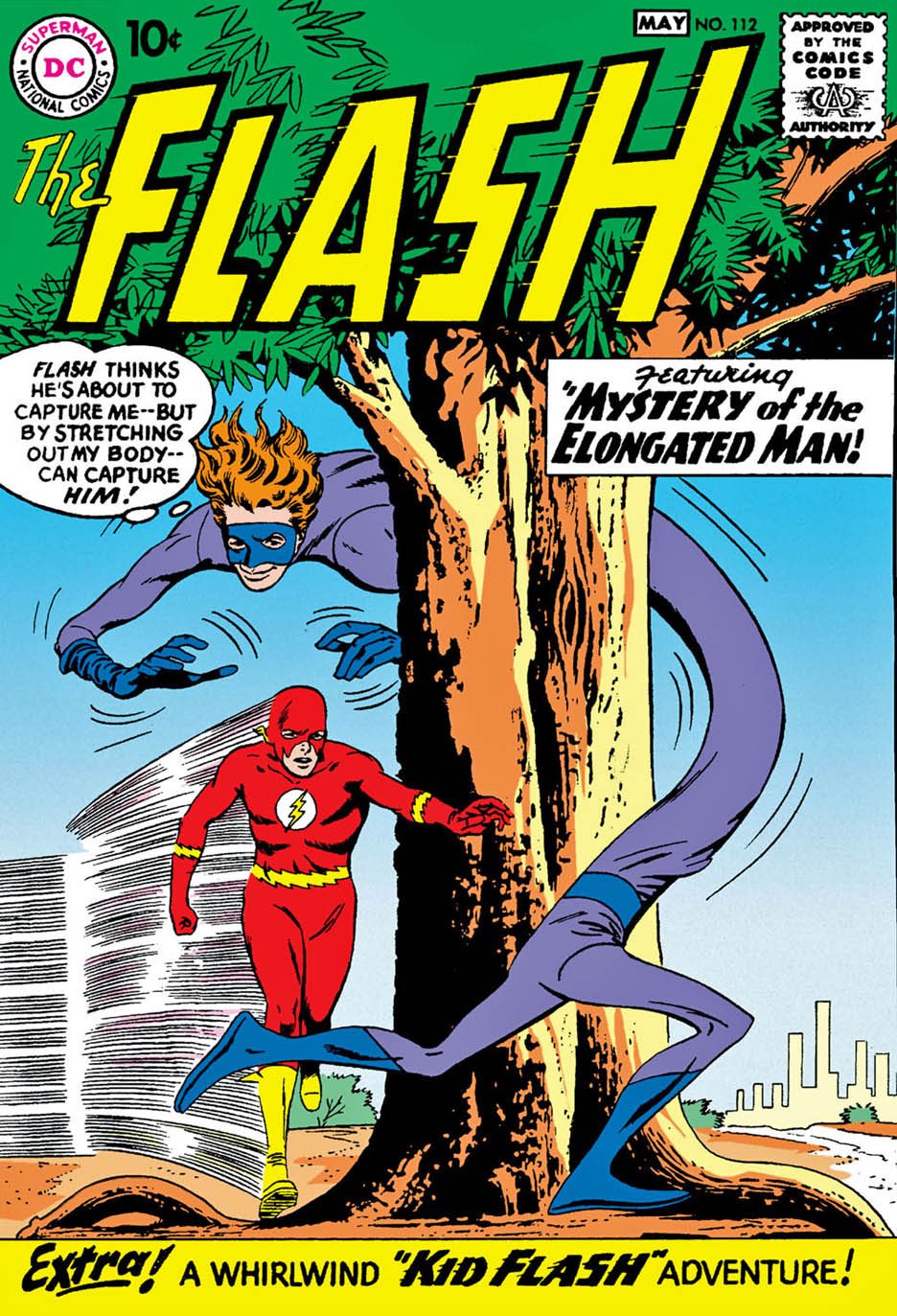
Continuing our celebration of the Fastest Man Alive with a few classic “reruns” — pun absolutely intended— from the early days of the blog.
Some of the most talented superhero storytellers in comics couldn’t figure out what to do with the narrative and exposition elements that move the story along when no one is wearing spandex or a cape.
Many older comics were filled with pages and pages of standard medium-angle shots of talking heads. Six panels per page. Rinse. Repeat.
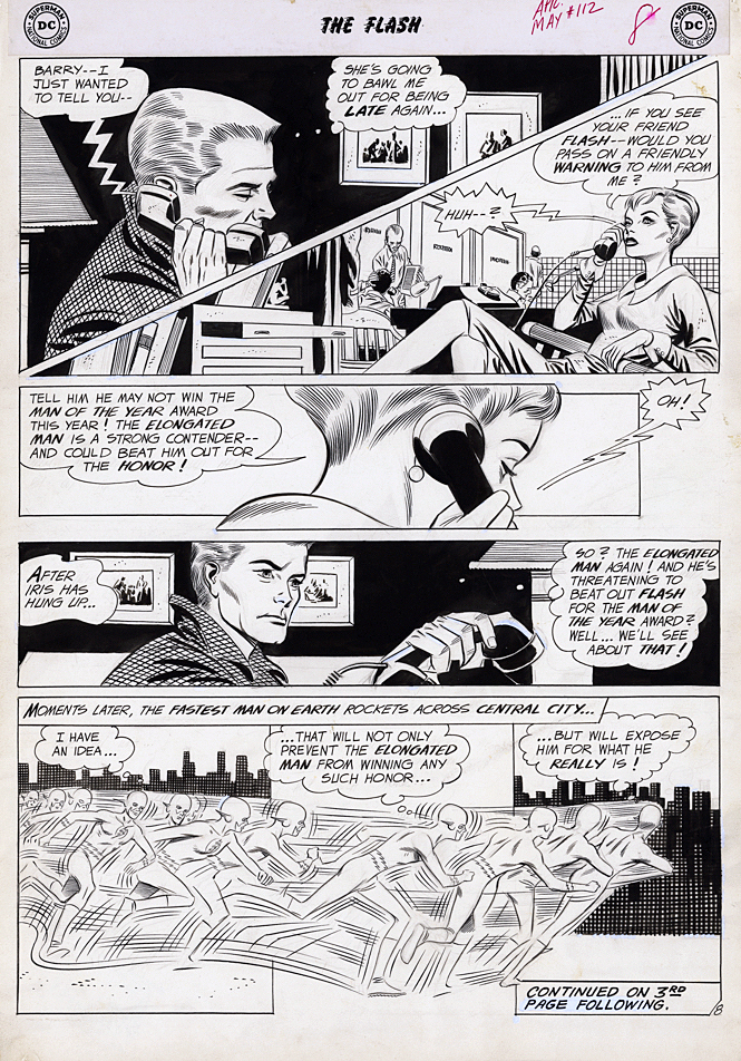
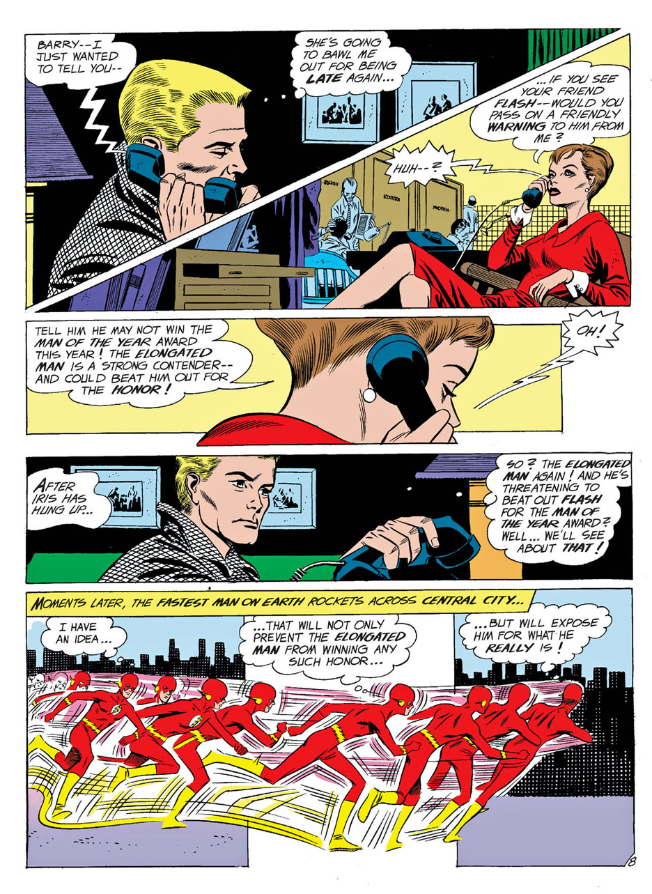
Not Carmine Infantino’s pages. His innovative sense of panel composition and design, and use of varying camera angles, made the “yada yada” part of the story much more engaging than most of his peers.
In this very early Flash story from issue #112, he even manages to innovate a phone call. Nowadays we take narrow “widescreen” (horizontal) panel layouts for granted, but in 1960? Less so. A page design like this is revolutionary 60 years ago.
Of course, superhero comics are ultimately about conflict and action, and re-reading these early Flash stories, his innovative style really jumps out. Those crazy speed lines that help give the illusion of 3D motion in a 2D medium. That sleek space age costume… designed before the space age really began.
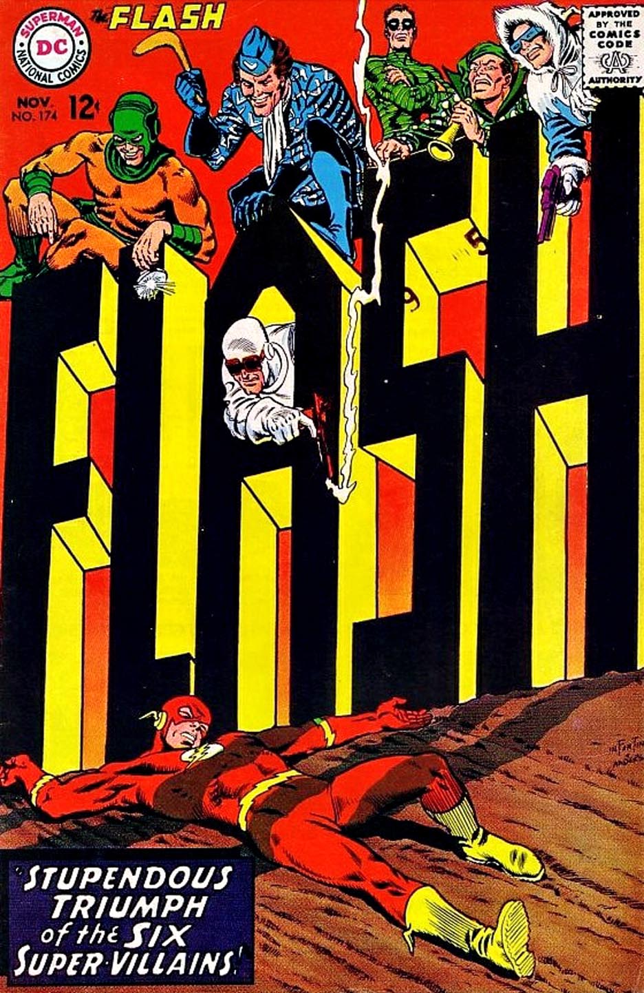
And those amazing covers? Carmine gave up pencilling The Flash when he was promoted to DC’s art director. His innovative cover on the final issue of his 11-year run as Flash artist blew my mind as a kid in 1967 — and still does today.
What else would you expect from the lead designer of the Silver Age of Comics?
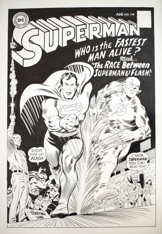
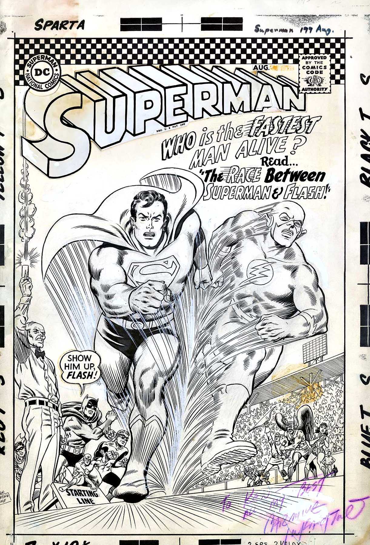
Recreation, Superman #199 Cover, 2005 (Original By Carmine Infantino, August 1967)
I read, and re-read, a handful of comics over and over again as a little kid. Avengers Annual #1 and #2 both come to mind, as do a few other annuals and specials. The first JLA/JSA crossover I discovered (JLA #56 and #57) was a favorite story, and I remember both Batman #200 and Superman #200 fondly.
But Superman #199? That was definitely my most frequent go-to. It doesn’t hurt that Carmine Infantino’s cover (Murphy Anderson on inks) is definitely my favorite (non-Neal Adams) DC cover of all time.
Fast-forward to about 15 years ago, just when I started getting my toes wet in the original art collector’s market again. My pal, Pete Koch (art collector/dealer/aficionado) and I are about to complete an art swap when I see that he has this stunning cover recreation by Rober Quijano in a stack of pages.
Trade completed.
Thanks, Pete.
Not-so-fun Fact: The scanned image doesn’t do the art justice, because I couldn’t remove the art from the frame without destroying it. Sad!
DC was apparently still planning on using the “Go-Go Checks” trade dress on books this month, but pulled it at the last minute.