Greg Goldstein's Comic Art Gallery

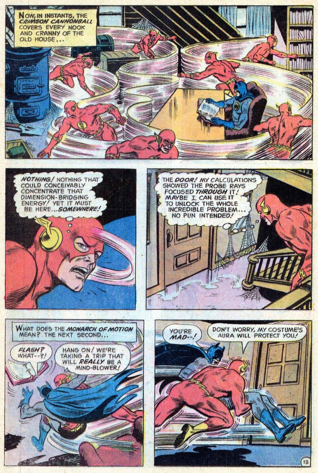
Bob Brown & Nick Cardy — Circles

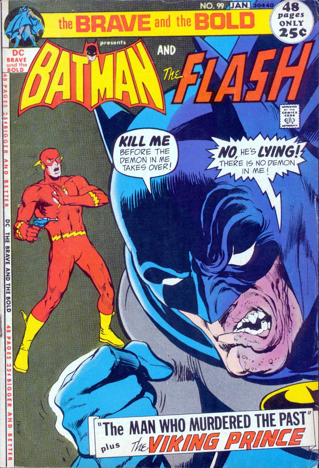
The Brave And The Bold #99, January 1972

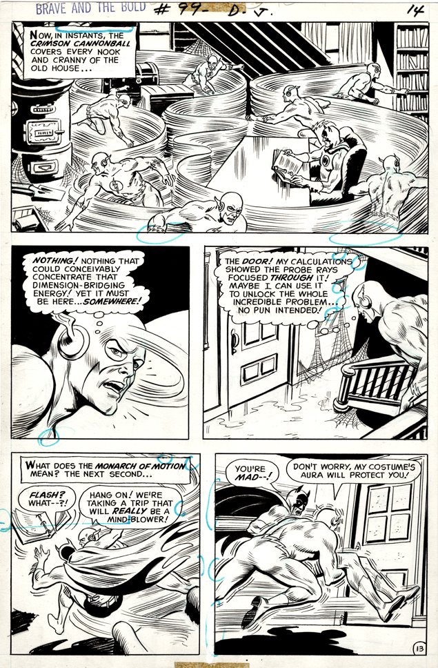
As a kid, my first thought on any Flash team-ups was this: He needs to join forces with someone with actual super powers, otherwise he will end up running circles around his partner.

Sure enough, on this page, he proves the point showing off his super speed to the worlds greatest, but definitely not fastest, detective. (I assume Batman is — wait for it — a speed-reader.)

Bob Brown pencils (pretty much layouts only) the action here, and Nick Cardy provides the inks, which means the art looks like… Nick Cardy. 

This of course is consistent with his very specific embellishment style. Almost anything he inked looked like he had penciled it as well. Which, considering he was a terrific penciller, is ok with me.

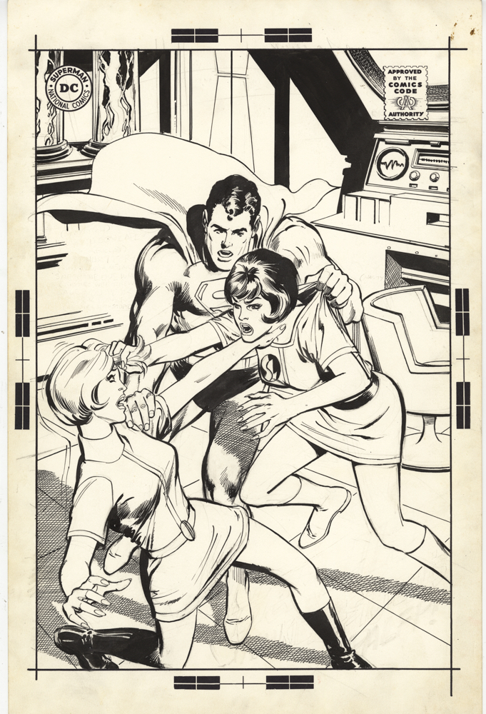
Fun Fact: Jim Aparo takes over as permanent artist for The Brave and Bold series with the following issue (#100) and pretty much draws the next 100 issues. Whew.

Neal Adams — R.I.P.

I’m still processing the loss of the legendary Neal Adams, who truly was a one-of-kind artist and person. Dozens of stories and anecdotes come to mind, and at some point in the near future, I will post one or two of my favorites.

Which leads me to one of the most quoted lines of dialogue in film history, from the classic John Ford western, The Man Who Shot Liberty Valance:

 “When the legend becomes fact, print the legend” 

In Neal’s case, the legend and the fact are pretty much the same thing. Any story you’ve heard — you can safely believe it.

Or, to quote from another film: (Harrison Ford/Han Solo in The Force Awakens)

“Its true… All of it.”

Thanks for everything Neal. Godspeed.

https://greggoldsteincomicartgallery.com/?s=neal+adams

All our posts on Neal Adams and his arts in the link above.

Bruce Wayne At The Movies

Forget about The Batman for a moment, who is the best cinematic Bruce Wayne?

Michael Keaton’s hairstyle might be a bit off, even for 1989, but his Bruce Wayne interpretation is otherwise compelling and terrific.

Irony.

Even without the Internet and social media, the trolls managed to make so… much… noise.. about Michael Keaton cast as Batman in Tim Burton’s 1989 feature.  

The long knives were definitely out for Burton, Warner Brothers, DC, and pretty much anyone and everyone associated with film prior to release.

And you know what? 

Keaton is still the most enjoyable version of Bruce Wayne on screen. 

Not to take anything away from Christian Bale, who, overall is terrific and definitely has his Bruce Wayne moments, there’s both a charm and weirdness to Keaton’s Wayne. (And who wouldn’t be weird, dressing up as a bat and fighting crime at night? But we digress.)

And Pattinson might turn out to be a terrific Bruce Wayne. But we didn’t see much of him as Wayne in The Batman so the jury is still out.

Keaton’s Wayne is very self-aware, less brooding, has a sense of a humor and charisma, but still — on the edge, and likely psychotic. He provides many shades to the Wayne persona.

He might not be the best-looking Batman in a cowl (I specifically never warmed up the style guide art based on his Batman likeness) but as Bruce Wayne, just a blast.

Evan Dorkin — World’s Funniest

Bizarro Comics, August 2001

Concluding our 70th celebration of Superman and Batman (Robin, too) teaming up for the first time.

Why so serious?

Why, indeed.

DC has typically been afraid of too much humor in its traditional superhero storytelling. Frightening flashbacks to Batman ’66, in all likelihood.

But somehow, management green lit this great “Bizarro” graphic novel anthology, lovingly edited by my longtime* pal Joey Cavalieri, and featuring alternative interpretations of the world’s greatest superheroes.  

I considered it a home run, and obviously others did as well because it’s an Eisner and Harvey winner, and an acknowledged classic. (They had me at the Matt Groening cover.)

Evan Dorkin (Milk and Cheese) wrote a few of the stories, and drew this one as well.  I smile every time I look at it.

*Fun Fact: I’ve know Joey 50 years. And if tell you I KNEW he would be a star in the comics and/or animation field way back then, well, you can trust me on this.

Chris Batista — Nasty Combo

Superman / Batman Annual #3, May 2009

Continuing our 70th celebration of Superman and Batman (Robin, too) teaming up for the first time.

Ah, the Composite Superman (Half Superman, half Batman). I’m not sure why I found this character so compelling as a kid, but I did.

I purchased his second appearance (World’s Finest #168) off the racks as a little kid. I was a bit too young for his first, a few years prior. (Both are shown below.)

Years later, what I can’t figure out is why he’s not on the cover in that issue. It’s not like I wouldn’t have flipped through the issue quickly and figured it out before I either gave Mr. Wurman my 12 cents or got tossed from his candy store.

In contemporary times, Chris Batista delivers a terrific page featuring the villain, plus Superman and Batman, and Metallo thrown in for good measure.

The issue also features a rare cover from the late Bernie Wrightson. No surprise, Bernie’s interpretation of the composite character is… intimidating.

Frank Miller & Lynn Varley — Family Feud

Batman: The Dark Knight #3, August 1986

Continuing our 70th celebration of Superman and Batman (Robin, too) teaming up for the first time.

Today’s original art oddity: 

Two original pages exist for every page of Frank Miller, Klaus Jansen’s and Lynn Varley’s The Dark Knight Returns.

First of course, are the traditional pen and ink black and white line art pages. Gorgeous, of course.

Next up, are Lynn Varley’s stunning hand-painted color pages. For emphasis: These are NOT color proofs. DC shot acetates of every line art page, and Lynn hand painted each one. (And, the color palate of DKR is of course critical to the storytelling.)

And his stunner is one of those pages. One of only a handful that features Superman, Batman and Robin all on the same page.

Anyone want to sell me the original Miller line work to go with it? I can start working on my line of credit with the bank today.

George Tuska — Lost Team-Up

World’s Finest, “Inventory” Story, 1984

Continuing our 70th celebration of Superman and Batman (Robin, too) teaming up for the first time.

I can’t quite put my finger on it… But I always appreciated George Tuska’s art s at DC more than I did at Marvel.

I think it’s because — in my mind’s eye at least— George’s art seemed much more suited to the Bronze Age DC house style.

Or it could just be my imagination.

Here we have a “inventory” story intended for World’s Finest that appears to have never seen the light of day. Dynamic action featuring both Superman and Batman. What more could you possibly ask for? 

Except possibly the published page to go with it.

I never understood DC’s policy regarding inventory and cancelled stories. Once they’re fully inked, and in many cases lettered, it’s really difficult to lose money coloring it and publishing it. The prior sunk cost is already sunk.

Except… as my friends in finance would happily point out, the investment in the story and artwork counts as an asset. If you never actually put it out, you never have to write the whole thing off.

Tricky, very tricky. 

I’ve owned pages from quite a few DC cancelled stories. There’s an omnibus in there somewhere. Assuming  (big assumption) all the scans and files have survived myriad changes in management over the years, and a few physical moves as well.

Pete Poplaski — World’s Finest

Promotional Illustration, Kitchen Sink Press, 1990

Continuing our 70thcelebration of Superman and Batman (Robin, too) teaming up for the first time.

Pete Poplaski’s 1990 promo art of the Dynamic Duo and the Man of Steel makes me happy. 

It appears informally modeled after World’s Finest Comics #2, the issue that changed titles from the original World’s Best Comics. (Which, as noted previously, was the successor to World’s Fair Comics. No worries, there’s never a quiz on this material, especially since I’d probably be the first one to mess it up.)

Of course, as we’ve posted previously, all of Pete’s gorgeous retro work makes me happy.

Remnants of a different era, indeed.