Greg Goldstein's Comic Art Gallery

Carmine Infantino — History Calling

Flash #112, May 1960

The Flash returns to THE CW shortly for its sixth TV season, so the Scarlett Speedster receives his own multi-part blog series this week.

Some of the most talented superhero storytellers in comics couldn’t figure out what to do with the narrative and exposition elements that move the story along when no one is wearing spandex or a cape.  

Many comics were once filled with pages and pages of standard medium-angle shots of talking heads. Six panels per page. Rinse. Repeat.

Not Carmine Infantino’s pages. His innovative sense of panel composition and design, and use of varying and dynamic camera angles, made the “yada yada” part of the story much more engaging than most of his peers. 

In this very early Flash story from issue #112 (inks by Joe Giella) he even manages to innovate a phone call.  We take narrow “widescreen” (horizontal) panel layouts for granted now, but in 1960? Not so much. A page design like this is revolutionary 60 years ago.

Of course, superhero comics are ultimately about conflict and action, and re-reading these early Flash stories, his innovative style really jumps out. Those crazy speed lines that help give the illusion of 3D motion in a 2D medium. That sleek space age costume… designed before the space age really began. 

And those amazing covers? Carmine gave up pencilling The Flash when he was promoted to DC’s art director. His cover on the final full issue of his 11-year run as Flash artist blew my mind as a kid in 1967 — and still does today.

What else would you expect from the designer of the Silver Age of Comics?

An exercise in futility when I tried this at home…
Infantino’s final pencilled issue of the Flash ended with this show-stopping cover.

Steve Rude — Card Tricks

Upper Deck, Marvel VS. System TCG: Web of Spiderman,
Card #162 — Surrounded, 2004

Concluding a multi-part look at Spider-Man vs. Mysterio in honor of Spider-Man: Far From Home landing on digital streaming platforms this week.

Some of the most tantalizing art ever created for Marvel and DC characters is hiding in plain sight — on trading cards… and trading card games. 

In fact, the Upper Deck Vs. TCG System, started in 2004, and lasting in its original incarnation through 2009, is home to hundreds, if not thousands, of original artworks by some of the industry’s leading talents. 

Except for a handful of the key art pieces, which includes illustrations by Alex Ross and Drew Struzan, all the TCG images were printed at postage stamp size only. (Some, like this one, were cropped ruthlessly to fit the printed image area.)

Sigh.

Steve “The Dude” Rude illustrated number of cards in the various VS series, and this one, featuring Spider-man vs. multiple Mysterios, is a favorite. 

Steve’s clean and dynamic superhero rendering typically feels like a fascinating cross between Jack Kirby and Joe Schuster — with storytelling influences from Alex Toth , and yet here, he channels some John Romita for good measure.

Most trading card is created at a relatively small size, but fortunately this Rude original is drawn on traditional comic board, with the live image area just slightly smaller than most standard modern art.  

Just enough room for all those Mysterios. 

Too many Mysterios — or too much Spider-Man. Either way, Spidey is in a jam. This great panel by John Romita from ASM # 67 is a classic.

Neal Adams — Happy Batman Day

Convention Commission, 2012

We interrupt our multi-part look at Spider-Man vs. Mysterio in honor of today’s “Batman Day” (9/21) celebration. Our regularly scheduled programming will continue tomorrow.

Neal Adams first Batman story appeared more than 50 years (!) ago in World’s Finest Comics #175. The art blew my mind then, and still does today. Happy Batman Day, Neal, and thanks for all of it!

Tomorrow, we conclude our multi-part look at Spider-Man vs. Mysterio with none other than “the Dude” — artist Steve Rude.

Scott Koblish — Ditko Forever!

Spider-Man/Deadpool #7, September 2016

Continuing a multi-part look at Spider-Man vs. Mysterio in honor of Spider-Man: Far From Home landing on digital streaming platforms this week.

Scott Koblish as a person?: Engaging. Upbeat. Energetic. Witty. Et al.

Koblish as an artist?: Engaging. Upbeat. Energetic. Witty. Et al.

Rarely does a creator’s artistic style so match his personality. Hell, there are great cartoonists, past and present, with lively and bright art aesthetics, who are darker personally than Van Gogh on a bad day. (No I will not be naming names. That’s what the rest of the Internet is for.)

Scott’s mostly zany artistic approach to Deadpool is perfectly on point for the character. (And that’s not taking anything away from Ed McGuinness, a fantastic artist whose work I absolutely love — or any other Deadpool illustrator for that matter.) 

In this “flashback” issue of Spider-Man/Deadpool, Scott draws the entire issue in classic “Steve Ditko” style. It’s clearly done with affection and reverence, and the finished issue, complete with simulated old-school coloring, “bad” printing (out-of register) and aged paper, is old-school fun.

How “classic” is the art style here, you ask? Review the middle panel on this page.  It is most definitely… Classic Ditko! (In fairness, the rest of the issue features more original Ditko interpretations as well. Koblish was clearly having a bit of extra fun here.)

And what’s the difference between comedy and tragedy? Check out Scott’s book, The Many Deaths of Scott Koblish, and decide. 

Alex Saviuk — Meta Mysterio

Spider-Man Adventures #5, Unused Cover, April 1995

Spider-Man: Far From Home landed on digital streaming platforms this week, so the next few posts feature — who else? — Spider-Man and Mysterio.

Spider-Man Adventures, a ‘90s comic book title, existed mainly to support Spider-Man: The Animated Series, which ran on Fox Kids from 1994 – 1998. In fact, the first thirteen issues of the comics are direct adaptations of the first-season episodes.

The episodes themselves are adapted (albeit loosely in some cases) from original Spider-Man comic books.

So…

Issue #5, featuring Mysterio, is an adaptation of Episode #5 of the TV series, which in turn, is adapted from Mysterio’s very first comic book appearance — by Stan Lee and Steve Ditko — in Amazing Spider-Man #13. (1964).

A comic book adaptation…. of a TV show adaptation… of a comic book story.  That trick definitely trumps anything up Mysterio’s sleeve.

Alex tells me that his original cover was rejected because the editors wanted more emphasis on Mysterio —and for the character to be more “dramatic and menacing,” and I think he delivered. (See below.) Still, I like Alex’s original take, especially with that iconic Spidey image.

Alex’s creative spin on the wall-crawler has lasted more than 30 years.  He drew the Web of Spider-Man comic book for seven years, and then the full Spider-Man Adventures run, and then the Spidey newspaper strip from 1997 to its end earlier this year.

Nothing mysterious about that longevity — Alex’s passion for, and understanding of, the Spider-Man character is obvious anytime he puts pencil to paper.

Walter Simonson — Bucket List

Hercules Unbound #7, November 1976

Jose Luis Garcia-Lopez and Wally Wood only teamed up for six issues of the short-lived Hercules Unbound. Garcia-Lopez moved on, and Walter Simonson took over with Issue #7. (Wood only stayed on for one additional issue.)

Walter’s art style, like many of his generational peers (Chaykin, Wrightson, etc.) is very distinctive. Manhunter. Thor. X-Factor. Ragnarok. Et al. Typically, when you see a Walter Simonson penciled page, you know it.
Not here though. As noted earlier, Wood’s inks typically put so much lush polish on the pencils, It’s not that easy to sort out the penciller’s own style. When I first scanned this issue, I didn’t immediately catch that Garcia-Lopez was off the book. (Once you know, and compare against the earlier issues, you can definitely see some differences.) 

Here’s an extra cool thing about this great Herc page. I luckily acquired it at a convention where Walter was a guest of ours at IDW Publishing, and I asked him to inscribe it. It reads:

“Another bucket list check mark — my layouts — Wallace Wood inks!”

Footnote — More creative shuffling: After two issues inked by Bob Layton, Walter provided both pencils and inks on the final two issues. As evidenced below, Walter’s work again looks like… Walter!

Wally Wood — Inking Unbound

Hercules Unbound #4, May 1976 (Pencils by Jose Luis Garcia-Lopez) 

Gerry Conway and Jose Luis Garcia-Lopez — an artist’s artist if there ever was one — launched Hercules Unbound in 1975. But the real news was that Wally Wood would be inking the book. 

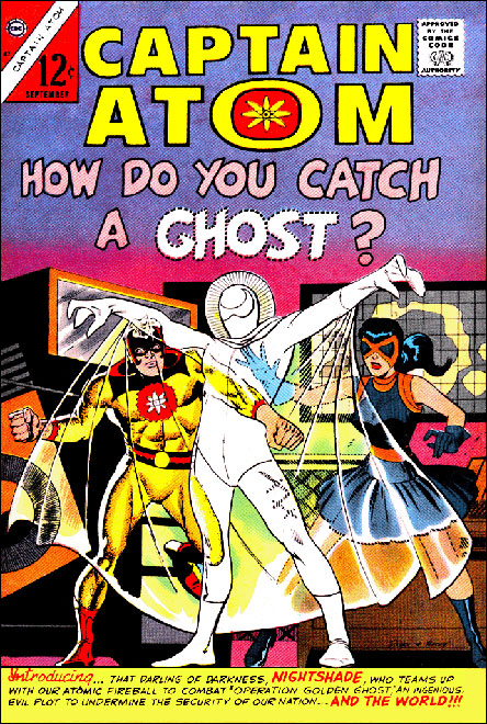
Wally’s lush art had graced just a handful of DC superhero titles in the late ‘60s, when I had first started actively reading comics. My first exposure to his stellar inking was likely in 1968’s Captain Action. (He also penciled issue #1 of that short-lived series.)

By the time he returned to DC in the mid ‘70s, I was not only familiar with much of his oeuvre (EC, Marvel, Warren, Tower, etc.), I was pretty much obsessed with his art, as both penciller and inker. 

If his work at DC was going to be inking only, so be it, because typically it didn’t matter who was penciling — Wood’s dramatic and distinctive inks make everything look mostly like… Wood. That includes hall-of-fame stylists like Steve Ditko and Gil Kane.  And frankly, some of those artists’ styles were more fluid and dynamic than Wally’s to begin with.

This page is no exception, featuring dynamic action and storytelling by Garcia-Lopez, who had only recently broken into DC, and would rapidly become one of the industry’s most respected artists. At this point in the series, the art team was most definitely firing on all cylinders.

It did not matter that I wasn’t quite sure how Hercules fit into the greater DC universe, or even if he did. I was going to be saving a small piece of my comics’ budget for Hercules Unbound.

Like they say in the comics: To be continued…

Andrew Pepoy — Wally World II

Archie #646, September 2013

What if EC Comics merged with the Archie line back in the ’50s and survived through the present day? Andrew Pepoy gives us the short answer with Betty and Veronica as Wally Wood-styled space girls on this cool variant cover for Archie #646.

And, as bonus, Cosmo the Merry Martian brings along the whole Martian army. (Mars Attacks!)

Andrew Pepoy — Wally World

T.H.U.N.D.E.R. Agents 50th Anniversary Special (IDW), July 2015

No one today pulls off a tribute to the great Wally Wood quite like the very talented Andrew Pepoy

To celebrate the 50th Anniversary of the T.H.U.N.D.E.R Agents, IDW Publishing asked Andrew to illustrate a cover variant – an homage to the iconic Wood EC cover, Incredible Science Fiction #29. For our version, we substituted Wood’s astronaut with the sexy and villainous Iron Maiden, one of the main adversaries in Wood’s original T.H.U.N.D.E.R Agents.

The detail is terrific (especially noticeable in its original B&W form), and while no one can actually replicate Wally Wood, this might be as close as it gets. Home run!

George Wilson (Attributed) — Submitted For Your Approval

Twilight Zone #64, July 1975

Stay with me here:

I’ve always wanted to own an original cover painting by the amazing George Wilson, whose covers graced Magnus Robot Fighter, Turok, Doctor Solar and so many others, primarily for Gold Key and Classics Illustrated. In fact, the original art of my favorite painted cover — The Classics version of H.G. Wells Time Machine — appeared at auction just a few years ago. And rapidly escalated out of my price range.

Soon after, waves of other covers attributed to Wilson were also offered at auction. Many of these were selling at much more affordable prices. Vague provenance. Lesser titles. Later issues. Etc. 

I glanced at many of the covers for sale, appreciated them, but pretty much overlooked them.

Then this one caught my eye — a cover for Twilight Zone.  A subway scene creatively composed and nicely lit. Made me nostalgic for my New York City days. The “killer graffiti” concept seemed a bit out there, even by Twilight Zone standards, but, so what? Even if not actually “deadly,” graffiti was a giant problem during that period in New York… I remember it all too well.
I examined the painting closer. The train’s design is clearly based on an actual NYC subway car of that era, not a “generic” one. It’s the Number 7 train. Runs cross town Manhattan to Queens — a subway I had taken many times as a kid to comic book conventions at the landmark Commodore Hotel at Grand Central Station. The Commodore was the home of many historic fan conventions. Funny coincidence.

Date of the published comic book:  July 1975. 

July 1975? That was the final appearance of Phil Seuling’s New York Comic Art Convention at the financially struggling Commodore. It’s a convention I remember fondly. The Industry was still buzzing about Jack Kirby’s return to Marvel Comics, announced just a few months earlier, at Marvel’s own convention, also at the Commodore.

Ok, owning this painting was meant to be, whether Wilson actually painted it or not. The actual story in the issue mattered not at all, but this specific cover image, at this specific time and place, certainly did. Sold.

What ultimately became of the struggling Commodore Hotel you ask? Well… The young son of a very successful New York real-estate developer, looking for his first project he could call his own, persuaded NYC to give him a 40-year tax abatement if he renovated and re-opened the landmark hotel. Abatement in hand, he took the deal to the Hyatt corp., and convinced them to partner with him to make the deal a reality. 

His name? Donald Trump. 

And this is a story that could only happen…in the Twilight Zone.