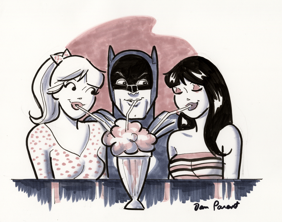
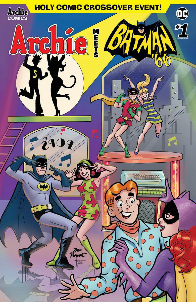
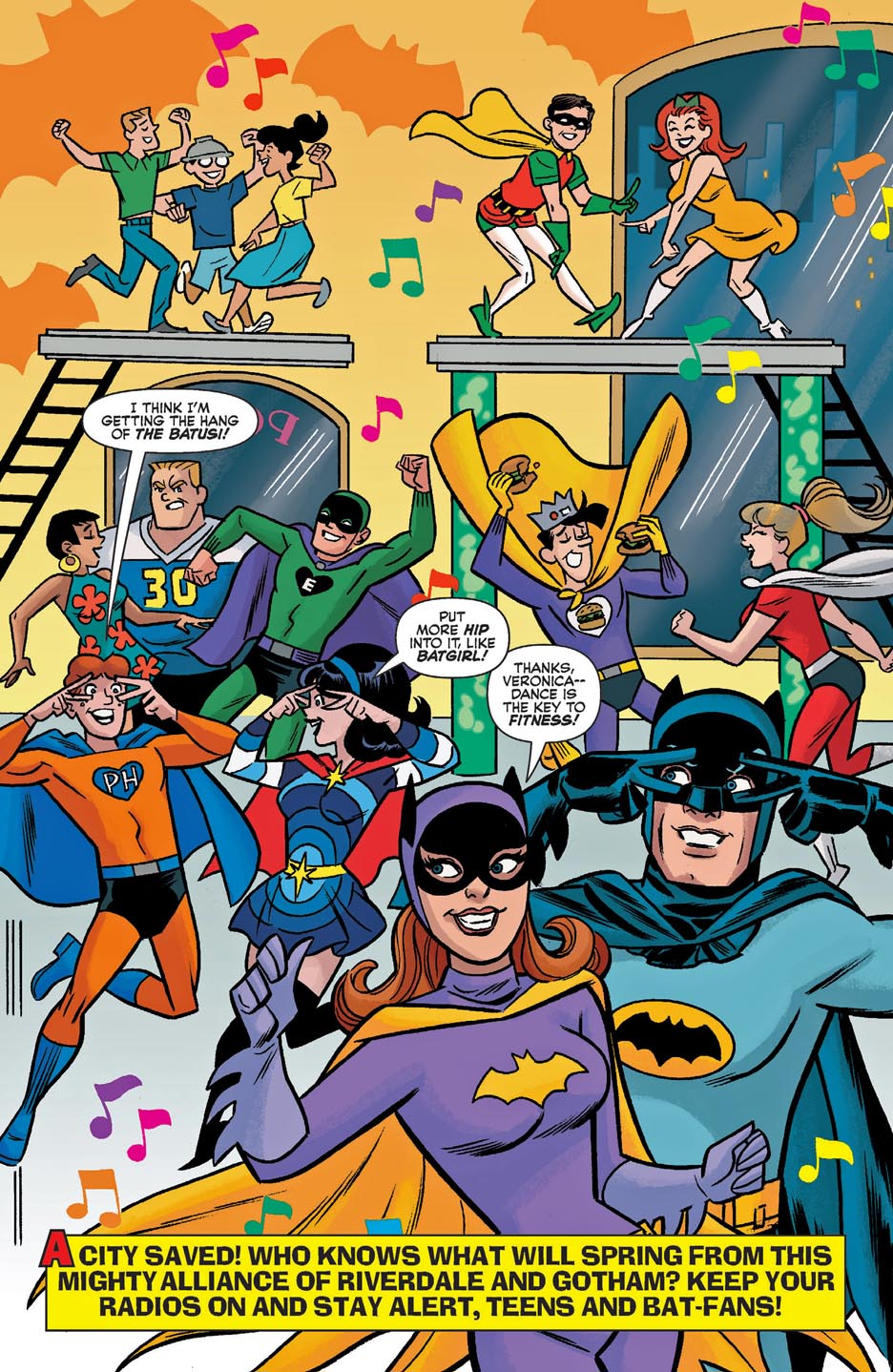
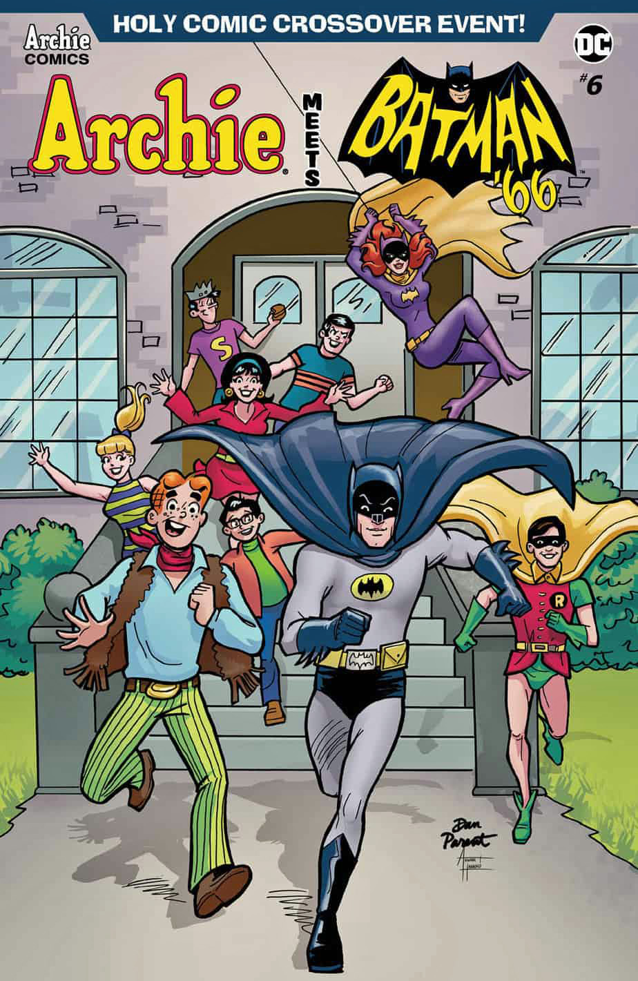
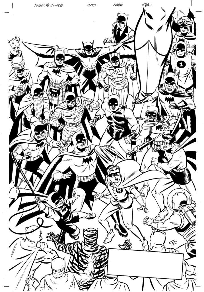
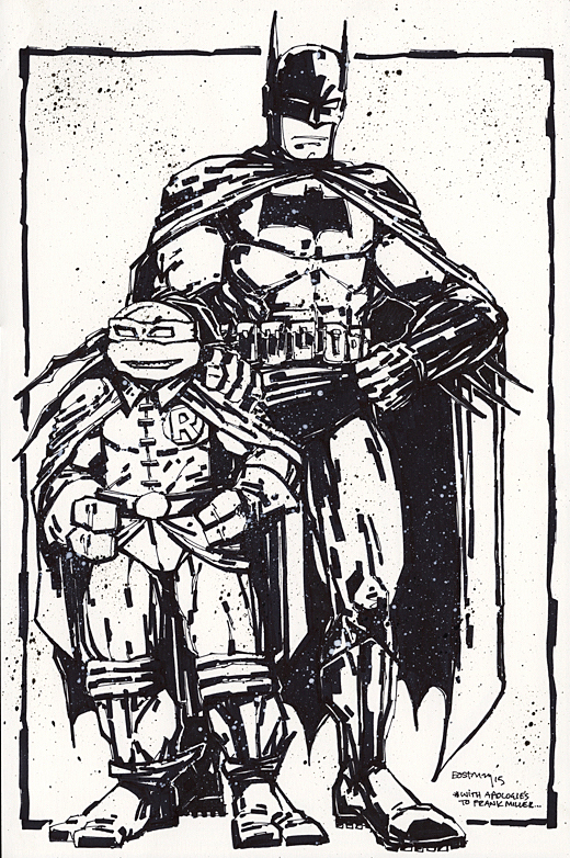
I asked my pal Dan Parent for this commission in 2019, shortly after he completed art chores on the actual Batman / Archie crossover.
I love this piece, but shortly after I returned home with it, the first thought that occurred to me was: “Shouldn’t this be Robin?” Duh.
Well, there’s always next time. Meanwhile, in addition to the 80th anniversary of Archie, it’s the 55th anniversary of the Batman television show as well.
Nothing pleases an editor (and publisher) more than when a creative team gels in such a way that they define a character(s) for a long time, and deliver consistently quality storytelling issue after issue.
The readers, obviously, notice.
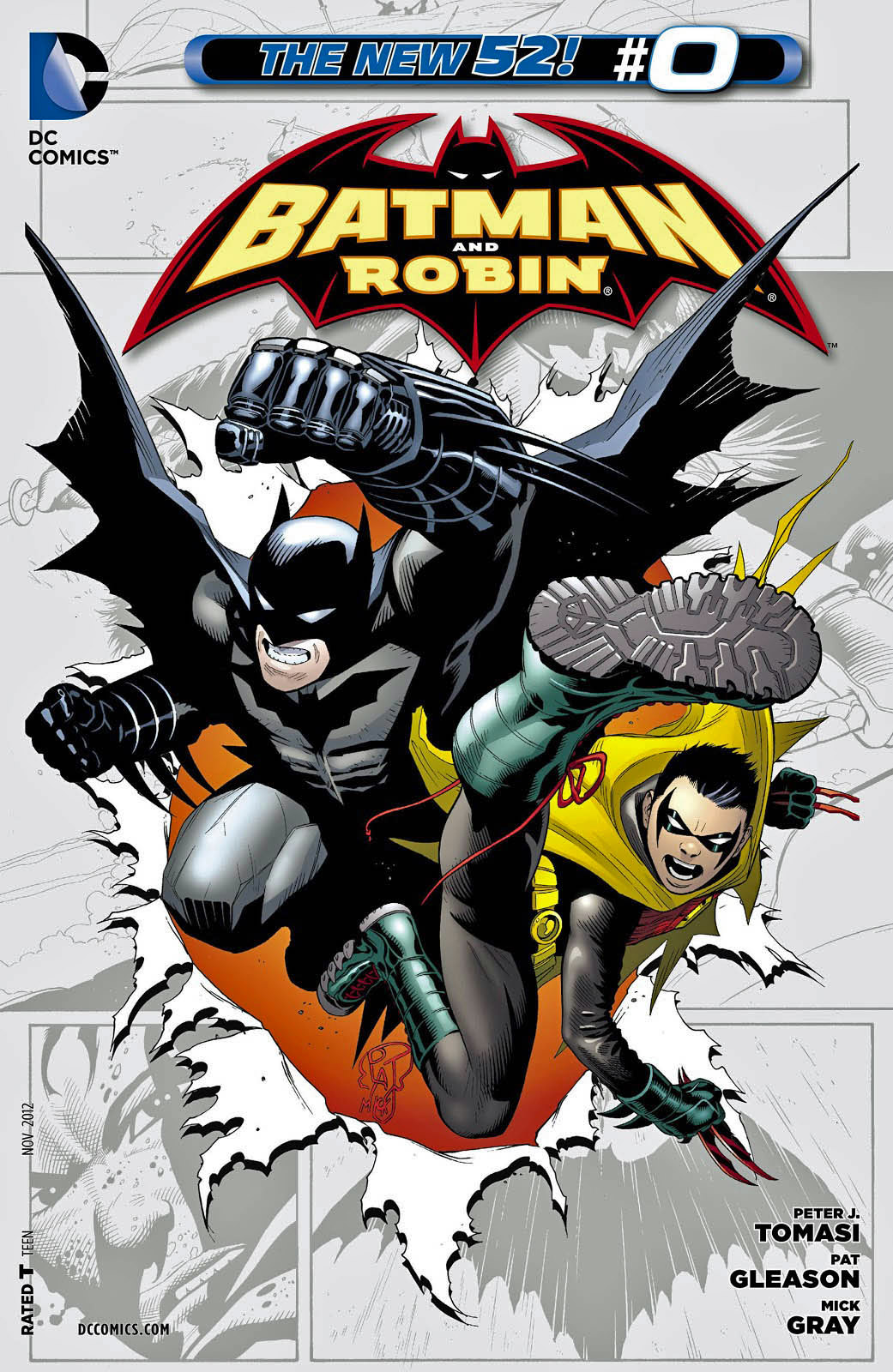
Case in point: Writer Peter Tomasi, penciller Patrick Gleason and inker Mick Gray delivered a great run on Batman and Robin during the “New 52” period.
(They had actually created a cool three-parter in the “Batman Reborn” period prior. So many eras, so little time.)
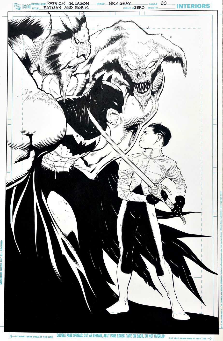
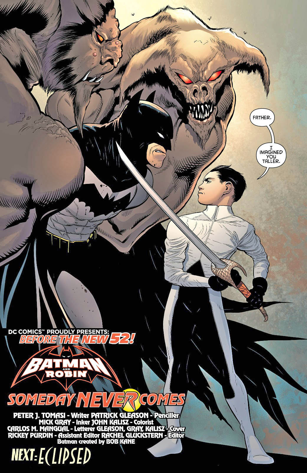
This page is the phenomenal closing splash from a prequel “zero” issue featuring the full origin of Damien Wayne, the (genetically-engineered) offspring of Bruce Wayne and Talia al Ghul. As you can see from the published page, this is the first time father and son meet.
The composition and use of negative space work seamlessly. Batman looks pissed, and the much-smaller Damien isn’t intimidated at all upon meeting his legendary father.
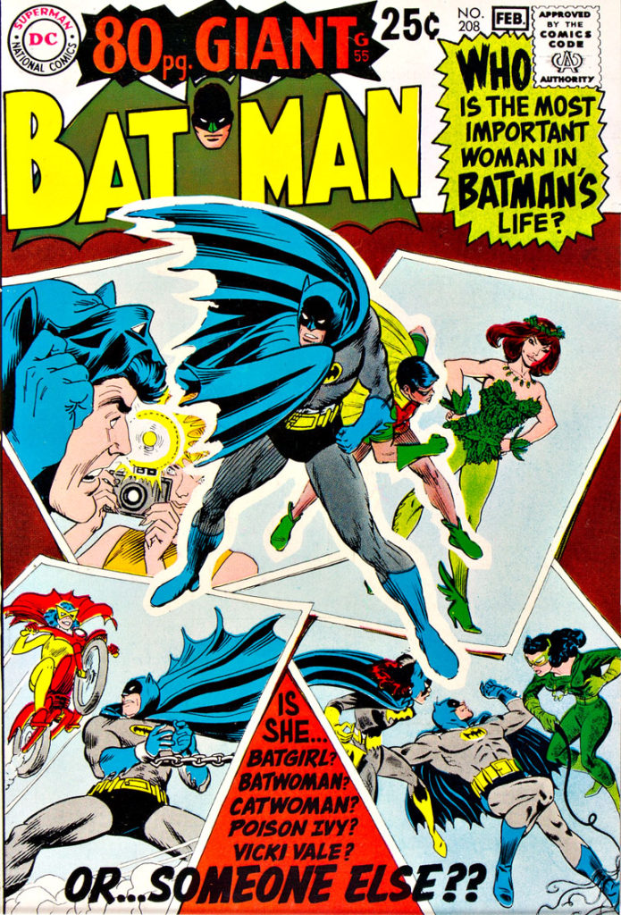
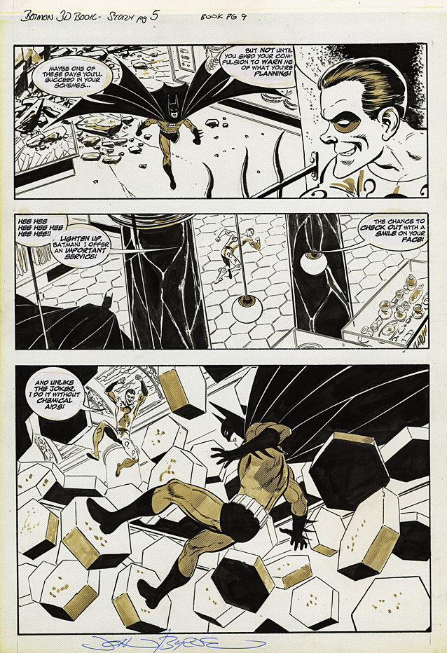
Giants. Annuals. King-Size Specials. It didn’t matter what you called them, but for 25 cents I was all in.
The DC oversize reprints appeared frequently when I was a kid. And I had no regular access to back issues until later on, so these definitely scratched the “classics” itch.
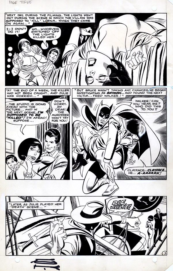
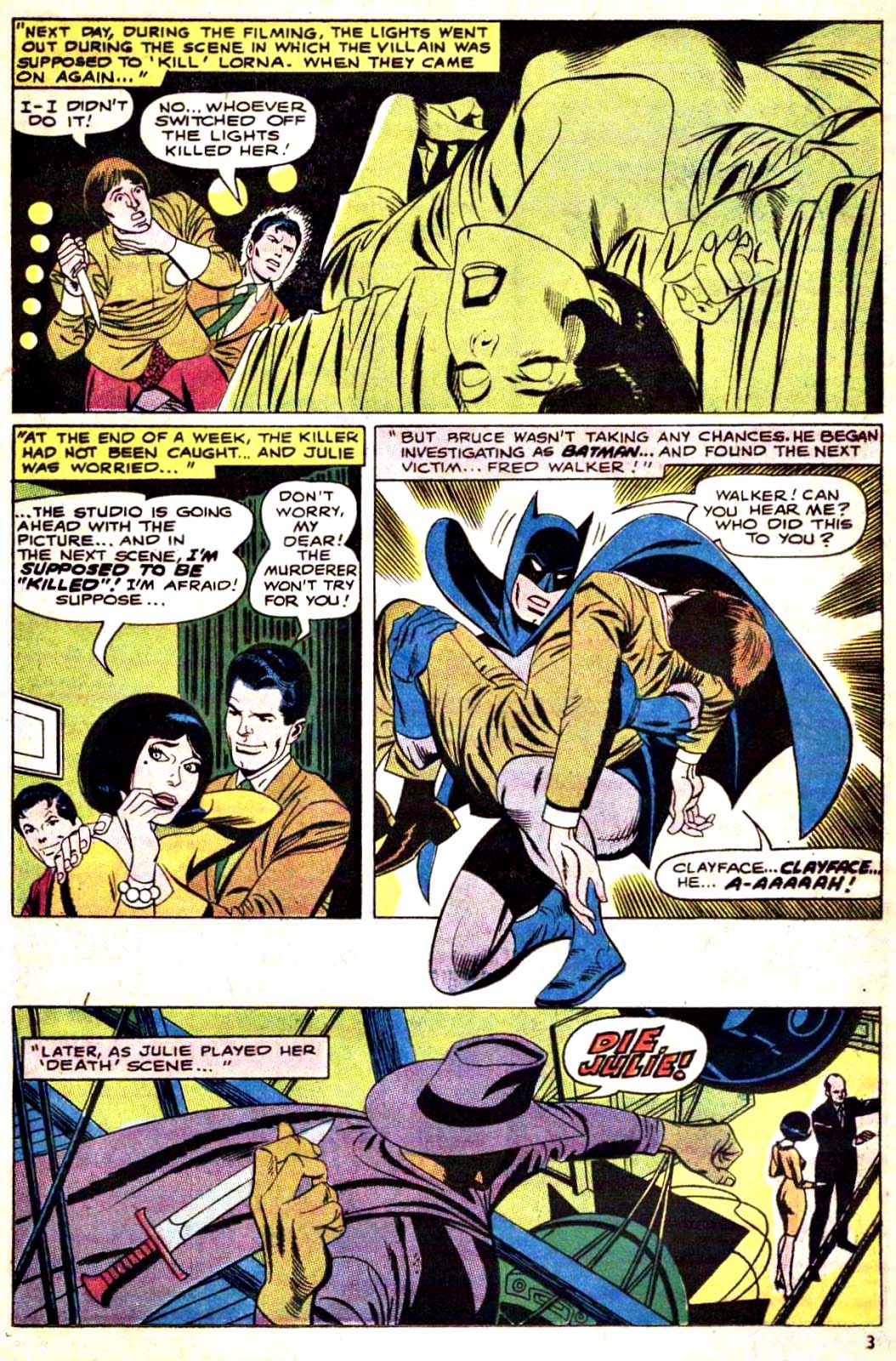
This Gil Kane Batman page comes from a short “bookend” story tying the theme of the reprints together.
I don’t think DC used this bookending approach all that often.
It’s always nice to pick up a page from a story you specifically remember well. It tweaks the Batman origin a bit, although I’m pretty sure this specific thread was never picked up again.
And Silver Age Kane Batman pages are a rarity in themselves. (Although he did draw some Batgirl back-up stories, which often featured Batman as well.)
(The story itself has never been reprinted elsewhere, a challenge with many DC comics of the same period.)
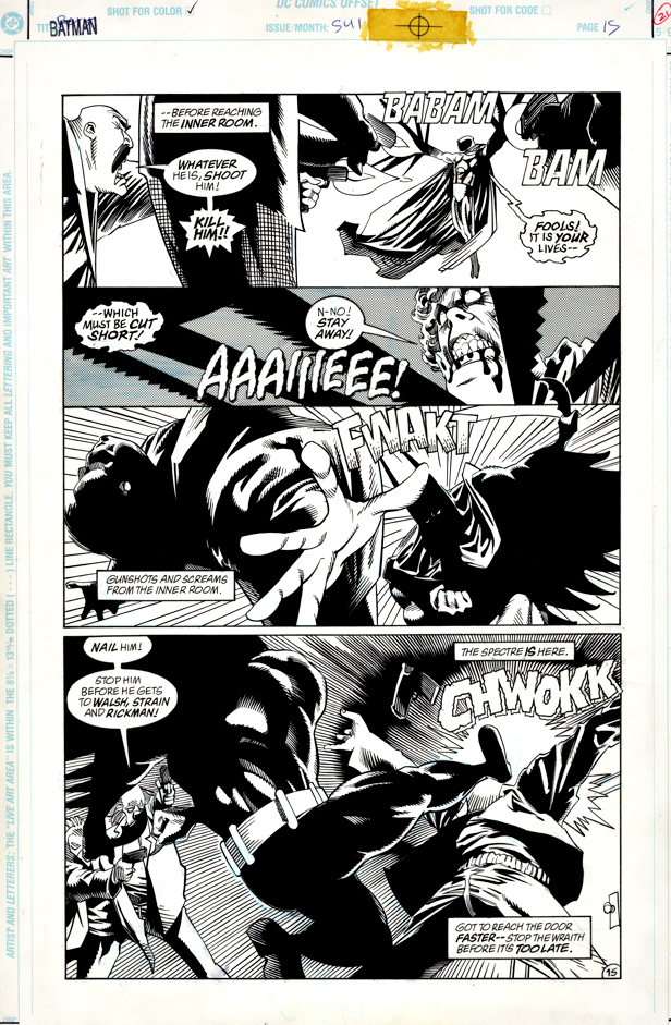
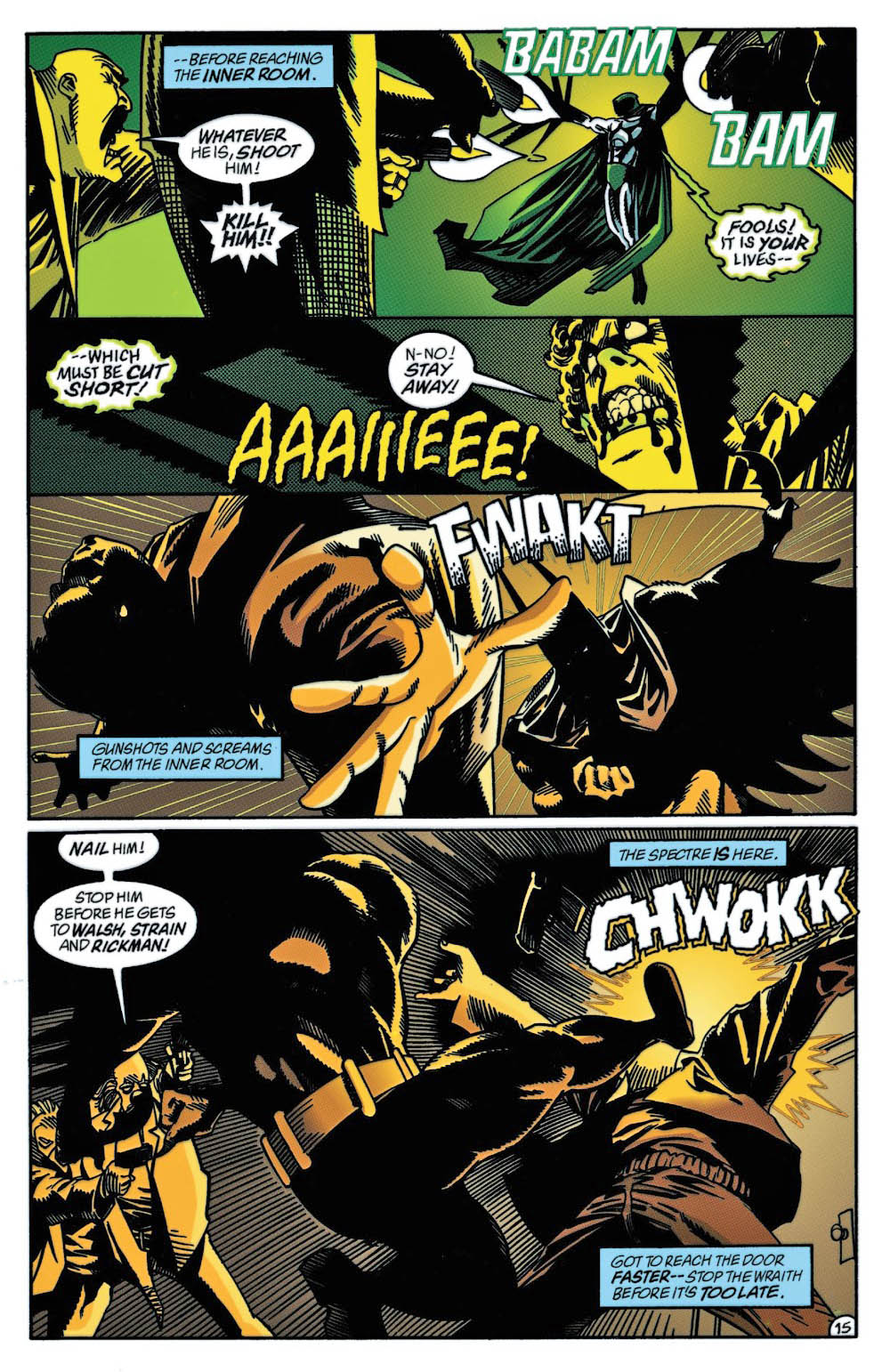
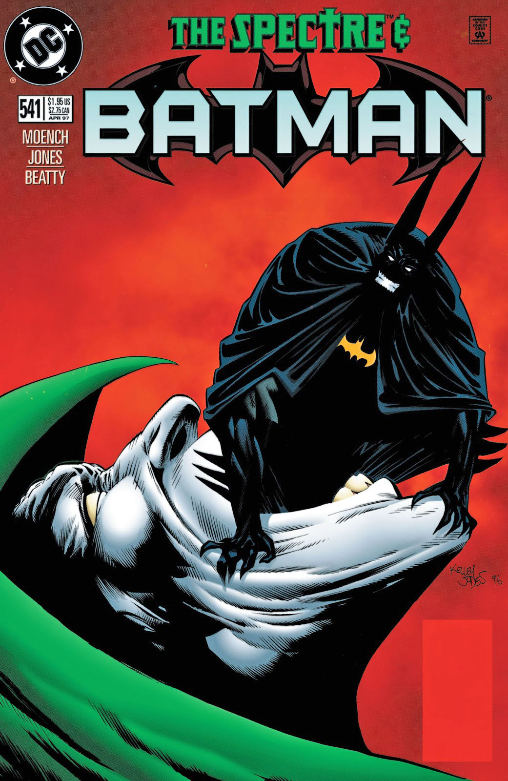
Batman and Spectre in the same issue with Kelley Jones on pencils? You KNOW some weirdness is most definitely in store.
Sign me up.
Jones (with writer Doug Moench of course) channels some of the classic sadistically vengeful Fleisher and Aparo Spectre in this issue — the second part of a two-part story. This wraith is not fooling around. (You can see why the infamous Comics Code Authority was completely meaningless at this point.)
And let’s just say Batman and Spectre disagree about a few things. Like capital punishment. And eternal Hell. Those sorts of things.
Terrific art team (John Beatty on inks), terrific page. Overall, a great run of Batman.
Continuing our art showcase in honor of the annual “Batman Day.”
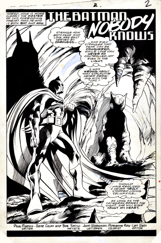
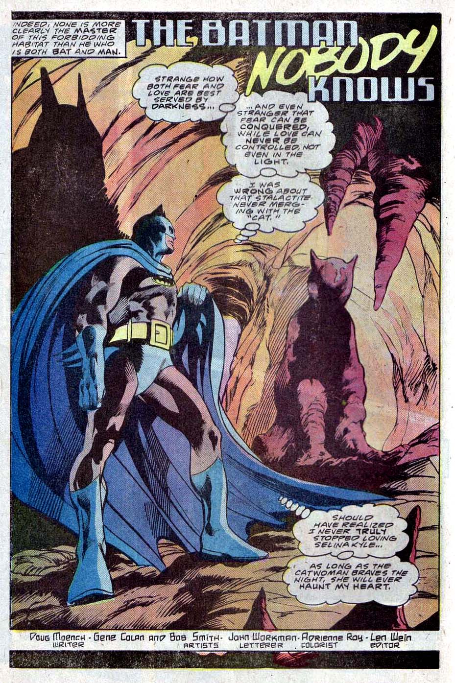
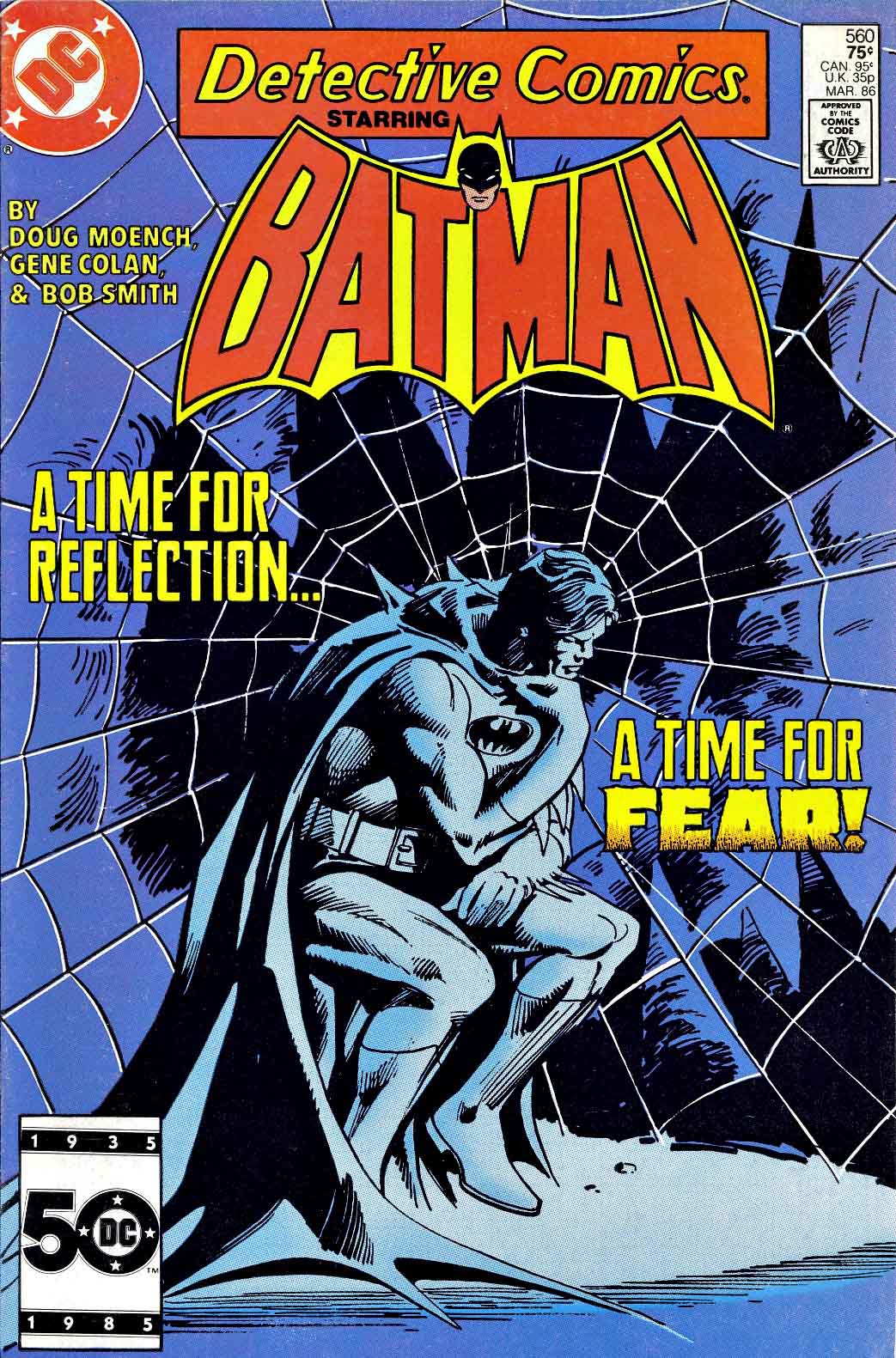
Gene Colan was a perfect choice for Batman.
Dark, moody noir? Check.
Acrobatics that defy the laws of physics? Check.
Shadowy forays into the supernatural and horrific? Check.
Gene had left Marvel after some heated disagreements with EIC Jim Shooter, and drew a number of titles for DC, but Batman was easily the best and most logical of the group.
This title page comes from his team-up with writer Doug Moench, following tales he created with Gerry Conway. It was interesting era for Batman, and included Batman’s return to the Wayne manor and his original Batcave for the first time in more than 10 years.
Colan had helped Bruce make the move back a few years prior to this moody splash page.
Continuing our art showcase in honor of the annual “Batman Day.”
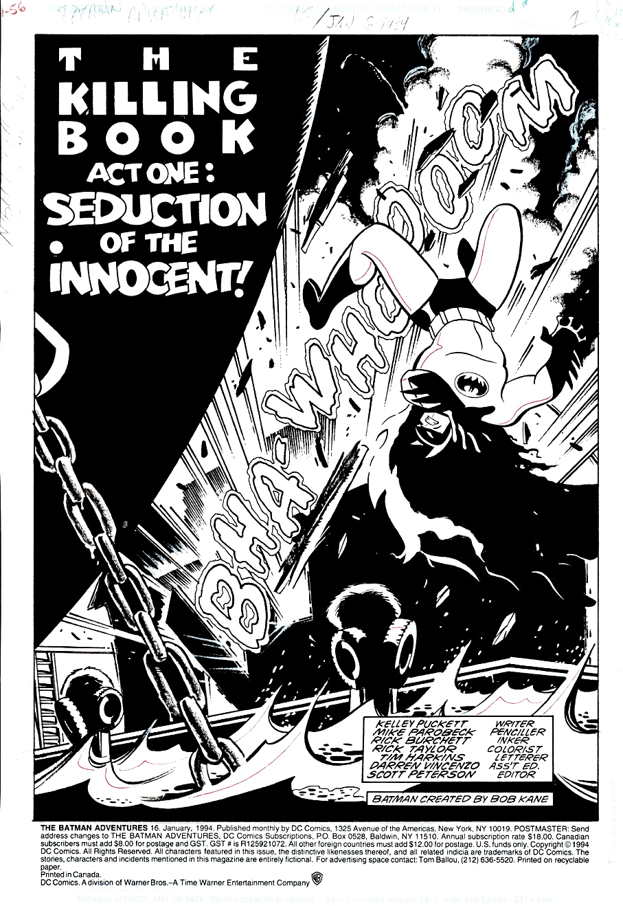
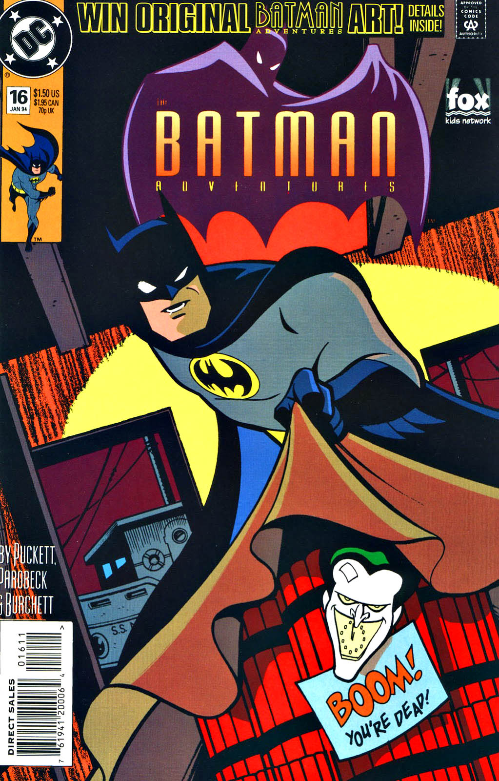
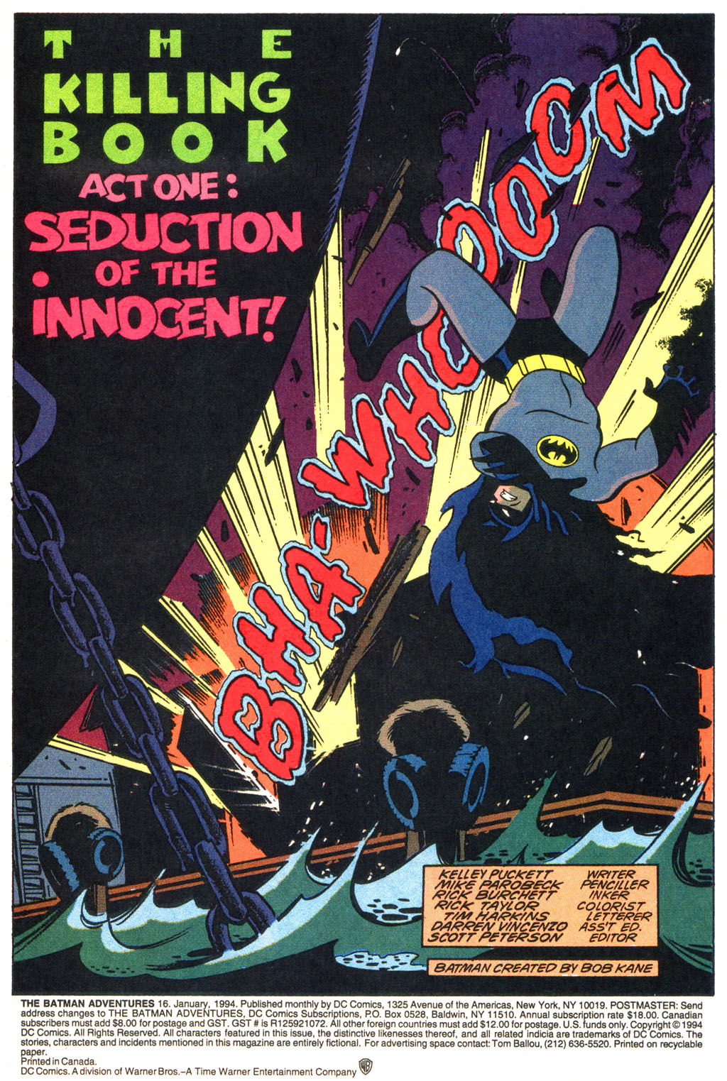
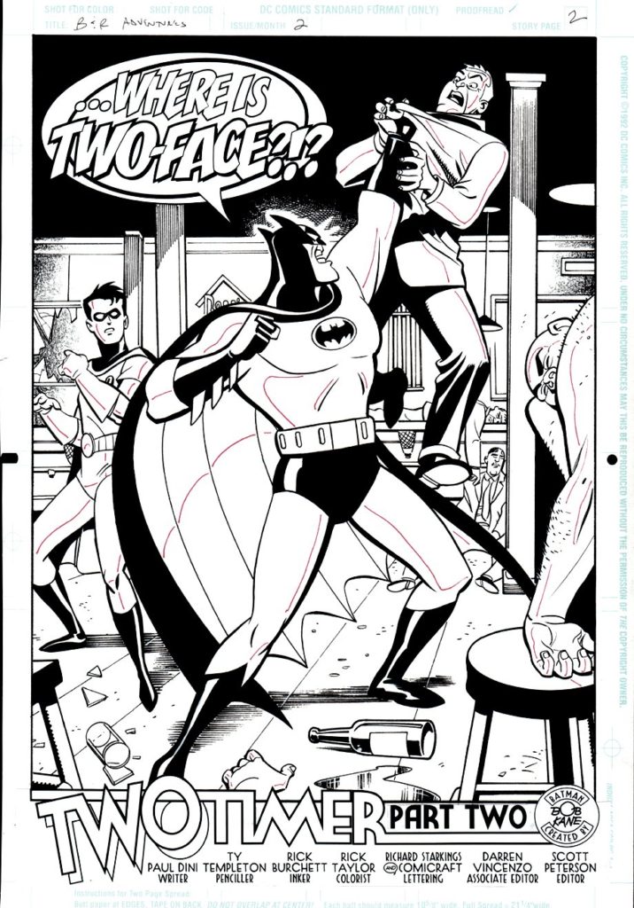
Here’s an example of the terrific work DC’s editorial accomplished on its Batman animated tie-in comics, which captured the look and spirit of the brilliantly produced animated series.
Mike Parobeck, as discussed in a previous post, passed away much too early. The work he produced in his short time was so well done that an amazing long-term career appeared inevitable.
Lots of things to love about this title splash, including fun lettering (on the art board) by Tim Harkins, his final issue on the series.
Composition is terrific of course, and the multi-faceted Rich Burchett provides some nice slick inks.
Today is officially “Batman Day”, so here is a gallery of all the Batman images published prior to this year’s celebration. Click on any name to see larger images and the original post.
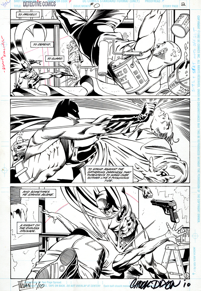
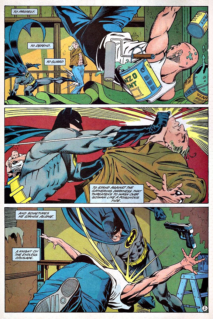
Graham Nolan delivers an action-packed three-panel page from the peak period of the his and Chuck Dixon’ Batman run in the early 90s. This is of course the same dynamic duo that brought us the supervillain Bane a year earlier.
(I still break into a cold sweat from that page where Bane breaks Batman’s back. But I digress.)
I’m fascinated that 100 percent horizontal panel layouts took such a long time to become more commonplace, especially given the frequent storytelling relationship between comic books and film. Although Hollywood introduced widescreen in the 50s (a marketing ploy primarily to lure audiences away from their TV sets) the square format panel was standard for many years.
Now of course the horizontal panel layout is ubiquitous, but even in 1993 it stood out among the crowd. And this one specifically is a dynamic example of how it can enhance the action.
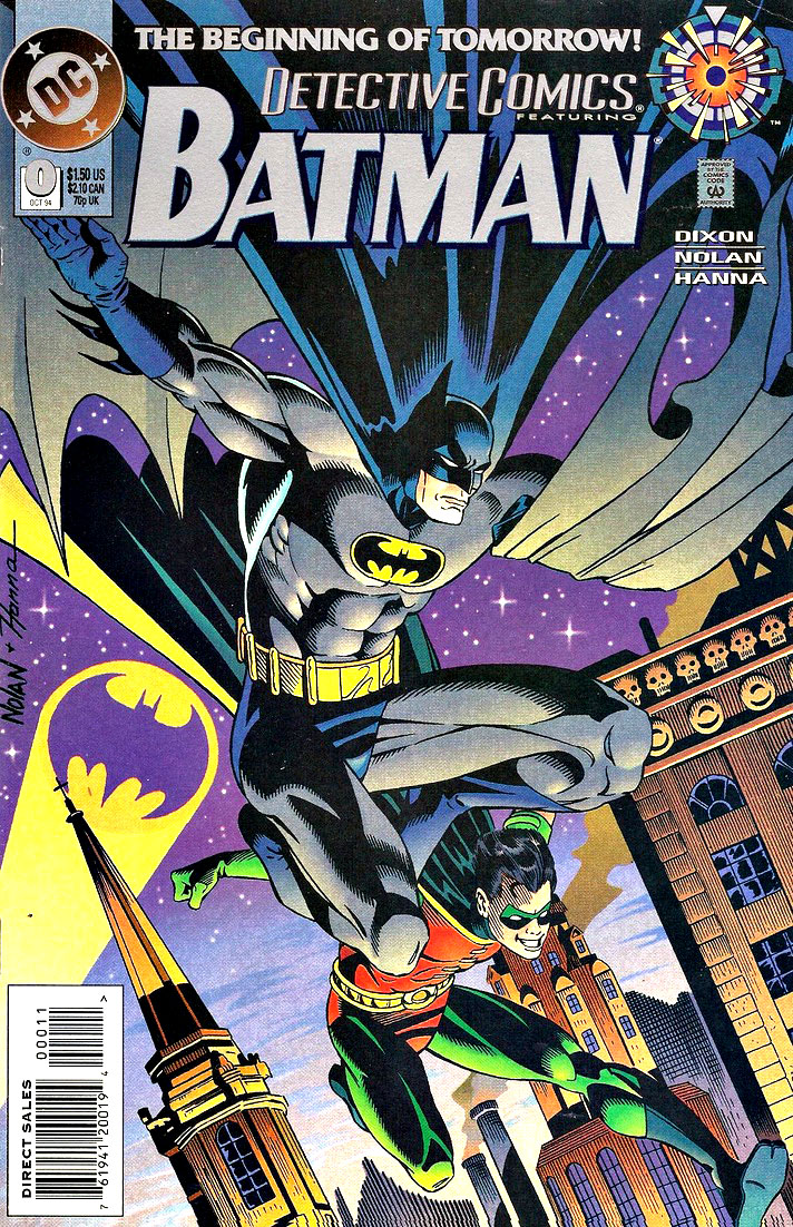
(All The Batman books had “Zero” issues as part of the broader Zero Hour DC crossover event.)
Fun fact #1:
The first bar I ever (illegally) hung out at as a kid in my Long Island hometown was built by Graham’s grandfather — who had sold it by then. (Pub still there, by the way, hopefully it will survive Covid.)
Fun fact #2:
My pal Joey Cavalieri and I both had an English HS teacher who was a classic barfly at said bar. (Good teacher though).
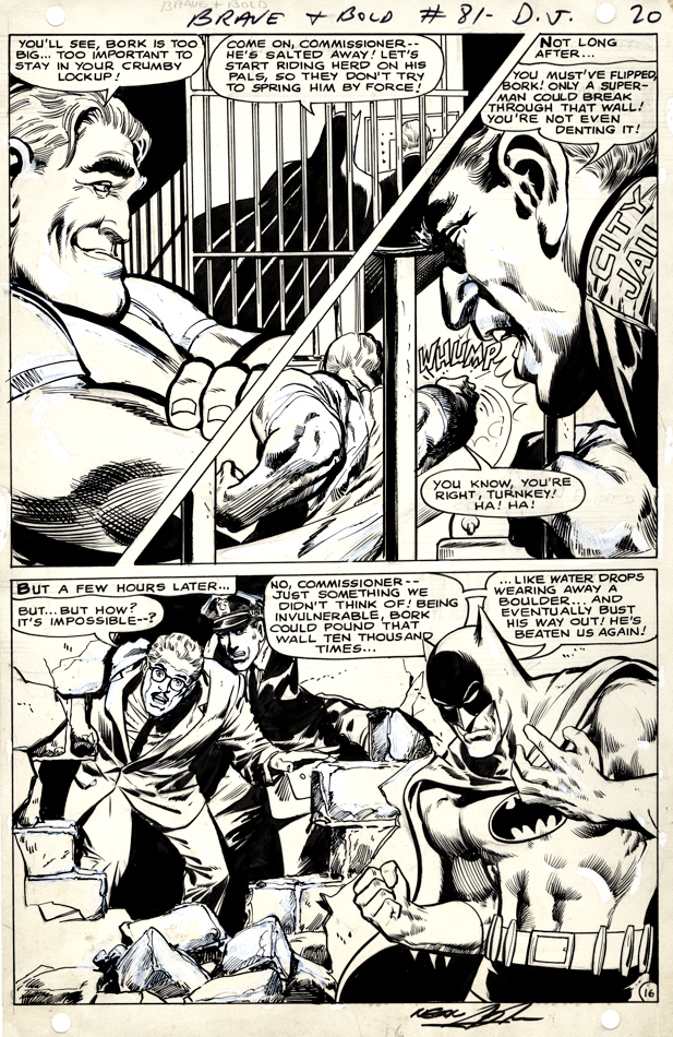
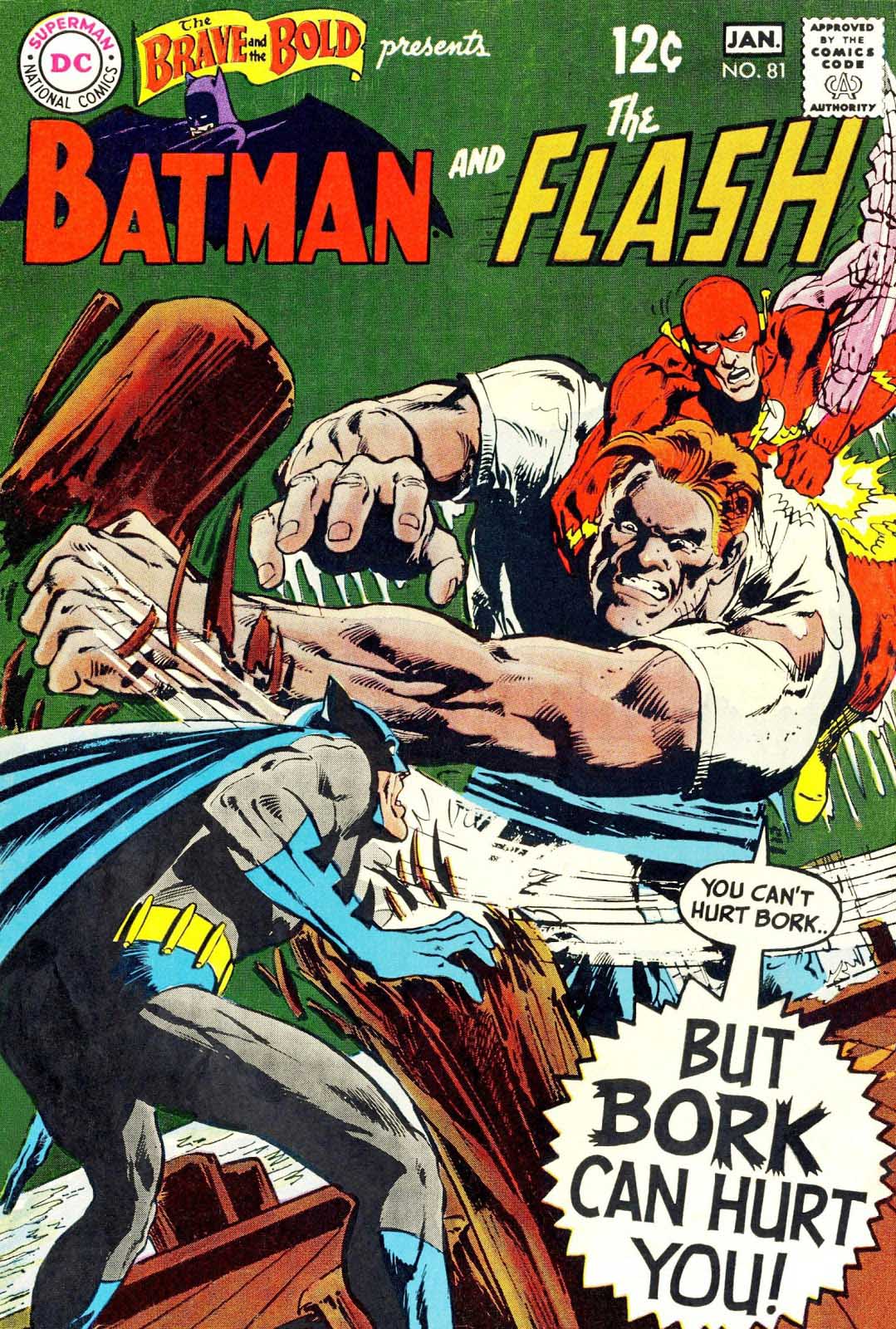
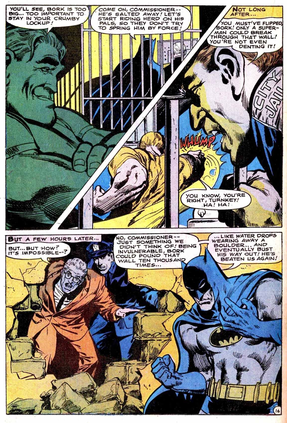
Here’s a splashy Neal Adams page from his fourth overall Batman story.
As always, Neal’s facial emotions are spot on. I love Bork’s smug face, Commissioner Gordon’s shocked expression, and Batman’s frustration with the entire situation. The body language on all the characters on the page also adds drama to the storytelling.
Vince Colletta was the first inker on the story, and Neal wasn’t happy with the results so he and Dick Giordano re-inked some of it. You can see some corrections on this page, and others in the story, when viewing scans of the original art.
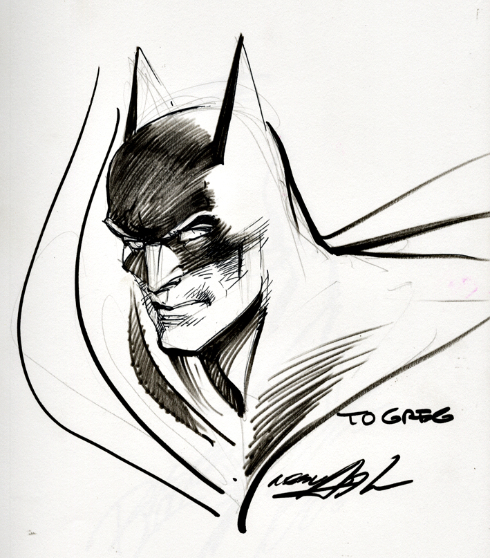
Neal Adams Batman from the Silver Age — Definitely pleased to own this one.