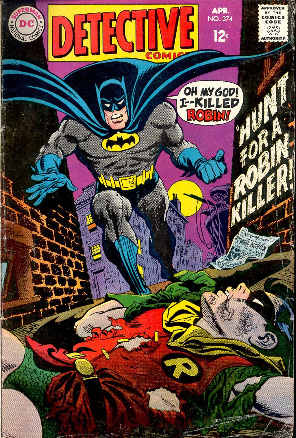
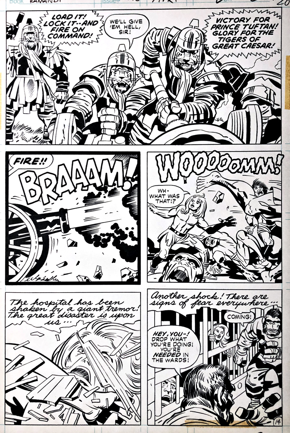
Gil Kane — Not Pulling Punches
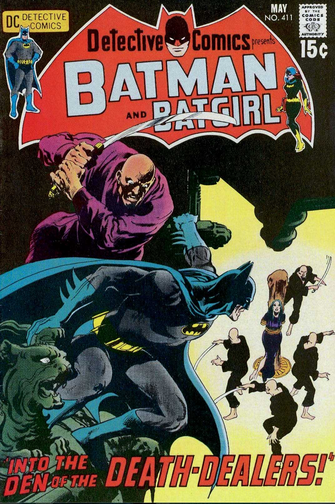
Detective Comics #374, April 1968
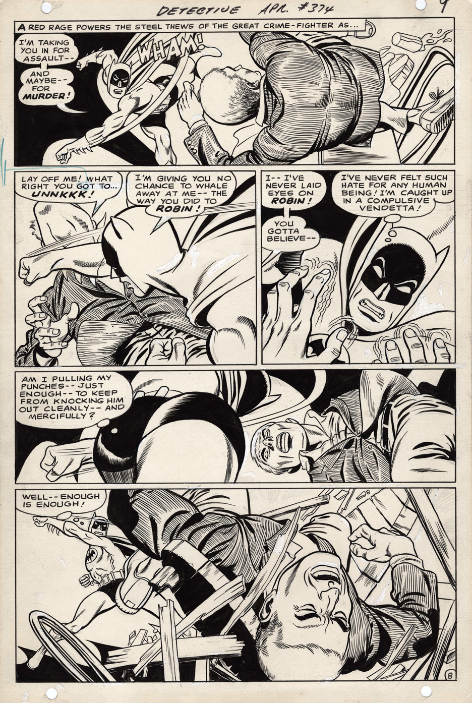
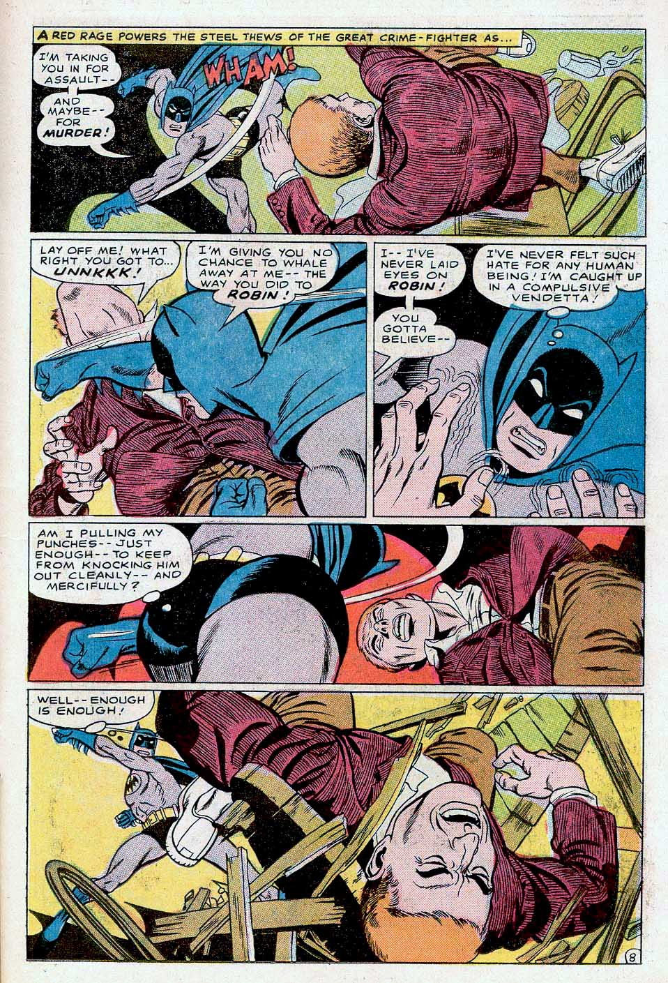
Nobody threw a punch quite like Gil Kane.
Not John Buscema. Not John Romita Sr.. Not even Jack Kirby.
When Gil’s heroes—or villains—cut loose, the poor victim didn’t just get hit. They came flying out of the panel toward you, arms and legs flailing, like they were trying (and failing) to stop themselves from being launched right out of the comic book.
A few years ago, Howard Chaykin—who got his start as Gil’s assistant—and I did a convention panel on swipes. We put together dozens of examples of Gil’s signature punch. Each one choreographed like he was inventing a brand-new dance.
Some of them were almost identical.
Sometimes in the same issue.
Sometimes on the same page.
Didn’t matter.
What mattered was this: when Gil threw a punch… it landed.
And this past Monday would have been Gil’s 100th birthday. Feels like a good time to remember how hard those punches still hit.