Batman and Spectre in the same issue with Kelley Jones on pencils? You KNOW some weirdness is most definitely in store.
Sign me up.
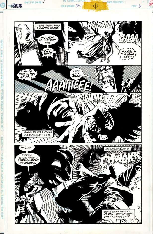
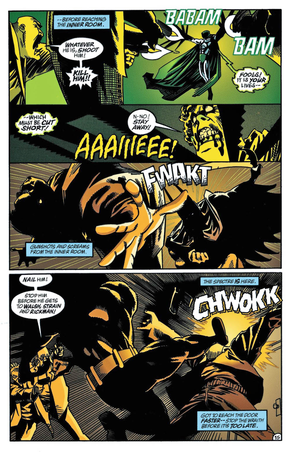
Jones (with writer Doug Moench of course) channels some of the classic sadistically vengeful Fleisher and Aparo Spectre in this issue — the second part of a two-part story. This wraith is not fooling around. (You can see why the infamous Comics Code Authority was completely meaningless at this point.)
And let’s just say Batman and Spectre disagree about a few things. Like capital punishment. And eternal Hell. Those sorts of things.
Terrific art team (John Beatty on inks), terrific page. Overall, a great run of Batman.
Continuing our art showcase in honor of the annual “Batman Day.”
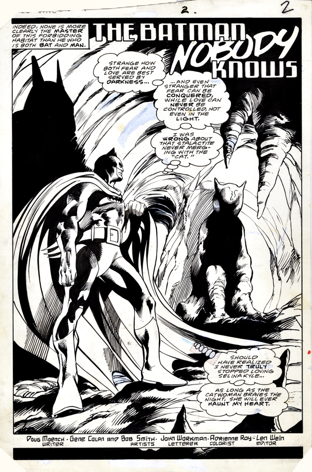
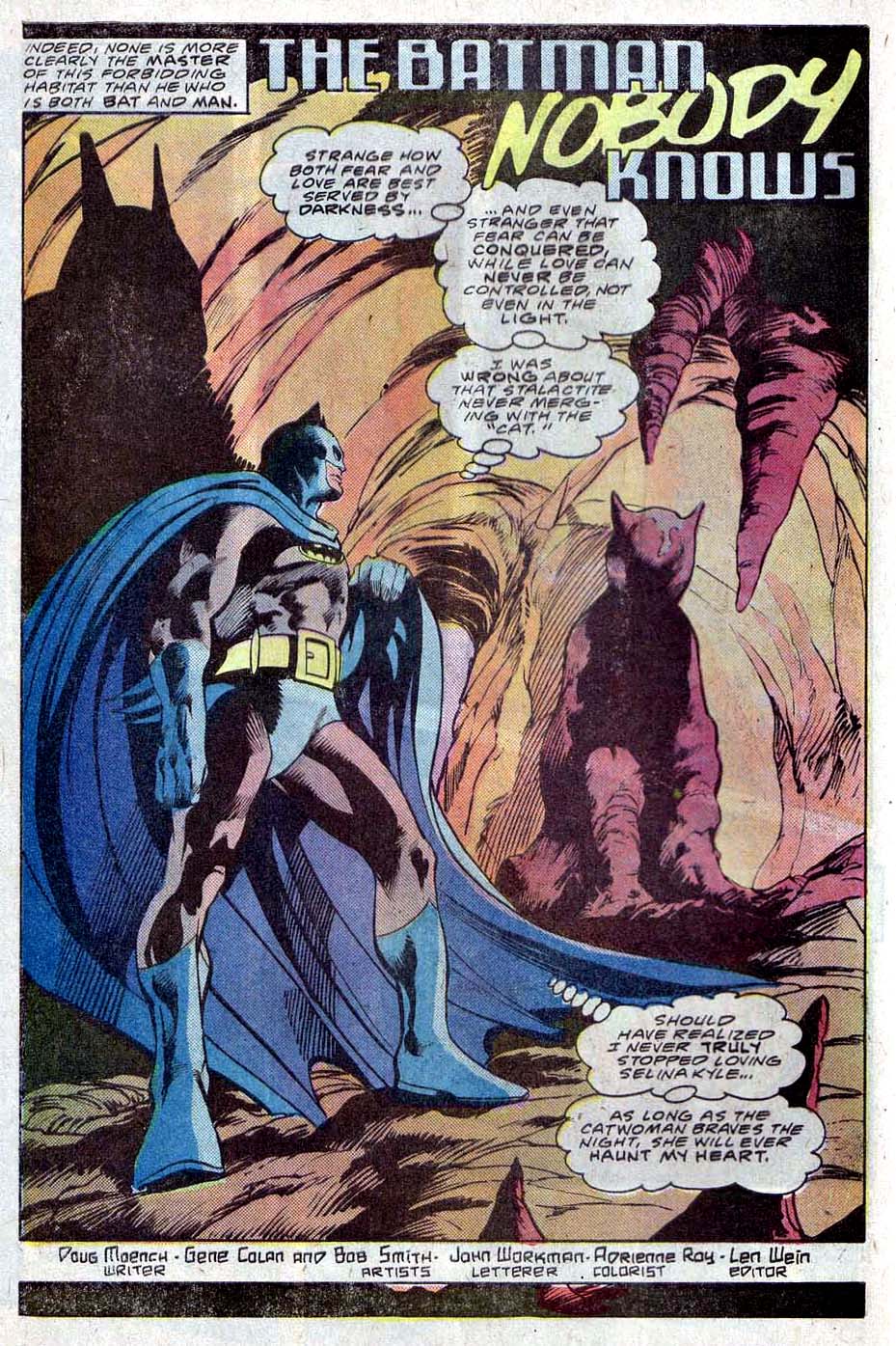
Gene Colan was a perfect choice for Batman.
Dark, moody noir? Check.
Acrobatics that defy the laws of physics? Check.
Shadowy forays into the supernatural and horrific? Check.
Gene had left Marvel after some heated disagreements with EIC Jim Shooter, and drew a number of titles for DC, but Batman was easily the best and most logical of the group.
This title page comes from his team-up with writer Doug Moench, following tales he created with Gerry Conway. It was interesting era for Batman, and included Batman’s return to the Wayne manor and his original Batcave for the first time in more than 10 years.
Colan had helped Bruce make the move back a few years prior to this moody splash page.
Today is officially “Batman Day”, so here is a gallery of all the Batman images published prior to this year’s celebration. Click on any name to see larger images and the original post.
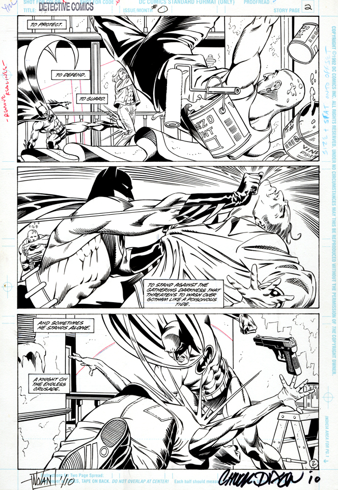
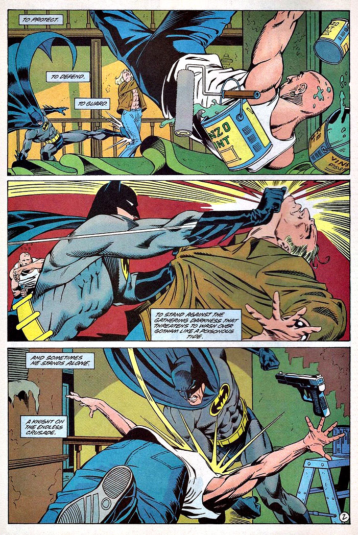
Graham Nolan delivers an action-packed three-panel page from the peak period of the his and Chuck Dixon’ Batman run in the early 90s. This is of course the same dynamic duo that brought us the supervillain Bane a year earlier.
(I still break into a cold sweat from that page where Bane breaks Batman’s back. But I digress.)
I’m fascinated that 100 percent horizontal panel layouts took such a long time to become more commonplace, especially given the frequent storytelling relationship between comic books and film. Although Hollywood introduced widescreen in the 50s (a marketing ploy primarily to lure audiences away from their TV sets) the square format panel was standard for many years.
Now of course the horizontal panel layout is ubiquitous, but even in 1993 it stood out among the crowd. And this one specifically is a dynamic example of how it can enhance the action.
(All The Batman books had “Zero” issues as part of the broader Zero Hour DC crossover event.)
Fun fact #1:
The first bar I ever (illegally) hung out at as a kid in my Long Island hometown was built by Graham’s grandfather — who had sold it by then. (Pub still there, by the way, hopefully it will survive Covid.)
Fun fact #2:
My pal Joey Cavalieri and I both had an English HS teacher who was a classic barfly at said bar. (Good teacher though).
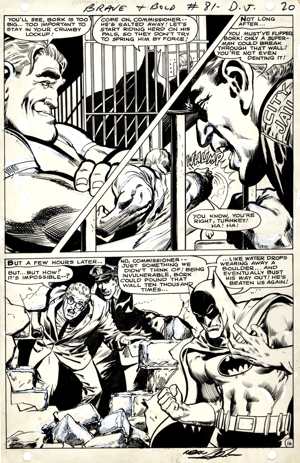
Here’s a splashy Neal Adams page from his fourth overall Batman story.
As always, Neal’s facial emotions are spot on. I love Bork’s smug face, Commissioner Gordon’s shocked expression, and Batman’s frustration with the entire situation. The body language on all the characters on the page also adds drama to the storytelling.
Vince Colletta was the first inker on the story, and Neal wasn’t happy with the results so he and Dick Giordano re-inked some of it. You can see some corrections on this page, and others in the story, when viewing scans of the original art.
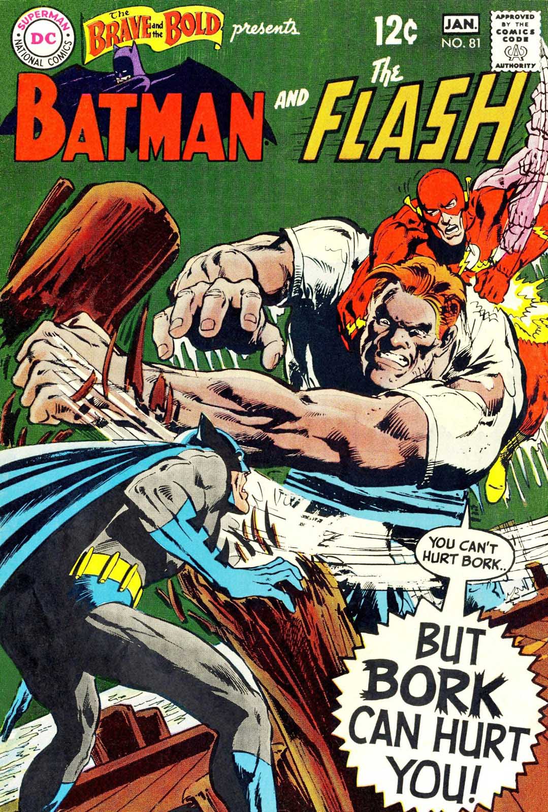
Neal Adams Batman from the Silver Age — Definitely pleased to own this one.
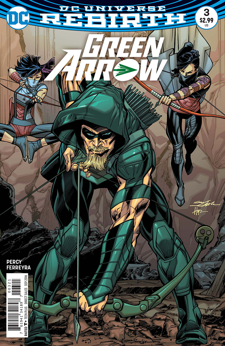
Green Arrow is back on the air (CW) for its eighth and final season, so before the emerald archer fades into the TV sunset, we’re focusing a few posts on Green Arrow originals.
Neal Adams had a big year for DC in 2016. In addition to a themed-cover month in February, Neal started drawing the variant covers for the Green Arrow Rebirth series ands drew 17 in a row. Not too shabby, and pretty appropriate, since he created the first Green Arrow “rebirth” 50 years ago.
With a semi-monthly schedule, Neal suddenly had a lot of covers. And… a lot of deadlines. So, most of the covers are inked by others.
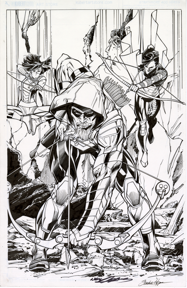
This specific Adams cover — paying tribute to the Mike Grell reboot of the character in 1987’s Longbow Hunters — is inked by the talented (and underrated) Sandra Hope. The inks are terrific, very complimentary to Neal’s style; you’ll get no argument from Neal himself, who revisited and praised the inks last week at NYCC.
That’s the easy part. The more difficult side of the equation? It’s inked on a “blue-line” copy of Neal’s pencils. DC sent a digital scan to Sandra, who then printed it out, inked it, scanned it and then sent it back to DC for colors and final production. When you absolutely, positively have to have it overnight, forget FedEx. Digital is the wave of the present.
Now this version is the printed cover, no argument from anyone. (DC added Neal’s and Sandra’s signature digitally to the final published version.) But here’s the rub: The pencils themselves exist on a separate board. Neal has kept them or sold them — doesn’t really matter for this discussion. They exist separately. There are technically no Adams “pencils” on this page.
This subject drives many art dealers (especially those that specialize in vintage material) — and some collectors (ditto) — absolutely bananas. They prefer, and I think most of us do, the pencils and inks on the same board. Blue-lines, gray-lines, whatever, for many it reeks as “incomplete” if the inks are rendered over pencil copies. After all, it’s the penciller’s illustration that sets the stage for the inker.
But… it’s 2019. Digital is a way of life. We’re fortunate that any material is still created the “traditional” way. And comics are now truly an international profession — we may be dealing with a penciller in Brazil and a separate inker in Romania. No amount of priority shipping is going to solve that deadline crunch.
So yes, I absolutely still prefer a Jack Kirby page that has Mike Royer inks rendered directly over jack’s original pencils. Or, a Steve Ditko original where I can see the faint pencil lines of his original layouts. Etc.
And I respect that pages with pencils and inks both should, and will always, command a premium price.
But 20 years from now, a kid who loved, say, the Ivan Reis / Joe Prado Man of Steel #1 cover is going to grow up to be a Wall Street financier. Or a successful Hollywood producer. And he’s going to want the original of the published cover, and not care one whit that Joe inked the cover from Ivan’s digital scan. By then, practically everything will be digital, and hand-drawn original comic book art will be a scarce commodity.
And… a killer published cover… is still a killer published cover.
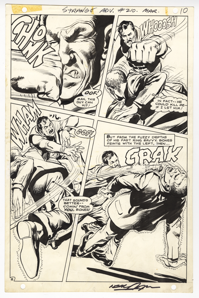
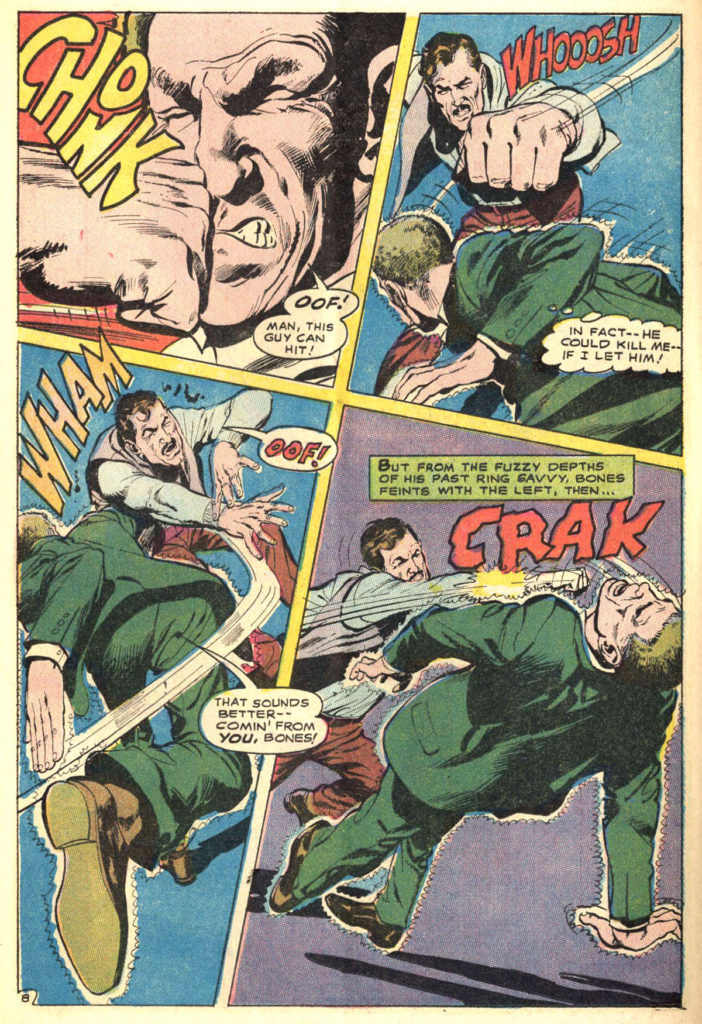
Art pages from the short-lived (but amazingly wonderful) Deadman series in Strange Adventures are often at odds with more traditional superhero series. Deadman — aka Boston Brand — is given the power to possess any living being in order to track down his killer. Which means Adams (and others) needed to draw many pages of Deadman “inhabiting” the body of an unwitting civilian. Therefore the character is often at the heart of the action sans costume.
This is one of those pages, and it’s a great one. Four dynamic panels —each a slightly different size — of a straight out slugfest. (Deadman is typically identified with a little aura around his civilian host —he’s the short-haired fellow without the moustache, getting his face smashed the first panel. And wow, when Deadman exits, that fellow is going to wake up very confused…)
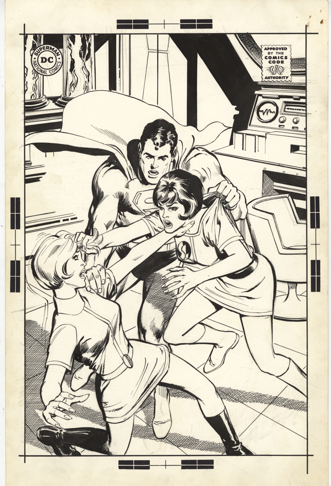
I love looking at comic book covers — I can easily head down the rabbit hole on-line or at a convention scanning through them. To my mind, no one shook up the comic book cover world more than Neal Adams.
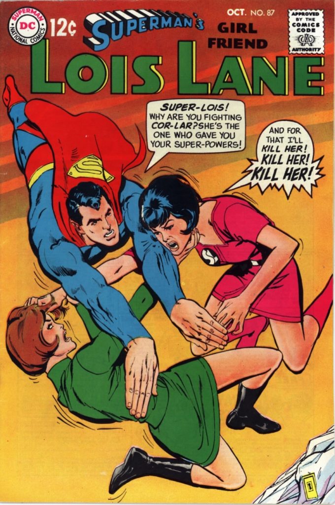
I was a kid when Neal’s realistically dynamic DC covers transformed the line, modernizing and freshening many titles pretty much overnight. 1968 rolled in, and suddenly Lois Lane wore contemporary clothing and had fashionable haircuts, Superboy’s foes looked genuinely menacing, and… Batman and Green Arrow?” The rest as they say, is history.
This is the unpublished cover for Lois Lane 87. Neal told me that any unpublished DC covers are “self-rejected,” meaning that he decided he didn’t like them himself, as opposed to any editorial dictate. Either way, you can see the switch makes sense. The “rejected” cover has Superman breaking up a scuffle. The published cover, where the characters are flying, rather than on the ground, makes it much clearer that two super-powered women are trying to kill each other. (Although Superman never had to actually break up the fight in the story itself. Lois handled it herself, thank you very much.)
That said, I like the overall appearance of the unpublished cover much better and the “Fortress of Solitude” interior, with chair and control center, is especially cool.