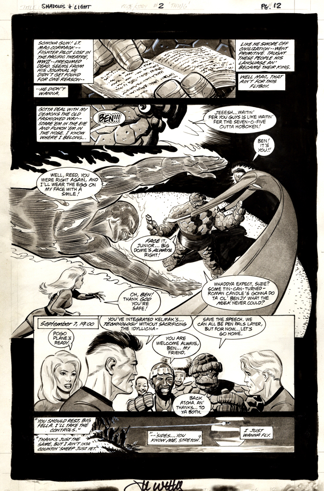
Lee Weeks — Tonality… And Totality
Shadows & Light #2, 1998
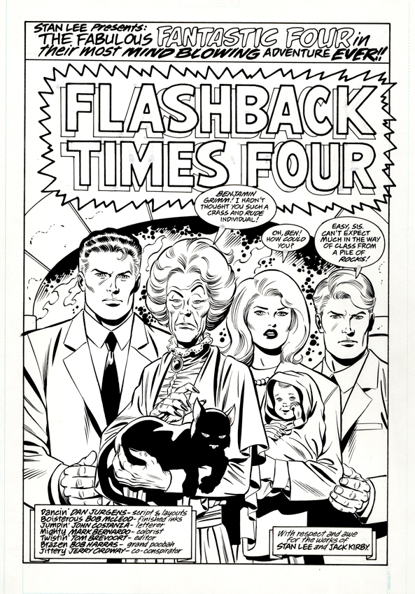
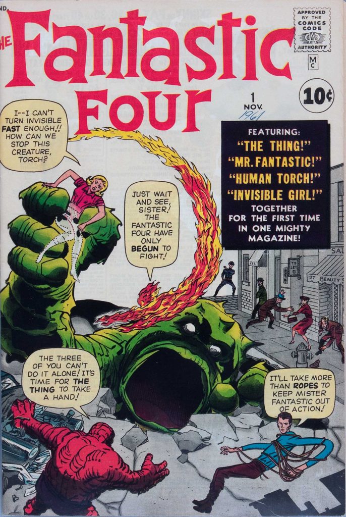
Continuing our multi-part tribute to the 60thanniversary of the Fantastic Four — and the “Marvel Age of Comics.”
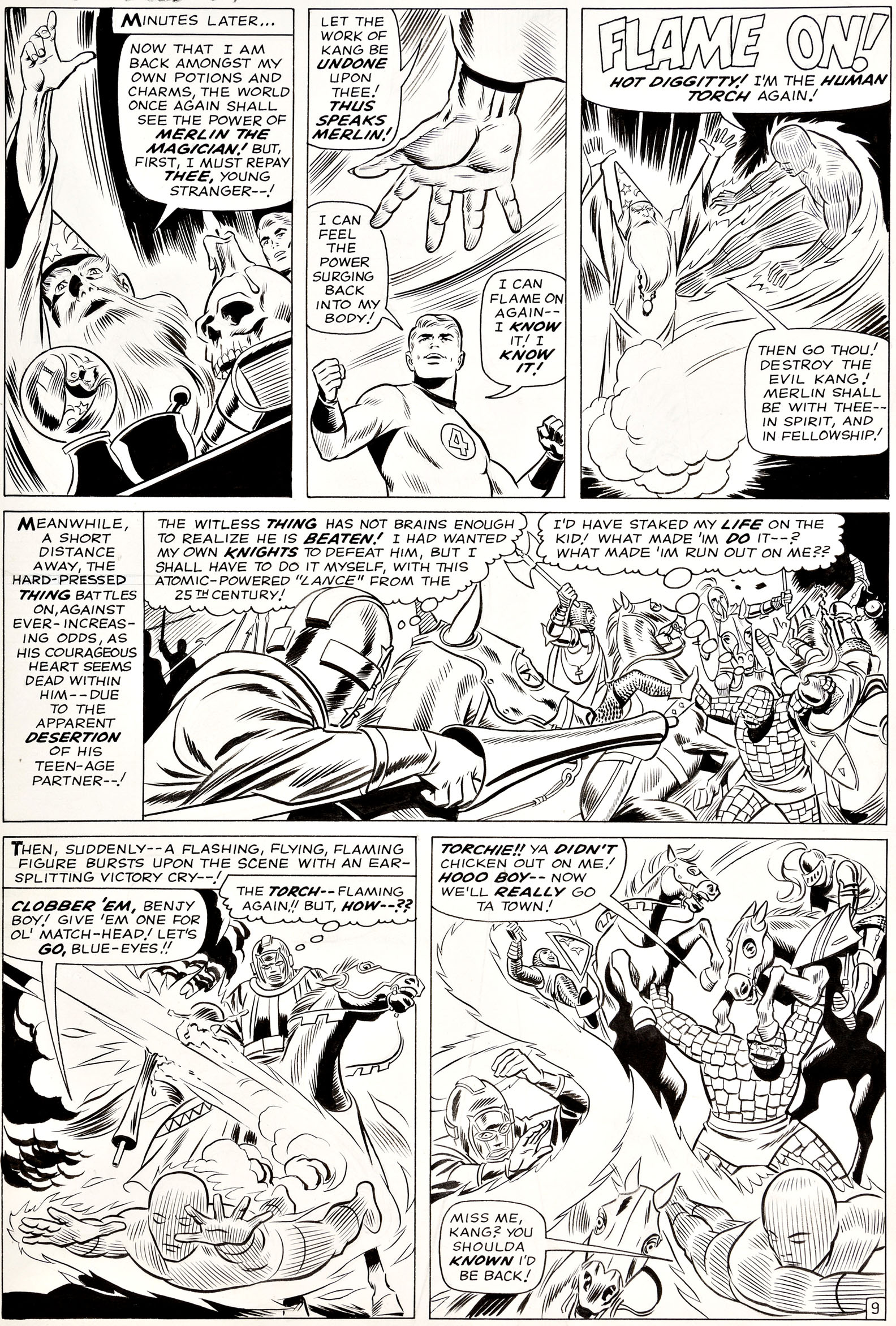
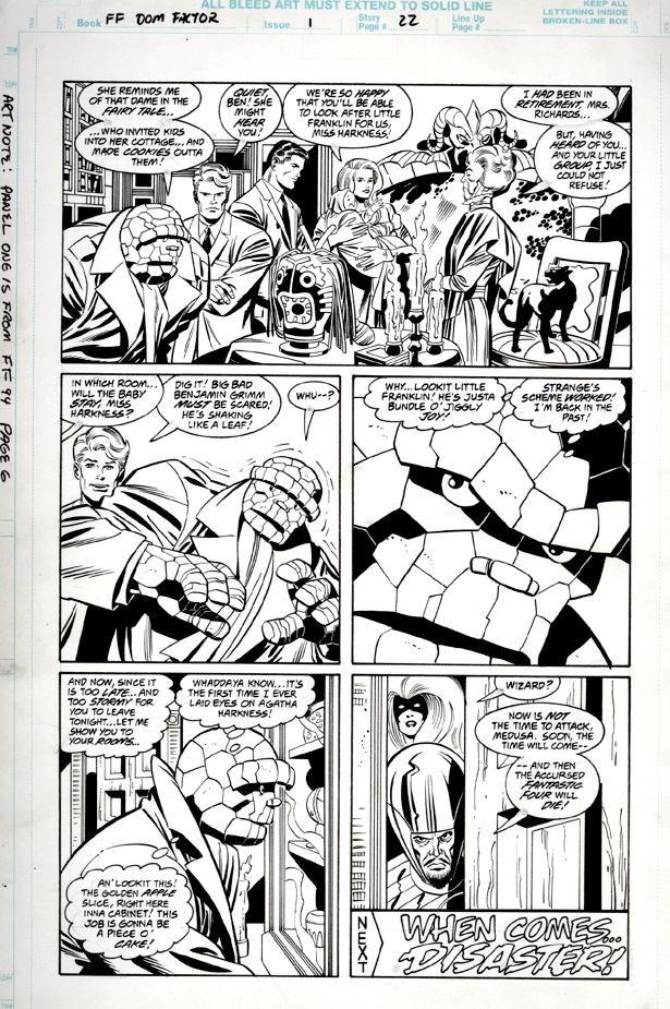
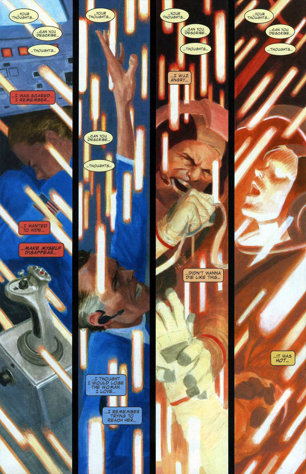
Hardly any fans I know are aware of this three-issue Marvel series featuring shorter-form stories by top creators. All of them are in black and white (hence the series title) and some, like this one by the very-talented Mr. Weeks, use wash-tone to add depth to the art.
Lee brought this page (and a few others) from this Fantastic Four story to a convention years back, and, even though it had a price tag on it, I could tell he was a bit reluctant to part with it. (I believe it’s the very first published story he wrote in addition to drawing, so I understood.) But, ultimately, I think he knew it would be in good hands and he let me pry it away from him.
I’m happy and grateful that he did. And I’d love to see more Weeks art employing gray-tone. It’s beautifully rendered.