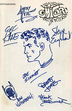
Joe Sinnott, easily one of the greatest comic book inkers of all time, and a terrific person to boot, passed away a few days ago. He was 93.
Joe drew the very first sketch I ever owned (and still do, BTW) in my convention program at my very first NYCC, 1972.
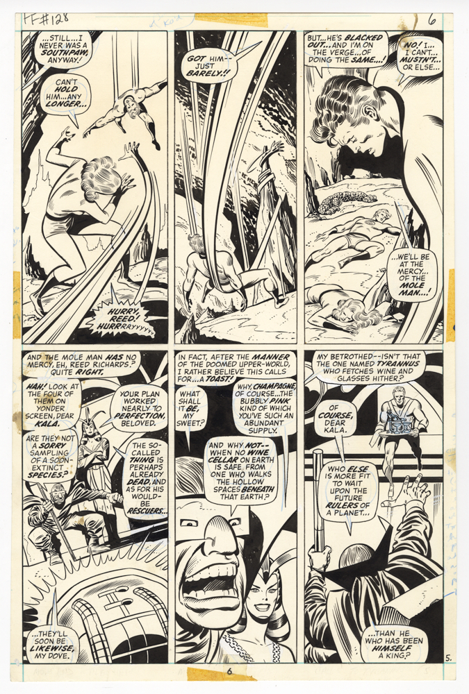
Reed Richards — Mr. Fantastic — was an appropriate choice, because Joe’s legendary inks on both Kirby and then John Buscema (and ultimately others) provided a polished, consistent look for “The World’s Greatest Comic Magazine.”
I own other art inked by him, but this one is extra special.
RIP Joe. Many thanks and salutes from all of us for your astonishing career.
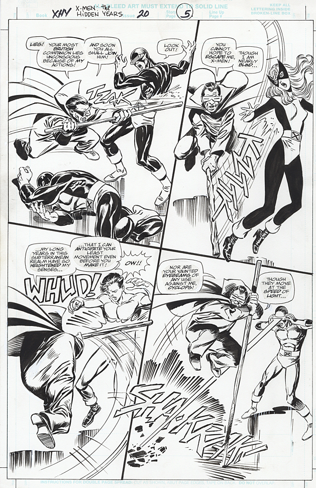
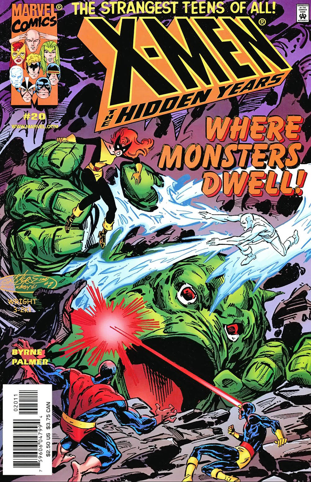
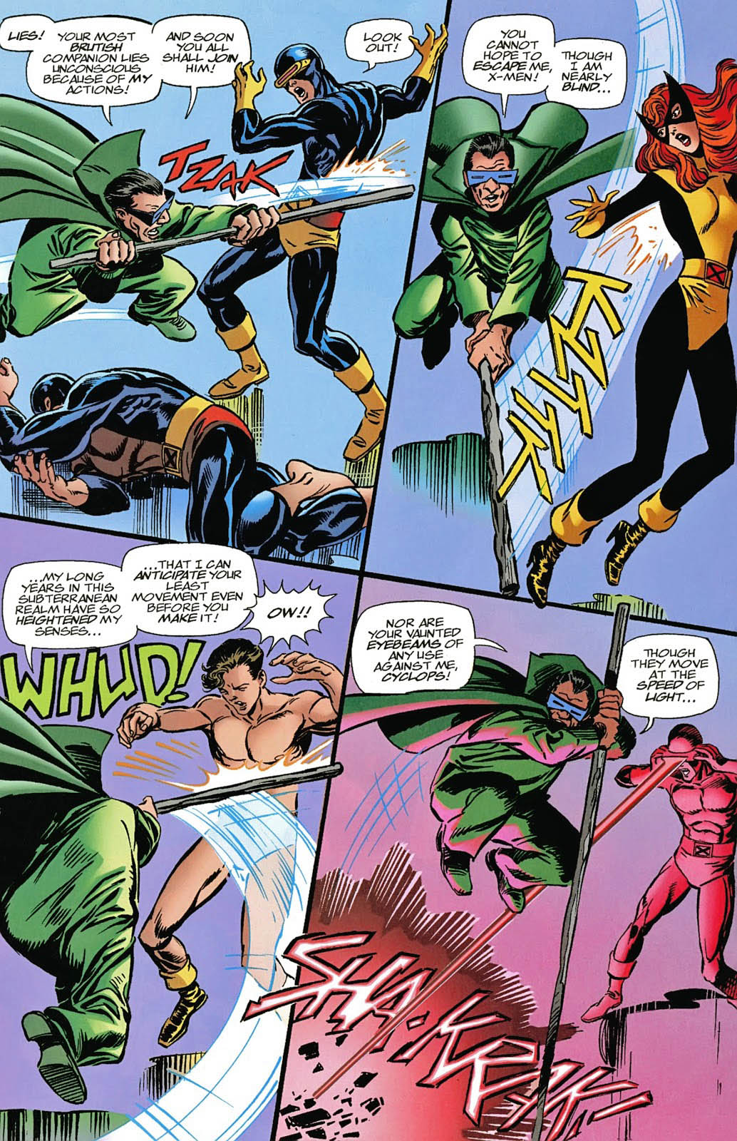
X-Men: The Hidden Years # 17, April 2001 & #20, July 2001
John Byrne returned to the X-Men in 1999. Not his beloved X-Men of Wolverine, Storm, Colossus and Phoenix, however. This time it was the “original” X-Men — in the period between their cancellation and rebirth. The “Hidden Years.”
It’s an often overlooked series and shouldn’t be. John brought great energy — and closed some outstanding story loops — in the 22-issue series.
Inks are by the terrific Tom Palmer, which gave the series a
classic look, reminiscent of those great original Neal Adams issues, while still
keeping it clearly Byrne.
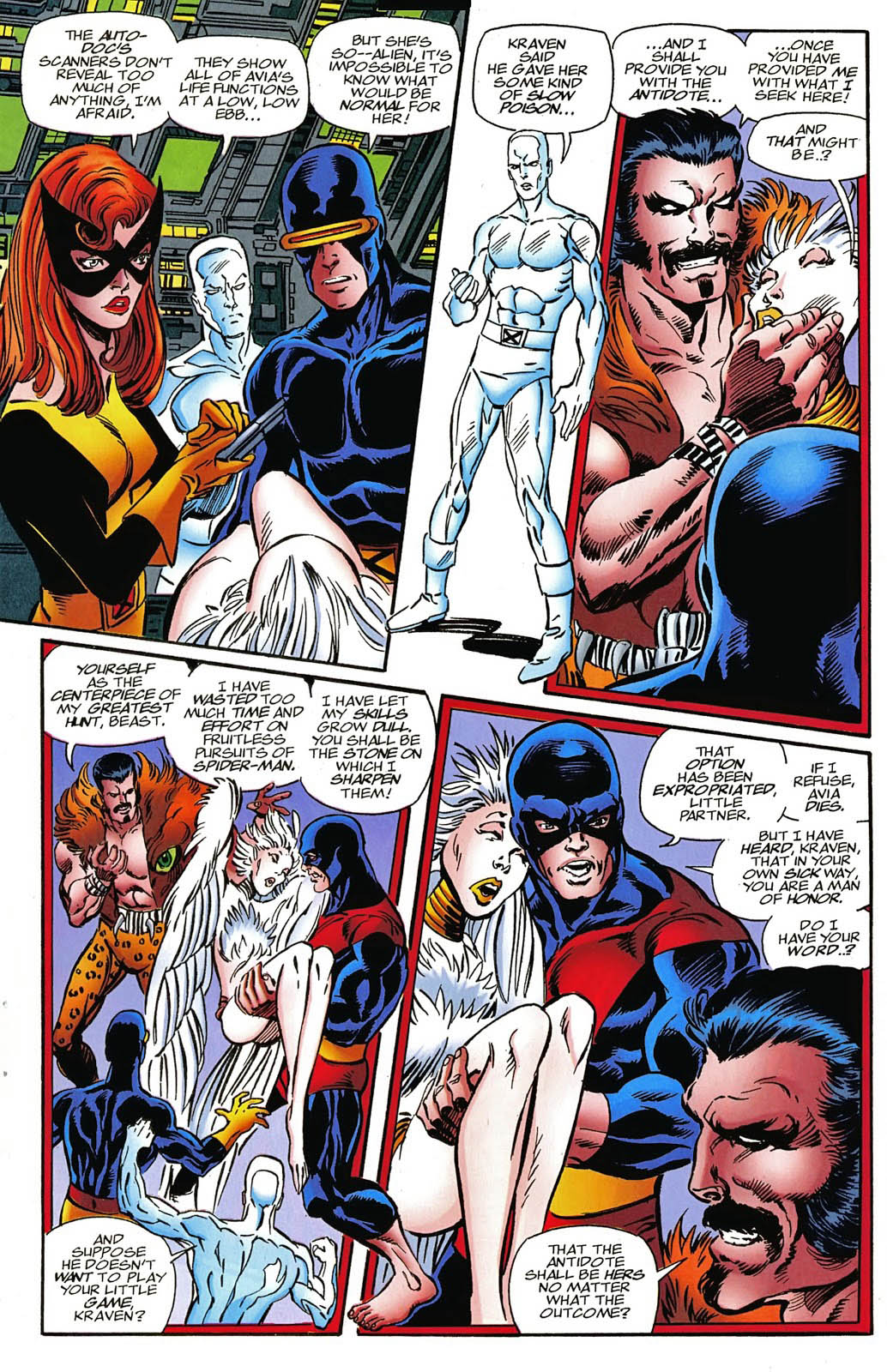
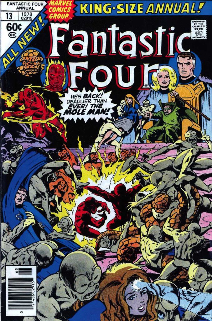
Lots of fun guest appearances in the series as well, including the Fantastic Four — inked in one issue by the legendary Joe Sinnott.
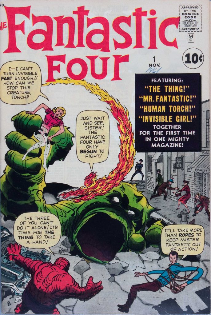
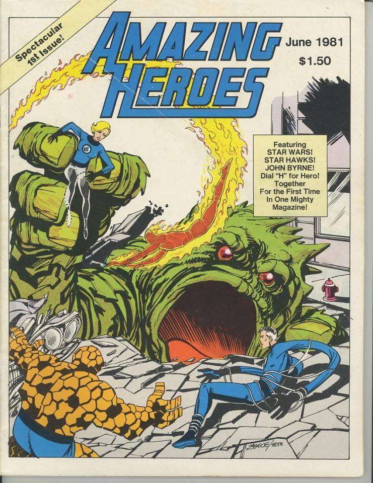
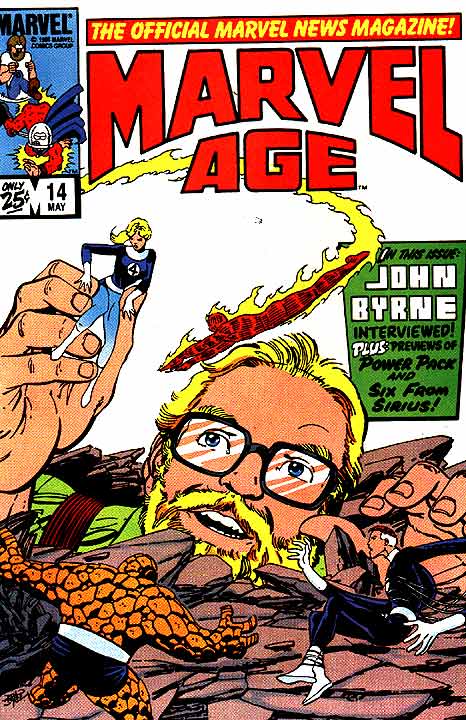
X-Men: Hidden Years #20 is a Byrne homage to Jack Kirby’s Fantastic Four #1. It was the sixth (and final) Marvel-related FF #1 homage that John drew.
We continue to
remember Jack Kirby with the help of Giorgio Comolo, an Italian artist who
worships the King — and expresses his
adoration with unique and lovely homages and recreations.
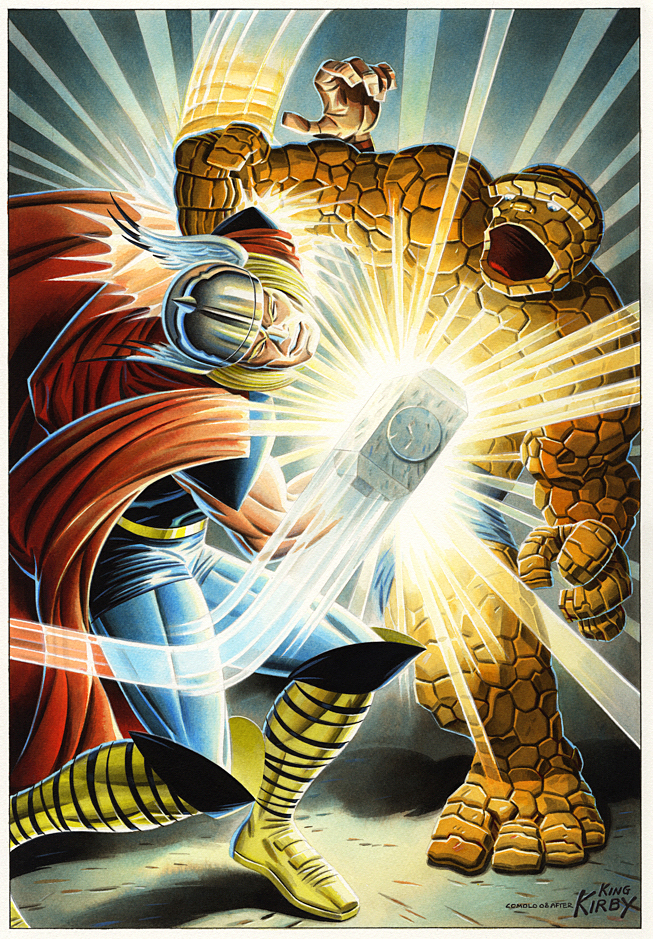
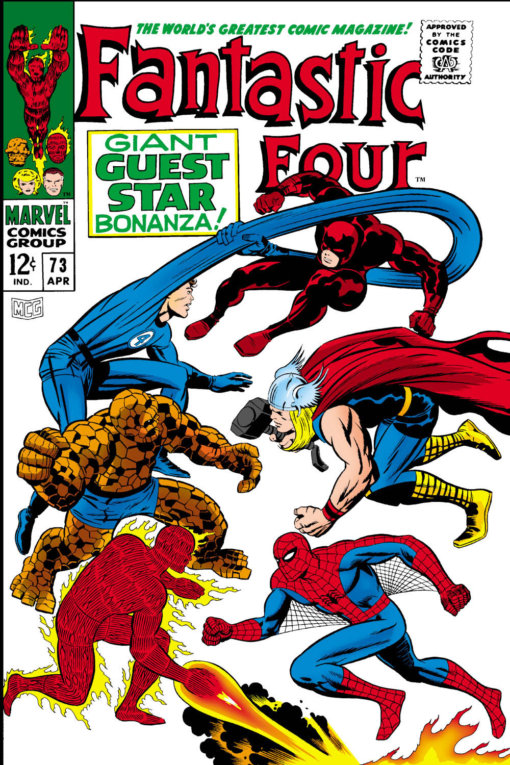
Thor vs. Thing? Come on, no contest. The Thing is powerful, but Thor is a GOD, right?
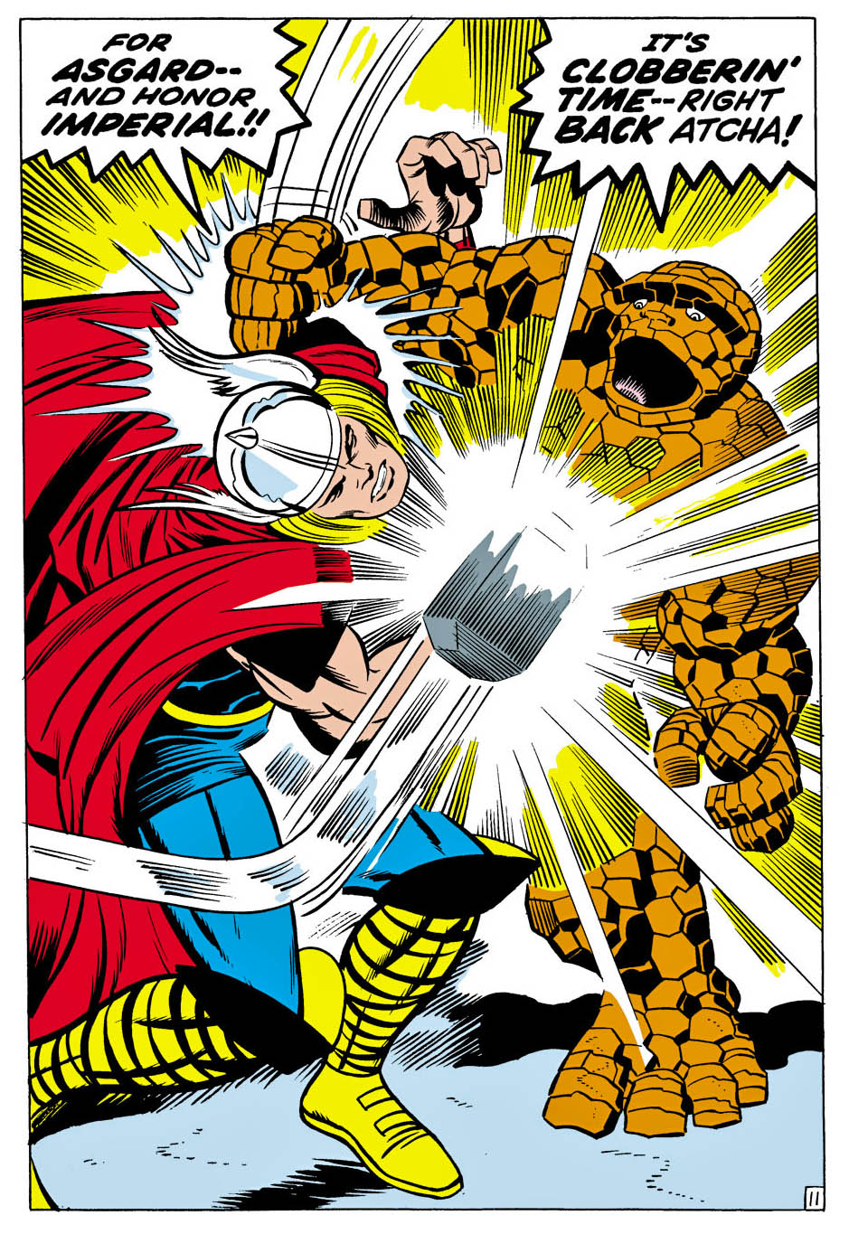
In this one-off issue of Fantastic Four (#73), Thor (with diminished powers) helps Spider-Man, who in turn is helping Daredevil, who recently had a mind transference with Doctor Doom who… never mind. The FF think Daredevil is still Doc Doom. Chaos ensues. Read the comic yourself and catch back up with us later.
Pretty much the entire issue is a battle royale, and Comolo
captures the power of this terrific Kirby splash with his own specific style
and palate.
Good thing Thor is having power problems… or Thing would be
a pile of rocks on the next page.
Also, FYI, in this issue Thing calls Thor “Curly” “Goldilocks” and “Cornball” at various times, and Spider-Man calls him an “Asgardian Hippie.” I know that was Stan’s style, but we are perilously close to Not Brand Echh territory at this point.
Fortunately for us, Galactus and the Silver Surfer return in the next issue. More operatic than comedy.
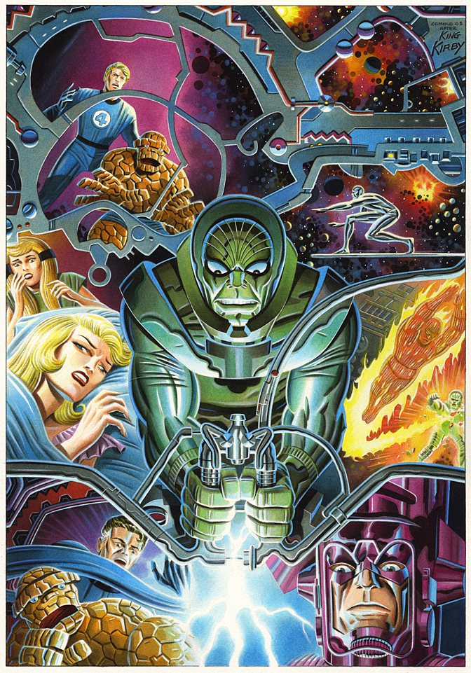
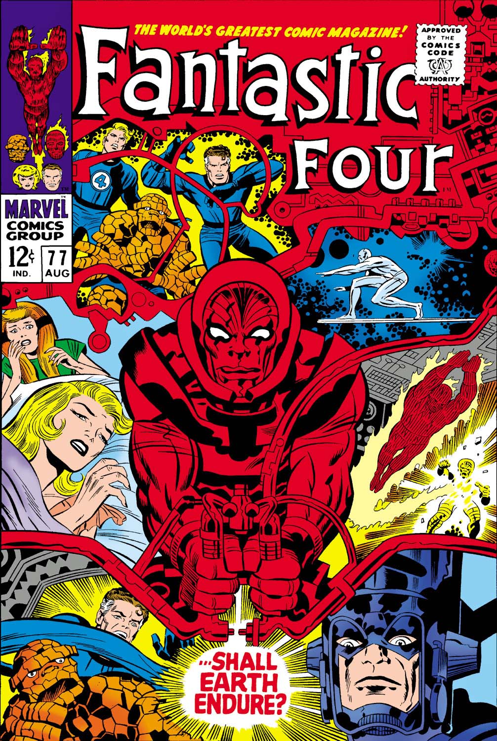
Fantastic Four #77 (August 1968), Cover Re-creation, 2008
This week we remember Jack
Kirby with an artist who worships the King
— and expresses his adoration with unique and lovely homages and
recreations.
Giorgio Comolo speaks no English. None. Niente.
That makes speaking to him about his art challenging if, like me, you don’t speak Italian. (I don’t include the handful of words I learned in my childhood neighborhood. Those are not very useful for polite conversation.)
Thankfully, his brother speaks some, and his sister-in-law a
bit more, so roughly translated, I was able to tell him last year how much I
enjoy his work when I met the whole family in Italy.
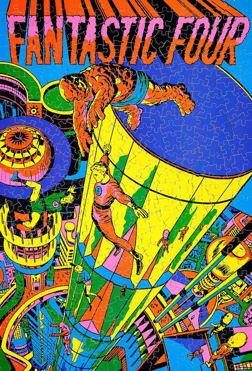
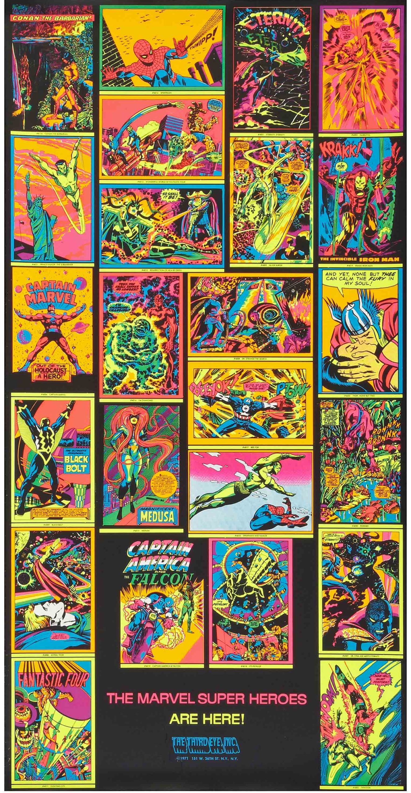
And fortunately, King Kirby is a universal language, and Comolo speaks Kirby fluently. The Italian artist recreates many Kirby covers and scenes as paintings, using a specific palate that utilizes cooler color tones and hues. It might be a stretch to some, but his cosmic paintings often remind me of those wild blacklight posters published in 1971 by a long defunct company called Third Eye.
Of course Comolo’s paintings are not Day-Glo — but they definitely pop. His palette creates a very distinctive look to his homages.
And he focuses on Jack’s later works at Marvel (and some of
the Fourth World material at DC), so there’s plenty of cosmic material to work
with.
Like this cover recreation of FF 77. It’s a trippy composition
to begin with, and in Comolo’s hands, becomes… even trippier.
Kirby — and much more Marvel — in Day-Glo. Posters, puzzles and greeting cards from Third Eye, now defunct, in 1971.
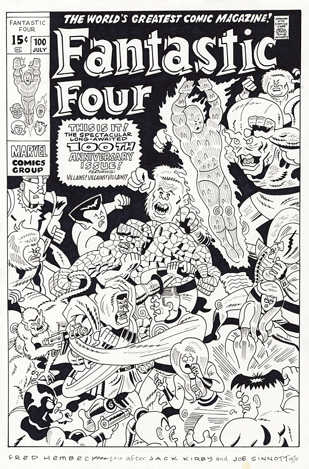
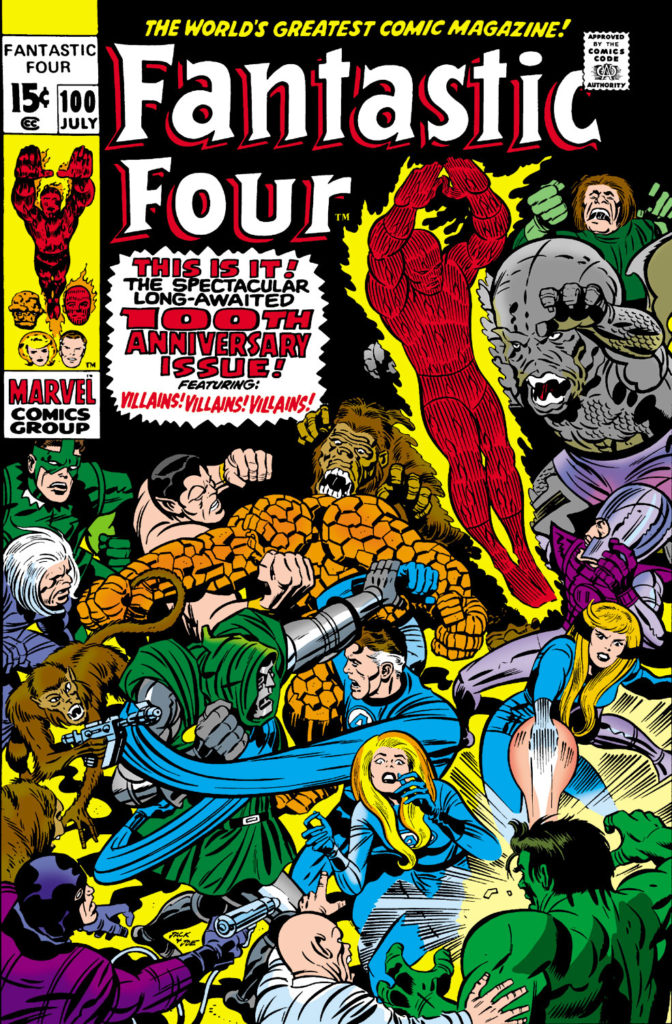
Fantastic Four #100 (Jack Kirby), July 1970, Re-creation by Fred Hembeck, 2010
50 years Ago, Marvel Comics celebrated its first ever milestone issue, with Fantastic Four #100, redrawn here 10 years ago by the very talented and affable Mr. Hembeck.
But the milestone proved bittersweet — because 50 years ago, one of the biggest stories in comic book history shook the industry: Jack Kirby was leaving Stan Lee and Marvel Comics to head to DC.
In March of that year, Jack turned in the pages for FF #102 and told Stan he was out. The most accomplished creative team in comics history was done. In comic book fan circles, it was as if the Beatles had broken up.
Which, actually, they had, with Paul making the announcement official just a few weeks later.
A dramatic beginning to a new decade of pop culture.
More on Jack and the move to DC later on; In the meantime, Happy New Year, and welcome to 2020!
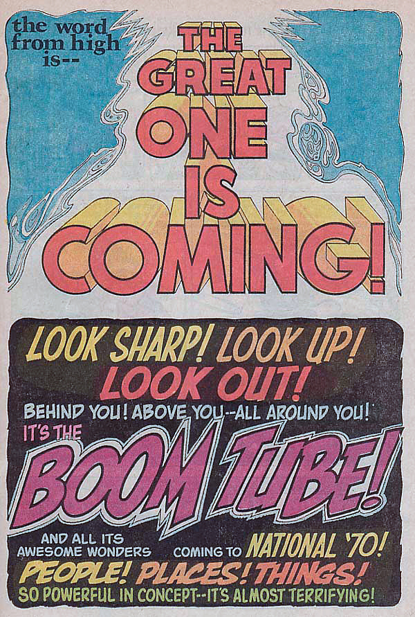
The ironic final panel of Fantastic Four #100. The Lee / Kirby team may have been the greatest ever, but they were a team no longer. Plus, pop culture’s other superteam calls it quits, too.
Continuing our ongoing celebration of Marvel’s 80thAnniversary.
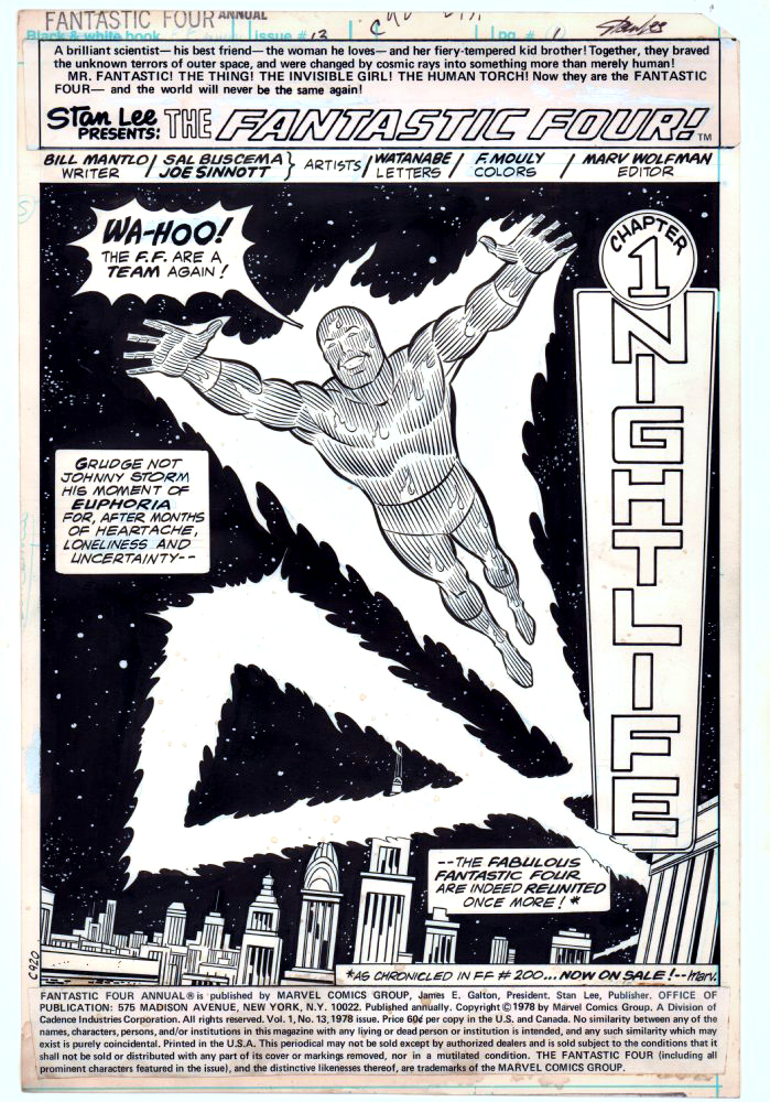
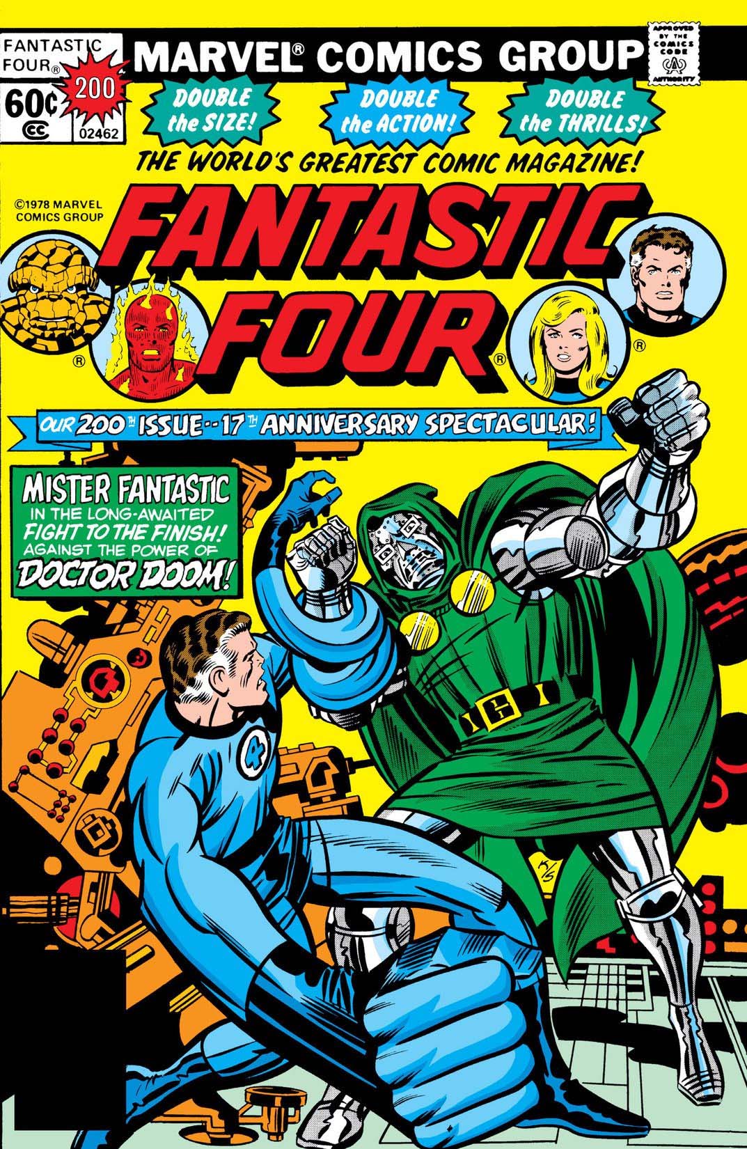
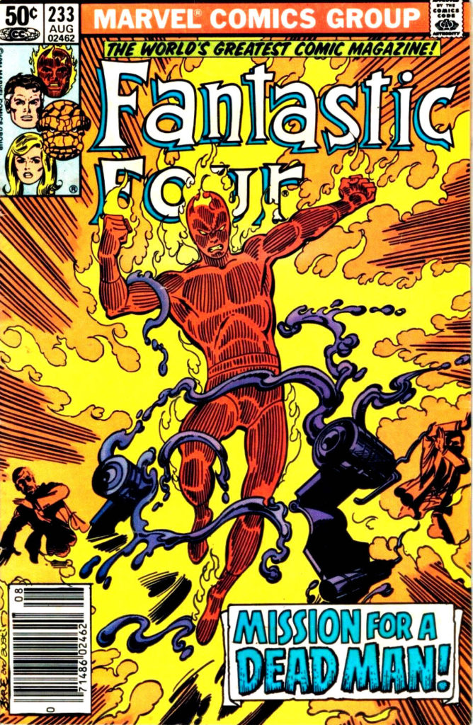
Sal Buscema and Joe Sinnott deliver an iconic (and terrific) image of the Human Torch in this celebratory opening splash page.
Celebratory in that the Fantastic Four had just gone through a quirky period editorially where they were essentially “broken-up”, and they have reunited in FF #200, on-sale at the same time.
At this point in the run, Joe Sinnott, acknowledged as one of the all-time greats, is pretty much the only consistent through line in the FF — the series was rapidly going through a number of mix and match creative teams. In a three-year period, Joe inks pencillers Sal Buscema, John Buscema, Keith Pollard, Rich Buckler, Ron Wilson, and of course George Perez, who does some of his best known work in this era. (Shortly after this issue is published, Joe adds John Byrne and Bill Sienkiewicz to this mélange.)
Sinnott’s credits, including this one, are often categorized as “finishes” during this timeframe, as many of the pencillers are providing breakdowns only. Doesn’t help enough with the schedule though, as a number of issues are reprints and fill-ins. Marvel, as others have noted, was going through some difficult times. The Fantastic Four themselves wouldn’t truly find their full footing again until a few years later, when Byrne fully takes over writing and art chores.
As for Joe and Sal? With the end of the Spider-Man newspaper strip this year, Joe officially retired from inking … at age 92. Sal (age 83) “retired” in 2000, but continues to be coaxed into working — sometimes by my former colleagues — to this day.
“Flame on!”
So many interpretations of the Human Torch, so little time.
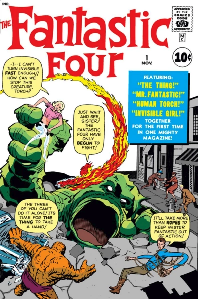
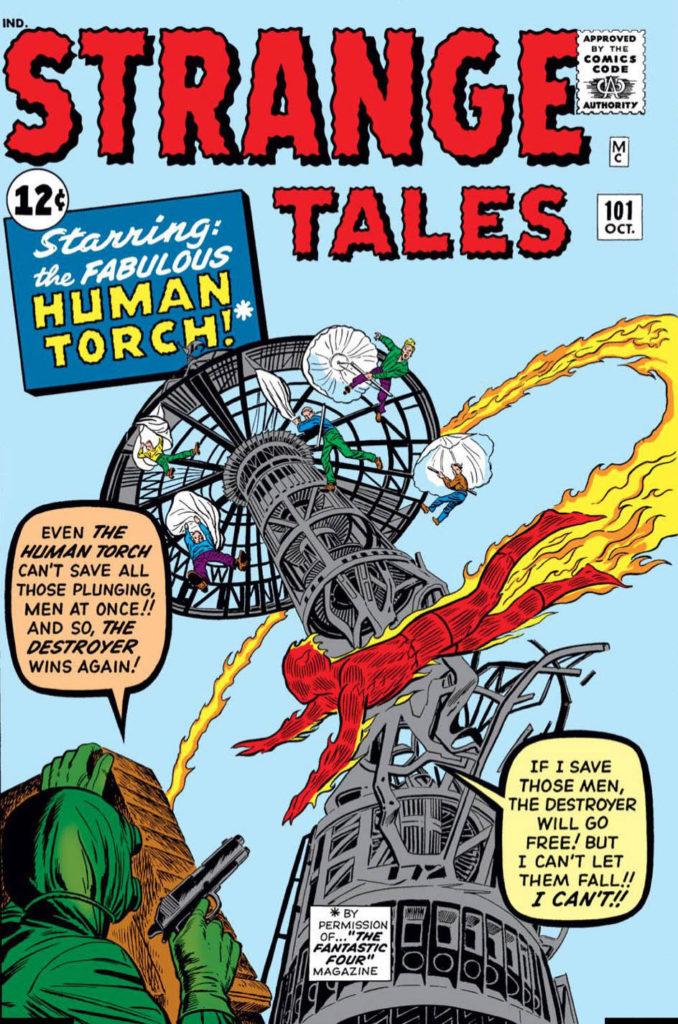
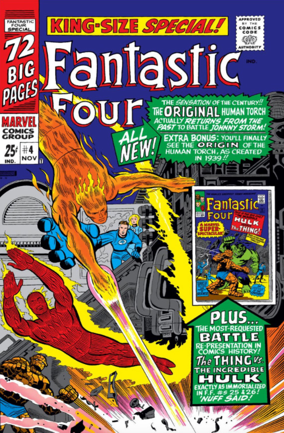
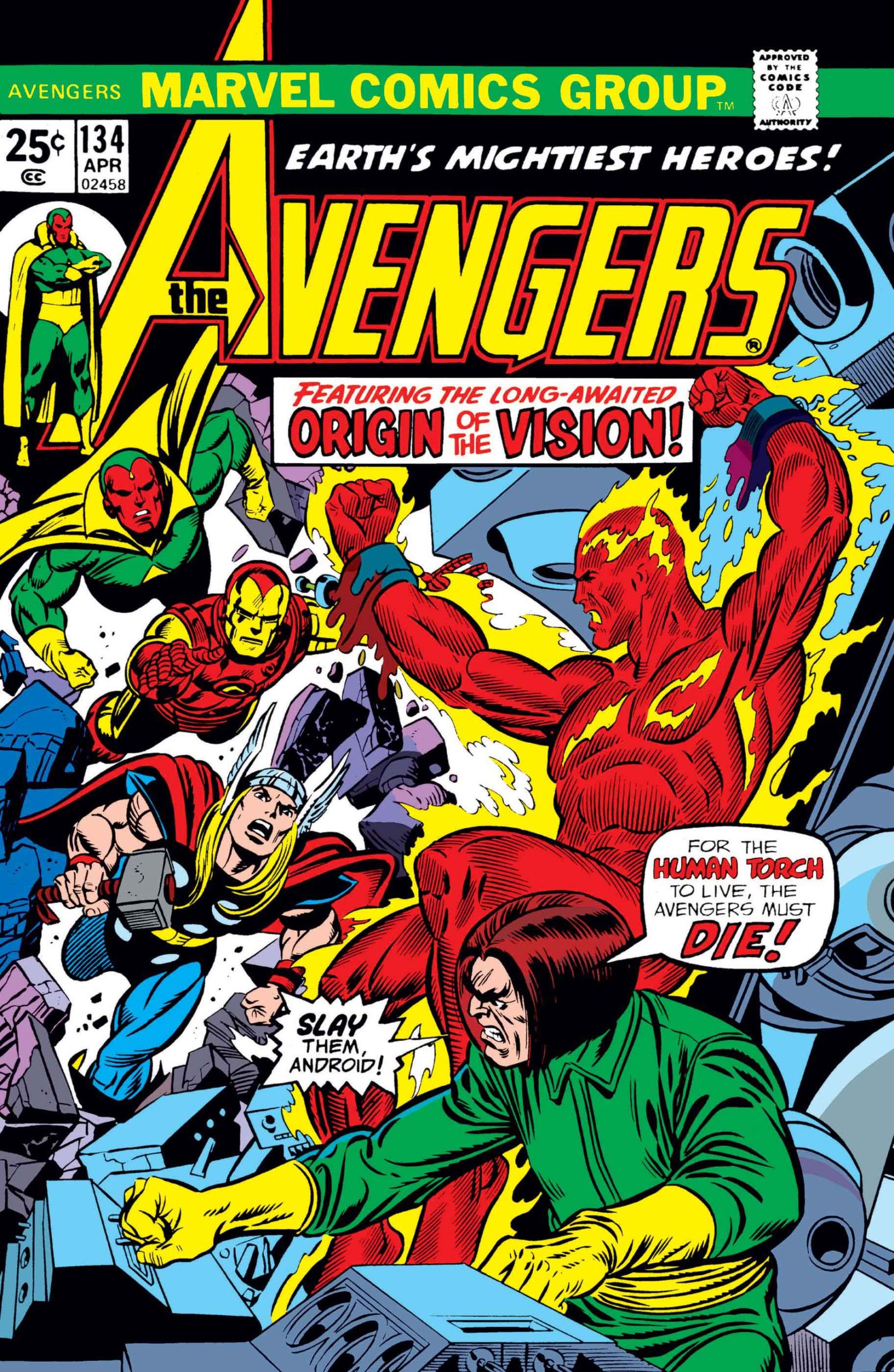
In his earliest appearances, Johnny Storm, the Silver Age Human Torch looked a bit more like the Golden Age version (more flame, less body definition) ultimately evolving to his more familiar form. Meanwhile, the Golden Age Torch, who (with the help of some of clever retconning) eventually makes a comeback in the modern era, appears to look more like the silver age version.
Above: The first appearance of the Silver Age Torch, Johnny Storm, in Fantastic Four #1 (1961) followed shortly thereafter by his first solo outing in Strange Tales #101 (1962) and ultimately followed by a clash with the “original” Torch in FF Annual #4 (1966). The Golden Age Torch returns in Avengers #133- #135 (1975), and revives yet again to join the West Coast Avengers during John Byrne’s run. (Avengers West Coast #50, 1989)
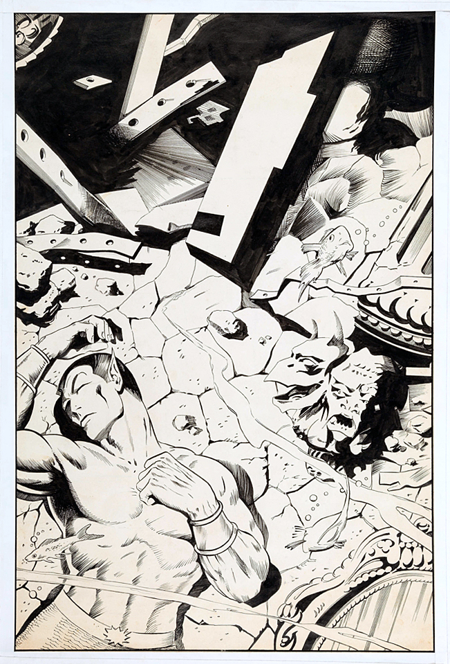
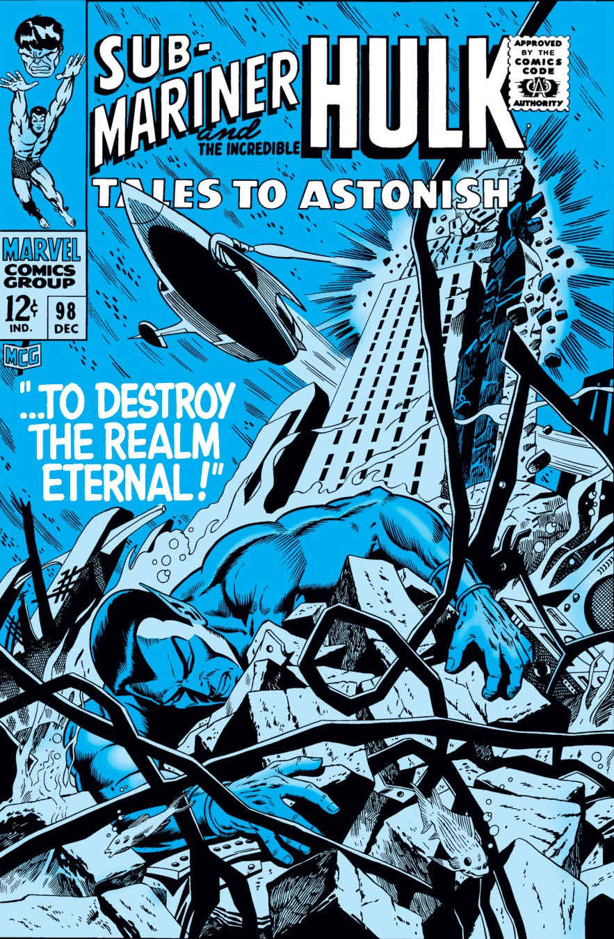
This version of the cover for Tales to Astonish #98 by Dan
Adkins, ultimately unused, did not fit the bill. It conveys the storyline
inside, and it’s pretty in its own right, but definitely not very dynamic.
“Likely too soft for Stan,” agreed Roy Thomas, (yes, him again) who wrote this story arc of Sub-Mariner.
But, let’s talk about the replacement cover, also drawn by Adkins — likely in one heckuva hurry. Sure, more dynamic. Namor, in a better pose, still unconscious. (Or dead — but even as kids we knew he wasn’t.) In this version we also see the attack that’s destroying Atlantis. Except… since when are New York City skyscrapers in Atlantis?
I didn’t notice the architecture til later on, but once you see it, you can’t unsee it. (Even the unused cover has modern steel girders.) Why is Empire State Building underwater? What in the name of Neptune was Dan thinking?
The unused cover has the Marvel production guides masked off by tape, leading me to believe the piece may have ultimately been printed elsewhere. Marvelmania magazine? Witzend? Convention program? Any comic book detectives out there recognize it?
Poor Dan; he had to redraw a Doctor Strange cover (Strange Tales #168) a few months later. (I’ll post it if I can get an image of the original version.) I loved his inks — he was one of the best — but he definitely struggled meeting Marvel’s editorial standards for cover layout and composition.
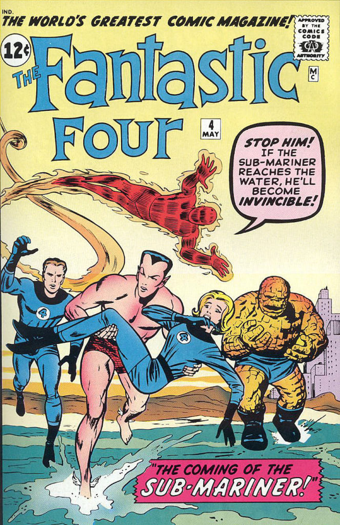
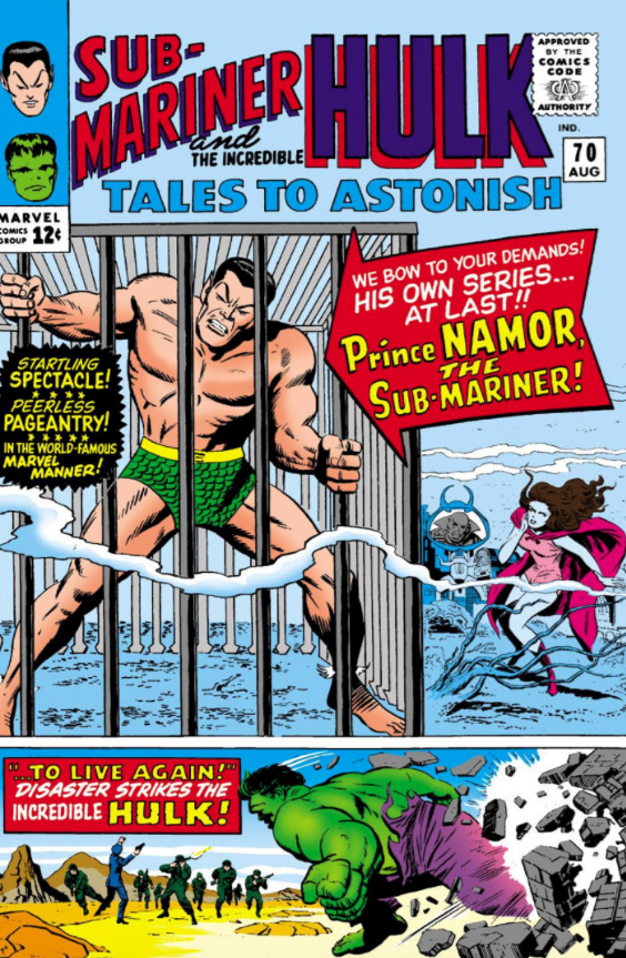
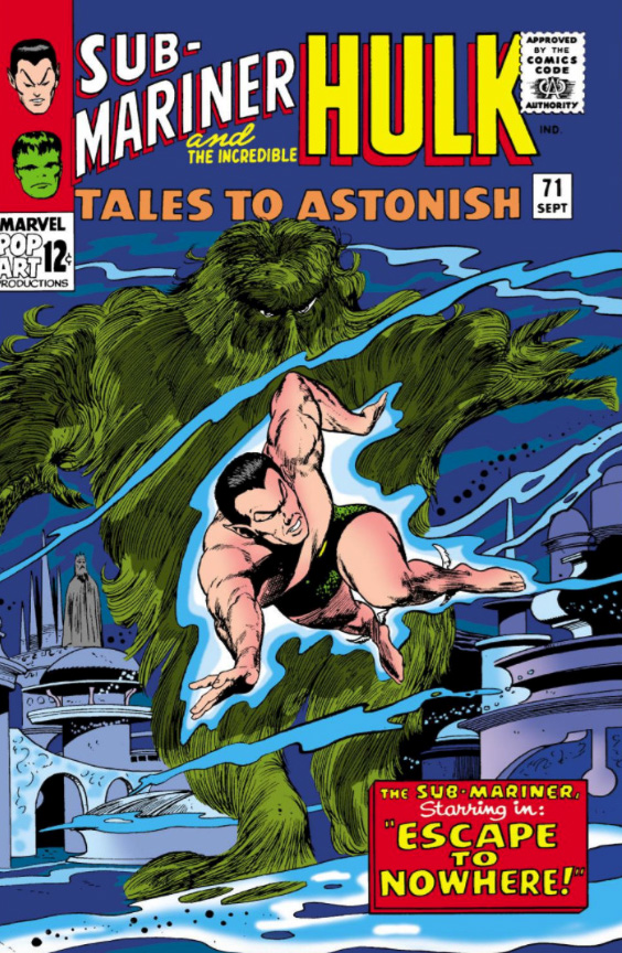
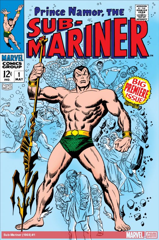
Key appearances by Sub-Mariner in the Silver Age: After a seven-year hiatus in comic book limbo, he first re-emerges in Fantastic Four #4, ultimately becoming a key antagonist for the FF. A few years later in Tales to Astonish #70 he gets his own series, sharing space with the Hulk, and a month later gets his first solo cover. Ultimately, he gets his own series in 1968.
Our weeklong tribute to The Human Torch and Sub-Mariner continues, in honor of the late summer weather at the California coast.
“Cover-quality” is an overused adjective in the comic art-retailing world.
Typically it appears when a reseller is trying to grab attention on an unpublished commission for sale: “Gee, look, isn’t this as good as a published cover?”
Why do this? The short answer of course is marketing. Hyperbole (theoretically) helps support a higher asking price. Also, it adds the word “cover” to the item description’s metadata, meaning it appears in any on-line search for that word. Clever.
Here, however, “cover-quality” is no exaggeration for this richly detailed Sub-Mariner commission by Mike Deodato — a moody portrait of Prince Namor with the only human he truly pines for, the lovely Sue (Invisible Woman) Storm. Hell, it’s better than many published covers.
Who hasn’t marveled (sorry) at the evolution of Deodato’s artistic style? When he broke in professionally about 25 years ago, Mike’s art approach was much more similar to the “Image Comics” style of the day. Today, his storytelling blends similar dynamism with an often astonishing photo-realism into an accomplished, and enviable, form.
One previous owner of this piece did in fact describe it as an actual published cover, without evidence. But… so many retailer variants and limited exclusive covers have been published the last few years, anything is possible. I’m aware of multiple instances where a piece of art was indeed assigned — and executed — for a cover variant, but then cancelled last minute.
So… if anyone can provide evidence that this art was indeed professionally published. or solicited to be published, somewhere — anywhere — you will have my thanks, and a piece of original art as a finder’s fee.
I found a number of color versions online, adding a bit to more mystery to the provenance of the piece, but they appear to be samples by aspiring colorists.
Continuing our week-long tribute to The Human Torch and Sub-Mariner, in honor of the late summer weather at the California coast.
John Byrne’s 5-year run on Fantastic Four is rightfully considered an all-time classic, and it’s certainly on my short list of “desert island” omnibuses. (I have no idea how these books survive the shipwreck with me, but let’s stay on point.)
I always loved the Fantastic Four – and in fact, although I may be in the minority, I definitely enjoyed Hanna Barbera’s short-lived FF animated series from 1967 a bit more than Spider-Man, which aired in the same block. With a few exceptions, the FF cartoon stories felt much more authentic to the comics than Spidey, although he definitely had the better theme song. FF only lasted 20 episodes, and has never been “officially” released in home video. (So much for staying on point.)
The Human Torch, as the youngest member of the FF, was always the most relatable to me, and always a favorite. (He could fly… He could burn stuff… He could fly…)
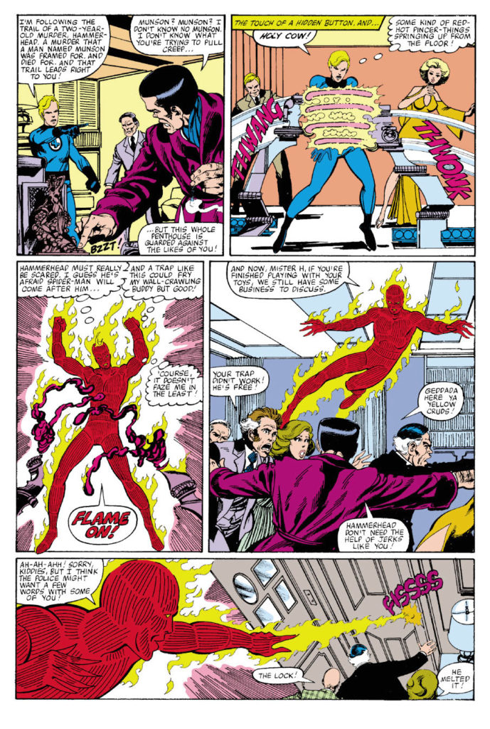
Byrne. Fantastic Four. Human Torch. Cover scene. Most of the boxes are checked on this great action page, with Byrne on story, pencils and inks. He rebuilt the FF sandbox —and played in it expertly and creatively.
Summer came very late to the Southern California Coast this year, so in honor of the warm weather and cool surf, we’ll stay with The Human Torch and The Sub-Mariner for a few more posts.
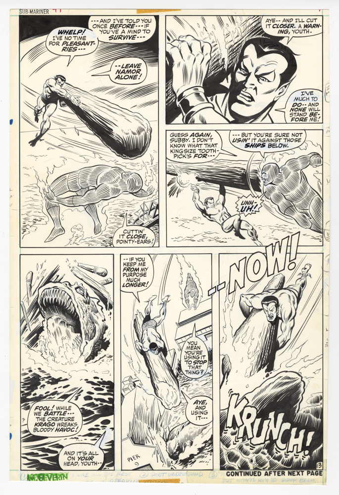
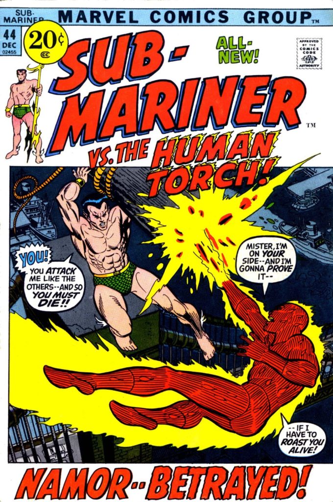
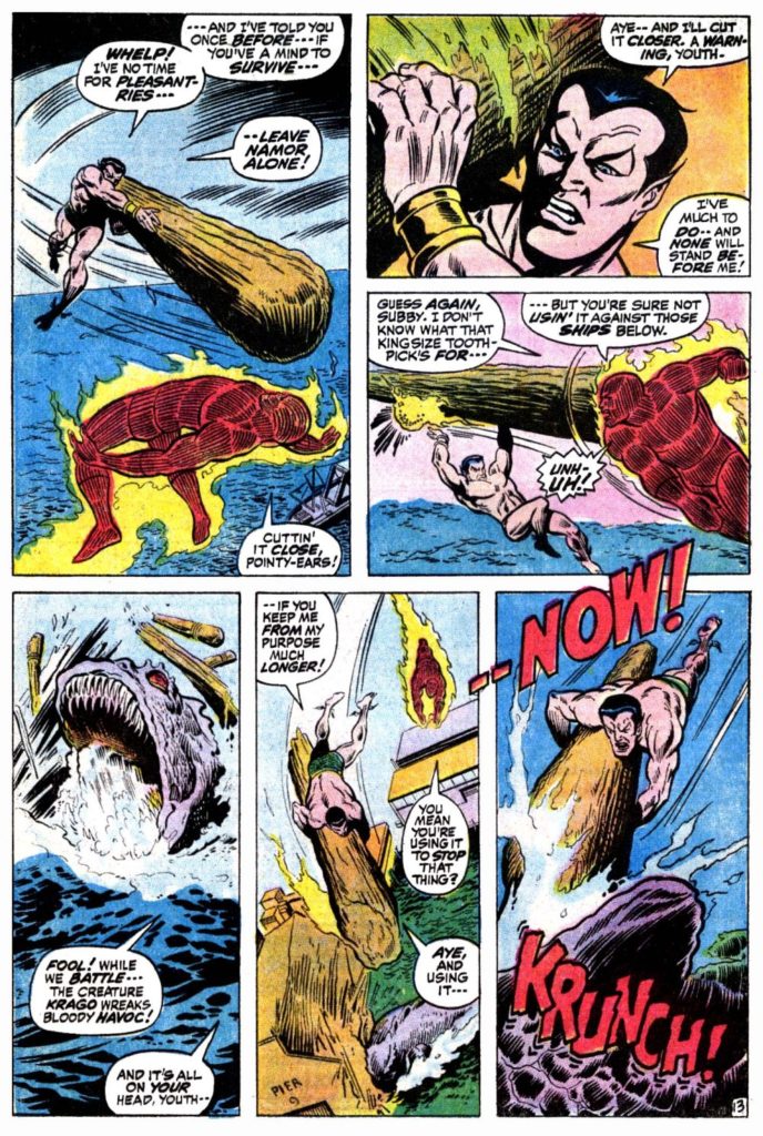
This great battle page, penciled by Marie Severin, and inked by Jim Mooney, features Sub-Mariner vs. the contemporary Human Torch, Johnny Storm. This a feud that started in Fantastic Four #4 in 1962 (Torch is the one who discovers an amnesiac Namor living in NYC) and continued intermittently through the silver and bronze ages.
Along for the fun this time is the giant sea-beast Krago, woken from his slumber by Subby’s enemies to wreak havoc among us, and to have Namor blamed. Krago is apparently NOT related to Giganto, another giant sea-beast Namor himself brought along in FF #4. How many species of giant sea creatures are there anyway? And to think I was worried about the occasional shark.
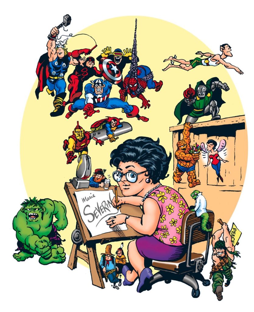
What can you say about the late great Marie Severin, easily one of the most versatile talents to ever work in comics? Penciller, inker, colorist, occasional letterer, caricaturist, production artist, cover designer, satirist… and so on. Hands down, an amazing career, made even more so because she needed to make her bones — more than once — in a thoroughly male-dominated industry.
Marie passed away almost exactly a year ago, and many well-written tributes speak to the scope of her career: Marvel.com, The Comics Journal, and the New York Times all provide good starting points to this remarkable creator.