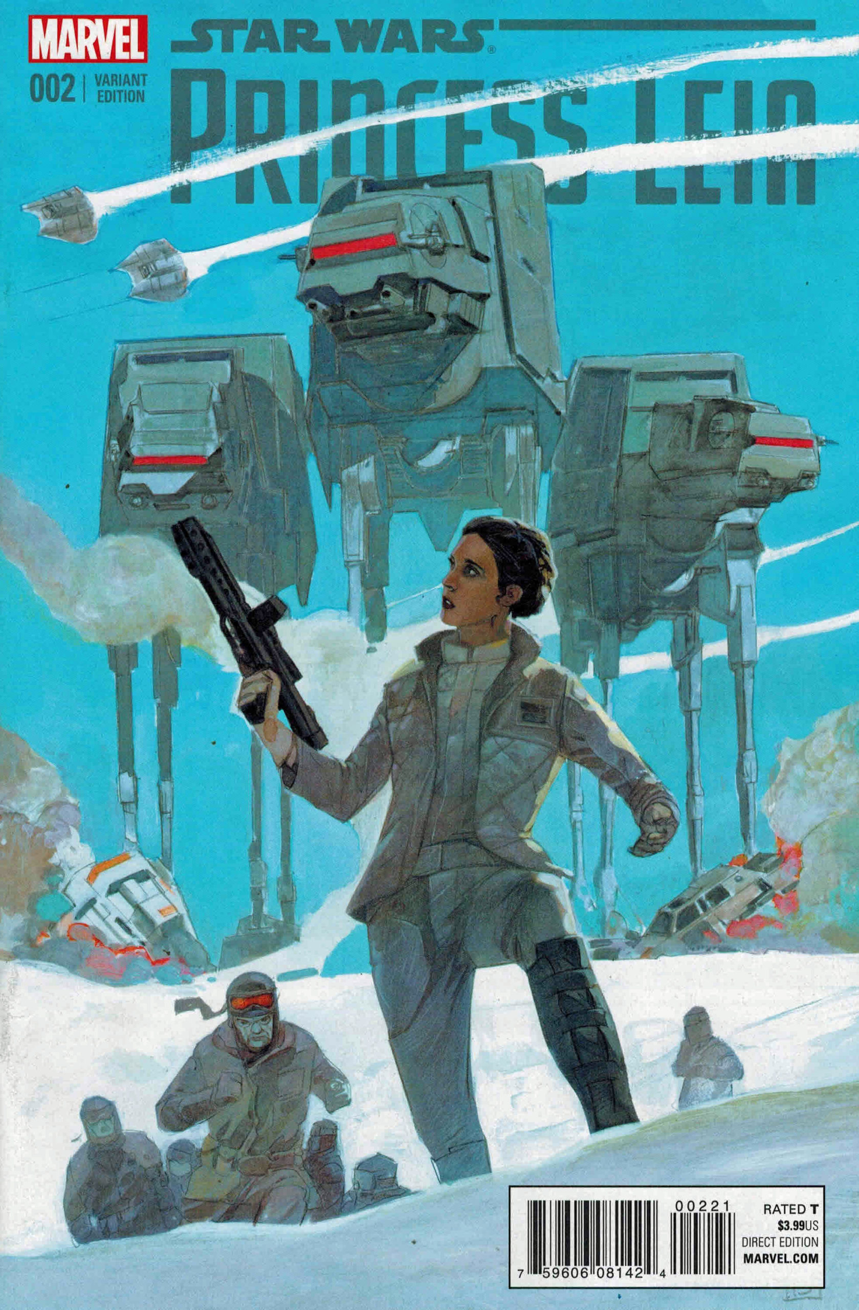
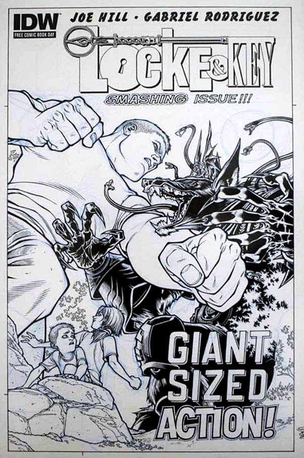
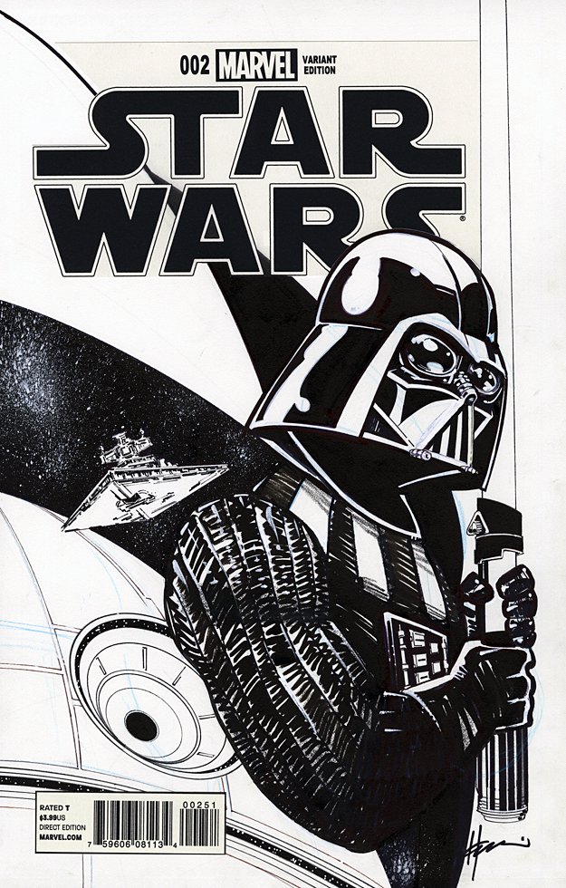
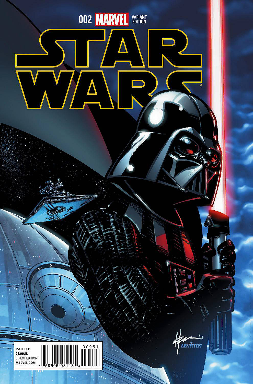
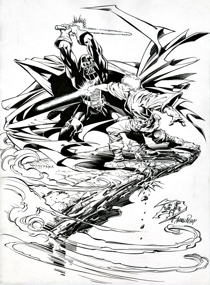
Alex Maleev — A Long Time Ago…
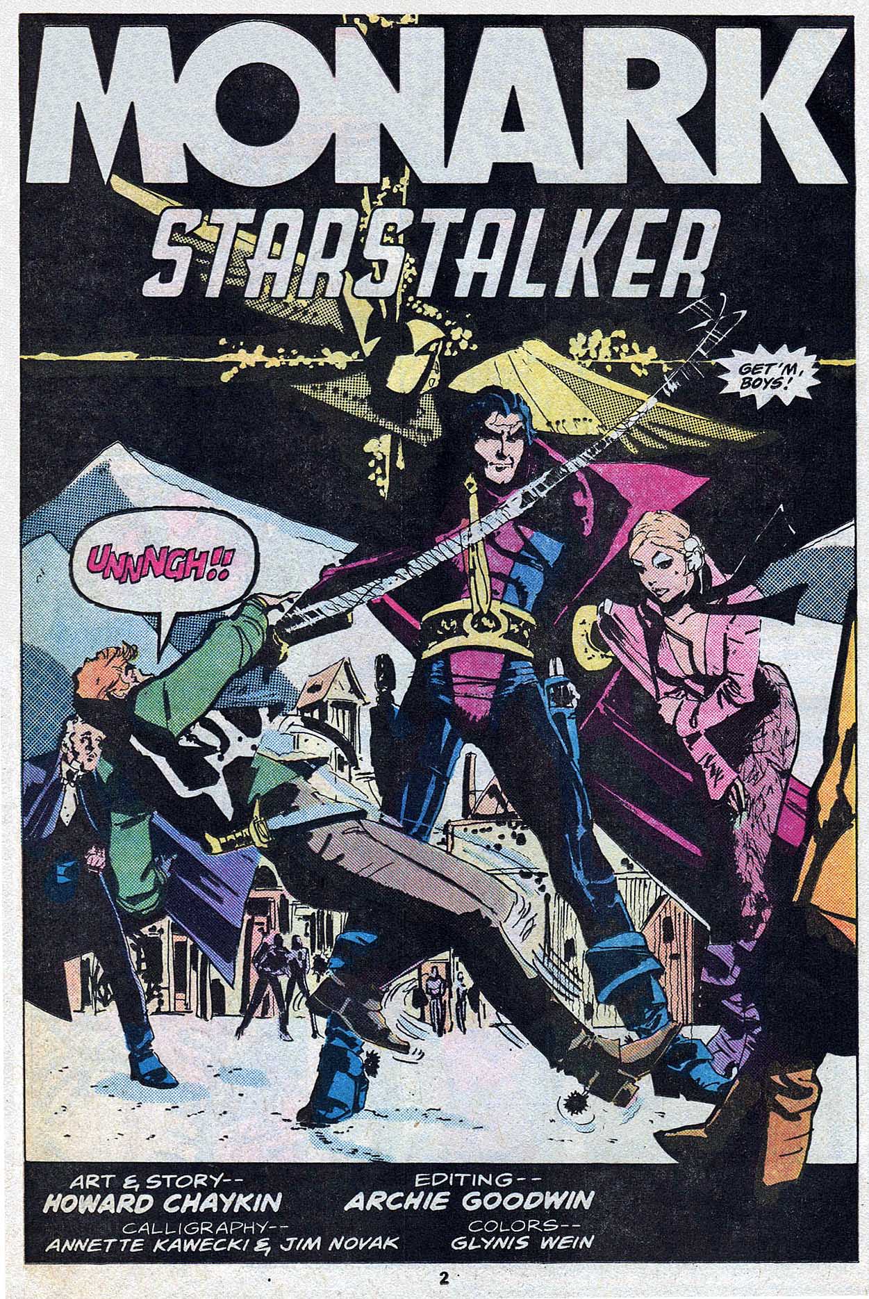
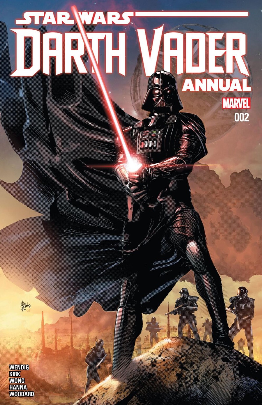
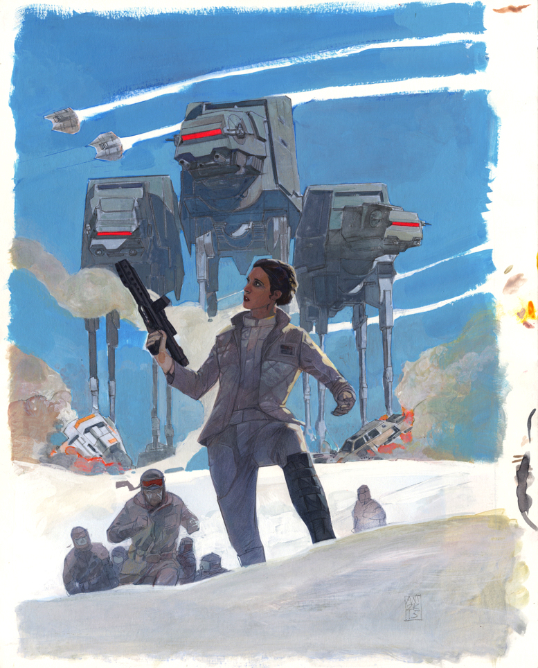
Star Wars: Princess Leia #2, March 2015
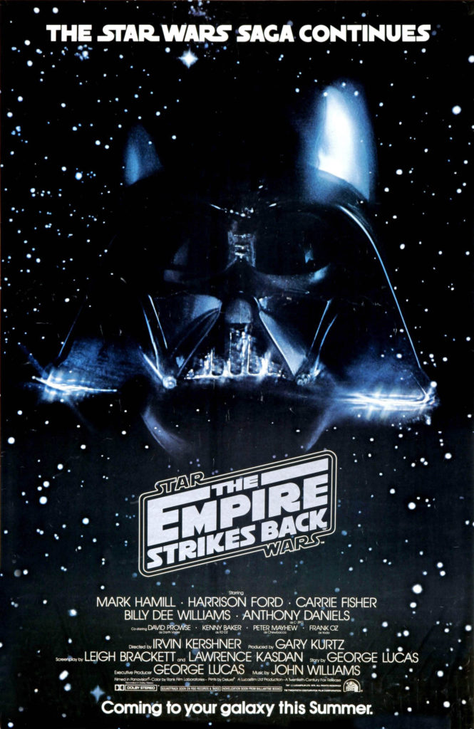
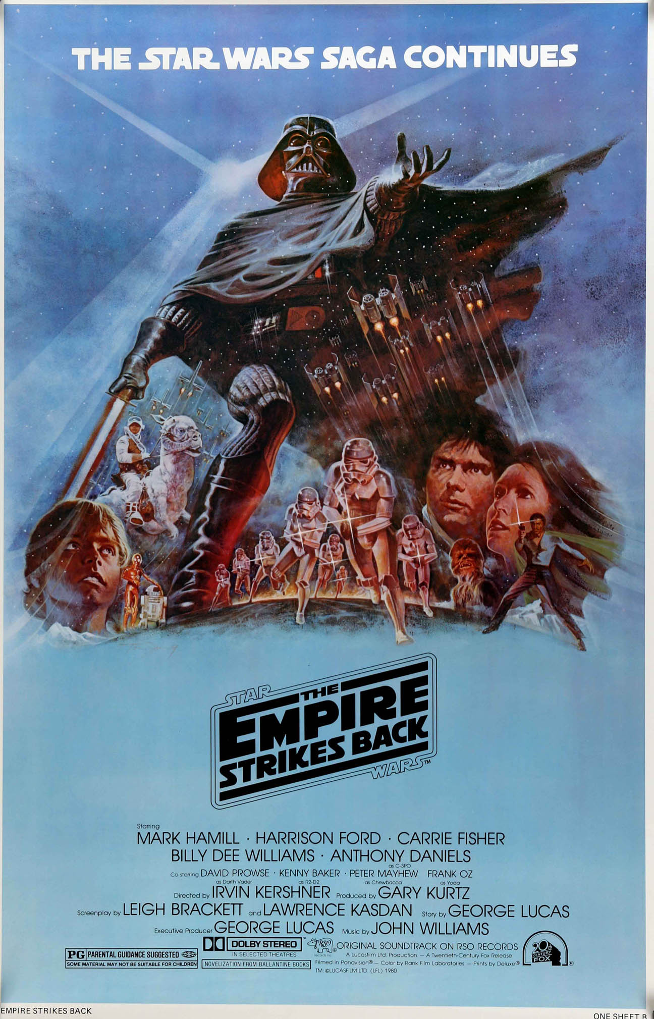
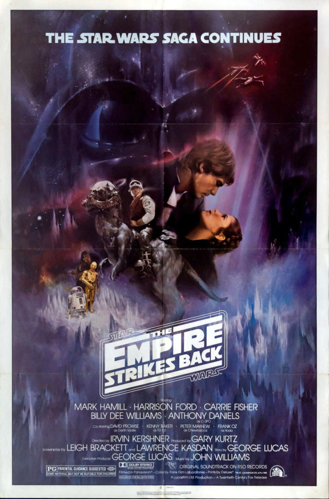
Forty years ago today, life was definitely simpler. All I had to do was how to figure out how to get to the opening night of Empire Strikes Back.
Well, maybe not that simple.
Big films often did not open “wide” in those days, which meant ESB would not be playing anywhere near my college town of Binghamton, New York. Closest theater? In Syracuse. 75 miles away.
Fortunately, I had a car. Gas was (relatively) cheap. And finals had just ended.
That was the good news.
The bad? No on-line ordering. (Ha. We were still using punch cards and booking computer time in the lab.) No advance orders by phone. This was 1980. Horse and buggy era, tickets and technology wise. And in those days, no bank was offering credit cards to broke college students anyway.
So we had to wing it. The “we” in this case, my buddy Bob and I, pretty much the only people that hadn’t packed up for the semester.
Off we went. Up through farm country on Interstate 81. Somehow, even though we didn’t leave that early, and the legal speed limit was still 55mph, we made it to the “purchase tickets” line, and then the “entry” line in time, and had reasonable seats.
Good thing, too.
We had waited three years. I didn’t really want to wait another day.
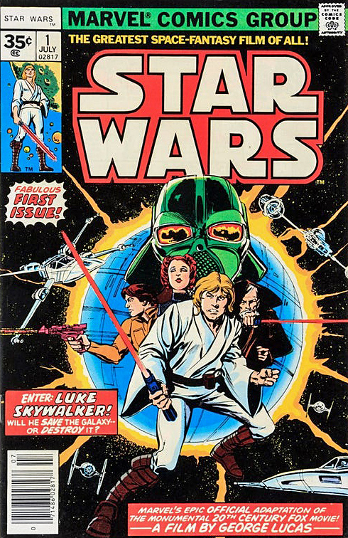
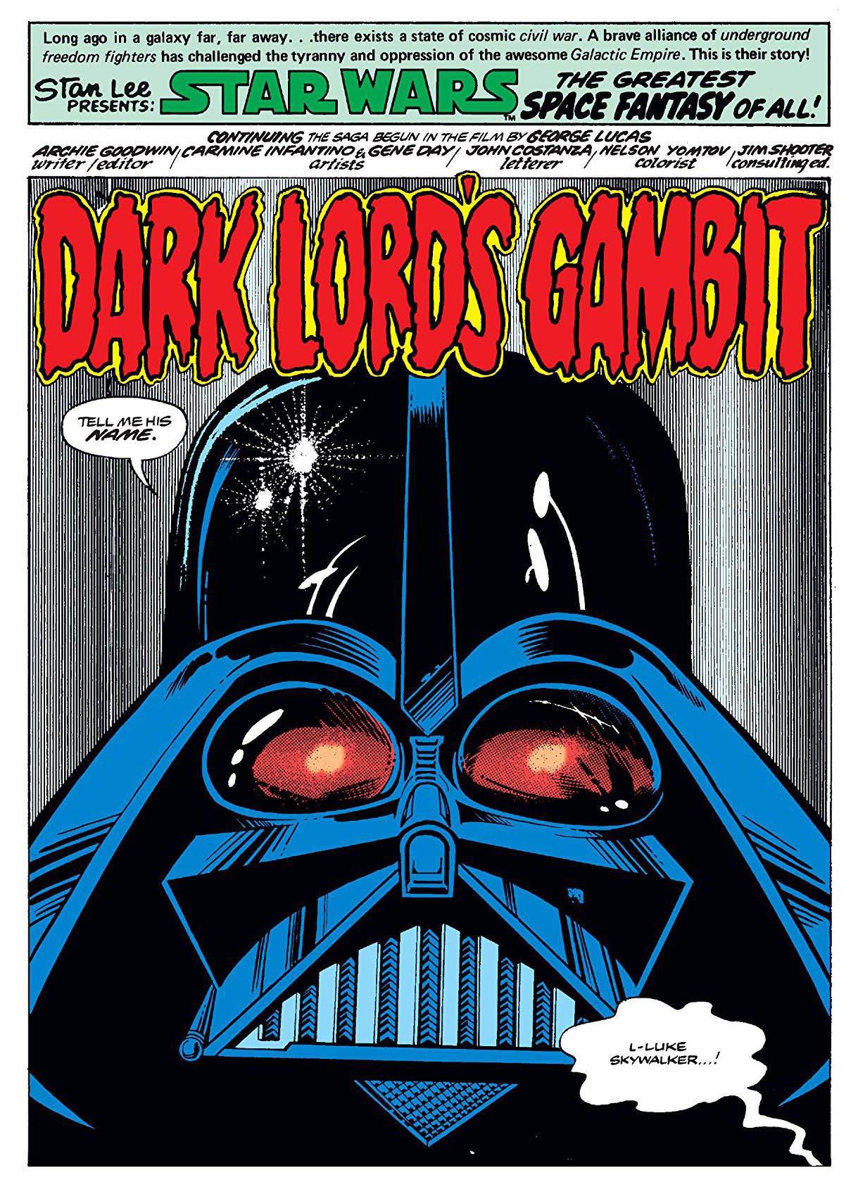
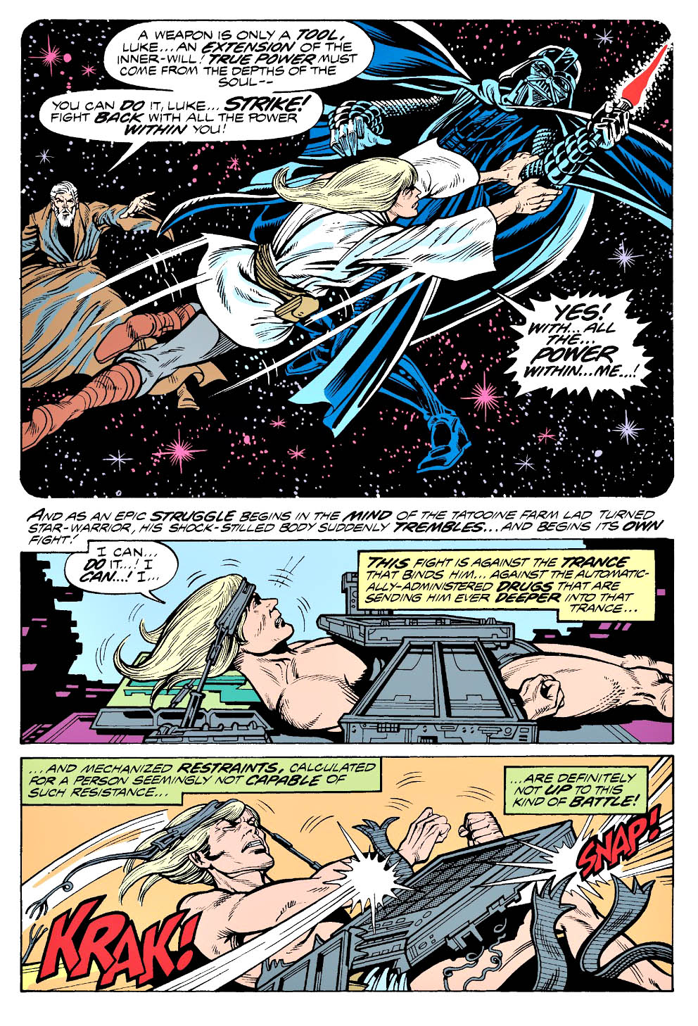
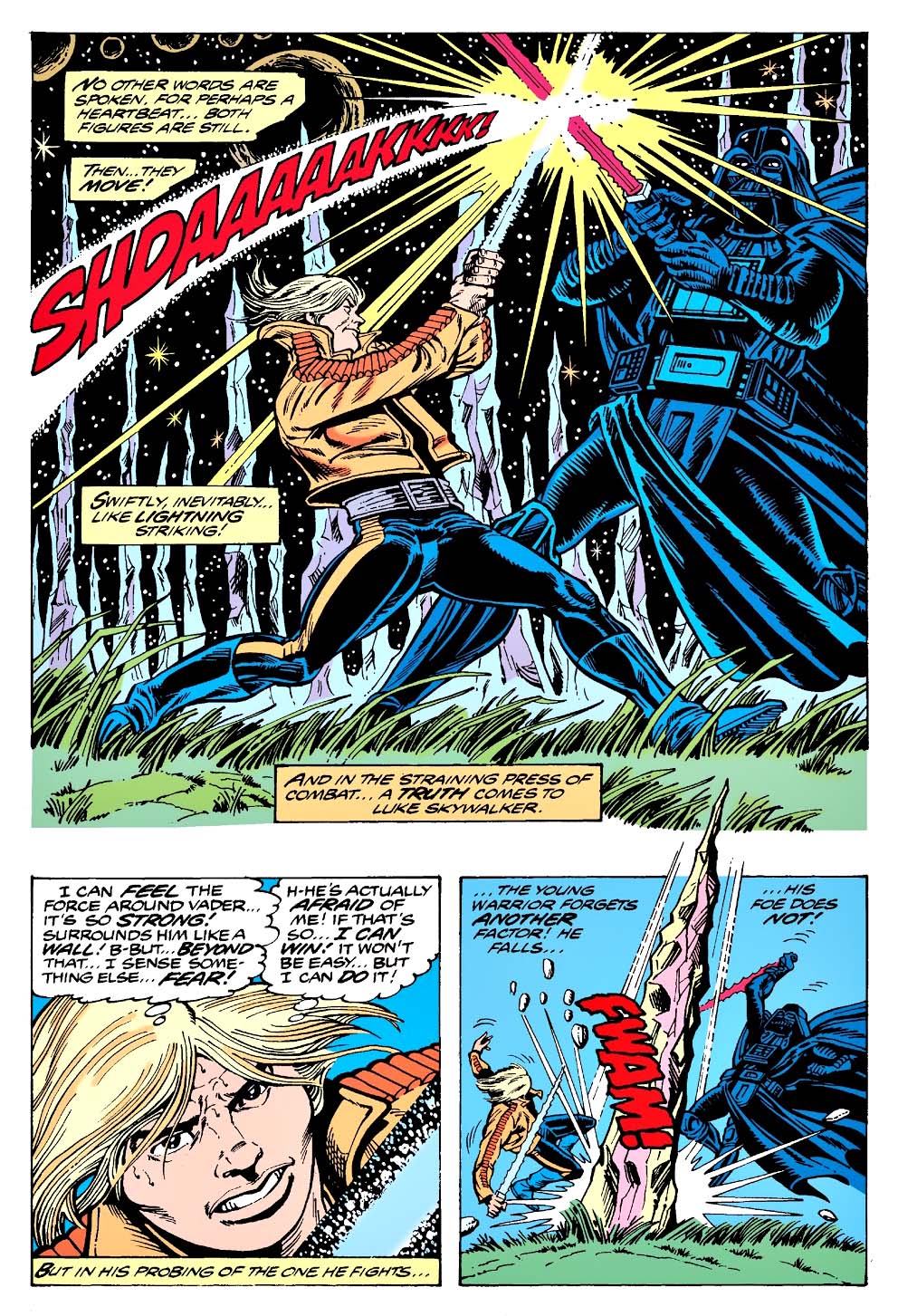
I enjoyed it. A lot. Despite the fact that the story had been “spoiled” for me by the Marvel Comics adaptation, because I didn’t have the discipline to avoid reading it. (Lesson learned there. I never made that the mistake again, including, and especially, for Return Of The Jedi. Hell, I’ve occasionally forced friends who work on films into vows of silence.)
Alex Maleev’s beautiful painted cover features of one my favorite things about ESB: The battle on Hoth. I have a distinct memory of the first time I saw the Empire trailer tacked on to a Star Wars re-release in 1979. The audience absolutely lost its mind at the Hoth tease. (Well at pretty much everything, I guess.) And the finished battle did not disappoint, stop-motion and all.
Where was I? Oh yes. Great cover. Terrific artist. Wonderful memory.
And somehow Bob and I made it back before the cows came home. But not by much, I imagine.