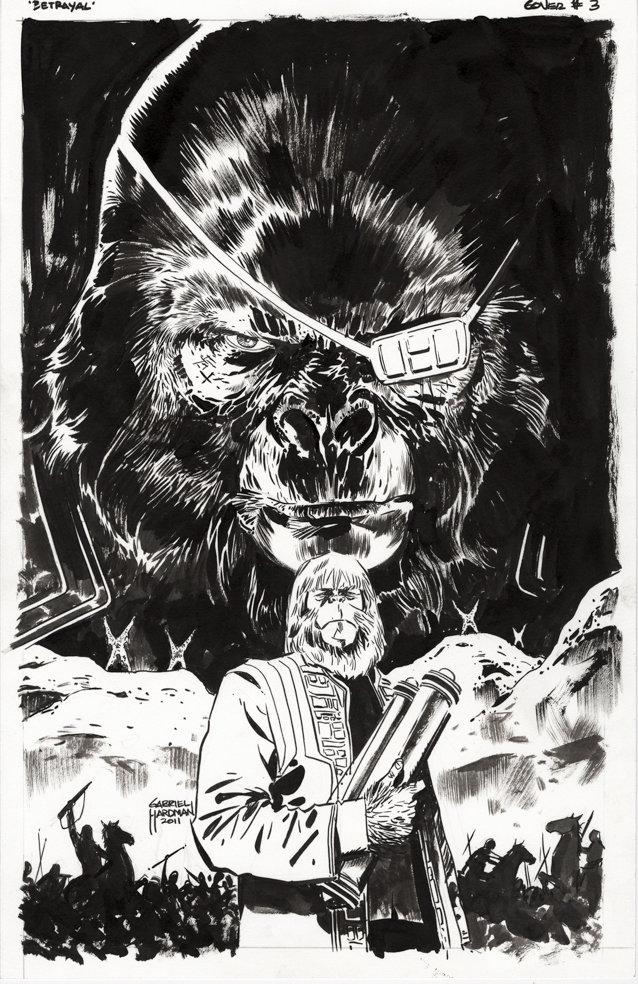
Gabe Hardman — The Apes Go “Boom”
Betrayal Of The Planet Of The Apes #3, January 2012
True Confessions:
When I was at IDW Publishing, we chased the Planet of Thae Apes license hard. And I mean hard. (I’m a super fan.) We had some terrific story ideas, and some talented creators ready to come on board if we acquired it.
The challenge was, that Fox couldn’t provide us with a guarantee that they had proper clearances on the original Marvel material. Reprinting that material would help finance the creative costs on the new series, as well as help fund the licensing fees, so that ended up as a deal breaker for us.
So… Boom swept in and acquired those rights without the reprint guarantee. And did a great job on their new material. And the joke was on us, ultimately, because Boom did end up with at least some of those reprint rights.
Sigh.
That said, we did get to do a super fun Star Trek / Planet of The Apes crossover with Boom, which is mostly a story for another day. But one nugget: Boom asked me to negotiate the “Taylor” (Charlton Heston) likeness rights with the estate, and that was one of the more reasonable and rational Hollywood-style negotiations I have ever had. And even Marvel didn’t originally have those rights. So, there’s that.
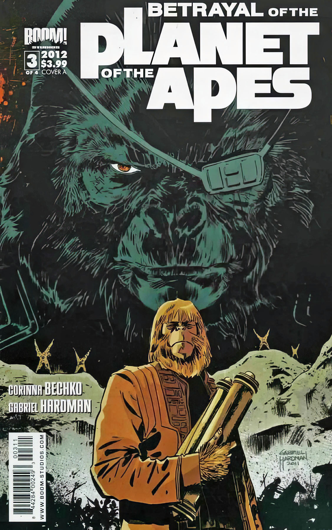
Oh, and the great Gabe Hardman did this superb cover for an issue of one the Boom series. Did I neglect to mention that?