By now, we should be in the next phase of the Marvel Cinematic Universe, but unfortunately, we have a six-month delay. So, for the first time in a dozen years, no Marvel film to launch the summer movie-going season.But, we won’t let that delay slow us down here — this week, we’re looking at some comics art related to the next three scheduled films.
Jack Kirby’s Eternals was a natural extension of Jack’s interest and abilities in all things cosmic — Norse Gods, New Gods, et al. In my mind, this series was the most engaging of Jack’s efforts during his brief return to Marvel in the mid 70s.
When Jack left Marvel again in 1978, Eternals went into mothballs and only made a brief reappearance in 1985 (without Kirby) before disappearing again.
Then in 2006, another take, this one, a mini-series (7 issues) by Neil Gaiman and John Romita Jr. appeared. It seemed like an odd team-up — the Vertigo “alternative” star writer, paired with the more “meat and potatoes” (superheroes) star artist. But ultimately, the talents meshed and it’s a well-done series, bringing the Eternals into the “modern” Marvel Universe, with some twists.
If anything did the series a disservice, it was the main covers by Rick Berry. Berry is super talented artist of course, and in a vacuum the covers are wonderful paintings. But they don’t match the stylistic content of the stories. I’m guessing he was hired because the editors wanted the covers’ artistic style to match the established Gaiman “brand” – despite the fact the stories are so much more traditional than Neil’s Sandman work.
Nonetheless, great Romita Artwork is still great Romita artwork, and this splash of Ikaris and Thena (inks by Danny Miki) is one of the best pages in the series. The page (pencils version) was used as the cover for a sketchbook from the series.
Jack Kirby’s original series, followed seven years later by a second series by Peter Gillis and Sal Buscema. (Cover of that first issue by Walter Simonson.)Eternals match game, comics and film.
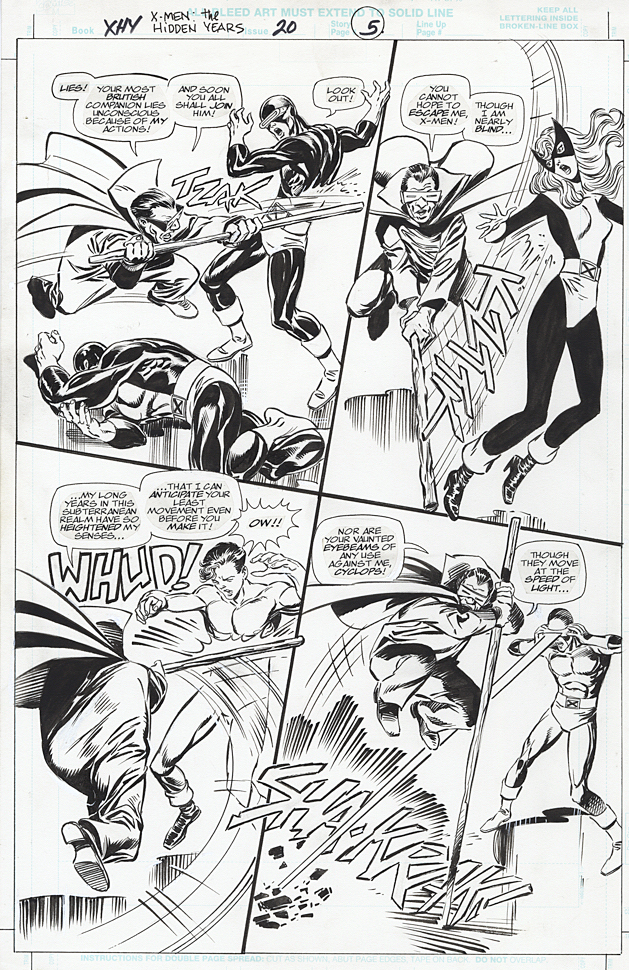
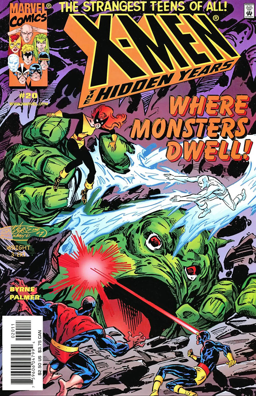
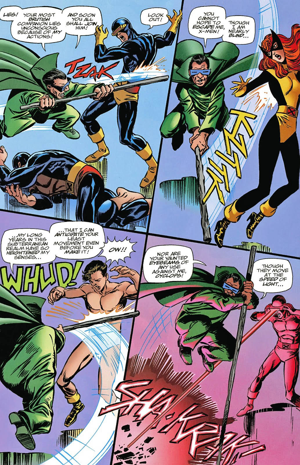
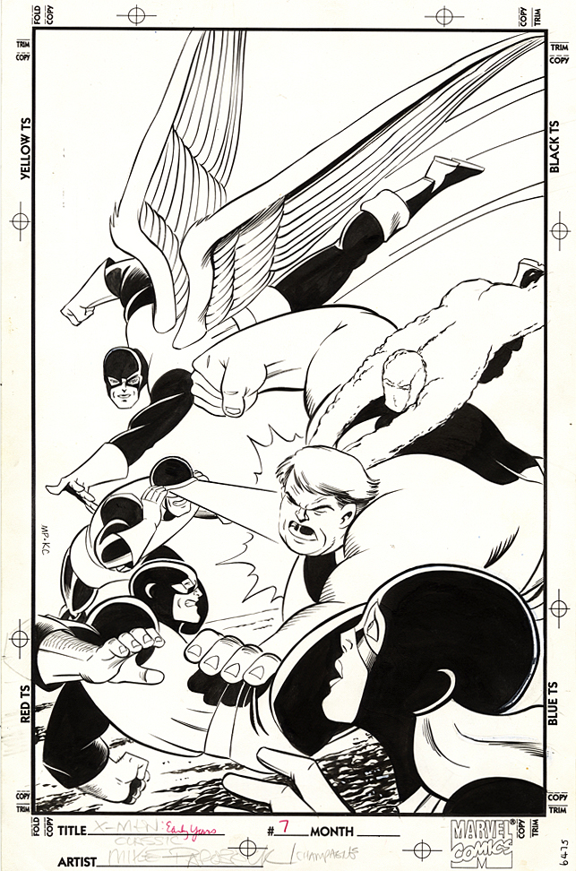
X-Men: The Hidden Years # 17, April 2001 & #20, July 2001
John Byrne returned to the X-Men in 1999. Not his beloved X-Men of Wolverine, Storm, Colossus and Phoenix, however. This time it was the “original” X-Men — in the period between their cancellation and rebirth. The “Hidden Years.”
It’s an often overlooked series and shouldn’t be. John brought great energy — and closed some outstanding story loops — in the 22-issue series.
Inks are by the terrific Tom Palmer, which gave the series a
classic look, reminiscent of those great original Neal Adams issues, while still
keeping it clearly Byrne.
Lots of fun guest appearances in the series as well, including the Fantastic Four — inked in one issue by the legendary Joe Sinnott.
X-Men: Hidden Years #20 is a Byrne homage to Jack Kirby’s Fantastic Four #1. It was the sixth (and final) Marvel-related FF #1 homage that John drew.
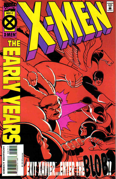
Case in point, Mike Parobeck’s cover of X-Men: Early Years #7, which reprints the original X-Men #7.
Jack’s original cover (below) is overloaded, and a composition mish-mash. Ok, I know it’s by Jack Kirby, and some fans will bristle about anything negative about the King’s work, but sorry, there’s no real comparison between the original and the reprint.
Jack’s original has way too many characters all over the map, with the X-men oddly positioned in the background and The Brotherhood of Evil Mutants voyeuristically up front, awkwardly. Are they watching from a window? Or on a TV screen? A magical portal? Why the heck are they even on this cover? This is a selling point?
Now, just to be clear, this may not be at all Jack’s fault. Maybe Stan Lee art directed it. And overwrote the cover blurbs to death. (Now, the Stan haters can come out of the woodwork.)
As I’ve said on the record many times, I’m a fan of both Stan
and Jack, so let’s all calm down. However this original cover developed, it’s simply
not a great one. Even legends drop the ball once in a while.
Mike’s solves the problem thirty years later by focusing only on the X-men coordinating — or attempting to — an attack on the Blob.
Simple. Clear. Clean. Powerful. Typical of Parobeck’s work.
But… On the published version, the trade dress is a bit
heavy handed, so some of the art is obscured — and the entire image had to be
flipped to accommodate said trade dress. And, to add to this litany, why the monochrome
coloring? Ah Hell, who knows.
Anyway, the original art is great and Mike’s Marvel work is
pretty rare; he is best known for some great looking art on the Batman Animated
comic books. I was also a big fan of his Justice Society run.
He unfortunately passed away MUCH too early at the age of 31
(from Diabetes) in 1996.
Today wraps our
special remembrance to Jack Kirby with a third piece by Giorgio Comolo, an Italian
artist who worships the King — and
expresses his adoration with unique and lovely homages and recreations.
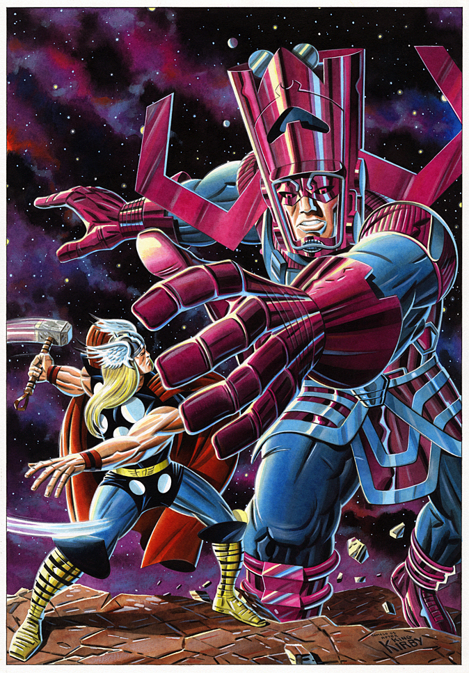
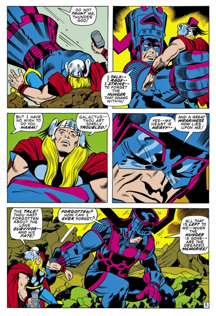
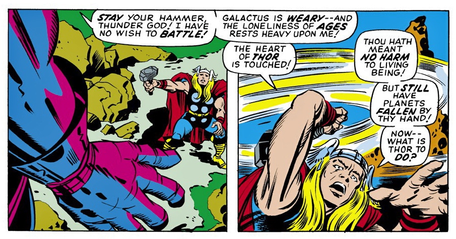
“It is your understanding I seek — and not your enmity!” —Galactus
Galactus reveals his origin to Thor (and to us) in this story arc, after Thor, at Odin’s insistence, tracks down the planet devourer in the far reaches of the universe.
Kirby is doing some of his wildest Marvel science fiction in these issues — a small hint of what will come just a short time later in his “Fourth World” comic books at DC.
Apparently, Galactus is not a bad guy. Despite the fact that he devours worlds and galaxies, destroys trillions of lives, he’s misunderstood. That’s all.
Uh-huh.
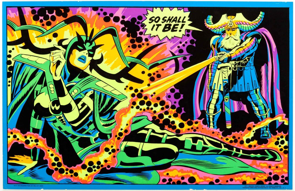
Comolo homages the cool Kirby cover image and fleshes out the background with cosmic details. And again, he employs that very specific neon-like palate. He also makes Thor’s face a bit more visible — a nice touch. (Although he keeps Thor’s somewhat wonky hand from Jack’s original.)
Oh, and he gives Galactus pants and full sleeves. Galactus should always have pants and full sleeves.
No one has (yet) published a book
–or even a portfolio — of Comolo’s Kirby homages. I hope that is rectified in
the near future.
Or hey, at a minimum, how about
celebrating the 60th anniversary of the Fantastic Four next year by
doing Kirby cover homages all year long. Who wouldn’t want to contribute to
that?
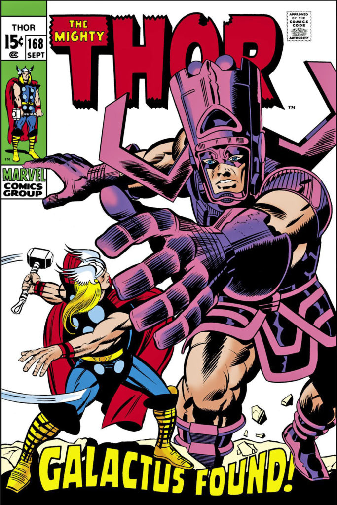
Meanwhile, Thor #168 itself?:
Kirby. Thor. Odin. Galactus. The Watcher. Balder. The Warriors Three. The Thermal Man…
A pretty good deal at 15 cents.
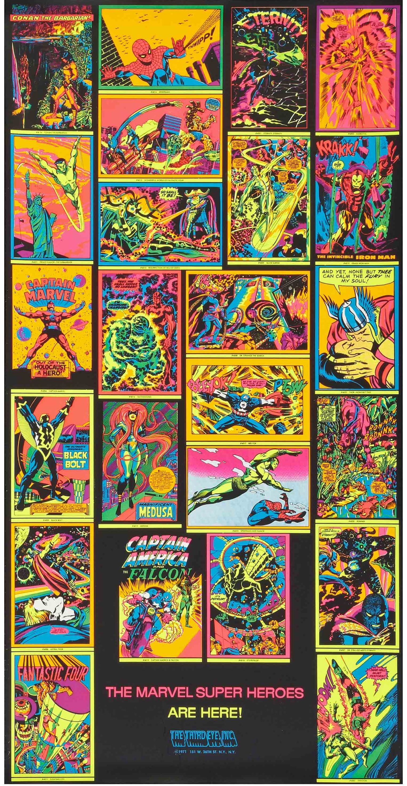
Galactus gets emo… Thor struggles with cosmic ethics… The universe will never be the same.1971 blacklight posters repurposed existing panels & pages from Marvel comics, adding a rich cosmic feel to the art.
We continue to
remember Jack Kirby with the help of Giorgio Comolo, an Italian artist who
worships the King — and expresses his
adoration with unique and lovely homages and recreations.
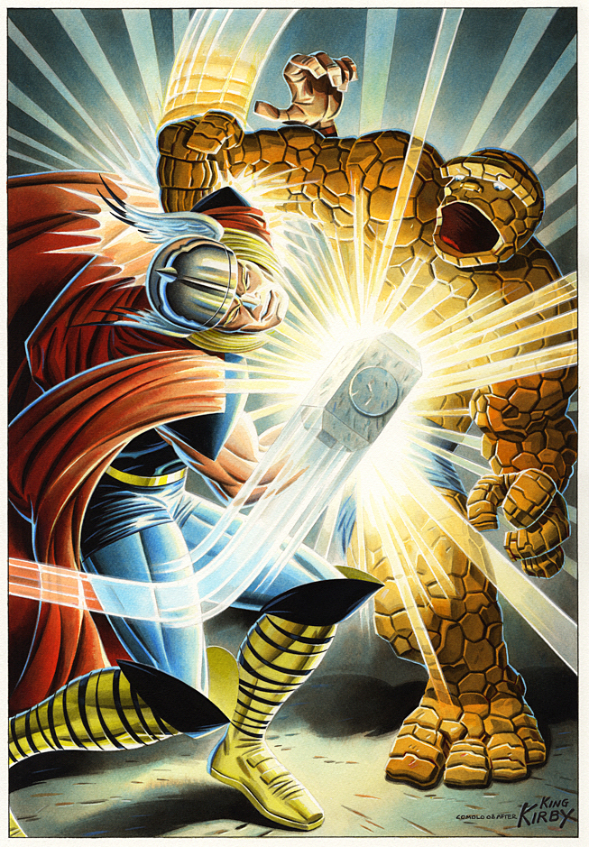
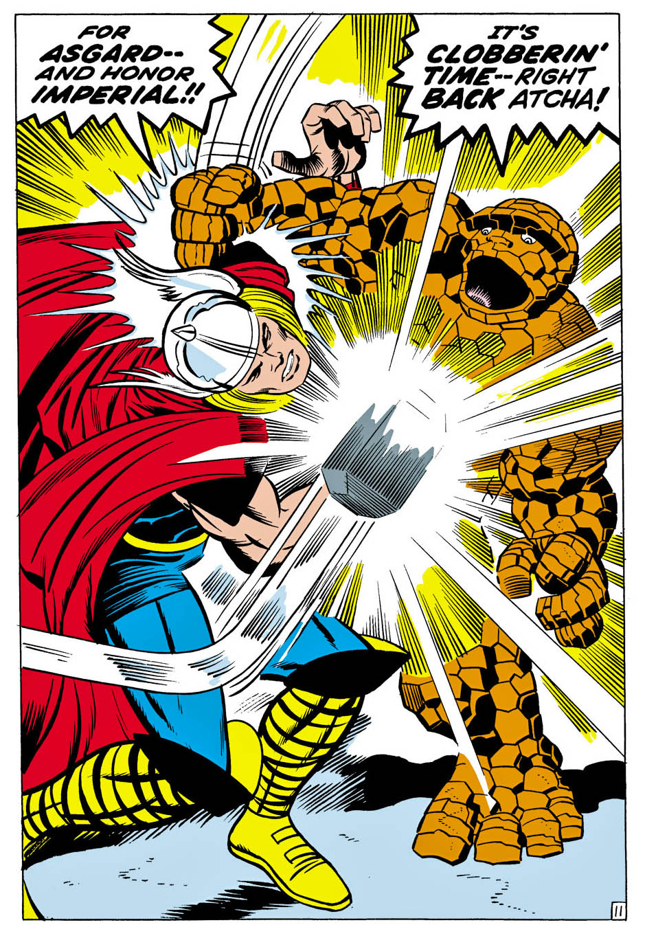
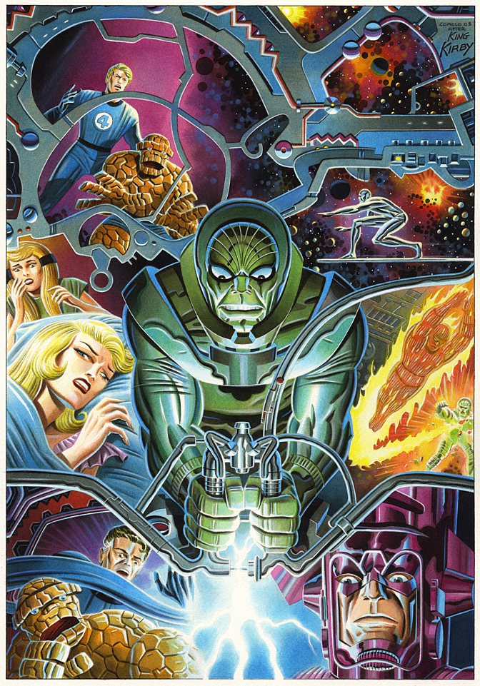
Thor vs. Thing? Come on, no contest. The Thing is powerful, but Thor is a GOD, right?
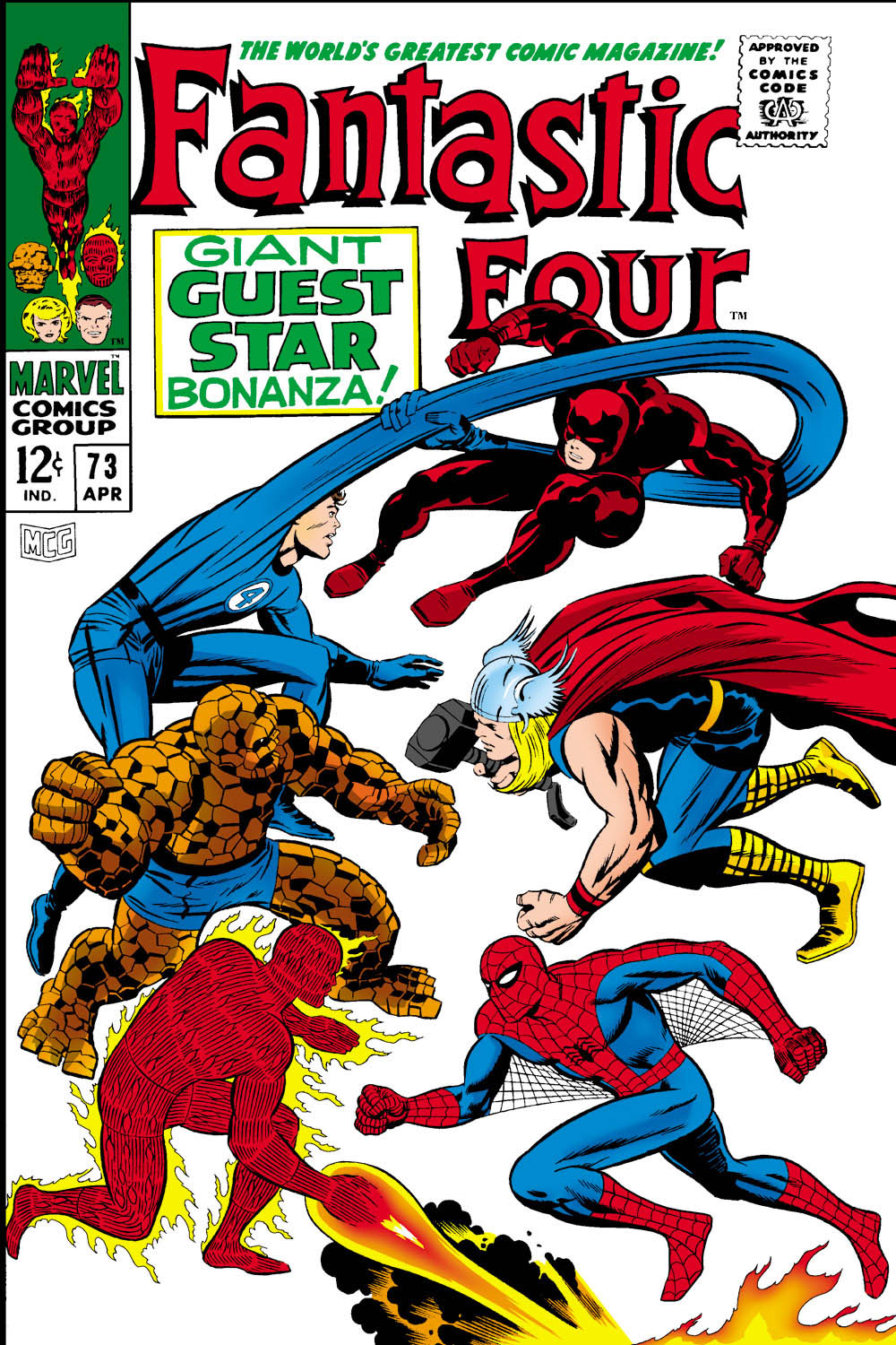
In this one-off issue of Fantastic Four (#73), Thor (with diminished powers) helps Spider-Man, who in turn is helping Daredevil, who recently had a mind transference with Doctor Doom who… never mind. The FF think Daredevil is still Doc Doom. Chaos ensues. Read the comic yourself and catch back up with us later.
Pretty much the entire issue is a battle royale, and Comolo
captures the power of this terrific Kirby splash with his own specific style
and palate.
Good thing Thor is having power problems… or Thing would be
a pile of rocks on the next page.
Also, FYI, in this issue Thing calls Thor “Curly” “Goldilocks” and “Cornball” at various times, and Spider-Man calls him an “Asgardian Hippie.” I know that was Stan’s style, but we are perilously close to Not Brand Echh territory at this point.
Fortunately for us, Galactus and the Silver Surfer return in the next issue. More operatic than comedy.
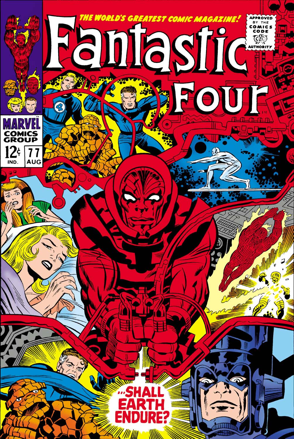
Fantastic Four #77 (August 1968), Cover Re-creation, 2008
This week we remember Jack
Kirby with an artist who worships the King
— and expresses his adoration with unique and lovely homages and
recreations.
Giorgio Comolo speaks no English. None. Niente.
That makes speaking to him about his art challenging if, like me, you don’t speak Italian. (I don’t include the handful of words I learned in my childhood neighborhood. Those are not very useful for polite conversation.)
Thankfully, his brother speaks some, and his sister-in-law a
bit more, so roughly translated, I was able to tell him last year how much I
enjoy his work when I met the whole family in Italy.
And fortunately, King Kirby is a universal language, and Comolo speaks Kirby fluently. The Italian artist recreates many Kirby covers and scenes as paintings, using a specific palate that utilizes cooler color tones and hues. It might be a stretch to some, but his cosmic paintings often remind me of those wild blacklight posters published in 1971 by a long defunct company called Third Eye.
Of course Comolo’s paintings are not Day-Glo — but they definitely pop. His palette creates a very distinctive look to his homages.
And he focuses on Jack’s later works at Marvel (and some of
the Fourth World material at DC), so there’s plenty of cosmic material to work
with.
Like this cover recreation of FF 77. It’s a trippy composition
to begin with, and in Comolo’s hands, becomes… even trippier.
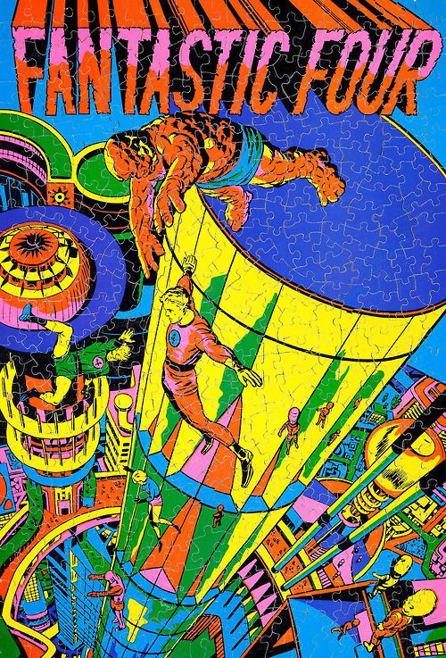
Kirby — and much more Marvel — in Day-Glo. Posters, puzzles and greeting cards from Third Eye, now defunct, in 1971.
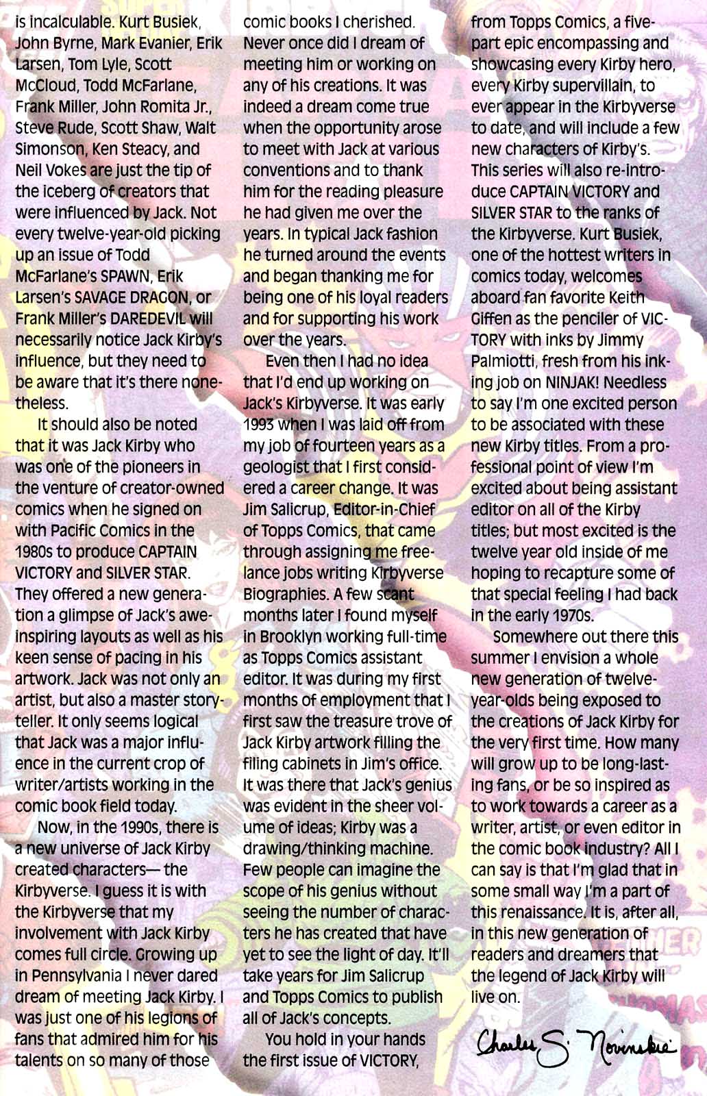
It was February 6, 1994. As we put the first (and it turned
out, last) issue of Victory to bed at Topps Comics, the sad phone call came
into our offices. The King had moved on — Jack Kirby had passed away at age
76.
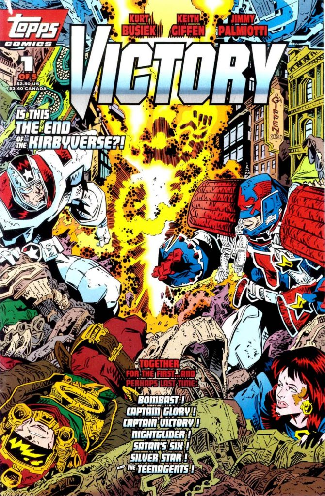
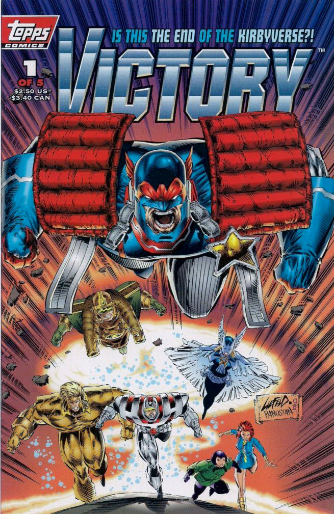
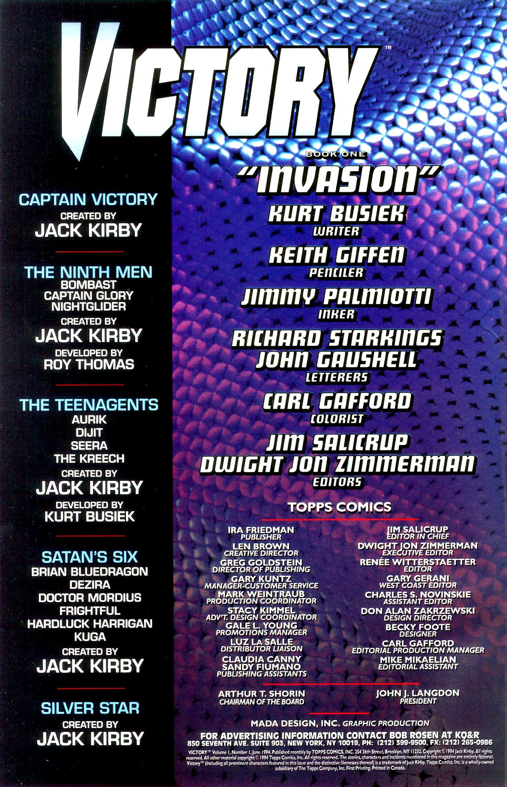
Victory was supposed to be a monumental crossover project between
all of Jack’s creator owned characters; the new ones we had already developed,
and the previously existing ones that included Silverstar, and of course
Captain Victory. It was going to be the event that shook the “Kirbyverse.” (I
can’t remember who thought of that – EIC Jim Salicrup or myself, so we will
each take have to take co-credit.)
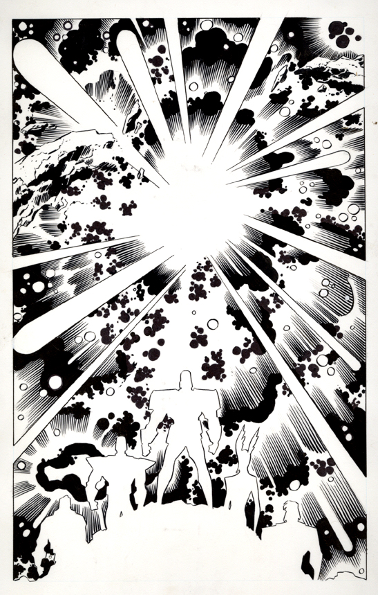
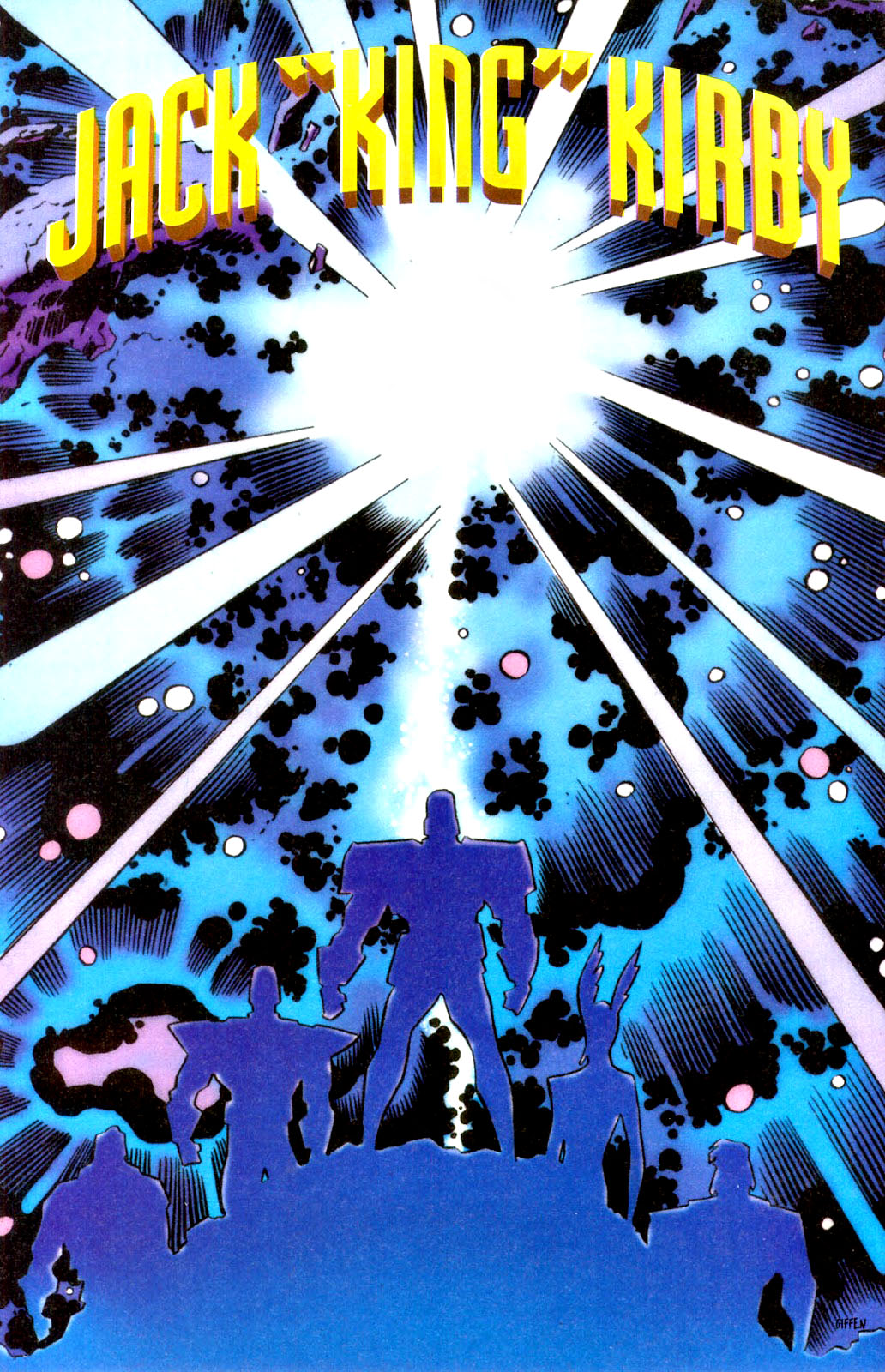
Since the issue had not yet gone to press, we were able to include this lovely art memorial to Jack by Keith Giffen and Jimmy Palmiotti in the published issue, as well as a two-page editorial tribute written affectionately by Charlie Novinskie.
Although Jack was not directly involved in character or story development, he did enjoy being kept in the loop and, from the feedback we received, he enjoyed our efforts.
The challenge at the time of course, is that the marketplace didn’t enjoy our efforts quite as much as he OR we did. A year prior, we had launched the Kirbyverse with a bang. Four titles launched in April 1993, plus a freebie. Total circulation of the group: More than one million copies. (That is not a typo.)
But our titles launched with mostly retro styling, and the market was not interested in classic storytelling and clean draftsmanship. The market wanted the dynamism and styling of Image-type comics (preferably from Image itself; remember this was 1993). And the younger readers gobbling up Cyberforce and Spawn weren’t that interested in Jack Kirby.
From the moment we launched, sales of the Kirby titles dropped each month. By the time Victory project came to fruition, it was too late. Despite that issues #2 and #3 of the crossover were drawn, they never saw the light of day.
So ironically, and most definitely not intentionally, this
version of the Kirbyverse was laid to rest at about the same Jack was.
But… did the King really die?
Captain America. The Hulk. The Avengers. The X-Men. The Eternals. Darkseid. The Black Panther. The Silver Surfer. Add a few hundred more, and you will just about scratch the surface of Kirby’s creative output.
The King lives on.
Long live the King.
Topps Comics sponsored a memorial event at Pro-Con (tied in to Wonder-Con, back in the day) and attendees were provided with a small program book. I flew out to pay my respects to Jack’s wife Roz — who liked me in part because her maiden name was Goldstein.
Main cover by Keith Giffen, variant by Rob Liefeld
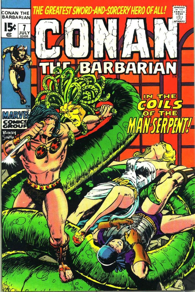
Conan celebrates its
50th anniversary in comics this year, and we celebrate the anniversary with
three Conan-themed posts this week.
Barry Winsdor-Smith was not the first choice to draw Conan. Legend has it that Roy Thomas knew that John Buscema was the idea artist for the job. But Publisher Martin Goodman nixed the idea, citing budget and schedule, and told Stan/Roy to find someone less expensive.
The solution? The young British-born Smith, who had been a
fill-in artist on a handful of super-hero titles with an unmistakable Kirby
influenced style, and who was both cheap — and available.
And so Barry drew Conan for 21 of the first 24 issues — and the comic book world promptly grew up.
Smith, one of the many “young guns” of similar age, and breaking in at around the same time, (Chaykin, Kaluta, Simonson, Wrightson among the many others) ultimately developed an inimitable style. Yes the Kirby influence was there, especially early on. But so is Steranko. And Alphonse Mucha, the best-known stylist of the Art Nouveau period (late 19th – early 20th century), provides much of the inspiration for the intricate designs and beautiful women that populate those early Conan stories.
Smith’s run on Conan is unlike any other in professional comics at that time. And Baby Boomers, who had grown up on the simple stories of DC, and had segued into the cosmic soap operas of Stan and Jack, were primed for these comics. The Boomers were growing older, and now, the comics were growing up with them.
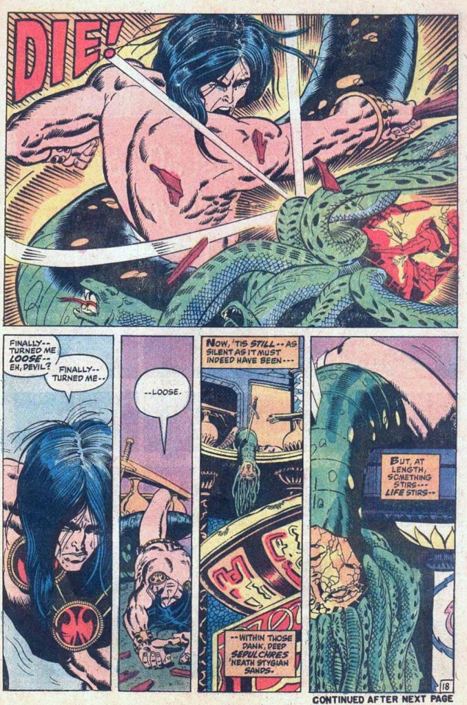
Smith’s style developed rapidly over his three year run on Conan, culminating in the extraordinary “Red Nails” that first appeared in 1973/1974 in Savage Tales. And of course, the work was always best when Smith was inking himself, but both Sal Buscema and Dan Adkins did excellent work, and interestingly, both are credited on this issue. Sal is credited on this specific page, but without all 20 original pages together, it’s difficult to tell.
Either way, it’s a stunning page, and only a small harbinger of things to come.
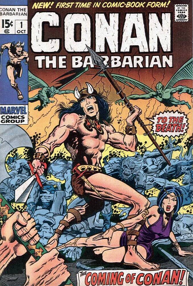
Conan launches in comic books and the more “mature” Marvel magazines.
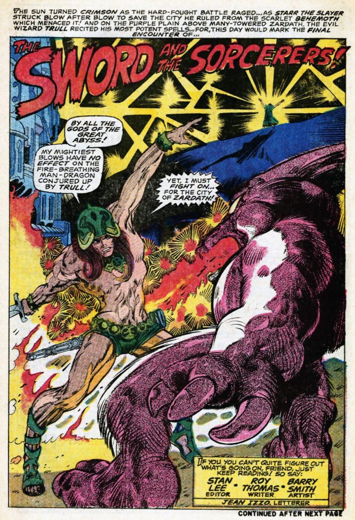
And early try-out story by Smith and Thomas features “Starr the Slayer,” published just a few months prior to Conan in Chamber of Darkness #4. Smith also developed a Kull Black and White proposal for a paperback graphic novel. (Similar to Gil Kane’s Blackmark) that ultimately was published (unfinished) much later in Savage Sword of Conan #3. Both prototypes look nearly identical to Smith’s Conan.
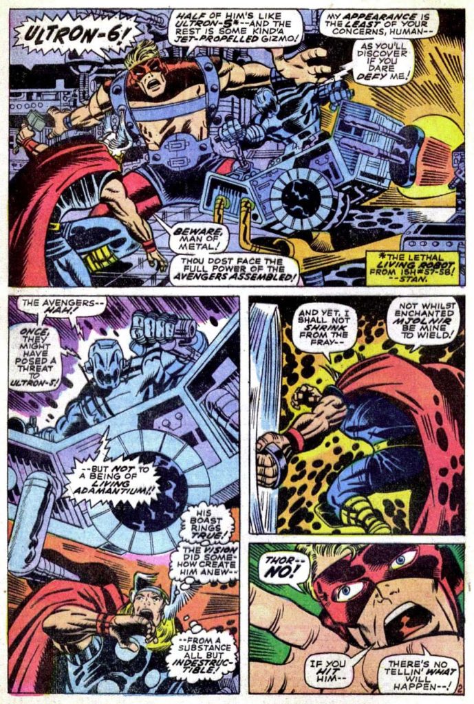
Smith’s early Marvel work on Avengers is pretty much straight from the Jack Kirby handbook — except for the wild Vision splash page (Avengers #66) which adds some Steranko and Alphonse Mucha into the mix; a sign of things to come.
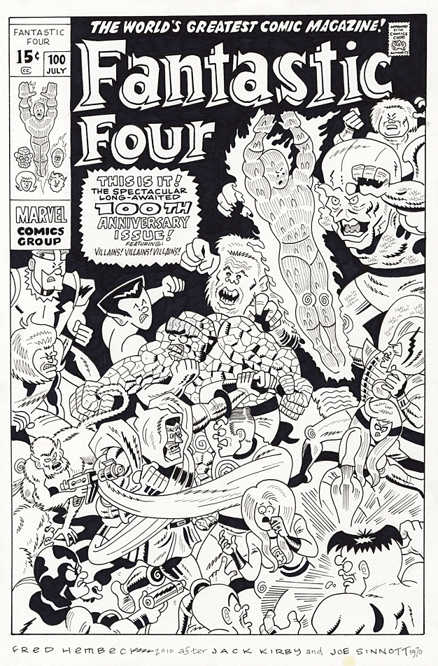
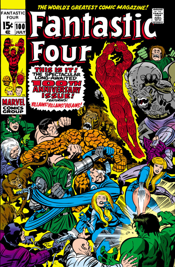
Fantastic Four #100 (Jack Kirby), July 1970, Re-creation by Fred Hembeck, 2010
50 years Ago, Marvel Comics celebrated its first ever milestone issue, with Fantastic Four #100, redrawn here 10 years ago by the very talented and affable Mr. Hembeck.
But the milestone proved bittersweet — because 50 years ago, one of the biggest stories in comic book history shook the industry: Jack Kirby was leaving Stan Lee and Marvel Comics to head to DC.
In March of that year, Jack turned in the pages for FF #102 and told Stan he was out. The most accomplished creative team in comics history was done. In comic book fan circles, it was as if the Beatles had broken up.
Which, actually, they had, with Paul making the announcement official just a few weeks later.
A dramatic beginning to a new decade of pop culture.
More on Jack and the move to DC later on; In the meantime, Happy New Year, and welcome to 2020!
The ironic final panel of Fantastic Four #100. The Lee / Kirby team may have been the greatest ever, but they were a team no longer. Plus, pop culture’s other superteam calls it quits, too.
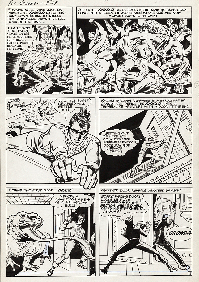
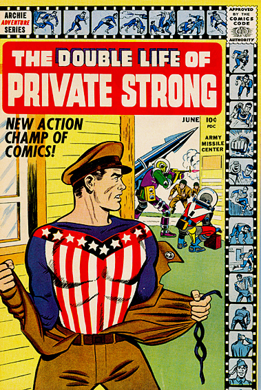
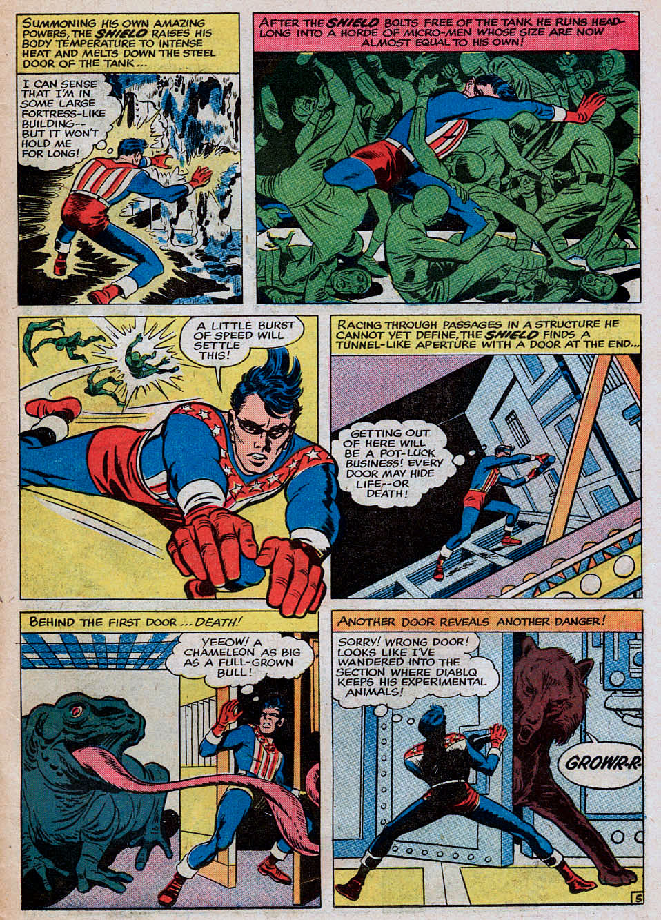
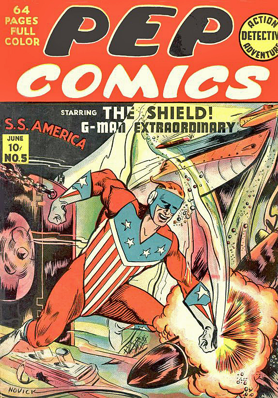
Classic Jack Kirby action highlights this dynamic page from the extremely short-lived Double Life of Private Strong in 1959.
Here though, “Classic” suggests a Kirby Golden Age look and feel. (As an example, The Shield is jumping out of a panel — very similar to earlier Simon and Kirby techniques.) Definitely a time warp, since we were theoretically a few years into the Silver Age at this point.
When did the Golden Age end, exactly? I devoured all the comics’ history books I could get my hands on as a youngster. (Steranko, Feiffer, Daniels, Lupoff / Thompson, et al.) I’m not sure they all agreed on, or even in some cases, identified, the exact point of the “end.”
So my youthful brain filled in the blanks: If the first appearance of Silver-Age Flash (Showcase #4, 1956) launches the Silver Age, then Flash #104, the final issue of the original Flash Comics (1949) obviously ends the Golden Age. (Let’s just call the in-between period the “EC Age.”)
Very neat and tidy, but it only took a short while before I realized it was much more complex than that.
If not Flash, then, how about when All-Star Comics kicks out the Justice Society and switches to All-Star Western (1951)? Perhaps the last issue of the Spirit newspaper supplement (1952)? Or maybe when Captain Marvel and Whiz Comics ceased publication (1953)? And what about the brief return (1954) of Marvel’s “Big Three” (Sub-Mariner, Torch and Captain America). Are those Golden Age Comics?
EBay defines Golden Age Comics as any published through 1955. The well-known back-issue retailer Sparkle City Comics says the era ends in 1956, leading directly into the Silver Age.
See, it gets complicated.
But, if we consider Golden Age as a style of superhero storytelling rather than a timeframe, my vote goes here: The final Simon and Kirby team-up.
Archie Comics, seeing DC’s success at re-introducing superheroes, hired Joe Simon, who in turn hired Jack Kirby (they were no longer partners at this point) to help create some new super suits for themselves.
Two titles came as an immediate result of that ideation: The Fly, and The Double of Life of Private Strong, featuring an updated version of their original patriotic superhero, The Shield. Both characters were Simon and Kirby superheroes. And both looked and felt like Simon and Kirby superheroes. (Even if Simon himself didn’t ink the page.) The page and the story don’t in any way capture the modern feel of DC’s sleeker and slicker Flash, Adam Strange, et al — or especially Kirby’s own Challengers of the Unknown.
The Fly buzzed around for a few years, although Simon and Kirby left after a few issues. Private Strong? A mess from the start, with a terrible title, retro trade dress that appears borrowed from Simon and Kirby’s Golden Age Speed Comics, some obvious knock-offs from Captain America, and a background story that seemed so similar to Superman, DC sent a cease and desist letter to Archie.
After two issues, The Shield was done. Shortly thereafter, the temporary reunion of the Simon and Kirby team was also finished.
A few months later, Kirby and Stan Lee, already churning out monster stories at Marvel, would collaborate for the first time on an ongoing character with Rawhide Kid #17. Although no one knew it at the time, the “Marvel Age” had begun, and the Silver Age was about to rev into high gear.
And the Golden Age of Comic Books was definitively over.
With some pretty great old-school art by Jack to usher it out.
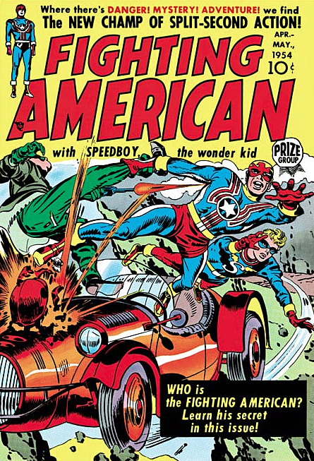
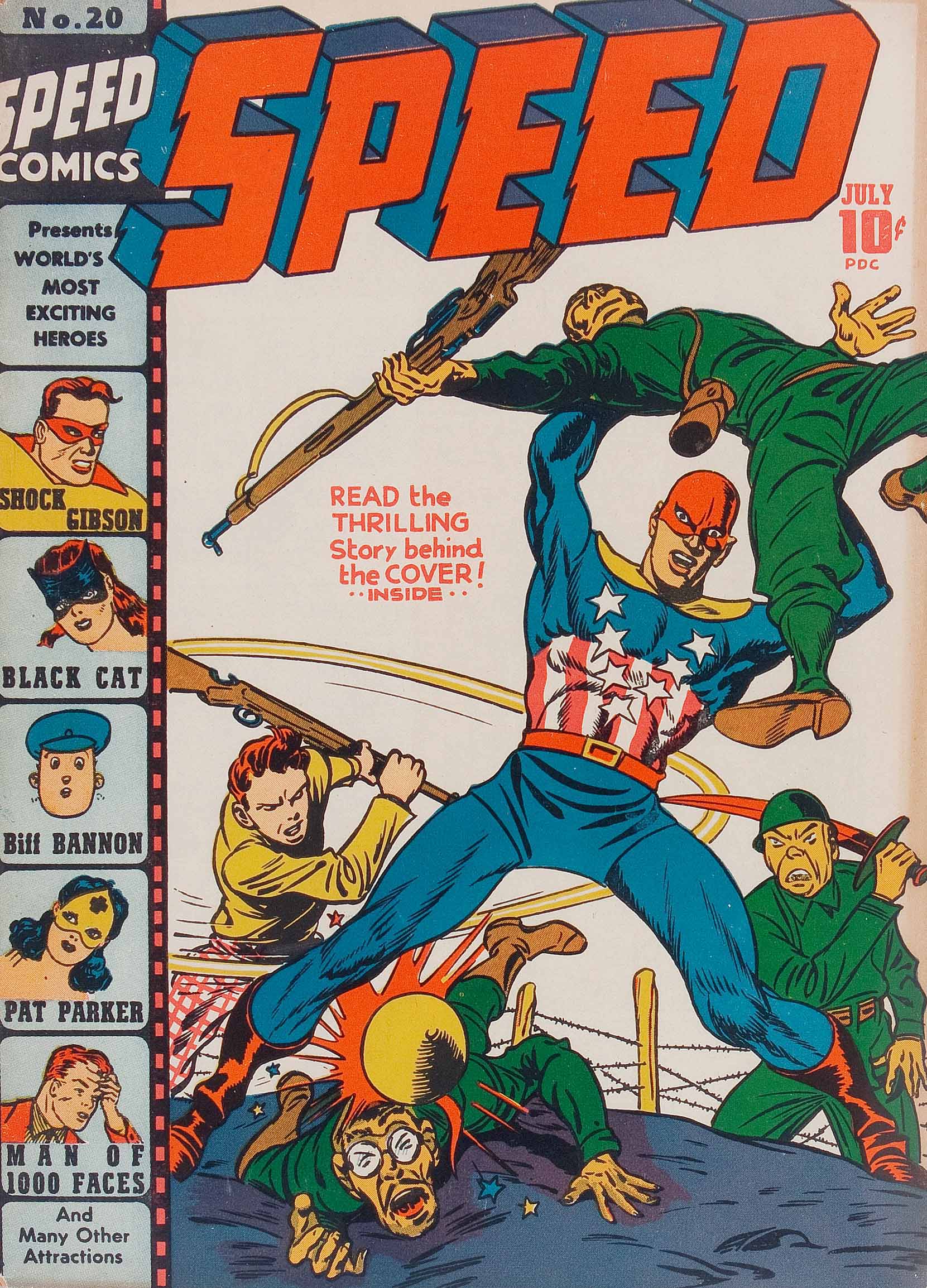
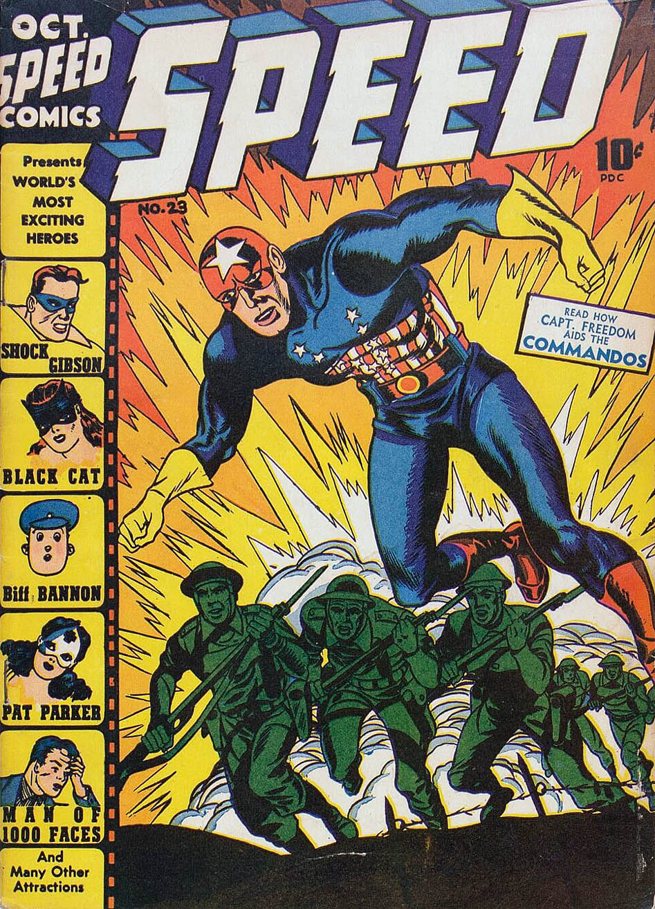
Archie’s original version of the Shield predates Simon and Kirby’s Captain America. Not to ever give the patriotic superhero concept a rest, the two star creators develop Captain Freedom (below) for Harvey, and Fighting American, an early creator-owned series in the 50s.
Apparently Joe and Jack couldn’t decide on Captain Freedom’s costume from issue to issue. Notice the star on the mask that disappears and reappears, not to mention the proportions of the stars on the chest, and the belt too.
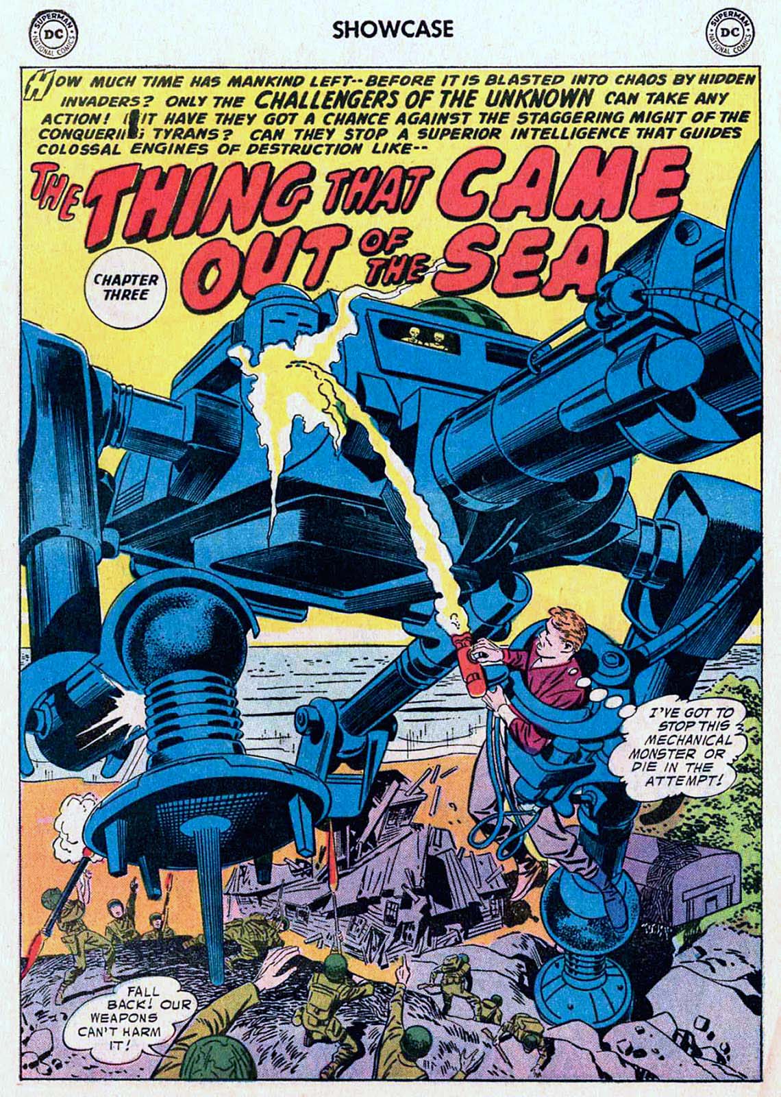
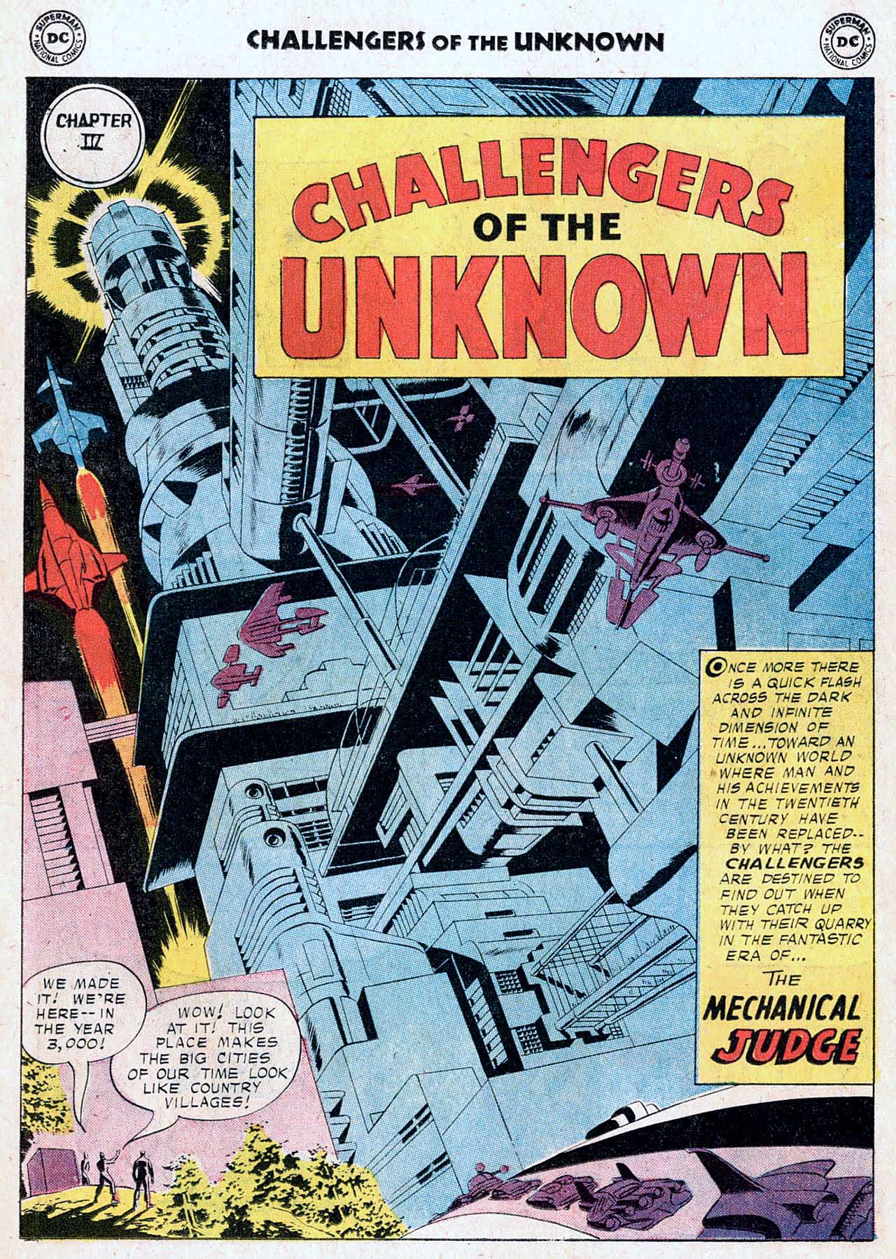
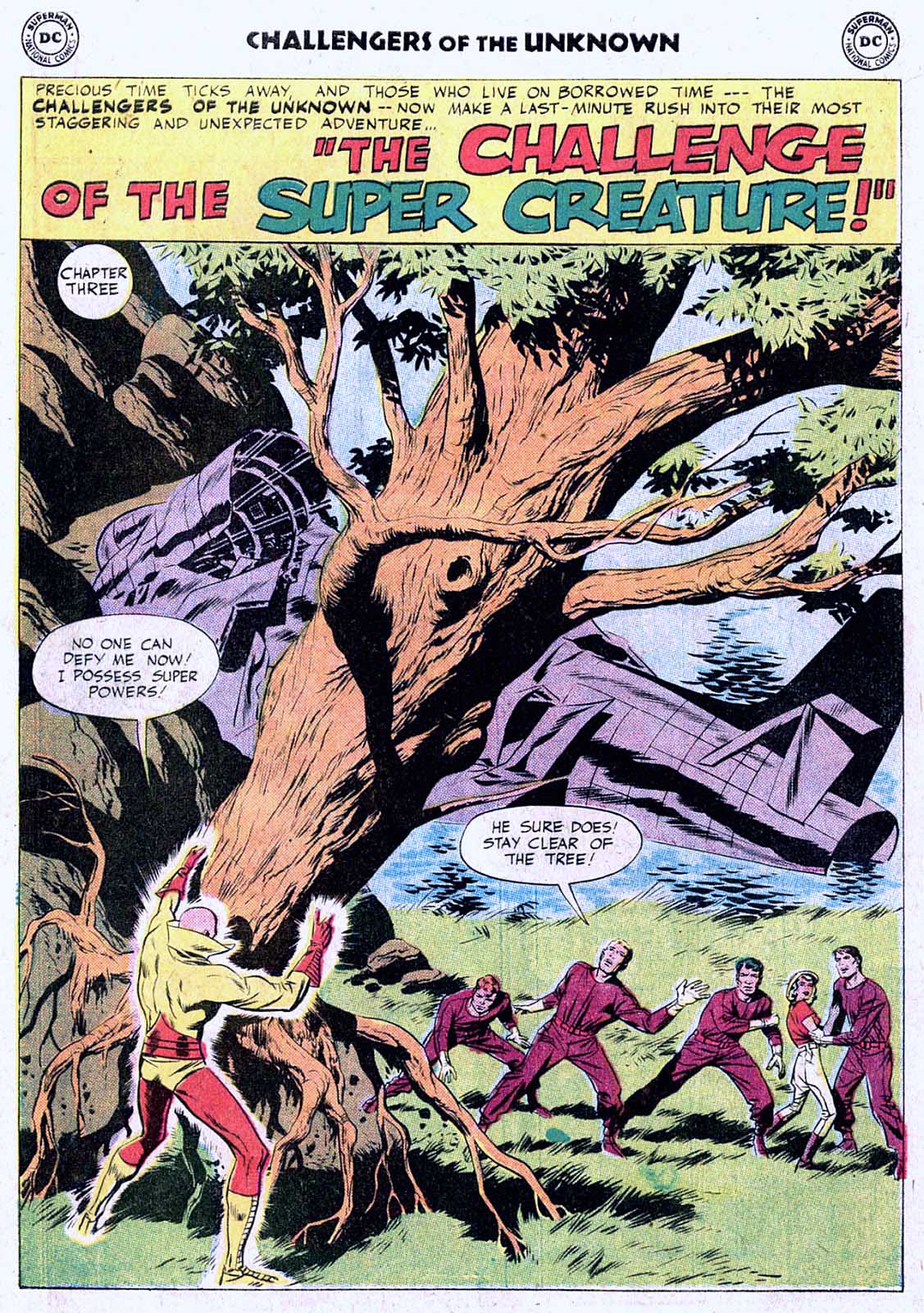
Meanwhile… Across town at DC, Kirby’s Silver Age Challengers of The Unknown look like… Jack Kirby in the Silver Age! Giant robots, futuristic cities, et al, are a sign of things to come.