Greg Goldstein's Comic Art Gallery

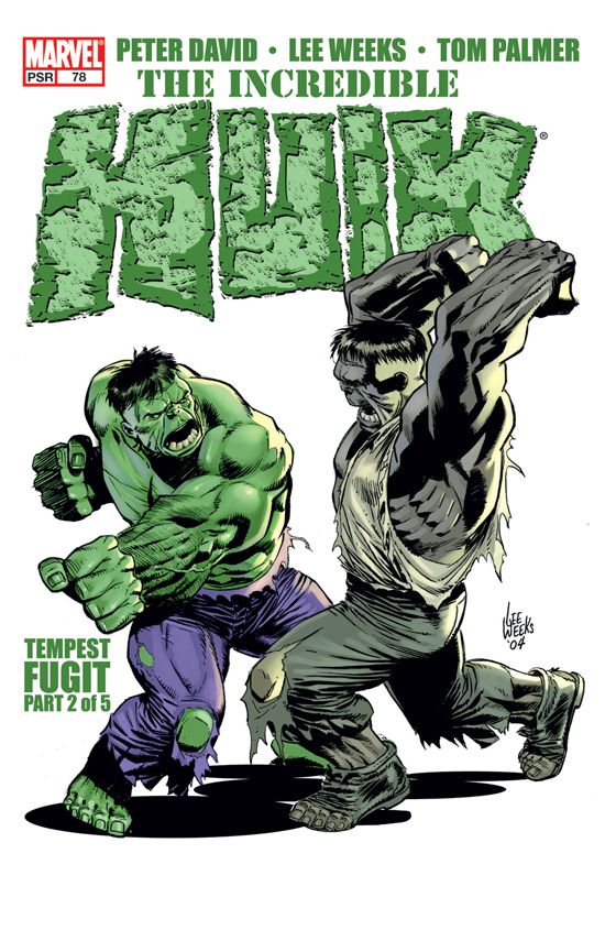
Mark Bagley — Secret Origin

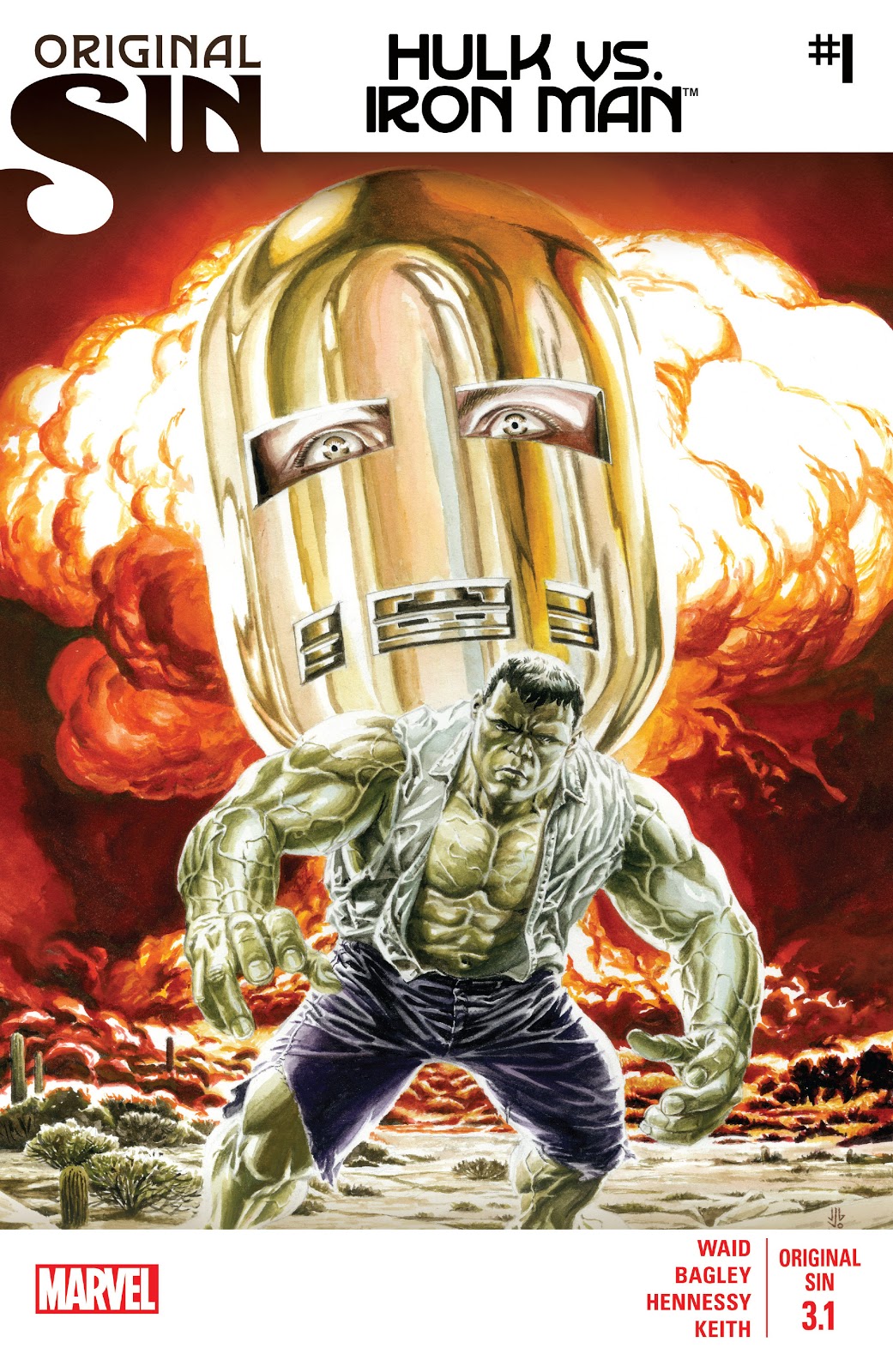
Original Sin #3.1, August 2014

Continuing our ongoing celebration of Marvel’s 80thAnniversary.

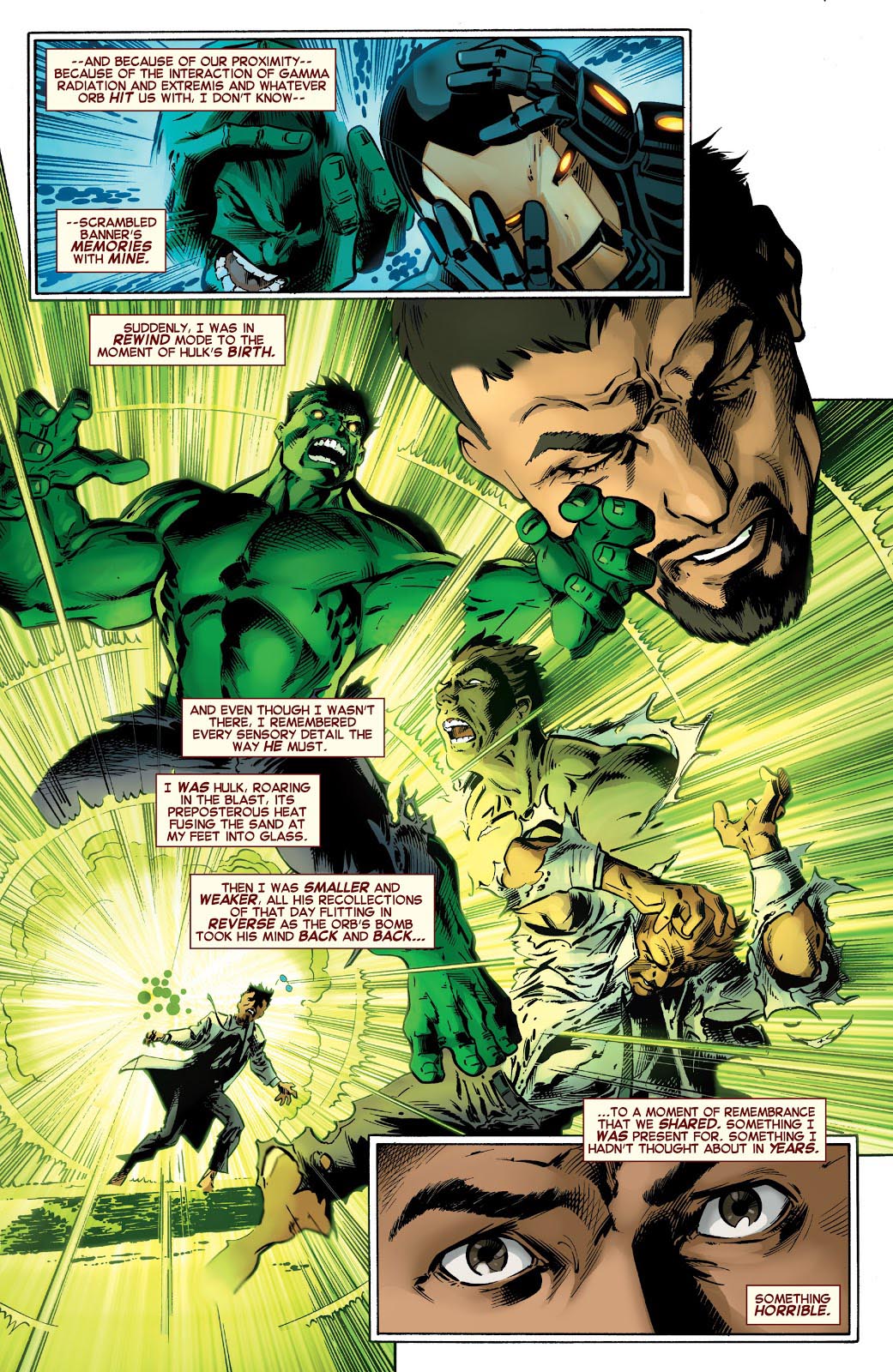
Tony Stark is forced to relive The Hulk’s origin — and his own potential culpability in the fateful gamma blast — in Original Sin, a clever 2014 crossover event by Mark Waid that introduces some new retcon elements into the Marvel Universe.

Re-imagining a classic scene is an interesting challenge for an artist, and Mark Bagley delivers on Bruce Banner’s transformation with inventive (and concise) storytelling and solid draftsmanship. Andrew Hennessy’s inking on Bagley’s pencils adds some nice polish.

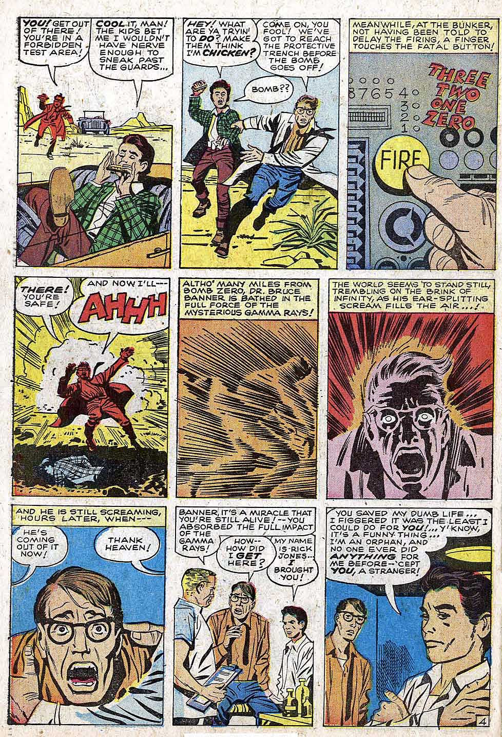
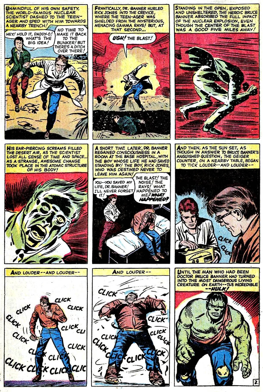
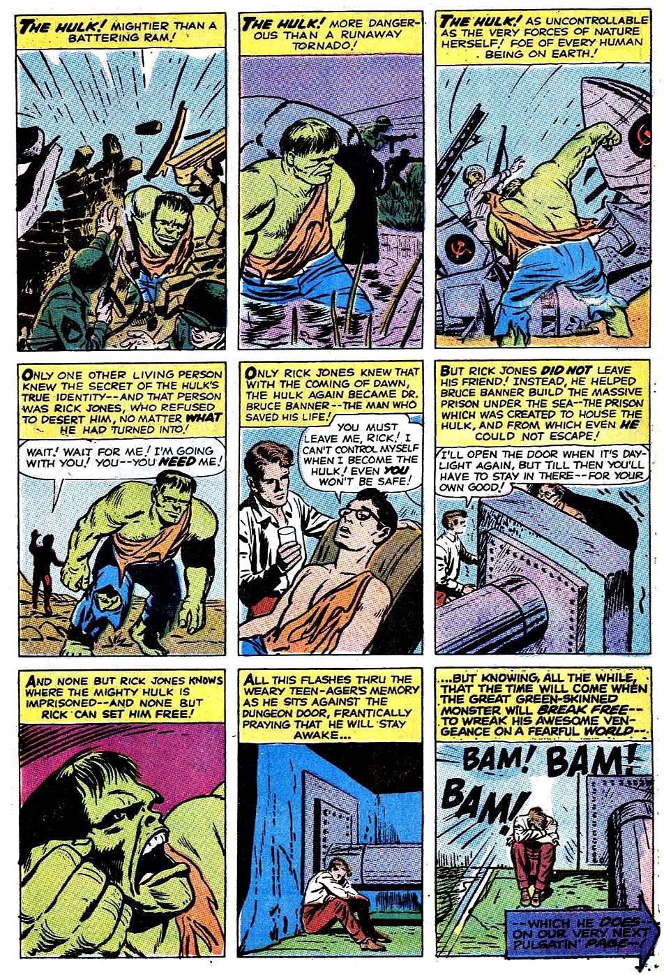
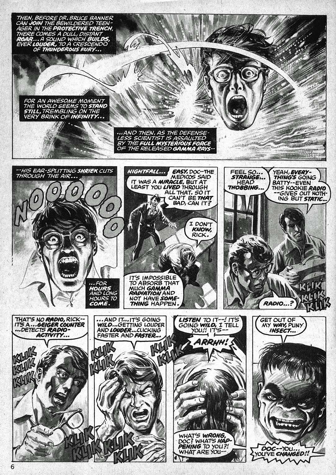
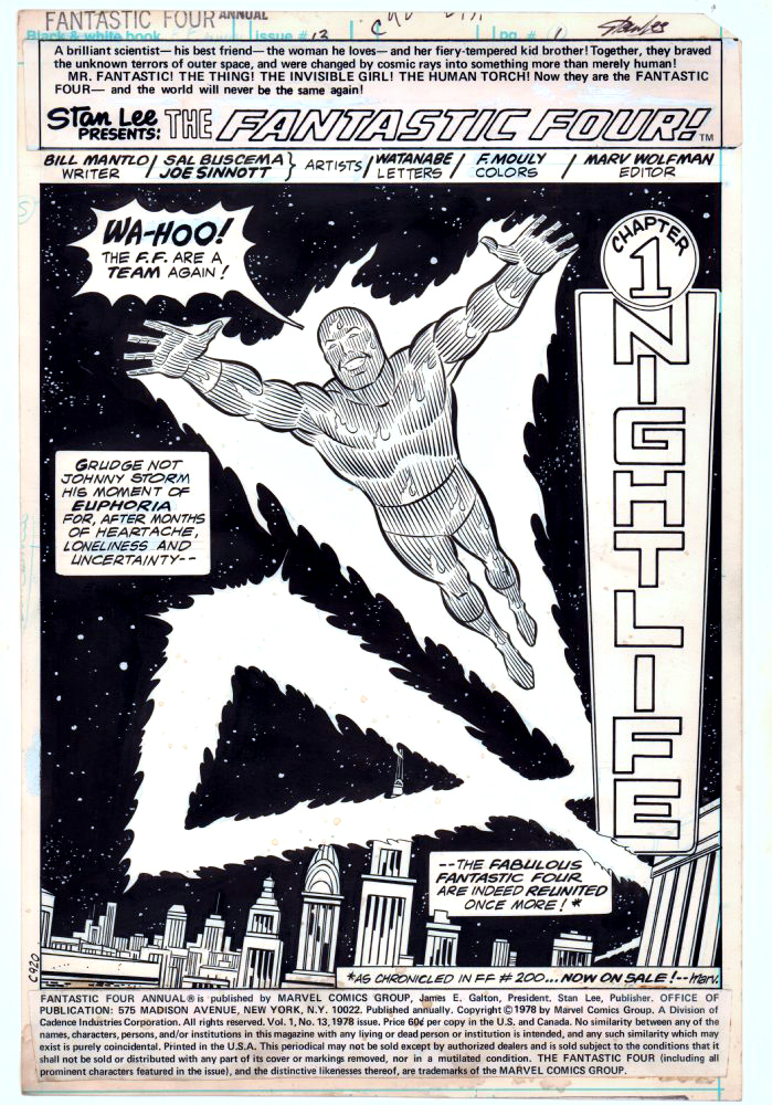
The basics of Hulk’s origin haven’t changed much in the nearly 60 years of his existence, but the nuances have been modified many times. In the early days of the Silver and Bronze ages, a number of artists did different takes, as evidenced below.

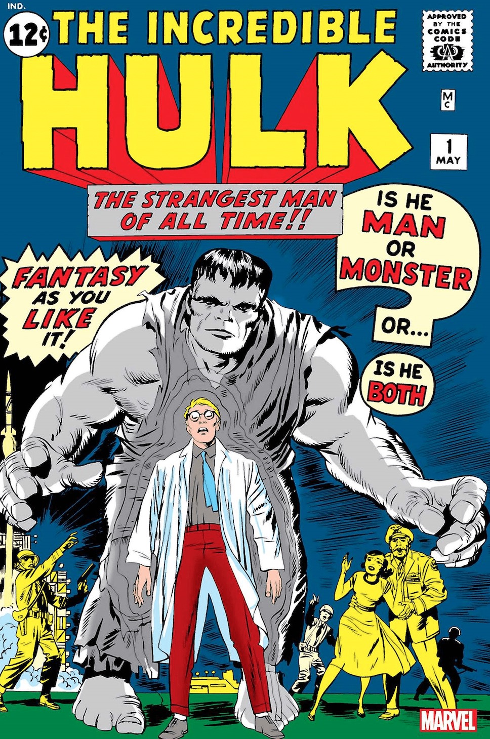
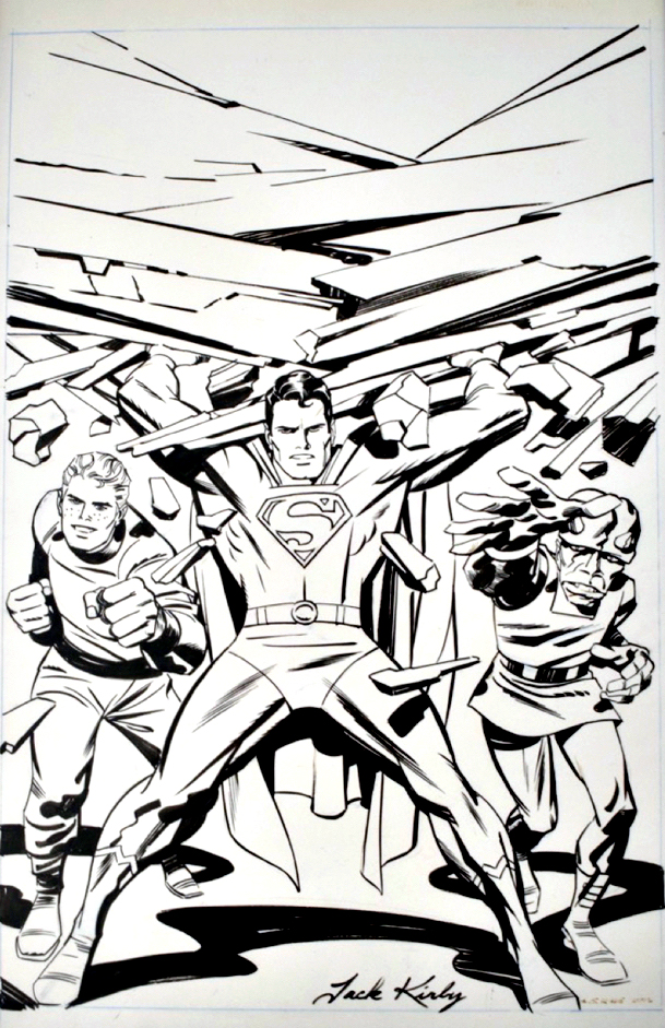
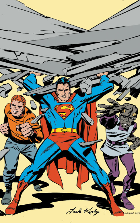
Where did I first see the Hulk’s origin? On TV, of course, in the 1966 Marvel Super-Heroes Cartoons. (Courtesy of Jack Kirby’s art.)

Sing along to the theme song if you will:

(Lyrics by Jacques Urbont)

Doc Bruce Banner,
Belted by gamma rays,
Turned into the Hulk.

Ain’t he unglamor-ous!

Wreckin’ the town
With the power of a bull,

Ain’t no monster clown
Who is as lovable.

As ever-lovin’ Hulk! HULK!! HULK!!

Advertising material for the 1966 Marvel Super-Heroes Cartoon

Sal Buscema and Joe Sinnott — Fireworks

Fantastic Four Annual #13, 1978

Continuing our ongoing celebration of Marvel’s 80thAnniversary.

Sal Buscema and Joe Sinnott deliver an iconic (and terrific) image of the Human Torch in this celebratory opening splash page.

Celebratory in that the Fantastic Four had just gone through a quirky period editorially where they were essentially “broken-up”, and they have reunited in FF #200, on-sale at the same time.

At this point in the run, Joe Sinnott, acknowledged as one of the all-time greats, is pretty much the only consistent through line in the FF — the series was rapidly going through a number of mix and match creative teams. In a three-year period, Joe inks pencillers Sal Buscema, John Buscema, Keith Pollard, Rich Buckler, Ron Wilson, and of course George Perez, who does some of his best known work in this era. (Shortly after this issue is published, Joe adds John Byrne and Bill Sienkiewicz to this mélange.)

Sinnott’s credits, including this one, are often categorized as “finishes” during this timeframe, as many of the pencillers are providing breakdowns only.  Doesn’t help enough with the schedule though, as a number of issues are reprints and fill-ins.  Marvel, as others have noted, was going through some difficult times. The Fantastic Four themselves wouldn’t truly find their full footing again until a few years later, when Byrne fully takes over writing and art chores.

As for Joe and Sal? With the end of the Spider-Man newspaper strip this year, Joe officially retired from inking … at age 92. Sal (age 83) “retired” in 2000, but continues to be coaxed into working — sometimes by my former colleagues — to this day.

“Flame on!”

Darwyn Cooke — Breaking The Glass

Redo of Tales of Suspense #59, undated (approx. 2008)

The late, great Darwyn Cooke produced a number of these reinterpretations and homages of classics during his all too short lifetime.

I asked him about this one time and he told me he did them to “relax.” Relax? Wow. Think Albert Pujols walking into the batting cage prior to a game. Bam. Home Run. Bam. Another. Bam. Another…

Chic Stone originally inked this milestone splash, one of Jack Kirby’s best known from his Captain America run. Darwyn’s version makes some tweaks — for the better. Most notable are the subtle changes to the face. Cap’s eyes now engage the reader more directly, and overall, his facial expression is clearer and more confident and feels more accurate to Kirby’s vision.

Once upon a time, Darwyn and Marvel talked about an origins series, sort of the Marvel version of his amazing New Frontier series at DC. That is definitely a project I’m certain would have been a classic as well.

For more about Darwyn and the New Frontier, click here.

For more about this classic Captain America tale, click here.

Darwyn’s brilliant New Frontier at DC.
Now imagine the Marvel version too.

Jack Kirby — The Devil You Say

Satan’s Six #1, Original Cover Production Art, Kirby File Copy, 1978 / 1993

Continuing a two-week series celebrating Halloween with the best in monsters, mystery and mayhem.

Here’s an oddity about an odd Jack Kirby comic featuring a bunch of oddballs.

Kirby’s Satan’s Six was developed as part on an unrealized “Kirby Line” of comics in 1978, shortly after Jack’s final tenure at Marvel had ended.

Jack drew a cover and eight story pages, plus a character concept and design page. Mike Royer was hired to ink some of those pages as samples, but when the concept for a “Kirby Line” dissipated, the pages sat in a drawer unused for nearly 15 years.

Enter Topps Comics, the fledging publishing line from the trading card and confectionary giant. Topps signed a deal with Jack in 1992 to produce comic books based on new, and (primarily) previously unused concepts. It was essentially a second chance for a “Kirby Line.” With the King in declining health, however, others would have to create content around Jack’s ideas.

Topps editor Jim Salicrup called his old friend Todd McFarlane and asked Todd if he would like to have a chance to work on a Kirby project. I’m pretty sure Todd said yes before Jim finished the question. 

Of course, Todd was busy with his own series, a small Image title called Spawn, so Todd could only commit to inking a cover. And the only Jack-penciled cover was issue #1, previously inked by Royer, but on photocopies or overlays. So Todd re-inked the cover. You can read Todd’s own recollection about that here.

And now, this production art has re-surfaced, complete with the original “Marvel style” trade dress, and Royer’s original inks, just in time for Halloween. 

What became of Satan’s Six? Tony Isabella’s stories based on Jack’s high concept of a lovable group of misfits too mischievous for Heaven but not evil enough for Hell seemed wackily appropriate enough, but the art definitely was a challenge from issue one. 

Especially issue one. 

Kirby’s eight original pages are scattered throughout the full story with the rest of the art from John Cleary, making for a dizzying juxtaposition of styles.

And Cleary’s “contemporary” (1993) art here, and through the remaining three issues, was simply not enticing enough to sustain interest.  The book was cancelled with issue #4. You can read a complete illustrated overview of the series here.

Satan’s Six has yet to return to comics. They remain in… Limbo.

Gabriel Hardman — Like A Demon

Cursed Comics Cavalcade #1, October 2018

Continuing a two-week series celebrating Halloween with the best in monsters, mystery and mayhem.

Jack Kirby’s Demon — despite a short-lived original run of 16 issues — endures 47 years after his first appearance in 1972.

Talented creators have reinvigorated, and in some cases outright reinvented, Jack’s supernatural character in the ensuing decades. It’s an all- star list that includes Matt Wagner, John Byrne, Garth Ennis, John McCrea, and many others.

Add to that list Gabriel Hardman, who, on this splash, provides an iconic and frightening image of the classic character. Gabe’s use of deep black inks and the off-setting lightning and breaking glass create a haunting and dramatic page. (I think the art looks more impressive in black and white than in published color, but regular readers of this blog probably already guessed that.)

Hardman’s main professional work is creating storyboards for films, a list that includes Spider-Man, Batman, Logan and much more. He’s terrifically talented, and much sought after in Hollywood, so we don’t get enough of his work in comics, which is a definite pity for comic art aficionados. 

In the meantime, we can likely look forward to yet another artistic interpretation of Kirby’s character sometime in the future. 

After all, we all have our Demons.

An atmospheric storyboard from Logan. Even if Gabe were permitted to part with it, he couldn’t — he does most of his storyboards fully digital.


Eric Powell — Monster Mash

Marvel Monsters: Where Monsters Dwell #1, December, 2005

Continuing a two-week series celebrating Halloween with the best in monsters, mystery and mayhem.

Marvel Comics has only recently fully embraced its monstrous heritage; giant creature stories that dominated its publishing line just prior to the “Marvel Age of Comics.” 

When it came to oversized behemoths (home grown or alien) terrorizing Earth’s inhabitants, no one could hold a candle to these giant-size oddballs from 1959 -1963. 

And I do mean odd: Oog, Orrgo, Ulvar, Rombu, Rorrg, Goom —and his offspring Googam (I kid you not) — are only a few of the dozens of beasts, lizards, robots, and aliens that walked the earth. (And of course, our pal Groot from Guardians Galaxy was originally a planet-wrecking alien conqueror way back in 1960.)

Obviously inspired by the pop culture of the day (Godzilla, et al) Stan Lee, along with co- creators Jack Kirby, Steve Ditko, Dick Ayers Larry Lieber and others, took a monster-sized football and ran with it. 

Eric Powell created all four covers for this series of modern one-shots in 2005, plus he provided interior art for the Devil Dinosaur issue. I’ve shared my thoughts about Eric previously. The creator of the Goon is a terrific talent, and his art style blends reverence and satire perfectly on these covers.

The Where Monsters Dwell issue specifically features three main characters: Bombu, Monstrollo and Manoo. The covers of their original appearances, along with Eric’s three other covers, are shown below.

Lee Weeks — FOOM!

Incredible Hulk #78, April 2005

Continuing a two-week series celebrating Halloween with the best in monsters, mystery and mayhem.

Lee Weeks drawing the Incredible Hulk? Excellent.

Lee Weeks drawing a Hulk splash in which our hero is about to be clobbered by Lee and Kirby’s Fin Fang Foom? Feels like a must-have page.

Weeks… Hulk…Fin Fang Foom… Monster Island. Not much more to add here about this cool and surreal page.  It’s from the Peter David multi–issue story “Tempest Fugit”, that seems very influenced by the “Lost” television show, which was then in its first season. 

This story arc, marking David’s return to the character, definitely has some detractors (spoiler alert — it’s essentially a dream story) but Weeks art, with inks by the amazing Tom Palmer, definitely transcends whatever story issues might exist.

Fin Fang Foom, one of the many great giant creatures created at the dawn of the silver age, appeared just shortly after the birth of Fantastic Four #1, whose debut would ironically herald the end of the age of Marvel Monsters.

He resurfaces from time to time — including a one-shot with the Hulk shortly after this story — but his appearances are too infrequent for my own taste. 

Fun fact: His surname became the name of the Marvel -run fan club magazine in the 70s. Friends of ‘Ol Marvel indeed!

Weeks signing at Baltimore Comic-Con, (yesterday), October 18, 2019

Jack Kirby — Happy 102!

Jack Kirby and Steve Rude, Jimmy Olsen: Adventures by Jack Kirby – Volume 1

Today, let’s celebrate The King’s birthday with some help from an unabashed professional Kirby admirer — Steve “The Dude” Rude. Steve completed a previously unpublished Kirby Jimmy Olsen cover rough for a TPB collection in 2003.  I love the power and playfulness in this image, and Steve’s inks nailed it.

Interesting that the initial color version of the cover, used for solicit purposes, is realized in the “classic” style, while the final printed version is digitally rendered in the “modern” style.

Anyone want to guess which version I prefer? Anyone?

(On the subject of Superman’s likeness in the DC Kirbyverse, Kirby expert and author Mark Evanier has some illuminating background here.)

Happy Birthday Jack!

Original (previously unpublished) cover rough, likely an early version of Olsen #145