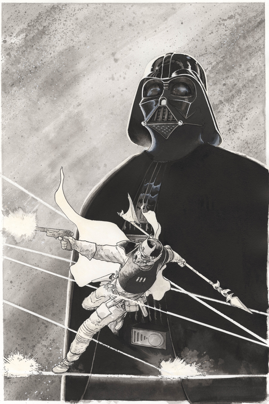
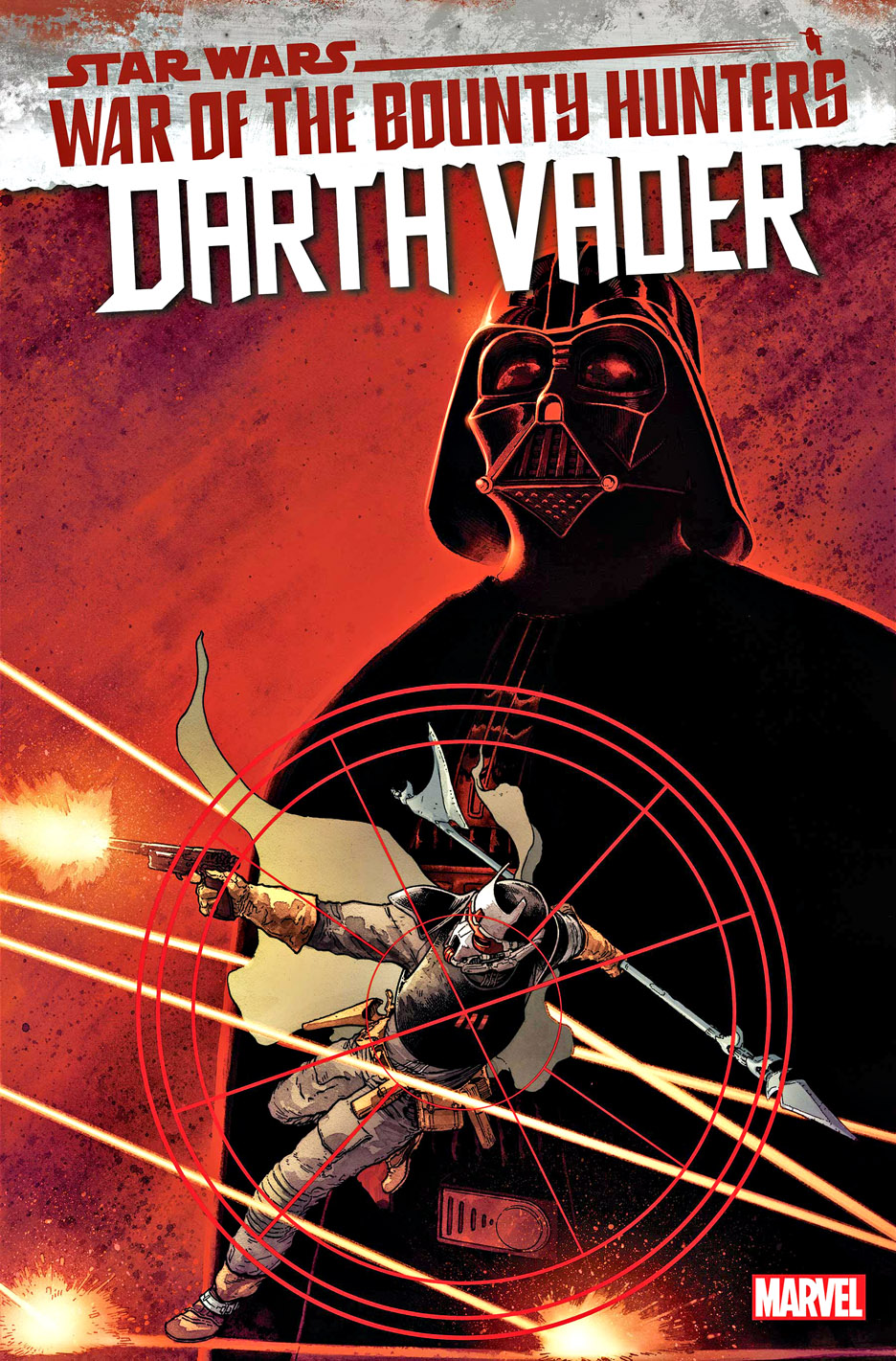
Here’s a Star Wars original cover that really stands on its own.
With modern comics, so much texture and atmosphere can be added digitally during production that the original art can sometimes end up looking pretty stripped down compared with the published cover.
Not here.
Aaron Kuder really finished this piece. The grey wash, splatter effects, lighting, and overall mood are already sitting on the board. The color certainly adds another dimension, but the original already feels complete, which makes the OA a knockout in person.
I don’t collect a ton of modern comic art, but every now and then something just clicks and breaks through my usual collecting habits.
And of course—I’ve always had a soft spot for Darth Vader.
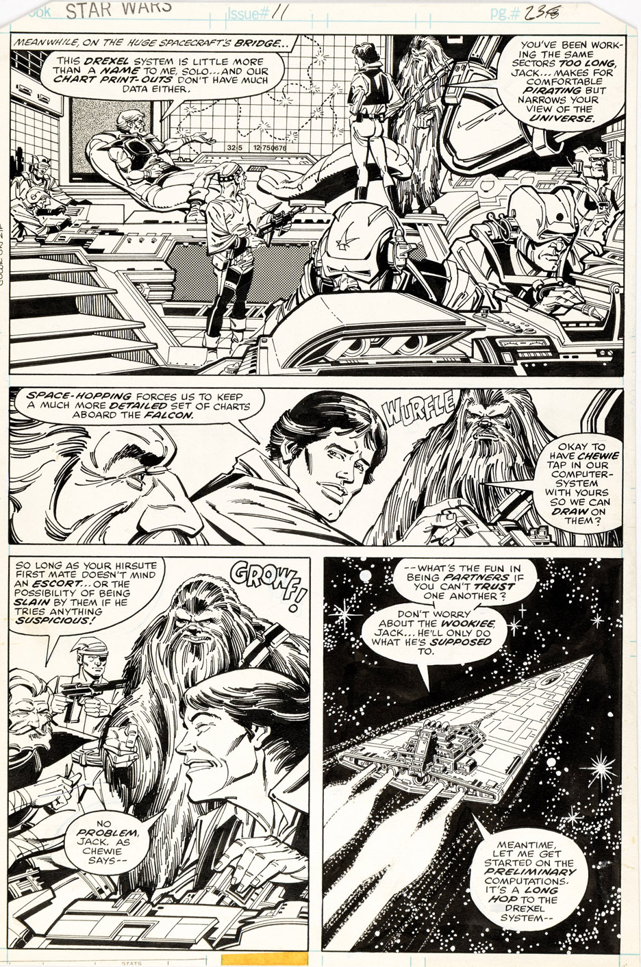
It took me a minute to get used to Carmine Infantino making the jump from DC Comics to Marvel Comics. He was such a DC institution.
And honestly, he wouldn’t have been my first choice for Star Wars—especially coming right on the heels of those first ten issues by Howard Chaykin. I probably would’ve gone with someone a little hipper, a little edgier.
But… I came around.
There’s something about Infantino’s take on Star Wars that just works for me. The quirks, the slightly offbeat energy… it all starts to click once you settle into it. Even the occasionally odd likenesses* became part of the charm. I figured if they were good enough for Lucasfilm, they were good enough for me.
This page is from his very first Star Wars issue (Terry Austin on inks), and about a year ago I somehow found myself in a bidding war over it. No grand strategy—just pure emotion, adrenaline, and collector impulse.
Still… it’s a very cool page, and I’m glad I ended up with it.
*That said… Chewbacca looks absolutely ridiculous here. I mean, come on, this wasn’t issue #1. Had Carmine even seen the film? Or at least flipped through a magazine?
And based on the published colors, Janice Cohen—normally terrific—may have needed a screening or two herself.
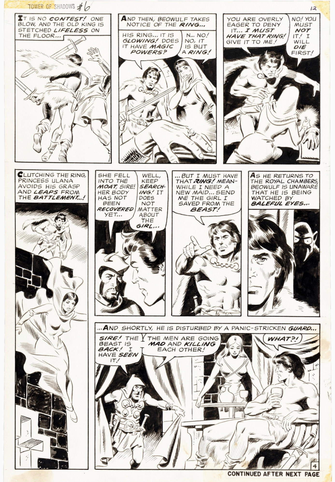
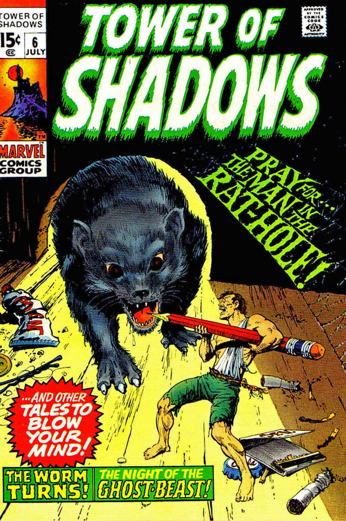
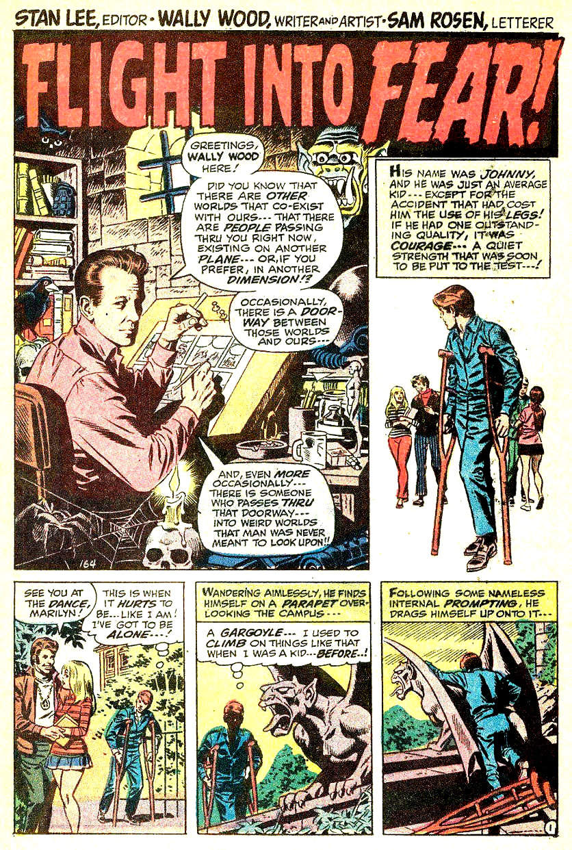
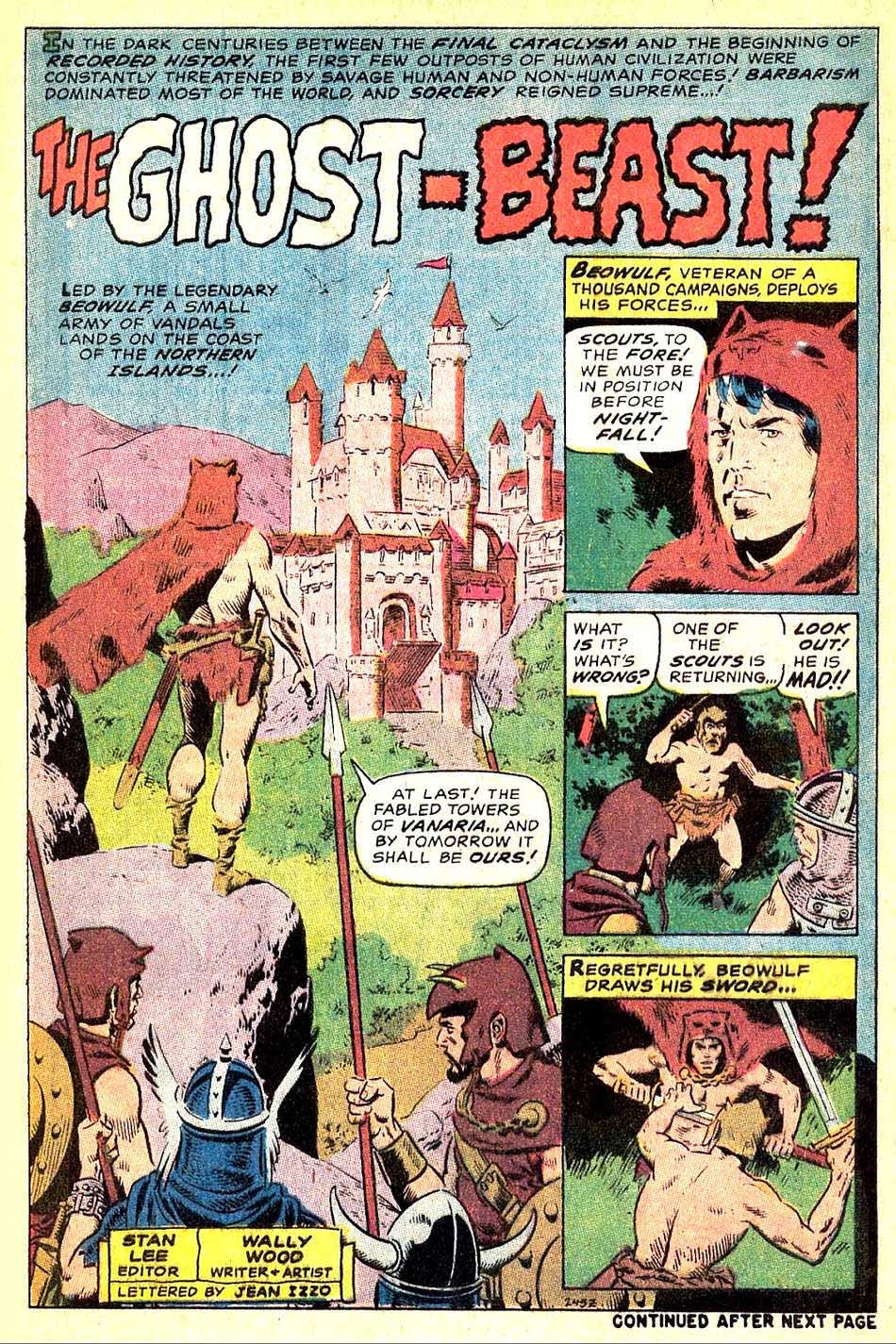
Wallace Wood’s brief return to Marvel in 1970 gave us an early glimpse of the sword-and-sorcery wave that was about to hit like a tidal surge.
If you mostly know Wood from EC or straight-up superhero work, his Tower of Shadows run (#5–8) is a really fun side trip into that territory. This great page comes from the second story, featuring an offbeat take on Beowulf.
He wrote and drew all four shorts, so what we’re getting is pure, undiluted Wood: moody lighting, dramatic staging, and an always-present feeling that everyone’s living one bad decision away from doom.
These aren’t Conan-style epics. They’re more like dark fairy tales from a guy who clearly loved drawing adventurers, monsters — and gorgeous women. The earliest of them — including this one — actually predate Conan #1. Woody was ahead of the curve.
Short stories. Big atmosphere. Fantastic art.
And a preview of what he’d later unleash in his own indie — and decidedly adult — fantasy project, The Wizard King.
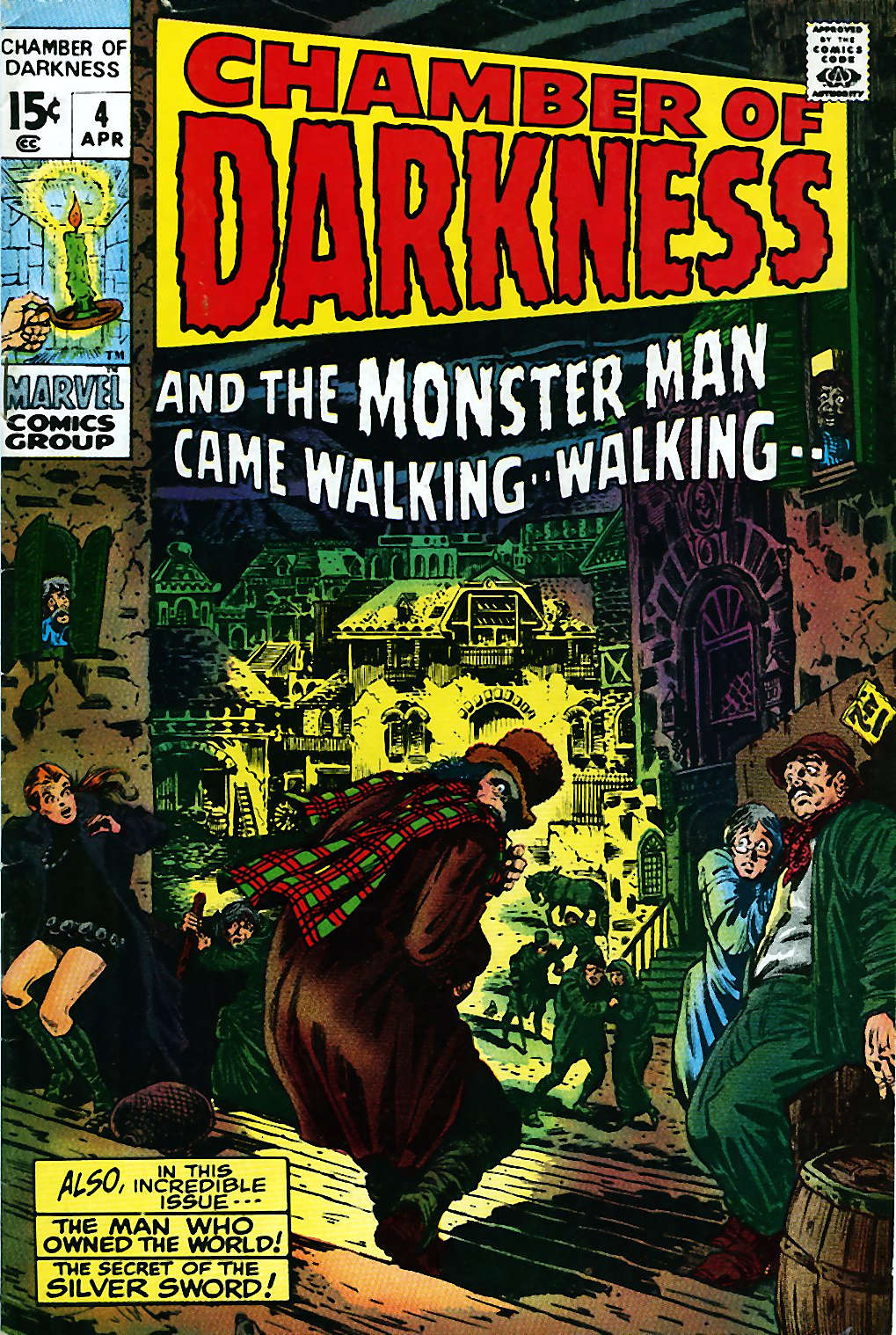
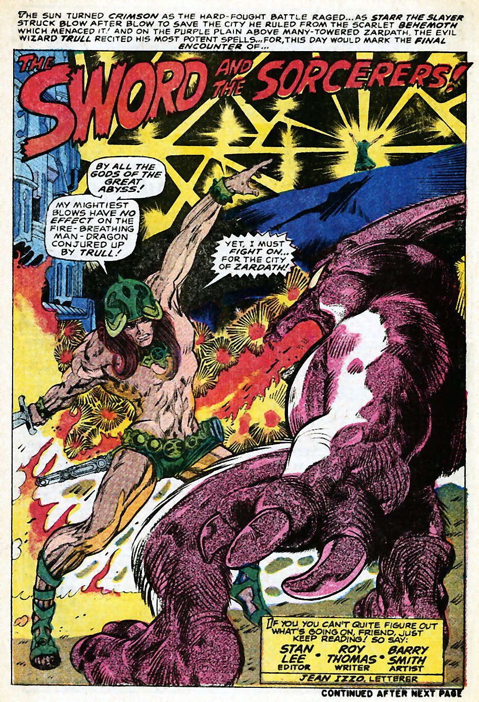
Four stories, four great title pagesAlso before Conan the Barbarian #1, Roy Thomas and Barry Smith tested the waters with a prototype Conan-like hero—Starr the Slayer—in Chamber of Darkness, the sister title to Tower of Shadows.
WALLY WOOD — MARVEL CHECKLIST (1964–1972)
1964–1965 Run (Primary Period)
☐ Daredevil #5 — Dec 1964 Pencils, inks (Wood’s Marvel debut; defined early DD look)
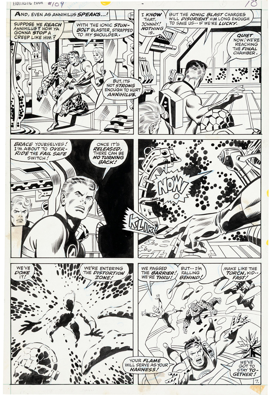
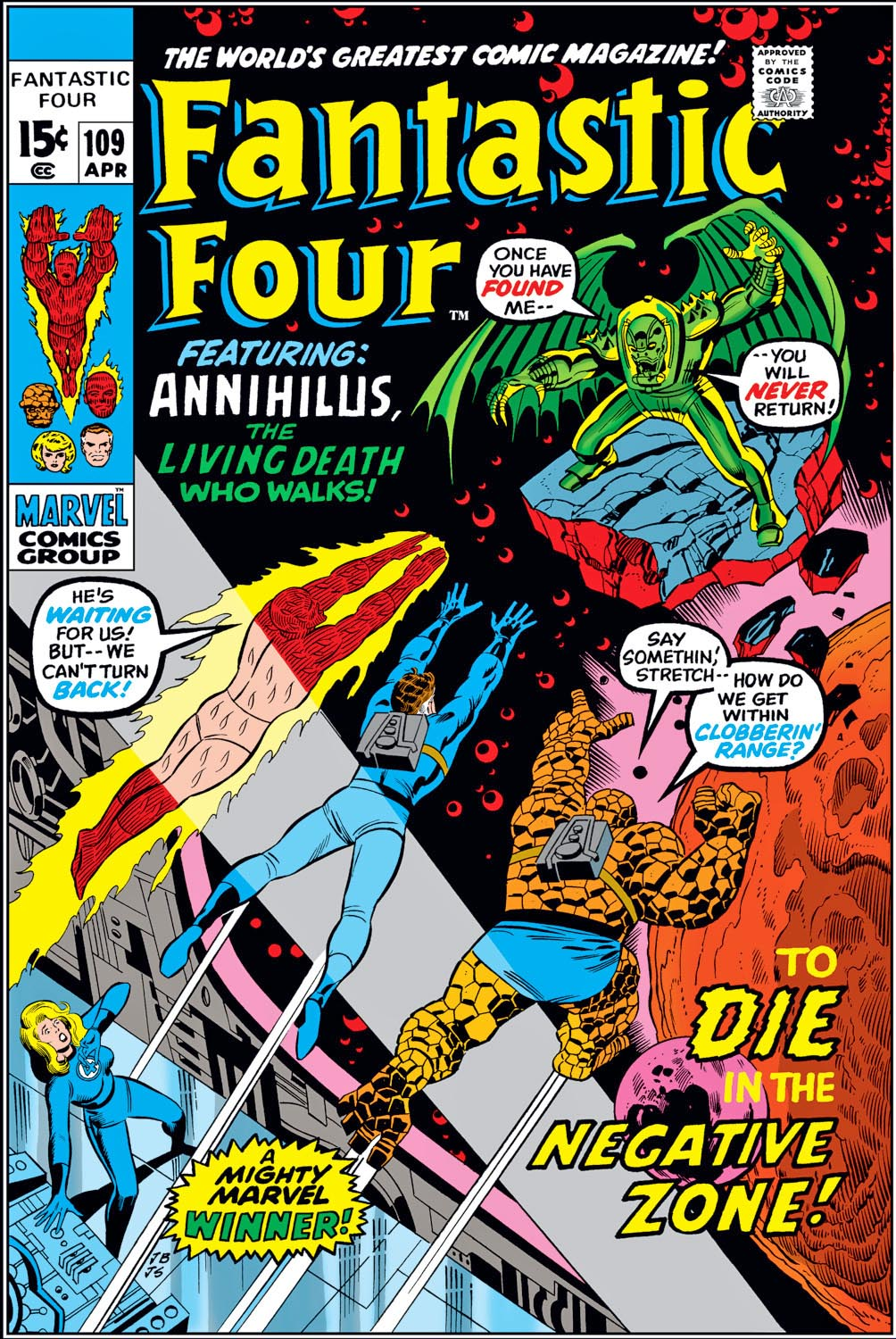
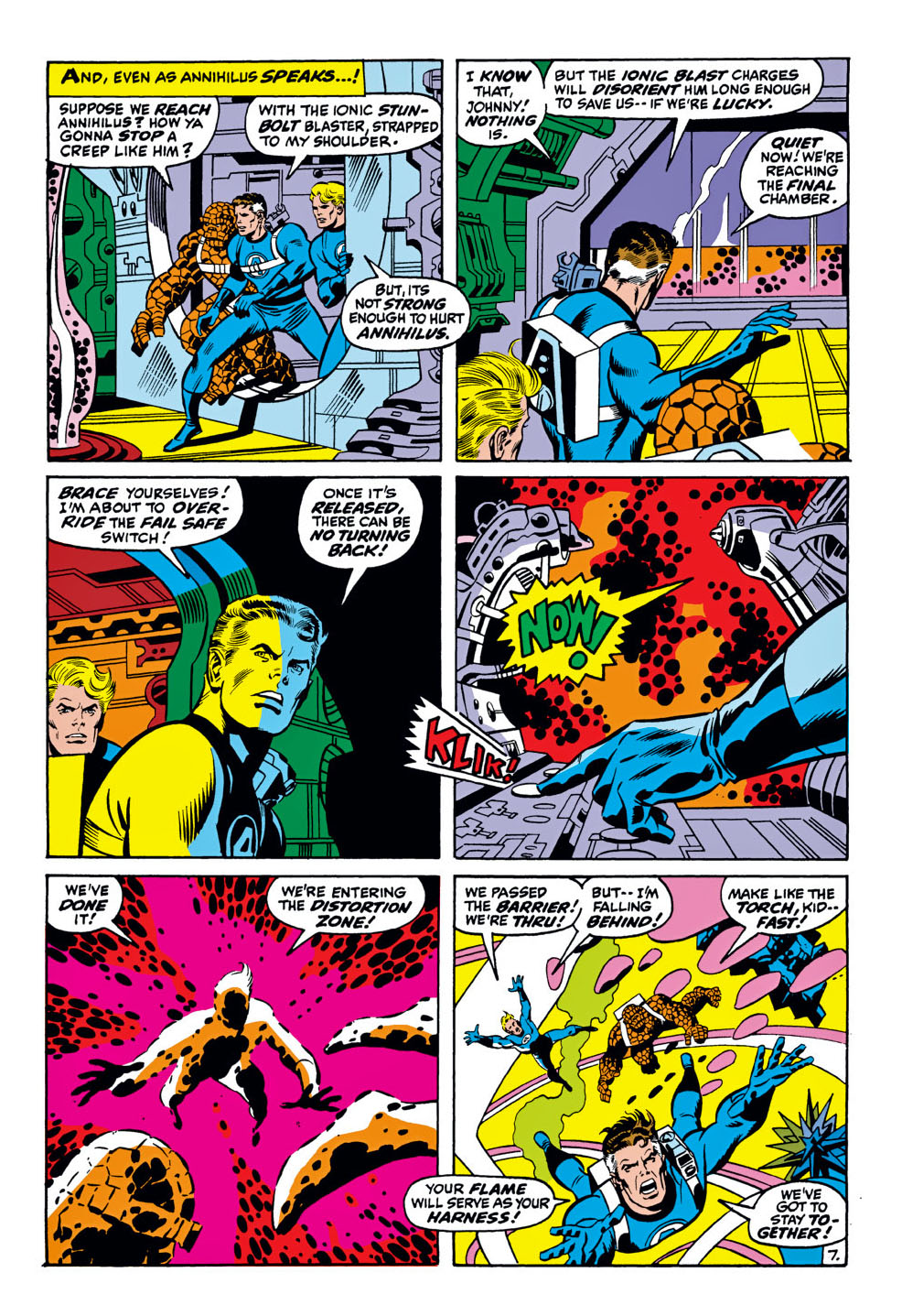
If Jack Kirby built the Marvel Universe by flooring the gas pedal, John Buscema is the artist who proved it could keep moving at speed without flying off the road. This page from The Fantastic Four #109 doesn’t feel like a reset after Kirby—it feels like a smooth handoff. (Especially with the amazing Joe Sinnott continuing on as co-pilot.)
Nearly everything that defines the FF is here: impossible tech, last-second switches, and reality bending under pressure. Kirby detonates ideas; Buscema directs them. The action is clean, the staging is crystal clear, and even as the team tumbles through the “Distortion Zone,” you always know where everyone is—and what’s about to go wrong.
That’s why Buscema was the perfect artist to follow Kirby. He didn’t try to out-Kirby Kirby; he translated the chaos into confident, cinematic storytelling.
Fantastic Four #109 lands squarely in my prime spinner-rack era—back when the future arrived every month for 15 cents a pop. Owning this page feels like closing a long loop—from Wurman’s candy store (Long Beach, NY) back to the original art board, without losing any of the wonder.
In fact, it gains even more.
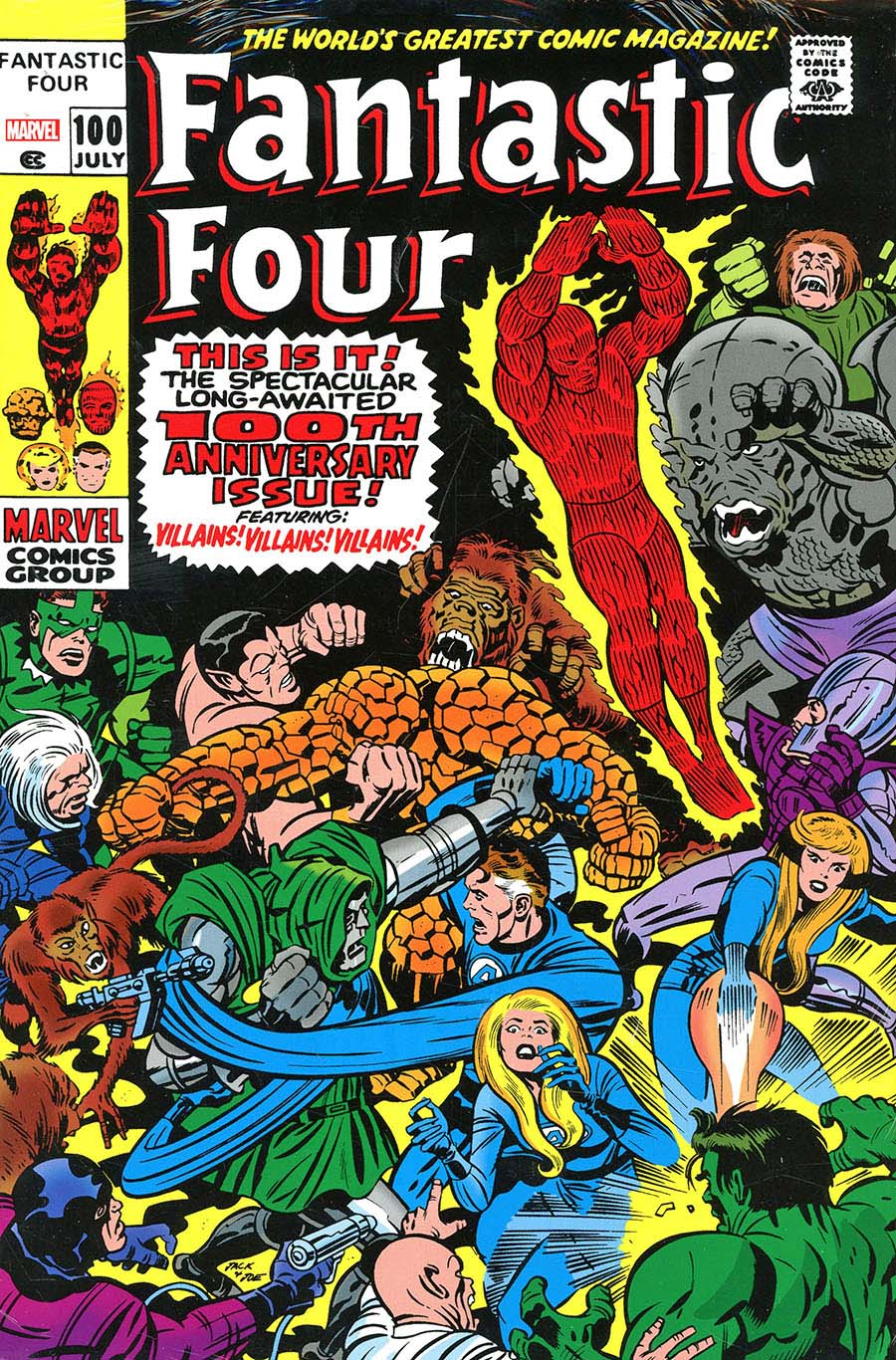
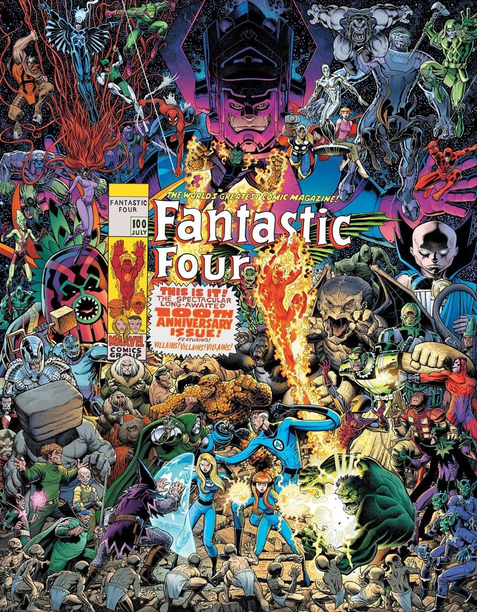
The early Buscema stories (plus some late Kirby and the fill-in Romita stories) can be found in the FF omnibus #4, with either the Kirby #100 cover — or the astonishing homage by Arthur Adams.
Sixty-five years on, The Fantastic Four still feels like Marvel figuring itself out in real time—and getting it spectacularly right. These weren’t heroes born in alleys or back rooms; they were a product of the early ’60s, when the Space Race filled the headlines and the future felt thrilling, reckless, and inevitable. Rockets were launching, limits were being tested, and the question wasn’t should we go farther—it was how fast can we get there. Marvel’s cosmic imagination starts right here, with four people charging into the unknown.
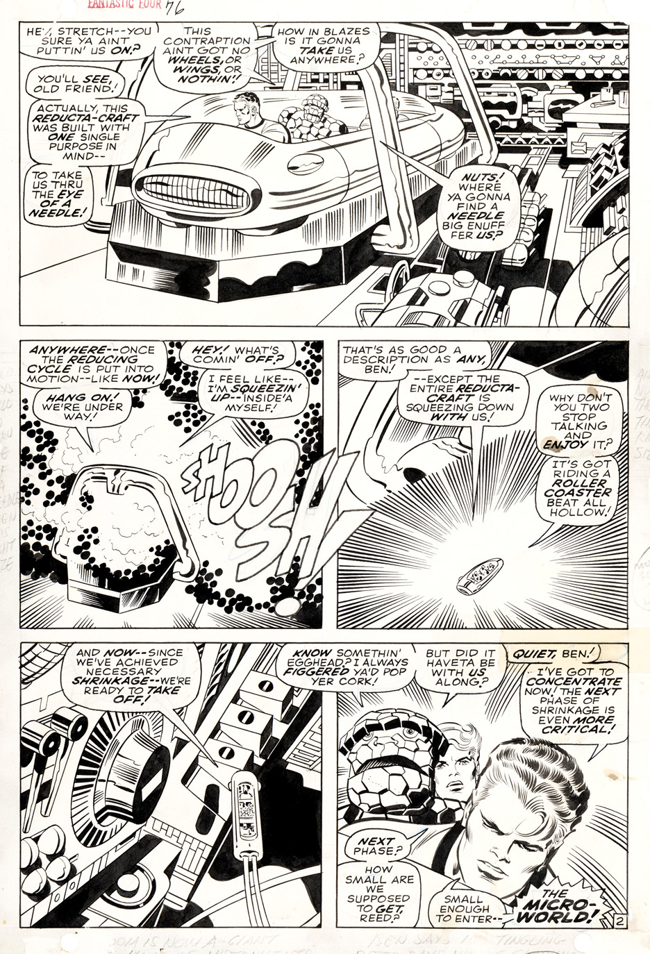
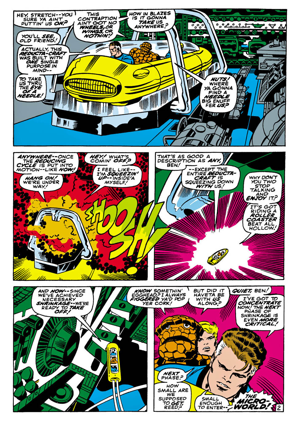
And speaking of charging ahead—just look at this page by Jack Kirby, beautifully locked down by Joe Sinnott. This isn’t just a shrinking sequence; it’s Kirby inventing scale. Machines loom like alien vistas, panels crackle with motion, and your eye doesn’t just read the page—it gets pulled inside it. Sinnott’s inks keep all that chaos crisp, clear, and impossibly confident.
I continue to believe the first 100 issues (and especially the marvelous three-year stretch from about issues #39–76) of The Fantastic Four rank among the most important runs in comic-book history—one long creative hot streak where the ideas redefined pretty much everything that came before.
I’m never going to referee who did what between Kirby and Stan Lee, but one thing is pretty obvious: Lee contributed much of the personality, friction, and soap-opera snap that made the cosmic feel personal. The Fantastic Four bicker, joke, and melt down while rewriting reality—and that mix of big ideas and human irritation became Marvel’s calling card.
Happy 65th to the Fantastic Four: Marvel’s original first family, and a wondrous revolution in comic books.
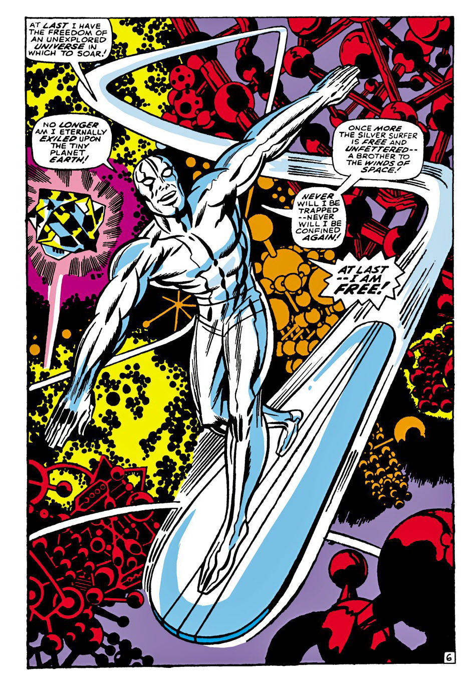
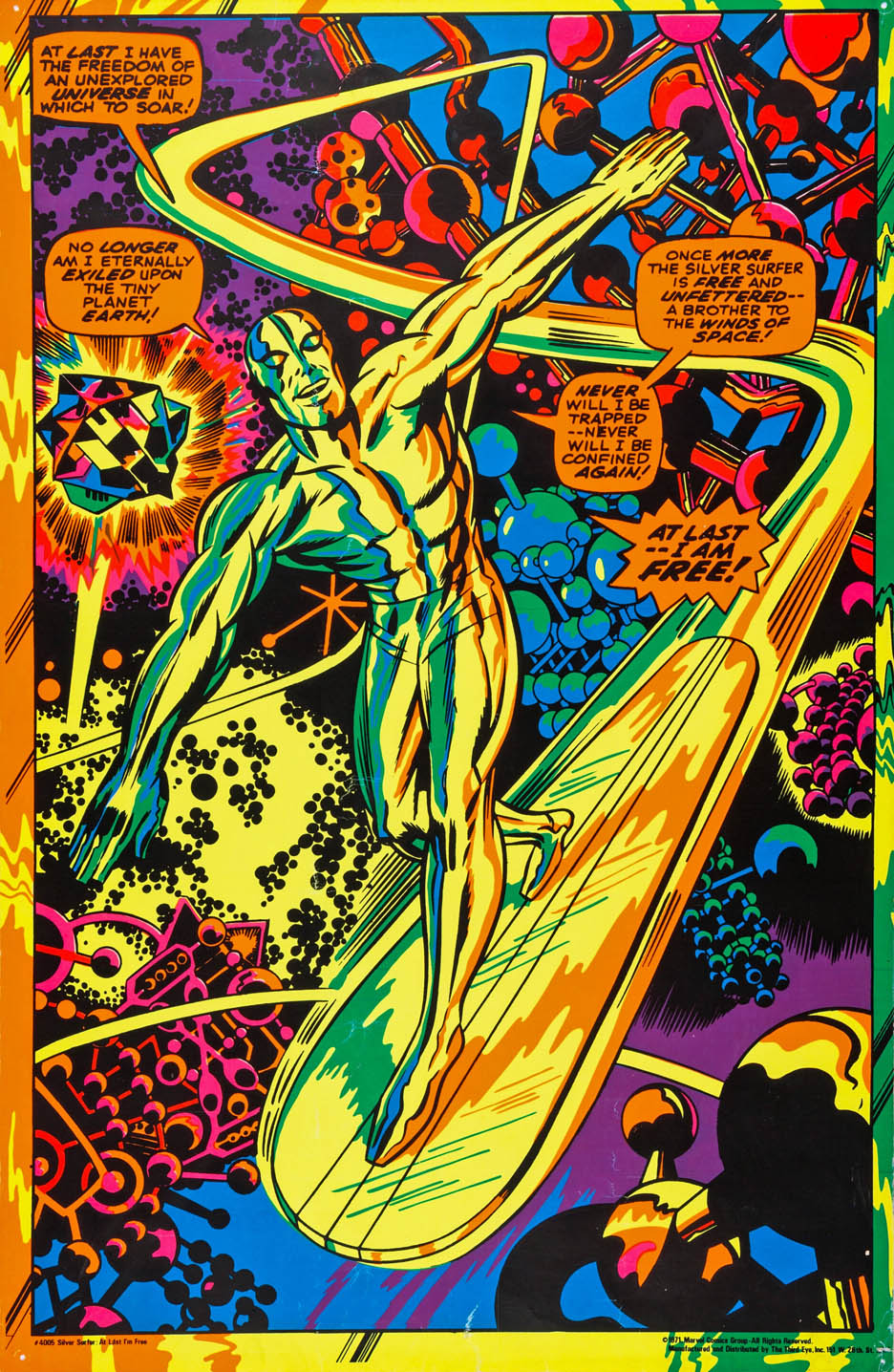
The Silver Surfer splash from this issue is so striking and iconic that it was later selected as one of Marvel’s classic licensed blacklight posters.
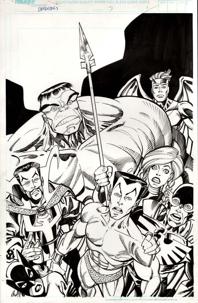
Here’s a fun title page from the great Erik Larsen, inked by the always-amazing Sal Buscema. If you like the Defenders, how can you not love this?
Larsen packs the composition as if he’s cramming an entire issue into a single image—a glorious jumble of big personalities and startled reactions, with a barely contained Hulk dominating the page and everyone else looking like they’ve wandered into the wrong cosmic crisis.
Loud, funny, and bursting with life, this Defenders run—written by Larsen with Kurt Busiek nearly 25 years ago—is pure, entertaining chaos. These heroes are powerful and iconic, sure, but also an endearingly oddball bunch who often seem annoyed to be sharing the same space.
Come for the heroics. Stay for the dysfunctional group dynamics.
Thanks for stopping by in 2025 — see you next year!
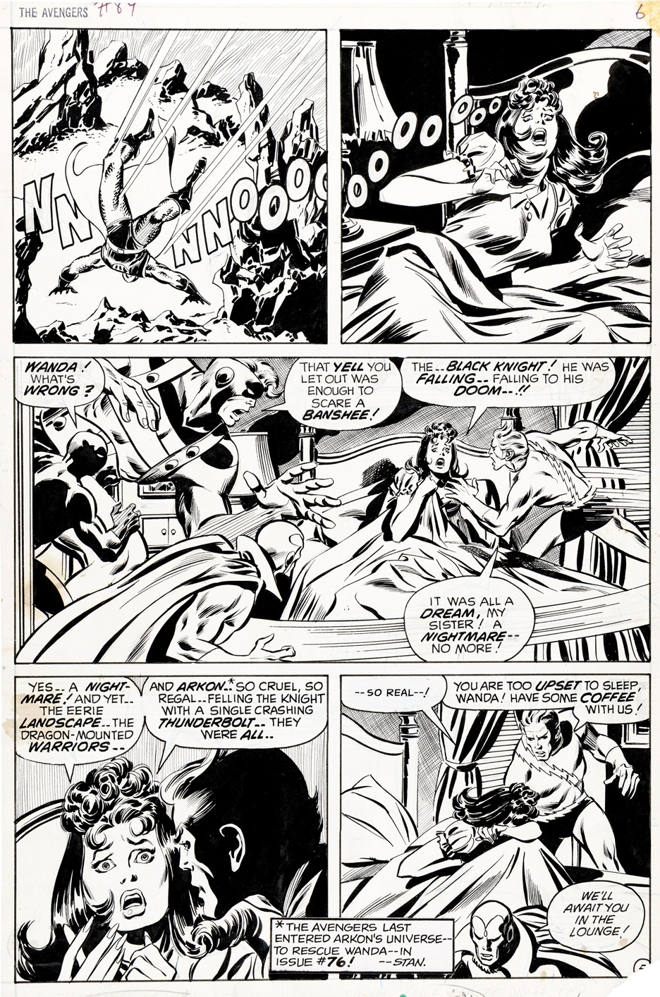
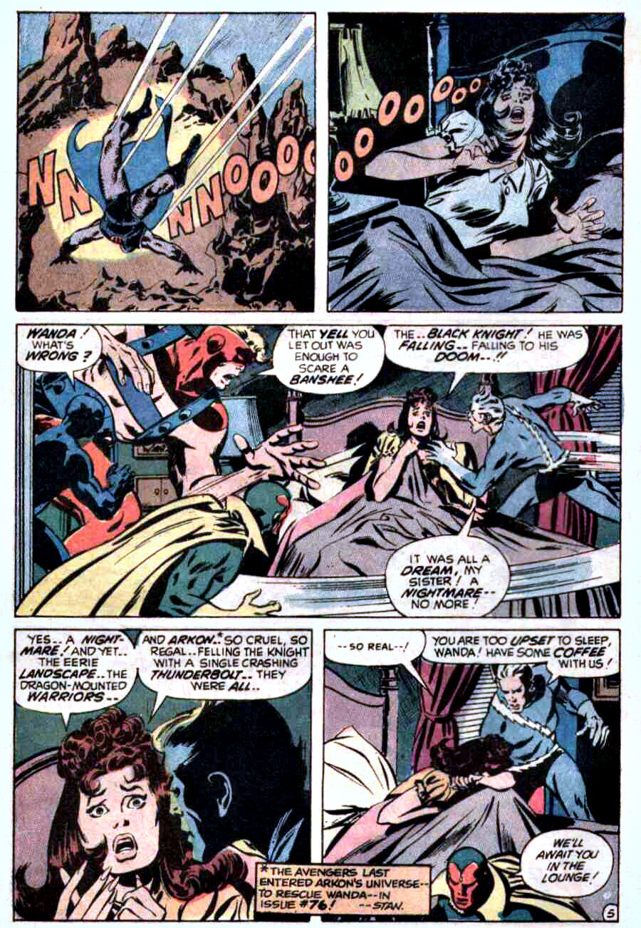
John Buscema was the Avengers artist of the late ’60s and early ’70s—despite famously claiming he didn’t much care for superheroes.
Every panel feels like it could’ve been pulled from a widescreen adventure film, even when the scene is nothing more than a nightmare and a jolting wake-up. That was his magic: Buscema could make anything feel epic.
This page shows exactly how he defined the Avengers in that era. Grace, power, and cinematic clarity are baked into every beat, transforming a bad dream into something memorable—and unmistakably Avengers.
Behind the scenes, Marvel was running hot. Kirby had just left for DC, schedules were tightening, pages were due, and assignments were shifting fast. You can feel a stronger Tom Palmer inking presence here than in some earlier issues, suggesting John may have supplied looser pencils as deadline pressure mounted and the machine kept moving.
Marvel may have been in motion, but Buscema’s vision was locked in.
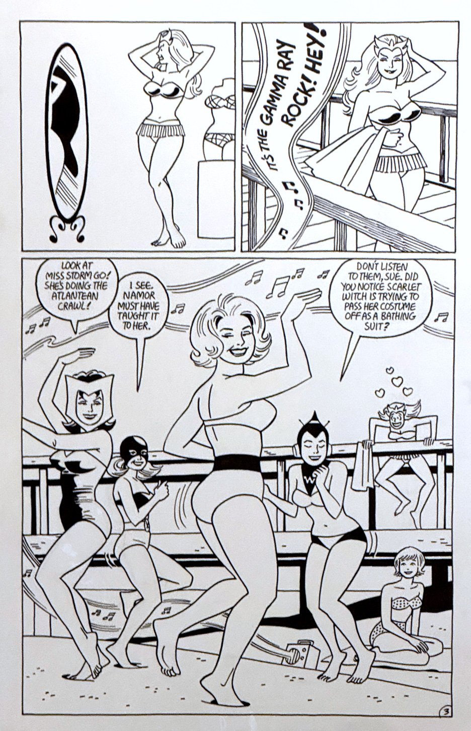
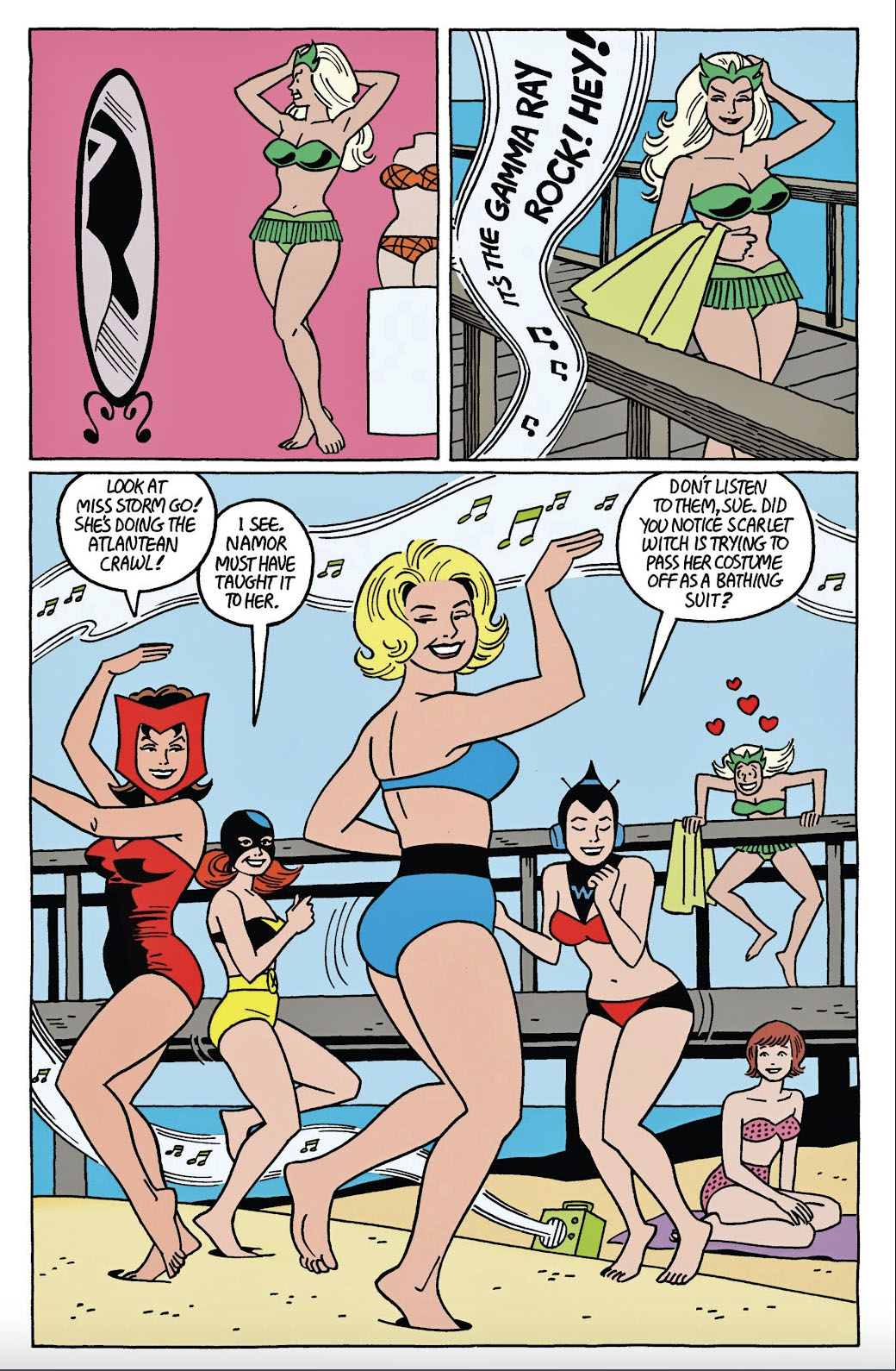
“Love and the Space Phantom,”Strange Tales II #2, January 2011
Jaime Hernandez writing and drawing a light-hearted story with the women of Marvel? In their beach best? How did I miss this one?
Scott Eder broke up the originals to the complete short story back in this past Spring and I happened to see it just as it became available.
All the pages are fun, and the cover (with the goofy supervillains lurking in the background) is naturally terrific —and priced accordingly — but I think I did pretty well with this great one-of-a-kind splash.
Extra dividend: The published story features spot-on coloring by the uber-talented Laura Allred.
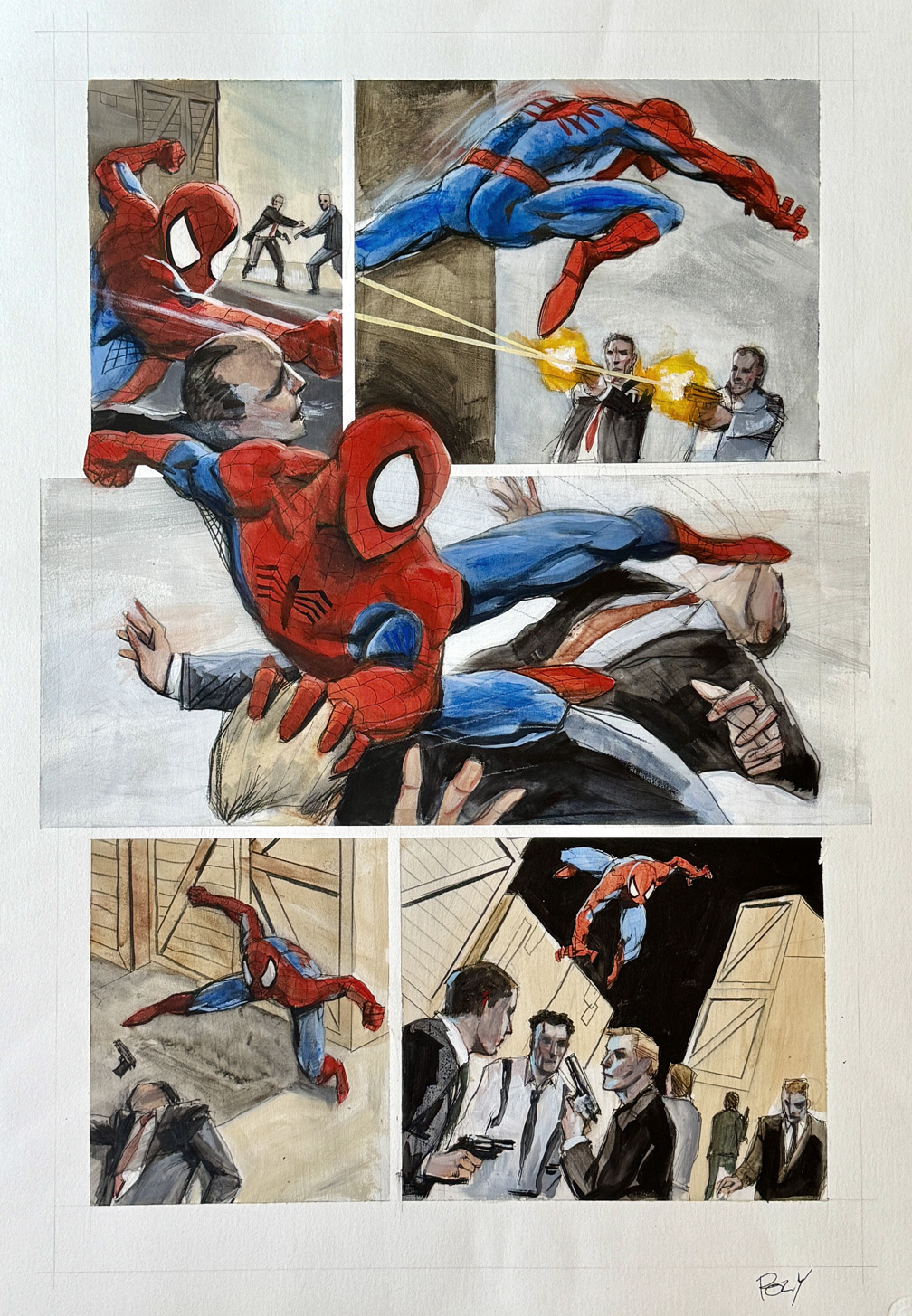
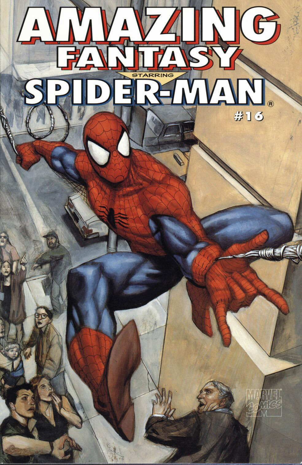
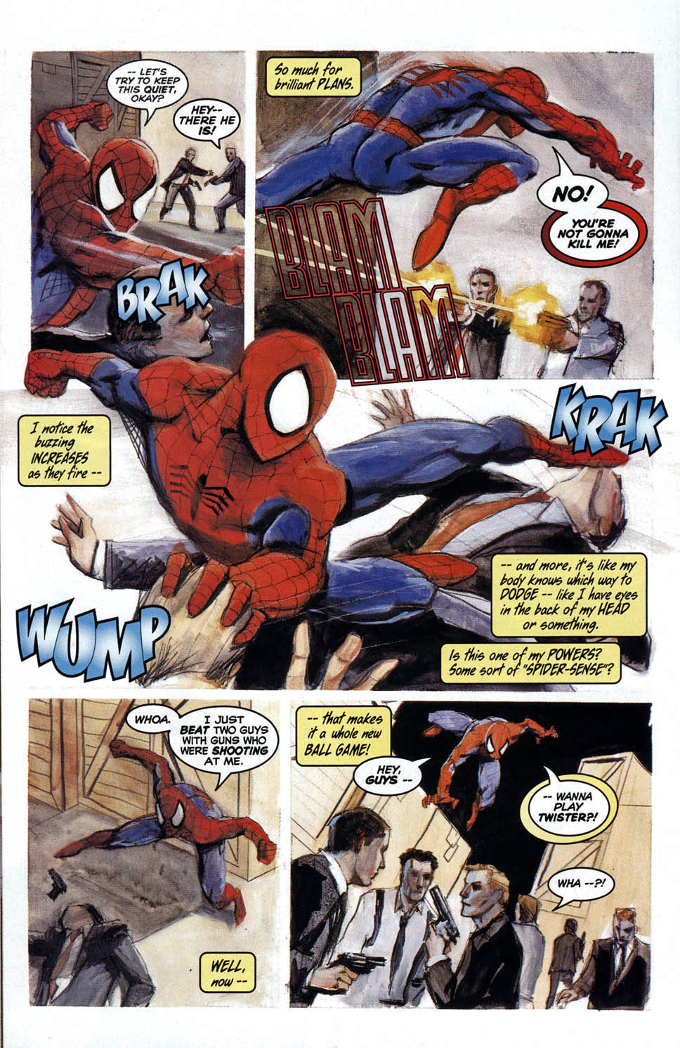
This is the largest printed panel page of Spider-Man art I will likely ever own, and one of the most stylish:
Spidey’s front and center in this big, bold, painted story page, straight from the issue that picked up right where August 1962’s Amazing Fantasy #15 left off — the issue that first introduced us to our favorite wall-crawler. Even though AF #16 didn’t hit shelves until over 30 years after #15, it reflected the spirit of Peter’s early, chaotic days as a new hero, prior to the events of Amazing Spider-Man #1.
Artist Paul Lee brought writer Kurt Busiek’s mini-series to life with gorgeous, fully painted artwork like this page, where Spidey’s flipping and fighting his way through every panel, including (and especially) the amazing — pun intended — mid-page money shot. The page is created in mixed media with a whopping 17″ x 23″ image area on textured Bristol board, measuring 20″ x 29.”
Amazing Fantasy #15 first appeared 63 years ago with an August cover date; This belated sequel is itself now 30 years old.
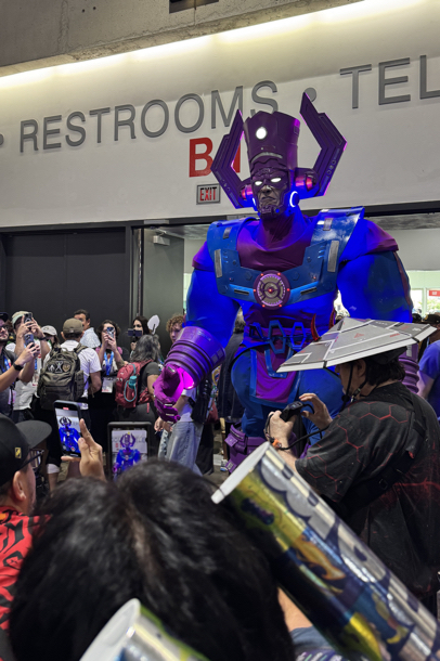
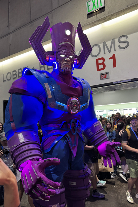
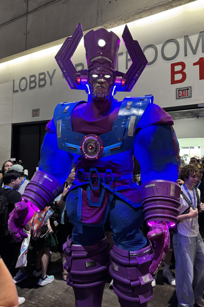
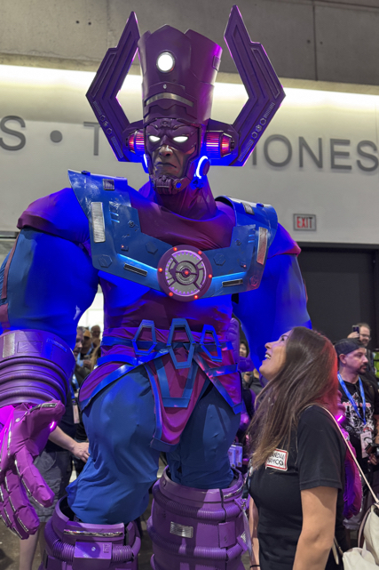
Once again, another San Diego Comic-Con is I the books. I’ll be posting some photos in the next few days, but in the meantime… Here is Galactus entering the main room for the first time on Thursday I believe; 10-12 feet of one of the greatest costume designs and executions I’ve ever seen.