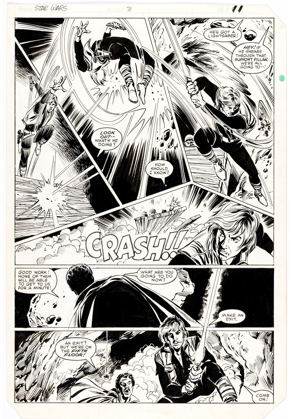
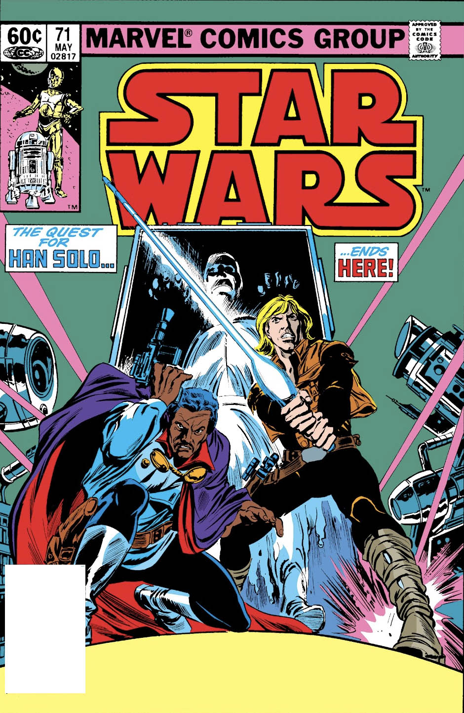
Here is a very dynamic page from a very dynamic art duo (sorry, couldn’t resist) of Ron Frenz and Tom Plamer. Following the terrific run by Walter Simonson and a few fill-in issues from Gene Day, Frenz took over as regular penciller; Palmer stayed on as inker, once again providing a smooth consistency to the art.
As for the story? Don’t let the cover blurb fool you. The quest For Han Solo most definitely did not end here; he wasn’t able to return to Marvel’s Star Wars series until a few months after the release of Return of The Jedi. (Issue #81, to be precise.) And again, Marvel’s creative team did a heckuva job with the little information they had ahead of ROTJ.
Ah, to have been a fly on the wall at a Marvel Comics- Lucasfilm meeting, about 9 months or so before the release of Empire Strikes Back in 1980:
Lucas: “So, guys, let us tell you— the next film is going to end quite dramatically: Han Solo will be in suspended animation, in the ship of a bounty hunter, on his way to the clutches of Jabba The Hutt. Chewie, and a new character, Lando, will appear to be going after them, and Luke, clearly not a Jedi yet, will remain with Leia and the droids in the rebel fleet.
Marvel: “Great, what happens next?”
Lucas: “That’s it, that’s the end of the film. It’s a cliffhanger.”
Marvel: “And we don’t know what transpires until the next film?” Lucas: “Correct.”
Marvel: “For three years?
Lucas: “Also correct.”
Marvel: “Ok. That’s about 36 issues. You’ll give us the broad strokes of how the next film opens so we can create scenarios and plots with the remaining characters accordingly?”
Lucas: “Er, we don’t have all the details yet, but we will figure it out.”
All credit to Louise Simonson, Archie Goodwin, Walter Simonson, David Michelinie and an hefty all-star group of talent for somehow making the challenge work.
And, of course, extracredit to Tom palmer, who, as always, made it visually come together, regardless of who penciled the book: Simonson, Ron Frenz, Gene Day, Kerry Gammill, et al.
Oh, and they recycled an unused Carmine Infantino John Carter of Mars story during this period as well.
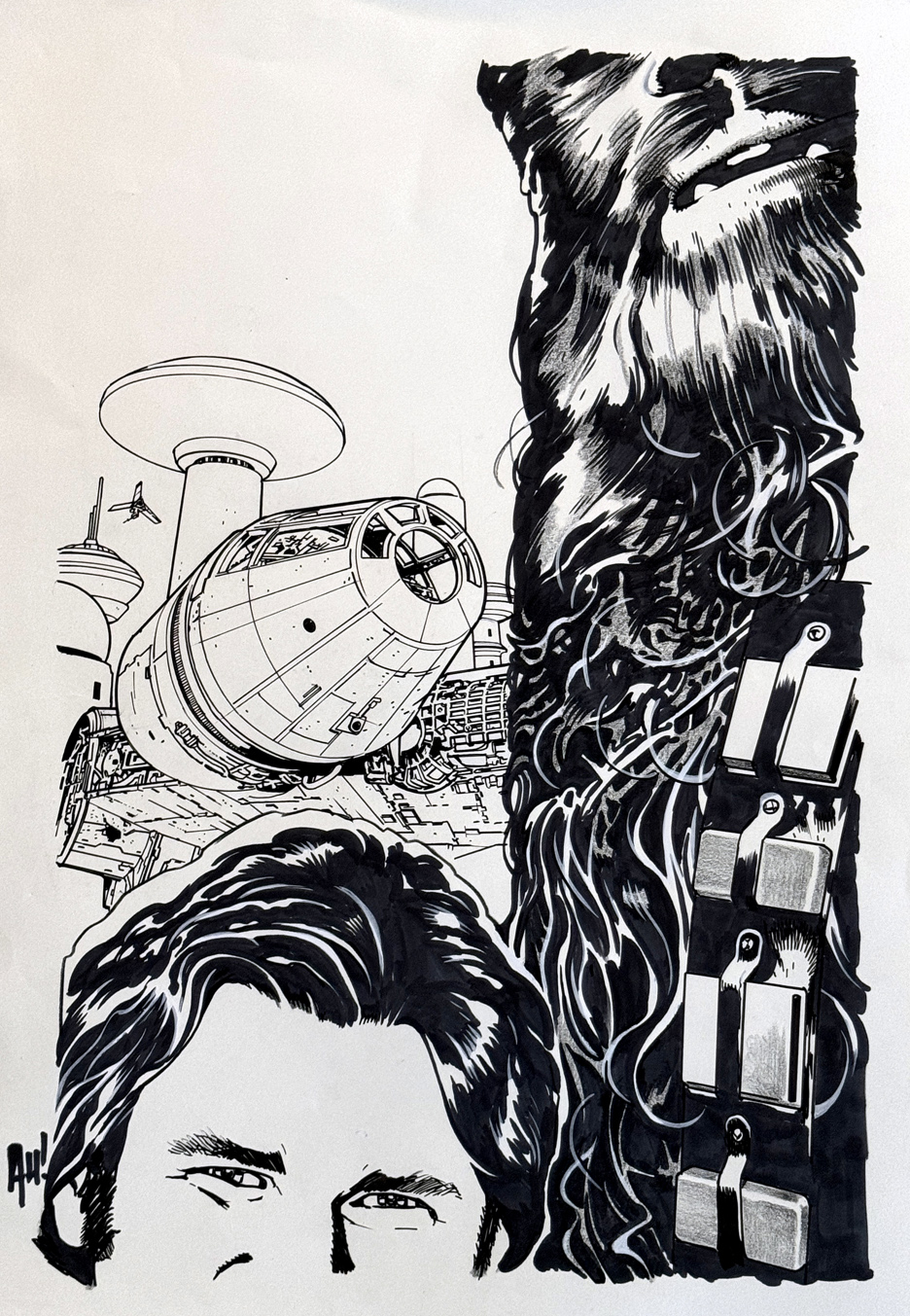
This fun Star Wars cover from Adam Hughes brings a giant smile to my face.
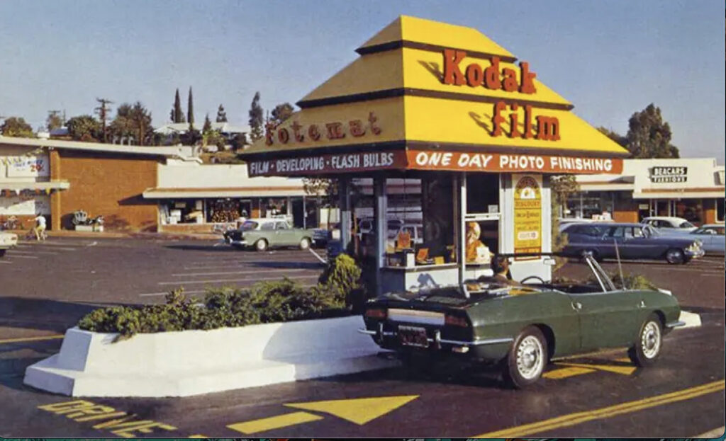
It reminds of the pre-digital age of photos, when we all used film cameras (with some notable exceptions thanks to Polaroid). We took the roll of film into a processor (Fotomat* anyone?) and never knew what we would find in return.
Didn’t quite frame all the subjects the way we planned? Oops, too bad. I had a few of those photos. Probably more than a few.
The focal point of Adam’s composition, of course, is to highlight the Millennium Falcon, something more obvious in the original art. The detail in the ship is just great, as is the clever cropping. (Much of the Falcon’s detail is obscured in the published color version.)
If it weren’t for the tiny ship in background flight, by the way, It looks like Han and Chewie visited Star Wars Galaxy’s edge at Disneyland and couldn’t quite get the selfie right. I think I may have one of those pictures myself.
Happy Star Wars month — more to come, of course. And of course, Happy 45th, Empire Strikes Back, as well.
*Odd fact of the day: Fotomat processing centers peaked in scope in 1980, with 4,000 locations, at about the release time of ESB.
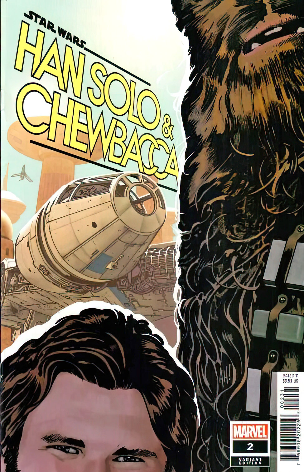
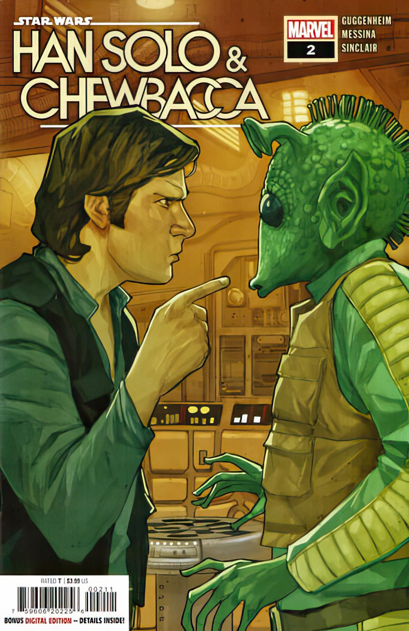
Fun covers all around: The Hughes variant and the “main” cover, courtesy of Phil Noto.
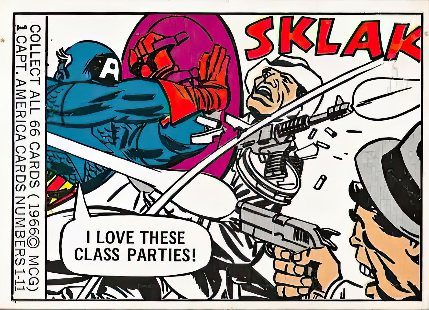
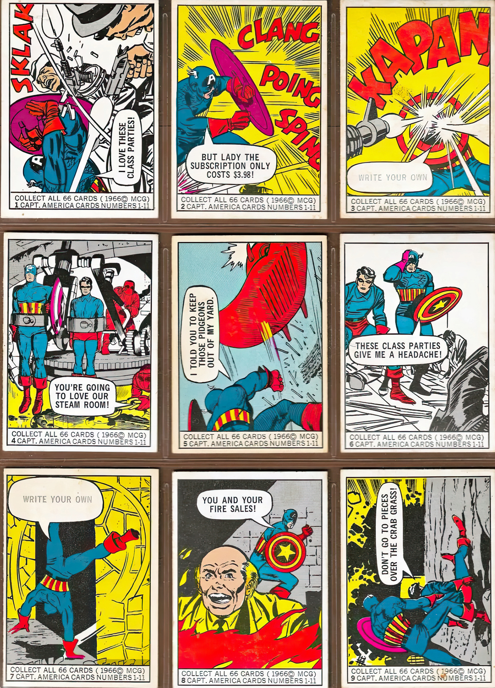
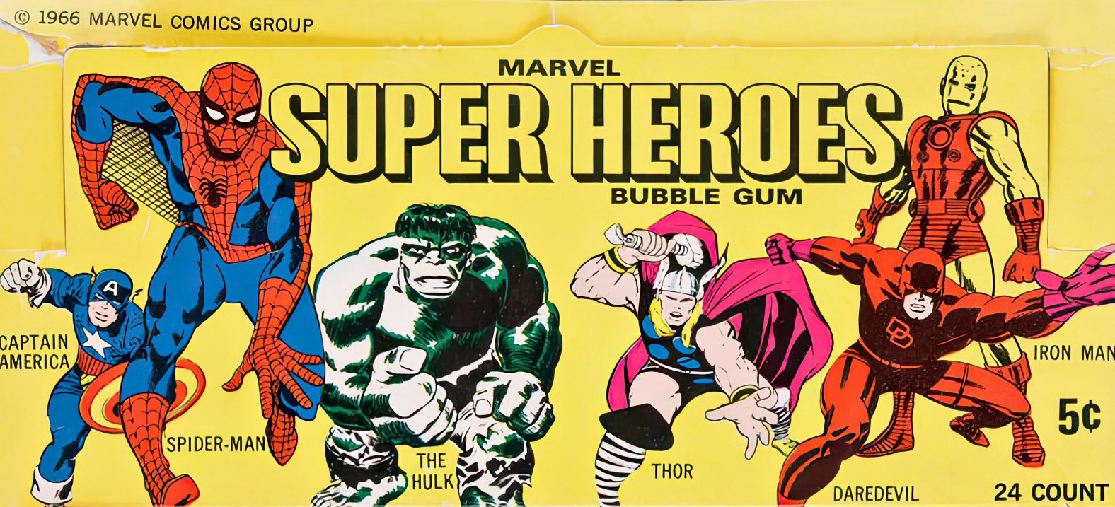
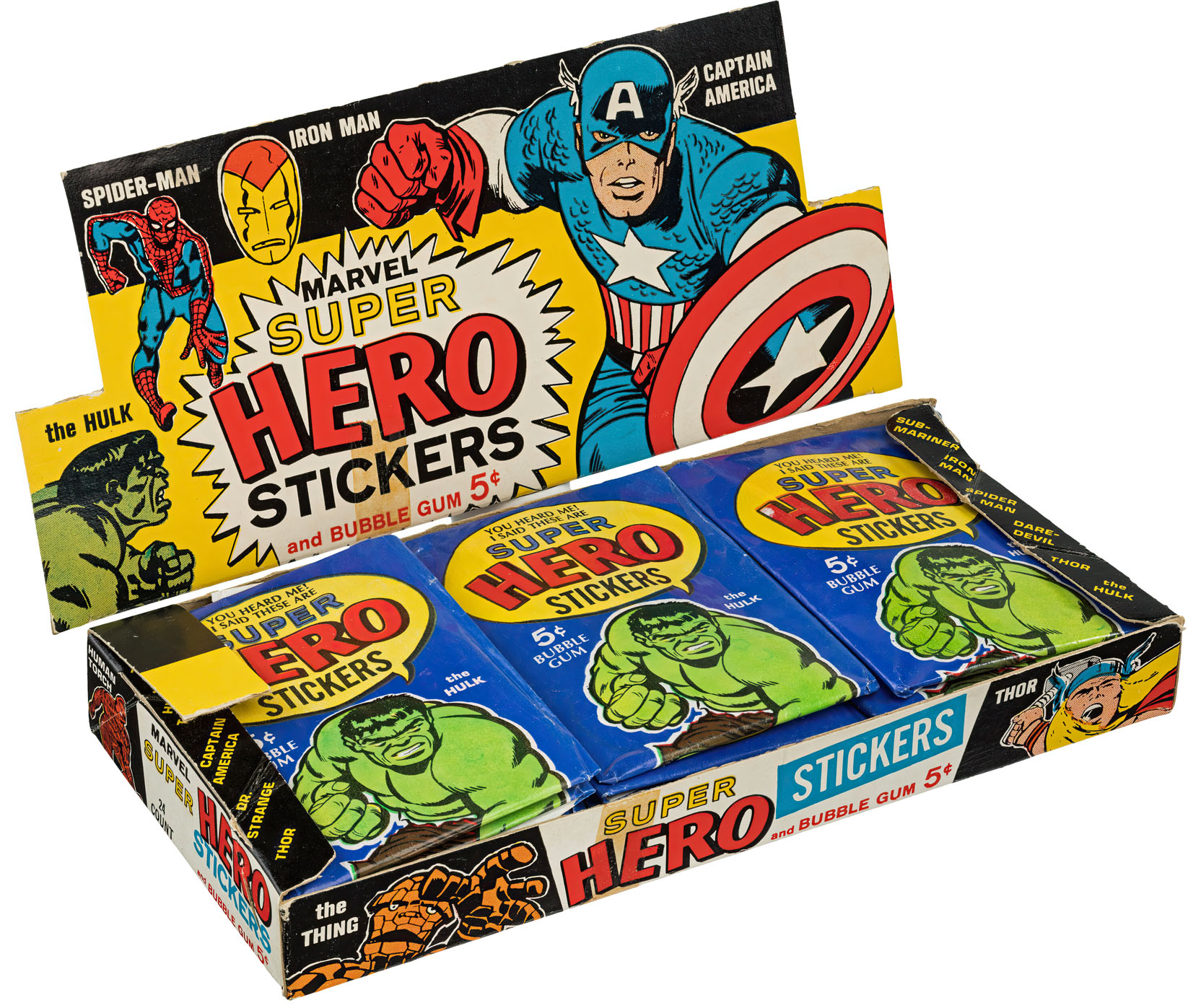
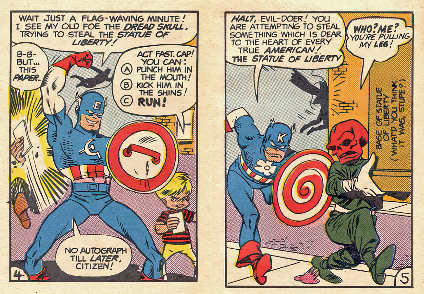
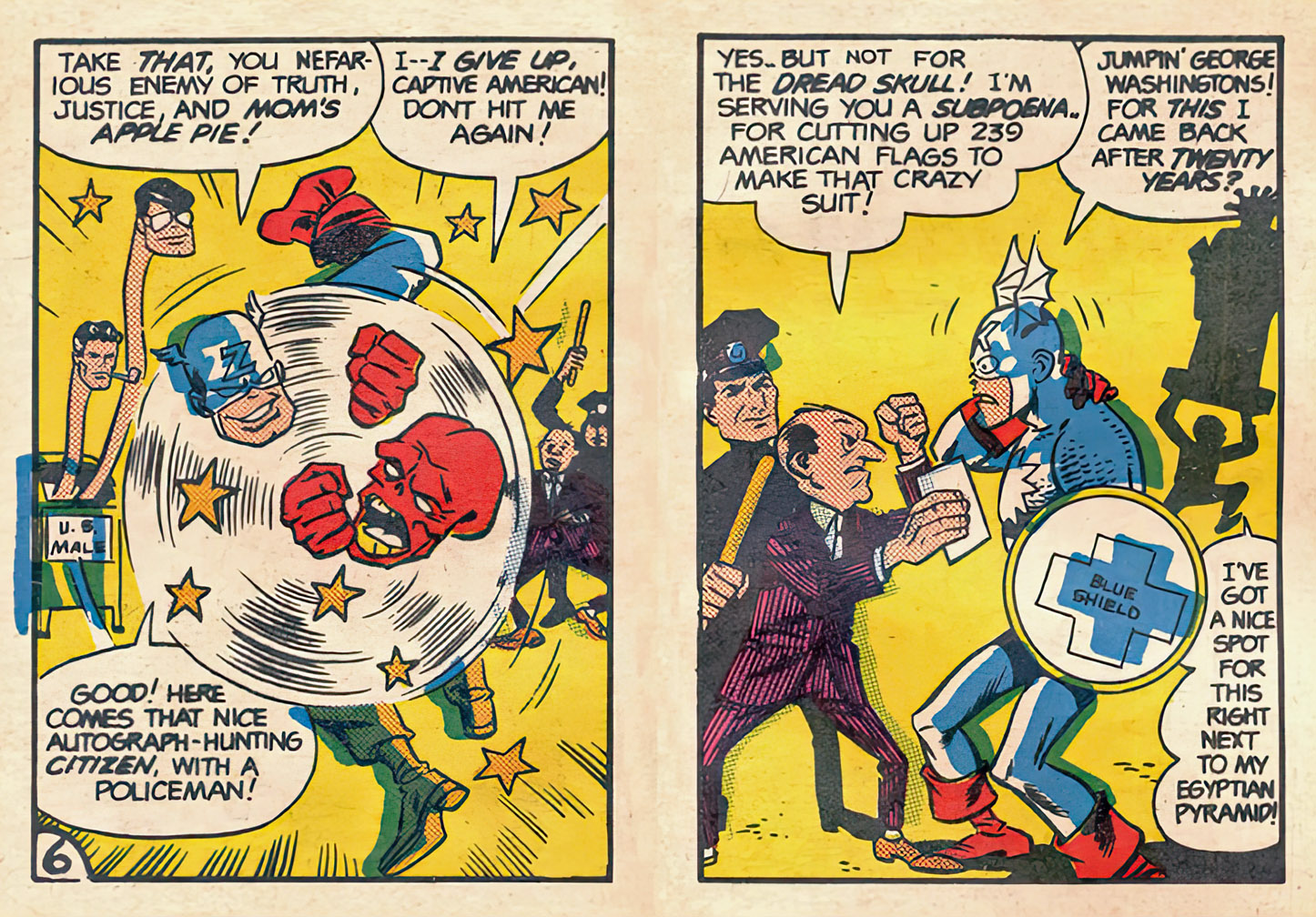
Marvel’s superhero business “blew up” in 1966. A cliché, maybe. But thanks to the Marvel cartoons airing in nationwide syndication that fall, Marvel’s licensing and merchandising business went from pretty much from negligible to ubiquitous, overnight.
I loved those cartoons. I didn’t fully understand that they were pretty much “animating” on the cheap by mostly directly lifting and moving around the actual comic book pages and panels, and at six-years old I didn’t care. (Technically, these cartoons are not much more than primitive motion comics.)
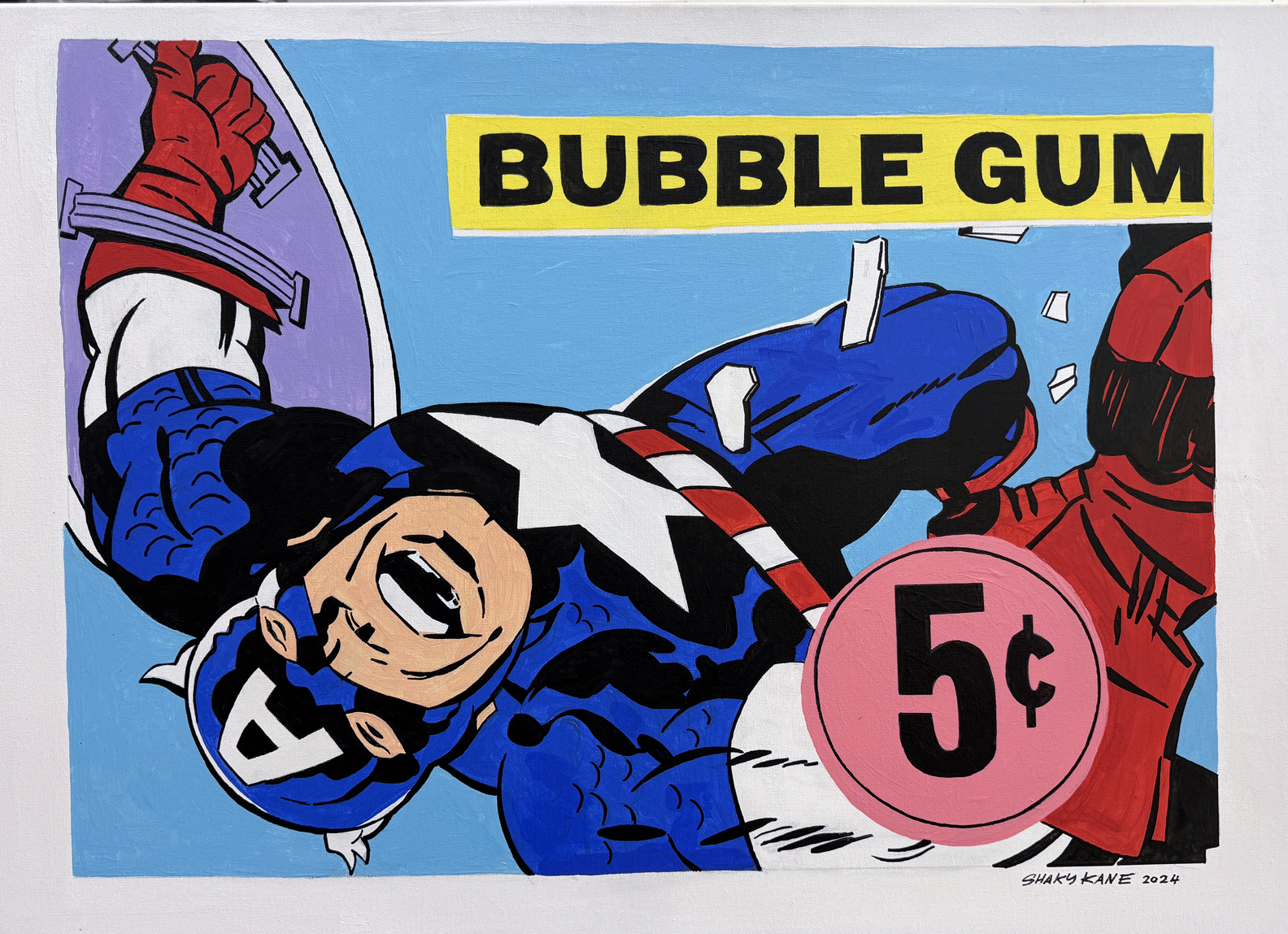
I bought a lot of that merch. The comics of course, were the main thing. But the cards. And the stickers. Dumb gags I admit. But I loved the Jack Kirby, Steve Ditko, et al, art in miniature.
So, when I saw Shaky Kane’s original painted tribute to Marvel “bubblegum” cards at the Jack Kirby art exhibit in LA this past summer, it knocked me out, flooding me with (literally) sweet memories.
Unfortunately, it had already sold. This bummed me out of course, until one of my pals with me that day, the brilliant (and extremely logical) designer Stan Madaloni, said to me:
“Why don’t you reach out to him see if he’ll make another one for you.”
Uh. Duh.
Shaky agreed, and, although I hate to use another cliché, the rest, is in fact, history.
The second one is now fortunately, and gratefully, in my possession.
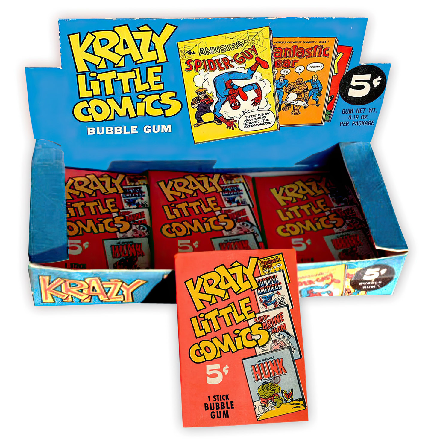
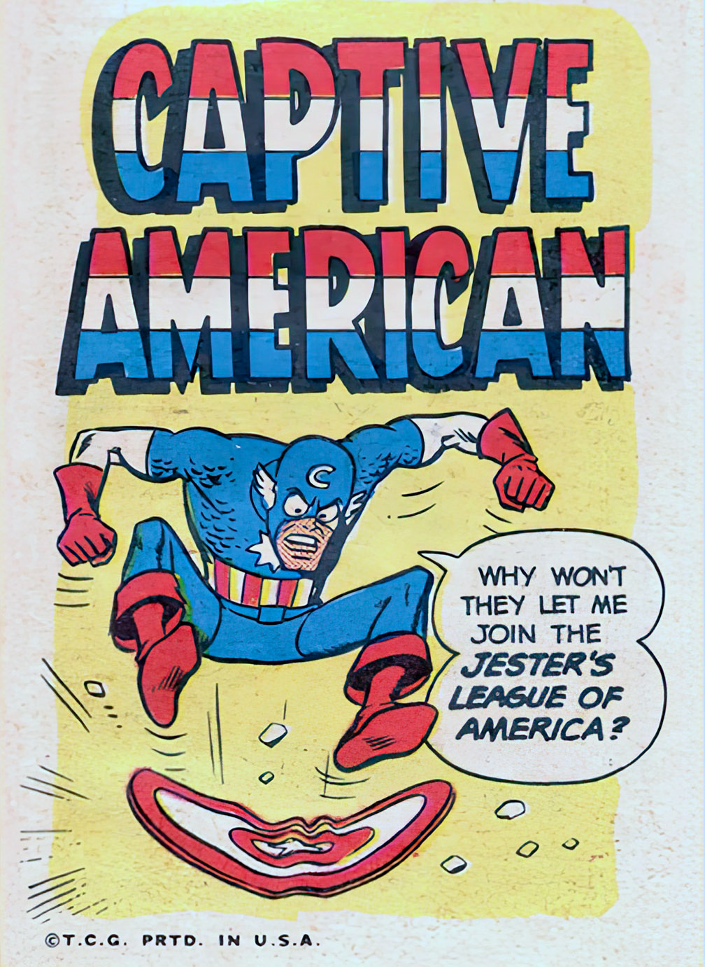
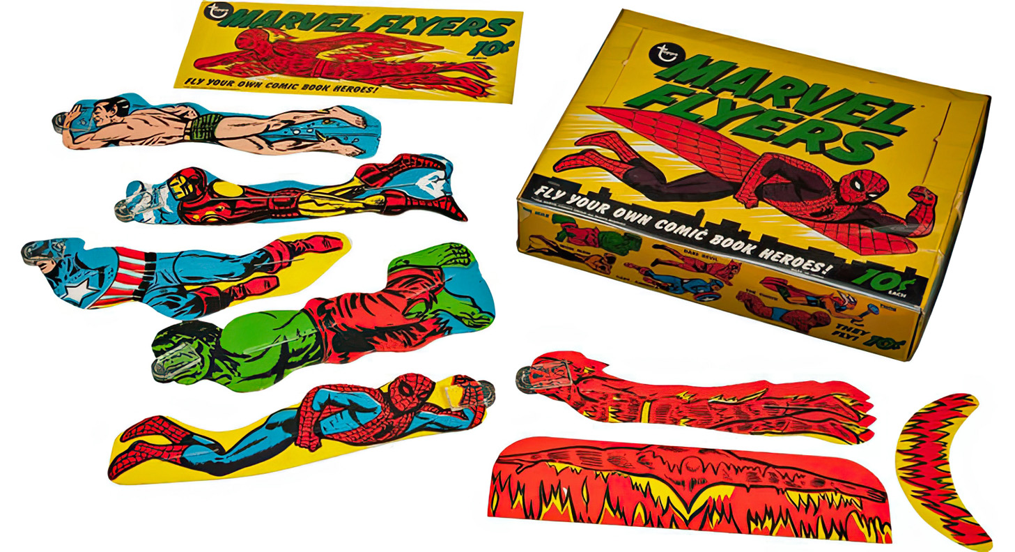
Both Donruss and Philadelphia Gum (“Swell”) beat Topps to the punch in the Marvel business in 1967, with cards and stickers respectively. Topps found a way in with the odd Marvel Flyers collection (designs from Wally Wood’s studio) and the mini-comics satire “Krazy Little Comics”, with art by Wood, Gil Kane and others. (Scripts by Roy Thomas.)
Final thoughts: If I could go back in time and tell seven-year Greg that he would one day work for both Topps AND Marvel, he’d probably tell me I’m nuts and chase me away.
The single greatest compliment I ever heard abut John Severin’s art — and there were many others — came from Jack Kirby, via Mark Evanier:
“Jack used to say that when he had to research some historical costume or weapon for a story, it was just as good to use a John Severin drawing as it was to find a photo of the real thing.”
Severin’s lavish attention to detail caught my eye early. The line-work was so precise and polished. It was amazing stuff, especially considering that those details needed to reproduce on cheap, pulpy newsprint running on industrial web presses.
As a kid, especially remember his pitch-perfect inking on Herb Trimpe’s pencils for The Incredible Hulk. I also loved John’s pairing with sister Marie Severin on some of the earliest issues of Kull. John’s had one weakness was that occasionally his realistic line work could come off as stiff and inking Marie’s more dynamic layouts solved that issue.
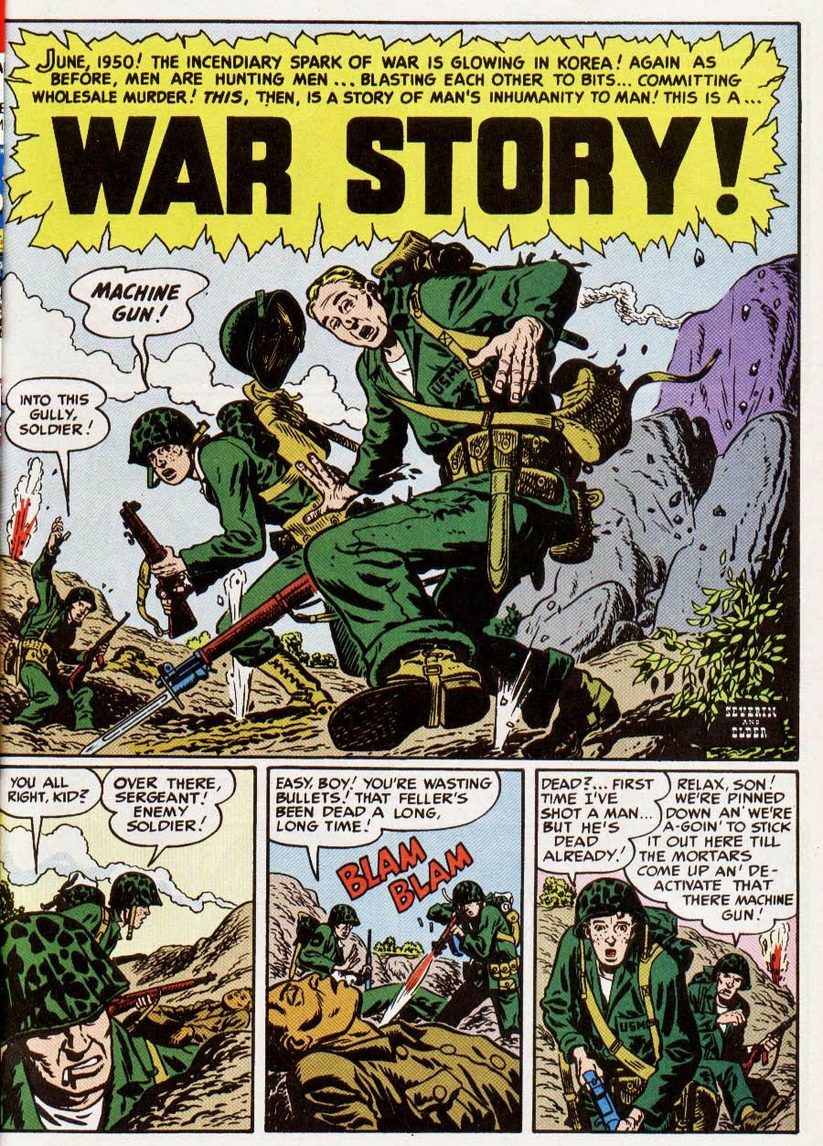
Severin was best known for three non-superhero genres: Westerns, humor, and war. He was a pro at all three, and everything else he touched as well.
As Evanier wrote, “They don’t make ’em like that anymore.”
Indeed they don’t.
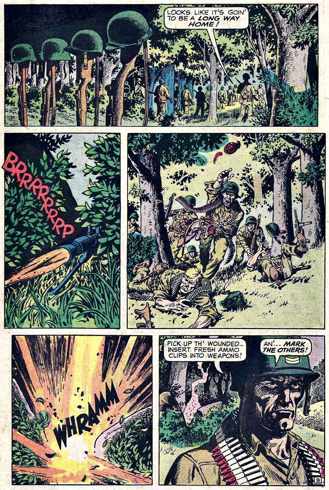
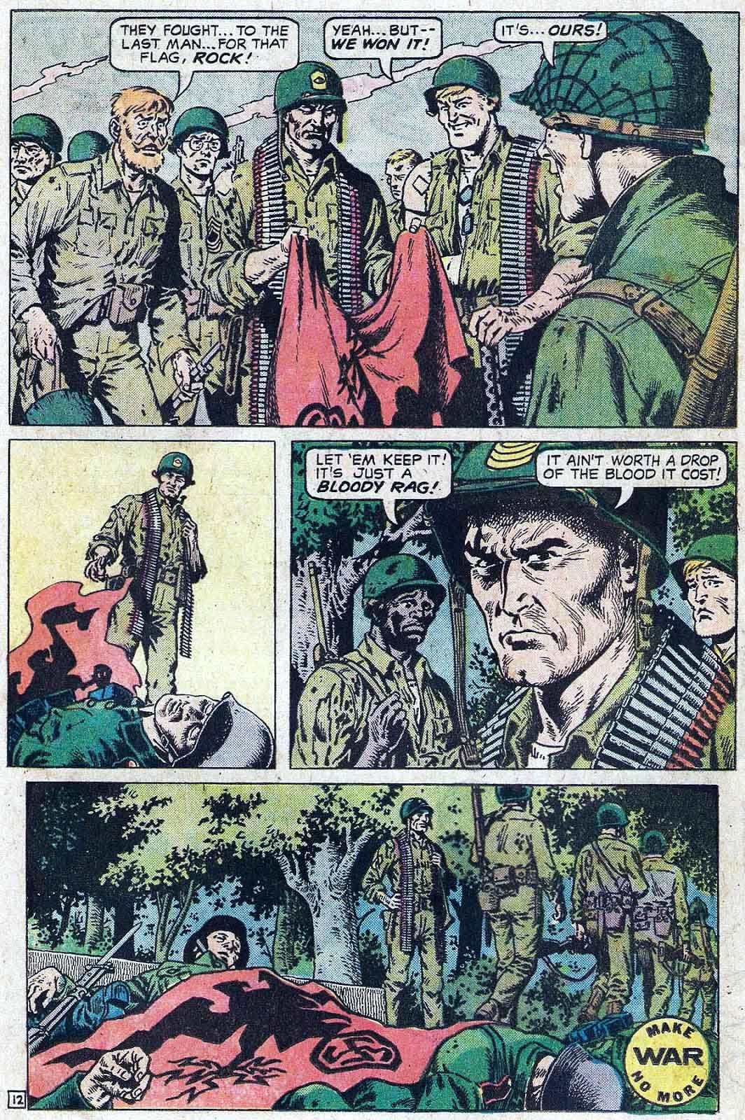
(These two pages, along with others, were especially selected for the exhibit “War No More” at the Words & Pictures Museum in Northampton, Mass. in 1993.)
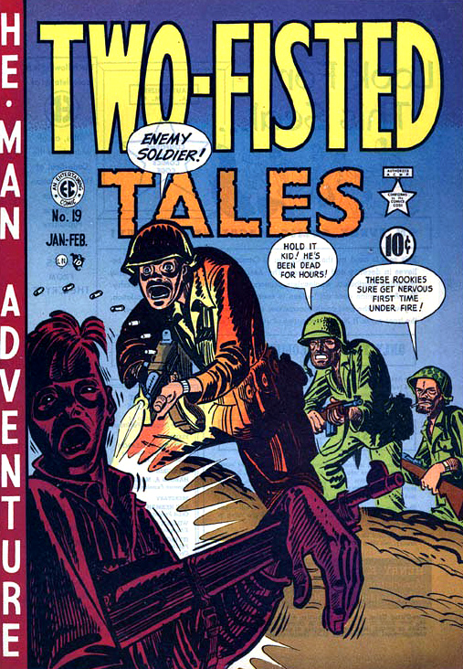
John Severin’s first published war story appeared in EC’s Two Fisted Tales; inks by Will Elder and layouts by Harvey Kurtzman.
Early issues of Kull The Conqueror featured pencils (& colors) by Marie Severin and inks by brother John.
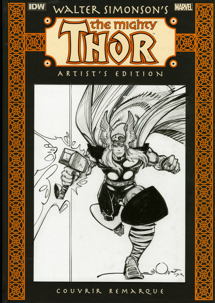
Walter Simonson’s The Mighty Thor: Artist’s Edition HC, Original Art Cover
Editor/Original Art expert Scott Dunbier brought his Artist’s Edition idea to IDW Publishing, and the rest as they say, is history. In 2011, Walter Simonson’s groundbreaking Thor run became the very first of the many Marvel Artist’s Editions in this extraordinary series. (And the second IDW Artist’s Edition overall, following Dave Stevens’ Rocketeer the year prior.)
Scott also had the wild idea to do actual original art covers of these original art reprint books on a super-limited basis, and Walter went along with it. These are not “sketch” covers, but rather very nicely detailed individual pencil and ink full-figure drawings of Thor done on blank cover variants. Walter only did about 10 of these — 15 at the most.
The only drawback — I can’t think of any way to frame it. (It’s also the heaviest piece of original art I own. Artist’s Editions are not light, but that is definitely the textbook definition of a first world problem…)