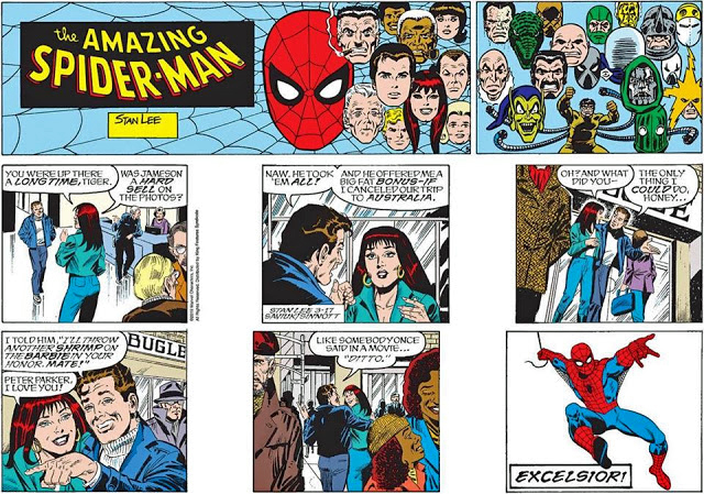
Story: Stan Lee. (With ghostwriting help likely from Roy Thomas.)
It’s an all-star team of creators contributing to this Sunday Spider-Man strip, and signed by everyone.
(Well almost. If I’m correct about Roy, I hope I can get his John Hancock at a convention. Whenever conventions become the norm again, that is.)
Fun Fact: I acquired this Sunday directly from Alex, who was kind enough to Remarque it for me to distinguish from the few others that had all four autographs. A talented artist and a super nice guy.
Nuff said.
(*You can read about Stan Lee and the legend of “Nuff Said” here and here.)
The very final Spider-Man Sunday, concluding a successful 40-year run.
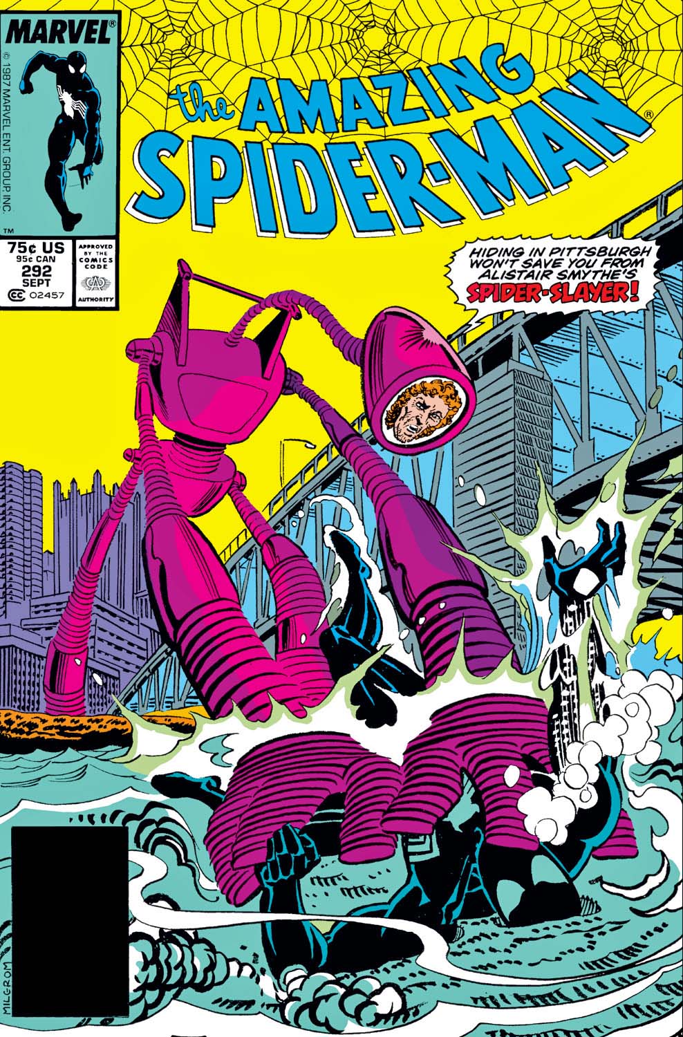
The first volume of the classic Spidey strips features art by John Romita.
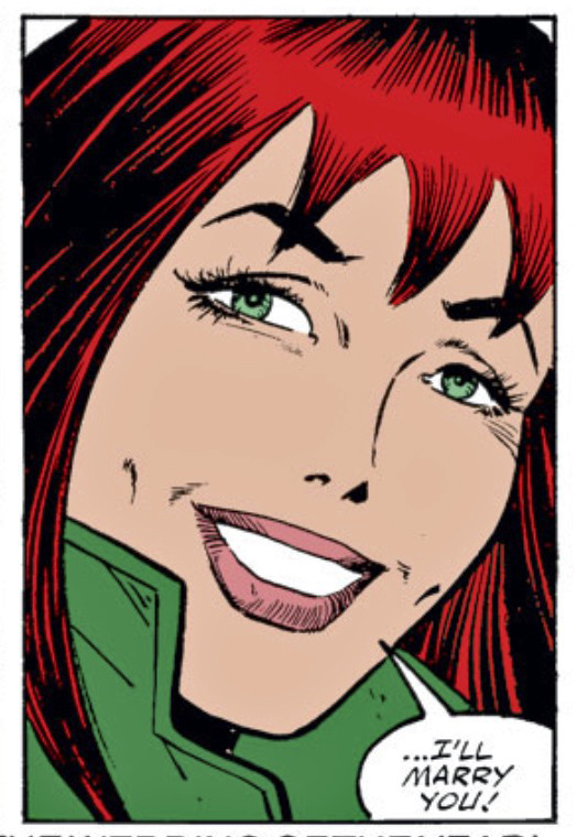
Alex’s very first Spider-Man story featured Mary Jane saying yes to the big question back in 1985.
Continuing our multi-part tribute to the 60thanniversary of the Fantastic Four — and the “Marvel Age of Comics.”
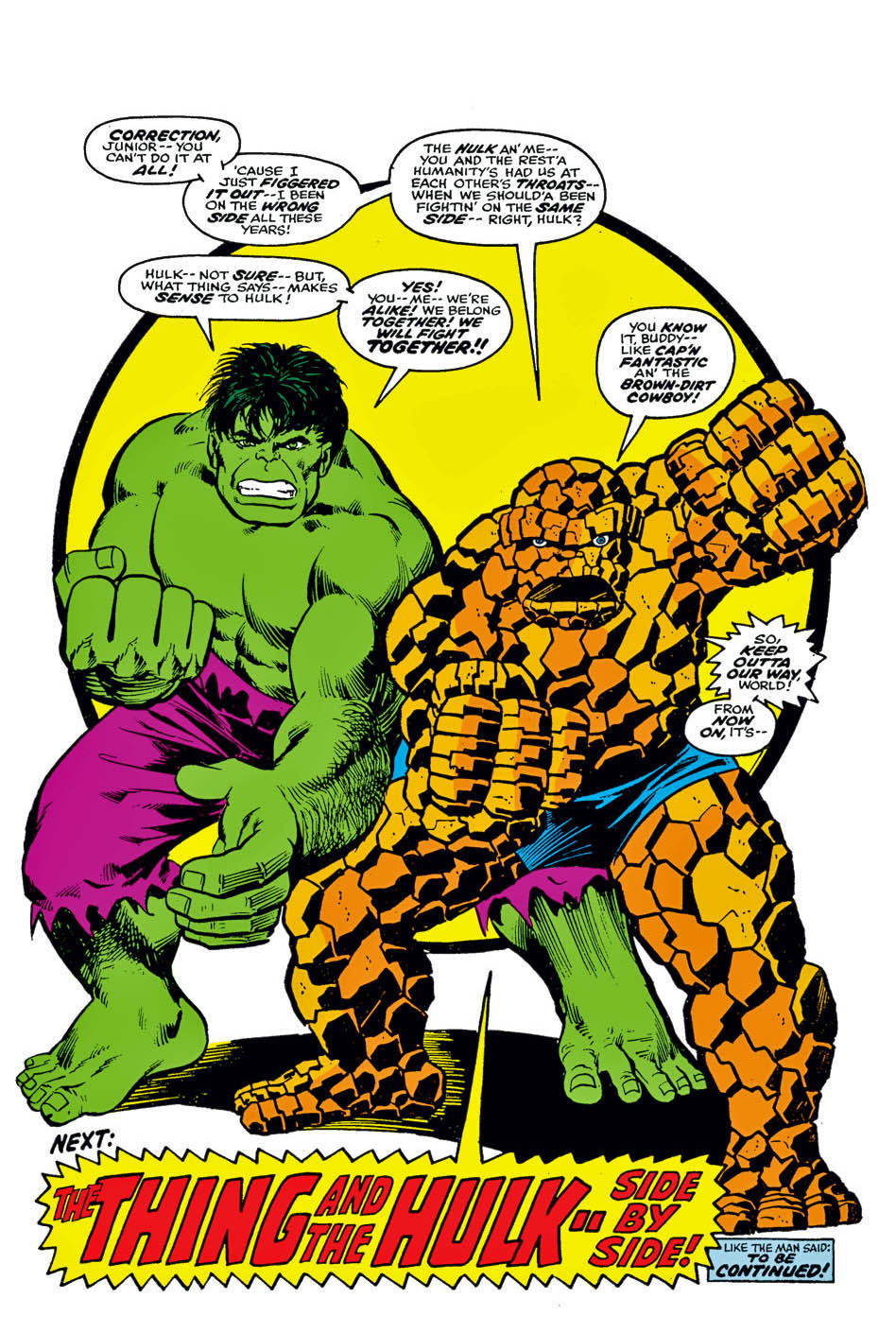
Hulk vs. Thing? Think about it. The Thing can give the Hulk a run for his money, I suppose, but in the end Hulk wins. No contest, really.
The “shock ending” here is that after quite a few matches during the years, The Thing takes pity on Hulk and joins forces with him to fight the army and the Fantastic Four (or more accurately, three), and anyone else who might be persecuting the Hulk at that moment.
George Perez, aided by the amazing Joe Sinnott, delivers a great looking action page featuring both characters. Pages from this issue rarely turn up and I’m fortunate that I found one. This is one of my favorite issues from the late bronze era, and it doesn’t hurt that it features a terrific cover by Jack Kirby, one of his earliest from his “return” to Marvel a few months prior.
That said, about the scale accuracy of the Gateway Arch Monument (St. Louis) vs. the occupants as depicted here? The less said, the better.
The Thing vs. The Hulk, becomes the Thing AND The Hulk — vs. everyone — at the end of FF #166.
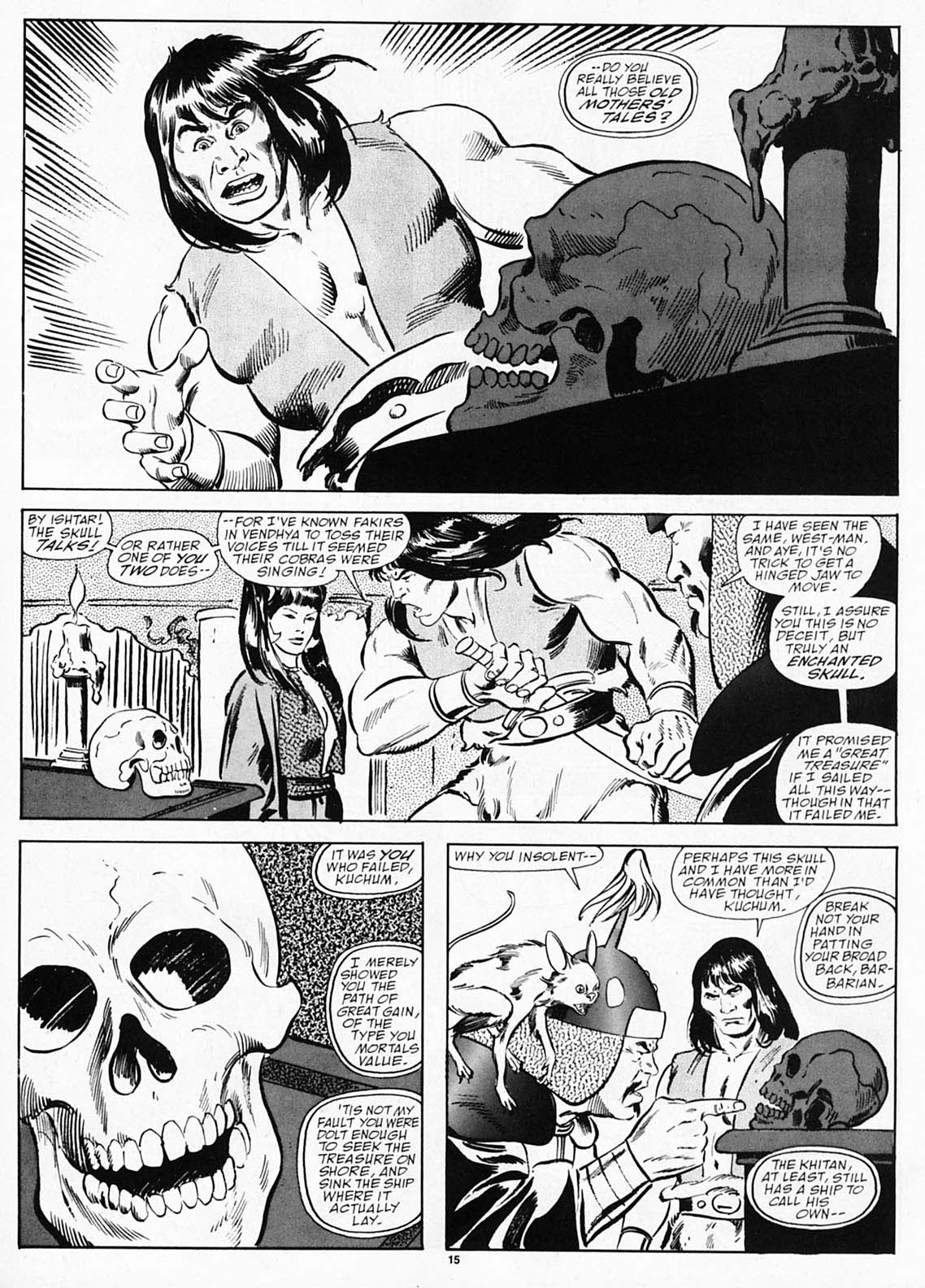
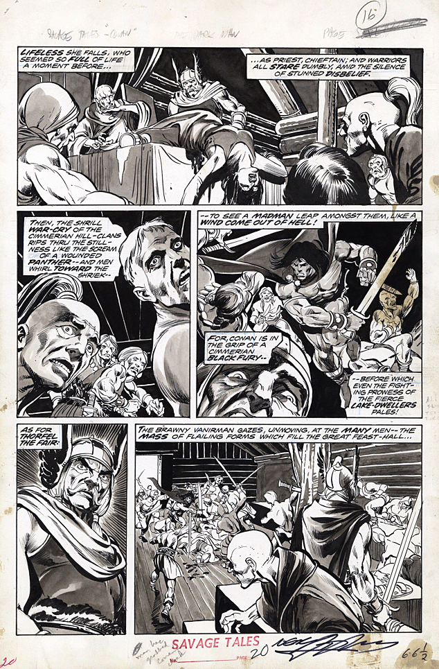
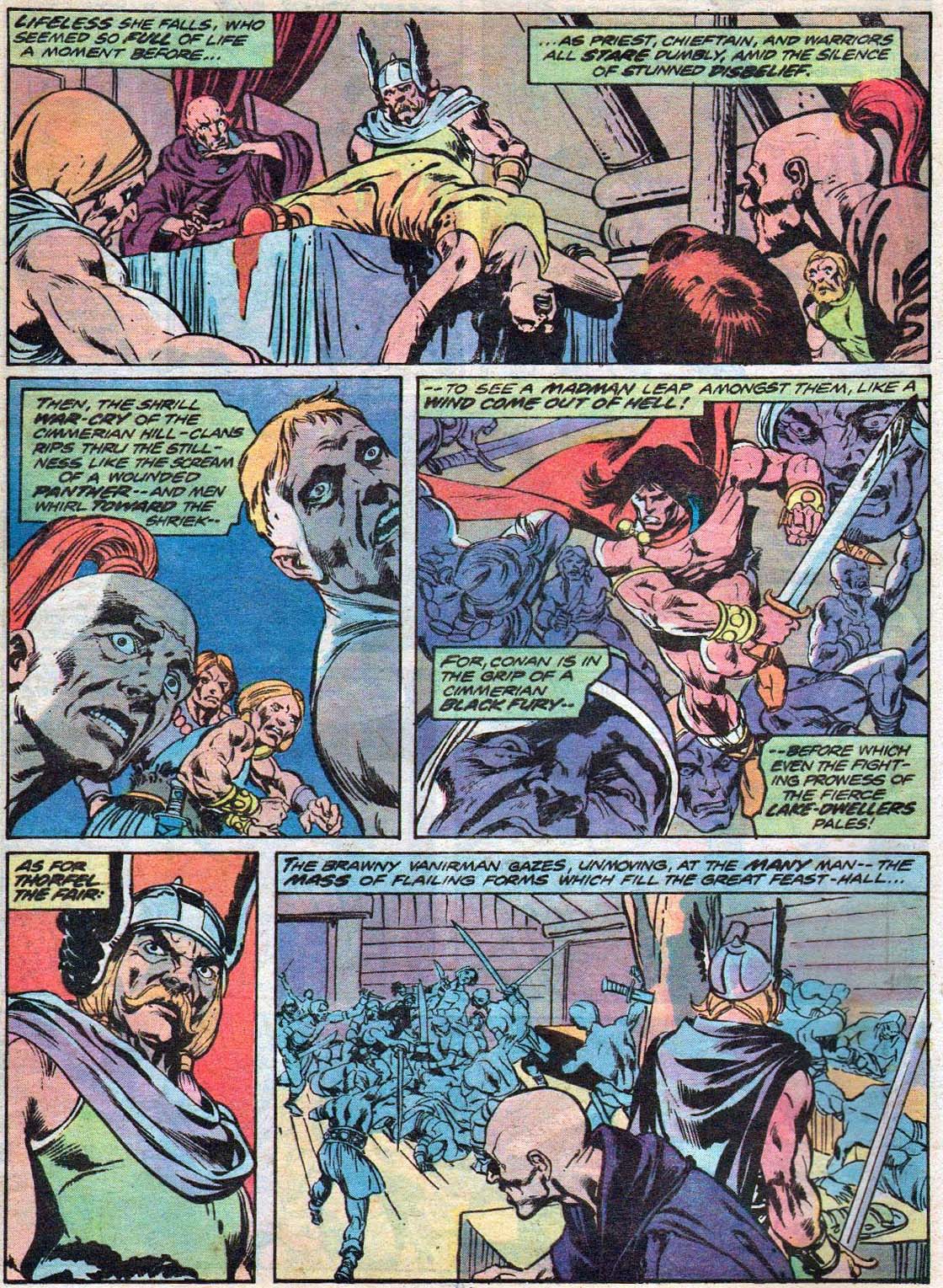
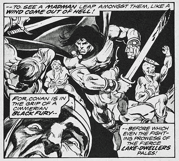
Roy Thomas returns to Conan for the first time in 10 years, and partners with superstar artist John Buscema, pretty much picking up where the pair left off in terms of innovative and exciting Conan stories.
In addition to astonishing talent, Buscema could be very productive in terms of his total output — in this stretch of Conan he is providing layouts and rough pencils only, freeing him up for other projects. Here Tony DeZuniga provides some nice finishing touches for John. (I think here you can see John’s obvious handiwork, which was not always the case with DeZuniga inks.)
Lots of ink — as it were — has been spilled on who was Buscema’s best embellisher on Conan. See here, here, and here for illustrative discussions.
My opinions have varied over time, and sometimes from issue to issue. The debate itself is fun.
And the talking skull? Spoiler alert: It belongs to King Kull’s arch nemesis Thulsa Doom. (In fairness, Thulsa eventually gives Conan much grief as well.)
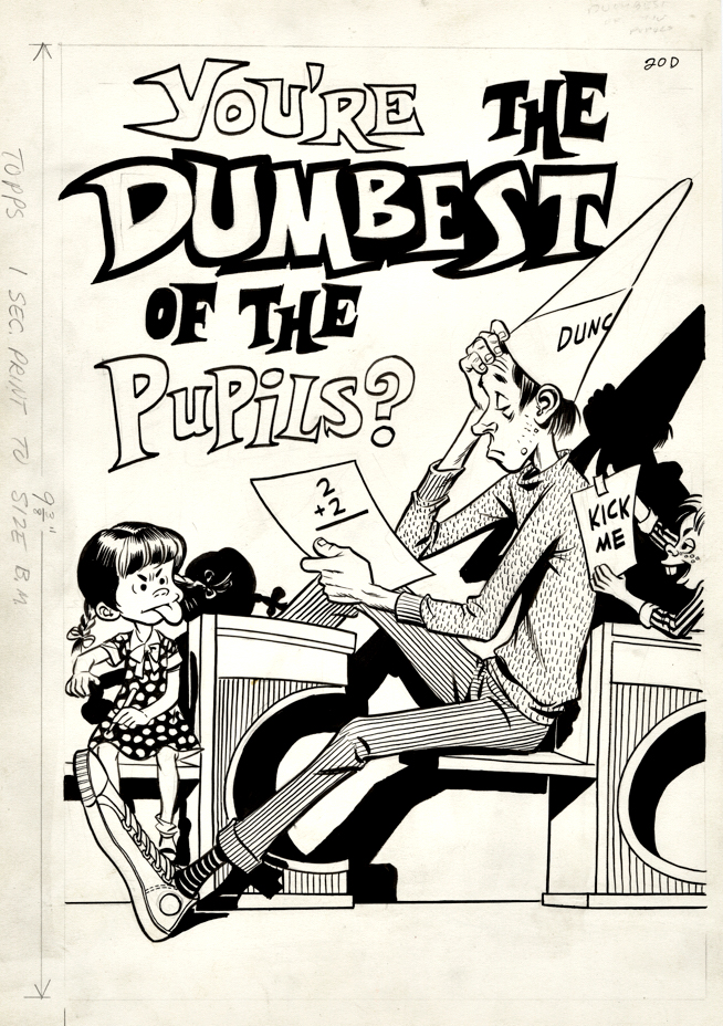
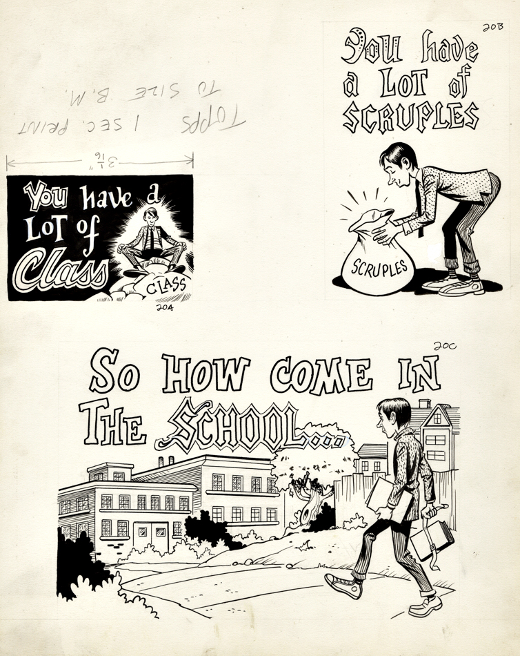
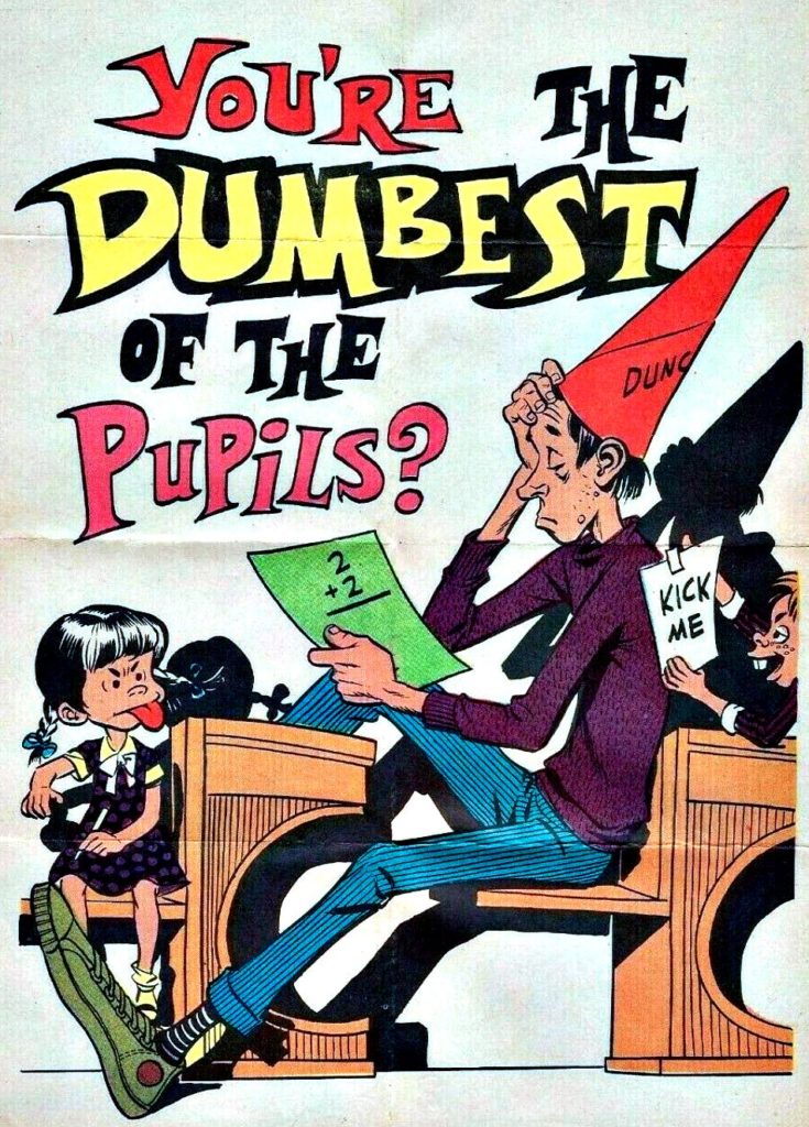
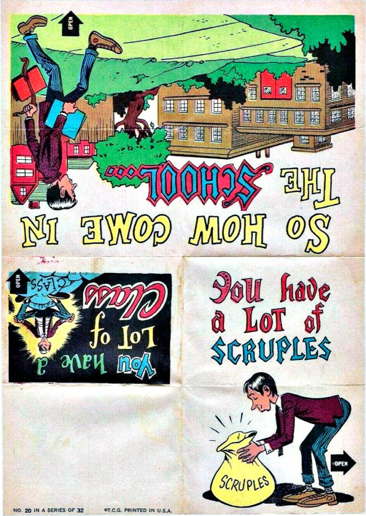
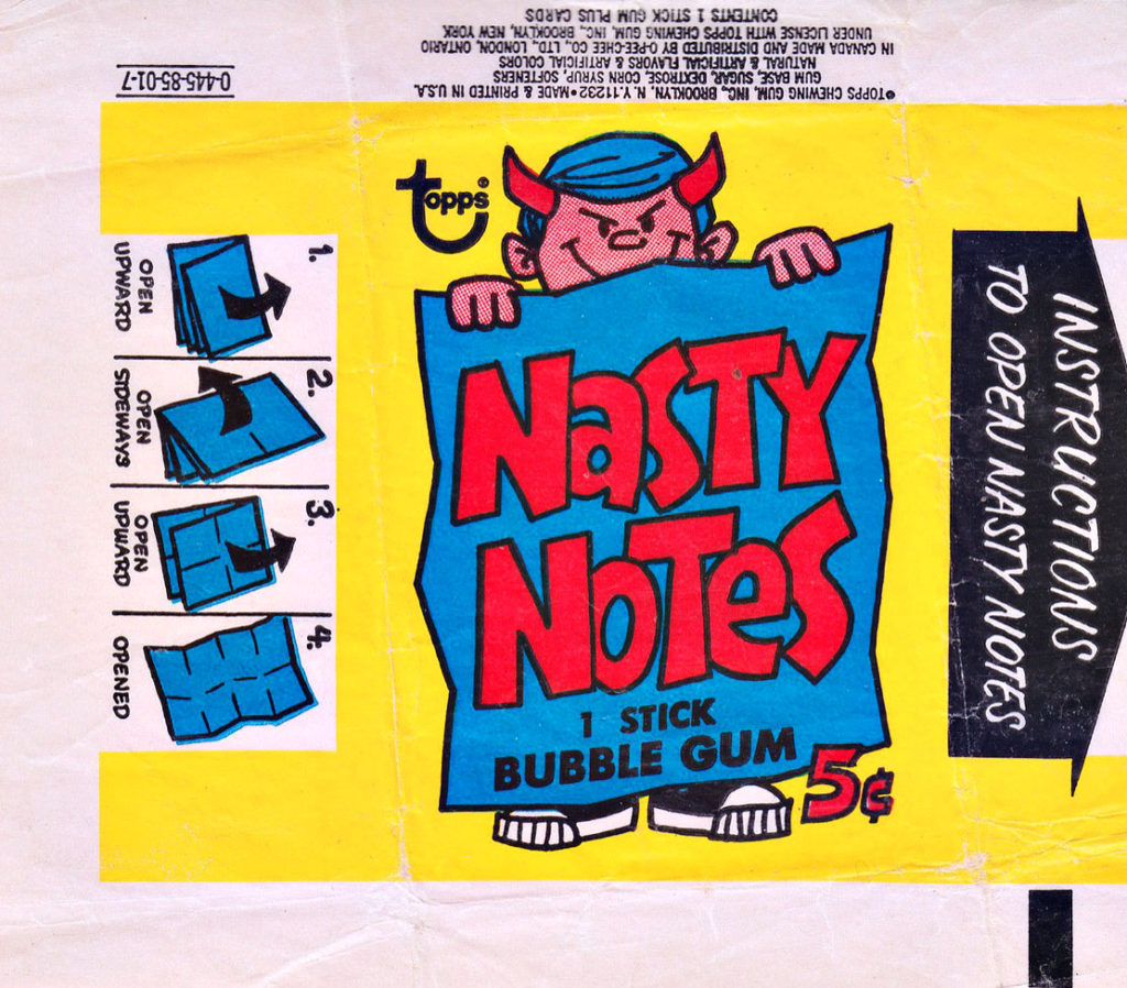
Wallace Wood brings his penchant for humor to Topps with this great looking 1967 series of novelties appropriately entitled “Nasty Notes.”
Why call them novelties instead of trading cards? Because they are actually two-sided posters that are designed to resemble the folded notes you might pass around in class.
Woody did a generous amount of work for Topps in the 60s as he became increasingly frustrated with the mainstream comics houses. Also, he was friends with one of Topps creative directors, Len Brown.
In fact, as noted previously, Len helped shape the creative direction of Wood’s T.H.U.N.D.E.R Agents, and. in return, Woody named the civilian identity of Dynamo, the lead character, “Len Brown.”
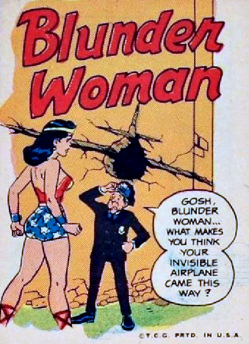
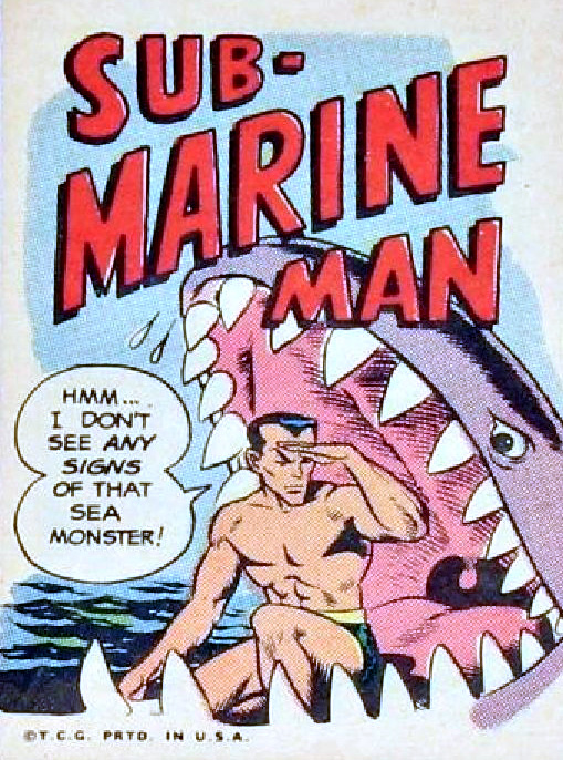
Some of the greatest and best-known talents of the comics contributed to Topps creative “Non-Sports” projects. It’s an all-star list that includes Jack Davis, Bob Powell, Basil Wolverton, Robert Crumb, Jay Lynch and Art Spiegelmanamong others.
(And of course, well-know pulp cover painter Norm Saunders was responsible for the finished work on Mars Attacks, Batman, Civil War, and others.)
My favorite Topps / Wood project of the era: Krazy Little Comics, 16 different parodies of classic superheroes in the style of EC’s classic Mad Comics . Written by Roy Thomas, with art by Wood and Gil Kane, too. These predate Not Brand Ecch! #1
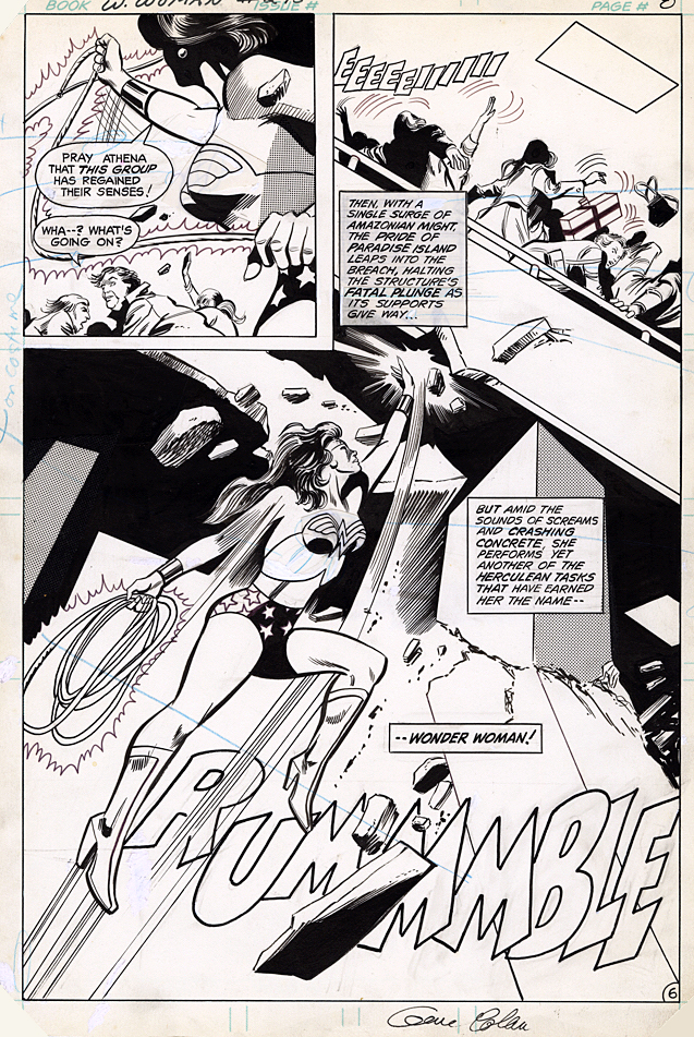
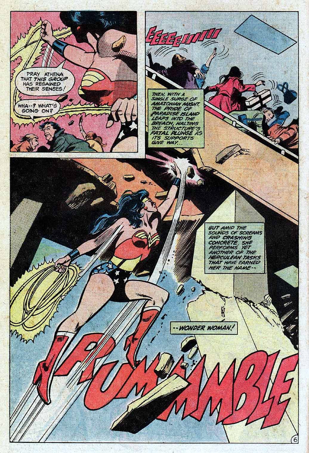
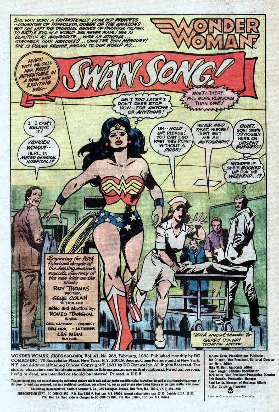
Continuing our celebration of Wonder Woman for the next few posts — no matter when the new film finally releases.
Gene Colan delivers an outstanding splash in an offbeat story involving t video-game mania. Well, it was 1982. Think Atari 2600. Only here we have a cast-off villain –General Electric — from Jack Kirby’s Sandman (I kid you not) who uses a kind of mass hypnosis… oh never mind.
As mentioned previously, I’m a passionate fan of Gene’s work and picked up nearly everything he did at Marvel. By the time he jumped ship to DC I was less interested in superhero comics in general and paid little attention to his work on Wonder Woman. (Batman was another story, as I thought he was a great choice for the dark detective.)
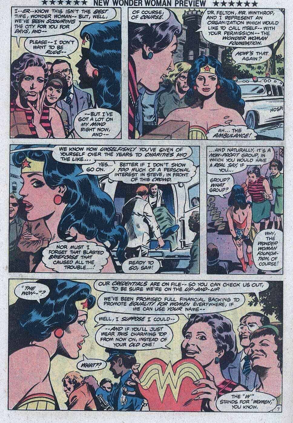
Turns out it was a short but memorable run on WW (artistically at least) and Gene is actually responsible —under the direction of publisher Jeanette Kahn — for her very first costume re-design, replacing the eagle on her chest with the “WW.” (Not including a brief stint in “mod” civilian attire in 1968- 1973.)
The exact new design may have been a work in progress, because the halter on this original has an art patch on it.
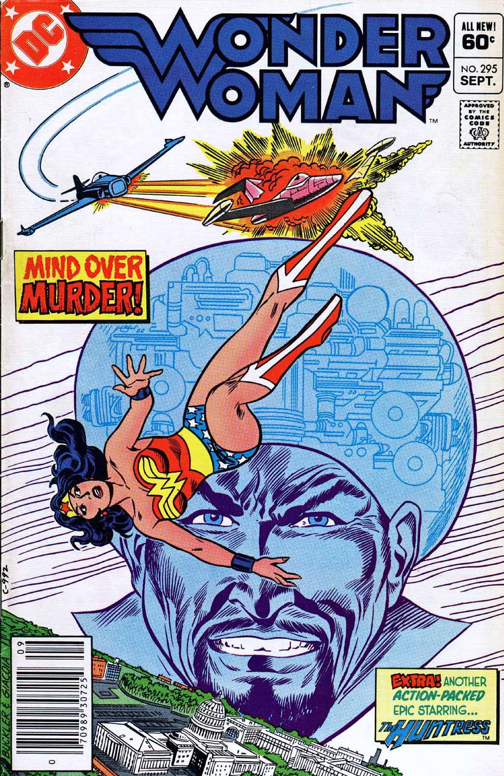
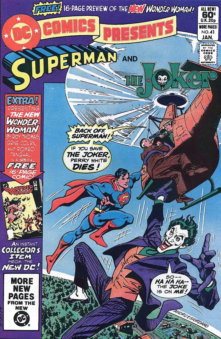
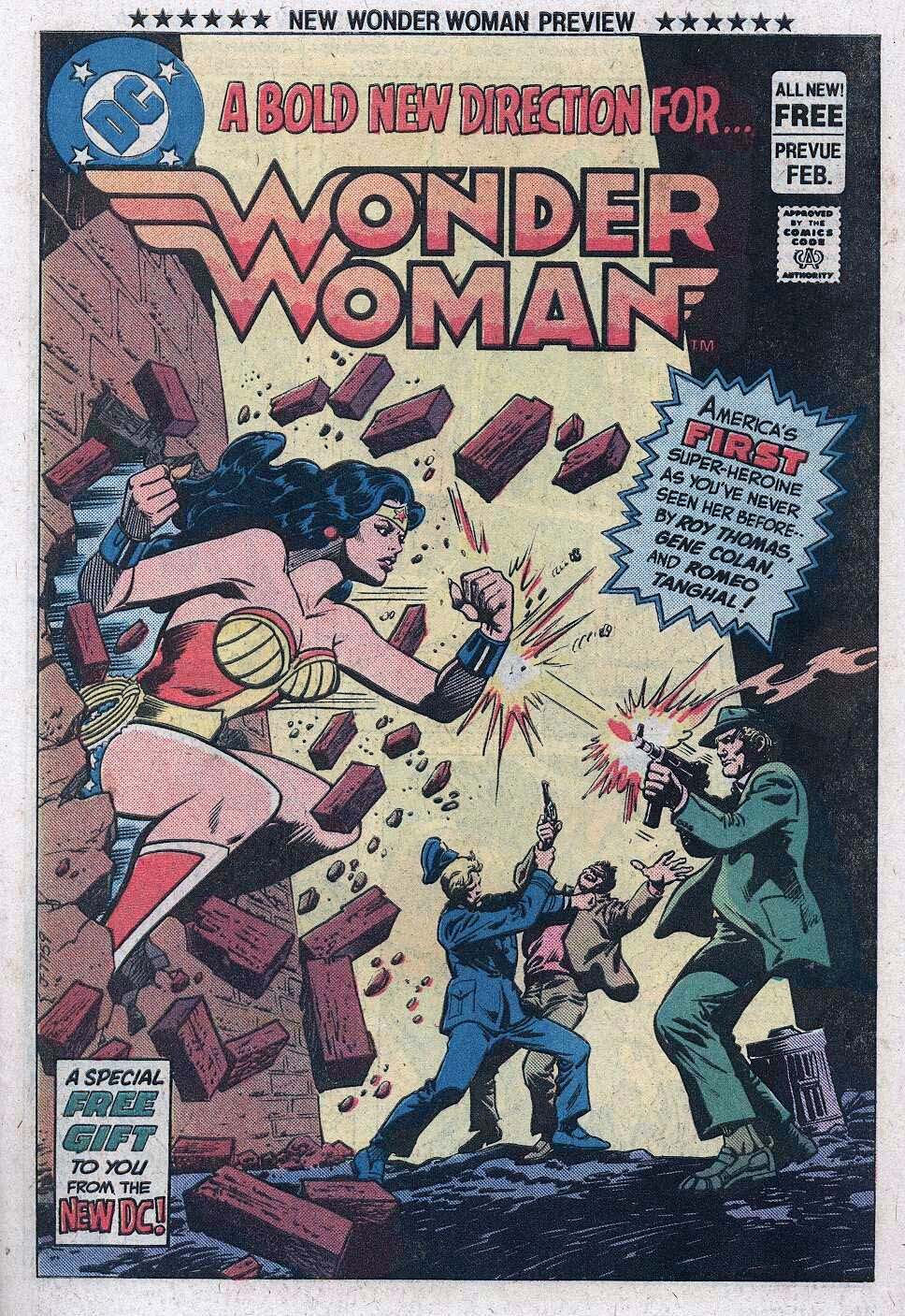
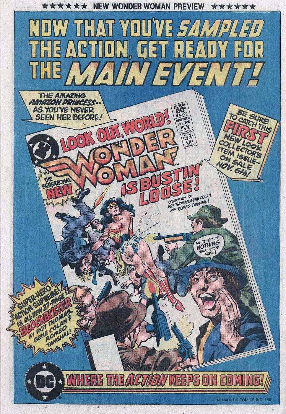
Wonder Woman gets an updated halter, logo and creative team, as previewed in DC Comics Presents #41, and ultimately launching in Wonder Woman #288.
Gene’s work at Marvel looked nothing like the other “bullpen” artists, yet somehow fit in perfectly. Where he went, I typically followed.
Continuing our multi-week celebration of the 80thanniversary of the Justice Society of America.
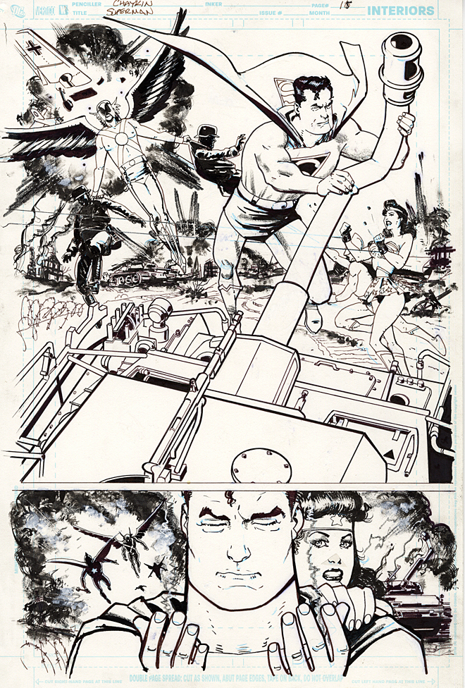
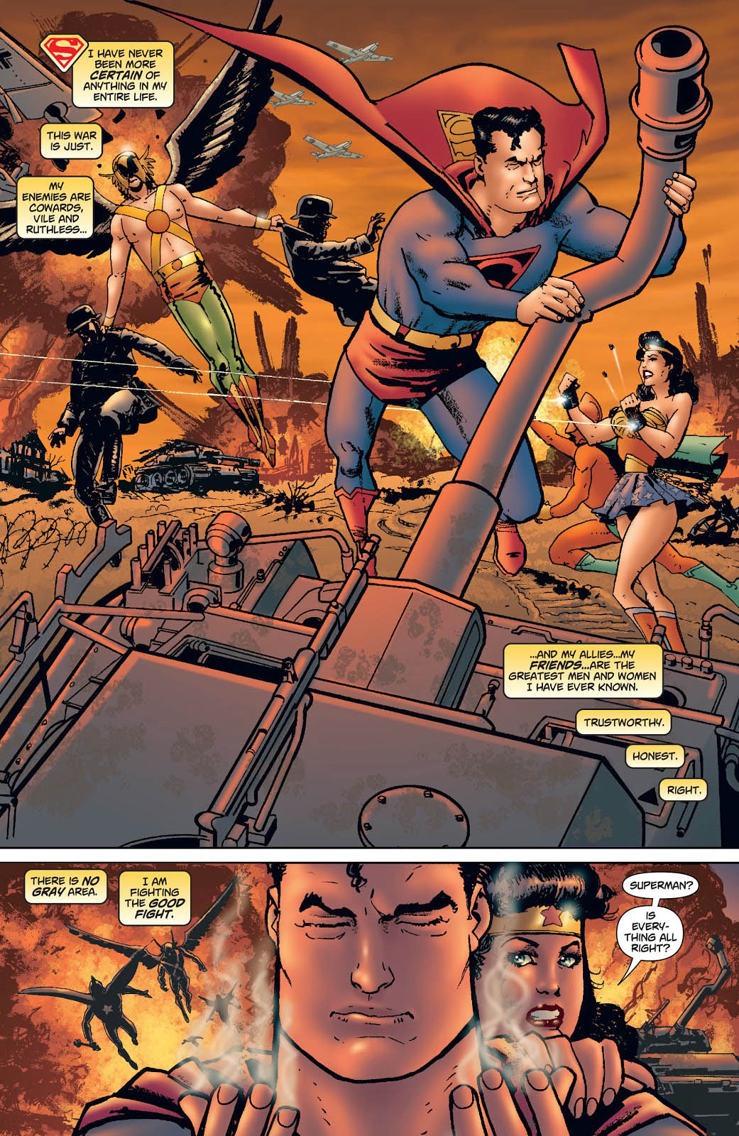
This is great action splash from Howard Chaykin, and a rare treat to see him illustrate classic superheroes.
As part of the Infinite Crisis storyline, Supermen from two different universes clash, each one living the life the other. When one goes to halt the Nazi atrocities of World War 2, he learns the difficult truth about Hitler’s super stalemate courtesy of the Spear of Destiny.
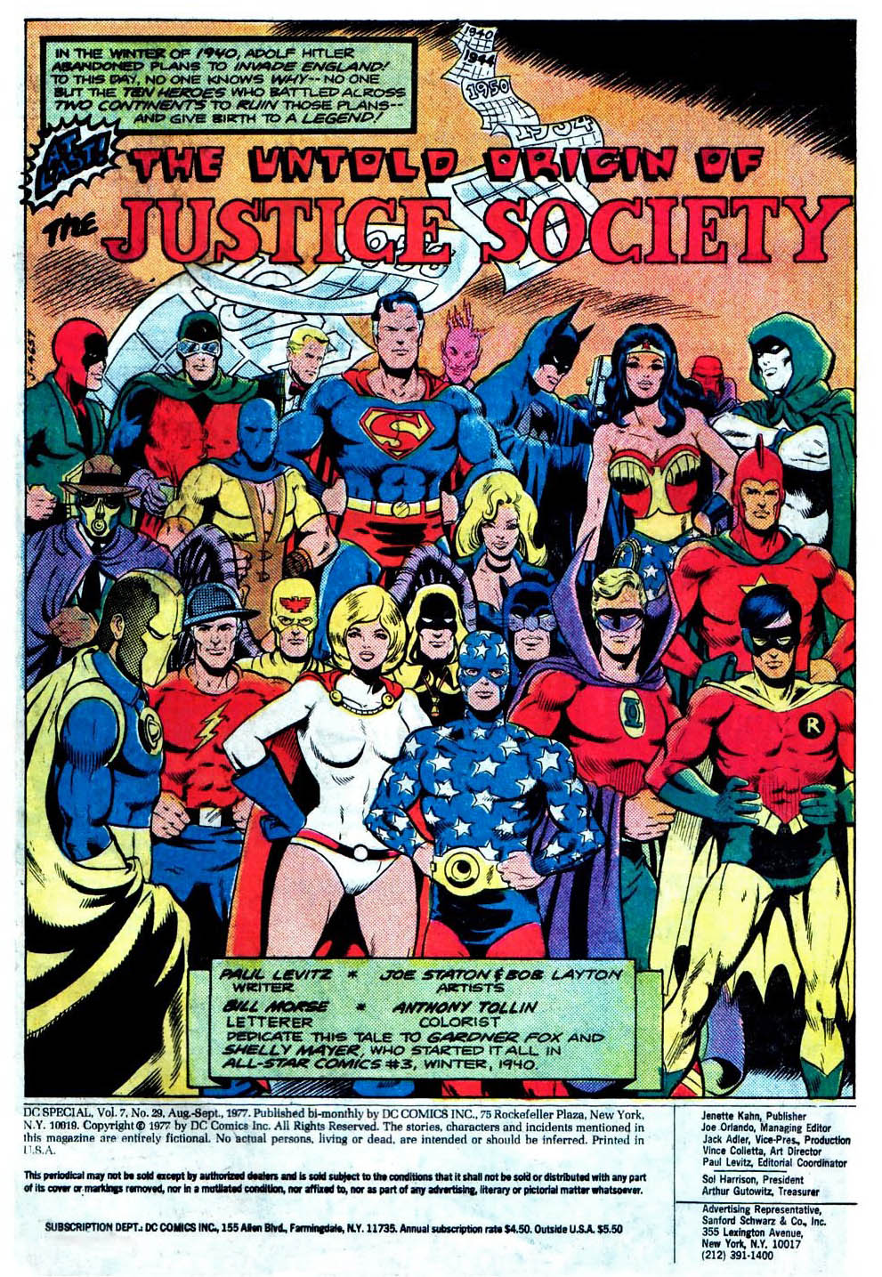
It took more than 35 years to tell the origin of the Society, and Paul Levitz created a plausible scenario that explained why America’s heroes simply didn’t use their powers to end the war in favor of the Allies quickly and decisively. Spoiler alert: It involves magic.
Roy Thomas and other writers ultimately ran with (and expanded) the concept, and writer Joe Kelly incorporates this premise into this Crisis Crossover.
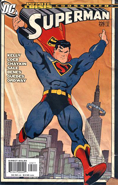
This is the final issue of this specific volume of Superman, launched nearly 20 years prior, as part of the “John Byrne reboot.”
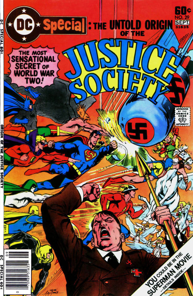
One of my favorite single issues from the late 70s (DC Special #29) tells the “untold origin” of the Justice Society and explains why they can’t simply destroy the Axis Powers. The “magic” theme would carry into other stories as well.
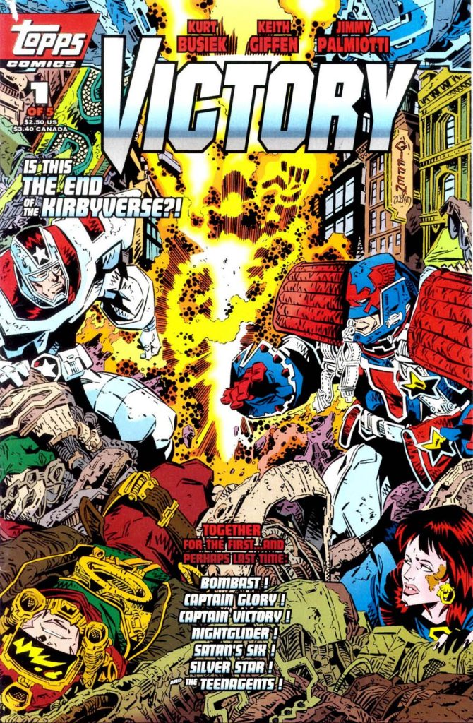
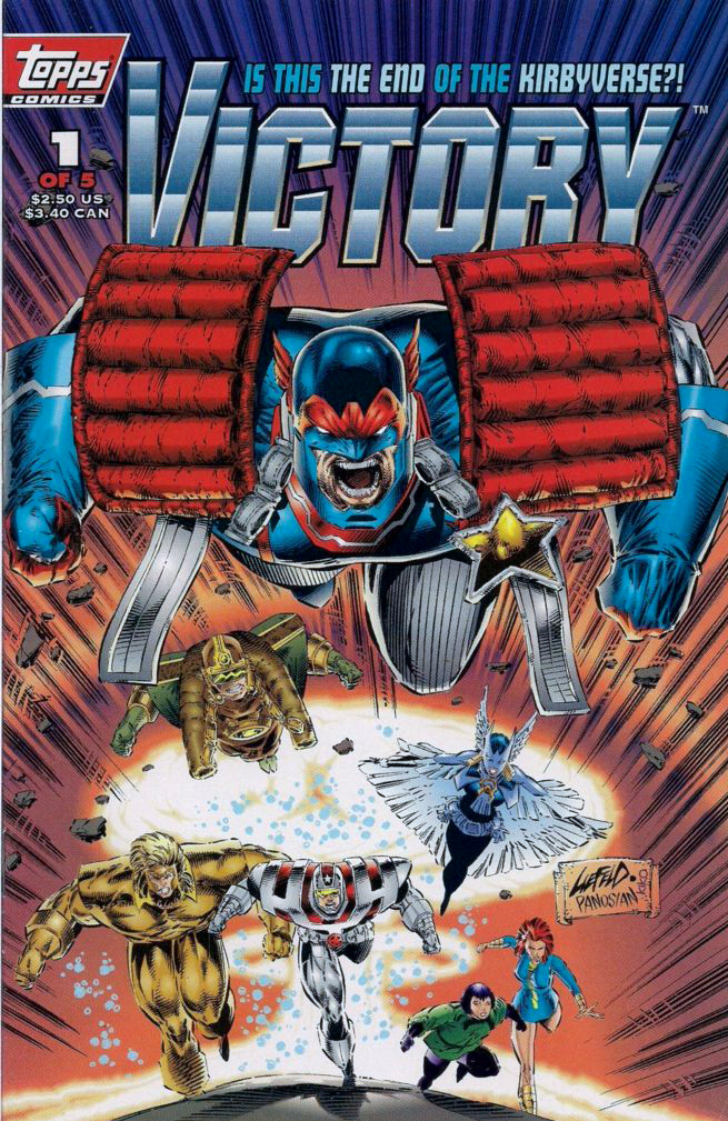
It was February 6, 1994. As we put the first (and it turned
out, last) issue of Victory to bed at Topps Comics, the sad phone call came
into our offices. The King had moved on — Jack Kirby had passed away at age
76.
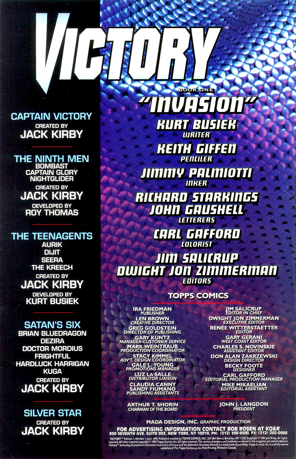
Victory was supposed to be a monumental crossover project between
all of Jack’s creator owned characters; the new ones we had already developed,
and the previously existing ones that included Silverstar, and of course
Captain Victory. It was going to be the event that shook the “Kirbyverse.” (I
can’t remember who thought of that – EIC Jim Salicrup or myself, so we will
each take have to take co-credit.)
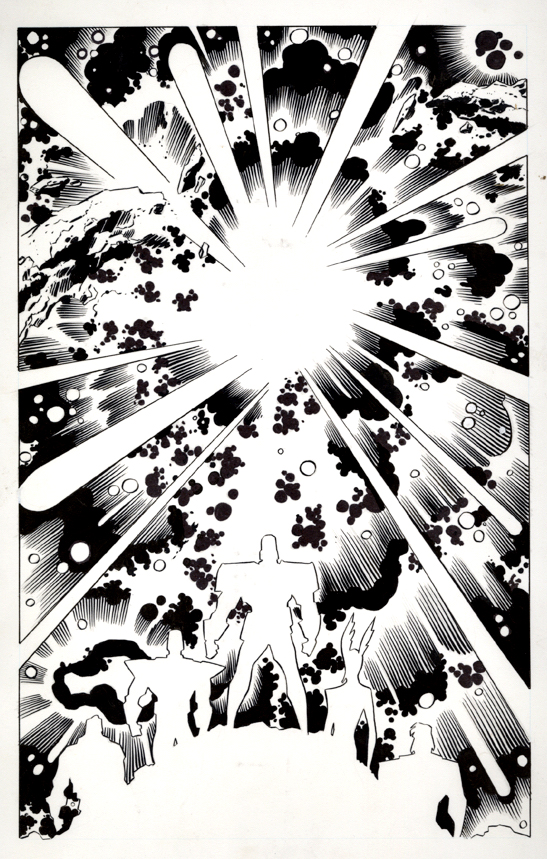
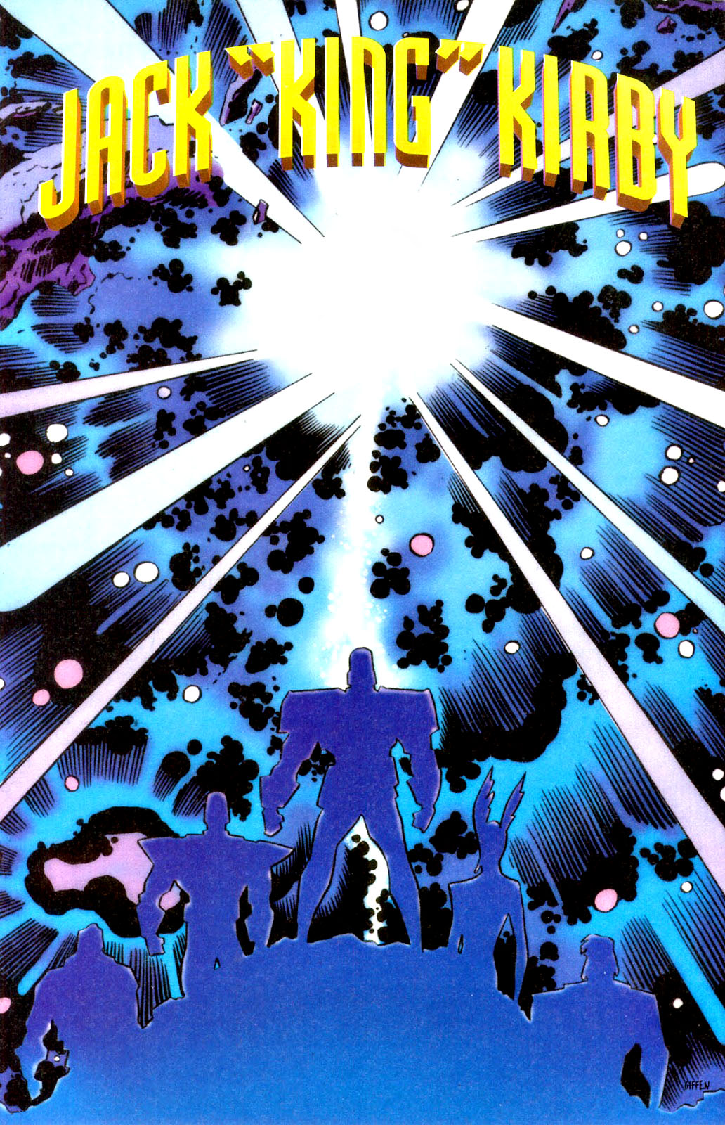
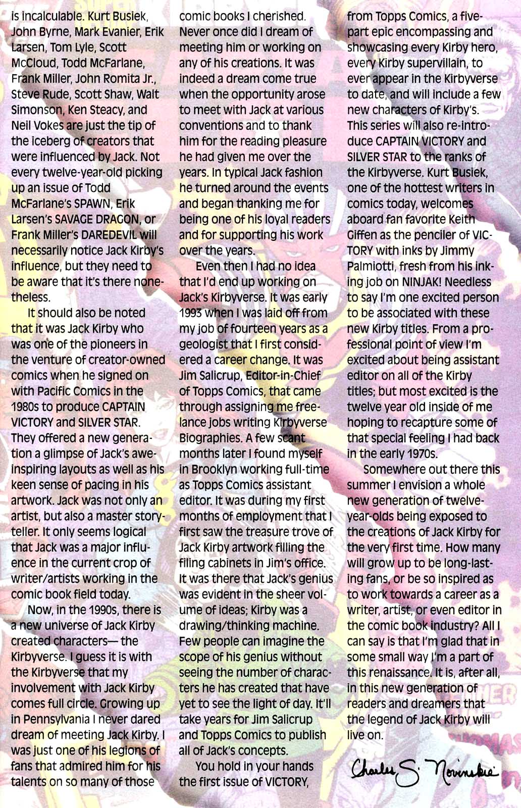
Since the issue had not yet gone to press, we were able to include this lovely art memorial to Jack by Keith Giffen and Jimmy Palmiotti in the published issue, as well as a two-page editorial tribute written affectionately by Charlie Novinskie.
Although Jack was not directly involved in character or story development, he did enjoy being kept in the loop and, from the feedback we received, he enjoyed our efforts.
The challenge at the time of course, is that the marketplace didn’t enjoy our efforts quite as much as he OR we did. A year prior, we had launched the Kirbyverse with a bang. Four titles launched in April 1993, plus a freebie. Total circulation of the group: More than one million copies. (That is not a typo.)
But our titles launched with mostly retro styling, and the market was not interested in classic storytelling and clean draftsmanship. The market wanted the dynamism and styling of Image-type comics (preferably from Image itself; remember this was 1993). And the younger readers gobbling up Cyberforce and Spawn weren’t that interested in Jack Kirby.
From the moment we launched, sales of the Kirby titles dropped each month. By the time Victory project came to fruition, it was too late. Despite that issues #2 and #3 of the crossover were drawn, they never saw the light of day.
So ironically, and most definitely not intentionally, this
version of the Kirbyverse was laid to rest at about the same Jack was.
But… did the King really die?
Captain America. The Hulk. The Avengers. The X-Men. The Eternals. Darkseid. The Black Panther. The Silver Surfer. Add a few hundred more, and you will just about scratch the surface of Kirby’s creative output.
The King lives on.
Long live the King.
Topps Comics sponsored a memorial event at Pro-Con (tied in to Wonder-Con, back in the day) and attendees were provided with a small program book. I flew out to pay my respects to Jack’s wife Roz — who liked me in part because her maiden name was Goldstein.
Main cover by Keith Giffen, variant by Rob Liefeld
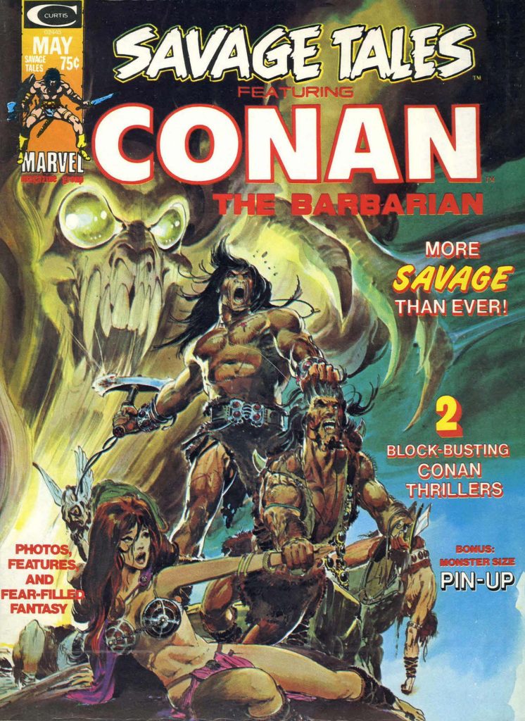
Conan celebrates its
50th anniversary in comics this year, and we conclude our anniversary recognition
with our final of three Conan-themed posts.
Night of the Dark Gods is a great example of Roy Thomas’
ability to adapt an Robert E Howard story without Conan, into one.
Given the artistic talent that worked on the story, clearly
some deadline problems ensued. Not surprising, since at this point in Marvel’s 70s
expansion, (comic books and “mature magazines”) deadlines were whizzing
by a the speed of light.
Neal Adams assisted Gil Kane on the pencils, and inked some
of the story as well, supported by Vince Colletta, Frank McLaughlin, and Pablo
Marcos. Marcos also provided the wash tones on the story, necessary to add
depth to a black and white, and also provide some consistency to the art style.
The inking credits are listed as Diverse Hands, and this appears to be the only time that the credit is employed, meaning it’s likely that this specific group of professionals never contributed jointly again on one story.
Neal, of course, was a pro at collaborative art creation. His “Crusty Bunkers” a group of (ever-changing) artists at his Continuity Studios, filled in many times during deadline crunches for Marvel, DC, Charlton and others during the 1970s.
It’s easy to be fondly nostalgic about something you missed entirely, but, based on everything I’ve heard, it sounds like a hoot. Stop by, ink some pages, spot some blacks, and make your deadline, head to the pub. (It was probably much more stressful than that, but I digress.)
The story is ultimately also printed in color, in a Marvel Treasury Edition, and although the coloring itself is okay, many of the inking and wash details are obscured, likely in an effort to get the job done quickly.
(And see below for the mystery of the extra face.)
Night of the Dark God, in glorious black and white, and a bit later on in color. But wait a moment…
…Where did the extra face in the color version come from? It balances the panel a bit more, I guess, but still… I wish had the time right now to compare every panel of this story to see what other “Where’s Waldo” attributes I can find.
Conan celebrates its
50th anniversary in comics this year, and we continue to celebrate the
anniversary with our second of three Conan-themed posts this week.
“This guy used to eat, sleep and breathe drawing. It didn’t matter what was going on around him. He would get bored with it and start sketching. … He just couldn’t stop drawing. [His back-of-board sketches were] better than some of the stuff that he did on the front. … He’d get a spark of inspiration and turn the page over and draw whatever was in his skull.” — Sal Buscema, speaking about his late brother John.
Roy knew that John’s artistic style and storytelling skills
(and interests) could perhaps best capture the Conan character —- and most
remind readers of the amazing eight Frank Frazetta covers that graced the
Lancer paperbacks of the last few years. Those images had helped Conan rapidly turn into
a phenomenon among fantasy readers.
But budgetary concerns forced Thomas to work with the mostly
unknown Barry Windsor Smith, and a different kind of Conan developed. Younger,
sleeker, a bit more handsome. And after a slow start, (it was nearly cancelled
after issue #7) the book caught fire, and inspired a sword and sorcery age in
comic books.
But Smith, frustrated by the deadlines of the comics periodical business, ultimately left Conan.
And so fate called again, and Roy got what he wanted the
second time around.
Under Buscema’s pencils, the burly, muscular, often-raging Conan ultimately epitomized by Arnold Schwarzenegger, emerged. This was an older Conan with more experience (and world weariness) under his belt.
Buscema has rightfully become identified with the character, rendering more than 100 stories each for both the Conan comic book and the more “mature” Savage Sword of Conan magazine.
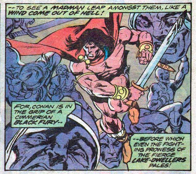
I’ve owned and traded many Buscema Conan pages over the
years, and this splash remains one of my favorites. After a long fought series
of adventures and battles, Conan is taking a break, and celebrating his
victory.
Nothing wrong with that.
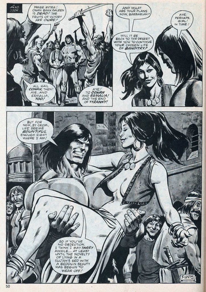
The story itself is an odd one. Michael Fleisher is the scribe, having come on board a just a few months earlier after Roy Thomas bolted for DC. Given the varying art styles of the story, the story length (46 pages) and the multiple inkers (Ernie Chan, Tom Palmer and Bob McLeod are all credited) it’s entirely possible it was originally destined to be a shorter story, and fleshed out when something else fell through.
If so, it’s a feat that John Buscema could pull off — while most others couldn’t even attempt it.
The printed page by Buscema, and the story-driven cover by Joe Jusko, who often cites Buscema as his most important influence.Had this story actually ever been reprinted in comic books, they would have added an undergarment. This was the height of risqué for Marvel at the time, although over at Warren Magazines, (partial) nudity had already crept in.
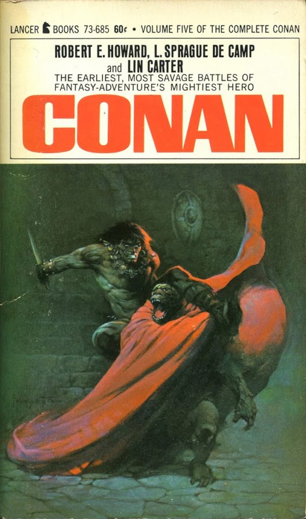
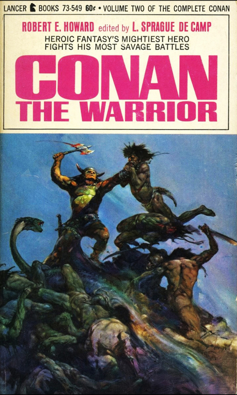
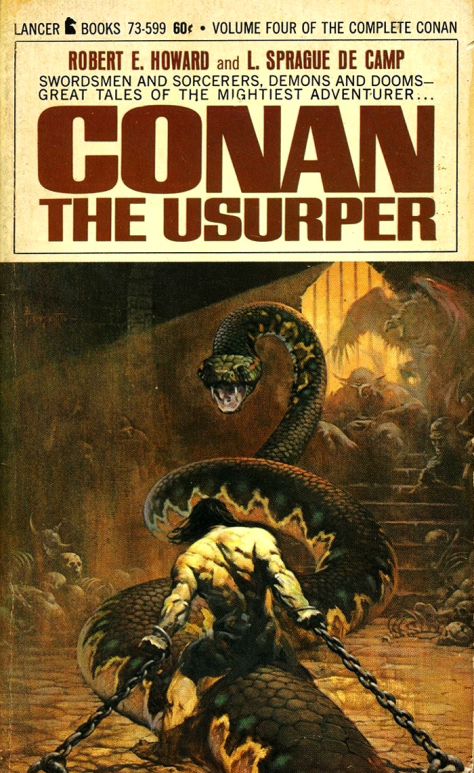
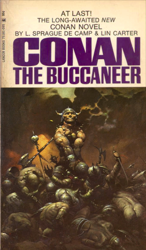
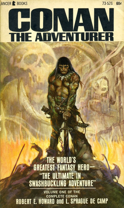
Eight images worth millions of words — the original Frank Frazetta covers on the Lancer paperback editions of Conan (starting in 1966). In a short time, both Conan and Frazetta would be embedded in the popular culture.
Conan celebrates its
50th anniversary in comics this year, and we celebrate the anniversary with
three Conan-themed posts this week.
Barry Winsdor-Smith was not the first choice to draw Conan. Legend has it that Roy Thomas knew that John Buscema was the idea artist for the job. But Publisher Martin Goodman nixed the idea, citing budget and schedule, and told Stan/Roy to find someone less expensive.
The solution? The young British-born Smith, who had been a
fill-in artist on a handful of super-hero titles with an unmistakable Kirby
influenced style, and who was both cheap — and available.
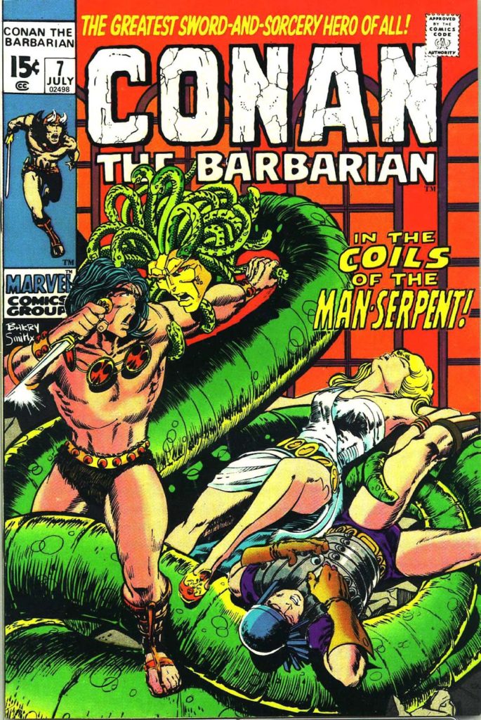
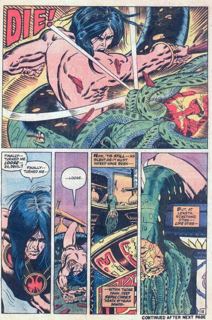
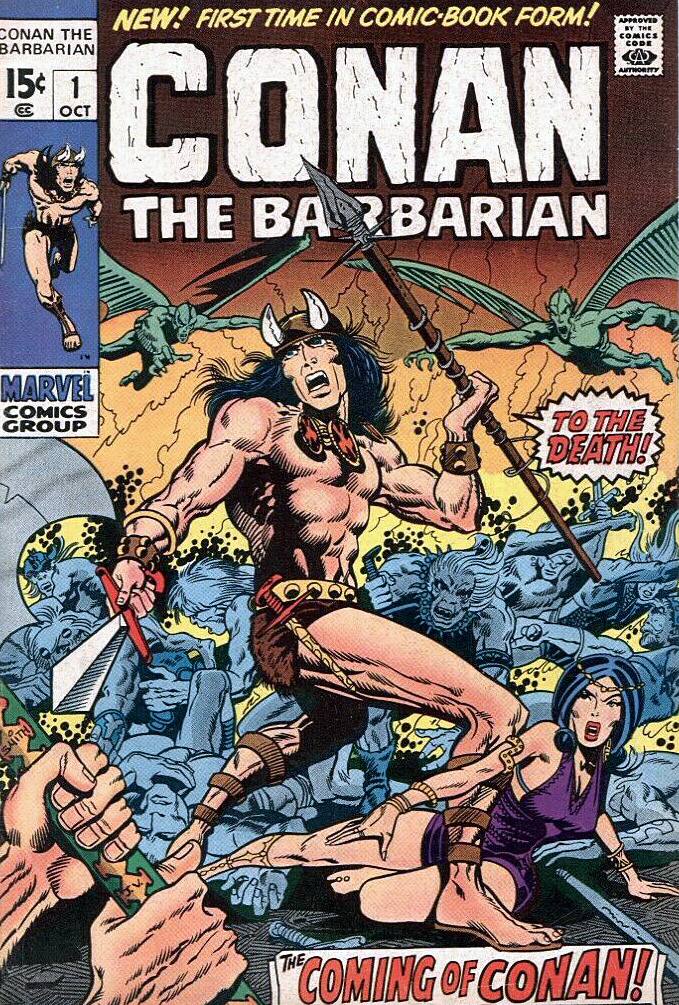
And so Barry drew Conan for 21 of the first 24 issues — and the comic book world promptly grew up.
Smith, one of the many “young guns” of similar age, and breaking in at around the same time, (Chaykin, Kaluta, Simonson, Wrightson among the many others) ultimately developed an inimitable style. Yes the Kirby influence was there, especially early on. But so is Steranko. And Alphonse Mucha, the best-known stylist of the Art Nouveau period (late 19th – early 20th century), provides much of the inspiration for the intricate designs and beautiful women that populate those early Conan stories.
Smith’s run on Conan is unlike any other in professional comics at that time. And Baby Boomers, who had grown up on the simple stories of DC, and had segued into the cosmic soap operas of Stan and Jack, were primed for these comics. The Boomers were growing older, and now, the comics were growing up with them.
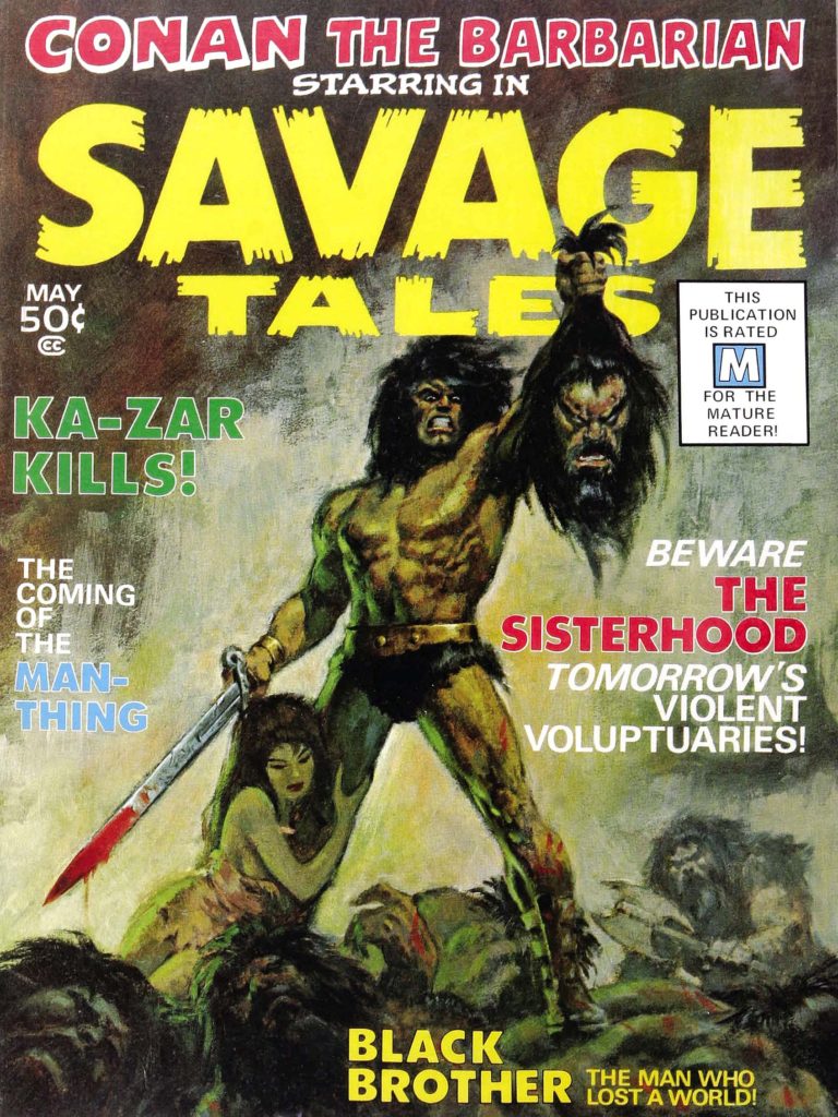
Smith’s style developed rapidly over his three year run on Conan, culminating in the extraordinary “Red Nails” that first appeared in 1973/1974 in Savage Tales. And of course, the work was always best when Smith was inking himself, but both Sal Buscema and Dan Adkins did excellent work, and interestingly, both are credited on this issue. Sal is credited on this specific page, but without all 20 original pages together, it’s difficult to tell.
Either way, it’s a stunning page, and only a small harbinger of things to come.
Conan launches in comic books and the more “mature” Marvel magazines.
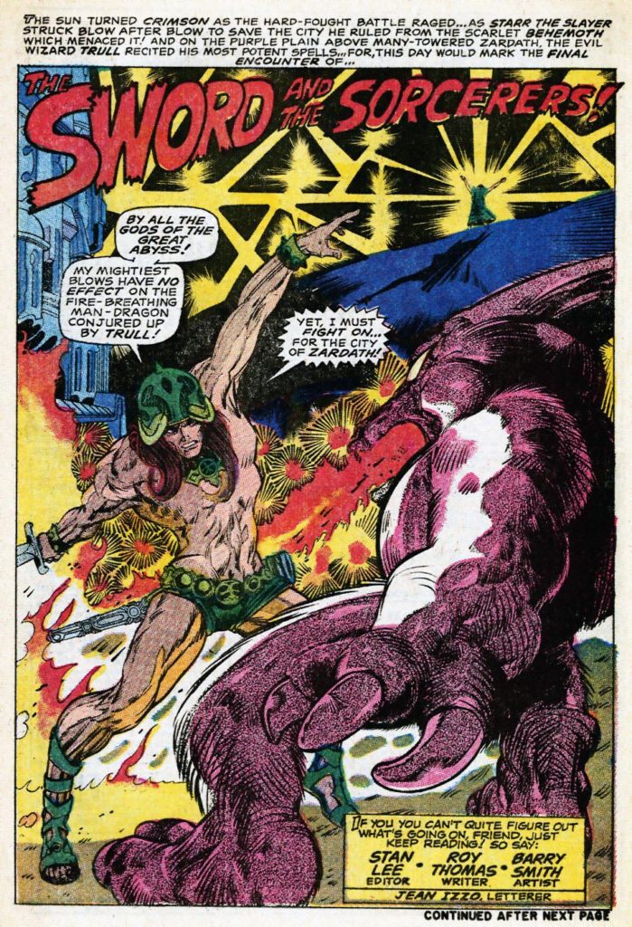
And early try-out story by Smith and Thomas features “Starr the Slayer,” published just a few months prior to Conan in Chamber of Darkness #4. Smith also developed a Kull Black and White proposal for a paperback graphic novel. (Similar to Gil Kane’s Blackmark) that ultimately was published (unfinished) much later in Savage Sword of Conan #3. Both prototypes look nearly identical to Smith’s Conan.
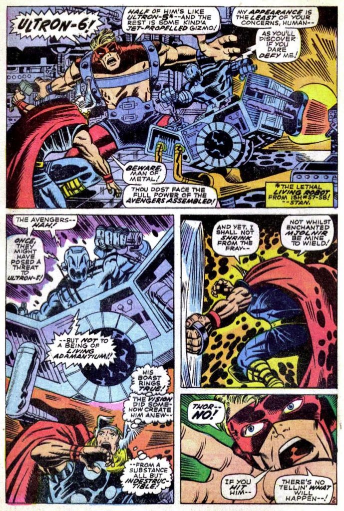
Smith’s early Marvel work on Avengers is pretty much straight from the Jack Kirby handbook — except for the wild Vision splash page (Avengers #66) which adds some Steranko and Alphonse Mucha into the mix; a sign of things to come.