Greg Goldstein's Comic Art Gallery

Howard Chaykin — Dark Force Rising

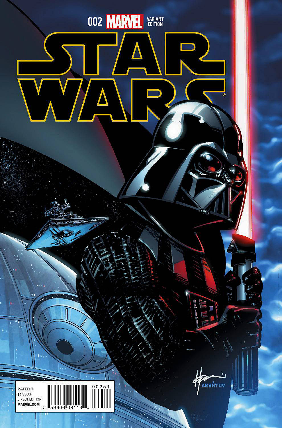
Star Wars #2, April 2015


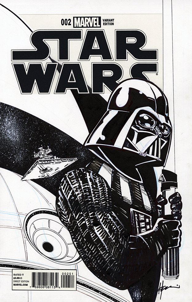
Howard Chaykin returns to Star Wars with an imposing cover of Darth Vader in 2015. You don’t want to mess with this version of Vader, even if you’re on his side.

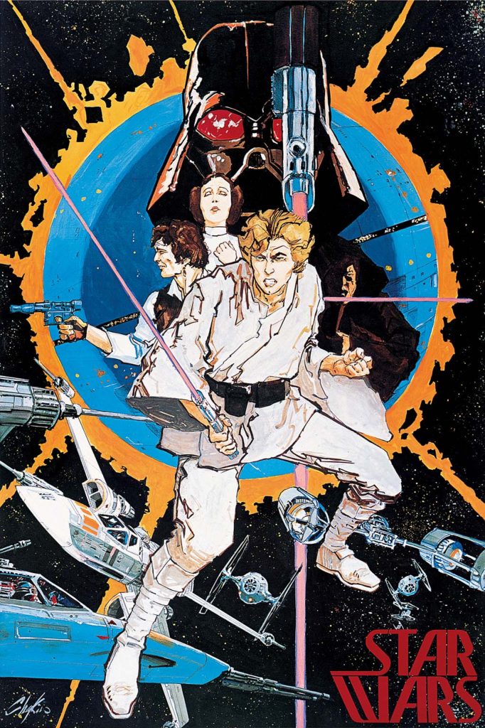
Howard Chaykin. Star Wars. This might be a greater conflict than the empire vs. the rebellion. 

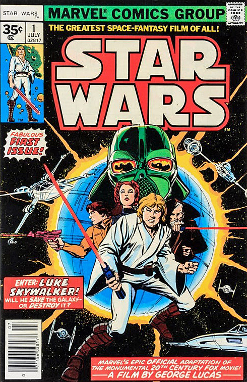
I don’t need to repeat Howard’s many on the record comments about his original artwork on the series (Marvel’s 1977 issues #1-#10, which includes the six-part adaptation of the original film.) You can see more for yourself here, here or here.

Suffice to say, he doesn’t like it. (Reading anything Howard says about his own work — or others, or anything, for that matter — is always highly entertaining, so I recommend taking a deeper dive.)

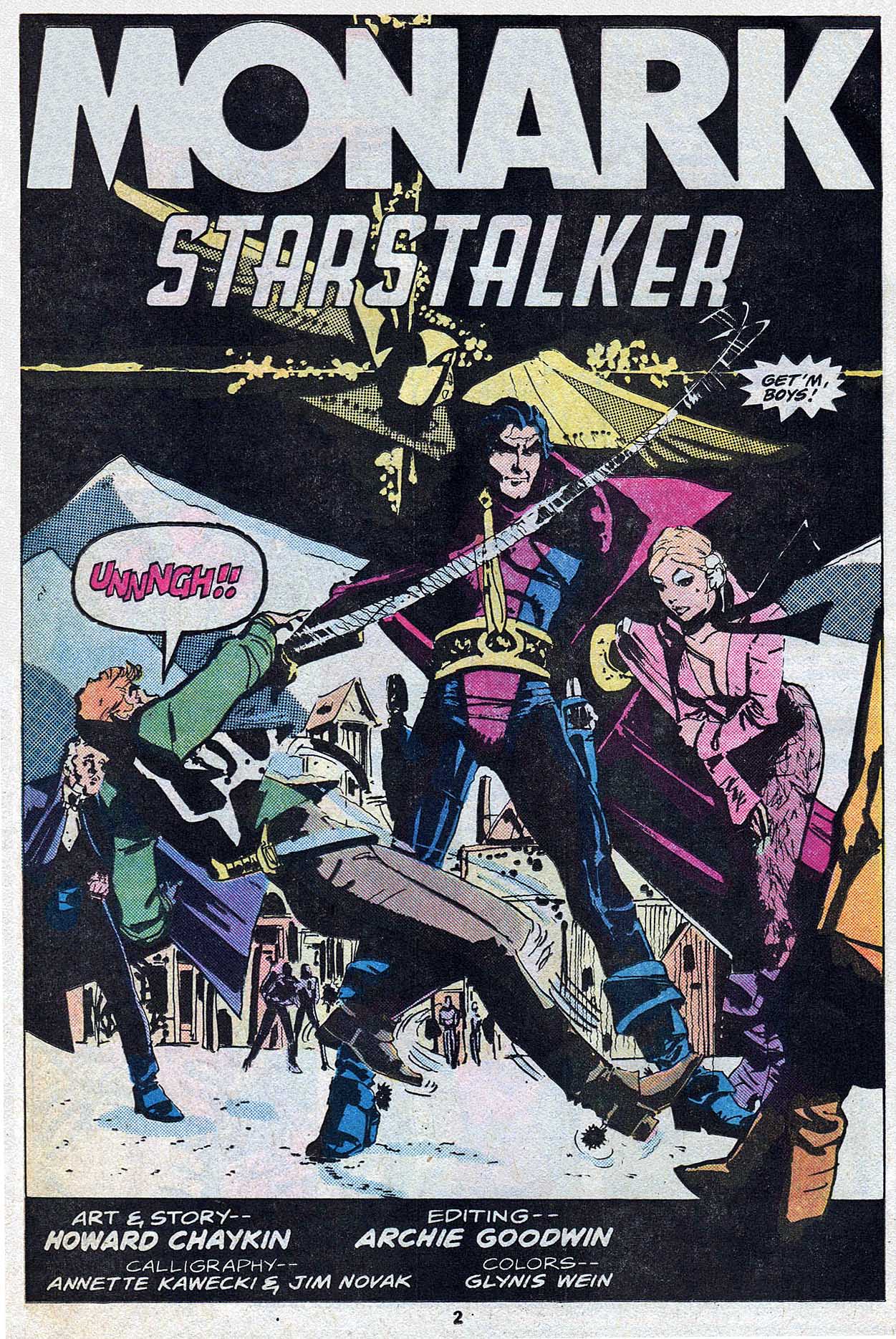
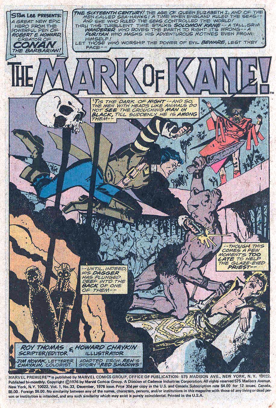
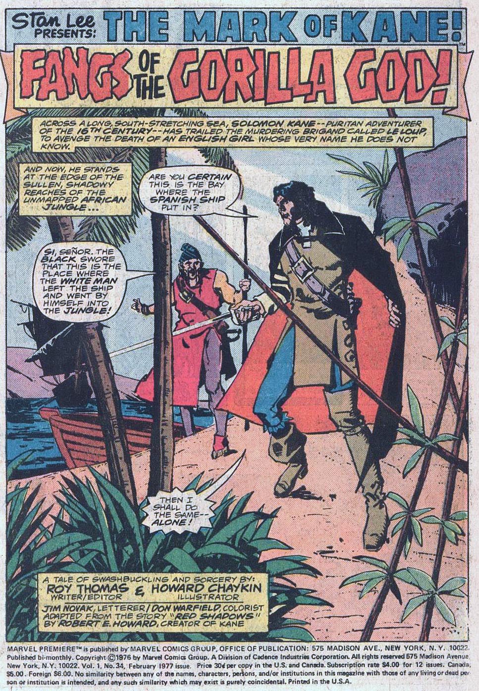
Objectively, Star Wars is of course, not his best work — not even close. It’s not even as good as his other early comics. He drew three issues (and wrote one) of Marvel Premiere just prior to Star Wars that are excellent, especially for the period. (Howard is generally self-critical of all his earliest work, so I bet he won’t agree. But I digress.) 

Licensed comics are always a challenge, especially with limited reference and insane deadlines. That said, given these constraints, and many others, I think his Star Wars art, especially on the first issue, is definitely better than much of what was coming from the big two companies at the time.  But, ultimately, not so great on the Chaykin Curve. (A new scientific term coined especially for this post.)

Just a few years later (1982) he created the astonishing American Flagg. Groundbreaking, although often overused, barely does that series justice. (Much more on that in a future post). Based on Flagg alone, Mark Chiarello DC’s long-time Art Director has described Chaykin as one of the architects of the modern comic book. 

Unfortunately, Flagg was published by a smallish independent publisher, which means that few casual readers ever saw it. Although knowledgeable long-time fans are well aware of the series, it doesn’t have the legacy it deserves.

Star Wars? Reprinted about a zillion times, in more formats than I can count. And I am one of the guilty parties here, publishing the Star Wars Artifact Edition (IDW), showcasing the original art — in its original (11×17) size. 

Shortly after Flagg, Chaykin went on to other fascinating projects, geared for older readers. Times Squared. Blackhawk. The Shadow. Black Kiss. Etc. Ultimately, after a long stint in Television, he returned with other series that reflected his interests and passions. Mighty Love (feels like a television show and was apparently originally developed for that medium) and City of Tomorrow are two personal favorites.  He’s currently working on Hey Kids! Comics!, a fascinating fictionalized look at the drama, jealousy and scandals in the history of comic book business itself.

His innovative and realistic storytelling is complex, violent, sexual, and political. He left space operas behind a lifetime ago.

So if you were a kid when you saw Star Wars, loved Star Wars, and only had the Star Wars comics to read over and over again, because there was no home video, I get it, you love those comics.

I think that’s cool. Even Howard is probably ok with you remembering those comics through the warm glow of childhood nostalgia.

But if you’re an adult? Just don’t remember HIM for them. 

That’s like remembering Nolan Ryan only for his one World Series appearance for the 1969 “Amazing” Mets. You’ve missed the point.

Dan Adkins — Underwater

Tales To Astonish #98, December 1967

Stan Lee demanded action. ACTION!

This version of the cover for Tales to Astonish #98 by Dan Adkins, ultimately unused, did not fit the bill. It conveys the storyline inside, and it’s pretty in its own right, but definitely not very dynamic.

“Likely too soft for Stan,” agreed Roy Thomas, (yes, him again) who wrote this story arc of Sub-Mariner.

But, let’s talk about the replacement cover, also drawn by Adkins — likely in one heckuva hurry. Sure, more dynamic. Namor, in a better pose, still unconscious. (Or dead — but even as kids we knew he wasn’t.) In this version we also see the attack that’s destroying Atlantis. Except… since when are New York City skyscrapers in Atlantis?

I didn’t notice the architecture til later on, but once you see it, you can’t unsee it. (Even the unused cover has modern steel girders.) Why is Empire State Building underwater? What in the name of Neptune was Dan thinking?

The unused cover has the Marvel production guides masked off by tape, leading me to believe the piece may have ultimately been printed elsewhere. Marvelmania magazine? Witzend? Convention program?  Any comic book detectives out there recognize it?

Poor Dan; he had to redraw a Doctor Strange cover (Strange Tales #168) a few months later. (I’ll post it if I can get an image of the original version.) I loved his inks — he was one of the best — but he definitely struggled meeting Marvel’s editorial standards for cover layout and composition.

Anthony Castrillo — Timely Gathering

Convention Litho, 2007

Anthony (“MAC”) Castrillo gathers Marvel’s original heroes from its “Timely Comics Era” (1939-1950) for a group portrait used for a print. 

And we present it just in time (ok, barely) for Marvel’s 80thanniversary.

Castrillo’s art-style for the piece works well ; A bit cartoony in the contemporary sense, adding some pizazz and just a touch of whimsy to some of the otherwise stoic heroes.

I didn’t immediately recognize every character — even in color — and Roy Thomas was kind enough to help me sort through it when I acquired the original. With the exception of one mystery character who might be one of the “Marvel Boys”, the full cast list is presented below.

(“Rows” are a bit subjective because of the group composition.)

From top to bottom:

Row 1: Sun Girl, Red Raven, Citizen V

Row 2: Blue Diamond, Blazing Skull, Toro

Row 3: Marvel Boy (?), Challenger (AKA Thunderer), Vision (Original), Jack Frost, Black Marvel, Namora, Patriot, Thin Man, Mercury (AKA Hurricane)

Row 4: Miss America, Destroyer, Namor, Captain America, Whizzer, Human Torch, Bucky, Angel, Blonde Phantom

One of many “Marvel Boys.” Click on the pic for more info.

Mike Mignola — On The Road To Hellboy

Bram Stoker’s Dracula, #3, December 1992


Happy Halloween! Today we wrap up our two-week series celebrating the best in monsters, mystery and mayhem.

Here’s a sweet page from Roy Thomas and Mike Mignola’s adaption of Francis Ford Coppola’s 1992 film, Bram Stoker’s Dracula.

Fun Fact: All the pages in this adaption are “sweet.” There’s not a miss in the bunch. In fact it’s one of the best looking of any film adaptations ever done in comics. (Top of mind, only Archie Goodwin and Walter Simonson’s Alien graphic novel is in the same league.) 

It’s also fair to say that while the film itself is fine (mixed reviews when it was released), the comics adaption itself is actually better.

Fun Fact: Coppola liked Mike’s art so much he hired him to provide illustrative material for the film itself, and Mike’s work is credited in the movie. 

Fun Fact: The title was the launch project for Topps Comics, and was in development prior to the hiring of an actual Editor-In- Chief. (Jim Salicrup.)

Fun Fact: John Nyberg inked the series in spectacular fashion— it’s astonishing how anyone but Mike could make it so “Mignola-like,” but John nails it. The brilliantly effective coloring is by Mark Chiarello, who later colors the first full Hellboy series, Seed of Destruction.  (Hellboy himself appears for the first time just a few months after Dracula concludes in an SDCC giveaway comic book.)

Fun Fact: For many years, Dracula was a lost classic — one of the few major Mignola projects not in print — for more than 20 years. I personally chased those reprint rights for 10 of those 20. Sometimes, insane tenacity pays off.

Fun Fact: It’s the first comic book I ever worked on professionally, and its reprint was one of the final projects published prior to my departure from IDW. (I will have to figure out a way to bring another version to my next publishing home. Ha.)

Fun Fact: Despite one of the best looking comic book series ever, it’s unlikely there will ever be an “artists edition” style book. The originals are scattered to the wind, and only occasionally offered for sale. I consider myself fortunate to own this one.

Ross Andru — Laughing Matter

Not Brand Echh # 1, August 1967

I had only recently started buying Marvel comics off the spinner racks when Not Brand Echh premiered in the summer 1967. I was immediately attracted to its zaniness. I knew Marvel didn’t take itself too seriously from reading its traditional comics — The “Bullpen Bulletins”, the “no-prize” gimmick, the Merry Marvel Marching Society, et al — but Not Brand Echh (NBE) was a new level of nutty.  (A bit later on I discovered it was in the spirit of the original EC Mad comics, but I didn’t know anything about that era yet.)

The actual golden age fight between the Human Torch and Sub-Mariner had just been reprinted a few months ago in Fantasy Masterpieces (# 8), and here was a send-up making fun of the whole thing? The Human Scorch?  The Sunk-Mariner? As my friends’ older siblings would say back then, far out.

Bill Everett is typically credited as one of the pencillers on this story — I’d like to believe that — but writer Roy Thomas says he remembers that Everett may have only worked on the title splash at most. Either way, Ross Andru was no stranger to superheroes or satire, and this page is a favorite.

1967 also saw the debut of Topps Wacky Packages and Roy’s earlier comic book satires, Krazy Little Comics, also from Topps. Summer of Love? Sure. But also —- Summer of Satire.