Greg Goldstein's Comic Art Gallery

Keith Giffen — Tribute To The King

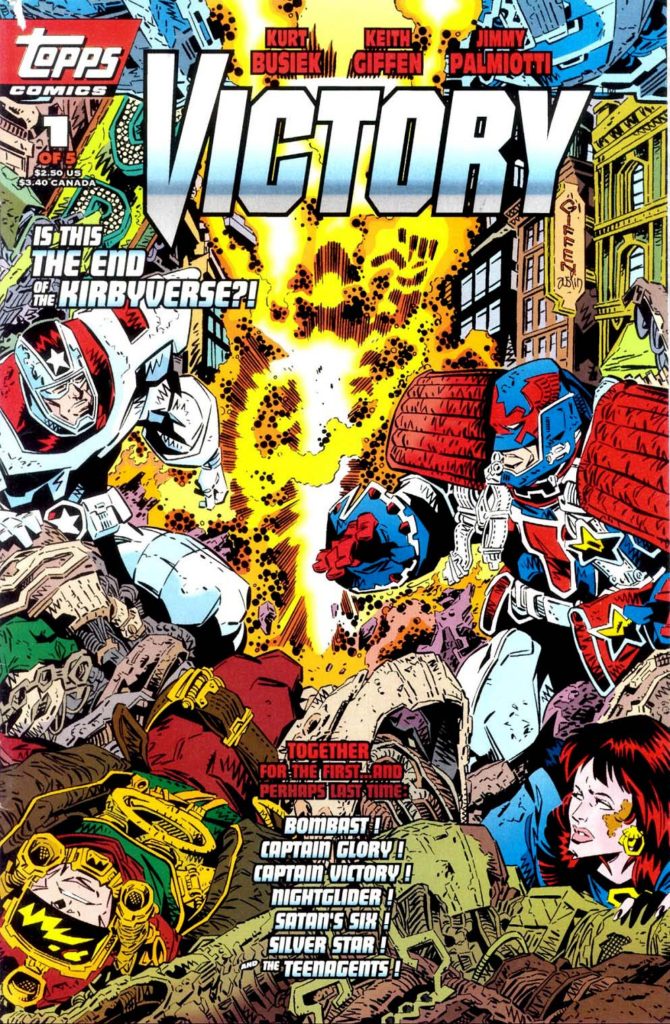
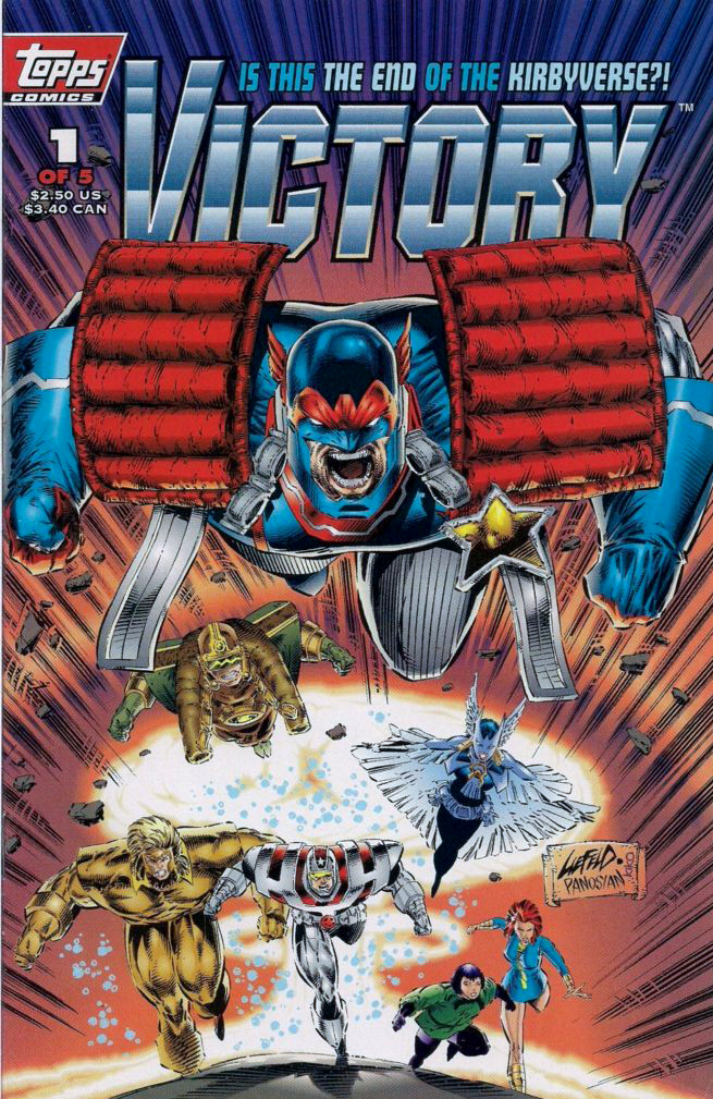
Victory #1, April 1994
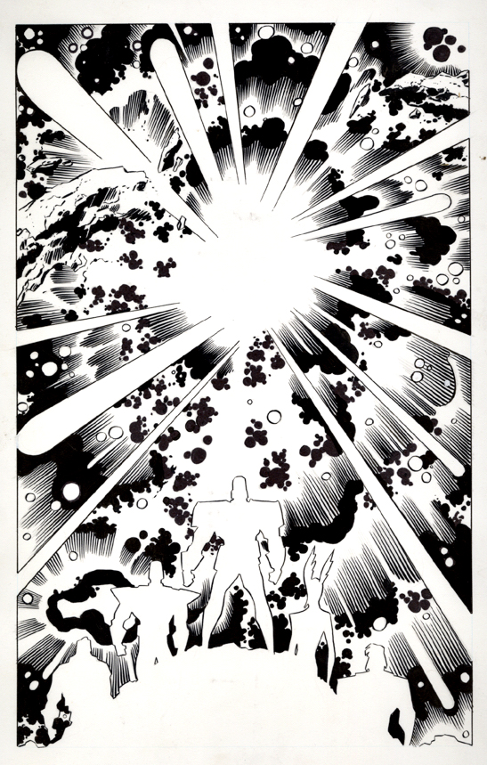
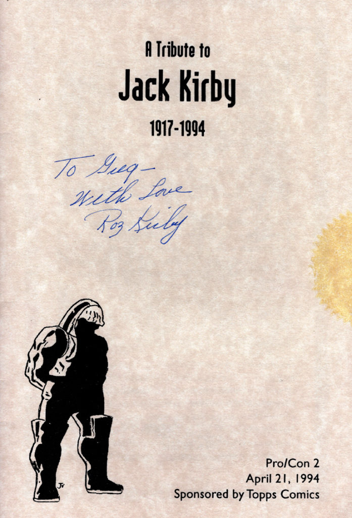
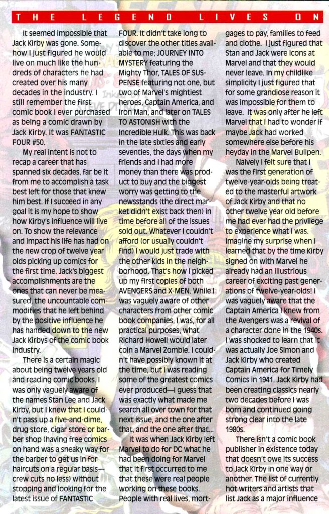
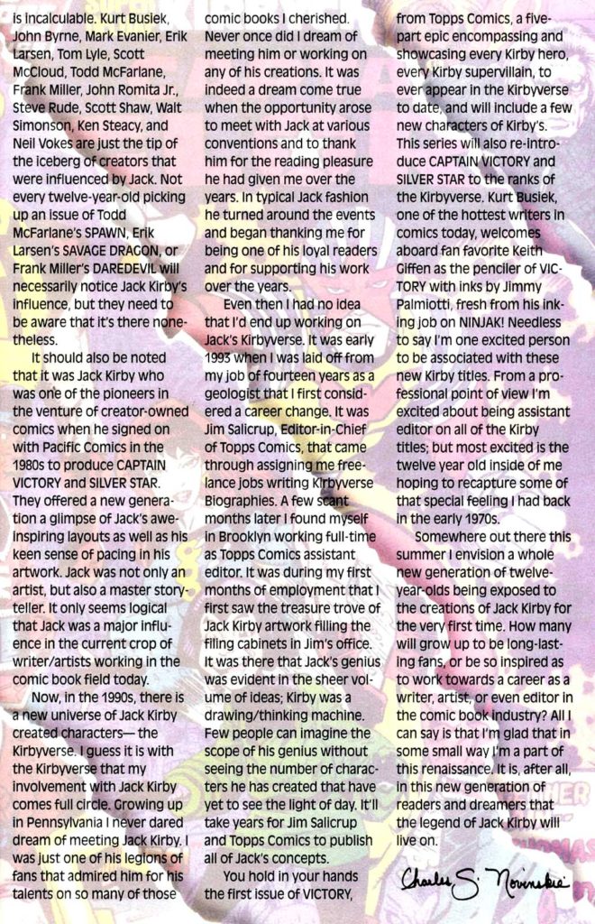
It was February 6, 1994. As we put the first (and it turned out, last) issue of Victory to bed at Topps Comics, the sad phone call came into our offices. The King had moved on — Jack Kirby had passed away at age 76.

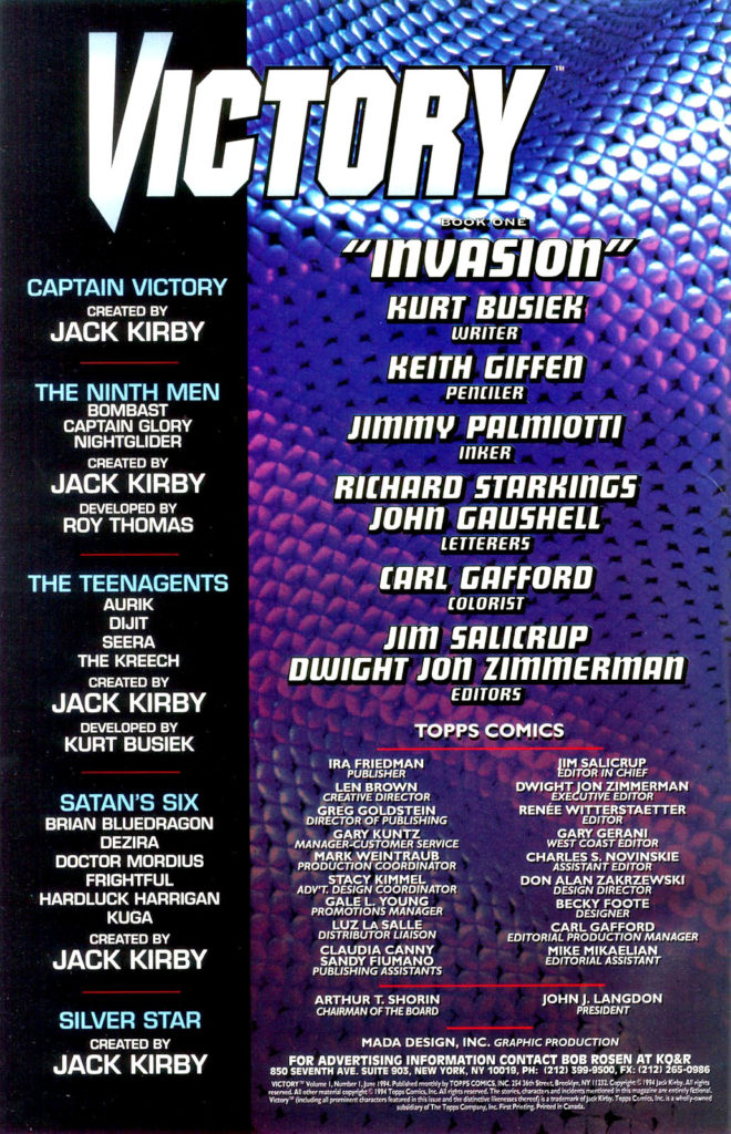
Victory was supposed to be a monumental crossover project between all of Jack’s creator owned characters; the new ones we had already developed, and the previously existing ones that included Silverstar, and of course Captain Victory. It was going to be the event that shook the “Kirbyverse.” (I can’t remember who thought of that – EIC Jim Salicrup or myself, so we will each take have to take co-credit.)

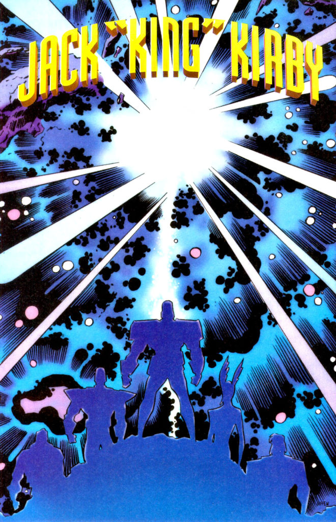
Since the issue had not yet gone to press, we were able to include this lovely art memorial to Jack by Keith Giffen and Jimmy Palmiotti in the published issue, as well as a two-page editorial tribute written affectionately by Charlie Novinskie.

Although Jack was not directly involved in character or story development, he did enjoy being kept in the loop and, from the feedback we received, he enjoyed our efforts.

The challenge at the time of course, is that the marketplace didn’t enjoy our efforts quite as much as he OR we did. A year prior, we had launched the Kirbyverse with a bang.  Four titles launched in April 1993, plus a freebie. Total circulation of the group: More than one million copies. (That is not a typo.)

But our titles launched with mostly retro styling, and the market was not interested in classic storytelling and clean draftsmanship. The market wanted the dynamism and styling of Image-type comics (preferably from Image itself; remember this was 1993). And the younger readers gobbling up Cyberforce and Spawn weren’t that interested in Jack Kirby.

From the moment we launched, sales of the Kirby titles dropped each month. By the time Victory project came to fruition, it was too late.  Despite that issues #2 and #3 of the crossover were drawn, they never saw the light of day.

So ironically, and most definitely not intentionally, this version of the Kirbyverse was laid to rest at about the same Jack was.

But… did the King really die?

Captain America. The Hulk. The Avengers. The X-Men. The Eternals. Darkseid. The Black Panther. The Silver Surfer. Add a few hundred more, and you will just about scratch the surface of Kirby’s creative output.

The King lives on.

Long live the King.

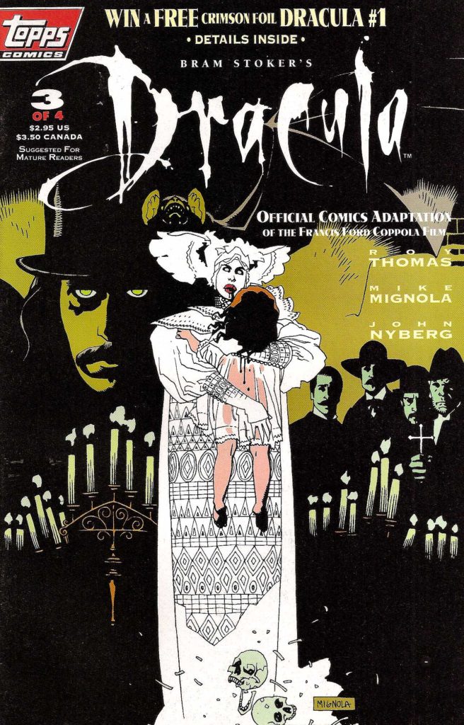
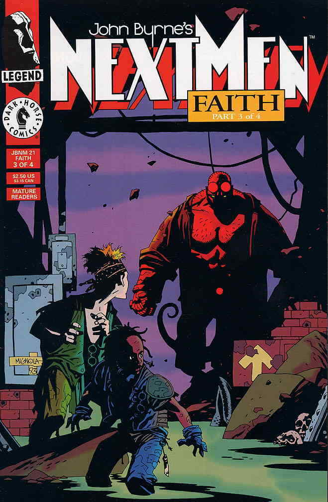
Mike Mignola — On The Road To Hellboy

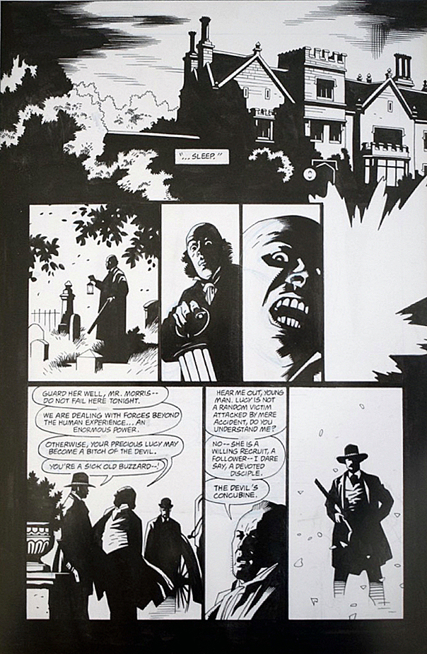
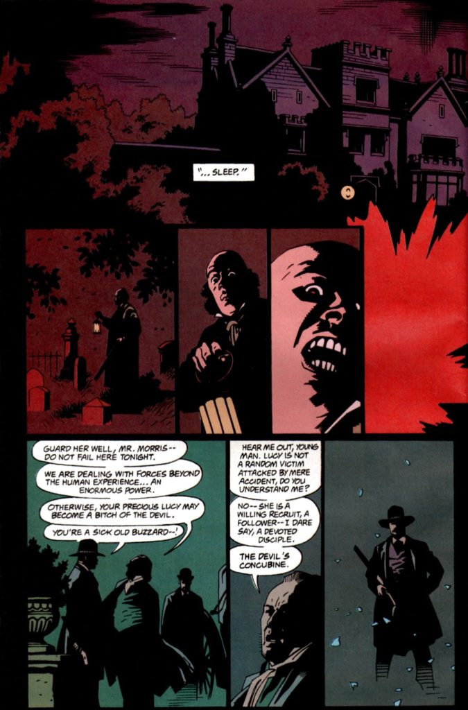
Bram Stoker’s Dracula, #3, December 1992


Happy Halloween! Today we wrap up our two-week series celebrating the best in monsters, mystery and mayhem.

Here’s a sweet page from Roy Thomas and Mike Mignola’s adaption of Francis Ford Coppola’s 1992 film, Bram Stoker’s Dracula.

Fun Fact: All the pages in this adaption are “sweet.” There’s not a miss in the bunch. In fact it’s one of the best looking of any film adaptations ever done in comics. (Top of mind, only Archie Goodwin and Walter Simonson’s Alien graphic novel is in the same league.) 

It’s also fair to say that while the film itself is fine (mixed reviews when it was released), the comics adaption itself is actually better.

Fun Fact: Coppola liked Mike’s art so much he hired him to provide illustrative material for the film itself, and Mike’s work is credited in the movie. 

Fun Fact: The title was the launch project for Topps Comics, and was in development prior to the hiring of an actual Editor-In- Chief. (Jim Salicrup.)

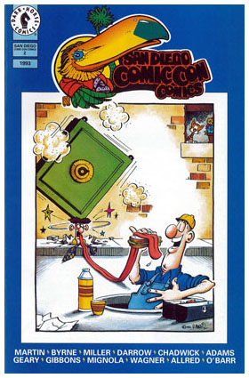
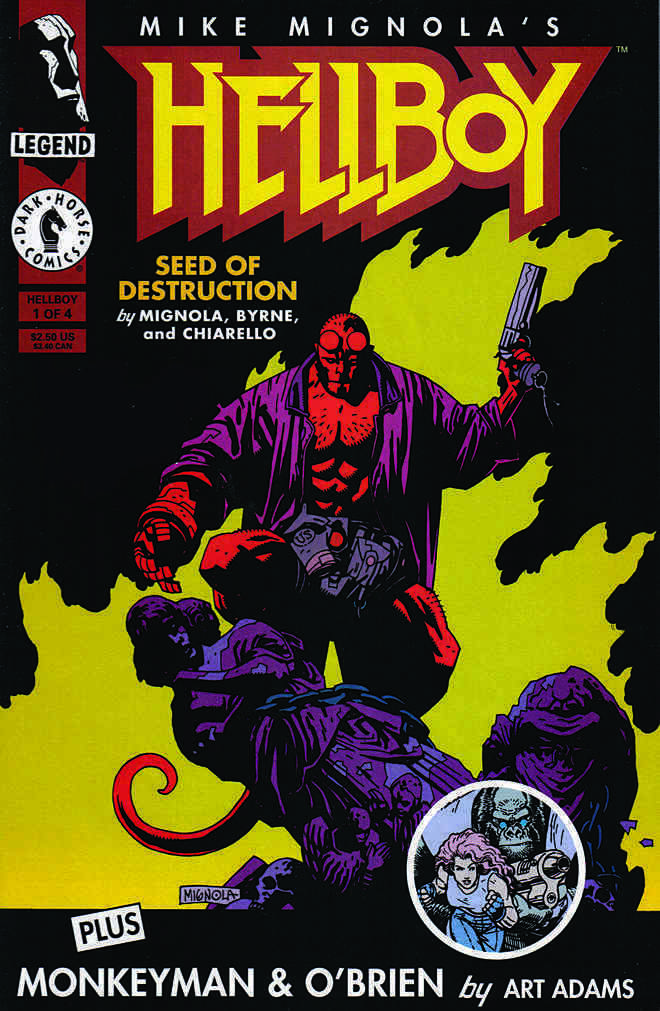
Fun Fact: John Nyberg inked the series in spectacular fashion— it’s astonishing how anyone but Mike could make it so “Mignola-like,” but John nails it. The brilliantly effective coloring is by Mark Chiarello, who later colors the first full Hellboy series, Seed of Destruction.  (Hellboy himself appears for the first time just a few months after Dracula concludes in an SDCC giveaway comic book.)

Fun Fact: For many years, Dracula was a lost classic — one of the few major Mignola projects not in print — for more than 20 years. I personally chased those reprint rights for 10 of those 20. Sometimes, insane tenacity pays off.

Fun Fact: It’s the first comic book I ever worked on professionally, and its reprint was one of the final projects published prior to my departure from IDW. (I will have to figure out a way to bring another version to my next publishing home. Ha.)

Fun Fact: Despite one of the best looking comic book series ever, it’s unlikely there will ever be an “artists edition” style book. The originals are scattered to the wind, and only occasionally offered for sale. I consider myself fortunate to own this one.

Jack Kirby — The Devil You Say

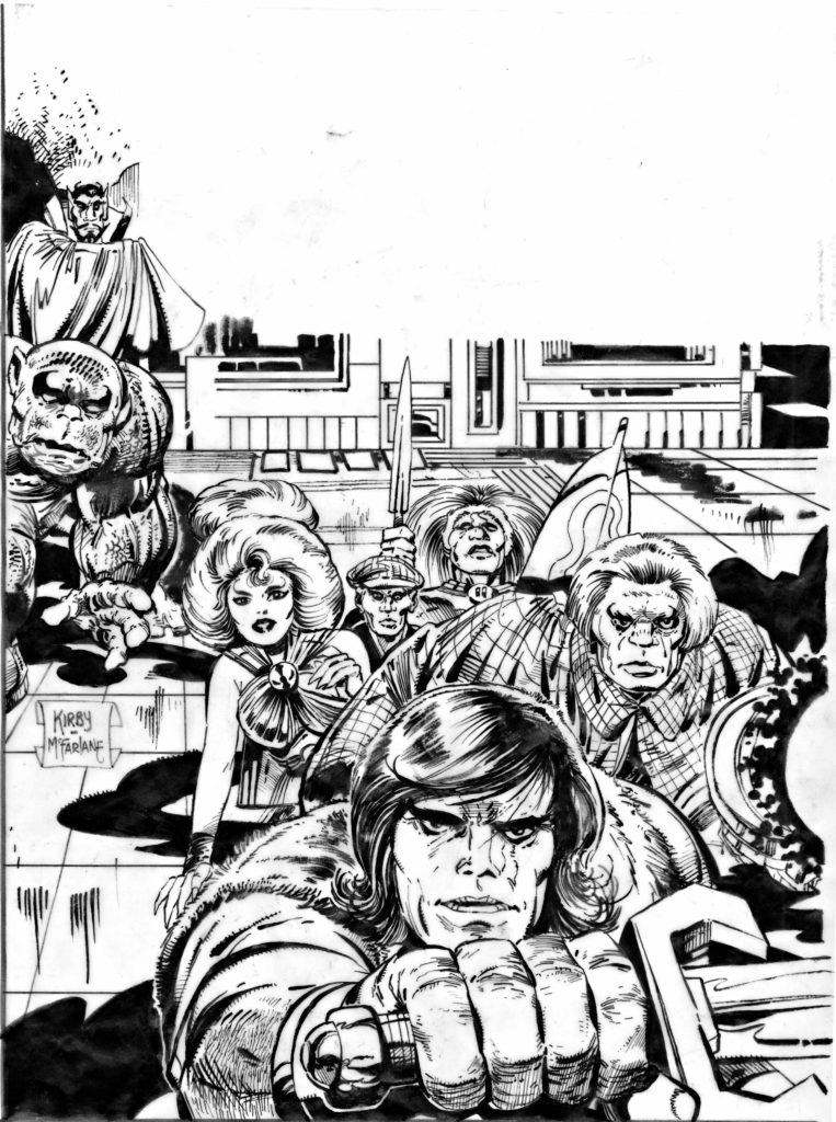
Satan’s Six #1, Original Cover Production Art, Kirby File Copy, 1978 / 1993

Continuing a two-week series celebrating Halloween with the best in monsters, mystery and mayhem.

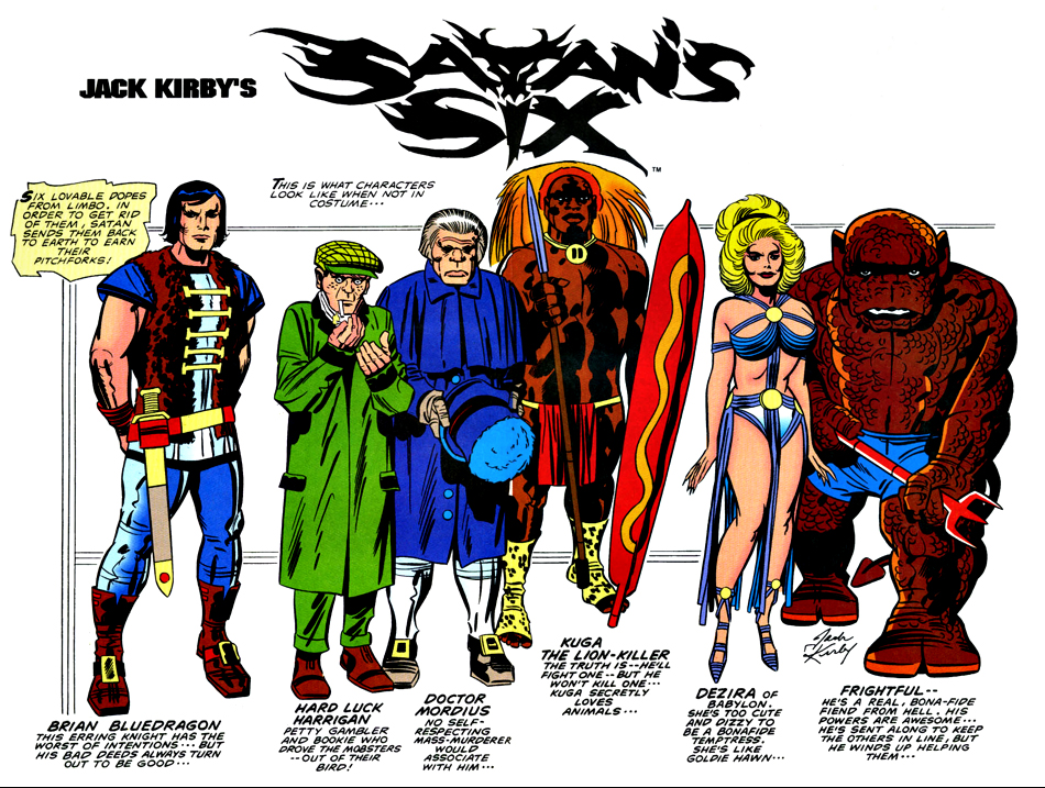
Here’s an oddity about an odd Jack Kirby comic featuring a bunch of oddballs.

Kirby’s Satan’s Six was developed as part on an unrealized “Kirby Line” of comics in 1978, shortly after Jack’s final tenure at Marvel had ended.

Jack drew a cover and eight story pages, plus a character concept and design page. Mike Royer was hired to ink some of those pages as samples, but when the concept for a “Kirby Line” dissipated, the pages sat in a drawer unused for nearly 15 years.

Enter Topps Comics, the fledging publishing line from the trading card and confectionary giant. Topps signed a deal with Jack in 1992 to produce comic books based on new, and (primarily) previously unused concepts. It was essentially a second chance for a “Kirby Line.” With the King in declining health, however, others would have to create content around Jack’s ideas.

Topps editor Jim Salicrup called his old friend Todd McFarlane and asked Todd if he would like to have a chance to work on a Kirby project. I’m pretty sure Todd said yes before Jim finished the question. 

Of course, Todd was busy with his own series, a small Image title called Spawn, so Todd could only commit to inking a cover. And the only Jack-penciled cover was issue #1, previously inked by Royer, but on photocopies or overlays. So Todd re-inked the cover. You can read Todd’s own recollection about that here.

And now, this production art has re-surfaced, complete with the original “Marvel style” trade dress, and Royer’s original inks, just in time for Halloween. 

What became of Satan’s Six? Tony Isabella’s stories based on Jack’s high concept of a lovable group of misfits too mischievous for Heaven but not evil enough for Hell seemed wackily appropriate enough, but the art definitely was a challenge from issue one. 

Especially issue one. 

Kirby’s eight original pages are scattered throughout the full story with the rest of the art from John Cleary, making for a dizzying juxtaposition of styles.

And Cleary’s “contemporary” (1993) art here, and through the remaining three issues, was simply not enticing enough to sustain interest.  The book was cancelled with issue #4. You can read a complete illustrated overview of the series here.

Satan’s Six has yet to return to comics. They remain in… Limbo.

Mike Mayhew — Inside Job

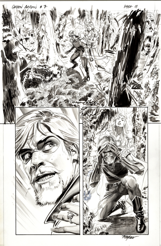
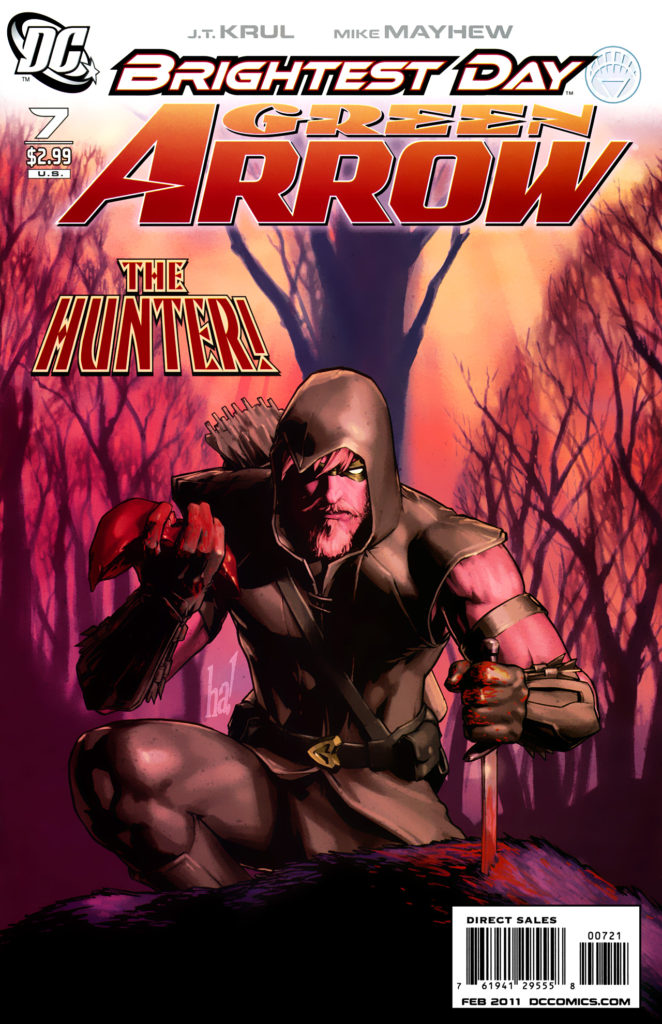
Green Arrow #7, February 2011

Green Arrow is back on the air (CW) for its eighth and final season, so before the emerald archer fades into the TV sunset, we’re focusing a few posts on Green Arrow originals.

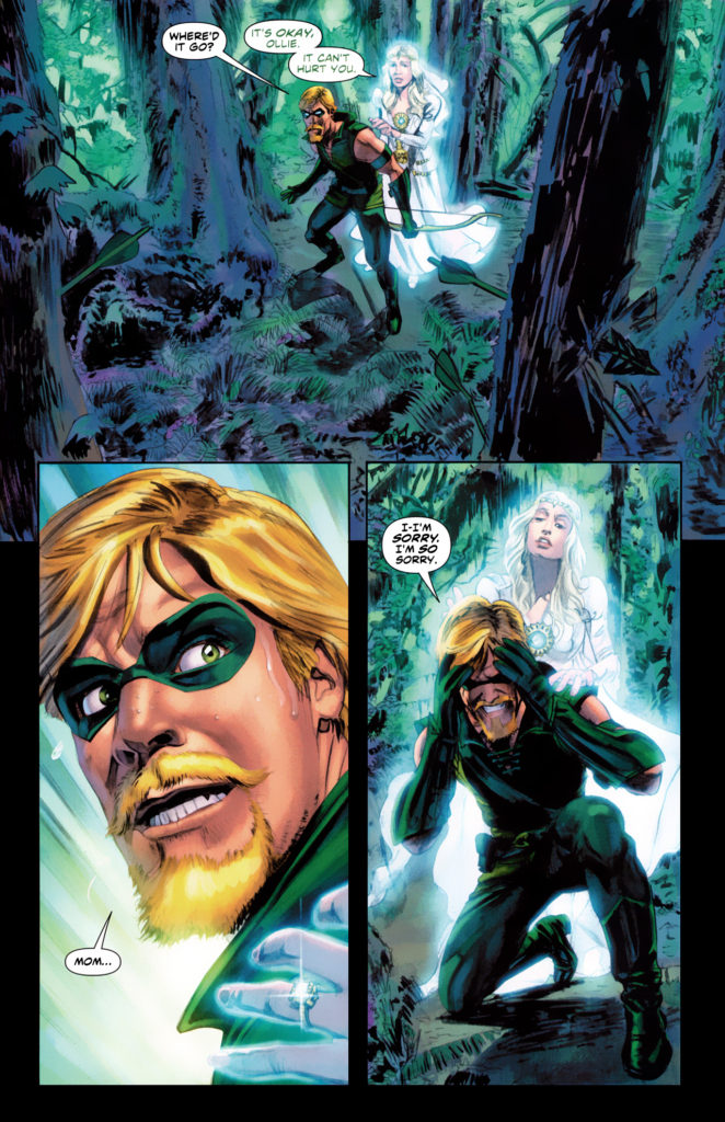
Here’s a great panel page example by the phenomenal Mike Mayhew. 

Mike’s earliest regular work was at Topps, excelling at dynamic storytelling on Zorro (yes, Zorro) in the traditional pen and ink medium. After the comic book implosion of the mid- 90’s left many talented artists out of a job, Mike tried his hand at painting for a book cover assignment. The result? Mike quickly transformed from talented story artist to a premier cover painter.

These days, Mike’ schedule only occasionally allows for fully illustrated interior stories. Here he demonstrates his tonal skills on Green Arrow — creating a lush, haunting page. (GA is dealing with the apparent ghost of his dead mother, hence the haunting.)

When Mike introduces me to a third party, he often says I was his “first boss.” Technically, that would have been Jim Salicrup, who edited Topps comics during its brief heyday, from 1992-97. But I was the Director of Publishing… so why quibble? Mike’s a great talent and a friend. I’ll take it.

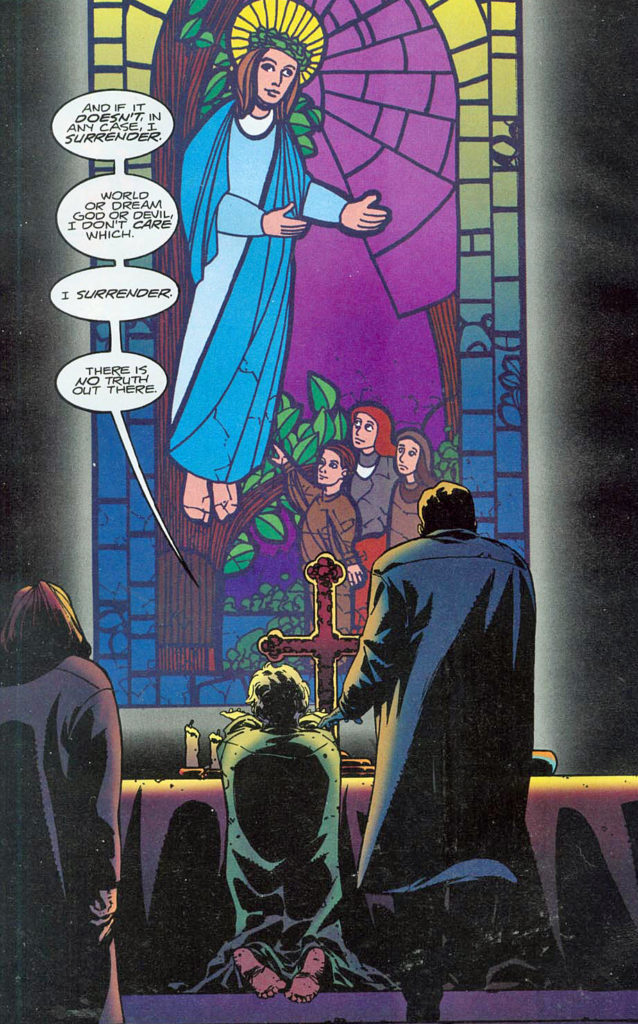
Charlie Adlard — The Truth is…

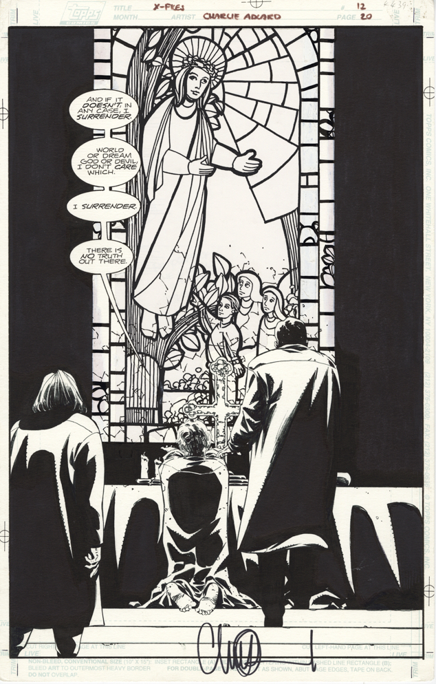
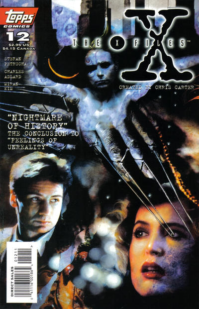
X-Files #12, Topps Comics, January 1996

Sometimes, you like a page… just because.

Because of the theme? Because of the composition? Because of the way the artist uses design to contrast light and darkness? Because you have a special fondness for the comic book series? All of that? Something completely different?

I think this X-files page appeals to me for all of the reasons above and more. Obviously not what collectors typically think of when they think of a cool splash page. (Among its many quirks, you can’t see the characters’ faces.) But for me, something about this just works.

I’ve always loved science fiction and unexplained phenomena and the X-Files was a great combination of the two   And I consider myself fortunate to have published the franchise twice: Once at Topps Comics during the show’s first-run heyday, and then 20 years later at IDW Publishing, where I remain convinced that our comics drove the renewed interest in the franchise.

The truth about Charlie Adlard? Charlie helped make the Walking Dead into one of the most important comics of the last 20 years. And Walking Dead, in turn, helped Charlie achieve the star status he deserves as a brilliant artist and storyteller. And I couldn’t be more pleased (and not at all surprised) about his success.