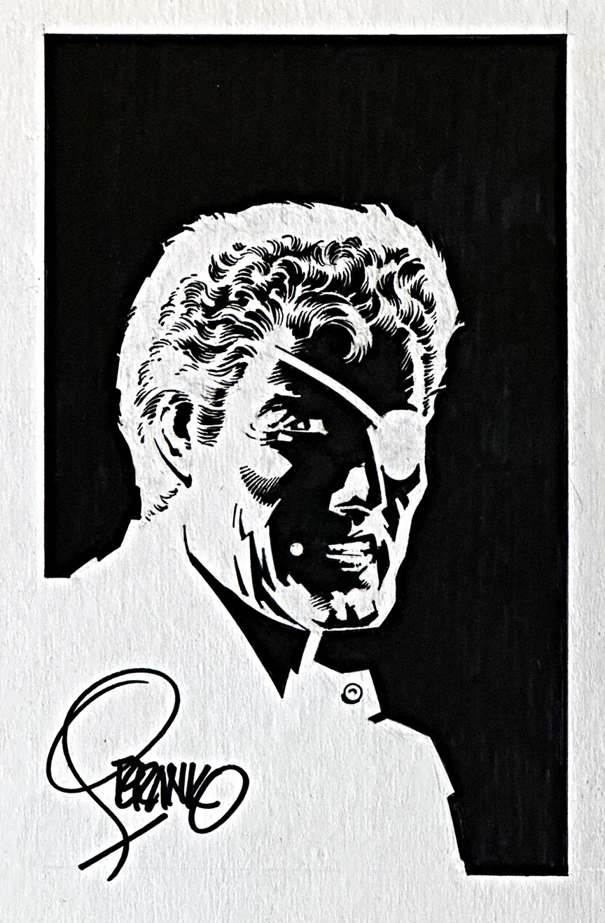
Jim Steranko — Full Of Fury
Nick Fury commission, undated
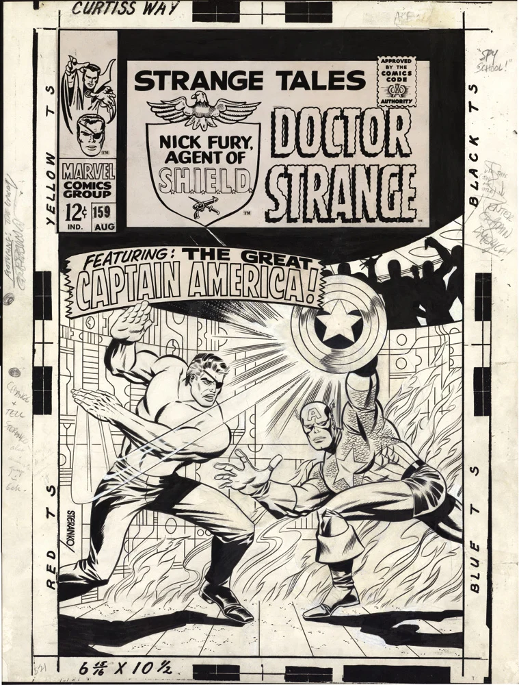
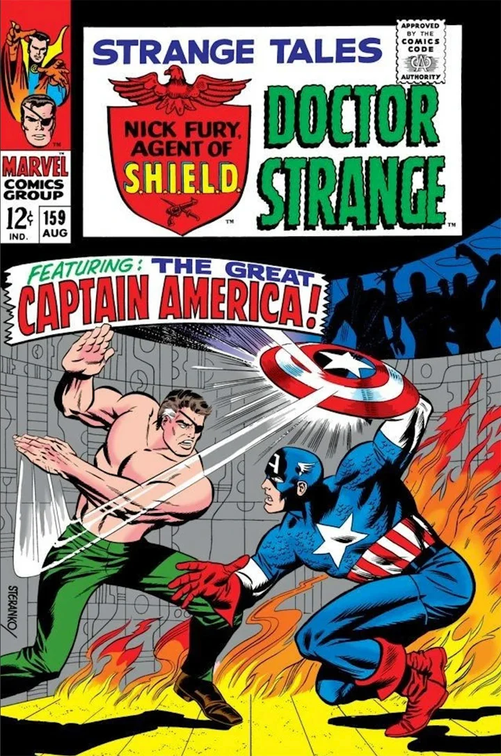
I was only a little kid (7.5 years — I checked) when I first discovered Jim Steranko in Strange Tales #159. (In fairness, I might have discovered him an issue or two sooner, but it’s Captain America’s appearance on the cover that stands out in my mind’s eye.)
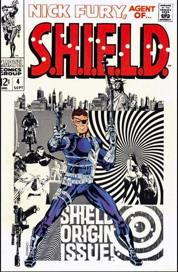
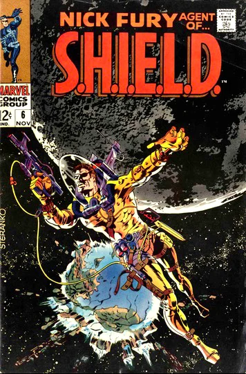
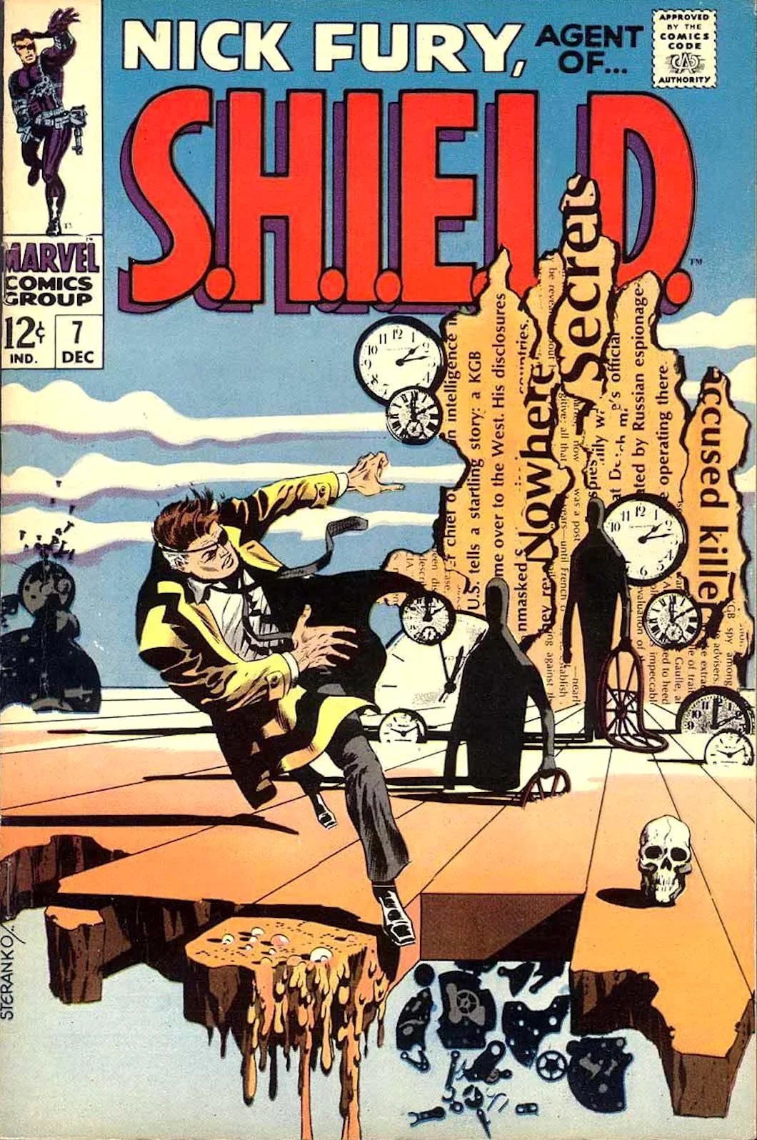
This is right around the time that Jim became STERANKO — no first name or other reference required. In subsequent issues of Strange Tales, and then his short-lived legendary run on the solo Nick Fury series, I most definitely didn’t always understand what he was doing, but I knew it was dynamic, wild and special. Looking back at the material today, it remains so.
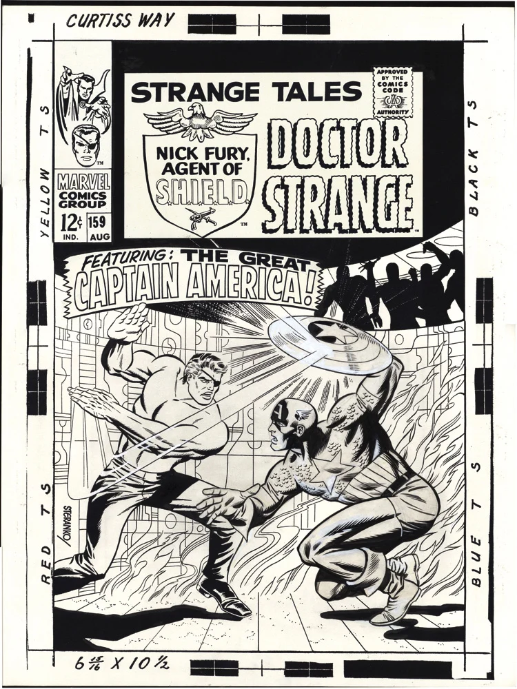
Jim holds on to most of his published artwork, so a cool specialty piece like this one is a rare opportunity to have something of Jim’s in a collection. And when — and if — that published art ever comes on the market, there is so little of it, and it will be in such high demand, that affordability is going to be a challenge.
A big one.