Greg Goldstein's Comic Art Gallery

William Stout — Creature Feature

Tribute to Ray Harryhausen, 2003

2020 is the 100th anniversary of the birth of Ray Harryhausen, movie visual effects pioneer who inspired generations of filmmakers. Interestingly, Harryhausen and Ray Bradbury, subject of our previous post, were lifelong best friends.

Harryhausen’s cinema creatures are iconic, including The Cyclops from his first color feature, the 7th Voyage of Sinbad (1958).

Bill Stout drew this impressive Cyclops (plus a few supporting “characters”) to use as his cover for his tribute book to Haryhaussen in 2003. Stout has done a number of these tribute books, including one appropriately enough for Willis Obrien, Haryhausen’s special effects mentor.

The art ended up in the collection of film director Frank Darabont, and was auctioned off when Darabont sold much of his collection in 2019.

Leading comic art dealer Mike Burkey then acquired it, and I acquired it from Mike.

And now, to paraphrase, the Cyclops stops here.

William Stout — Thunderous

Ray Bradbury Comics #1, February 1993

The legendary SF author Ray Bradbury would have turned 100 years old this year. He passed away in 2012.

Ray Bradbury’s A Sound of Thunder is my favorite time travel short story.

It’s also the very first time travel short story I ever read. (I had already read HG Wells’ novel, The Time Machine, at that point. Multiple times in fact.)

Thanks to the progressive spirit of my secondary school system, we read the Bradbury short story collection “R is For Rocket” in eighth or ninth grade.

A Sound of Thunder: Time travel. Adventure. Dinosaurs. In other words, for my tastes, perfect.

Nearly 20 years later, Byron Preiss and Topps struck a deal to publish comic book versions of Preiss’ graphic novel series, Ray Bradbury Illustrated.  Main feature in the first issue? A Sound of Thunder, cover by the incredibly talented Bill Stout, who is generally in a class by himself when it comes to Dinosaurs.

(The comic features a new adaptation by Richard Corben and the reprint of the classic EC story by Al Feldstein and Al Williamson.)

And 25 years after that? Stout decides to part with the cover, and I literally stumble upon at his booth at SDCC. Hanging in the frame that hung in his studio for many years.

Serendipity at work. Lets call this one a part of the “ permanent collection.”

June Brigman And Whilce Portacio — Snik!??

Alpha Flight #52, November 1987

Concluding — for now — our two-week series celebrating a few important X-Men anniversaries in 2020.

A full-page splash of an iconic superhero… on the phone?

Well yes, why not, if done well?

And here in Alpha Flight it’s done very well, by the talented June Brigman and Whilce Portacio.

I love the look on Logan’s face. And, his coif reminds me of the line from great Warren Zevon song “Werewolves of London:” 

“His hair was perfect.”

Wolverine is not self-quarantining here. I double-checked. He’s just chilling at the moment. Also, note there are two things you won’t see anymore in a Marvel Comic. A phone cord and a cigar; old technology and a bad influence on kids, in the order.

But Snik?!?  Someone apparently forgot the “t” in Snikt? That’s an odd one. Chris Claremont first used “Snikt” way back in X-Men #116. And, apparently it’s become a legit trademark for the sound of Wolverine’ claws.

Fun fact: The story continues — with Wolverine — in Alpha Flight #53 and, while also inked by Whilce, its penciled by none other than Jim Lee, whose very first Marvel work was two issues earlier, in #51. But this time, he draws Wolverine, a sign of things to come.

Fun fact #2: Whilce and I bumped into each other —- both of us with unscheduled visits — on Free Comic Book Day a few years ago. Pretty fun and random coincidence — its not like San Diego is a small county, or only has one comic book store.

Fun fact #3; If for any odd reason you have not read the Power Pack series by Brigman and Louise Simonson, well, stop what you’re doing and get to it. Brilliant. And fun!

More X-men and Wolverine related posts late in the year. Stay tuned.

Paul Pelletier And Ken Lashley (With Mark Morales) — Battle For The Ages

Commission, 2017

It all started with Hulk vs. Wolverine.

Beginning on the last page of Incredible Hulk # 180 and continuing through the now iconic (and ultra–expensive) Incredible Hulk #181 the introduction of Wolverine foreshadowed the “new” X-men a few short months later.

(FYI, he also appears on the first page of #182, where get’s forced to leave by the Canadian authorities he works for. Remember when it was a big deal that Wolverine was “Canadian?” But I digress…)

Since that moment 46 years ago, Hulk and Wolverine have crossed paths more than a few times. And why not? Feels like a reasonable match-up.

This commission jam piece by Ken Lashley on Wolverine, and Paul Pelletier on Hulk — with Mark Morales on inks — captures he dynamics of this battle perfectly.

The original commissioner had a very specific vision in mind —- and obviously realized it — but then chose to sell / trade it shortly thereafter to a comic art dealer. Apparently, the original collector has MANY pieces featuring Hulk vs. Wolverine.

I don’t normally collect commissions (unless it’s a recreation or re-imagination) with some notable exceptions by comic art veterans, but this one called it out to me, and it ended up in my possession as part as a larger acquisition.

All three artists knocked it out of the park.

Which, based on the scene itself, is about to happen to ether Hulk or Wolverine — or both — in a millisecond.

Tom Grummett / Sean Chen — He’s Dead, Jim

X-Men Forever #10, December 2009

As noted earlier, John Byrne had returned to X-Men with X-Men: The Hidden Years.

His original collaborator, writer Chris Claremont, returned much later on in 2010 via a more direct route, in X-Men Forever.

Basically picking up after he left off in 1991 — and then immediately diverging — Claremont quickly killed Wolverine and had the remaining X-Men team deal with the ramifications of his death.

Tom Grummett’s character-packed cover deals with the team laying their fallen comrade to rest. Grummett was the many artists on the Forever series, which also included X-men mainstay Paul Smith on this issue, and others.

It’s an interseting choice — and a good one, commercially — to leave Wolverine’s uniform on top of the coffin. Contextually, of course, it makes little sense.

Sean Chen’s variant cover takes a look at an imaginary one moment later — when “zombie” Wolverine breaks out of his coffin(In uniform). This event is not in the series. Wolverine in fact stays dead. This image seems a tribute to the popular (and multiple) Marvel Zombies series.

It’s a clever set-up, and one of the few times a main cover and a variant are done in this manner. Kudos to editor Mark Paniccia — or whoever came up with the imaginative idea.

John Byrne — Unhidden

X-Men: The Hidden Years # 17, April 2001 & #20, July 2001

John Byrne returned to the X-Men in 1999. Not his beloved X-Men of Wolverine, Storm, Colossus and Phoenix, however. This time it was the “original” X-Men — in the period between their cancellation and rebirth. The “Hidden Years.”

It’s an often overlooked series and shouldn’t be. John brought great energy — and closed some outstanding story loops — in the 22-issue series.

Inks are by the terrific Tom Palmer, which gave the series a classic look, reminiscent of those great original Neal Adams issues, while still keeping it clearly Byrne.

Lots of fun guest appearances in the series as well, including the Fantastic Four — inked in one issue by the legendary Joe Sinnott.

Mike Parobeck — Modern Composition

X-Men: The Early Years #7, November 1994

Sometimes the reprint cover is just better.

Case in point, Mike Parobeck’s cover of X-Men: Early Years #7, which reprints the original X-Men  #7.

Jack’s original cover (below) is overloaded, and a composition mish-mash. Ok, I know it’s by Jack Kirby, and some fans will bristle about anything negative about the King’s work, but sorry, there’s no real comparison between the original and the reprint.

Mike’s cover is strong and focused.
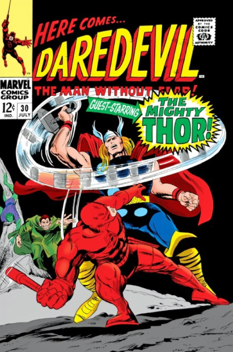
Jack’s original has way too many characters all over the map, with the X-men oddly positioned in the background and The Brotherhood of Evil Mutants voyeuristically up front, awkwardly. Are they watching from a window? Or on a TV screen? A magical portal? Why the heck are they even on this cover? This is a selling point?

Now, just to be clear, this may not be at all Jack’s fault. Maybe Stan Lee art directed it. And overwrote the cover blurbs to death. (Now, the Stan haters can come out of the woodwork.)

As I’ve said on the record many times, I’m a fan of both Stan and Jack, so let’s all calm down. However this original cover developed, it’s simply not a great one. Even legends drop the ball once in a while.

Mike’s solves the problem thirty years later by focusing only on the X-men coordinating — or attempting to — an attack on the Blob.

Simple. Clear. Clean. Powerful.  Typical of Parobeck’s work.

But… On the published version, the trade dress is a bit heavy handed, so some of the art is obscured — and the entire image had to be flipped to accommodate said trade dress. And, to add to this litany, why the monochrome coloring? Ah Hell, who knows.

Anyway, the original art is great and Mike’s Marvel work is pretty rare; he is best known for some great looking art on the Batman Animated comic books. I was also a big fan of his Justice Society run.

He unfortunately passed away MUCH too early at the age of 31 (from Diabetes) in 1996.

His is a talent that is sorely missed.
John Byrne — X-Men Redux

X-Men #115 Re-Imagination, 2006 (Orig. Nov. 1978)

2020 is a big year for X-Men anniversaries.

It’s the 50th anniversary of the original title’s cancellation (Issue #66). It had struggled to find consistent commercial success or creative direction for much of its original seven-year history.

It’s the 45th anniversary of the X-Men’s “comeback” with the launch of Giant-Size X-Men #1, possibly the greatest rags to riches story in comics’ history. If anyone else can tell me where a book goes from cancelled to a company’s most popular title in less than 10 years, I’m all ears.

And, perhaps more importantly from a broader pop culture perspective, it’s the 20th anniversary of the X-Men film franchise from Fox, which concludes forever in a short while with the release of the problem-plagued New Mutants. (Postponed many times, it was most recently scheduled for an April 3 theatrical release, and has now been indefinitely delayed because of the COVID-19 outbreak.)

The first X-Men film launched 8 years ahead of the MCU, and in my mind, established what a Marvel film could do in terms of both creativity and commercial success. It paved the way for what was to come.

Meanwhile, we have this great commission by John Byrne.

John Byrne. X-Men. Not much to add here except a few details.

This is a Byrne re-imagination (as John calls them, I believe) of the cover of X-Men # 115 featuring the dinosaur villain Sauron. The re-imagination is more dynamic and dramatic than the original, which was only John’s third cover on the book. Dave Cockrum had a few in the can when Byrne took over art duties on issue #108.

Byrne’s commissions can be found easily through a Google search and there a lot of great ones — at sizes up to 30x 40!

Unfortunately, John’s not doing much if any in the way of commissions right now as he is spending time on his X-Men fan fiction (his phrase) but if you want to keep fingers crossed that he will take them up again, you can contact his art representative, Jim Warden.

John’s Commission is closer in spirit to this great original double-page spread from #115.

Jack Davis — Casualty Of War

Frontline Combat #5, March 1952

Concluding (for now) our 60th anniversary celebration of the legendary EC “New Trend” comics with another classic piece of great art from the legendary Jack Davis.

“We got into the Civil War thing.  It was a favorite project of mine.  We were hot to do the story of the Civil War from front to back.”
— Harvey Kurtzman, 1972 EC fan convention panel.

War stories were among EC’s many strengths, and many of those, thanks to Harvey Kurtzman’s obsessive editorial attention, were accurately based on historical events.

“Stonewall Jackson!” is a perfect example. Jackson, a brilliant Confederate military tactician, was accidentally shot by his own men in a nighttime battle. This Kurtzman story retells that tale through the voice of the supposed soldier who shot him.

Lighting is an illusion created by a creative combination of black ink and negative space. On this splash, one of my personal favorites, Davis indeed creates a beautiful illusion of campfire light. There is no actual illumination here of course, but thanks to the well-crafted art, our mind’s eye sees it.

The storytelling is equally effective. The camera work closes in on one figure through multiple panels — we instinctively know that this is our narrator and his story, even without reading the dialogue.

Kurtzman and Davis were a terrific team.

All our stories really protested war.  I don’t think we thought war was very nice generally.  The whole mood of our stories was that war isn’t a good thing.  You get killed.  That’s the way war is; you get killed suddenly for no reason. — Harvey Kurtzman, 1972 EC fan convention panel.

In 2011, Davis told The Wall Street Journal about his early career and his breakthrough with EC:

I was about ready to give up, go home to Georgia and be either a forest ranger or a farmer. But I went down to Lafayette St., up in an old rickety elevator and through a glass door to Entertaining Comics where Al Feldstein and Bill Gaines were putting out horror comic books. They looked at my work and it was horrible and they gave me a job right away!

Every time you went in to see Bill Gaines, he would write you a check when you brought in a story. You didn’t have to put in a bill or anything. I was very, very hungry and I was thinking about getting married. So I kept the road pretty hot between home and Canal Street. I would go in for that almighty check, go home and do the work, bring it in and get another check and pick up another story. [Edit: the actual cross street to Lafayette was Spring Street, not Canal.]
Jack Davis — Kurtzman’s Obsession

Two-Fisted Tales #21, May 1951

Continuing our 60th anniversary celebration of the legendary EC “New Trend” comics with another classic piece of great art from the legendary Jack Davis.

This is actually the fourth issue of EC’s Two-Fisted Tales. William Gaines — and other publishers — used a variety of title and numbering gimmicks to ensure they didn’t lose a slot in the challenging newsstand system.

It’s a Korean War story — ongoing at the time of publication — and one of many published prior to the “ceasefire” that ended the war.

Davis, in one of his early war stories, does a fantastic job following — and enhancing — Harvey Kurtzman’s very specific layouts.

Very specific layouts? Kurtzman was obsessive about the storytelling and the detail. If he couldn’t draw the story himself, e wanted to ensure that the finished result would be as close to his own material as possible. Again, because this is an early Davis war story, even the art style itself is mimics Kurtzman’s in places.

Davis and Kurtzman (and others) discussed Kurtzman’s methodology at the 1972 EC fan convention, and took a question from the audience…

QUESTION:  I’d like to know how the individual artists felt working with the very strict layouts.

KURTZMAN:  I’d like to hear that, too.

DAVIS:  I don’t know.  I think the end product came out pretty good – the detail and all.  There are a lot of people that appreciate detail and there are a lot of people that don’t.  Once you do something you like it to be authentic.  Where doing the horror books you didn’t have to be authentic, this was something that you’d like for it to come across as true, and Harvey felt very strongly about truth – the way the weapons worked and everything.  We did the best we could, and I enjoyed it.  It wasn’t that bad.  I’d hate to do it all the time.