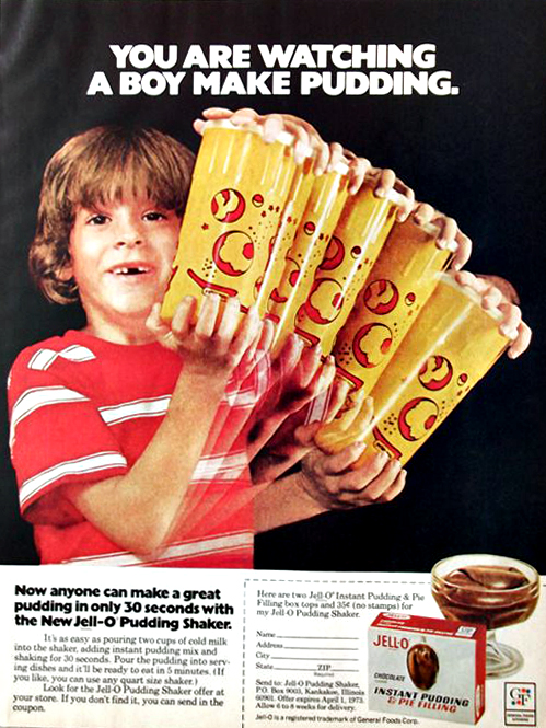
Darwyn Cooke — Detective Duo
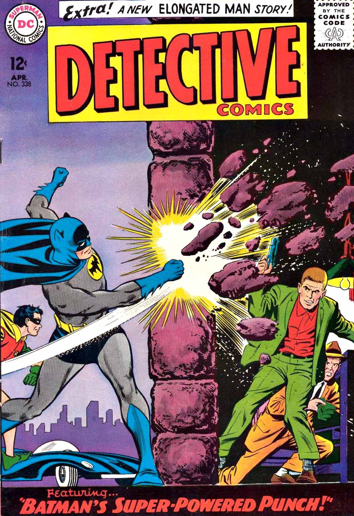
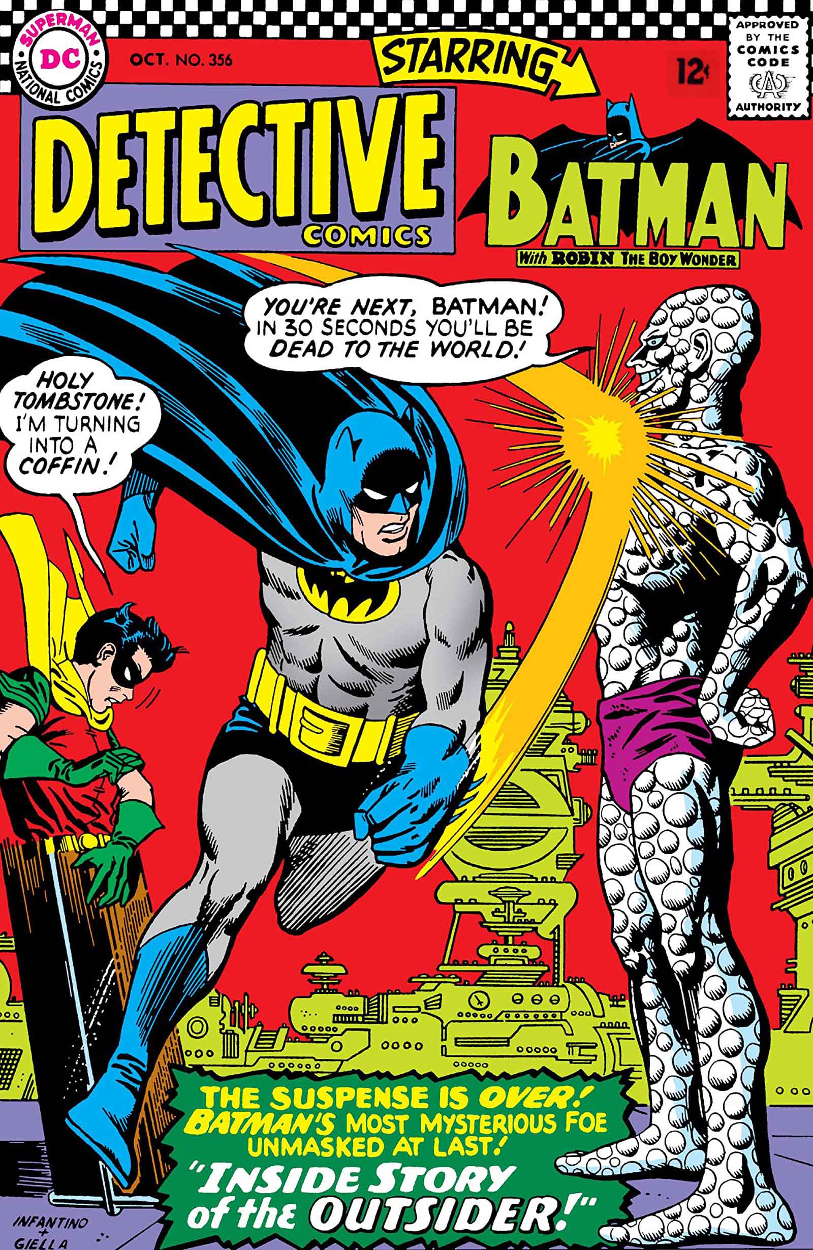
Detective Comics # 338 and #356 Mashup Re-imagination, 2010
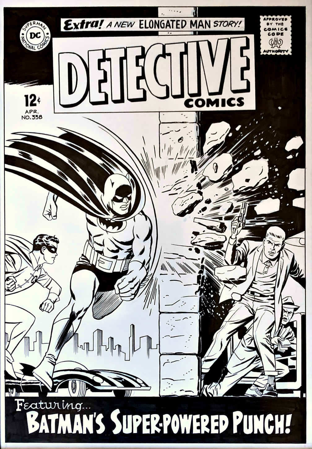
As noted last year, the late, great Darwyn Cooke produced a number of these reinterpretations and homages of classics during his all too short lifetime.
In this dynamic drawing, Darwyn combined two classic covers into one, taking the iconic “punch scene” from Detective #356 and fitting into the #338 layout. Carmine Infantino (pencils) and Joe Giella (inks) created both of the memorable original covers.
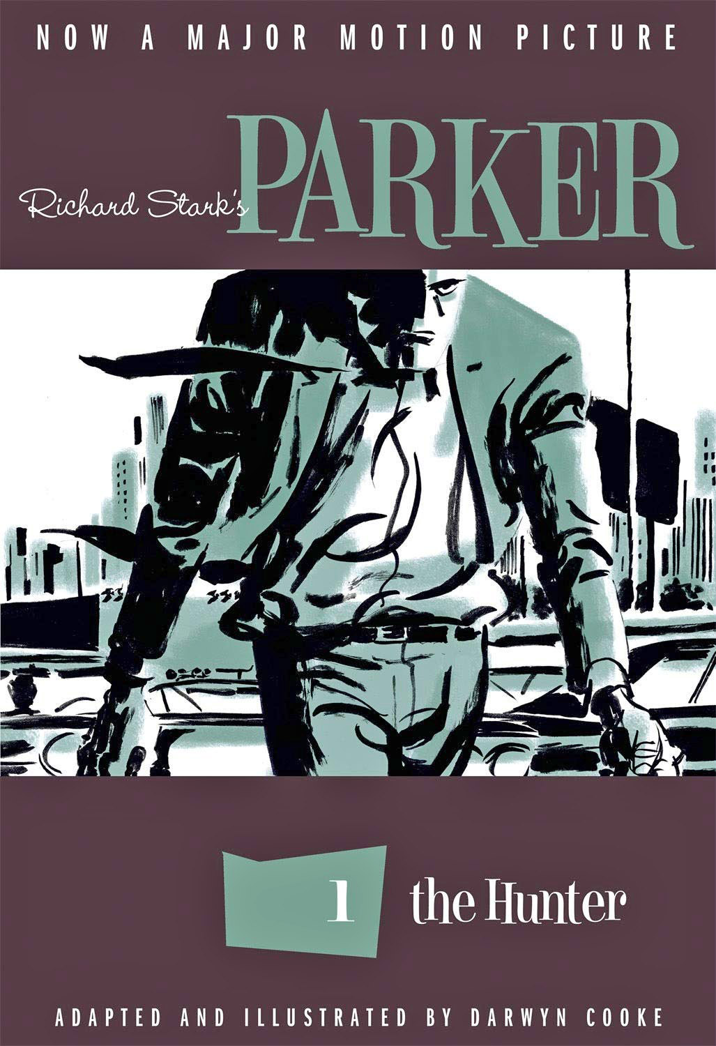
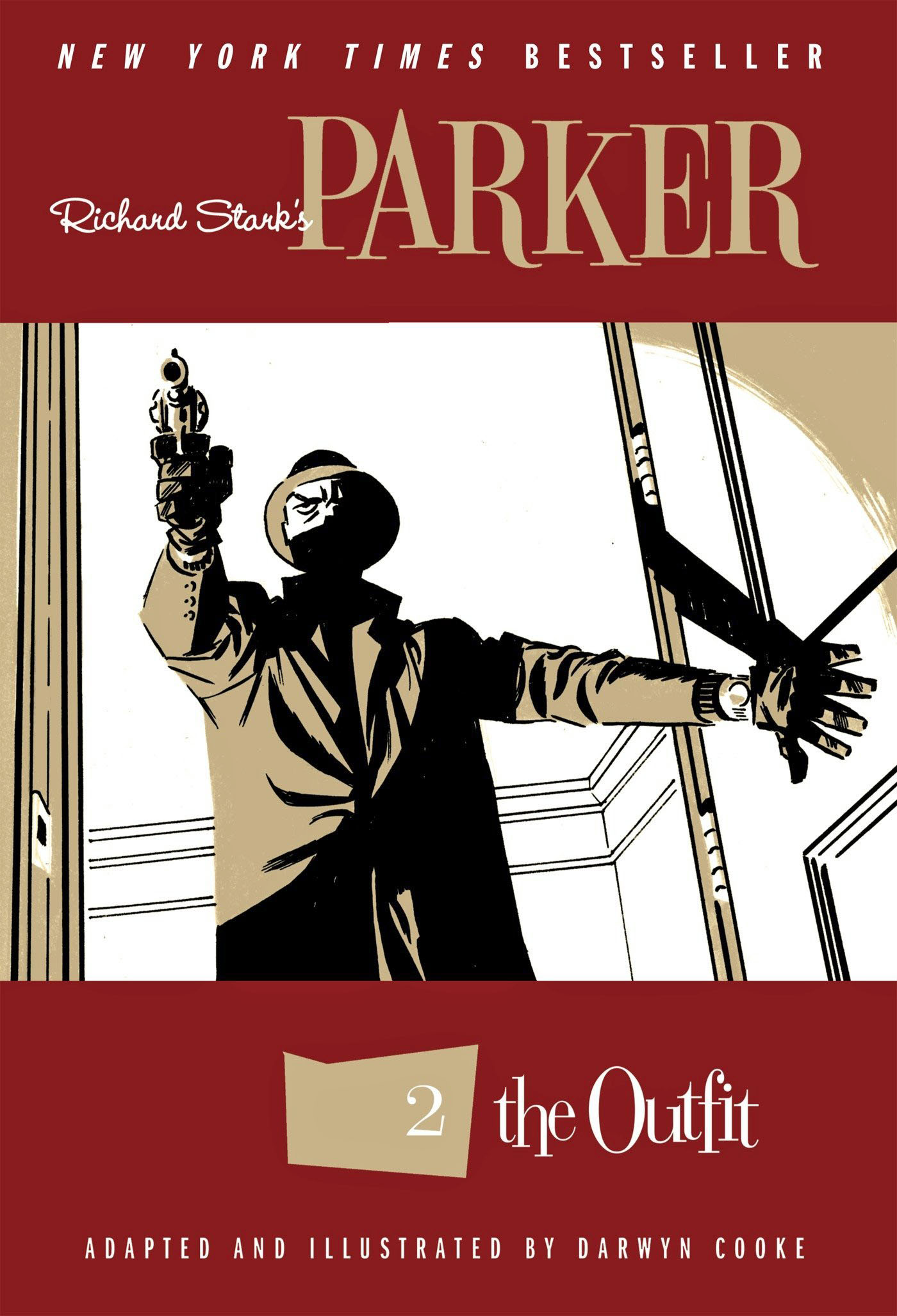
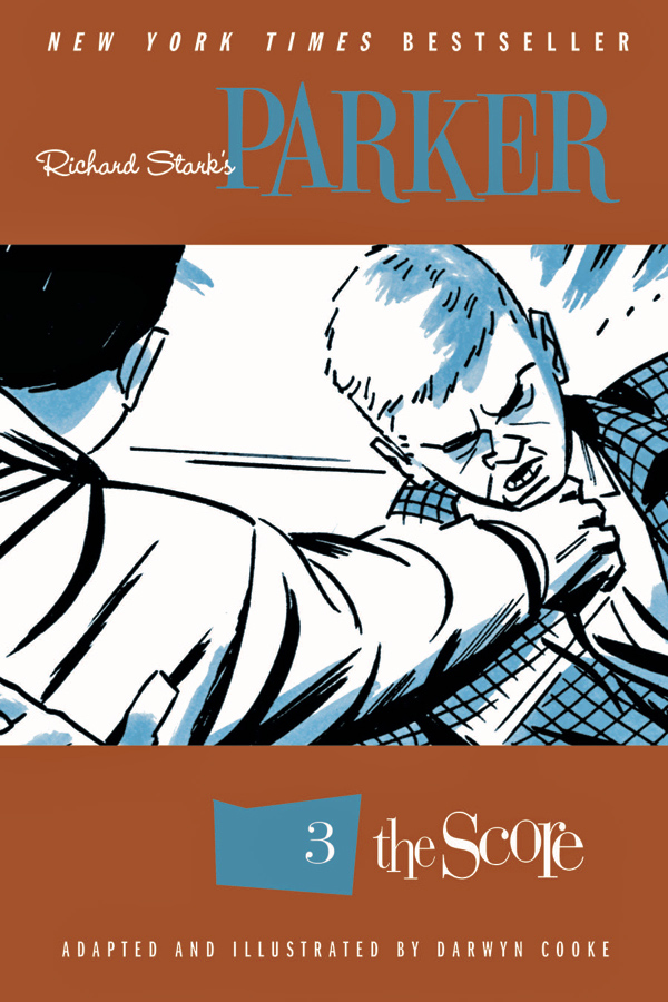
When you dive the detail of the re-imagination, you might notice that the crooks in the right frame now more closely resemble the hoods that populate the Darwyn’s astonishing Parker graphic novel series that we published at IDW. It’s a wonderful touch.
Definition of a comics geek?
When I saw this piece offered for sale, I recognized what Darwyn had done — without it being specifically noted in the item description. Issue #356 was one of the first Batman comics I remembered reading as a kid.