Greg Goldstein's Comic Art Gallery

Gil Kane and Wallace Wood — Toys For The Holidays (Part 2)

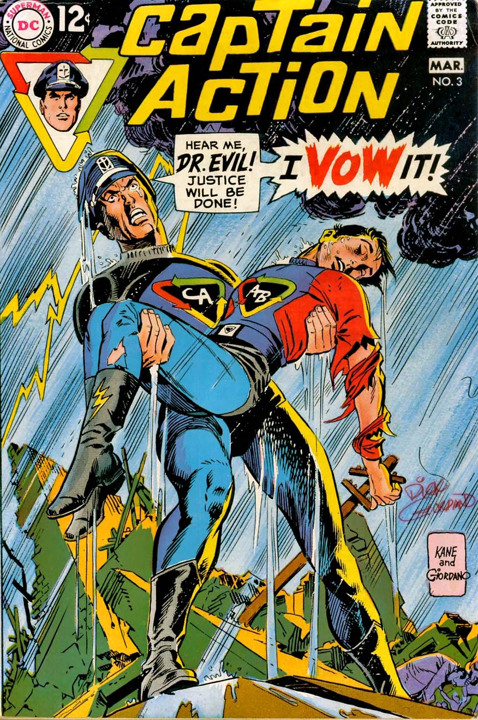
Captain Action #3, May 1969

Can lightning strike twice in the toy biz?  Inventor Stan Weston thought so, and I for one, became proof of concept.

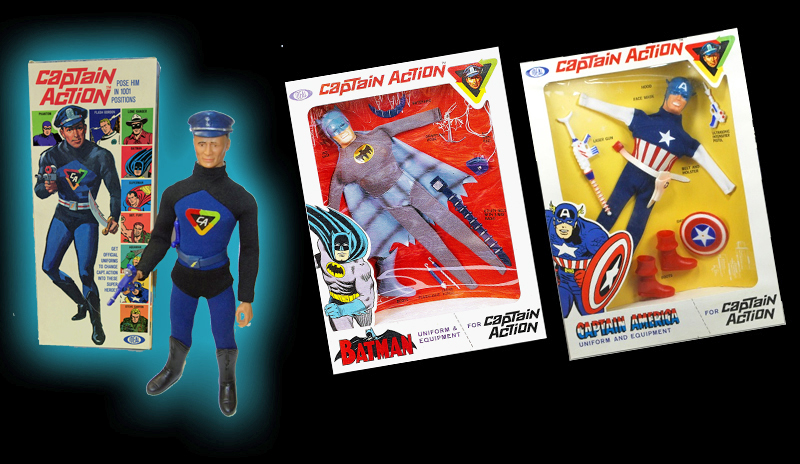
Weston had created the original 12” G.I. Joe “doll” for Hasbro in 1964 and younger baby boomers like myself quickly became obsessed with the figures and all their wonderfully detailed accessories.

Next up: Weston took his invention to Ideal Toys in 1966, and turned it into a superhero concept, capturing the zeitgeist of the era. Captain Action was born, and despite the goofy name, its dozen licensed superhero costumes were a terrific gimmick.

Kids could turn the good captain into a number of well-known characters including Superman, Batman, Spider-Man, Captain America and Aquaman.

And the best part? The costumes and accessories worked just fine with existing G.I. Joes, so any crafty kid (we were all crafty, FYI) could create a multiverse Justice League without buying multiple Captain Action figures.

The toy line burned brightly, but briefly, and by 1968/69, the product was heading to the closeout racks. That apparently didn’t concern DC, which licensed the character for yet another brief comic book series.

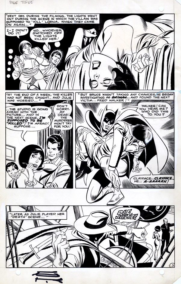
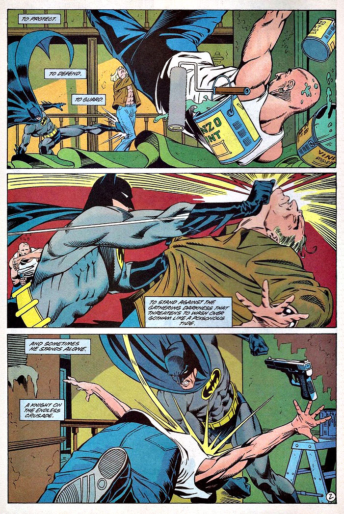
Fortunately, visual storytelling chores were handled by Gil Kane and Wally Wood, making for some great original art. (Wood drew issue #1 solo, and then inked Gil on issues #2, #3 and #5. Gil scripted, penciled and inked issue #4.)

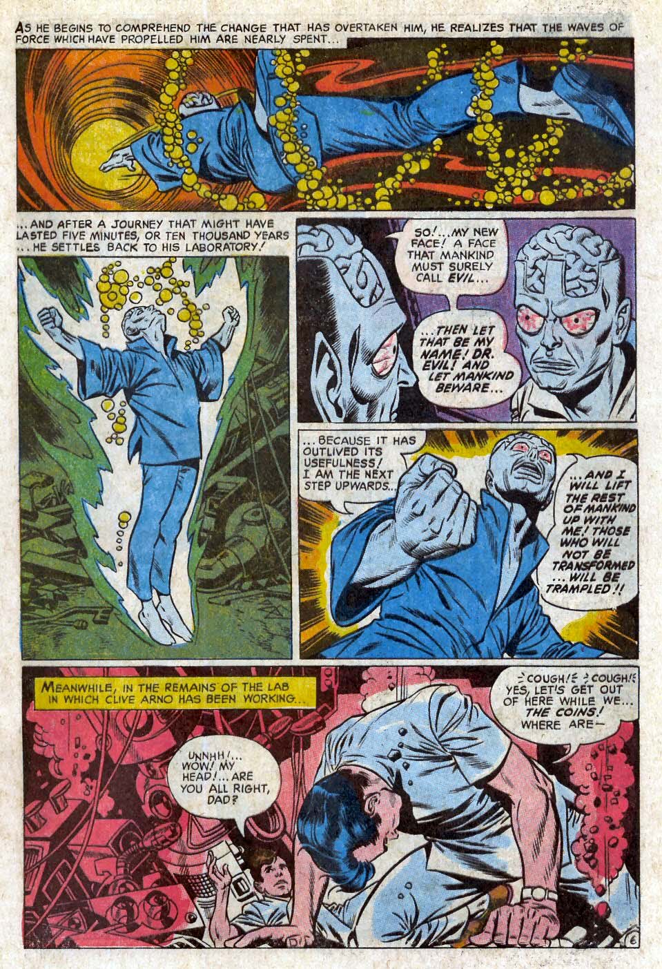
This cool page features the origin of “Dr. Evil,” main nemesis to the good Captain. Remember when I said the Captain Action name was goofy? I have no words for naming a villain “Dr. Evil.”

Bill Morrison — Christmas Time (Is Here Again)

Batman Family Commission, 2016

Bill Morrison helps the Bat Family — and us — get ready for some Christmas spirit.

(Although I’m not sure Batgirl is all that happy about her present.)

I keep meaning to get this great commission colored, but somehow I never quite get around to it. Oh well, there’s always next year.

In the meantime, here’s hoping everyone has a safe, healthy and happy Holiday Season. We’ll be back here on Christmas Day with a special post.

Carlos Pacheco — Shattered Glass

Ultimate Avengers #3, December 2009, and Avengers Assemble Season 2 (Marvel Universe) #4, 2015

Continuing our tribute to Captain America’s 80th anniversary.

Captain America breaks a lot of a glass. In his very first solo appearance in the Silver Age, (Tales of Suspense #59) Jack Kirby has him jumping directly at the reader, shattering a window as he does.

Maybe that shield gives him a sense of security. After all, the super soldier serum made him super strong, but not invulnerable. And Batman and the other “ordinary” (no enhanced super-powers) heroes tend to break a bit less glass.

This great splash page features rouge Captain America doing the glass bit with tremendous drama and detail by the terrific Carlos Pacheco.

And the art is so dynamic that Marvel used again six years later as a cover for an animated series cover.

That’s pretty cool —it could have been used as a cover the first time around, but second time’s the charm apparently.

Eduardo Barreto — Caught

Pin-up, Rocket’s Blast and Comic Collector (RBCC) #4, 2003

Kraven the Hunter, a classic Spider-Man nemesis, is getting his own film

Er… ok. 

I like the character, especially since I’ve been a fan of the legendary Richard Connell short story “The Most Dangerous Game” since, well, forever.

But… Kraven without Spider-Man is useless to me. Actually all of the Spider-man villains are pointless without the main protagonist.

What, exactly, was the point of the Venom film.  A bad guy we root for? Especially one who looks like a monstrous version of… Spider-Man. Huh? What?  Tom Hardy was fine as Eddie Brock as the title character, and the film looks great, but it is ultimately pointless. No Spider-Man, no Venom, as far as I’m concerned.

Of course, none of this apparently bothered mass audiences whatsoever. Venom grossed more than  $800 million worldwide.

And so, back to Kraven. I would love to see him, even as cameo in Spider-Man 3, before we get to a feature length Kraven film. 

In the meantime, the late Eduardo Barreto delivers a terrific splash of Spider-Man capturing Kraven with terrific tonal quality throughout. It appeared in Rockets Blast and Comic Collector #4, the final issue of the short-lived revival of the famous comics zine.

The one question I have is…. Why does Spider-Man look surprised? Did another wall-crawler grab Kraven first? Is this an early and prescient look at the Spider-verse?

But I digress.

Barreto, a Uruguayan artist who passed away at the too young age of 57, was better known for some excellent work at DC (New Teen Titans, Batman, Superman, et al), but his first actual US assignment was in fact Spider-Man, inking Marvel Team-Up #88, featuring Spidey and The Invisible Girl.

As for the actual Spider-Man 3 villains? Start with Scorpion, who is in the Easter egg at the end of Spidey 1, along with possibly the Vulture (ditto), and head down the rabbit hole from there…

And you never know… maybe Kraven after all.

Patrick Gleason — Demon Child

Batman and Robin #0, November 2012

Nothing pleases an editor (and publisher) more than when a creative team gels in such a way that they define a character(s) for a long time, and deliver consistently quality storytelling issue after issue. 

The readers, obviously, notice.

Case in point: Writer Peter Tomasi, penciller Patrick Gleason and inker Mick Gray delivered a great run on Batman and Robin during the “New 52” period. 

(They had actually created a cool three-parter in the “Batman Reborn” period prior. So many eras, so little time.)

This page is the phenomenal closing splash from a prequel “zero” issue featuring the full origin of Damien Wayne, the (genetically-engineered) offspring of Bruce Wayne and Talia al Ghul. As you can see from the published page, this is the first time father and son meet.

The composition and use of negative space work seamlessly. Batman looks pissed, and the much-smaller Damien isn’t intimidated at all upon meeting his legendary father.

Perfect.

Gil Kane — All In Color For A Quarter

Batman # 208, February 1969

Giants. Annuals. King-Size Specials. It didn’t matter what you called them, but for 25 cents I was all in.

The DC oversize reprints appeared frequently when I was a kid. And I had no regular access to back issues until later on, so these definitely scratched the “classics” itch.

This Gil Kane Batman page comes from a short  “bookend” story tying the theme of the reprints together.

I don’t think DC used this bookending approach all that often.

It’s always nice to pick up a page from a story you specifically remember well. It tweaks the Batman origin a bit, although I’m pretty sure this specific thread was never picked up again.

And Silver Age Kane Batman pages are a rarity in themselves. (Although he did draw some Batgirl back-up stories, which often featured Batman as well.)

(The story itself has never been reprinted elsewhere, a challenge with many DC comics of the same period.)

Kelley Jones — Wrath Of The Wraith

Batman #541, April 1997

Batman and Spectre in the same issue with Kelley Jones on pencils? You KNOW some weirdness is most definitely in store.

Sign me up.

Jones (with writer Doug Moench of course) channels some of the classic sadistically vengeful Fleisher and Aparo Spectre in this issue — the second part of a two-part story. This wraith is not fooling around. (You can see why the infamous Comics Code Authority was completely meaningless at this point.)

And let’s just say Batman and Spectre disagree about a few things. Like capital punishment. And eternal Hell. Those sorts of things.

Terrific art team (John Beatty on inks), terrific page. Overall, a great run of Batman.

Nuff said.

Gene Colan — Moody Detective

Detective # 560, March 1986

Continuing our art showcase in honor of the annual “Batman Day.”

Gene Colan was a perfect choice for Batman.

Dark, moody noir? Check. 

Acrobatics that defy the laws of physics? Check.

Shadowy forays into the supernatural and horrific? Check.

Gene had left Marvel after some heated disagreements with EIC Jim Shooter, and drew a number of titles for DC, but Batman was easily the best and most logical of the group.

This title page comes from his team-up with writer Doug Moench, following tales he created with Gerry Conway. It was interesting era for Batman, and included Batman’s return to the Wayne manor and his original Batcave for the first time in more than 10 years. 

Colan had helped Bruce make the move back a few years prior to this moody splash page.

Mike Parobeck — Not Joking

Batman Adventures #16, January 1994

Continuing our art showcase in honor of the annual “Batman Day.”

Here’s an example of the terrific work DC’s editorial accomplished on its Batman animated tie-in comics, which captured the look and spirit of the brilliantly produced animated series.

Mike Parobeck, as discussed in a previous post, passed away much too early. The work he produced in his short time was so well done that an amazing long-term career appeared inevitable.

Lots of things to love about this title splash, including fun lettering (on the art board) by Tim Harkins, his final issue on the series.

Composition is terrific of course, and the multi-faceted Rich Burchett provides some nice slick inks.

Graham Nolan — Widescreen

Detective Comics #0, October 1994

Graham Nolan delivers an action-packed three-panel page from the peak period of the his and Chuck Dixon’ Batman run in the early 90s. This is of course the same dynamic duo that brought us the supervillain Bane a year earlier.

(I still break into a cold sweat from that page where Bane breaks Batman’s back. But I digress.)

I’m fascinated that 100 percent horizontal panel layouts took such a long time to become more commonplace, especially given the frequent storytelling relationship between comic books and film. Although Hollywood introduced widescreen in the 50s (a marketing ploy primarily to lure audiences away from their TV sets) the square format panel was standard for many years.

Now of course the horizontal panel layout is ubiquitous, but even in 1993 it stood out among the crowd. And this one specifically is a dynamic example of how it can enhance the action.

(All The Batman books had “Zero” issues as part of the broader Zero Hour DC crossover event.)

Fun fact #1: 

The first bar I ever (illegally) hung out at as a kid in my Long Island hometown was built by Graham’s grandfather — who had sold it by then. (Pub still there, by the way, hopefully it will survive Covid.)

Fun fact #2:

My pal Joey Cavalieri and I both had an English HS teacher who was a classic barfly at said bar. (Good teacher though).

But these are stories for another day.