Greg Goldstein's Comic Art Gallery

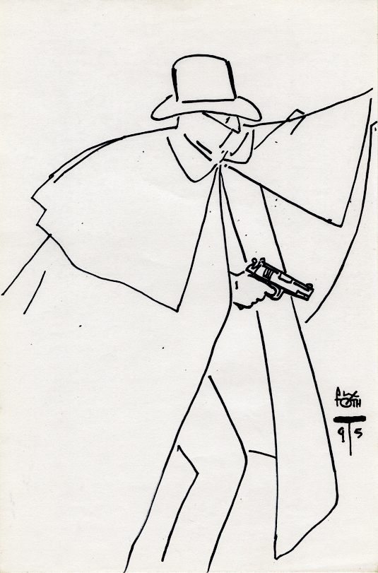
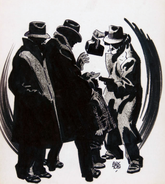
Alex Toth — Simple Shadow

Sketch, 1995

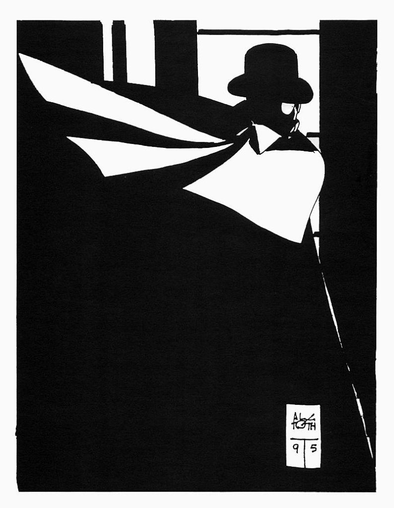
A simple rendering of the Shadow by the legendary Alex Toth leads us down the “What If” rabbit hole.

What if Archie Comics had phoned Toth in 1964, and said “Hey, we just acquired the rights to The Shadow, not sure what direction we should go with it, are you interested?”

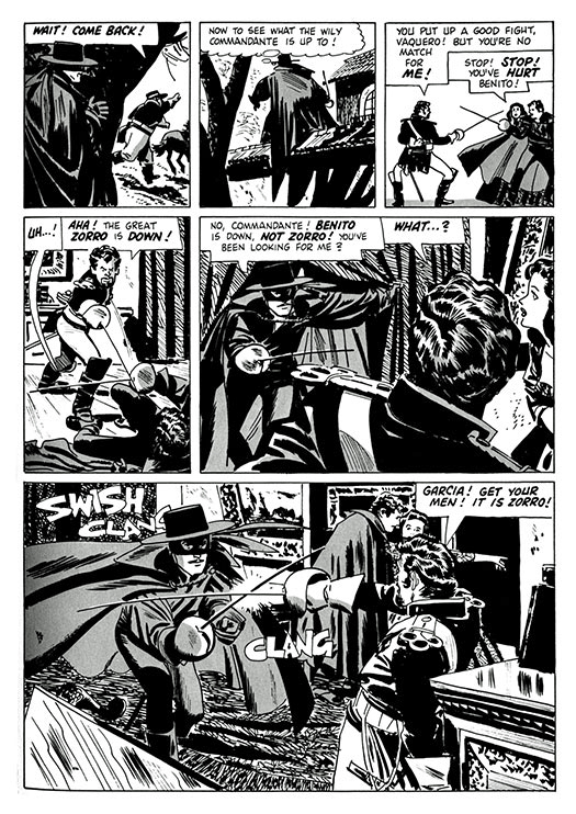
Would Toth, who five years previously had beautifully illustrated another pulp icon, Zorro (based on the popular TV series) said yes? One can only imagine the results if he had.

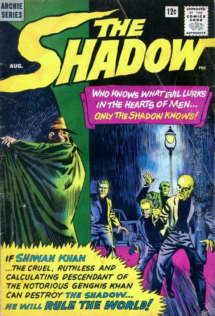
Archie did indeed take the license for the Shadow.  But instead of a classic version, illustrated by Toth, or someone comparable, we are left with a giant puzzle.

The cover of issue #1 features a classic rendition of the character.

But inside? A completely different version, with blonde hair no less.

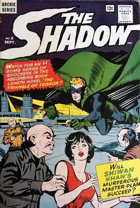
Issue #2 amplifies the gaudy superhero costume, keeps the blonde hair.

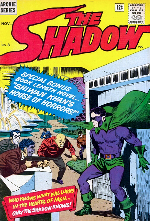
Issue #3 keeps the costume, but changes the hair to black.

And so on. At this point, he looks — and pretty much acts — like a poor knock-off of any number of classic Archie / MLJ heroes from the golden age that they already owned.

Why license The Shadow if you’re going to create something wholly different? That indeed is a puzzle. (And also, it can’t capitalize on the “camp” craze,” because it appears well ahead of the Batman TV series.)

After eight issues, the title is mercifully cancelled. 

As for Toth? He spent much of the 60s designing many of our favorite animated TV shows, including Space Ghost and Super Friends.

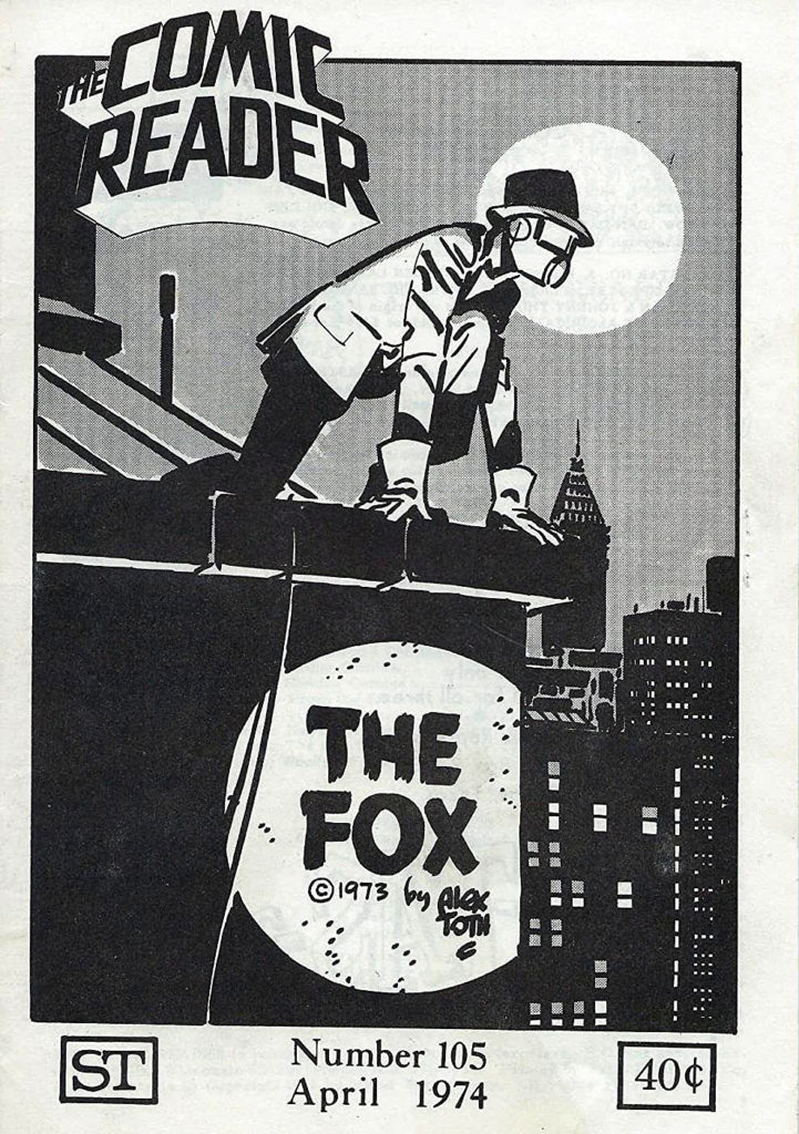
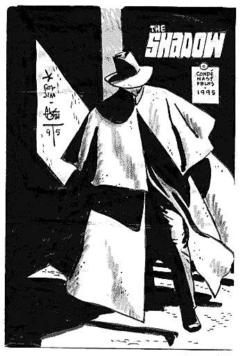
But he never strayed too far from comics, and has illustrated all-time classic stories, in many genres. And, many of his sketches and commissions reflect a passion for classic pulp characters and motifs.

A Toth Shadow series would have been something to see.

Toth, born in 1928 (and died in 2006 at his drawing table), would have turned 92 today.  Happy Birthday, Alex!

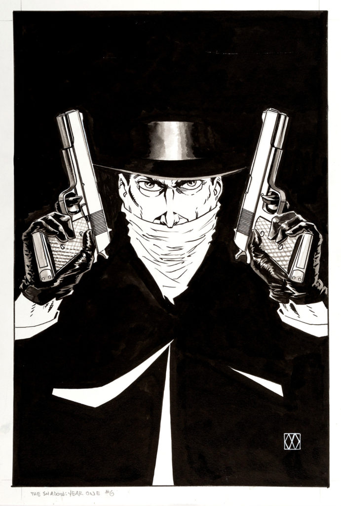
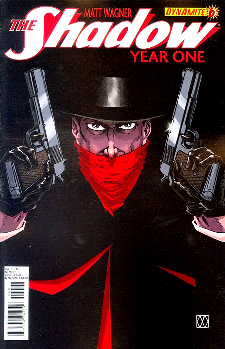
Matt Wagner — Pistol Packing

Shadow Year One #6, October 2013

Matt Wagner delivers a dynamic two-gun version of The Shadow for his much lauded Shadow origin series in 2015.

The Shadow routinely carried two .45 guns. That said, he wasn’t opposed to a rifle or machine gun, now and then.

Matt wrote this excellent series, and illustrated most of the covers, each one a frame-worthy rendition of the classic pulp character.

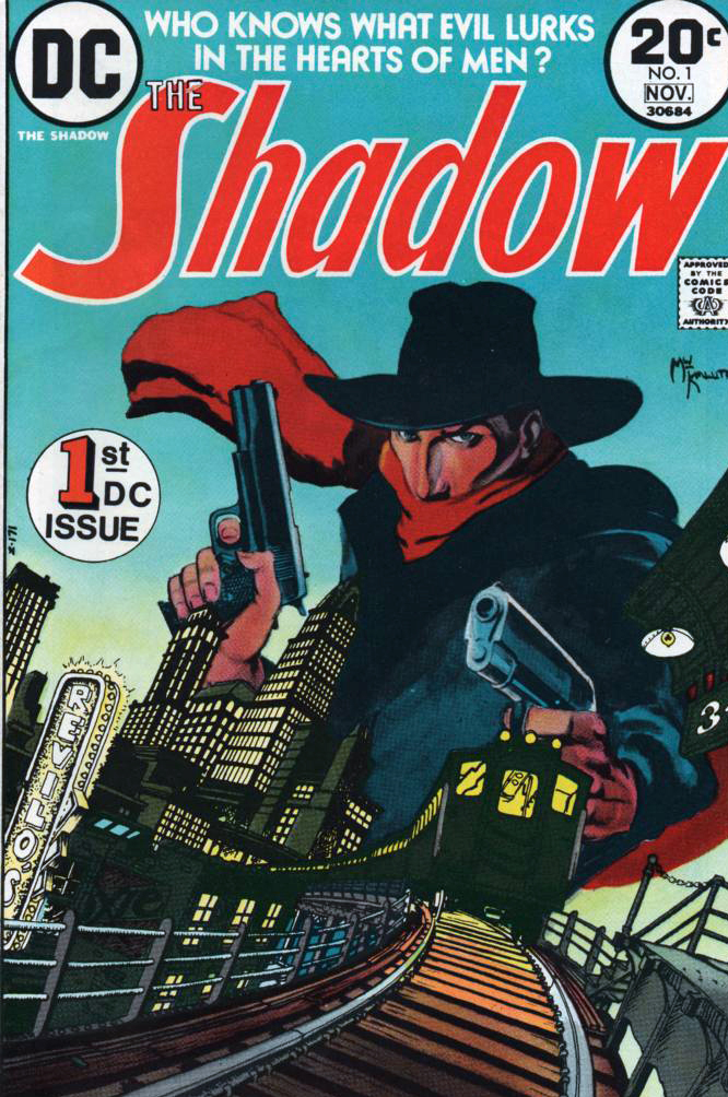
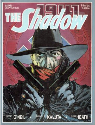
When DC brought back The Shadow after a long absence from comics in 1973, Mike Kaluta drew the now genre-defining early issues, and ultimately illustrated a beautiful graphic novel for Marvel years later.  

Mike is also a big fan of the double-barreled look as well.

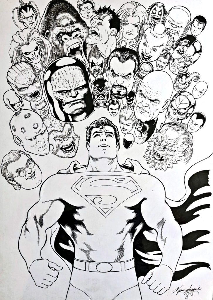
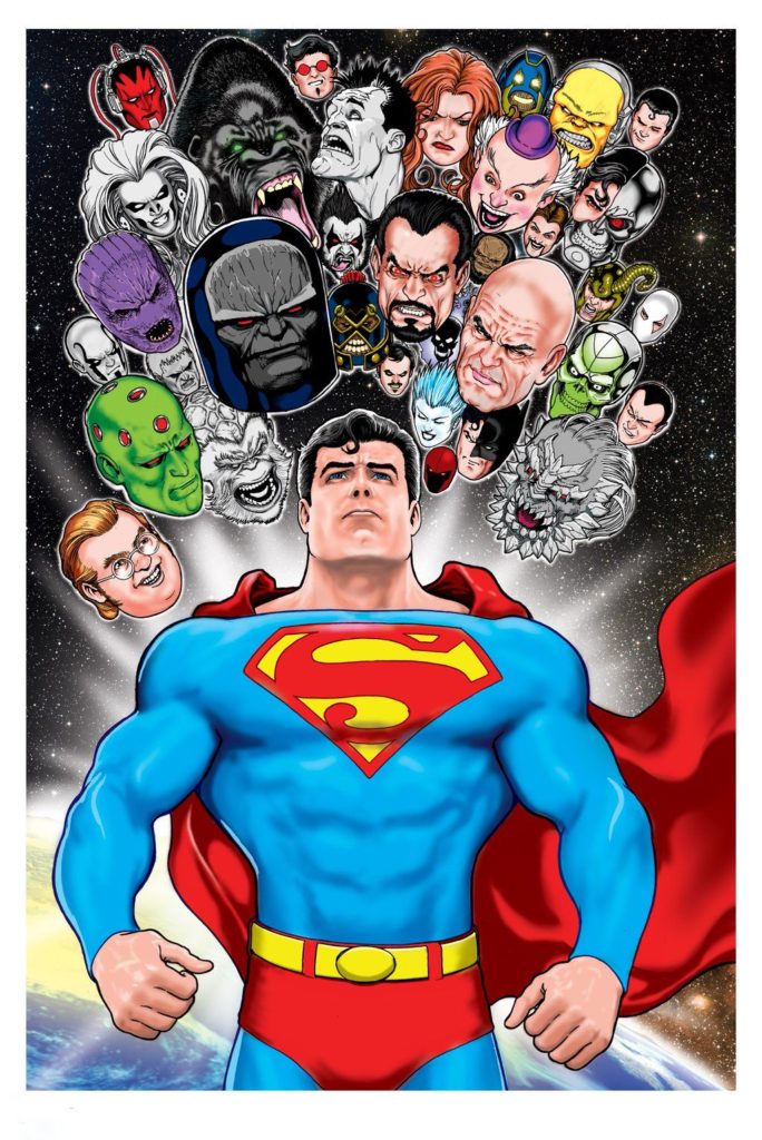
Kevin Maguire — Heroes and Villains

Superman Poster, 2017

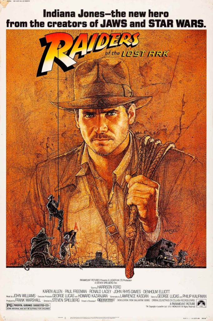
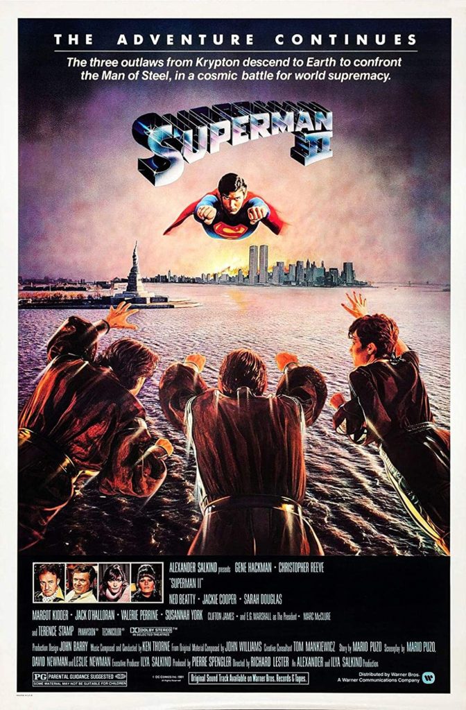
For those movie buffs who think that the action blockbuster crowding out other films is a modern phenomena, let’s discuss June 1981.

6/12 — Raiders of the Lost Ark opens.

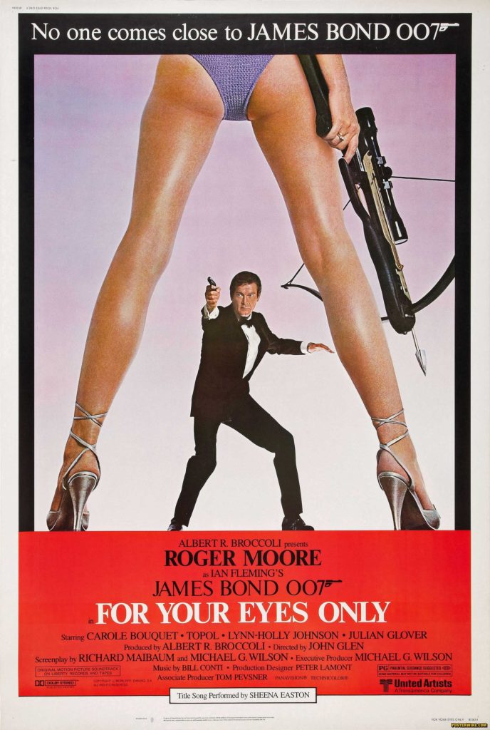
6/26 — James Bond: For Your Eyes Only opens.

And the week in between?

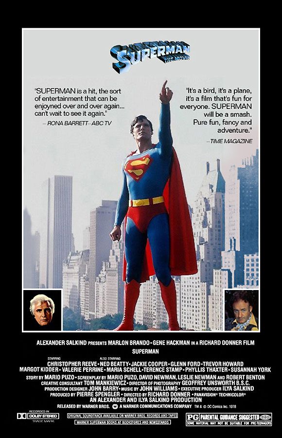
6/19 — Superman 2 opens.

All three pretty good, and one certifiably one of the greatest adventure films ever made. (I don’t have to say which one, do I?) That’s pretty much the entire summer, right there.

I’ve always had mixed emotions about the first two Superman films. (No mixed opinions about films 3 and 4. They are terrible.)

Christopher Reeve as Superman AND Clark Kent, is terrific of course, and some of the action sequences and effects are great in both. And, as a dyed-in-the-wool New Yorker, I enjoyed the location filming, especially the actual Daily News building standing in for the Daily Planet. Plus, Lex Luthor and the Phantom Zone criminals. (I loved the Phantom Zone.)

Some of it, however, is pretty cheesy. Even by 1978/1981 standards. If these films were meant to cleanse the palate of the completely camp 1966-68 Batman TV series, they didn’t completely accomplish it.  There are definitely some groaners in here. (Miss Teschmacher!)

But…  Would I rather watch these films as say compared to the modern film versions of Superman? Ha. Easy choice. It’s not nostalgia clouding my judgment when I say that.

The first two films capture the spirit of the Superman character in a joyous way. And although character has often been terrifically well-represented television since then (Superman Animated, anyone?) the recent films are mostly… ugh. Just ugh.

Someday, a reboot will fix that. You can’t keep a good Superman down.

Until that time, we will always have art, including this magnificent poster by Kevin Maguire featuring Supes and most of his key villains. Love the art, dislike the coloring. Over-rendered, and not well executed, specifically on Superman’s facial features. (Almost looks like a completely different face.)  Modern coloring is like film CGI. Less is usually more.

Great art, though. Who said everything looks worse in black and white?

Alex Ross — Justice Is Served

Giclee, Warner Brothers Store, 1997

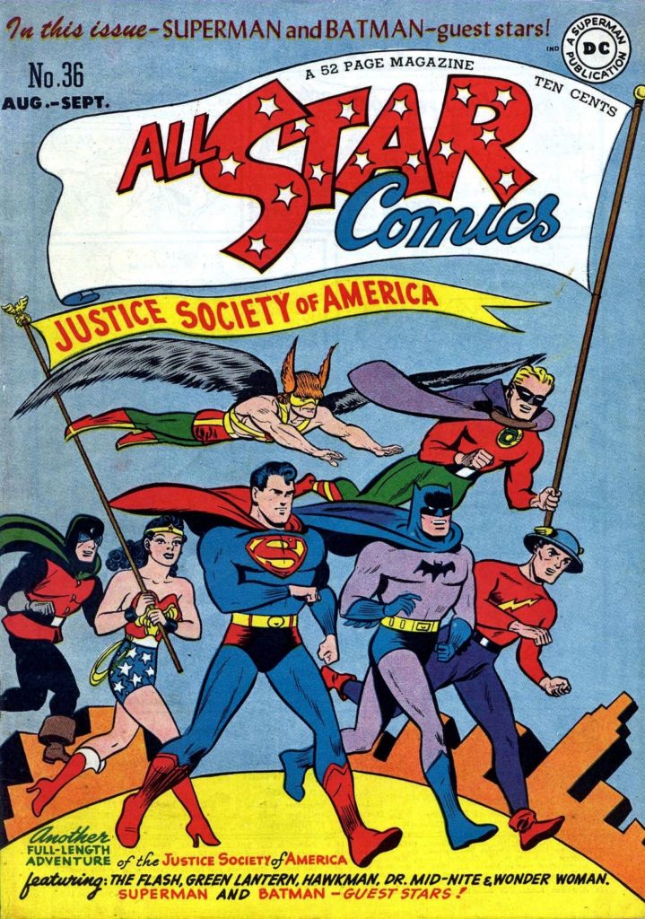
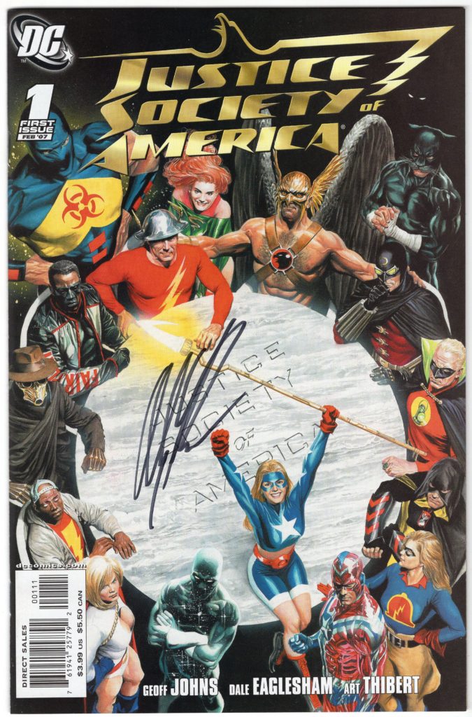
Concluding our three-week tribute to the 80th anniversary of the JSA, with one special bonus post.

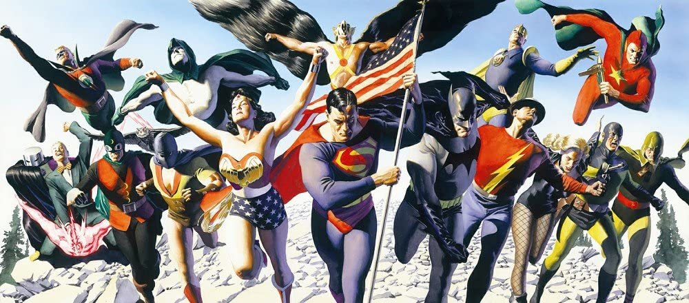
Alex Ross presents pretty much the entire classic Justice Society of America (16 heroes) in one fantastic image.

As noted earlier, I rarely post anything other than actual originals, but this piece is so great, it deserves its own showcase.

Other than perhaps the irony of Superman and Batman in the forefront (they barely appeared in the Golden Age JSA), this is everything you want, and more, in a exceptional photorealistic painting.

There seem to be many versions available of his image; mine is the large canvas, which I believe was limited to either 10 or 100. Unfortunately, the numbering was handwritten in sharpie marker, and like my Mickey Mantle and Sandy Koufax autographs (seriously), the numbering has faded into oblivion.

I sure hope I find that “certificate of authenticity” someday.

(A smaller version of the image is available for purchase here, and other versions have appeared in auction at Heritage and other houses.)

George Pratt — Comics Noir

Sandman Mystery Theatre #1, 1994

Continuing our celebration of the 80th anniversary of the Justice Society of America, with each new post featuring a different classic JSA character.

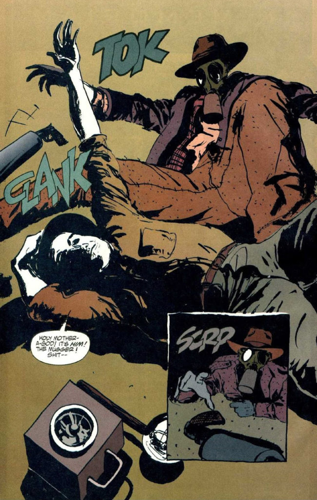
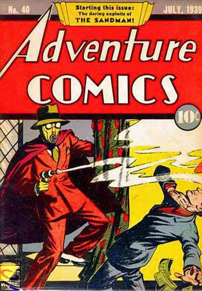
Neil Gaiman’s extraordinary success with his Sandman series, had an additional and welcome consequence. DC added a retro Sandman title to its line-up featuring a retconned version of the original Sandman, with great noir-ish stories written primarily by Matt Wagner and Steven Seagle.

This terrific action splash page comes from the often overlooked annual, drawn by George Pratt.  It’s a rare pen and ink example by the award-winning Pratt, who is known for his terrific painted graphic novels on Enemy Ace, Batman, and Wolverine.

The “original” Sandman never looked so good.

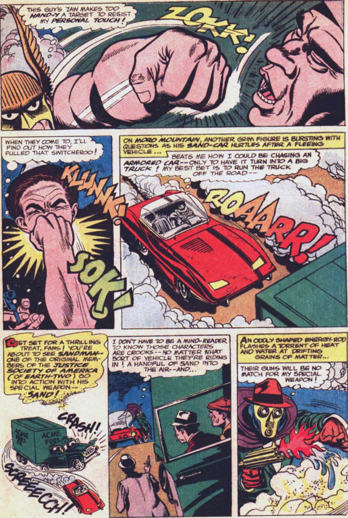
Fun fact: Joe Simon and Jack Kirby created often over-looked version of Sandman in the 1970s. Simon dropped out after one issue, Jack took a few issue break, and the final issue, #7, featuring Santa Claus (yes, you heard right) was cancelled prior to publication and didn’t appear in print until a few years later.

That Simon and Kirby Issue, originally intended as a one-shot, was their final collaboration.

This version of Sandman makes an unexpected comeback appearance in Wonder Woman #300, with versions by both Gene Colan and Kirby fanatic Keith Giffen. More on all of this in a future post.

Mike Parobeck — Modern Composition

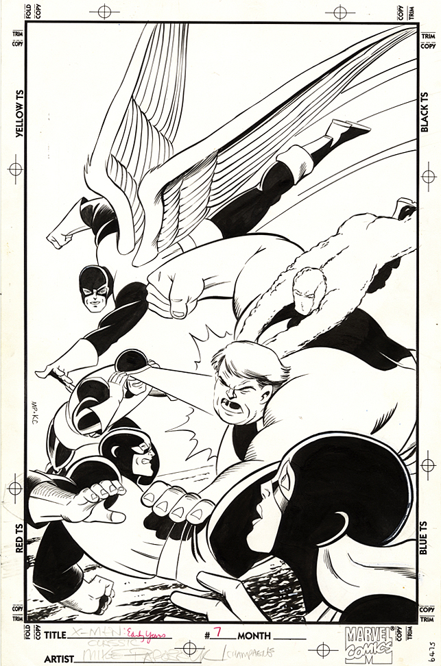
X-Men: The Early Years #7, November 1994

Sometimes the reprint cover is just better.

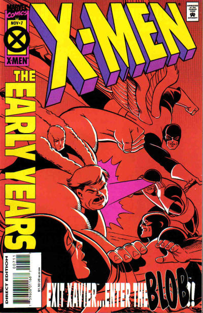
Case in point, Mike Parobeck’s cover of X-Men: Early Years #7, which reprints the original X-Men  #7.

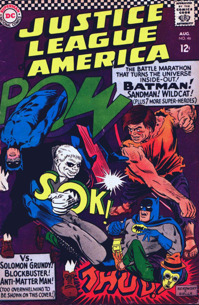
Jack’s original cover (below) is overloaded, and a composition mish-mash. Ok, I know it’s by Jack Kirby, and some fans will bristle about anything negative about the King’s work, but sorry, there’s no real comparison between the original and the reprint.

Mike’s cover is strong and focused.

Jack’s original has way too many characters all over the map, with the X-men oddly positioned in the background and The Brotherhood of Evil Mutants voyeuristically up front, awkwardly. Are they watching from a window? Or on a TV screen? A magical portal? Why the heck are they even on this cover? This is a selling point?

Now, just to be clear, this may not be at all Jack’s fault. Maybe Stan Lee art directed it. And overwrote the cover blurbs to death. (Now, the Stan haters can come out of the woodwork.)

As I’ve said on the record many times, I’m a fan of both Stan and Jack, so let’s all calm down. However this original cover developed, it’s simply not a great one. Even legends drop the ball once in a while.

Mike’s solves the problem thirty years later by focusing only on the X-men coordinating — or attempting to — an attack on the Blob.

Simple. Clear. Clean. Powerful.  Typical of Parobeck’s work.

But… On the published version, the trade dress is a bit heavy handed, so some of the art is obscured — and the entire image had to be flipped to accommodate said trade dress. And, to add to this litany, why the monochrome coloring? Ah Hell, who knows.

Anyway, the original art is great and Mike’s Marvel work is pretty rare; he is best known for some great looking art on the Batman Animated comic books. I was also a big fan of his Justice Society run.

He unfortunately passed away MUCH too early at the age of 31 (from Diabetes) in 1996.

His is a talent that is sorely missed.

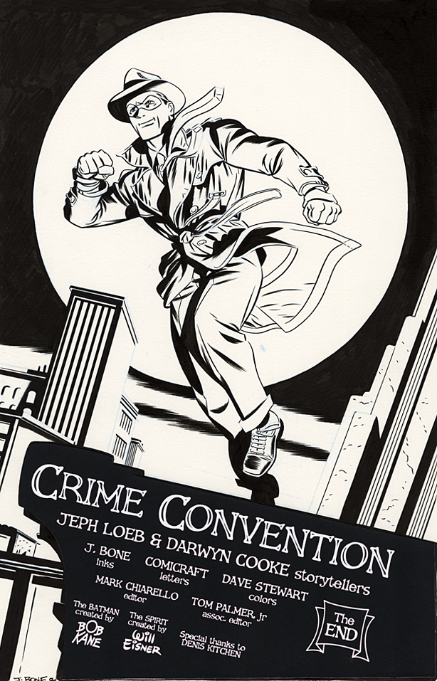
Darwyn Cooke — Captures The Spirit

Continuing our celebration of “Will Eisner Week” and the 80th anniversary of The Spirit, with other creators’ takes on the beloved and influential character.

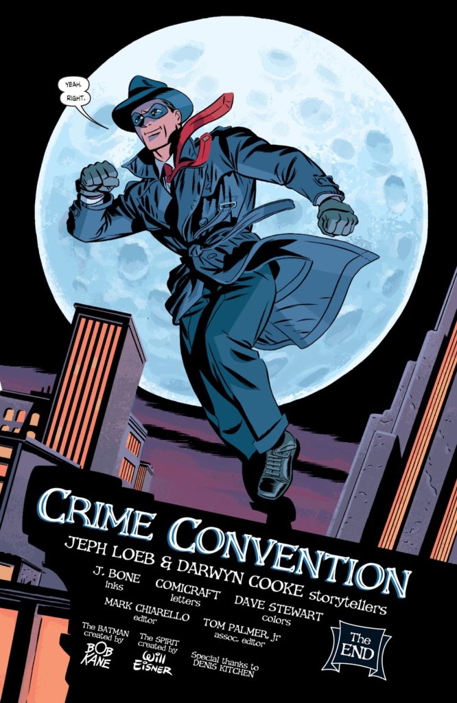
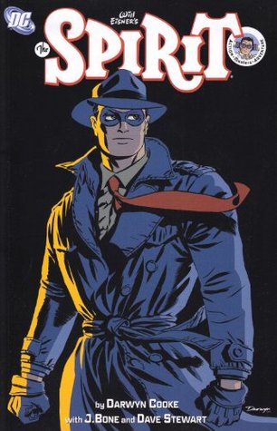
The late Darwyn Cooke?  The closest thing to Will Eisner this modern generation of talent had seen. Visionary storyteller, writer, illustrator, letterer and more. Not only could he do it all, Darwyn could do it well. VERY well.

He was the logical choice for an ongoing series of Spirit stories — the first since Eisner’s run ended in 1952.

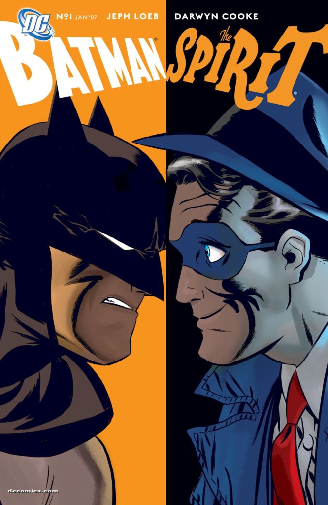
DC launched the series with a Batman Sprit crossover, and this terrific splash is the final page of that story. Inked by J. Bone, this issue, and the subsequent ones of the ongoing series are the closet in spirit (ahem) to Eisner’s vision more than 50 years prior.

Darwyn, we miss you.

“I think everybody who is consumed by storytelling within this medium has had some profound schooling from Will…

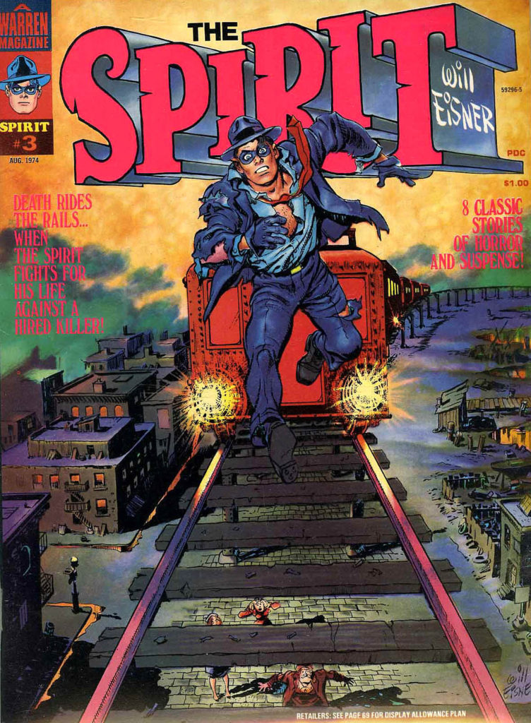
I can remember it was one of those days when I was thirteen, and I was in a comic store, and there was nothing that I wanted to get. On the wall was a copy of Warren’s Spirit magazine. I think it’s number three, where he is running down the elevated track straight at you, and the train is behind him. It’s just one of the most exciting images I have ever seen…”

-Darwyn Cooke interview From Will Eisner: A Spirited Life by Bob Andelman

Kurt Schaffenberger — Golden Age Marvel

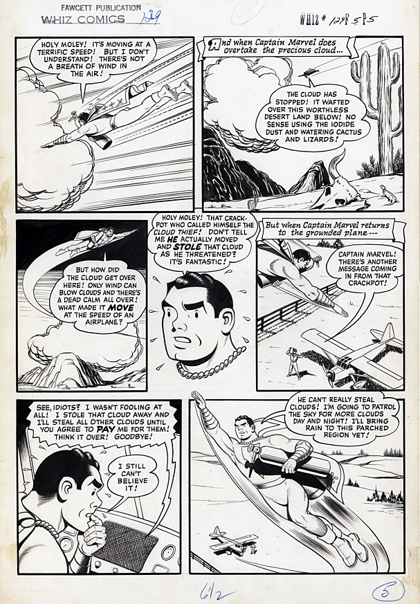
Whiz Comics # 129, January 1951

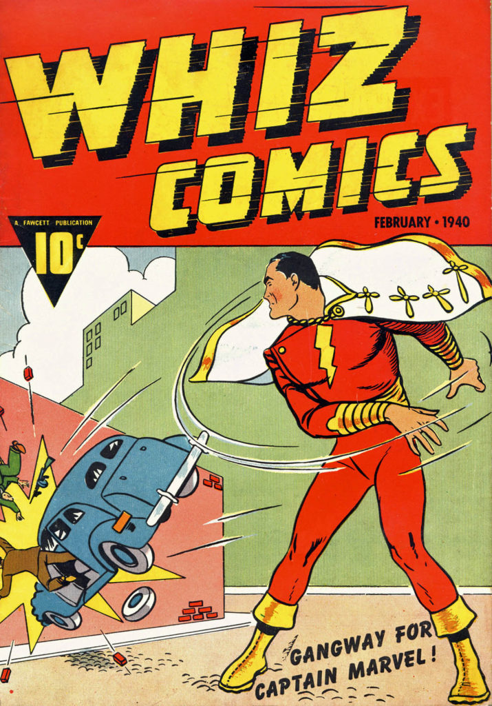
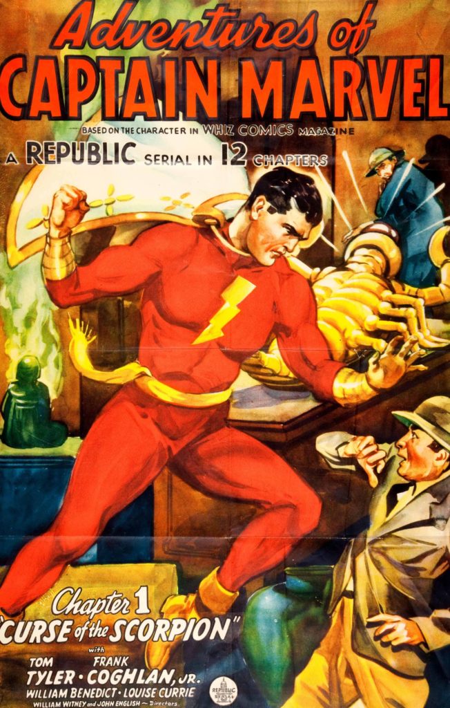
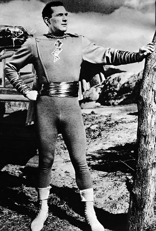
This week we celebrate the 80th anniversary of the original Captain Marvel, (cover dated in 1940, although the issue likely appeared on most newsstands in late 1939) now known as Shazam.

Captain Marvel (Shazam to you kids) appears in every panel in this ebullient page pencilled and inked by Kurt Schaffenberger.

Schaffenberger went to work as an assistant in the Jack Binder studio in 1941 just as Fawcett’s Captain Marvel was soaring, eventually outselling DC’s Superman. When Schaffenberger returned from World War 2 military service, he ultimately penciled and inked complete stories.

His wholesome, uncluttered and often whimsical style was a perfect fit for Captain Marvel, who was nothing if not wholesome and whimsical.

Schaffenberger drew many of the stories that capped the end Captain Marvel’s amazing run — and 10 years of legal battles with DC.

In fact, despite the seemingly never-ending copyright lawsuit that alleged that the Big Red Cheese was a knockoff of Superman, The Captain outlasted many of his spandex-attired peers, publishing longer than most competitive superhero titles.

But, by 1954, declining sales meant that Fawcett no longer had the will to fight. They settled with DC, and called it a day for Captain Marvel.

As they say…  To Be Continued.

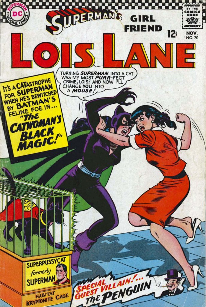
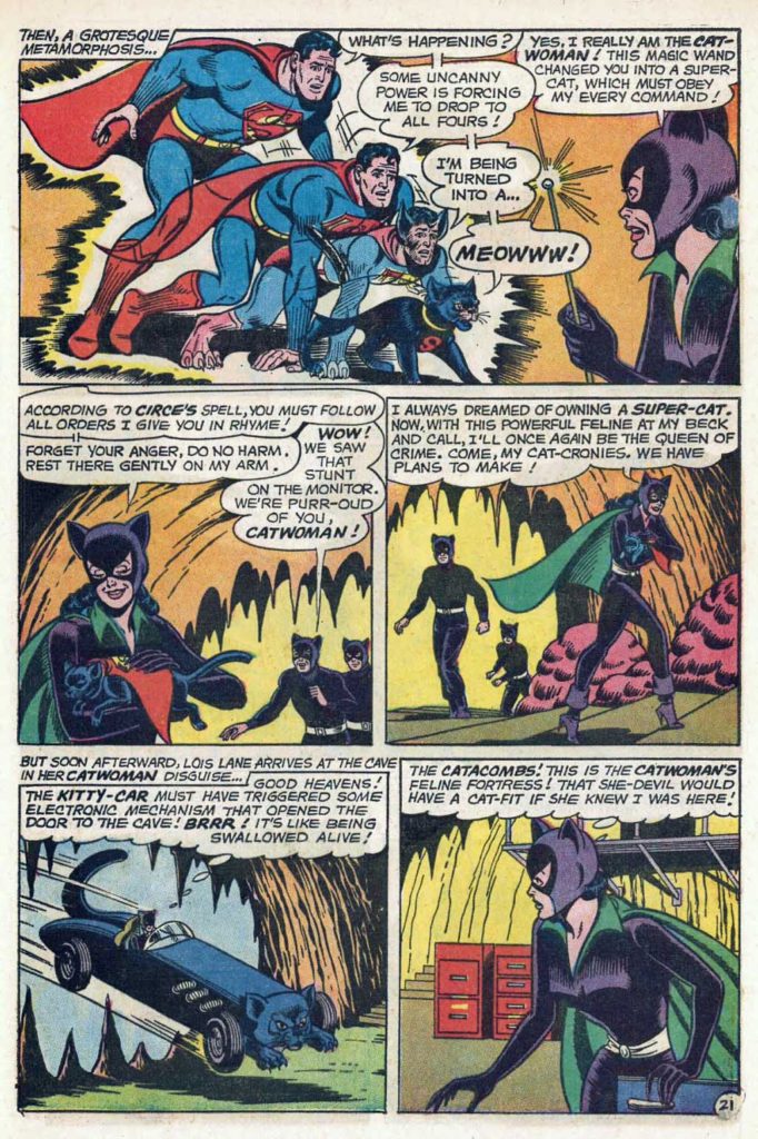
Fun Fact: After Fawcett left the superhero business, Schaffenberger ultimately went to work for DC, and became best known for his 10-year run on the Lois Lane series, setting the DC house style for the character for much of the silver age.

Steve Ditko and Wallace Wood — Time Of Death

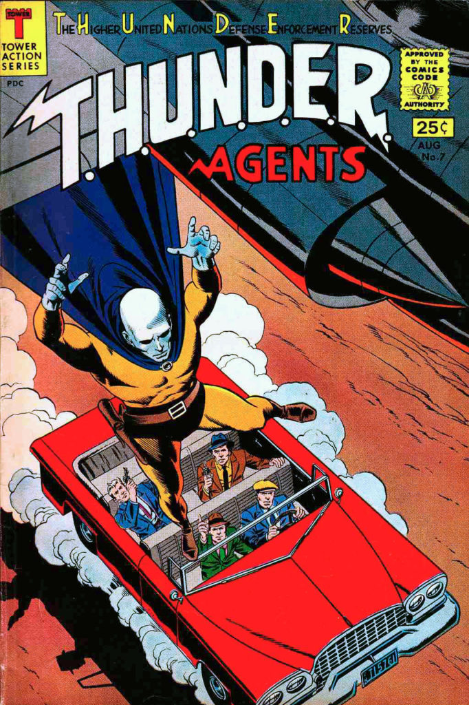
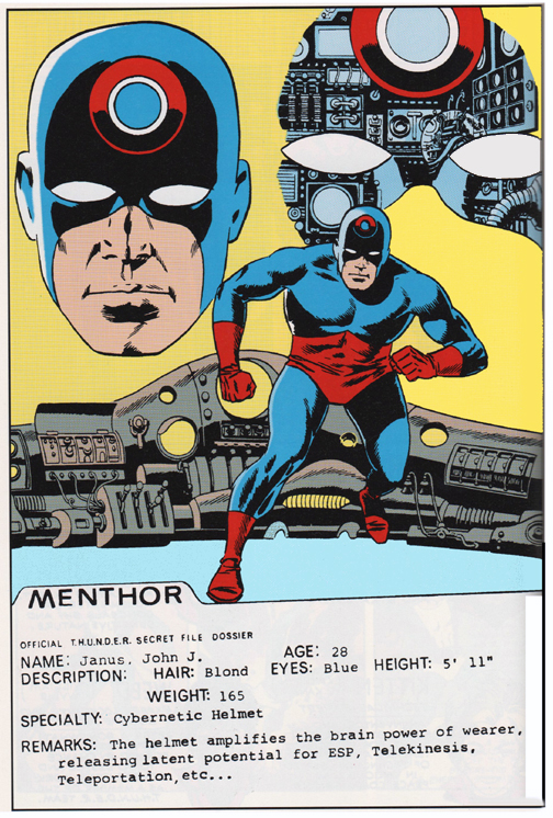
T.H.U.N.D.E.R Agents #7, August 1966

Death in superhero comic books had always been a gimmick. “Robin Dies at Dawn” likely meant he would be back by dinnertime. (In fairness, it’s a pretty good story.)

Imaginary stories, hoaxes, dreams, mad science, robots, time travel, alien resurrection, etc. all kept our featured players in good health. There was not much chance a title character was going to exit from his book permanently.

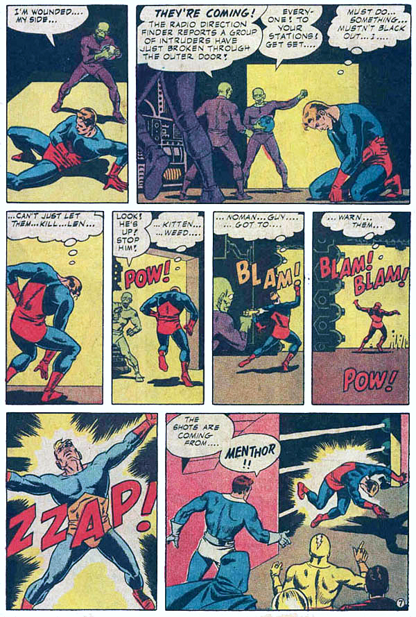
So back in the 60s, legitimately killing a character was in fact, a groundbreaking novelty. And this T.H.U.N.D.E.R Agents story is one of the first. Ditko, Wood and company had spent 6 issues developing the character of Menthor (John Janus), and they shot him to death on this page in Issue #7.

This historic page captures that collaborative methodology of Woody and the Tower artistic team on T.H.U.N.D.E.R Agents. Dan Adkins scripted and provided layouts, Ditko penciled the story, and Wood inked it, with assists by Adkins.

The original T.H.U.N.D.E.R Agents lasted only last 20 issues, and perhaps, had it survived, John would have been resurrected at some point. But it certainly did not appear that way.

Unlike, say, modern times where killing a lead character is a gimmick once again.

Superman. Dead. Then alive.

Batman. Dead? Nope, he’s back.

Captain America? Reborn. Bucky? Not dead, just hiding in Russia for a few decades.

Etc.

Kevin Eastman — To Frank, With Love

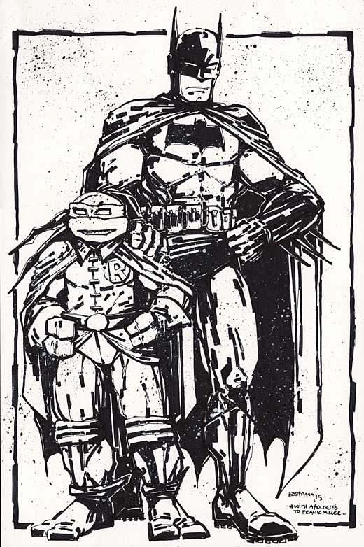
Batman / TMNT, Unused Variant Cover, 2015

Here’s an original to help us celebrate the 80th anniversary of Batman (I know, we said we were finished with that series… but this time we mean it!) and the 35th anniversary of the Teenage Mutant Turtles, launched in 1984.

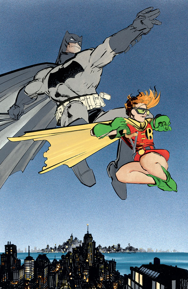
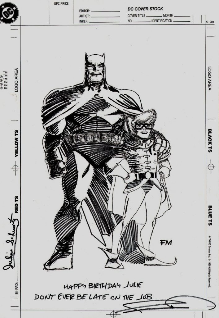
Kevin Eastman was inspired to create this Frank Miller Dark Knight Returns homage during the first DC / IDW crossover between Batman and the Teenage Mutant Turtles. No surprise, as Kevin cites Miller and Jack Kirby as inspirations for his and Peter Laird’s original TMNT. The piece wonderfully captures the grittiness and weariness of Miller’s Batman; and Michelangelo as Robin? Mad genius. Everyone at both companies loved it.

But the art was formally submitted for approval a bit late in the game — after all the retailer variants and exclusive covers for that series had been determined and solicited, so it missed series one.

Flash forward to series two and three (2017 and 2019) — and now the DC retailer variant program has been virtually eliminated, and there is no logical place for the piece to appear as a cover. Sigh.

That third series is wrapping up now, and I’m assuming there will be collection of all three in a deluxe format at some point. Maybe this piece will appear as a bonus; I think fans would love to see it, and selfishly, I would love to see a color version.

As for how TMNT came to crossover with Batman in the first place? That’s a great tale, but one for another day.