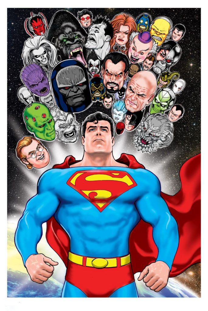
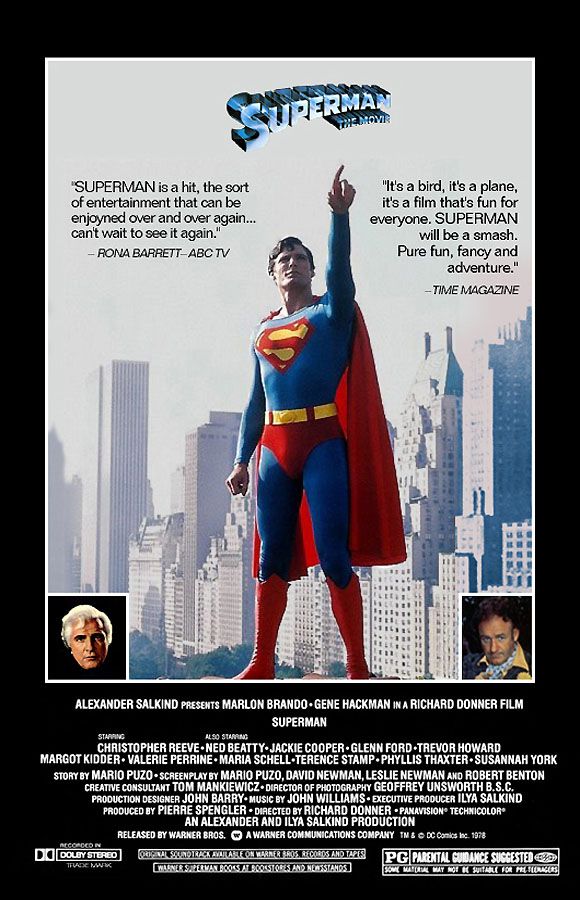
Superman Poster, 2017
For those movie buffs who think that the action blockbuster crowding out other films is a modern phenomena, let’s discuss June 1981.
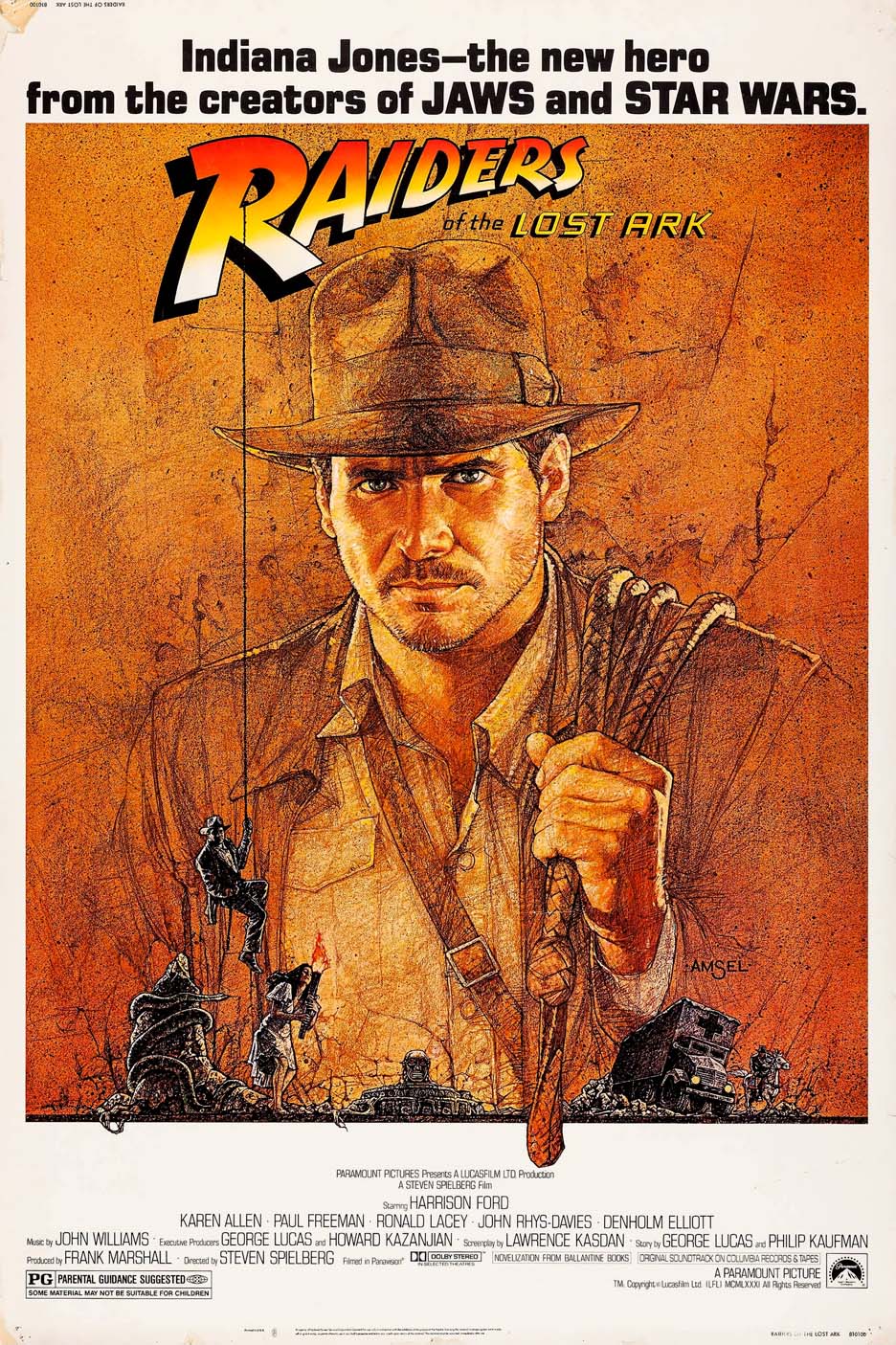
6/12 — Raiders of the Lost Ark opens.
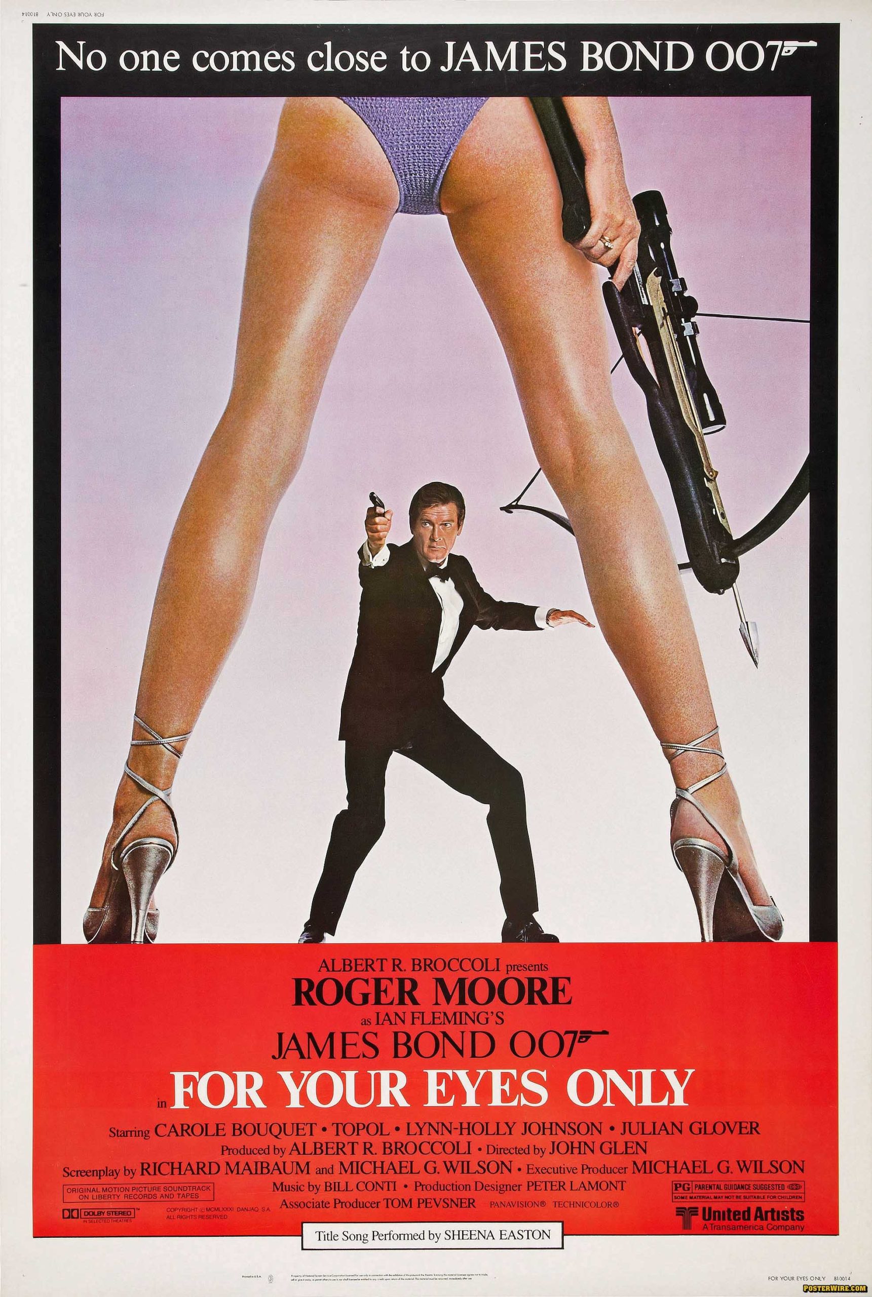
6/26 — James Bond: For Your Eyes Only opens.
And the week in between?
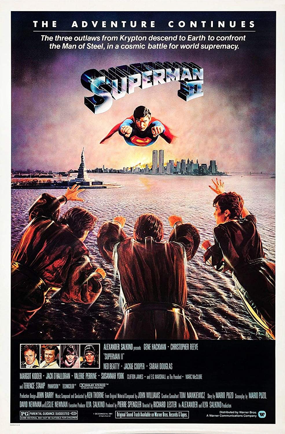
6/19 — Superman 2 opens.
All three pretty good, and one certifiably one of the greatest adventure films ever made. (I don’t have to say which one, do I?) That’s pretty much the entire summer, right there.
I’ve always had mixed emotions about the first two Superman films. (No mixed opinions about films 3 and 4. They are terrible.)
Christopher Reeve as Superman AND Clark Kent, is terrific of course, and some of the action sequences and effects are great in both. And, as a dyed-in-the-wool New Yorker, I enjoyed the location filming, especially the actual Daily News building standing in for the Daily Planet. Plus, Lex Luthor and the Phantom Zone criminals. (I loved the Phantom Zone.)
Some of it, however, is pretty cheesy. Even by 1978/1981 standards. If these films were meant to cleanse the palate of the completely camp 1966-68 Batman TV series, they didn’t completely accomplish it. There are definitely some groaners in here. (Miss Teschmacher!)
But… Would I rather watch these films as say compared to the modern film versions of Superman? Ha. Easy choice. It’s not nostalgia clouding my judgment when I say that.
The first two films capture the spirit of the Superman character in a joyous way. And although character has often been terrifically well-represented television since then (Superman Animated, anyone?) the recent films are mostly… ugh. Just ugh.
Someday, a reboot will fix that. You can’t keep a good Superman down.
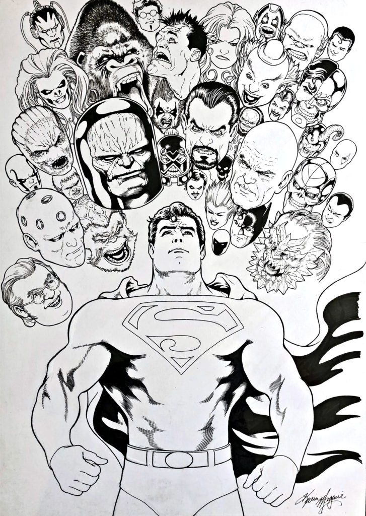
Until that time, we will always have art, including this magnificent poster by Kevin Maguire featuring Supes and most of his key villains. Love the art, dislike the coloring. Over-rendered, and not well executed, specifically on Superman’s facial features. (Almost looks like a completely different face.) Modern coloring is like film CGI. Less is usually more.
Great art, though. Who said everything looks worse in black and white?