Greg Goldstein's Comic Art Gallery

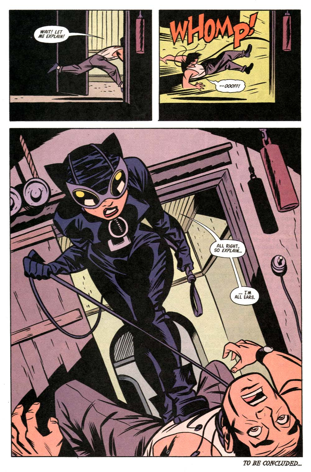
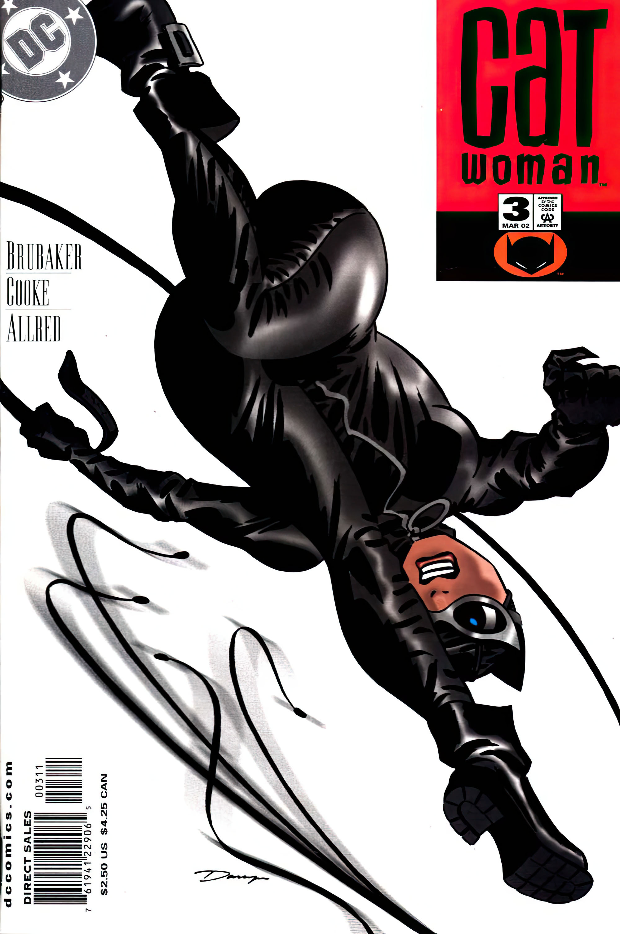
Darwyn Cooke & Mike Allred — Cat Got Your Tongue?

Catwoman #3, March 2002
Darwyn Cooke drew only four “regular” issues of Catwoman.

Four.

Yes, there was also “Trail of the Catwoman” in Detective Comics, and the terrific Selina’s Big Score. But still, it wasn’t nearly enough.

Ed Brubaker and Darwyn gave us a terrific version of Selina Kyle. Smart, stylish, funny and noirish, with a costume that was both sexy — and, for a change, a bit more practical.

She finally looked like someone who could actually leap across rooftops without losing parts of her wardrobe.

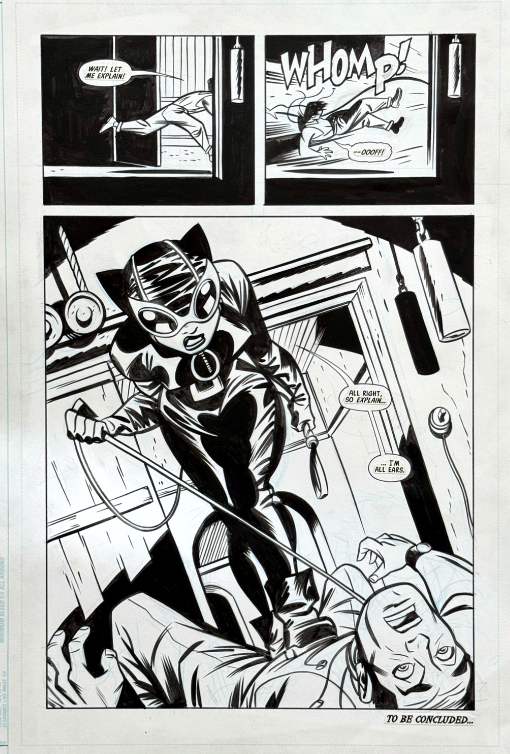
This page, inked by Mike Allred, is a great example of Darwyn’s storytelling. Two small panels to set things up, followed by one big payoff.

Simple. Clear. Terrific.

And, of course, Catwoman owns the page.

I’ve featured Darwyn’s work on the blog many times: Parker, The Spirit, and those wonderful classic comic-book reinterpretations he apparently created to “relax.”

(Most of us relax differently. But I digress.)

Darwyn’s Catwoman run was much too short. Sadly, so was Darwyn’s time on planet Earth. He died in 2016 at the age of 53.

He was one of the greatest cartoonists of his generation, despite entering the field relatively late, and I was fortunate to know him and work with him. I might be biased, but his Parker graphic novels (IDW Publishing) are some of the best ever published.

The man and his talent are very much missed. Fortunately, the art and the stories are still very much with us.

I’m thrilled that DC is finally publishing Batman by Darwyn Cooke: The Absolute Edition, collecting all of his extraordinary work with the Batman family in a format it deserves.

DC asked me to provide images of several pieces of Darwyn’s original art from my collection, and I happily obliged. Which pieces did they actually use in the finished book? Excellent question.

Apparently, even with a $125 cover price, their budget didn’t quite stretch far enough for a contributor copy. As a former publisher, I definitely recognize fiscal discipline, although this might be pushing that philosophy a bit too far.

No worries. I’ll contribute to the Warner Bros. bottom line as soon as I can get a copy.

Meanwhile, this page is a pretty good reminder of just how much Darwyn could accomplish in a very small amount of space.

And how much more we wish there had been.
Batman Day, 2026

September 19, 2026

“Batman Day” is today, Saturday, September 19.

It is pretty obvious that I have posted a lot of Batman art over the years.

More than I realized, actually.

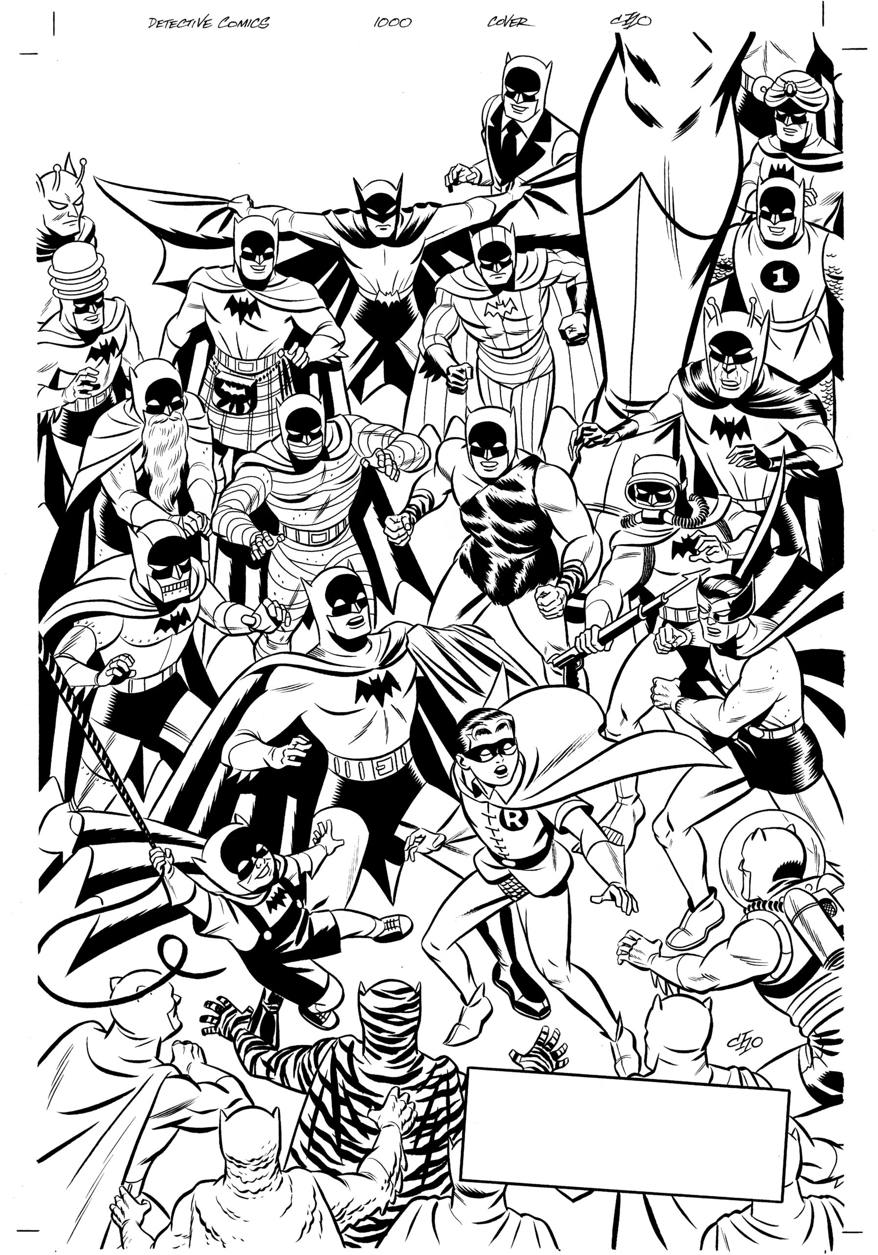
Neal Adams. Carmine Infantino. Jim Aparo. Gene Colan. Frank Miller. Berni Wrightson. Tim Sale. Michael Cho. Mike Parobeck. Russ Heath. Paul Smith. And plenty more.
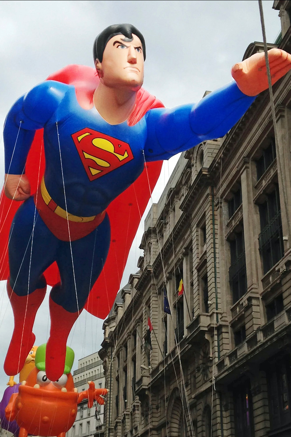
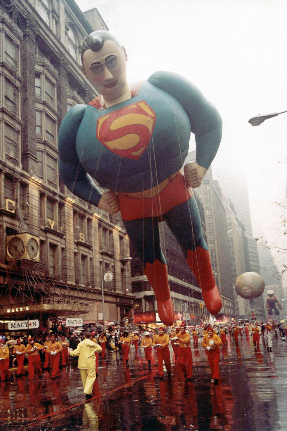
Batman, Robin, Catwoman, Batgirl, the Joker, and assorted other Gotham residents — most of whom are not exactly having a good day.

I don’t own all of these pieces anymore, of course. But somehow, I keep finding new ones to add.

Rather than pretend I can pick a favorite, here’s one link to all of it:

Every Batman post on the blog:
https://greggoldsteincomicartgallery.com/?s=batman

There are worse ways to lose an hour.

Happy Batman Day.

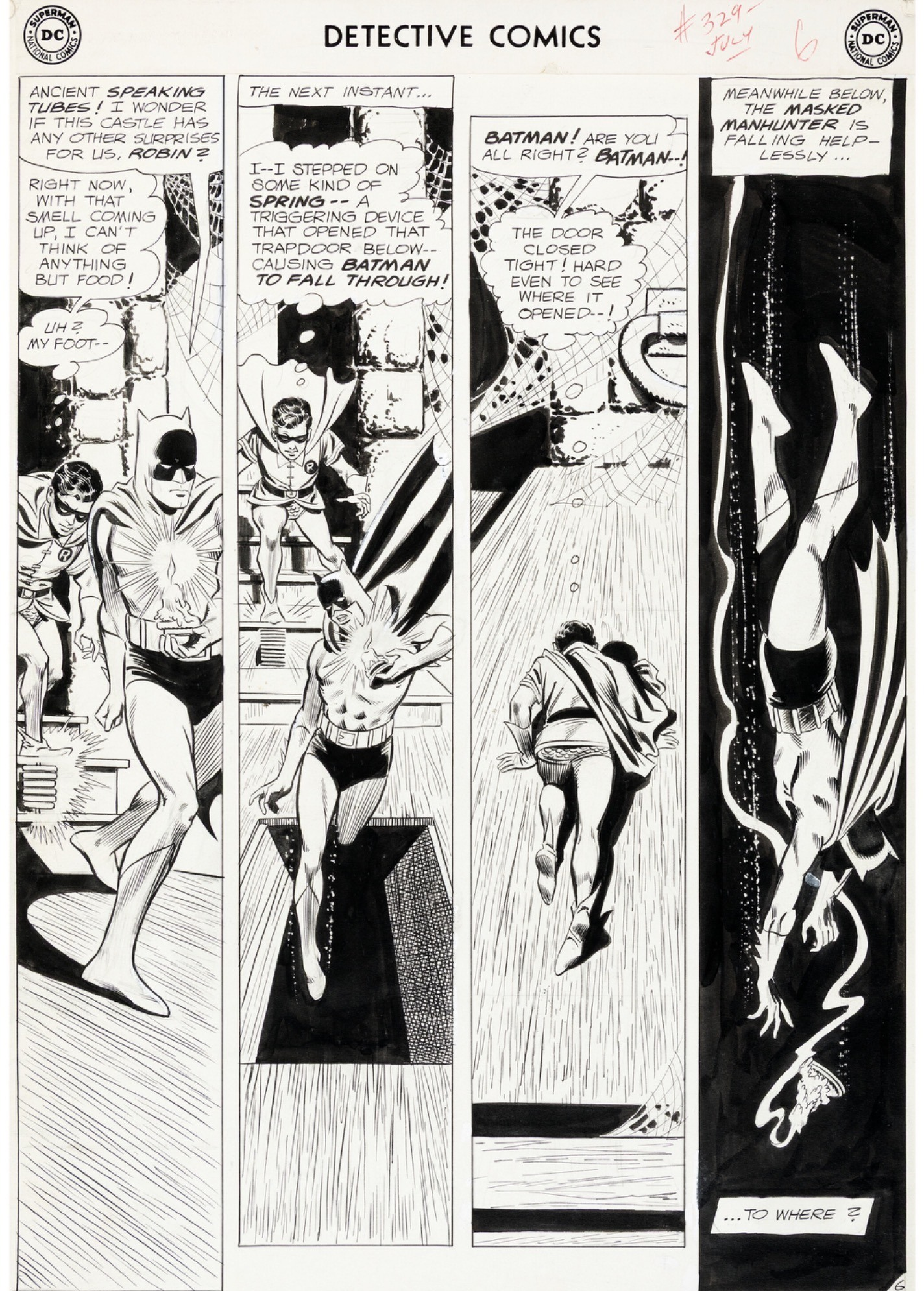
Carmine Infantino — Batman’s New Look

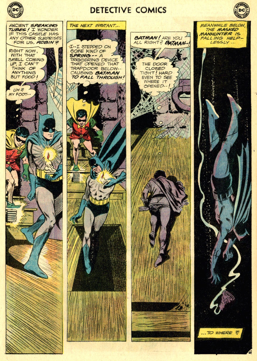
Detective Comics #329, July 1964

I always wanted an early Carmine Infantino Batman page, and I couldn’t resist this one: four tall vertical panels on a large-art 1964 page, from only the third issue of the “New Look” Batman.

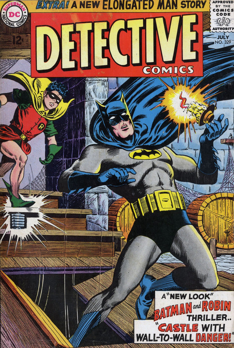
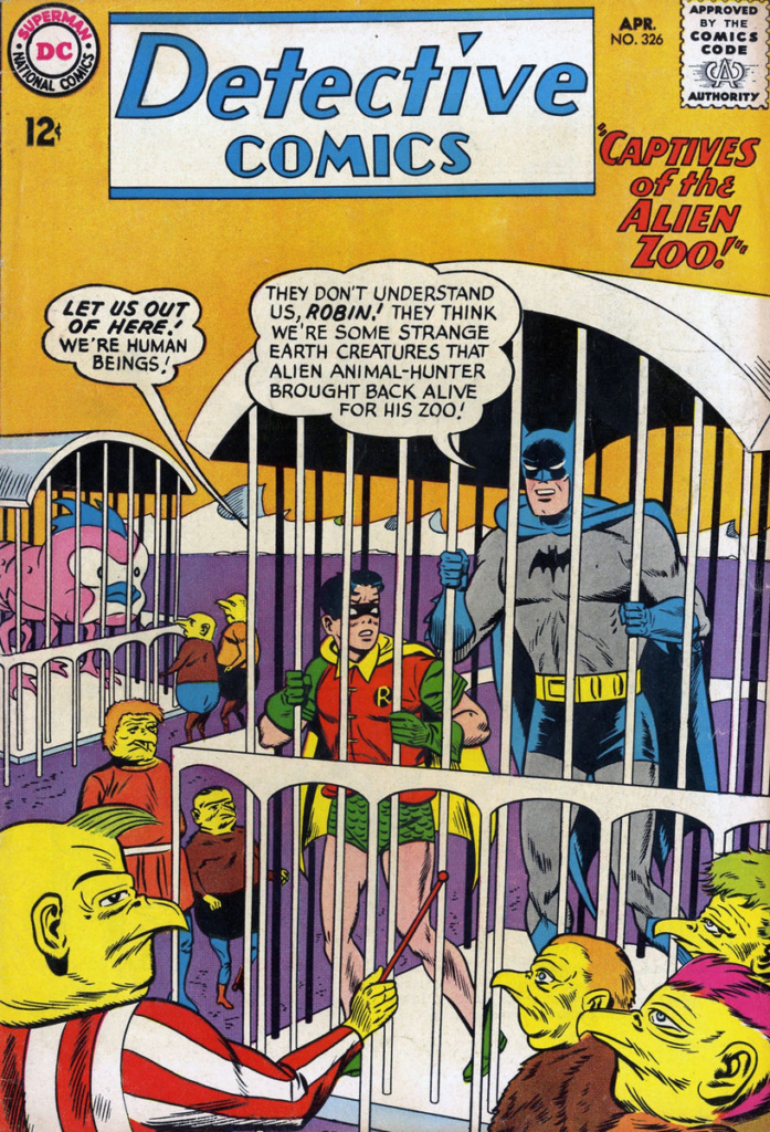
I love the layout. Infantino uses those narrow panels beautifully, moving Batman steadily downward through the page until that terrific final shot of him dropping into the darkness. (And, as a bonus, we are essentially looking at the cover scene.)

As Robin might have said: “Far out.”

Large-art Infantino Batman pages seem much tougher to find than his Flash work. There were simply fewer of them to begin with, and unless somebody is sitting on a hidden stash, they’re pretty scarce.

This page is from Detective Comics #329, published just a few months after DC decided Batman needed a bit of an overhaul.

By 1964, most of the company’s superhero line had moved pretty decisively into the Silver Age — the Flash, Green Lantern, Atom, Hawkman, along with the Challengers, Adam Strange, Doom Patrol and plenty of others.

Batman, meanwhile, was still dealing with goofy space aliens, mutant creatures, time travel, color variations of his costume — and whatever else somebody could dream up that month.

To be clear, as a very young kid, I loved those stories in the 25-cent reprints. But sales suggested readers at the time were a little less enthusiastic.

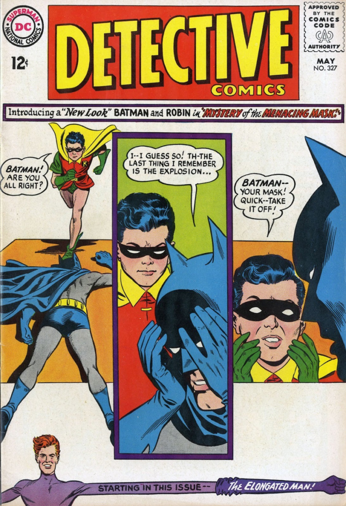
DC handed the Batman reins to Julius Schwartz, and the result was the “New Look” — more grounded stories, a redesigned costume, and a renewed emphasis on mystery and crime.

Infantino’s art made the change feel immediate. His Batman was sleek, elegant and modern, and this page is a great example of why I’ve always wanted one.

As for the stories?

Well, of course, not long after that, the TV show came along.

Things got silly again.

But that’s another tale.

Batman Day, an annual event, is Saturday, September 19.

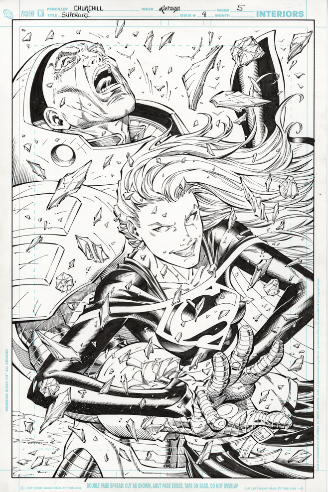
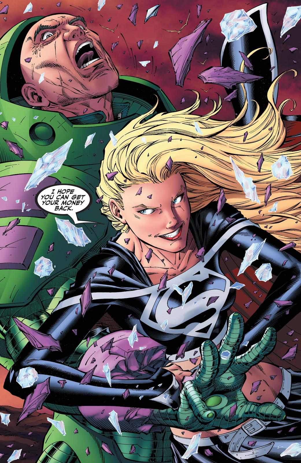
Ian Churchill & Norm Rapmund — Supergirl’s Schizophrenia

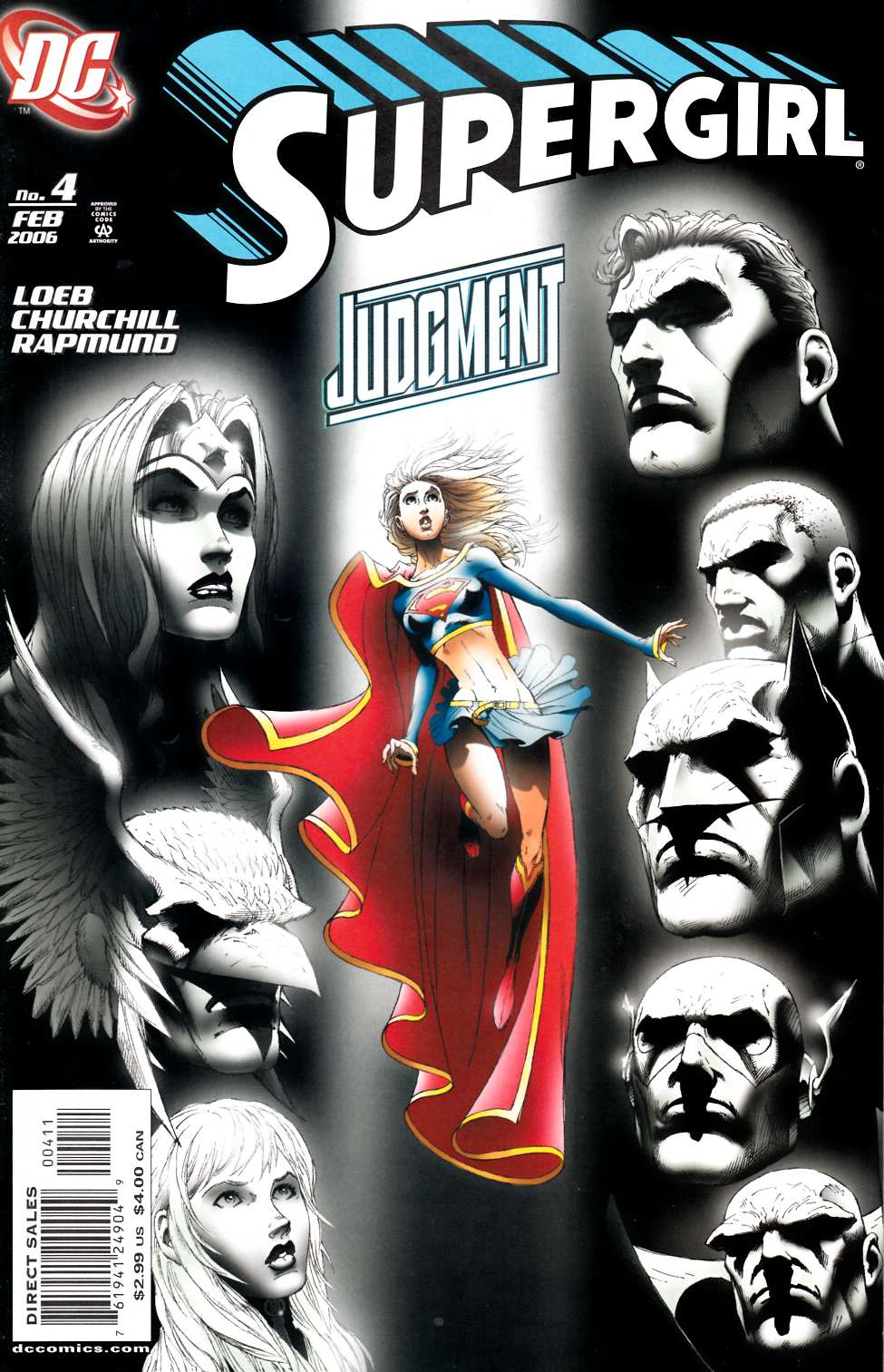
Supergirl # 4 (2005 Series), February 2006

This was one of my earliest blog posts (2019), but with the new Supergirl film arriving in a few days, it felt worth revisiting.

This Ian Churchill and Norm Rapmund splash is a personal favorite—and it comes with a good collecting story.

I had to pry it away from my pal Norm. He quoted me a price so high that I was sure he didn’t really want to sell it.

And he was sure I wouldn’t buy it.

Heh.

Years later, I still love the piece. And after seeing the movie trailers, I can easily imagine the current cinematic version of Supergirl doing exactly this to Lex Luthor—without having to split into two personalities first.

The setup is straightforward enough. Black Kryptonite—making one of its earliest comic-book appearances after debuting on Smallville—splits Kara into separate personalities. Her darker half has little interest in restraint. Here she gleefully tears apart the weaponized arm of Luthor’s war suit, sending shards flying in every direction.

Churchill and Rapmund really sell the moment. The exploding machinery is great, but Luthor’s expression may be the best part. It’s a wonderful mix of shock, panic, and the sudden realization that things are not going according to plan.

The new Supergirl movie opens wide in a few days. Whether it turns out to be a hit, who knows?

But I’ll happily wager this original art that it won’t age quite as badly as the 1984 version.

Sorry, Helen Slater. We adore you, but oof… that film.


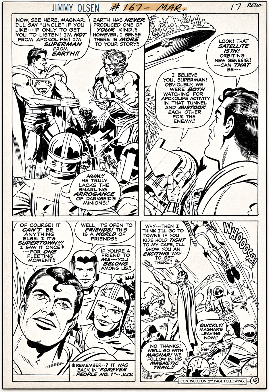
Jack Kirby & Mike Royer — Superman, Embellished

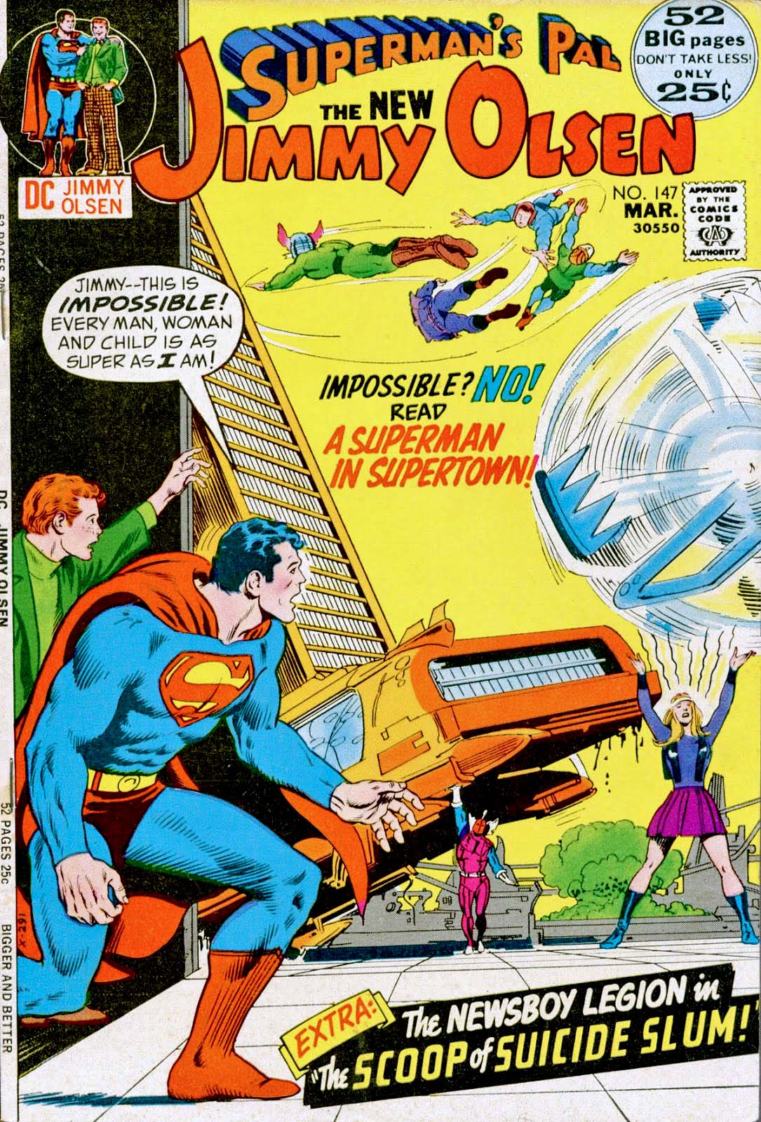
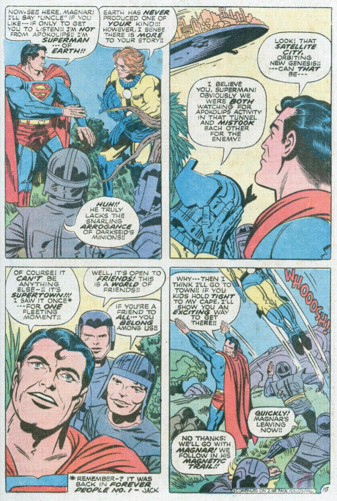
Superman’s Pal, Jimmy Olsen #147, March 1972

Every so often in Jack Kirby’s offbeat Jimmy Olsen run, you run across something extra special.

In this case, it’s a ’70s Kirby Superman, refined by Mike Royer, rather than jarringly redrawn by Al Plastino or Murphy Anderson.

And a rare combination at that. This was Royer’s only inking assignment on Jimmy Olsen, coming in Kirby’s second-to-last issue on the title.

DC’s editors famously insisted that Superman conform to the company’s house style. Looking back, it seems short-sighted and cautious. If you’re hiring Jack Kirby, shouldn’t part of the appeal be seeing what his Superman looked like?

Fortunately, Royer’s refinements didn’t cross the line (no pun intended) into a wholesale redraw, leaving us with perhaps the closest thing to Kirby’s unfiltered Superman published during his original DC run.

And what a book Jimmy Olsen was.

Kirby used a struggling Superman spinoff to launch the Fourth World.

Darkseid. New Genesis. Apokolips…

Then there’s the Newsboy Legion. The Guardian…

And somehow, Don Rickles.

Only Jack could make that seem perfectly logical.

Alex Toth — Wonder Woman Ties It Up

Commission, 1998

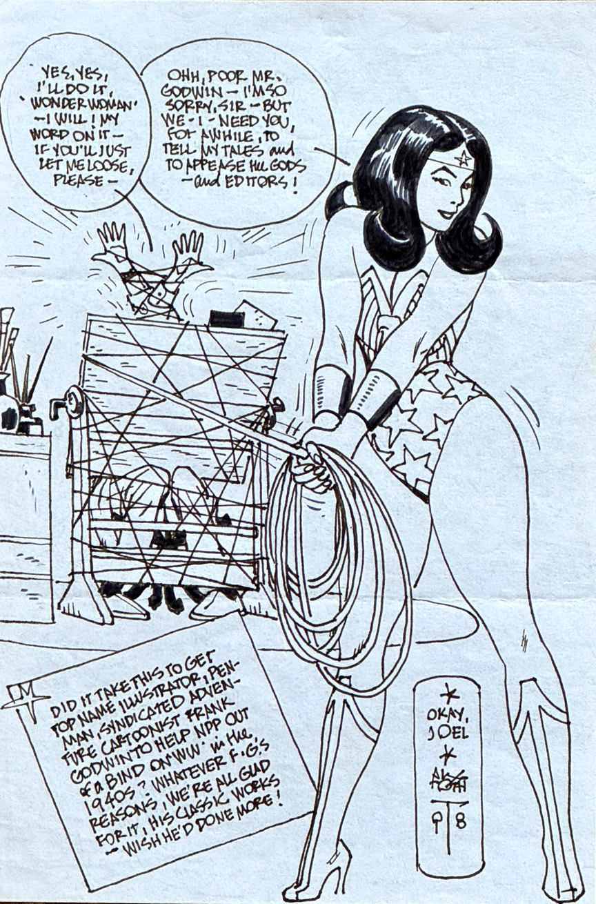
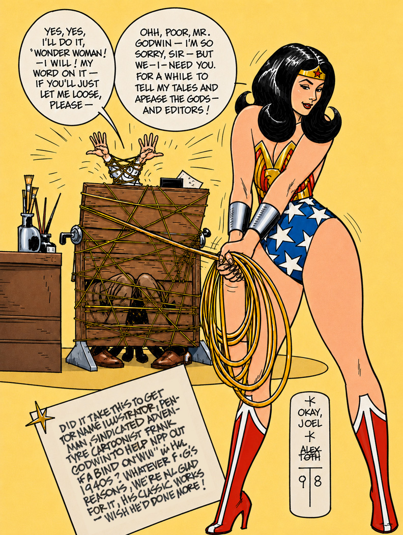
This fun little Alex Toth commission really shows off every side of his cartooning ability—draftsmanship, storytelling, humor, design sense, and of course that instantly recognizable lettering style that somehow always looked effortless.

Typically, it’s drawn on a simple 6×9 sketchpad sheet, folds and all—you can even see how Toth mailed it off to “Joel,” which only adds to the charm.

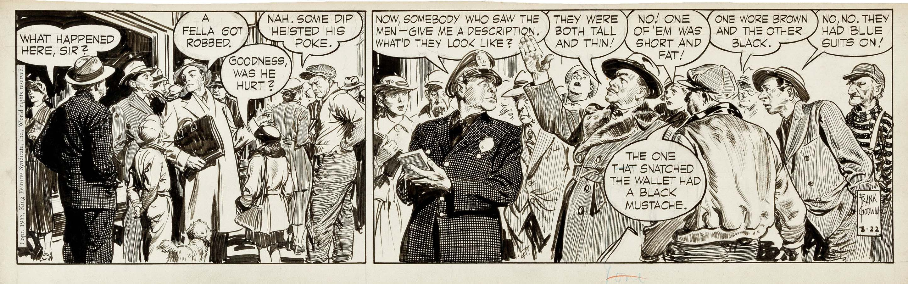
The gag is terrific: poor Frank Godwin (best known for Rusty Riley and some stunning adventure-strip work) has been literally hogtied by Wonder Woman and forced to help DC (then National Periodical Publications) out of a bind by drawing a few Wonder Woman stories in the 1940s.

I’ve always loved Toth’s Wonder Woman commissions because they never feel overly reverent. He understood the character visually, sure—but he also understood that comics are supposed to be fun.

Even fooling around on sketchpad paper, Toth still couldn’t help making great comics.

Mike Sekowsky — Team Effort

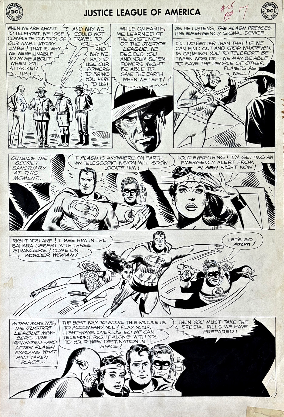
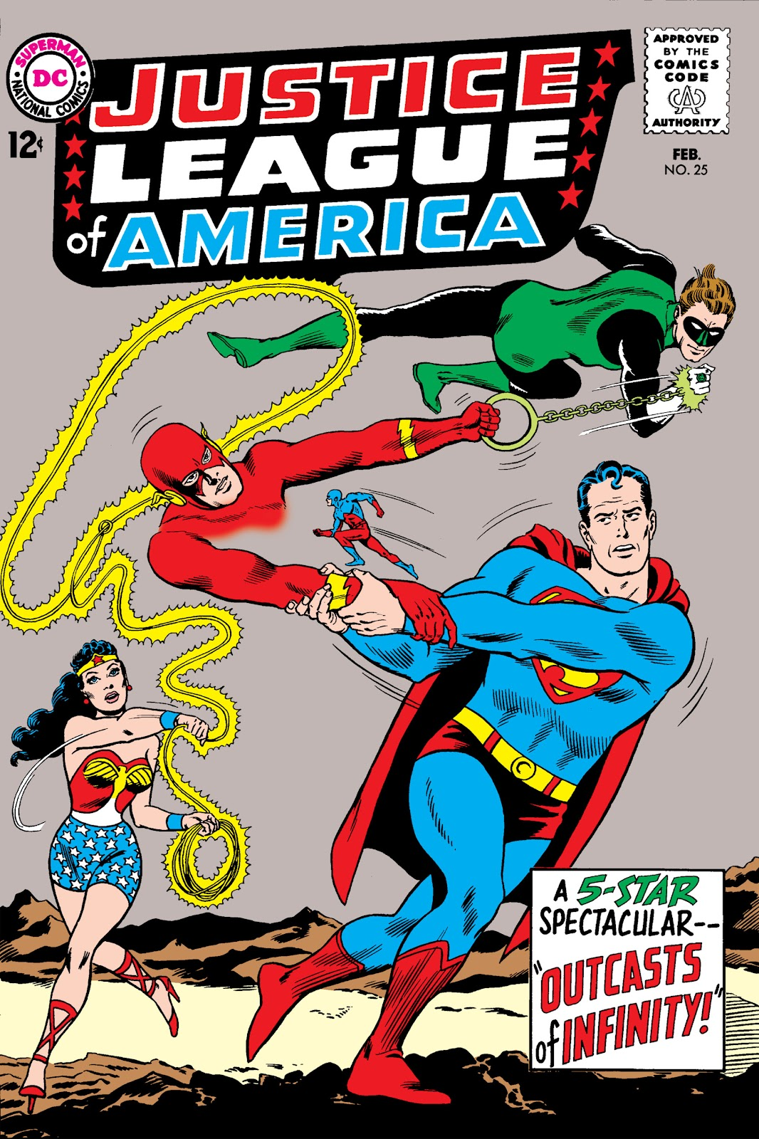
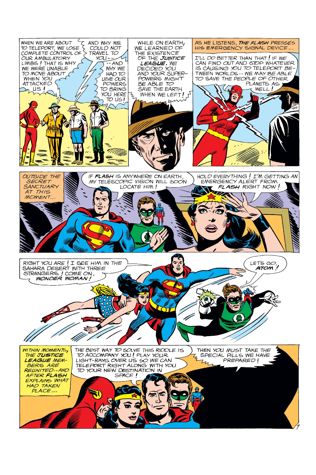
Justice League of America #25, February 1964

Here’s a very cool—and not all that common—page from Mike Sekowsky’s run on Justice League of America.

What jumps out right away is that you’ve got all five Leaguers from the issue sharing the same page. That wasn’t always the case—these stories often split the team into smaller groups, each getting their own chapter. So having everyone here, across multiple panels, really gives the page that full-on “team book” feel.

And then there’s Superman—front and center.

That’s actually a bit unusual in those early JLA years. He was around, sure, but often used a little more sparingly. Cover-wise, he’d only popped up a handful of times before this—and even then, kind of on the margins. Here, he feels like a real driver of the story, not just part of the roster.

This one’s from before my own newsstand era, which is part of the fun. Big, bold, early Silver Age stuff—goofy aliens, interdimensional problems, the kind of threats where you actually need a whole team. You’re not calling in the Justice League for a bank robbery.

And Sekowsky—never really labeled a top-tier stylist—but the guy could draw anything, in any situation, and keep the story moving. That’s a skill that’s easy to overlook, and shouldn’t be.

Just a great page—and a really nice slice of JLA history.

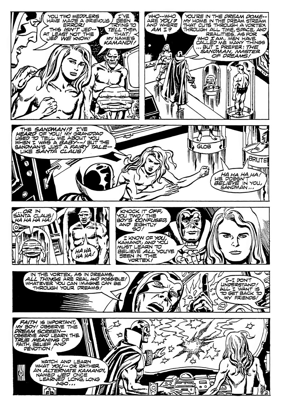
Jack Kirby & Mike Royer— Ragnarök at the North Pole

The Best of DC #22, March 1982 (Intended for Sandman #7, —Unpublished — 1975)

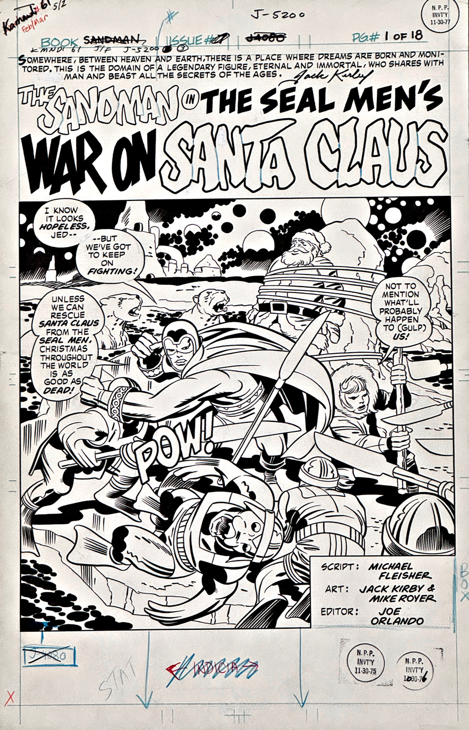
When Jack Kirby wanted to make an entrance, he didn’t tiptoe — he detonated. This Sandman title page kicks down the door, grabs you by the collar, and announces, “Strap in — things are about to get very weird.”

Only he could take a story called The Seal Men’s War on Santa Claus and treat it like Ragnarök at the North Pole. The floating spheres, extra moons, and cosmic backdrop all calmly insist, “Relax — this is exactly how dreams are supposed to look.”

Down on the ground, Sandman is carving a path through a crowd of angry Seal Men, cape swirling, fists flying, looking every bit like someone who rescues Santa on an annual basis. Jed is right beside him, doing his best with a staff that’s taller than he is, while poor Santa watches from the background, wrapped up like he’s on the world’s least festive gift list.

Mike Royer’s inks give the whole scene its crisp, confident snap — bold lines, clear action, and just enough shadow to keep the mayhem grounded.

It’s light, it’s wild, and it is unmistakably DC Kirby — a dream-world dust-up where everyone seems to believe in the moment. 

Even Santa.

Has any comic story ever been cancelled twice? Jack Kirby holds a lot of comic-book records, but this one might be the strangest.

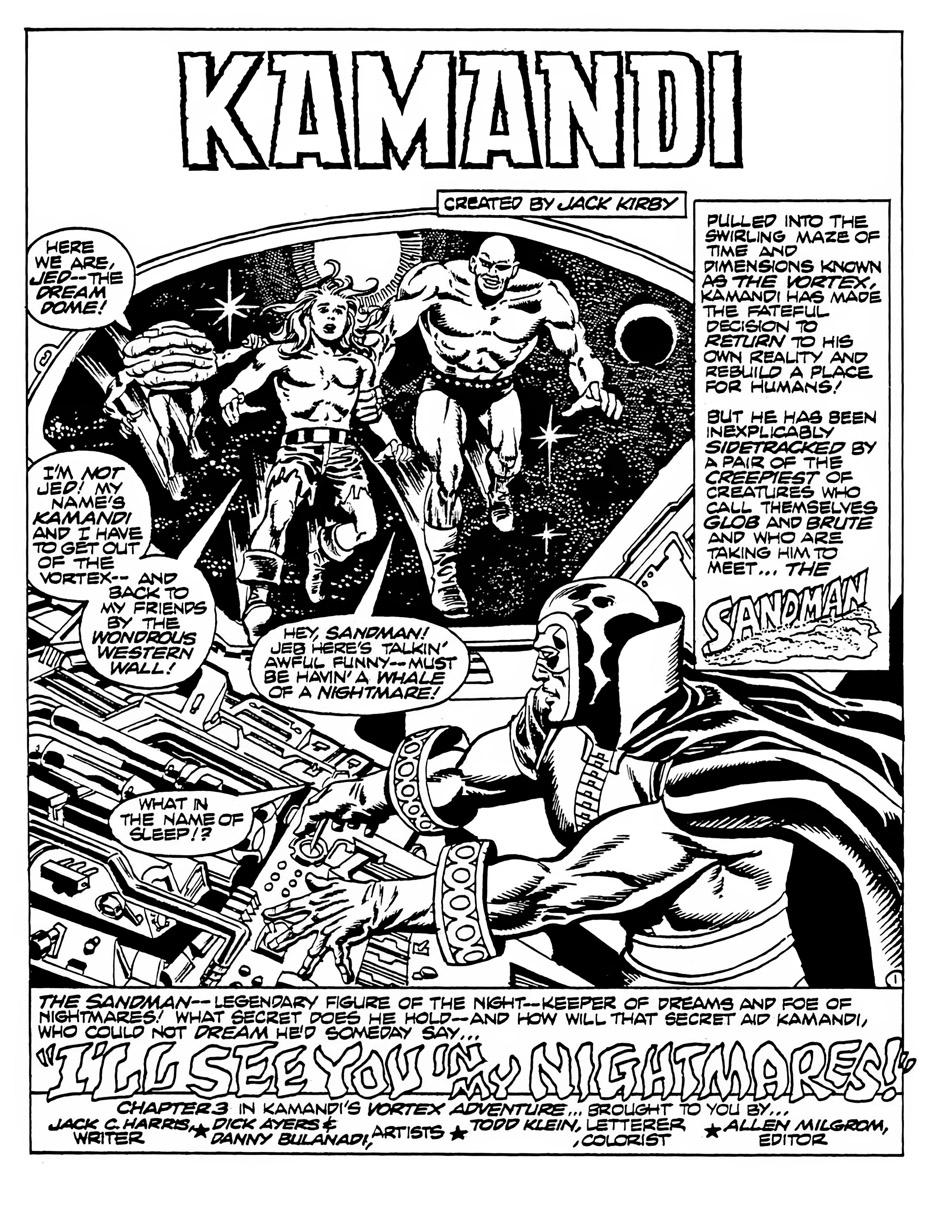
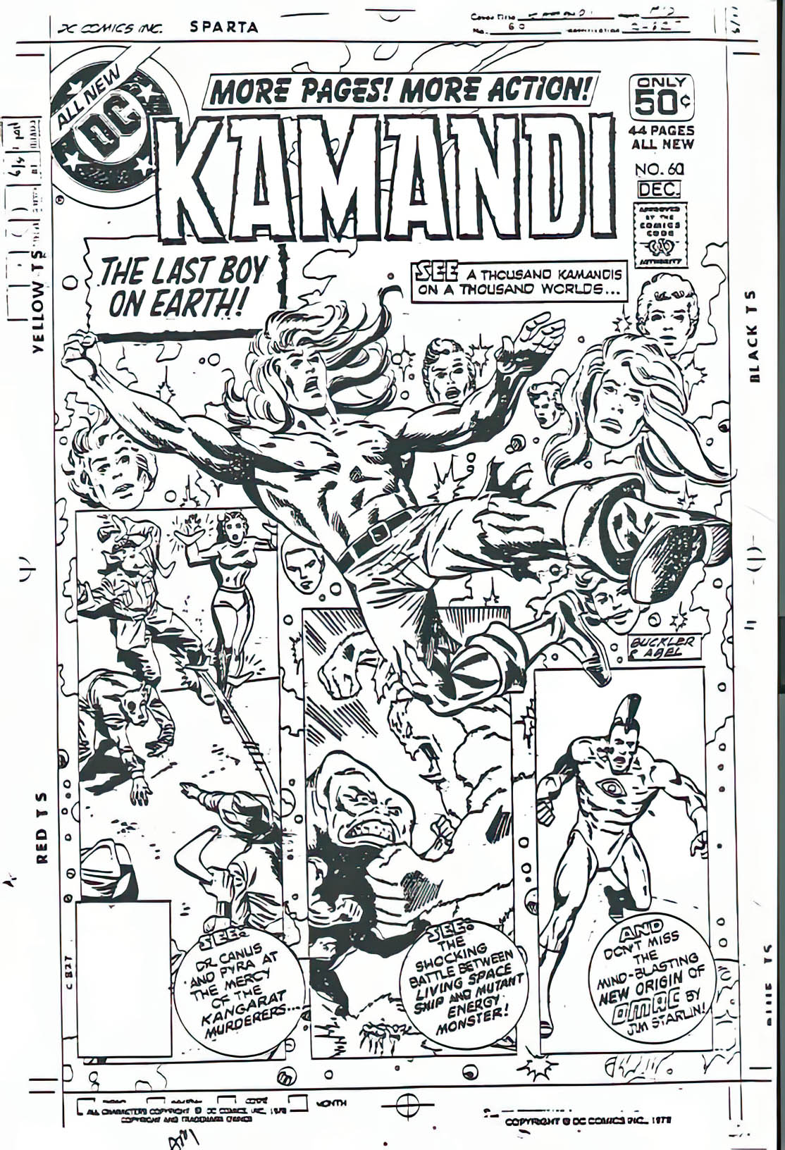
Sandman #7 was fully finished when DC pulled the plug on the series after issue #6 in 1975. The completed story went into limbo — filed away, forgotten, probably wondering what it did wrong. A few years later, DC tried again, planning to incorporate it narratively (don’t ask) in Kamandi #61… and then the infamous “DC Implosion” hit. Kamandi was cancelled too.

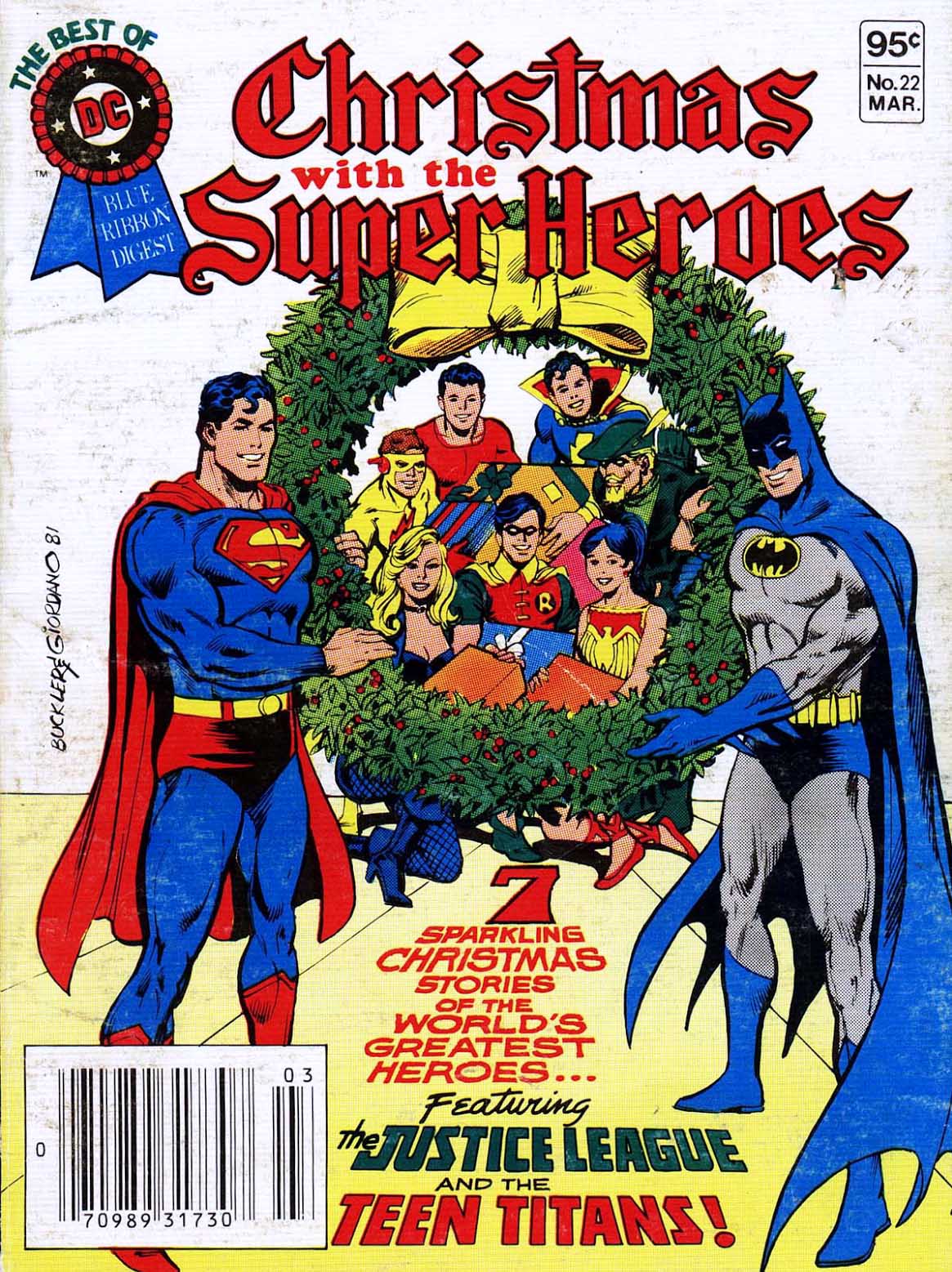
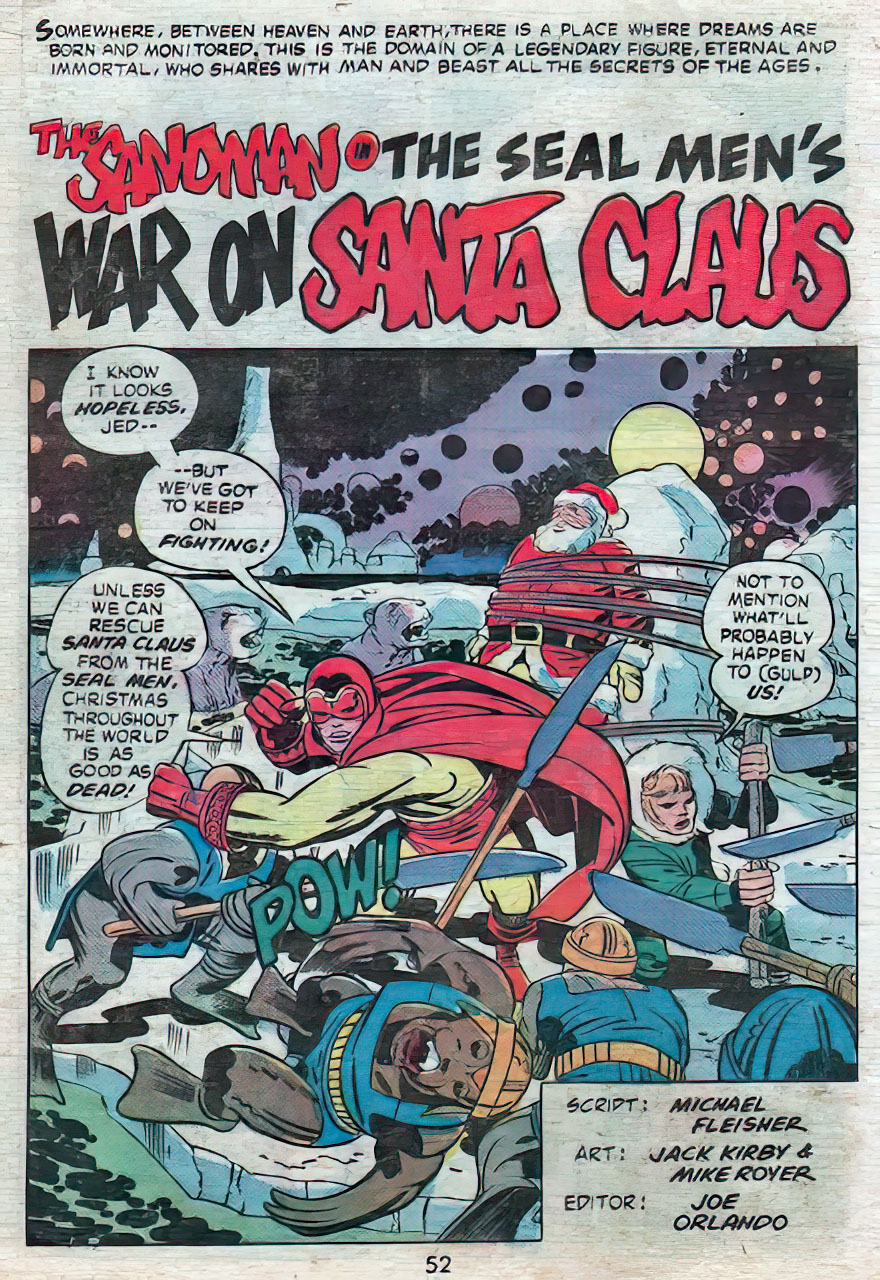
It finally escaped publishing purgatory in Best of DC #22, a digest-sized Christmas special from late 1981 — because if you’re going to rescue a lost Kirby comic, why not do it as a bite-sized stocking stuffer?

Sigh.

It arrived late, sure — but fortunately, Kirby pages age better than most publishing plans. 

(And now, fortunately, you can find a full-size version collected in The Kirby DC Bronze Age Omnibus. The perfect Christmas present to give yourself.)

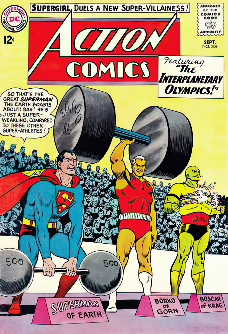
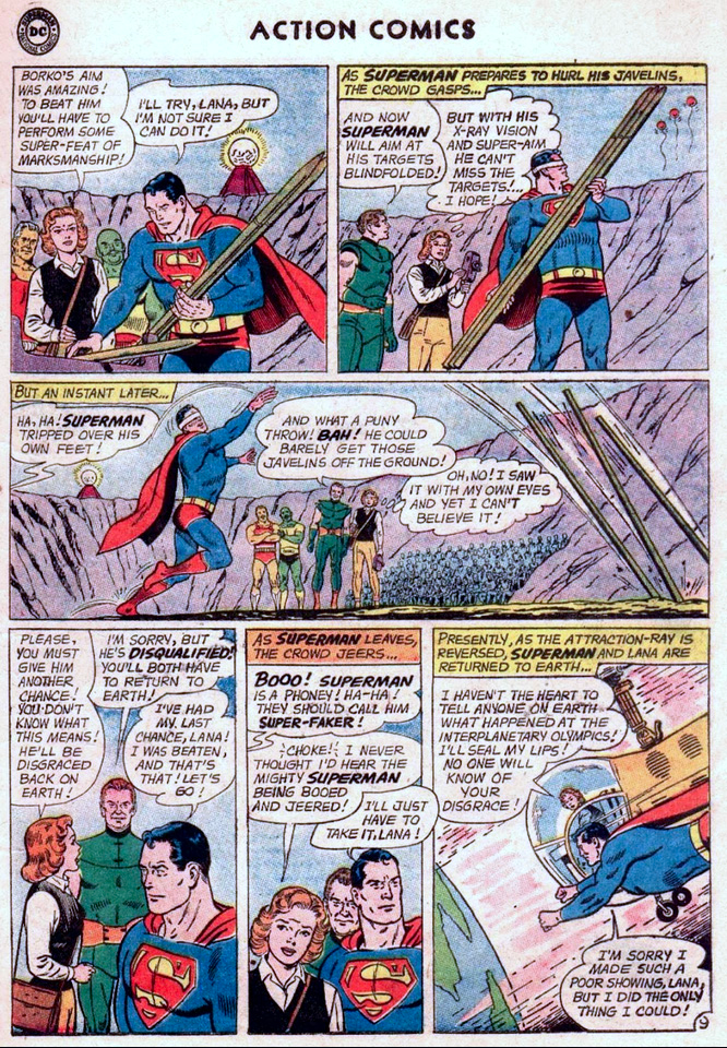
Curt Swan & George Klein — Feats of Strength

Action Comics #304, September 1963

If you ever need proof that George Klein was Curt Swan’s best inker on the Superman books, just pull out this page from Action Comics #304. No explanations required—the art does the bragging for you.

From the first panel, Swan gives Superman that clean, honest pose only he could draw, and Klein locks it down with lines that are confident without showing off. Superman looks strong, sure—but also human. That balance? Classic Klein.

Jump to the big panel—Superman wrangling those hilariously oversized javelins—and you see the Swan/Klein team firing on all cylinders. Klein never wrestles for control; he boosts Swan, picking exactly the right details and politely ignoring the ones that don’t matter.

Across the page, the “S” shield is crisp, the cape moves like actual fabric, and the crowd reads clearly without becoming a visual traffic jam. It’s the kind of clean storytelling that looks effortless—until you see someone else try it.

And that bottom tier—Lana’s concern, Superman’s sheepish dignity—Klein hits it perfectly. Just enough warmth to make the moment feel lived-in.

Look, I love Murphy Anderson on Swan. (And pretty much everywhere else.) But the truth is simple:

George Klein doesn’t just ink Swan. He completes him.

I had my eye on this page for a while before I finally pulled the trigger — and I’m certainly glad I did.

Steve Ditko — Beware The Creeper (& DC’s Publishing Strategy)

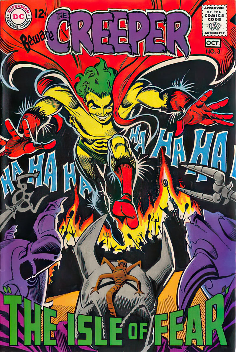
Beware The Creeper #3, October 1968

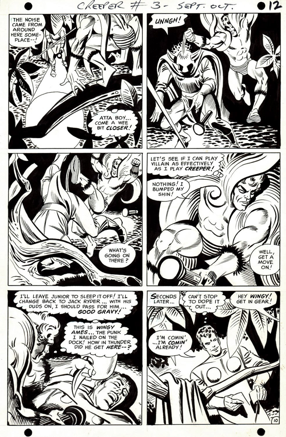
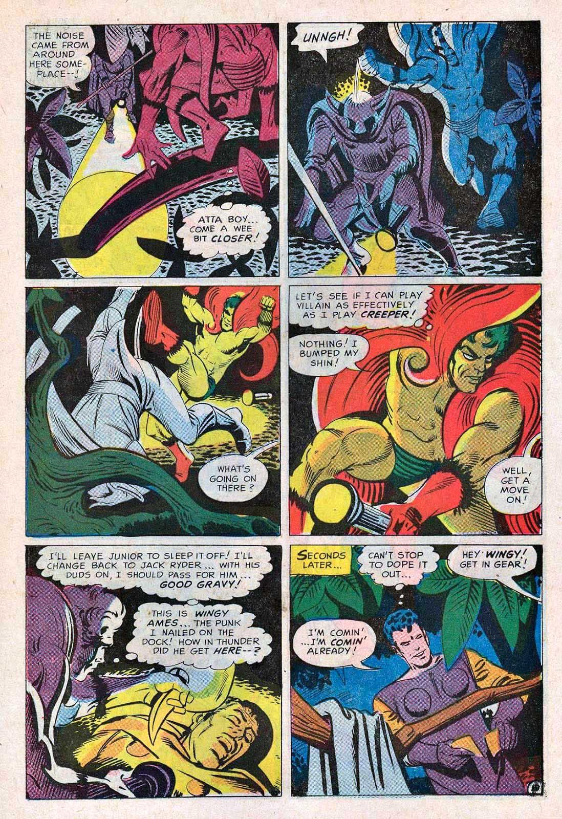
Here’s a great Beware The Creeper page from issue #3. The Creeper (Jack Ryder) in every panel with classic Steve Ditko action and composition.

The Creeper was Ditko’s first superhero work for DC— just ahead of Hawk and Dove —and even as a kid, I recognized its offbeat genius. I had already admired Ditko’s talents from the Spider-Man reprints in Marvel Tales, and also in his Charlton work on Captain Atom, Blue Beetle, and The Question. 

But this quirky title definitely found a sweet spot for me.

In the late 60s, DC didn’t stick with any title that didn’t find an immediate audience — so naturally, it only lasted six issues. 

Sigh. 

Funny thing about this specific art page: If I recall correctly, I almost owned it about a dozen years ago in a purchase/trade that went south at the last minute.

Second time is a charm, I guess. Better late than never. (Two cliches for the price of one!)

As for DC’s publishing strategy:

I’m sure someone has compiled a comprehensive list of all the titles that DC launched in the late 1960s and early 70s and lasted less than a dozen issues.

Without thinking too hard, I came up with these:

The Spectre; Secret Six; Inferior 5; Anthro; Brother Power The Geek; Plastic Man; Hawk and Dove and Angel and The Ape.  (Not to mention Jacky Kirby’s New Gods and Forever People, et al.) And, if you include licensed books, add in Captain Action and Hot Wheels.

That was a lot of work for few, if any, meaningful results.

Good thing the Superman and Batman titles were money machines.