Mike Sekowsky — Road To Minutemen
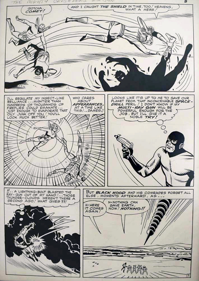
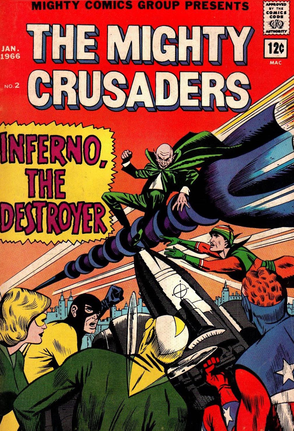
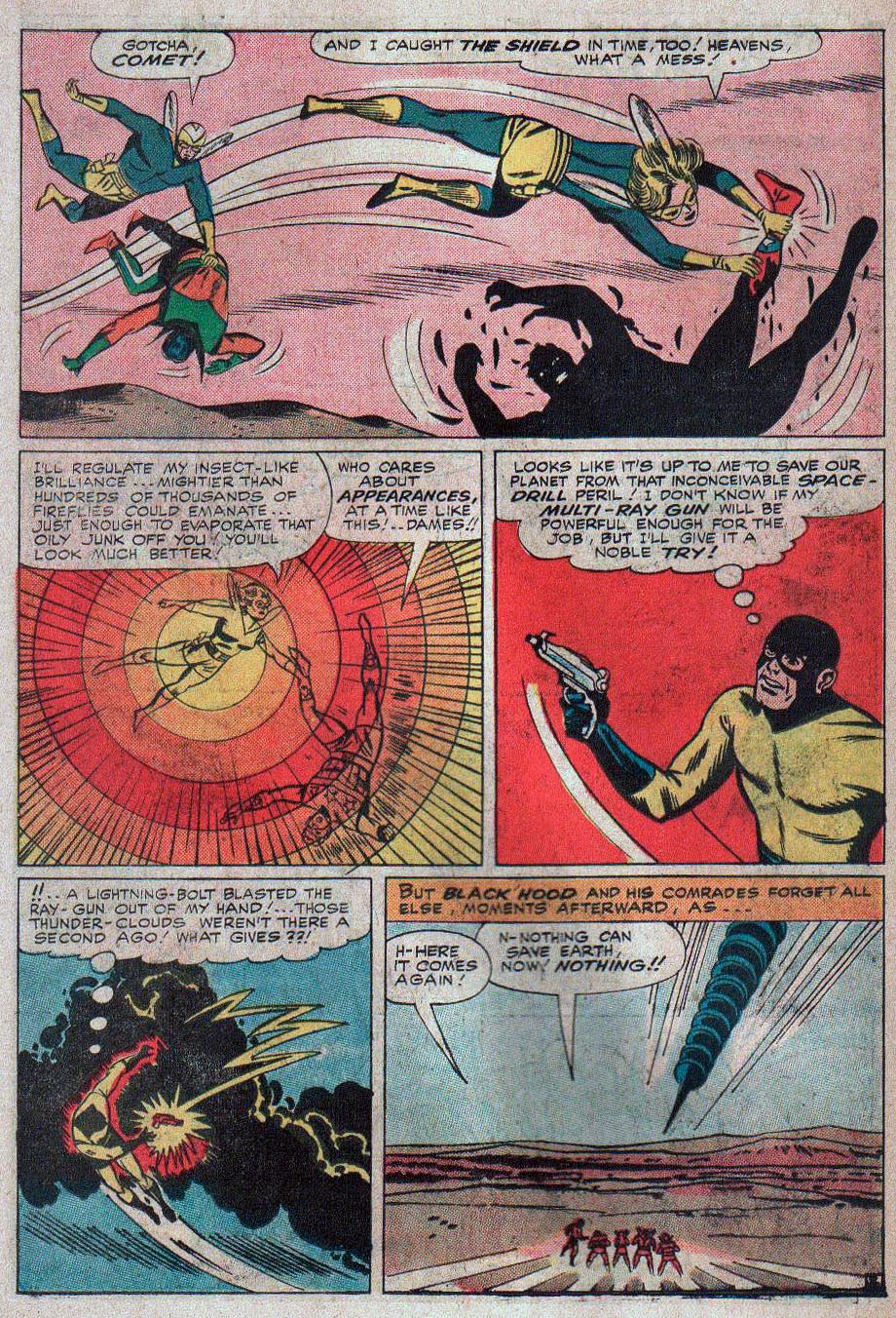
Mighty Crusaders #2, January 1966
Continuing our series on the roots of the Watchmen characters.
Alan Moore, on his original idea for Watchmen:
“I wanted more average super-heroes, like the Mighty Crusaders line … [the] original idea had started off with the dead body of the Shield being pulled out of a river somewhere.”
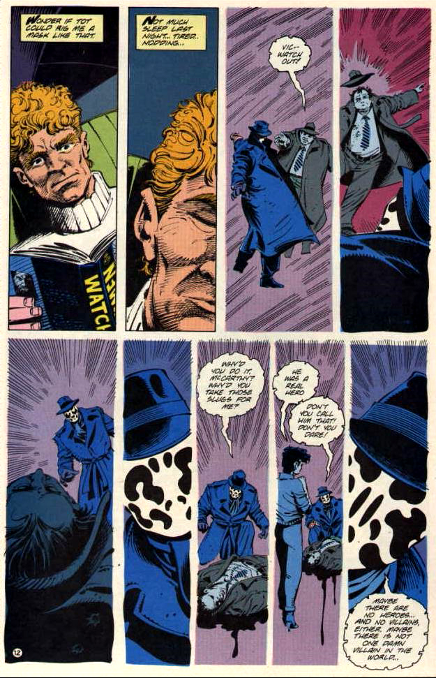
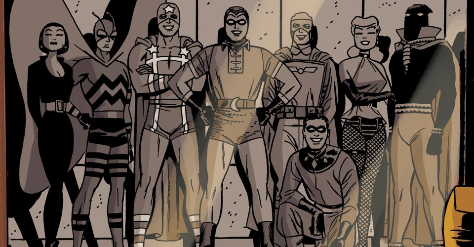
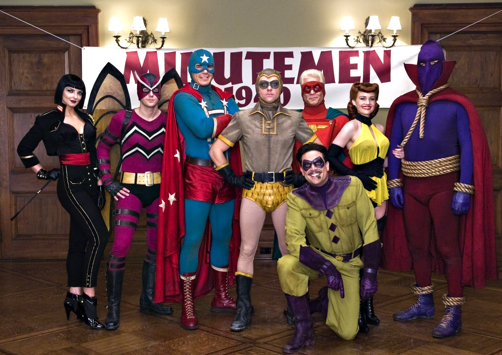
Although the Watchmen eventually morphed out of Charlton heroes instead, elements of the Crusaders and the other MLJ/Archie Superheroes found their way into Watchmen lore. Perhaps most notable is the Hangman, a Golden age Archie character who along with Black Hood, becomes the obvious inspiration for Hooded Justice, a member of the original Golden Age Minutemen in the Watchmen series. (And has a critical role in the Watchmen HBO show.)
Also notable is the Mothman, an obvious derivation of Archie’s (Simon and Kirby’s) Fly / Flyman.
The original MLJ superheroes disappeared into the mists after World War 2, which didn’t impact Archie financially as the title character and his teenage friends transformed the company, including the published actual name which changed from MLJ to Archie in 1946.
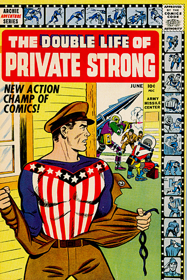
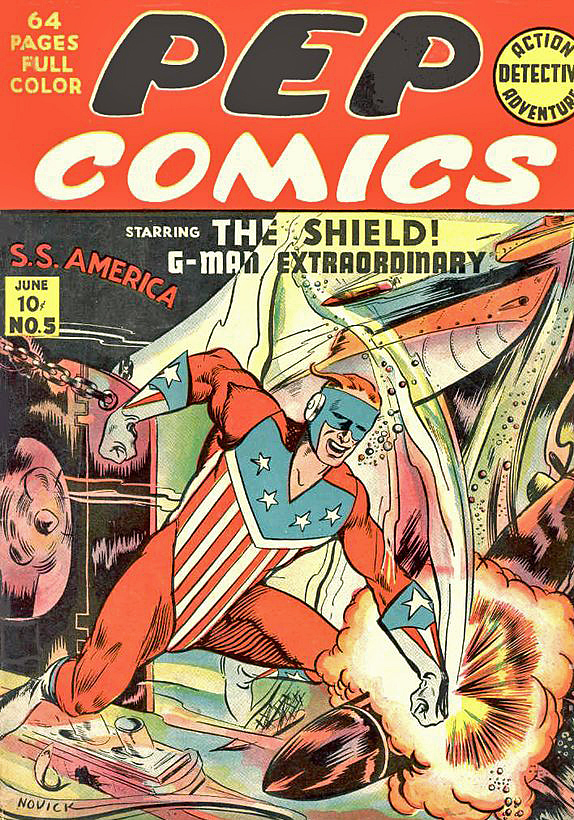
But Archie’s management seeing the giant superhero success down the road at DC and Marvel took another stab starting in 1959 with the Shield and the Fly. Ultimately, many of the golden age characters reappeared, forming a team, the Mighty Crusaders.
Superhero artist Mike Sekowsky was first a Timely (nee Marvel) staffer and then a long-time DC mainstay. He is perhaps best known for his work on Justice League of America, where he could draw almost any character.
So he is well suited to tackle the Mighty Crusaders, a team-up book developed to compete with Justice League and other superhero team books of the day.
But Jerry Siegel’s (yep, Superman’s creator) writing style had most definitely not kept up with the style of the day, and the book was cancelled after seven issues. In fact, the entire Archie superhero experiment fizzled out by late 1967.
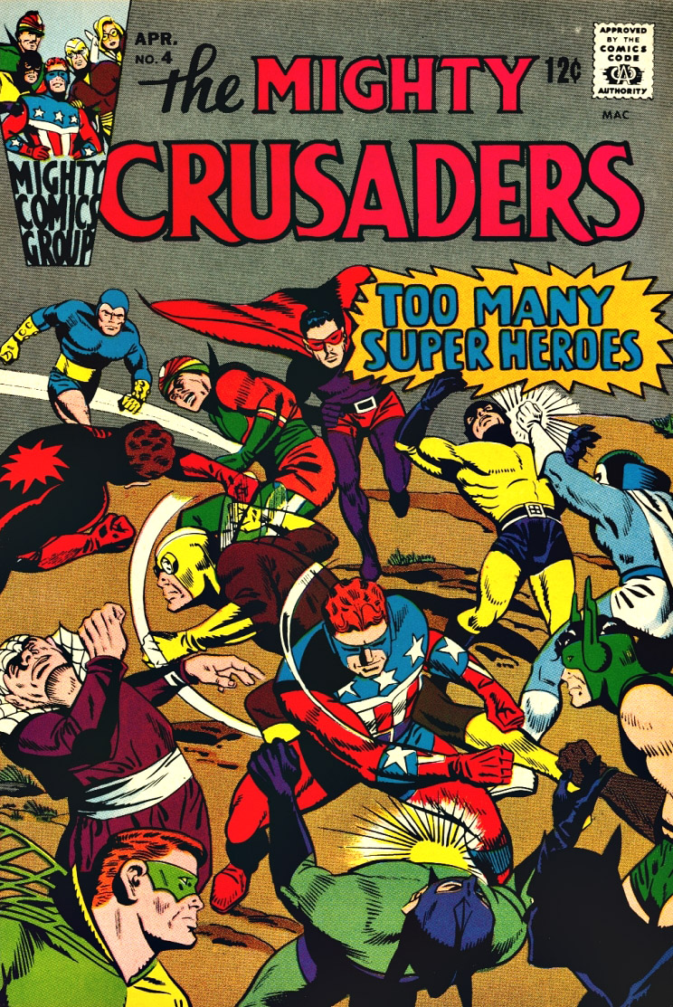
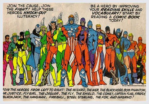
But… not before they managed to bring together nearly all the dusty MLJ heroes and put them in one comic book. Issue #4 of Mighty Crusaders, is a goofy favorite, entitled “Too Many Heroes.”
Too many, perhaps, but certainly enough to reach into for character ideas twenty years later.
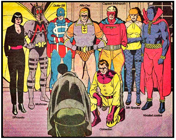
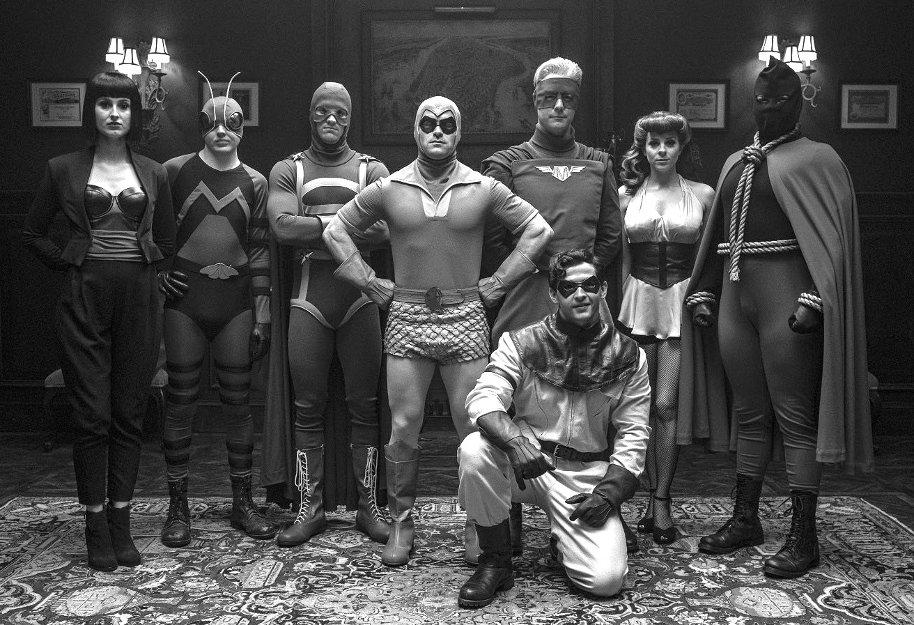
Final Scorecard — Minutemen and their original counterparts:
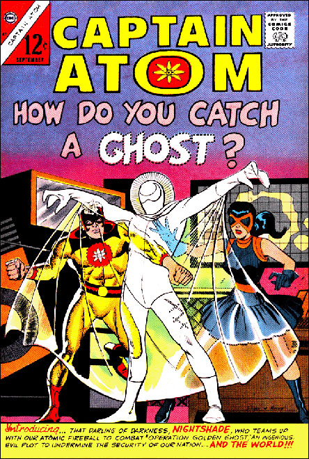
Silhouette = Completely unique. (Maybe an amalgam of Black Canary, Black Cat and a female version of the Fox if you want to stretch out the derivations…)
Mothman = Flyman
Dollar Bill = Captain Flag
Nite Owl 1 = Blue Beetle 1 (Dan Garrett)
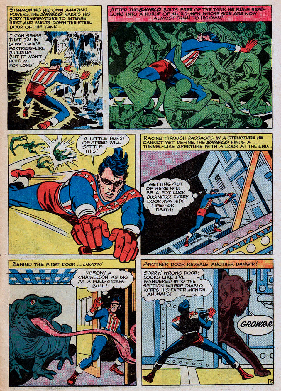
Captain Metropolis = Shield (with some Steel Sterling thrown in)
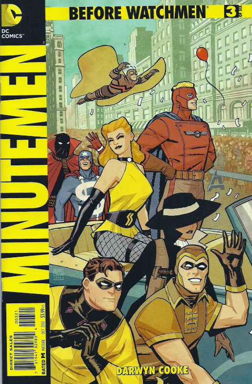
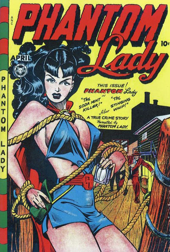
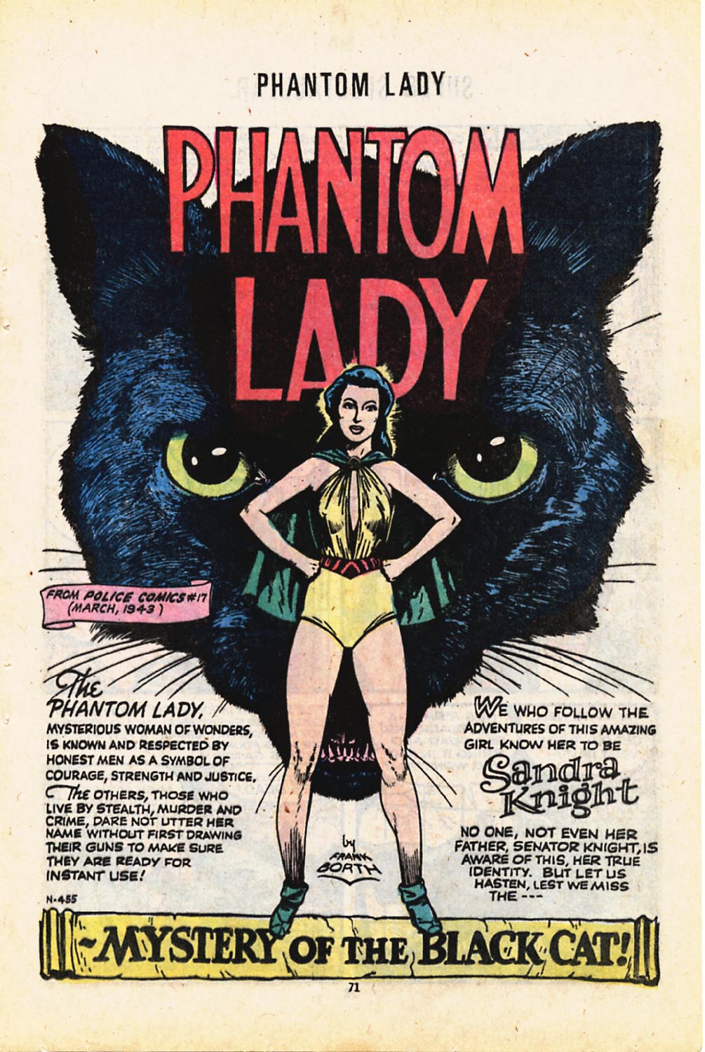
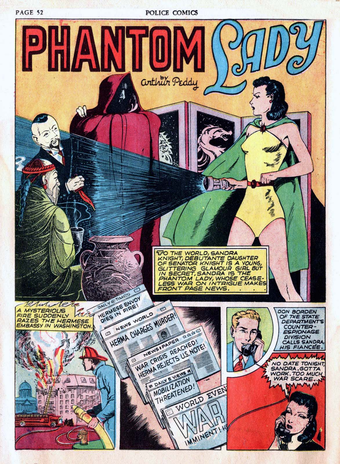
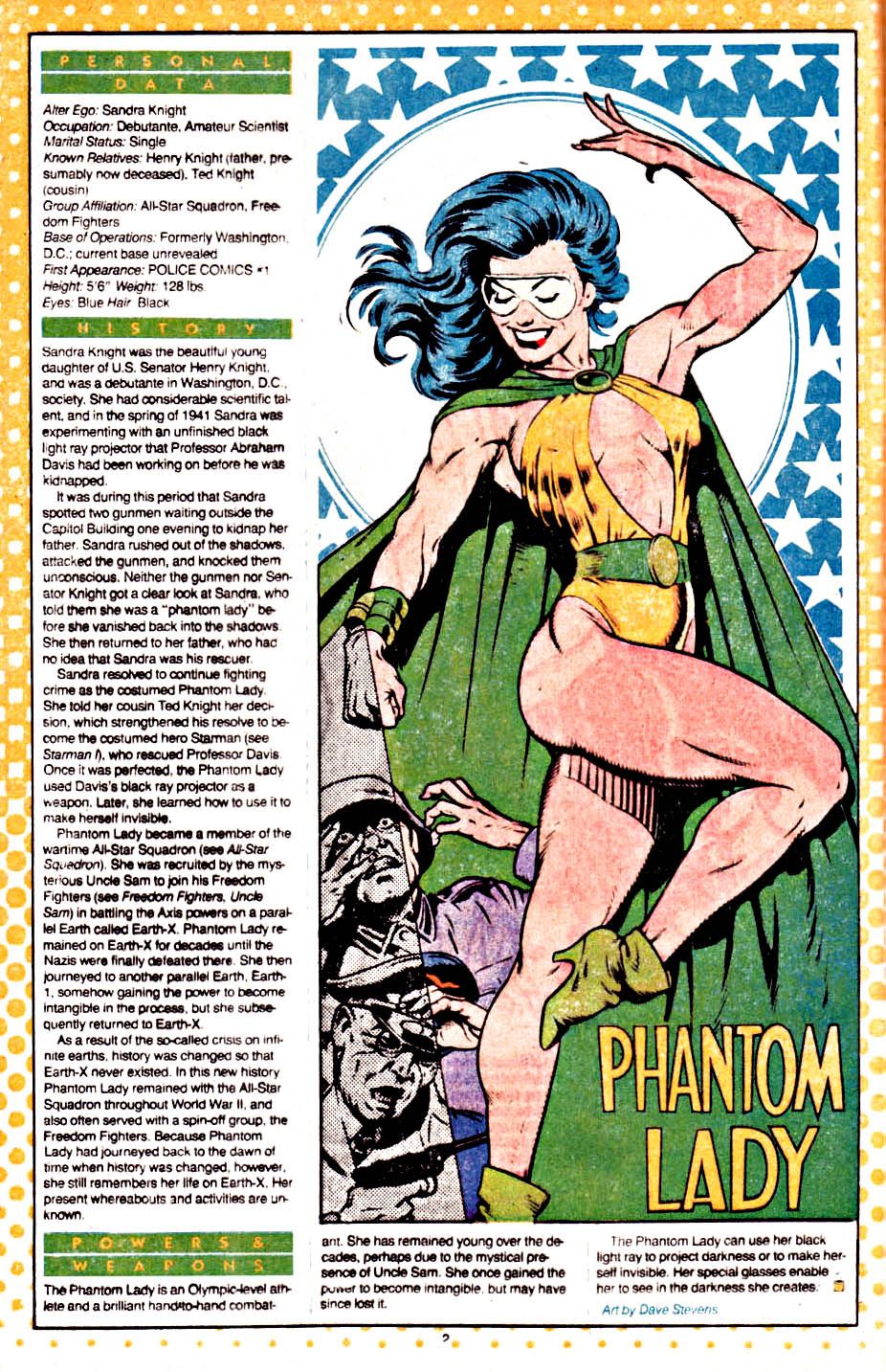
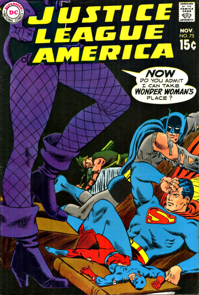
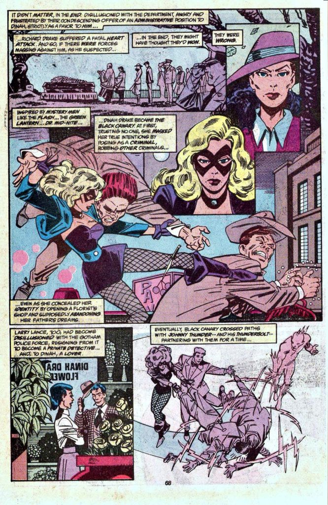
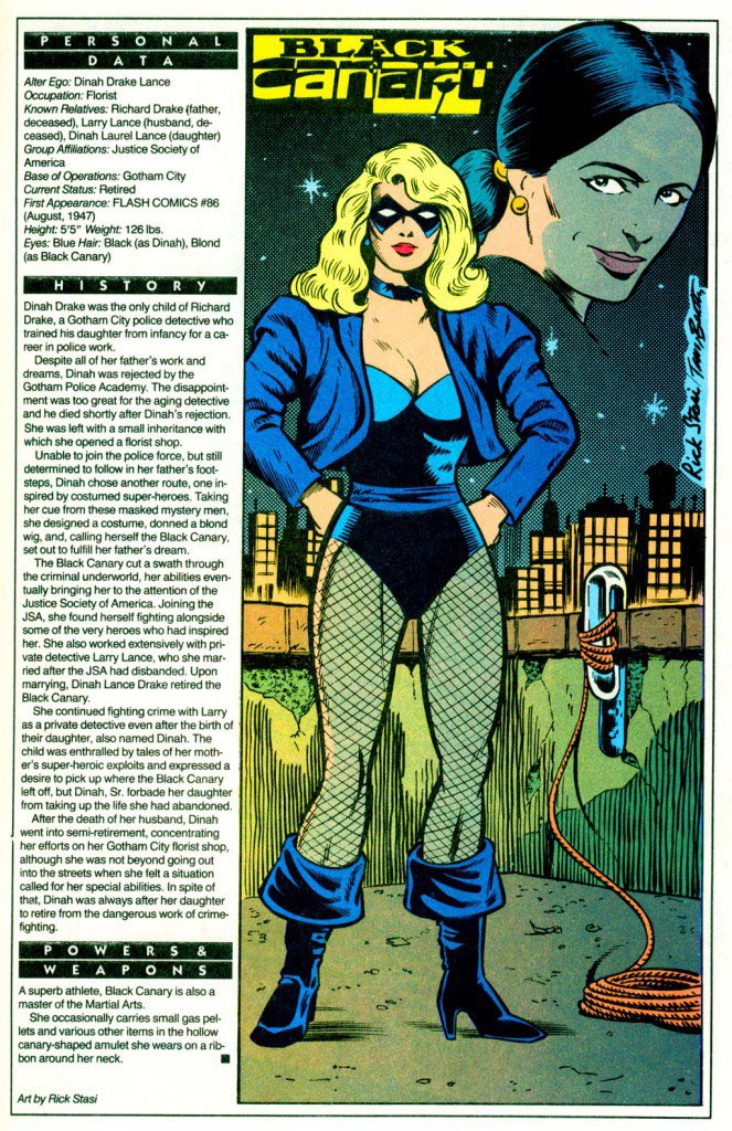
Silk Spectre 1 = Phantom Lady (with some Black Canary thrown in)
Hooded Justice = Hangman (with some Black Hood thrown in)
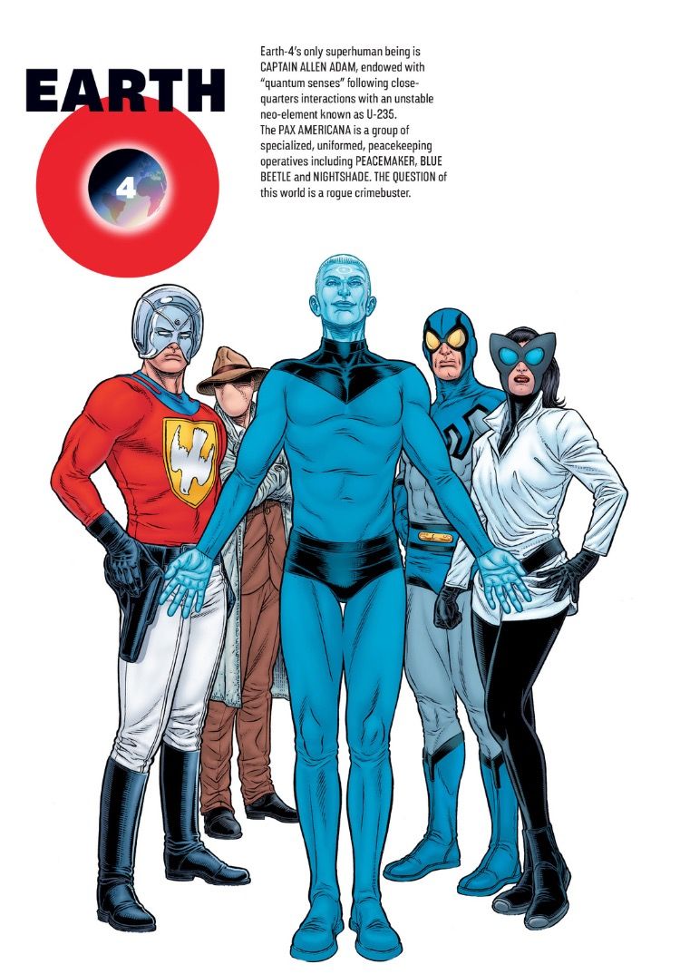
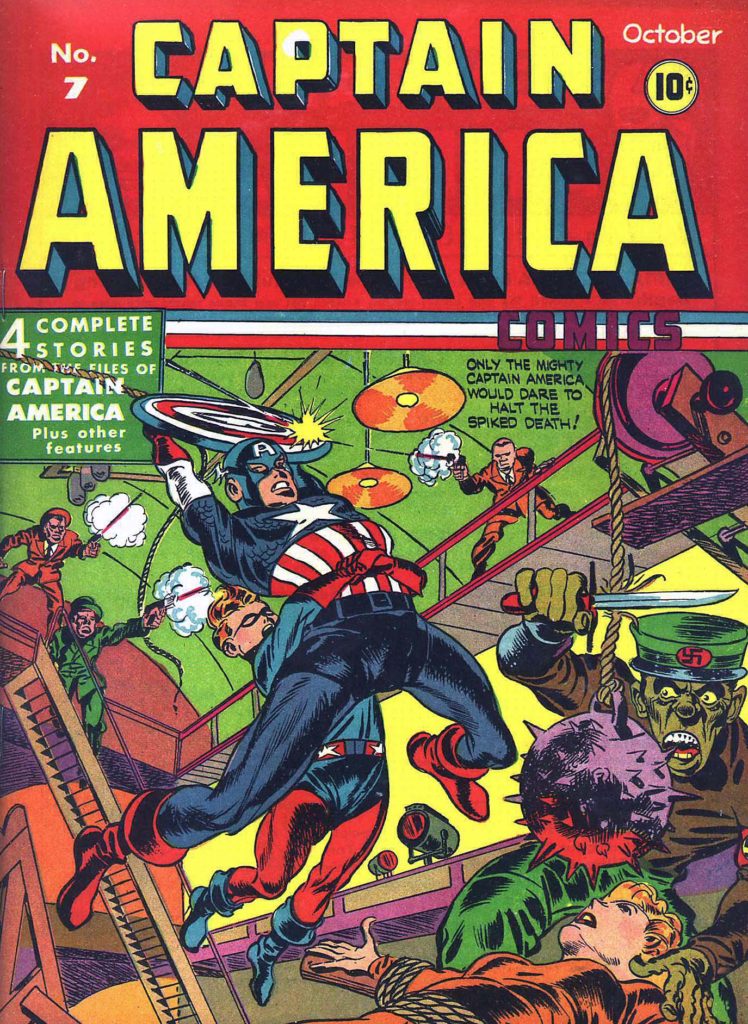
Comedian = Peacemaker (with some Shield thrown in)