Greg Goldstein's Comic Art Gallery

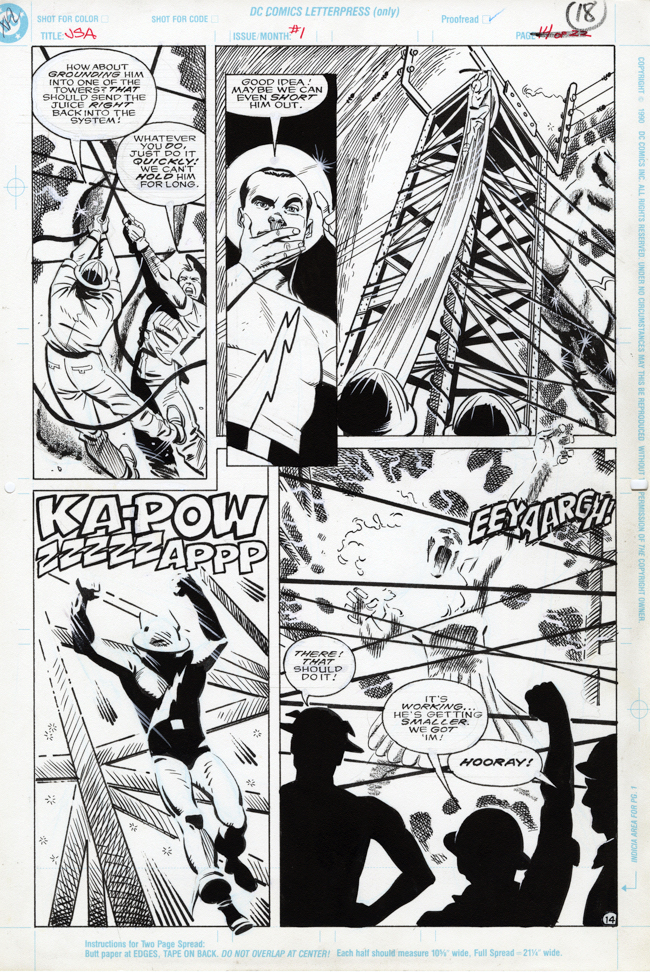
Rich Burchett — Flashy Team-Up

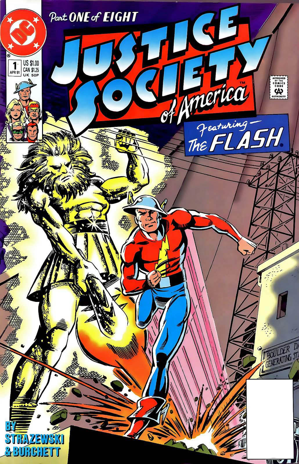
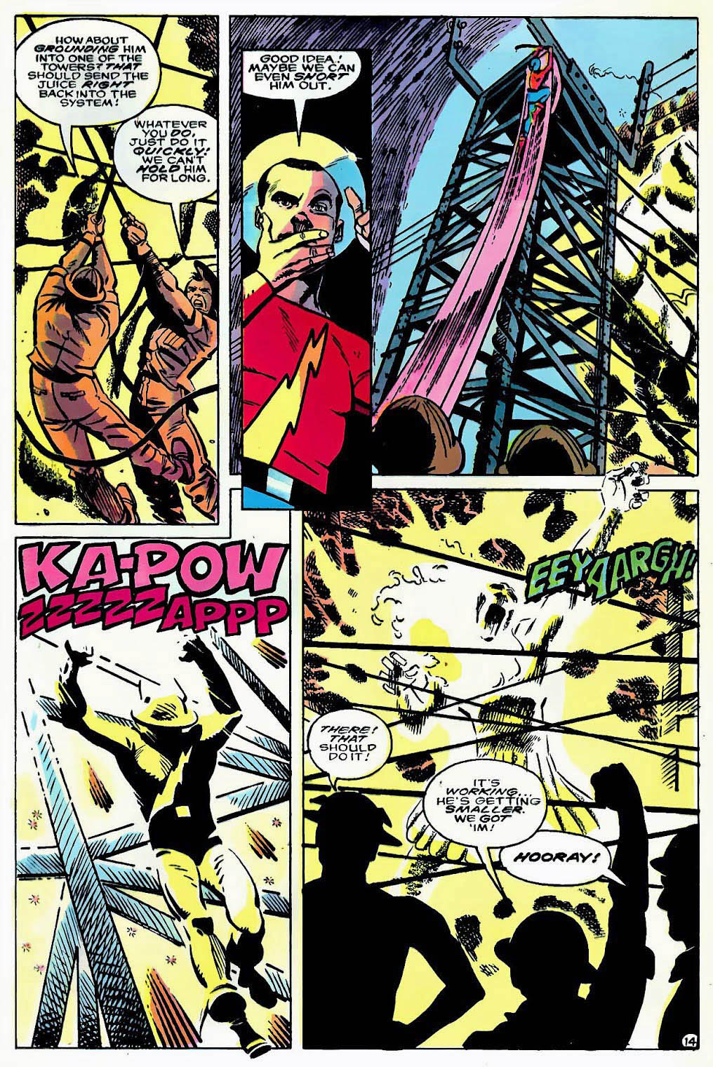
Justice Society of America #1, April 1991
2020 marks the 80th anniversary of the very first super team in comic book history, The Justice Society of America.

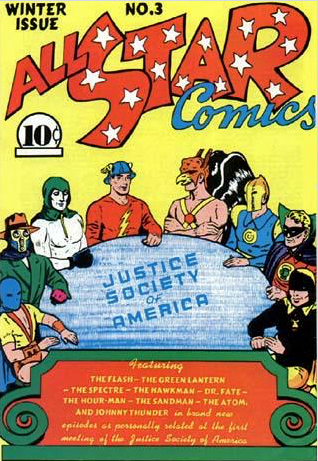
Superhero comics were barely two years old, when a gaggle of heroes appeared on the cover All Star Comics #3. Imagine the reaction of a young comic book reader at his local newsstand or candy store seeing Doctor Fate, Hourman, The Spectre, Green Lantern, The Atom, The Sandman, Hawkman, and of course, The Flash all seated at the one table.

Brain blown.

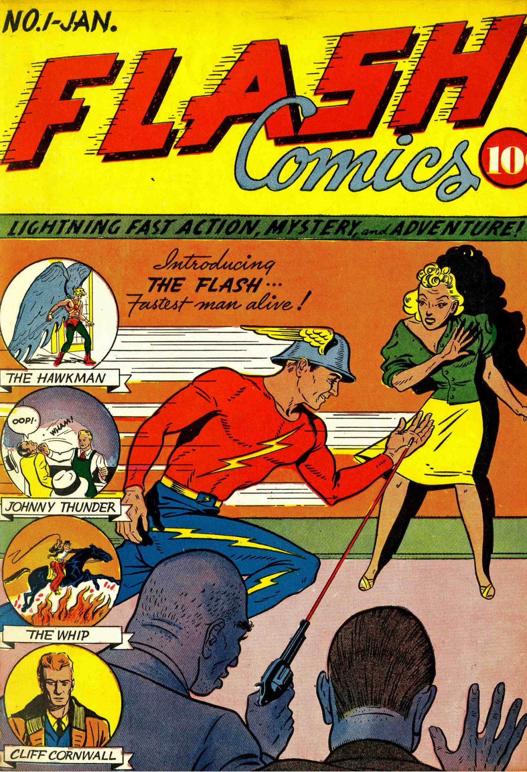
During the various “Comic Book Ages” (Gold, Silver, Bronze, Modern, et al) the original Flash seems to symbolize the Society more than any one character. This is partly due to the fact that he is the very first Golden Age superhero to be reintroduced into the Silver Age (Flash #123).

In this 1991 JSA mini-series, one classic character receives solo billing in each issue, and the Flash leads off in issue #1, with art (pencils and inks) by the often under-appreciated Rich Burchett. This is a fun and dynamic page of the Flash in action, with the action taking us through the page.

And, I find it amusing that Flash’s helmet and the construction workers are not that dissimilar. If only those guys could run at super speed…

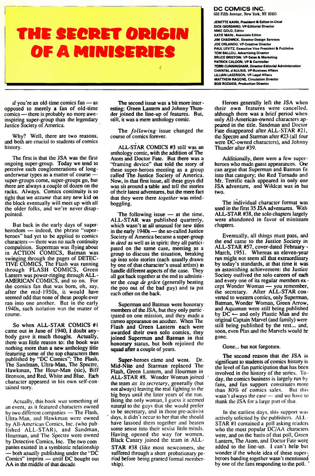
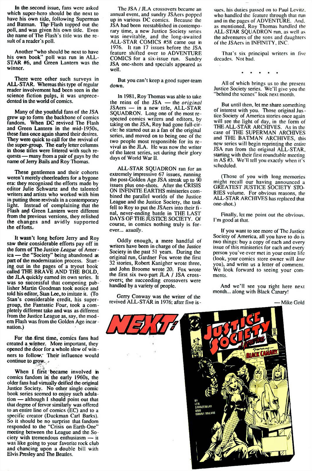
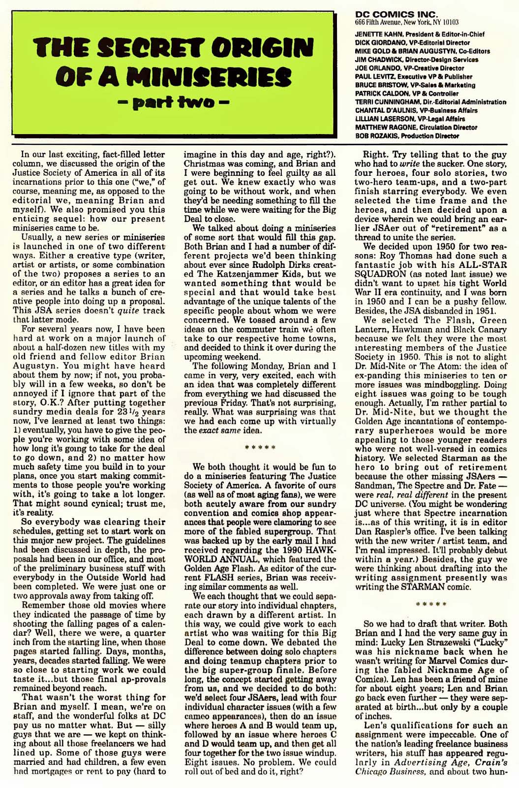
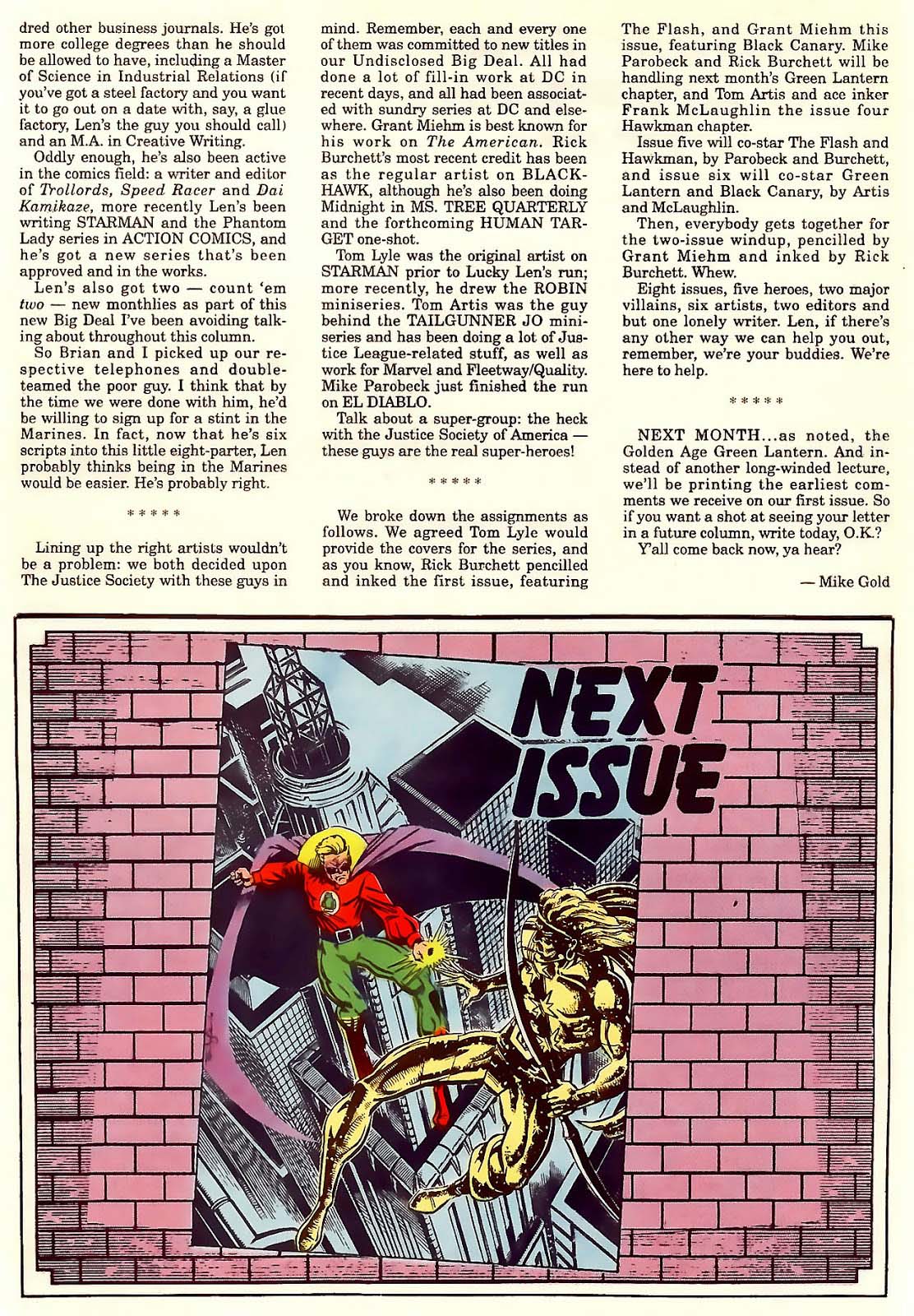
(My pal Mike Gold edited the series, and he provides a lovely history of the JSA, and an origin of this specific series, which is provided below.)
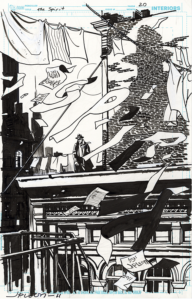
John Paul Leon — Spirit In The Sky

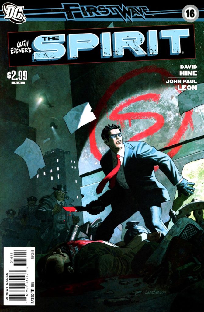
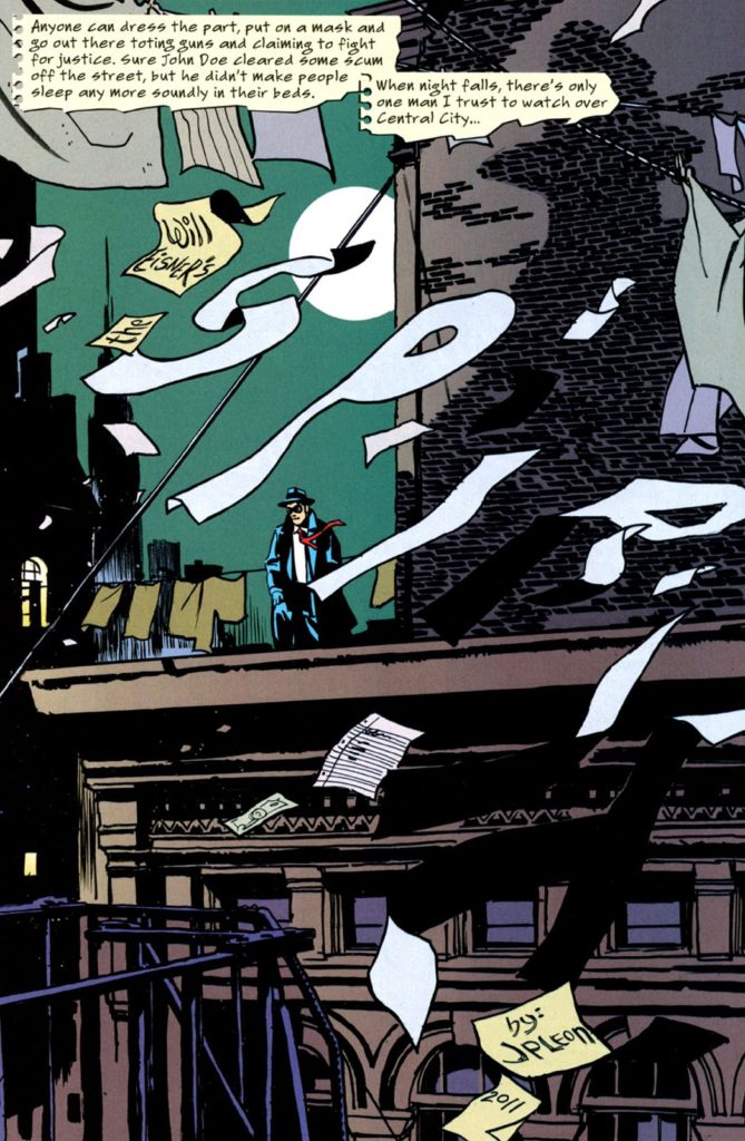
Spirit #16, September 2011

Continuing our celebration of the 80th anniversary of The Spirit, with additional creators’ takes on the beloved and influential character.

David Hine (Spider-Man Noir) authors a clever tale where pretty much every page is a splash — with the Spirit title included as part of the art. John Paul Leon hits the concept out of the park successfully homaging Will Eisner’s original brilliant splash pages with innovations of his own.

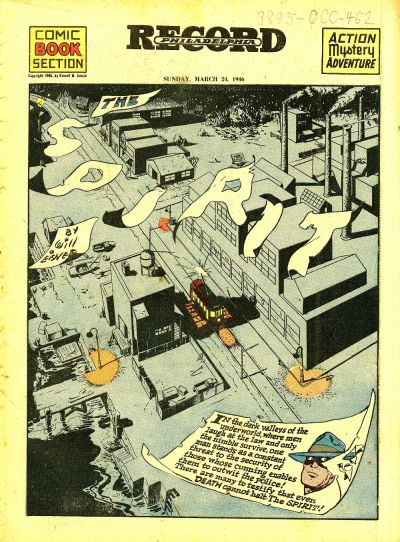
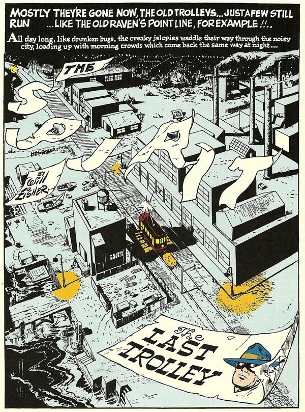
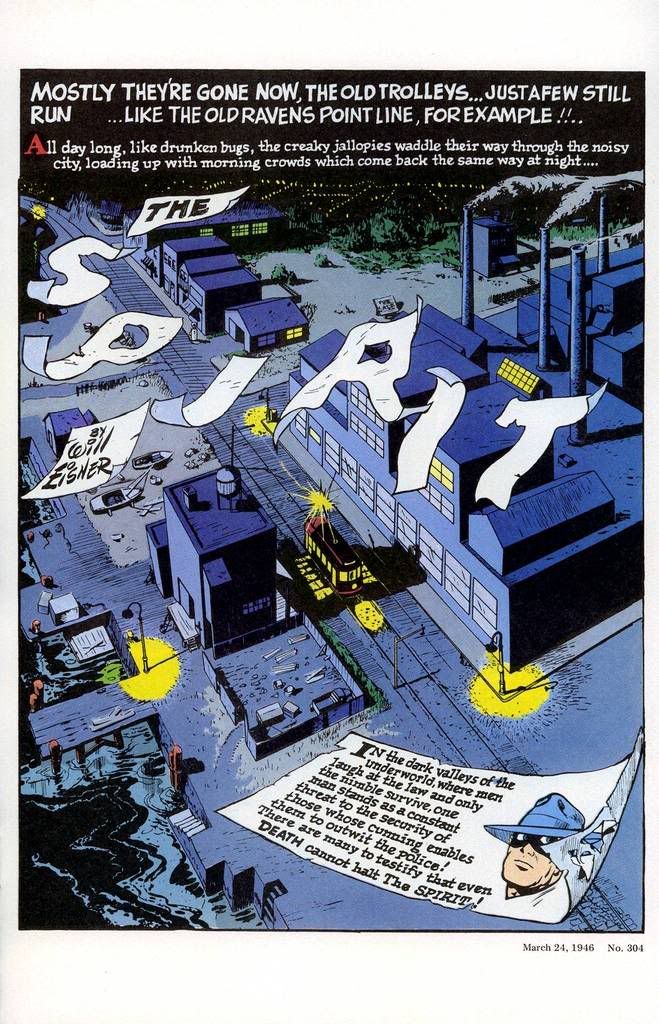
On this page, the final one of the story, Leon perhaps finds inspiration for the logo from 1946 — from the classic tale, “The Man Who Killed The Spirit” AKA “The Last Trolley.”

Fun fact: This issue — and this entire series — was edited by the ultra-talented Joey Cavalieri, a pal of mine for nearly 50 years. Joey and I first met as kids hunting down comics in the candy stores, newsstands and luncheonettes of the lovely seaside town of Long Beach, New York.

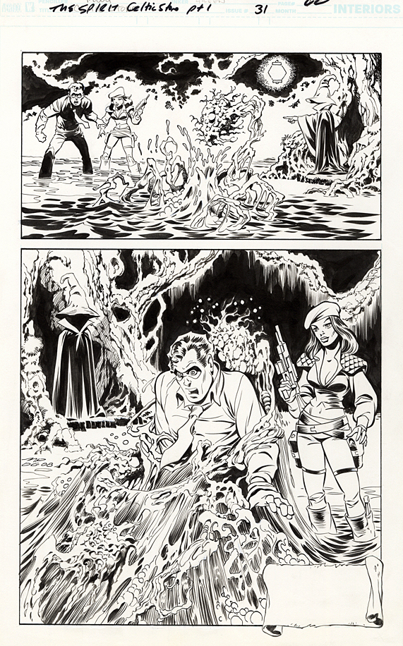
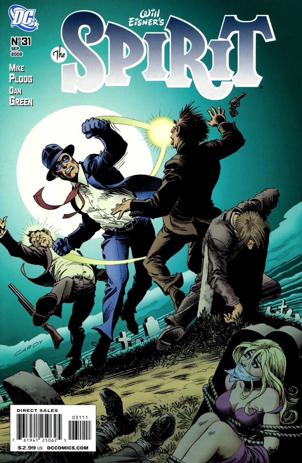
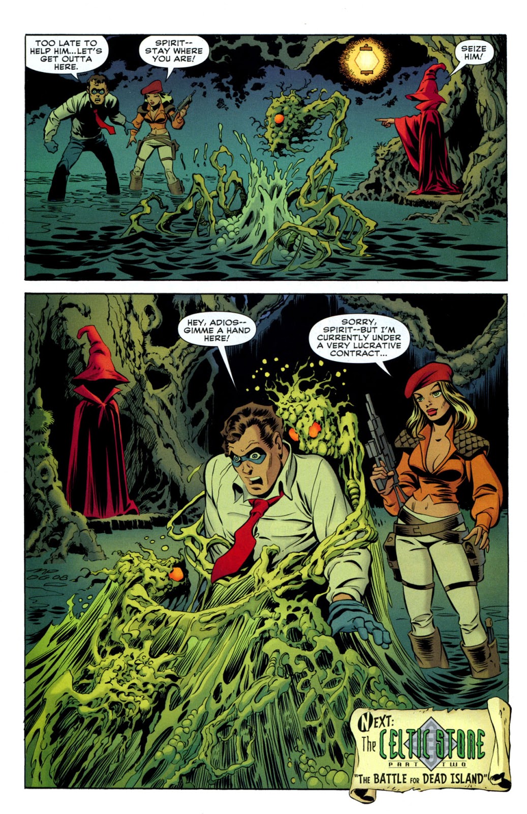
Mike Ploog — PS, I Love You

Spirit # 31, September 2009

Continuing our celebration of the 80th anniversary of The Spirit, with additional creators’ takes on the beloved and influential character.

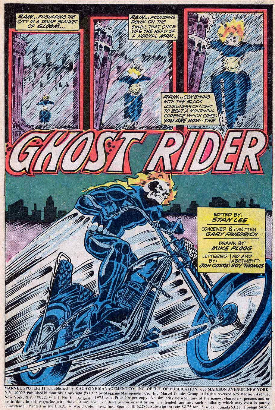
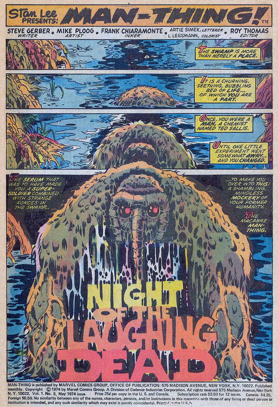
Perhaps the artist with the most specific style similarities to Will Eisner is Mike Ploog, who worked for Eisner briefly in the early 1970s, on Eisner’s PS Magazine for the military. Ploog credits his initial Eisner influence on the 10 years he himself spent in the Marines reading and copying the magazine.

Ironically, as a kid, Ploog was not a comic book fan, so he had no idea who Eisner was, or the history of the Spirit.

But that obviously changed as Ploog discovered Eisner, The Spirit and comics’ lore in general. On this page from 2007, Ploog, aided by inks from vet Dan Green, captures Eisner’s Spirit — and adds his own taste for a horrific milieu.

Ploog spoke with journalist Jon B. Cooke about the early part of his career in an interview for Comic Book Artist #2 in 1998. Read the full interview here.

CBA: How’d you get the call from Will?
Ploog: I was working for Hanna-Barbera, and the guy in the room with me belonged to the National Cartoonist’s Society. He got a flyer Will had put out, looking for an assistant. He looked at it and said, “Ploog, this looks like your stuff.” I looked at it and said, “It is my stuff.” [laughter]. I called Will, and two days later he was in L.A. and interviewed me…the following week I went to work for him.

CBA: When you first burst upon the scene in comic books, you had a style very reminiscent of Will’s work. Did you start developing that style through osmosis, just being around him?
Ploog: It was very difficult for me, because I hadn’t done that much work. I really didn’t know what a “style” meant. When Will saw my work, he said, “This guy can adapt to what I’m doing easily.” Obviously whatever I had, it was adaptable to him. I could emulate Will right down to a pinpoint on an occasion…I’m sure from working with Will, it developed in that direction…

I love Will; he’s a dear, dear old friend. He’s been an enormous influence on my work both in comics and film.

-Mike Ploog, 1998

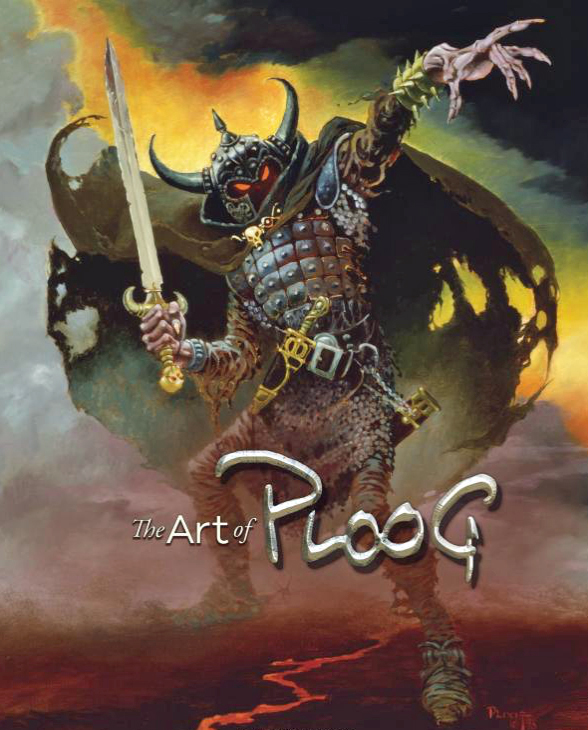
The Ploog art book is a must have for any fan of Mike’s — or simply for those who like great looking art books.

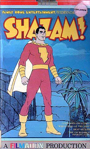
Jerry Ordway — Shazam!

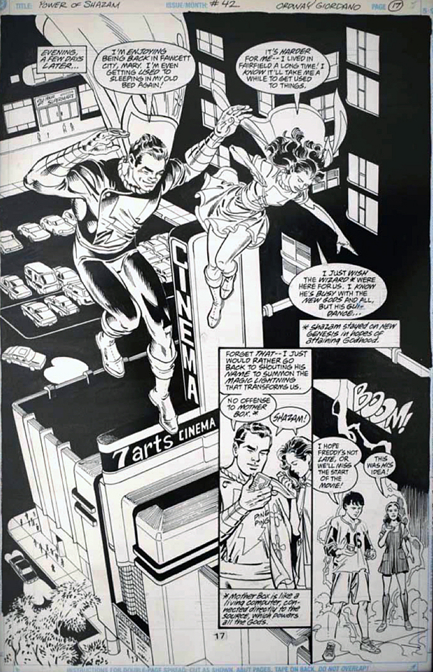
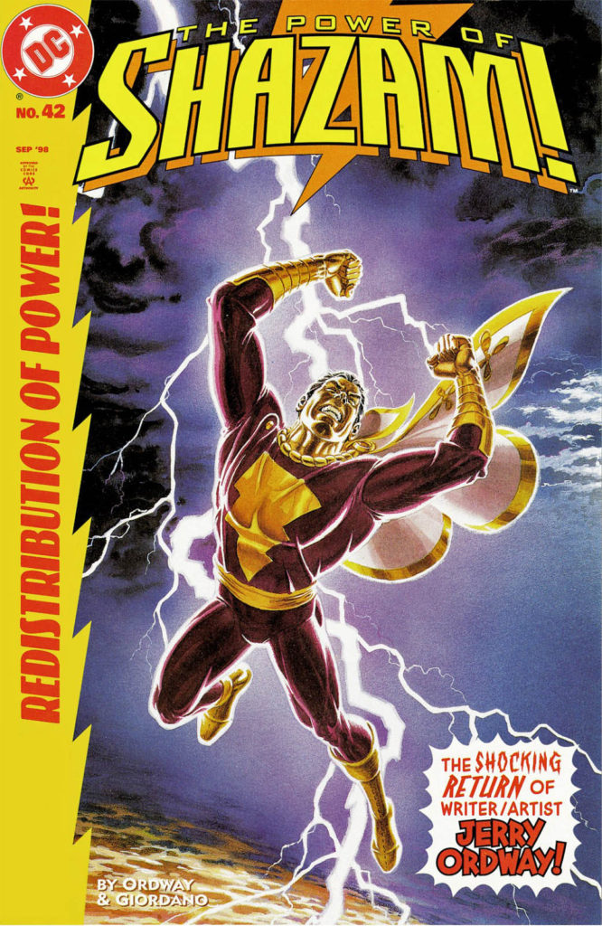
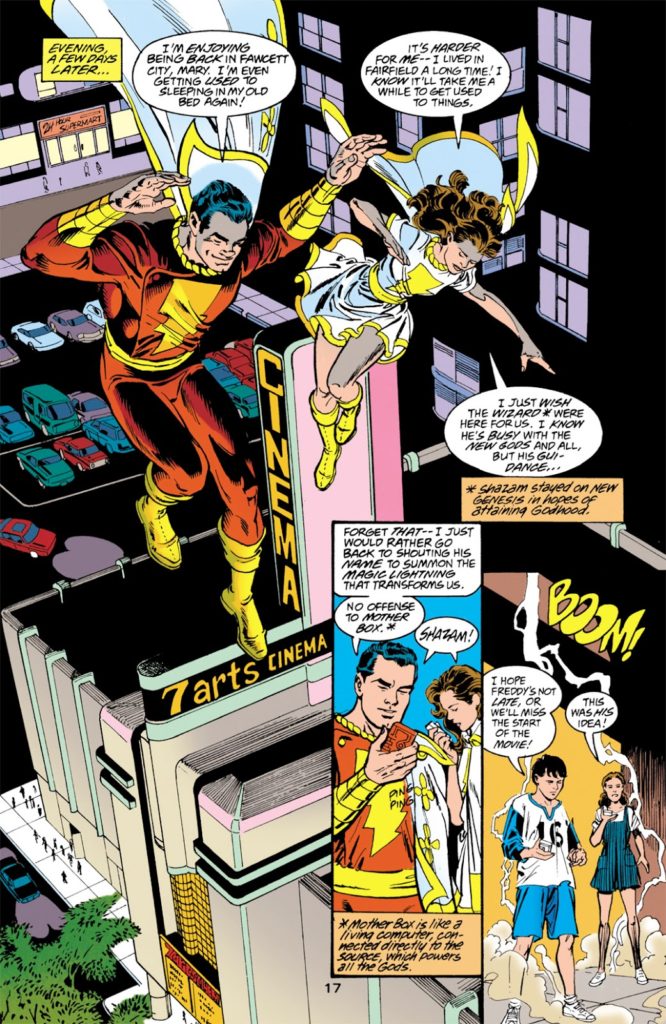
Power of Shazam #42, September 1998

Sometimes the stars and planets line up harmoniously.

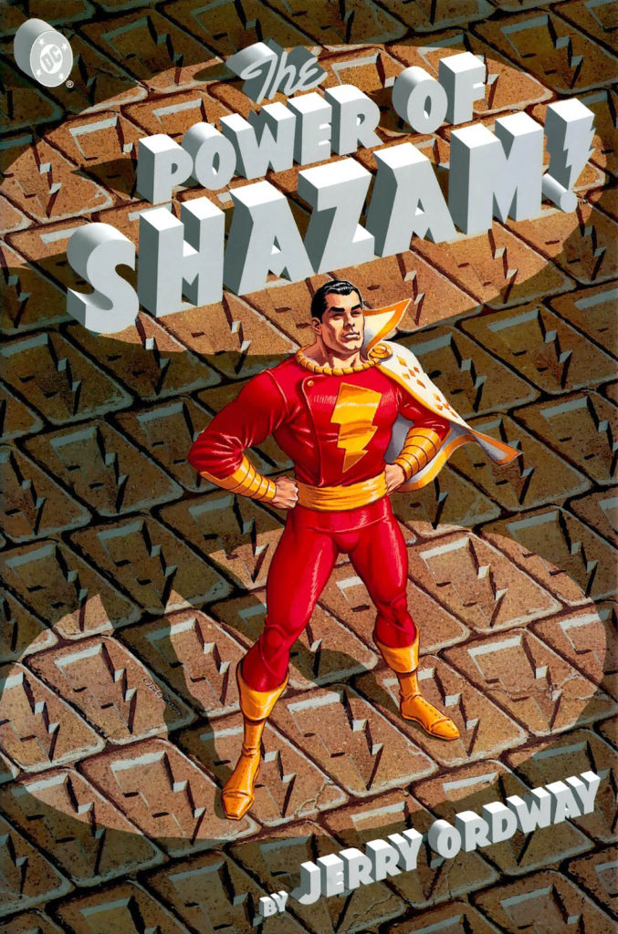
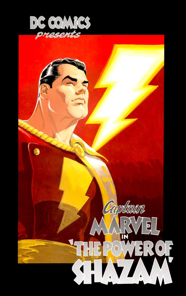
Case in point: Jerry Ordway on Shazam, who managed to keep the spirit of the original Captain Marvel intact, while making the character more relatable to contemporary late 20th century audiences. Not an easy feat.

Ordway launched the Captain Marvel “reboot” with a brilliant Graphic Novel in 1994 that he wrote drew and colored entirely himself. Shortly thereafter, Ordway wrote a new ongoing series, the Power of Shazam, and then drew a few stories at the end of its run five years later.

This brilliant splash page is from the first issue that he penciled, and is inked lovingly by the late, great Dick Giordano. It’s a textbook example of storytelling and composition, and it’s contrasting use of light and dark brings the entire scene together in an extraordinary way.

I love the use of the art deco design on the movie theater as well. The “7 Arts” name is likely an easter egg. Seven Arts acquired Warner Brothers in 1967, setting up the initial steps that led to the Warner / DC conglomerate that exists today.

Every once in a while we have to remind ourselves that nearly all art is essentially an illusion — three dimensional narrative on a two dimensional plane. This illusion? Pretty great.

Fun fact: With few exceptions, Jerry keeps his published art, so pretty much the only way to acquire something he’s created is from his collaborator — if there is one. That makes acquiring such a cool page even more challenging.

Kurt Schaffenberger — Still Marvelous

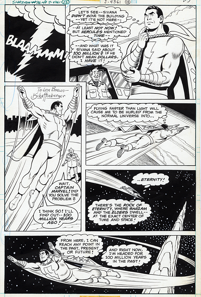
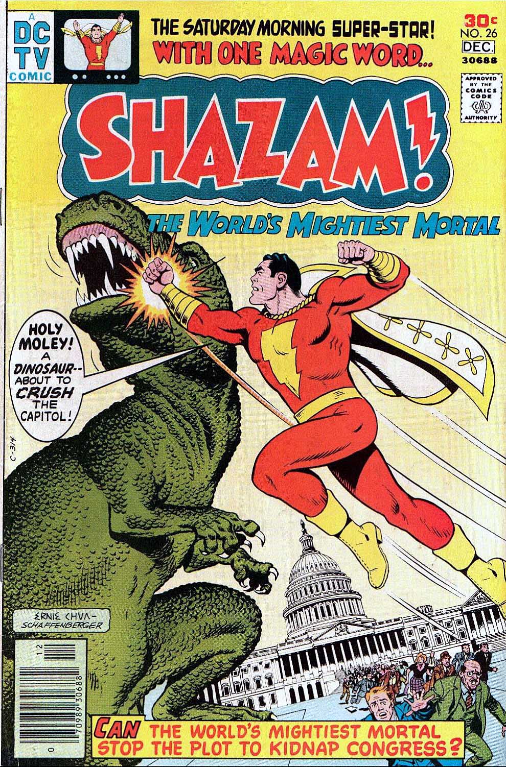
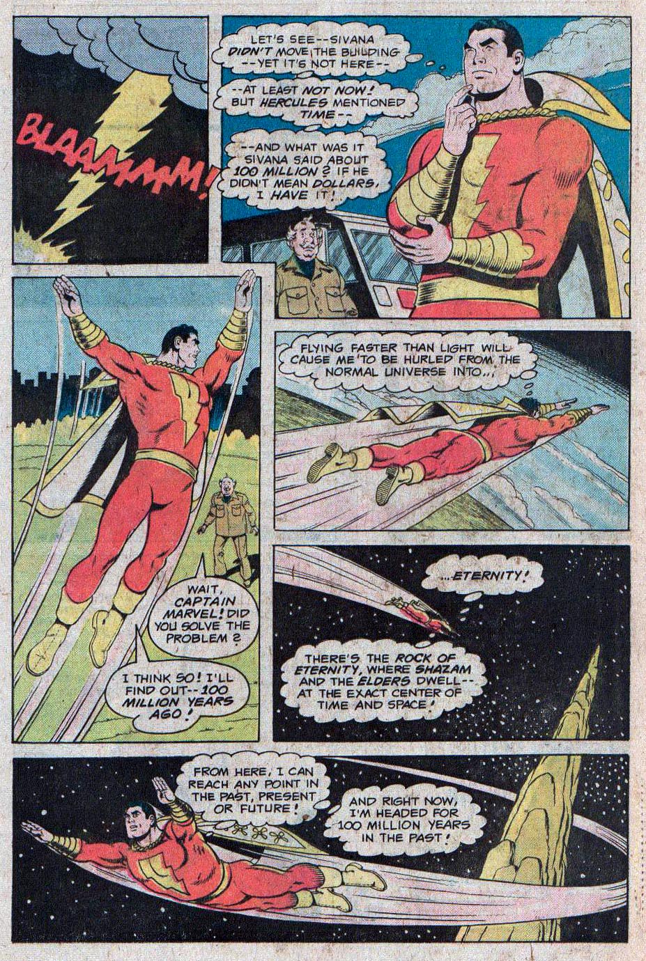
Shazam #26, December 1976

We continue to celebrate the 80th anniversary of the original Captain Marvel, now known as Shazam.

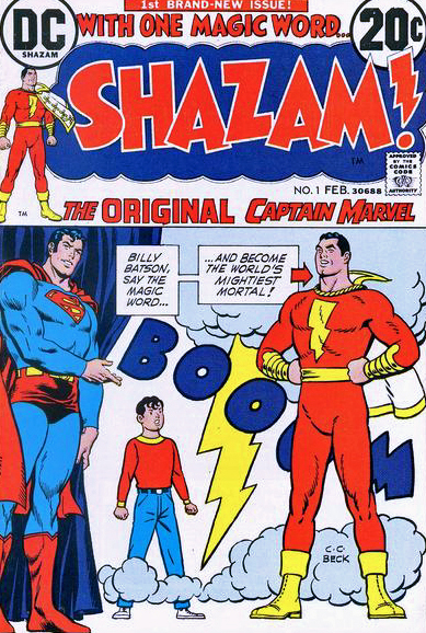
In 1972, with a nostalgia craze in full swing in the US, DC shocked the fan world by announcing that they had acquired the rights to the original Fawcett Comics characters. So… after 20 years, the Captain was back. Unfortunately for DC, a little company called Marvel had added its own Captain Marvel character and title to its line-up, and so at first the DC comic’s title was called Shazam. Ultimately, the character himself became named after his own magic word to avoid additional legal battles.

Title aside, Shazam presented a challenge for DC. The audience that had grown up on 50s and 60s comic book stories had in fact… grown up. And in a universe of Kirby, Steranko, Adams, et al, the golden age Captain Marvel was simply too quaint. Shazam #1 sold like proverbial hotcakes, because of the nostalgia craze and curiosity factor — and the burgeoning collectors’ market — but it was clear that the struggle to keep the character true to his roots AND somehow contemporize him created enormous editorial and commercial challenges. (One that’s challenged DC for nearly 50 years.)

In this terrific page by Schaffenberger, we see the classic Captain Marvel art style, only updated very slightly from the stories that Kurt had drawn 20 years previously.  Although Schaffenberger was a more accomplished artist at this point, his clean and uncluttered style is still his trademark.

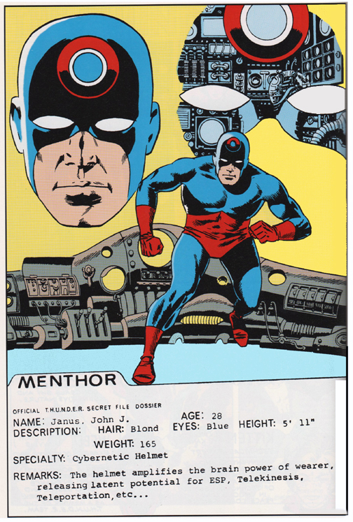
Fun fact: As you can see from the inscription, this page was originally acquired from Kurt by my friend and former colleague Len Brown (Mars Attacks, T.H.U.N.D.E.R. Agents). Len ultimately sold it, and it made its way through the collectors market until I spotted it about 10 year ago and purchased it. I offered it to Len in case he had any regrets, but he doesn’t collect art anymore, so he declined.

Leaving it in my hands, with some interesting provenance as a bonus.

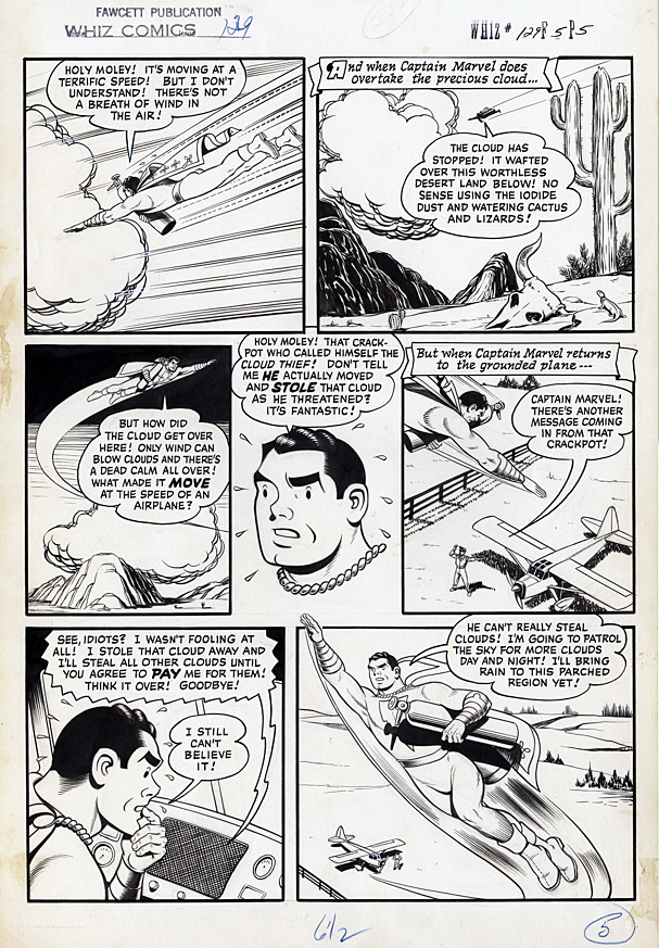
Kurt Schaffenberger — Golden Age Marvel

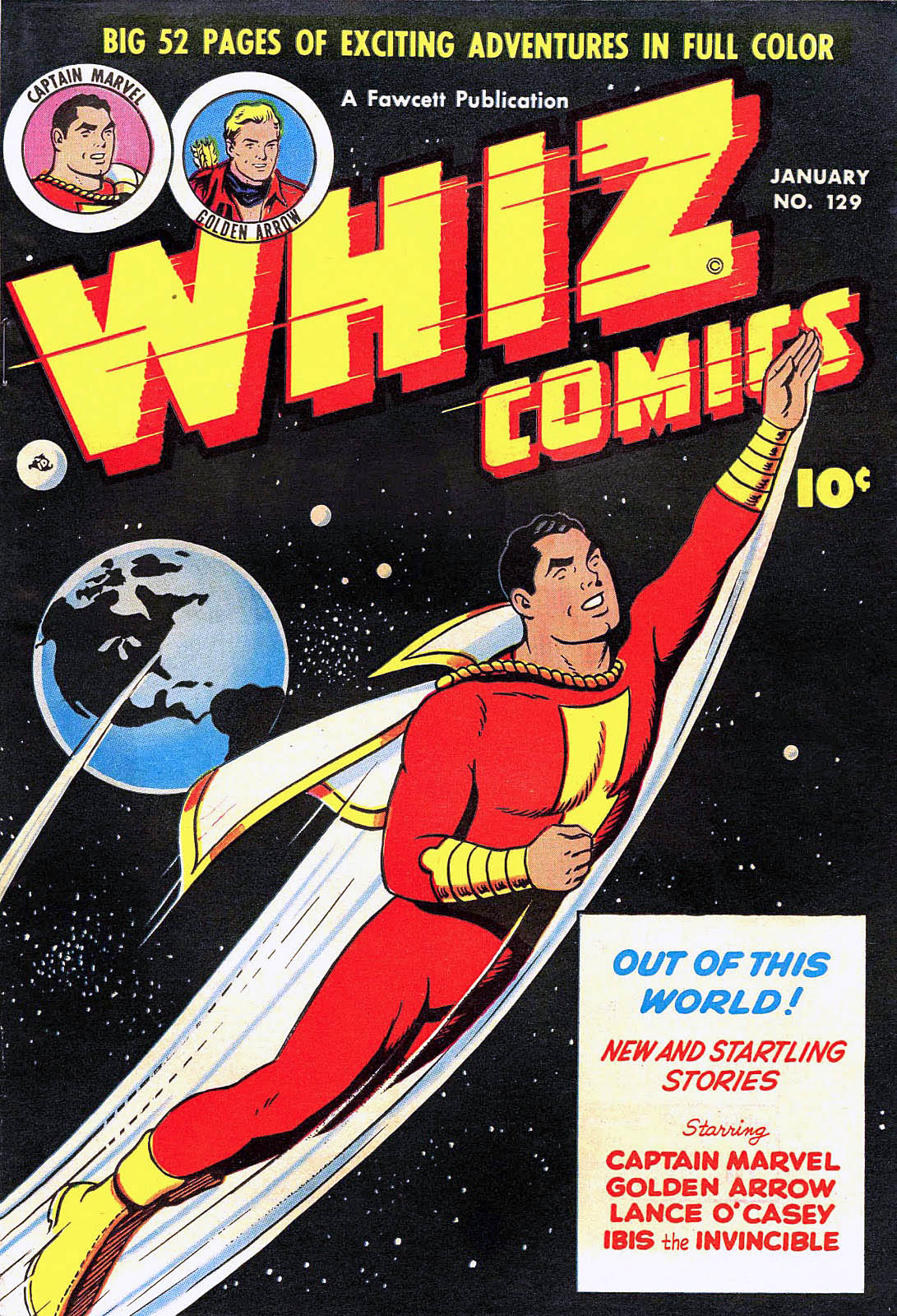
Whiz Comics # 129, January 1951

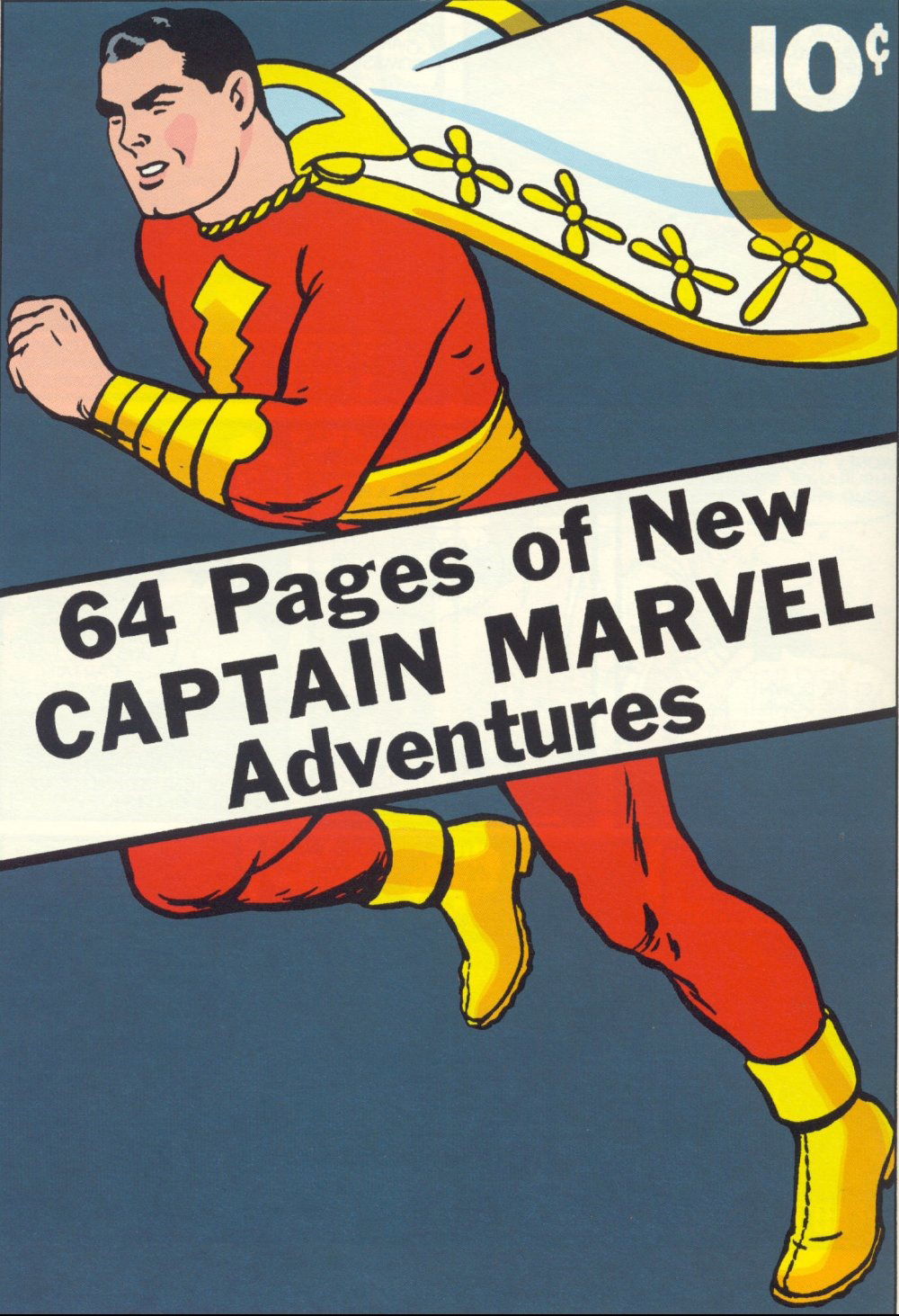
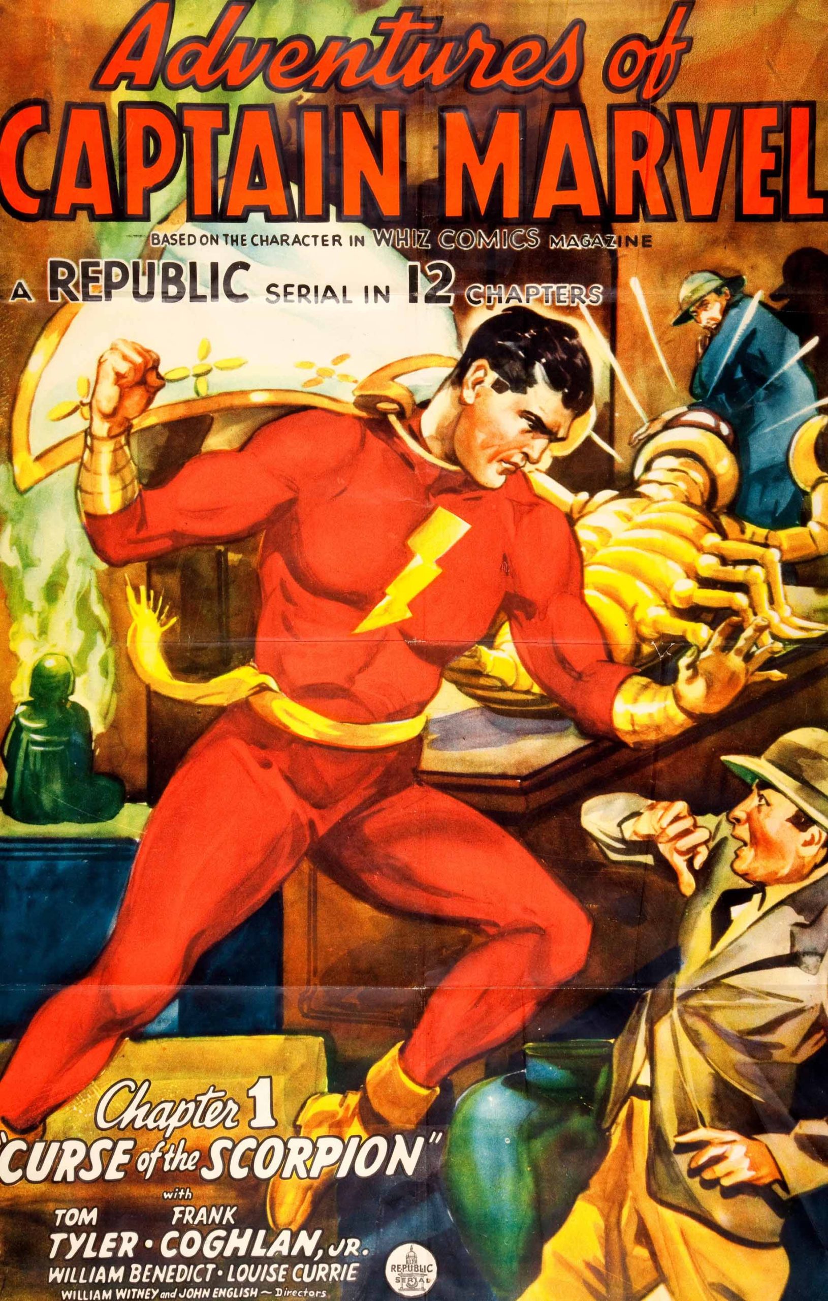
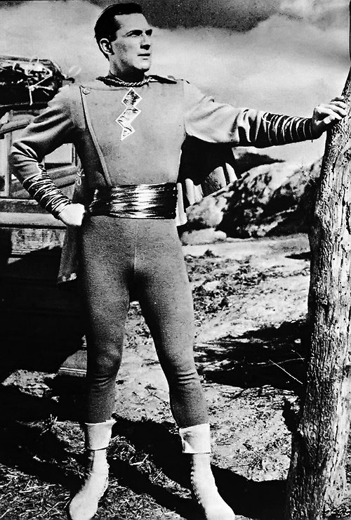
This week we celebrate the 80th anniversary of the original Captain Marvel, (cover dated in 1940, although the issue likely appeared on most newsstands in late 1939) now known as Shazam.

Captain Marvel (Shazam to you kids) appears in every panel in this ebullient page pencilled and inked by Kurt Schaffenberger.

Schaffenberger went to work as an assistant in the Jack Binder studio in 1941 just as Fawcett’s Captain Marvel was soaring, eventually outselling DC’s Superman. When Schaffenberger returned from World War 2 military service, he ultimately penciled and inked complete stories.

His wholesome, uncluttered and often whimsical style was a perfect fit for Captain Marvel, who was nothing if not wholesome and whimsical.

Schaffenberger drew many of the stories that capped the end Captain Marvel’s amazing run — and 10 years of legal battles with DC.

In fact, despite the seemingly never-ending copyright lawsuit that alleged that the Big Red Cheese was a knockoff of Superman, The Captain outlasted many of his spandex-attired peers, publishing longer than most competitive superhero titles.

But, by 1954, declining sales meant that Fawcett no longer had the will to fight. They settled with DC, and called it a day for Captain Marvel.

As they say…  To Be Continued.

Fun Fact: After Fawcett left the superhero business, Schaffenberger ultimately went to work for DC, and became best known for his 10-year run on the Lois Lane series, setting the DC house style for the character for much of the silver age.

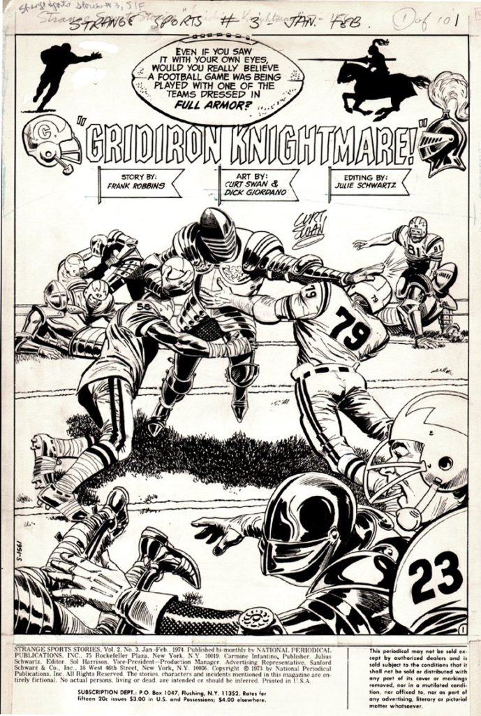
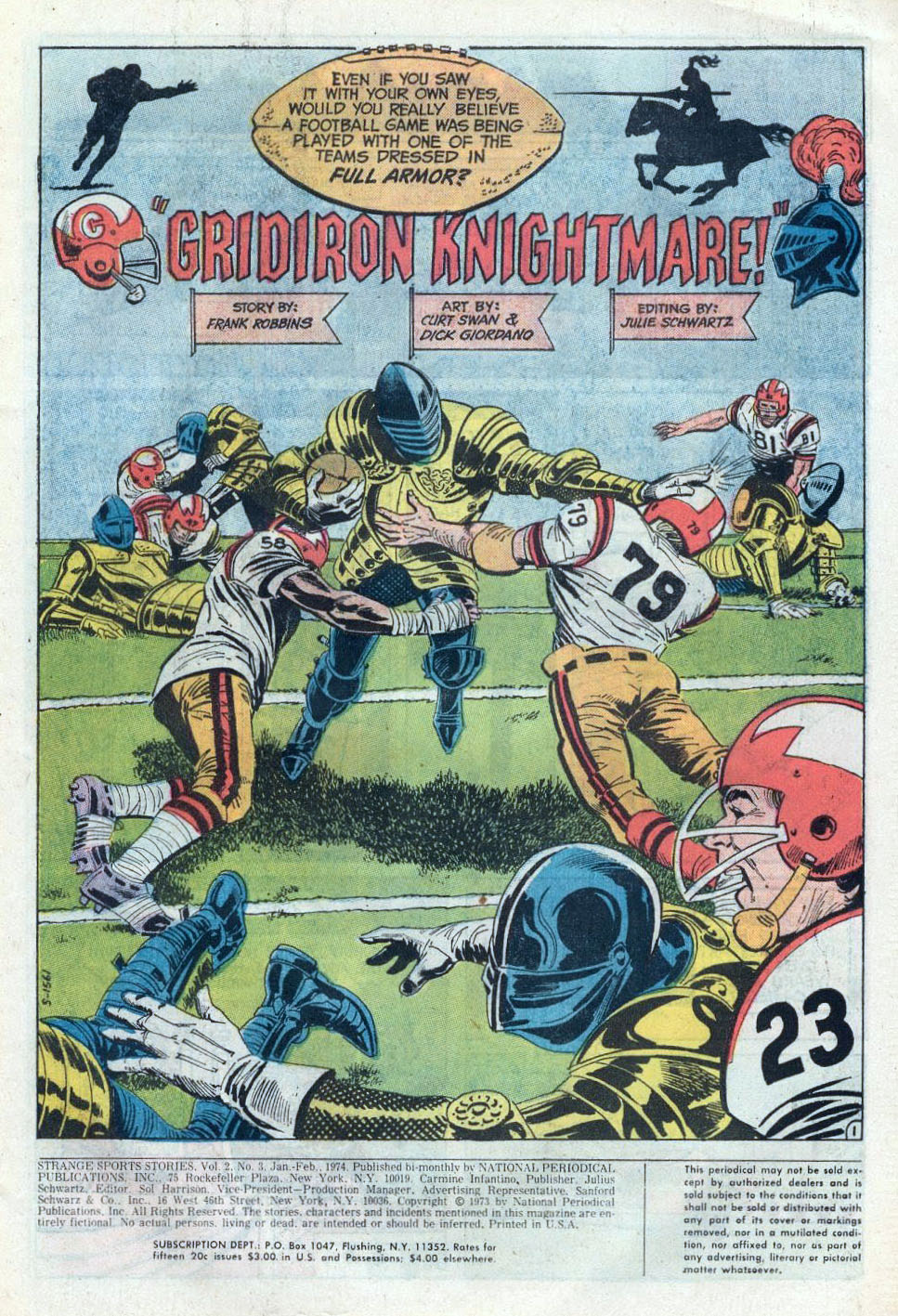
Curt Swan — Sportsman

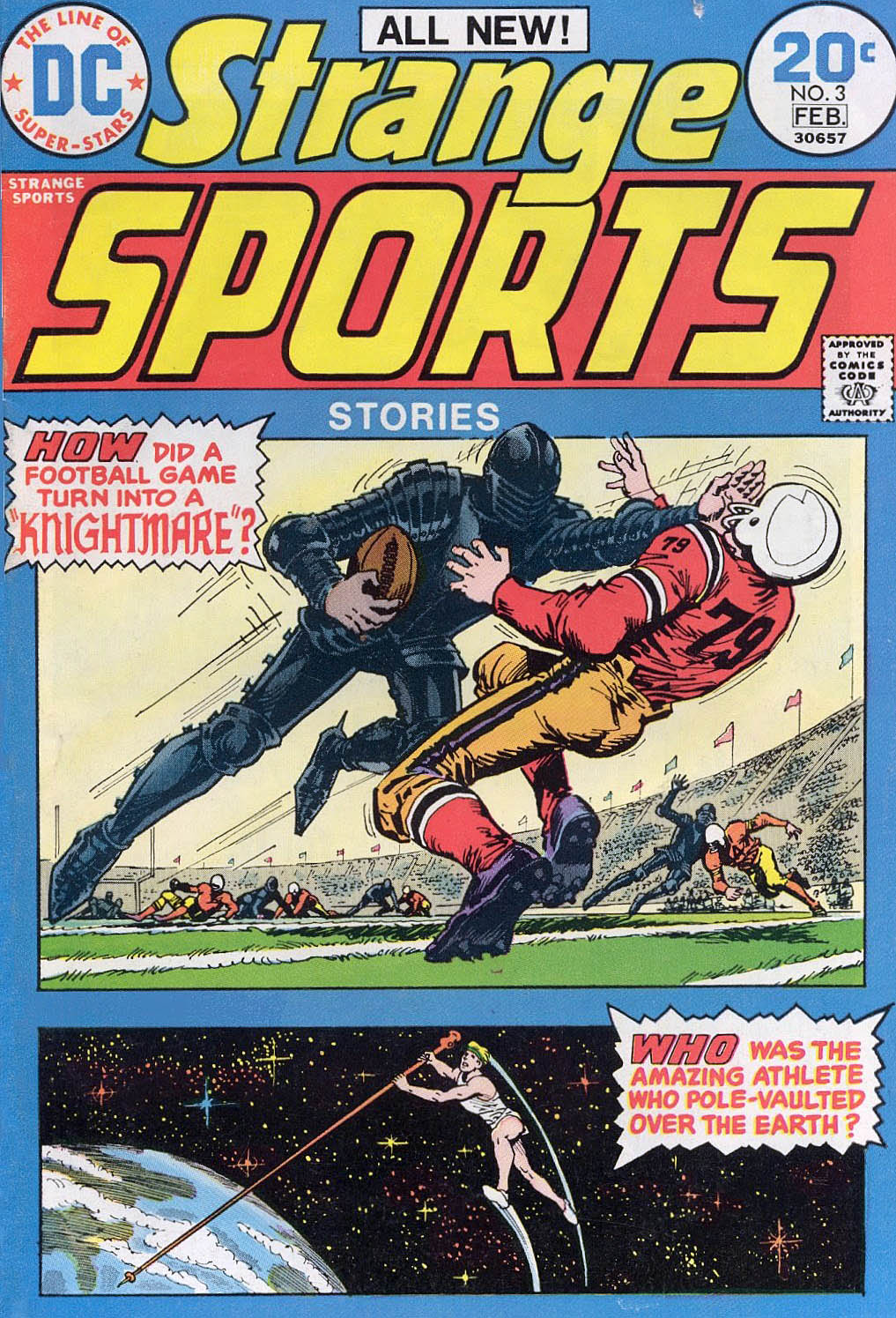
Strange Sports #3, February 1974

Today is the 100th birthday of the late, great Curt Swan, one of DC’s all-time storytellers. And while the internet is blowing up with great Swan Superman images, (and there are literally thousands of those) let’s instead pull this splash out of left field. (Ouch, wrong sport.)
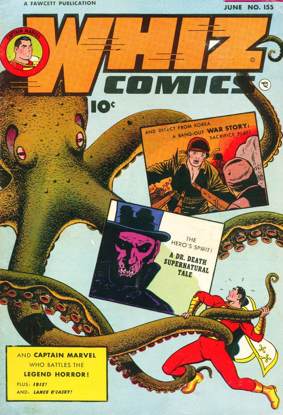
It’s a Hall of Fame page from this fun 70s series, with story by Frank Robbins, inks by Dick Giordano and the whole shebang edited by Julie Schwartz.

Merlin? King Arthur? Knights playing football against contemporary players? Somehow the whole thing made perfect sense — to me, at least.

Thanks for all the magic Curt — here and everywhere else.

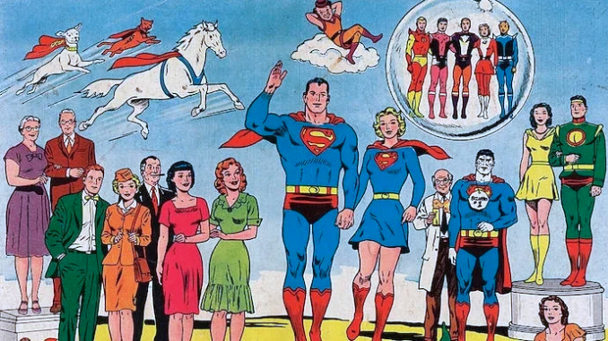
Ok, so we can’t resist ONE Superman family image…

Steve Ditko and Wallace Wood — Time Of Death

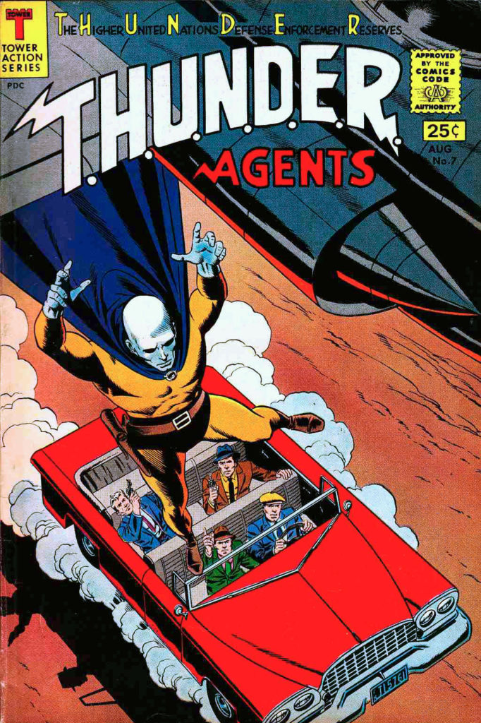
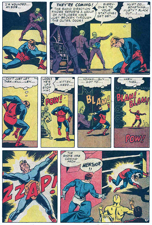
T.H.U.N.D.E.R Agents #7, August 1966

Death in superhero comic books had always been a gimmick. “Robin Dies at Dawn” likely meant he would be back by dinnertime. (In fairness, it’s a pretty good story.)

Imaginary stories, hoaxes, dreams, mad science, robots, time travel, alien resurrection, etc. all kept our featured players in good health. There was not much chance a title character was going to exit from his book permanently.

So back in the 60s, legitimately killing a character was in fact, a groundbreaking novelty. And this T.H.U.N.D.E.R Agents story is one of the first. Ditko, Wood and company had spent 6 issues developing the character of Menthor (John Janus), and they shot him to death on this page in Issue #7.

This historic page captures that collaborative methodology of Woody and the Tower artistic team on T.H.U.N.D.E.R Agents. Dan Adkins scripted and provided layouts, Ditko penciled the story, and Wood inked it, with assists by Adkins.

The original T.H.U.N.D.E.R Agents lasted only last 20 issues, and perhaps, had it survived, John would have been resurrected at some point. But it certainly did not appear that way.

Unlike, say, modern times where killing a lead character is a gimmick once again.

Superman. Dead. Then alive.
Batman. Dead? Nope, he’s back.

Captain America? Reborn. Bucky? Not dead, just hiding in Russia for a few decades.

Etc.

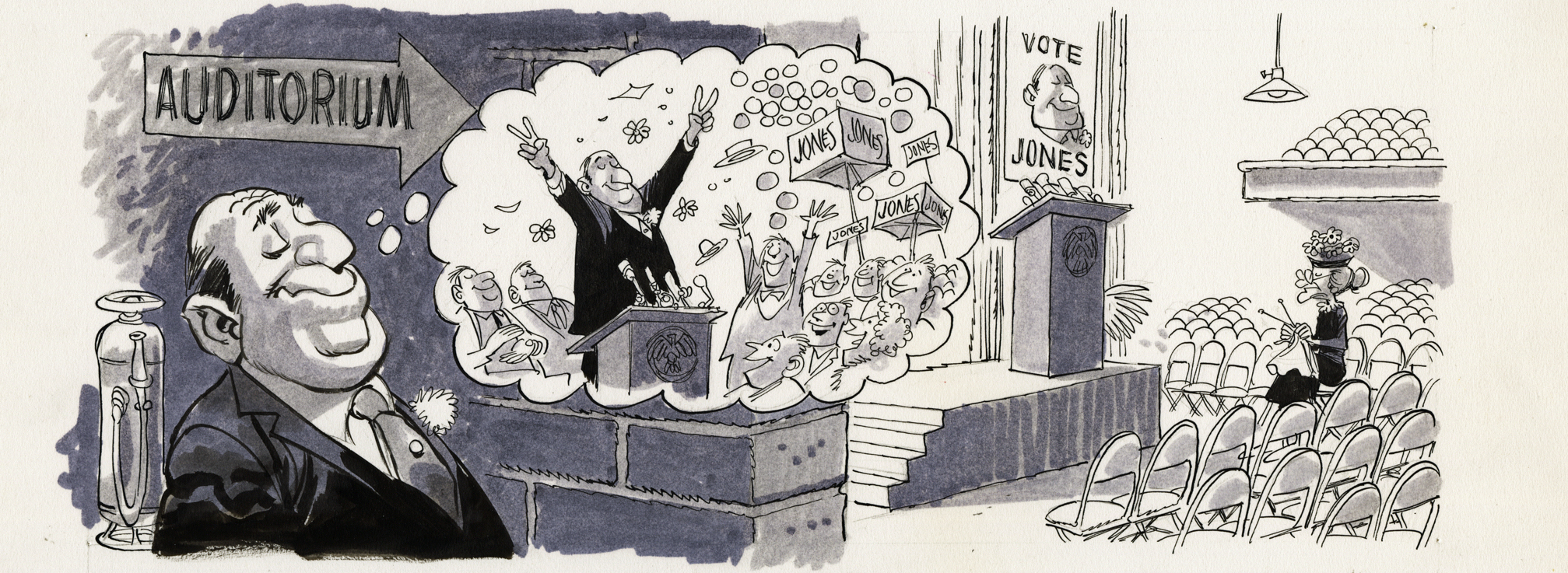
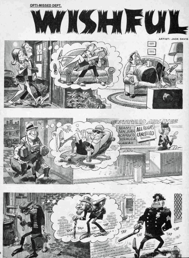
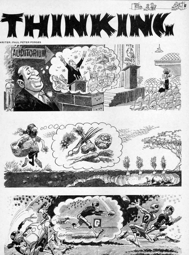
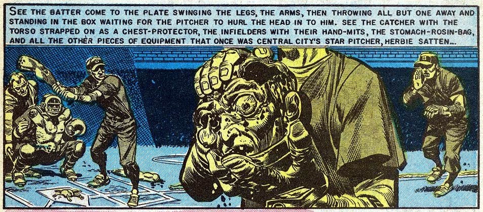
Jack Davis — On The Campaign Trail

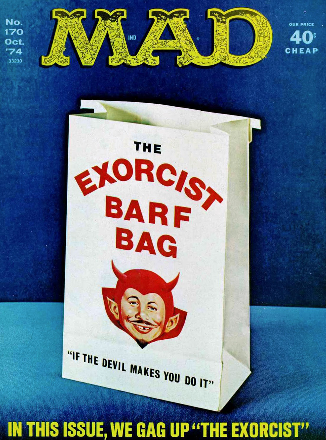
Mad #170, October 1974

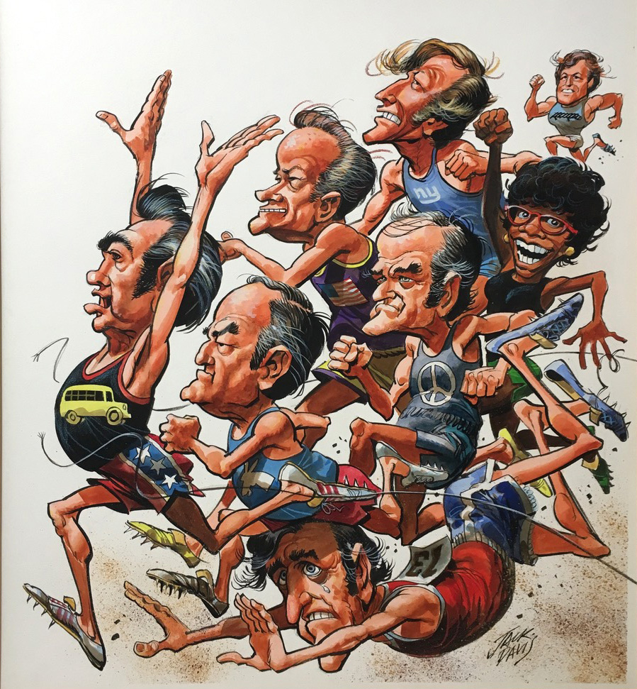
The Iowa caucuses officially kicked off the 2020 national campaign season yesterday. (Although in the 21st century, it feels like every day, of every year, is campaign season. Sigh.)

Campaign season always makes me think of Jack Davis.

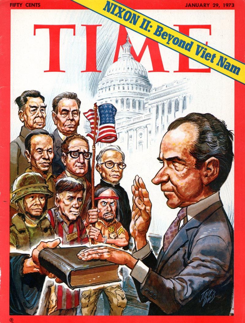
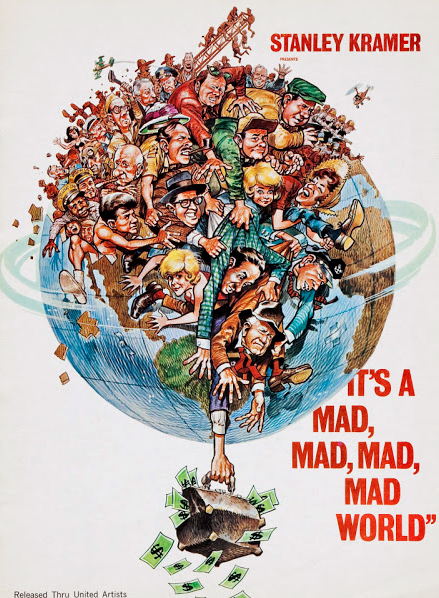
I loved his caricatures of famous politicians. Many of them — especially in the 70s— had plenty of personality, and Davis, like a great illustrator, could show you that personality through his art. And if they were bland, boring, run of the mill politicians, Davis could still manage to find something to say about them — truthful, of course –that would make you smile.

I also liked that Davis, who went from EC horror artist to one of America’s top commercial artists in less than 20 years, never became too successful for appearances in the pages of Mad magazine.

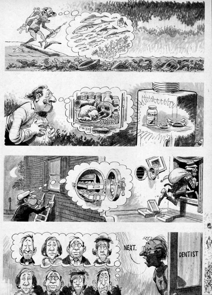
This strip is from a multi-page story called “Wishful Thinking.” It appears to be done on a single board, so in all likelihood all the gags in this story are single pieces of art cobbled together to create story pages. That said, many oversized Mad original art pages have been cut up over the years, to sell individual gags like this separately, so it’s difficult to be definitive.

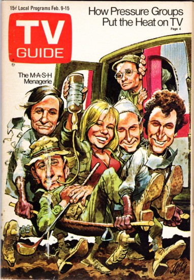
But it’s not difficult to be definitive about this: In addition to being one of the great American commercial artists, Davis is also one of my personal favorites. Want to offer me an original piece of art for a TV Guide or Time Magazine cover?

I’m all ears.

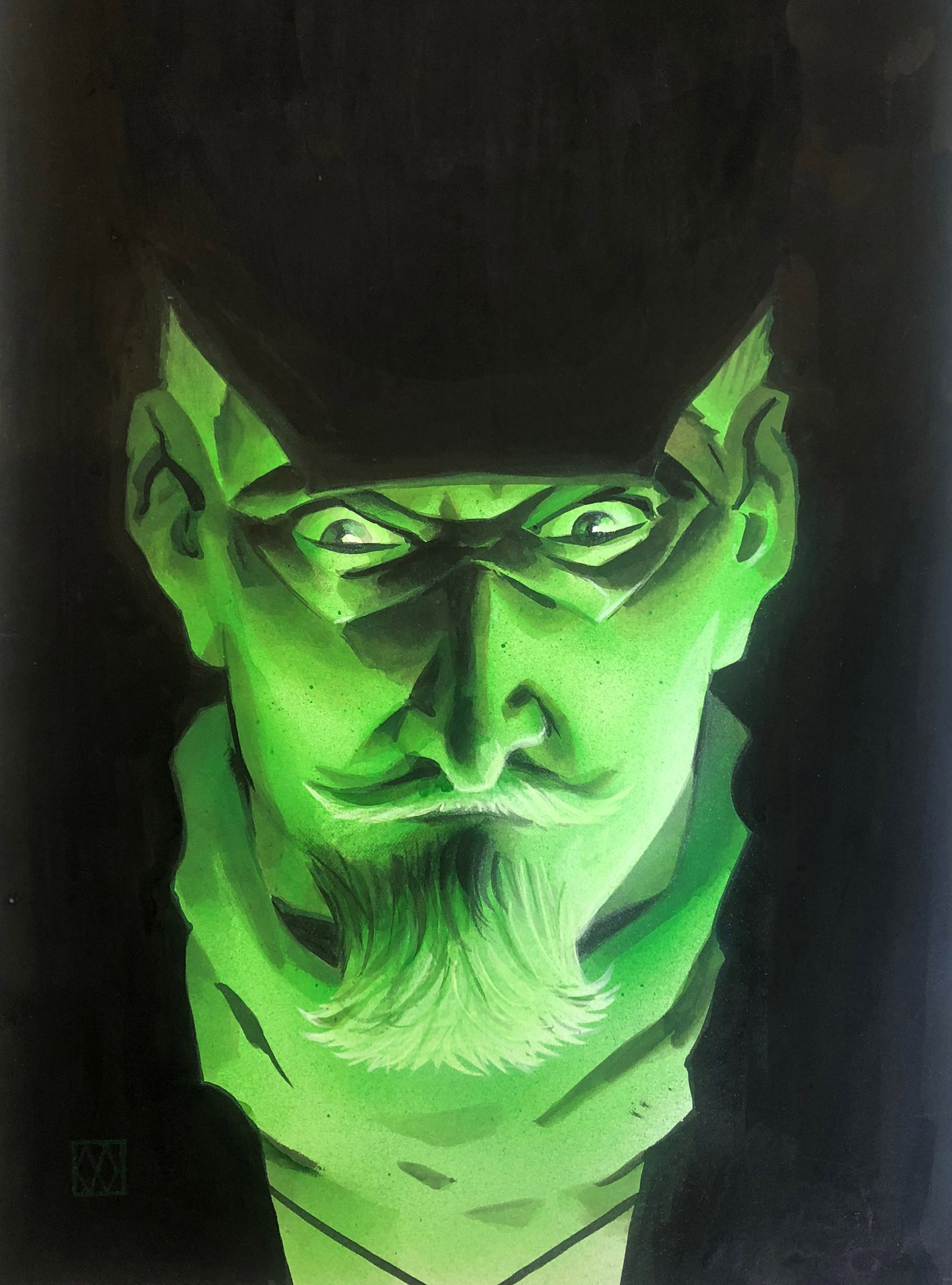
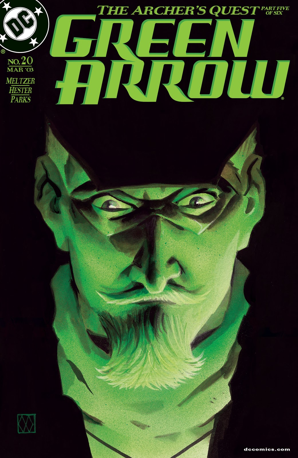
Matt Wagner — Oliver Queen Bows Out

Green Arrow #20, March 2003

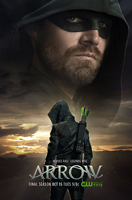
Tonight is the final episode of the extremely well-done Arrow, lasting eight seasons on the CW and successfully launching the “Arrowverse” which now includes Flash, Legends of Tomorrow, Supergirl and more. I doubt anyone could have predicted that these shows would create a well-crafted and (mostly) unified TV DCU, much like Marvel has created a unified film universe.

I’ve seen some (unjust) criticism that ultimately, these shows feel like any other show on the CW, just with more spandex. I think some of that criticism comes from grading these Greg Berlanti produced shows against the more mature (and expensive) shows that are running (less frequently) on premium cable and streaming services.

Its difficult to imagine something like this unified DCU coming together even just 10-years ago, and kudos off to Berlanti and company for creating quality shows with just enough (hopefully not too much) fan service. And the shows will continue on even without the launch series, and star Stephen Amell.

Matt Wagner created a terrific series of painted covers for this Brad Meltzer run of Green Arrow in 2002 and 2003, including this very dramatic portrait of Oliver Queen. (In this story arc, Ollie is dealing with a Hal Jordan (Green Lantern) sub-plot, hence the green illumination.) And speaking of Green Lantern, will he (they) crossover from the upcoming HBO Max series?  Very much looking forward to seeing how this all plays out .