Greg Goldstein's Comic Art Gallery

Walter Simonson — Bucket List

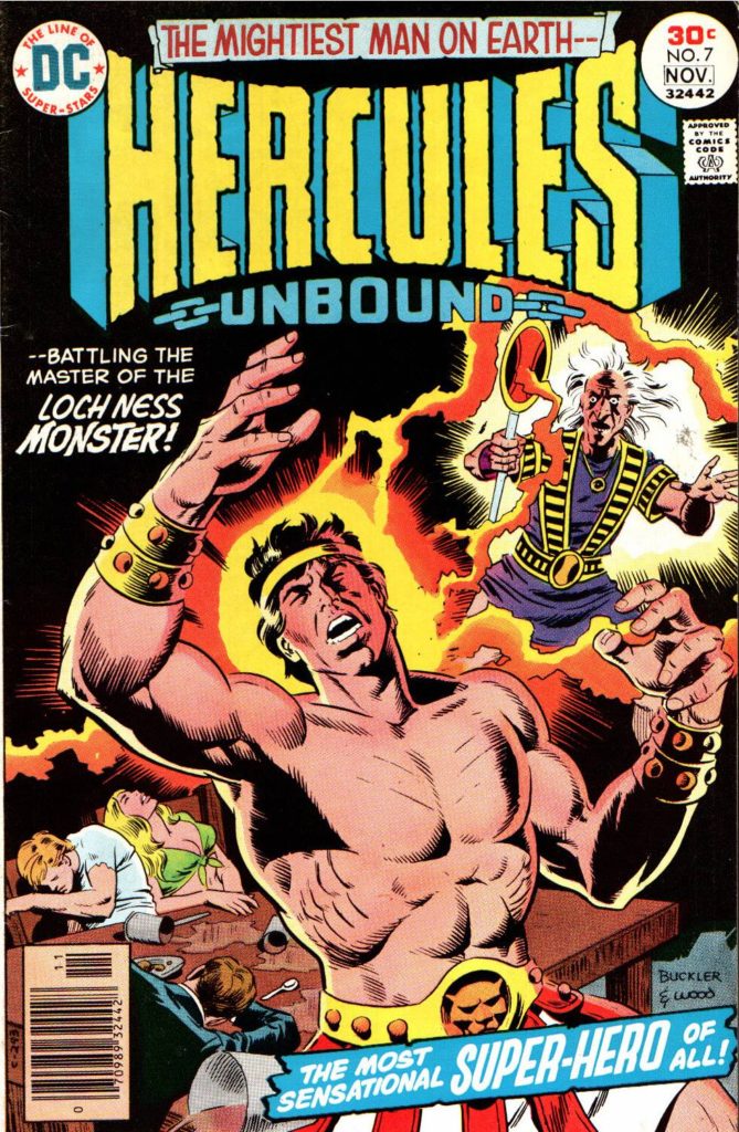
Hercules Unbound #7, November 1976
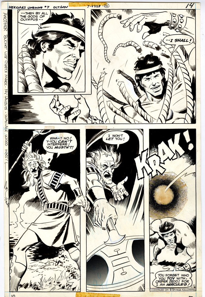
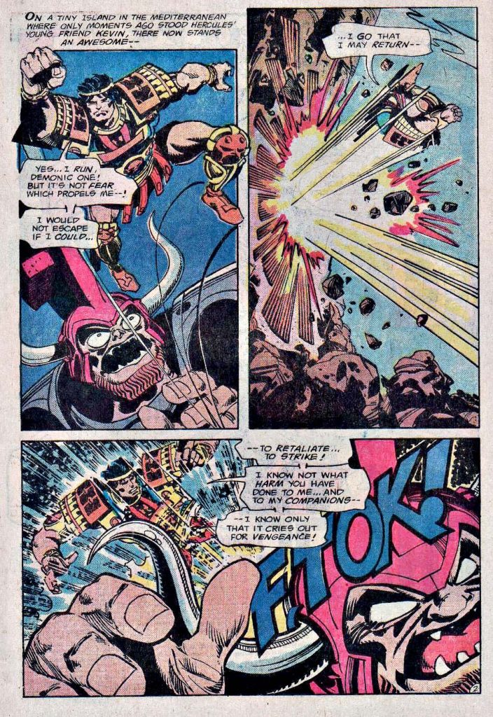
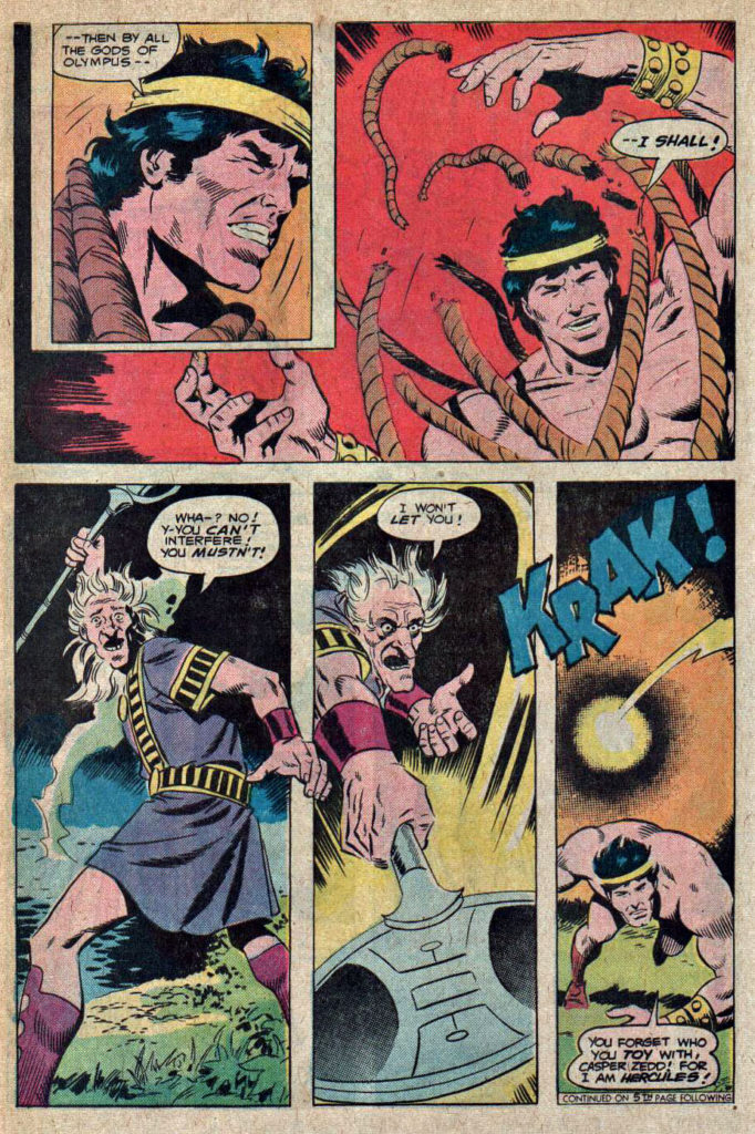
Jose Luis Garcia-Lopez and Wally Wood only teamed up for six issues of the short-lived Hercules Unbound. Garcia-Lopez moved on, and Walter Simonson took over with Issue #7. (Wood only stayed on for one additional issue.)

Walter’s art style, like many of his generational peers (Chaykin, Wrightson, etc.) is very distinctive. Manhunter. Thor. X-Factor. Ragnarok. Et al. Typically, when you see a Walter Simonson penciled page, you know it.

Not here though. As noted earlier, Wood’s inks typically put so much lush polish on the pencils, It’s not that easy to sort out the penciller’s own style. When I first scanned this issue, I didn’t immediately catch that Garcia-Lopez was off the book. (Once you know, and compare against the earlier issues, you can definitely see some differences.) 

Here’s an extra cool thing about this great Herc page. I luckily acquired it at a convention where Walter was a guest of ours at IDW Publishing, and I asked him to inscribe it. It reads:

“Another bucket list check mark — my layouts — Wallace Wood inks!”

Footnote — More creative shuffling: After two issues inked by Bob Layton, Walter provided both pencils and inks on the final two issues. As evidenced below, Walter’s work again looks like… Walter!
Wally Wood — Inking Unbound

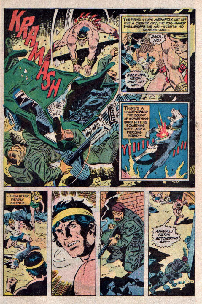
Hercules Unbound #4, May 1976 (Pencils by Jose Luis Garcia-Lopez) 

Gerry Conway and Jose Luis Garcia-Lopez — an artist’s artist if there ever was one — launched Hercules Unbound in 1975. But the real news was that Wally Wood would be inking the book. 

Wally’s lush art had graced just a handful of DC superhero titles in the late ‘60s, when I had first started actively reading comics. My first exposure to his stellar inking was likely in 1968’s Captain Action. (He also penciled issue #1 of that short-lived series.)

By the time he returned to DC in the mid ‘70s, I was not only familiar with much of his oeuvre (EC, Marvel, Warren, Tower, etc.), I was pretty much obsessed with his art, as both penciller and inker. 

If his work at DC was going to be inking only, so be it, because typically it didn’t matter who was penciling — Wood’s dramatic and distinctive inks make everything look mostly like… Wood. That includes hall-of-fame stylists like Steve Ditko and Gil Kane.  And frankly, some of those artists’ styles were more fluid and dynamic than Wally’s to begin with.

This page is no exception, featuring dynamic action and storytelling by Garcia-Lopez, who had only recently broken into DC, and would rapidly become one of the industry’s most respected artists. At this point in the series, the art team was most definitely firing on all cylinders.

It did not matter that I wasn’t quite sure how Hercules fit into the greater DC universe, or even if he did. I was going to be saving a small piece of my comics’ budget for Hercules Unbound.

Like they say in the comics: To be continued…

Ian Churchill — Split Personality

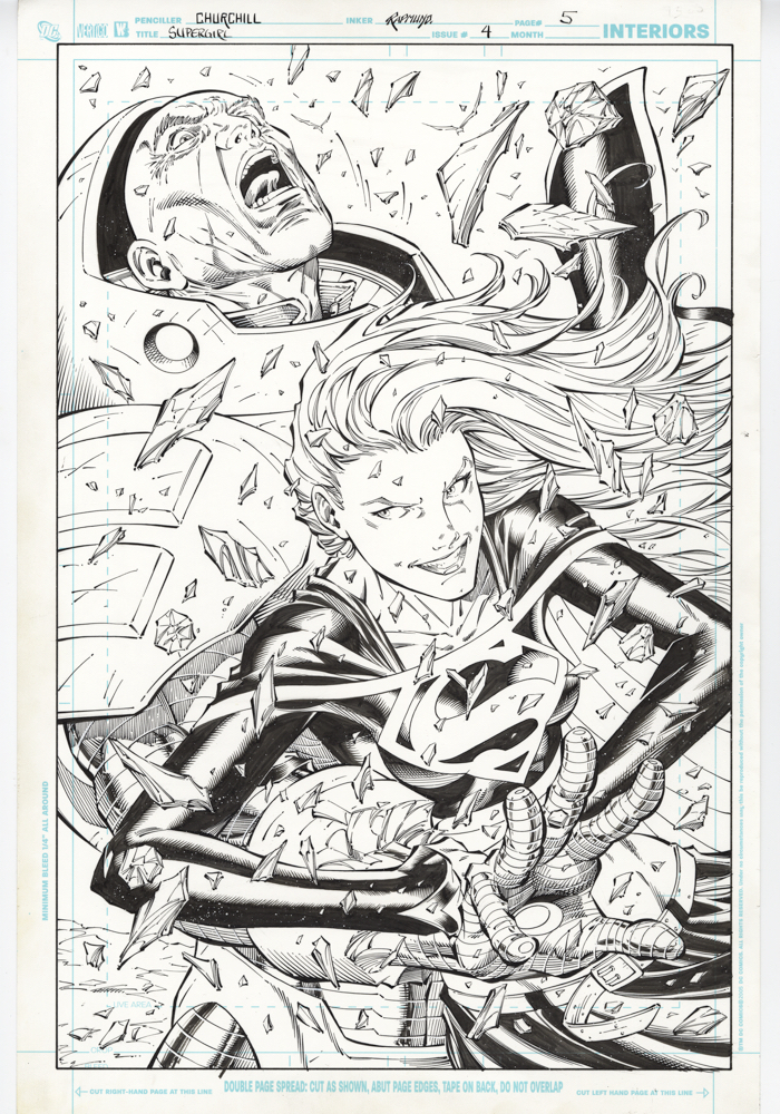
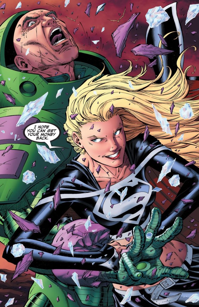
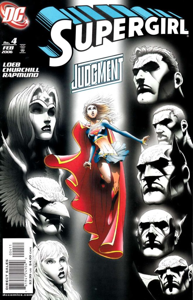
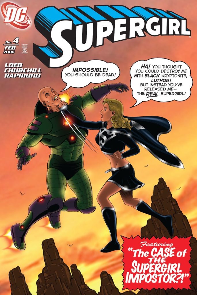
Supergirl # 4 (2005 Series), February 2006

Two Supergirls — one “light”, one “dark.” Lex Luthor in his “war-suit.” Appearances by Superman and the Justice League. Covers by the late Michael Turner. Darkseid. Big splashy fight scenes. And did I mention Luthor in his “war-suit?”

This fun —albeit brief — arc of Supergirl comes to us courtesy of Jeph Loeb, writer, and is rendered dynamically by Ian Churchill, penciller and Norm Rapmund, inker. 

Black Kryptonite, making an early comic book appearance here (It was first introduced in the Smallville TV show) is responsible for Kara’s split personality, and her dark side has no problem taking the gloves off, quite literally. Here we see her get the upper hand on Luthor’s — (ahem)— upper hand, as she gleefully destroys the weapon of mass destruction built into his arm. Check out the amazing detail as it shatters into a million pieces. Also noteworthy is Luthor’s face, which expresses a rare combination of pain and shock.

It’s always fun to see Luthor in his super-suit post Crisis on Infinite Earths, and especially entertaining to see Supergirl shred it.

CBR has a fascinating look at the iconic suit’s history here.

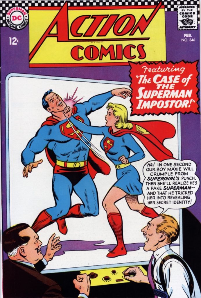
The “B” cover of the issue is a Churchill homage to Curt Swan’s cover of Action # 346.

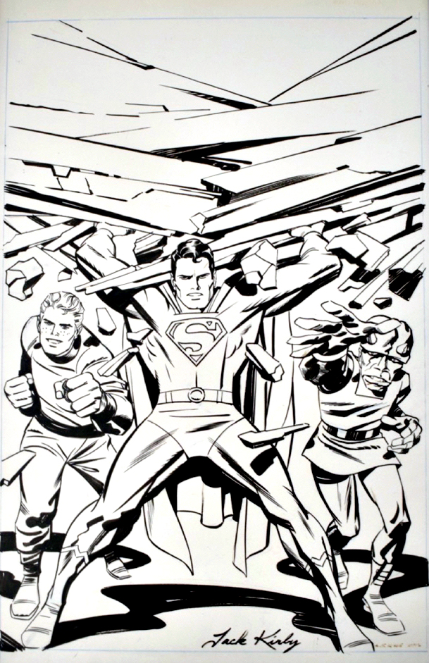
Jack Kirby — Happy 102!

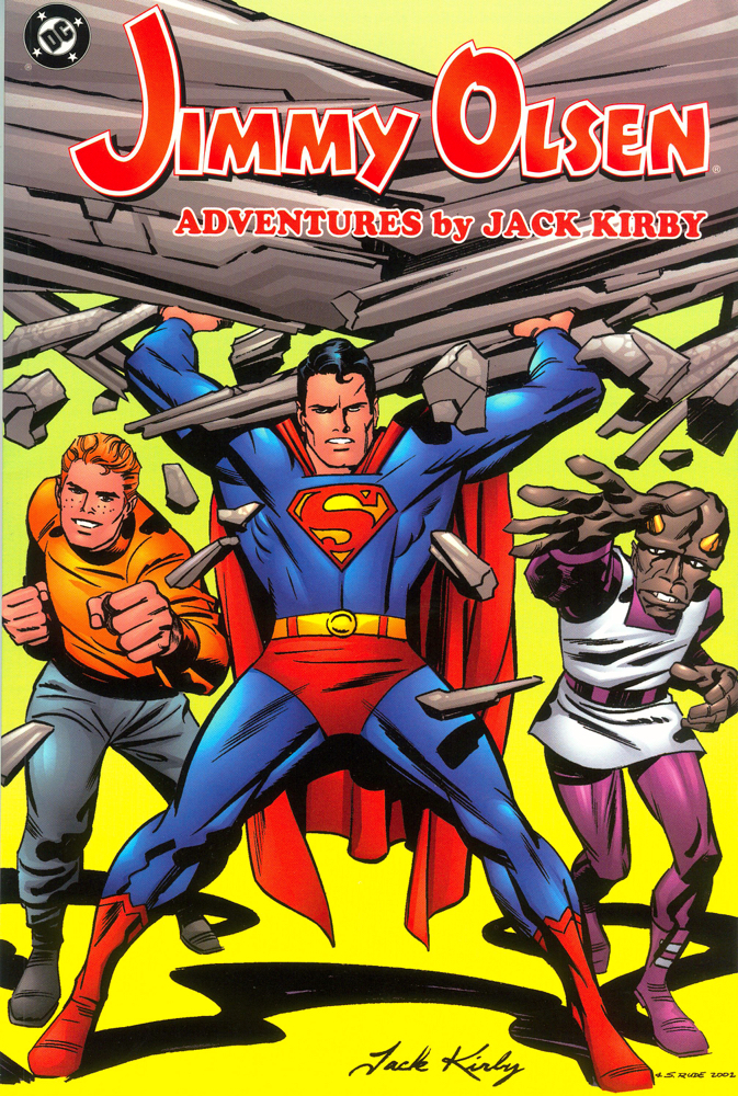
Jack Kirby and Steve Rude, Jimmy Olsen: Adventures by Jack Kirby – Volume 1

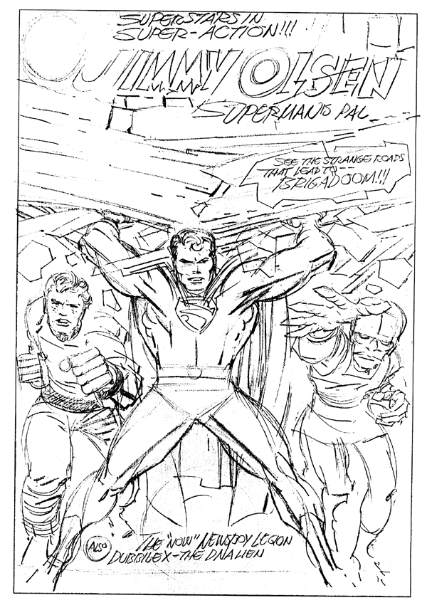
Today, let’s celebrate The King’s birthday with some help from an unabashed professional Kirby admirer — Steve “The Dude” Rude. Steve completed a previously unpublished Kirby Jimmy Olsen cover rough for a TPB collection in 2003.  I love the power and playfulness in this image, and Steve’s inks nailed it.

Interesting that the initial color version of the cover, used for solicit purposes, is realized in the “classic” style, while the final printed version is digitally rendered in the “modern” style.

Anyone want to guess which version I prefer? Anyone?

(On the subject of Superman’s likeness in the DC Kirbyverse, Kirby expert and author Mark Evanier has some illuminating background here.)

Happy Birthday Jack!

Original (previously unpublished) cover rough, likely an early version of Olsen #145

Howard Chaykin — Blackhawk Up

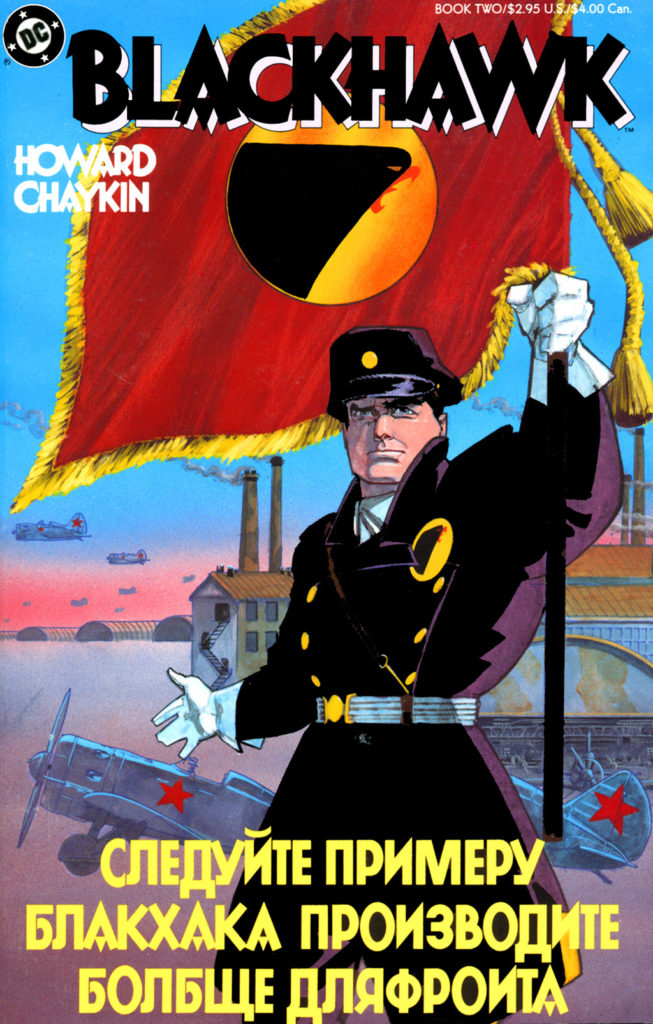
Blackhawk #2, April 1988

As I was preparing the earlier post today about Howard Chaykin’s Scorpion work for Atlas, I ran across an announcement that the 1988 “controversial” Chaykin Blackhawk series is being collected for the first time — along with some additional “modern” Blackhawk stories — into a deluxe hardcover.

I had forgotten that the series (originally 3 issues in “prestige format”) had never been collected. Each issue must have been optimistically overprinted. You can purchase copies today pretty much from any back issue comic book retailer — 30 years later — for less than cover price. I wouldn’t be surprised if Diamond Distributors still has them in stock.

Why was this series “controversial”? The alternate universe setting, the different spin on the lead character and his politics — or perhaps, most likely, Blackhawk’s sexual appetites — and an implied oral sex scene. Today, in an age of “mature” reboots and retcons, plus an overwhelmingly (and unhealthy) lack of interest in political history — even the modern kind — those features would hardly be discussed.

Controversy or not, Chaykin’s Blackhawk remains a worthy follow-up to his American Flagg series. It has many similarities — not the least of which is innovative and dynamic visual style and design throughout. It’s no wonder that when I started collecting original art again about 12-13 years ago, I was pleased to find this page available to purchase right off the bat.

Hawk-a-a-a indeed!

If you want to head down the academic rabbit hole on this subject, try this:

http://imagetext.english.ufl.edu/archives/v7_2/costello/