Greg Goldstein's Comic Art Gallery

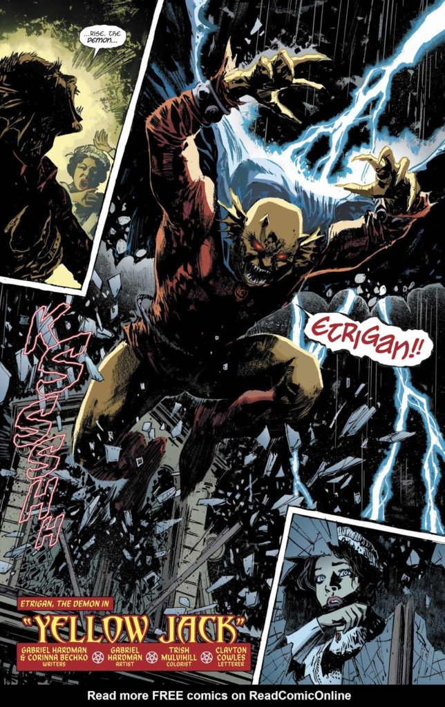
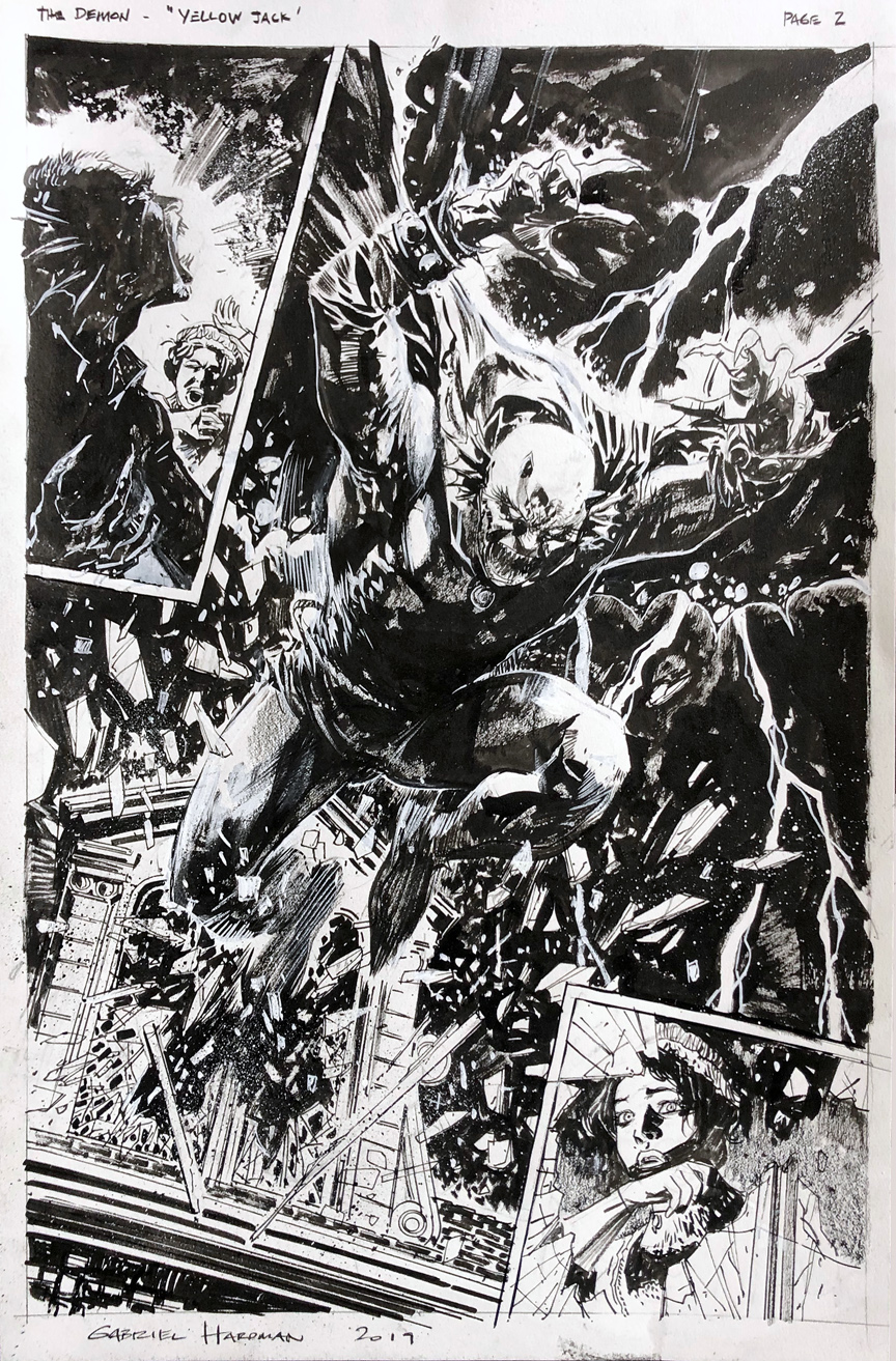
Gabriel Hardman — Like A Demon

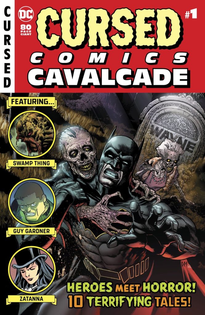
Cursed Comics Cavalcade #1, October 2018
Continuing a two-week series celebrating Halloween with the best in monsters, mystery and mayhem.

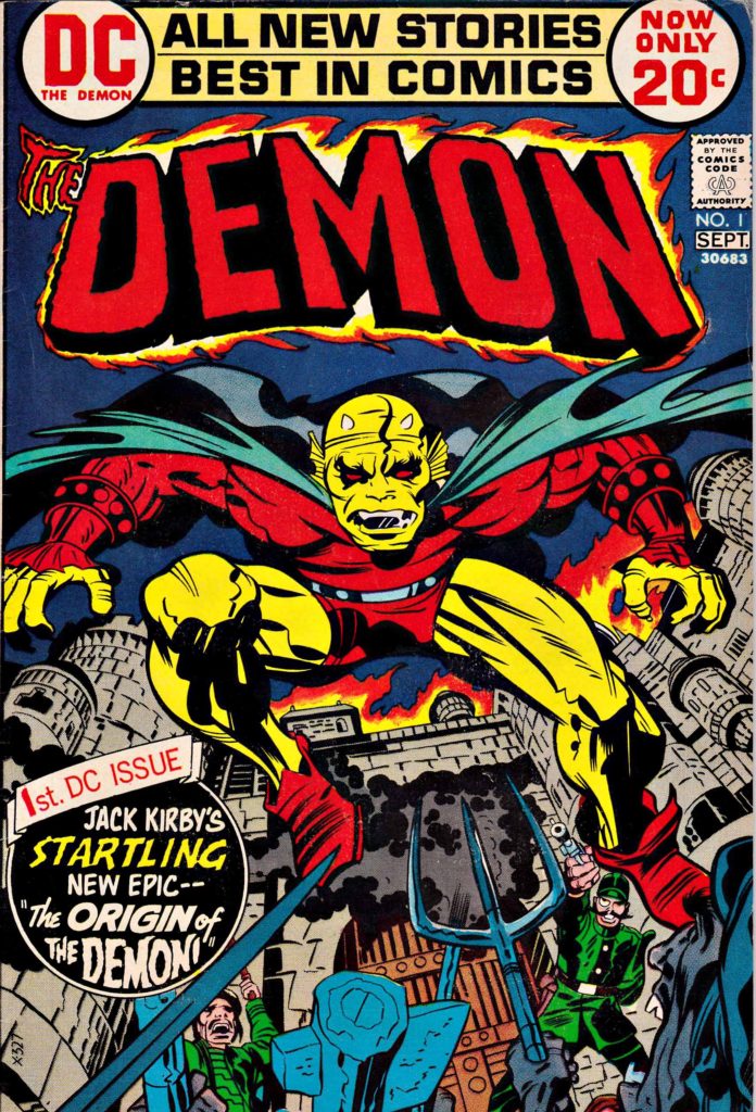
Jack Kirby’s Demon — despite a short-lived original run of 16 issues — endures 47 years after his first appearance in 1972.

Talented creators have reinvigorated, and in some cases outright reinvented, Jack’s supernatural character in the ensuing decades. It’s an all- star list that includes Matt Wagner, John Byrne, Garth Ennis, John McCrea, and many others.

Add to that list Gabriel Hardman, who, on this splash, provides an iconic and frightening image of the classic character. Gabe’s use of deep black inks and the off-setting lightning and breaking glass create a haunting and dramatic page. (I think the art looks more impressive in black and white than in published color, but regular readers of this blog probably already guessed that.)

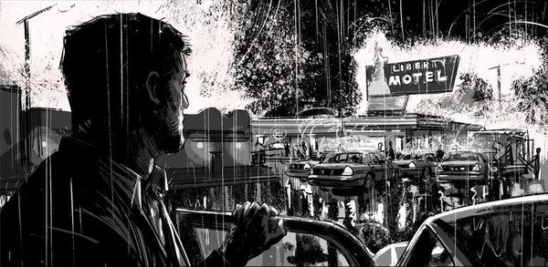
Hardman’s main professional work is creating storyboards for films, a list that includes Spider-Man, Batman, Logan and much more. He’s terrifically talented, and much sought after in Hollywood, so we don’t get enough of his work in comics, which is a definite pity for comic art aficionados. 

In the meantime, we can likely look forward to yet another artistic interpretation of Kirby’s character sometime in the future. 

After all, we all have our Demons.
An atmospheric storyboard from Logan. Even if Gabe were permitted to part with it, he couldn’t — he does most of his storyboards fully digital.


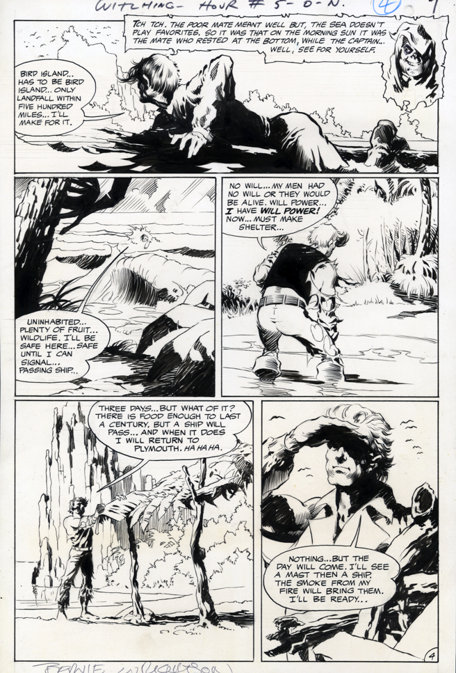
Bernie Wrightson — Legend In Progress

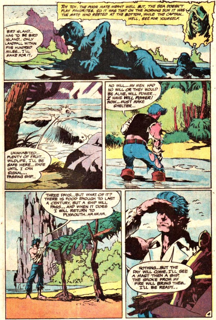
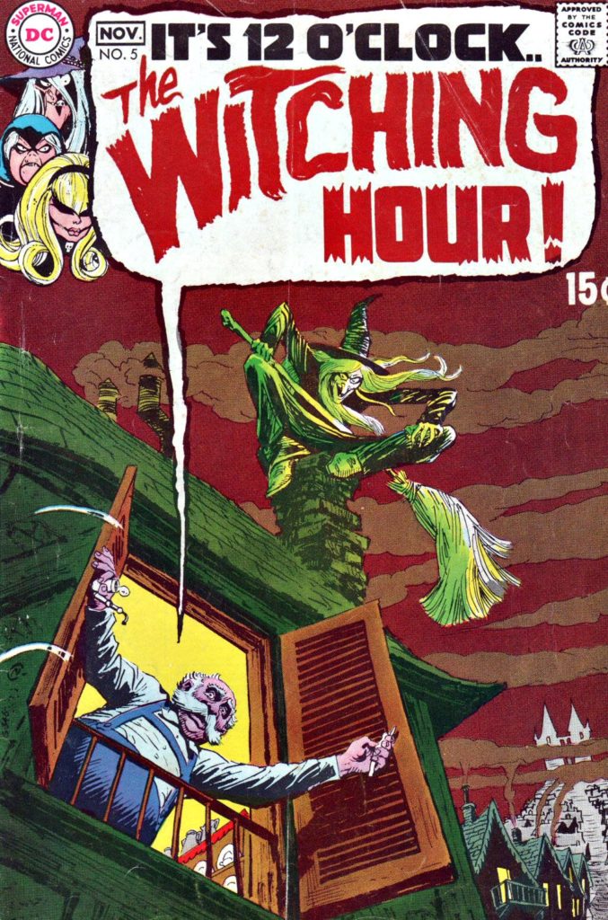
Witching Hour #5, November 1969, “The Sole Survivor”

Today we launch a two-week series celebrating Halloween with the best in monsters, mystery and mayhem.

It’s difficult to attend Baltimore Comic Con without thinking about Bernie Wrightson, who hailed from here, and made his final convention appearance here six months prior to his death in 2017.

Wrightson’s professional comics career began in DC’s mystery anthology titles just six months before this art was published, 50 years ago this month.  

This page, therefore, is very early Wrightson, and although it’s still a few years away from his artistic peak, the talent, and signature detail, is already unmistakably there. His art hooked me early on, and I remain hooked.

Those DC mystery and horror comics, many edited by EC legend Joe Orlando, often showcased star artists like Wrightson, Mike Kaluta, Neal Adams, Gil Kane, and others, including occasionally Orlando himself.

Of course, like other anthology comics, you never knew what the line-up was going to be from title to title, issue to issue. These series were indeed like Forrest Gump’s proverbial box of chocolates: You never know what you’re going to get.

So of course they were always the titles I tried to skim through urgently on the candy store spinner racks, before that crusty proprietor Mr. Wurman would inevitably glance my way and say: “You gonna buy those? This is not a library.”

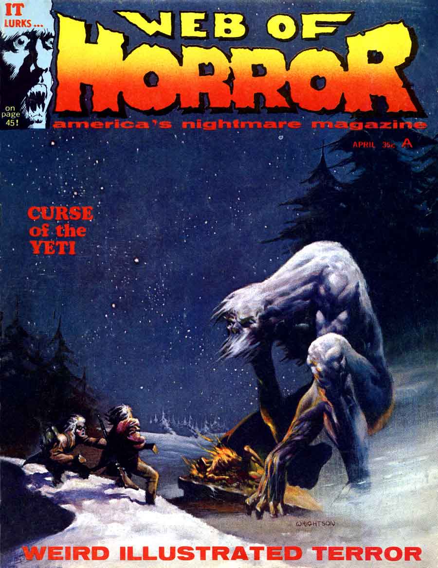
Bernie painted this beautiful cover for the short-lived Web of Horror magazine in the same timeframe as his early DC work — He was 21 years old.

Mike Mayhew — Inside Job

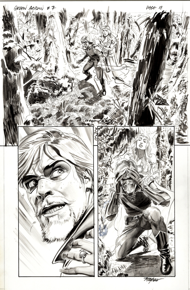
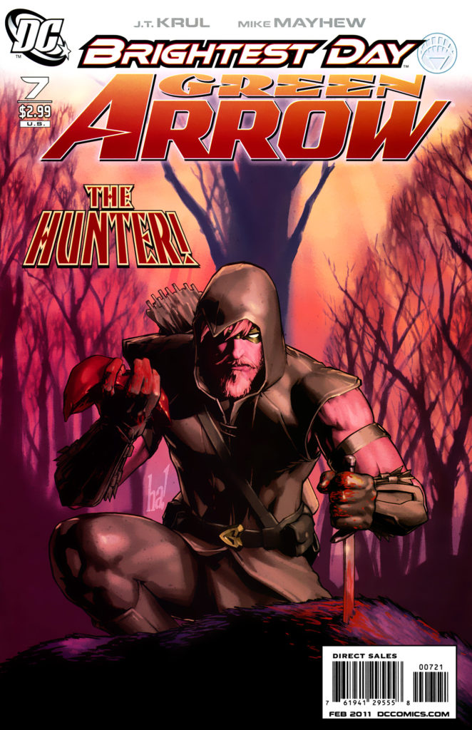
Green Arrow #7, February 2011

Green Arrow is back on the air (CW) for its eighth and final season, so before the emerald archer fades into the TV sunset, we’re focusing a few posts on Green Arrow originals.

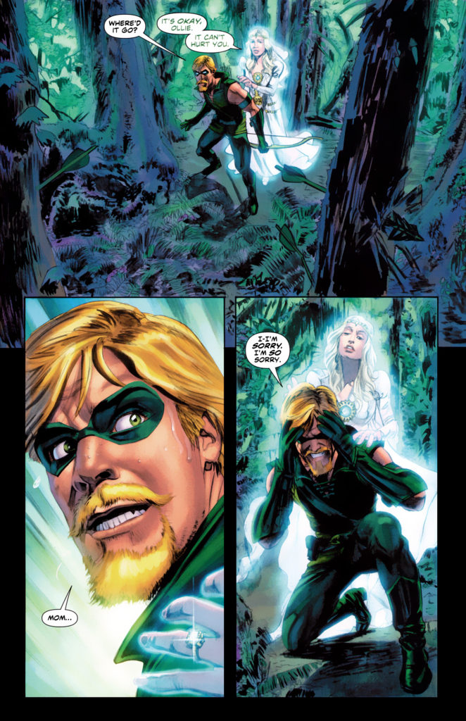
Here’s a great panel page example by the phenomenal Mike Mayhew. 

Mike’s earliest regular work was at Topps, excelling at dynamic storytelling on Zorro (yes, Zorro) in the traditional pen and ink medium. After the comic book implosion of the mid- 90’s left many talented artists out of a job, Mike tried his hand at painting for a book cover assignment. The result? Mike quickly transformed from talented story artist to a premier cover painter.

These days, Mike’ schedule only occasionally allows for fully illustrated interior stories. Here he demonstrates his tonal skills on Green Arrow — creating a lush, haunting page. (GA is dealing with the apparent ghost of his dead mother, hence the haunting.)

When Mike introduces me to a third party, he often says I was his “first boss.” Technically, that would have been Jim Salicrup, who edited Topps comics during its brief heyday, from 1992-97. But I was the Director of Publishing… so why quibble? Mike’s a great talent and a friend. I’ll take it.

Ian Churchill — Melee

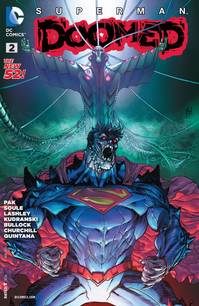
Superman Doomed #2, October 2014

Presenting the final post in our series celebrating Supergirl’s 5thseason premiere tonight on the CW.

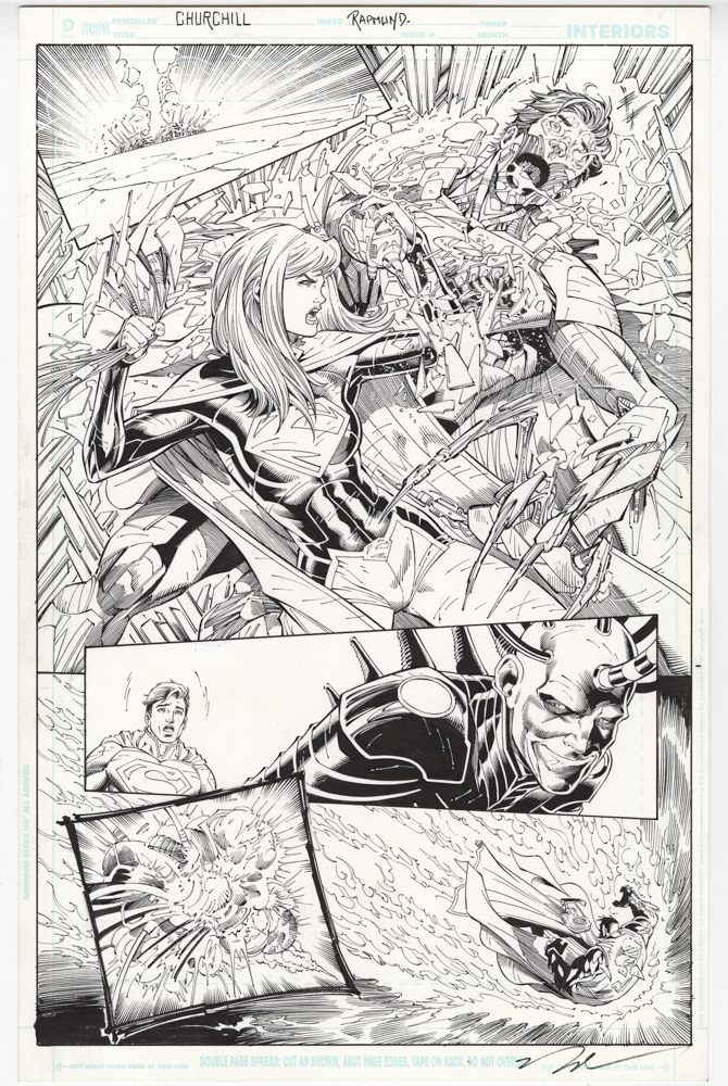
As noted previously, Ian Churchill’s run on Supergirl was terrific, and his brief return here, is still a welcome one.

On this dynamic page, Supergirl shreds Cyborg Superman, who is (I think) actually Supergirl’s father, who is under the mind control of Brainiac, who is… never mind. This “prequel” to the complicated DC convergence crossover is convoluted, and the less said, the better.

But the art, of course, is great.

Dick Dillin — Whirlwind Entrance

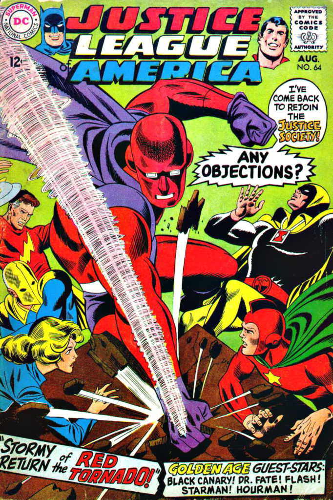
Justice League of America #64, August 1968

Continuing our series celebrating Supergirl’s 5thseason premiere on the CW on Sunday.

One of the cool features of all of the DC CW shows is the introduction of supporting characters you would hardly imagine would ever make it into live action TV.

Rip Hunter? Firestorm? Mister Terrific? The Ray? The list goes on… and on… and on.

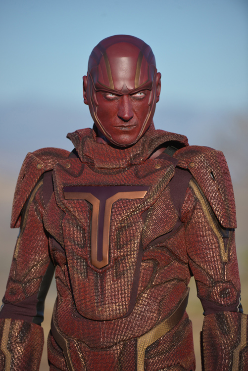
One such character is Red Tornado, who made it into an early episode of Supergirl. Ok, so he’s a villain… and his backstory definitely veers from much of his retcon continuity in the DCU, but who cares. He certainly looked great.

Red Tornado’s first appearance in his contemporary droid form is in Justice League #64, and this splash – the cover scene — is actually his first rendering in that first appearance issue. More importantly, it’s also the very first JLA appearance of artist Dick Dillin, who went on to draw the series for an astounding 12 years until his untimely death in 1980.

And that cover? One of my all time favorites, enhanced by that unique greenish background, and featuring a full cast of the Justice Society. It jumped out at you on the spinner racks 50 years ago, and still does today.

Chris Sprouse / Karl Story — Double Feature

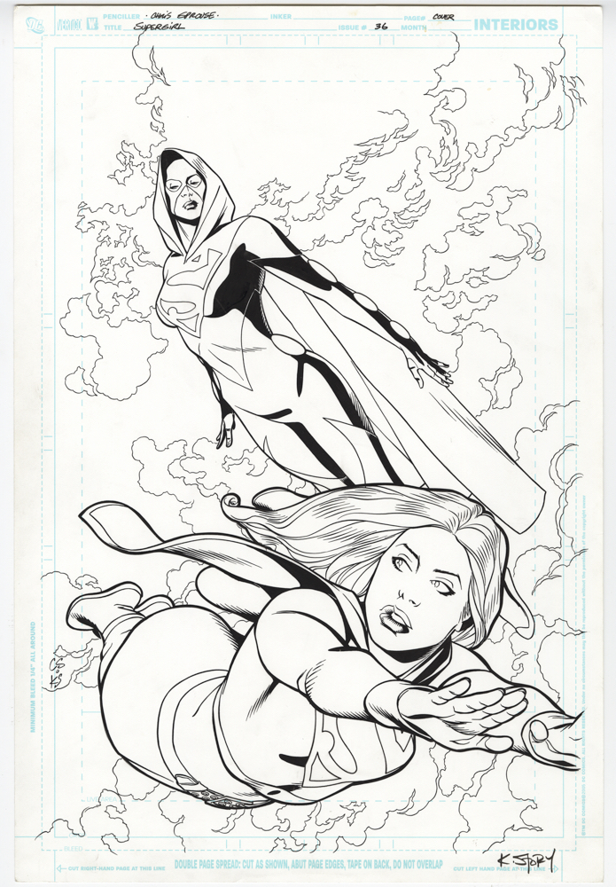
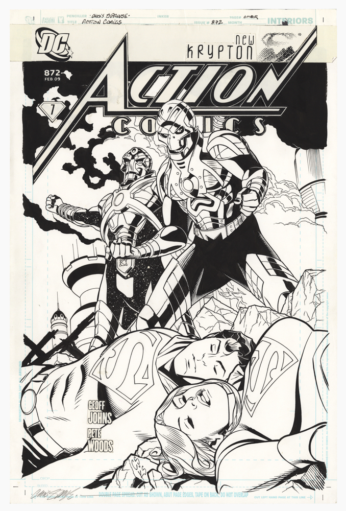
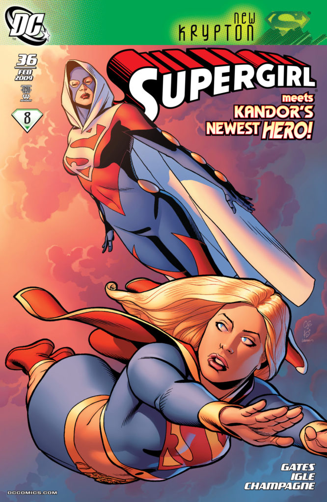
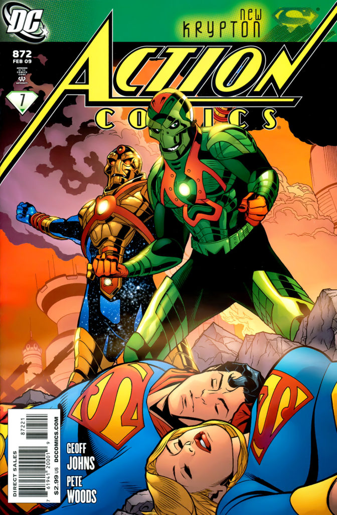
Supergirl #36, and Action #872, February 2009

Supergirl’s 5thseason premieres on the CW on Sunday, so our next few posts will take a look at the cousin of steel.

Here’s my unsolicited story idea for the terrific art team of Chris Sprouse and Karl Story:  A Superman Family “Elseworlds” limited series that includes Superman, Supergirl, Lois and Jimmy, The Super Pets, The Legion of Superheroes, Kandor, Bizarro… And a full line-up of classic villains.  Pretty much everyone who populated the mid 20th century Superman comics.
In other words, a longer form story that’s similar to Alan Moore’s and Curt Swan’s classic “Whatever Happened to The Man of Tomorrow,” but with —- spoiler alert — no fatal tragedies involved.
In 2020, that’s about as likely to happen as Perry White yelling “Great Caesar’s Ghost”, or Jimmy Olsen turning back into a giant turtle, but a guy can dream, can’t he?

Much like Steve Rude, Chris Samnee, and a handful of other artists, Chris and Karl take classic styling and adapt it into a modern form. It’s both retro and contemporary. 

In many ways, it’s the best of both worlds. (Hey — that could be the name of the series.)

In the meantime, we have these two great covers: Supergirl and “Superwoman” (long story) gracefully flying, and Metallo and Reactron defeating the super cousins. Cyborgs rarely look this menacing on a super-hero cover.

And, if someone at DC miraculously likes my idea, and Mark Waid is tied up, it’s pretty easy to find me…

Rodney Ramos — Flash Back

The Flash of Two Worlds — DC Comics Classics Library, 2009

The Flash TV series (CW) explores DC’s multiverse legacy in creative and often reverential ways. Today’s post, along with the next two, feature “The Flash of Two Worlds.” 

Flash #123, “The Flash of Two Worlds” is one of the most important comic book milestones of DC’s silver age, establishing the DC multiverse and paving the way for countless crossover storylines that ultimately lead up to 1985’s Crisis on Multiple Earths. Its 1961 cover follows as one of the most iconic images of the era. 

But, when DC went to reprint the earliest Flash crossover stories in a special collection, the original art and layout didn’t quite work within the new cover design.

So, the editors turned to the very talented (and very underrated) Rodney Ramos to recreate (and reconfigure) the iconic imagery, in the Infantino/ Murphy Anderson “style.” 

He nails it — and you could be headed for a career in the FBI’s counterfeit investigations unit if you can immediately tell the published cover is not Infantino / Anderson.

(As seen below, the final published piece crops the image significantly, and also digitally manipulates the two Flashes even closer together.)

Apparently it all started here… and Flash #123 is actually an homage to this cover of Our Fighting Forces by Jerry Grandenetti

Ross Andru / Mike Esposito — Flashy Follow-Up

Flash #190, August 1969

Part two in our five-part Flash series this week.

Following Carmine Infantino on the Flash was obviously no easy assignment to begin with, but it appears Ross Andru and Mike Esposito had the deck stacked against them.

At the starting line was a fun issue, Flash #175, the sequel race between Superman and the Flash. Shortly thereafter is Carey Bates’ offbeat tale in Flash #179 that introduces Earth “Prime” — our earth— into the DC multiverse.

But, after that… we get: Giant-headed Flash, Flash with a broken toe, Flash color-blind, etc. Plus: Flash fighting hippies, sea creatures, lizards, demons, aliens, oh my.  Samurais? Seriously?

WTF? How about the rogues, who only make a handful of minor appearances during this run, with only Captain Cold, warranting a cover? Where’s Grodd? What about Flash of Earth-2? And, if you’re going to have a Green Lantern team-up (#191) how about putting him — or at least a blurb — on the cover?!

I count seven writers —seven! — during this 20-issue run. It’s no wonder the character couldn’t get any traction. As a kid, on a kid’s budget, it was difficult not to give up on everything but the 25-cent reprints at that point. My allowance screamed: Run Away!

Still, the art can transcend the material, and does so here. On this unusual page, Andru, who always had a great sense of space and time, delivers a fascinating layout as Flash races from one point to the next in Central City. (Plus, as fans of Andru’s latter Spider-Man run can confirm, Ross loved drawing buildings, and he’s definitely warming up on this page.)

It’s also a reminder of what could have been accomplished artistically with better material to work from — and less questionable editorial choices.

Special Note:

DC needs to reprint the entire Robert Kanigher/Andru/Espo Wonder Woman run — about 73 issues — in an Omnibus. Only the first dozen comics have ever appeared in color since their original publication about 60 years ago. (Also, Metal Men needs a similar treatment… But I digress.)

Carmine Infantino — History Calling

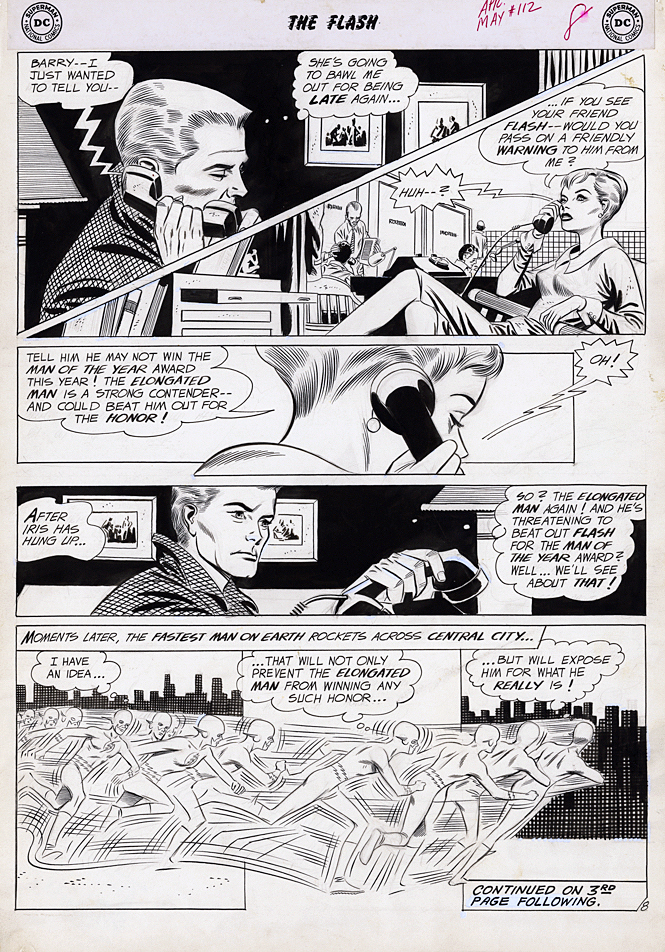
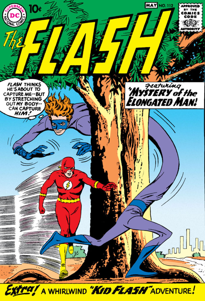
Flash #112, May 1960

The Flash returns to THE CW shortly for its sixth TV season, so the Scarlett Speedster receives his own multi-part blog series this week.

Some of the most talented superhero storytellers in comics couldn’t figure out what to do with the narrative and exposition elements that move the story along when no one is wearing spandex or a cape.  

Many comics were once filled with pages and pages of standard medium-angle shots of talking heads. Six panels per page. Rinse. Repeat.

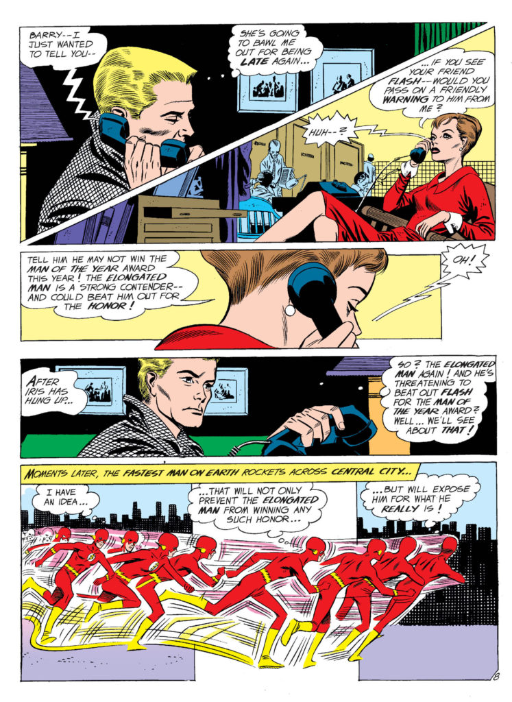
Not Carmine Infantino’s pages. His innovative sense of panel composition and design, and use of varying and dynamic camera angles, made the “yada yada” part of the story much more engaging than most of his peers. 

In this very early Flash story from issue #112 (inks by Joe Giella) he even manages to innovate a phone call.  We take narrow “widescreen” (horizontal) panel layouts for granted now, but in 1960? Not so much. A page design like this is revolutionary 60 years ago.

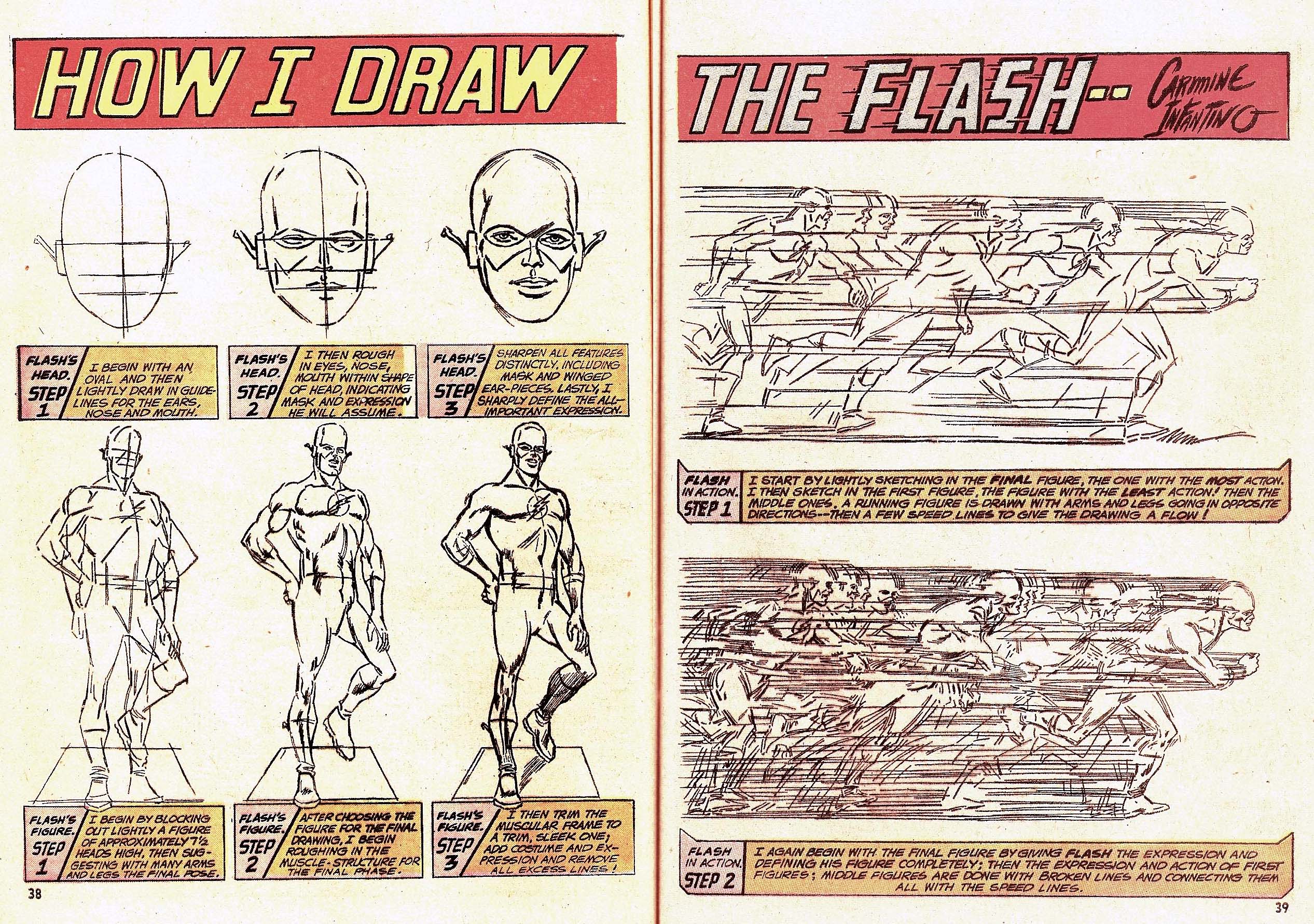
Of course, superhero comics are ultimately about conflict and action, and re-reading these early Flash stories, his innovative style really jumps out. Those crazy speed lines that help give the illusion of 3D motion in a 2D medium. That sleek space age costume… designed before the space age really began. 

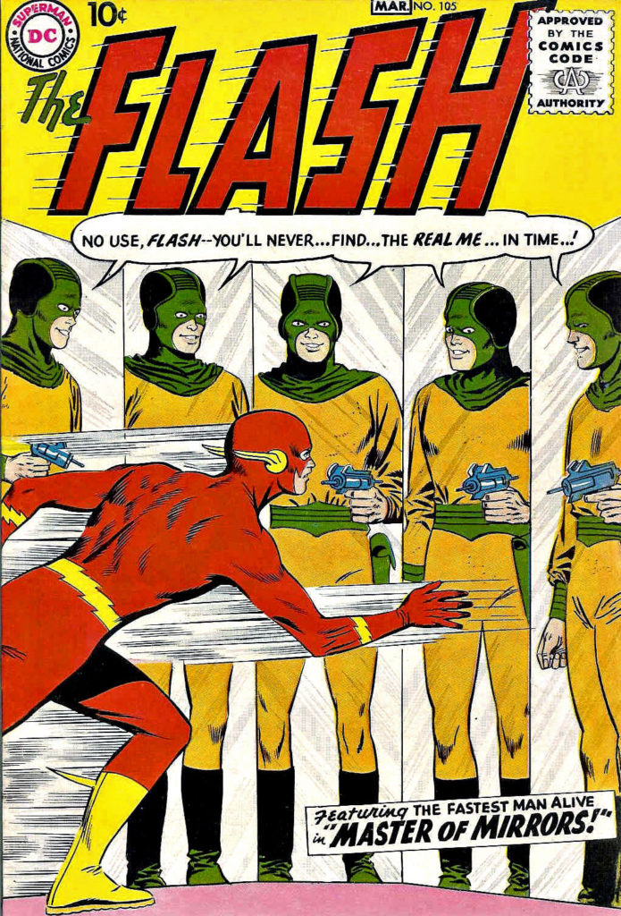
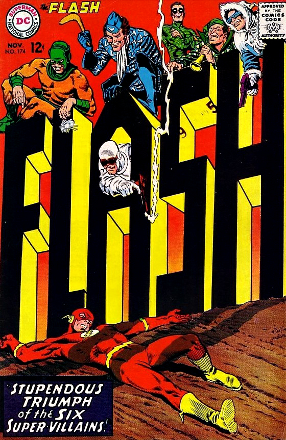
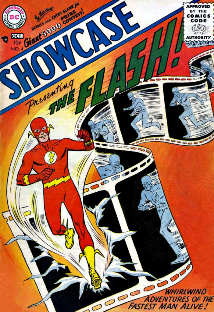
And those amazing covers? Carmine gave up pencilling The Flash when he was promoted to DC’s art director. His cover on the final full issue of his 11-year run as Flash artist blew my mind as a kid in 1967 — and still does today.

What else would you expect from the designer of the Silver Age of Comics?

An exercise in futility when I tried this at home…
Infantino’s final pencilled issue of the Flash ended with this show-stopping cover.

Neal Adams — Happy Batman Day

Convention Commission, 2012

We interrupt our multi-part look at Spider-Man vs. Mysterio in honor of today’s “Batman Day” (9/21) celebration. Our regularly scheduled programming will continue tomorrow.

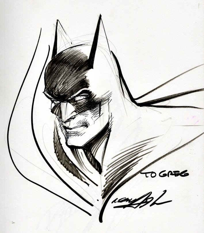
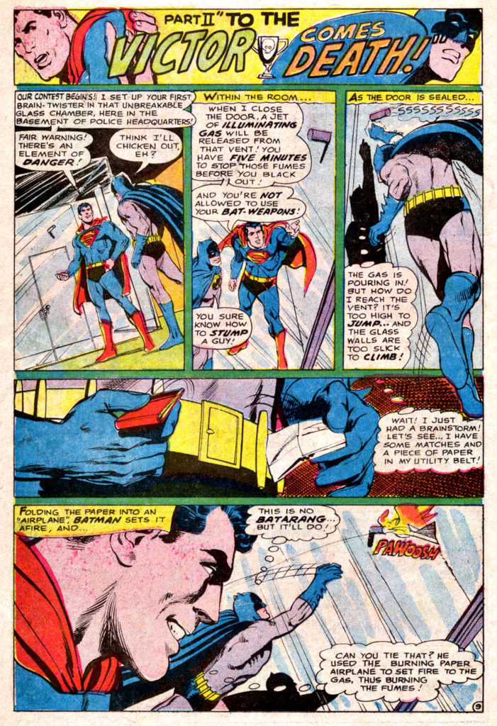
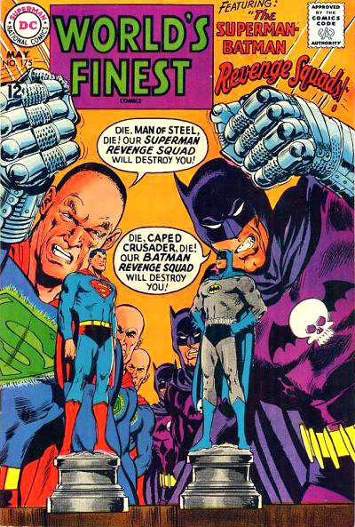
Neal Adams first Batman story appeared more than 50 years (!) ago in World’s Finest Comics #175. The art blew my mind then, and still does today. Happy Batman Day, Neal, and thanks for all of it!

Tomorrow, we conclude our multi-part look at Spider-Man vs. Mysterio with none other than “the Dude” — artist Steve Rude.