Batman: The Silver Age Dailies and Sundays, Volume #1, March 2014
As noted a few years back, Pete Poplaski has been called an “artist’s artist” by many creators. His name might not be known as well as other artists, but his talent is unquestionable.
Pete, who broke into comics in the 70s underground community, ultimately became Kitchen Sink Press’ art director, and among many accomplishments helped give some of Robert Crumb’s projects just the right design touch.
Kitchen had the rights to reprint the DC Batman and Superman comic strips in the early 1990s, and Pete created brand new covers that evoked the classic style of those strips.
When we acquired those reprint rights at IDW in 2012, we went back to Pete to see if he would be interested in picking up where he left off, and fortunately he was.
Wayne Boring. Dick Sprang. Al Plastino. You name a classic artist, and Pete can replicate the style.
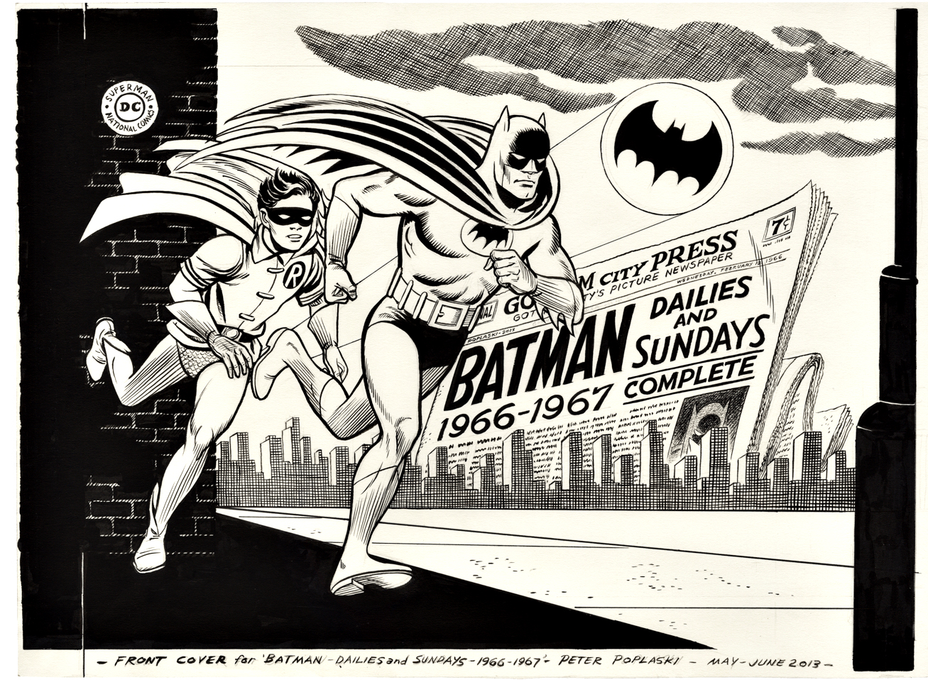
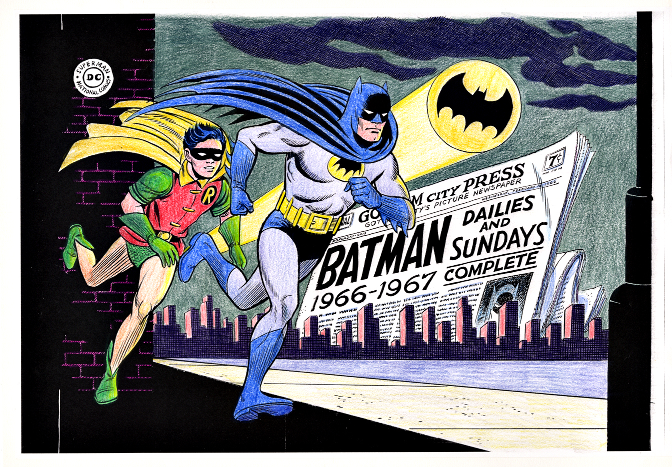
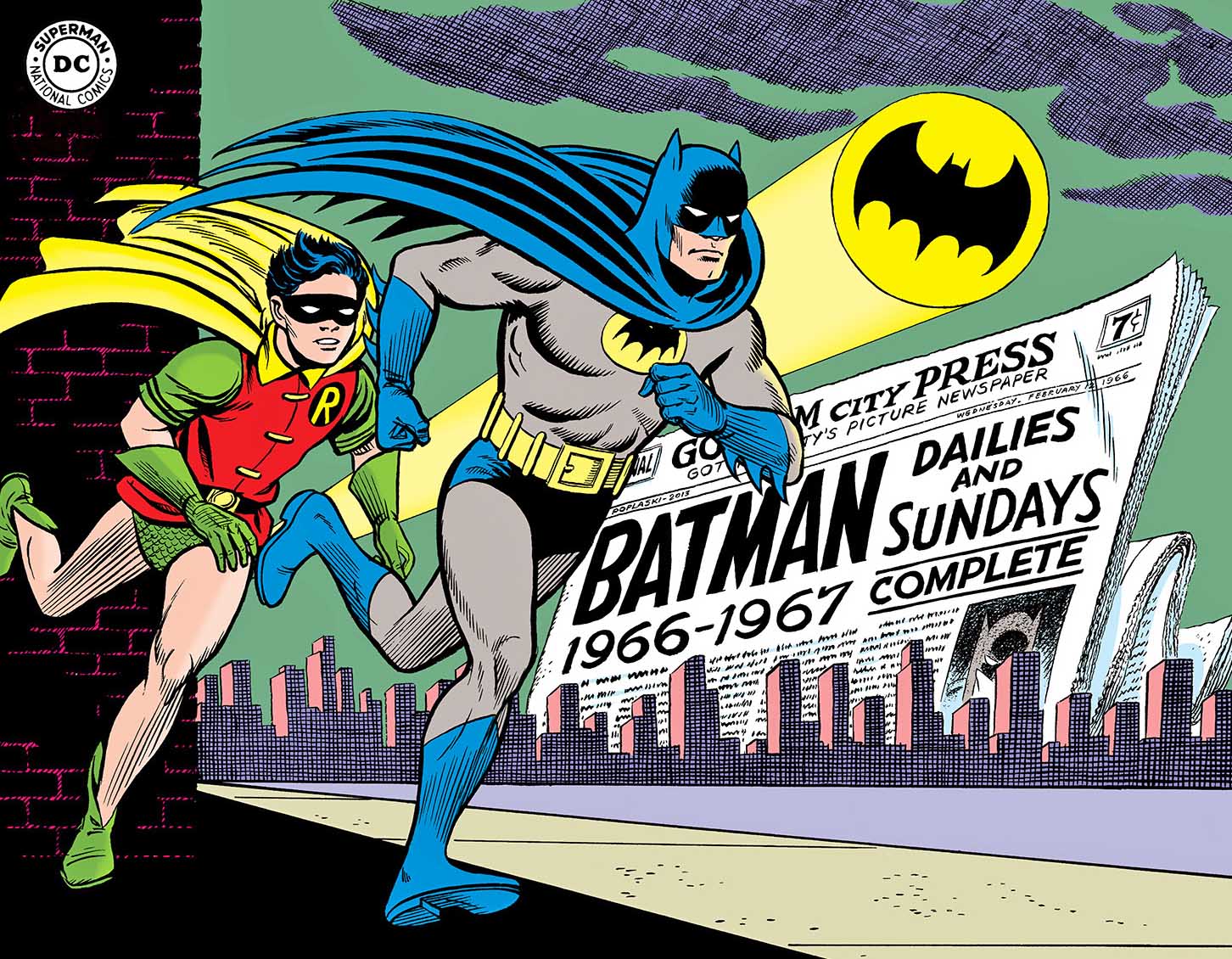
This, of course, is his amazing cover to Batman Silver Age Vol.1. It not only evokes the classic 60s Carmine Infantino revamp of the Dynamic Duo, but also the opening animation of the classic (beloved, and often hated) 60s Batman TV show. (Which is why these newspaperstrips exist in the first place, but, as always we digress.)
Pete takes his Black and White Art, photocopies it and hand colors it to create a color guide.The published cover — entirely hand drawn except fo the DC logo in the upper left corner.
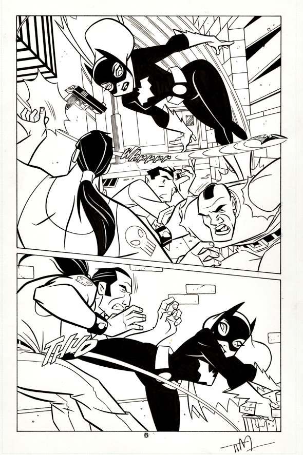
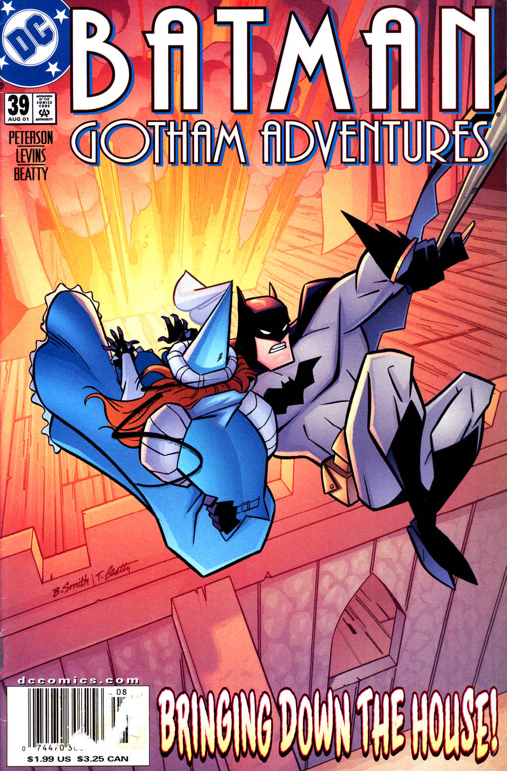
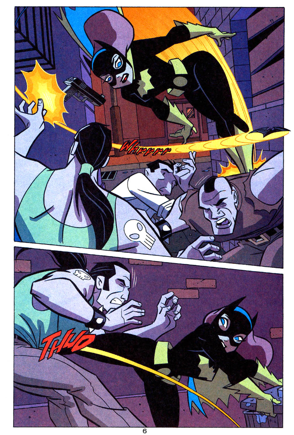
Here’s a cool “Batman-animated” style page from Tim Levins that captures the fun and the flair of the 90s animated series.
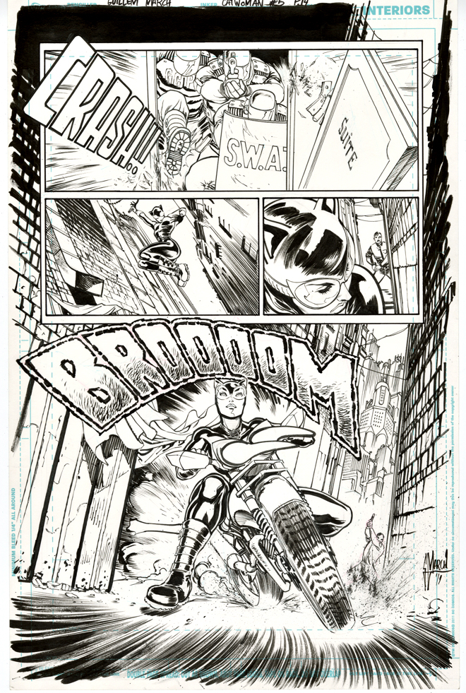
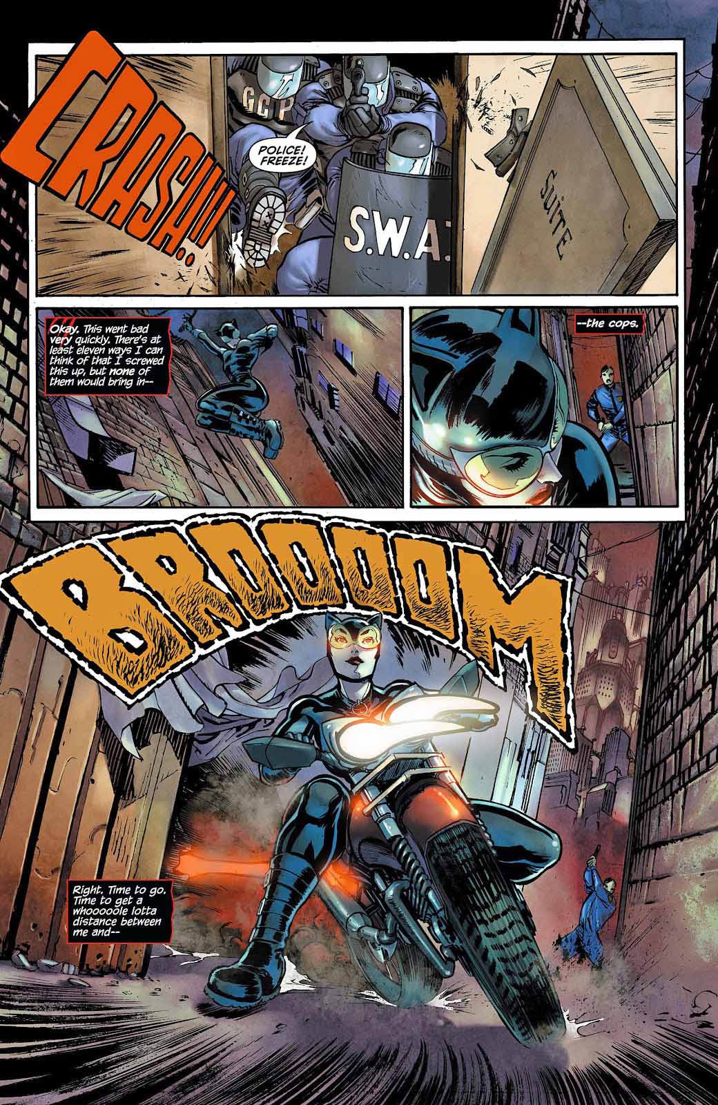
The best art pages have no words — therefore, no word balloons needed. (And therefore, no missing word balloons on original modern art, 98% or more of word balloons are digitally added later.)
I realize its a bit of a cliche — but I always do get a kick out of Batgirl’s signature action move.
And, yes, I likely deserve one myself for employing that pun.
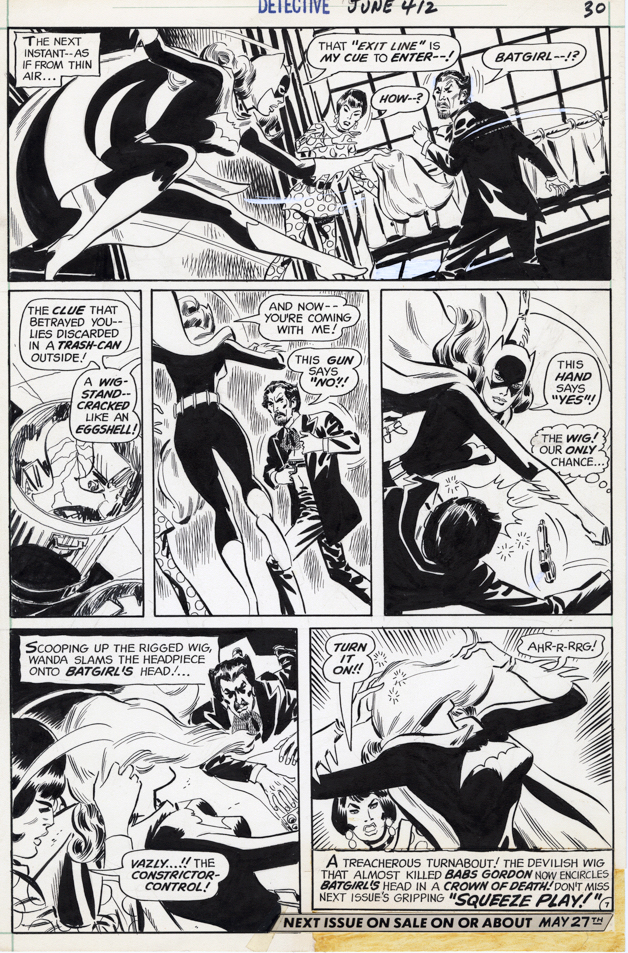
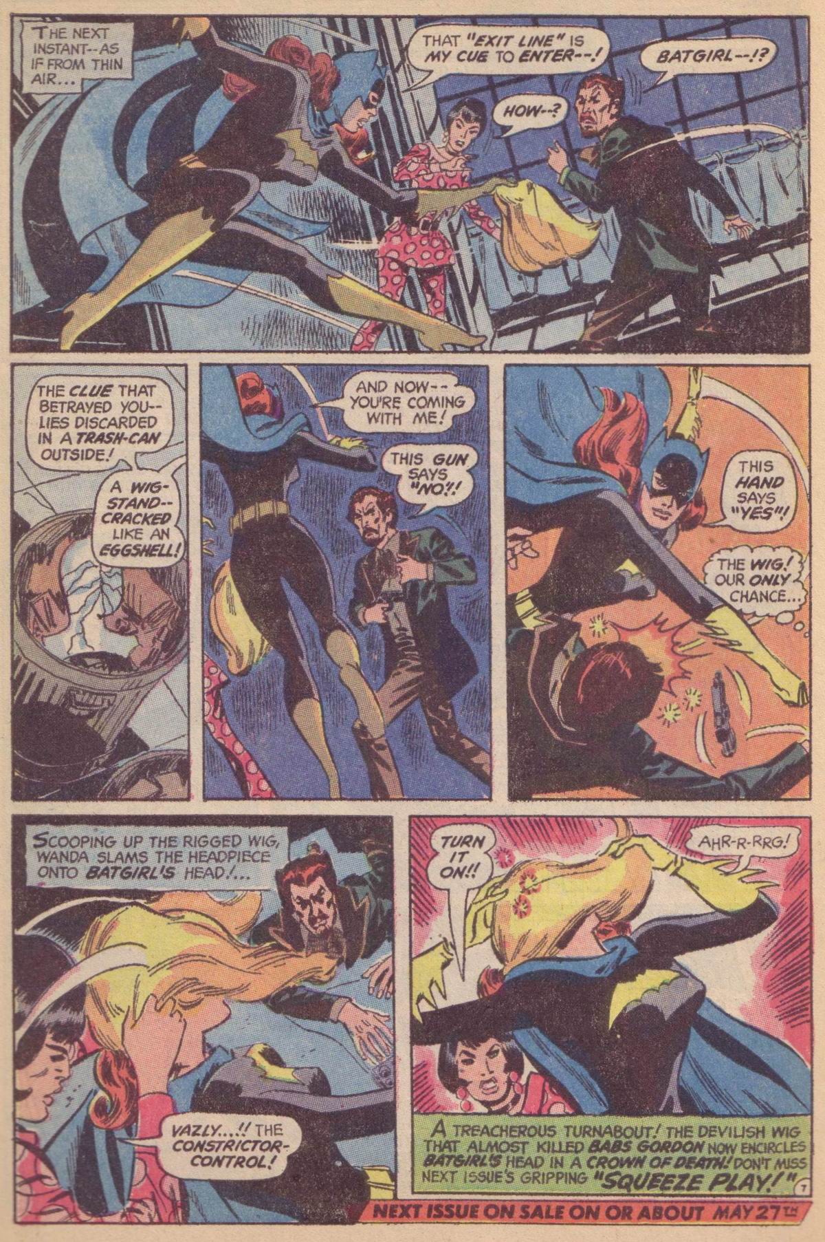
“Dandy” Don Heck was a pro at a glamorous situations and glamorous people — including Batgirl and pretty much all the women he tackled, as evidenced in the page above.
Don was best at inking his own pencils, also evidenced above, in this cool action page from Batgirl’s back-up feature in Detective Comics.
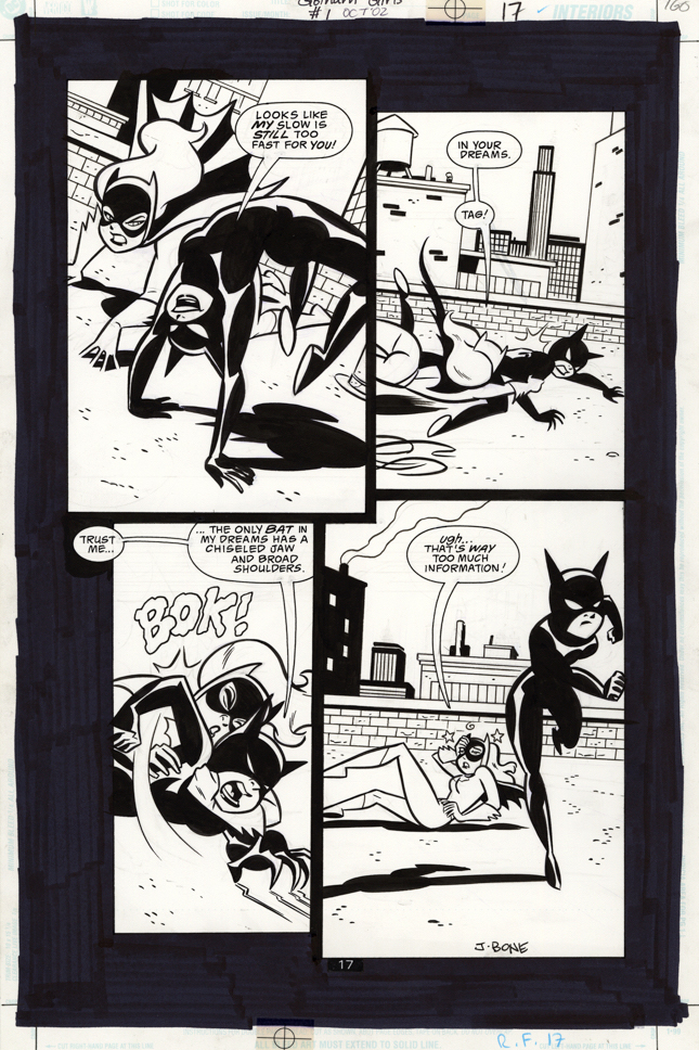
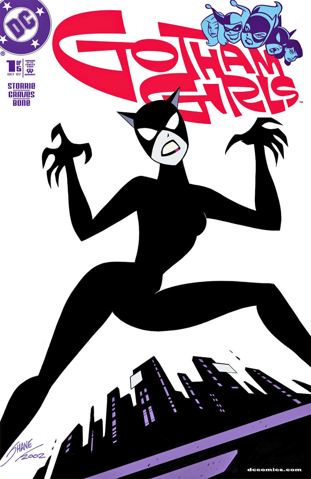
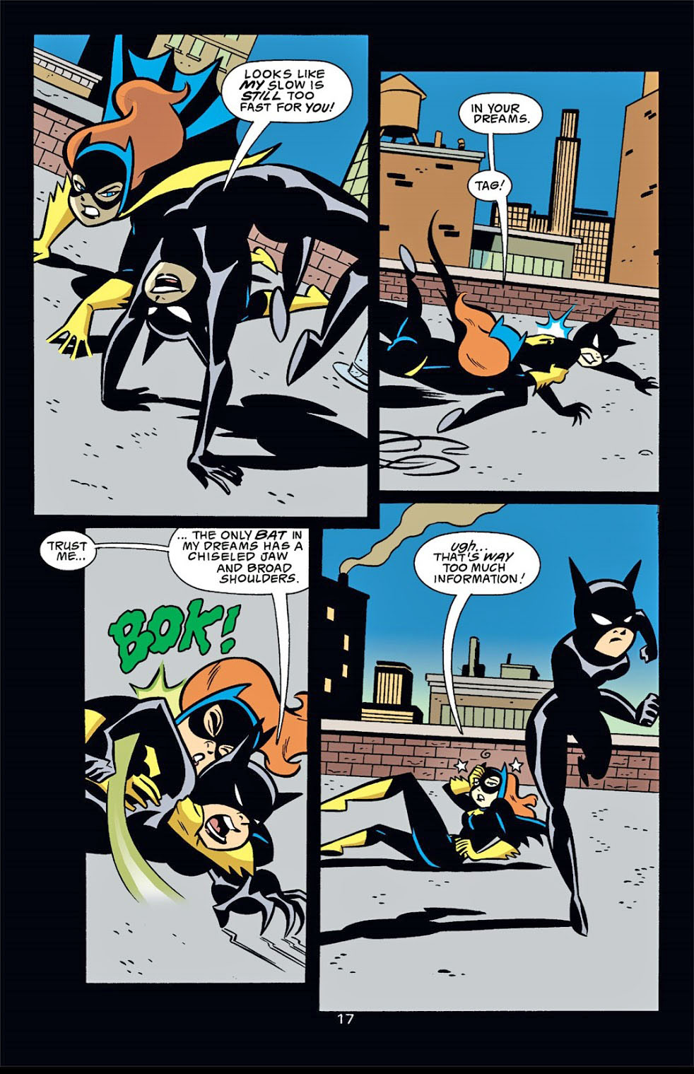
Batgirl fighting Catwoman? — seems like a great way to celebrate Halloween (upcoming) and Batman Day (belatedly) within a terrific action page by Jennifer Graves and the equally terrific J.Bone.
And, always a pleasant surprise to have a 21st Century piece of art with the word balloons hand lettered on the page.
Call me “old-school” all you want. It’s a compliment.
Fun fact: It took nearly 20 years for DC to collect this mini-series, and when they did they renamed it “Harley Quinn and the Gotham Girls to capitalize on — you guessed it — Harley Quinn, who is by no means the centerpiece of the original series.
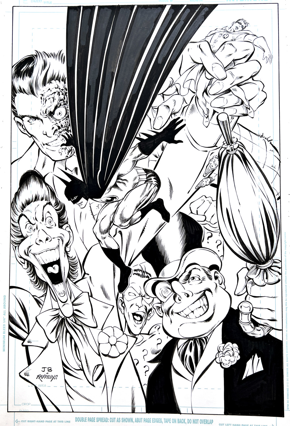
Norm Rapmund Recreation of John Byrne Batman, July2022
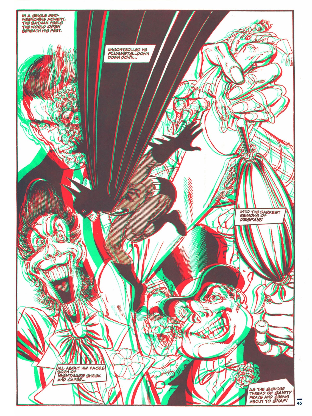
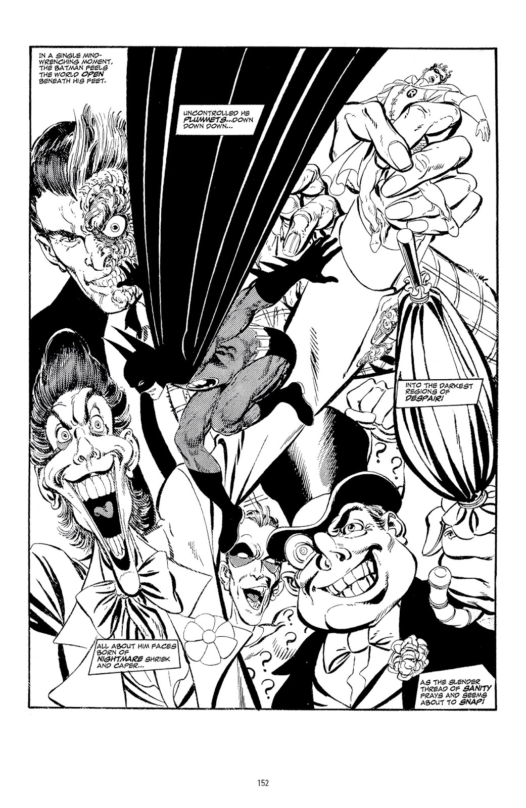
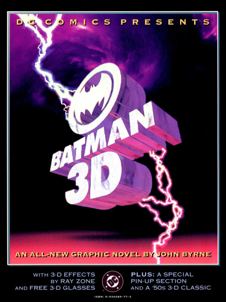
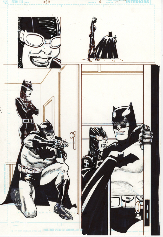
How to celebrate the 500th blog post — and a little more than three years of posting?: Here’s a beautiful Norm Rapmund recreation of a John Byrne Batman splash page (from the 1990 Batman 3-D graphic novel) that Norm started well before this blog was even conceived. (Probably 2017 or so.*)
The 500 milestone includes some “reruns” and a few “cheats,” but hey, 500 is still 500. And we have may slipped in frequency for the first time this past month, but there’s still more great art to come.
Stay tuned.
(*A story for another day.)
Byrne’s original 3D graphic novel and the black and white reprint from a Byrne DC collection 25 years later. One change that Norm made that I really like is that the Harvey Dent side of Two-Face’s face is a bit less evil — as it should be.
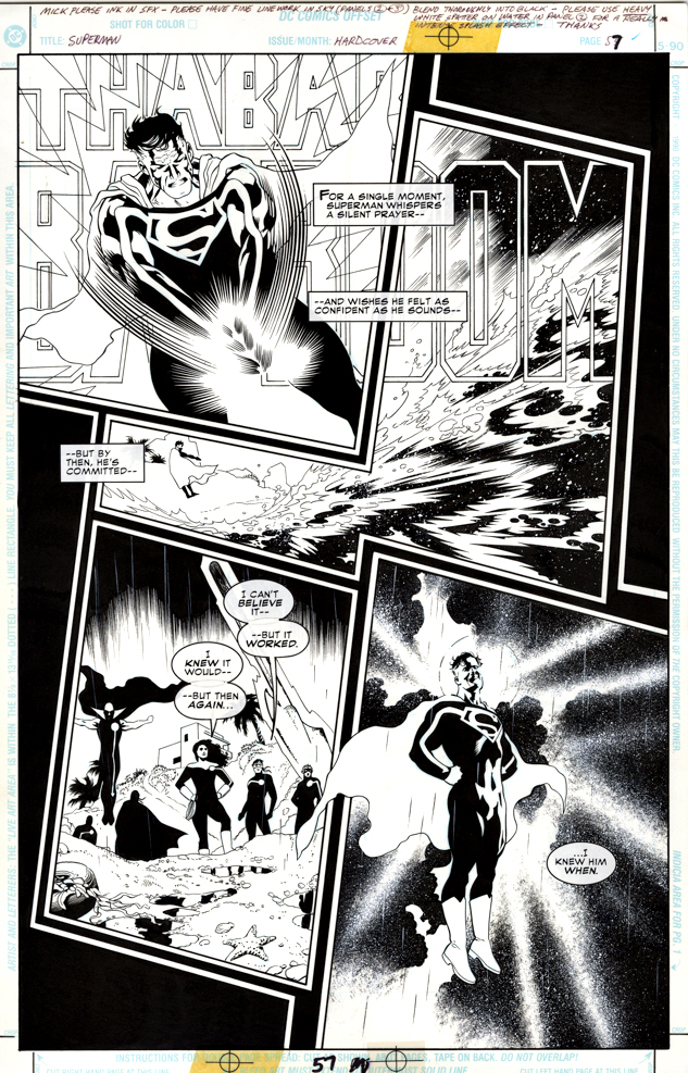
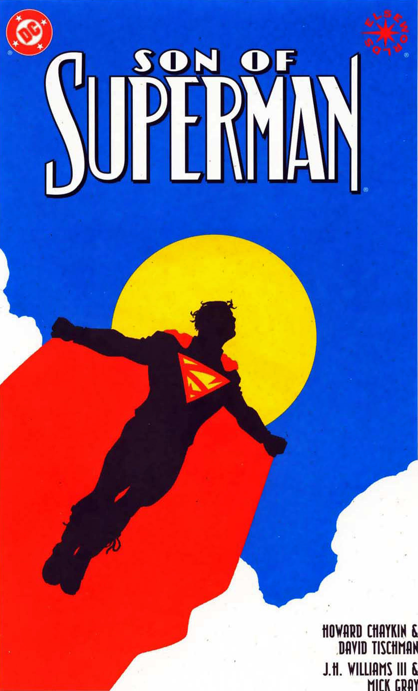
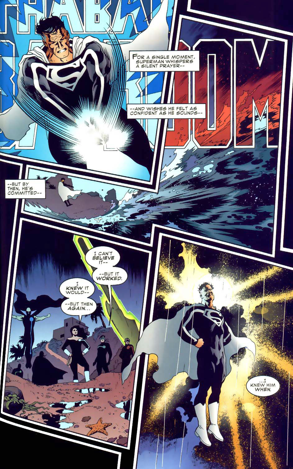
Here’s a beautiful Superman page by the super-talented J.H. Williams, inked by his long-time collaborator Mick Gray. It’s an “Elseworlds” (imaginary, out of continuity) story when DC still published those.
Original art pages are artifacts of course, and fortunately, and this one relies on traditional inking methods, lettering and sound effects as opposed to digital enhancements to provide the final result.
I love Williams’ note to Gray in the top margin, explaining how he envisions the final look of the page. (It’s interesting that the colorist chose to reduce the dynamic splash effect in the water in the second panel. To each his own, I guess.)
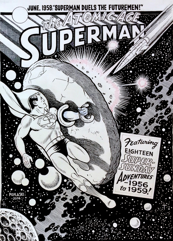
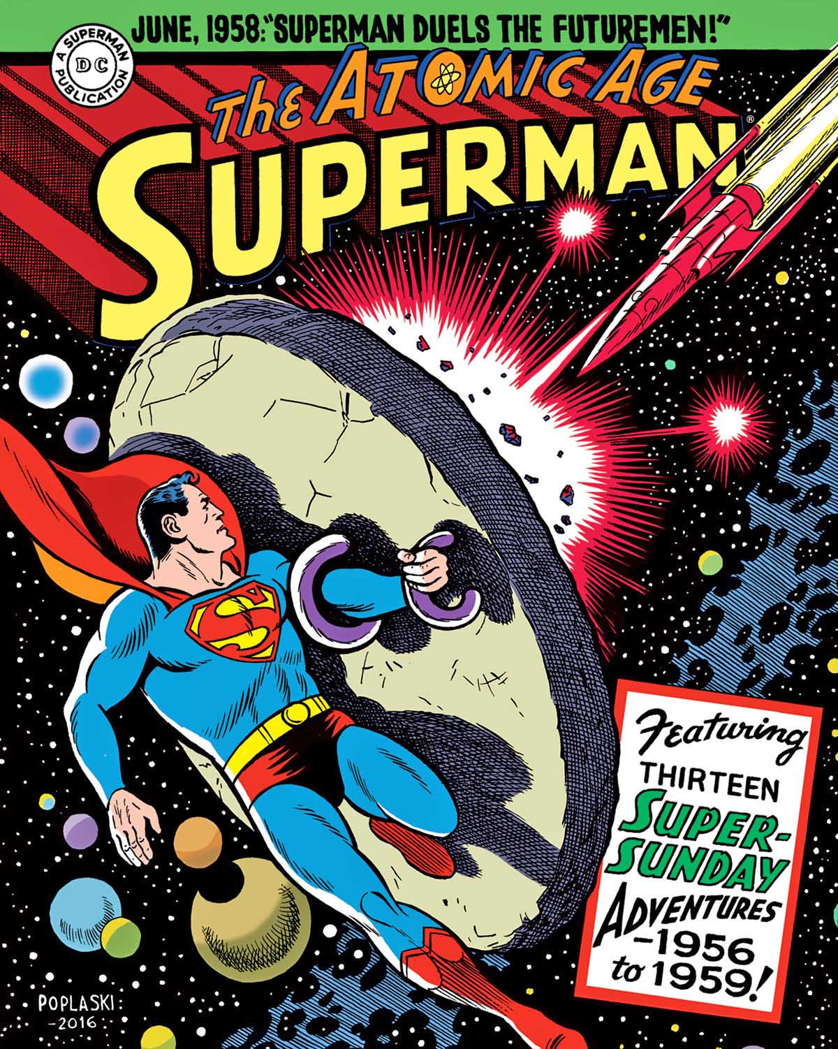
Superman — Atomic Age Sundays Volume 3, December 2017
As described in a earlier post, Pete provided all the terrific covers for our DC superhero strip reprints for The Library of American Comics.
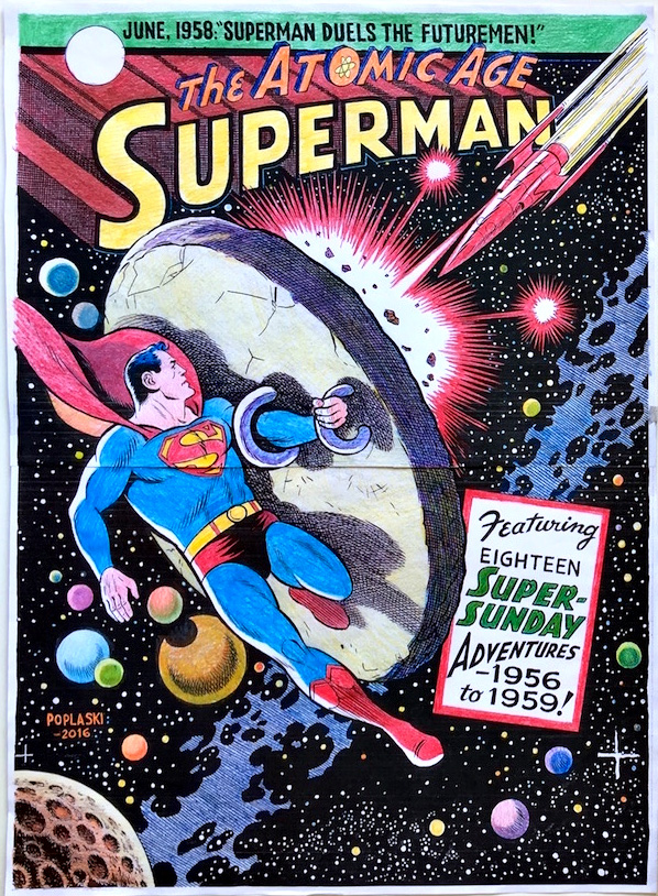
Pictured is a typical great example where Pete emulates legendary artist Wayne Boring — with some Curt Swan thrown in for good measure.
Oversized — and beautiful.
Fun Facts: (From the marketing copy):
Written by Alvin Schwartz and Bill FInger and Illustrated by Wayne Boring
The Man of Steel stars in thirteen classic adventures as the 1950s “Atomic Age” comes to a close. Some of the stories are original to the newspaper strip, while others were alternate versions of tales that were simultaneously published in the regular comic books. One of the featured adaptations is “Superman Versus the Futuremen,” written by Batman co-creator Bill Finger, which retells Superman’s origin. This concluding volume of Superman’s Atomic Age Sundays reprints all strips July 1, 1956 to October 11, 1959.
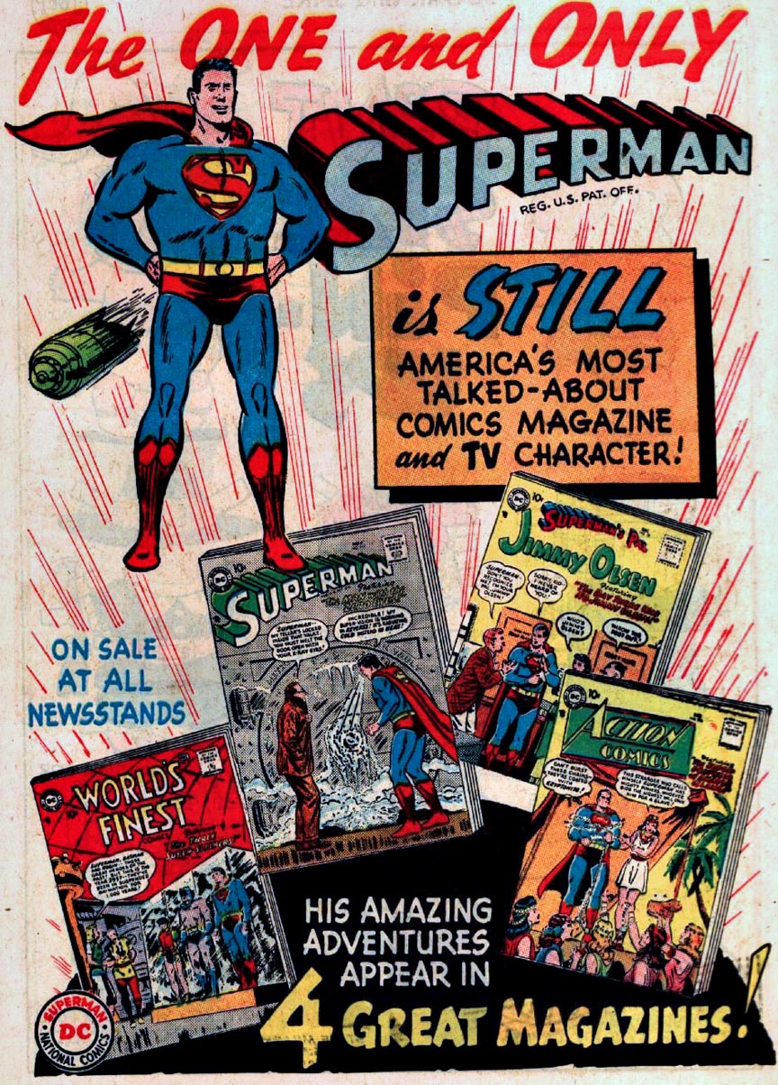
Pete hand colors copies of his original art, and those color guides are then handed off to the digital colorist who completes the work for publication.Meanwhile, over in the comics, Superman reminds us to read all his adventures.
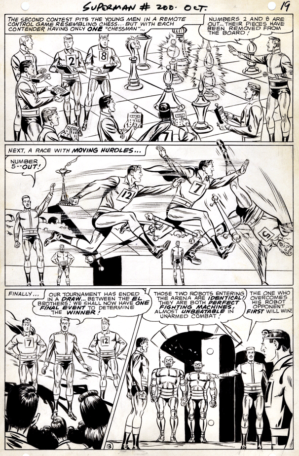
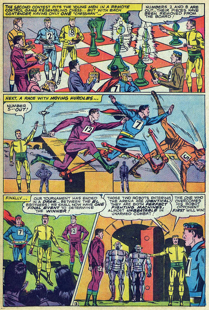
This art is from Wayne Boring’s final new story for DC comics for more than 20 years.
Boring, one of Superman’s truly legendary artists, was part of a group of creators that asked for pay rate increases, benefits and other employment improvements. So, naturally, DC fired them all.
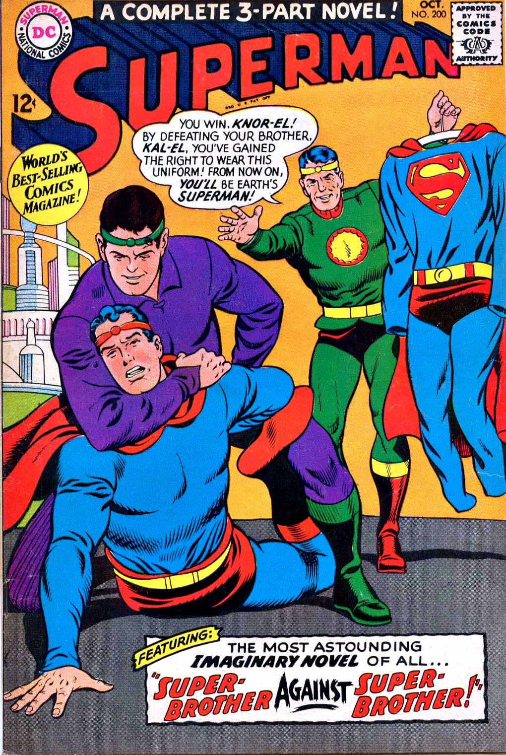
It’s an oddball imaginary story with the end spoiler right there on the (Curt Swan) cover for kids like me to see. I had only been reading Superman comics for a short while, but I knew his Kryptonian origin by heart from TV and other media. So, I was intrigued by this alternative vision of The Superman legend.
I acquired this page whenI first started collecting art again about 15 years ago, and I haven’t seen one since.