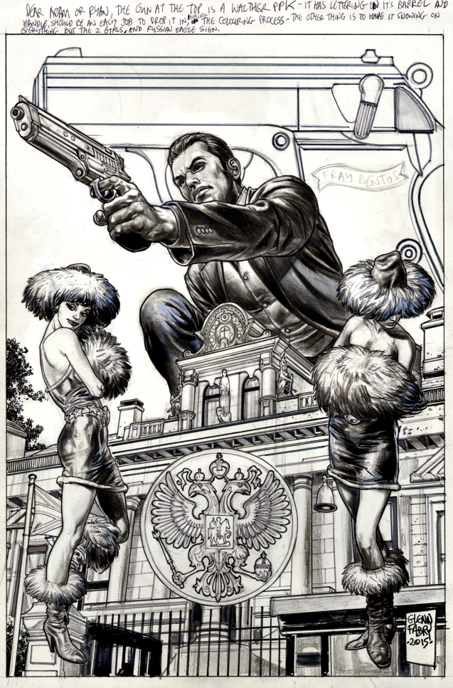
Glenn Fabry — Disappearing Act
James Bond #1 (Dynamite), November 2015
Today, after an 18-month pandemic induced delay, No Time To Die finally opens in the United States. We mark the occasion with our third, and final, piece of James Bond original art.
Ah, comic book art in the age of powerful digital technology. This original cover by Glenn Fabry starts off with two beautiful Russian women, but ultimately ends up without them.
(The gun in the background also disappears between solicitation and actual publication, but that is more a function of the trade dress choice, and certainly less jarring.)
Digital manipulation aside, it’s still a cool cover. And kudos to Dynamite for landing the rights. At IDW Publishing, we hounded the rights holder(s) endlessly and continuously came up empty handed. (I’m sure other publishers tried as well.)
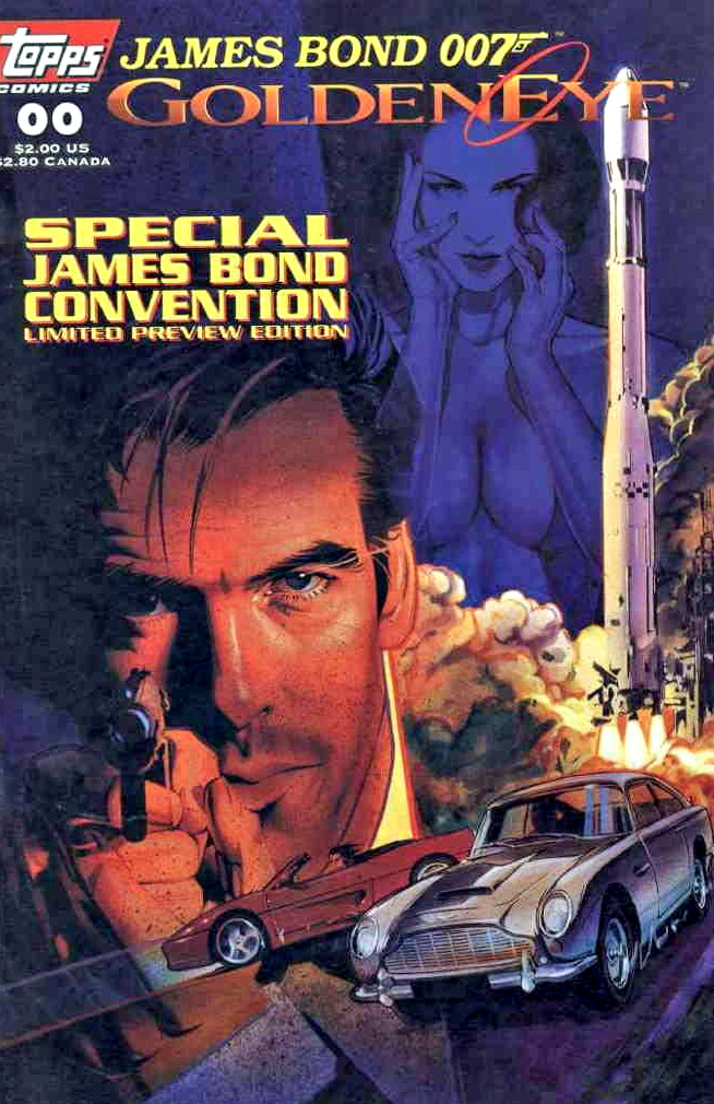
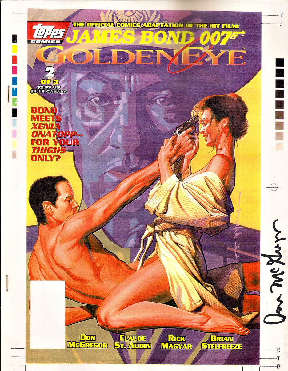
And speaking of disappearing acts — When I was at Topps Comics, we acquired the Goldeneye (Pierce Brosnan’s first outing as Bond) rights in 1995. We launched with a first issue of what was planned as a three-issue adaptation. Unfortunately, issues two and three never appeared. In addition to approvals that came in at the speed of molasses, the licensor — and I kid you not — objected to the adult material that was appearing in the comics.
Nothing crazy — just the same “adult” material that appears in the film.
Seriously.