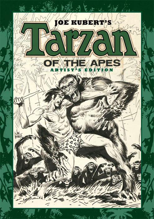
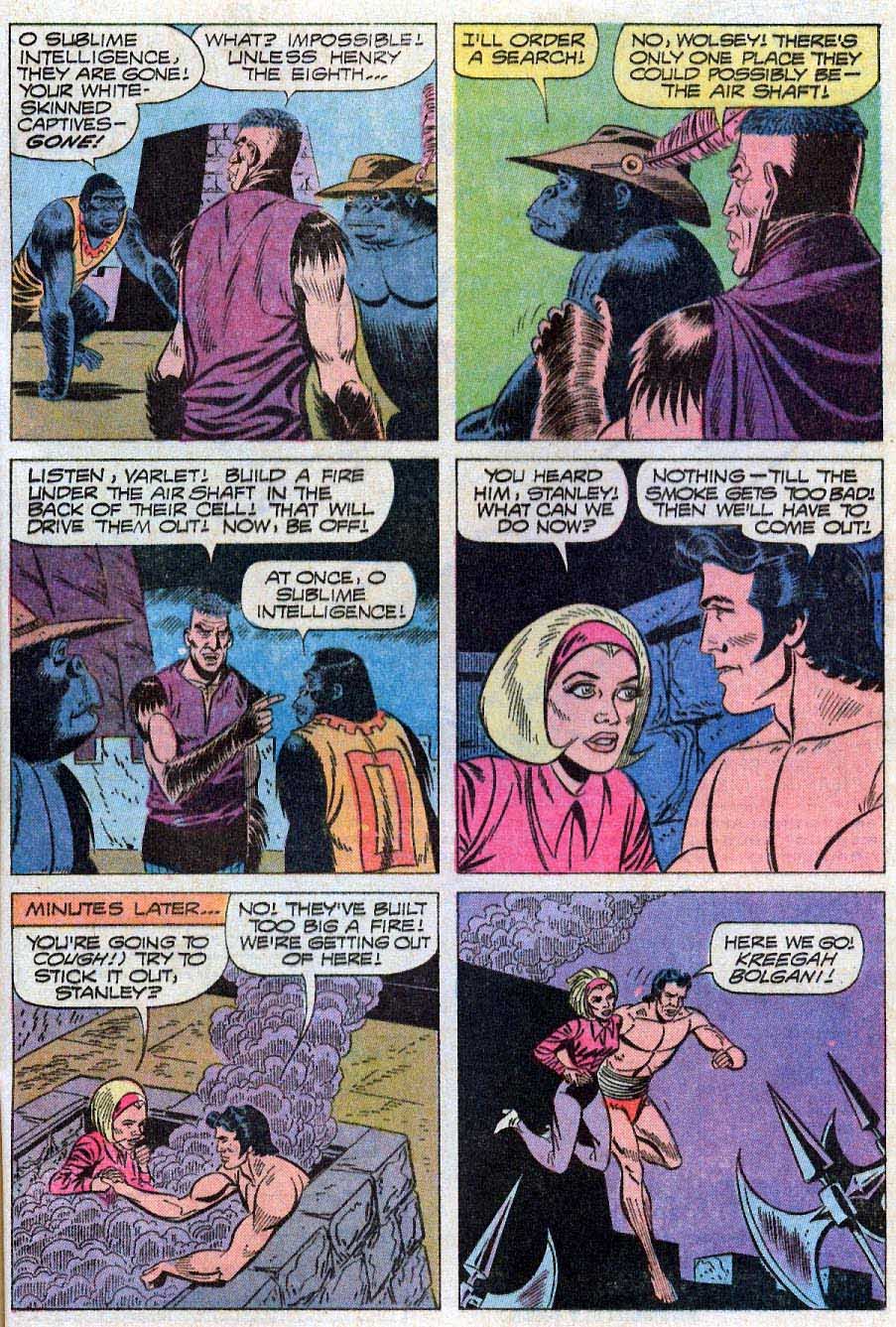
Joe Kubert — Tarzan, Unvarnished
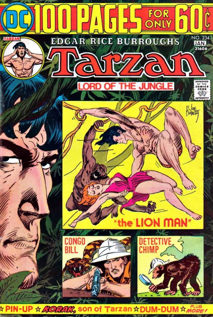
Tarzan #234, January 1975

2022 is the 110th anniversary of Edgar Rice Burroughs’ jungle icon, Tarzan.
This year has at least two-other important Tarzan-related anniversaries:
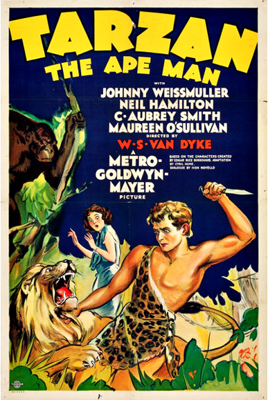
The first is 1932, the release year of the first Johnny Weissmuller Tarzan feature film. Tarzan existed on screen prior to the Weissmuller film, of course, but his 12 features likely did more to enshrine the character in the popular imagination than any other media representation.
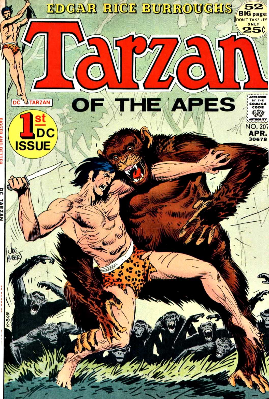
The second is 1972, the year DC took over the comic book license from Gold Key and re-established Tarzan as a savage lord of the Jungle. Joe Kubert’s comic art work on the character was the first that took the sheen of the character and returned him to his literary roots.
Long before “reboot” became part of the pop culture vocabulary, Kubert’s Tarzan was a stunning new look for comic book readers.
DC, as part its licensing deal, had to provide all the original art to the Burroughs estate. It’s still there in the archives, in excellent condition, and we used it to create three beautiful Artist’s Editions volume at IDW.
Ultimately, thought, this means that Kubert Tarzan pages are among the rarest of the last 50 years. With the exception of a handful, none of them have ever been offered on the open market.
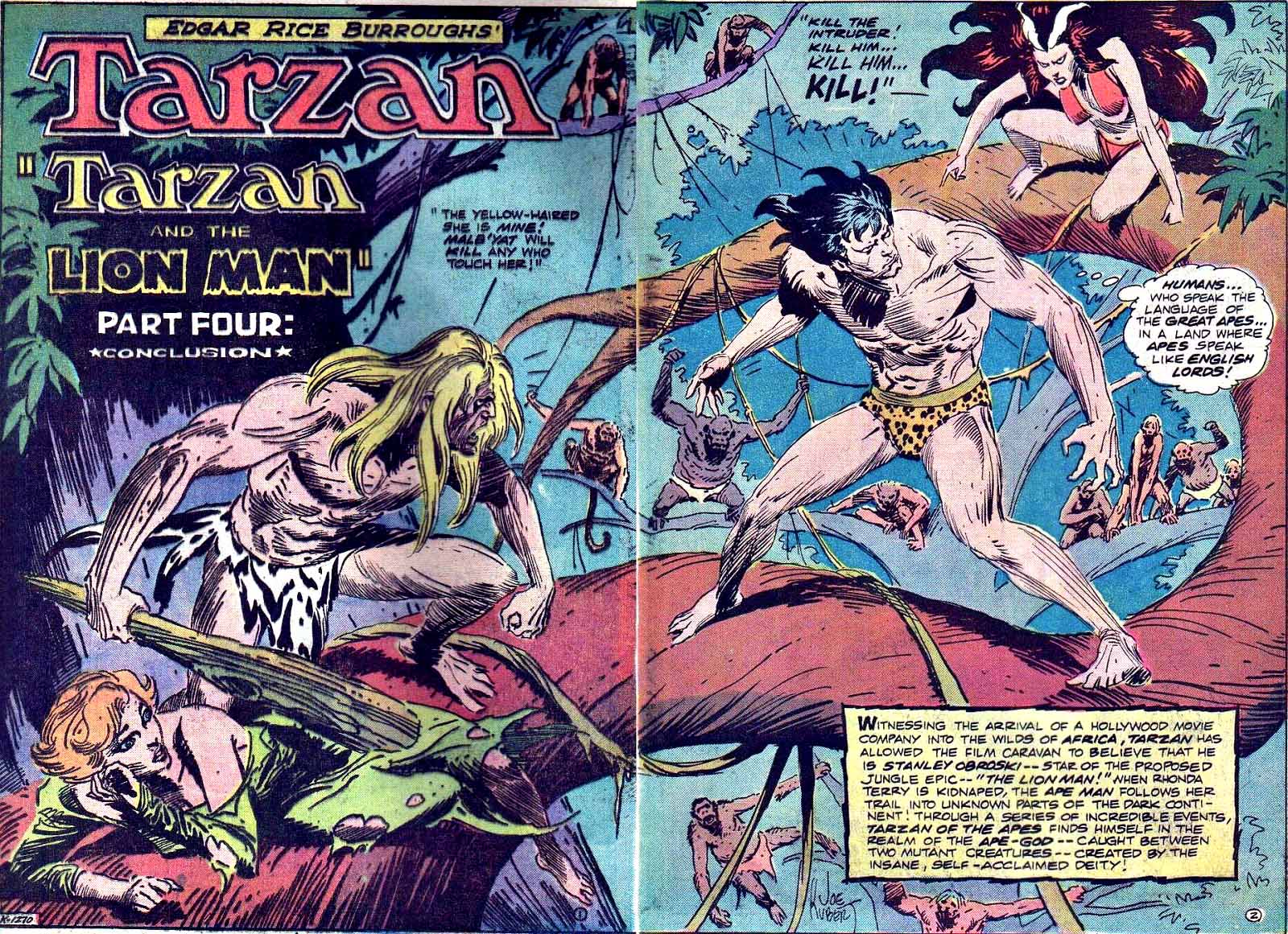
Joe originally gifted this splash, part of a DPS, to a friend.
I happened to see it the day it the day it came up for sale, and despite a lofty price, I acquired it then and there.
I knew I wouldn’t likely see another one.