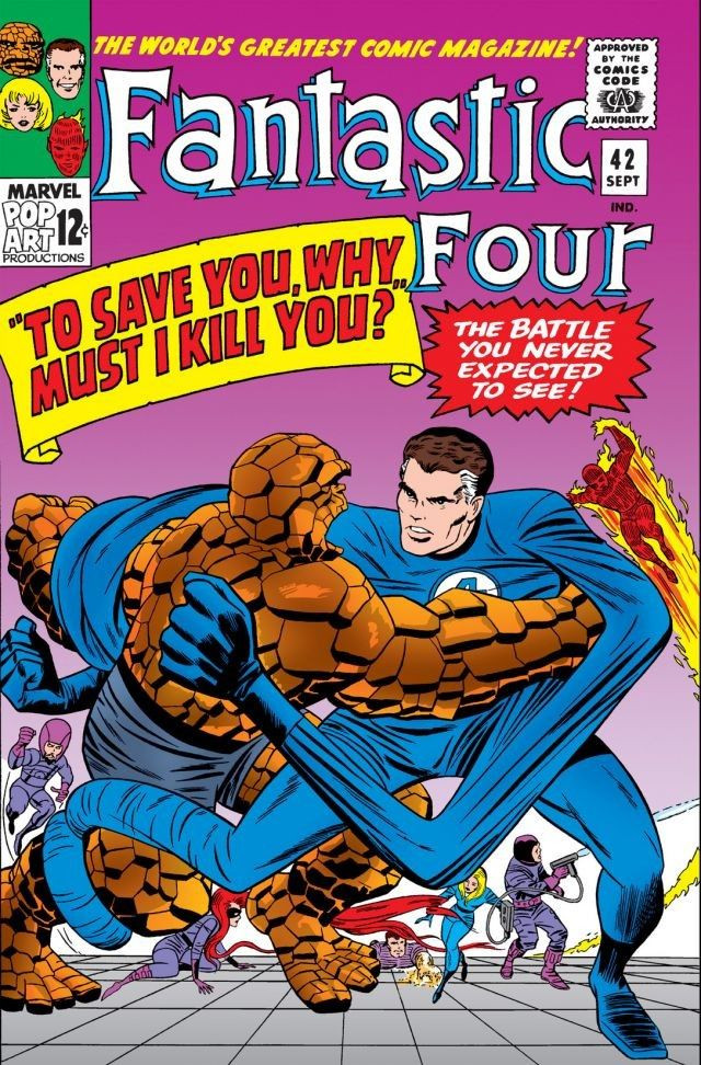
Jack Kirby. The Fantastic Four. A great action page from near the beginning of the peak three-year period of the comic that launched a cultural phenomenon.
Not much more to add here.
Except…2021 is the 60th anniversary of “The World’s Greatest Comics Magazine” and the “Marvel Age of Comics.”
60 years. That’s a big deal. Much more on the Fantastic Four to come during the next few weeks.
When I was a kid, G.I. Joe never looked like this.
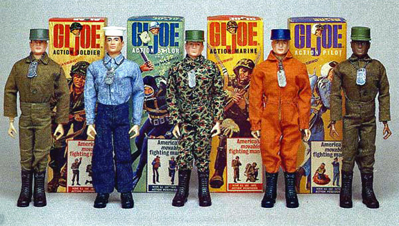
Of course, there’s an easy explanation for that. I grew up with the original Joe’s somewhat vanilla representations of America’s fighting forces. I loved them, as did most of my friends, but character development was not in the 60s line-up.
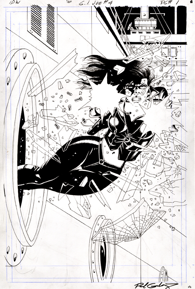
Characters like “bad girl” Baroness here were the result of Hasbro’s re-introduction and revamp of the brand in 1982. Marvel Comics was essentially paid to create colorful heroes and even more colorful bad guys. And they delivered, mainly with the creativity and guidance of writer Larry Hama.
The rest, as they say (Ok, I say it a lot) is history.
IDW became publisher of record shortly after I cane on board in 2008, and has had some terrific success with various iterations during the last dozen years.
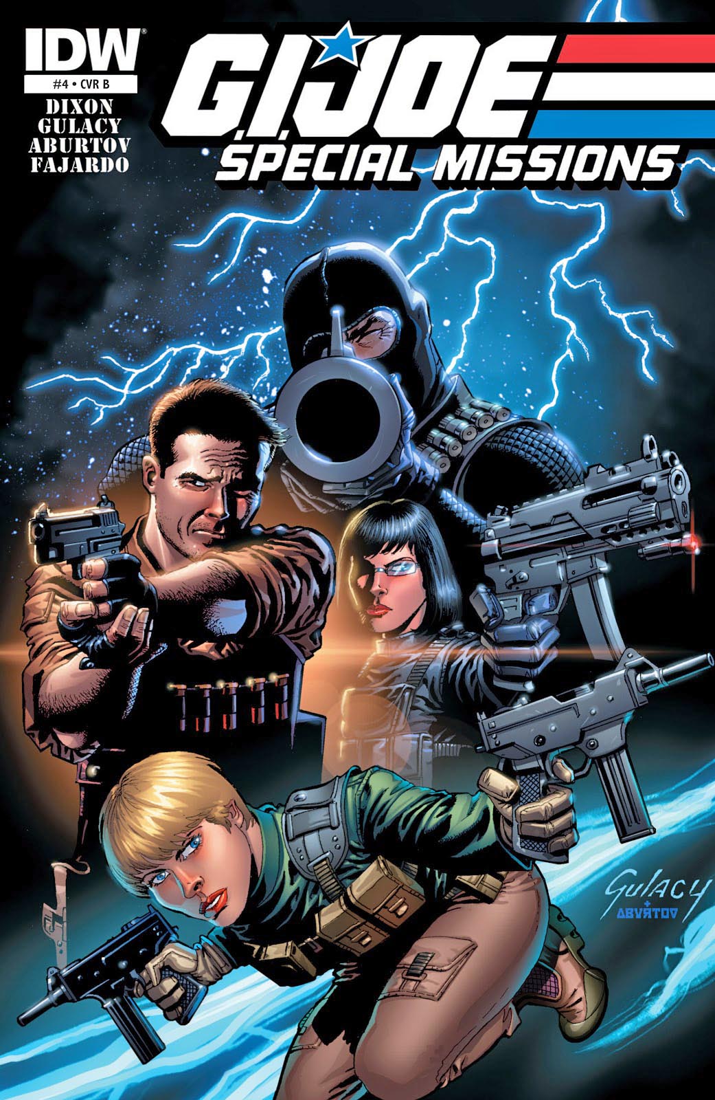
This Special Missions series is a fine example, with script by Chuck Dixon and terrific visual storytelling by fan favorite Paul Gulacy.
I acquired a few pages from this series, including this dynamic splash, but another one of these pages comes with a unusual annecdote, which I will share down the road. (I’d bet you can’t wait, but I’d lose.)
And so, 2020 finally comes to an end. Whew. Here’s looking forward to a much better 2021. We will be back on Thursday, January 7, with a special year-opening series on… well… that will be telling. See you soon, and thanks again for visiting.
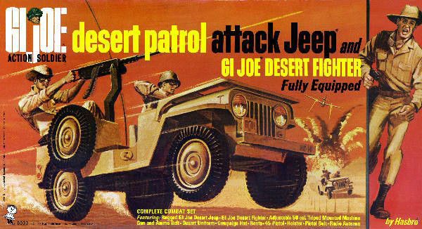
The original G.I. Joe included a desert jeep and related gear, capitalizing on the brief success of the Rat Patrol television series. I was obsessed with this vehicle.
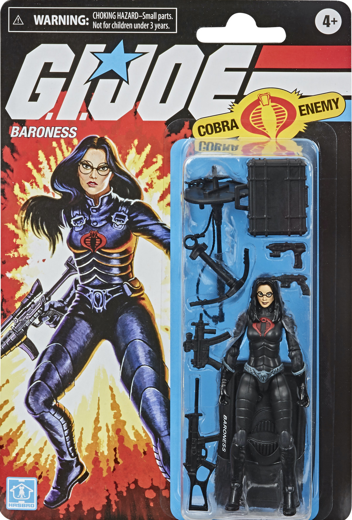
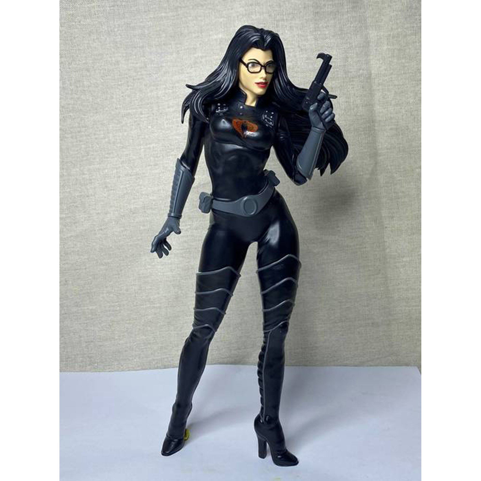
Cobra’s Baroness started out as a sexy character back in the 80s, but became even sexier as figure design and sculpting moved into the digital age.
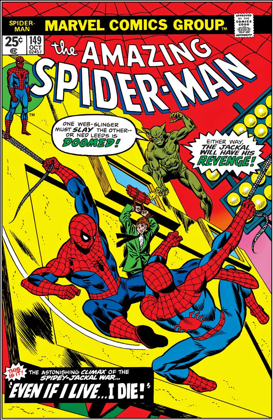
Ben Reilly is Peter Parker’s clone. Ben Reilly died, Peter Parker lived.
No, wait. Ben Reilly lived; it was actually Parker that died.
Scratch that. Ben Reilly thought he was Peter Parker, but he actually WAS Peter Parker, who thought he was Ben Reilly.
No, wait, that’s not right either…
The clone saga is one of Marvel’s most controversial storylines from the 90s. I remember having a very spirited conversation about the subject with Tom Defalco back in 1995 or so at SDCC when it seemed like it was going to go on forever and ever. I’m sure I wasn’t the only one.
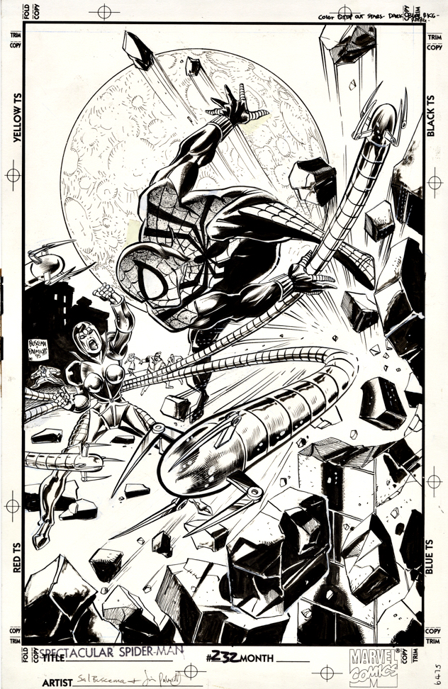
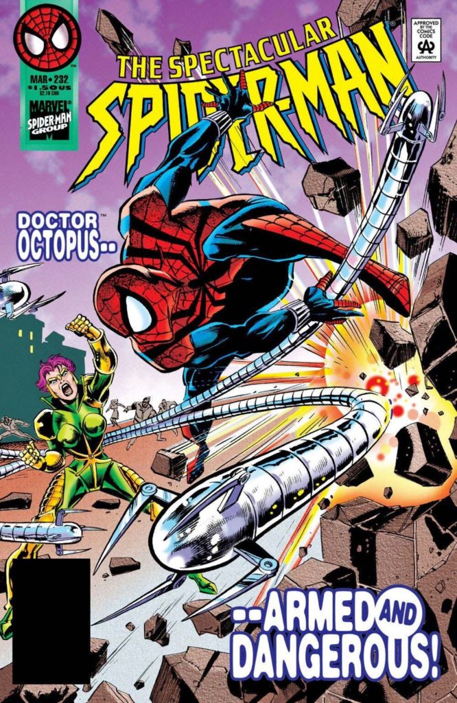
In this issue of Spectacular Spider-Man, this is actually Ben Reilly fighting as Spider-man, (theoretically) while Peter Parker is in brief retirement with the very pregnant Mary Jane.
Regardless, Sal Buscema draws a knockout cover, with inks by Jimmy Palmiotti, as Spidey (real or Memorex) faces Lady Octopus in mortal combat.
And where did that crazy moon go from original art to final colored, published version? I have no idea. Although I almost titled this post, “Goodnight Moon.”
The 1994-1996 clone saga has its roots in a much more accessible run of Spider-Man 20 years prior.
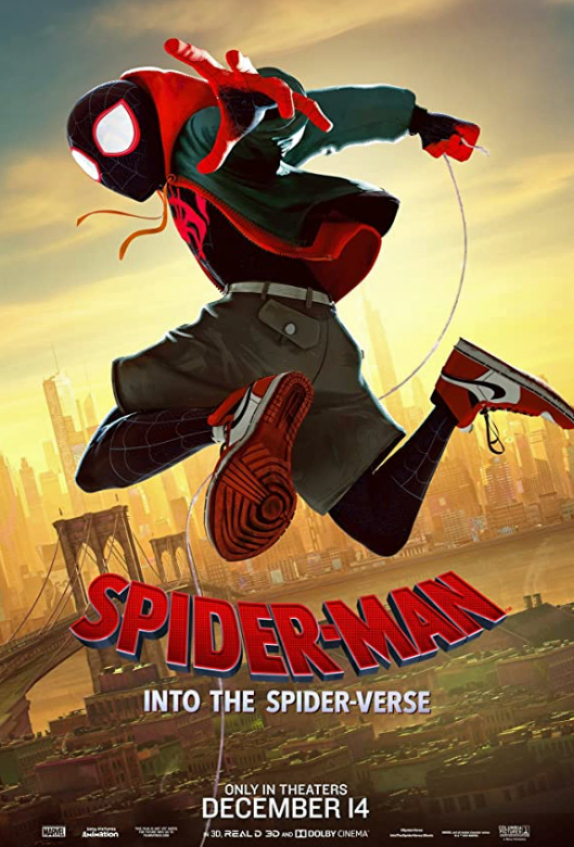
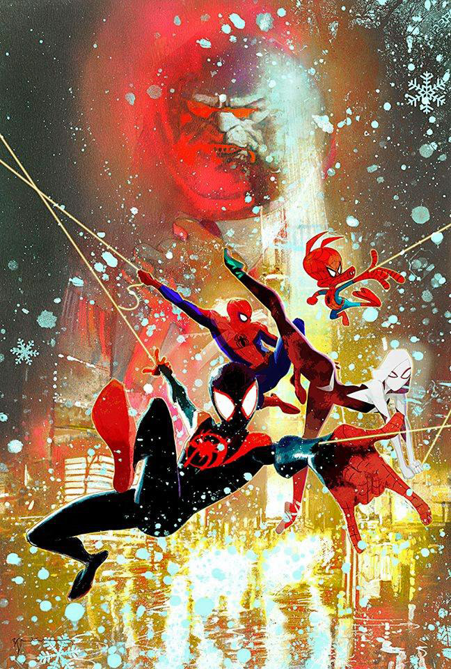
Continuing our celebration of the two-year anniversary of the groundbreaking animated film, Spider-Man: Into The Spider-Verse.
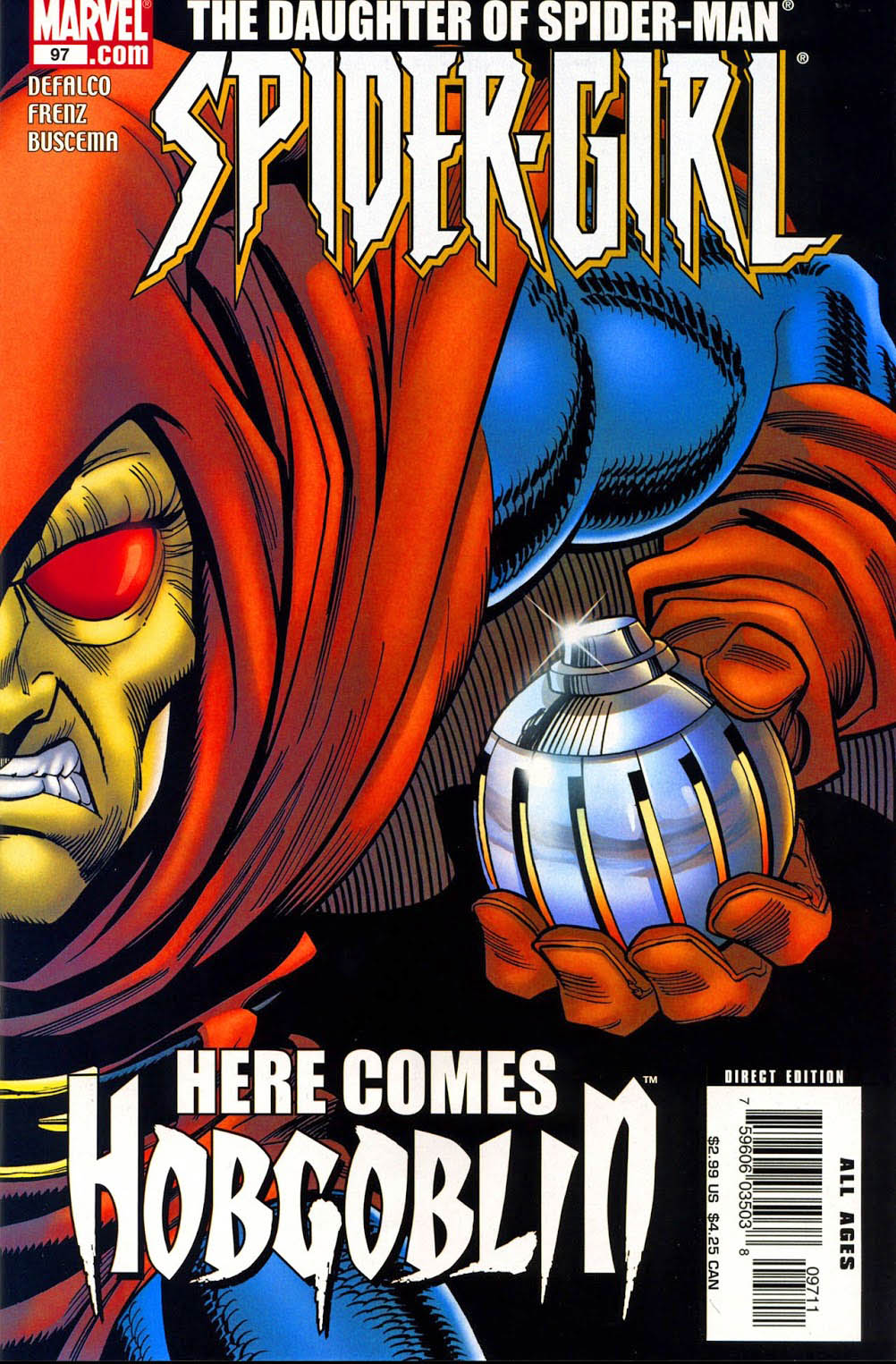
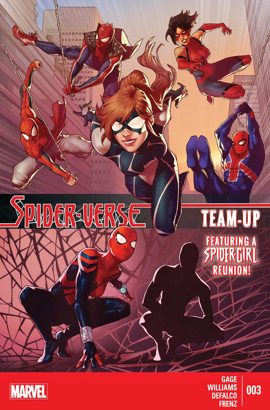
The original Spider-Girl (The “future” daughter of Peter Parker and Mary Jane Watson) is a member of the Spider-Verse who refused to die. Every time her series was on the verge of cancellation, a small, but very passionate group of fans persuaded Marvel to keep he book going. You can read more about that here and here.
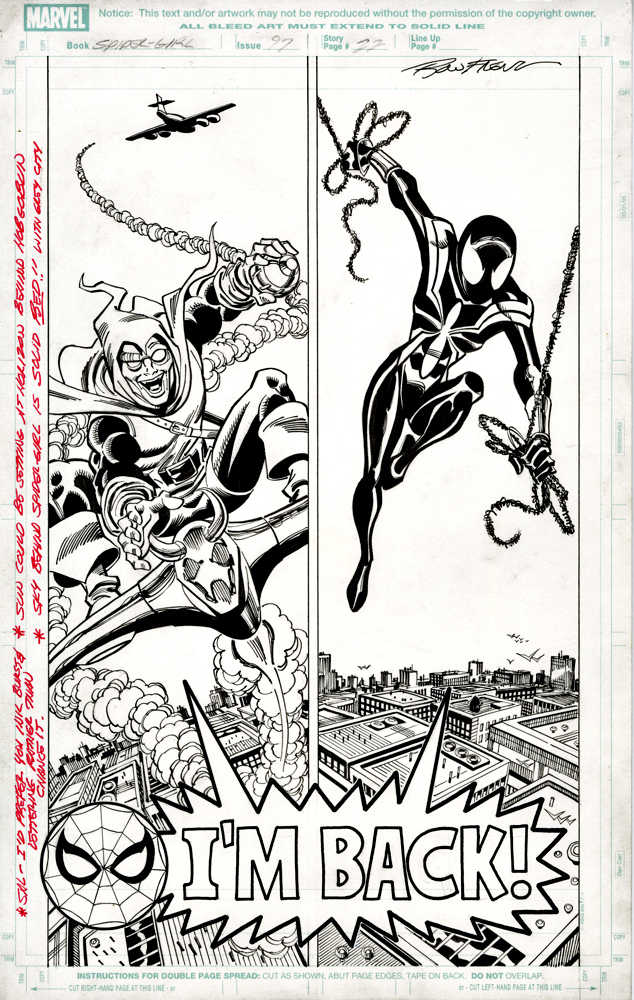
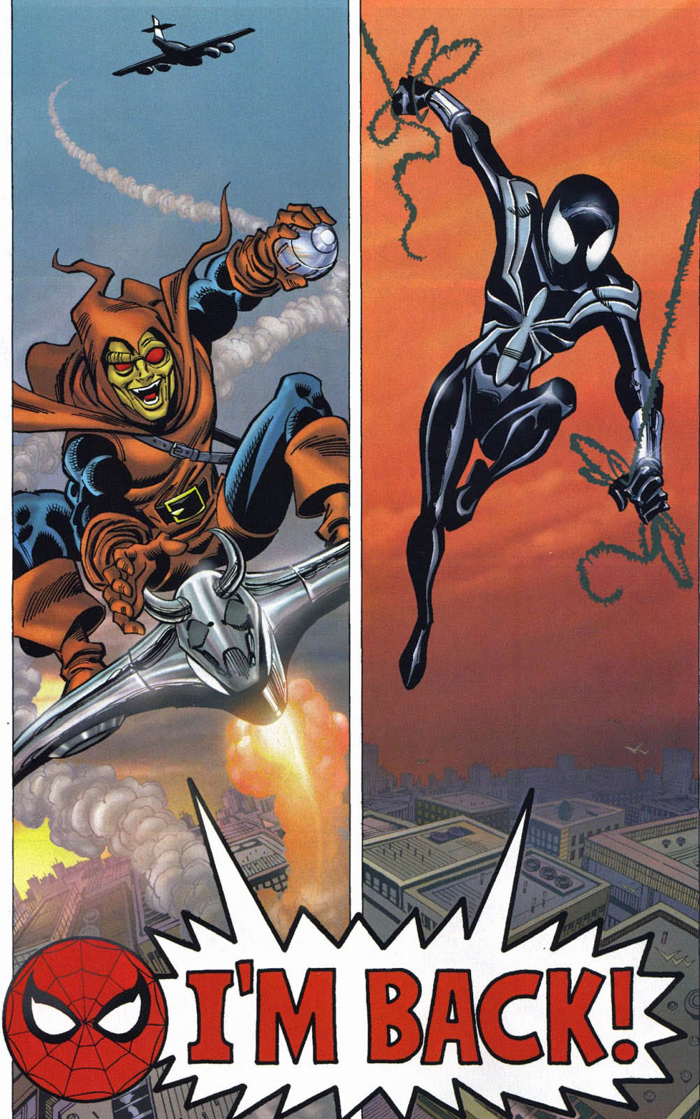
In this story arc, the final one of the first 100-issue ongoing series, the original Hobgoblin returns, and Spider-Girl switches to the black spider-costume. This of course echoes the choice made by her dad way back in the historic Amazing Spider-Man #252 (May 1984), also penciled by the talented Mr. Frenz. (And Ron also drew the original Hobgoblin saga in ASM as well.)
And this vertical split screen “mirror” effect on the final page? Seldom used, but very cool. I don’t own another page like it.
Two years ago this week, many of us settled into a comfy (hopefully) movie theater seat to catch Spider-Man: Into the Spider-Verse. I think I’m speaking for the majority of filmgoers when I say: “Brain Blown.”
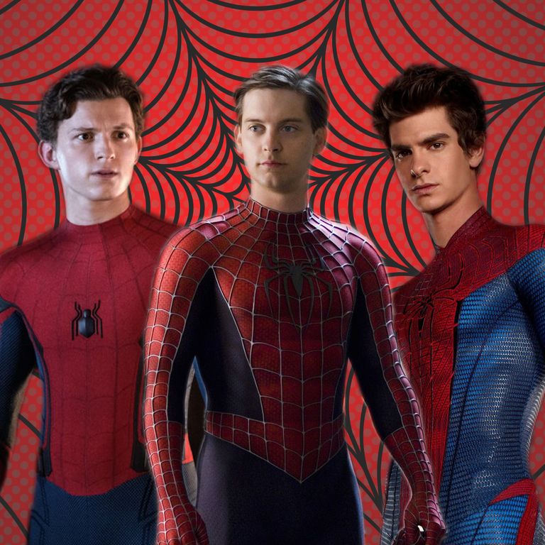
The Spider-Verse concept was so successful in this ground breaking animated film, that apparently some of its alternate Spidey universes appear to be creeping into the next live action Spider-Man film, currently due in theaters in a year from now.
Rumors are swirling in recent weeks that many actors and characters from the two previous Spider-Man film universes will reappear in this film, with supposedly Jamie Foxx (Electro) and Alfred Molina (Doctor Octopus) confirmed.
A multiverse Sinister Six? I say, bring it on! (I’ve confessed my love of multiverse storylines previously.)
Meanwhile, in the comics, you don’t have to wait for Disney and Sony and the talent and the screenwriter and the director to have a meeting of the minds.
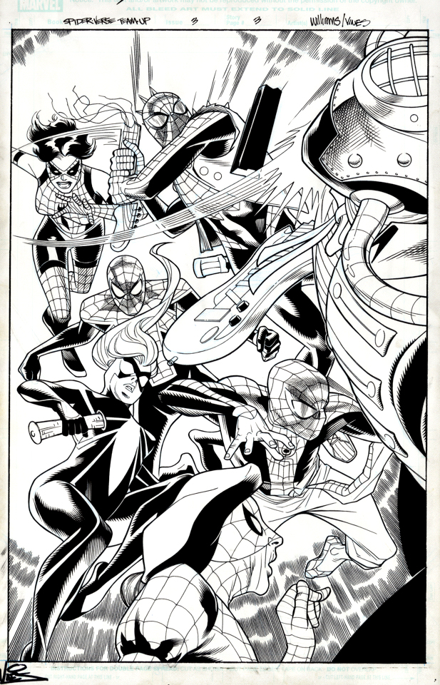
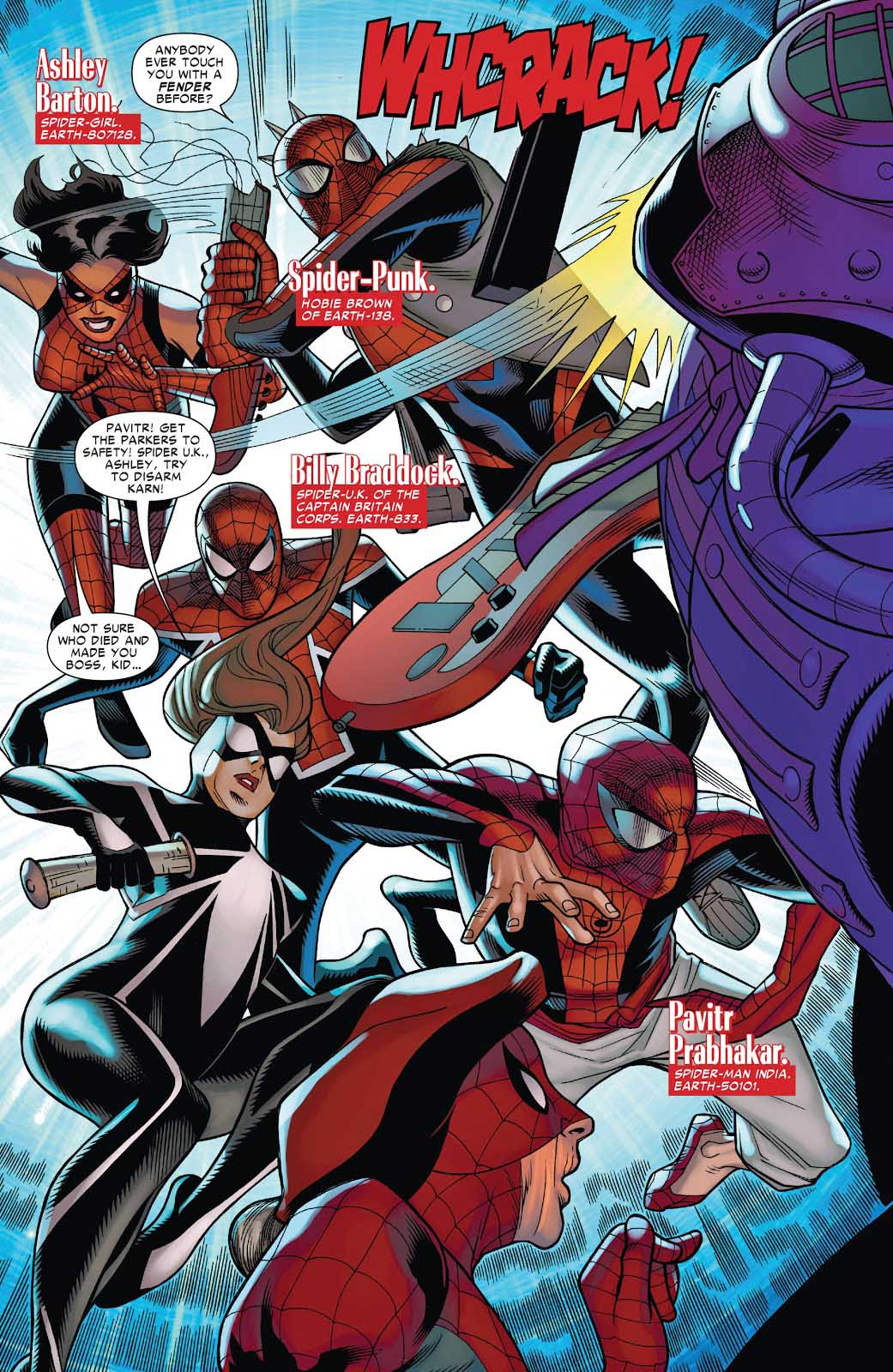
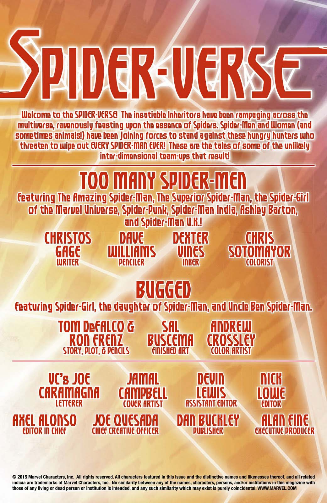
You can simply read any number of Spider-Verse related comic book titles, including this one featuring art by the vastly underrated David Williams.
Here you get six Spider-People for the price of one. Seems like a good deal to me.
The film poster, the original art for Bill Sienkiewicz’s promo poster, and the cover to IDW’s Marvel Action :Spider-Man featuring the first comic book team-up of Peter Parker, Miles Morales and Spider-Gwen.
All three actors in one Spider-Man film? You never know…
Concluding our tribute to Captain America’s 80th anniversary.
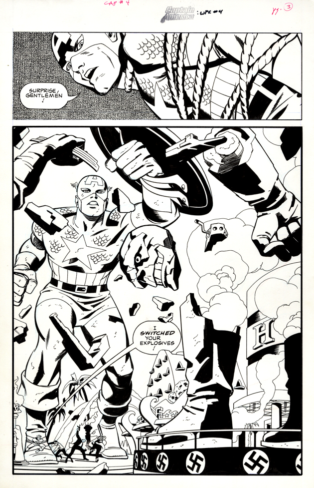
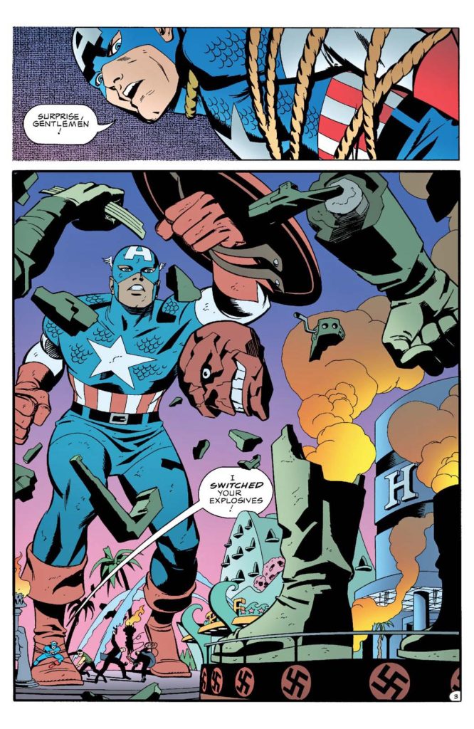
Ah Las Vegas.
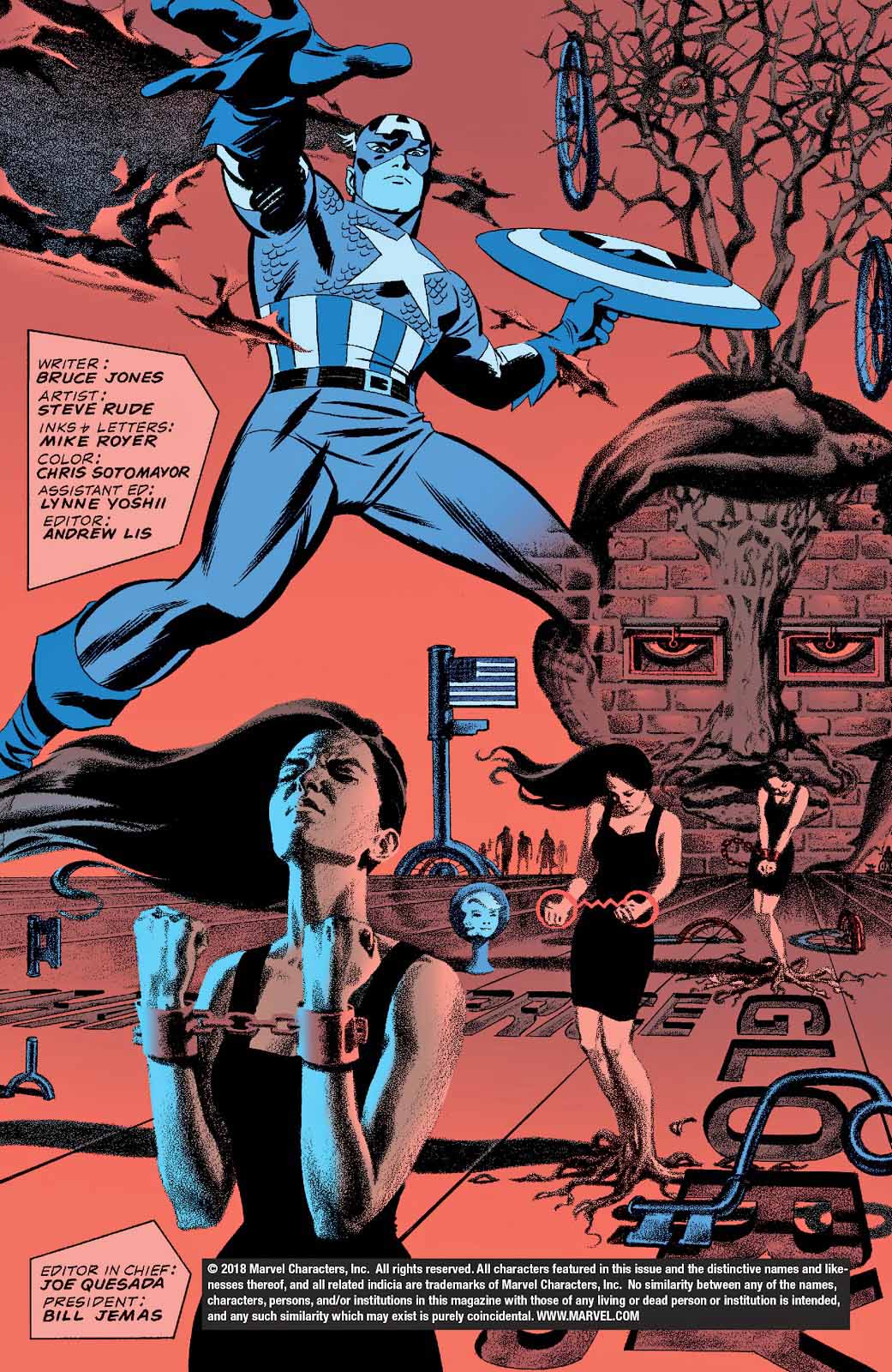
The only place where you are likely to find a giant statue of Captain America, yes? But even Las Vegas wouldn’t have accepted a giant statue of the Red Skull — swastikas and all. (Imagine a giant Patton statue facing off against a giant Rommel sculpture. It does not compute. ) It’s a rare slip in an otherwise fun Cap mini-series penned by Bruce Jones with beautiful visual storytelling by Steve Rude and Mike Royer.
And the good news is that the Skull statue that gets blown to smithereens on this great splash page, anyway.
Happy 80th Mr. Rogers!
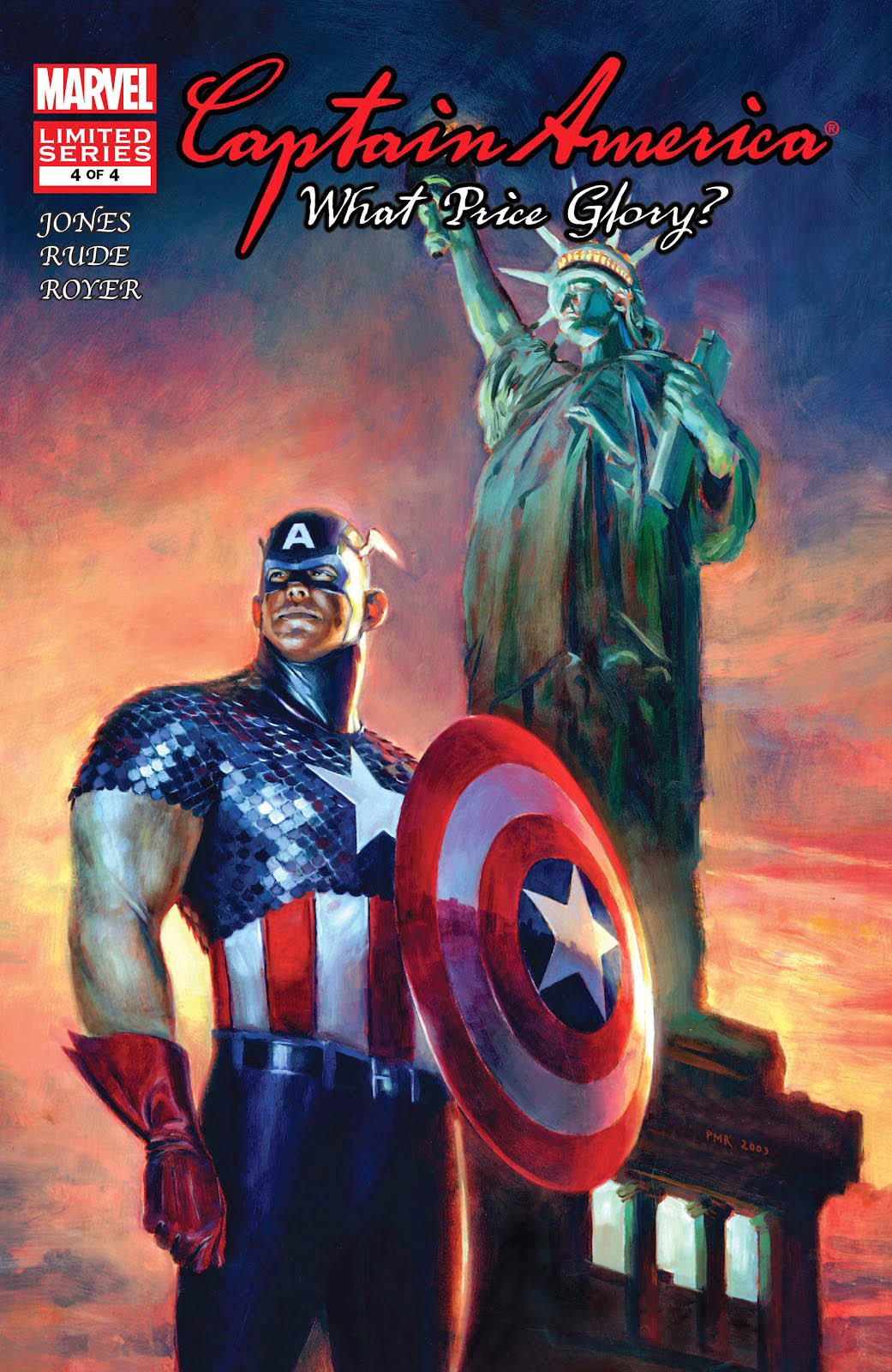
In addition to the obvious Jack Kirby references throughout, Rude manages to work in a Steranko homage on the opening page of the issue. Meanwhile JG Jones delivers a surprisingly boring and stiff painting of Cap on the cover, which, to make matters worse, looks like it belongs to a completely different series altogether.
The “impersonation” trope is one of my favorites in comics, and a long-standing tradition in Marvel’s history. In fact, the first time Captain America “appears” in the Silver Age in Strange Tales #114, it’s not Captain America at all. It’s a Human Torch villain, The Acrobat, in disguise.
And this trope was consistently employed throughout the early Marvel Comics. The Skrulls impersonate the Fantastic Four in issue #2, The Chameleon impersonates Spider-Man in ASM #1, and the Avengers are nearly defeated by the shape-changing Space Phantom in issue #2 of their launch title.
Stan was obsessed with this concept, apparently.
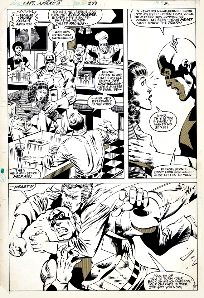
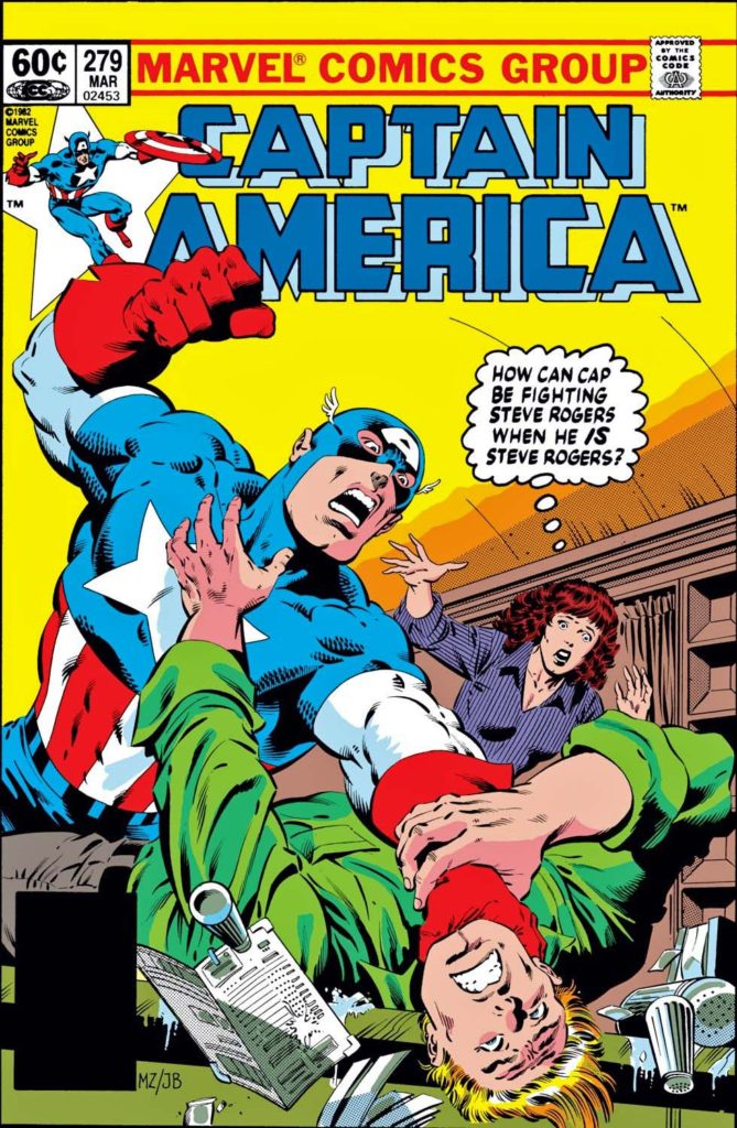
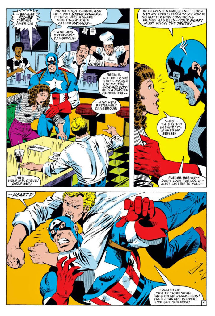
For the record, here on this terrific action page by Mike Zeck and John Beatty, the uniformed Cap is the “real” one. The clown impersonating Steve Rogers is Primus, The Mutate.
File that under: “Don’t Ask, Don’t Tell.”
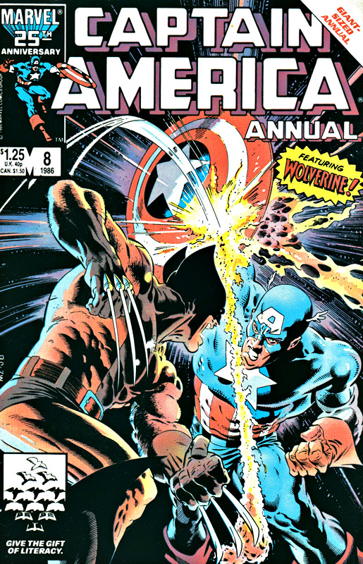
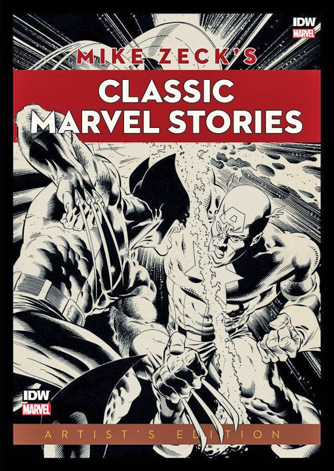
Zeck drew one of the most iconic images of the era: Captain America vs. Wolverine.
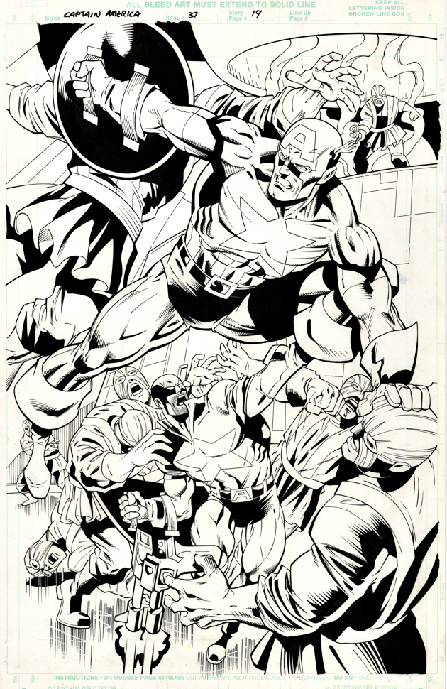
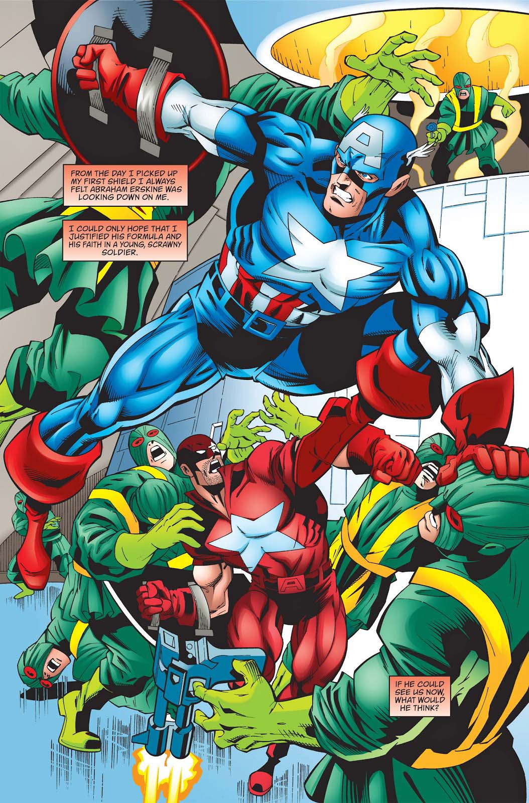
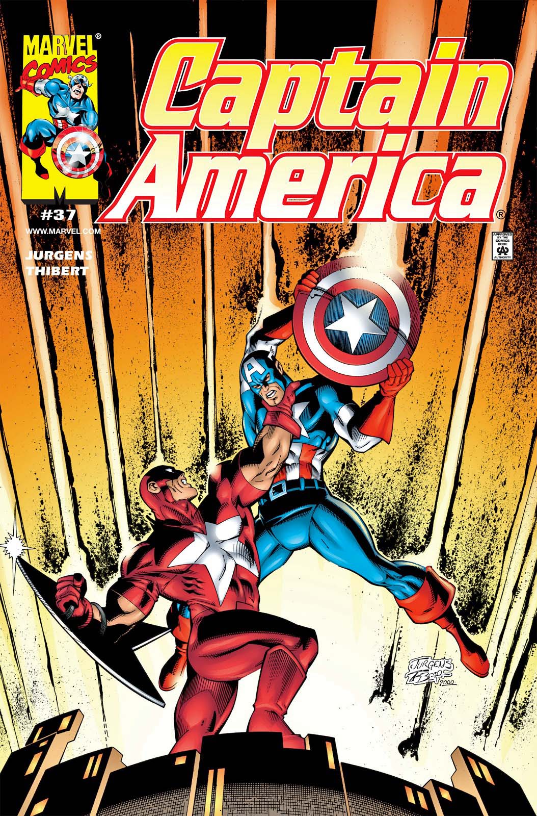
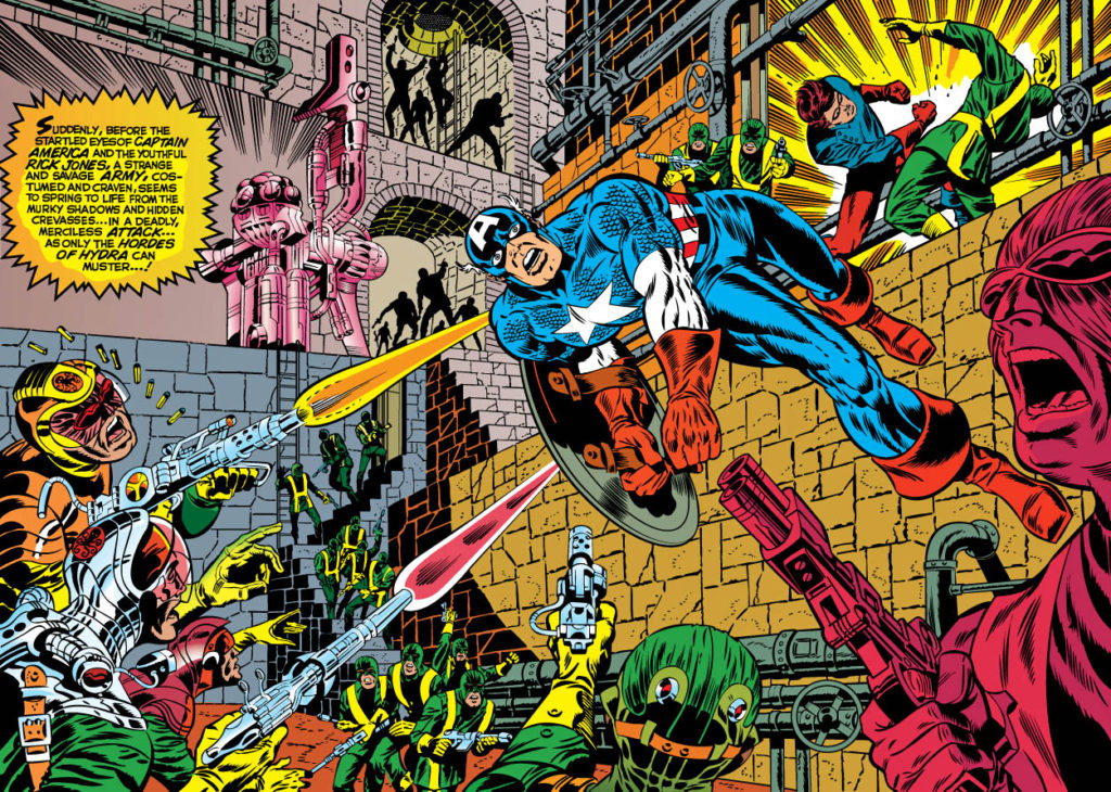
Dan Jurgens delivers a dynamic and powerful splash of Captain America fighting the hordes of Hydra. Whenever I look at this page, I’m reminded of Jim Steranko’s great double page spreads of Cap in action against similar — or — greater odds.
Dan’s splash is not a swipe — and possibly not even a purposeful homage — but its energy captures the spirit of that great Steranko run.
This is the part where I should swipe Stan Lee and say “Nuff said, “ except I would be remiss if I didn’t mention the other main figure on the page who appears at first glance to be The Red Guardian.
He is not. He is, in fact, “Protocide,” an early super soldier experiment retconned into Cap’s continuity — and pretty much retconned out, after the Jurgens run ended.
Now I can say it:
“Nuff Said.”
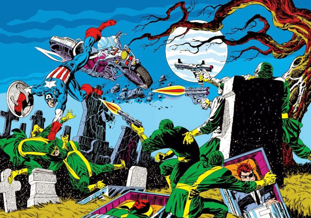
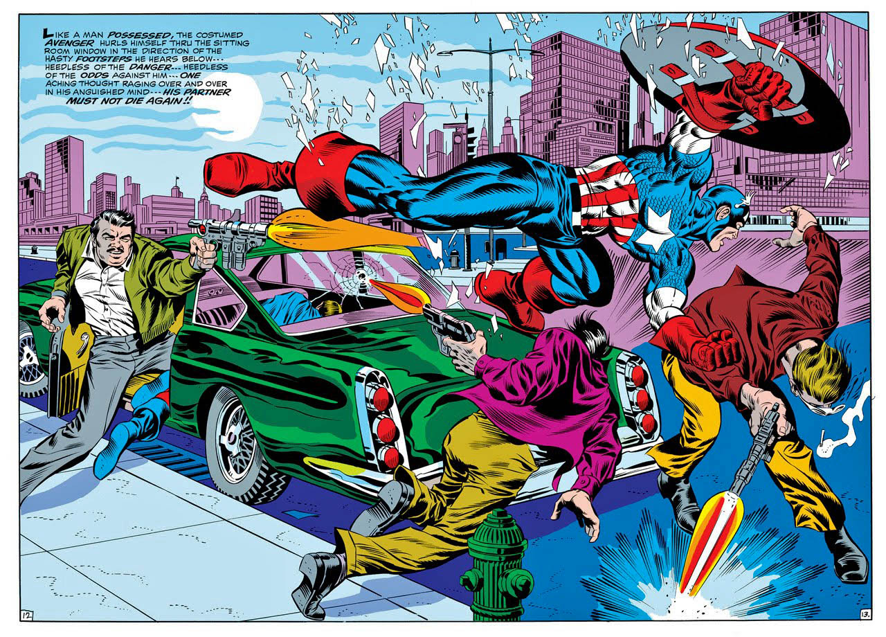
Steranko’s great splashes always had Cap in mid-air, performing improbable acrobatics against impossible odds!
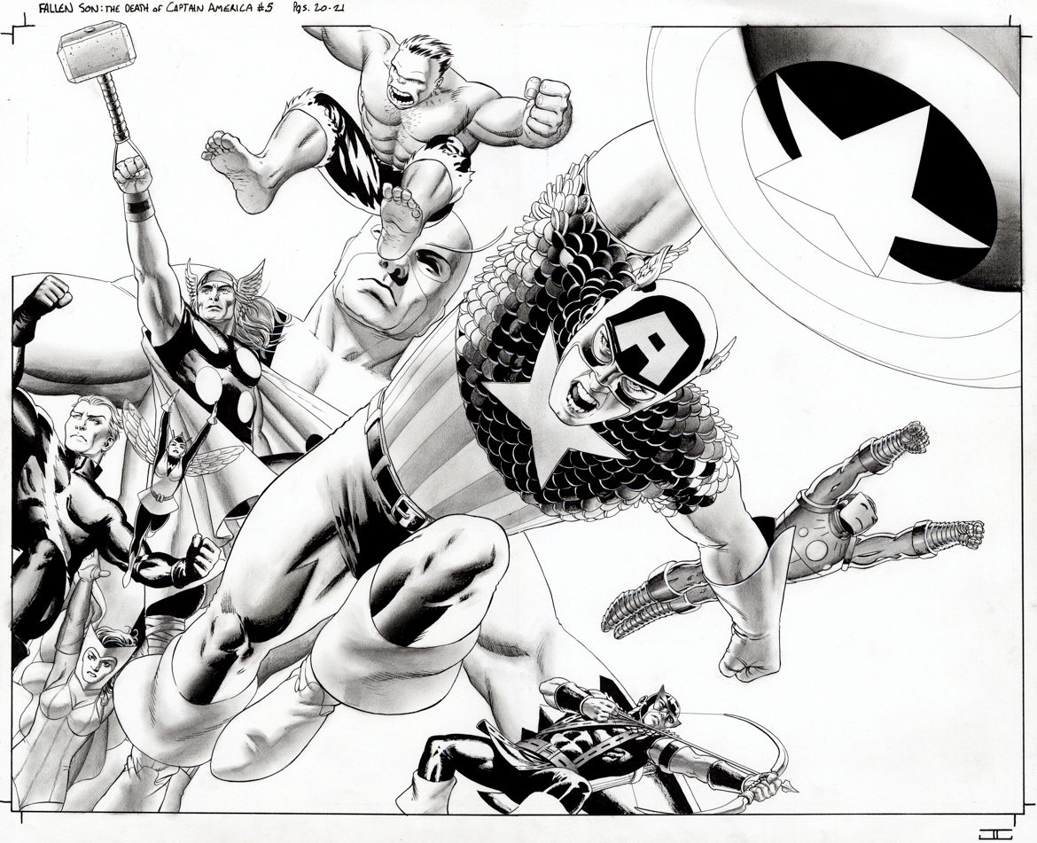
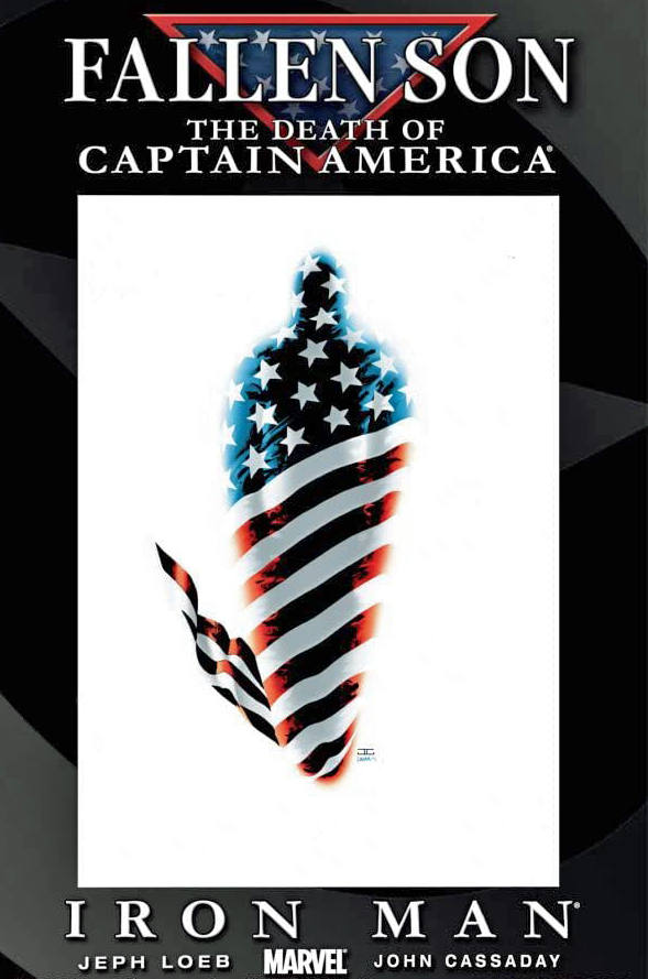
Fallen Son: The Death Of Captain America #5, August 2007
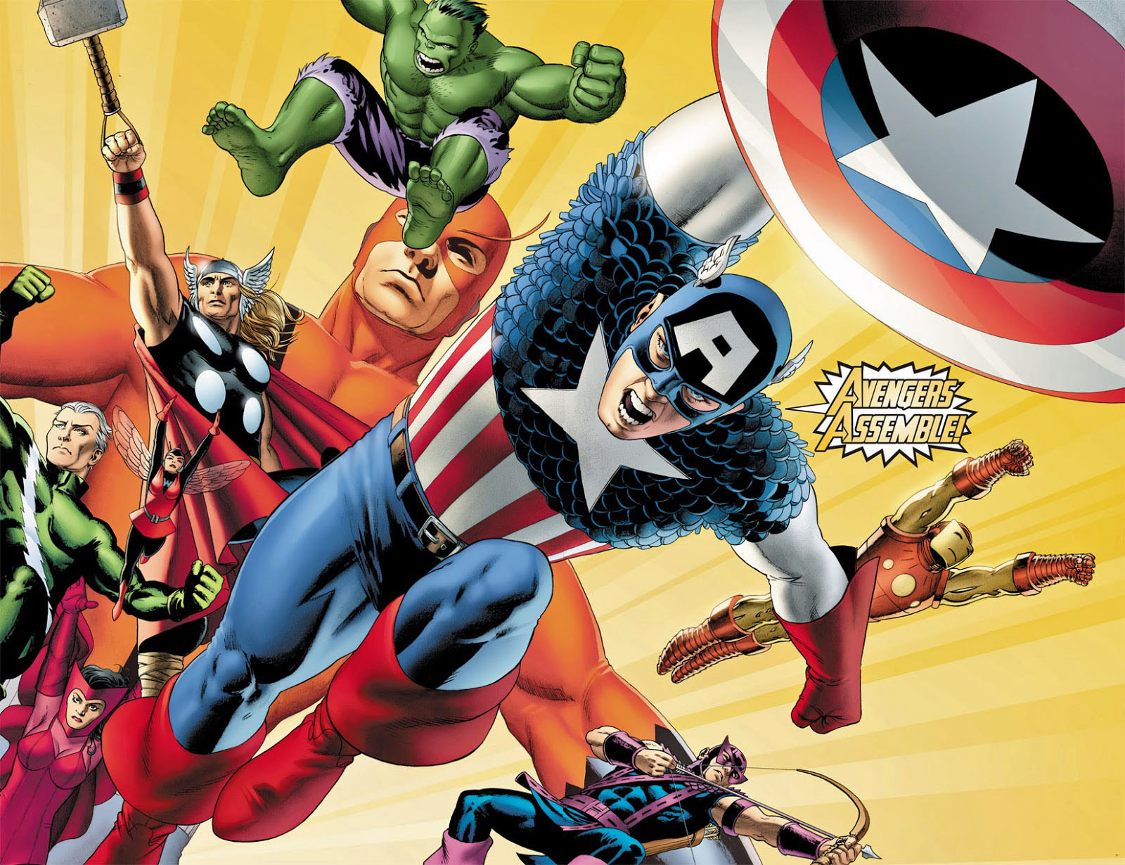
John Cassaday — a fan favorite artist if ever there was one — delivers a striking double-page splash of the Silver Age Avengers, with Captain America dominating the scene.
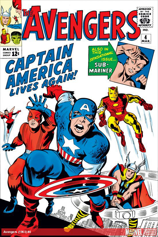
In the original comic, it was the Avengers that discovered the World War 2 legend floating in suspended animation in (essentially) a large ice cube. Of course, they never would have found him if it wasn’t for another Golden Age icon, Namor the Sub-Mariner, but as always, we digress.
This rendering actually combines multiple 60s Avengers line-ups into one image; The Hulk quit in a huff at the end of issue #2, fought against the team in issue #3, and was MIA by the time Cap thawed out in issue #4.
Cassaday’s art is stunning throughout this issue, but, biasedly perhaps, I think this is by far the best page(s) among many great ones.
The spread has appeared as both a poster and a limited edition Giclee, so, clearly it’s had some impact.
Assemble indeed!
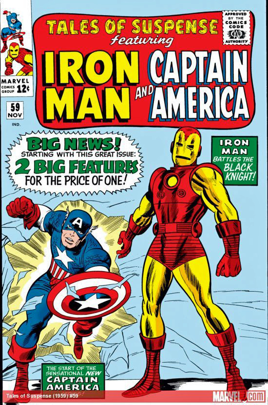
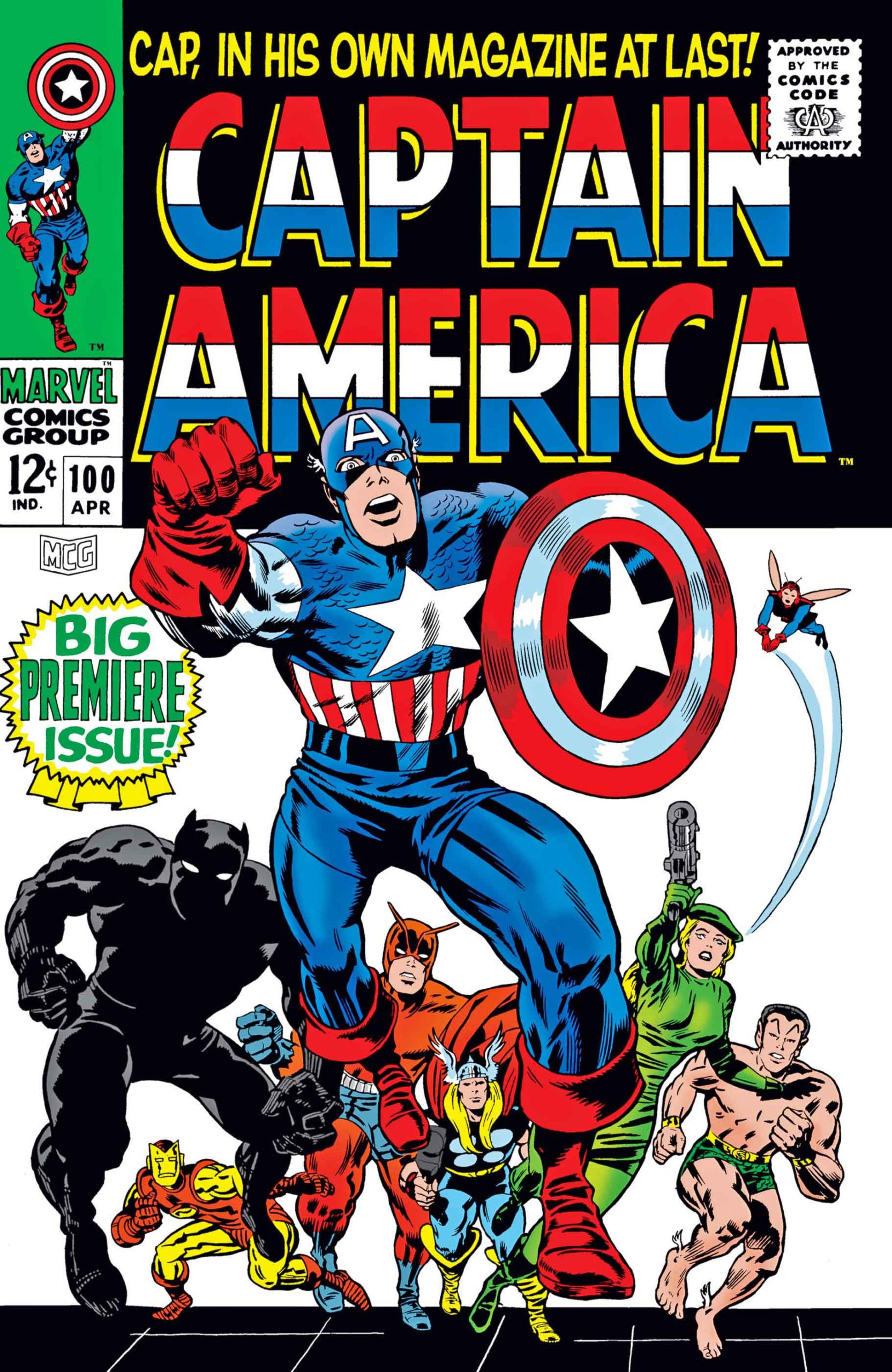
In short order, Cap returned to the Marvel line-up, received his own solo feature, and then a few years later, his own series. (Picking up the numbering from Tales of Suspense.)
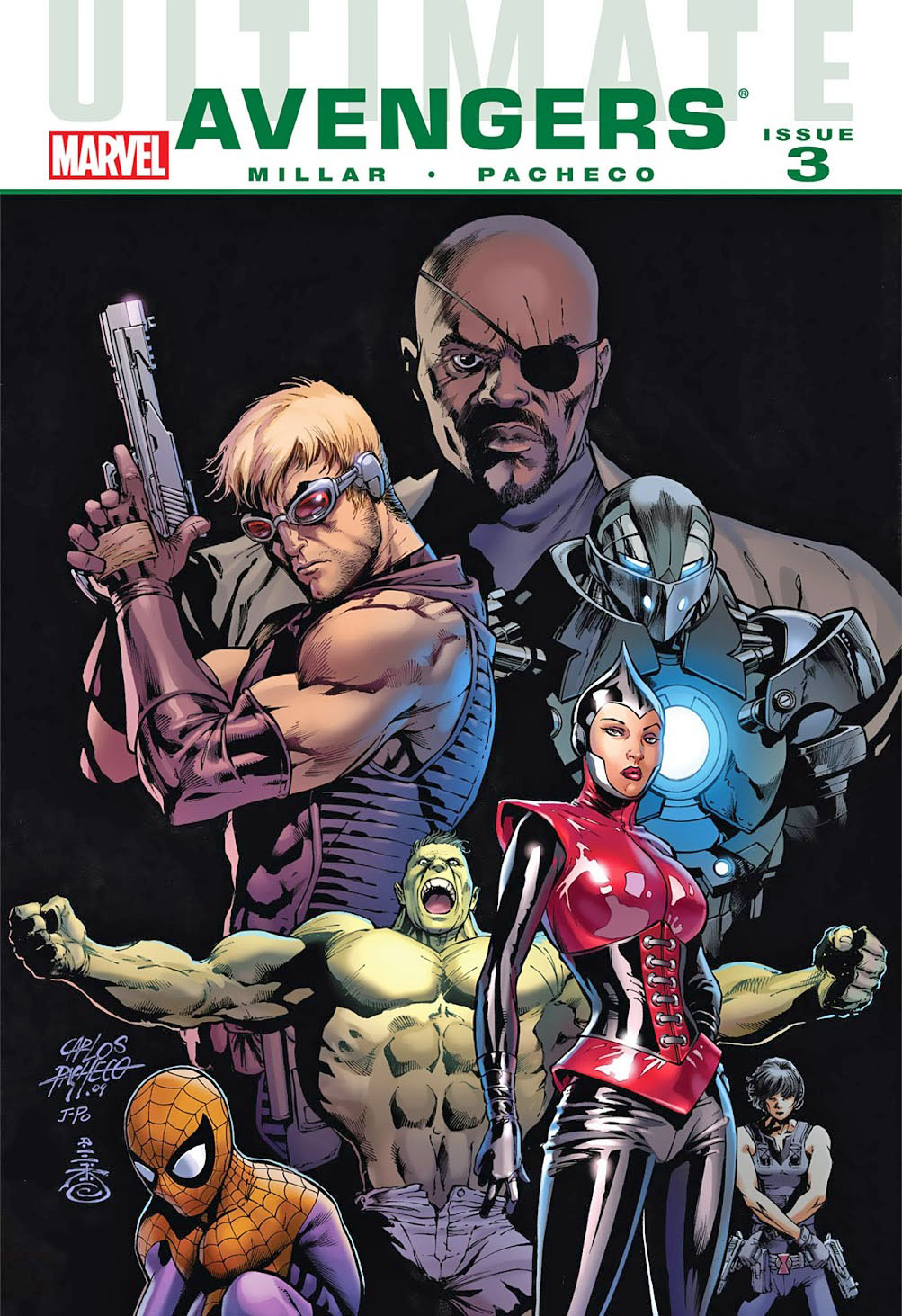
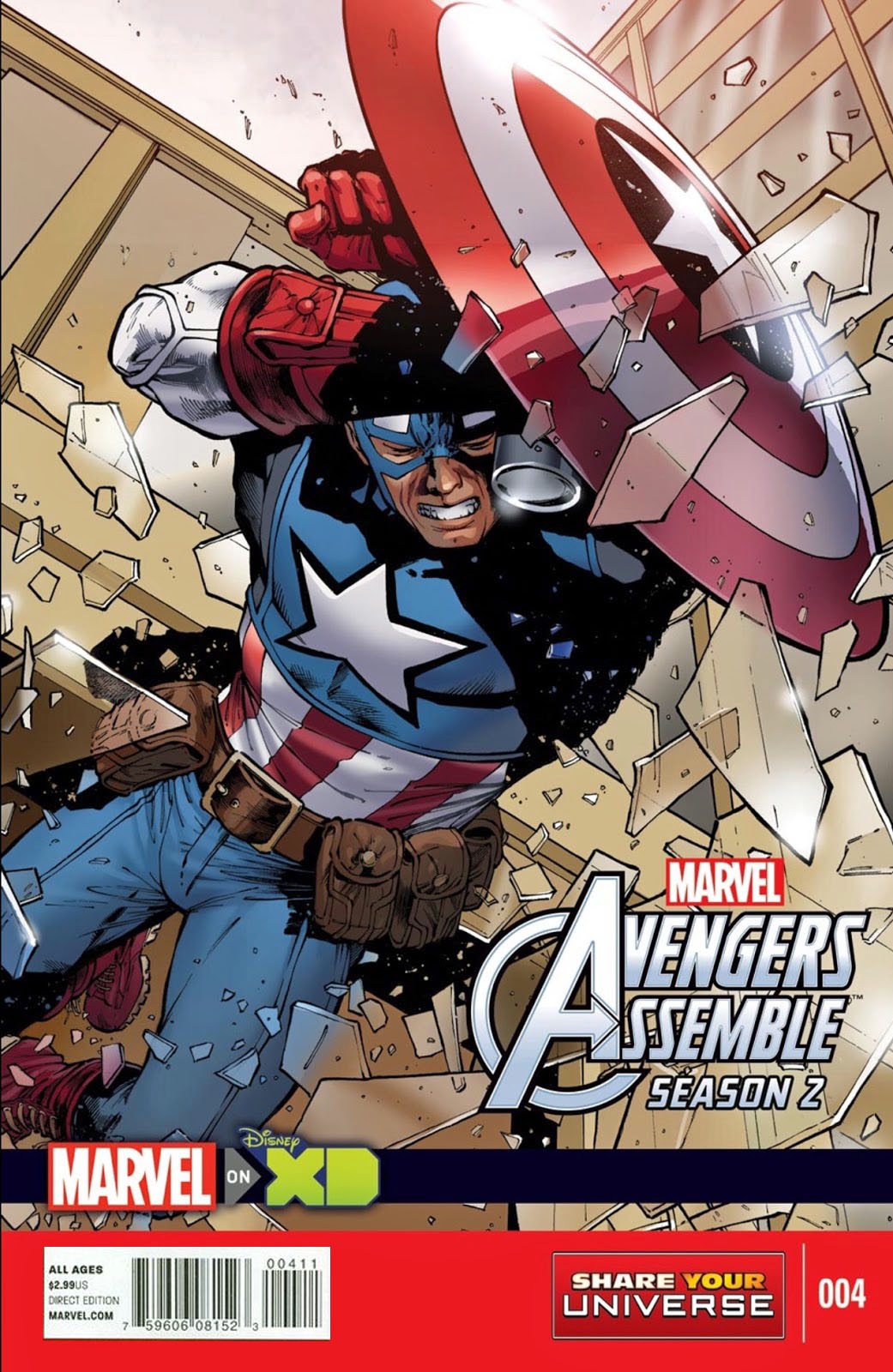
Ultimate Avengers #3, December 2009, and Avengers Assemble Season 2 (Marvel Universe) #4, 2015
Continuing our tribute to Captain America’s 80th anniversary.
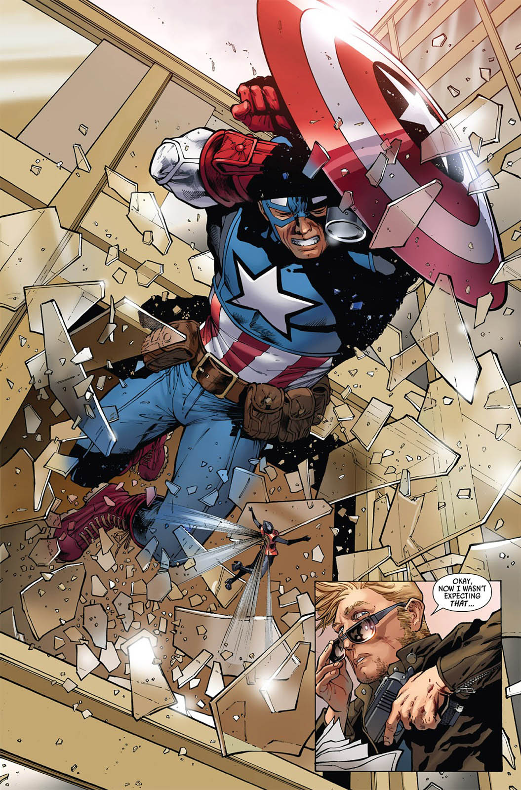
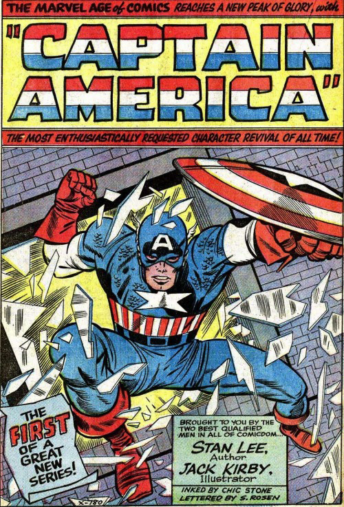
Captain America breaks a lot of a glass. In his very first solo appearance in the Silver Age, (Tales of Suspense #59) Jack Kirby has him jumping directly at the reader, shattering a window as he does.
Maybe that shield gives him a sense of security. After all, the super soldier serum made him super strong, but not invulnerable. And Batman and the other “ordinary” (no enhanced super-powers) heroes tend to break a bit less glass.
This great splash page features rouge Captain America doing the glass bit with tremendous drama and detail by the terrific Carlos Pacheco.
And the art is so dynamic that Marvel used again six years later as a cover for an animated series cover.
That’s pretty cool —it could have been used as a cover the first time around, but second time’s the charm apparently.
The splash becomes a cover a few years later.
Stan Lee and Jack Kirby break the glass in Captain America’s very first Silver Age solo appearance.