Greg Goldstein's Comic Art Gallery

Frank Thorne —Emperor Of Doom

Savage Sword of Conan #23, October 1977

Here’s a gorgeous and splashy Frank Thorne washtone page from a terrific Red Sonja story published in the black and white Savage Sword of Conan magazine.

Thorne is one of those artists that I enjoyed as a kid but did not fully appreciate until much later. Excellent draftsmanship, storytelling, and an imaginative sense of design.

And, of course, beautiful women. That part was always obvious.

I acquired this page earlier this year at OAX. Paid too much for it.

But not sorry about it.

George Perez — Avengers & JLA, Assemble!

Avengers / JLA #4, May 2004

Captain Marvel fighting alongside… Captain Marvel? Only on this great battle page by the legendary George Perez from the Justice League / Avengers crossover that took more than 20 years to make happen.

And, appropriately, 2024 is the 20th anniversary of its publication. Twenty years ago? How on Earth (1,2, or 616) did that happen?

(Thanks to pal and super collector Michael Lovitz for parting with this one.)

Howard Chaykin — ‘Round About Midnight

Midnight Men #4, September 1993

Never let a great idea go to waste.

Howard Chaykin turned an unused Batman pitch into an imaginative new series for the extremely short lived “Heavy Hitters” imprint from Marvel/Epic in 1993.

I’ve seen most of the original art for this title, and each page is beautiful: Great storytelling, terrific draftsmanship, and a generous use of deep India ink and screen tone for depth and effect.  He worked his ass off on these pages, and it shows.

Bonus: Great lettering, as always, by John Workman.

Honestly, the only thing I don’t like about the series is the coloring (not by Howard), but hey, it was the 90s.

The four-issue series has never been collected, but individual issues typically turn up in dollar bins, and are worth seeking out.

Remember, you can’t kill the Midnight Men.

Jim Starlin & Alex Nino — Wild Rampage

Rampaging Hulk #4, August 1977

Alex Nino proves to be one of Jim Starlin’s better inkers (if not the best) with this one and only fabulous collaboration for Rampaging Hulk magazine in 1977.

It’s a gorgeous Hulk fantasy story, worth seeking out in its original magazine format. (It’s reduced to comic book size, with inferior reproduction, in Rampaging Hulk Essentials, the only available reprint.)

As I was working on this post, Nostalgic Investments listed a beautiful DPS from this story for 15k (see below) and, in today’s market, that definitely seems reasonable.

Joe Kubert — In His Sights

Punisher War Zone #36, 1990

Joe Kubert just kept getting better… and better.

I didn’t realize Joe had worked on a Punisher storyline until I saw these lovely original art pages. And, no surprise, it’s a terrific looking arc, indeed.

Chuck Dixon is the credited writer, but the storytelling here is all Kubert. A unique page with eight small panels and that superbly dramatic half-splash close-up. (A perfect callback to the first panel.)

Kubert was in his sixth decade of professional work when this story appeared; and he was still drawing for more than another 20 years before he passed away at 85 in 2012.

Incredible.

Herb Trimpe & John Severin — Love Lost

Incredible Hulk #154, August 1972

Herb Trimpe, inked by John Severin. 

Perfect Hulk art team on a pretty perfect Incredible Hulk page. 

Ol’ greenskin knows that somewhere in Hank Pym’s laboratory — and Bruce Banner’s brain — hides the secret to shrinking back down to the microverse. 

Why is this so important? I’m glad you asked. Our poor Hulk is lovesick and desperate to reunite with his beautiful Jarella.

Hulk in very panel: Raging, smashing, and blinded by love — and the self-awareness that he doesn’t retain enough of Banner’s smarts to work through it.

As noted, pretty perfect.

Wally Wood — Astonishing, As Always

Astonishing Tales #4, February 1971

Wally Wood drew four short Doctor Doom stories in Astonishing Tales. This page, from the fourth and final story is, like all of them, a Wood classic.

And yes, that’s the Red Skull lurking in the last panel. After all, what use is a super-villain story without another, even more twisted super-villain as the antagonist?

This would turn out to be Wood’s final output for Marvel Comics.

Took me a long time to pull the trigger on the “right” deal for one of these, and I’m glad to have finally acquired one.

John Buscema — Man On Fire

Sub-Mariner #3, June 1968

Five straight weeks in the Spring of 1968. Five comic book issues drawn by the legendary John Buscema:

Sub-Mariner #3

Avengers #53

Sub-Mariner #4

Avengers #54

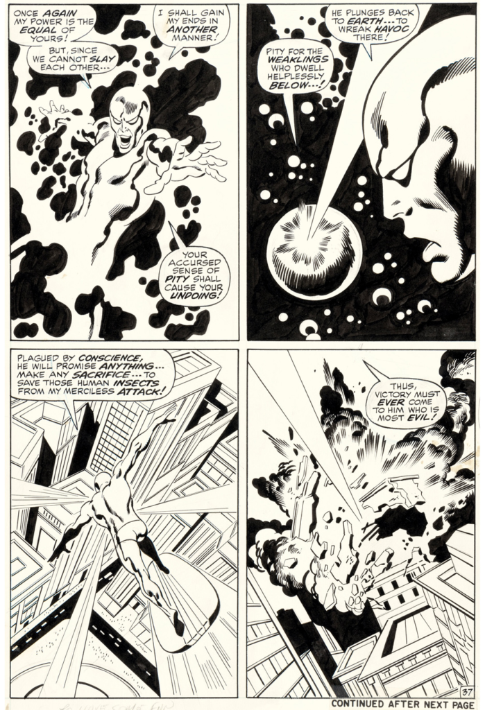
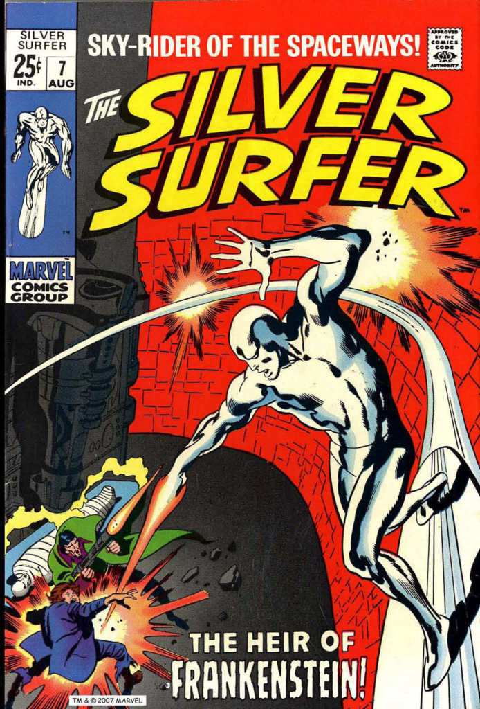
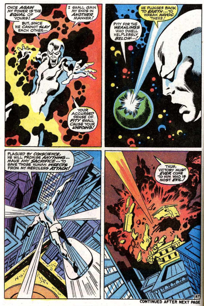
Silver Surfer #1 (38 pages)

Gems. Every single one. (And yes, I might be biased, because these comics are from my newsstand-era sweet spot — 1967-1973 — but I’m not wrong.) My guess is that only Jack Kirby ever had an achievement similar, or greater.

This Sub-Mariner page featuring Namor and Triton is the best Buscema superhero page I’ve ever owned, and unless an amazing opportunity comes my way, will likely remain that way. 

Dynamic inks from one of John’s favorite inkers, Frank Giacoia.

All action. 

Just terrific.

Scott Koblish — Kitty Pryde, The Sequel

Wolverine First Class #15, July 2009

Finishing our mini-celebration of the X-Men’s 60th anniversary.

Here’s a fun page from X-Men First Class, featuring, as part of the story, Kitty a bit out of sorts in an underground drainage system. It’s here she learns the secret of Doc Blake’s cane and his transformation abilities into — well — the last panel tips us off, doesn’t it? (Of course, the cover was a giveaway, too.)

Clear and interesting storytelling, and a wonderful use of shadows and light, make this an exceptionally compelling page. (Once again, although the published page is fine, the original looks much better in black and white.)

David Williams — Wolverine: Terrifying To Foes — & Friends

Wolverine First Class #13, May 2009

Continuing a mini-celebration of the X-Men’s 60th anniversary.

Here’s a perfect (or as perfect gets) Wolverine cover by underrated artist David Williams. It features a pissed off Wolverine (actually, that might be redundant) and a shocked and terrified Kitty Pryde dynamically heading into — or out of — trouble.

Great background detail (nicely adapted from from photo reference) provides extra depth and interest while still setting off the foreground. Overall, a very nice use of shadows and light. (The digital coloring on the published cover handles it less effectively.)

And cliche’s are cliche’s for a reason: Every time I examine the expression on Kitty’s Face I do indeed think one picture is worth a thousand words.