Sounds potentially a bit comedic. But if only “a bit”… I’m ok with that.
Thor Ragnarok mixed seriousness with humor as well. I like the film — and mass audiences responded to it very much— but it comes a bit close to camp in places.
Fingers crossed that a new film doesn’t cross that line that line completely.
I’m definitely intrigued to see Thor’s pal girlfriend Jane Foster take on the Thor role. (It’s already happened in the comics.) Might we have more than one Thor when the film ends?
Maybe. Chris Hemsworth has said he isn’t planning on going anywhere if he has anything to say about it, so who knows.
We can have more than one Thor. We have had at least a few in the main Marvel Universe. And throw in alternate realities, the multiverse, etc., and you have many, many Thors.
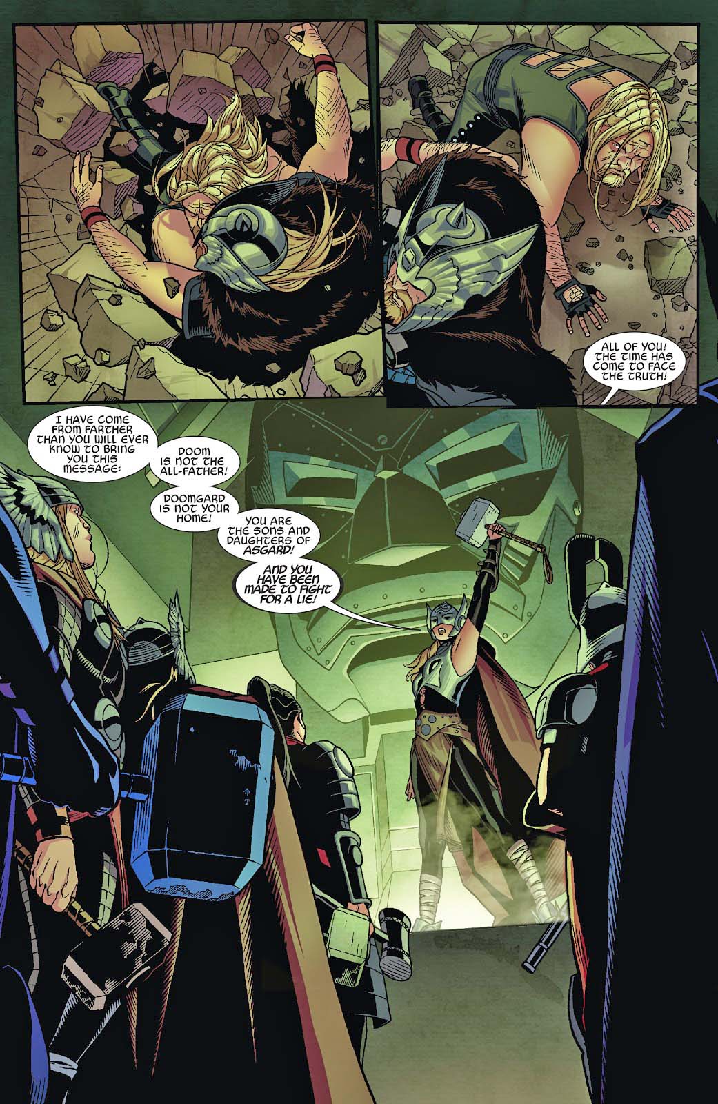
Case in point: This Secret Wars (2015) spin-off, appropriately titled Thors. The plot is too complex to cover in detail here, but in this pivotal splash on Doomgard, Jane Foster attempts to rally the other Thors to fight a common foe instead of each other.
See, she’s not only Thor — she’s now a leader among Thors.
And great art, as always, by the terrific team of Chris Sprouse and Karl Story.
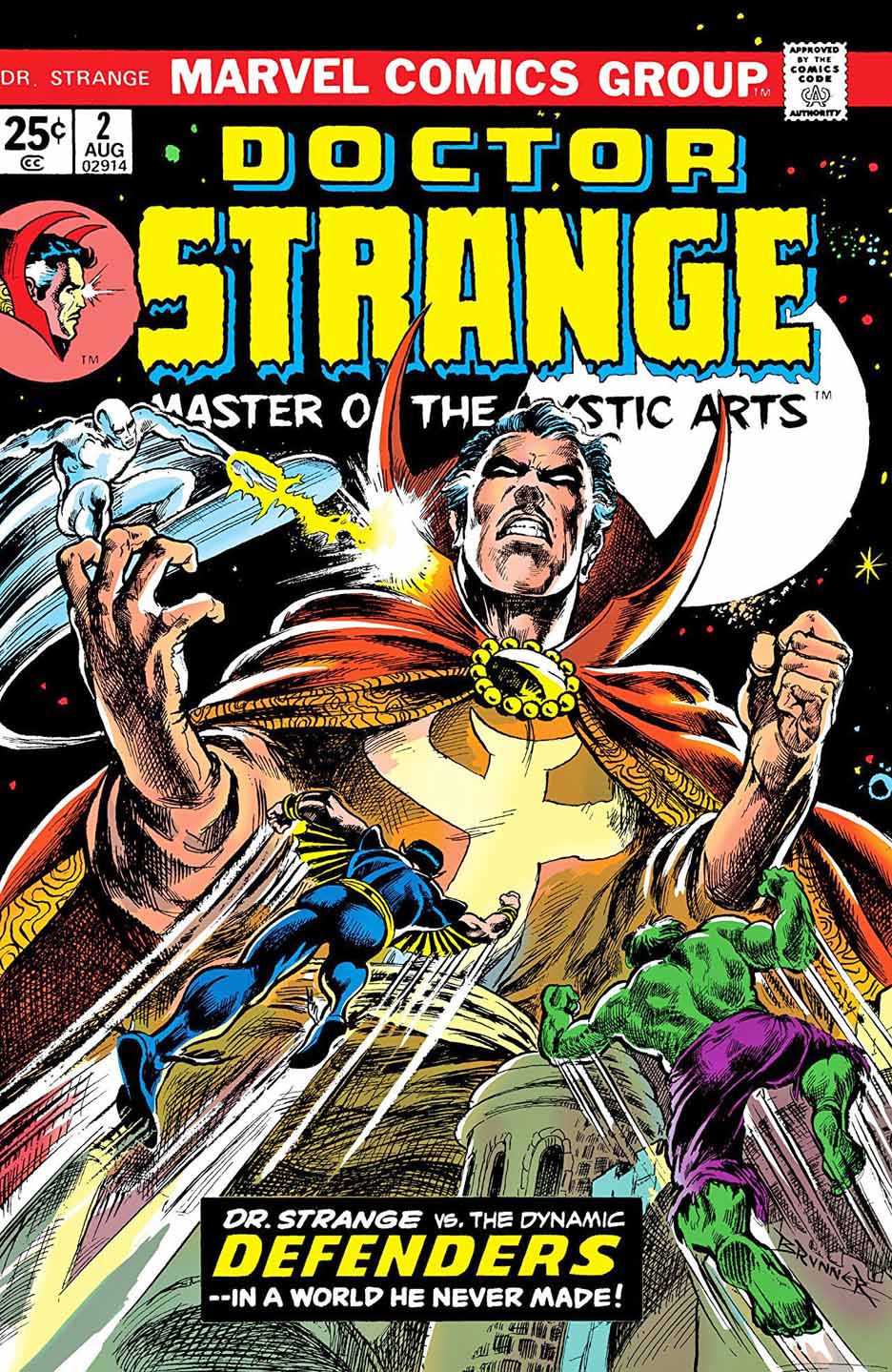
Frank Brunner’s run (with writer Steve Englehart) on Doctor Strange is among my favorites. In fact Jim Starlin and Brunner were (consciously, or otherwise) competing for the trippiest “superhero” stories published at the time. And I was the right age to eat up that stuff.
Comic book storytelling on acid. Side effects not included.
Brunner beautifully recreates his original cover for issue #2 of the 1973 series. In fact, the line work and cross-hatching appears more precise than the original. Overall impression — it is a knockout
Done correctly, Strange was always a fascinating character whose stories could combine magic, fantasy, SF and horror into a mind-bending mix.
So when I heard Sam Raimi was on tap to direct the Doctor Strange film sequel, the only word that jumped to mind?
Perfect.
Raimi is a very talented director — and good guy — who I had the pleasure of briefly working with during the filming of the original Spider-Man movie way back in 2001. As fans know, despite his Spidey pedigree, he has a love for the supernatural and the weird.
I’m really looking forward to his take on the good doctor.
Pin-up, Rocket’s Blast and Comic Collector (RBCC) #4, 2003
Kraven the Hunter, a classic Spider-Man nemesis, is getting his own film?
Er… ok.
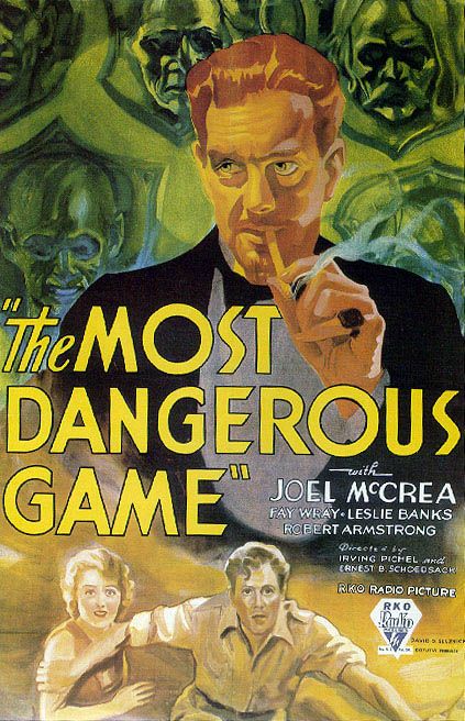
I like the character, especially since I’ve been a fan of the legendary Richard Connell short story “The Most Dangerous Game” since, well, forever.
But… Kraven without Spider-Man is useless to me. Actually all of the Spider-man villains are pointless without the main protagonist.
What, exactly, was the point of the Venom film. A bad guy we root for? Especially one who looks like a monstrous version of… Spider-Man. Huh? What? Tom Hardy was fine as Eddie Brock as the title character, and the film looks great, but it is ultimately pointless. No Spider-Man, no Venom, as far as I’m concerned.
Of course, none of this apparently bothered mass audiences whatsoever. Venom grossed more than $800 million worldwide.
And so, back to Kraven. I would love to see him, even as cameo in Spider-Man 3, before we get to a feature length Kraven film.
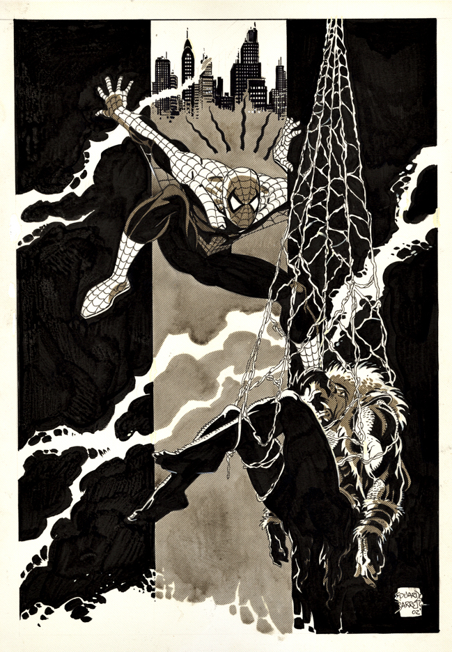
In the meantime, the late Eduardo Barreto delivers a terrific splash of Spider-Man capturing Kraven with terrific tonal quality throughout. It appeared in Rockets Blast and Comic Collector #4, the final issue of the short-lived revival of the famous comics zine.
The one question I have is…. Why does Spider-Man look surprised? Did another wall-crawler grab Kraven first? Is this an early and prescient look at the Spider-verse?
But I digress.
Barreto, a Uruguayan artist who passed away at the too young age of 57, was better known for some excellent work at DC (New Teen Titans, Batman, Superman, et al), but his first actual US assignment was in fact Spider-Man, inking Marvel Team-Up #88, featuring Spidey and The Invisible Girl.
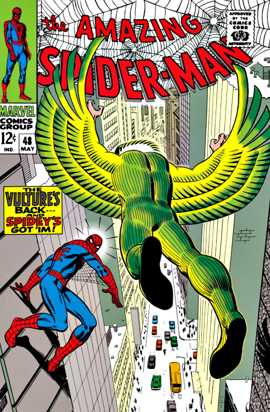
As for the actual Spider-Man 3 villains? Start with Scorpion, who is in the Easter egg at the end of Spidey 1, along with possibly the Vulture (ditto), and head down the rabbit hole from there…
And you never know… maybe Kraven after all.
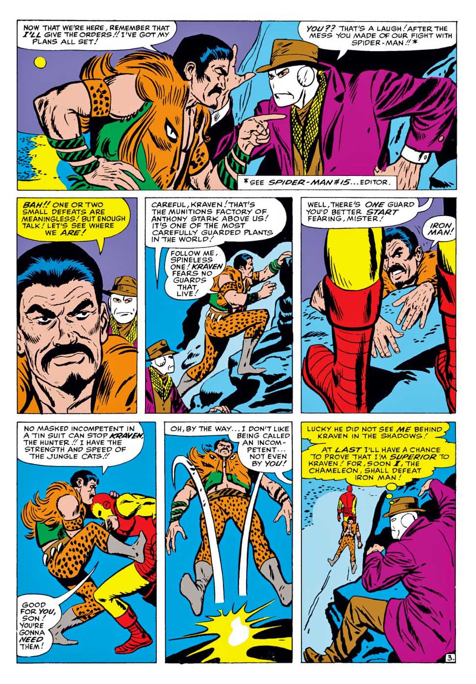
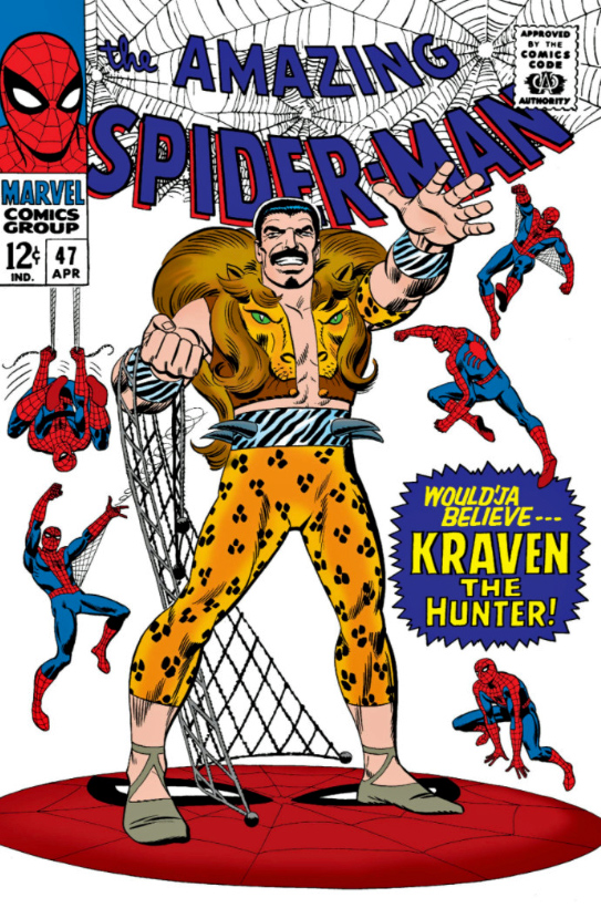
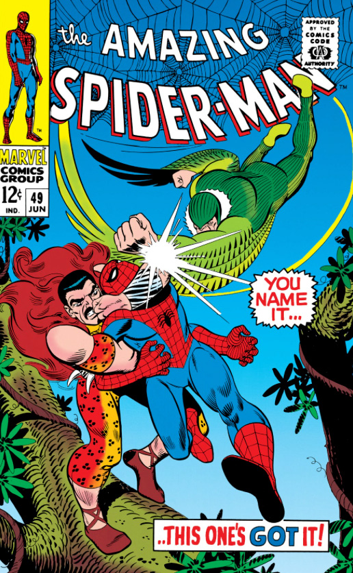
Kraven First appeared in Amazing Spider-Man #15, and returns about a month later with a few “friends” in ASM Annual #1.
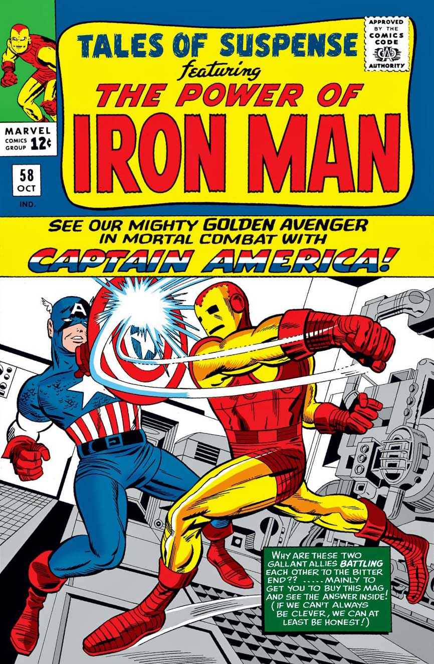
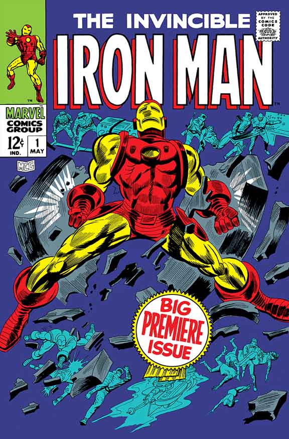
The shortest — and possibly most lopsided — hero vs. villain fight in history. Iron man takes care of Kraven in three panels to support narrative involving The Chameleon posing as Captain America. Convoluted, but hilarious.
Some of the earliest Marvel Comics I purchased at the candy store as a kid, and coincidentally about the time where John Romita comes into his own as Spider-Man’s artist. Compared to everything DC and the other companies were doing, this was heady stuff.
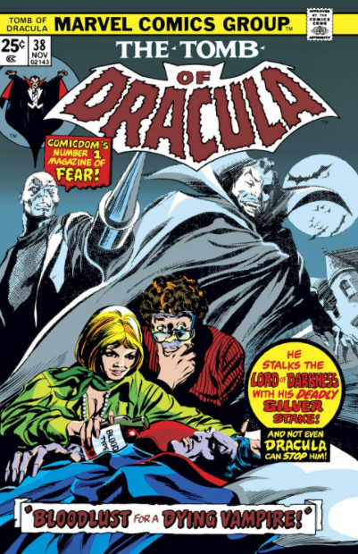
Kraven is the villain in one of the most beloved and critically Spider-Man stories of all time, “Kraven’s Last Hunt”. Also pictured: RBCC #4 where the Barreto pin-up appears, and the film poster for the first adaption of Most Dangerous Game, an obvious inspiration for the Kraven concept.
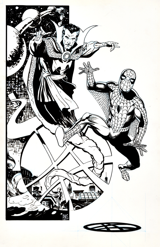
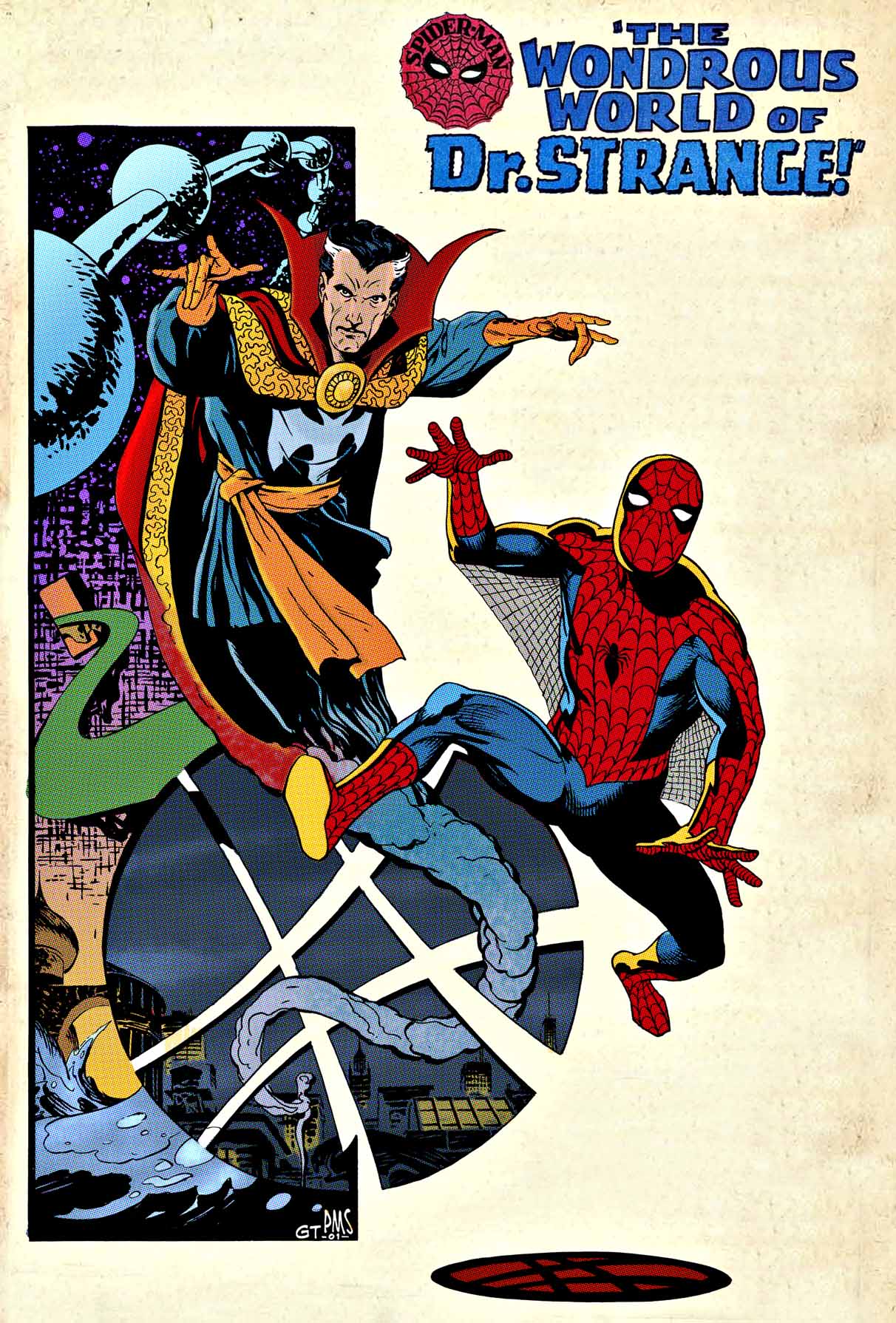
Paul Smith, Pin-up tribute to Steve Ditko, ASM Annual #2 (1965), 2001
Elegant, clean and striking: The definitive Paul Smith style captures Steve Ditko’s classic (and only) pairing of Spider-Man and Doctor Strange in Amazing Spider-man Annual #2 from September 1965.
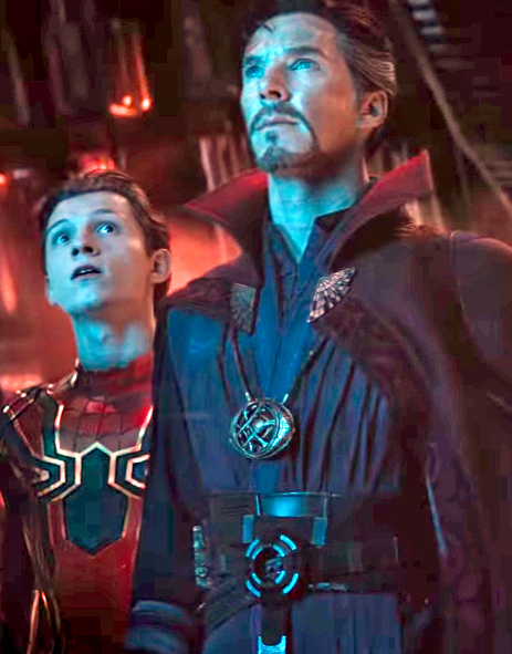
Seeing the pairing of these now iconic Marvel cinematic characters creates some wistfulness here.
Last week, Disney postponed the feature film Black Widow once again. It’s now scheduled for May 2021, a full year behind schedule. 2020 will be the first year without a film in The MCU since 2009.
And, even when the films were less frequent in the early days, a Fox or Sony Marvel film typically filled in the gaps.
(No, I’m not going to act as if the recent New Mutants counts. More people have probably seen the officially unreleased Roger Corman Fantastic Four film than New Mutants.)
Now of course, Covid has thrown the entire upcoming film schedule into disarray. Eternals and Shang-Chi also moved, and swapped positions in the queue — for now.
After that, it’s a bit of a wild card.
The next three films should be Spider-Man 3, Doctor Strange 2, and Thor 4… but, we’ve seen differing revised release dates for those just in the last week.
Then, the schedule becomes even hazier, but let’s put off that discussion until next week.
Meanwhile, up next this coming week on the blog:
Spidey, Doc, and of course… Thor. See you soon.
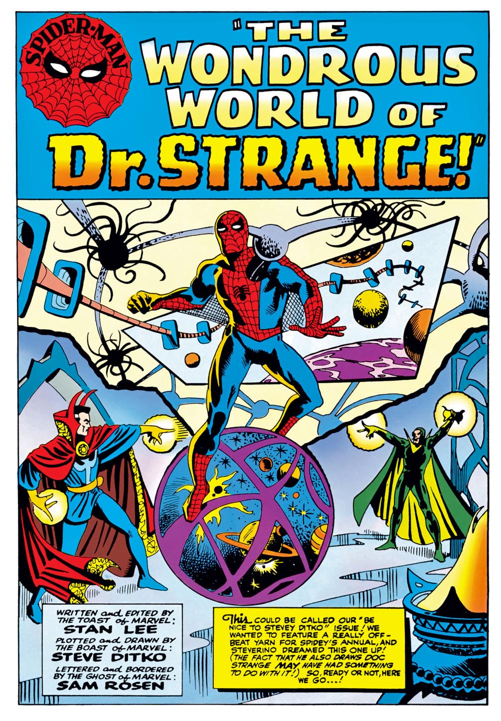
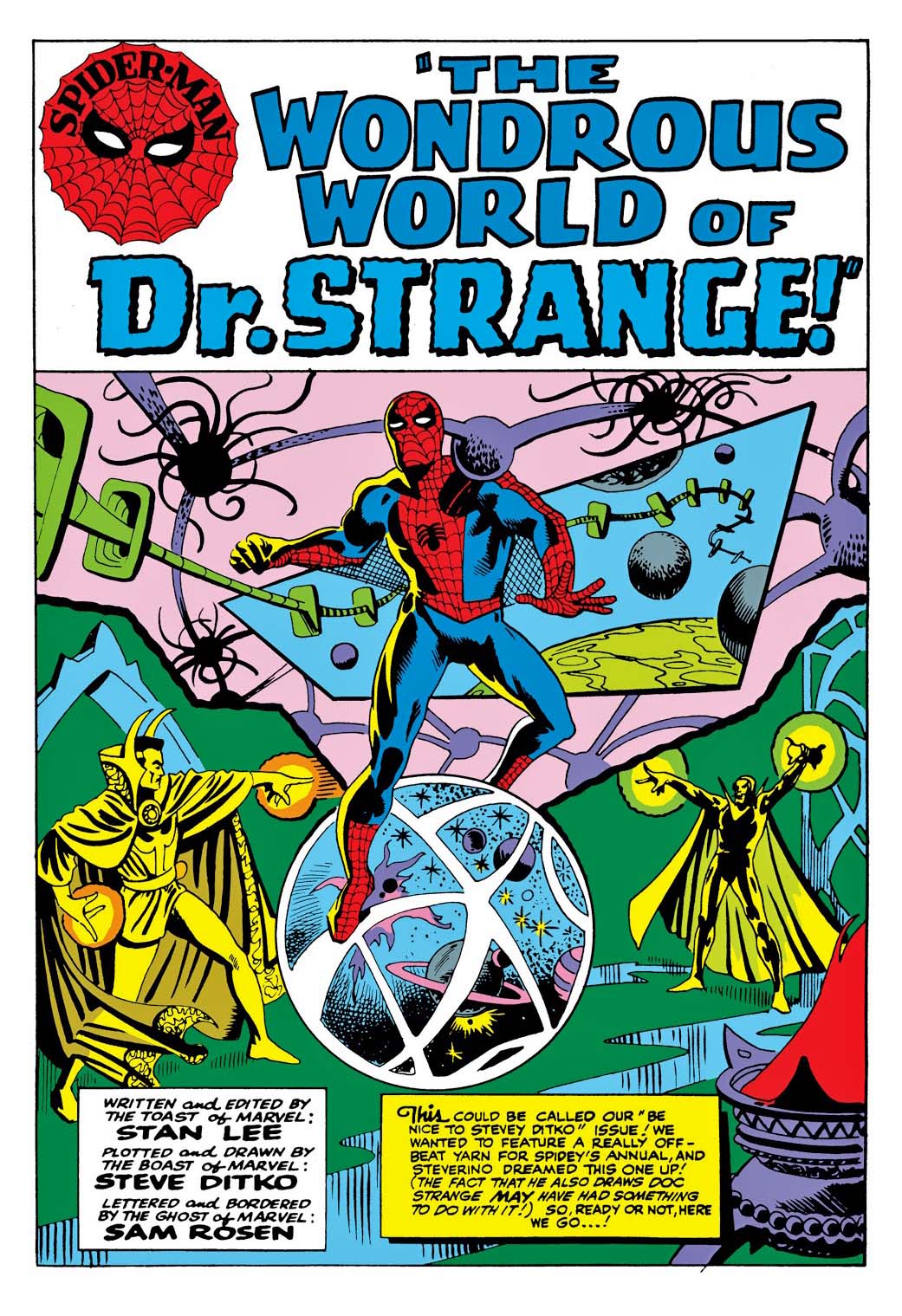
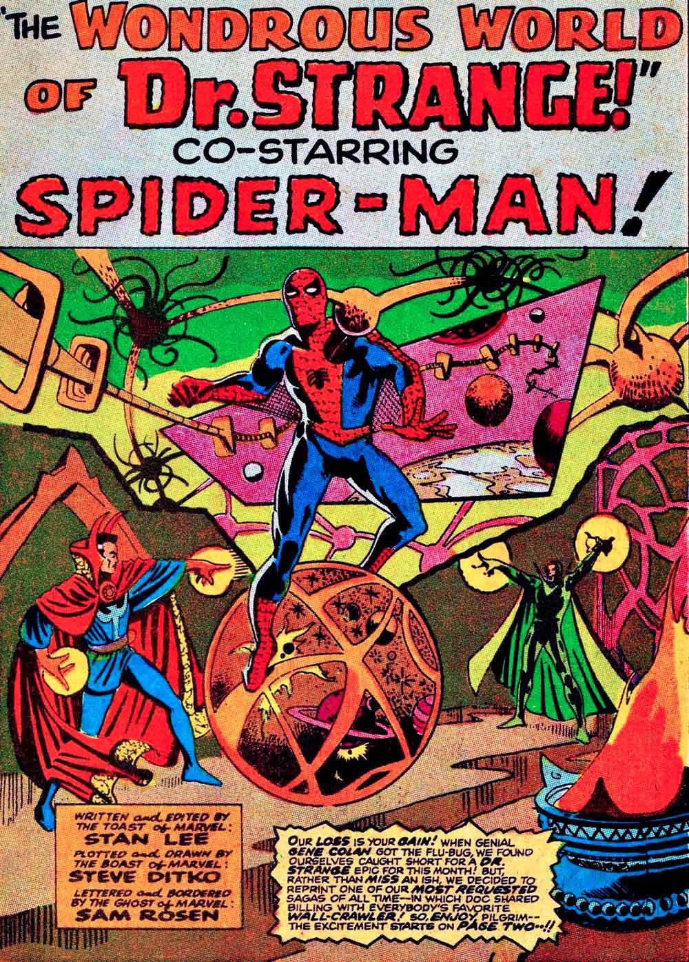
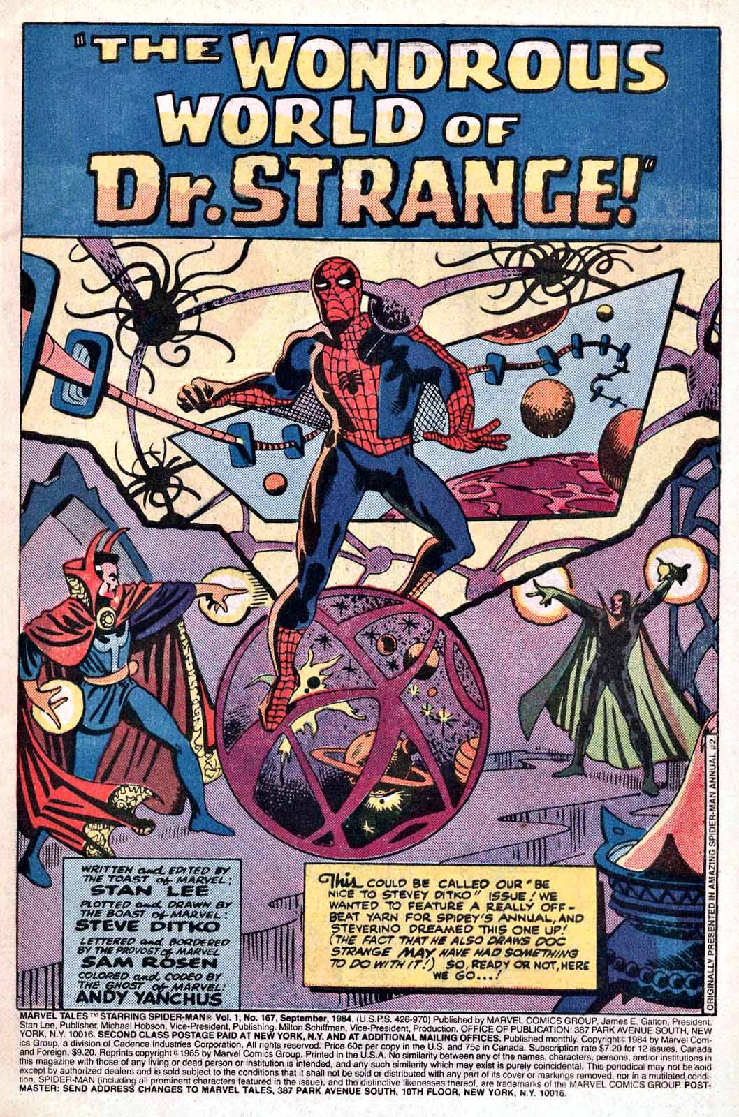
The current digital version of the original splash from Amazing Spider-Man Annual #2 in 1965.
Many reprints, many colors, and a few layout and production changes, too. From left to right, the original annual coloring re-mastered for digital, the coloring and other changes from the “emergency” reprint in Doctor Strange #179, and the re-colored (again) reprint from Marvel Tales.
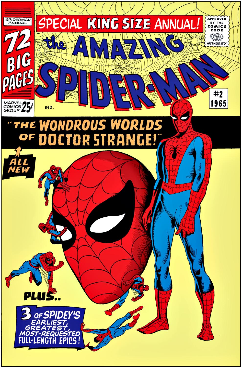
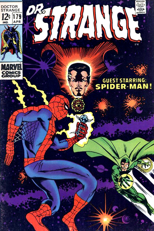
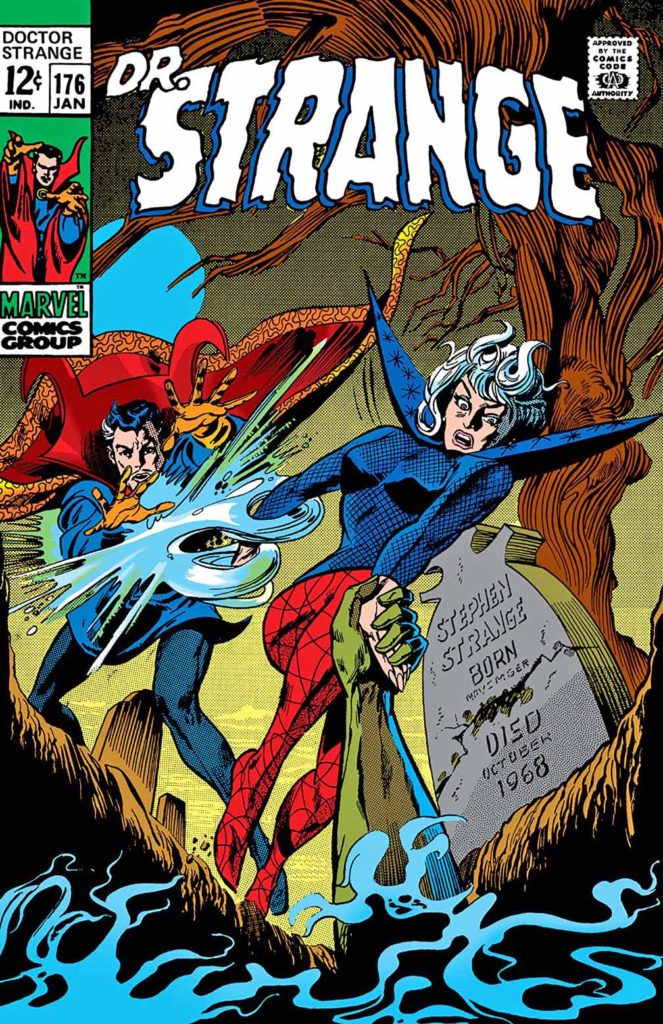
Here’s a bet: Ditko drew the cover for ASM Annual #2 well before he and Stan knew what the story would be. Otherwise… you’d probably see Doctor Strange actually on the cover. A few years later, and a deadline blown, Barry Smith was called on to provide a new cover for the story which was reprinted completely out of continuity in Doctor Strange #179.
Digital colors by Gerry Turnbull, and, in the MCU, Spidey and Doc work together to try to defeat Thanos in Avengers Infinity War. It doesn’t go well… at first.
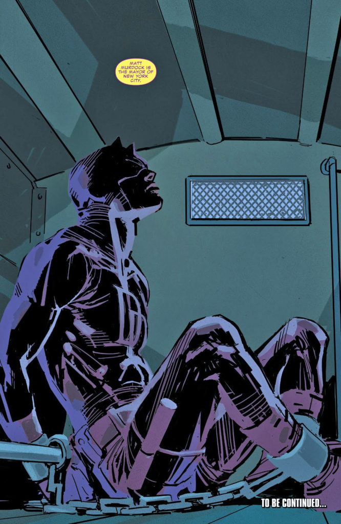
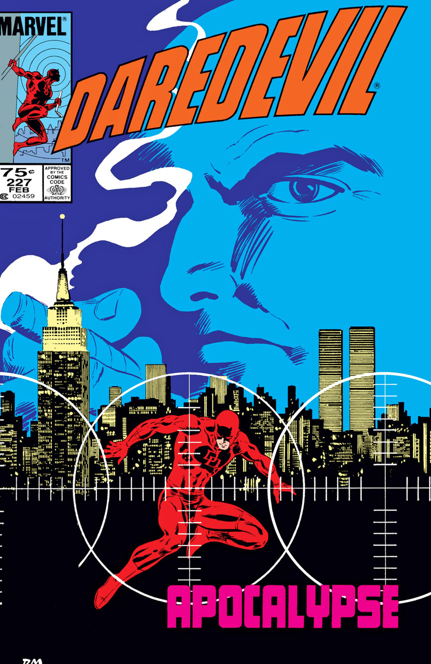
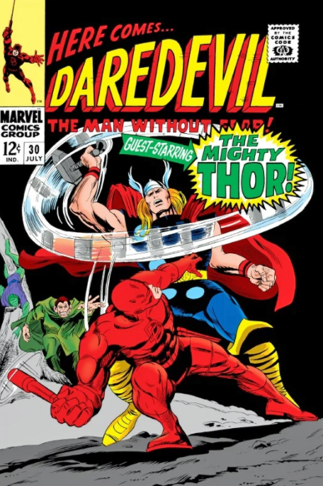
Daredevil, beaten and bruised, is hauled away by the NYPD in this cool cover by Chris Sprouse and Karl Story.
It’s an apt metaphor for the part of the Marvel Cinematic Universe that briefly resided on Netflix.
Daredevil, along with Jessica Jones, Luke Cage, Iron Fist and Punisher anchored an ultra-violent “Marvel Knights” style universe on the steamer for three years. Pretty good television shows, ultimately victims to the battles between the giant entertainment behemoths.
Daredevil was my personal favorite of the group, leaning very much into Frank Miller’s work on the “Man Without Fear” and “Born Again” story arcs. Terrific cast, well-written scripts, and a definitive, stunning performance by Vincent D’Onofrio as Wilson Fisk / Kingpin.
In about six months, the moratorium on rights reversion ends, so Marvel will be free themselves to use the characters in the MCU. In fact, there is a dedicated group of fans campaigning for the cast, if not the entire show, to return in some form under the Marvel banner.
A long shot of course, but the group has worked tirelessly to make its opinion known. Fingers crossed.
Meanwhile this cover is an oddity in that it highlights a scene that took place in the previousissue. Just in case you missed it, I guess.
Doesn’t matter from an art standpoint of course. It is a striking image. Regardless. And as mentioned in a previous post, I’m always happy to see Sprouse and Story on… pretty much anything.
Frank Miller returns to Daredevil and brings an all-star art team with him in the origin story, “Man Without Fear.”
Ok, easy to call “all-star” an oft-overused cliché, but in this case, no exaggeration. The artistic team of John Romita Jr. and Al Williamson is a stunning compliment to Frank’s storytelling.
This is Romita’s best work up until this point in his career, and Al certainly still had his inking chops as well.
I’m guessing (and strictlyguessing) that Miller provided a full script or close to it, because the layouts and storytelling are so “Milleresque.” Either that, or Romita Jr. channeled his inner Miller.
Probably a combination of both.
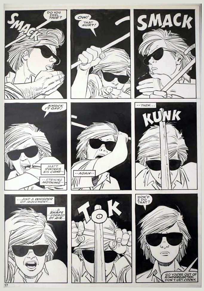
In this page, young Matt Murdoch discovers his true powers for the first time in a sink or swim training session provided by his tutor, the mysterious “Stick.”
The page layout cleverly and beautifully uses the nine-panel grid to show the development of Matt’s reaction time to Stick’s attack.
A great page from one of the all-time great limited series.
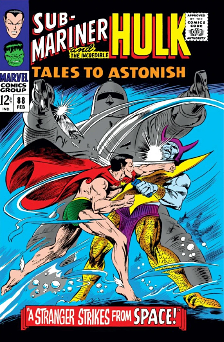
55 years ago, Wallace Wood emphasized the “devil” in Daredevil with a dramatic costume change for the character in issue #7. The series, which had floundered early on, started to gain some traction with Woody’s work just a few issues prior. Issue #7, featuring Daredevil hopelessly outmatched by the Sub-Mariner, is considered a silver-age classic.
Our next three posts celebrate this anniversary with a look at the “modern” man without fear.
I love classic film noir. Dark streets, shady characters, two-faced femme fatales, dimly lit apartments, et al. All great.
At one point, there was not a sign of comic art in my office — just classic noir posters.
So it’s no surprise that that some of my favorite takes on Daredevil are those same noir tropes applied to comics by outstanding storytellers like David Mazzucchelli.
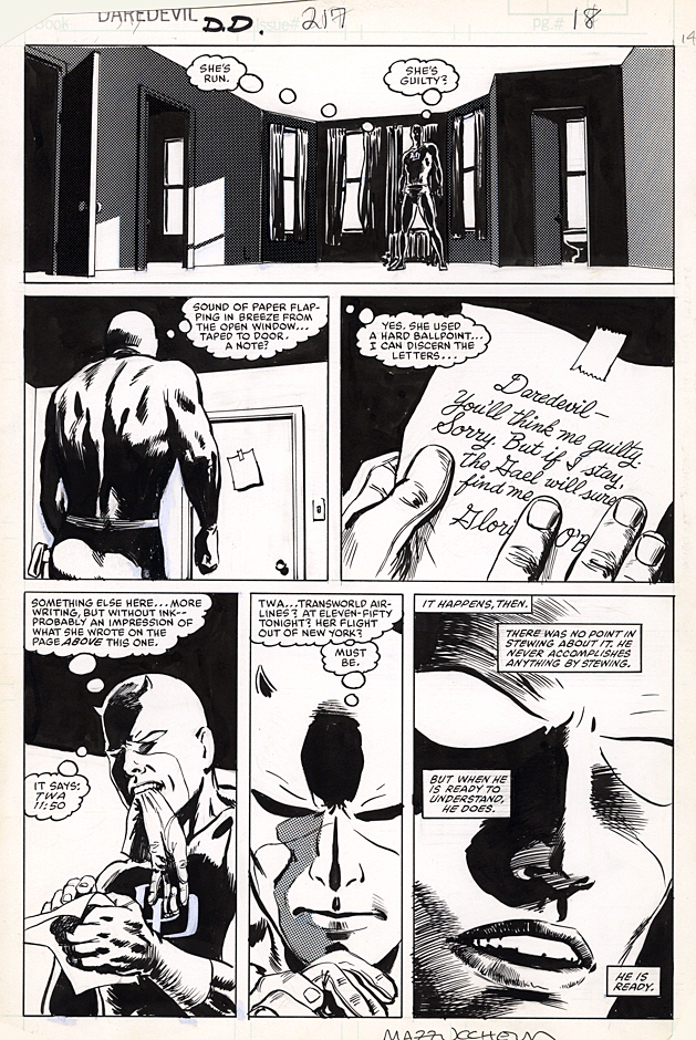
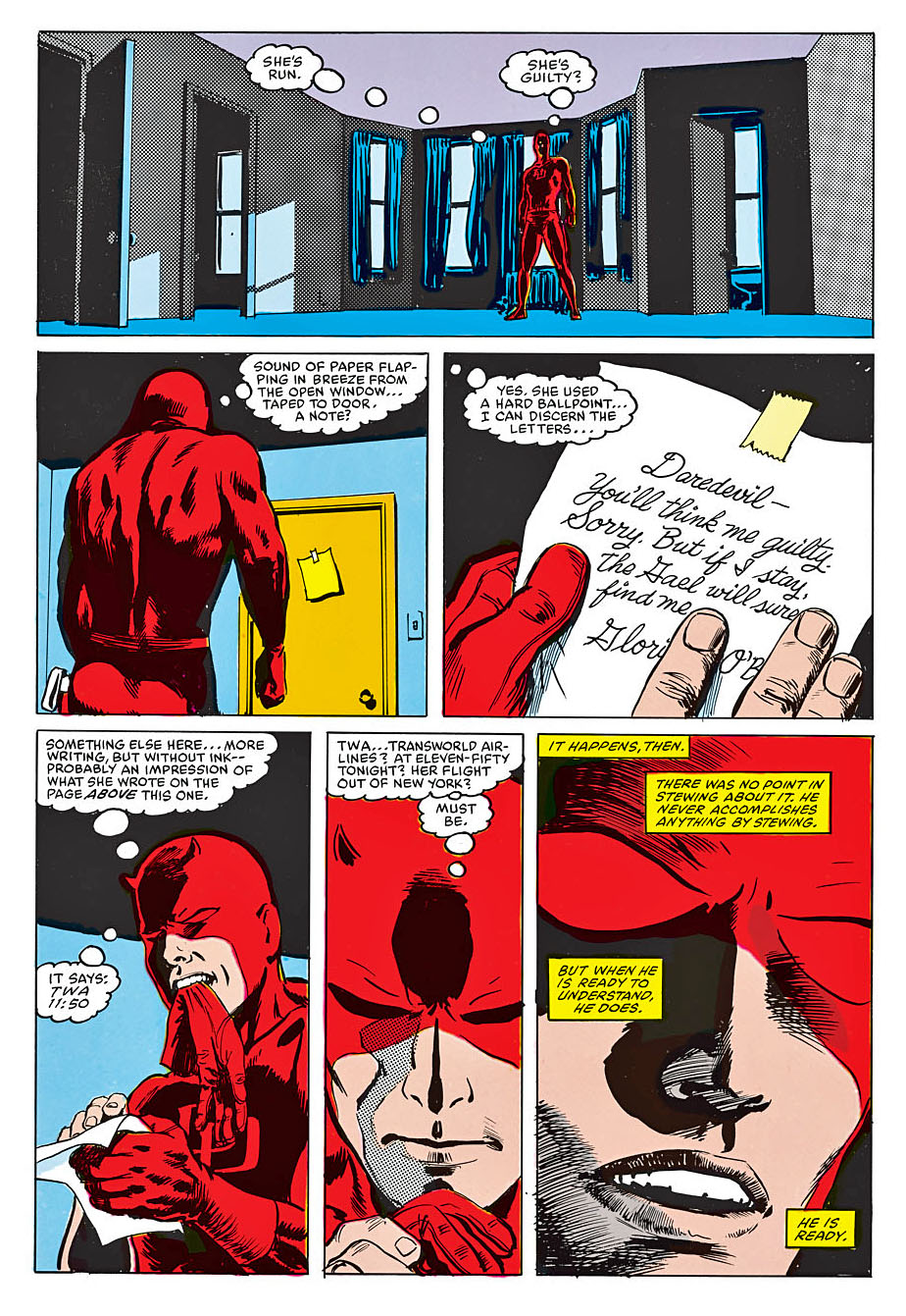
And great pages like this one, featuring Daredevil in every panel, playing the (blind, but super-powered) detective. Mazzucchelli’s use of cinematic camera angles and shadows and light creates a deeply moody page, especially when seen in its original form.
Mazzucchelli keeps nearly all of his original art, and he both penciled and inked this page, so it’s a fantastic rarity as well. Only a handful of Daredevil pages that he is fully responsible for have appeared for sale on the secondary market.
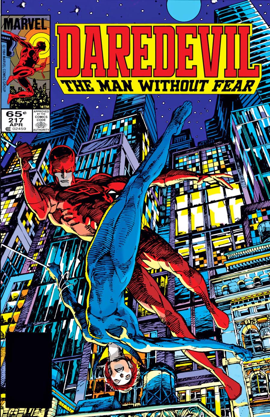
Daredevil #217 features a dramatic cover by the amazing Barry Windsor-Smith.
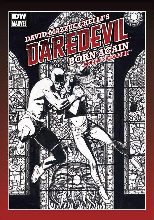
Frank Miller and David Mazzucchelli would collaborate on one of the best loved comic book story arcs of all time: “Born Again.” At IDW, we were fortunate enough to put together an Artist’s Edition of the series with beautiful scans provided from Mazzucchelli himself.
Continuing our celebration of Wonder Woman for the next few posts — no matter when the new film finally releases.
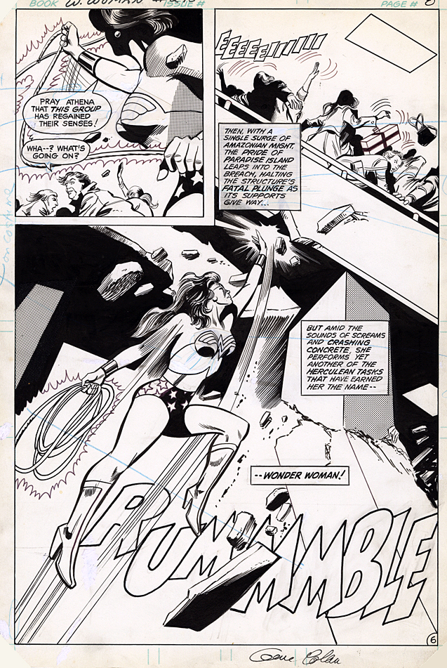
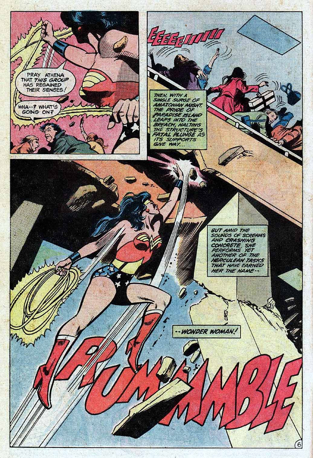
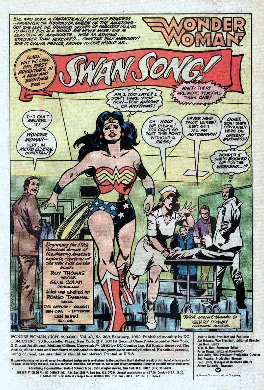
Gene Colan delivers an outstanding splash in an offbeat story involving t video-game mania. Well, it was 1982. Think Atari 2600. Only here we have a cast-off villain –General Electric — from Jack Kirby’s Sandman (I kid you not) who uses a kind of mass hypnosis… oh never mind.
As mentioned previously, I’m a passionate fan of Gene’s work and picked up nearly everything he did at Marvel. By the time he jumped ship to DC I was less interested in superhero comics in general and paid little attention to his work on Wonder Woman. (Batman was another story, as I thought he was a great choice for the dark detective.)
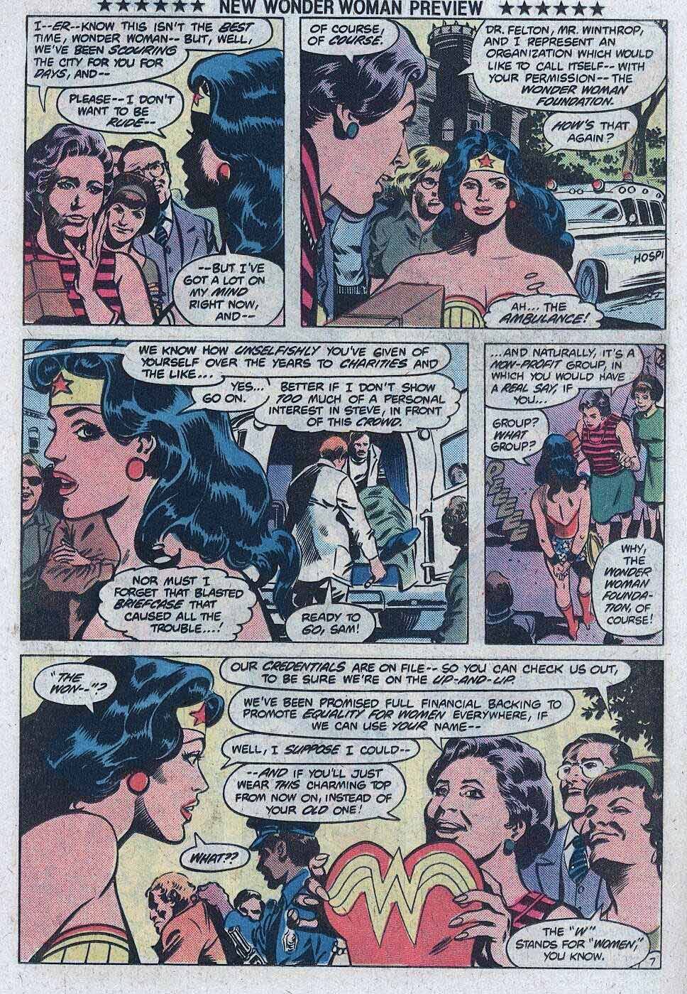
Turns out it was a short but memorable run on WW (artistically at least) and Gene is actually responsible —under the direction of publisher Jeanette Kahn — for her very first costume re-design, replacing the eagle on her chest with the “WW.” (Not including a brief stint in “mod” civilian attire in 1968- 1973.)
The exact new design may have been a work in progress, because the halter on this original has an art patch on it.
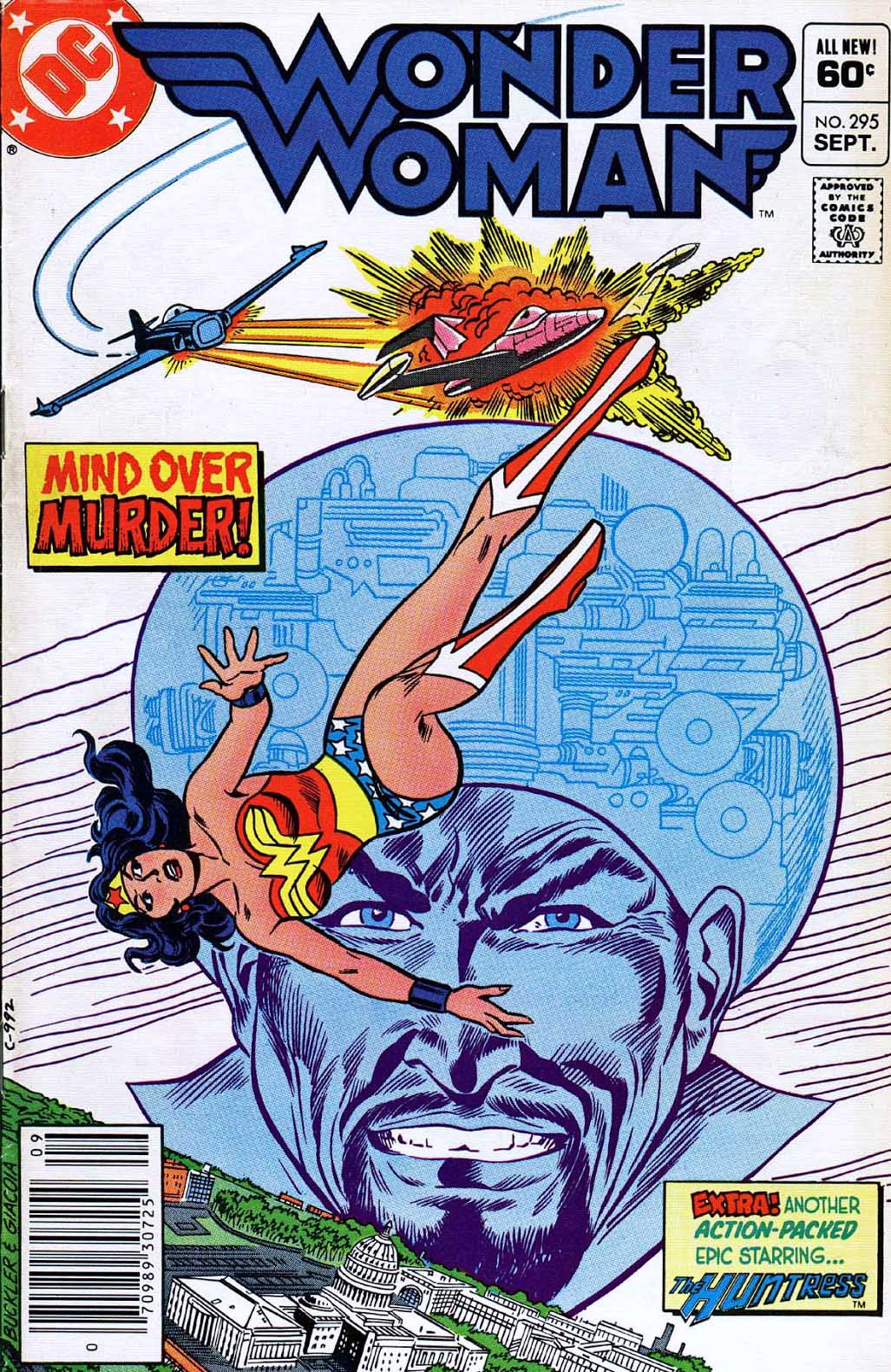
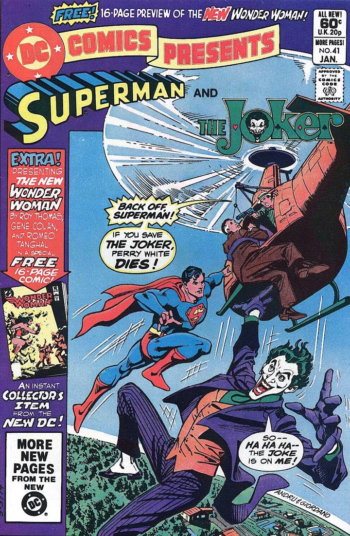
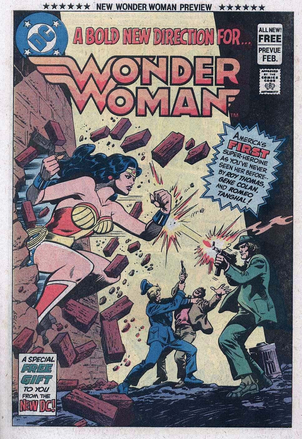
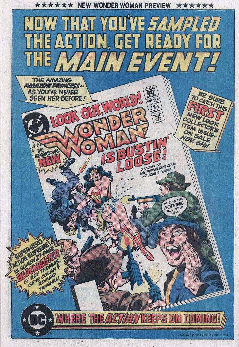
Wonder Woman gets an updated halter, logo and creative team, as previewed in DC Comics Presents #41, and ultimately launching in Wonder Woman #288.
Gene’s work at Marvel looked nothing like the other “bullpen” artists, yet somehow fit in perfectly. Where he went, I typically followed.
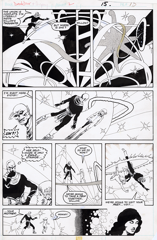
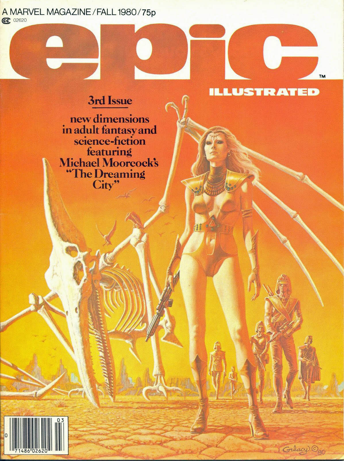
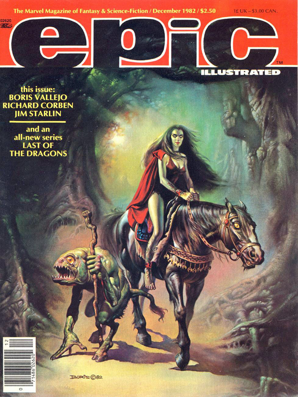
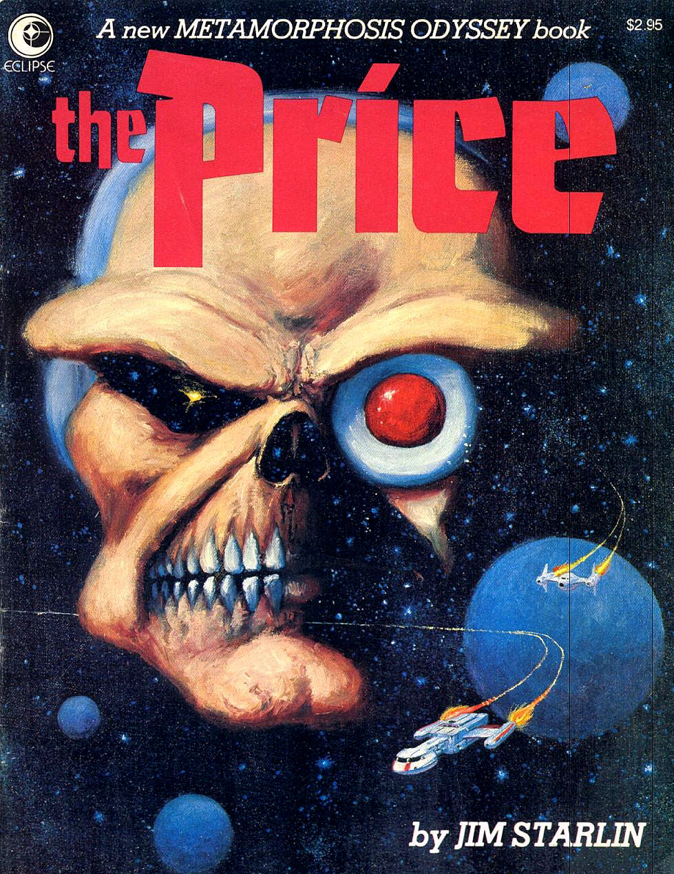
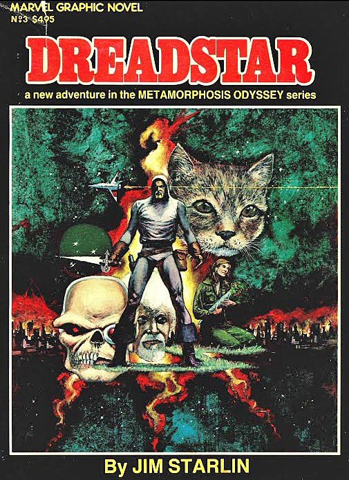
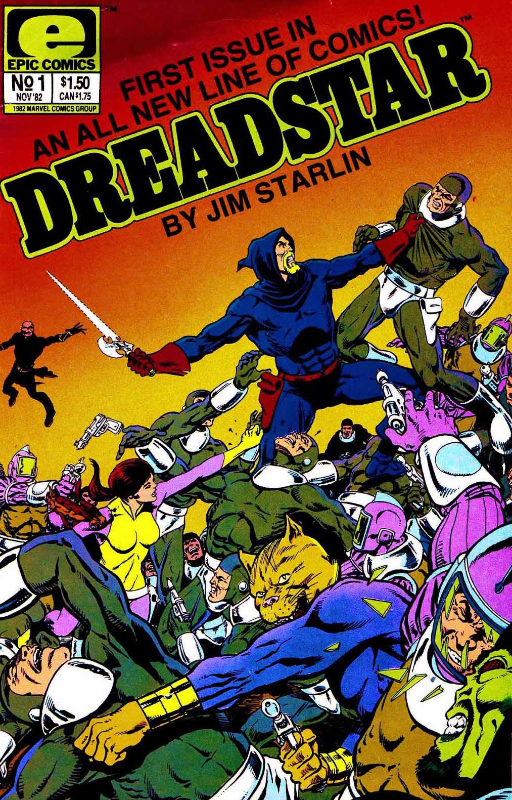
Jim Starlin’s Marvel work had a big impact on me back in the day: Space Opera. Philosophy. Offbeat humor every so often, just enough to keep us from focusing too much on the end of… well, everything.
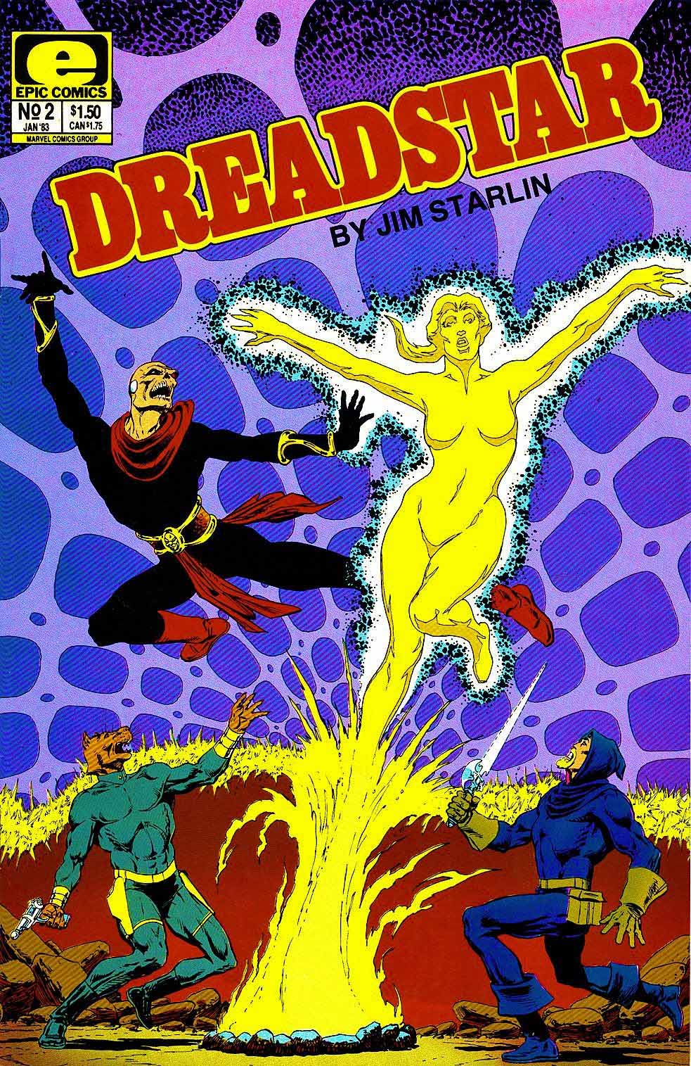
So it was no surprise that I was more than curious about Dreadstar, his creator owned project that launched form Epic (Marvel’s creator line) in 1982. Sure enough, it did not diverge from Starlin’s established interests — or my taste. I enjoyed his entire run on the series.
(It’s always so odd when a creator leaves a creator-owned book. But it happens frequently. And I digress.)
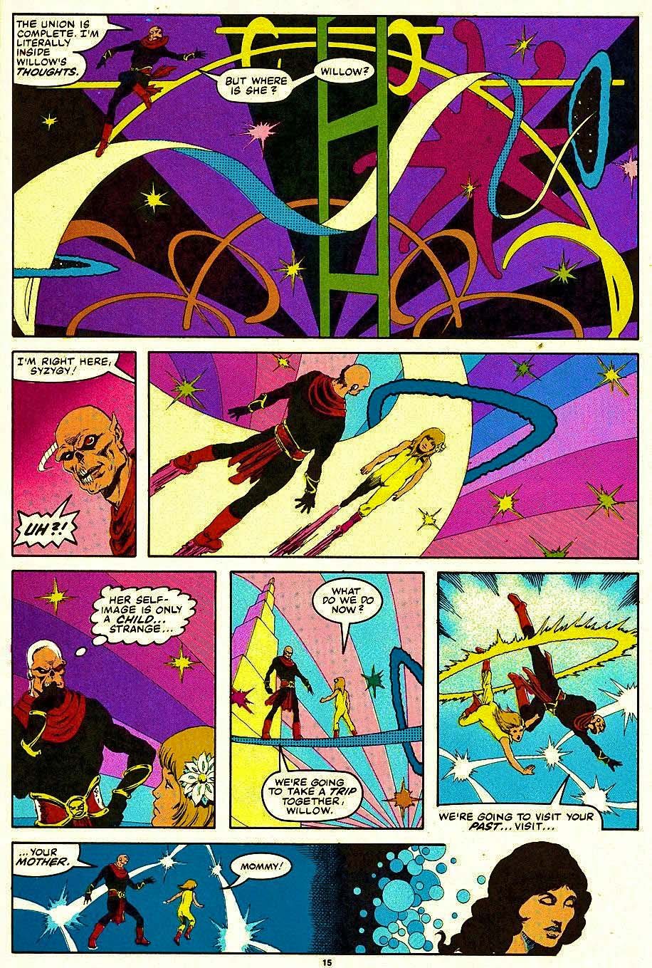
This page is actually one of two I acquired about 10 years ago. The other page had Vanth Dreadstar on it (although minimally) but I ended up keeping this one (and trading the other) because it sums up the classic Starlin style. To me, only Steve Ditko did space and time magic with the same trippy flair.
(Crazy neon coloring by Glynis Oliver Wein on the published piece as well.)
Dreadstar had to slowly make his way through magazines and graphic novels before he ultimately appeared in his own (color) ongoing series.
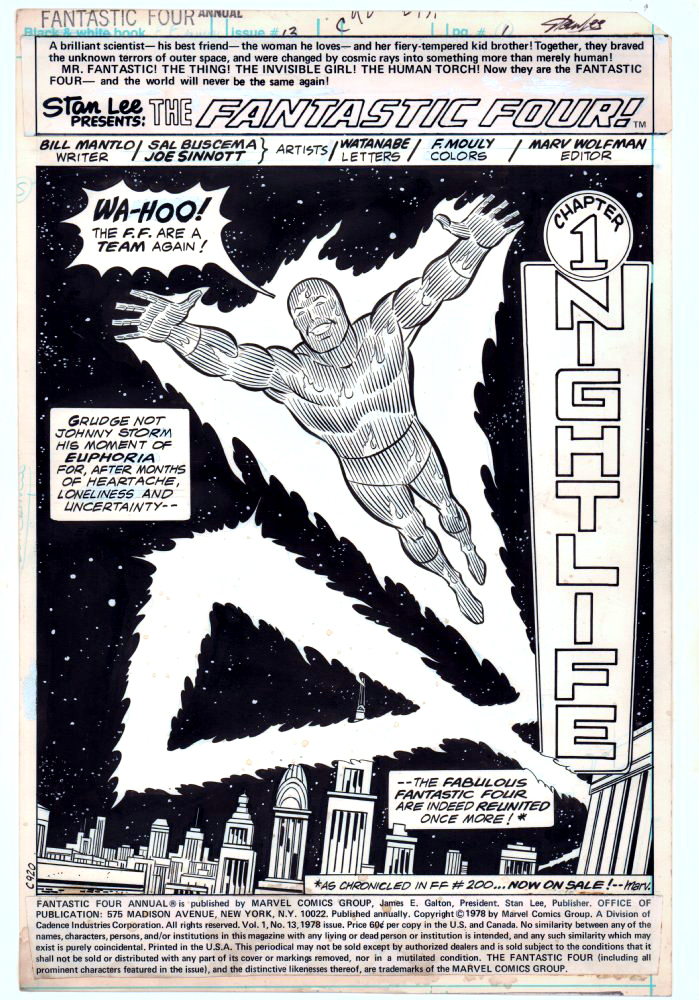
Joe Sinnott, easily one of the greatest comic book inkers of all time, and a terrific person to boot, passed away a few days ago. He was 93.
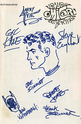
Joe drew the very first sketch I ever owned (and still do, BTW) in my convention program at my very first NYCC, 1972.
Reed Richards — Mr. Fantastic — was an appropriate choice, because Joe’s legendary inks on both Kirby and then John Buscema (and ultimately others) provided a polished, consistent look for “The World’s Greatest Comic Magazine.”
I own other art inked by him, but this one is extra special.
RIP Joe. Many thanks and salutes from all of us for your astonishing career.