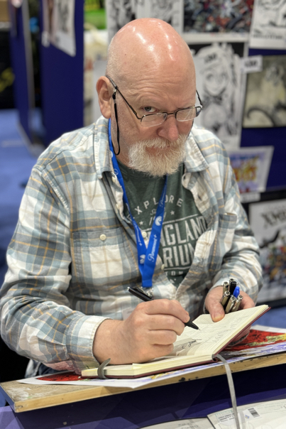
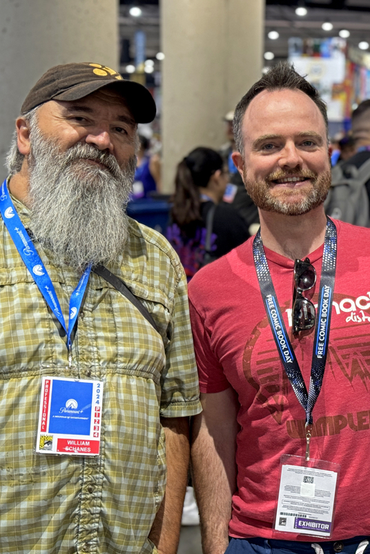
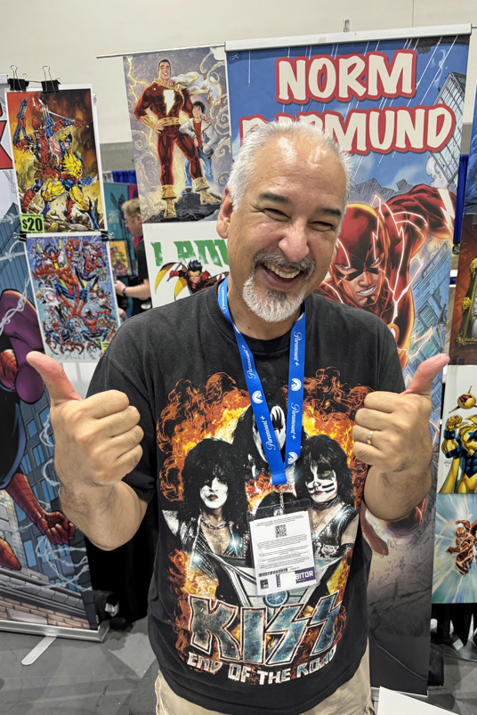
NYCC — Creators & Friends (Part 2)
New York Comic-Con, October 17-20, 2024


Greg Goldstein's Comic Art Gallery
Panels and Pages… Art and Artists… Creators and Conventions… Musings and Memories…

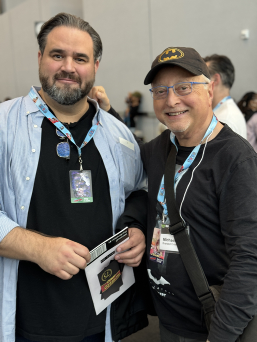
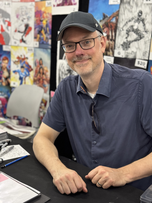
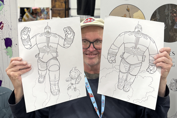
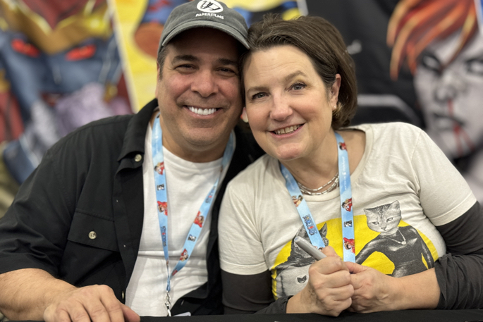
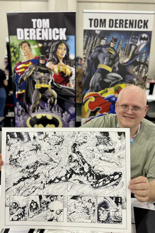
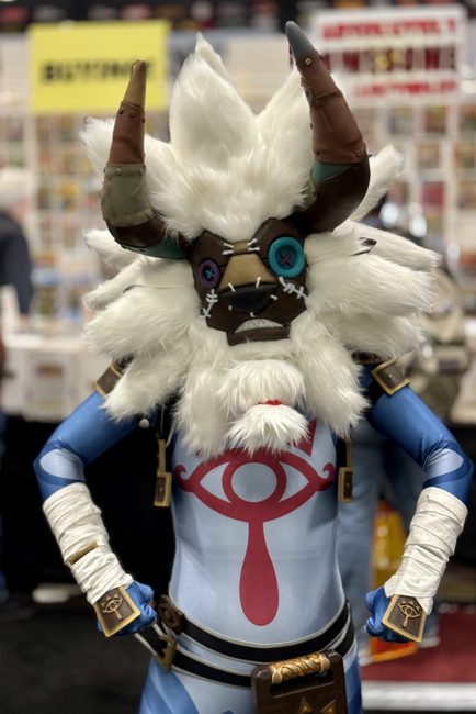
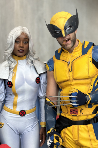
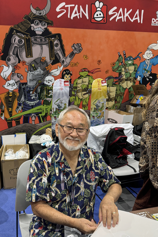
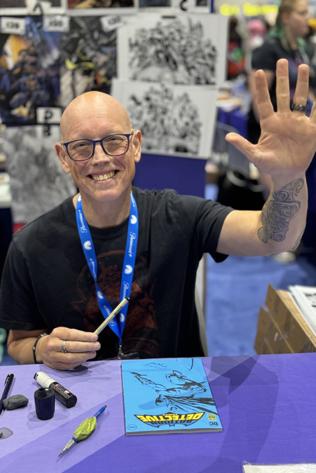
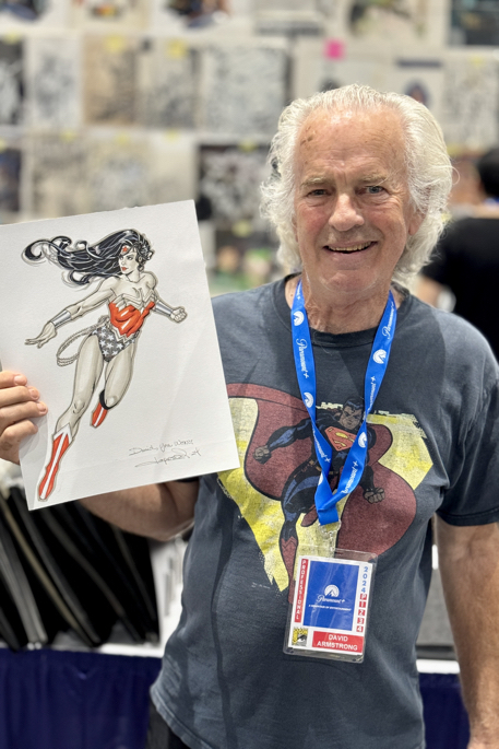
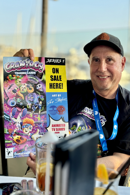
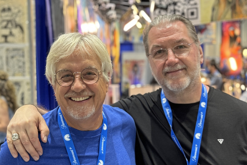
New York Comic-Con, October 17-20, 2024
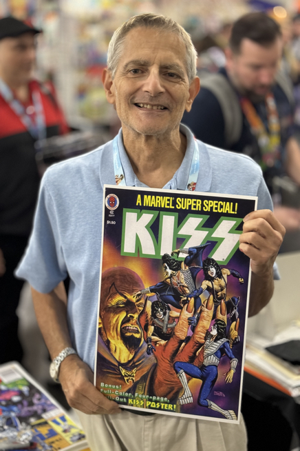
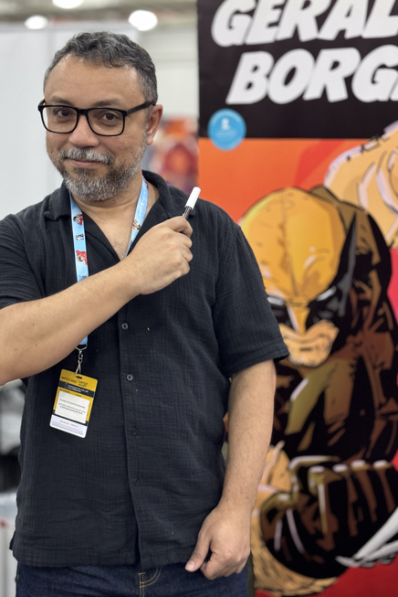
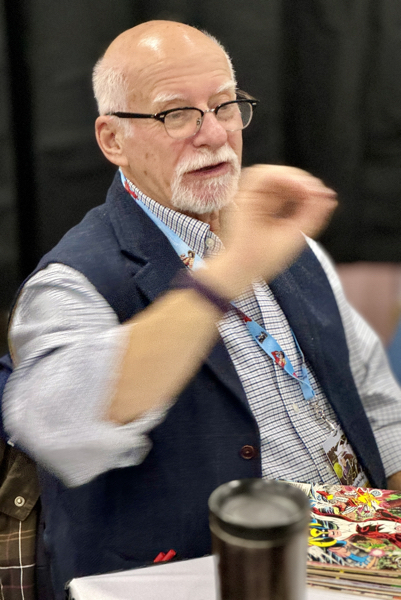
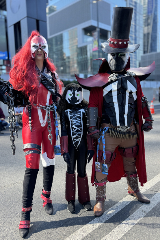
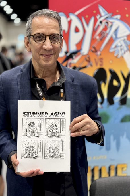
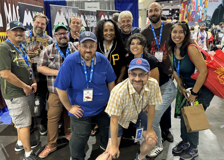
New York Comic-Con, October 17-20, 2024


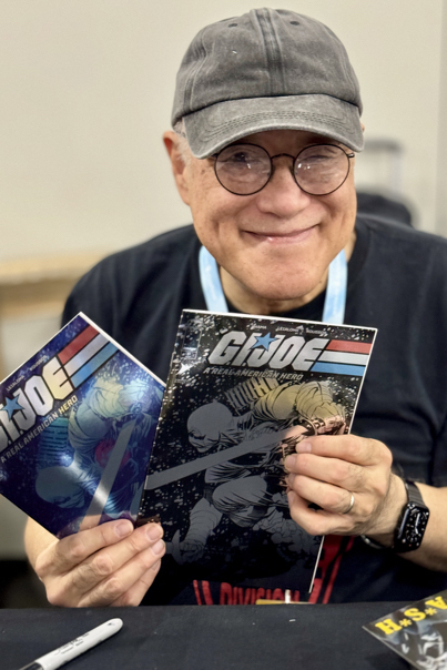


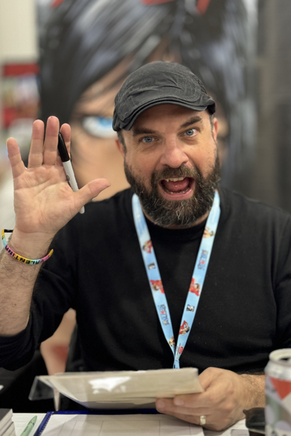


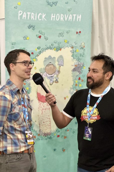


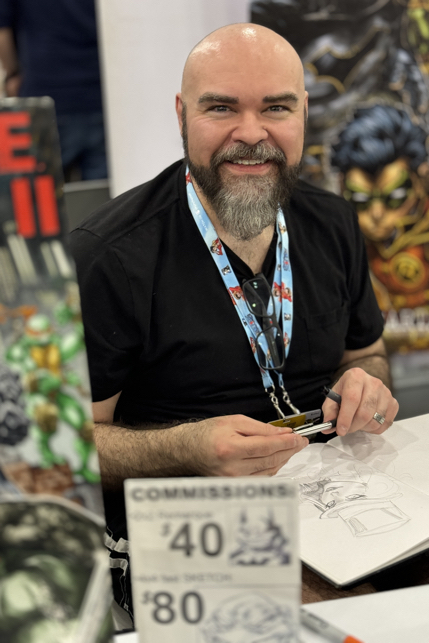


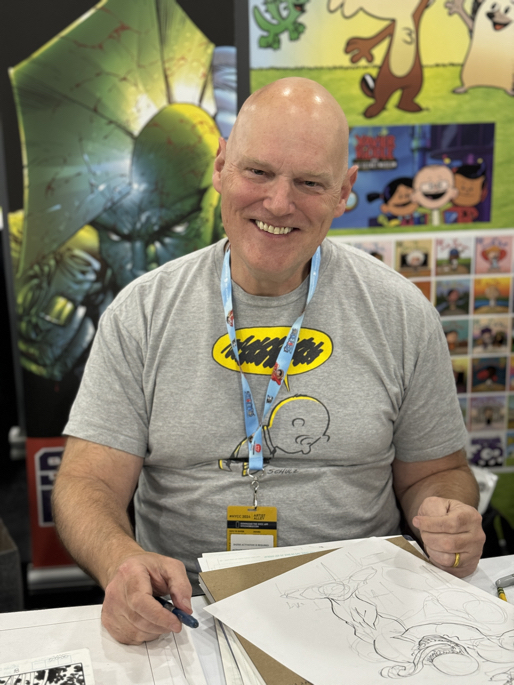
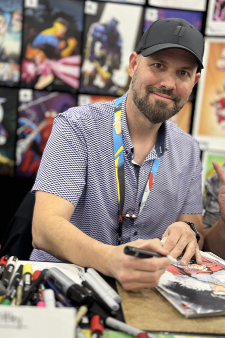
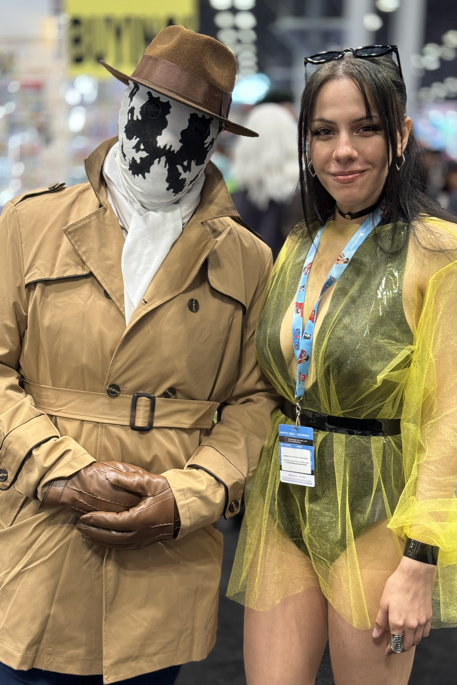
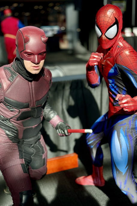
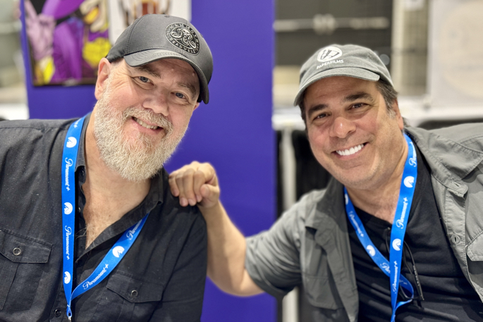
New York Comic-Con, October 17-20, 2024


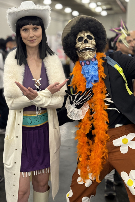


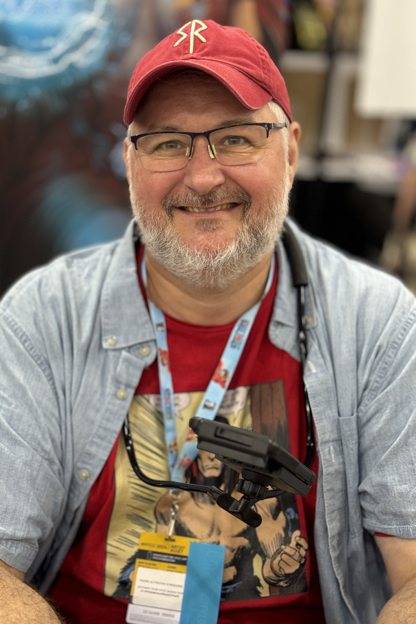
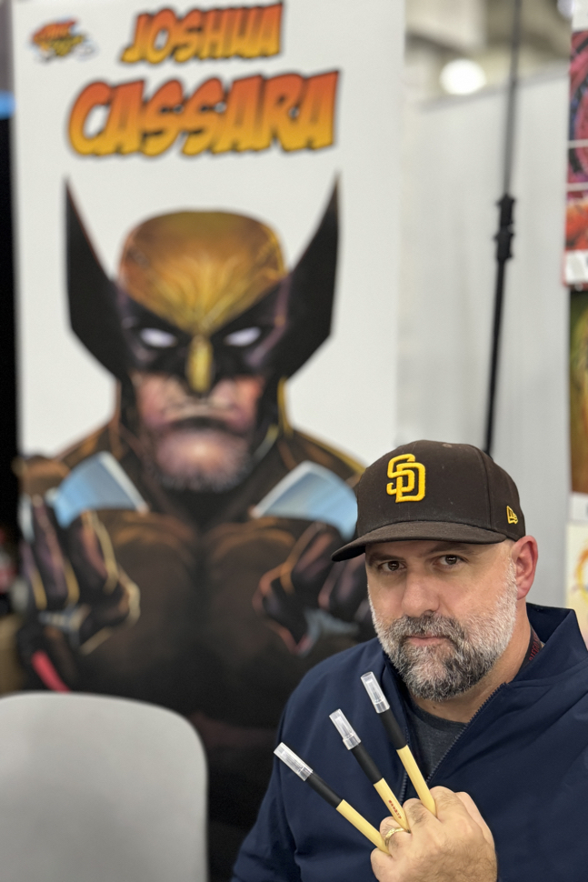
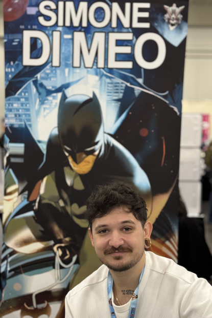
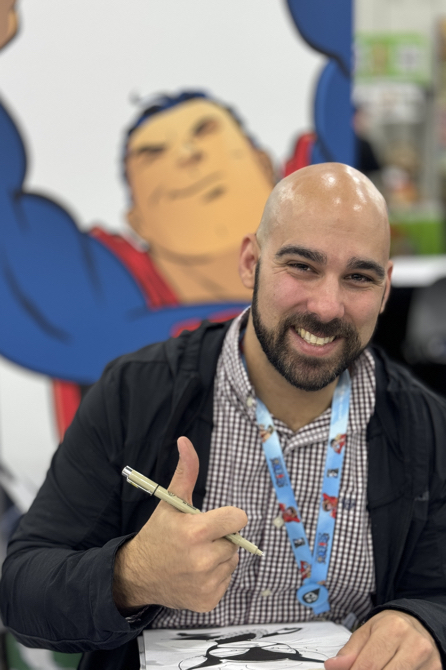
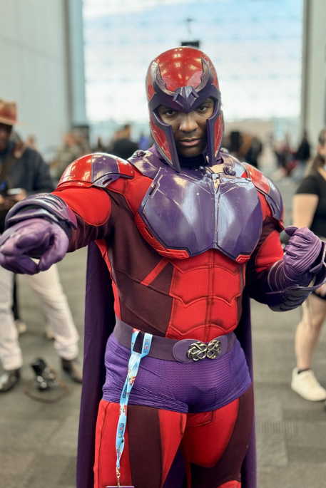
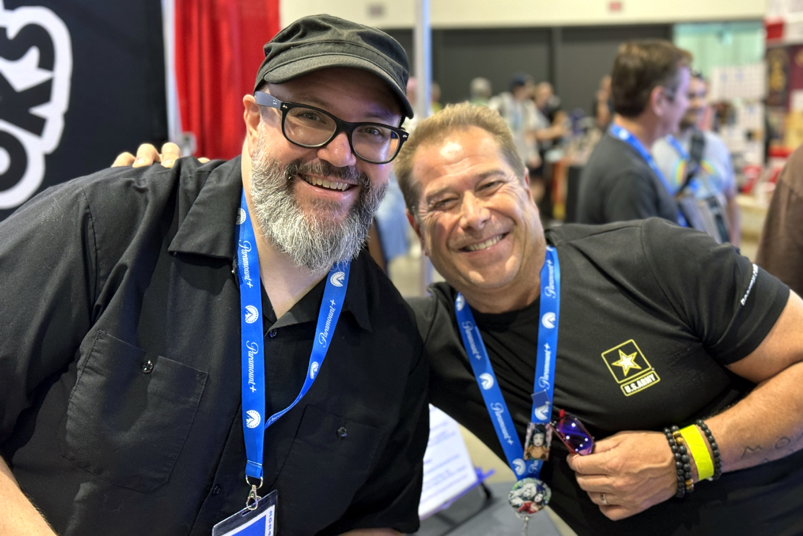
New York Comic-Con, October 17-20, 2024


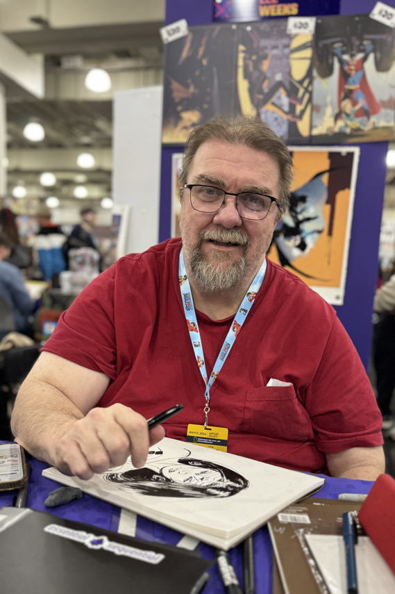
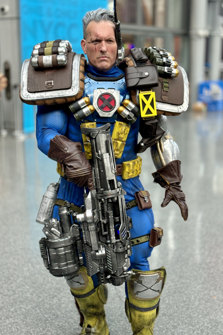
New York Comic-Con, October 17-20, 2024
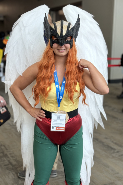
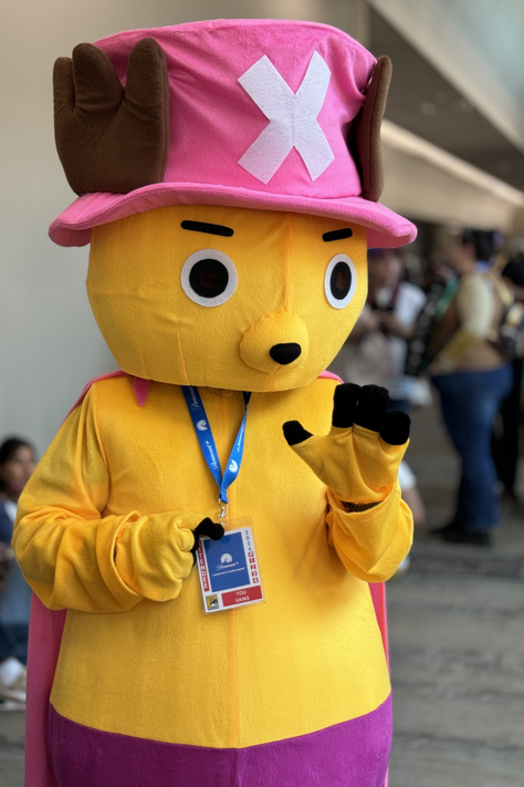
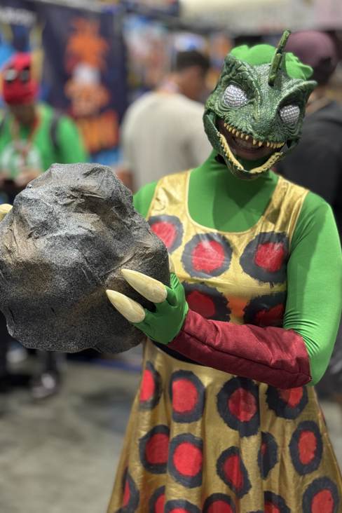
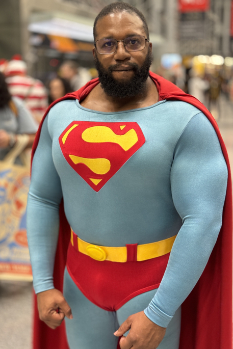
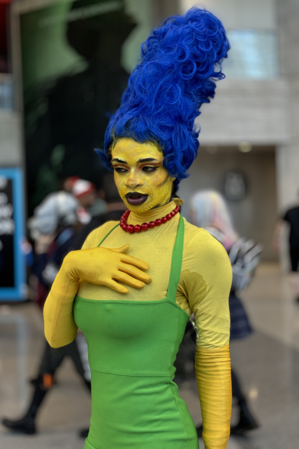
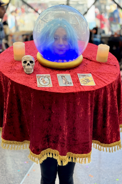
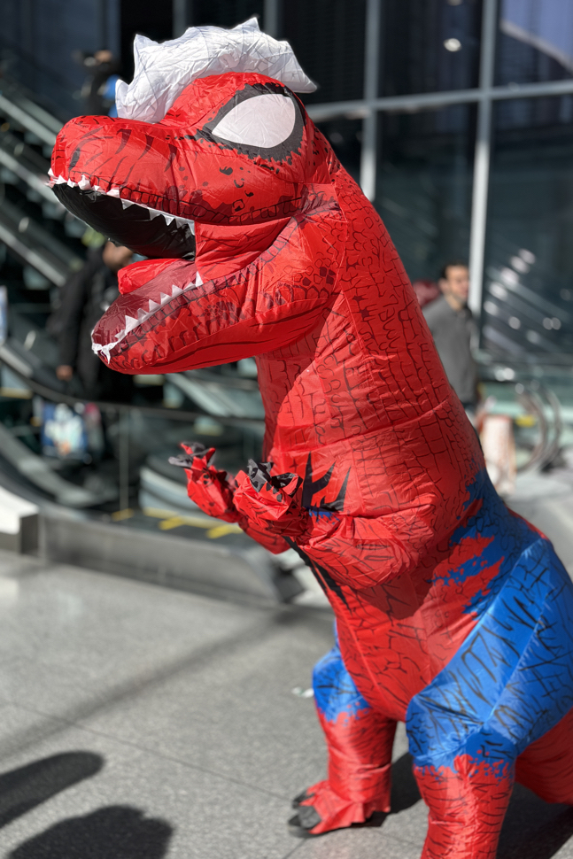
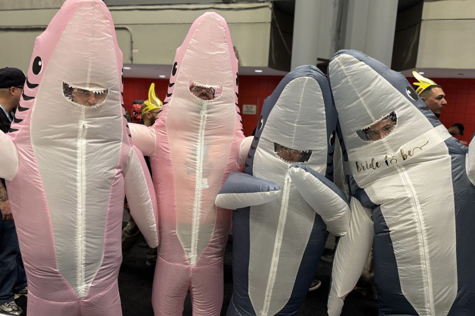
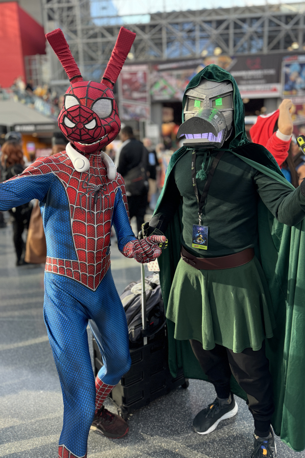
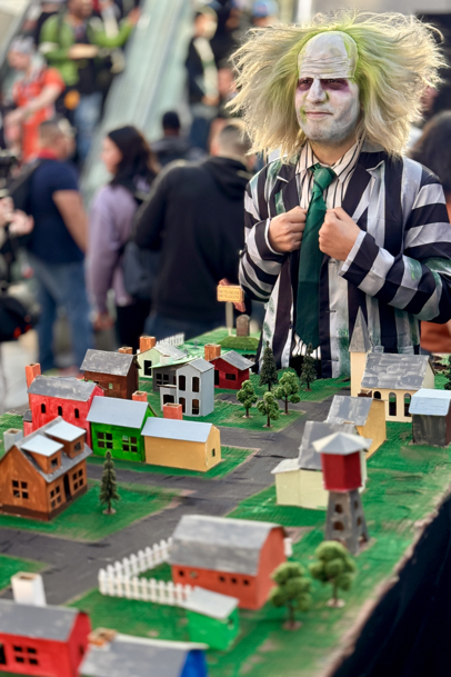
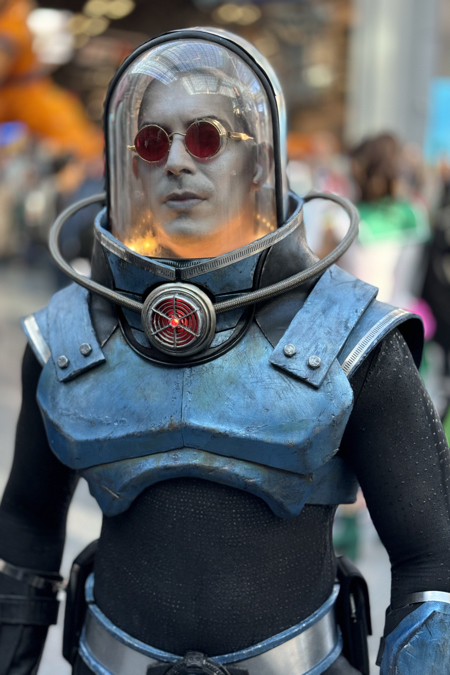
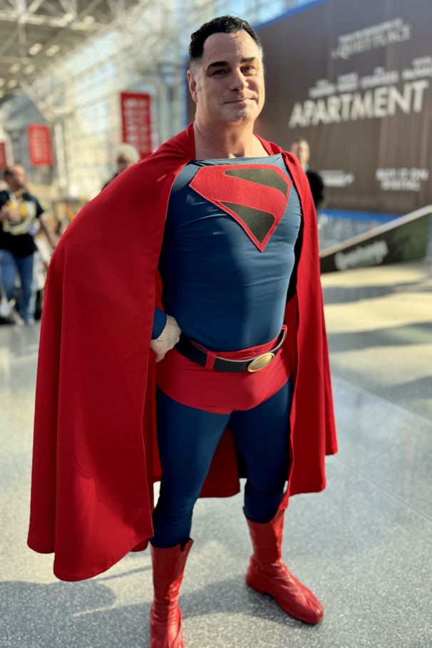
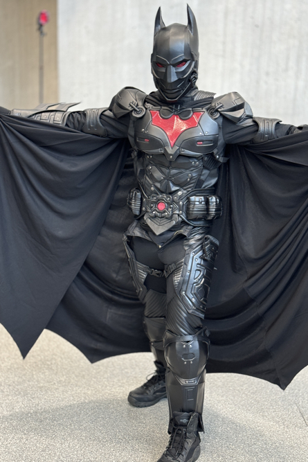
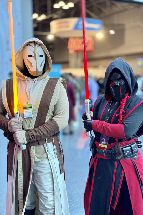
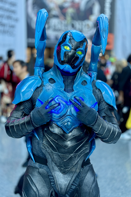
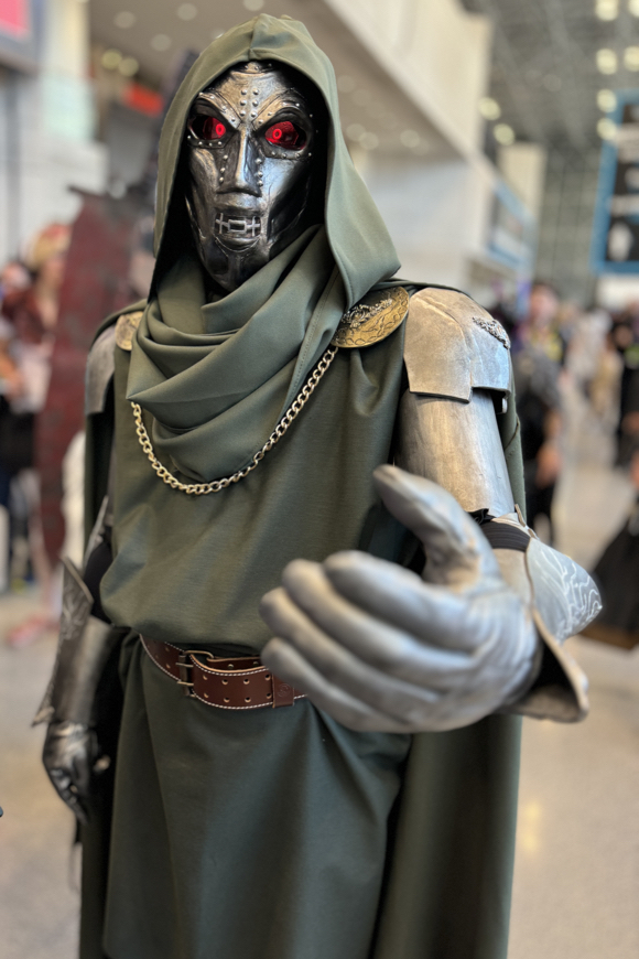
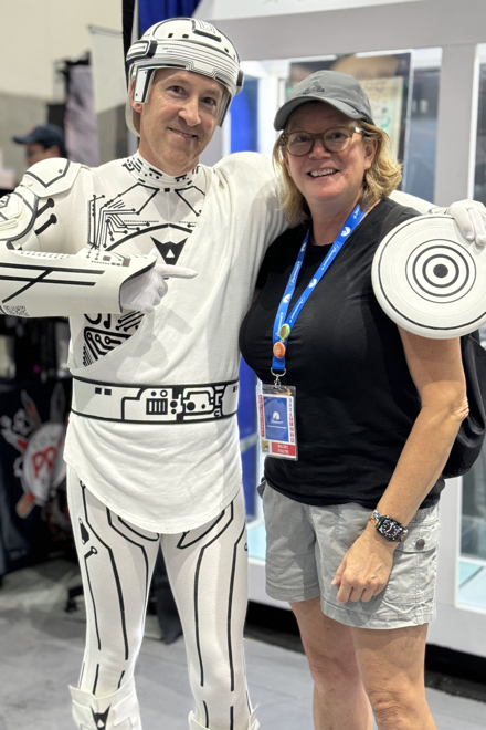
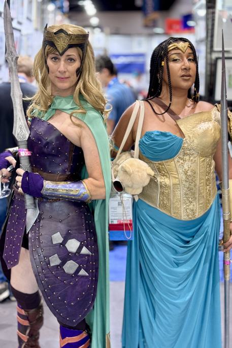
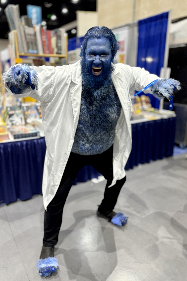
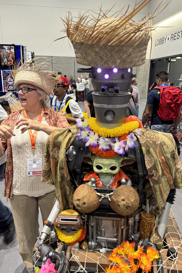
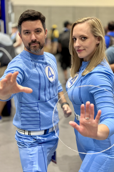
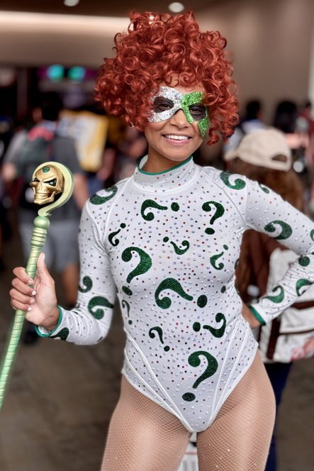
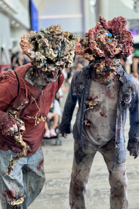
Another great (and exhausting) con, and some terrific Cosplay as well. Happy Halloween!


September 21, 2024
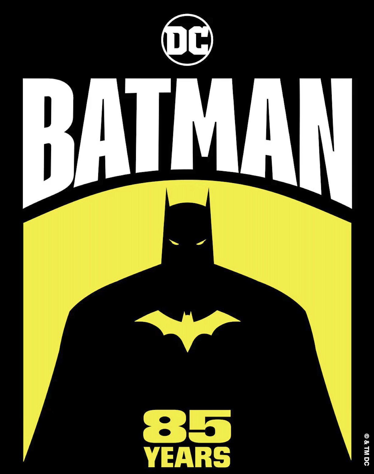
In honor of Batman Day — and the caped crusader’s 85th birthday — here’s a link to all the posts that have featured Batman and his cast of colorful allies — and even more colorful villains:
https://greggoldsteincomicartgallery.com/?s=batman
We’ve been celebrating the Dark Knight throughout the month of September; one more bat-post to load next week, and then it’s off to October and monsters and ghouls, et al.
Same bat-time, same bat-channel.
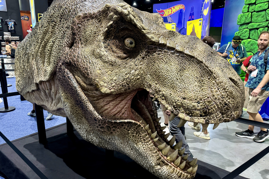
San Diego Comic-Con, July 24-28, 2024


San Diego Comic-Con, July 24-28, 2024
Even more cosplay…


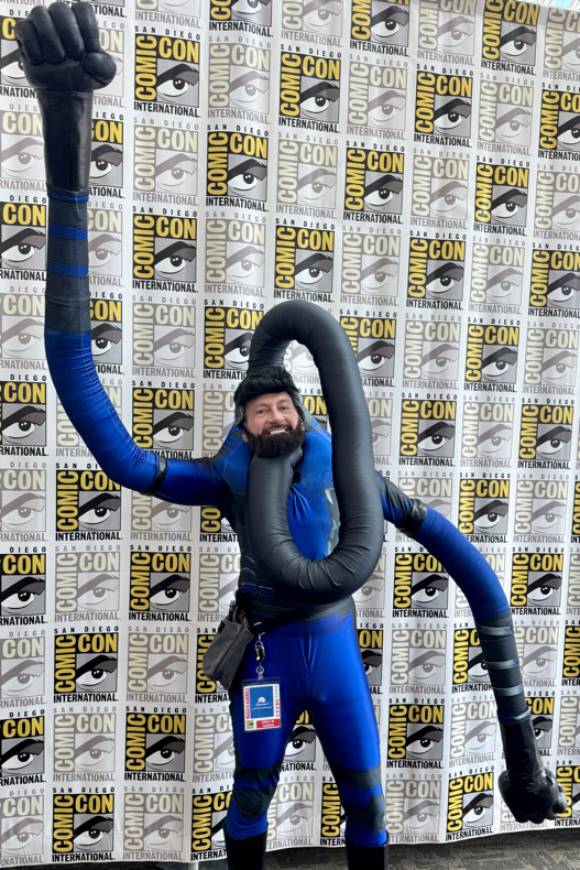
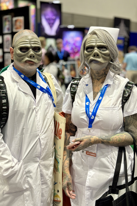


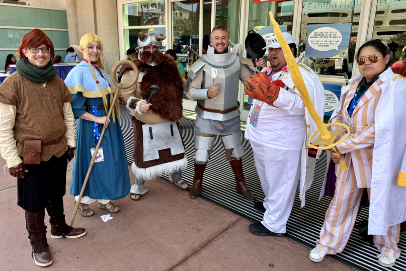
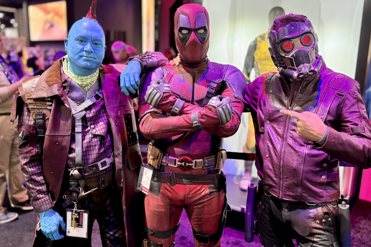
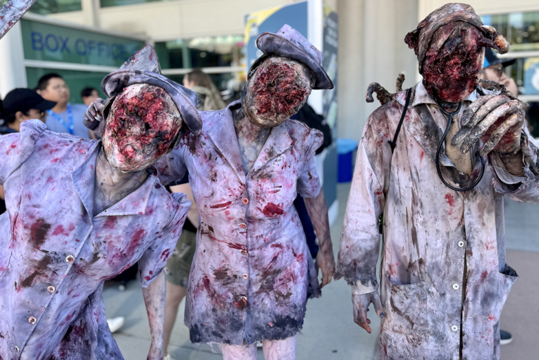
San Diego Comic-Con, July 24-28, 2024
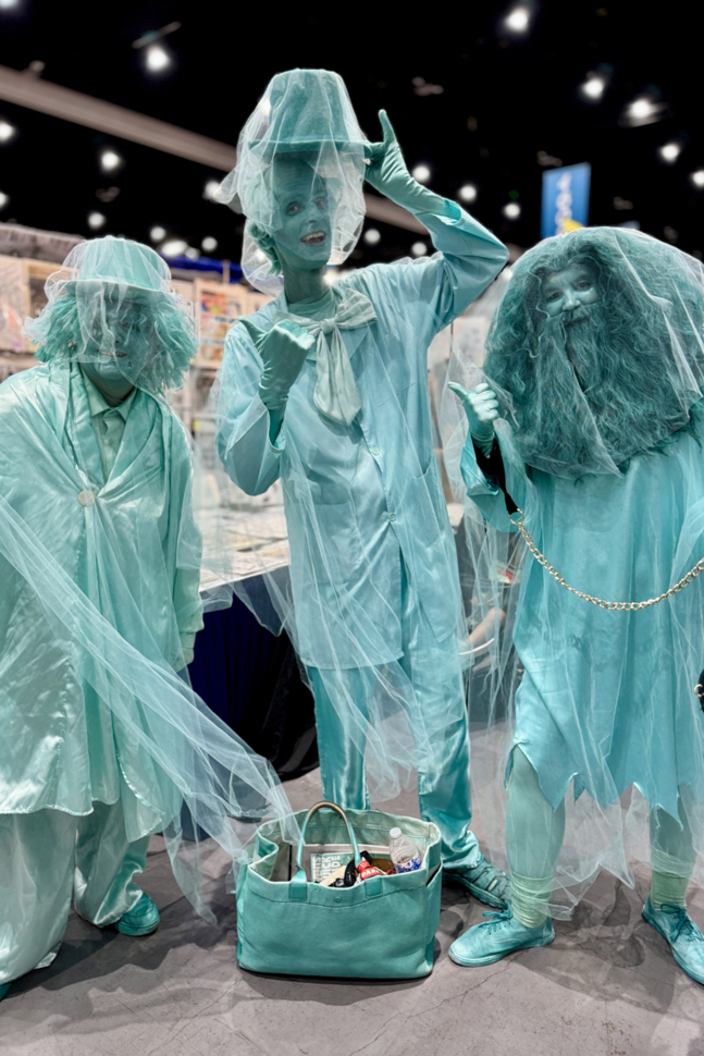
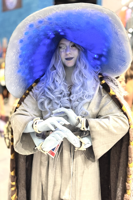
Some more cosplay…


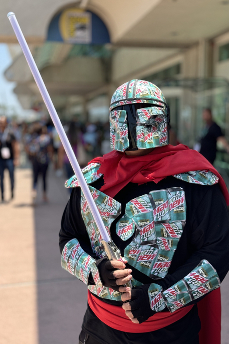

San Diego Comic-Con, July 24-28, 2024
Somehow, another year SDCC has already come and gone, and again, I ask the simple question: How does it go by so quickly?
I can’t answer that, but I can say this: For better or worse, the convention is pretty much back to it’s pre-pandemic magnitude.
Minus, of course, the carpeting. Please, on behalf of feet (and backs) everywhere — bring back the carpeting.