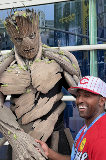
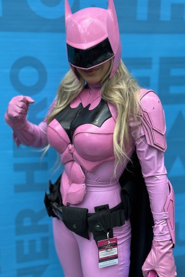
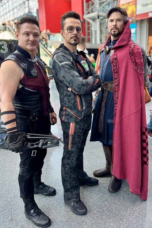
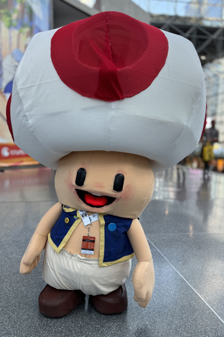
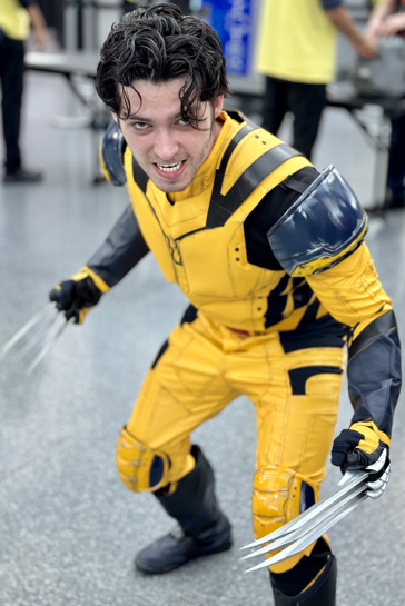
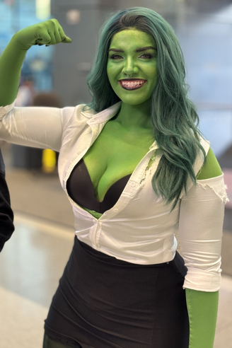
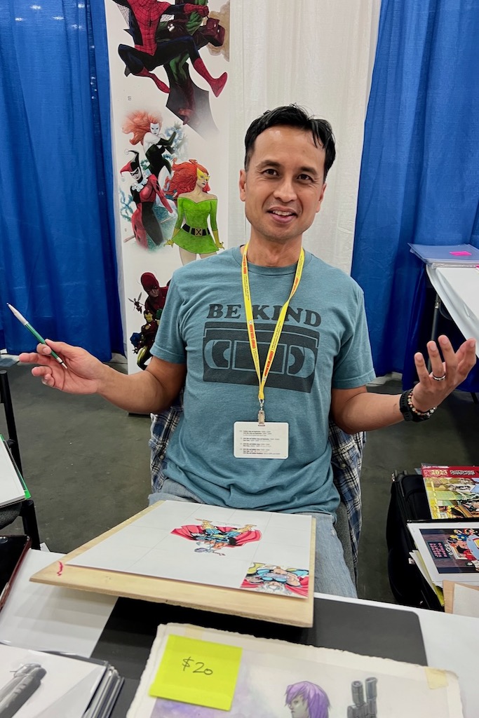
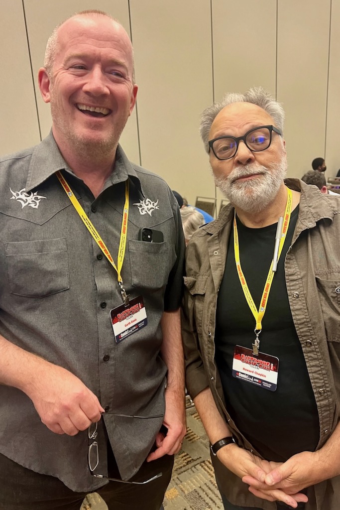
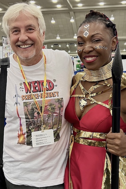
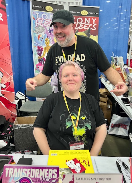
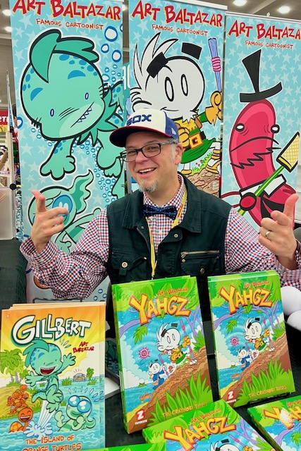
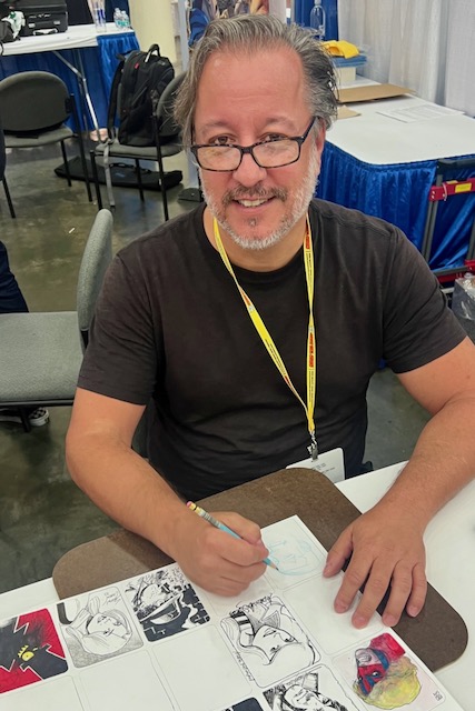
NYCC — 2023 Edition (Part 1)
October 12-15, 2023
My first trip back since 2019. The Convention expansion has provided (some) breathing room, but it still felt like it took forever to get from point A to point B. Of course, I am four years older…
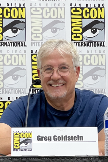
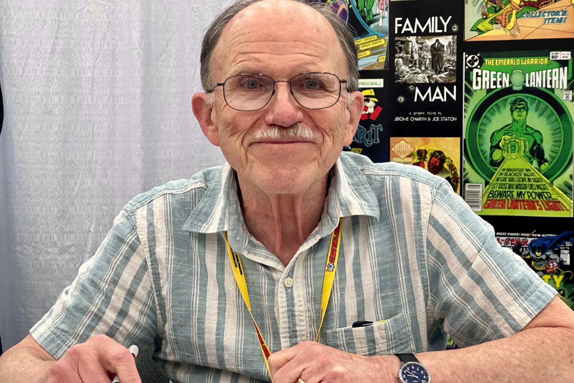
Greg Goldstein's Comic Art Gallery
Panels and Pages… Art and Artists… Creators and Conventions… Musings and Memories…

October 12-15, 2023
My first trip back since 2019. The Convention expansion has provided (some) breathing room, but it still felt like it took forever to get from point A to point B. Of course, I am four years older…
San Diego Comic-Con, July 1993
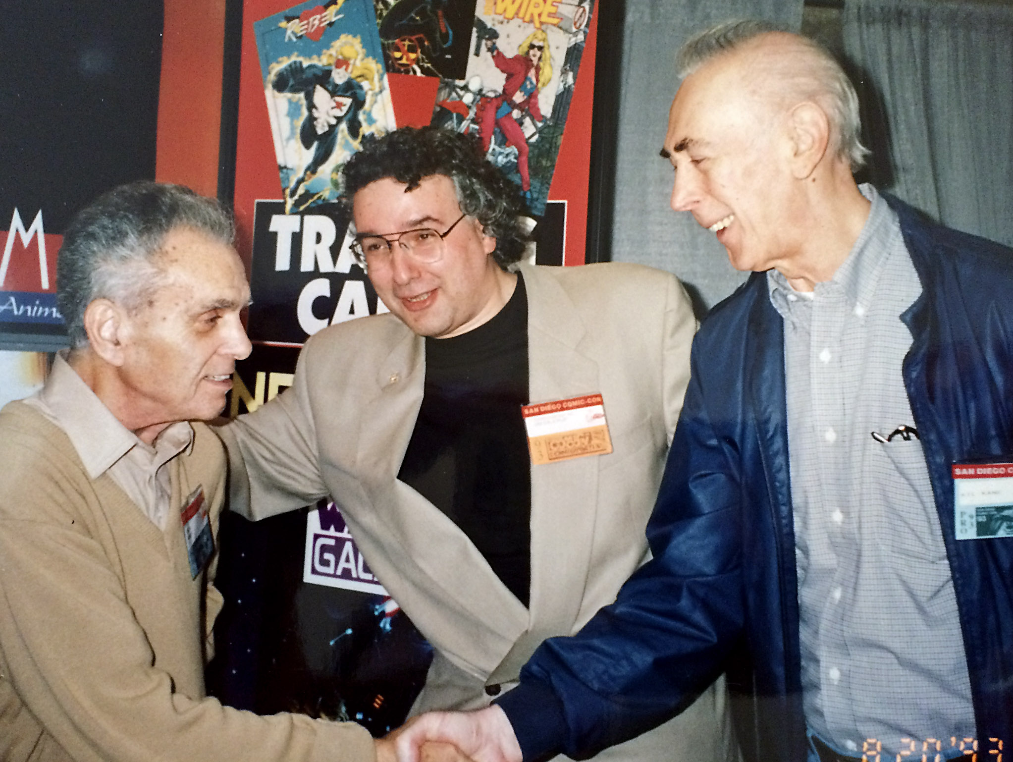
30 years ago, I had the good sense to snap this fantastic photo of Jack Kirby and Gil Kane at the 1993 San Diego Comic-Con. (Jaunty Jim Salicrup, the Topps Comics EIC, is the happy fella in the middle.)
Fantastic, but, as it turned out, bittersweet: This was the final time these two legends had a chance to greet each other. (Jack passed away the following winter.) I’m not sure they were both scheduled at the Topps booth at the same time, so it may have been a very happy coincidence.
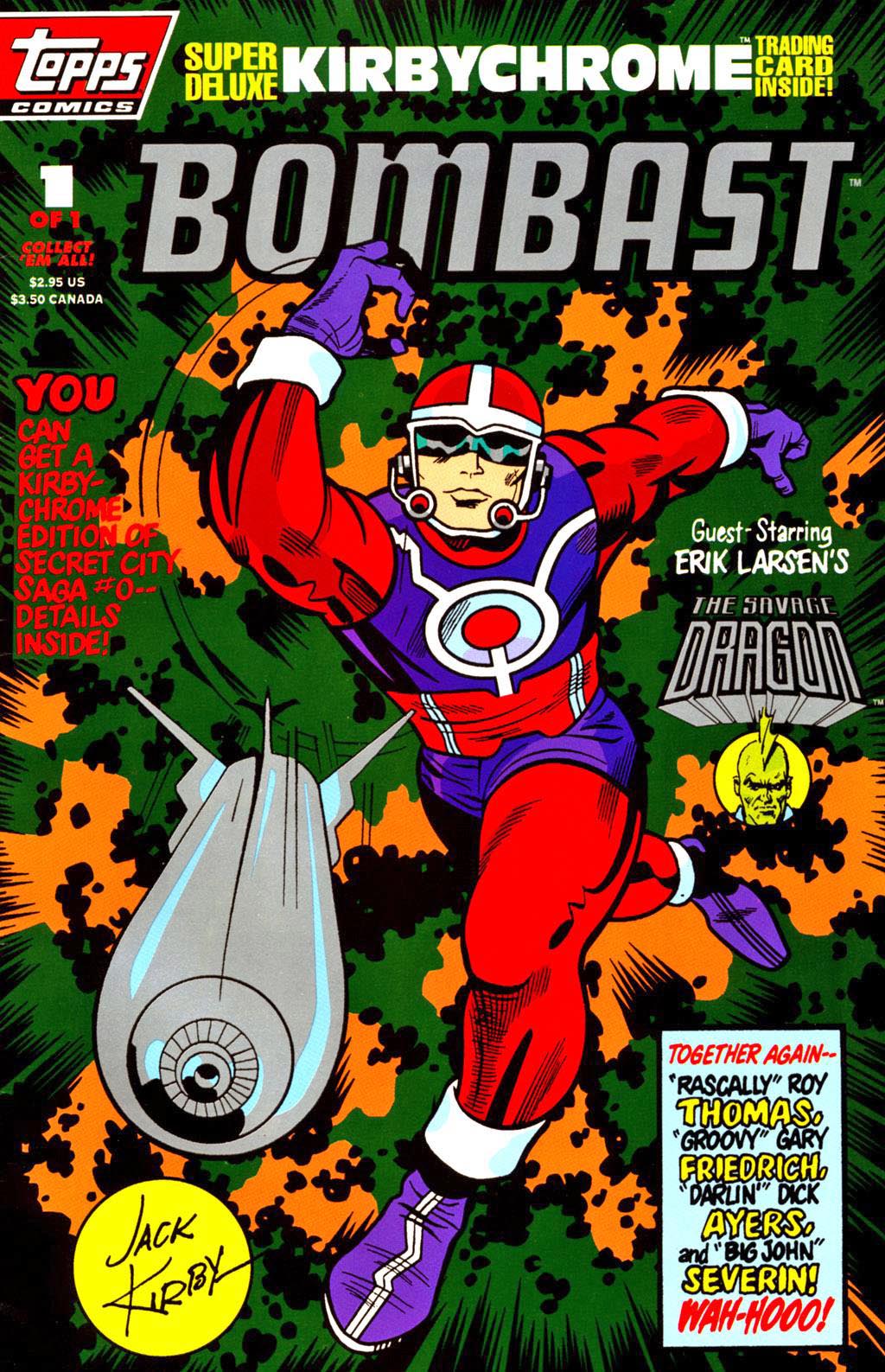
I’ve discussed Topps Comics (and trading cards) numerous times in previous posts — it was a wild ride with many great moments. This was one of my favorites.
And did I say good sense? Hardly. If I did, I would have handed off the disposable camera to someone else and jumped in the photo as well.
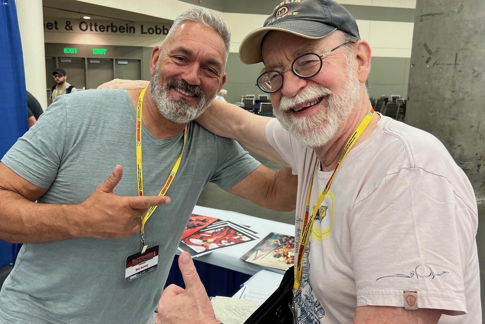
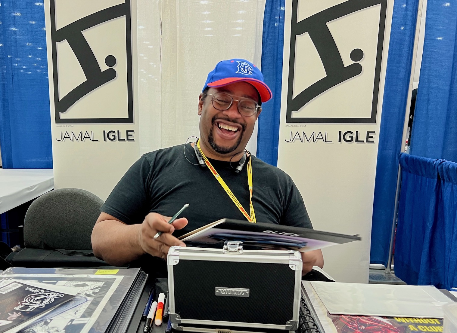
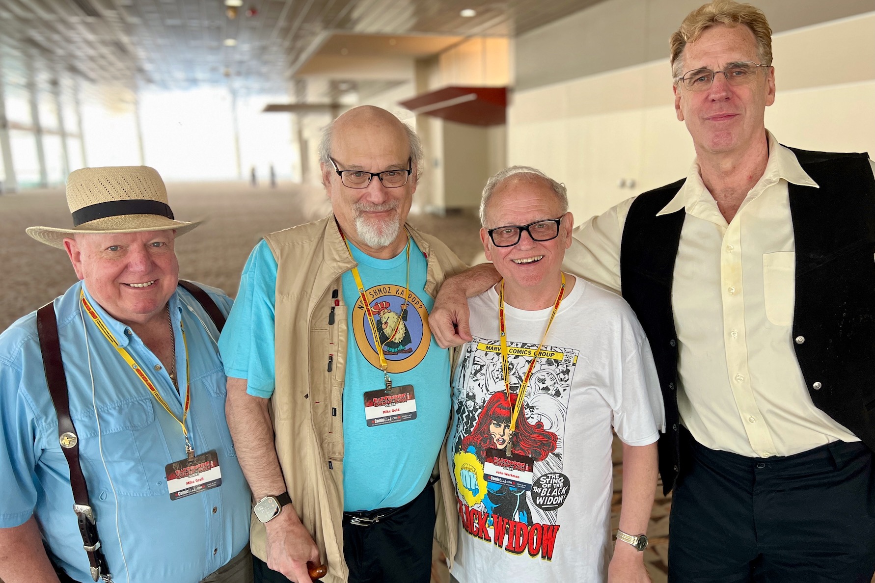
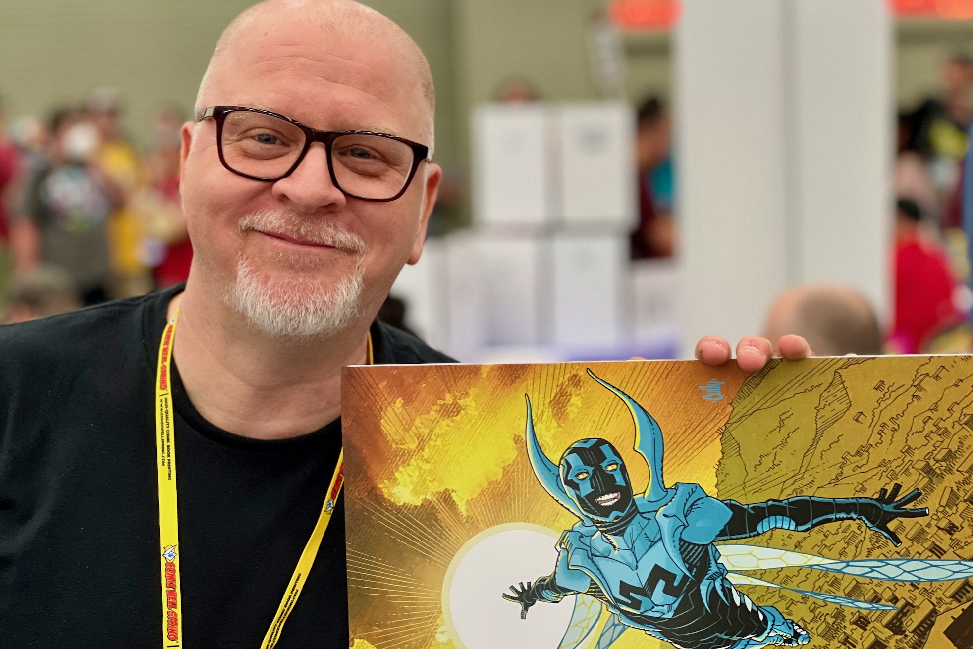
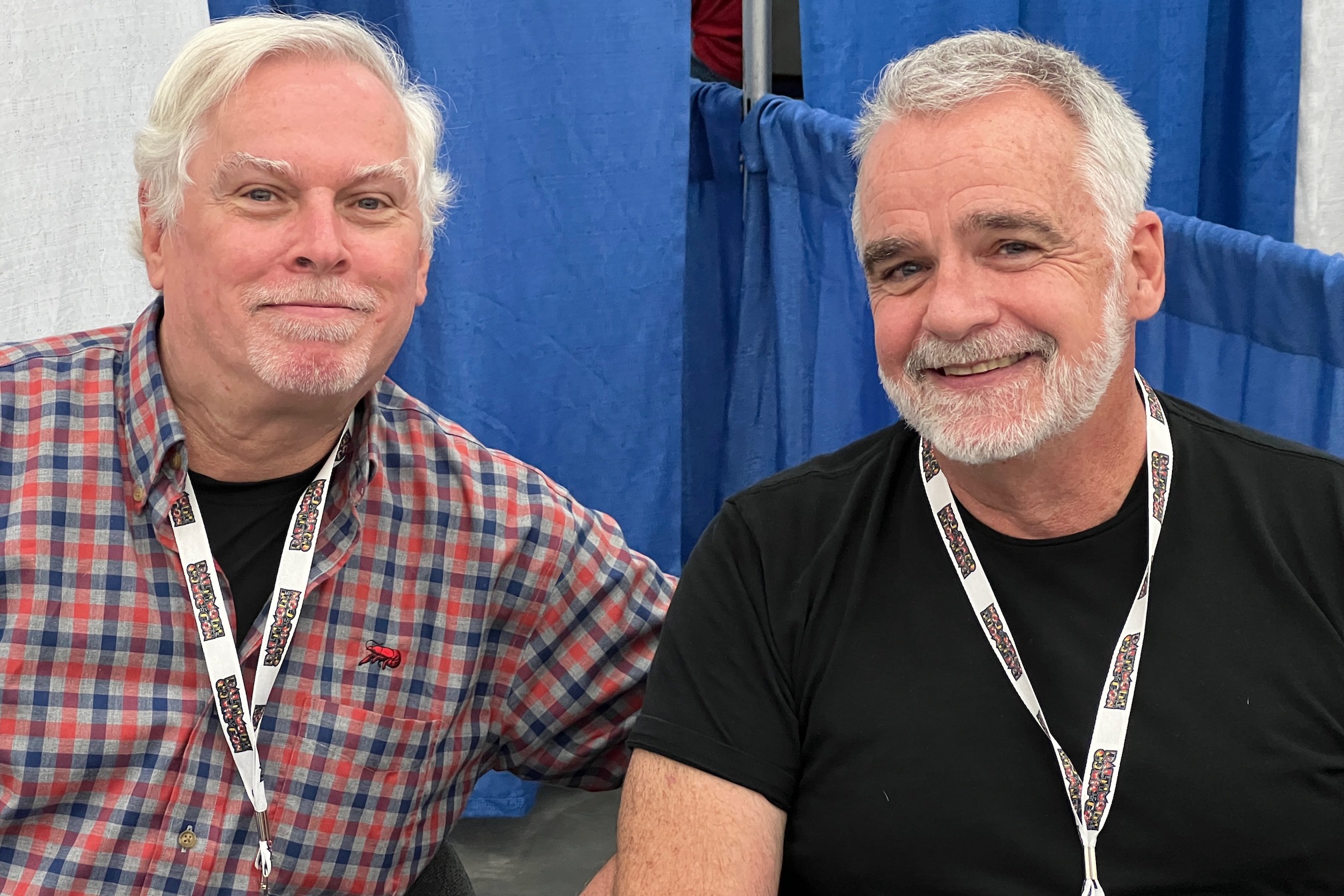
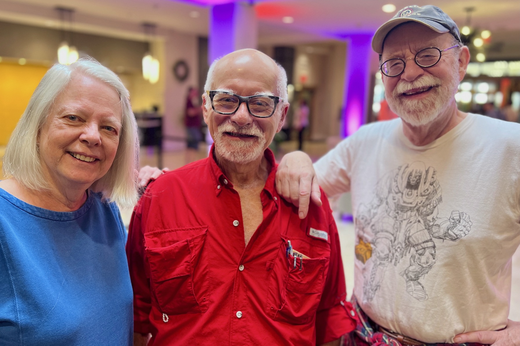
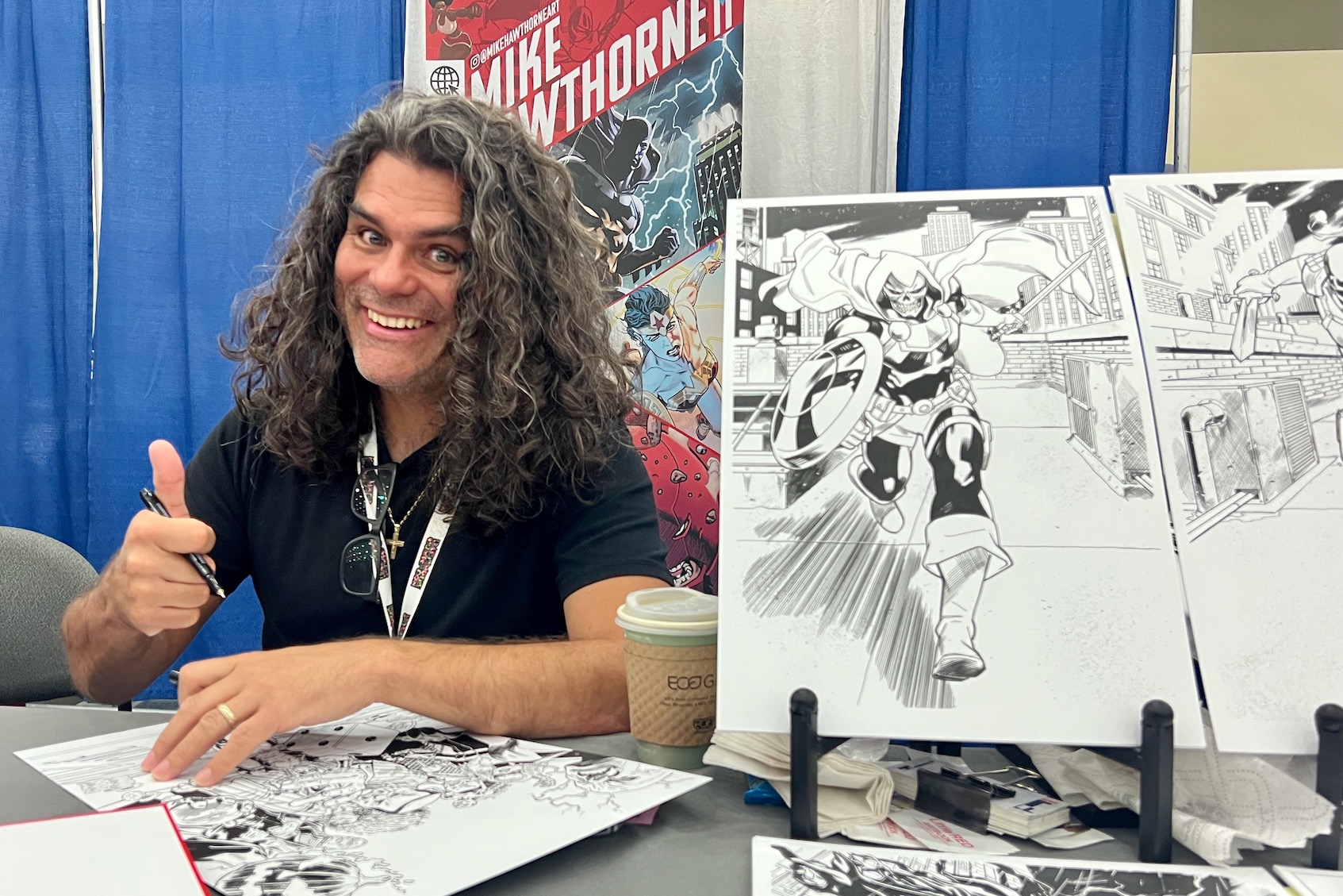
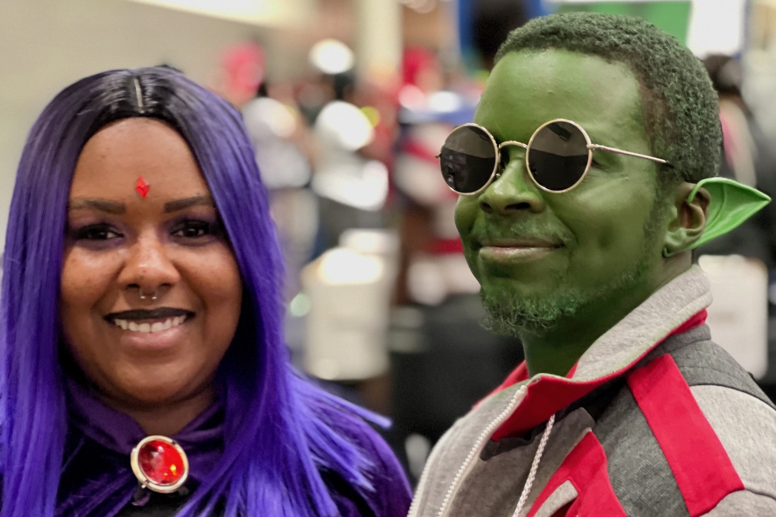
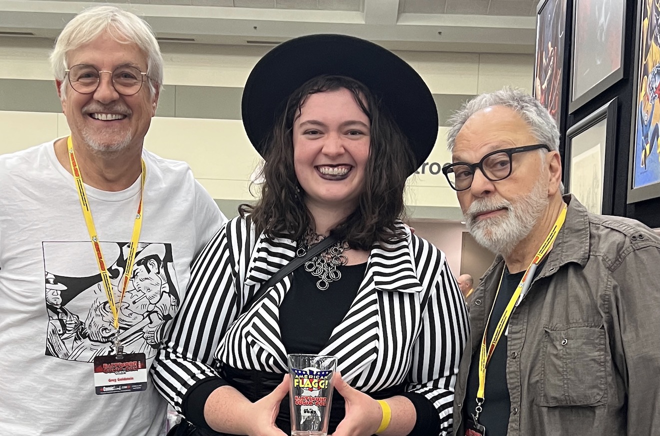
Baltimore Convention Center, September 8-10, 2023
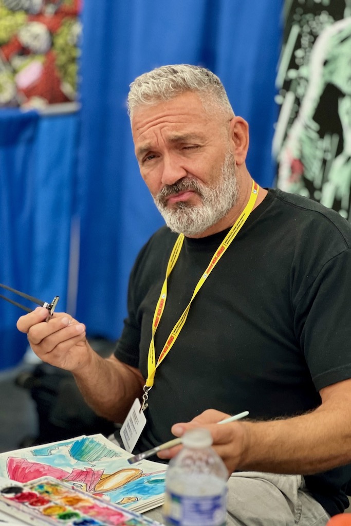
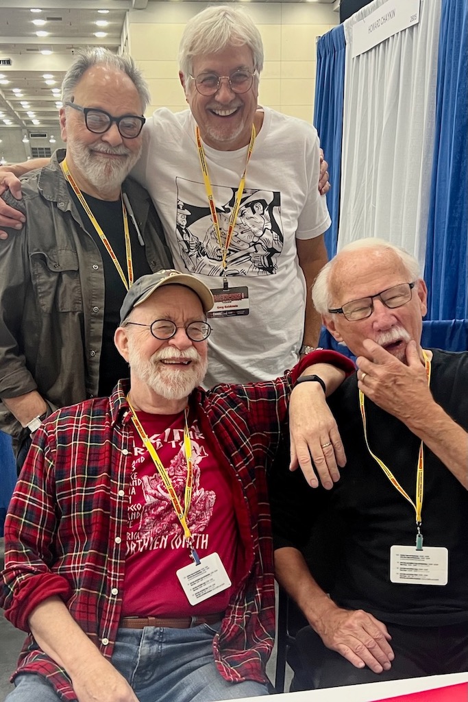
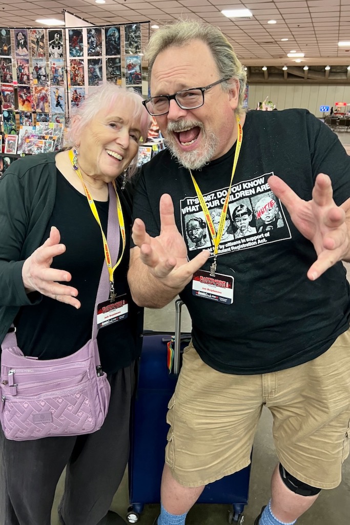
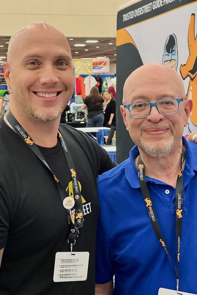
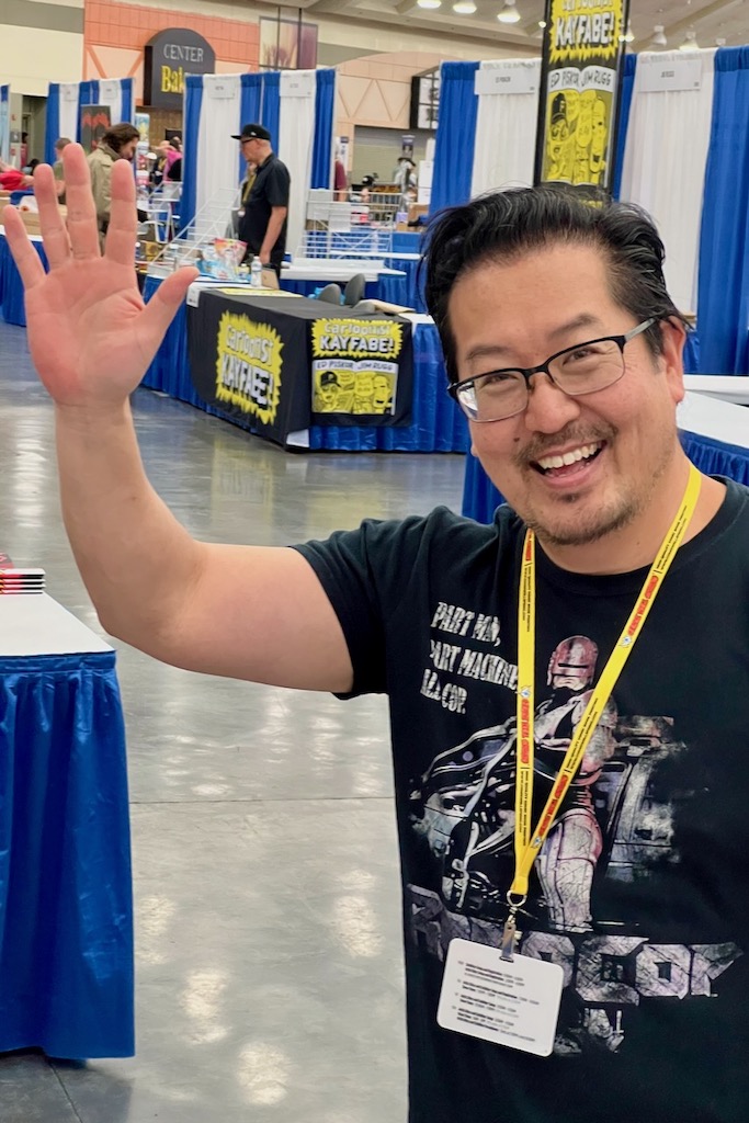
Baltimore Convention Center, September 8-10, 2023
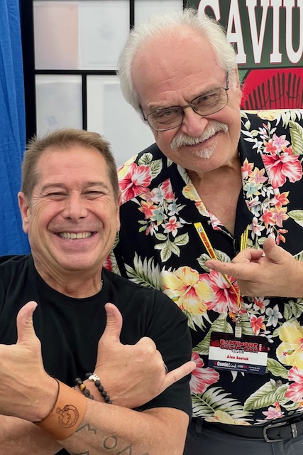

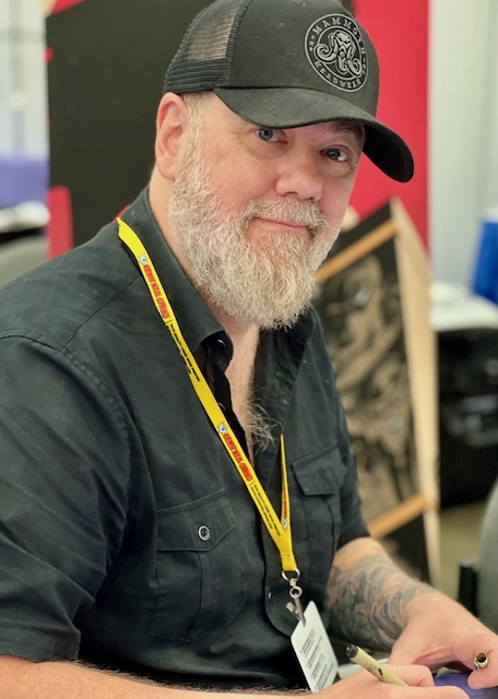
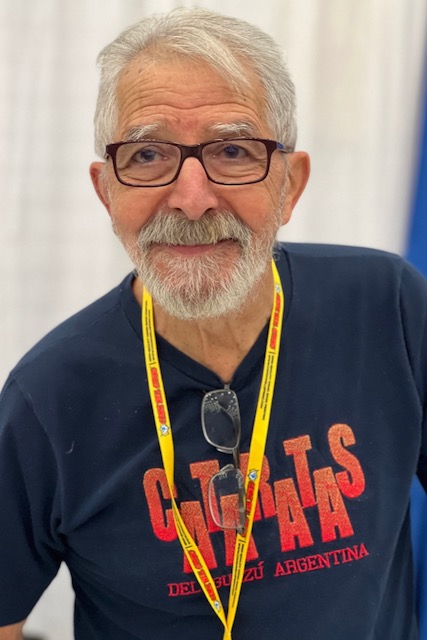
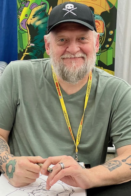
Baltimore Convention Center, September 8-10, 2023


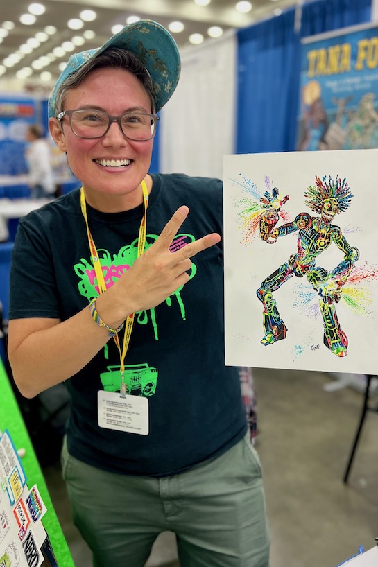
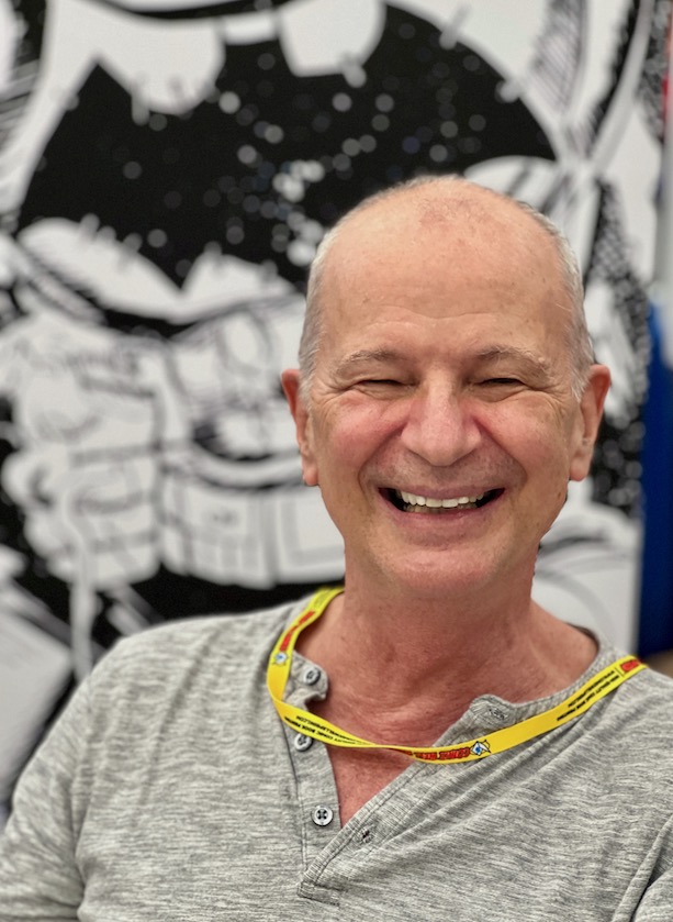
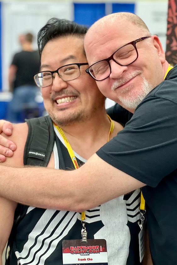
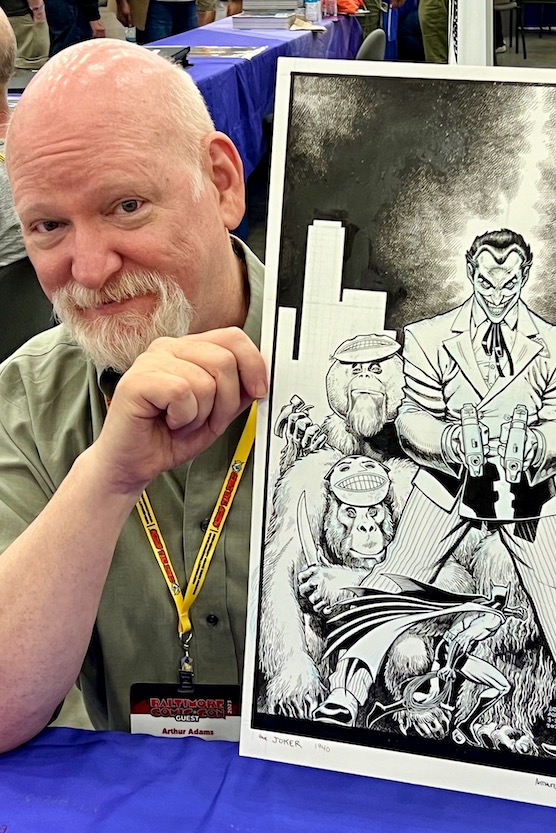
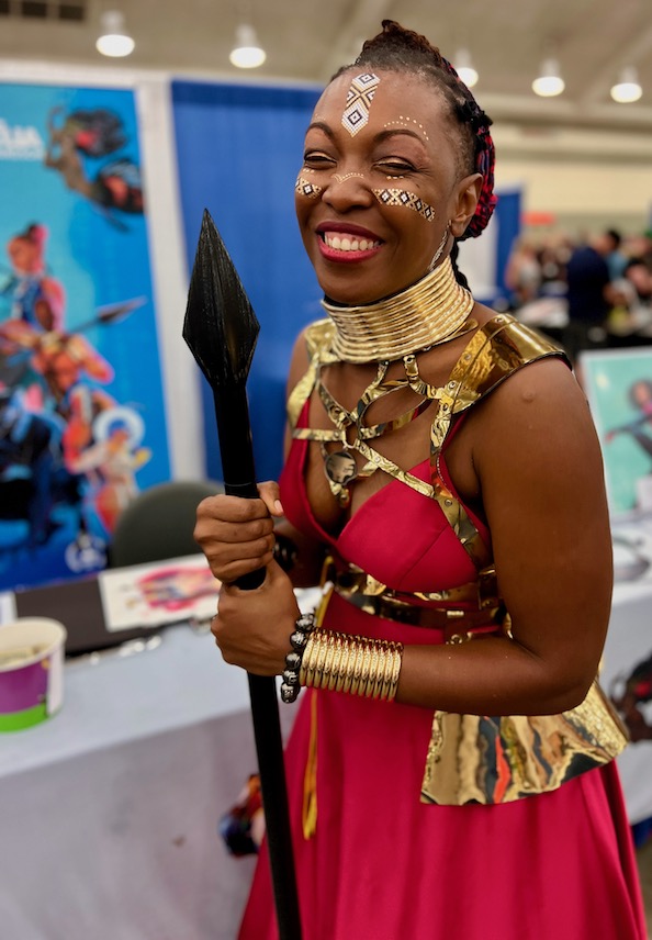
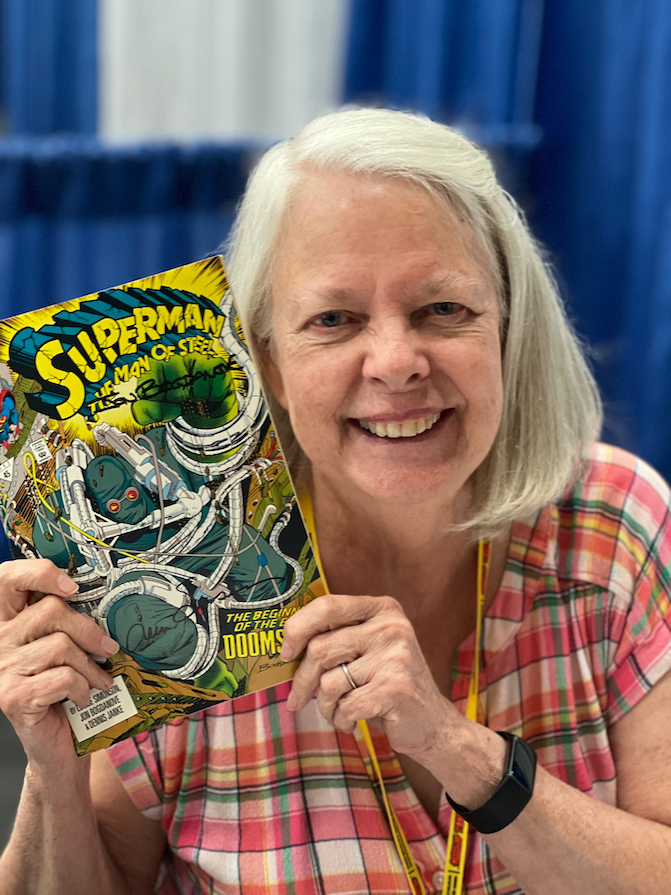
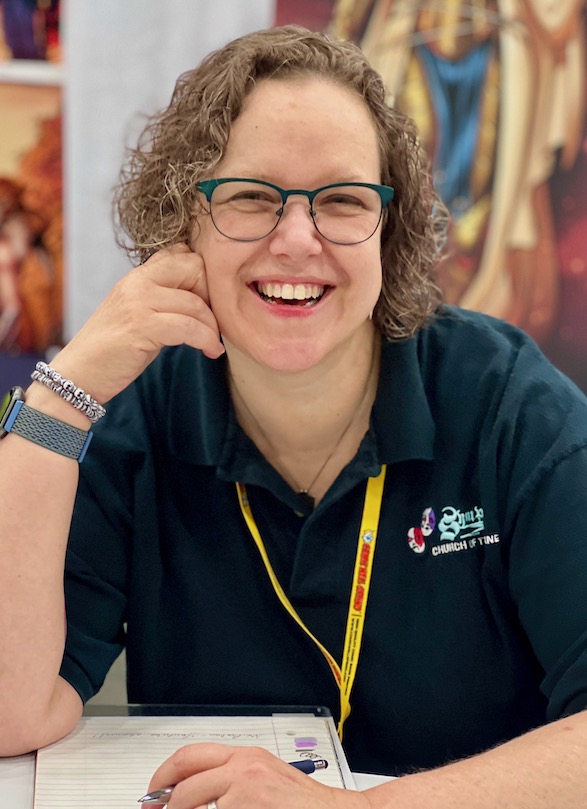
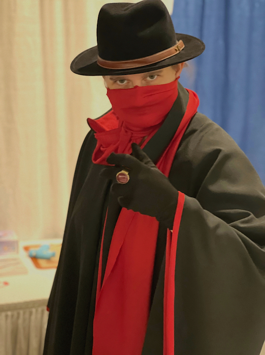
Baltimore Convention Center, September 8-10, 2023
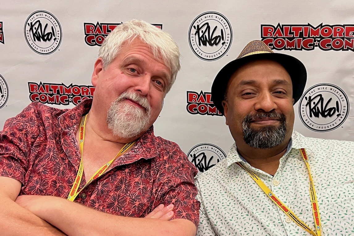
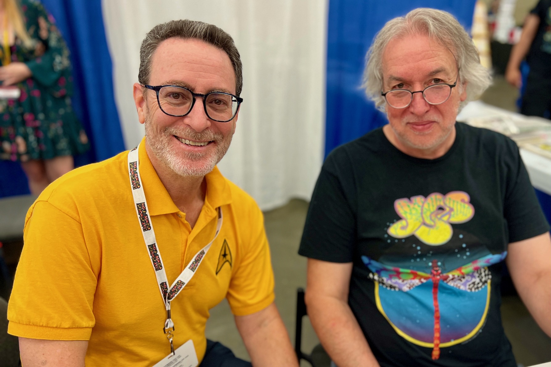
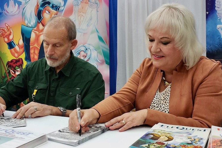
Once again, HUGE thanks and congrats to all the terrific folks who made this past weekend’s Baltimore Comic-Con just as perfect an event could be.
As noted in previous years, It’s easily one of my favorite conventions — an absolute delight to attend. I had a blast catching up with old friends and colleagues, making some new acquaintances, and hosting some fun panels.
I’m exhausted, but it’s a happy exhaustion, and once again, I miss all of you already.
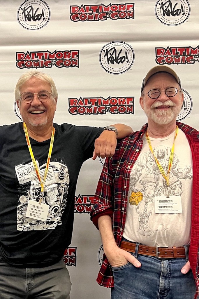
Baltimore Comic-Con, September 8-10, 2023
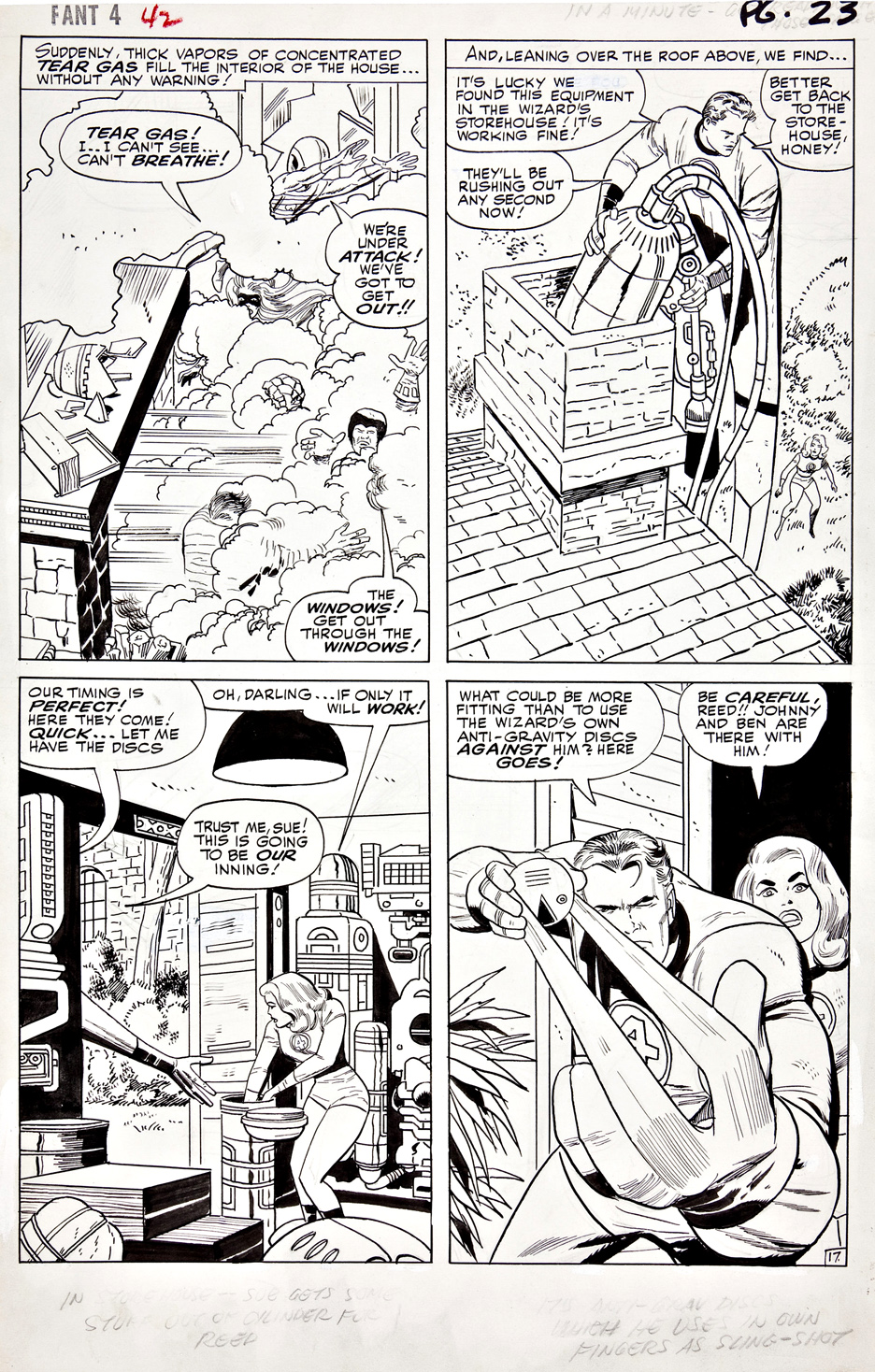
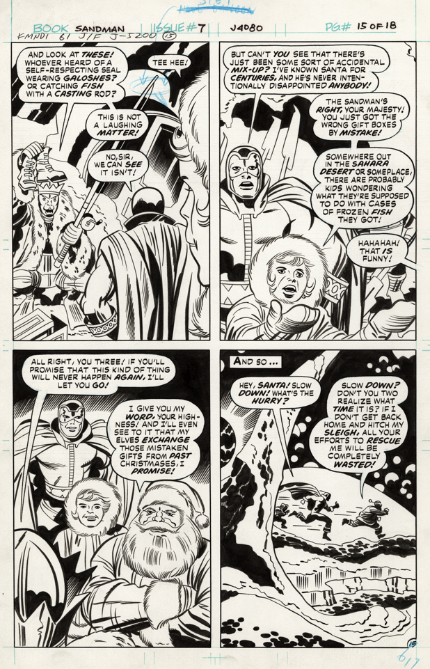
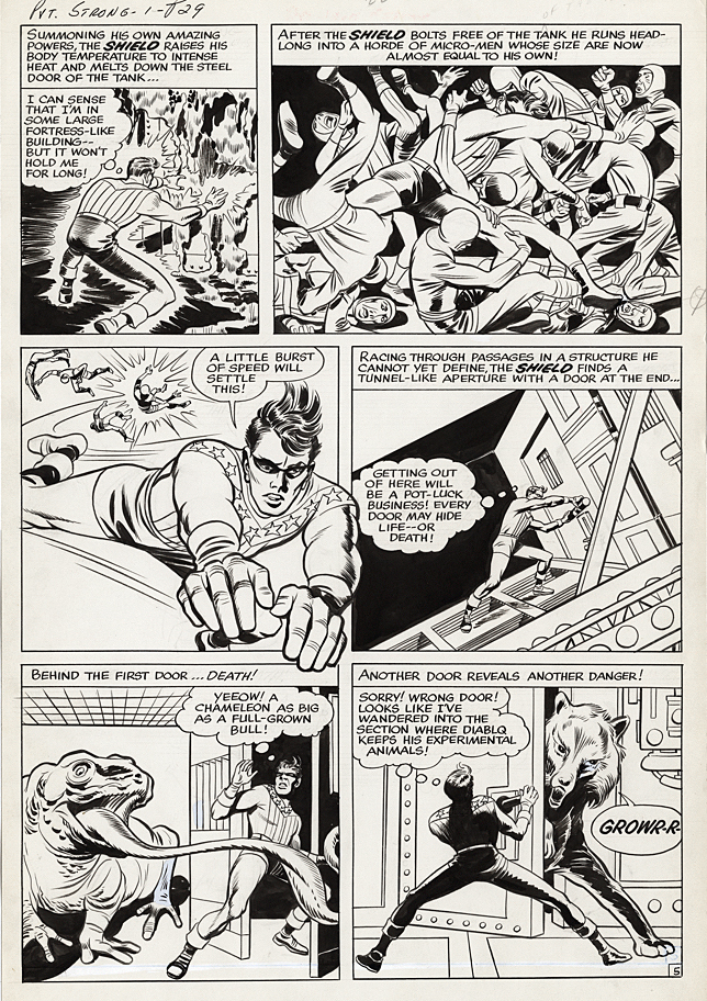
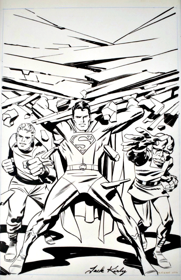
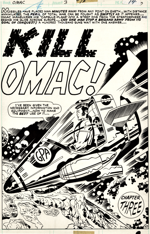
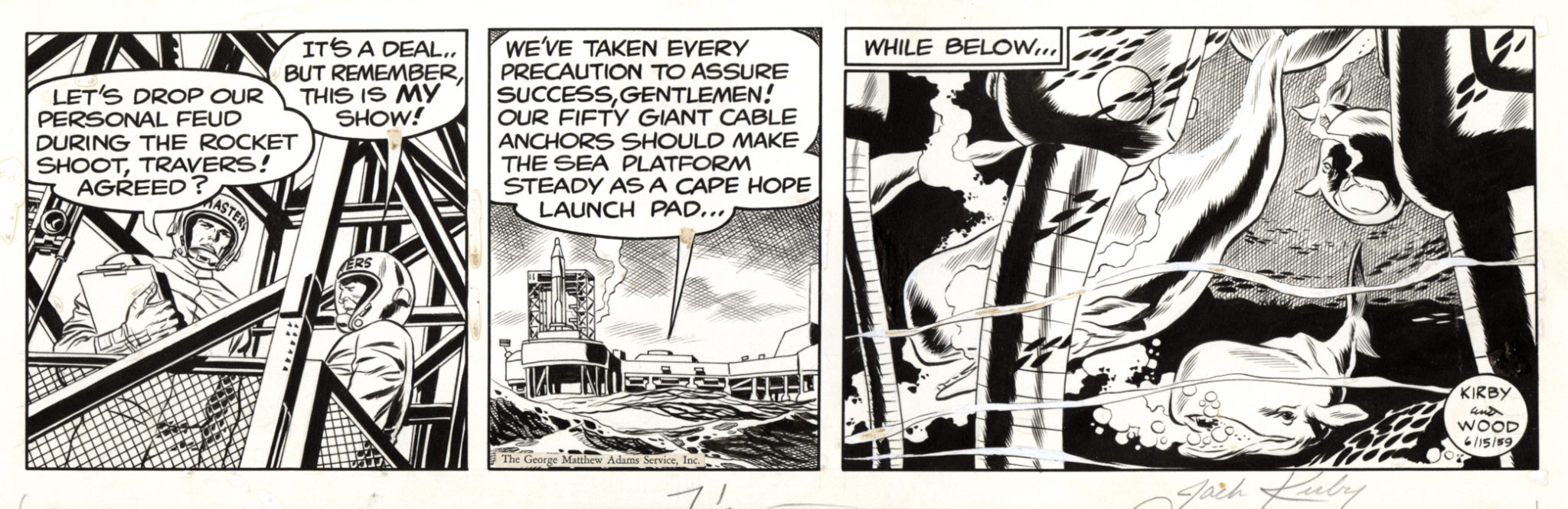
After a five-year hiatus, the legendary Jack Kirby original art presentation returns with nearly 1,000 high-res images* featuring some of the King’s most important pages and covers. Join myself, the legendary Walter Simonson, the incredible Scott Dunbier (at least 80(!) IDW Publishing Artist Edition collections under his editorial belt — I’ve lost count) for a Kirby tribute unlike any other.
Baltimore Comic Con 9/8-9/10, exact time and panel room location TBD.
(*Yes, nearly 1,000. It’s an hour-long presentation, so if you blink, you’ll miss a few.)
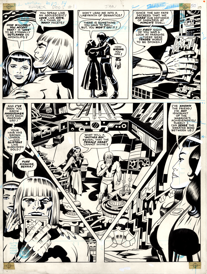
In the meantime, I’m fortunate enough to personally own a few pages of Jack’s original art and have covered most of them previously in the blog, but here they are in one place for the first time.
If you want to see them and much more, simply enter “Jack Kirby” into the blog search bar.
It was my turn to chat with Comic Art Fans (CAF) moderator Bill Cox this past Tuesday. We ended up talking about lots of interesting comic book publishing history… plus some great art. You can watch it directly through the link below:
And speaking of comic book history…
In celebration of 50 years of the creation of the comic book specialty distribution market, Milton Griepp of ICV2 is featuring a series of interviews with early “pioneers” in the business. The day before this past SDCC, my interview (video and print) appeared. If you’ve got some down time (Ok, if you’re bored with pretty much everything else on-line at the moment), please join me down the rabbit hole.
Good timing on the publication of the interviews; I am personally celebrating 40 years of professional contributions to the popular entertainment arts (Topps, IDW Publishing, Activision, et al) in one media format or another.
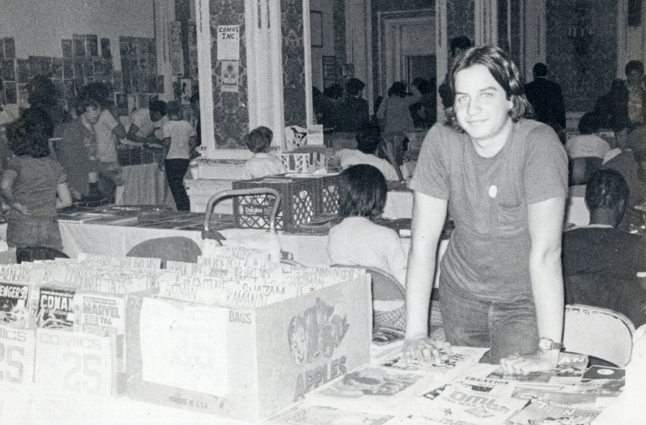
Teenage Greg (photo is October 1975, at Phil Seuling’s monthly Comic Book Marketplace show in New York City) would be very amused, if not startled.
Long, strange trip indeed.
Voodoo Ranger, Nerdin’ Out and… a Pirate ship
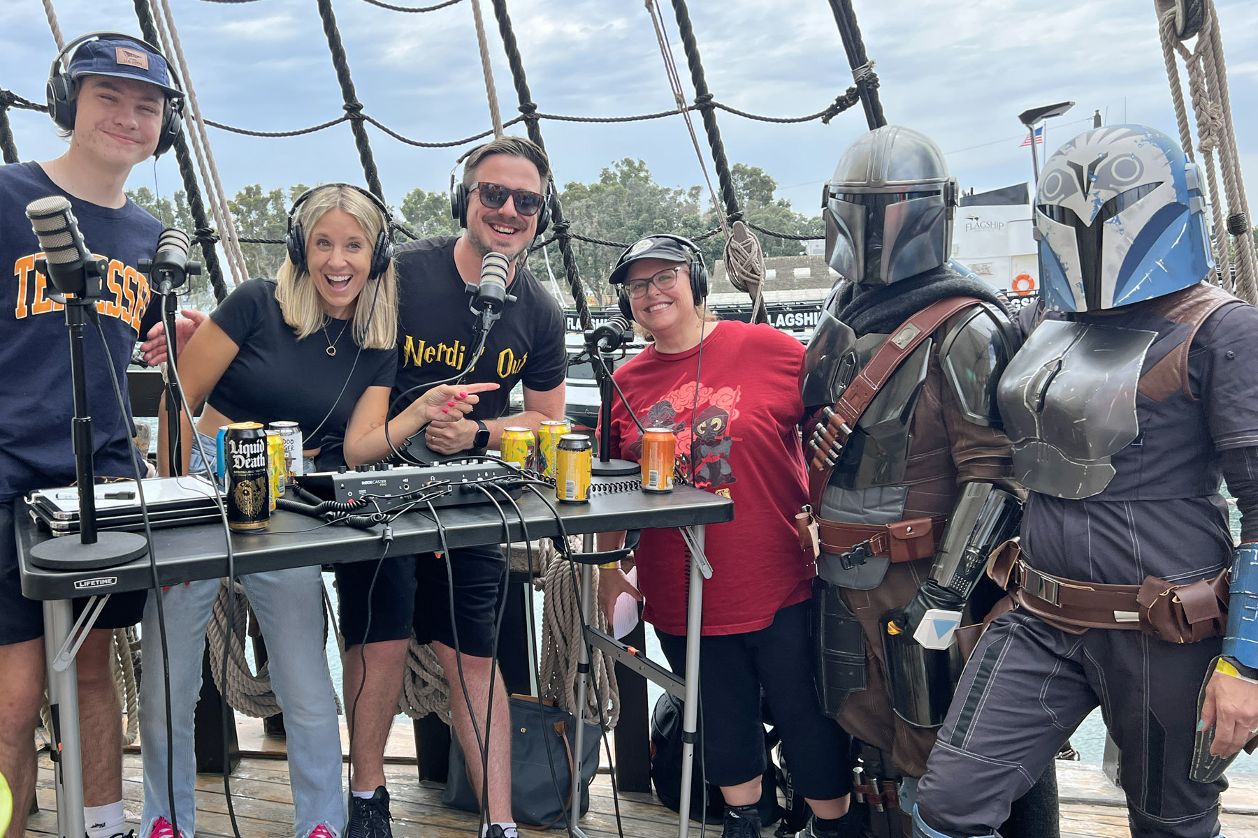
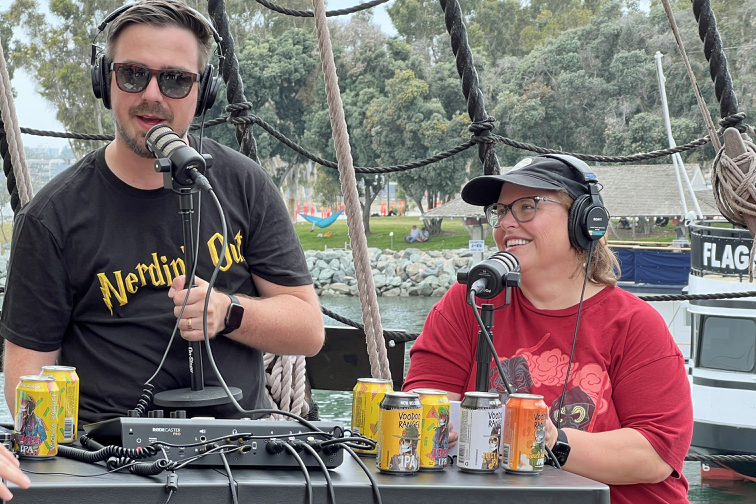
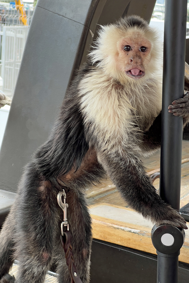
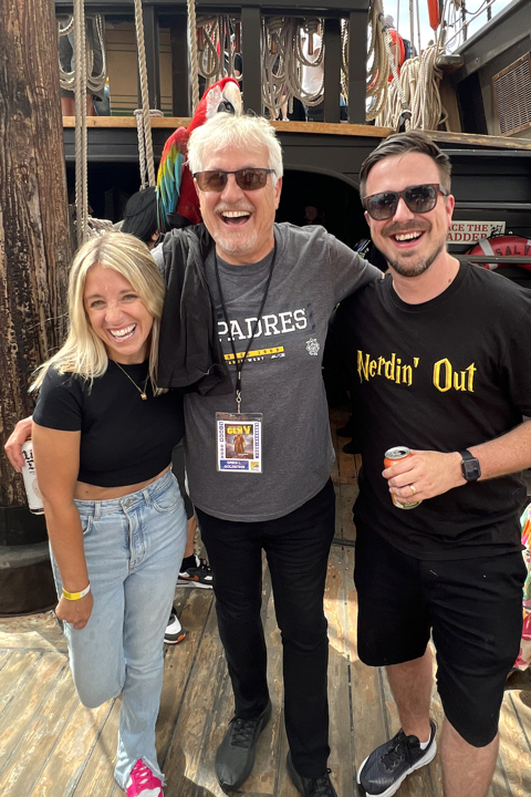
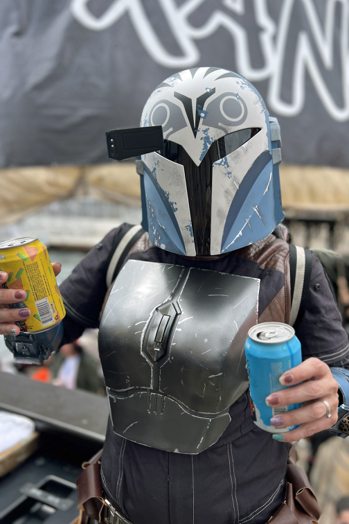
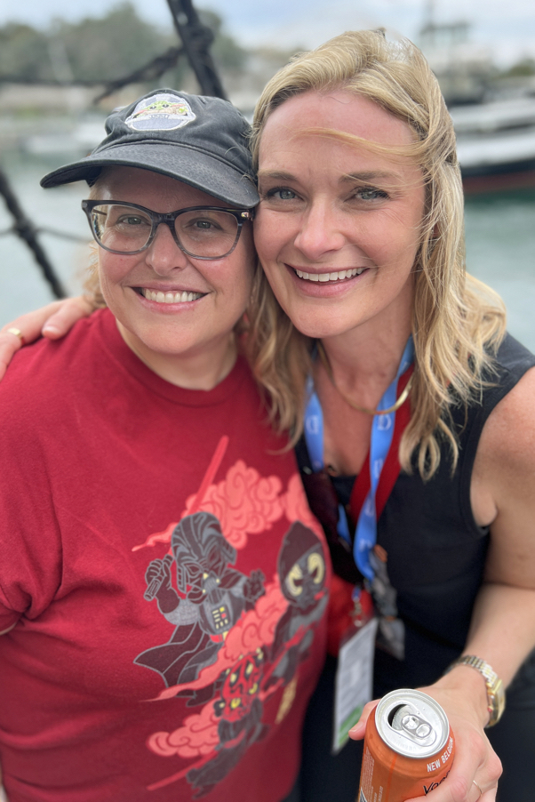
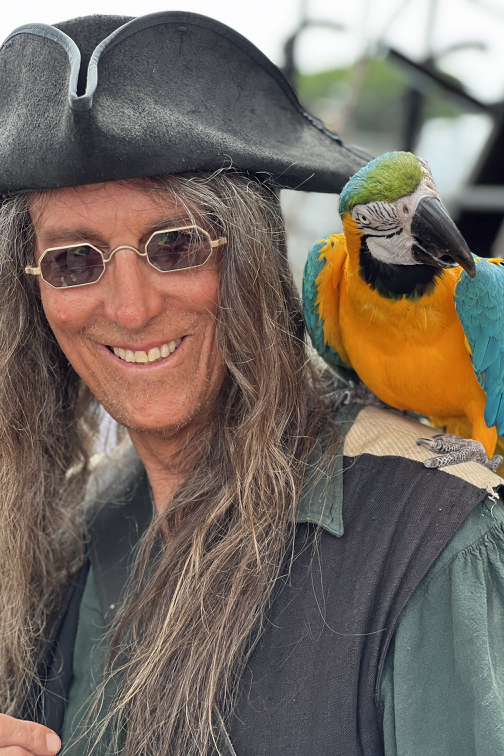
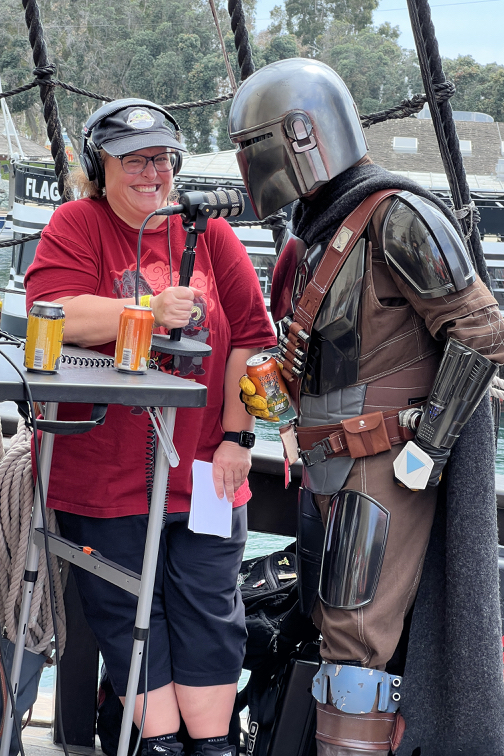
Live from the Voodoo Ranger Pirate Ship, Saturday July 22, 2023 — The Nerdin’ Out Podcast featuring Ravey, Cameron, Courtney, the rest of the great cast and crew, plus… pirates, parrots, a monkey and.. beer!
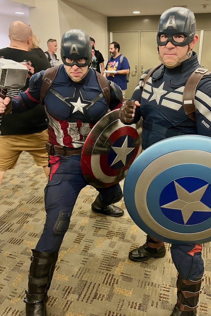
What does this have to do with comic art and/or graphic novel history?
Not much… But it was Comic-Con.
July 19-23, 2023