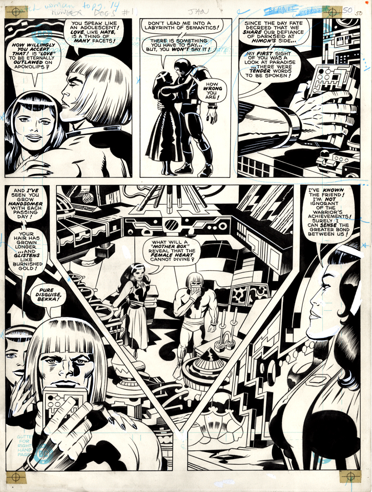
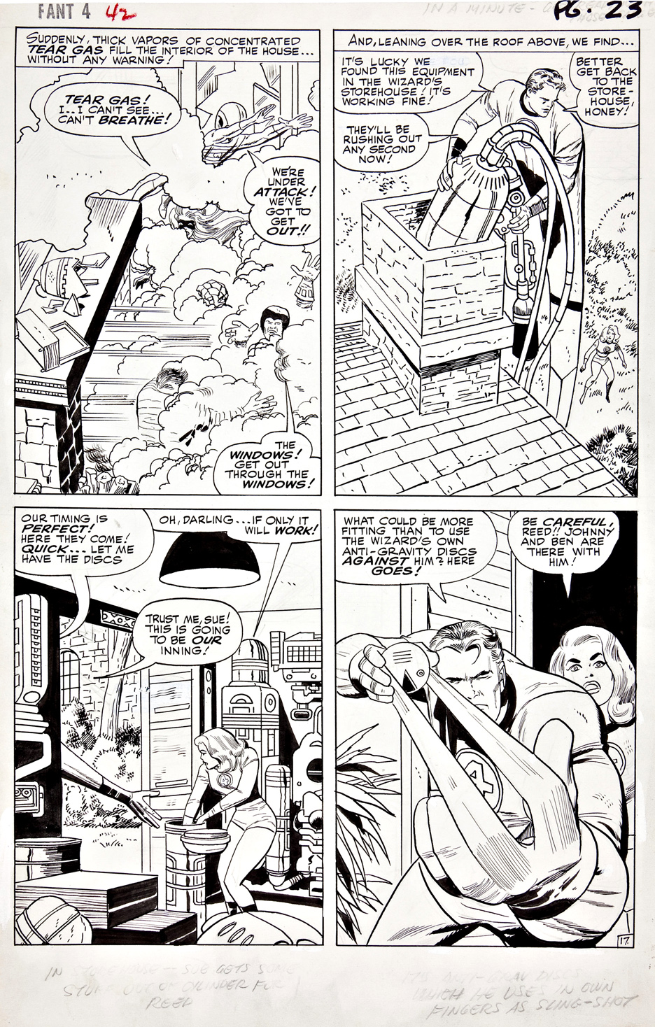
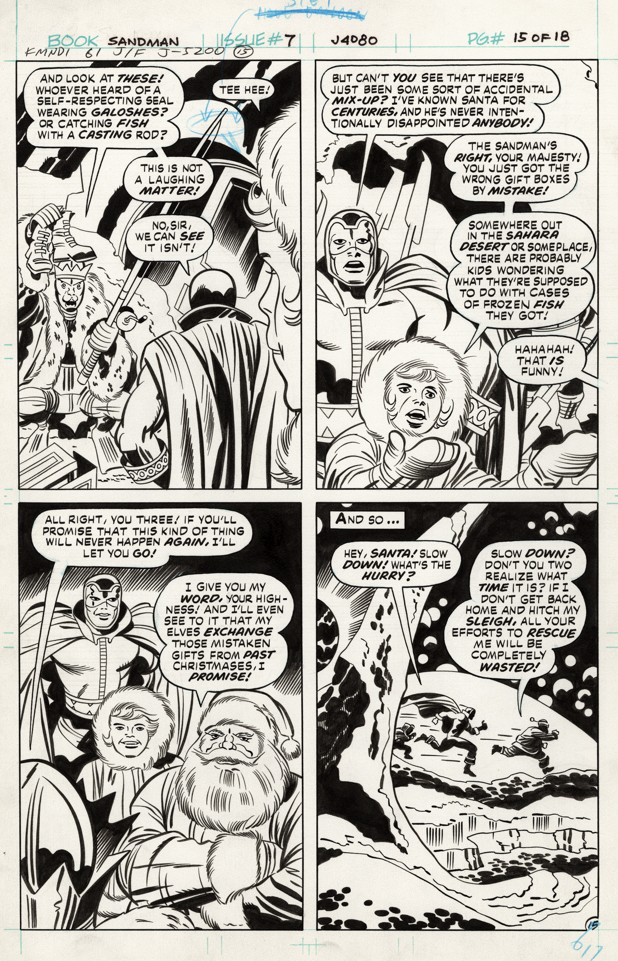
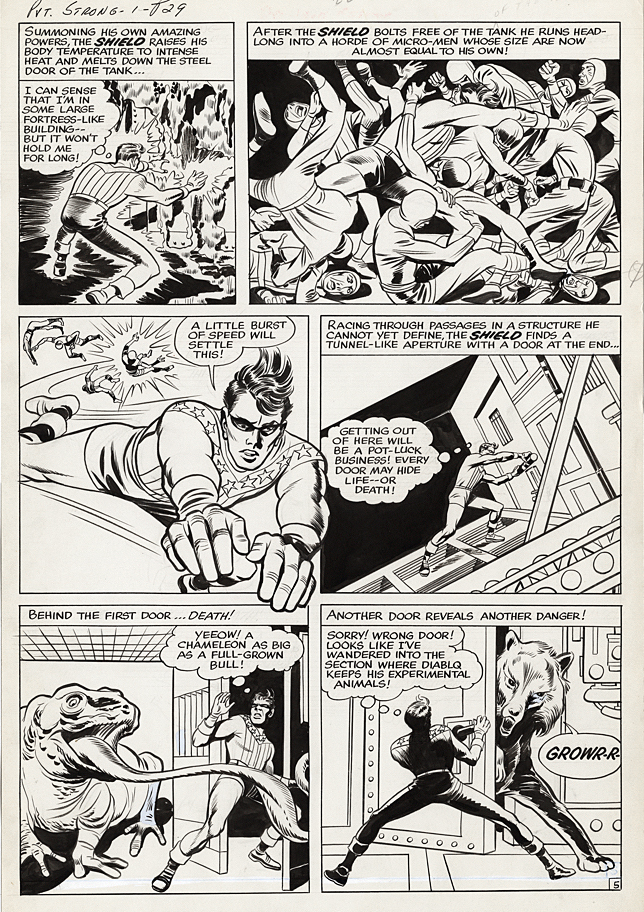
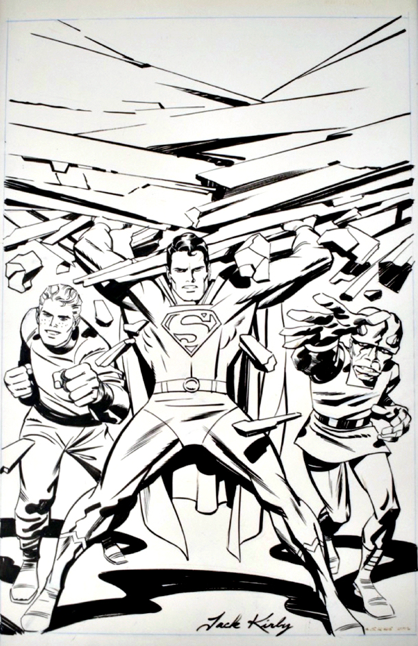
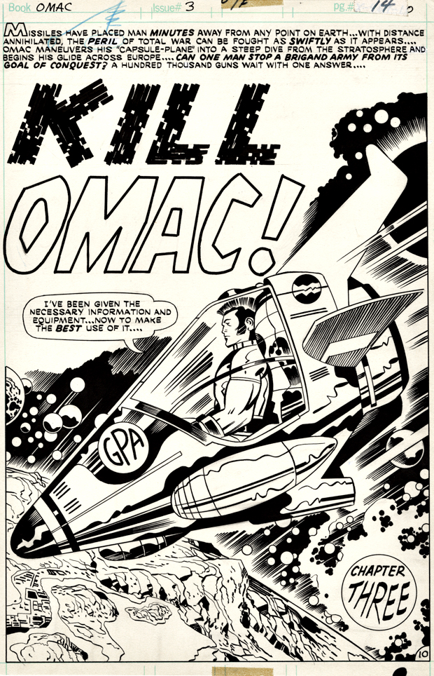
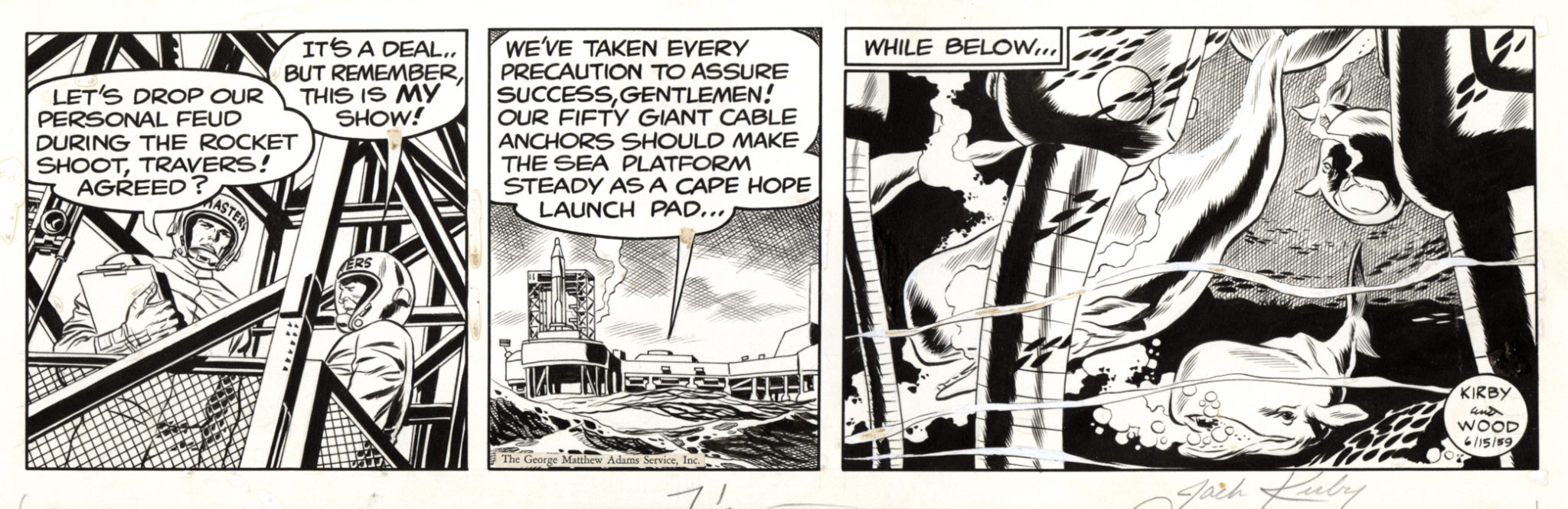
After a five-year hiatus, the legendary Jack Kirby original art presentation returns with nearly 1,000 high-res images* featuring some of the King’s most important pages and covers. Join myself, the legendary Walter Simonson, the incredible Scott Dunbier (at least 80(!) IDW Publishing Artist Edition collections under his editorial belt — I’ve lost count) for a Kirby tribute unlike any other.
Baltimore Comic Con 9/8-9/10, exact time and panel room location TBD.
(*Yes, nearly 1,000. It’s an hour-long presentation, so if you blink, you’ll miss a few.)
In the meantime, I’m fortunate enough to personally own a few pages of Jack’s original art and have covered most of them previously in the blog, but here they are in one place for the first time.
If you want to see them and much more, simply enter “Jack Kirby” into the blog search bar.
It was my turn to chat with Comic Art Fans (CAF) moderator Bill Cox this past Tuesday. We ended up talking about lots of interesting comic book publishing history… plus some great art. You can watch it directly through the link below:
And speaking of comic book history…
In celebration of 50 years of the creation of the comic book specialty distribution market, Milton Griepp of ICV2 is featuring a series of interviews with early “pioneers” in the business. The day before this past SDCC, my interview (video and print) appeared. If you’ve got some down time (Ok, if you’re bored with pretty much everything else on-line at the moment), please join me down the rabbit hole.
Good timing on the publication of the interviews; I am personally celebrating 40 years of professional contributions to the popular entertainment arts (Topps, IDW Publishing, Activision, et al) in one media format or another.
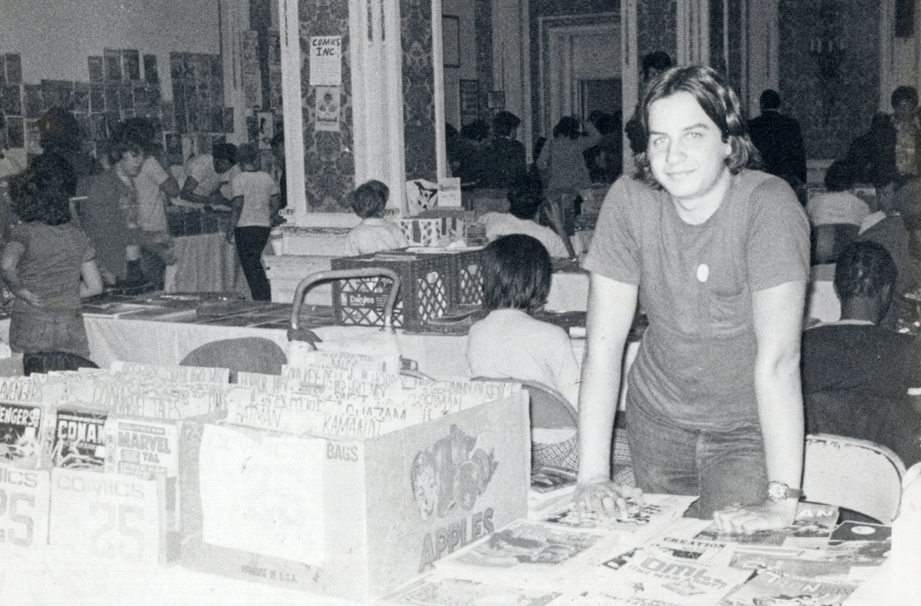
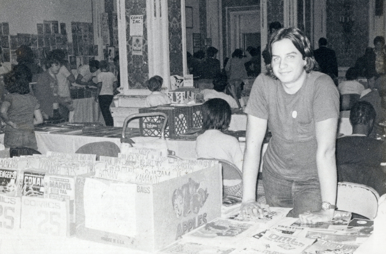
Teenage Greg (photo is October 1975, at Phil Seuling’s monthly Comic Book Marketplace show in New York City) would be very amused, if not startled.
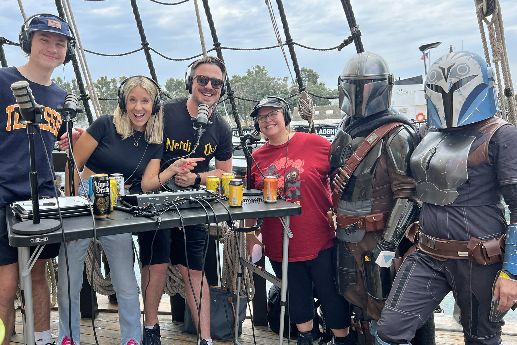
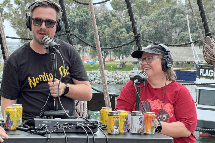
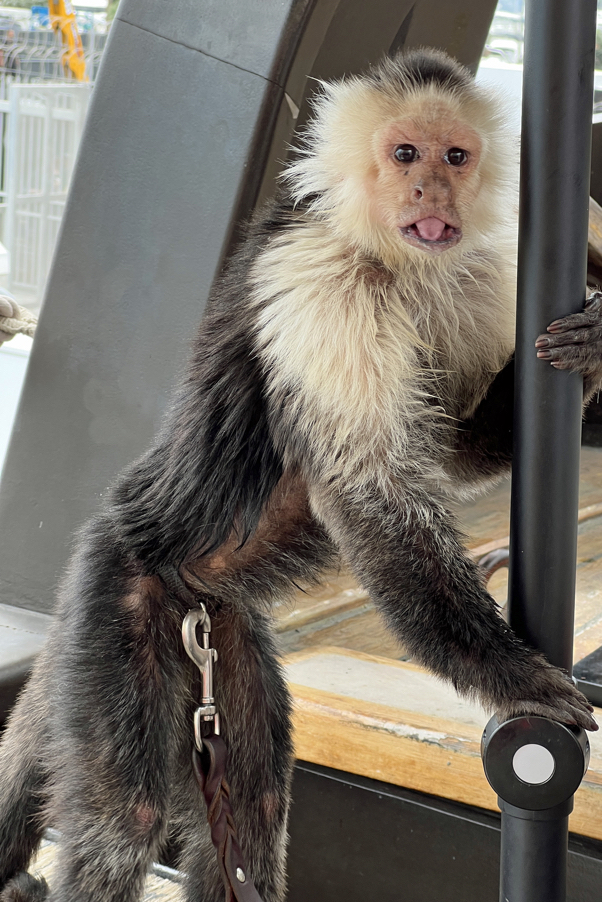
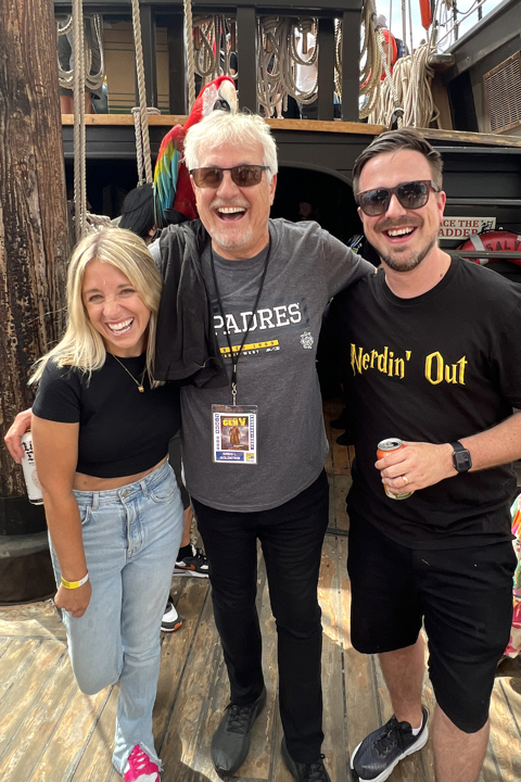
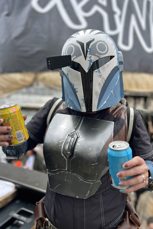
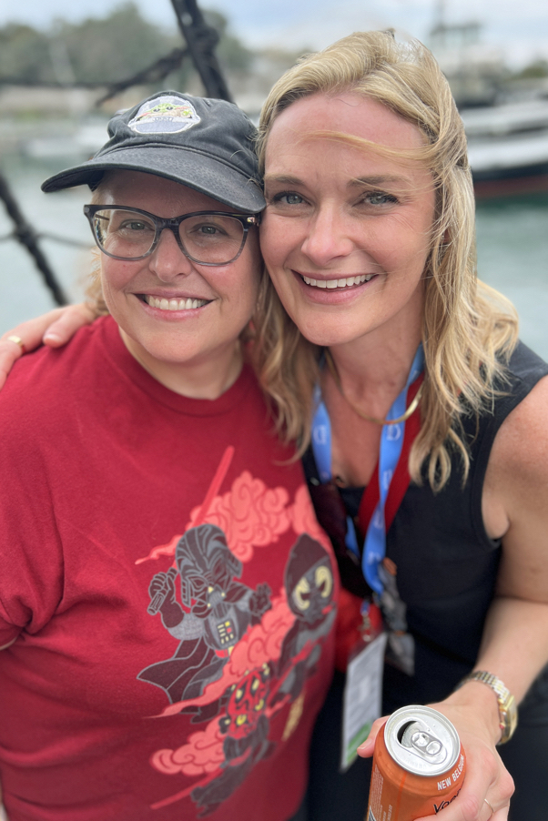
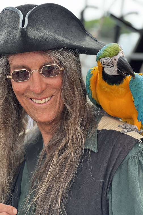
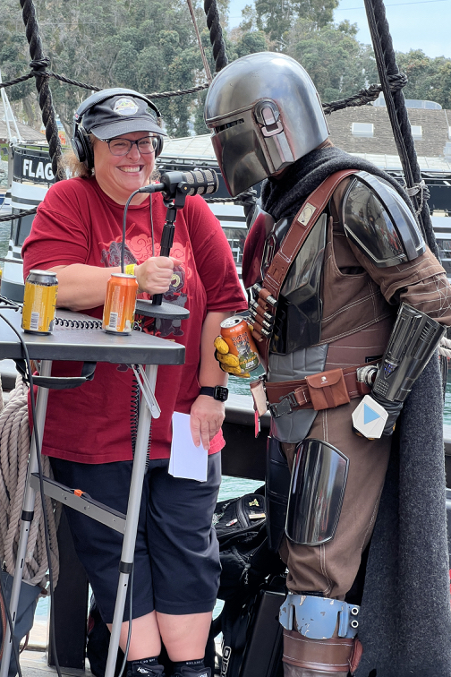
Live from the Voodoo Ranger Pirate Ship, Saturday July 22, 2023 — The Nerdin’ Out Podcast featuring Ravey, Cameron, Courtney, the rest of the great cast and crew, plus… pirates, parrots, a monkey and.. beer!
What does this have to do with comic art and/or graphic novel history?
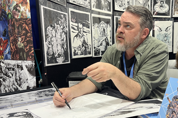
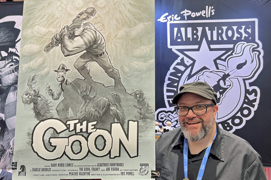
Mike Burkey (“Romitaman”), Jimmy Palmiotti, Scott DunbierMitch Gerads, Tom KingBen StenbeckEric PowellMike and Christine Mignola, Joyce Chin,Dan FragaScott MorseMilton Griepp, Maggie Thompson, Bill Schanes, Mike Richardson
In celebration of 50 years of the creation comic book specialty distribution market, Milton Griepp of ICV2 is featuring a series of interviews with early “pioneers” in the business. Yesterday, my interview (video and print) appeared. If you’ve got some down time (Ok, if you’re bored with pretty much everything else on-line at the moment), please join me down the rabbit hole.
Good timing on the publication of the interviews; Today is the first day of San Diego Comicon, and although I won’t be behind a table, and it won’t be as musty,I will indeed be celebrating more than 50 years of contributions to the popular entertainment arts (Topps, IDW Publishing, Activision, et al) in one media format or another.
Teenage Greg (photo is October 1975, at Phil Seuling’s monthly Comic Book Marketplace show in New York City) would be very amused, if not startled.
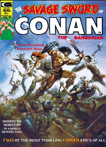
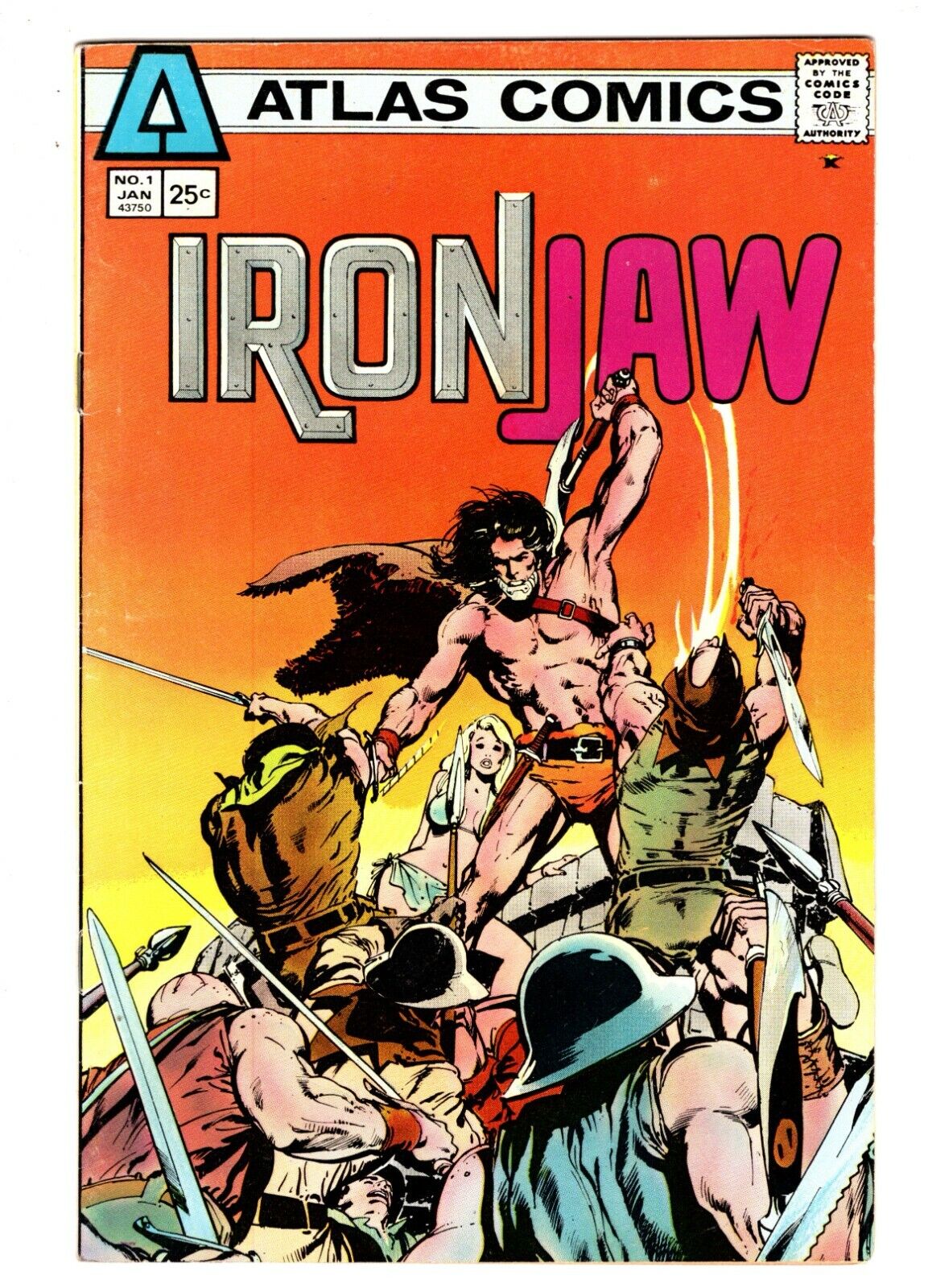
Visible on the table stacks: OMAC #1, Savage Sword of Conan #1, Iron Jaw # 1, all purchased through Seagate Distributors, the pioneering comic book distribution company launched by the legendary Phil Seuling.
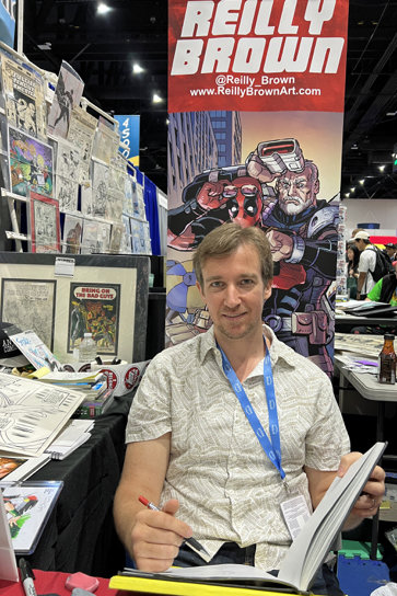
I’ll be attending the convention all four (five, really) days this week. As always, feel free to reach out — or track me down primarily in the original art pavilion.
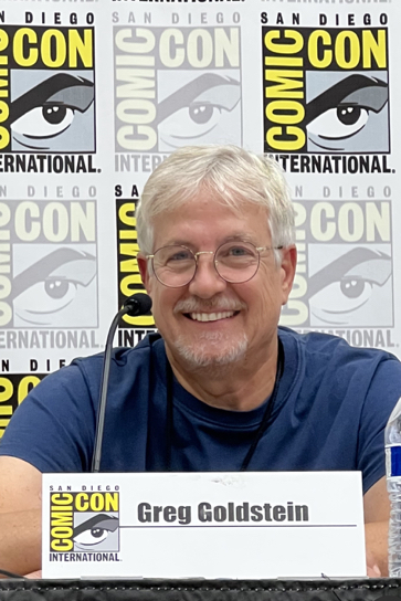
As advancements in computer animation technology take video game development to ever-more impressive heights, ASIFA-Hollywood will look back at the early days with these pioneers of video game animation. Actor and writer John Omohundro (Bravest Warriors, Tokyo Revengers) will go back in time with Kevin VanHook(Bloodshot, Valiant Comics), Greg L. Goldstein (CEO, Four Color Arts, formerly Activision, Acclaim, IDW Publishing), E. Daniel Arey (Creative Director at Niantic, VisionArey Entertainment), and other animators and game developers to explore the challenges and celebrate the accomplishments of classic video games, such as “Myst” and “Turok: Dinosaur Hunter.”
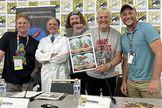
In 1988 Topps released a dinosaur-themed card series that sacrificed scientific accuracy for over-the-top action, violence, and gore. Fans of B-movies and dinosaurs were never the same! Series creator Gary Gerani (writer, film historian), Greg Goldstein (IDW Publishing, Topps), and Matt Corrigan (the Launchpad Podcast) discuss their favorite cards from this memorable set while Dr. Ashley Poust (paleontologist for San Diego Natural History Museum) separates fact from fiction. Matt and Greg will also show off original art produced for the series 35 years ago!
Saturday 7/22/23 7:30pm – 8:30pm Room 29CD
Lots of friends and colleagues appearing throughout the convention, but I would like to specifically point out that my pal Beau Smith is a Comic-Con Special Guest this year. His spotlight panel on Sunday, hosted by another pal, Ted Adams, is must-attend event!
Veteran comic art retailer Bechara Maalouf runs the focussed convention twice a year in LA (Redondo Beach) — typically May and November — and also one in the SF Bay area in February.
As always, it featured a great selection of original art —- plus a fun group of guests this time around. Pictured: Andy Kubert, David Mack, Mark Texeira, and yours truly with Andy.
If you blinked you missed it department:
I recently raised a glass to our friends at Dollar Bin Bandits (podcast, video) in honor of their second-year anniversary. Much more importantly, they used the occasion to announce that they had joined forces with the gang at Tomorrows Publishing. The fine folks there do a stellar job of publishing books and mags on the history of comics and pop culture.
It’s like combining peanut butter and chocolate: “Two great tastes that taste great together.” Very much looking forward to their joint efforts.
There are at least 10 million opinions about recent comic book superhero films out there (the on-line universe is obsessed with this art of thing) but I will add my own three cents anyway. (Spoiler- free, and ranked in order of my personal preference:)
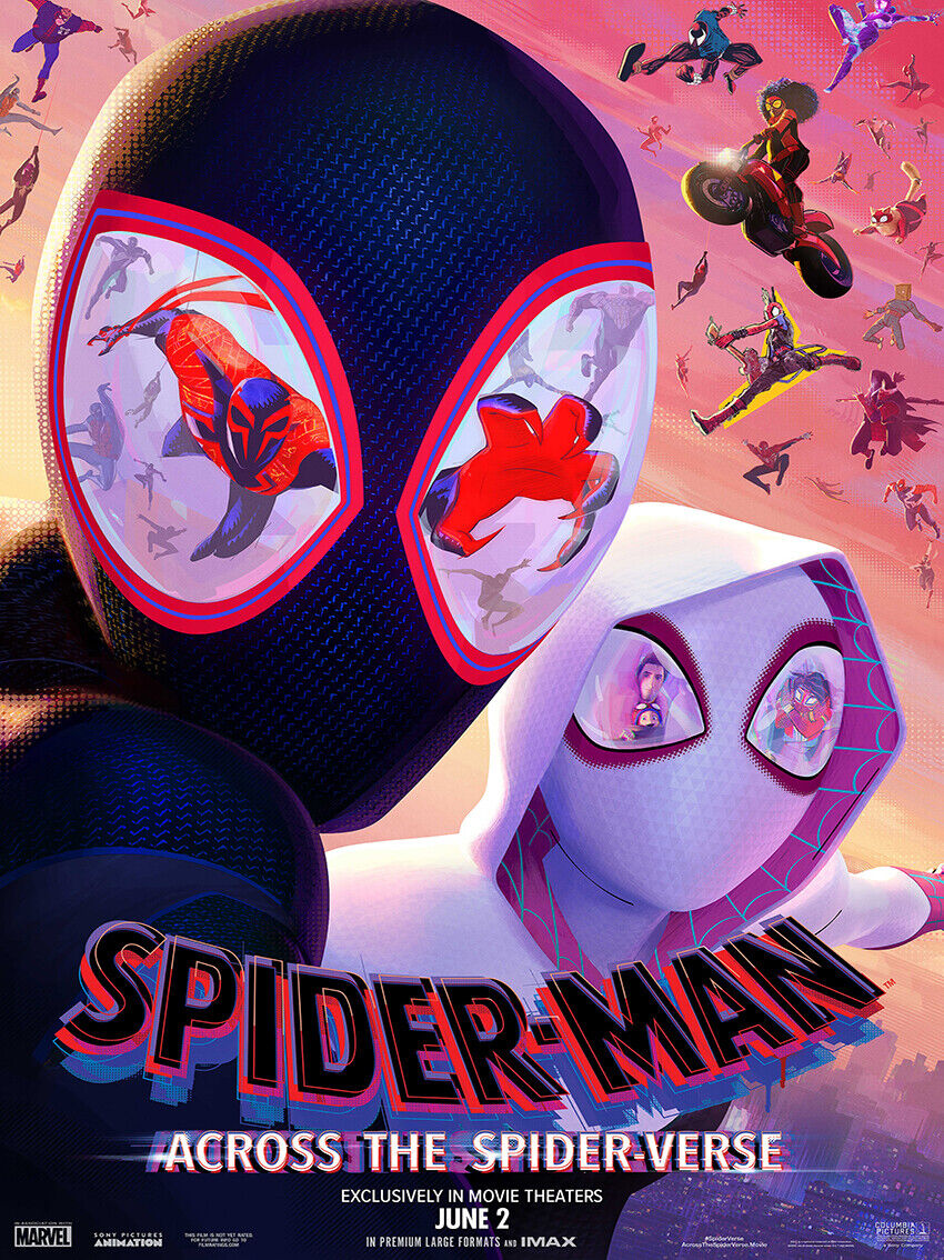
Spider-Man: Across the Spider-Verse:
• A landmark in animation.
• A landmark in comic book stories on film.
• A landmark in cinema, period.
Haven’t yet seen the film and think’s that hyperbole? Check it out — and let me know if you think I’m wildly off base.
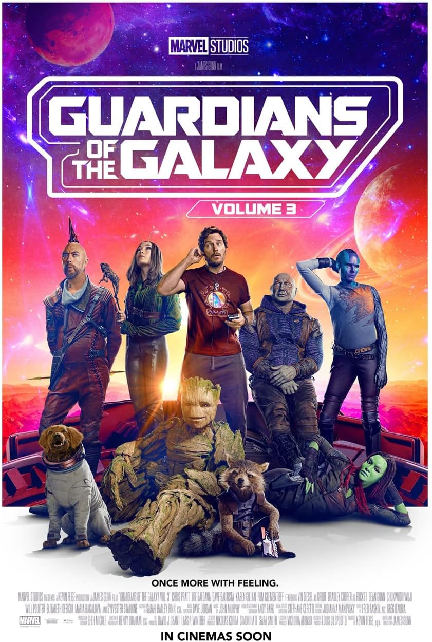
Guardians of The Galaxy 3:
Enjoyed it very much, and kudos to the filmmakers and their marketing efforts that managed to tell us what the film was about — without spoiling the story. The efforts worked, because pretty much every internet rumor about the film prior to the release was wrong. (Some just laughable.)
Caveat — I know the High Evolutionary’s animal experiments were needed for the story, but I do wish they had used a little more finesse in the editing room to tone some of it down.
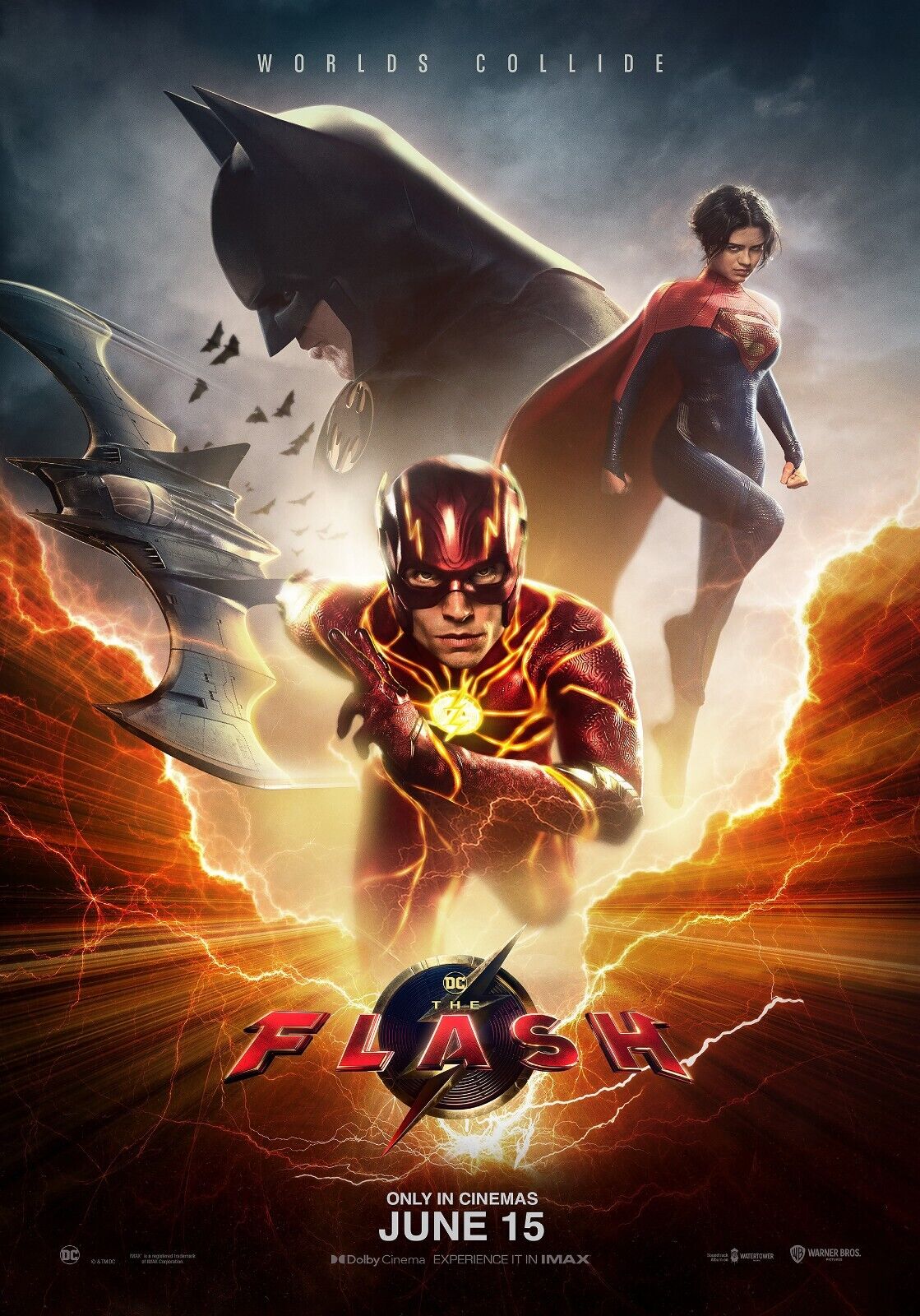
The Flash:
Between the changes in WB studio ownership / management and Ezra Miller’s well-publicized troubles, this was a cursed project that still somehow delivers a fair and occasionally fun superhero product, especially if you are familiar with the Flashpoint storyline.
Yes, the special effects needed a bit more work, but I barely tolerate most CGI anyway, so it didn’t annoy me as much as other fans apparently. As for the cameos? My only real reaction is where is TV Flash Grant Gustin? (The inter webs have plenty of thoughts on that, too.)
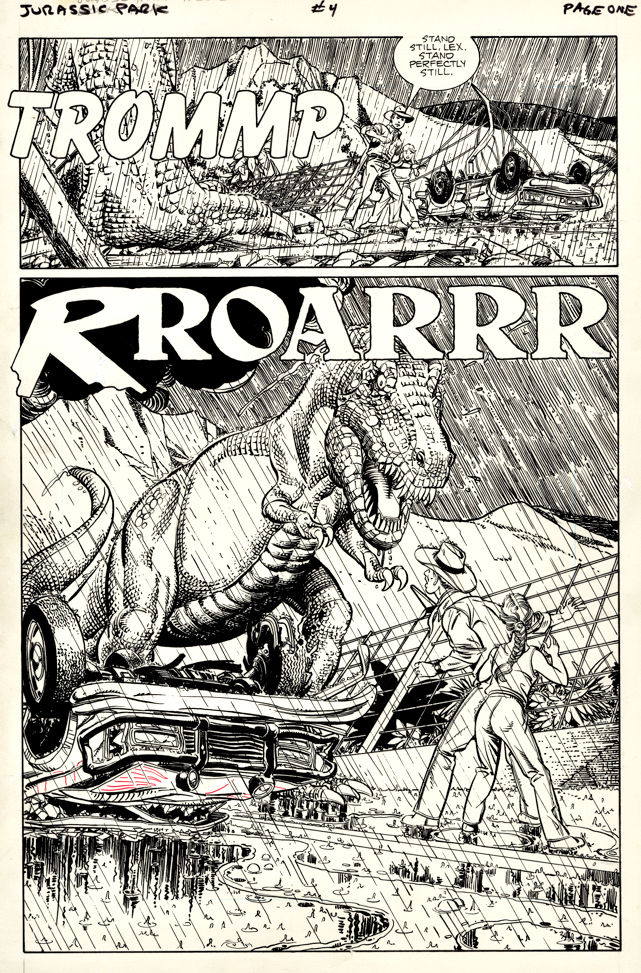
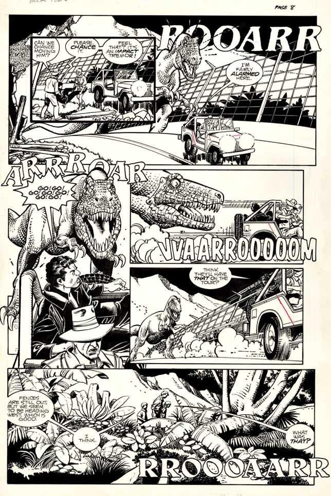
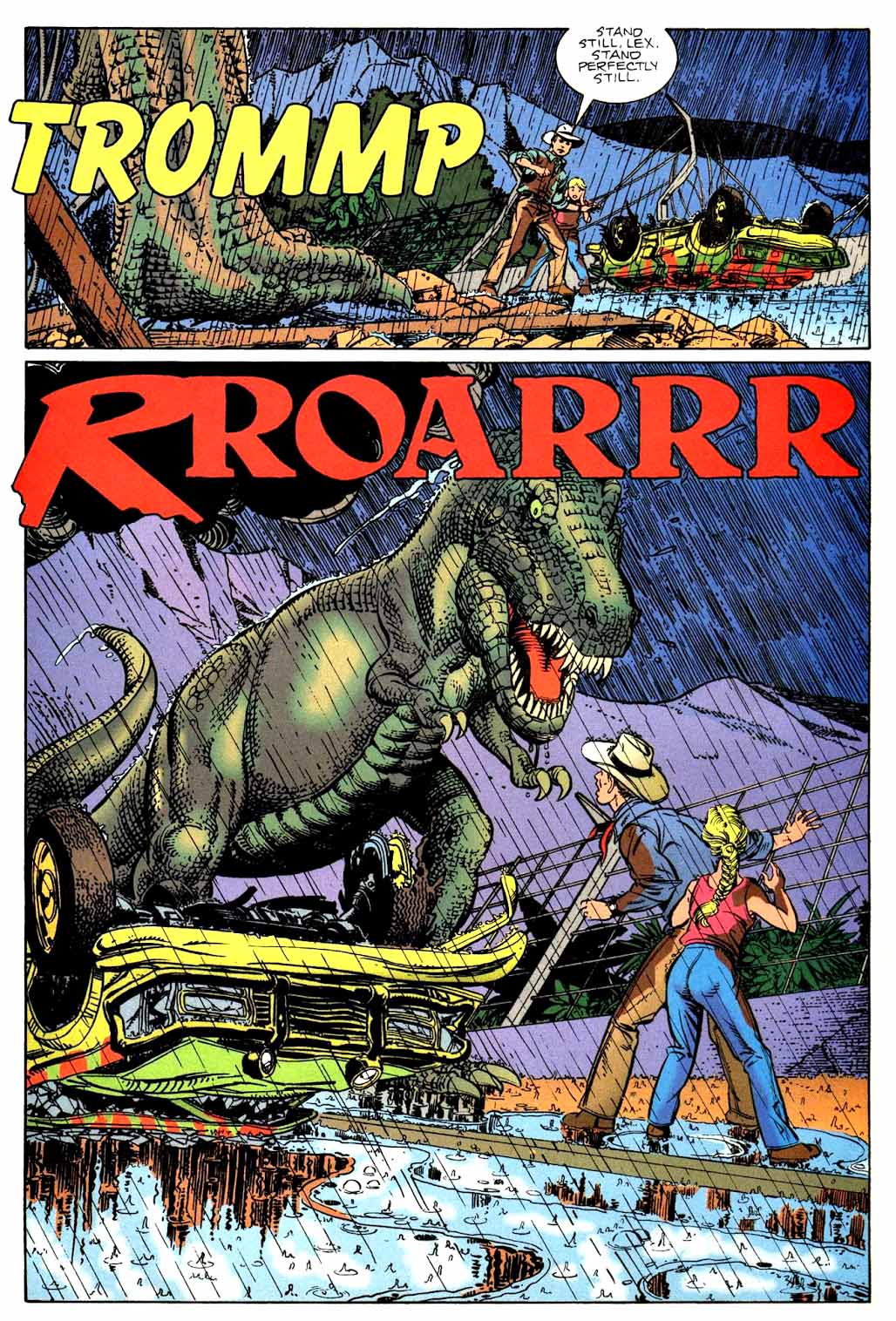
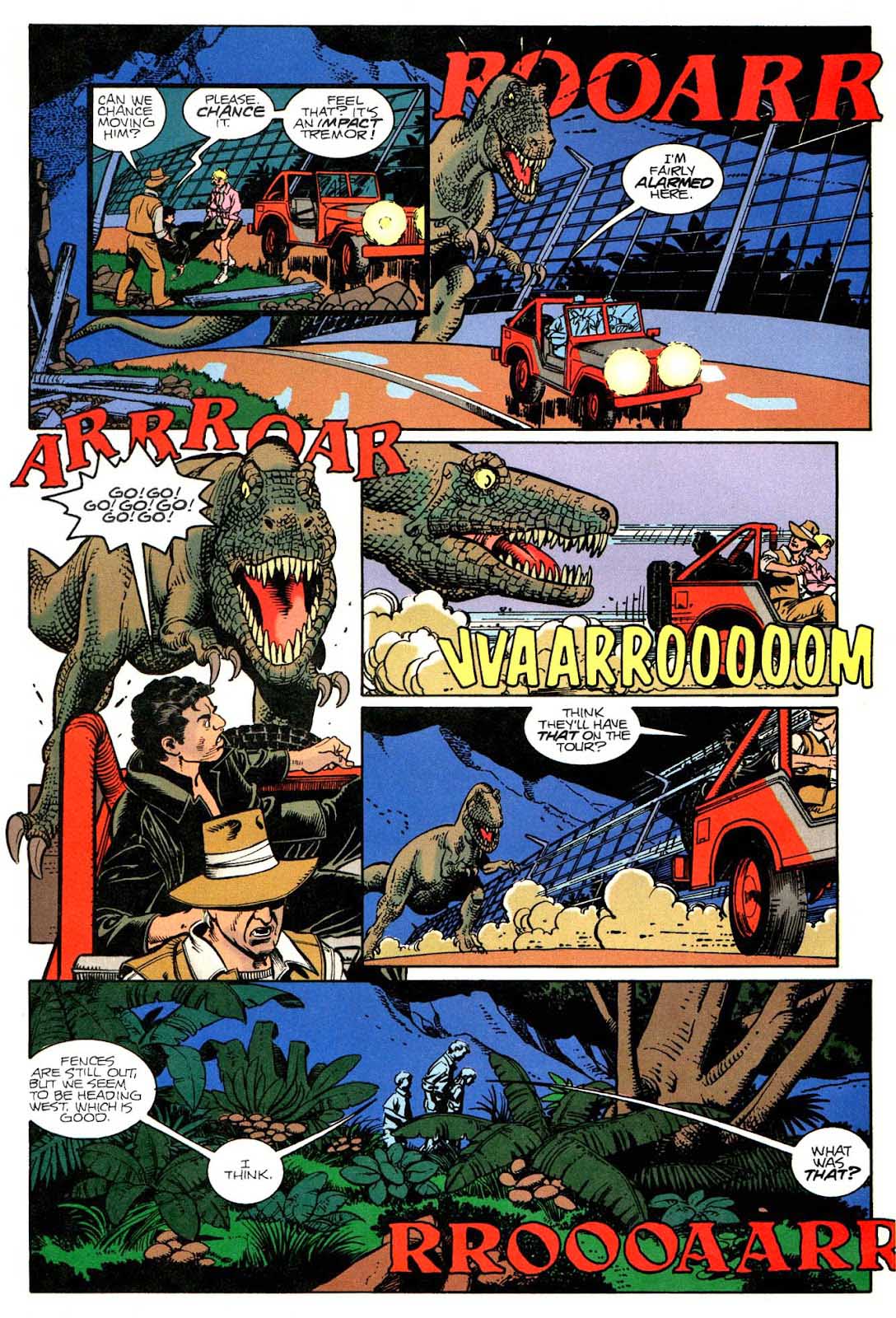
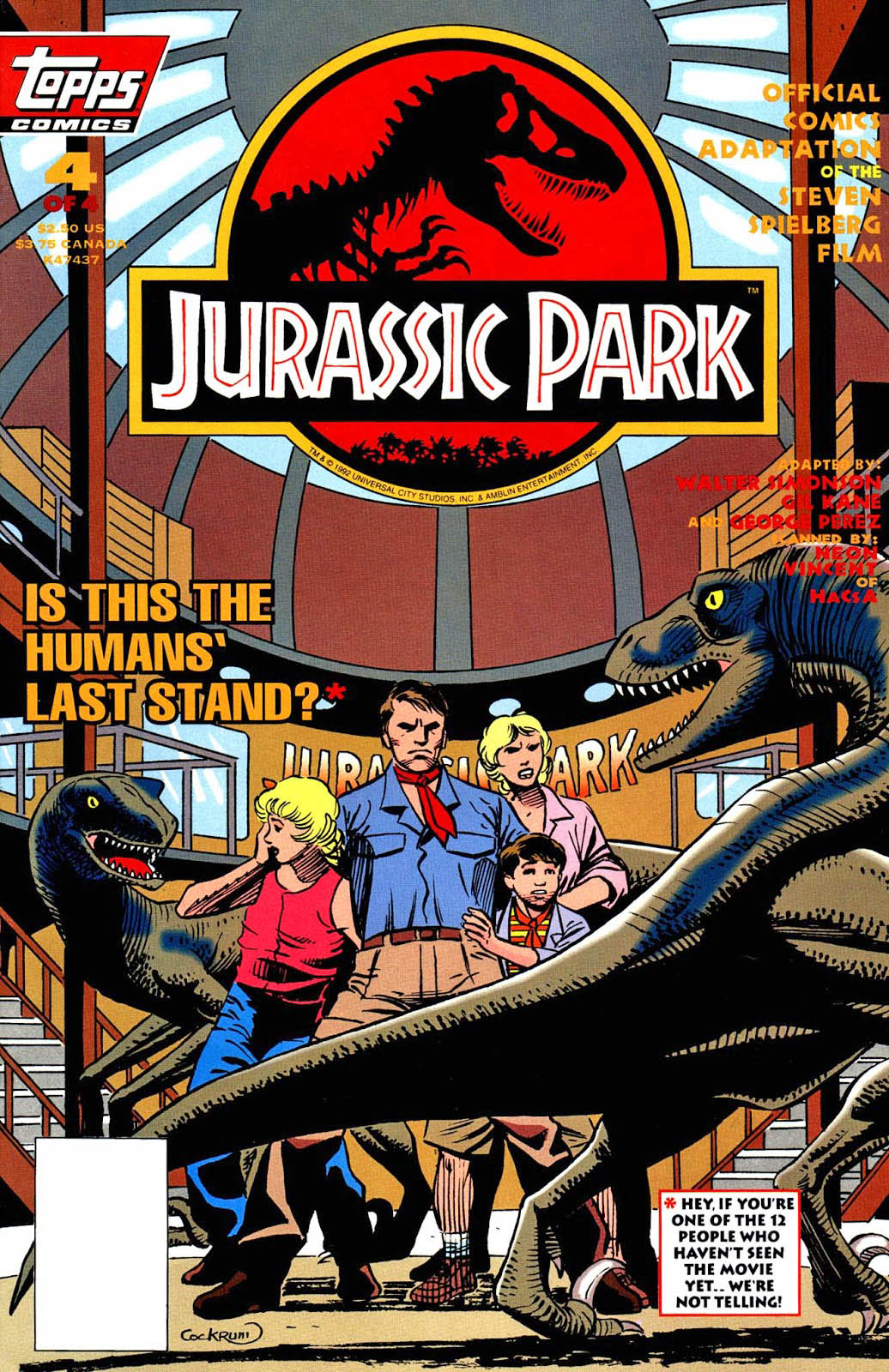
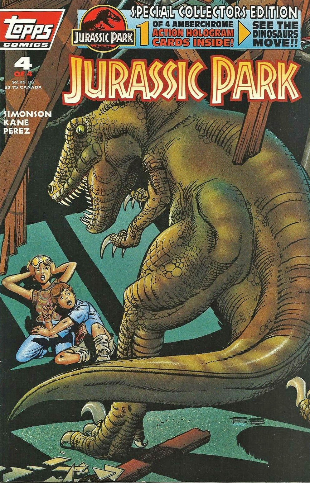
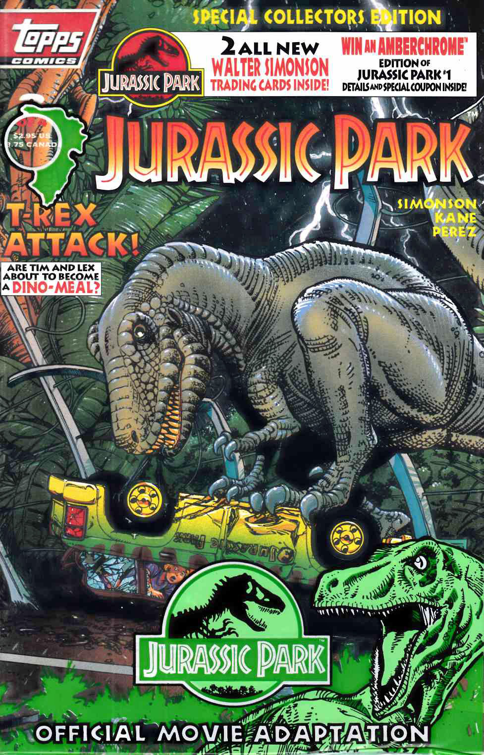
Here are two great pages from the final issue of the 1993’s Jurassic Park adaptation, penciled by Gil Kane and inked by the George Perez. As I noted previously, the key Dino action takes place in issue #4 which covers half (or more) of the film. (Thanks a lot, Universal.)
Fun fact: Universal had a giant launch party for the JP licensing and marketing program at New York City’s Museum of Natural History in February 1993 (at the annual Toy fair event) and Topps received several invites. So what happens when I hop out of the Subway to walk to the museum? I run into George Perez, and we make our way in together. I had a great time, but George was even more thrilled. It was clear he was absolutely delighted to be a part of this.
Fun fact #2: Topps also had a few invites to the NY premiere of Jurassic Park at the Ziegfeld Theater and Walter and Louise Simonson were able to accompany us to the theater, and a swell time was had by all. But, apparently, the final version of the shooting script had not made it from Universal / Amblin to Topps to Walter, so naturally he immediately noticed that his script and the Final Cut differed in a few places. (Fortunately, only a few.)
Jurassic Park opened thirty years ago June 11, so it seems like an ideal time to present some more great Jurassic Park pages from 1993’s adaptation drawn by Gil Kane and George Perez this week. (I still can’t believe it’s been thirty years.)
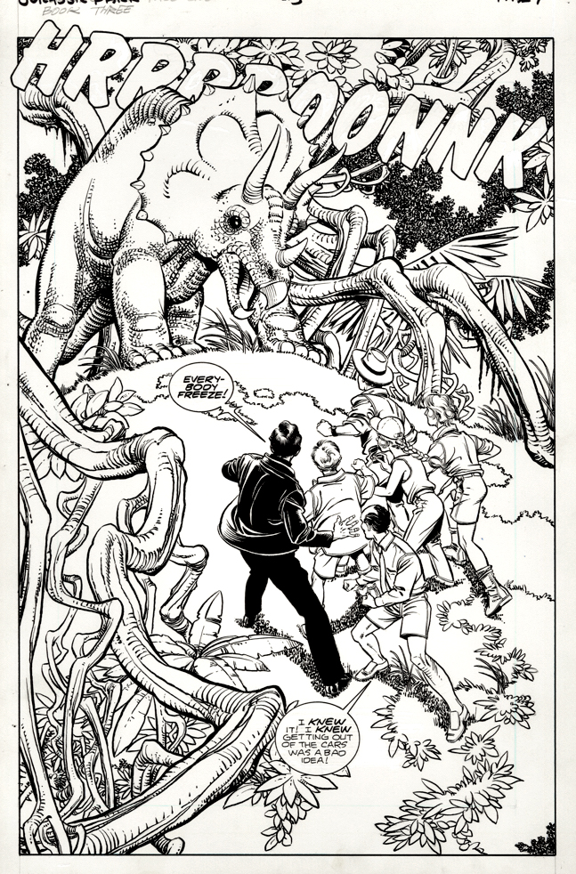
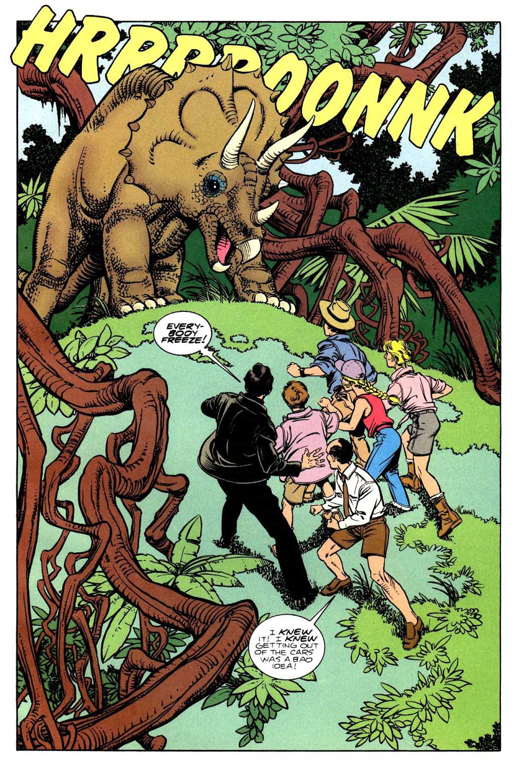
Here’s a terrific splash from issue three, with George’s telltale detailed inking mostly only evident in the original art; the color obscures many of those fine details in the published page.
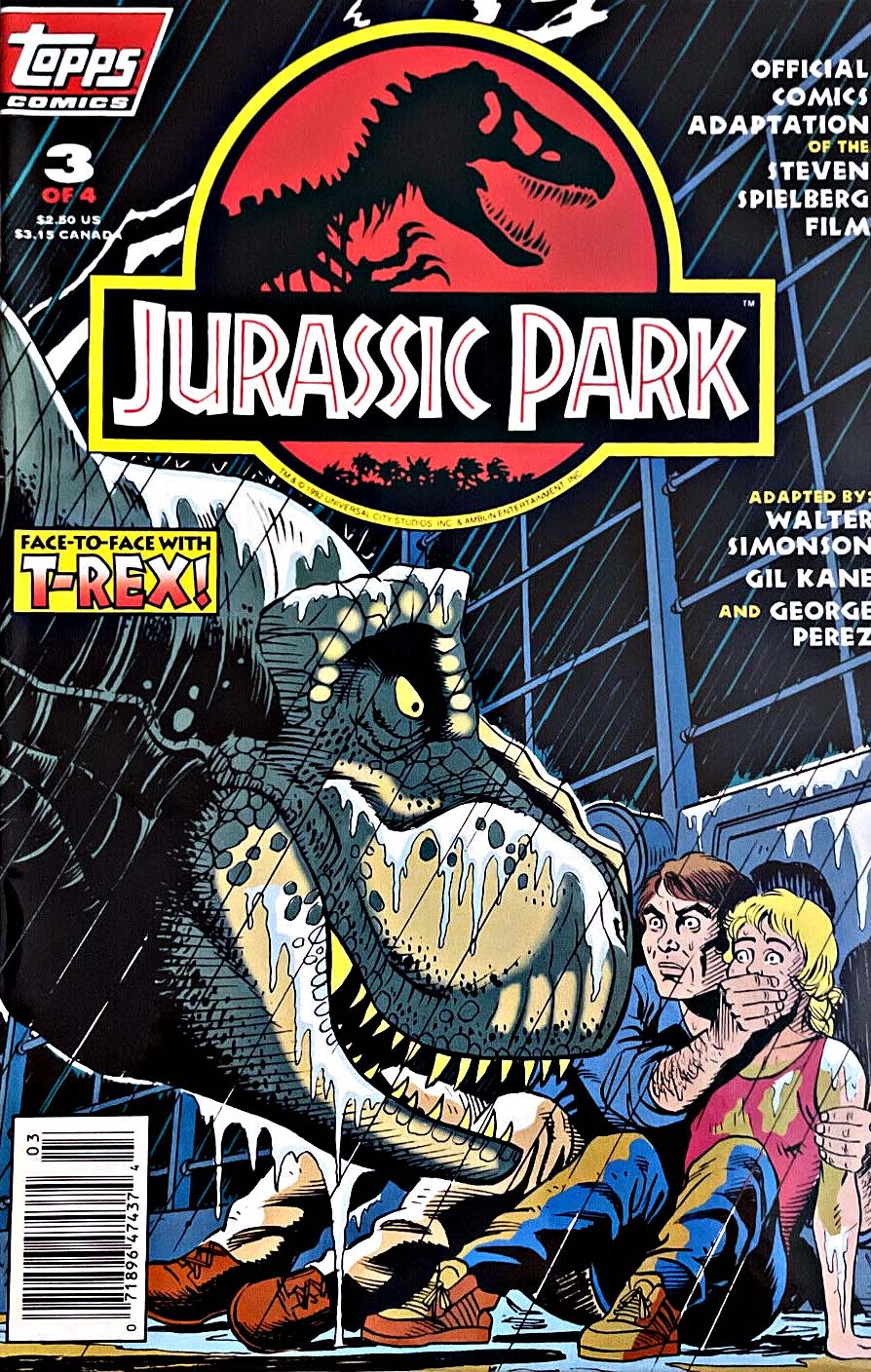
Fun fact: Because of licensing restrictions (including embargo dates) and publishing schedules, the film’s script and the four-issue comic breakdown are somewhat uneven. Not that much happens in Issues #1 and #2. Issue #3 has this cool opening, and some cool T-Rex action in the second part, but most of the exciting Dino action happens in issue #4. (Writer Walter Simonson did a terrific job balancing the script under those challenging restrictions.)