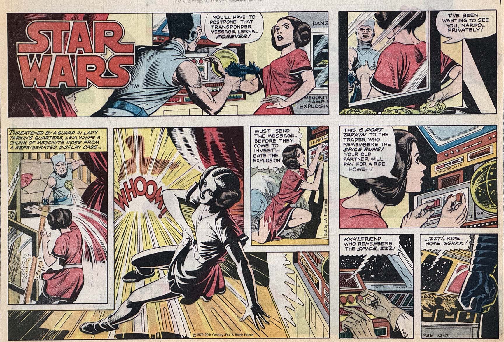
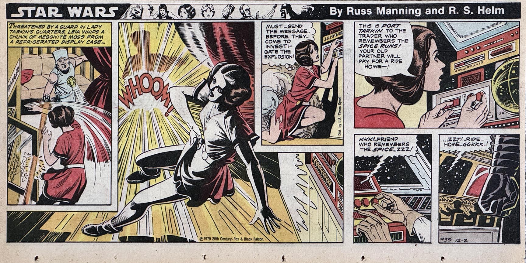
Russ Manning — Star Wars, Sunday Best
Star Wars Sunday Strip, #39, December 12, 1979
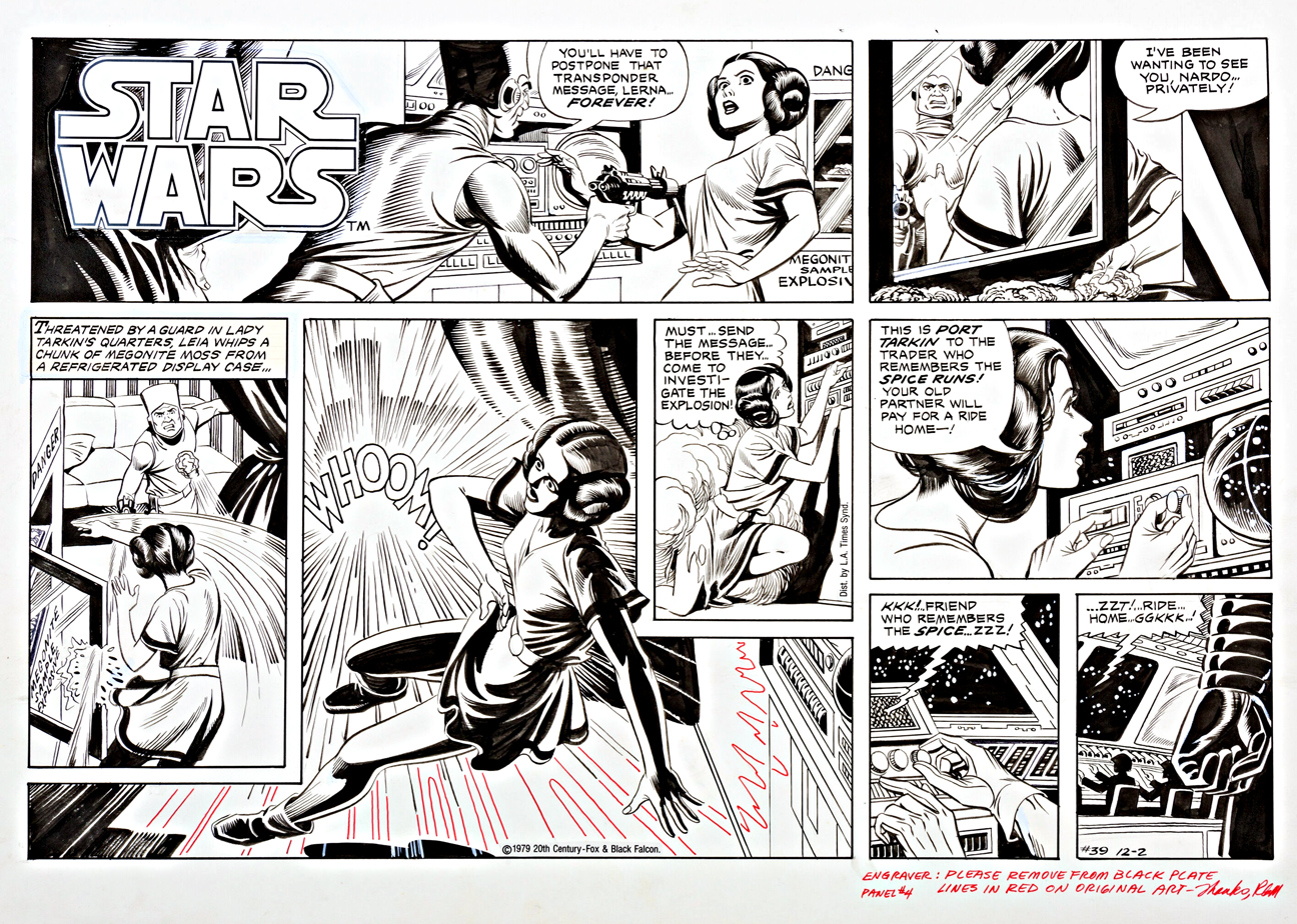
I finally checked off a piece of art from my OA “bucket list” with the acquisition of this terrific Russ Manning Star Wars Sunday strip late last year.
I own some great Star Wars original art, but not much focusing on Leia, so I’m especially pleased I won this strip at auction. Coincidentally, I was the underbidder the previous time it had appeared at auction — second time is the charm, apparently.
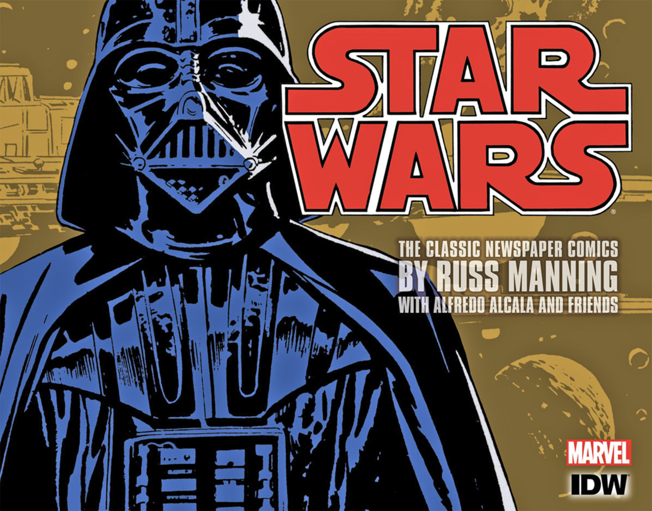
When we had the opportunity to collect the complete Star Wars strip collection at IDW Publishing, it was yet another box checked off from the publishing bucket list. Dean Mullaney and the Library of American Comics (LOAC) crew produced (as always) an amazing three-volume set.
Welcome to Star Wars “month.” May the force be with you throughout.