Greg Goldstein's Comic Art Gallery

Steve Rude — Card Tricks

Upper Deck, Marvel VS. System TCG: Web of Spiderman,
Card #162 — Surrounded, 2004

Concluding a multi-part look at Spider-Man vs. Mysterio in honor of Spider-Man: Far From Home landing on digital streaming platforms this week.

Some of the most tantalizing art ever created for Marvel and DC characters is hiding in plain sight — on trading cards… and trading card games. 

In fact, the Upper Deck Vs. TCG System, started in 2004, and lasting in its original incarnation through 2009, is home to hundreds, if not thousands, of original artworks by some of the industry’s leading talents. 

Except for a handful of the key art pieces, which includes illustrations by Alex Ross and Drew Struzan, all the TCG images were printed at postage stamp size only. (Some, like this one, were cropped ruthlessly to fit the printed image area.)

Sigh.

Steve “The Dude” Rude illustrated number of cards in the various VS series, and this one, featuring Spider-man vs. multiple Mysterios, is a favorite. 

Steve’s clean and dynamic superhero rendering typically feels like a fascinating cross between Jack Kirby and Joe Schuster — with storytelling influences from Alex Toth , and yet here, he channels some John Romita for good measure.

Most trading card is created at a relatively small size, but fortunately this Rude original is drawn on traditional comic board, with the live image area just slightly smaller than most standard modern art.  
Just enough room for all those Mysterios. 
Too many Mysterios — or too much Spider-Man. Either way, Spidey is in a jam. This great panel by John Romita from ASM # 67 is a classic.

Scott Koblish — Ditko Forever!

Spider-Man/Deadpool #7, September 2016

Continuing a multi-part look at Spider-Man vs. Mysterio in honor of Spider-Man: Far From Home landing on digital streaming platforms this week.

Scott Koblish as a person?: Engaging. Upbeat. Energetic. Witty. Et al.

Koblish as an artist?: Engaging. Upbeat. Energetic. Witty. Et al.

Rarely does a creator’s artistic style so match his personality. Hell, there are great cartoonists, past and present, with lively and bright art aesthetics, who are darker personally than Van Gogh on a bad day. (No I will not be naming names. That’s what the rest of the Internet is for.)

Scott’s mostly zany artistic approach to Deadpool is perfectly on point for the character. (And that’s not taking anything away from Ed McGuinness, a fantastic artist whose work I absolutely love — or any other Deadpool illustrator for that matter.) 

In this “flashback” issue of Spider-Man/Deadpool, Scott draws the entire issue in classic “Steve Ditko” style. It’s clearly done with affection and reverence, and the finished issue, complete with simulated old-school coloring, “bad” printing (out-of register) and aged paper, is old-school fun.

How “classic” is the art style here, you ask? Review the middle panel on this page.  It is most definitely… Classic Ditko! (In fairness, the rest of the issue features more original Ditko interpretations as well. Koblish was clearly having a bit of extra fun here.)

And what’s the difference between comedy and tragedy? Check out Scott’s book, The Many Deaths of Scott Koblish, and decide. 

Alex Saviuk — Meta Mysterio

Spider-Man Adventures #5, Unused Cover, April 1995

Spider-Man: Far From Home landed on digital streaming platforms this week, so the next few posts feature — who else? — Spider-Man and Mysterio.

Spider-Man Adventures, a ‘90s comic book title, existed mainly to support Spider-Man: The Animated Series, which ran on Fox Kids from 1994 – 1998. In fact, the first thirteen issues of the comics are direct adaptations of the first-season episodes.

The episodes themselves are adapted (albeit loosely in some cases) from original Spider-Man comic books.

So…

Issue #5, featuring Mysterio, is an adaptation of Episode #5 of the TV series, which in turn, is adapted from Mysterio’s very first comic book appearance — by Stan Lee and Steve Ditko — in Amazing Spider-Man #13. (1964).

A comic book adaptation…. of a TV show adaptation… of a comic book story.  That trick definitely trumps anything up Mysterio’s sleeve.

Alex tells me that his original cover was rejected because the editors wanted more emphasis on Mysterio —and for the character to be more “dramatic and menacing,” and I think he delivered. (See below.) Still, I like Alex’s original take, especially with that iconic Spidey image.

Alex’s creative spin on the wall-crawler has lasted more than 30 years.  He drew the Web of Spider-Man comic book for seven years, and then the full Spider-Man Adventures run, and then the Spidey newspaper strip from 1997 to its end earlier this year.

Nothing mysterious about that longevity — Alex’s passion for, and understanding of, the Spider-Man character is obvious anytime he puts pencil to paper.

Dan Parent — Battle Of The Century, Revisited

Betty vs. Veronica, Commission, 2015

Wrapping up our multi-part tribute to The Human Torch and Sub-Mariner, in honor of the late summer weather at the California coast.

From time to time, an offbeat Archie mash-up idea burrows its way into my consciousness, and Dan Parent always delivers.  In fact, this homage to the original battle scene by the legendary Bill Everett is one of my favorites among the many terrific ones Dan’s produced.

Dan is easily among the top tier of all-time Archie stand-out talents, joining a terrific group of cartoonists that includes Bob Montana, Dan DeCarlo and Harry Lucey, to name a few.

Incidentally, we matched the characters by overall appearance (Veronica/Namor, brunette and Betty/Torch, blonde) and, to some extent, personality. After all, Veronica is definitely the worse-tempered of the two, and Betty… does indeed carry a “torch” for Archie.

Ouch.

Mike Deodato — Regal Portrait

Sub-Mariner Commission, Unknown Date

Our weeklong tribute to The Human Torch and Sub-Mariner continues, in honor of the late summer weather at the California coast.

“Cover-quality” is an overused adjective in the comic art-retailing world.

Typically it appears when a reseller is trying to grab attention on an unpublished commission for sale: “Gee, look, isn’t this as good as a published cover?”

Why do this? The short answer of course is marketing. Hyperbole (theoretically) helps support a higher asking price. Also, it adds the word “cover” to the item description’s metadata, meaning it appears in any on-line search for that word. Clever.

Here, however, “cover-quality” is no exaggeration for this richly detailed Sub-Mariner commission by Mike Deodato — a moody portrait of Prince Namor with the only human he truly pines for, the lovely Sue (Invisible Woman) Storm. Hell, it’s better than many published covers.

Who hasn’t marveled (sorry) at the evolution of Deodato’s artistic style? When he broke in professionally about 25 years ago, Mike’s art approach was much more similar to the  “Image Comics” style of the day. Today, his storytelling blends similar dynamism with an often astonishing photo-realism into an accomplished, and enviable, form.

One previous owner of this piece did in fact describe it as an actual published cover, without evidence. But… so many retailer variants and limited exclusive covers have been published the last few years, anything is possible. I’m aware of multiple instances where a piece of art was indeed assigned — and executed — for a cover variant, but then cancelled last minute.

So… if anyone can provide evidence that this art was indeed professionally published. or solicited to be published, somewhere — anywhere — you will have my thanks, and a piece of original art as a finder’s fee.

I found a number of color versions online, adding a bit to more mystery to the provenance of the piece, but they appear to be samples by aspiring colorists.

John Byrne — Byrne, Baby,…

Fantastic Four #233, August 1981

Continuing our week-long tribute to The Human Torch and Sub-Mariner, in honor of the late summer weather at the California coast.

John Byrne’s 5-year run on Fantastic Four is rightfully considered an all-time classic, and it’s certainly on my short list of “desert island” omnibuses. (I have no idea how these books survive the shipwreck with me, but let’s stay on point.)

I always loved the Fantastic Four – and in fact, although I may be in the minority, I definitely enjoyed Hanna Barbera’s short-lived FF animated series from 1967 a bit more than Spider-Man, which aired in the same block.  With a few exceptions, the FF cartoon stories felt much more authentic to the comics than Spidey, although he definitely had the better theme song. FF only lasted 20 episodes, and has never been “officially” released in home video.  (So much for staying on point.)

The Human Torch, as the youngest member of the FF, was always the most relatable to me, and always a favorite. (He could fly… He could burn stuff… He could fly…)

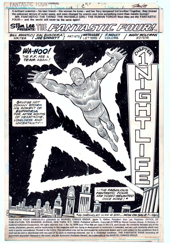
Byrne. Fantastic Four. Human Torch. Cover scene. Most of the boxes are checked on this great action page, with Byrne on story, pencils and inks. He rebuilt the FF sandbox —and played in it expertly and creatively.

Flame on!

Review of John Byrne FF Artist’s Edition

Marie Severin — Fighting Fire…

Sub-Mariner #44, December 1971

Summer came very late to the Southern California Coast this year, so in honor of the warm weather and cool surf, we’ll stay with The Human Torch and The Sub-Mariner for a few more posts.

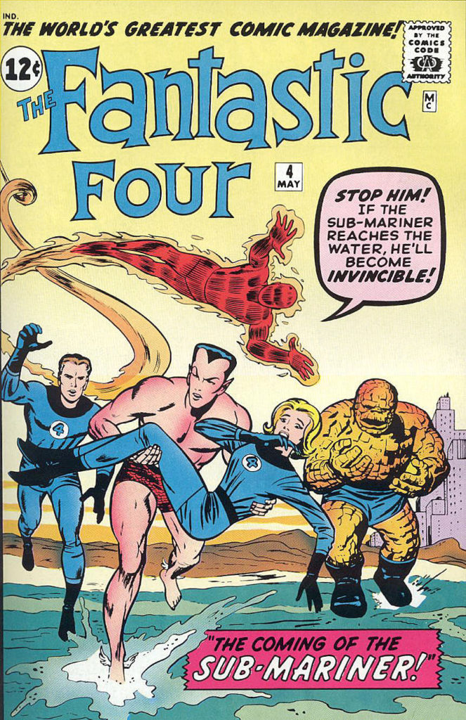
This great battle page, penciled by Marie Severin, and inked by Jim Mooney, features Sub-Mariner vs. the contemporary Human Torch, Johnny Storm.  This a feud that started in Fantastic Four #4 in 1962 (Torch is the one who discovers an amnesiac Namor living in NYC) and continued intermittently through the silver and bronze ages. 

Along for the fun this time is the giant sea-beast Krago, woken from his slumber by Subby’s enemies to wreak havoc among us, and to have Namor blamed. Krago is apparently NOT related to Giganto, another giant sea-beast Namor himself brought along in FF #4. How many species of giant sea creatures are there anyway? And to think I was worried about the occasional shark. 

What can you say about the late great Marie Severin, easily one of the most versatile talents to ever work in comics? Penciller, inker, colorist, occasional letterer, caricaturist, production artist, cover designer, satirist… and so on. Hands down, an amazing career, made even more so because she needed to make her bones — more than once — in a thoroughly male-dominated industry.

Marie passed away almost exactly a year ago, and many well-written tributes speak to the scope of her career: Marvel.com, The Comics Journal, and the New York Times all provide good starting points to this remarkable creator.

Ross Andru — Laughing Matter

Not Brand Echh # 1, August 1967

I had only recently started buying Marvel comics off the spinner racks when Not Brand Echh premiered in the summer 1967. I was immediately attracted to its zaniness. I knew Marvel didn’t take itself too seriously from reading its traditional comics — The “Bullpen Bulletins”, the “no-prize” gimmick, the Merry Marvel Marching Society, et al — but Not Brand Echh (NBE) was a new level of nutty.  (A bit later on I discovered it was in the spirit of the original EC Mad comics, but I didn’t know anything about that era yet.)

The actual golden age fight between the Human Torch and Sub-Mariner had just been reprinted a few months ago in Fantasy Masterpieces (# 8), and here was a send-up making fun of the whole thing? The Human Scorch?  The Sunk-Mariner? As my friends’ older siblings would say back then, far out.

Bill Everett is typically credited as one of the pencillers on this story — I’d like to believe that — but writer Roy Thomas says he remembers that Everett may have only worked on the title splash at most. Either way, Ross Andru was no stranger to superheroes or satire, and this page is a favorite.

1967 also saw the debut of Topps Wacky Packages and Roy’s earlier comic book satires, Krazy Little Comics, also from Topps. Summer of Love? Sure. But also —- Summer of Satire.

Gabriel Hardman — Non-Commercial Break

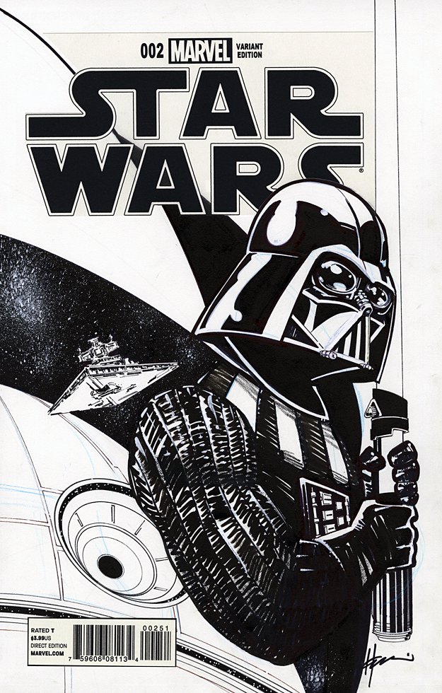
Our friends at Hero Initiative are running one of their great “100 projects,” this one featuring 100 different artistic interpretations of Captain America done on blank sketch covers. Lots of great original art at auction on EBay right now, including this astounding Cap cover by the amazing Gabe Hardman.

This round ends Tuesday, 9/3; Bid often — it’s for a great cause.

(Gabe along with his wife, the very talented writer Corinna Bechko, will be attending the terrific Long Beach Comic Con this weekend, 8/31-9/1. Hope to see you there.)

John Buscema — Keep the Lights On!

Thor # 238, August 1975

John Buscema is famously quoted as saying that when Jack Kirby left Marvel in 1970, he was surprised they didn’t close the doors.

You can quote me 

John Buscema is one of the top artistic reasons they didn’t have to. 

Taking over, nearly seamlessly, for Jack on both Thor and Fantastic Four for about seven years on the former, three years on the latter (with just a few gaps) Buscema kept Jack’s cosmic spirit alive on those series. He didn’t draw like Kirby — he didn’t have to. He had his own artistic voice, which had by then defined the Marvel “House Style.” And this from a guy who also famously didn’t like superheroes!

This Thor “chapter page” has everything you would want: Badass Buscema action and Thor in every panel, with inks by the legendary Joe Sinnott.

Thoom on!