Greg Goldstein's Comic Art Gallery

John Byrne — X-Men Redux

X-Men #115 Re-Imagination, 2006 (Orig. Nov. 1978)
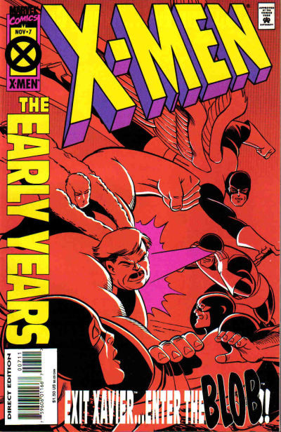
2020 is a big year for X-Men anniversaries.

It’s the 50th anniversary of the original title’s cancellation (Issue #66). It had struggled to find consistent commercial success or creative direction for much of its original seven-year history.

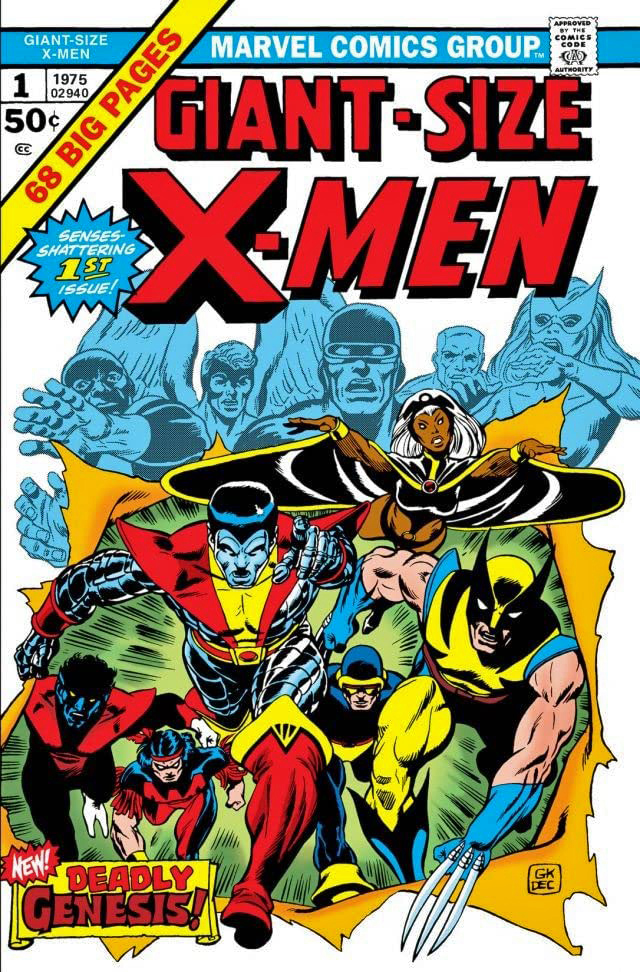
It’s the 45th anniversary of the X-Men’s “comeback” with the launch of Giant-Size X-Men #1, possibly the greatest rags to riches story in comics’ history. If anyone else can tell me where a book goes from cancelled to a company’s most popular title in less than 10 years, I’m all ears.

And, perhaps more importantly from a broader pop culture perspective, it’s the 20th anniversary of the X-Men film franchise from Fox, which concludes forever in a short while with the release of the problem-plagued New Mutants. (Postponed many times, it was most recently scheduled for an April 3 theatrical release, and has now been indefinitely delayed because of the COVID-19 outbreak.)

The first X-Men film launched 8 years ahead of the MCU, and in my mind, established what a Marvel film could do in terms of both creativity and commercial success. It paved the way for what was to come.

Meanwhile, we have this great commission by John Byrne.

John Byrne. X-Men. Not much to add here except a few details.

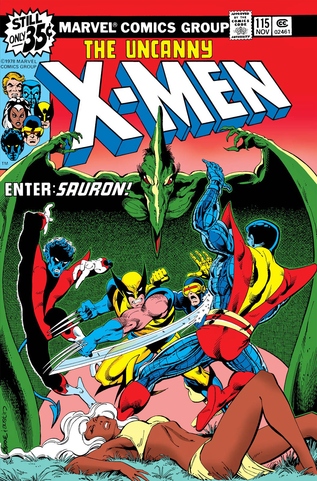
This is a Byrne re-imagination (as John calls them, I believe) of the cover of X-Men # 115 featuring the dinosaur villain Sauron. The re-imagination is more dynamic and dramatic than the original, which was only John’s third cover on the book. Dave Cockrum had a few in the can when Byrne took over art duties on issue #108.

Byrne’s commissions can be found easily through a Google search and there a lot of great ones — at sizes up to 30x 40!

Unfortunately, John’s not doing much if any in the way of commissions right now as he is spending time on his X-Men fan fiction (his phrase) but if you want to keep fingers crossed that he will take them up again, you can contact his art representative, Jim Warden.

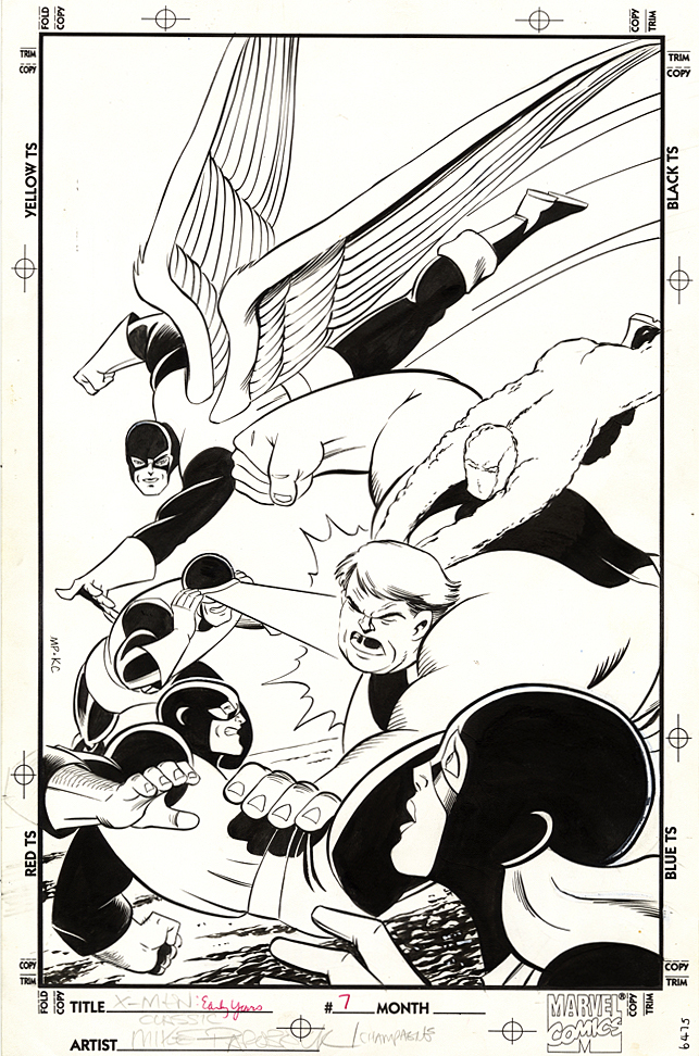
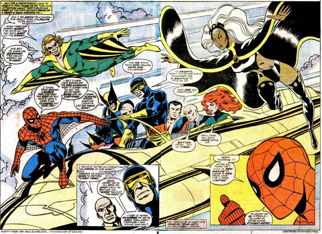
John’s Commission is closer in spirit to this great original double-page spread from #115.

Mike Ploog — PS, I Love You

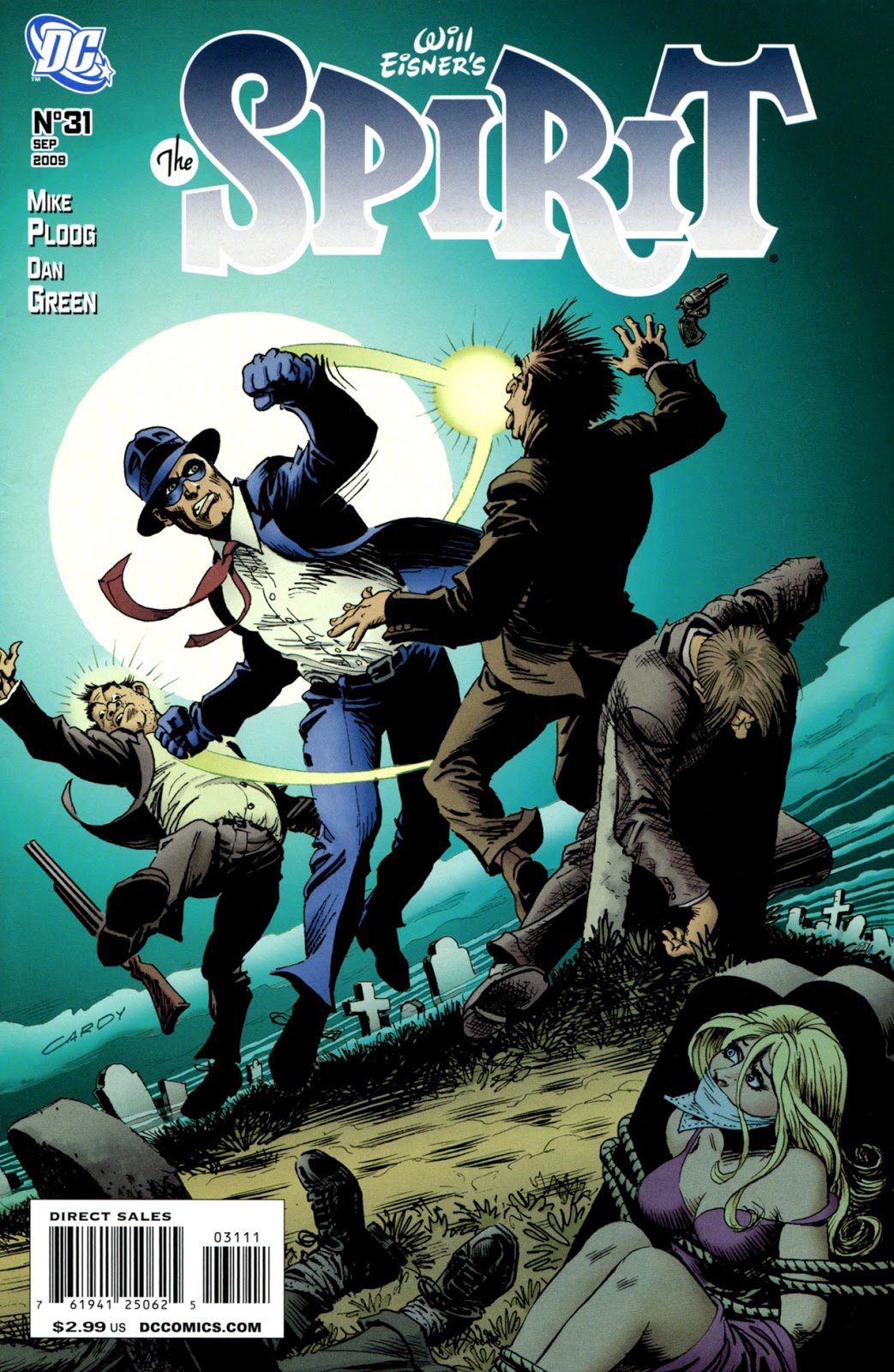
Spirit # 31, September 2009

Continuing our celebration of the 80th anniversary of The Spirit, with additional creators’ takes on the beloved and influential character.

Perhaps the artist with the most specific style similarities to Will Eisner is Mike Ploog, who worked for Eisner briefly in the early 1970s, on Eisner’s PS Magazine for the military. Ploog credits his initial Eisner influence on the 10 years he himself spent in the Marines reading and copying the magazine.

Ironically, as a kid, Ploog was not a comic book fan, so he had no idea who Eisner was, or the history of the Spirit.

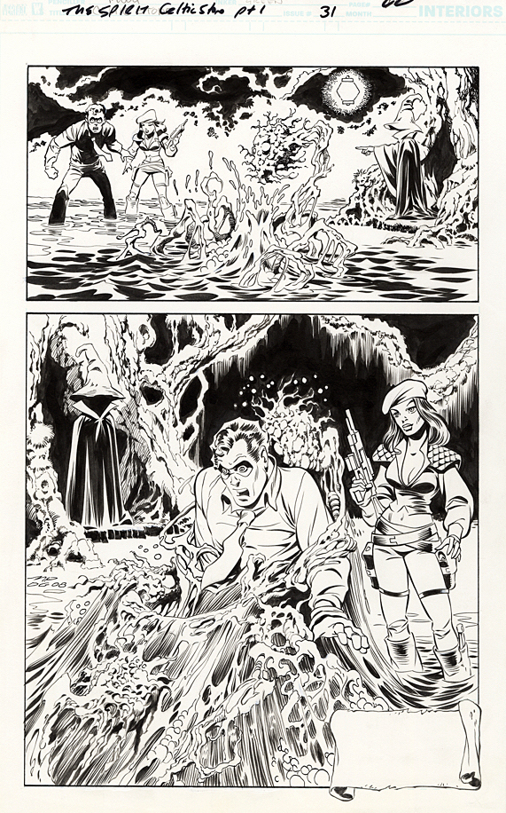
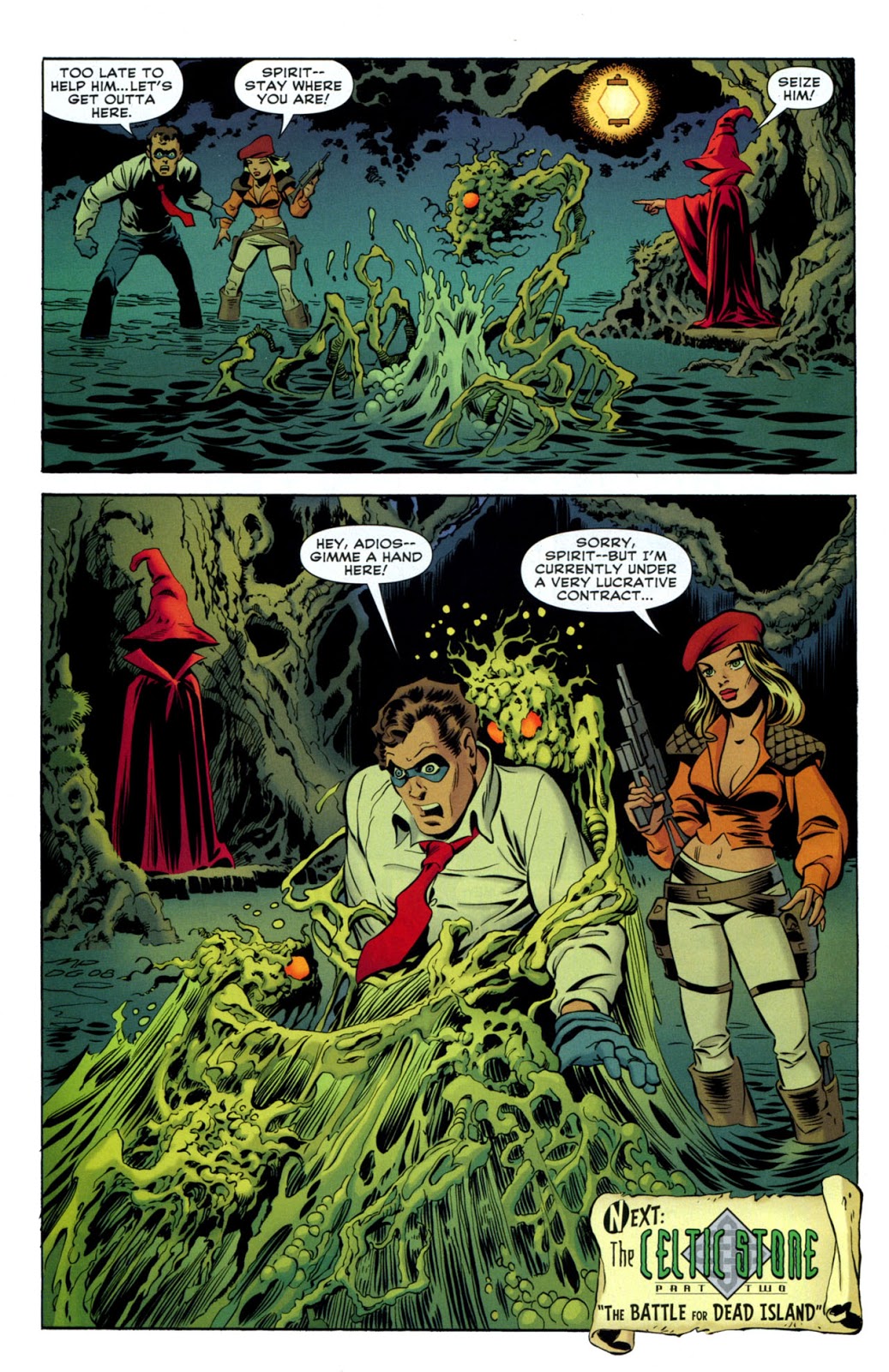
But that obviously changed as Ploog discovered Eisner, The Spirit and comics’ lore in general. On this page from 2007, Ploog, aided by inks from vet Dan Green, captures Eisner’s Spirit — and adds his own taste for a horrific milieu.

Ploog spoke with journalist Jon B. Cooke about the early part of his career in an interview for Comic Book Artist #2 in 1998. Read the full interview here.

CBA: How’d you get the call from Will?
Ploog: I was working for Hanna-Barbera, and the guy in the room with me belonged to the National Cartoonist’s Society. He got a flyer Will had put out, looking for an assistant. He looked at it and said, “Ploog, this looks like your stuff.” I looked at it and said, “It is my stuff.” [laughter]. I called Will, and two days later he was in L.A. and interviewed me…the following week I went to work for him.

CBA: When you first burst upon the scene in comic books, you had a style very reminiscent of Will’s work. Did you start developing that style through osmosis, just being around him?
Ploog: It was very difficult for me, because I hadn’t done that much work. I really didn’t know what a “style” meant. When Will saw my work, he said, “This guy can adapt to what I’m doing easily.” Obviously whatever I had, it was adaptable to him. I could emulate Will right down to a pinpoint on an occasion…I’m sure from working with Will, it developed in that direction…

I love Will; he’s a dear, dear old friend. He’s been an enormous influence on my work both in comics and film.

-Mike Ploog, 1998

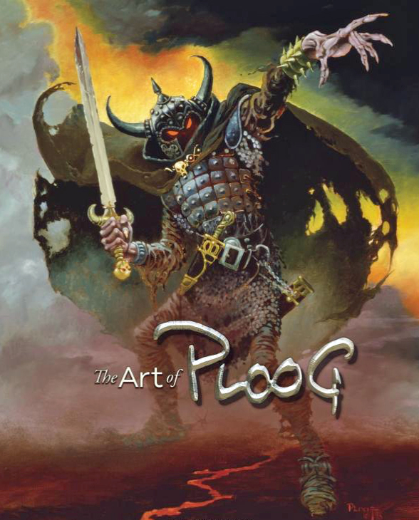
The Ploog art book is a must have for any fan of Mike’s — or simply for those who like great looking art books.

Giorgio Comolo — Across The Universe

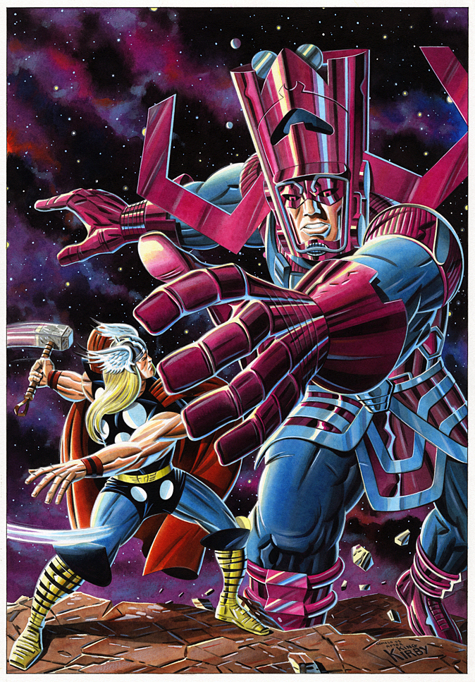
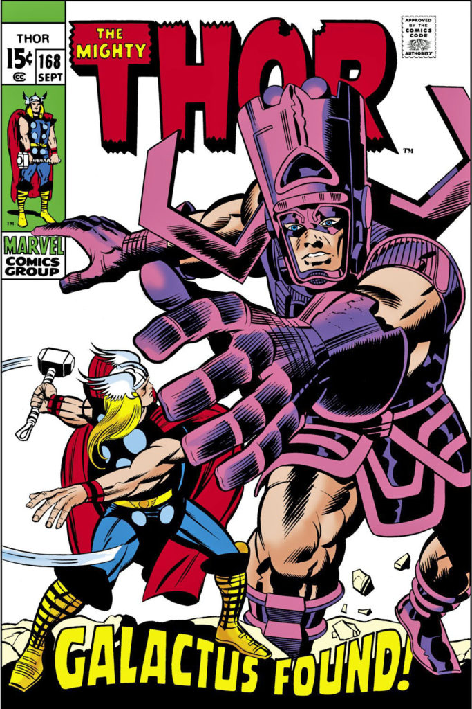
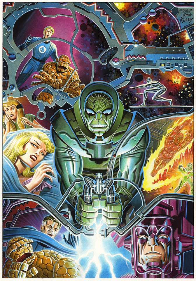
Thor #168 (September 1969), Cover Re-creation, 2006

Today wraps our special remembrance to Jack Kirby with a third piece by Giorgio Comolo, an Italian artist who worships the King  — and expresses his adoration with unique and lovely homages and recreations.

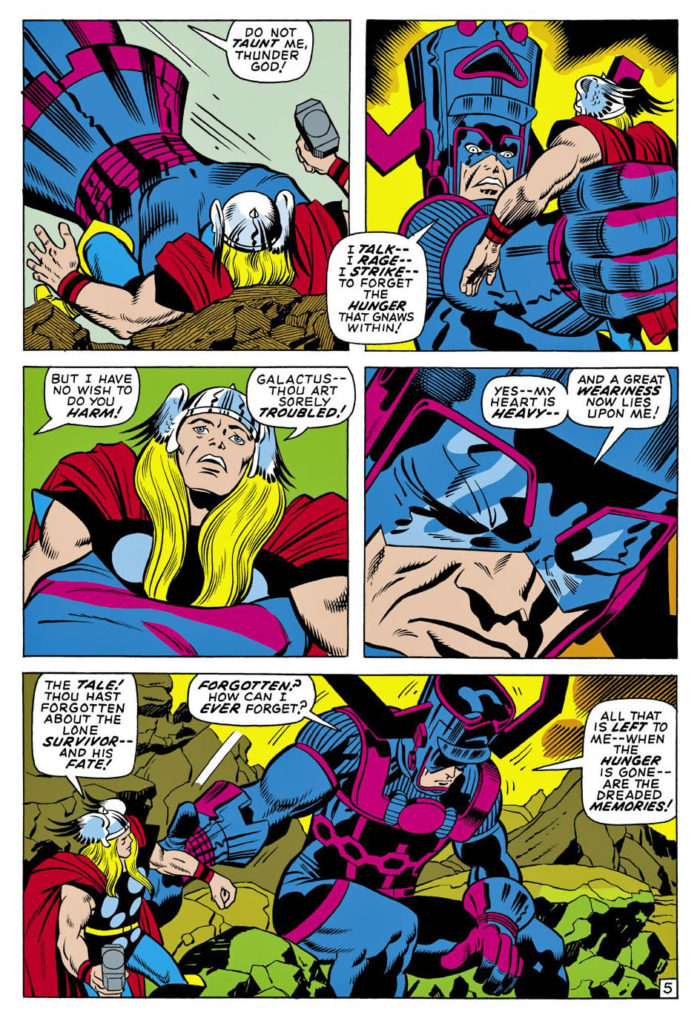
“It is your understanding I seek — and not your enmity!” Galactus

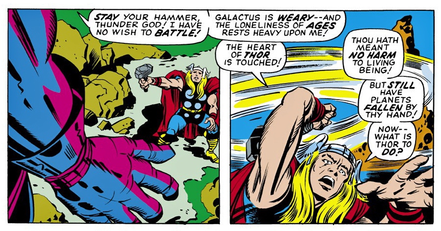
Galactus reveals his origin to Thor (and to us) in this story arc, after Thor, at Odin’s insistence, tracks down the planet devourer in the far reaches of the universe.

Kirby is doing some of his wildest Marvel science fiction in these issues — a small hint of what will come just a short time later in his “Fourth World” comic books at DC.

Apparently, Galactus is not a bad guy. Despite the fact that he devours worlds and galaxies, destroys trillions of lives, he’s misunderstood. That’s all.

Uh-huh.

Comolo homages the cool Kirby cover image and fleshes out the background with cosmic details. And again, he employs that very specific neon-like palate. He also makes Thor’s face a bit more visible — a nice touch. (Although he keeps Thor’s somewhat wonky hand from Jack’s original.)

Oh, and he gives Galactus pants and full sleeves. Galactus should always have pants and full sleeves.

No one has (yet) published a book –or even a portfolio — of Comolo’s Kirby homages. I hope that is rectified in the near future.

Or hey, at a minimum, how about celebrating the 60th anniversary of the Fantastic Four next year by doing Kirby cover homages all year long. Who wouldn’t want to contribute to that?

Meanwhile, Thor #168 itself?:

Kirby. Thor. Odin. Galactus. The Watcher. Balder. The Warriors Three. The Thermal Man…

A pretty good deal at 15 cents.

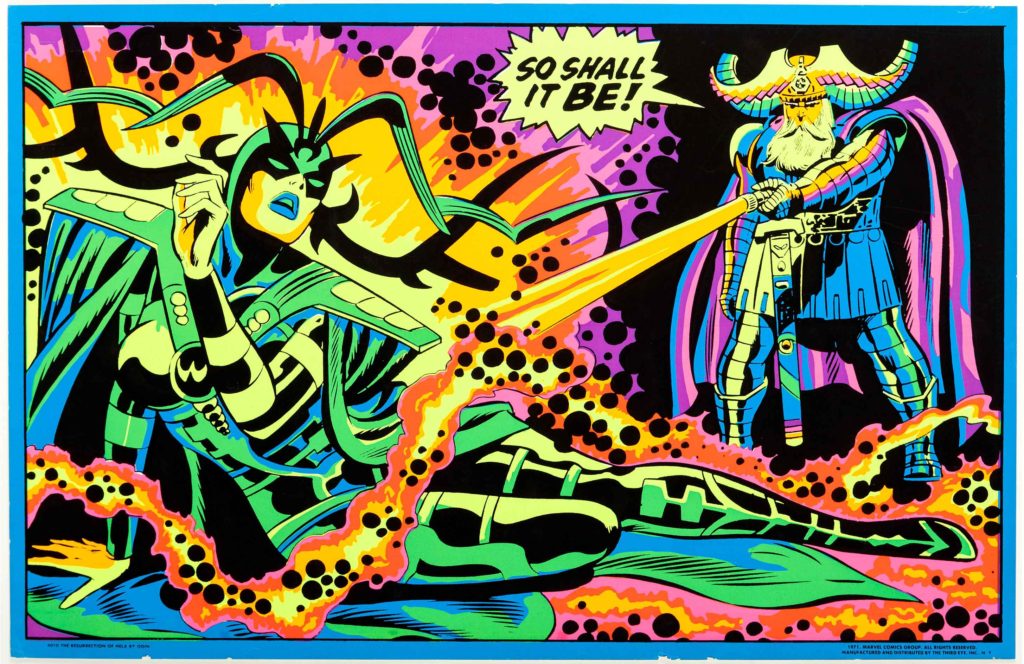
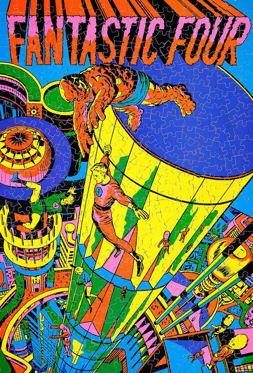
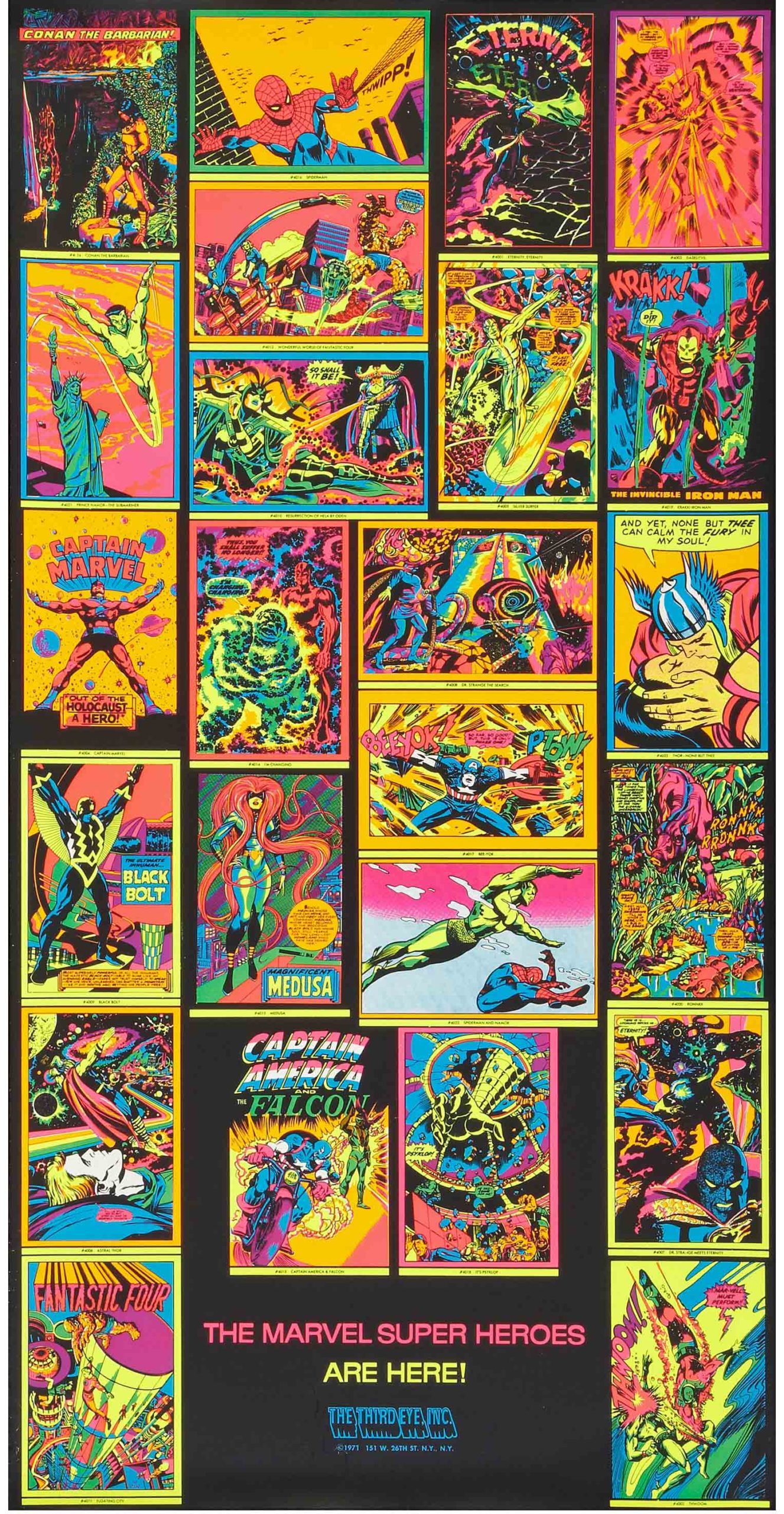
1971 blacklight posters repurposed existing panels & pages from Marvel comics, adding a rich cosmic feel to the art.

Giorgio Comolo — Clash Of The Titans

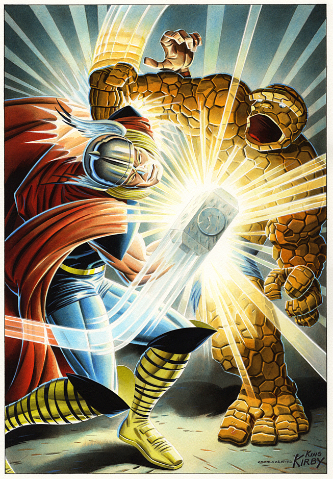
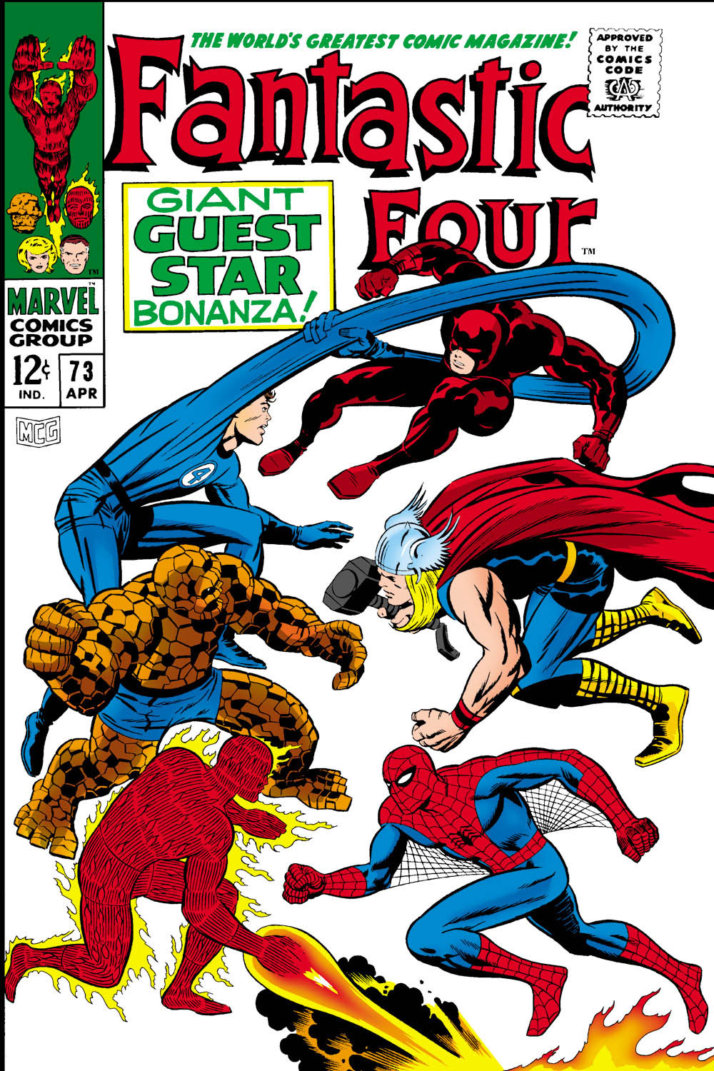
Fantastic Four #73 (April 1968) Re-creation, 2008

We continue to remember Jack Kirby with the help of Giorgio Comolo, an Italian artist who worships the King  — and expresses his adoration with unique and lovely homages and recreations.

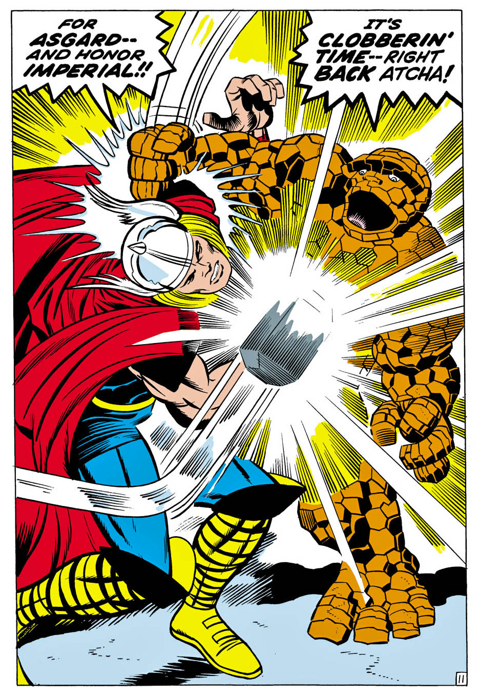
Thor vs. Thing? Come on, no contest. The Thing is powerful, but Thor is a GOD, right?

In this one-off issue of Fantastic Four (#73), Thor (with diminished powers) helps Spider-Man, who in turn is helping Daredevil, who recently had a mind transference with Doctor Doom who… never mind. The FF think Daredevil is still Doc Doom. Chaos ensues. Read the comic yourself and catch back up with us later.

Pretty much the entire issue is a battle royale, and Comolo captures the power of this terrific Kirby splash with his own specific style and palate.

Good thing Thor is having power problems… or Thing would be a pile of rocks on the next page.

Also, FYI, in this issue Thing calls Thor “Curly” “Goldilocks” and “Cornball” at various times, and Spider-Man calls him an “Asgardian Hippie.” I know that was Stan’s style, but we are perilously close to Not Brand Echh territory at this point.

Fortunately for us, Galactus and the Silver Surfer return in the next issue. More operatic than comedy.

Giorgio Comolo — In The King’s Court

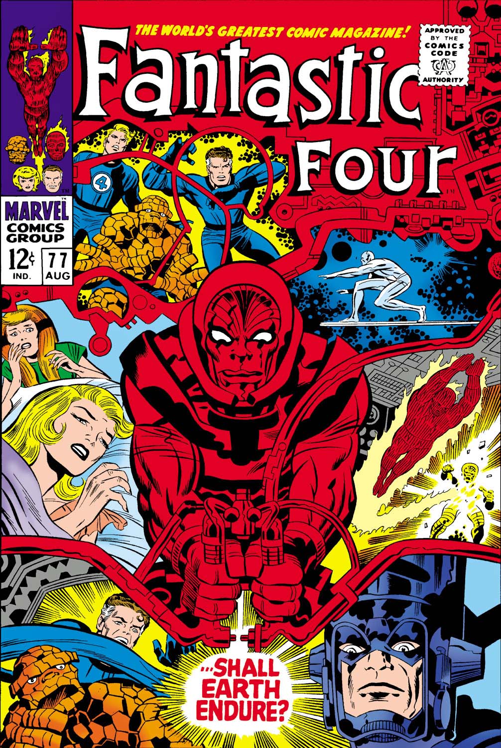
Fantastic Four #77 (August 1968), Cover Re-creation, 2008

This week we remember Jack Kirby with an artist who worships the King  — and expresses his adoration with unique and lovely homages and recreations.

Giorgio Comolo speaks no English. None. Niente.

That makes speaking to him about his art challenging if, like me, you don’t speak Italian. (I don’t include the handful of words I learned in my childhood neighborhood. Those are not very useful for polite conversation.)

Thankfully, his brother speaks some, and his sister-in-law a bit more, so roughly translated, I was able to tell him last year how much I enjoy his work when I met the whole family in Italy.

And fortunately, King Kirby is a universal language, and Comolo speaks Kirby fluently. The Italian artist recreates many Kirby covers and scenes as paintings, using a specific palate that utilizes cooler color tones and hues. It might be a stretch to some, but his cosmic paintings often remind me of those wild blacklight posters published in 1971 by a long defunct company called Third Eye.

Of course Comolo’s paintings are not Day-Glo — but they definitely pop. His palette creates a very distinctive look to his homages.

And he focuses on Jack’s later works at Marvel (and some of the Fourth World material at DC), so there’s plenty of cosmic material to work with.

Like this cover recreation of FF 77. It’s a trippy composition to begin with, and in Comolo’s hands, becomes… even trippier.

Sal Buscema — Belated Birthday Bash (II)

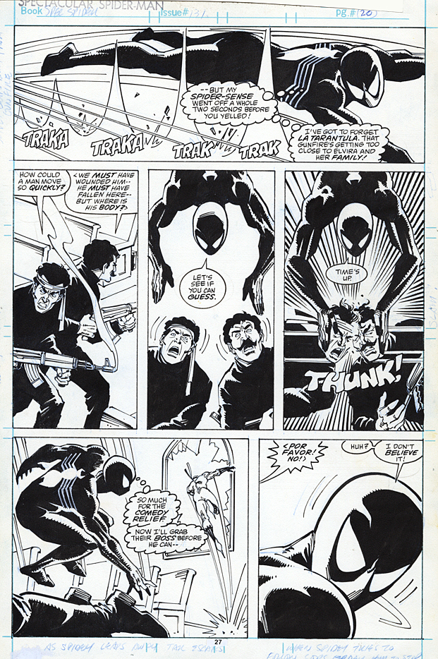
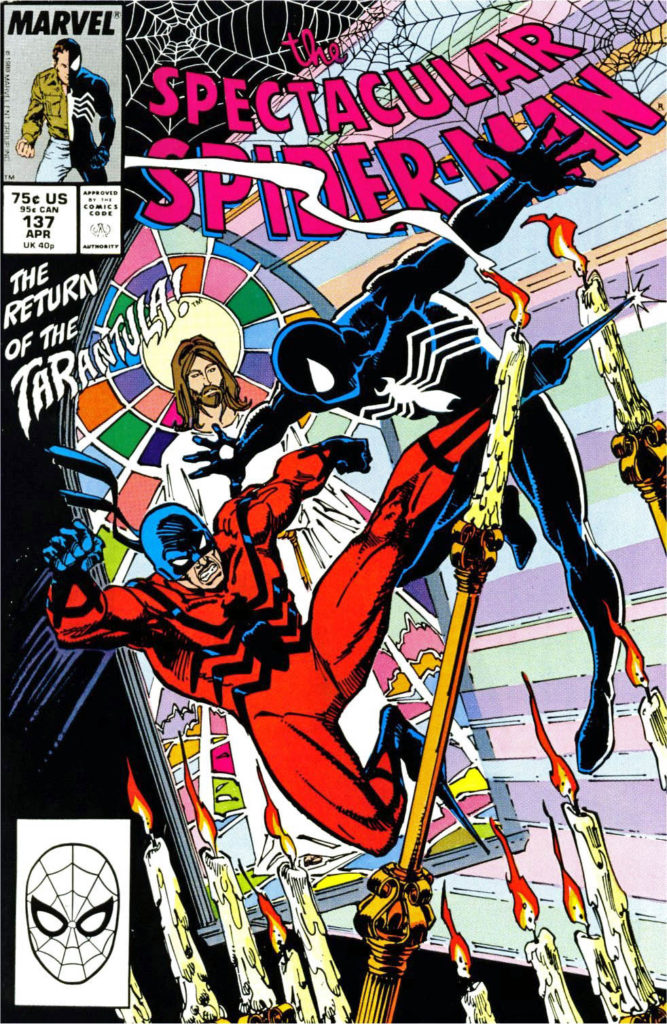
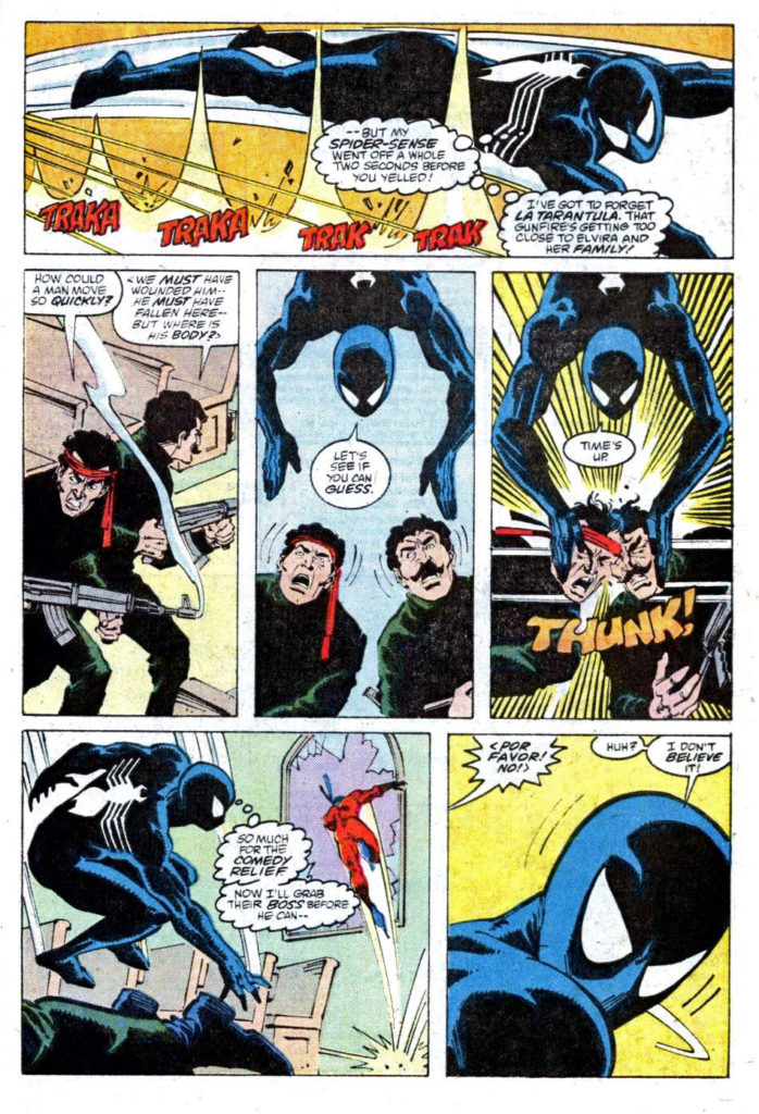
Spectacular Spider-Man #137, April 1988

Sal Buscema celebrated his 84th birthday earlier this week — how did that happen, you ask? I don’t know either. (January, by the way, is obviously a great month for the Marvel “bullpen.”) So, we continue our better-late-than-never tribute series.

Sal, one of Marvel’s most versatile and prolific artists, cites the Hulk as his favorite character. Nevertheless… he penciled and (mostly) inked 100 issues of Spectacular Spider-man. (That’s 100!)

Included in that record-setting run is this dynamic page from early in his return to the title in 1988. It’s the end of black spider-suit era — pretty much the final appearance of the costume before Peter ditches it for good (mostly) a month later in Amazing Spider-Man #300. (MJ is not too happy that her husband looks like Venom when he wears it, but I digress.) I love the way the three middle panels work cinematically to show Spidey getting the upper hand on the gunmen.

Sal wanted to be an inker. He has said in various interviews (emphatically, in some cases) he prefers it. And it’s clear that it took him some time to find his own voice penciling. (In fact, if you compare his early 70s work to his late 80s work, it’s obvious that, like many great artists, his voice evolved.)

But I think we are all happy that Stan and Marvel’s editorial team pushed him into pencils. He’s an amazing a spectacular storyteller.

John Romita Sr. — Belated Birthday Bash (I)

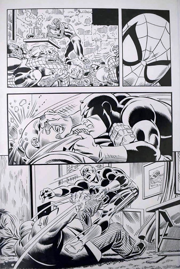
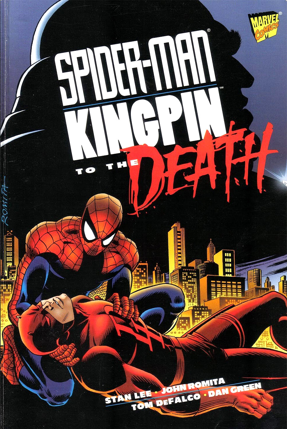
Kingpin (One-Shot), November, 1997

John Romita Sr. turned 90(!) the other day, and we would be remiss if we didn’t celebrate the amazing artist — even belatedly.

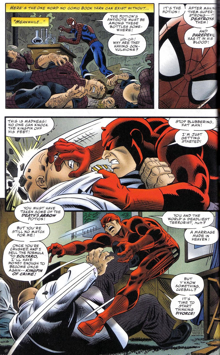
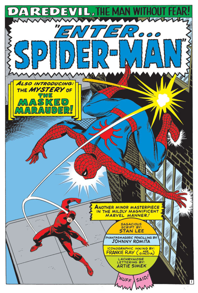
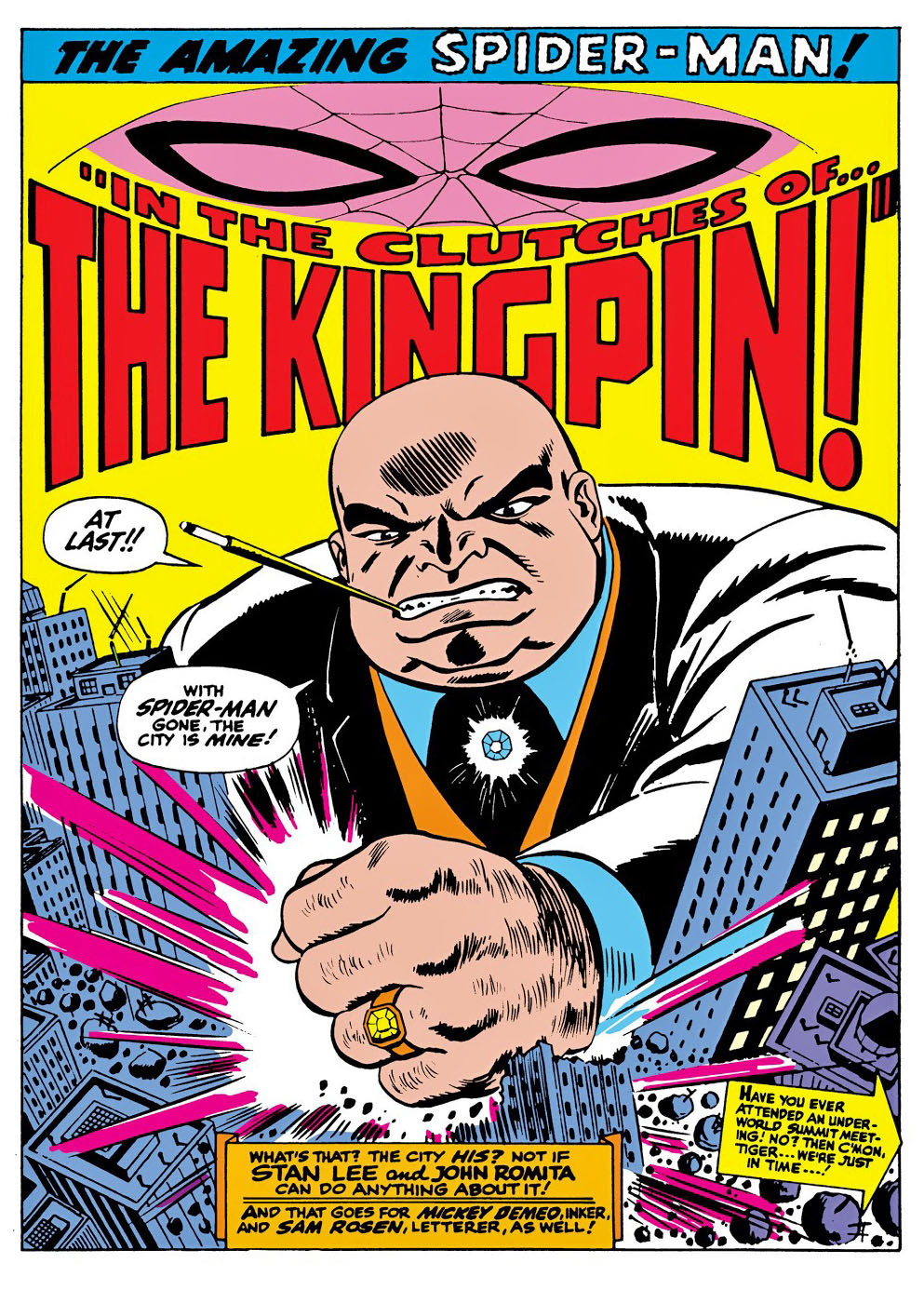
This great action page is from the one-shot Kingpin and it represents the final comic book story collaboration between Romita and Stan Lee (with help from Tom Delfaco and inker Dan Green).

What’s great about this story — and this page, specifically — is that it features three important Romita icons in one place:

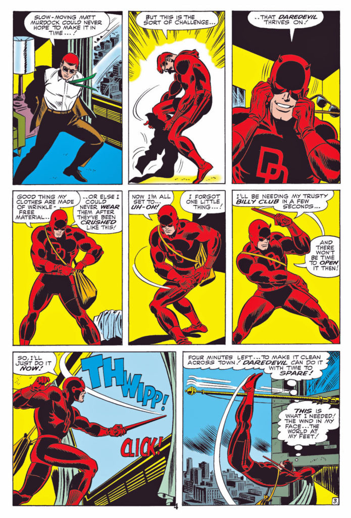
  • Daredevil, Romita’s first pencil gig at Marvel after eight years of DC romance comics.
  • Spider-Man, the character that Romita will always be most associated with, and the one he brought to new heights of popularity.
  • Kingpin, the all-too-familiar super-villain that John co-created, and who will likely vex DD, Spidey and others for the rest of time.

This page is obviously not from the classic Romita era — in fact, it comes 30 years later, but it’s still a great example of Romita’s superb draftsmanship and storytelling.

And all it’s missing is Mary Jane Watson.

You can’t have everything.

Romita on his Spidey assignment:

“I was hoping against it, believe it or not. People laugh when I say this, but I did not want to do Spider-Man. I wanted to stay on Daredevil. The only reason I did Spider-Man was because Stan asked me and I felt that I should help out, like a good soldier. I never really felt comfortable on Spider-Man for years. … I felt obliged to [mimic] Ditko because … I was convinced, in my own mind, that he was going to come back in two or three issues. … I couldn’t believe that a guy would walk away from a successful book that was the second-highest seller at Marvel. … After six months, when I realized it wasn’t temporary, I finally stopped trying to [mimic] Ditko. … “

From Alter Ego #9

Gil Kane / Neal Adams — Night Of Diverse Hands

Savage Tales #4, May 1974

Conan celebrates its 50th anniversary in comics this year, and we conclude our anniversary recognition with our final of three Conan-themed posts.

Night of the Dark Gods is a great example of Roy Thomas’ ability to adapt an Robert E Howard story without Conan, into one.

Given the artistic talent that worked on the story, clearly some deadline problems ensued. Not surprising, since at this point in Marvel’s 70s expansion,  (comic books and  “mature magazines”) deadlines were whizzing by a the speed of light.

Neal Adams assisted Gil Kane on the pencils, and inked some of the story as well, supported by Vince Colletta, Frank McLaughlin, and Pablo Marcos. Marcos also provided the wash tones on the story, necessary to add depth to a black and white, and also provide some consistency to the art style.

The inking credits are listed as Diverse Hands, and this appears to be the only time that the credit is employed, meaning it’s likely that this specific group of professionals never contributed jointly again on one story.

Neal, of course, was a pro at collaborative art creation. His “Crusty Bunkers” a group of (ever-changing) artists at his Continuity Studios, filled in many times during deadline crunches for Marvel, DC, Charlton and others during the 1970s.

It’s easy to be fondly nostalgic about something you missed entirely, but, based on everything I’ve heard, it sounds like a hoot. Stop by, ink some pages, spot some blacks, and make your deadline, head to the pub. (It was probably much more stressful than that, but I digress.)

The story is ultimately also printed in color, in a Marvel Treasury Edition, and although the coloring itself is okay, many of the inking and wash details are obscured, likely in an effort to get the job done quickly.

(And see below for the mystery of the extra face.)

John Buscema — Legendary Run

Savage Sword Of Conan #63, April 1981

Conan celebrates its 50th anniversary in comics this year, and we continue to celebrate the anniversary with our second of three Conan-themed posts this week.

 “This guy used to eat, sleep and breathe drawing. It didn’t matter what was going on around him. He would get bored with it and start sketching. … He just couldn’t stop drawing. [His back-of-board sketches were] better than some of the stuff that he did on the front. … He’d get a spark of inspiration and turn the page over and draw whatever was in his skull.” Sal Buscema, speaking about his late brother John.

Roy Thomas had wanted John Buscema to draw Conan.

Roy knew that John’s artistic style and storytelling skills (and interests) could perhaps best capture the Conan character —- and most remind readers of the amazing eight Frank Frazetta covers that graced the Lancer paperbacks of the last few years.  Those images had helped Conan rapidly turn into a phenomenon among fantasy readers.

But budgetary concerns forced Thomas to work with the mostly unknown Barry Windsor Smith, and a different kind of Conan developed. Younger, sleeker, a bit more handsome. And after a slow start, (it was nearly cancelled after issue #7) the book caught fire, and inspired a sword and sorcery age in comic books.

But Smith, frustrated by the deadlines of the comics periodical business, ultimately left Conan.

And so fate called again, and Roy got what he wanted the second time around.

Under Buscema’s pencils, the burly, muscular, often-raging Conan ultimately epitomized by Arnold Schwarzenegger, emerged. This was an older Conan with more experience (and world weariness) under his belt.

Buscema has rightfully become identified with the character, rendering more than 100 stories each for both the Conan comic book and the more “mature” Savage Sword of Conan magazine.

I’ve owned and traded many Buscema Conan pages over the years, and this splash remains one of my favorites. After a long fought series of adventures and battles, Conan is taking a break, and celebrating his victory.

Nothing wrong with that.

The story itself is an odd one. Michael Fleisher is the scribe, having come on board a just a few months earlier after Roy Thomas bolted for DC. Given the varying art styles of the story, the story length (46 pages) and the multiple inkers (Ernie Chan, Tom Palmer and Bob McLeod are all credited) it’s entirely possible it was originally destined to be a shorter story, and fleshed out when something else fell through.

If so, it’s a feat that John Buscema could pull off — while most others couldn’t even attempt it.

Barry Windsor-Smith — Slayer Of The Status Quo

Conan # 7, July 1971

Conan celebrates its 50th anniversary in comics this year, and we celebrate the anniversary with three Conan-themed posts this week.

Barry Winsdor-Smith was not the first choice to draw Conan. Legend has it that Roy Thomas knew that John Buscema was the idea artist for the job. But Publisher Martin Goodman nixed the idea, citing budget and schedule, and told Stan/Roy to find someone less expensive.

The solution? The young British-born Smith, who had been a fill-in artist on a handful of super-hero titles with an unmistakable Kirby influenced style, and who was both cheap — and available.

And so Barry drew Conan for 21 of the first 24 issues — and the comic book world promptly grew up.

Smith, one of the many “young guns” of similar age, and breaking in at around the same time, (Chaykin, Kaluta, Simonson, Wrightson among the many others) ultimately developed an inimitable style. Yes the Kirby influence was there, especially early on. But so is Steranko. And Alphonse Mucha, the best-known stylist of the Art Nouveau period (late 19th – early 20th century), provides much of the inspiration for the intricate designs and beautiful women that populate those early Conan stories.

Smith’s run on Conan is unlike any other in professional comics at that time. And Baby Boomers, who had grown up on the simple stories of DC, and had segued into the cosmic soap operas of Stan and Jack, were primed for these comics. The Boomers were growing older, and now, the comics were growing up with them.

Smith’s style developed rapidly over his three year run on Conan, culminating in the extraordinary “Red Nails” that first appeared in 1973/1974 in Savage Tales. And of course, the work was always best when Smith was inking himself, but both Sal Buscema and Dan Adkins did excellent work, and interestingly, both are credited on this issue. Sal is credited on this specific page, but without all 20 original pages together, it’s difficult to tell.

Either way, it’s a stunning page, and only a small harbinger of things to come.