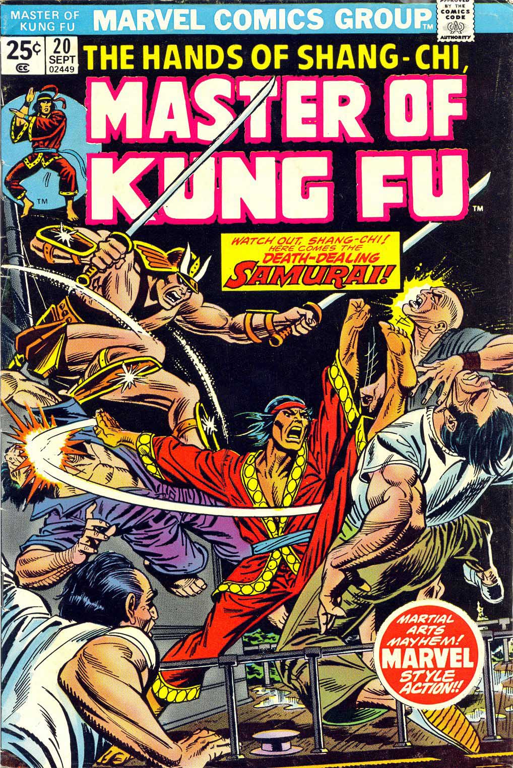
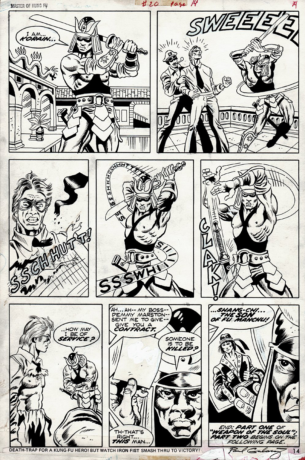
Paul Gulacy — Kung Fu Fighting
Master of Kung Fu #20, September 1974
By now, we should be in the next phase of the Marvel Cinematic Universe, but unfortunately, we have a six-month delay. So, for the first time in a dozen years, no Marvel film to launch the summer movie-going season. But, we won’t let that delay slow us down here — this week, we’re looking at some comics art related to the next three scheduled films.
Marvel’s ability to spot trends, and capitalize on them, definitely helped their their 1960s rise from second (more like fifth) banana to publishing powerhouse in the 60s and 70s.
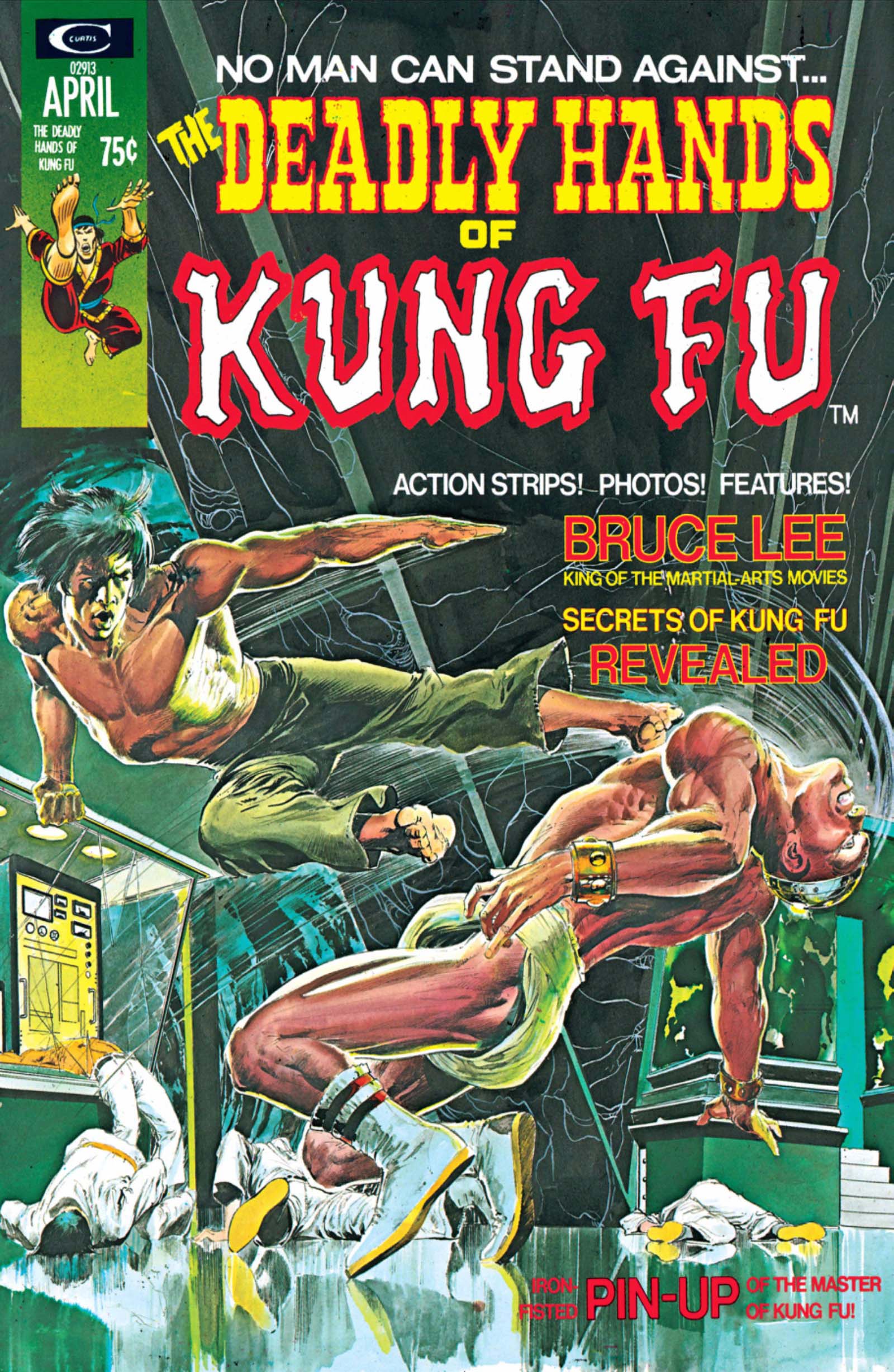
Case in point: Martial arts and specifically “Kung-Fu.”. First flooding film houses, and then television, the craze rapidly spread through pop-culture in the early 1970s. Bruce Lee — and dozens of imitators — had clearly caught the public’s imagination.
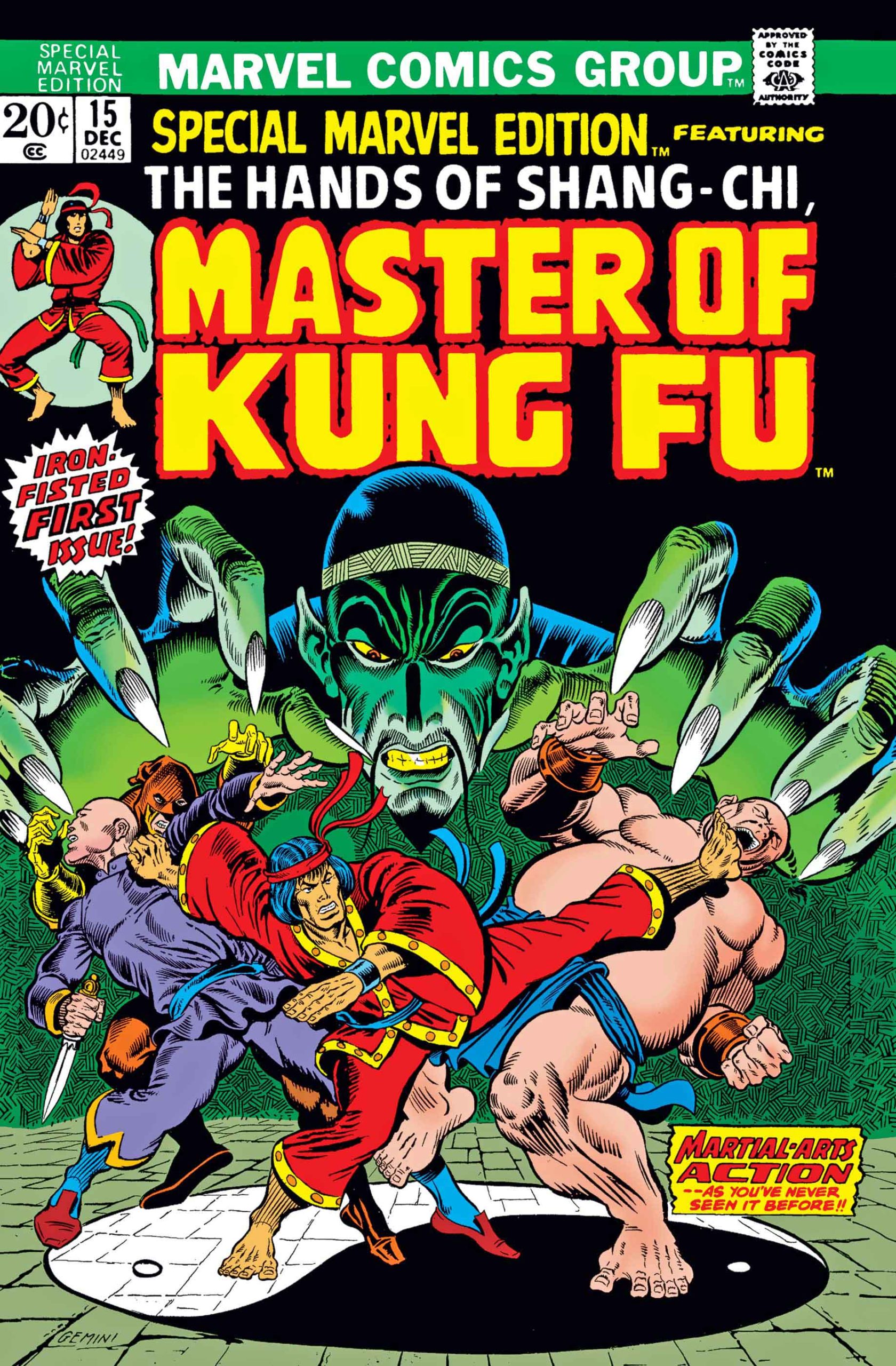
Marvel quickly launched three genre series in late 1973 and early 1974. First up was Shang-Chi, originally by Steve Englehart and Jim Starlin, and shortly thereafter by Doug Moench and Paul Gulacy.
Shang-Chi’s backstory was intriguing — in the comics, he’s the son of Dr. Fu Manchu, famed villain from the Sax Rohmer novels. This plot detail, ultimately a rights issue, helped derail Marvel from reprinting the series for more than 40 years.
And, it’s been changed apparently for the Shang-Chi film now scheduled for May, 2021. He’s re-written now as the son of the Mandarin, an early Marvel (Iron Man) mastermind who was “impersonated” in Iron Man 3. We will see how that plays out.
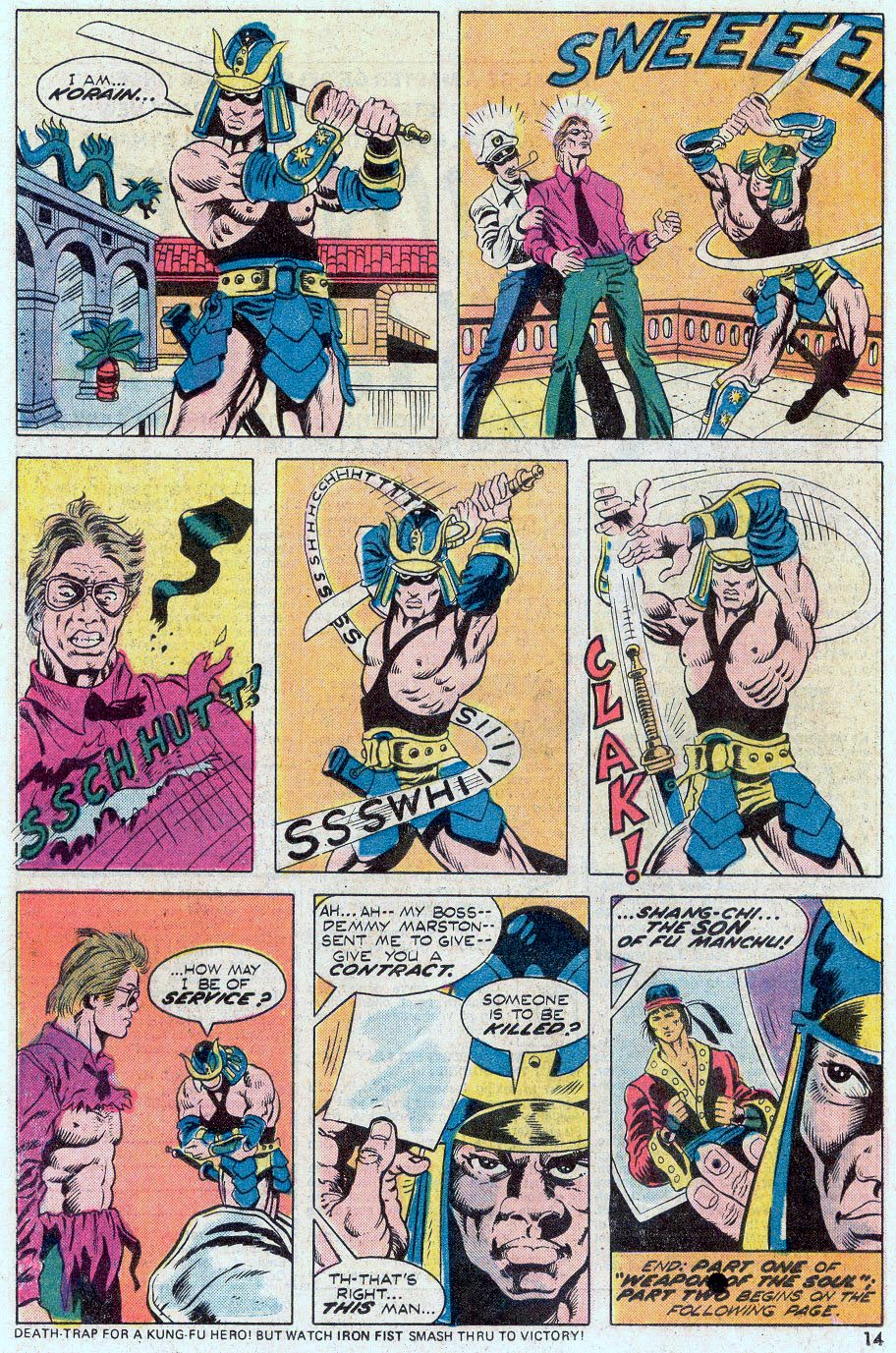
As for this page itself: Shang- Chi barely makes an “appearance”, but so what? It’s a cool example of Gulacy’s Steranko-influenced storytelling.
And, as for the criticism that perhaps Gulacy’s style was too influenced by Jim Steranko in these early issues? I say, so what to that too. Jim had already bowed out of comic book stories by then, and if you liked his work, this was possibly the next best thing.