Greg Goldstein's Comic Art Gallery

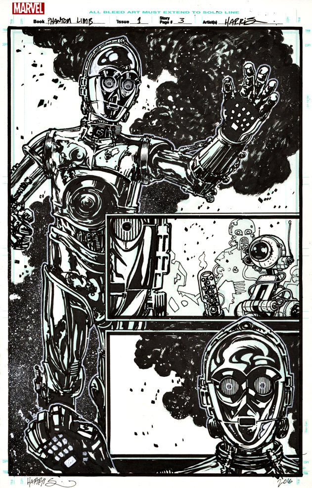
Tony Harris — The Phantom Limb

Star Wars Special: C-3PO #1, June 2016

Star Wars: The Rise of Skywalker opens in two short weeks, and the Star Wars Skywalker trilogy of trilogies (I can’t bring myself to call it a ennealogy) will apparently conclude, 42 years after it began. 
In honor, the next two weeks of posts will feature original art from Star Wars, showcasing one or more of the “original trilogy” characters.

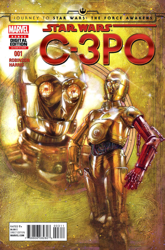
James Robinson and Tony Harris (Starman) reunite for a one-shot C-3PO story that explains the droid’s red arm in The Force Awakens. 

Their Starman run was one of the great comic book series of the late 20thcentury and it was nice to see them back together, even if only for a one-shot. And a pretty good one at that — a surprisingly moving tale about droid sacrifice.

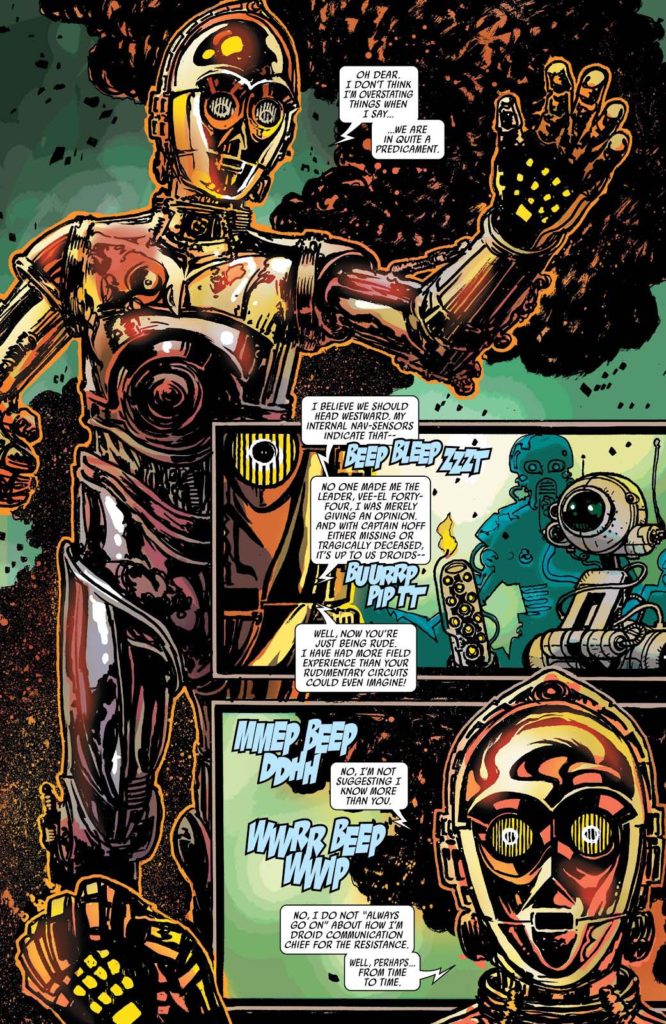
The story is packed with eccentric droids in tight spots, and this splash is perhaps the best page in the book — a full image of C-3PO rendered with delightful and quirky detail by the talented Mr. Harris.  He painted the striking “A” cover as well.

I love the final coloring, also by Harris, but as is often true, the art is especially striking in glorious black and white. 

May the force… Well, you know.

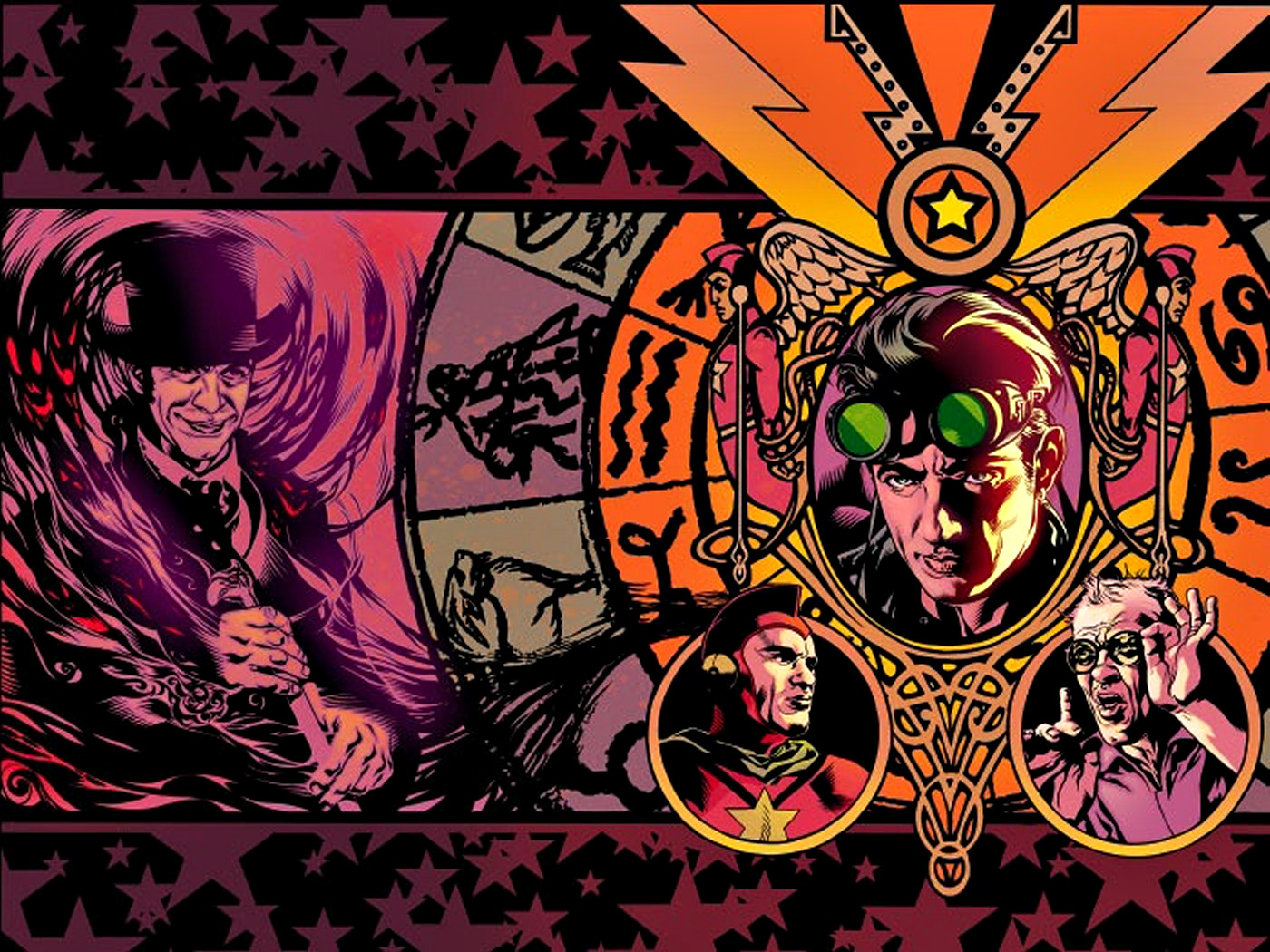
A knockout wraparound cover from the hardcover collections of Starman Robinson and Harris stories.

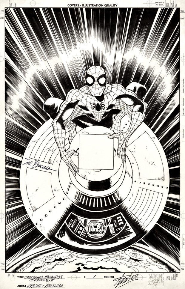
Ron Frenz and Sal Buscema — A Different Spin

Spider-Man Collectible Series #2, August 2006

Our celebration of Marvel’s 80thAnniversary concludes with the publisher’s most iconic character in one of his classic stories.

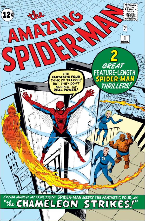
The lead story in the original Amazing Spider-Man # 1(1963) finally gets its own terrific cover more than 50 years later, thanks to this unique reprint series published in 2006.

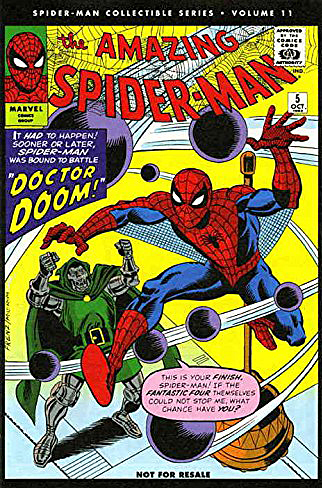
News America created The Spider-Man Collectible Series as weekly promotional supplements to Sunday newspapers. Each issue was printed on newsprint and contains half an issue of a classic Lee and Ditko Spider-Man comic, published in original order. Only 24 issues were produced, suggesting the series did not succeed as well as envisioned.

Since each original Spidey comic was split in half, every other issue of the supplements required brand new covers, depicting classic stories. For the most part, the covers are as dynamic as this one — if I could find them, I would attempt to acquire as many as possible.

Ron Frenz is a great visual storyteller (definitely influenced by classic Marvel artists), and Sal Buscema’s inks are always spot-on. (For more than 50 years!) I consistently enjoy their team-ups.

As for this Spider-Man story itself? It’s a classic that sets up storylines and characterizations for years, as Spidey saves J Jonah Jameson’s astronaut son  — only to be blamed for sabotaging the rocket in the first place. 

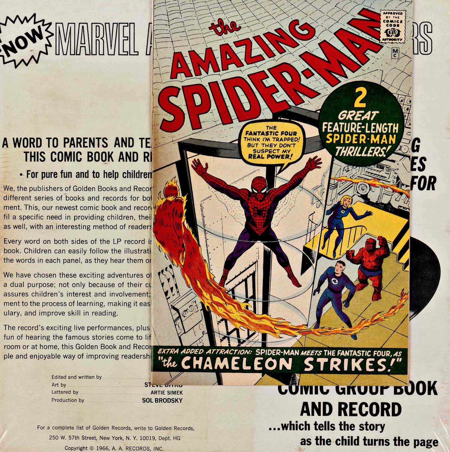
It’s a story I heard dramatized over and over again as a kid, because I was somewhat obsessed with the Golden Record recording of that classic issue. (See below). 

And of course, it makes sense that the “back-up” story featuring the Fantastic Four is the original cover of Amazing Spider-Man #1 and all other subsequent reprints. Although the original published cover blurb has made me wonder if the astronaut story was actually intended as the cover and pulled. Why call out the cover story as an “extra attraction” if that’s the story we can already see? Hmmm.

No good deed goes unpunished…and becomes the defining thread in Spidey stories.

Mark Bagley — Secret Origin

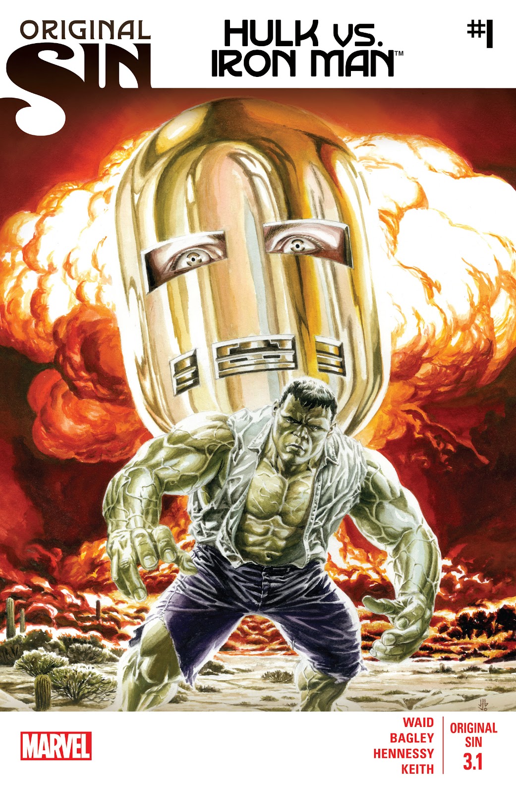
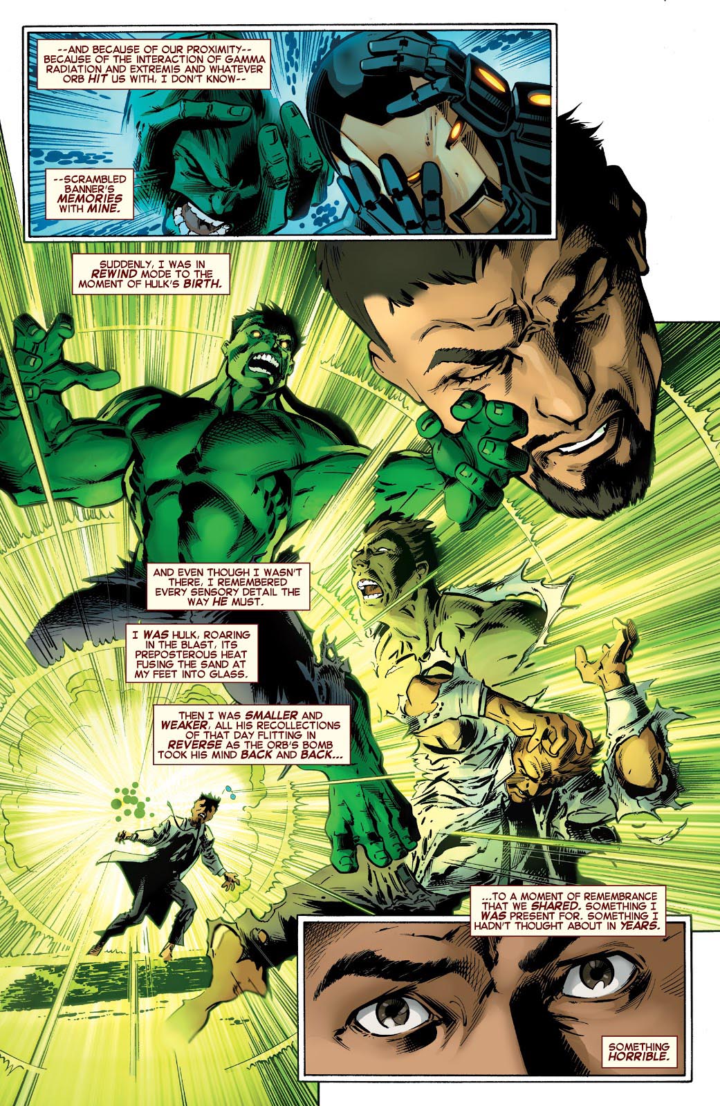
Original Sin #3.1, August 2014

Continuing our ongoing celebration of Marvel’s 80thAnniversary.

Tony Stark is forced to relive The Hulk’s origin — and his own potential culpability in the fateful gamma blast — in Original Sin, a clever 2014 crossover event by Mark Waid that introduces some new retcon elements into the Marvel Universe.

Re-imagining a classic scene is an interesting challenge for an artist, and Mark Bagley delivers on Bruce Banner’s transformation with inventive (and concise) storytelling and solid draftsmanship. Andrew Hennessy’s inking on Bagley’s pencils adds some nice polish.

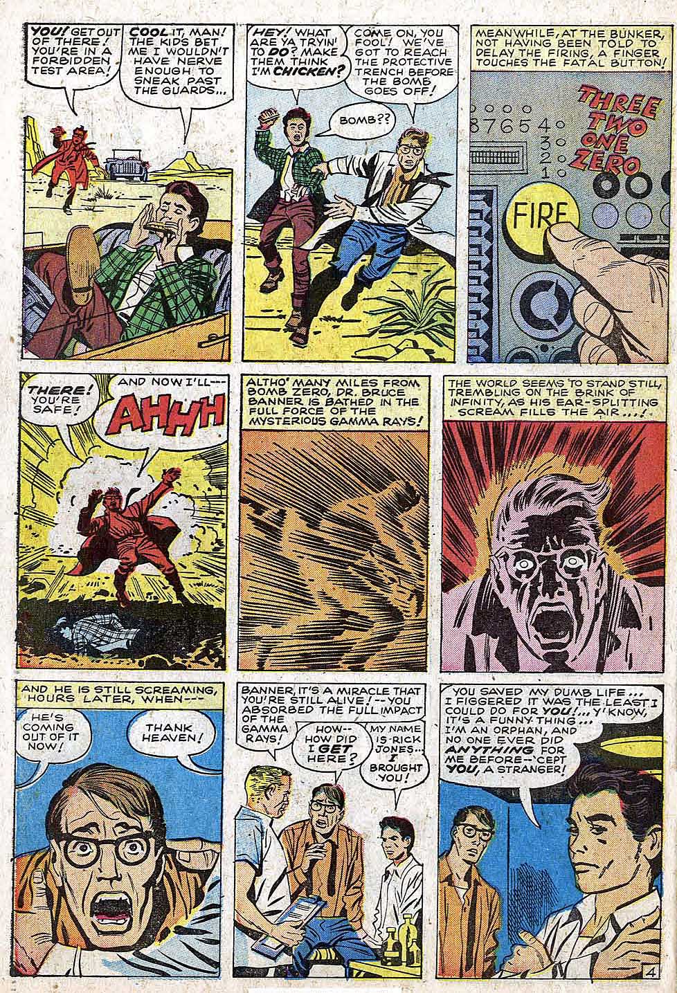
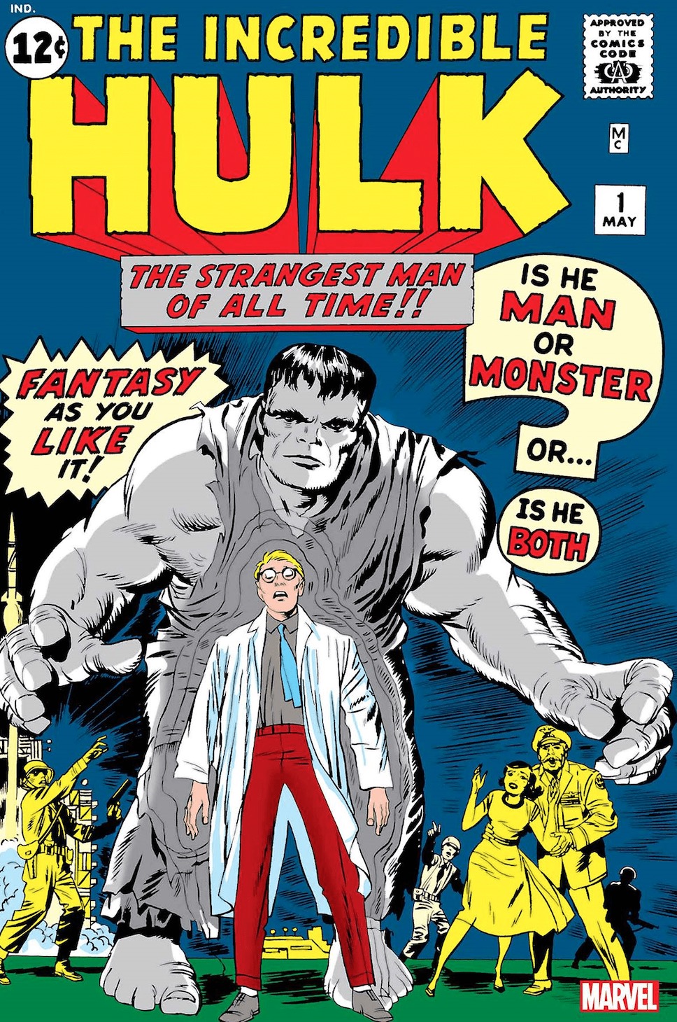
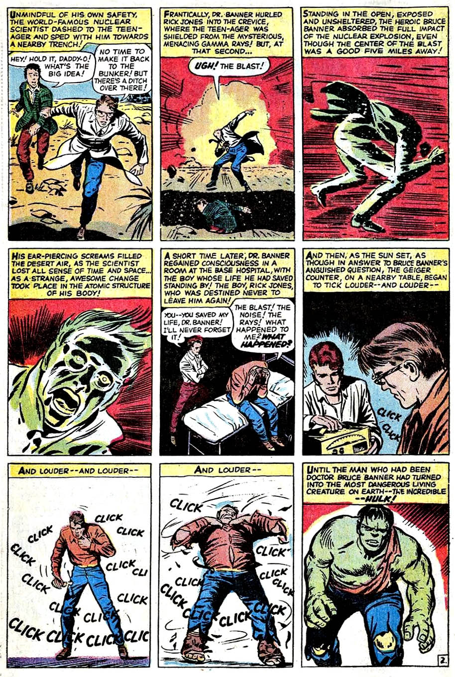
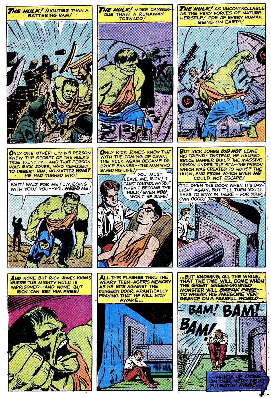
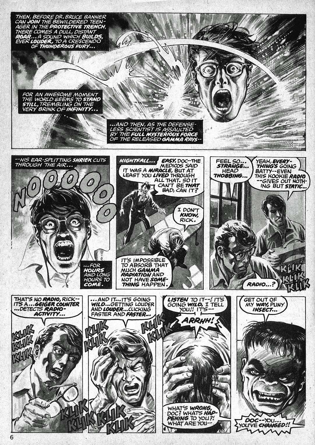
The basics of Hulk’s origin haven’t changed much in the nearly 60 years of his existence, but the nuances have been modified many times. In the early days of the Silver and Bronze ages, a number of artists did different takes, as evidenced below.

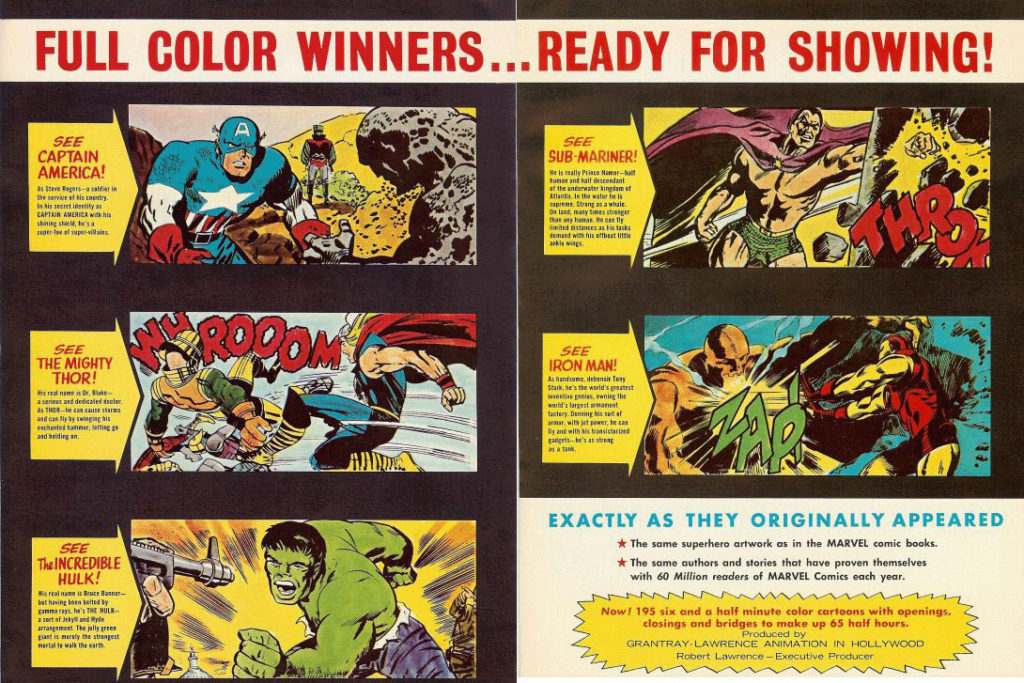
Where did I first see the Hulk’s origin? On TV, of course, in the 1966 Marvel Super-Heroes Cartoons. (Courtesy of Jack Kirby’s art.)

Sing along to the theme song if you will:

(Lyrics by Jacques Urbont)

Doc Bruce Banner,
Belted by gamma rays,
Turned into the Hulk.

Ain’t he unglamor-ous!

Wreckin’ the town
With the power of a bull,

Ain’t no monster clown
Who is as lovable.

As ever-lovin’ Hulk! HULK!! HULK!!

Advertising material for the 1966 Marvel Super-Heroes Cartoon

Sal Buscema and Joe Sinnott — Fireworks

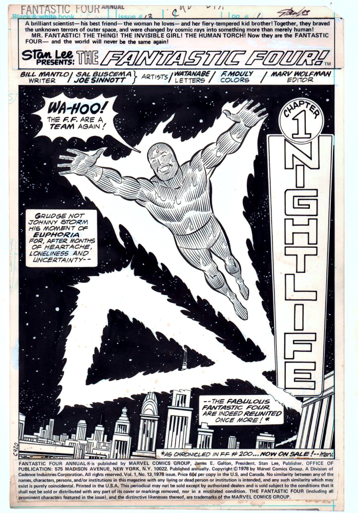
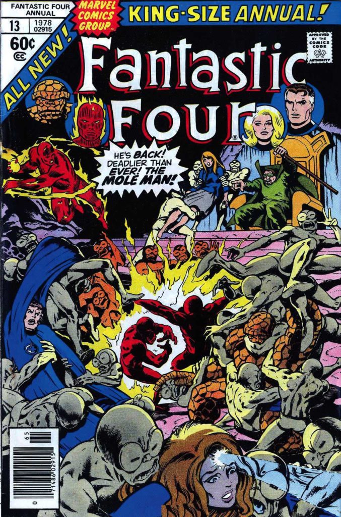
Fantastic Four Annual #13, 1978

Continuing our ongoing celebration of Marvel’s 80thAnniversary.

Sal Buscema and Joe Sinnott deliver an iconic (and terrific) image of the Human Torch in this celebratory opening splash page.

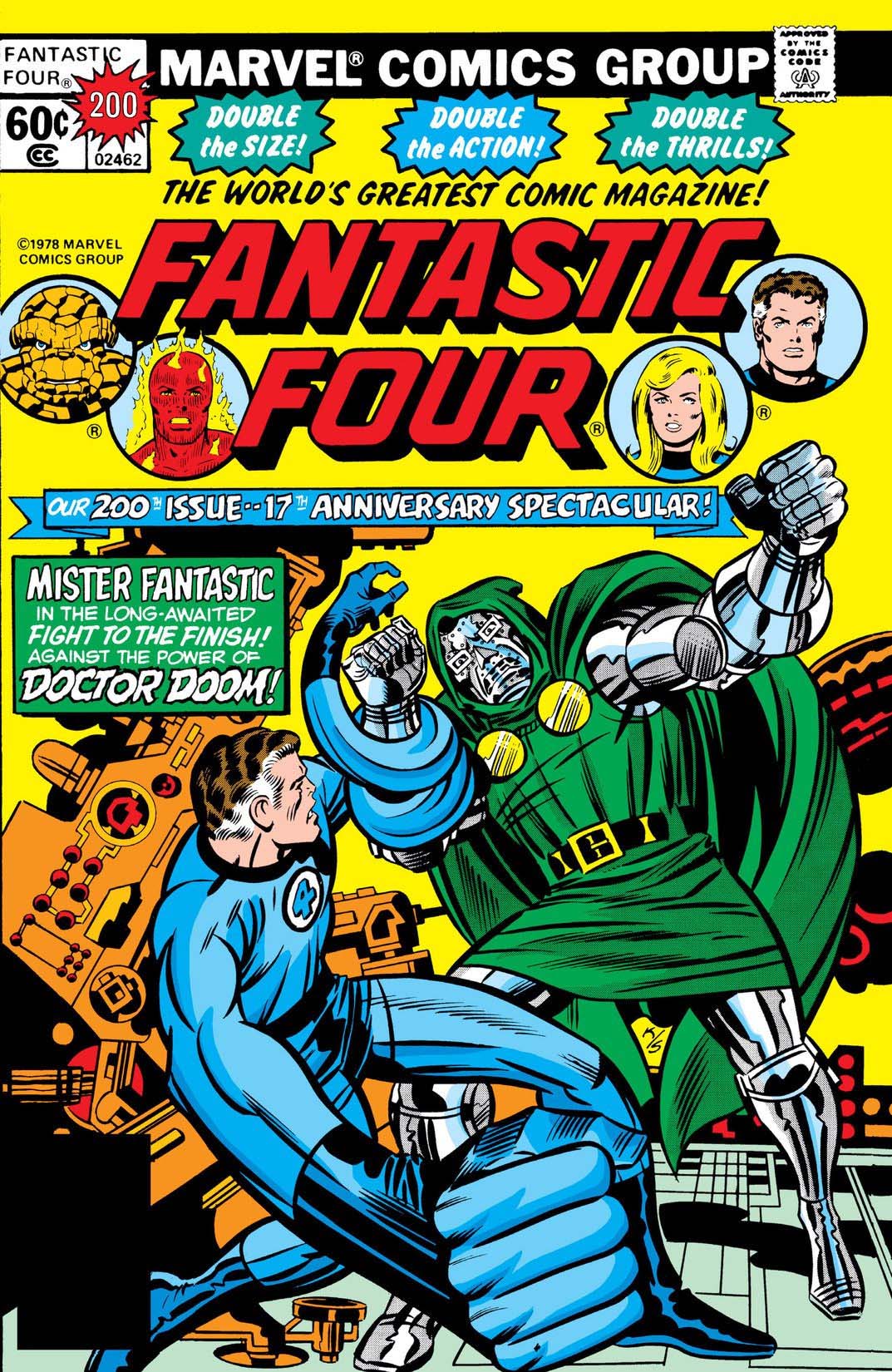
Celebratory in that the Fantastic Four had just gone through a quirky period editorially where they were essentially “broken-up”, and they have reunited in FF #200, on-sale at the same time.

At this point in the run, Joe Sinnott, acknowledged as one of the all-time greats, is pretty much the only consistent through line in the FF — the series was rapidly going through a number of mix and match creative teams. In a three-year period, Joe inks pencillers Sal Buscema, John Buscema, Keith Pollard, Rich Buckler, Ron Wilson, and of course George Perez, who does some of his best known work in this era. (Shortly after this issue is published, Joe adds John Byrne and Bill Sienkiewicz to this mélange.)

Sinnott’s credits, including this one, are often categorized as “finishes” during this timeframe, as many of the pencillers are providing breakdowns only.  Doesn’t help enough with the schedule though, as a number of issues are reprints and fill-ins.  Marvel, as others have noted, was going through some difficult times. The Fantastic Four themselves wouldn’t truly find their full footing again until a few years later, when Byrne fully takes over writing and art chores.

As for Joe and Sal? With the end of the Spider-Man newspaper strip this year, Joe officially retired from inking … at age 92. Sal (age 83) “retired” in 2000, but continues to be coaxed into working — sometimes by my former colleagues — to this day.

“Flame on!”

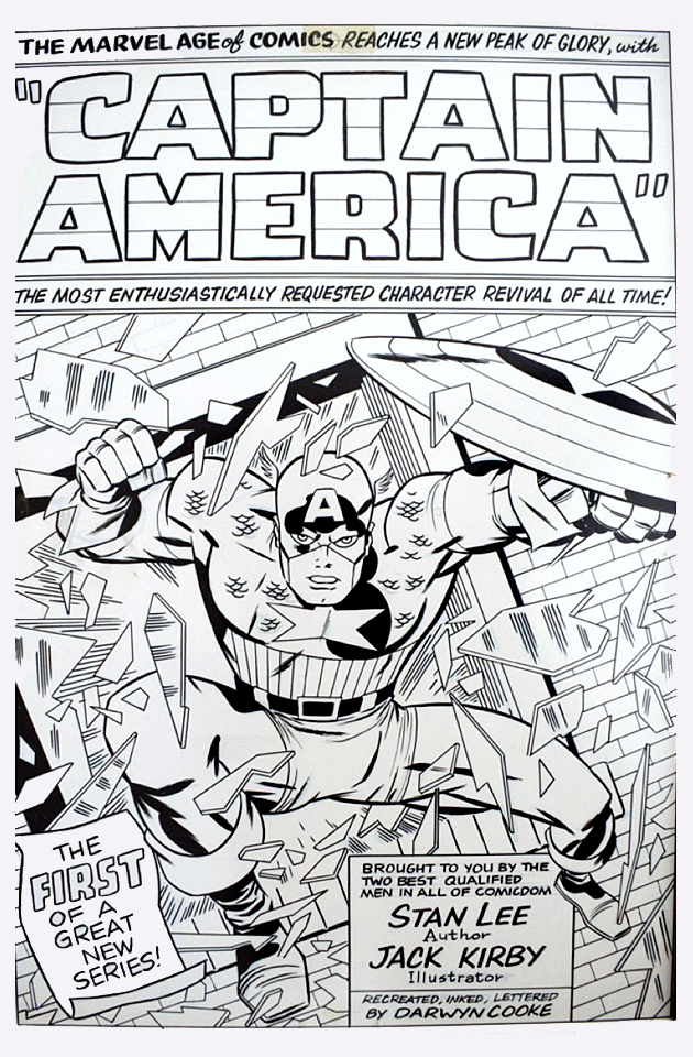
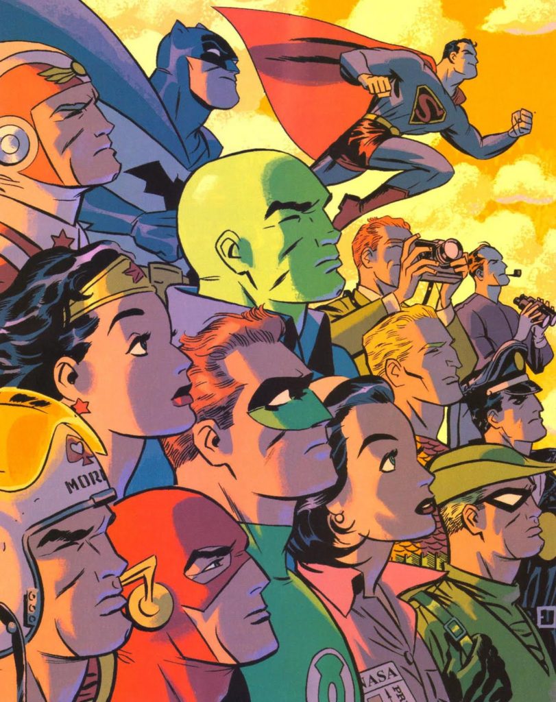
Darwyn Cooke — Breaking The Glass

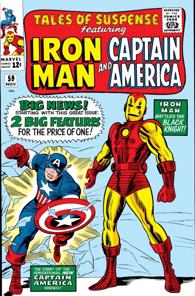
Redo of Tales of Suspense #59, undated (approx. 2008)

The late, great Darwyn Cooke produced a number of these reinterpretations and homages of classics during his all too short lifetime.

I asked him about this one time and he told me he did them to “relax.” Relax? Wow. Think Albert Pujols walking into the batting cage prior to a game. Bam. Home Run. Bam. Another. Bam. Another…

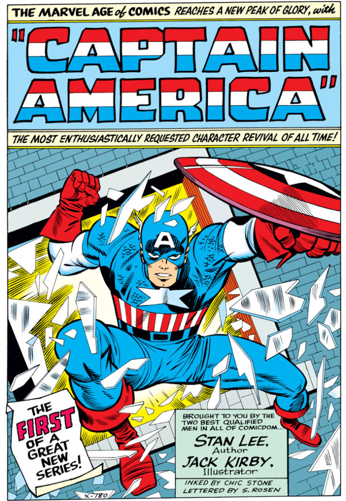
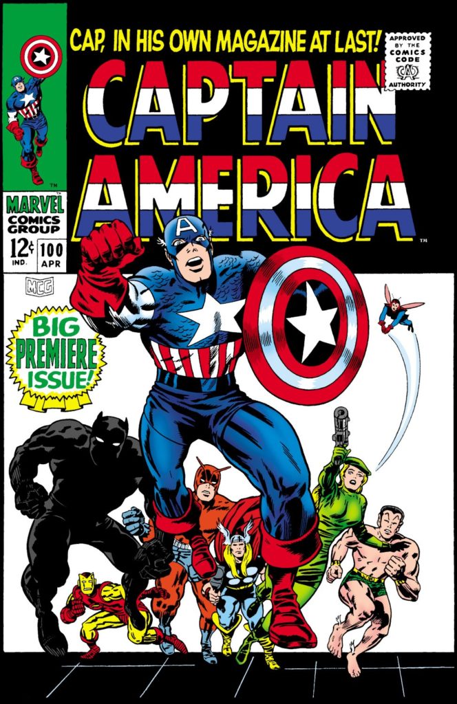
Chic Stone originally inked this milestone splash, one of Jack Kirby’s best known from his Captain America run. Darwyn’s version makes some tweaks — for the better. Most notable are the subtle changes to the face. Cap’s eyes now engage the reader more directly, and overall, his facial expression is clearer and more confident and feels more accurate to Kirby’s vision.

Once upon a time, Darwyn and Marvel talked about an origins series, sort of the Marvel version of his amazing New Frontier series at DC. That is definitely a project I’m certain would have been a classic as well.

For more about Darwyn and the New Frontier, click here.

For more about this classic Captain America tale, click here.

Darwyn’s brilliant New Frontier at DC.
Now imagine the Marvel version too.

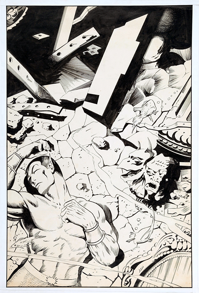
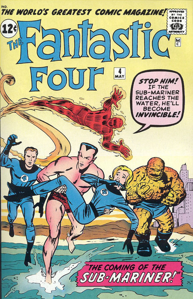
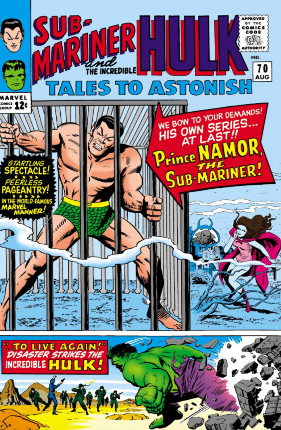
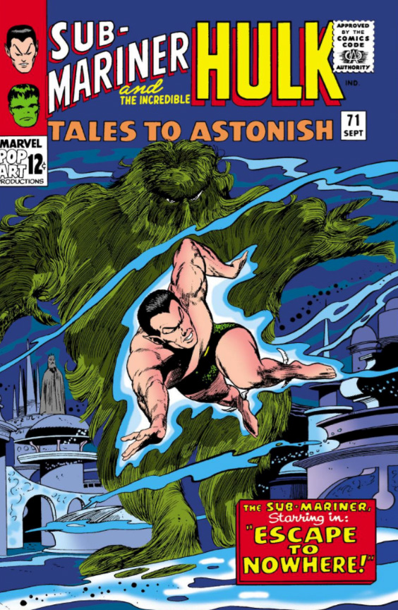
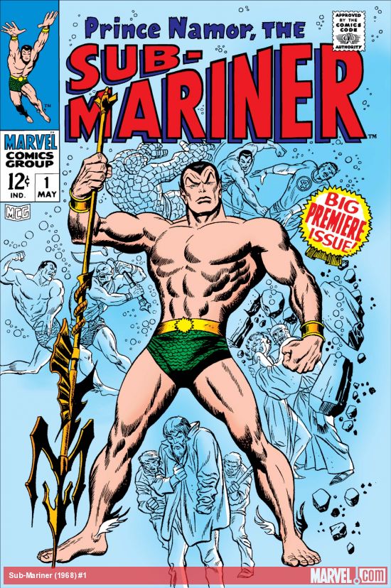
Dan Adkins — Underwater

Tales To Astonish #98, December 1967

Stan Lee demanded action. ACTION!

This version of the cover for Tales to Astonish #98 by Dan Adkins, ultimately unused, did not fit the bill. It conveys the storyline inside, and it’s pretty in its own right, but definitely not very dynamic.

“Likely too soft for Stan,” agreed Roy Thomas, (yes, him again) who wrote this story arc of Sub-Mariner.

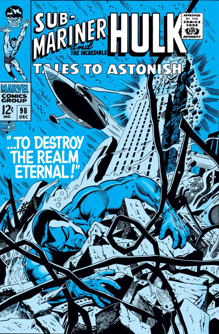
But, let’s talk about the replacement cover, also drawn by Adkins — likely in one heckuva hurry. Sure, more dynamic. Namor, in a better pose, still unconscious. (Or dead — but even as kids we knew he wasn’t.) In this version we also see the attack that’s destroying Atlantis. Except… since when are New York City skyscrapers in Atlantis?

I didn’t notice the architecture til later on, but once you see it, you can’t unsee it. (Even the unused cover has modern steel girders.) Why is Empire State Building underwater? What in the name of Neptune was Dan thinking?

The unused cover has the Marvel production guides masked off by tape, leading me to believe the piece may have ultimately been printed elsewhere. Marvelmania magazine? Witzend? Convention program?  Any comic book detectives out there recognize it?

Poor Dan; he had to redraw a Doctor Strange cover (Strange Tales #168) a few months later. (I’ll post it if I can get an image of the original version.) I loved his inks — he was one of the best — but he definitely struggled meeting Marvel’s editorial standards for cover layout and composition.

Anthony Castrillo — Timely Gathering

Convention Litho, 2007

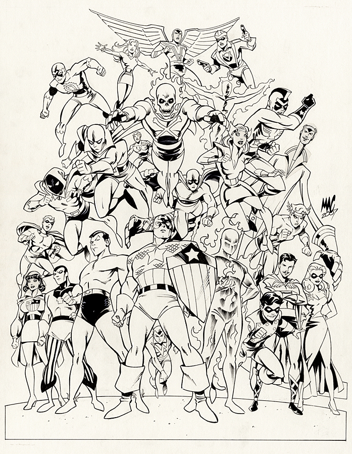
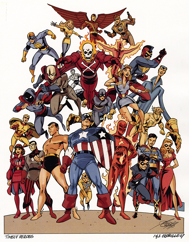
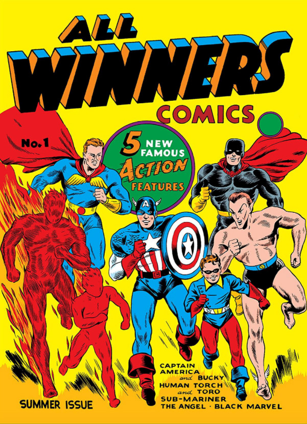
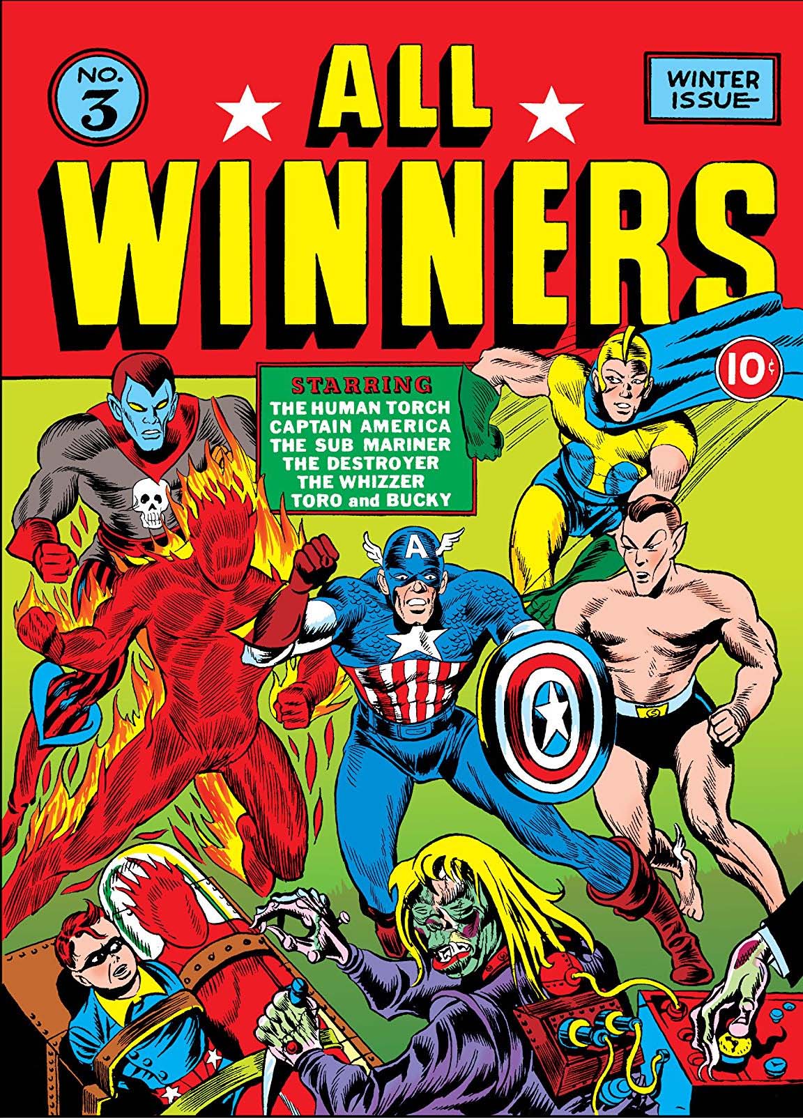
Anthony (“MAC”) Castrillo gathers Marvel’s original heroes from its “Timely Comics Era” (1939-1950) for a group portrait used for a print. 

And we present it just in time (ok, barely) for Marvel’s 80thanniversary.

Castrillo’s art-style for the piece works well ; A bit cartoony in the contemporary sense, adding some pizazz and just a touch of whimsy to some of the otherwise stoic heroes.

I didn’t immediately recognize every character — even in color — and Roy Thomas was kind enough to help me sort through it when I acquired the original. With the exception of one mystery character who might be one of the “Marvel Boys”, the full cast list is presented below.

(“Rows” are a bit subjective because of the group composition.)

From top to bottom:

Row 1: Sun Girl, Red Raven, Citizen V

Row 2: Blue Diamond, Blazing Skull, Toro

Row 3: Marvel Boy (?), Challenger (AKA Thunderer), Vision (Original), Jack Frost, Black Marvel, Namora, Patriot, Thin Man, Mercury (AKA Hurricane)

Row 4: Miss America, Destroyer, Namor, Captain America, Whizzer, Human Torch, Bucky, Angel, Blonde Phantom

One of many “Marvel Boys.” Click on the pic for more info.

Joe Jusko — Stan Strikes!

Trading Card and Litho, October 2013

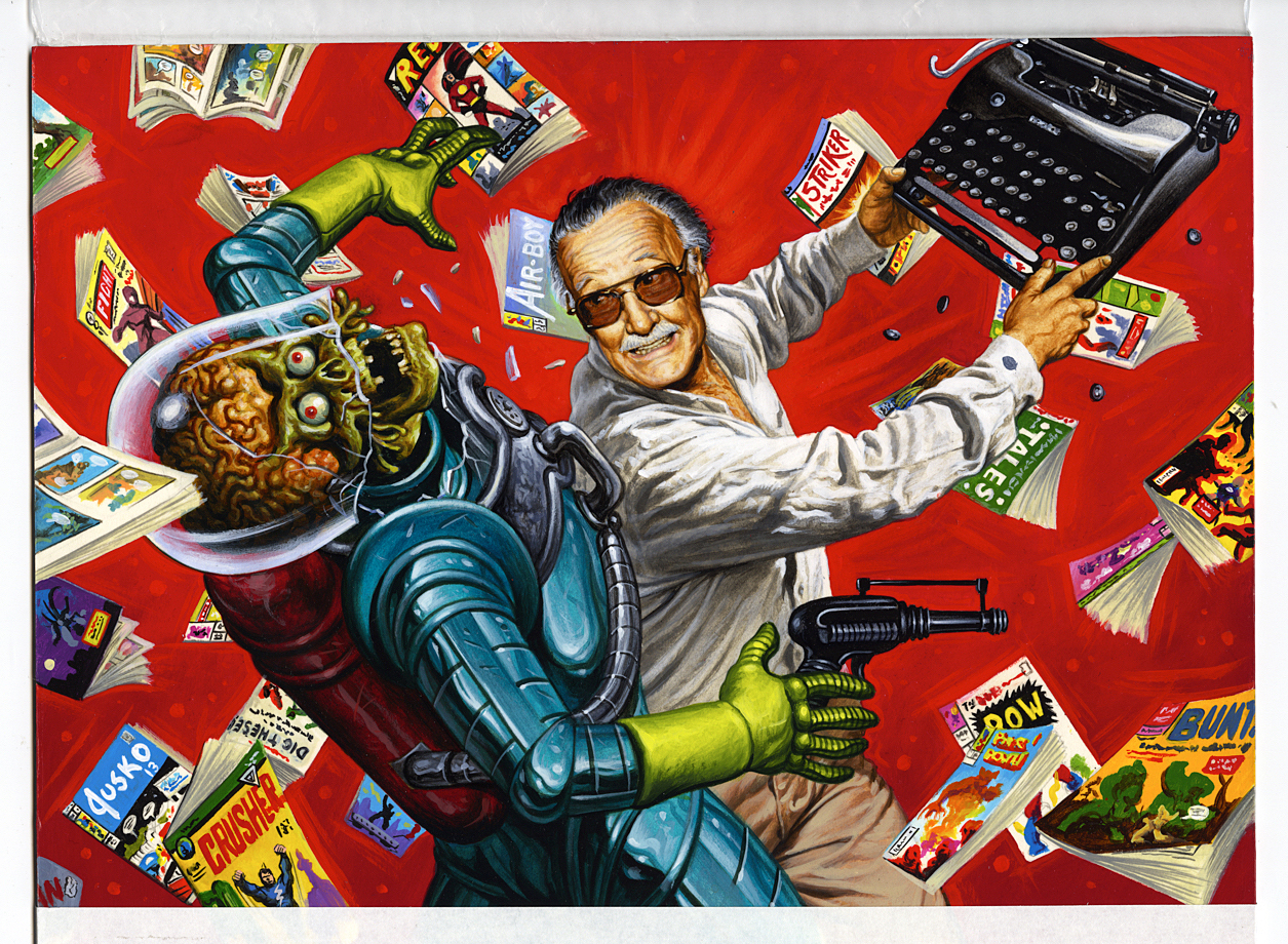
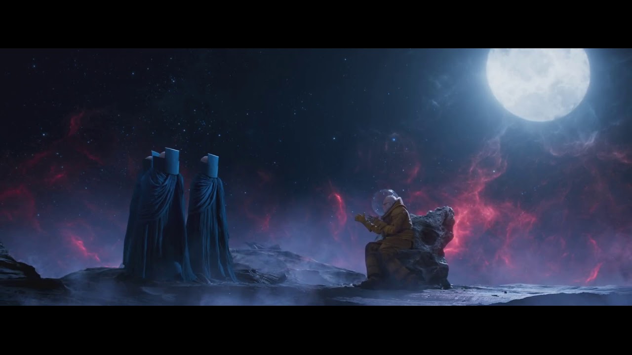
One year ago today, Stan Lee headed off into the greater cosmos. I like to think he’s bugging the Watchers, endlessly and enthusiastically reviewing his many adventures on Planet Earth with them. Like this:

“Hey fellas, remember that time I saved everyone form the Martian invasion? Remember? Fellas?”

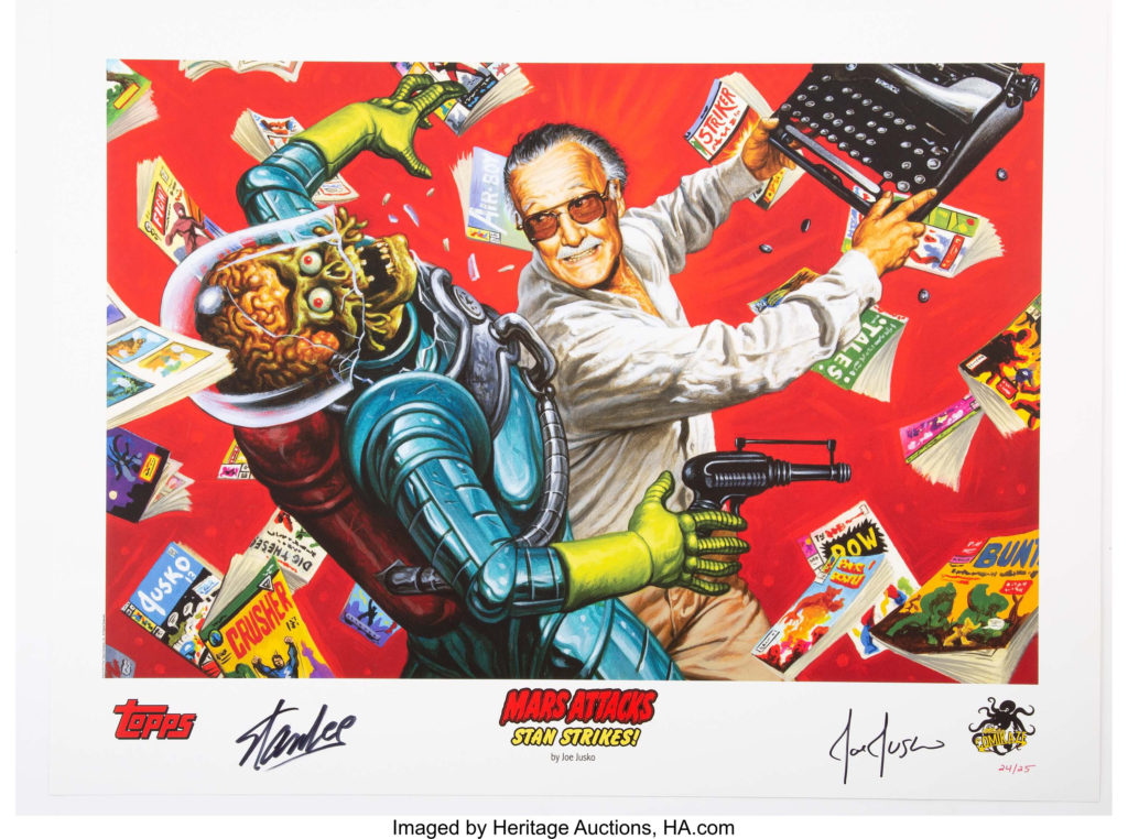
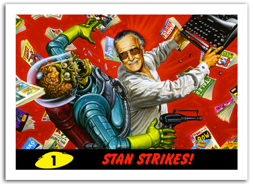
Fortunately for us, in case we forget, Joe Jusko captures the moment perfectly with this premium trading card and litho for Stan’s own Los Angeles comic book convention in 2013. 

Stan Lee and Topps Mars Attacks. It’s perfect reflection of my misspent youth, and well beyond. I knew the moment I saw the painting I had to have it. Hell, Joe probably knew I would need to have it when he took the assignment. (We’ve known each other a long time.)

We miss ya Stan. I hope Jack and Steve are taking you on a wild ride through the multiverse — just like the good old days. 

Greg Hildebrandt — “Monsters, Girls and Rockets”

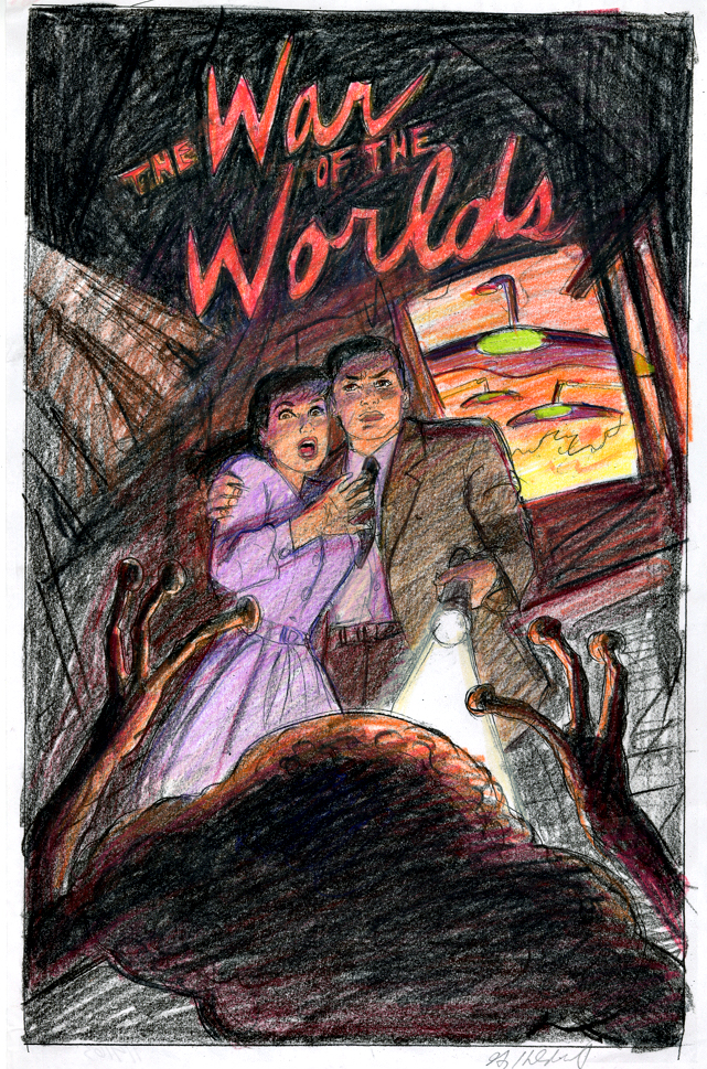
War of the Worlds Poster, Preliminary Concept, 2019

Continuing a two-week series celebrating Halloween with the best in monsters, mystery and mayhem.

Greg Hildebrandt turned 80-years old this year, and from his creative output, enthusiasm, and energy, you would absolutely not know it. He can run circles around many creators half his age. 

Any age, actually.

Greg’s striking painted covers for Marvel Comics, and his retro-but-contemporary American Beauties pin-up series are just a few examples among the many recent works that prove the point – with an exclamation mark. One of the world’s best-known and accomplished fantasy artists continues to dazzle.

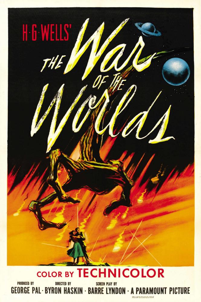
Among the many, many projects he is developing involves film posters. Greg is taking horror and SF movie classics he loves, and reimagining their posters as if he had painted them in the first place. War of the Worlds (1953) is one of those, and this piece is one rough concept (color pencils) for his painted version, date TBD.

And of course, Greg knows a few things about movie posters. He and his late brother Tim painted one of the most iconic posters in movie history — The “B” Poster for Star Wars. (Greg reimagined that poster solo last year.) More on that next month.

I had the good fortune to spend time with Greg at NYCC and Baltimore Comic Con this year and he anecdotally summed up his amazing career: 

“As an eight-year old, I loved to draw monsters, girls and rockets — and I still do.”

Sing along with Warren Zevon’s “Lawyers, Guns and Money” and swap out the words.  You may never get that earworm out of your head.

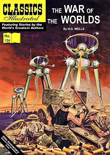
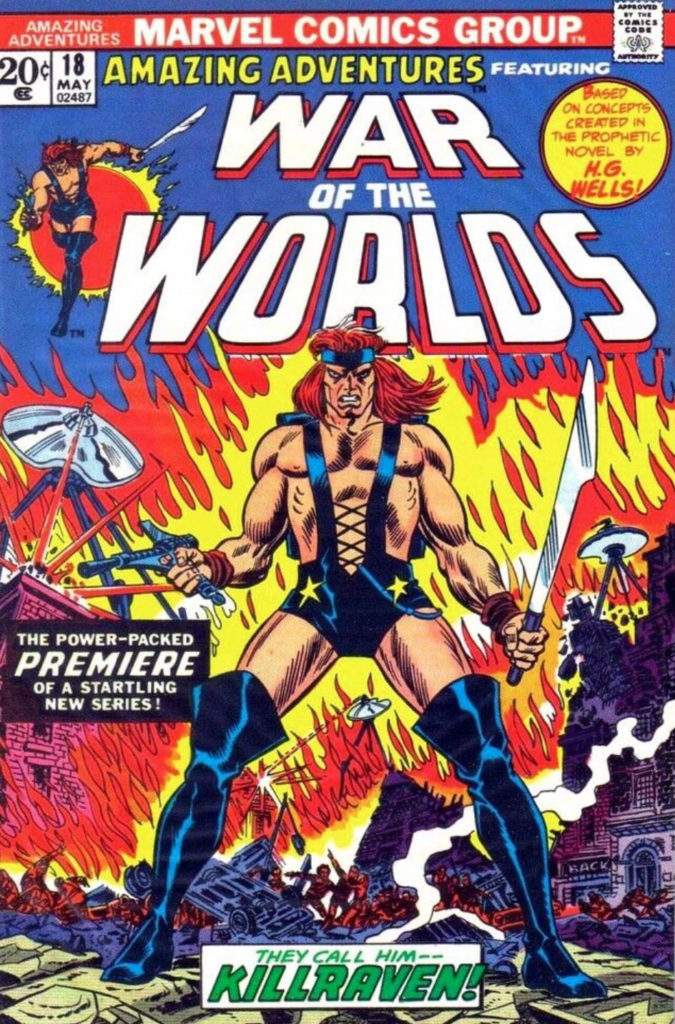
Footnote: Ok, so I know that the reimagining of a classic film poster is not actually original comic book art, but War of The Worlds has a solid legacy in comics ...

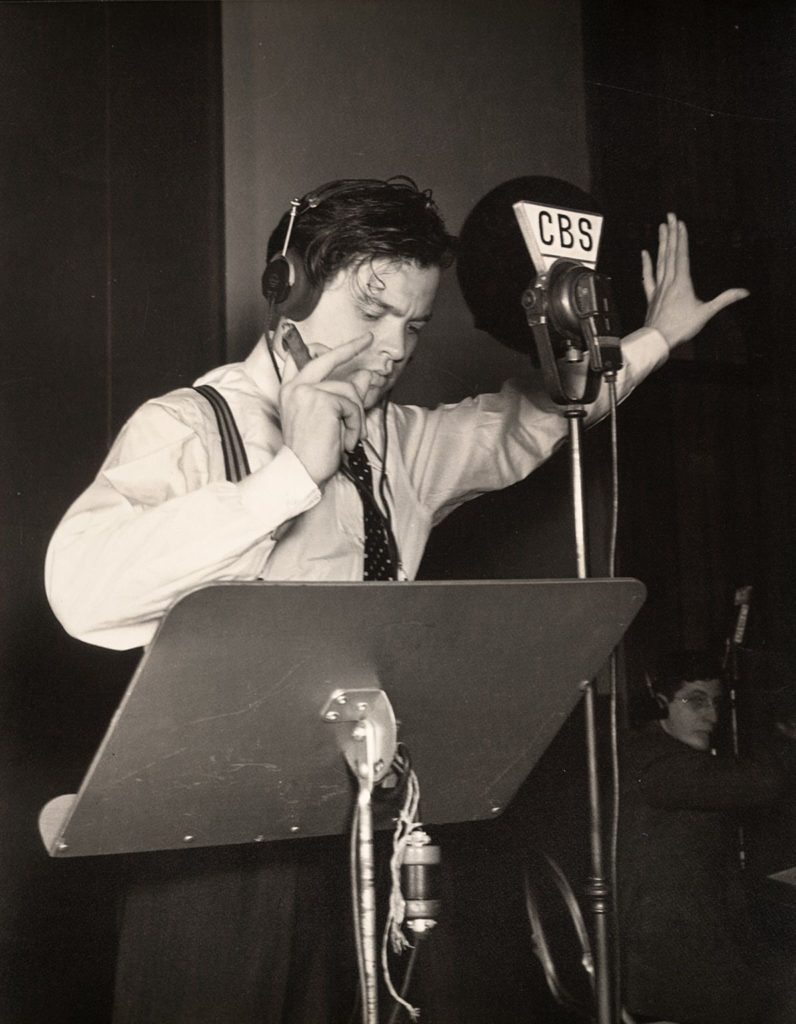
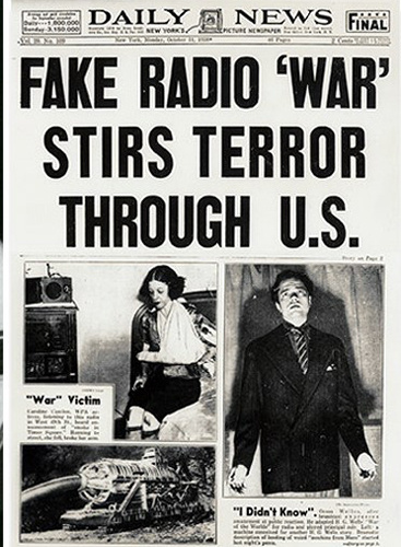
Footnote Extra: War of The Worlds will be forever linked with Halloween — On October 31,1938 Orson Welles broadcast a live radio dramatization, treating the HG Wells classic as a breaking news story out of New Jersey. It scared the daylights out of radio listeners, especially New York metro area residents. Fake news for real.

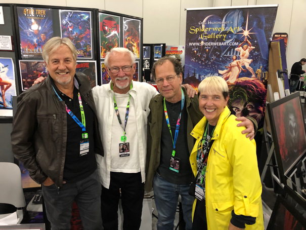
Greg Goldstein, Greg Hildebrandt, Bob Budiansky, Jean Scrocco at New York Comic Con

Gene Colan & Tom Palmer — Shadows and Light

Tomb of Dracula #54, March 1976

Continuing a two-week series celebrating Halloween with the best in monsters, mystery and mayhem.

The monsters returned to Marvel in 1972. 

But this time, the giant behemoths were mostly relegated to reprint titles. Thanks to a loosening of guidelines by the dreaded Comics Code Authority, new comics featured creatures of the night like werewolves, zombies and of course, vampires.

Marvel’s Tomb of Dracula, written by Marv Wolfman (you can’t make that up) and drawn exquisitely by Gene Colan for 70 issues, is a masterpiece of that era. And, it’s not only a legendary horror series, but also one of the great comic book runs, period.

Colan, the “painter with a pencil, “ made his bones at Marvel on classic superheroes like Iron Man, Captain America, and most notably Daredevil. When Marvel expanded into the horror genre, though, no artist could have been more suited to bring life to the undead Dracula. 

The stylist who had mastered the art of shadows and light, was now illustrating the character who hid in those very same shadows.

This moody and dynamic action page is typical of the series. Tom Palmer, who inked all but a handful of early issues, is one of the few who could ink Colan without diminishing — or (ahem) burying altogether — Gene’s pencils.

Colan’s unique style can be polarizing. His fans (and I obviously count myself among them) can be passionate to a fault about Gene’s inventive and atmospheric storytelling. Gene’s singular artistic approach made no attempt to mimic the styles of Marvel’s other star artists, and that represented a challenge to some readers, especially on superhero stories.

But to us, it didn’t detract, or distract, from what Kirby, Romita and Buscema brought to the party. Hell, they were the party. Stan Lee understood from the beginning that Gene’s art would stand on its own. And we appreciated that.

It’s like being an obsessive devotee of art impressionism, and also an enthusiast of Picasso’s cubism. It’s not a contradiction to enjoy both — is it?