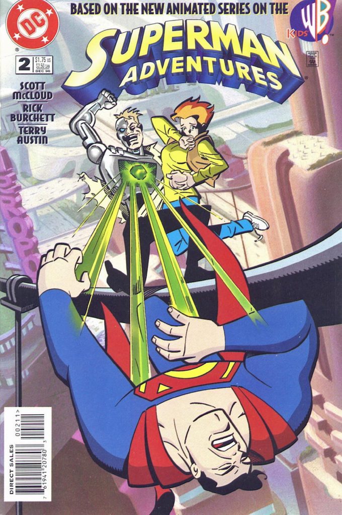
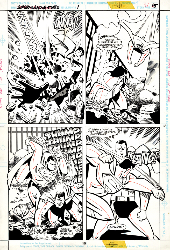
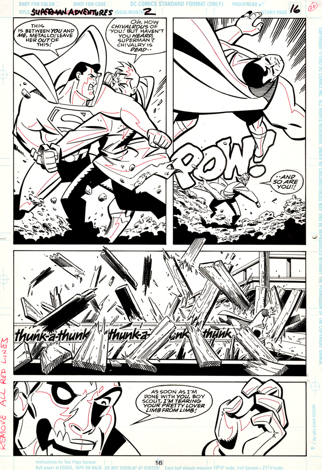
Rich Burchett — Flesh and Steel
Superman Adventures #2, December 1996
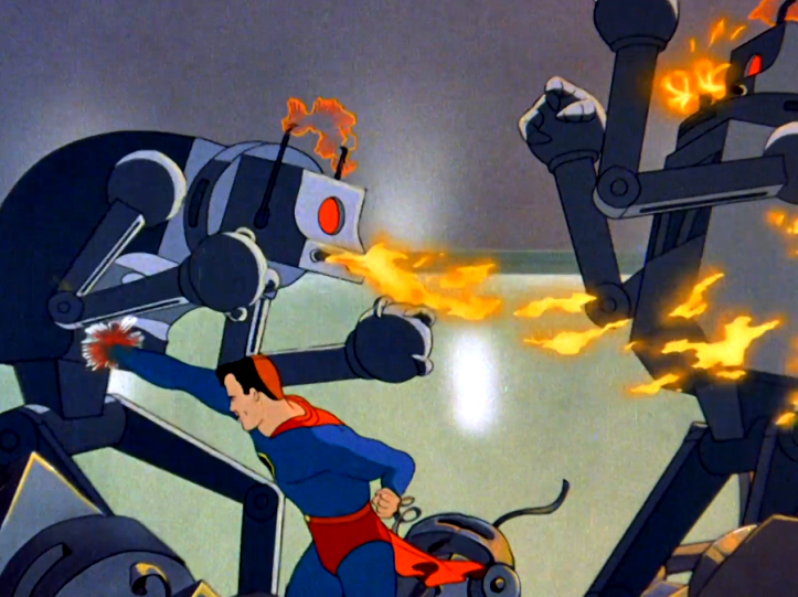
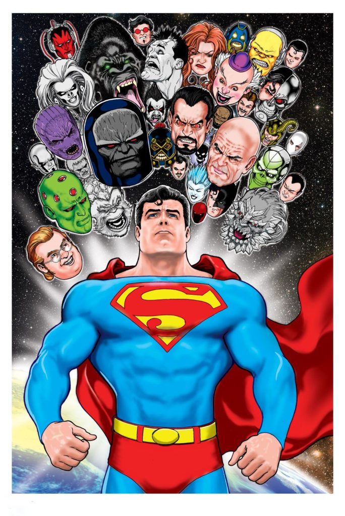
As discussed previously, the Superman animated TV series, living in the shadow of its older, more popular brother, Batman Animated, never really garners the respect it deserves.
In fact, all the 90s DC “all ages” comics based on the animated series are not appreciated enough.
Give the current interest and investment in YA and kids comics by nearly all publishers, those Superman and Batman series were likely, and unfortunately, too far ahead of their time.
I hope someday it makes commercial sense to collect all the Superman and Batman material into complete collections. They are delightful comics.
Also, similarly discussed, is the fact that Rich Burchett is a vastly underrated storyteller and artist. Pages like this are standard examples of his creative storytelling and imaginative use of composition and camera angles.
And Metallo? Finally something that is not underrated. He is a terrific member of Superman’s modern rogue gallery, especially the version that appears here, following up a classic episode on the TV series.