Our ode to Halloween and the creatures of the comic books continues…
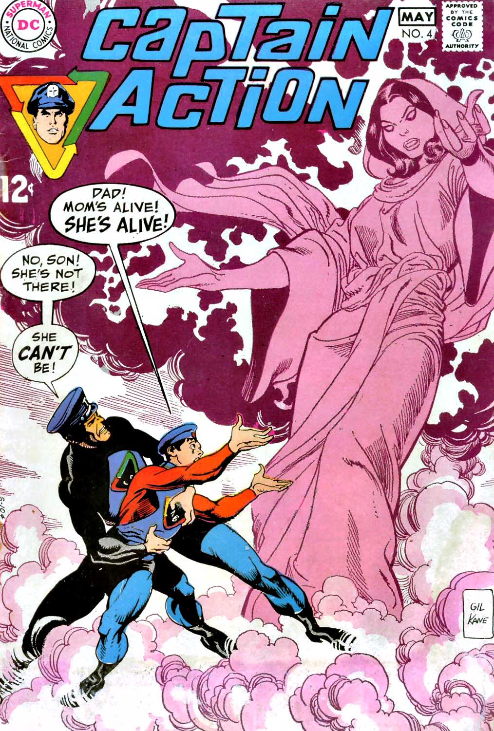
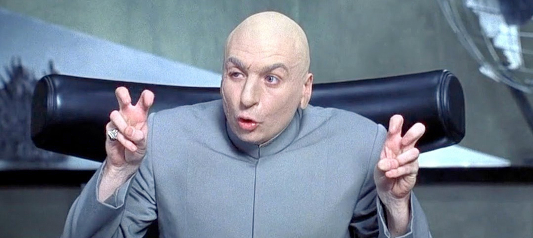
Dr. Evil — a good looking villain with a terribly cheesy name, even by the standards of the 1960s.
The character was the antagonist in the Captain Action “doll” product line, which launched in 1966. (More on that in a future post.)
DC adapted the toys into a short-lived series and Kane drew much of it. Ironically, the toy sales themselves were rapidly waning by the time the comic series launched in late 1968.
In this specific issue, Gil writes, pencils and inks the entire story — a first for him for either of the “big two” publishers.
And speaking of cheesy and the 60s: That amulet. The Nehru jacket. Those sandals. It just doesn’t get any better than this.
One very fashionably mod alien.
One of these Dr. Evils turned out to be much more memorable and iconic than the other. Chances are there were some Captain Action toys floating around Mike Meyers house back in the day…
Our ode to Halloween and the creatures that often inhabit the comic book pages continues…
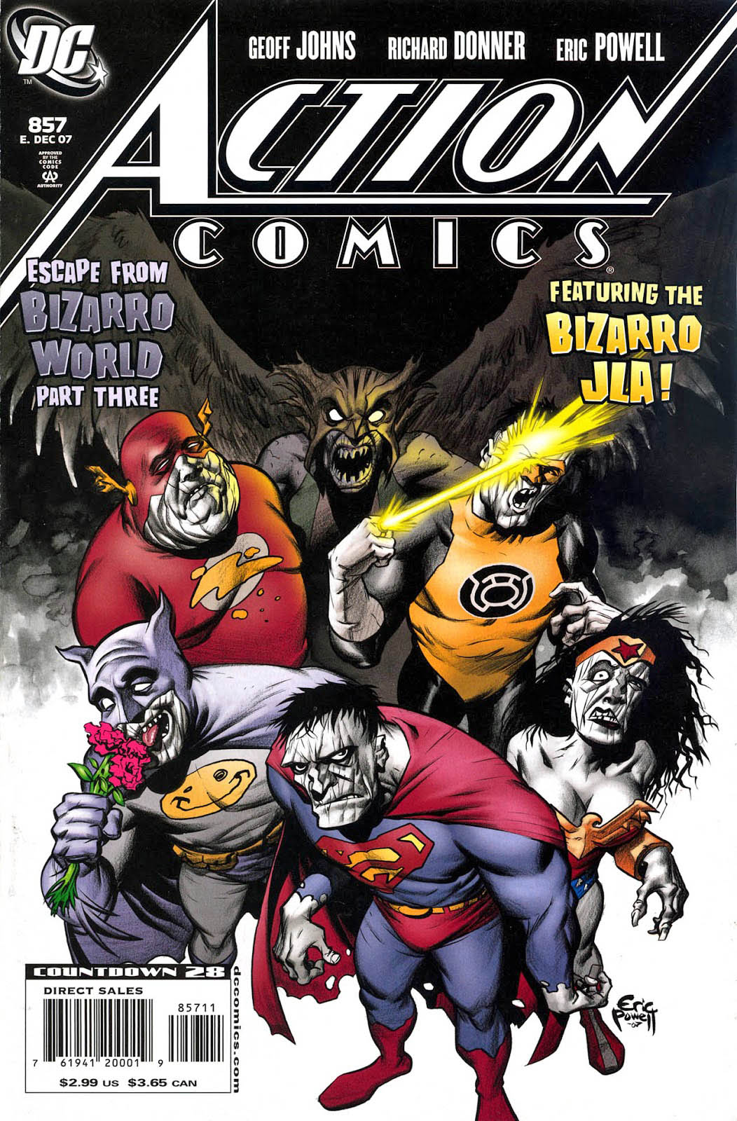
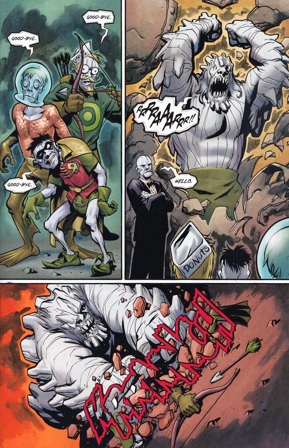
Bizarro Doomsday, at the bidding of Bizarro Lex Luthor, destroys the newly created members of the Bizarro Justice League.
Huh?
Trust me, it’s a wild ride. You just have to read it for yourself. Written by Geoff Johns and Richard Donner (Yes, that Richard Donner), the three-part story unravels (er, unfolds) in graphite, ink and wash-tone in perfect fashion by Eric Powell.
Donuts not included.
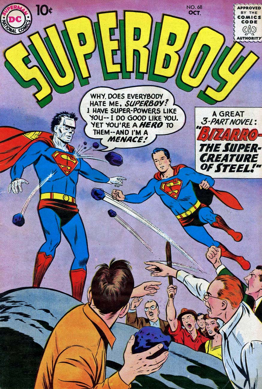
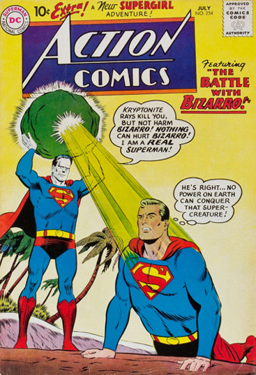
The first two appearances of Bizarro, and a collection that I re-read endlessly as a kid in 1968.
Today is officially “Batman Day”, so here is a gallery of all the Batman images published prior to this year’s celebration. Click on any name to see larger images and the original post.
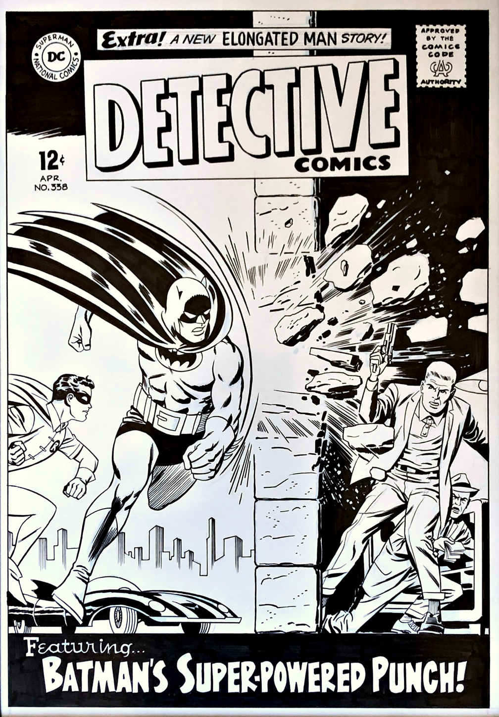
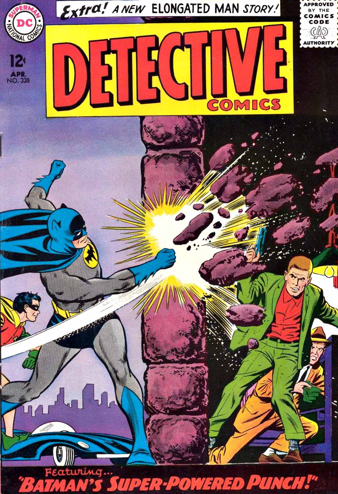
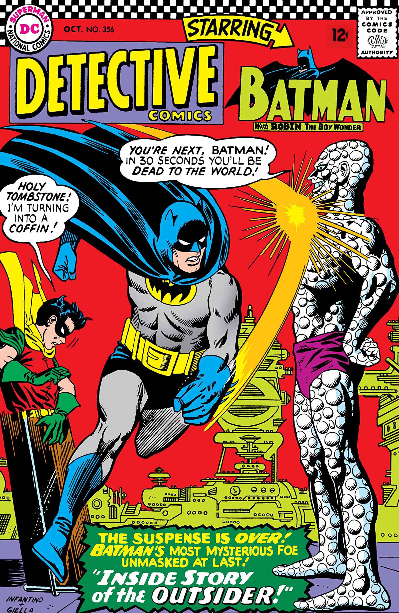
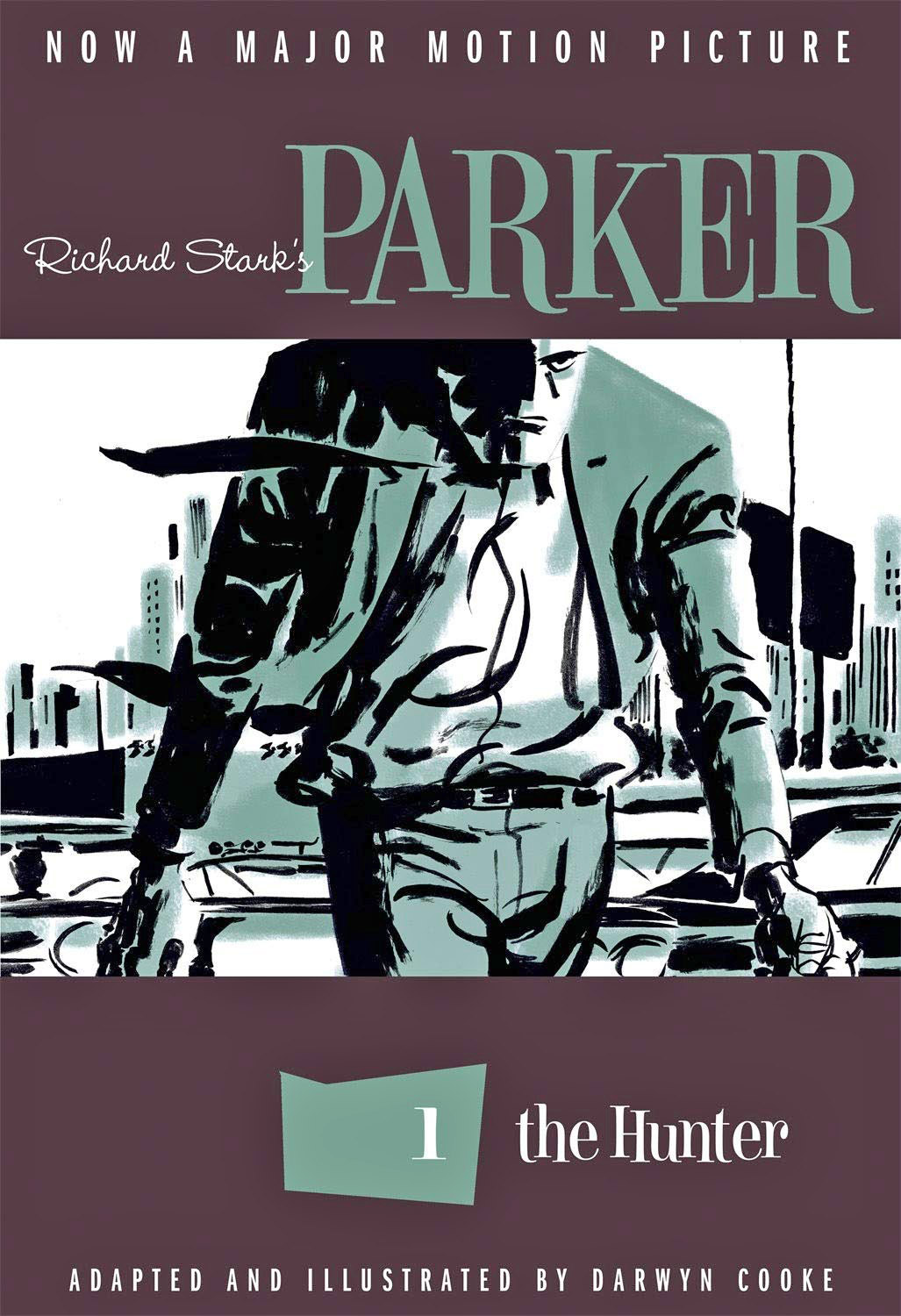
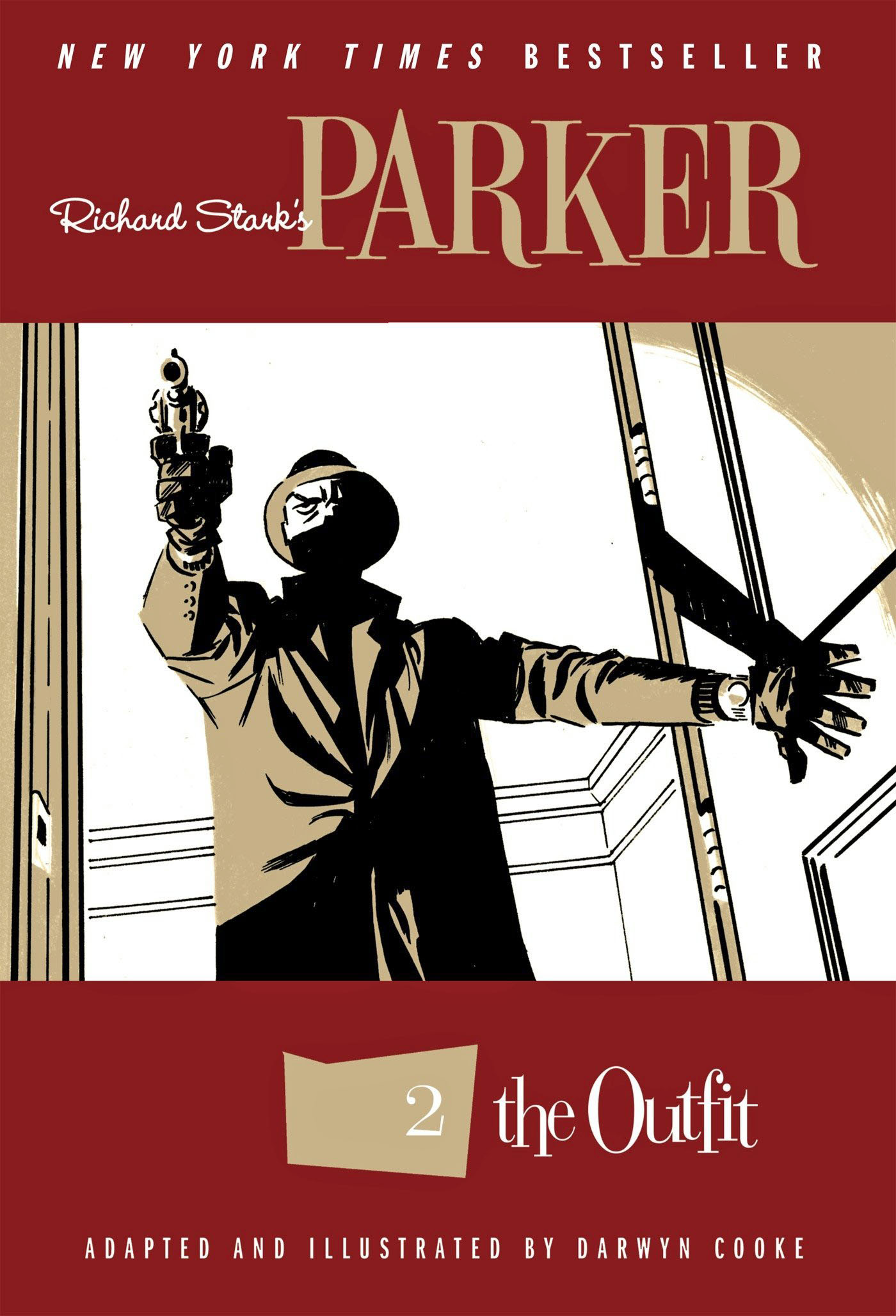
Detective Comics # 338 and #356 Mashup Re-imagination, 2010
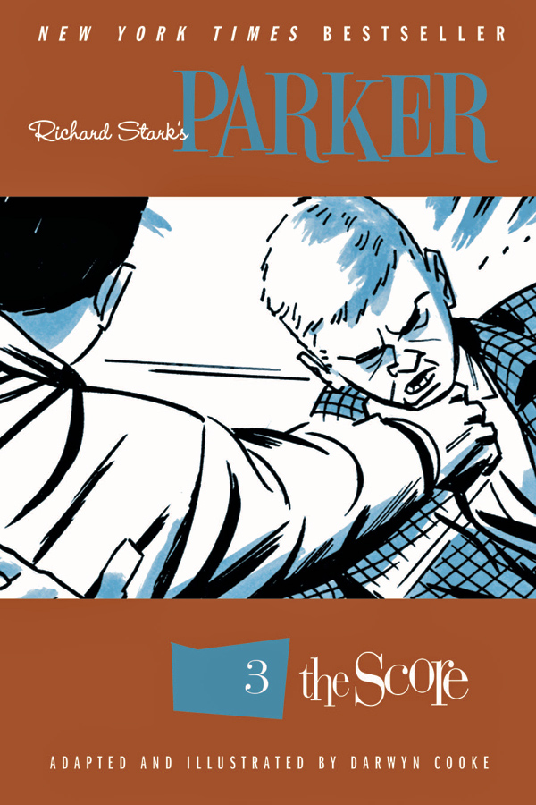
As noted last year, the late, great Darwyn Cooke produced a number of these reinterpretations and homages of classics during his all too short lifetime.
In this dynamic drawing, Darwyn combined two classic covers into one, taking the iconic “punch scene” from Detective #356 and fitting into the #338 layout. Carmine Infantino (pencils) and Joe Giella (inks) created both of the memorable original covers.
When you dive the detail of the re-imagination, you might notice that the crooks in the right frame now more closely resemble the hoods that populate the Darwyn’s astonishing Parker graphic novel series that we published at IDW. It’s a wonderful touch.
Definition of a comics geek?
When I saw this piece offered for sale, I recognized what Darwyn had done — without it being specifically noted in the item description. Issue #356 was one of the first Batman comics I remembered reading as a kid.
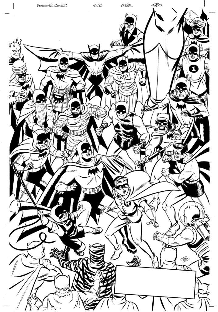
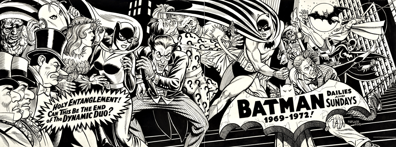
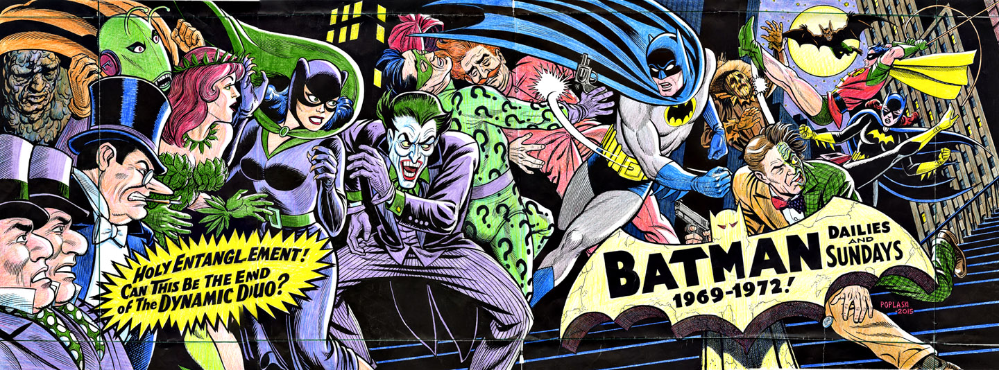
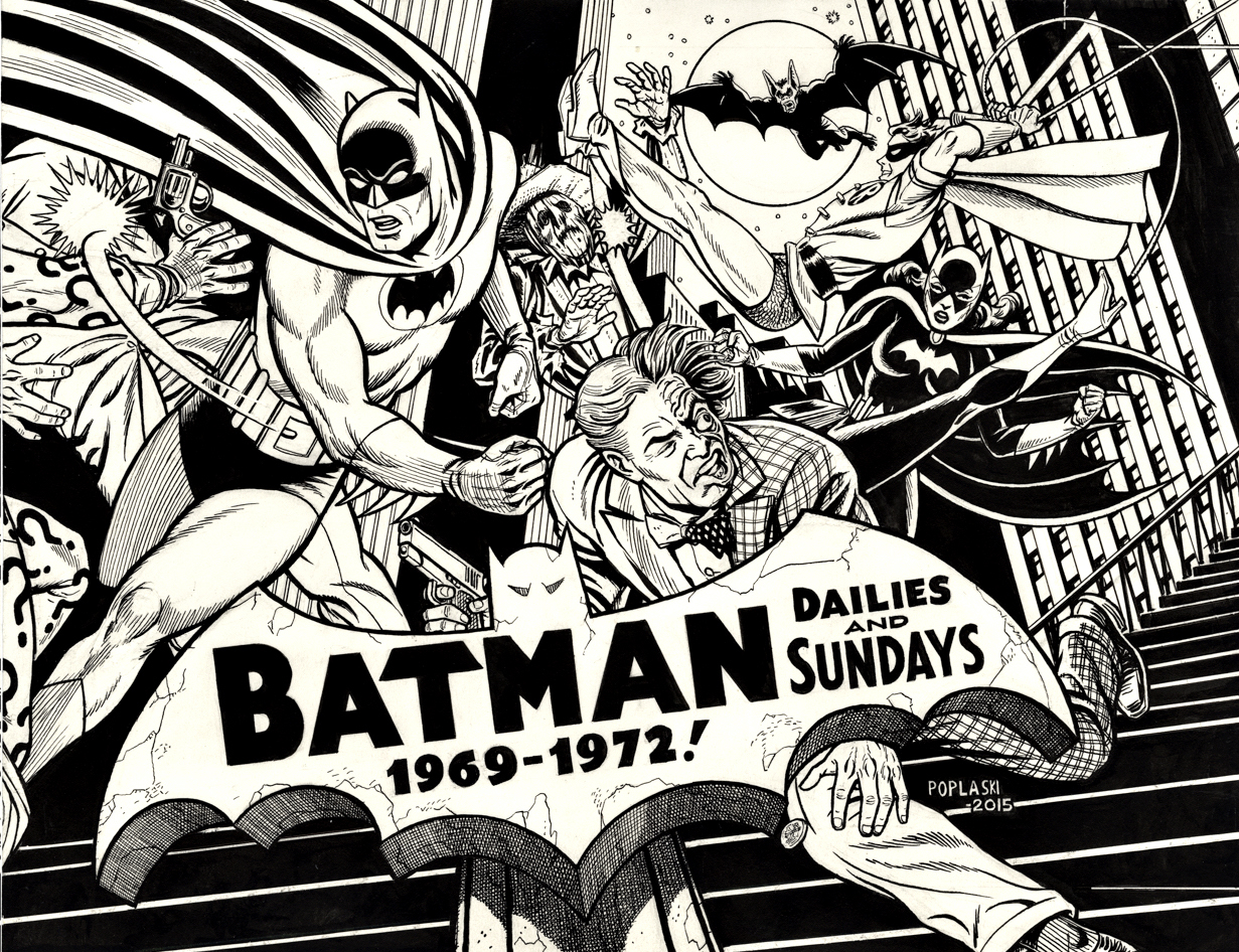
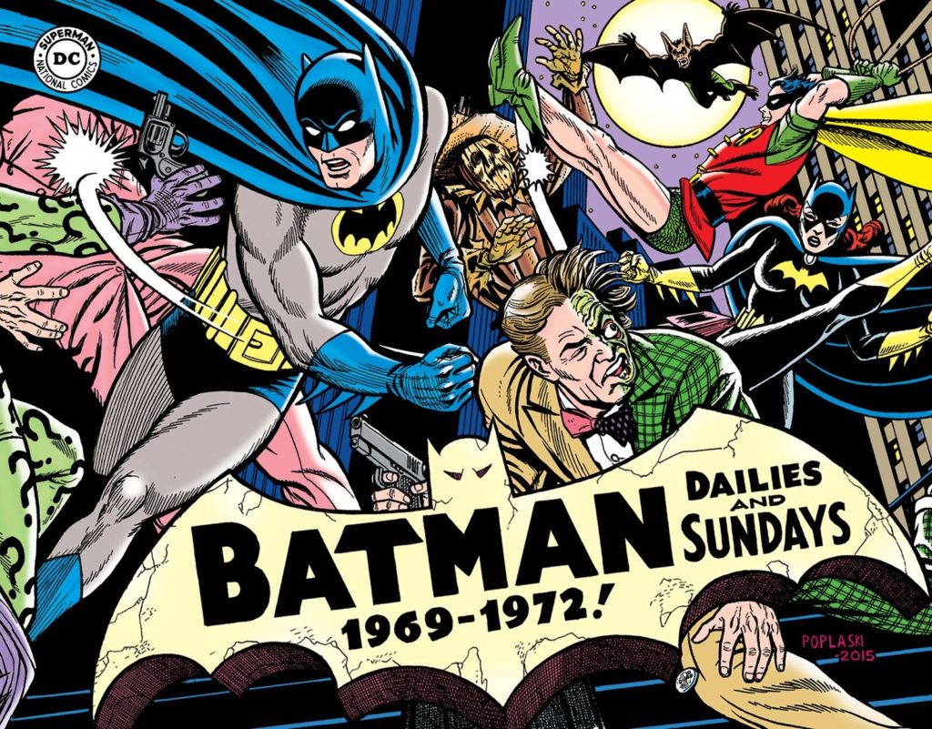
Batman: The Silver Age Newspaper Comics Vol. 3 (1969-1972), November 2016
Pete Poplaski has been called an “artist’s artist” by many creators. His name might not be known as well as other artists, but his talent is unquestionable.
Pete, who broke into comics in the 70s underground community, ultimately became Kitchen Sink Press’ art director, and among many accomplishments helped give some of Robert Crumb’s projects just the right design touch.
Kitchen had the rights to reprint the DC Batman and Superman comic strips in the early 1990s, and Pete created brand new covers that evoked the classic style of those strips.
When we acquired those reprint rights at IDW in 2012, we went back to Pete to see if he would be interested in picking up where he left off, and fortunately he was.
Wayne Boring. Dick Sprang. Al Plastino. Carmine Infantino. You name a classic artist, and Pete can replicate the style.
And perhaps most astonishing of all is this giant wraparound cover for Batman Silver Age Volume 3. Featured on these covers are nearly everyone in the Bat family from that era. Good guys and villains alike. All the type is hand lettered.
And when I say giant, I’m not kidding. When combined, the two pieces are nearly four-feet wide.
I’ve never seen another piece of comic art quite like it.
September 19 is “Batman Day,” so we’re going to ride the Bat-train for a few weeks and post some additional theme-appropriate art. No “Bam or “Pow” included.
Poplaski creates color guides by photocopying the original and, if too big, taping the pages together.
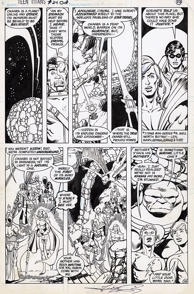
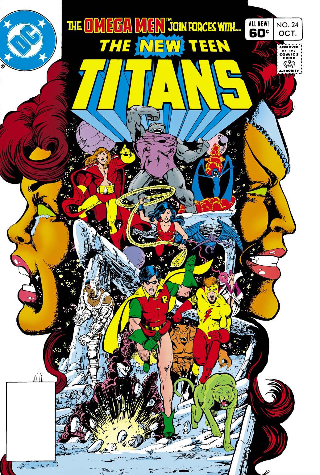
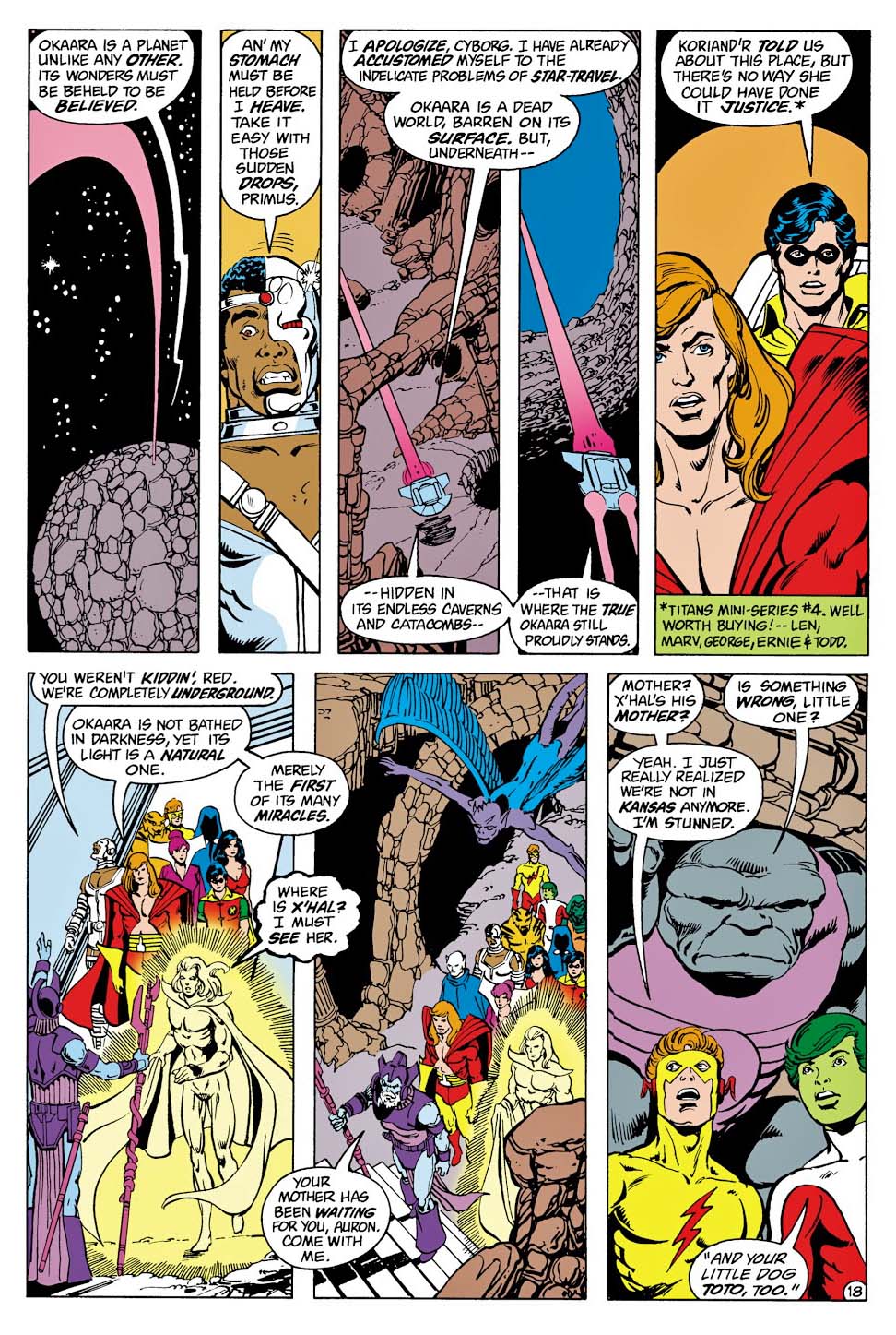
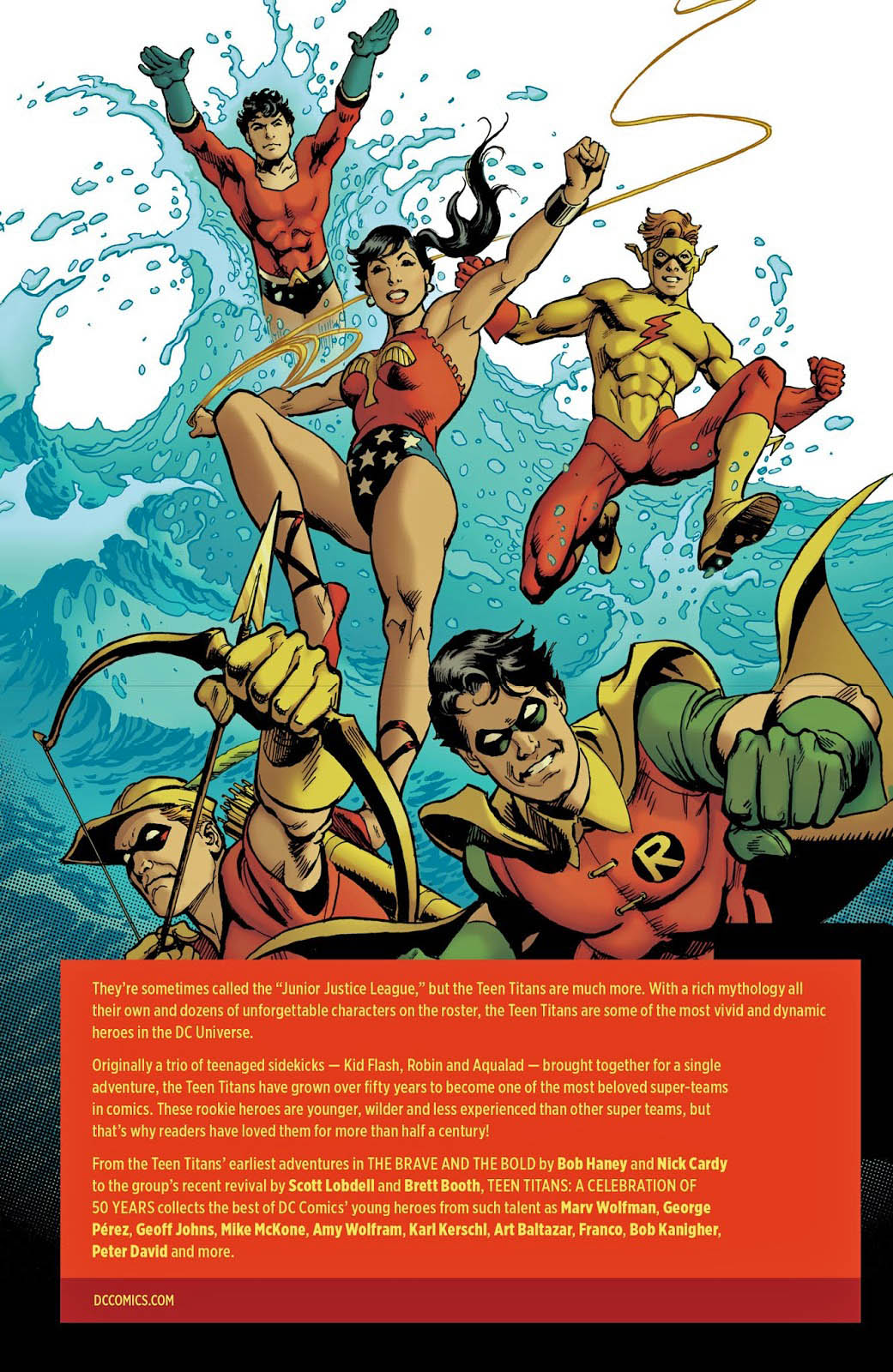
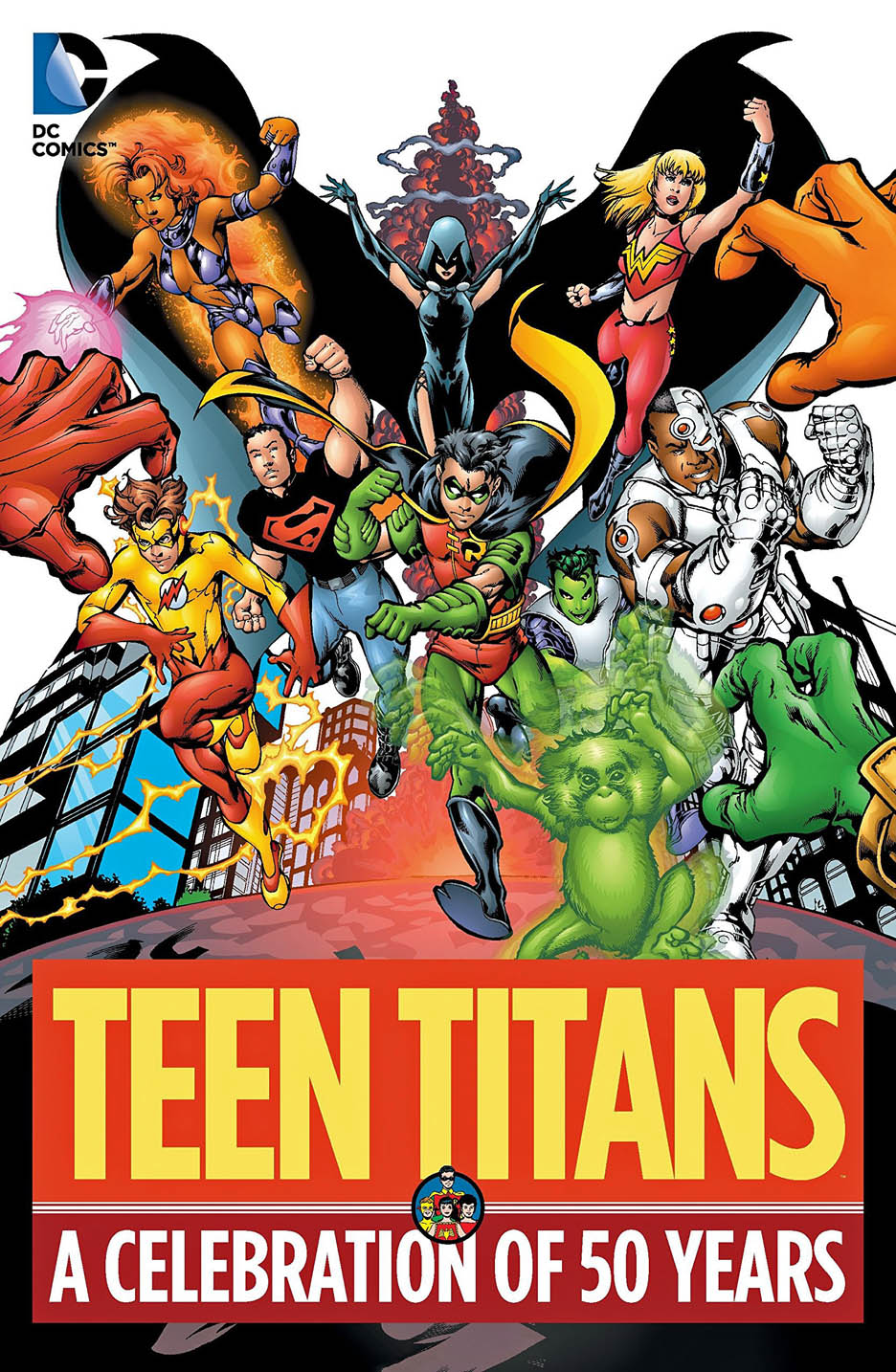
When Marv Wolfman and George Perez took on The New Teen Titans in 1980, they were aiming to rival Marvel’s immensely popular X-Men. Right off the bat, the team created one of the greatest villains in the DC Universe in Deathstroke, aka Slade Wilson. In addition, Perez and Wolfman were responsible for resurrecting the Titans and assembling the now-iconic team of Robin, Beast Boy, Cyborg, Starfire, and Raven. -Dana Forsythe, SyFy Wire, 2019
I came into Teen Titans reboot a few issues late. It hit stores during my college years, when my comic book purchasing was inconsistent, mostly sporadic actually, especially on mainstream titles. Somehow I missed the buzz — or the buzz missed me. (And the original Titan series had some great art from time to time, but the writing was all over the map.)
Fortunately, my college roommate had caught on from the beginning, and I borrowed his early issues. I was hooked. (I really should return those one of these days.)
I was in love with Perez’s astonishing detail on his Marvel titles (FF, Avengers, etc.), and this was superb work, perhaps even a notch greater.
When I returned to collecting original art about a dozen years ago or so, acquiring a Teen Titans page was an early priority.
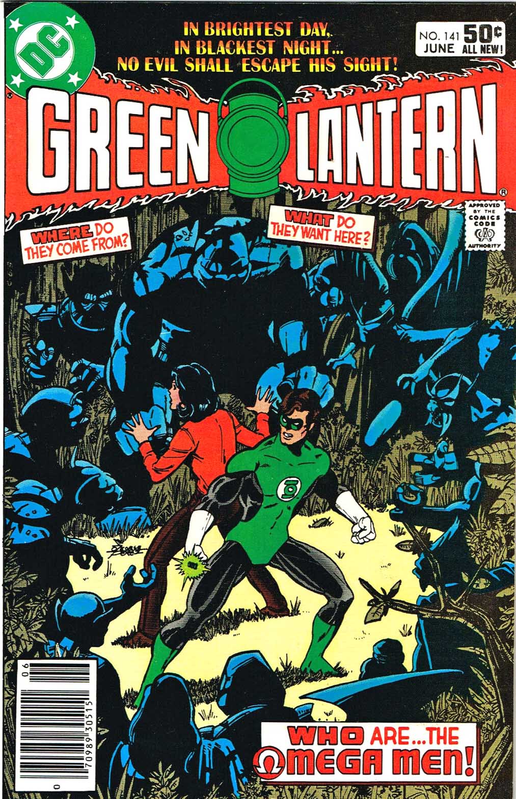
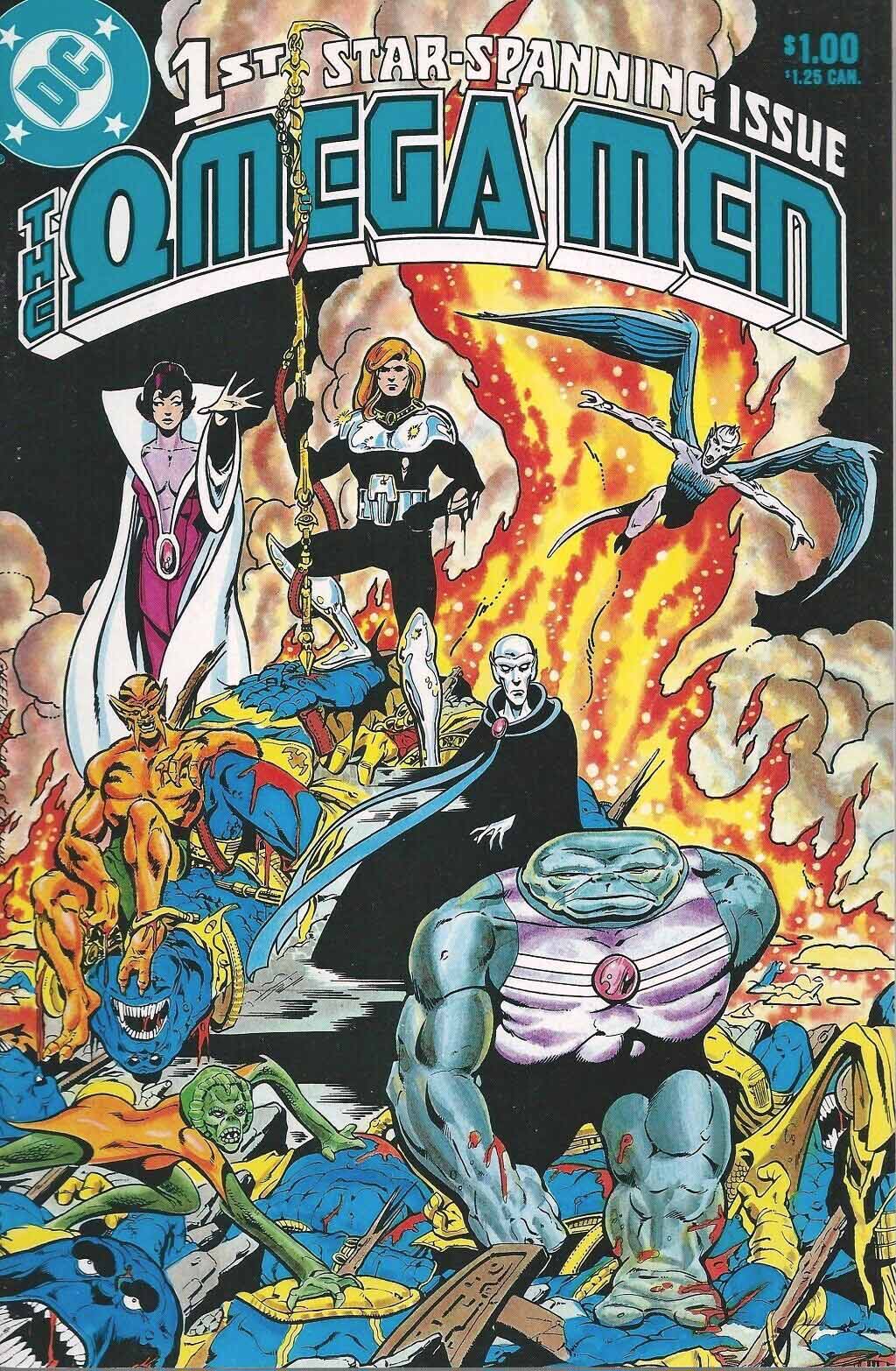
The Titans join with the Omega Men in this issue, and we get some of both in this classic Perez layout. No one else could do narrow panels like this, with this much detail, and frankly few tried.
The Titans / Omega Men crossover comes after their first appearance in Green lantern, and debuting in a short-lived series slightly thereafter.
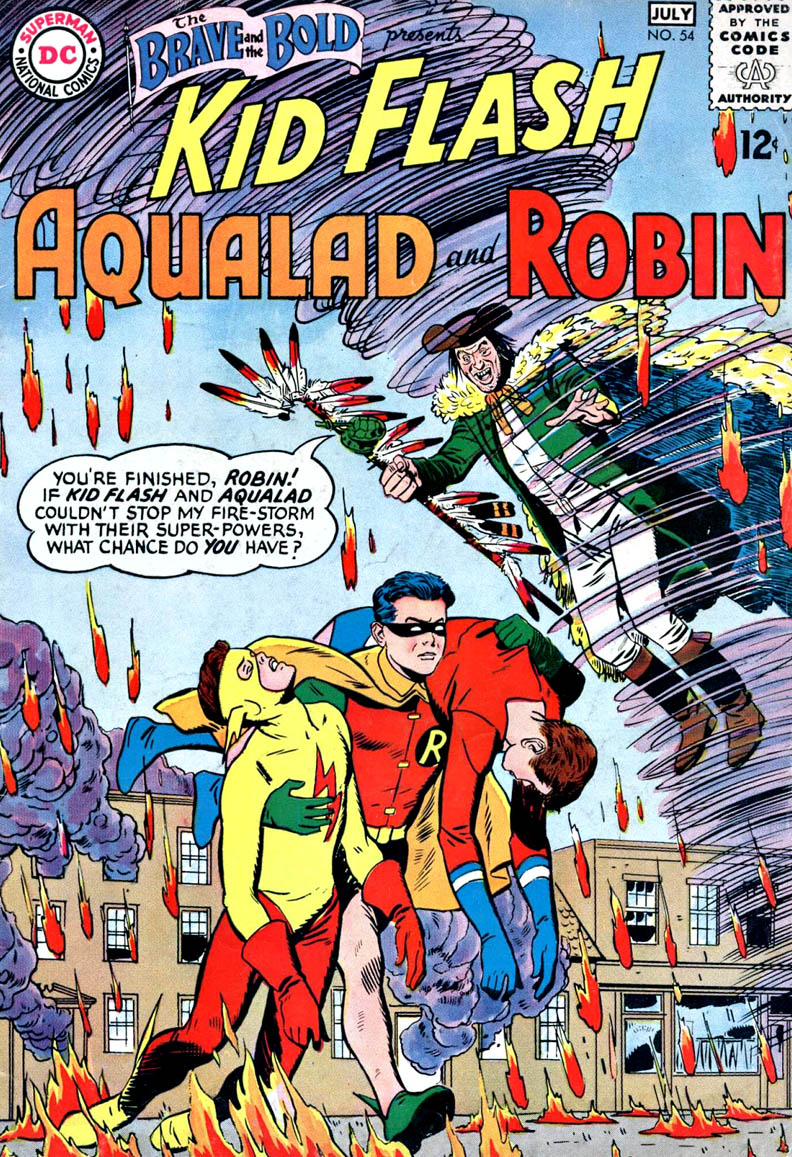
Late 1969 was apparently a great time for assassins on skis.
Making the biggest splash on the slopes were the bad guys in the latest James Bond flick, On Her Majesty’s Secret Service (OHMSS.)
In fact, the skiing action scenes were considered the best thing about the Bond film, the first — and only — featuring George Lazenby as 007. (Replacing Sean Connery.)
Meanwhile, on the newsstand, The Teen Titans have the same problem, among others.
I’m not saying writer Bob Haney borrowed the idea from the OHMSS marketing, which likely had appeared prior to script deadline time. More likely an amusing coincidence.
Either way, the art team of Gil Kane and Nick Cardy delivered some exciting storytelling on the script they had on hand. Glancing through the entire issue, Nick added some nice polish to Gil’s pencils, without turning the entire issue into Cardy instead of Kane.
That’s a bit of a balancing act, especially since Cardy was a terrific and well-established penciller himself.
But I can’t confirm that he skied.
The phenomenal ski slope action scenes —and Diana Rigg — were the best parts of the otherwise underwhelming James Bond flick.
Page two of the letters page features commentary on recent TT covers by 17-year old Klaus Janson. (Yes, that Klaus Janson.)
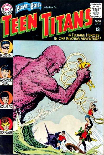
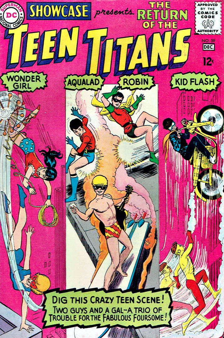
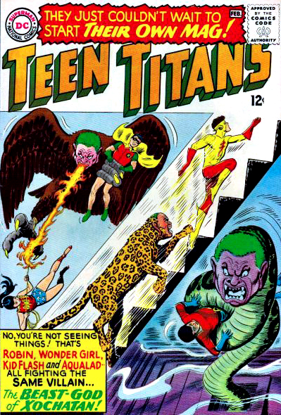
The “Teen Titans” did in fact launch in 1965, quickly moving from tryouts in The Brave and Bold and Showcase to their own series at the end of the year.
But, in 1964, three of the Titans actually appeared in an earlier issue of The Brave and Bold. No team name, just Robin, Aqualad, and Kid Flash appearing in an all sidekicks story.
They only became the “Teen Titans” the following year with the addition of Wonder Girl.
Wonder Girl of course is not actually Wonder Woman’s sidekick. She is actually… Wonder Woman as a teen, ala Superboy. But continuity be damned, she was retconned and re-retconned and… oh boy. (Screenrant has a good overview of this silliness here.)
We know the fine folks at DC were reading Marvel comics to see what all the fuss was about, but it’s obvious it wasn’t resonating in the continuity department.
Anyway…
Jose Luis Garcia-Lopez, one of the most talented artists to ever work at DC — or anywhere — here creates the definitive image of the classic group. (Speedy joined in issue #19 and Aqualad came in and out at that point, so these five are the core team.)
The pin-up initially appeared in issue #100 of a modern series, and shortly thereafter became the back cover of the 50th anniversary book of the team.
It will eventually appear elsewhere. Probably as a front cover of some silver age collection.
Trust me. It’s just too good to not be re-used.
Much more appropriate color on the second appearance of the artwork, although the copy block croups a bit too much go the image for my taste.
From sidekicks, to teammates, to their own title, in little more than a year.
Concluding for now our celebration of Wonder Woman, in anticipation of the much anticipated (and delayed) superhero film, Wonder Woman 1984.
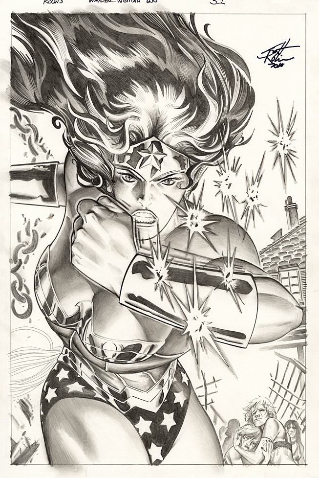
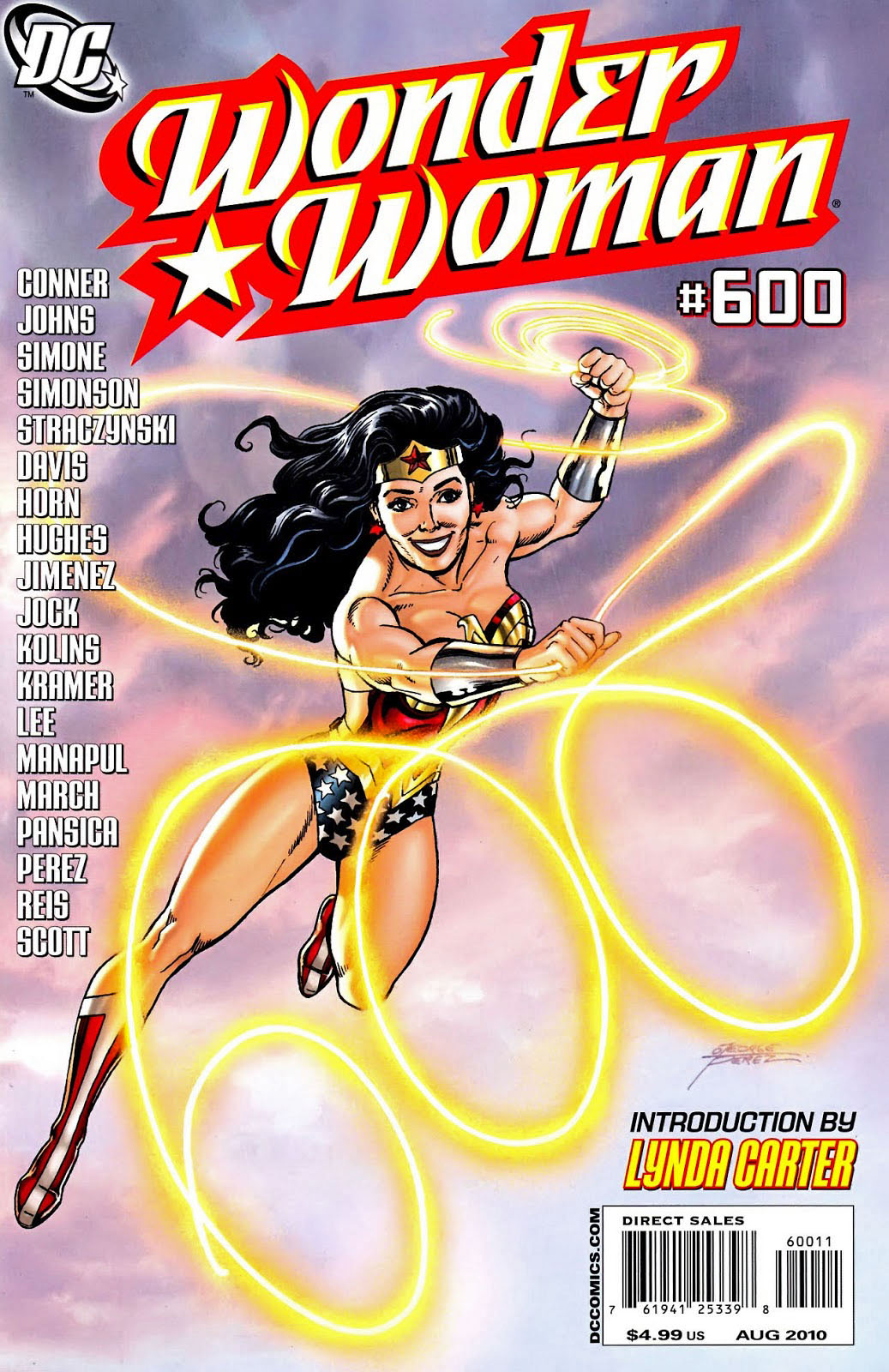
Scott Kolins creates a fierce “in-action” pin-up of Wonder Woman using only graphite. (The page is colored and published directly from the pencils.)
DC has created some terrific celebratory issues and this one is no exception. Plenty of other pinups in the oversized issue from 2010, featuring art by Adam Hughes, Jock, Ivan Reis and many more.
We will back with one more Wonder Woman post, whenever the film finally opens.
Continuing our celebration of Wonder Woman for the next few posts — no matter when the new film finally releases.
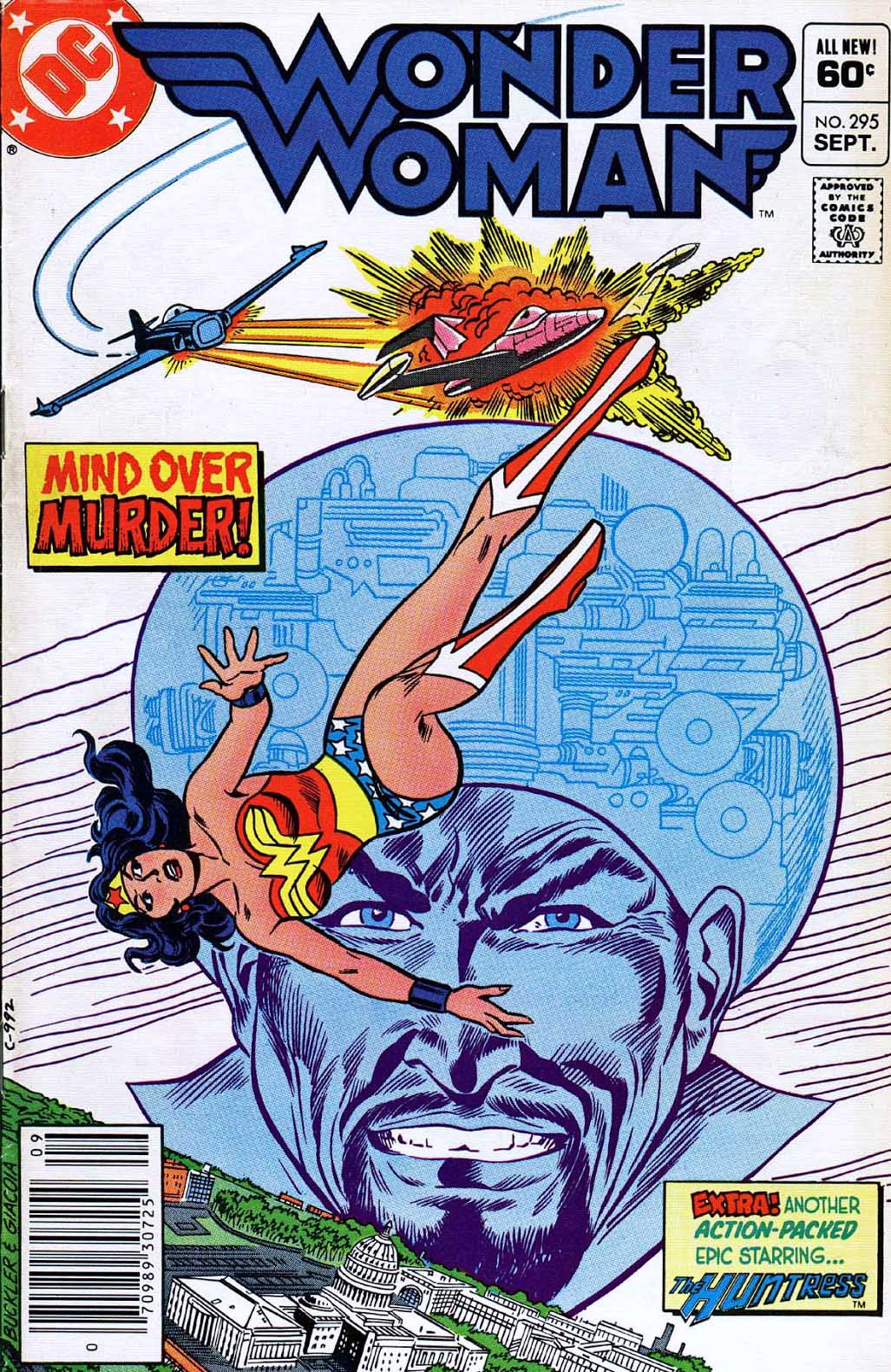
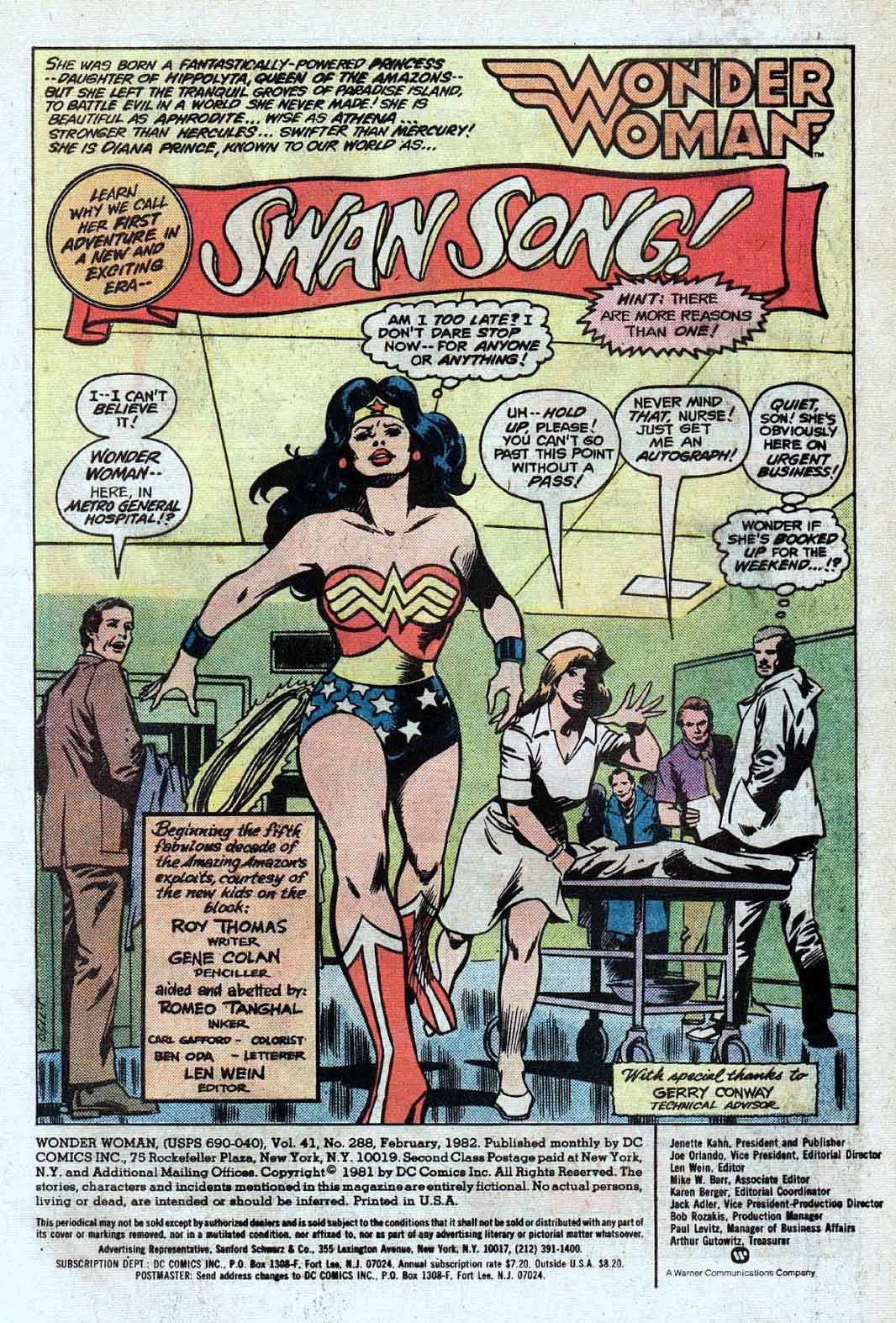
Gene Colan delivers an outstanding splash in an offbeat story involving t video-game mania. Well, it was 1982. Think Atari 2600. Only here we have a cast-off villain –General Electric — from Jack Kirby’s Sandman (I kid you not) who uses a kind of mass hypnosis… oh never mind.
As mentioned previously, I’m a passionate fan of Gene’s work and picked up nearly everything he did at Marvel. By the time he jumped ship to DC I was less interested in superhero comics in general and paid little attention to his work on Wonder Woman. (Batman was another story, as I thought he was a great choice for the dark detective.)
Turns out it was a short but memorable run on WW (artistically at least) and Gene is actually responsible —under the direction of publisher Jeanette Kahn — for her very first costume re-design, replacing the eagle on her chest with the “WW.” (Not including a brief stint in “mod” civilian attire in 1968- 1973.)
The exact new design may have been a work in progress, because the halter on this original has an art patch on it.
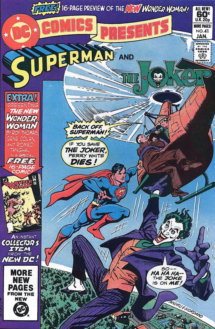
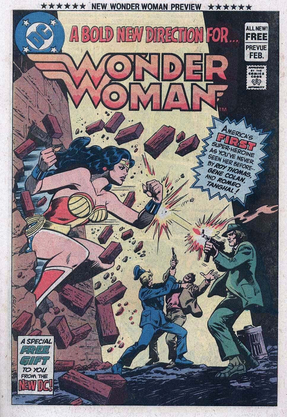
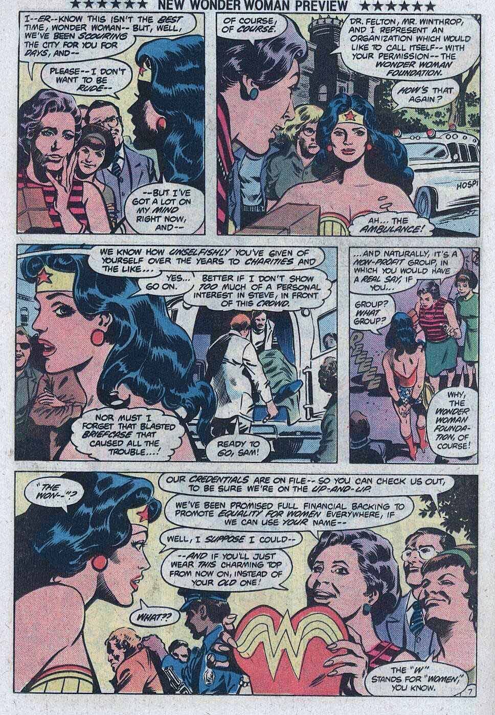
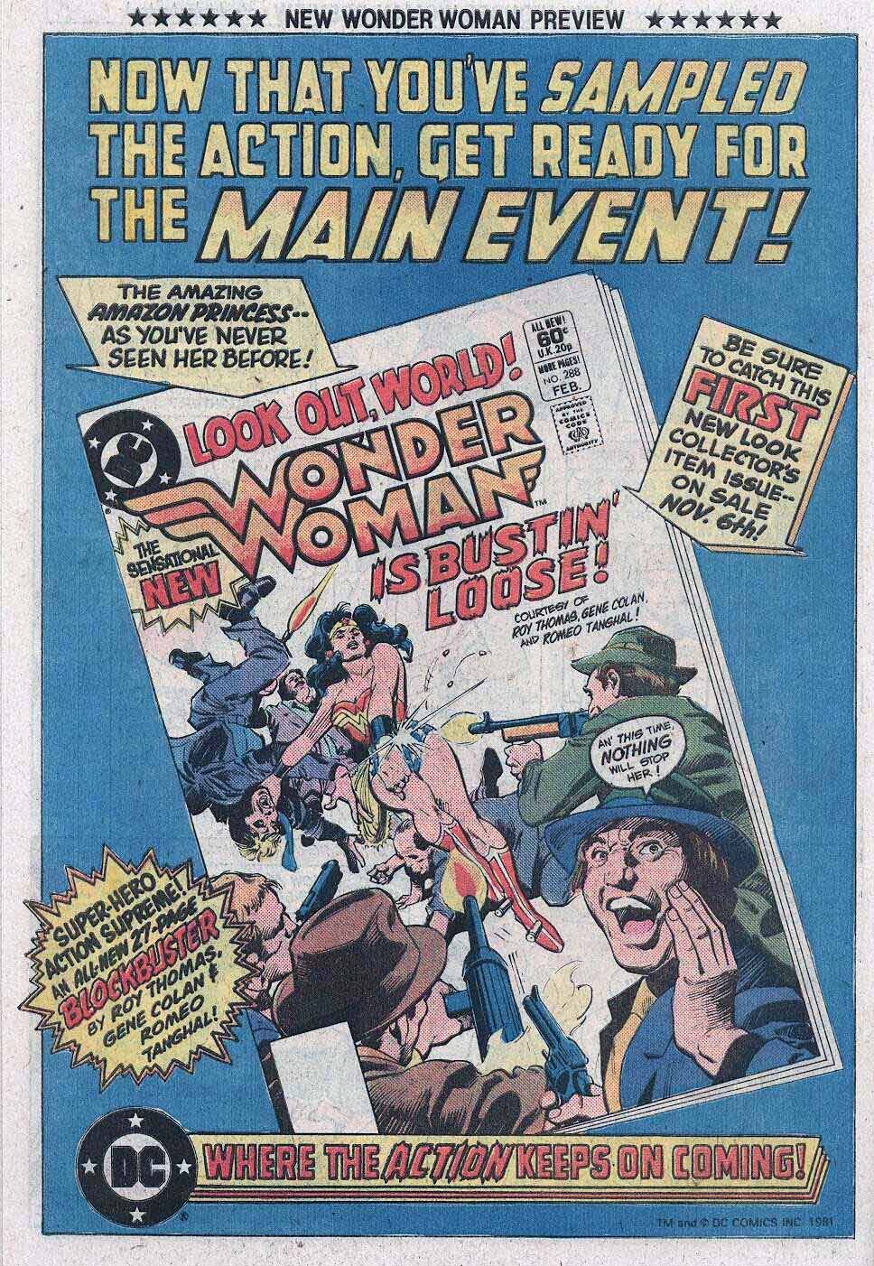
Wonder Woman gets an updated halter, logo and creative team, as previewed in DC Comics Presents #41, and ultimately launching in Wonder Woman #288.
Gene’s work at Marvel looked nothing like the other “bullpen” artists, yet somehow fit in perfectly. Where he went, I typically followed.