Greg Goldstein's Comic Art Gallery

Michael Golden — Able To Leap…

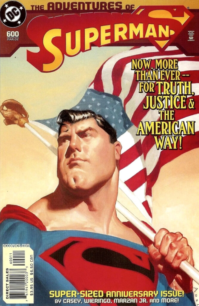
Pin-up (Unused Cover), Superman #600, March 2002
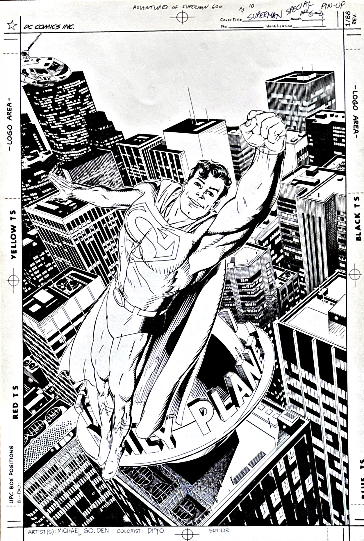
Michael Golden draws a terrific Superman here — likely with the most detailed and beautiful cityscape to ever appear on a comics page.

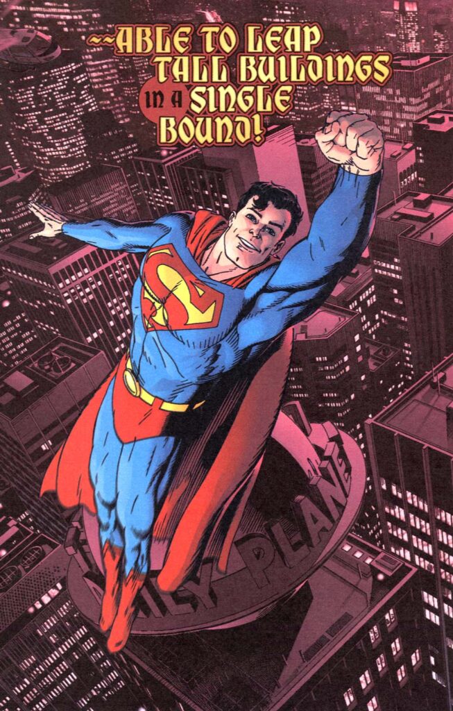
First it was commissioned as a cover — then it went into inventory — then it came back out as a pin-up in the 600th issue of Superman.

And look, I know it was just after 9/11, and the “American Way” theme made sense. But… when you look at the printed cover, and compare it at this amazing Golden piece, you simply shake your head at the missed opportunity.

(Side note: As noted previously, I am a sucker for “happy” Superman art.  If you had those powers, wouldn’t you be happy — at least some of the time?)
Paul Smith — Joke’s On Us

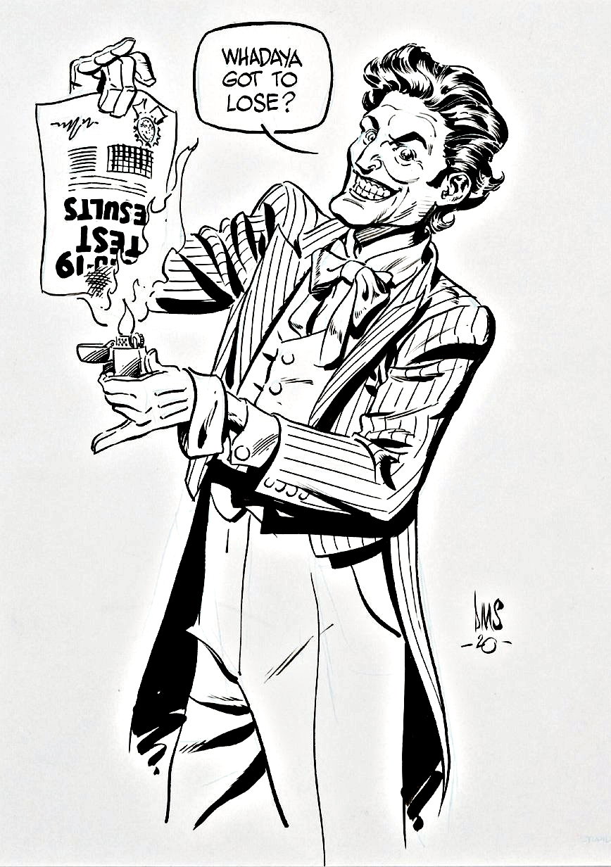
Joker Speciality Piece, 2020

True Story:

Nearly everyone I spent some time with at NYCC 2023 ended up with Covid-19. I indeed returned from the show feeling a bit under the weather, but when I tested negative, I assumed I had a case of the more common “con-crud” and went about my business. 

Next day, I stopped at a local fast-food taco joint for a seasonal lobster burrito and COULD NOT TASTE IT. So, I went home and took the test again, tested negative, and napped. Woke up, ate dinner, still couldn’t taste a thing, and went back to sleep.

Next morning, tested again. Third time a “charm?” Nope, still negative. Did some homework, and learned the home kits have about a 15 percent false negative result. Called the doctor’s office, and the nurse told me to check back in if I felt worse. I could practically see her shrug through the phone.

Fortunately, I didn’t get worse, and my taste buds returned to normal in a few days. Covid? Maybe. Maybe not. Welcome to the 2020s.

Which makes this great Paul Smith specialty art even greater. In my case, The Joker could have burned the test, and it wouldn’t have mattered.

Oh, and the punchline: Where did I acquire this art? 

NYCC 2023. 

Kismet, no?

Neal Adams & Bernie Wrightson — Twice As Great

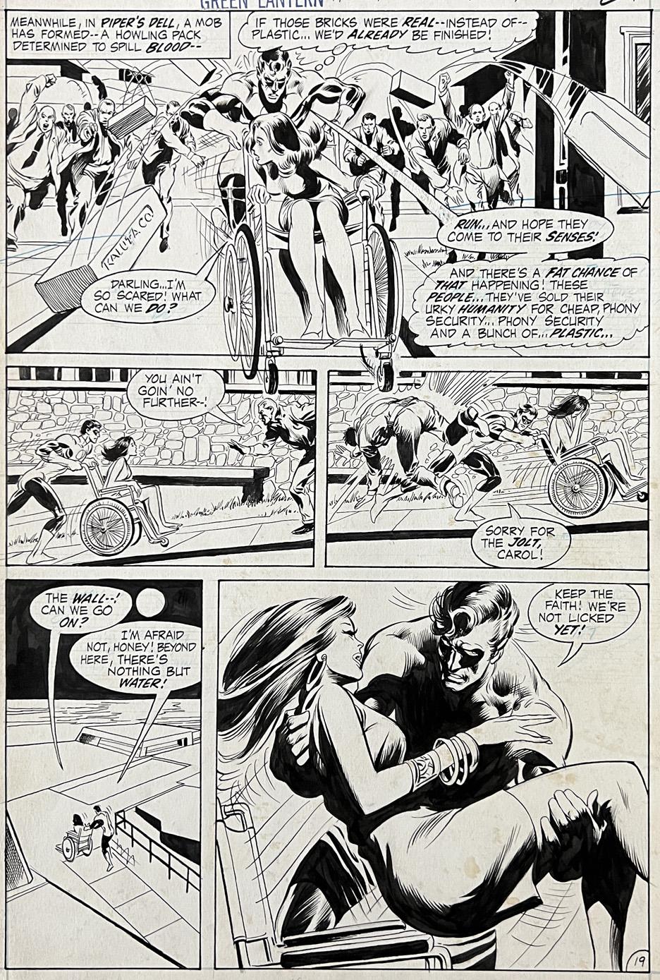
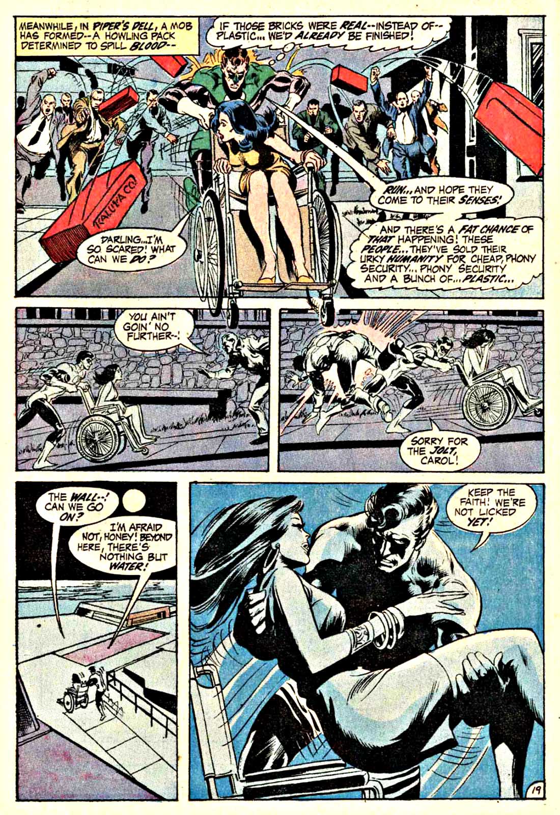
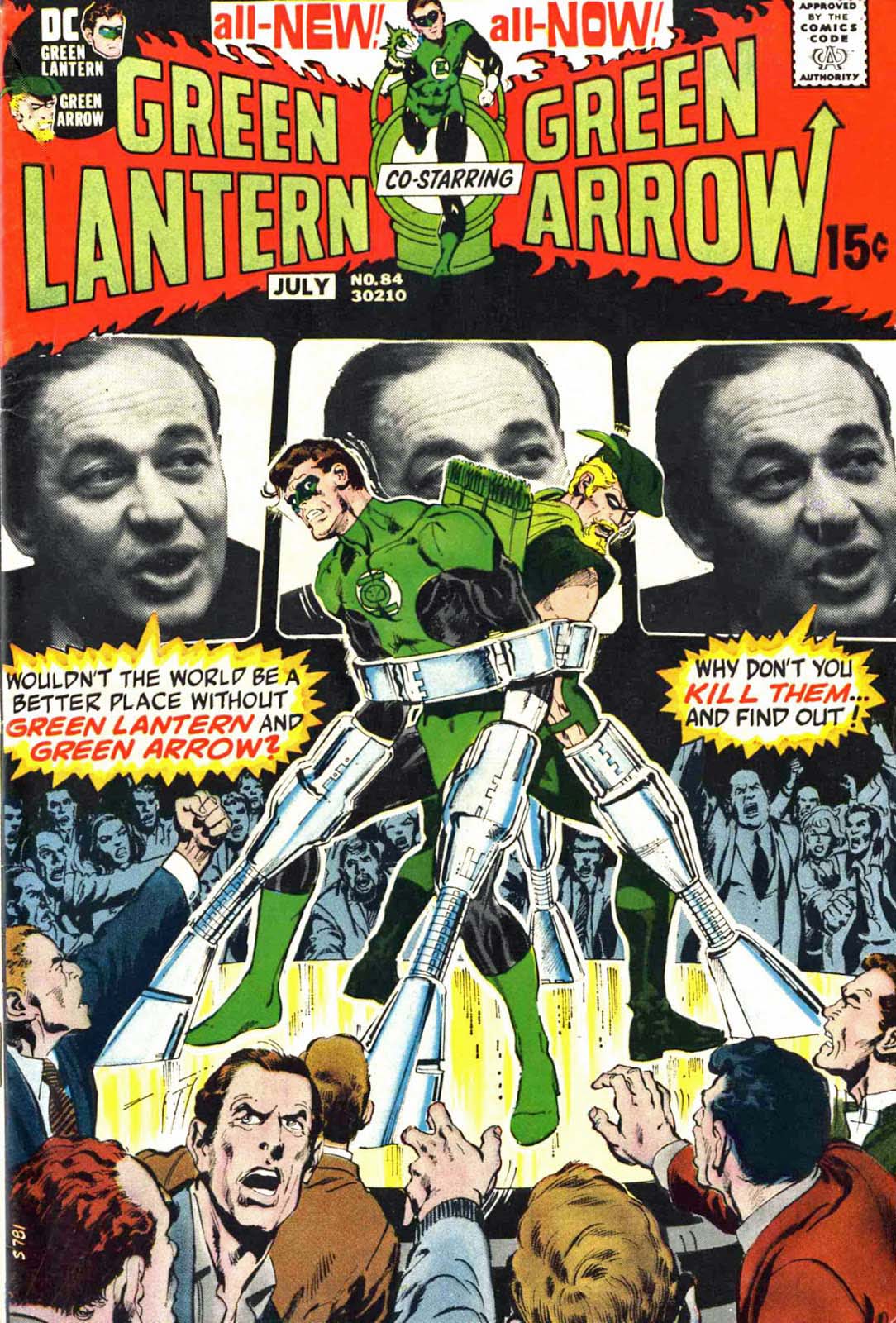
Green Lantern #84, July 1971

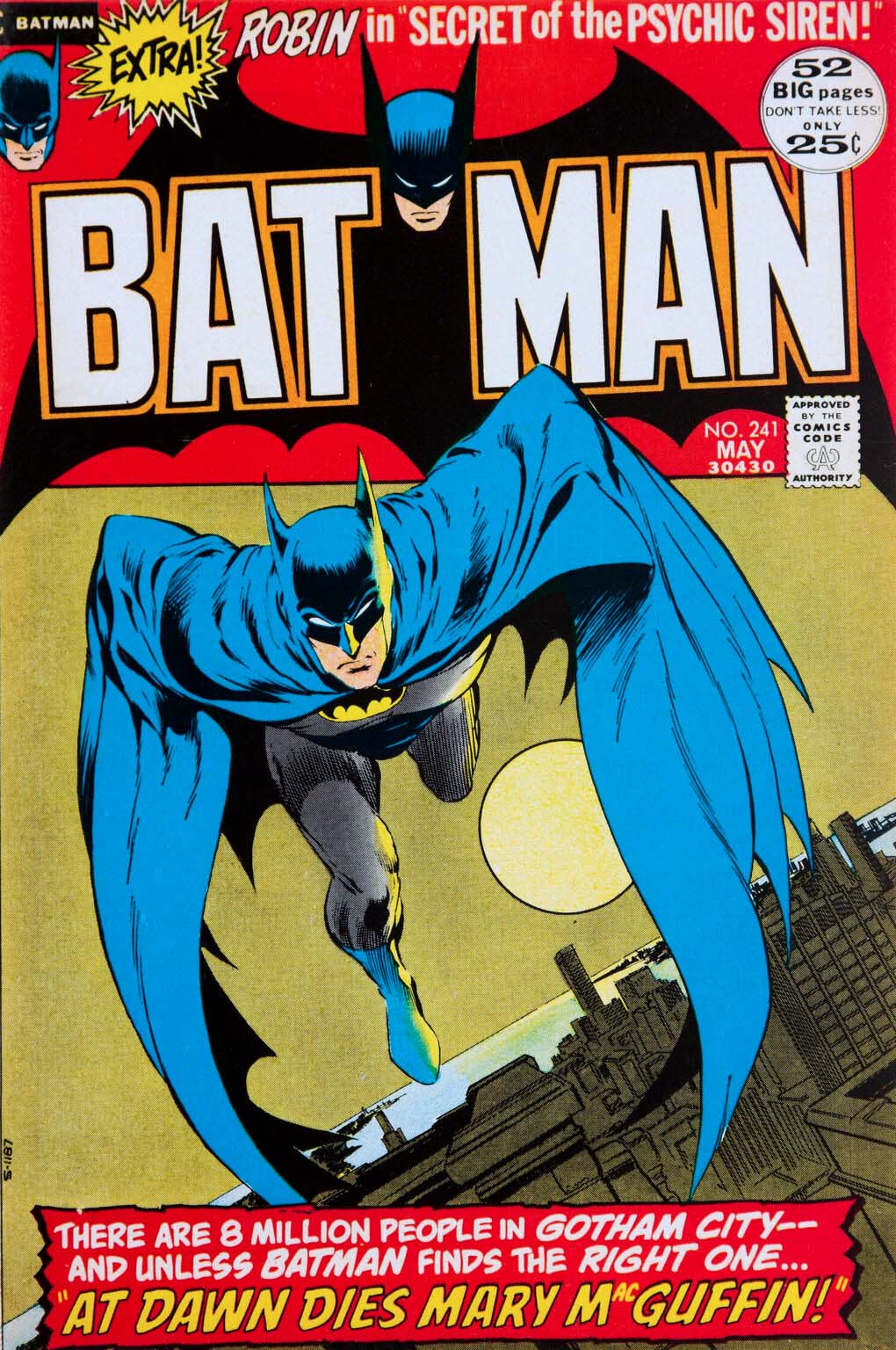
Opinions on Bernie Wrightson’s rare inks on Neal Adams pencils range from “dream team” to “dueling styles.”

Personally, I enjoy the combo, But Neal himself is said to have told Bernie he was better off going his own way. And that, I think, we can all agree upon.

As for this great Green Lantern page from Adams legendary run? The top panel feels more Adams dominant to me, and in the cool final panel I see more of Bernie’s efforts.

Your mileage may vary.

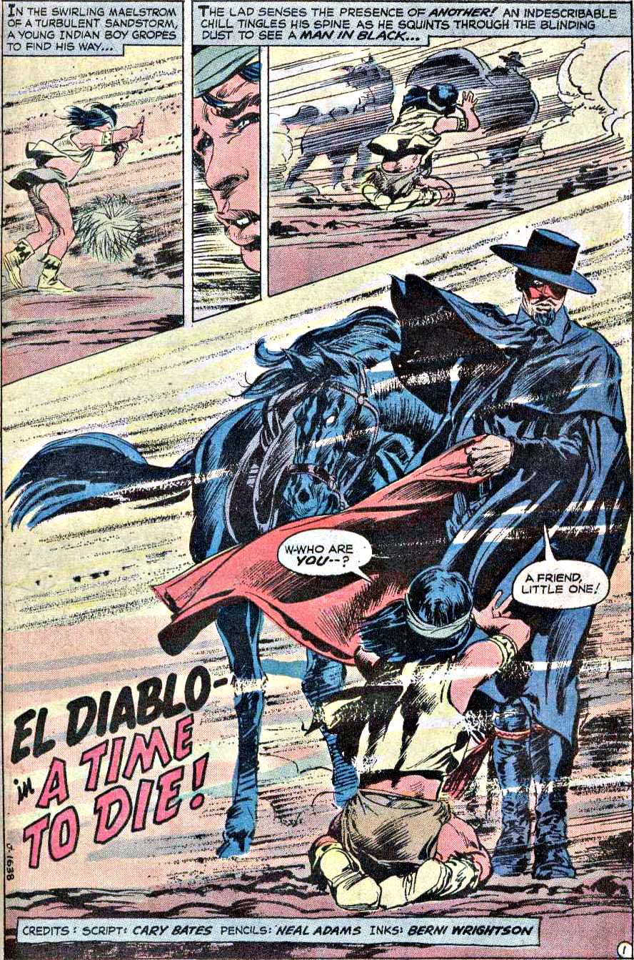
(Pictured below the published Green Lantern comic are a few more examples of the Adams/ Wrightson combo: A terrific Batman cover and the splash page to an El Diablo story from Weird Western #12.)

For more:

https://13thdimension.com/bernie-wrightson-a-birthday-salute-from-frankenstein-to-swamp-thing-and-more/

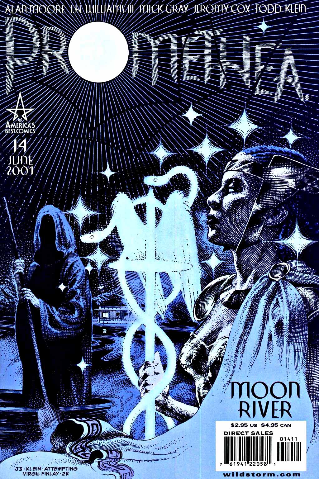
JH Williams III & Mick Gray — Dreams & Imagination

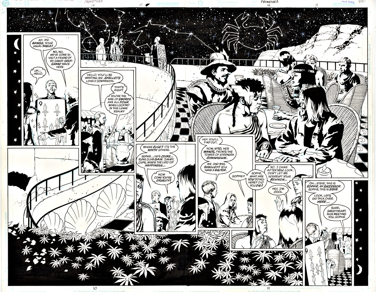
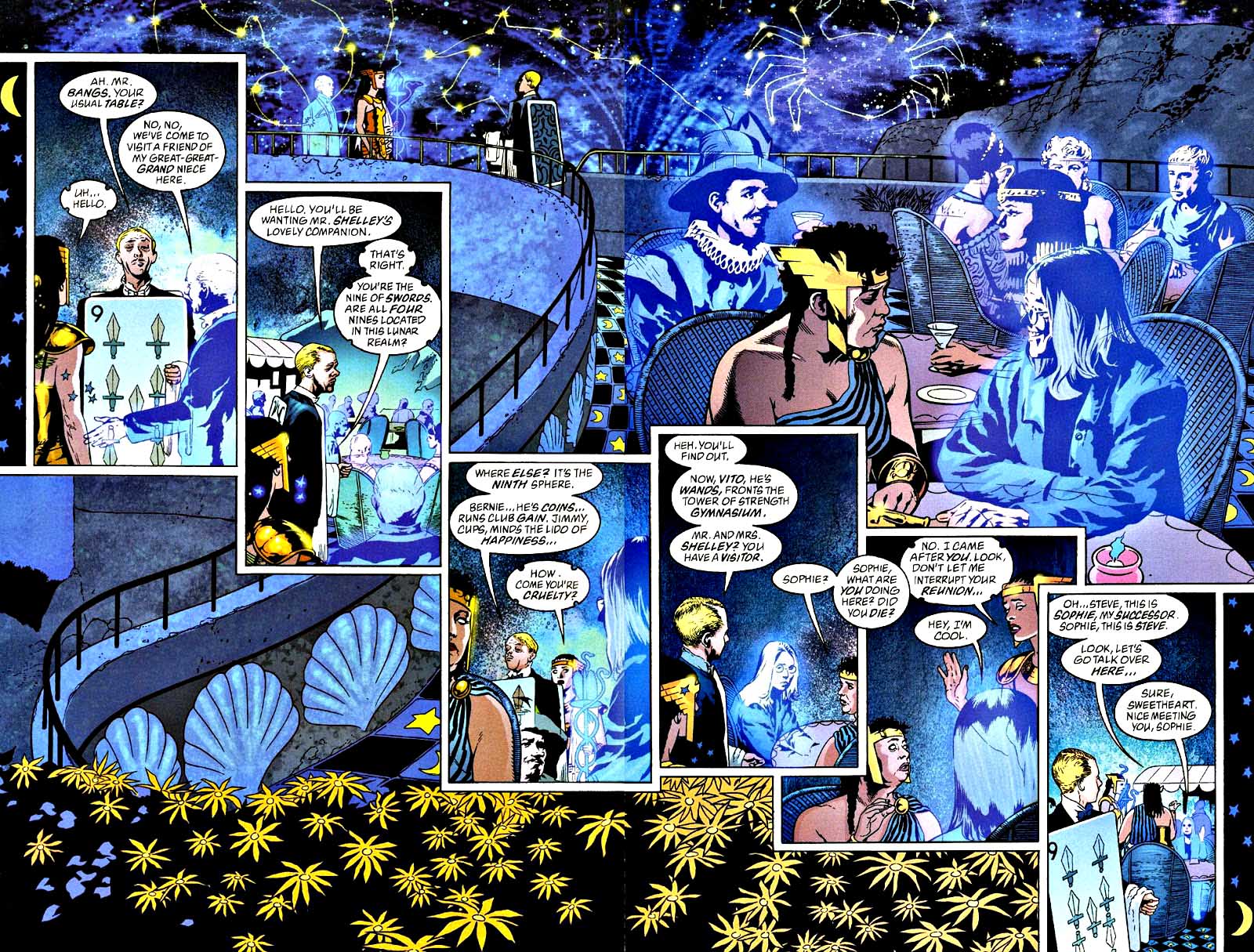
Promethea #14, June 2001

Criminally underrated artists.

Criminally underrated art team.

Criminally underrated artwork.

Seriously, each 2-page spread in Promethea is somewhere between great… and stunning. And yet, when pages sell at auction, the realized prices rarely reflect the quality of the work.

A definite head-scratcher, certainly. But a boon for collectors who want a terrific piece of art — from an Alan Moore project, no less — at a ludicrously low price.

And a lunar realm like this one seems like a good place to wish everyone a very happy and healthy New Year. 

See you in 2024.

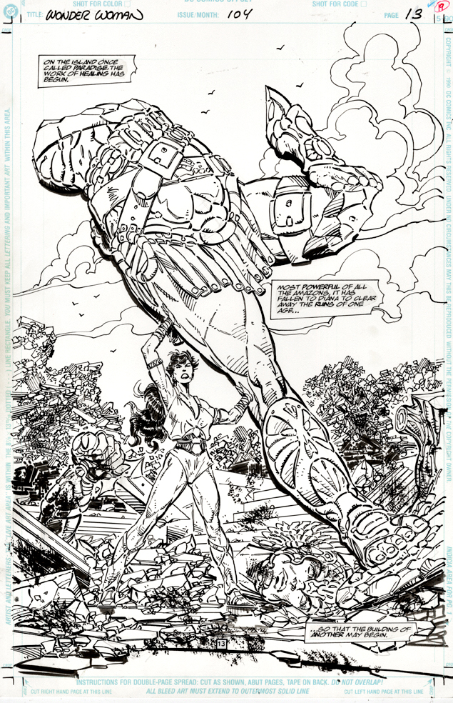
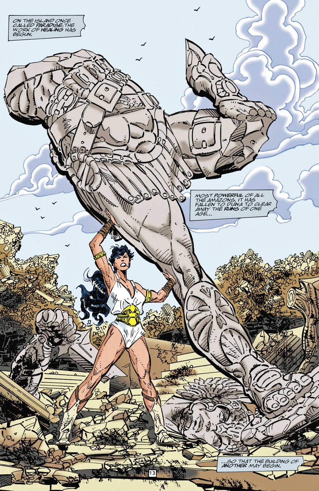
John Byrne — Bloody Victory

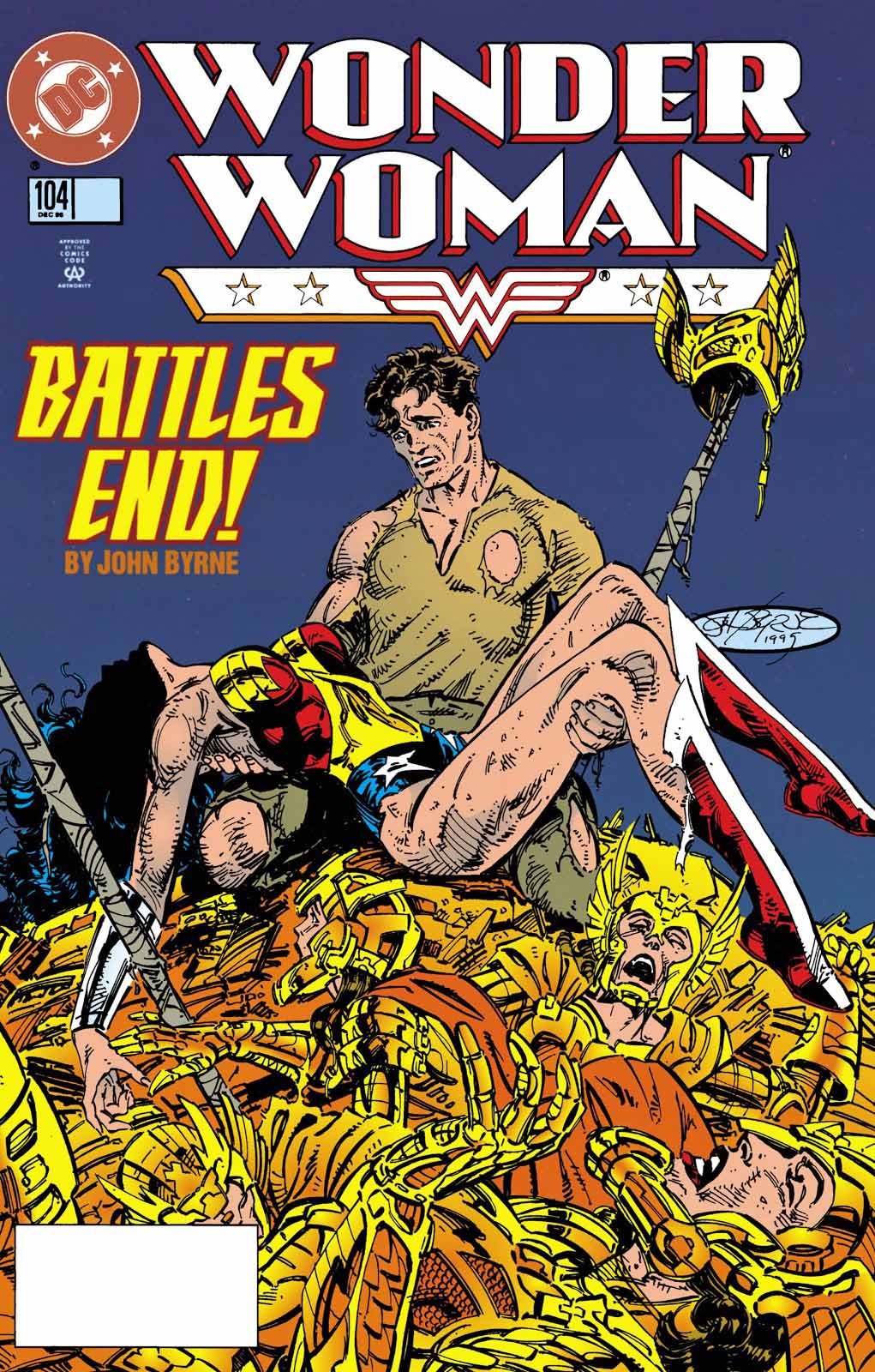
Wonder Woman #104, December 1995

This is obviously a cool splash page from John Byrne’s (story, pencils and inks) run on Wonder Woman. Tremendous detail apparent here.

Less obvious without the published page nearby of course is the terrific coloring here by Patricia Mulvihill. She creates a clear background and foreground with minimal tone, adding depth and clarity to the art.

If you’re curious about plot, Darkseid and his legions have killed quite a few of Diana’s fellow warriors and wrecked Themyscira, but didn’t get what they wanted, so they split.

Good riddance, even if only temporary.

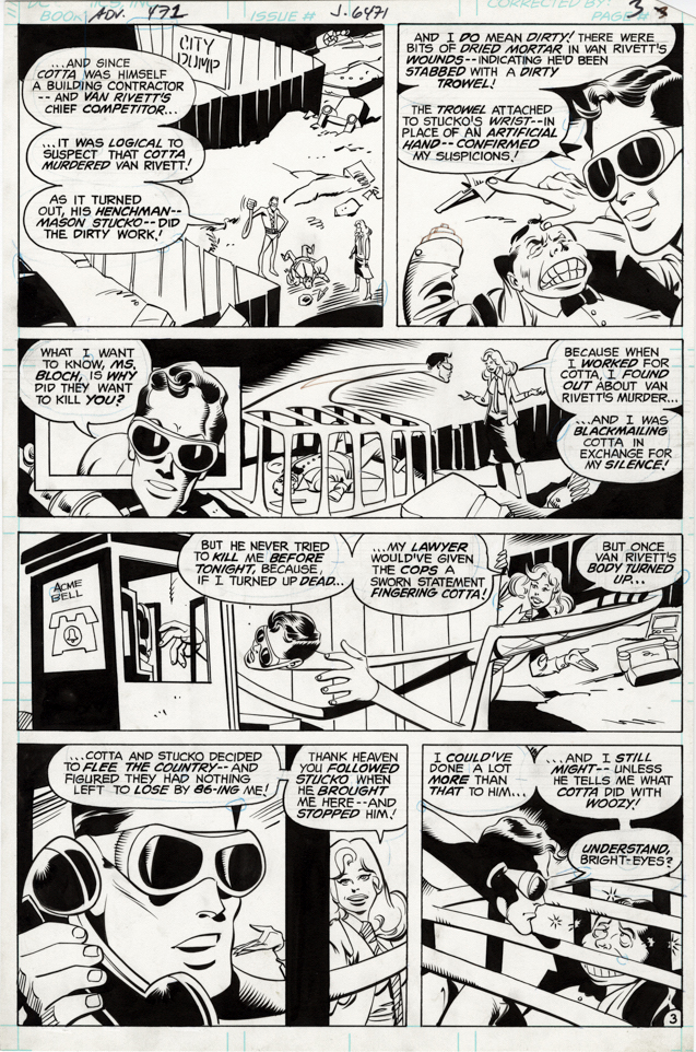
Joe Staton — That’s A Stretch

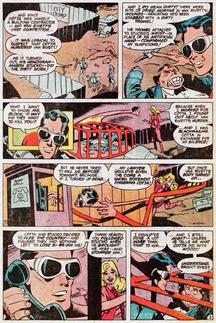
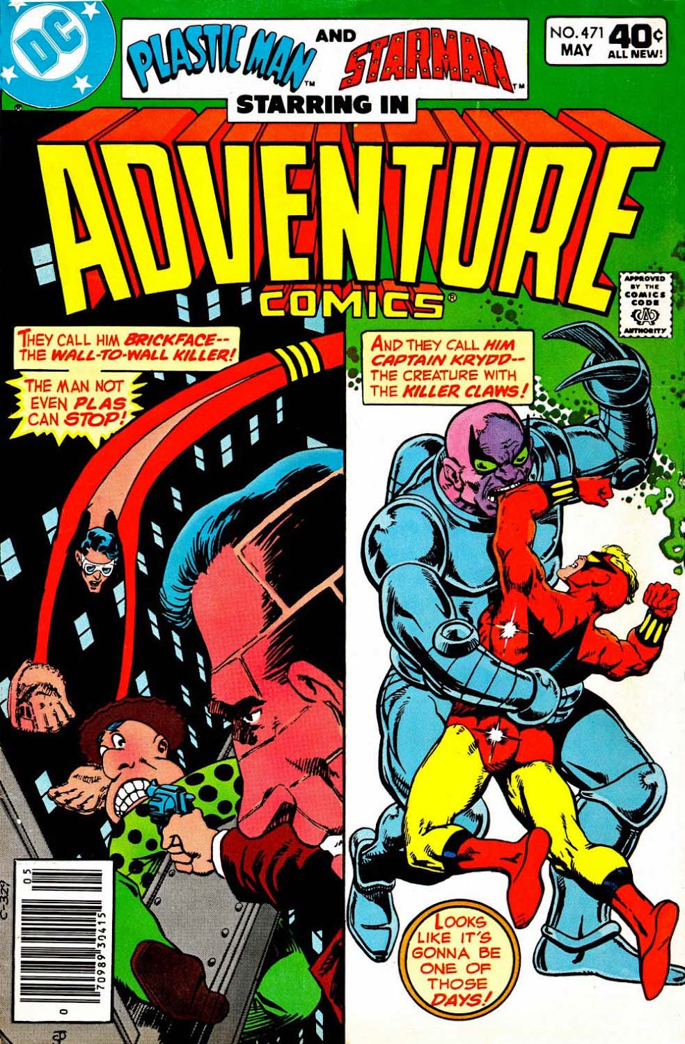
Adventure Comics #471, May 1980

Remember when DC had some space for some comics that were fun, even playful?

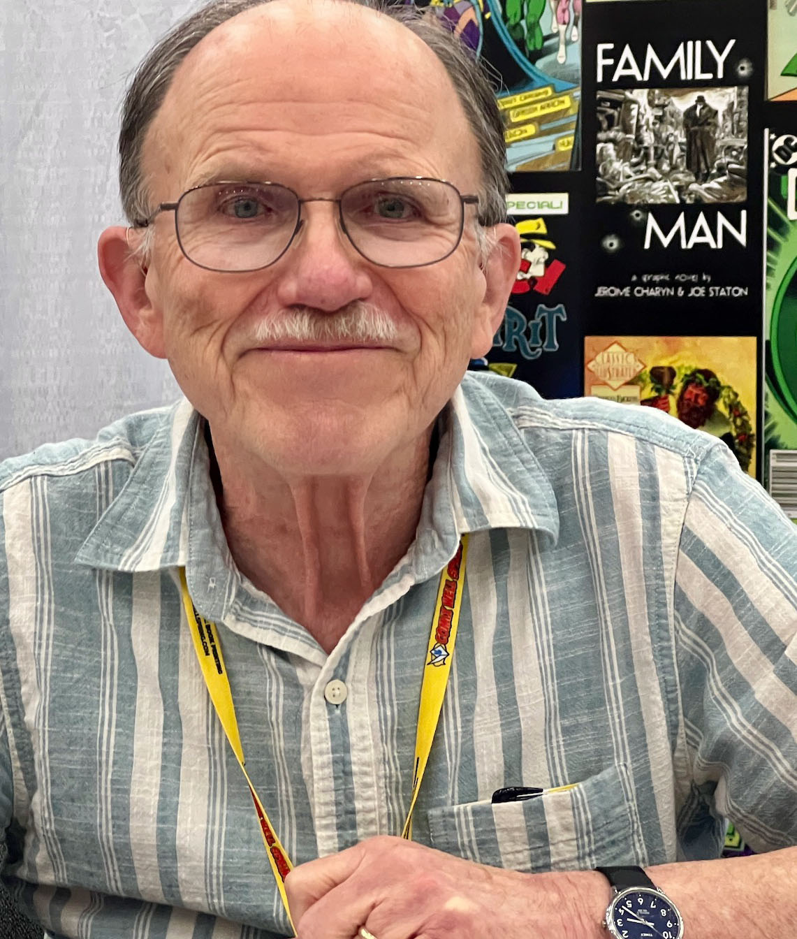
How about Plastic Man, written by Marty Pasko and drawn by the talented and versatile Joe Staton. (Also, he and his wife Hillary are two of the loveliest people you will ever meet. Trust me on this.)

DC will bring back ol’ Plas someday — although, given the current state of the editorial mindset in the industry, there is always a chance he will come back as a schizophrenic who only thinks he can stretch. 

Trust me on this, too.

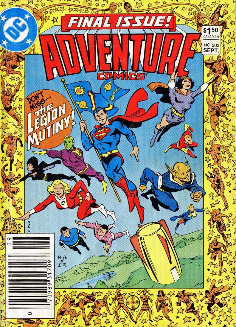
(Fun footnote. Someone at DC must have liked this story as much as I do — it was reprinted just a few years later in 1983’s Adventure #503, the final issue of the series.

Bob Brown & Wally Wood — Hidden Treasure

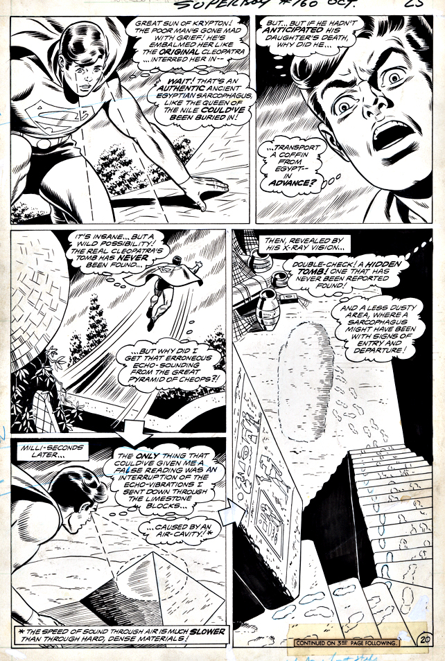
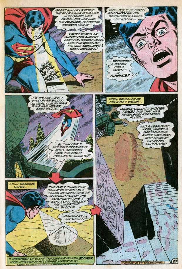
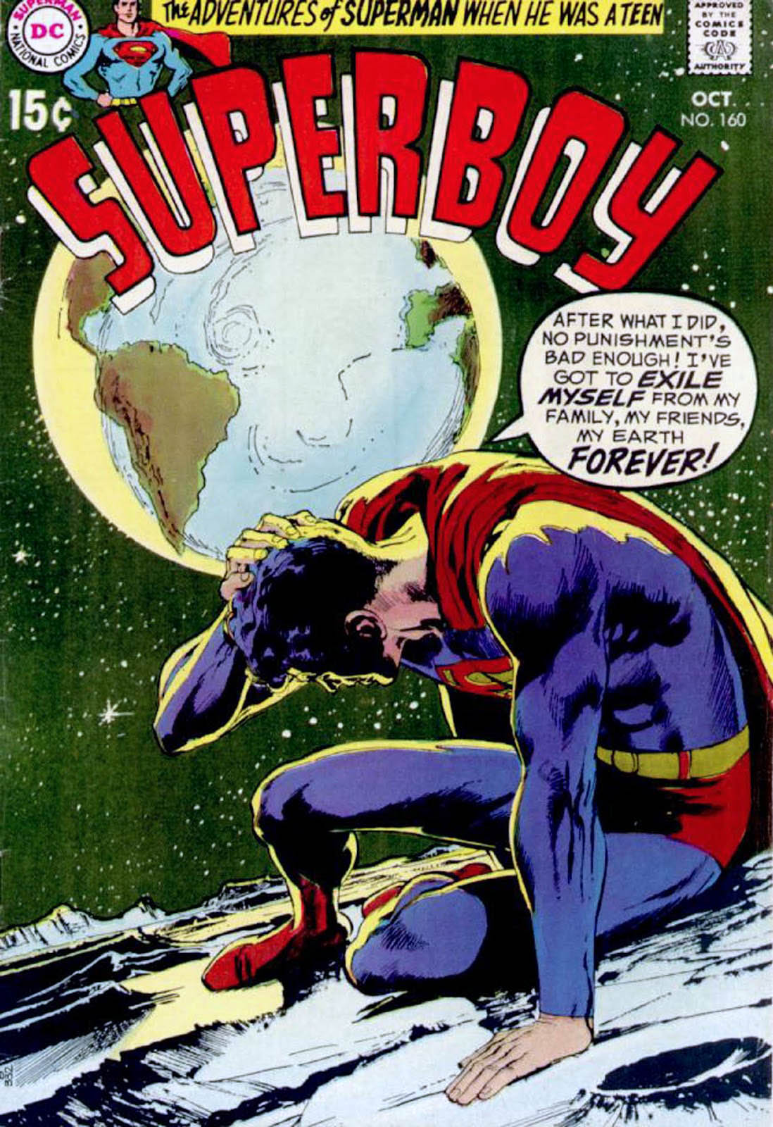
Superboy #160, October 1969

Bob Brown’s Superboy stories were the Superboy stories I read as a kid. 

Wally Wood inks? A very happy bonus. 

Even though the stories rarely matched the intensity of the typically featured Neal Adams covers, I’d likely buy a collection of this material on the spot if it ever becomes available. Nostalgia is a powerful thing. (It’s shocking how much DC silver age superhero material remains to be printed. But that’s a story for another day.)

Gil Kane & Kevin Nowlan — Never Fade Away

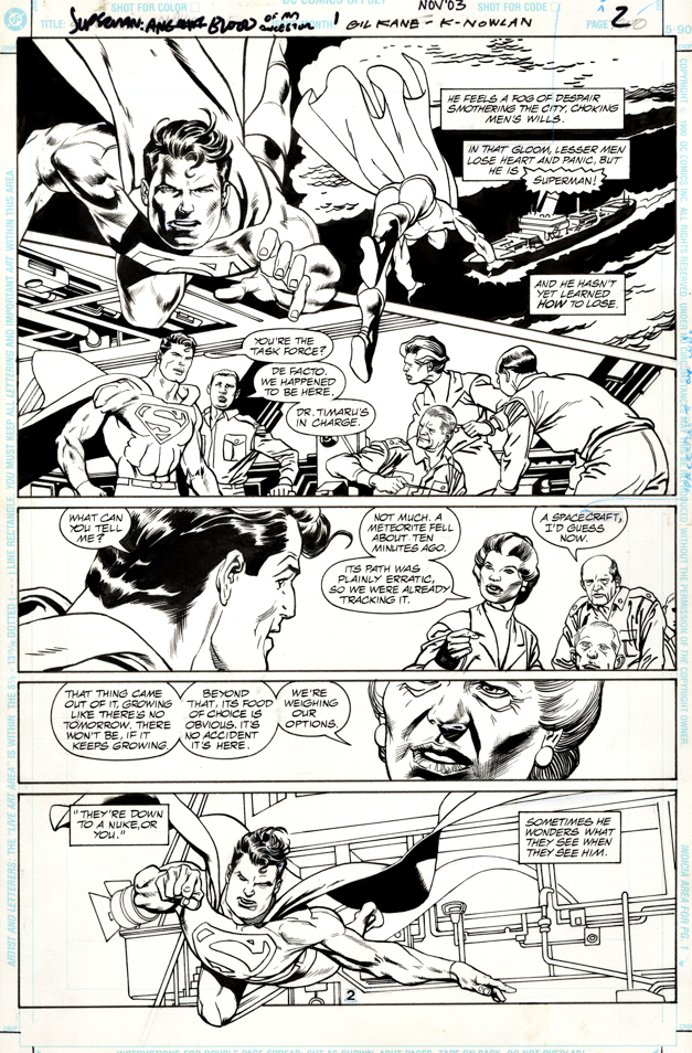
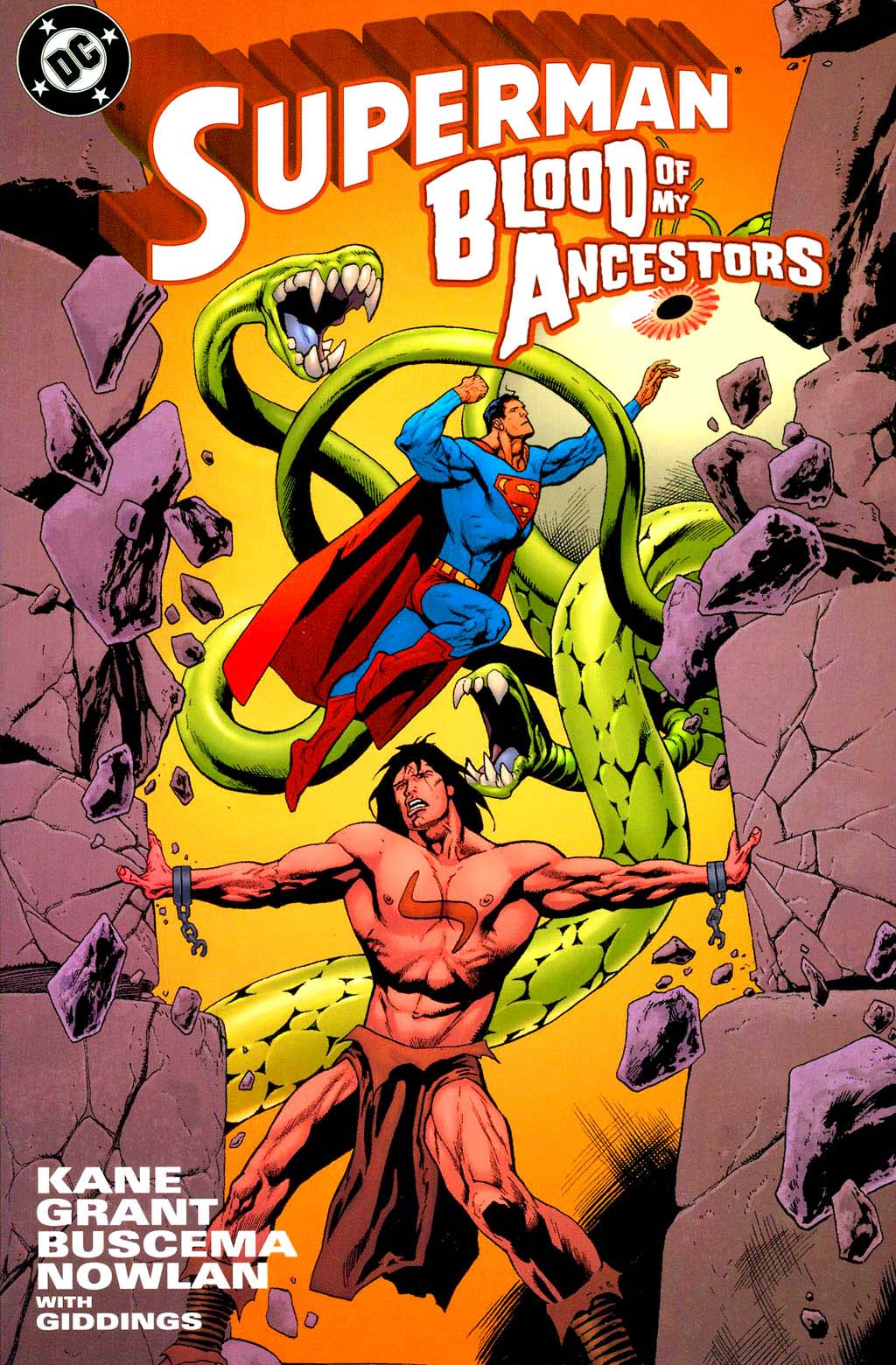
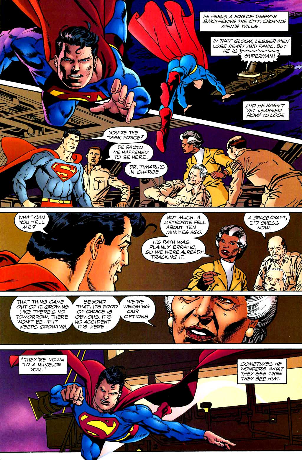
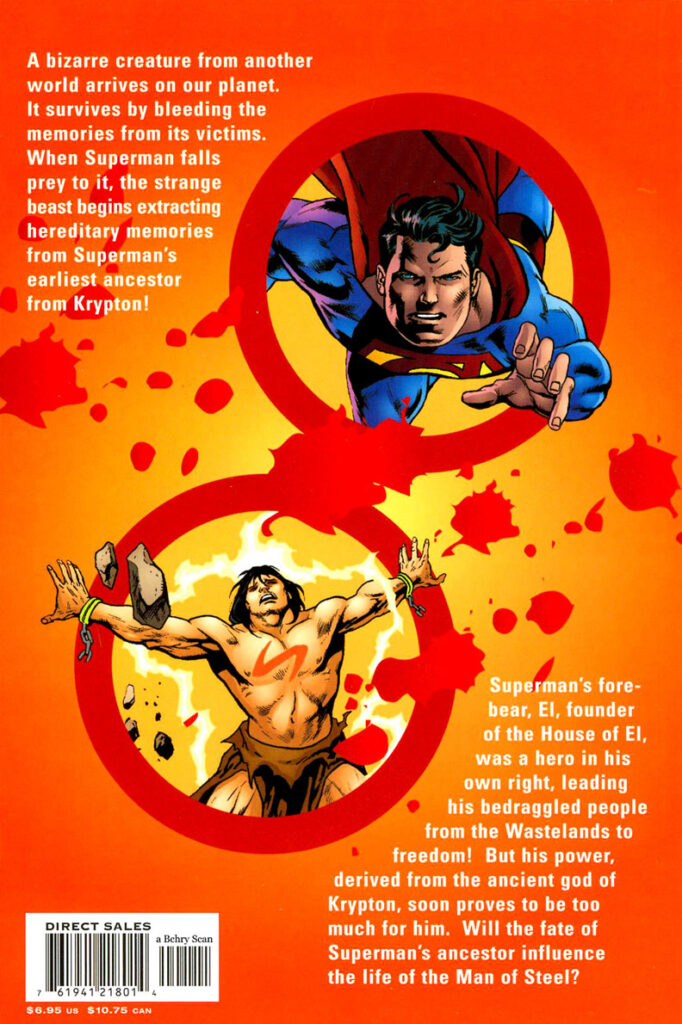
Superman: Blood of My Ancestors, November 2003

Superman: Blood of My Ancestors is an unusual project. Gil Kane was the original penciller, but he passed away before he could finish it, and then John Buscema took over the penciling, and did manage to finish it — before his passing shortly thereafter.

So, when the book finally see print in 2003, both pencillers, giants in the industry were gone.

Kevin Nowlan provides finishes for both. (And as a bonus, because Kevin inked Gil’s pages, they won’t fade away like so many of the other Kane “marker era” pages from his latter DC comics career.)

Not a ton of Superman in this one-shot since much of the story revolves around an early ancestor of the House of El. In fact, most of the Buscema pages look like a classic barbarian tale.  Kal-El’s distant relative is a dead ringer for Conan.

Who knew?

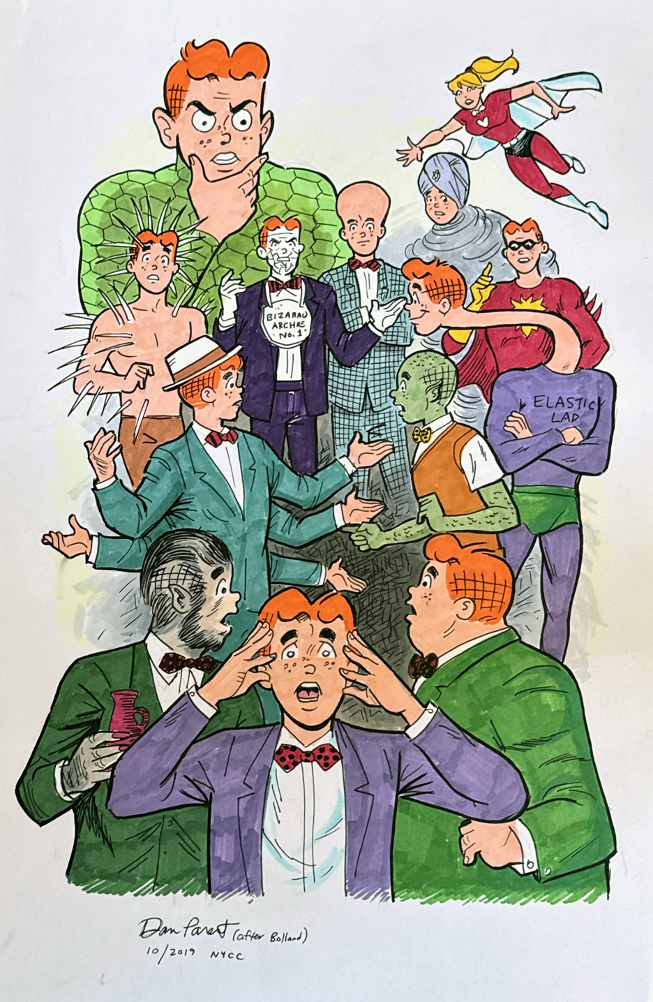
Dan Parent — The Amazing Transformations Of… Archie Andrews?

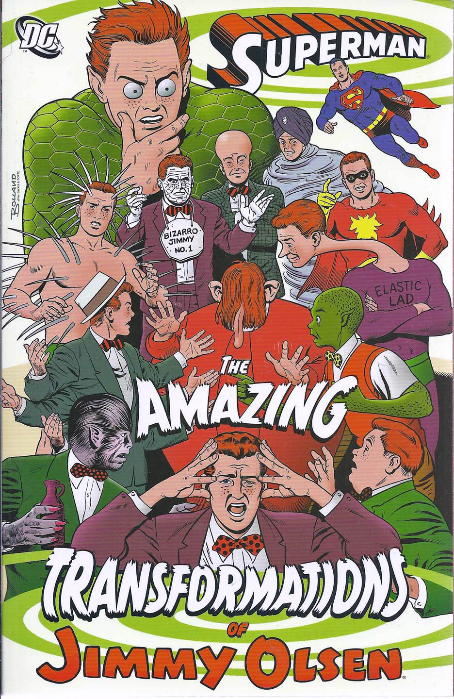
Commission, October 2019, Based on Brian Rolland’s TPB cover, The Amazing Transformations of Jimmy Olsen

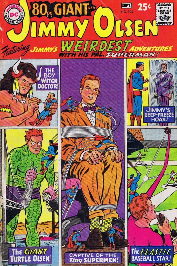
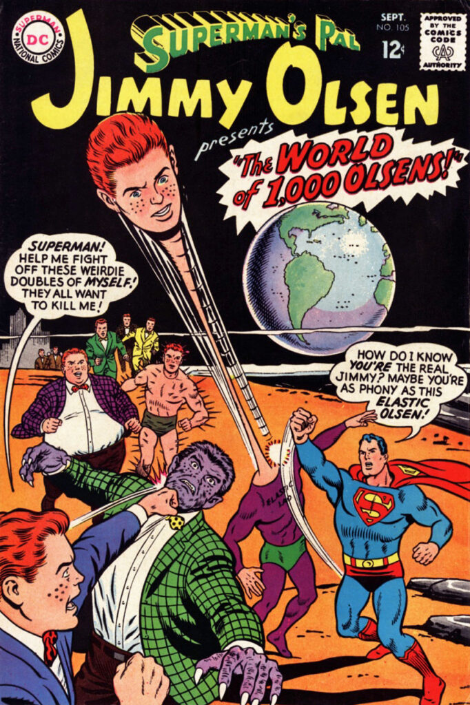
As a kid, I loved the goofy adventures of Jimmy Olsen. 

As an adult, I love Brian Bolland’s art. I wish I had the good sense to acquire a cover years ago, when the price was in a lower level of the stratosphere. But of course, hindsight is 20/20, etc.

So naturally, I get a kick out of Brian’s cover for The Amazing Transformations of Jimmy Olsen. Peanut Butter and Chocolate, yes?

Well, mostly. I think Bolland’s interpretation of Jimmy is a just a bit too “adult” — despite the bizarre themes and eccentric characterizations.

Enter Archie All-Star Artist Dan Parent: Turn Jimmy Olsen into Archie Andrews, and presto, you have the goofiness and joy this treatment deserves.

My pal Dan knocked it out of the park, and he is kind enough to show appreciation for my wacky commission ideas.

And let’s face it, the 60s Jimmy Olsen is pretty much a Pete Costanza or Curt Swan version of Archie anyway. Wait a minute — now that I think of it, I don’t think I’ve ever seen the two of them in the same place at the same time. Hmmmm…

Happy Halloween!