Greg Goldstein's Comic Art Gallery

Jordi Bernet — Black And White

Shadow Commission, Undated

Nearly all writers, amateur or professional, struggle with writers block at some point.

My blog schedule for 2020 is fairly consistent. About 250 -300 words per post, three posts per week. Add in some extra narrative in the captions, and the occasional “bonus” post, and we can generously call it 1000 words per week. 50,000 words per year, give or take.

That’s significantly less than my early newspaper or magazine days, and yet, every once in a while, I stare at the art — and the screen— blankly, trying to get my thoughts together in a semi-coherent fashion.

And then, there’s Walter Gibson, creator of the Shadow. During the height of the character’s popularity in the 30s and 40s, he wrote two novels PER month, each 50-60,000 words. (Using the pen name Maxwell Grant.)

50,000 — 60,000 (or more) words every… two… weeks.

In Gibson’s NY Times obituary, the paper calculated that in some years, his annual output was well over 1.6 million words!

Reading some of these Shadow stories, it’s obvious that although they were genre books, with certain themes and ideas repeated throughout, they were well written, creative and original. Quality novels, twice a month.

How the heck did he pull it off? Astonishing is definitely an understatement.

Turns out he and I were living fairly closely to each other shortly before he passed away in 1985. I wish I knew that (where was the internet when I needed it?), so I could have perhaps expressed my astonished admiration directly. And of course, thank him.

Oh, yes, back to the art: A great commission by the terrific Jordi Bernet. He’s done a bunch of these, so I assume he’s a fan.

I was fortunate enough to meet him — and host him briefly — at the 2011 San Diego Comic–Con. IDW published the first high quality collection of Torpedo stories in English. And although I’m not a huge fan of the stories themselves, I’m a big fan of the art.

That too, is an amazing understatement.

But at least I had an opportunity to tell him that. Even if my Spanish is fairly impotent.

Alex Maleev — A Long Time Ago…

Star Wars: Princess Leia #2, March 2015

Forty years ago today, life was definitely simpler. All I had to do was how to figure out how to get to the opening night of Empire Strikes Back.

Well, maybe not that simple.

Big films often did not open “wide” in those days, which meant ESB would not be playing anywhere near my college town of Binghamton, New York. Closest theater? In Syracuse. 75 miles away.

Fortunately, I had a car. Gas was (relatively) cheap. And finals had just ended.

That was the good news.

The bad? No on-line ordering. (Ha. We were still using punch cards and booking computer time in the lab.) No advance orders by phone. This was 1980. Horse and buggy era, tickets and technology wise.  And in those days, no bank was offering credit cards to broke college students anyway.

So we had to wing it. The “we” in this case, my buddy Bob and I, pretty much the only people that hadn’t packed up for the semester.

Off we went.  Up through farm country on Interstate 81. Somehow, even though we didn’t leave that early, and the legal speed limit was still 55mph, we made it to the “purchase tickets” line, and then the “entry” line in time, and had reasonable seats.

Good thing, too.

We had waited three years. I didn’t really want to wait another day.

I enjoyed it. A lot. Despite the fact that the story had been “spoiled” for me by the Marvel Comics adaptation, because I didn’t have the discipline to avoid reading it. (Lesson learned there. I never made that the mistake again, including, and especially, for Return Of The Jedi. Hell, I’ve occasionally forced friends who work on films into vows of silence.)

Alex Maleev’s beautiful painted cover features of one my favorite things about ESB: The battle on Hoth. I have a distinct memory of the first time I saw the Empire trailer tacked on to a Star Wars re-release in 1979.  The audience absolutely lost its mind at the Hoth tease. (Well at pretty much everything, I guess.) And the finished battle did not disappoint, stop-motion and all.

Where was I? Oh yes. Great cover. Terrific artist. Wonderful memory.

And somehow Bob and I made it back before the cows came home. But not by much, I imagine.

John Byrne — “Gronk”

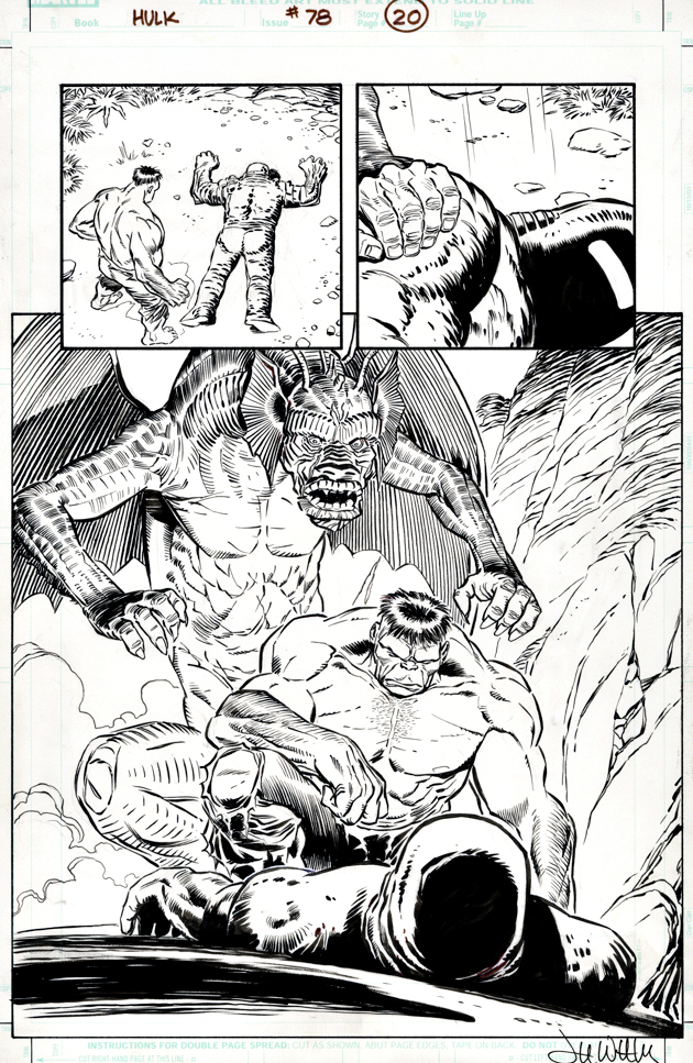
Jurassic Park: The Devils in the Desert #1, January 2011

I have no memory of how I acquired a few pieces of art. A chance dealer transaction at a convention perhaps … or possibly a last minute sweetener in a trade? Too much art probably, too many years definitely, and as they say…. hard drive almost full.

But this art’s provenance I remember very well.

NYCC about 5 years ago.  I had heard a lot about John Byrne’s house and all the various art collectibles that made up some of the décor, but hadn’t had a chance to get up to the wilds of Connecticut to check it out.

This time I was determined.  So, one rainy day at the end of the convention day, Chris Ryall and I trudged our way through monsoon-like rain (no exaggeration) to the train station, missed our connection, but eventually made it up to John’s town. After a nice Chinese meal, we headed back to John’s house.

It was everything as described. Great collectibles and memorabilia, and some great art hanging in his studio by comic book legends John admired. (No surprise, lots of Jack Kirby.)

Chris had already a direct working relationship with John, and in fact had been to his house previously. But I had actually not seen John since the early 90s, and he had no memory of our meeting, nor should he. 

As many colleagues can share, John can be reserved at times. Regardless, he was gracious to his publisher, and he definitely warmed up a bit as we discussed art in detail while I enjoyed the tour.

At the end of the night, He pointed us to his flat files of art and told us to each take something. These file were a potpourri of recent projects, pieces he had yet to give to his art representative Jim Warden to sell for him.

Chris found a page from DC’s OMAC series that John was especially proud of. I was a bit more interested in something that we had published at IDW, and after some deep digging, I came up with this great Jurassic Park double-page spread from the mini-series John created for us.

He was delighted that I admired it, and I, of course, was delighted with his generosity. It is a great piece, and to date, I walk past it every day and smile. Permanent collection, for certain.

Getting it back to California from New York wasn’t easy, but that’s a story for another day.

Thanks again, JB!

Gil Kane — Jurassic Jeopardy

Jurassic Park #4, August 1993

Michael Crichton’s Jurassic Park novel turns 30 this year, so the next few posts pay tribute to the book that became a blockbuster film franchise.

Gil Kane and George Perez teamed up on artistic chores for the original Topps Jurassic Park film adaption. (with writing by Walter Simonson). It was an unique pairing suggested by EIC Jim Salicrup, and for the most part, worked very well. All four issues came out on the predetermined schedule, not an easy feat, especially in those days with newsstand distribution considerations. But the schedule was… tight.

I was delighted to pick up the original art for Gil’s variant cover for issue #4 a few years ago at auction.

The scene is from the climax of the film where our young heroes are menaced in the commissary kitchen by the crafty velociraptors. It’s a cool composition that captures the terror of the moment.

Here’s the rub — Is that a chubby raptor missing a neck? Or a deformed T-Rex? I mean, what the hell kind of dino did Gil actually draw?

You can’t tell from the scan, but there’s an art patch on the dino’s face. Clearly some of it absolutely, positively needed to be altered to be approved overnight. But someone in Universal’s licensing department must have ultimately taken pity on our harrowing schedule, and us, because the final version is definitely not on model.

Since this is technically not the “main” cover, which is by Dave Cockrum, maybe they gave us a pass. (I don’t remember who did the art patch — George, our production department or for that matter, Gil.)

Ah, Gil. We sent him lots of photo reference. I can’t recall if we sent this exact scene specifically, but regardless, he had reference. Like I said, lots of it. Only problem is, as I found out later on, Gil didn’t have much use for reference.

It doesn’t matter. He was one of the best. I consider myself fortunate to know him professionally, albeit briefly. Stories about him were legendary by the time I met him in 1993.

And, I got at least one “Greg, my boy…” out of him, so I could cross that off the list. Whew.

Will Eisner — Peak Spirit

The Spirt, Register and Tribune Syndicate, September 12, 1948

2020 marks the 80th Anniversary of the Will Eisner’s Spirit, a comic series that ultimately became a game changer in the medium. This week is also celebrated annually as “Will Eisner Week,” dedicated top one of comics’ most influential legacies. So let’s dive in…

This cool page is from “Cache McStash”, and is from Eisner’s peak period on the Spirit. In fact, it is published just one week after his own personal favorite story, “The Story of Gerhard Shnobble,” perhaps the most perfect film noir ever created for the comics.

And don’t let the misleading credits on the otherwise great Grand Comics Database fool you. This story is all Eisner — script, pencils, inks, and letters — as confirmed by Denis Kitchen.

I was fortunate enough to be asked write the intro for the Spirit story “Sound” featured in the hot-off-the-presses Spirit 80th celebration from Clover Press.  No spoilers, but, I love the way Eisner integrated sound effects into his storytelling, and, on this page the simple ticking of the clock enhances tension and movement.

Like everything else he did, he found a way to make his two dimensional comics cinematic in scope.

“I grew up on the movies, that’s what I lived with. The movies always influenced me… Doing the Spirit strip was like making movies. It gave me a chance to be an actor, producer, author and cameraman all at once.”

— Will Eisner, quoted in Jim Steranko’s History of The Comics, Volume 2

Gabriel Rodriguez — Unlocked

Locke and Key: Crown of Shadows #5, February 2010

The first Locke and Key comic book from IDW Publishing went on sale 12 years ago, and nearly everyone who read it said, “wow, this would make a great television series.”

After a long, winding, often tortuous journey on the entertainment road, here we are. The first season of Locke and Key dropped on Netflix last night. I’m looking forward to binging it.

And I’m looking forward to re-reading the original six graphic novels that comprise the full Locke and Key story. Superb storytelling throughout by Joe Hill and Gabe Rodriguez make this one of the top graphic novel series of the 21st century. Gabe’s art just keeps getting better — and more lavishly detailed — as the series progresses.

I’ve loved nearly all of Gabe’s covers, but he rightfully guessed that this would be one of my favorites, with its emphasis on a classic hero vs. monster fight. (And beautiful detail on the monster.) When we introduced Locke and Key to a wider audience via Free Comic Book Day, we chose this to use cover as well.

It’s a beauty. Thanks Gabe.

Keith Giffen — Tribute To The King

Victory #1, April 1994

It was February 6, 1994. As we put the first (and it turned out, last) issue of Victory to bed at Topps Comics, the sad phone call came into our offices. The King had moved on — Jack Kirby had passed away at age 76.

Victory was supposed to be a monumental crossover project between all of Jack’s creator owned characters; the new ones we had already developed, and the previously existing ones that included Silverstar, and of course Captain Victory. It was going to be the event that shook the “Kirbyverse.” (I can’t remember who thought of that – EIC Jim Salicrup or myself, so we will each take have to take co-credit.)

Since the issue had not yet gone to press, we were able to include this lovely art memorial to Jack by Keith Giffen and Jimmy Palmiotti in the published issue, as well as a two-page editorial tribute written affectionately by Charlie Novinskie.

Although Jack was not directly involved in character or story development, he did enjoy being kept in the loop and, from the feedback we received, he enjoyed our efforts.

The challenge at the time of course, is that the marketplace didn’t enjoy our efforts quite as much as he OR we did. A year prior, we had launched the Kirbyverse with a bang.  Four titles launched in April 1993, plus a freebie. Total circulation of the group: More than one million copies. (That is not a typo.)
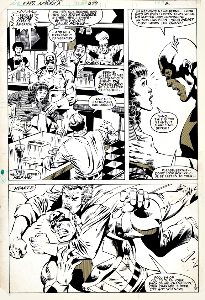
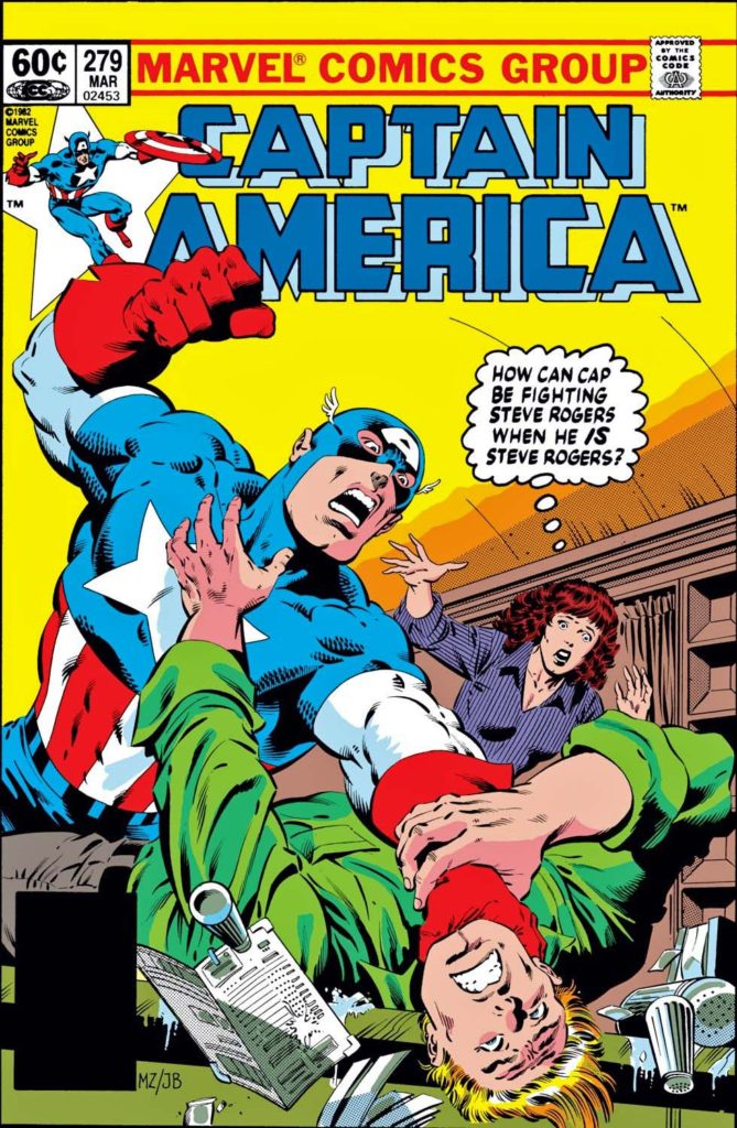
But our titles launched with mostly retro styling, and the market was not interested in classic storytelling and clean draftsmanship. The market wanted the dynamism and styling of Image-type comics (preferably from Image itself; remember this was 1993). And the younger readers gobbling up Cyberforce and Spawn weren’t that interested in Jack Kirby.

From the moment we launched, sales of the Kirby titles dropped each month. By the time Victory project came to fruition, it was too late.  Despite that issues #2 and #3 of the crossover were drawn, they never saw the light of day.

So ironically, and most definitely not intentionally, this version of the Kirbyverse was laid to rest at about the same Jack was.

But… did the King really die?

Captain America. The Hulk. The Avengers. The X-Men. The Eternals. Darkseid. The Black Panther. The Silver Surfer. Add a few hundred more, and you will just about scratch the surface of Kirby’s creative output.

The King lives on.

Long live the King.

Watchmen — Odds and Sods

Random Thoughts and Observations

Alan Moore and Dave Gibbons early concept art for Watchmen

The Price Of Greatness

  • Each time I consider a purchase of an original Watchmen page, the price becomes too rich for my taste and I get cold feet. And then, each succeeding time, the price is much higher. Lesson learned? Not yet.
  • That said, at IDW, we published a beautiful Watchmen Artifact Edition, so I did get to browse quite a few pages and see some impressive scans.

Archie’s Efforts

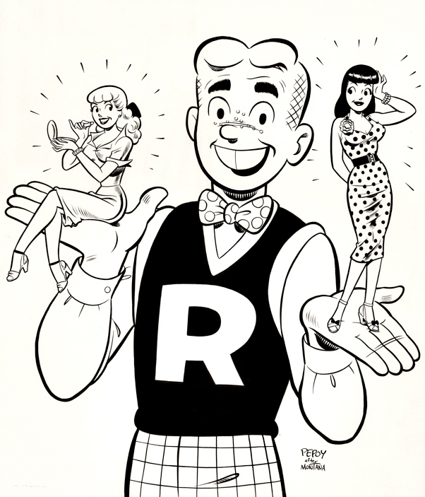
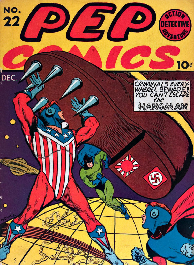
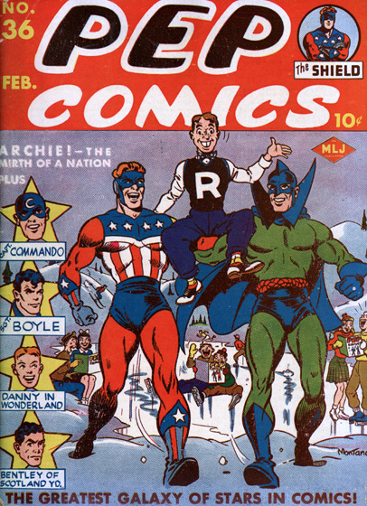
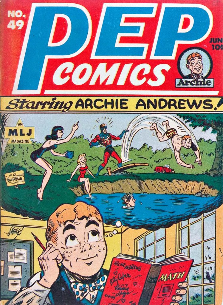
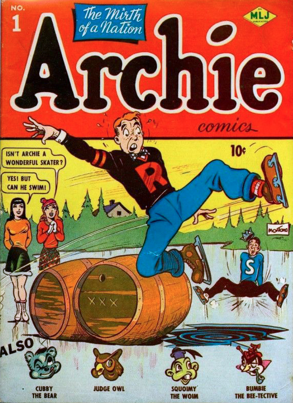
  • The MLJ/ Archie superhero universe is fascinating:  Since the 80s there have been multiple attempts to launch and sustain the characters, and none have quite worked. Fingers crossed for the most recent efforts, although I’m not certain any new titles featuring the latest iterations were published last year. It’s also interesting that Archie has licensed them to DC a few times.

DC’s Appetites

  • And speaking of DC, it’s fascinating to me that they would own so many superhero characters, add more, and then license even more. To wit: They purchased the Quality library, the Marvel family, The Charlton superheroes, and Wildstorm. At one point or another, they’ve licensed the Archie superheroes, The T.H.U.N.D.E.R Agents, The Spirit, The Conde Naste pulp characters and Fighting American. And a host of other ones I’m likely overlooking. Whew.

Moore’s Luck

  • Did Alan Moore’s familiarity with the Charlton and Archie characters come from childhood? Or later perhaps when he attends some fan gatherings/ early UK conventions? You could barely find some of those comics in New York, so it’s intriguing (and ultimately fortunate) that they made their way into the UK.

Morisi Gets His Rights

  • Why did Peter Cannon Thunderbolt revert back to creator Pat Morisi? Why was his deal so different than Steve Ditko’s? Or, did he manage to find a copyright loophole later on? Questions, so many questions…

Not Too Desolate:

  • If Bob Dylan receives a royalty for the Desolation Row lyrics included in the Watchmen comics, it’s probably the easiest and most surprising money ever. If his people took a flat fee, all I can say is… oops.

Howard Chaykin — Dark Force Rising

Star Wars #2, April 2015


Howard Chaykin returns to Star Wars with an imposing cover of Darth Vader in 2015. You don’t want to mess with this version of Vader, even if you’re on his side.

Howard Chaykin. Star Wars. This might be a greater conflict than the empire vs. the rebellion. 

I don’t need to repeat Howard’s many on the record comments about his original artwork on the series (Marvel’s 1977 issues #1-#10, which includes the six-part adaptation of the original film.) You can see more for yourself here, here or here.

Suffice to say, he doesn’t like it. (Reading anything Howard says about his own work — or others, or anything, for that matter — is always highly entertaining, so I recommend taking a deeper dive.)

Objectively, Star Wars is of course, not his best work — not even close. It’s not even as good as his other early comics. He drew three issues (and wrote one) of Marvel Premiere just prior to Star Wars that are excellent, especially for the period. (Howard is generally self-critical of all his earliest work, so I bet he won’t agree. But I digress.) 

Licensed comics are always a challenge, especially with limited reference and insane deadlines. That said, given these constraints, and many others, I think his Star Wars art, especially on the first issue, is definitely better than much of what was coming from the big two companies at the time.  But, ultimately, not so great on the Chaykin Curve. (A new scientific term coined especially for this post.)

Just a few years later (1982) he created the astonishing American Flagg. Groundbreaking, although often overused, barely does that series justice. (Much more on that in a future post). Based on Flagg alone, Mark Chiarello DC’s long-time Art Director has described Chaykin as one of the architects of the modern comic book. 

Unfortunately, Flagg was published by a smallish independent publisher, which means that few casual readers ever saw it. Although knowledgeable long-time fans are well aware of the series, it doesn’t have the legacy it deserves.

Star Wars? Reprinted about a zillion times, in more formats than I can count. And I am one of the guilty parties here, publishing the Star Wars Artifact Edition (IDW), showcasing the original art — in its original (11×17) size. 

Shortly after Flagg, Chaykin went on to other fascinating projects, geared for older readers. Times Squared. Blackhawk. The Shadow. Black Kiss. Etc. Ultimately, after a long stint in Television, he returned with other series that reflected his interests and passions. Mighty Love (feels like a television show and was apparently originally developed for that medium) and City of Tomorrow are two personal favorites.  He’s currently working on Hey Kids! Comics!, a fascinating fictionalized look at the drama, jealousy and scandals in the history of comic book business itself.

His innovative and realistic storytelling is complex, violent, sexual, and political. He left space operas behind a lifetime ago.

So if you were a kid when you saw Star Wars, loved Star Wars, and only had the Star Wars comics to read over and over again, because there was no home video, I get it, you love those comics.

I think that’s cool. Even Howard is probably ok with you remembering those comics through the warm glow of childhood nostalgia.

But if you’re an adult? Just don’t remember HIM for them. 

That’s like remembering Nolan Ryan only for his one World Series appearance for the 1969 “Amazing” Mets. You’ve missed the point.