SDCC 2023 (Part 1 of 3)
San Diego, July 19-23, 2003

Greg Goldstein's Comic Art Gallery
Panels and Pages… Art and Artists… Creators and Conventions… Musings and Memories…

San Diego, July 19-23, 2003
In celebration of 50 years of the creation comic book specialty distribution market, Milton Griepp of ICV2 is featuring a series of interviews with early “pioneers” in the business. Yesterday, my interview (video and print) appeared. If you’ve got some down time (Ok, if you’re bored with pretty much everything else on-line at the moment), please join me down the rabbit hole.
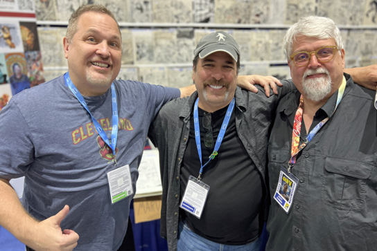
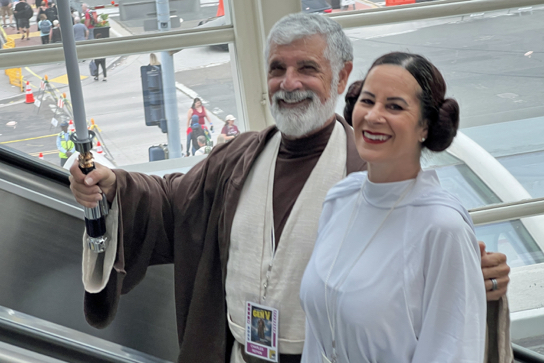
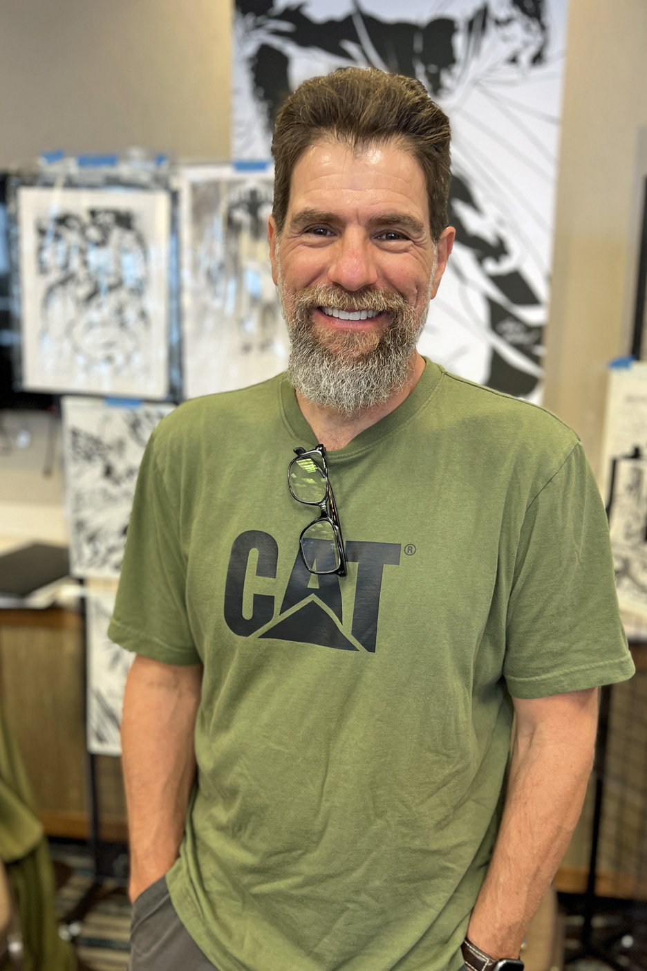
Good timing on the publication of the interviews; Today is the first day of San Diego Comicon, and although I won’t be behind a table, and it won’t be as musty,I will indeed be celebrating more than 50 years of contributions to the popular entertainment arts (Topps, IDW Publishing, Activision, et al) in one media format or another.
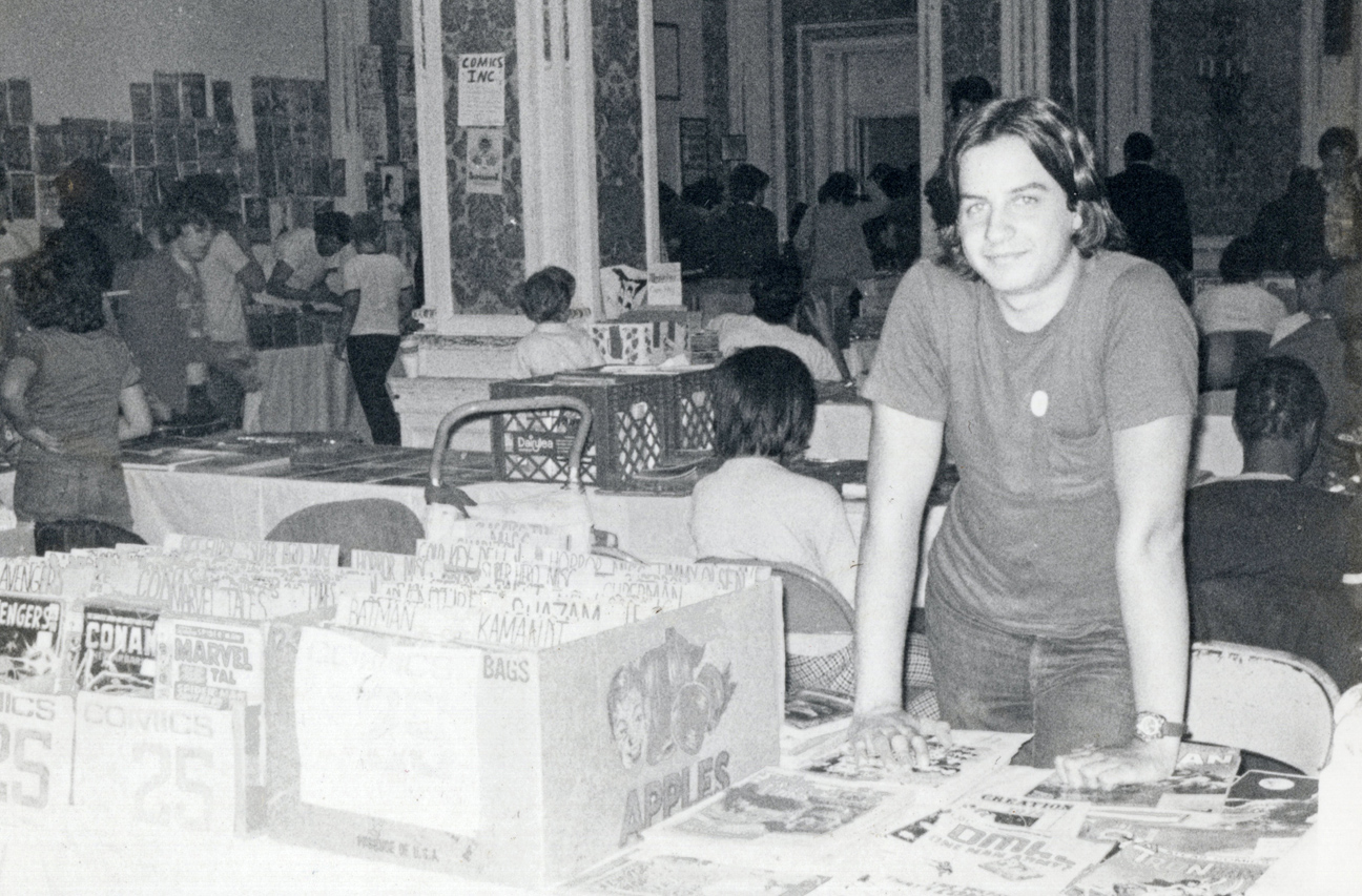
Teenage Greg (photo is October 1975, at Phil Seuling’s monthly Comic Book Marketplace show in New York City) would be very amused, if not startled.
Long, strange trip indeed.
https://icv2.com/articles/news/view/54613/icv2-interview-greg-goldstein


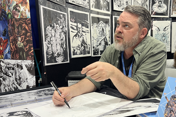
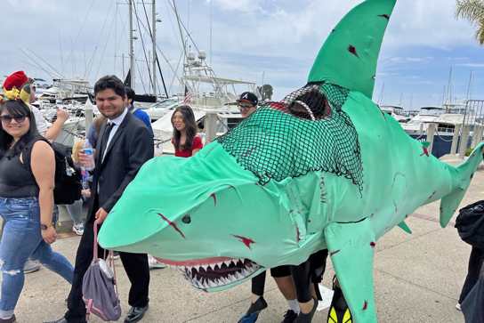
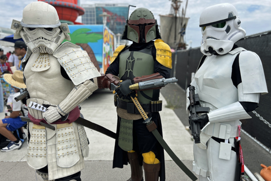
I’ll be attending the convention all four (five, really) days this week. As always, feel free to reach out — or track me down primarily in the original art pavilion.
Plus, I’m appearing on two panels:
Games: Pioneers of 1990s Gaming Animation
As advancements in computer animation technology take video game development to ever-more impressive heights, ASIFA-Hollywood will look back at the early days with these pioneers of video game animation. Actor and writer John Omohundro (Bravest Warriors, Tokyo Revengers) will go back in time with Kevin VanHook(Bloodshot, Valiant Comics), Greg L. Goldstein (CEO, Four Color Arts, formerly Activision, Acclaim, IDW Publishing), E. Daniel Arey (Creative Director at Niantic, VisionArey Entertainment), and other animators and game developers to explore the challenges and celebrate the accomplishments of classic video games, such as “Myst” and “Turok: Dinosaur Hunter.”
Friday, 7/21/23, 4:30PM – 5:30PM, Room 24ABC
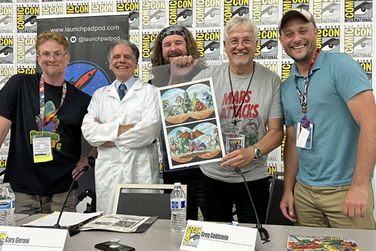
Nothing Topps Dinosaurs Attack! Cards
In 1988 Topps released a dinosaur-themed card series that sacrificed scientific accuracy for over-the-top action, violence, and gore. Fans of B-movies and dinosaurs were never the same! Series creator Gary Gerani (writer, film historian), Greg Goldstein (IDW Publishing, Topps), and Matt Corrigan (the Launchpad Podcast) discuss their favorite cards from this memorable set while Dr. Ashley Poust (paleontologist for San Diego Natural History Museum) separates fact from fiction. Matt and Greg will also show off original art produced for the series 35 years ago!
Saturday 7/22/23 7:30pm – 8:30pm Room 29CD
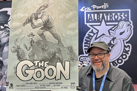
Lots of friends and colleagues appearing throughout the convention, but I would like to specifically point out that my pal Beau Smith is a Comic-Con Special Guest this year. His spotlight panel on Sunday, hosted by another pal, Ted Adams, is must-attend event!
June 2023

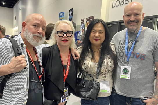
Some photos from the LA Comic Art Show this past June 4.
Veteran comic art retailer Bechara Maalouf runs the focussed convention twice a year in LA (Redondo Beach) — typically May and November — and also one in the SF Bay area in February.
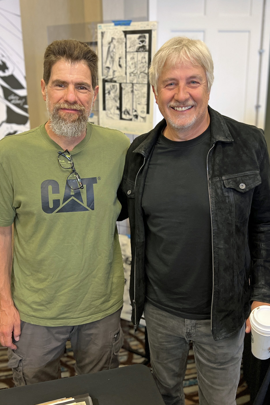
As always, it featured a great selection of original art —- plus a fun group of guests this time around. Pictured: Andy Kubert, David Mack, Mark Texeira, and yours truly with Andy.

If you blinked you missed it department:
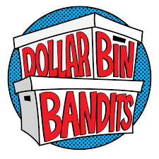
I recently raised a glass to our friends at Dollar Bin Bandits (podcast, video) in honor of their second-year anniversary. Much more importantly, they used the occasion to announce that they had joined forces with the gang at Tomorrows Publishing. The fine folks there do a stellar job of publishing books and mags on the history of comics and pop culture.
It’s like combining peanut butter and chocolate: “Two great tastes that taste great together.” Very much looking forward to their joint efforts.
https://www.youtube.com/c/DollarBinBandits/videos
https://dollarbinbandits.buzzsprout.com
Last, and maybe least:
There are at least 10 million opinions about recent comic book superhero films out there (the on-line universe is obsessed with this art of thing) but I will add my own three cents anyway. (Spoiler- free, and ranked in order of my personal preference:)
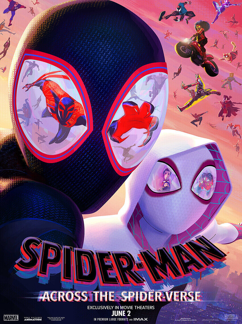
Spider-Man: Across the Spider-Verse:
• A landmark in animation.
• A landmark in comic book stories on film.
• A landmark in cinema, period.
Haven’t yet seen the film and think’s that hyperbole? Check it out — and let me know if you think I’m wildly off base.
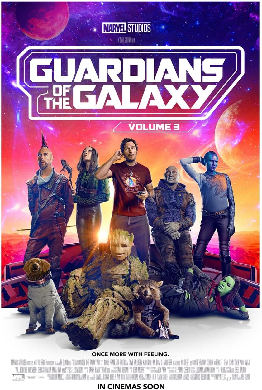
Guardians of The Galaxy 3:
Enjoyed it very much, and kudos to the filmmakers and their marketing efforts that managed to tell us what the film was about — without spoiling the story. The efforts worked, because pretty much every internet rumor about the film prior to the release was wrong. (Some just laughable.)
Caveat — I know the High Evolutionary’s animal experiments were needed for the story, but I do wish they had used a little more finesse in the editing room to tone some of it down.
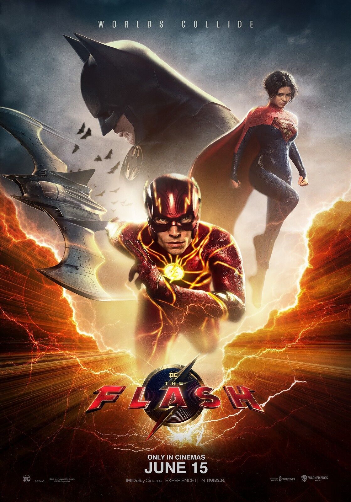
The Flash:
Between the changes in WB studio ownership / management and Ezra Miller’s well-publicized troubles, this was a cursed project that still somehow delivers a fair and occasionally fun superhero product, especially if you are familiar with the Flashpoint storyline.
Yes, the special effects needed a bit more work, but I barely tolerate most CGI anyway, so it didn’t annoy me as much as other fans apparently. As for the cameos? My only real reaction is where is TV Flash Grant Gustin? (The inter webs have plenty of thoughts on that, too.)
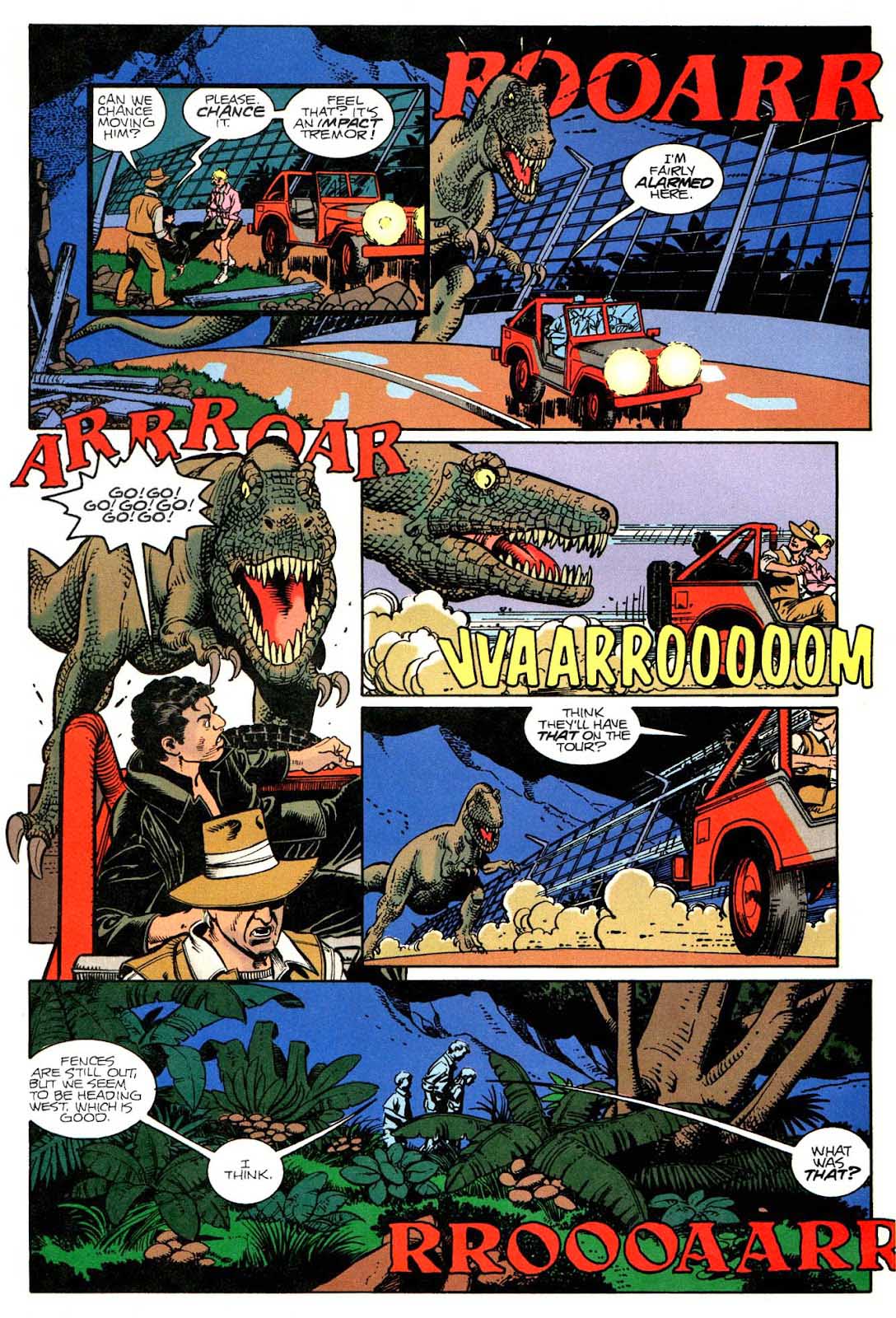
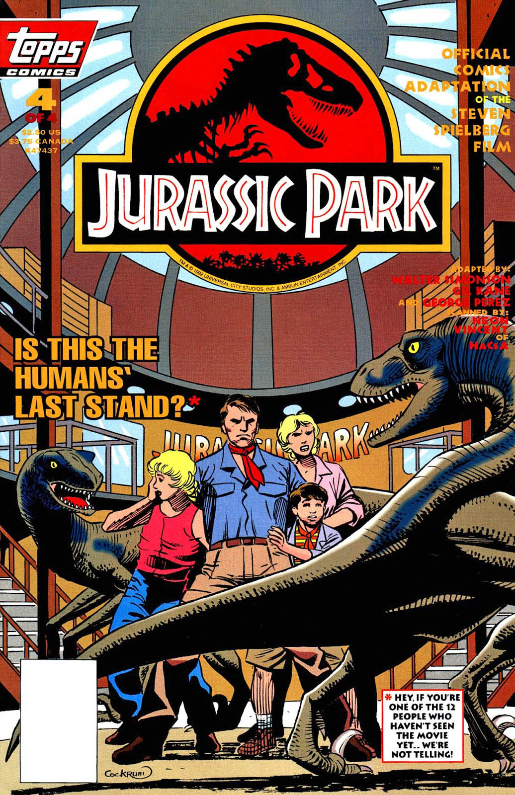
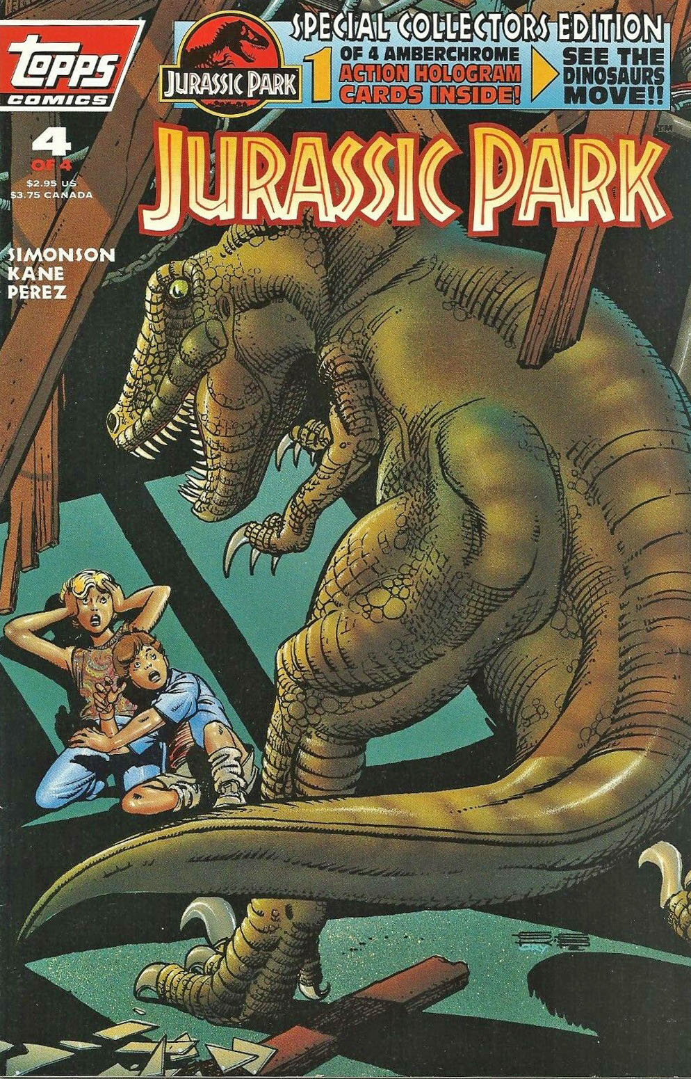
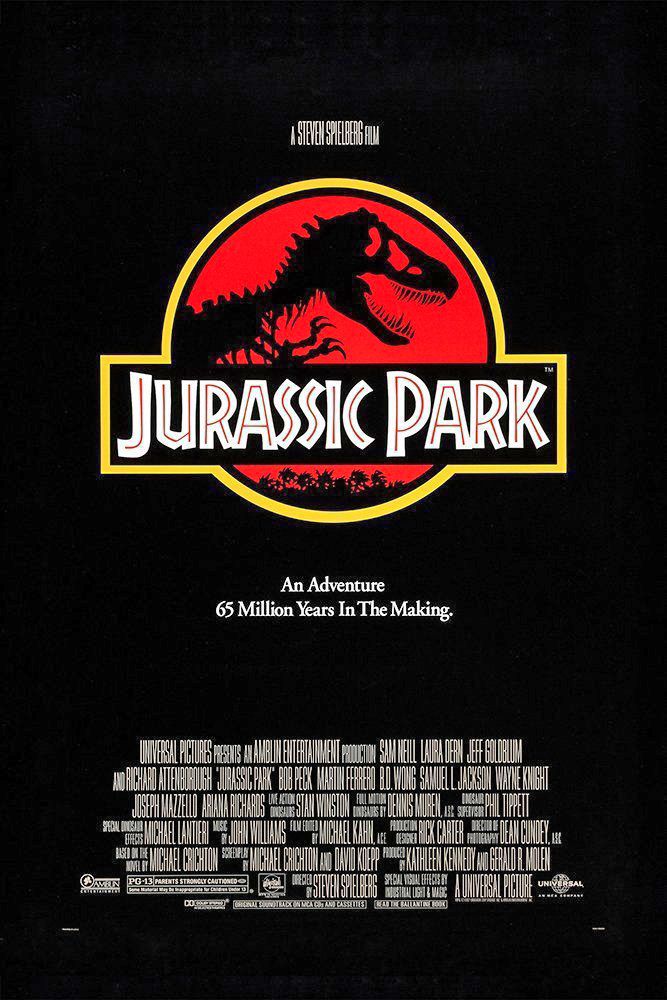
Jurassic Park #4, August 1993
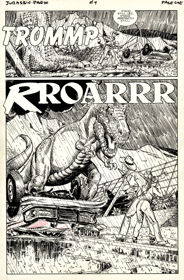
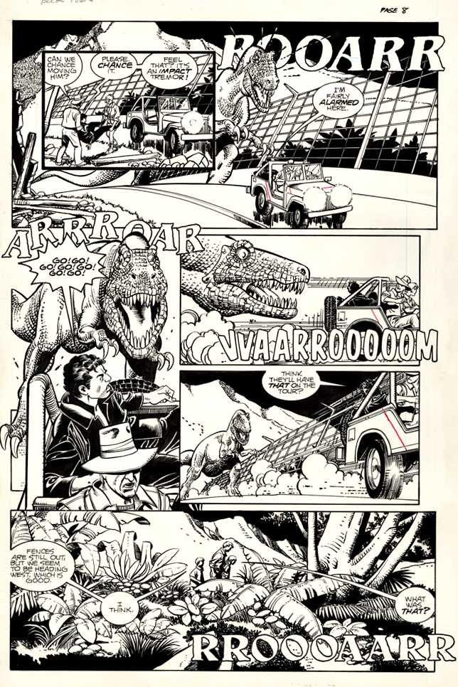
Here are two great pages from the final issue of the 1993’s Jurassic Park adaptation, penciled by Gil Kane and inked by the George Perez. As I noted previously, the key Dino action takes place in issue #4 which covers half (or more) of the film. (Thanks a lot, Universal.)
Fun fact: Universal had a giant launch party for the JP licensing and marketing program at New York City’s Museum of Natural History in February 1993 (at the annual Toy fair event) and Topps received several invites. So what happens when I hop out of the Subway to walk to the museum? I run into George Perez, and we make our way in together. I had a great time, but George was even more thrilled. It was clear he was absolutely delighted to be a part of this.
Fun fact #2: Topps also had a few invites to the NY premiere of Jurassic Park at the Ziegfeld Theater and Walter and Louise Simonson were able to accompany us to the theater, and a swell time was had by all. But, apparently, the final version of the shooting script had not made it from Universal / Amblin to Topps to Walter, so naturally he immediately noticed that his script and the Final Cut differed in a few places. (Fortunately, only a few.)
Oh well…
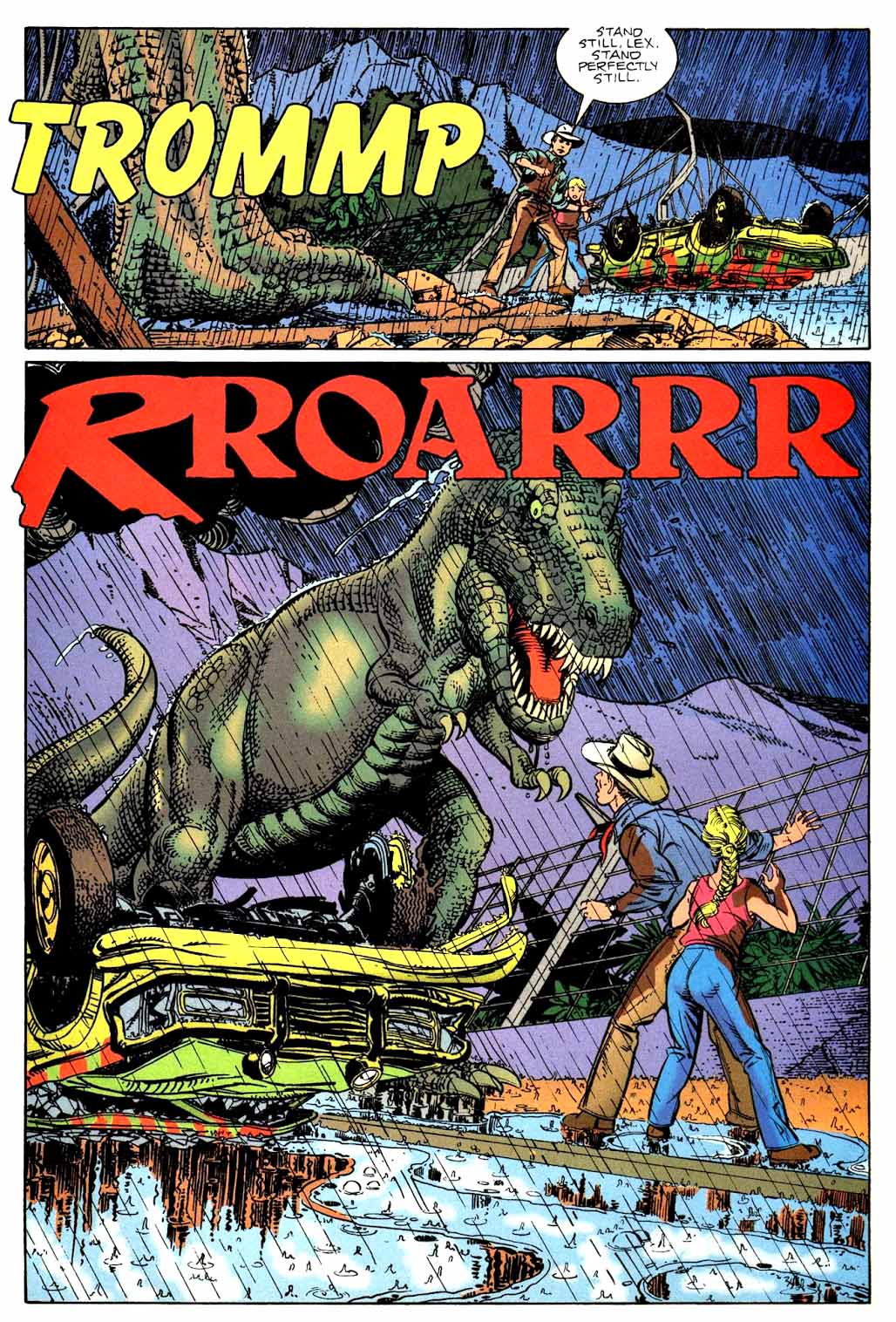
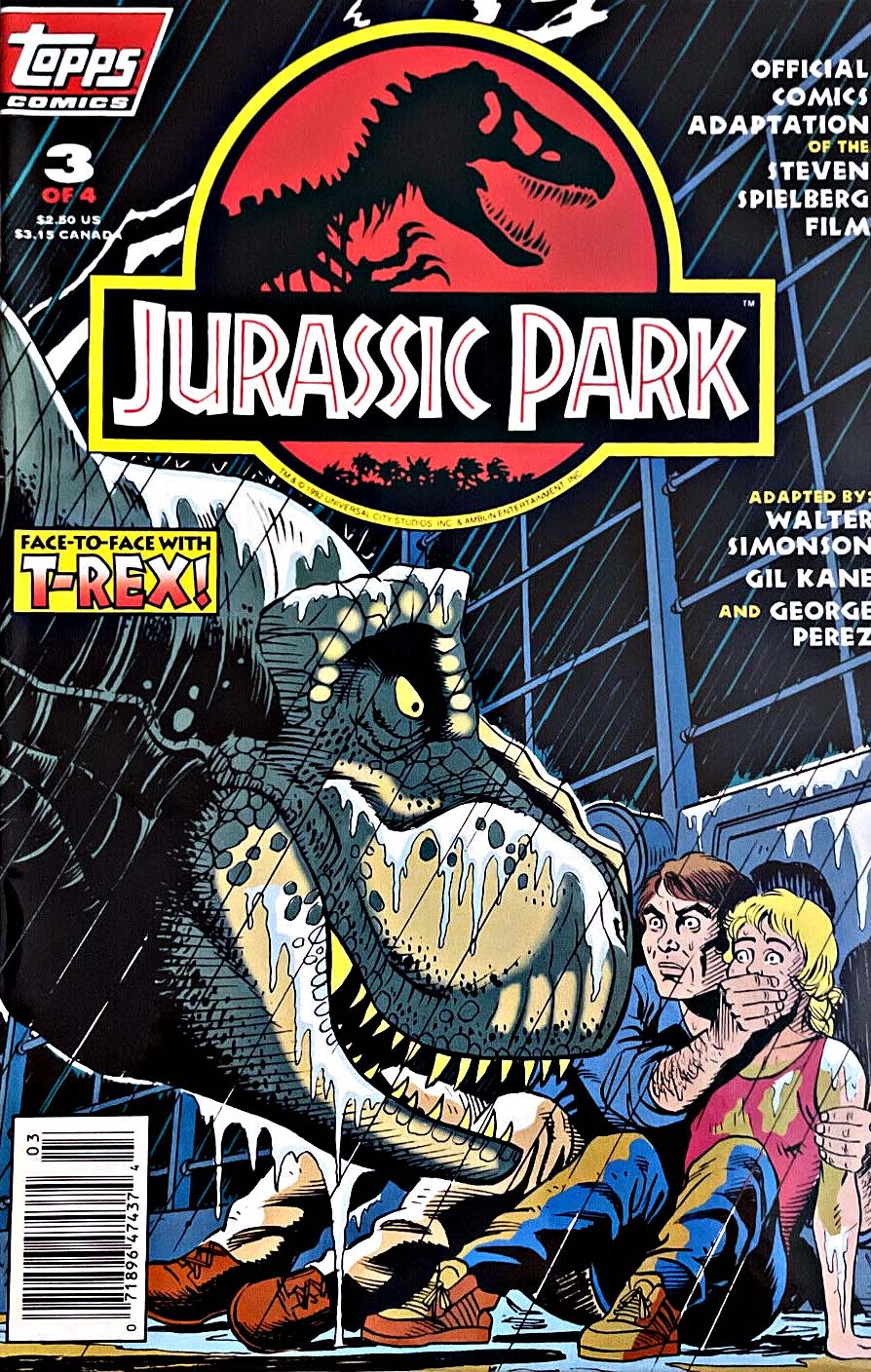
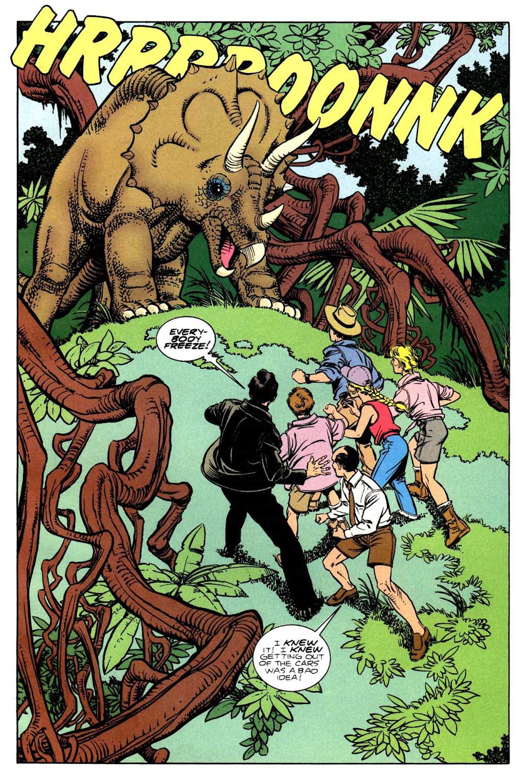
Jurassic Park #3, July 1993
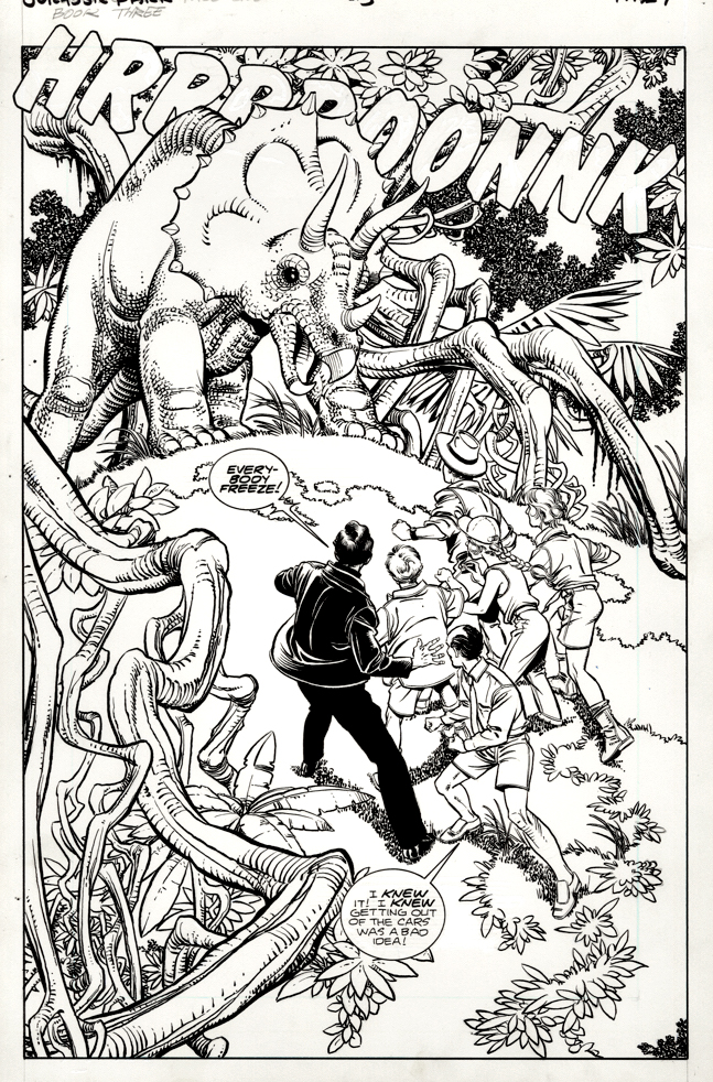
Jurassic Park opened thirty years ago June 11, so it seems like an ideal time to present some more great Jurassic Park pages from 1993’s adaptation drawn by Gil Kane and George Perez this week. (I still can’t believe it’s been thirty years.)
Here’s a terrific splash from issue three, with George’s telltale detailed inking mostly only evident in the original art; the color obscures many of those fine details in the published page.
Fun fact: Because of licensing restrictions (including embargo dates) and publishing schedules, the film’s script and the four-issue comic breakdown are somewhat uneven. Not that much happens in Issues #1 and #2. Issue #3 has this cool opening, and some cool T-Rex action in the second part, but most of the exciting Dino action happens in issue #4. (Writer Walter Simonson did a terrific job balancing the script under those challenging restrictions.)
For more on that, check back in on Friday.
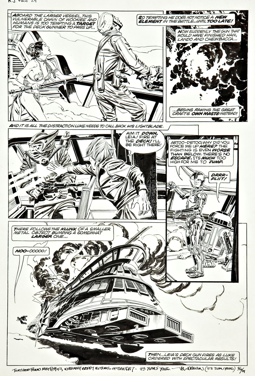
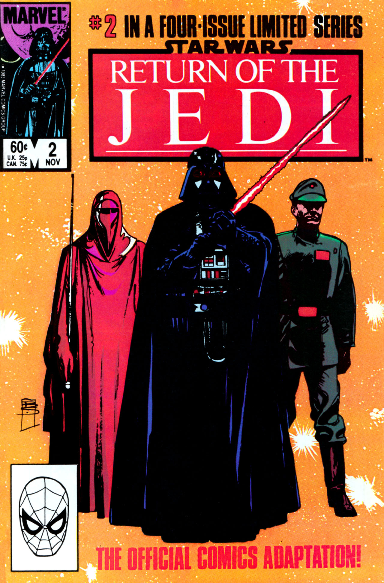
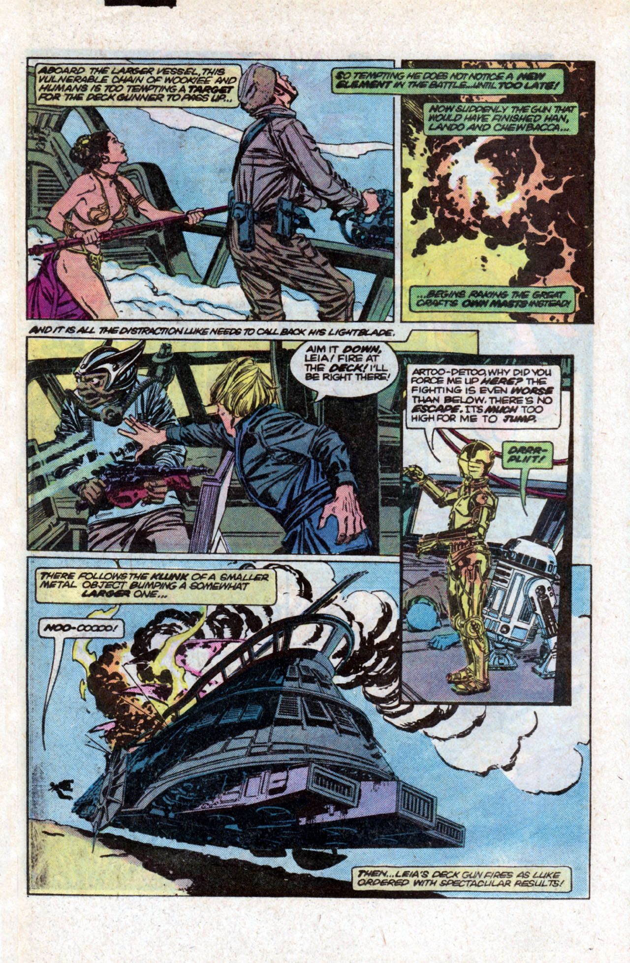
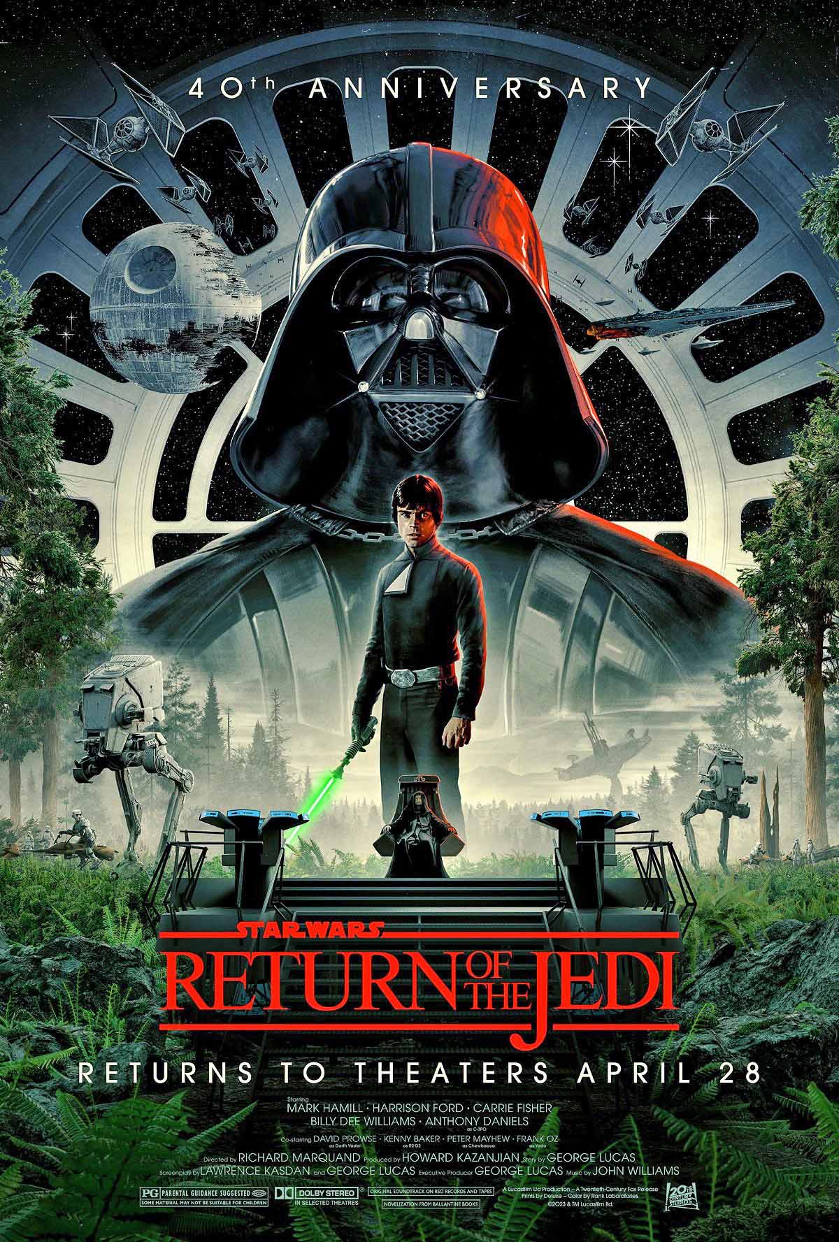
Return of the Jedi, #2, October 1983
Forty years ago, today —
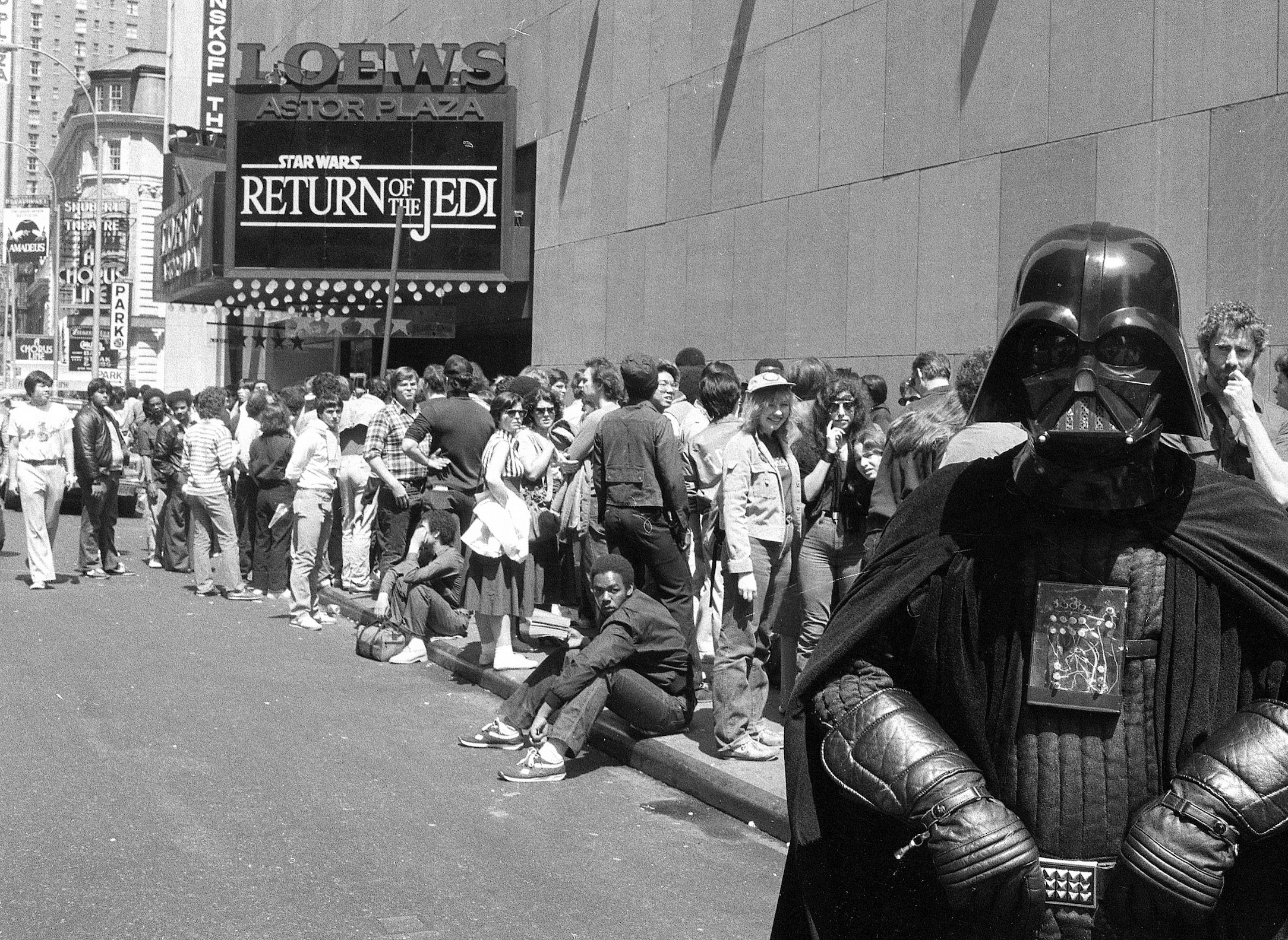
On a warm sunny day in NYC, my friends and I restlessly stood on a movie theater line, a line like many others that day, that wrapped around the proverbial city block. But did it matter that much? We had waited three years for this. What’s another three hours? (For the record, the theater, now gone, was the Loew’s 34th Street Showplace, near Second Ave.)
Return of the Jedi was opening that day, and we figured the Star Wars saga would reach its dramatic — and inevitable — conclusion. End of the story. (How naïve — but we were young and foolish.)
Somehow, I had the discipline and willpower to avoid opening Marvel’s ROTJ magazine adaptation which I owned for about two weeks prior to the film’s release date. (I did not have that same willpower three years prior for ESB, but that’s a story for another day.)
An original piece of art from that graphic novel adaptation, by the legendary Al Williamson, is a prized possession. Here’s my original 2019 post about the art:
Lush brushwork. Clear storytelling. Impeccable detail. Accurate anatomy and likenesses. Al Williamson’s page from Star Wars: Return of the Jedi adaption speaks volumes about realizing potential in adapting other mediums to comics.
George Lucas had the power to choose the artist to draw the Marvel Empire Strikes Back adaption and he had the good sense to choose Al Williamson.
Al’s gorgeous art on classic EC science Fiction stories as well as Flash Gordon had clearly made an impression.
Fortunately for us, Williamson agreed to also illustrate the Star Wars newspaper strip (after Russ Manning’s untimely passing), and he ultimately came back for Return of the Jedi adaption as well.
On all three projects — plus a handful of stories in the regular comics — Al delivered. It’s some of his finest work.
Williamson kept much of his Star Wars related art, and his estate now owns it. Nearly all the originals that have come on the market are those once owned by his assistants or inkers.
This great page from ROTJ has a more interesting provenance. Superstar inker Mike Royer received it from Al (see inscription) shortly after publication. It remained in his collection for many years.
So, it’s not only a great piece of original art, but it also has a great story behind it as well.
And it’s a cornerstone of my collection.
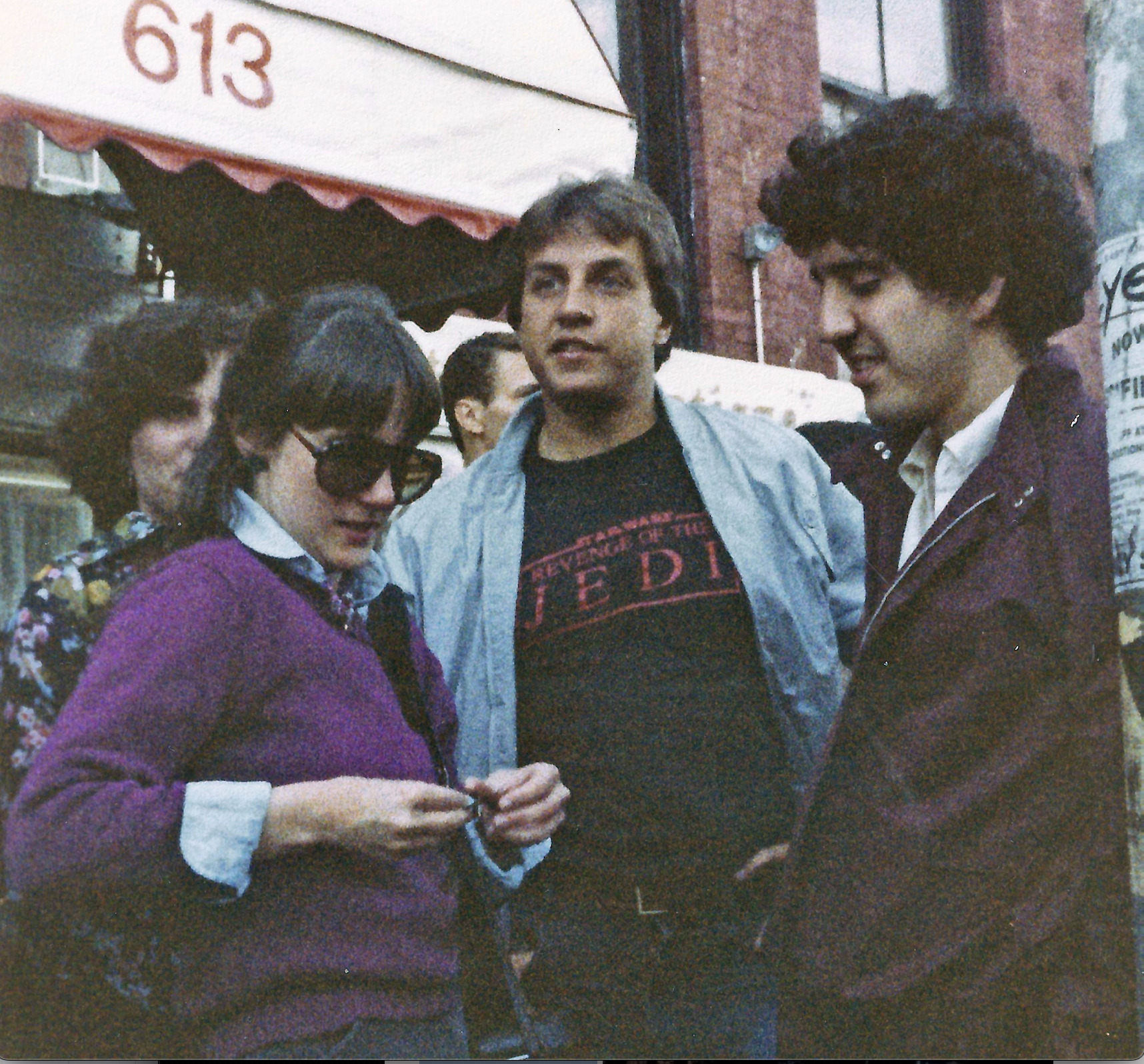
Yes, we waited in line. (That’s me, Star Wars sartorial in a bootleg “REVENGE” of the Jedi t-shirt.) I have a feeling the line on the other side of town was more interesting.
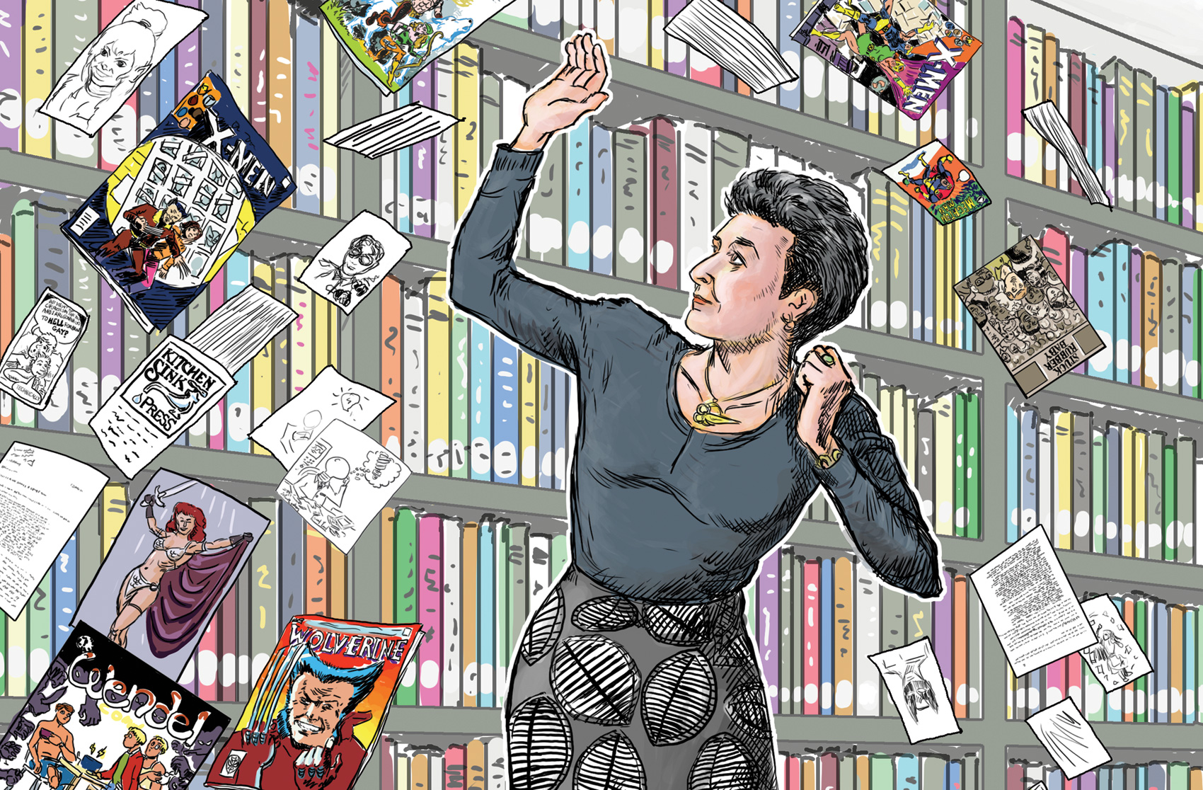
Columbia University, April 2023
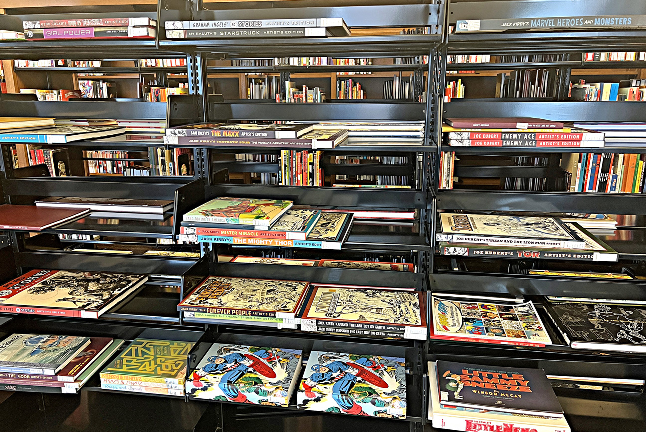
Happiness is a terrific graphic novel library.
Pictured is just one tiny part of the incredible collection at Columbia University curated by my pal, Karen Green, part librarian, part force of nature. From three books a few years ago — to three full rooms(!) of some of the best material published in the medium thanks to her tireless efforts. (Not to mention the acquisitions of personal papers and ephemera from some of the best-known names in the industry.)
Here we can see some of the shelves dedicated to the oversized material, including many of the original art “Artist Editions” titles I was fortunate enough to publish during the halcyon days at IDW Publishing. These of course were edited and curated by another pal, editor par excellence Scott Dunbier.
I cannot tell you how pleased I was to see the scope of this collection at my Alma Mater.
(Illustration of Karen below from Columbia Magazine by Nick Sousanis)
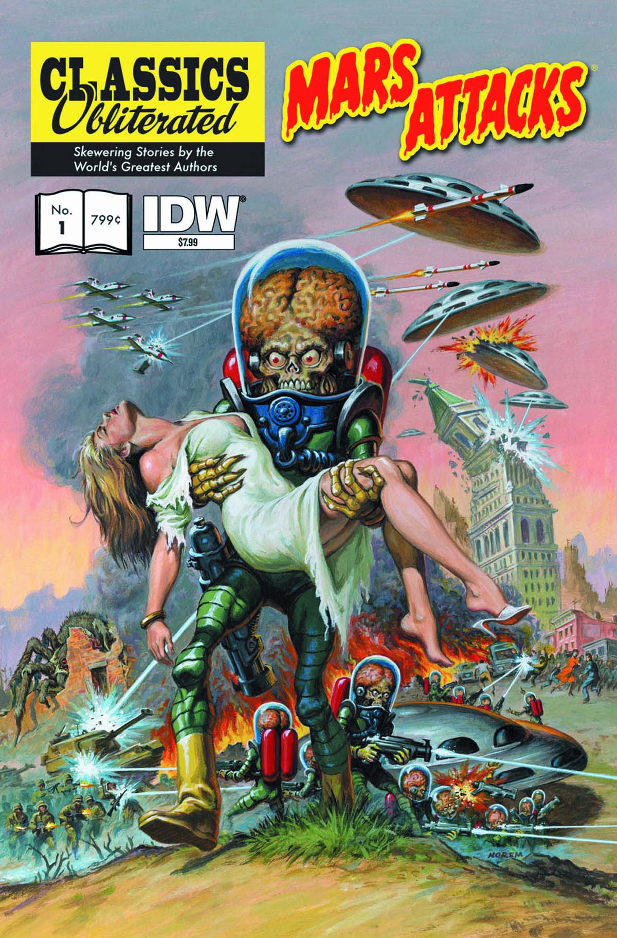
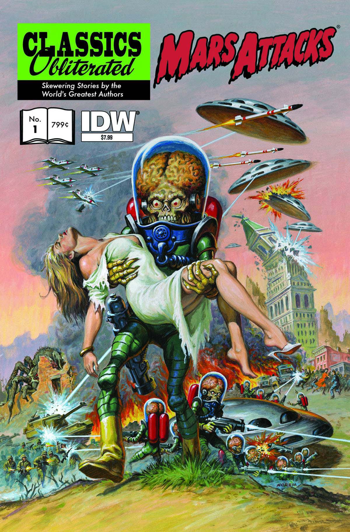
Painting for Topps Mars Attacks re-launch, 1994, used later as cover for Mars Attacks: Classics Obliterated (IDW) #1, June 2013
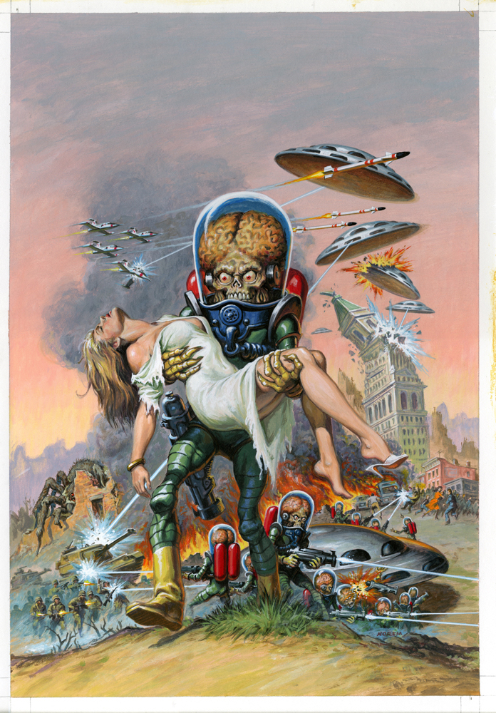
In 1994, to celebrate and promote the return of Topps Mars Attacks with its first series of comic books, and a brand-new series of Trading cards, we commissioned the legendary Earl Norem to create a “Classic” movie style painting of Mars Attacks as if it were a 50s SF poster painted by Reynold Brown or Joe Smith.
We immediately used the image on the back of a Topps convention staff t-shirt at SDCC, and other marketing materials as well. It was designated to appear on one of our comic books, but kept slipping through the cracks, until ultimately it remained unused through the series run. (It may have appeared on a bonus card or promo card though.)
As the owner of the original painting, I hadn’t forgotten about it, and when IDW acquired the Mars Attacks rights, it finally made its way as a cover for the “Classics Obliterated” one shot. It was only 18 years. Better late than never indeed.
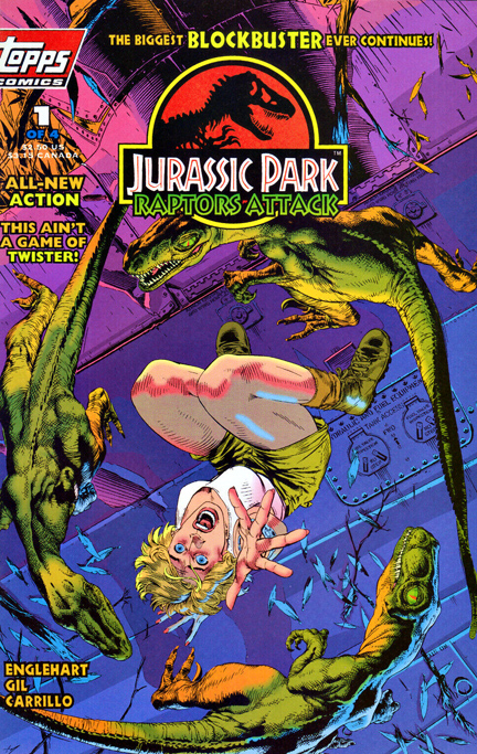
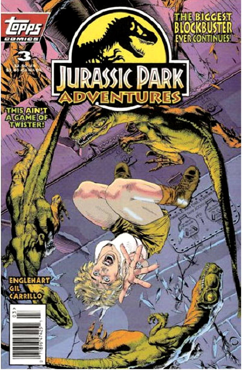
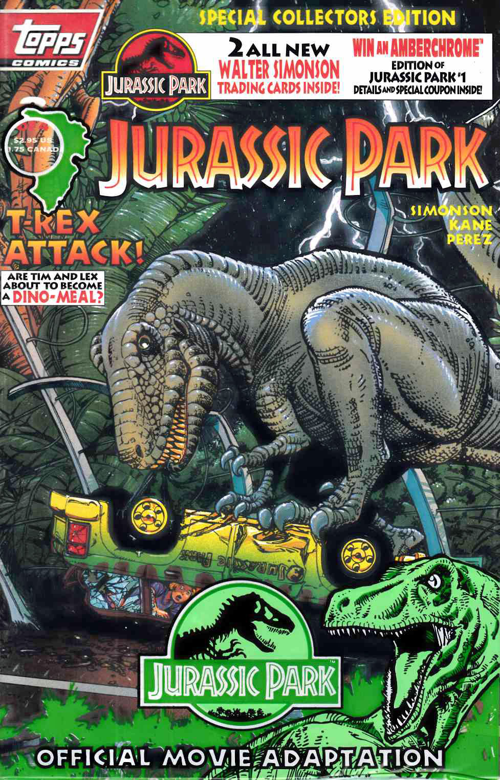
Jurassic Park: Raptor’s Attack #1, March 1994
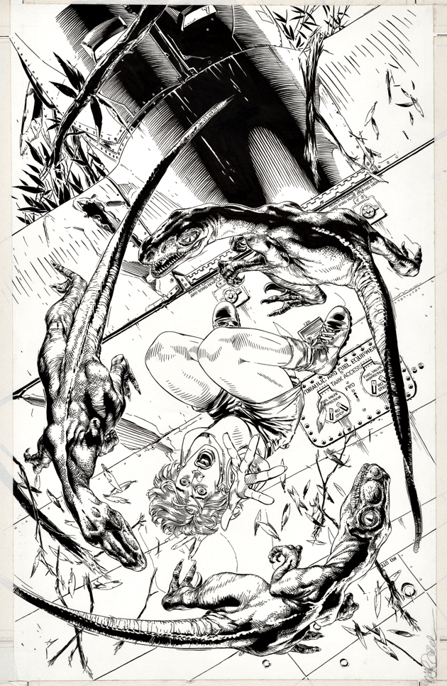
As noted previously, I’m a giant (pun intended) fan of Michael Golden’s dinosaur covers and portfolio plates for our Topps Jurassic Park comics.
Here’s one I haven’t posted before: Poor Ellie (Laura Dern) about to become a hors d’oeuvre for a group of velociraptors. I love the unique point of view on this one.
Originally designated as the cover for Jurassic Park: Raptor’s Attack #1, it was also reused for the cover of the newsstand exclusive JP comic, Jurassic Park Adventures #3.
Happy 30th Anniversary, Jurassic Park!