Greg Goldstein's Comic Art Gallery

Joe Sinnott — 4Ever

Sketch, NYCC Convention Program, 1972

Joe Sinnott, easily one of the greatest comic book inkers of all time, and a terrific person to boot, passed away a few days ago. He was 93.

Joe drew the very first sketch I ever owned (and still do, BTW) in my convention program at my very first NYCC, 1972.

Reed Richards — Mr. Fantastic — was an appropriate choice, because Joe’s legendary inks on both Kirby and then John Buscema (and ultimately others) provided a polished, consistent look for “The World’s Greatest Comic Magazine.”

I own other art inked by him, but this one is extra special.

RIP Joe. Many thanks and salutes from all of us for your astonishing career.

Michael Berry — Getting Serious

Humorama Magazine Group, 60s

The National Cartoonists Society would be poised for their annual awards event this month if it wasn’t for the COVID pandemic, so it’s a good week to celebrate cartoons.

And we need some way to celebrate summer again…

Michael Berry is very underrated cartoonist. With many appearances in Esquire and Playboy, plus hundreds of cartoons in the “cheapie girlie” magazines, his love of pretty women was always apparent. And many of his gags actually still hold up.

Unlike his better-known contemporaries like Dan DeCarlo, Jack Cole, Bill Ward et al, not enough is known about his life and career. That’s a shame — he’s just as good. One of the many things I enjoy about his art is that the finished result appears effortless.

Although I am sure it wasn’t.

Gene Colan — Agent Of Sleep

Captain America #120, December 1969

Concluding our look at SHIELD on the eve of its 55th anniversary.

Gene Colan was a polarizing storyteller when it came to artistic style.

Fans either really loved his work (count me in that group) or didn’t like it at all. I could never figure that out. Of course his work didn’t look anything like the rest of Marvel Bullpen, but that was cool; his dynamic storytelling and extraordinary use of light and shadows was astonishing. To me, at least.

Colan’s run on Captain America came after both Kirby and Steranko, and that was a definite change of pace. But Gene’s reality-defying physics felt like a perfect fit for Cap, Marvel’s own reality-defying super powered acrobat.

Inking Gene Colan was one of the most challenging assignments in comics, but the legendary Joe Sinnott delivers here.

Nick Fury, of course, is the most important supporting character in the Marvel Universe. After Kirby and Steranko’s run was completed, the character couldn’t sustain his own title, but SHIELD was an important part of the entire Marvel Universe, primarily with Captain America in the latter part of the Silver Age.

And of course that dynamic repeats — brilliantly — in the Marvel Cinematic Universe.

And for the record, even though it appears Fury’s up to absolutely no good by hypnotizing Steve Rogers in this scene, he actually did have a higher purpose in mind.

Ultimately it didn’t work. The man is Captain America, after all.

Frank Springer — Death To Fury!

Nick Fury, Agent of S.H.I.E.L.D. #10, March 1969

Continuing a look at SHIELD on the eve of its 55th anniversary.

Jim Steranko is not a hard act to follow.

He’s an impossible one.

But on the SHIELD solo series, Frank Springer gave it a try. And in possibly another circumstance, it probably would have been fine.

But, like I said, all of sudden SHIELD transformed into an inadvertent real life version of another spy series: Mission Impossible.

Springer, who broke into Marvel with his work on this series actually captured some of the Steranko vibe in these issues. Barry Smith also managed to capture some it in one issue as well, and even Herb Trimpe had a few cool stories before it became a moot point, and the series died.

In a vacuum, the Springer Fury issues, as exemplified by this page, are well told and illustrative. Clear storytelling and panel variety move us through the action quickly and creatively.

But coming off the Kirby-meets-Krigstein pop-psychedelic acid trip of Steranko’s earlier issues, it wasn’t enough to keep the series going.

But of course, Nick Fury, and SHIELD, lived on.
Springer’s original cover (right) had Fury as the “lead”, but it was re-done, with the help of Art Director John Romita, with the villainous Hate Monger as the main emphasis.
Springer’s great splash from issue #10, certainly channeling Steranko… and Krigstein, Eisner, et al…

Dave Bullock — Man For The Job

Ultimates #21, April 2013

1965. We entered the age of acronyms. 

SPECTRE. SMERSH. UNCLE. THRUSH. THUNDER. Et al.

The spy craze had given birth to super secret organizations for both good guys and the bad.

Enter SHIELD, 55 years ago. Nick Fury had already joined the Marvel Universe as WW 2 commando Sgt. Fury in 1963. And he showed up later that year in Fantastic Four, 20 years in the future (present day) as a CIA officer.  But now he was ColonelFury, head of the super secret spy agency SHIELD. (Originally, Supreme Headquarters, International Espionage and Law-Enforcement Division.)

In 12 short pages, we are not only introduced to SHIELD, but the villainous Hydra (Not an acronym, one of the few) and of course those great gadgets like the crazy heli-carrier. Comics, as noted previously, do not have budget constraints. Artists can go wild, and as we know when it came to wild tech, Kirby always delivered. All the bells and whistles of the Bond films, plus much, much more.

As a very young reader, I appreciated that Fury was a unique character; living in two different eras, in Sgt. Fury and in Shield.  And that he interacted with Captain America and Reed Richards (Mr. Fantastic) in both of those eras.

SHIELD was another great Lee and Kirby creation, but the series became something extraordinary when Jim Steranko took over, first pencilling over Jack’s layouts, and eventually writing, pencilling, inking and even coloring some those epic SHIELD stories himself. (More on that in the next post.)

Dave Bullock’s modern cover is a pseudo-homage to one of Steranko’s great Shield covers, SHIELD # 4, with the uniform almost identical, minus the dagger on the boots. The background references the groundbreaking pop psychedelic look that Steranko himself was creating at the time.

If Marvel ever decided to create a SHIELD animated series, I’d want it to look exactly like this.

Alex Maleev — A Long Time Ago…

Star Wars: Princess Leia #2, March 2015

Forty years ago today, life was definitely simpler. All I had to do was how to figure out how to get to the opening night of Empire Strikes Back.

Well, maybe not that simple.

Big films often did not open “wide” in those days, which meant ESB would not be playing anywhere near my college town of Binghamton, New York. Closest theater? In Syracuse. 75 miles away.

Fortunately, I had a car. Gas was (relatively) cheap. And finals had just ended.

That was the good news.

The bad? No on-line ordering. (Ha. We were still using punch cards and booking computer time in the lab.) No advance orders by phone. This was 1980. Horse and buggy era, tickets and technology wise.  And in those days, no bank was offering credit cards to broke college students anyway.

So we had to wing it. The “we” in this case, my buddy Bob and I, pretty much the only people that hadn’t packed up for the semester.

Off we went.  Up through farm country on Interstate 81. Somehow, even though we didn’t leave that early, and the legal speed limit was still 55mph, we made it to the “purchase tickets” line, and then the “entry” line in time, and had reasonable seats.

Good thing, too.

We had waited three years. I didn’t really want to wait another day.

I enjoyed it. A lot. Despite the fact that the story had been “spoiled” for me by the Marvel Comics adaptation, because I didn’t have the discipline to avoid reading it. (Lesson learned there. I never made that the mistake again, including, and especially, for Return Of The Jedi. Hell, I’ve occasionally forced friends who work on films into vows of silence.)

Alex Maleev’s beautiful painted cover features of one my favorite things about ESB: The battle on Hoth. I have a distinct memory of the first time I saw the Empire trailer tacked on to a Star Wars re-release in 1979.  The audience absolutely lost its mind at the Hoth tease. (Well at pretty much everything, I guess.) And the finished battle did not disappoint, stop-motion and all.

Where was I? Oh yes. Great cover. Terrific artist. Wonderful memory.

And somehow Bob and I made it back before the cows came home. But not by much, I imagine.

Paul Gulacy — Kung Fu Fighting

Master of Kung Fu #20, September 1974

By now, we should be in the next phase of the Marvel Cinematic Universe, but unfortunately, we have a six-month delay. So, for the first time in a dozen years, no Marvel film to launch the summer movie-going season. But, we won’t let that delay slow us down here — this week, we’re looking at some comics art related to the next three scheduled films.
Marvel’s ability to spot trends, and capitalize on them, definitely helped their their 1960s rise from second (more like fifth) banana to publishing powerhouse in the 60s and 70s.

Case in point: Martial arts and specifically “Kung-Fu.”. First flooding film houses, and then television, the craze rapidly spread through pop-culture in the early 1970s. Bruce Lee — and dozens of imitators — had clearly caught the public’s imagination.

Marvel quickly launched three genre series in late 1973 and early 1974. First up was Shang-Chi, originally by Steve Englehart and Jim Starlin, and shortly thereafter by Doug Moench and Paul Gulacy.

Shang-Chi’s backstory was intriguing — in the comics, he’s the son of Dr. Fu Manchu, famed villain from the Sax Rohmer novels. This plot detail, ultimately a rights issue, helped derail Marvel from reprinting the series for more than 40 years.

And, it’s been changed apparently for the Shang-Chi film now scheduled for May, 2021. He’s re-written now as the son of the Mandarin, an early Marvel (Iron Man) mastermind who was “impersonated” in Iron Man 3. We will see how that plays out.

As for this page itself: Shang- Chi barely makes an “appearance”, but so what?  It’s a cool example of Gulacy’s Steranko-influenced storytelling.

And, as for the criticism that perhaps Gulacy’s style was too influenced by Jim Steranko in these early issues? I say, so what to that too. Jim had already bowed out of comic book stories by then, and if you liked his work, this was possibly the next best thing.

John Romita Jr. — Eternally Yours

Eternals #1, August 2006

By now, we should be in the next phase of the Marvel Cinematic Universe, but unfortunately, we have a six-month delay. So, for the first time in a dozen years, no Marvel film to launch the summer movie-going season. But, we won’t let that delay slow us down here — this week, we’re looking at some comics art related to the next three scheduled films.

Jack Kirby’s Eternals was a natural extension of Jack’s interest and abilities in all things cosmic — Norse Gods, New Gods, et al. In my mind, this series was the most engaging of Jack’s efforts during his brief return to Marvel in the mid 70s.

When Jack left Marvel again in 1978, Eternals went into mothballs and only made a brief reappearance in 1985 (without Kirby) before disappearing again.

Then in 2006, another take, this one, a mini-series (7 issues) by Neil Gaiman and John Romita Jr. appeared. It seemed like an odd team-up — the Vertigo “alternative” star writer, paired with the more “meat and potatoes” (superheroes) star artist. But ultimately, the talents meshed and it’s a well-done series, bringing the Eternals into the “modern” Marvel Universe, with some twists.

If anything did the series a disservice, it was the main covers by Rick Berry. Berry is super talented artist of course, and in a vacuum the covers are wonderful paintings. But they don’t match the stylistic content of the stories. I’m guessing he was hired because the editors wanted the covers’ artistic style to match the established Gaiman “brand” – despite the fact the stories are so much more traditional than Neil’s Sandman work.

Nonetheless, great Romita Artwork is still great Romita artwork, and this splash of Ikaris and Thena (inks by Danny Miki) is one of the best pages in the series. The page (pencils version) was used as the cover for a sketchbook from the series.

Eternals (the movie) is currently (re)scheduled to open February 2021.

Eternals match game, comics and film.

Gene Colan — The Widow’s Sting

Daredevil #82, December 1971

By now, we should be in the next phase of the Marvel Cinematic Universe, but unfortunately, we have a six-month delay. So, for the first time in a dozen years, no Marvel film to launch the summer movie-going season.

But, we won’t let that delay slow us down here — let’s take a look at some of characters from the next three scheduled films this week.

From the trailer(s) for the Black Widow film, now releasing this November, it appears that many elements from Natasha Romanoff’s 55-year comic book backstory will make into the film. (No surprise, as that has been the Marvel M.O. since day one).

Of course, an exception will be her relationship with Daredevil, which lasted a few years in the original comics. Not sure what the entertainment rights status is for Daredevil and the other Netflix Marvel characters (now since cancelled), but I’d fall right out of my seat if any of them showed up in the cinematic universe in the near future.

This very cool Daredevil page from the great Gene Colan comes from early in the relationship between DD and the Widow; in fact they don’t actually have a relationship at this point in the chronology, but they soon will, and ultimately team-up and move to San Francisco together.

In fact, the comic book changes its cover nameplate to Daredevil and The Black Widow for more than a year.

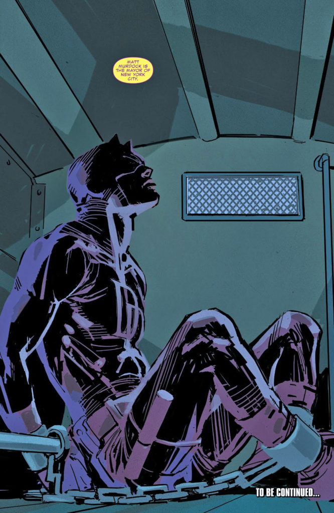
Let’s see: Matt Murdock suddenly ups and moves to Frisco. Daredevil — suddenly — is now fighting in the Bay Area. No one figures the connection out? Really?

June Brigman And Whilce Portacio — Snik!??

Alpha Flight #52, November 1987

Concluding — for now — our two-week series celebrating a few important X-Men anniversaries in 2020.

A full-page splash of an iconic superhero… on the phone?

Well yes, why not, if done well?

And here in Alpha Flight it’s done very well, by the talented June Brigman and Whilce Portacio.

I love the look on Logan’s face. And, his coif reminds me of the line from great Warren Zevon song “Werewolves of London:” 

“His hair was perfect.”

Wolverine is not self-quarantining here. I double-checked. He’s just chilling at the moment. Also, note there are two things you won’t see anymore in a Marvel Comic. A phone cord and a cigar; old technology and a bad influence on kids, in the order.

But Snik?!?  Someone apparently forgot the “t” in Snikt? That’s an odd one. Chris Claremont first used “Snikt” way back in X-Men #116. And, apparently it’s become a legit trademark for the sound of Wolverine’ claws.

Fun fact: The story continues — with Wolverine — in Alpha Flight #53 and, while also inked by Whilce, its penciled by none other than Jim Lee, whose very first Marvel work was two issues earlier, in #51. But this time, he draws Wolverine, a sign of things to come.

Fun fact #2: Whilce and I bumped into each other —- both of us with unscheduled visits — on Free Comic Book Day a few years ago. Pretty fun and random coincidence — its not like San Diego is a small county, or only has one comic book store.

Fun fact #3; If for any odd reason you have not read the Power Pack series by Brigman and Louise Simonson, well, stop what you’re doing and get to it. Brilliant. And fun!

More X-men and Wolverine related posts late in the year. Stay tuned.